1. Velvet Black Cat Eyes
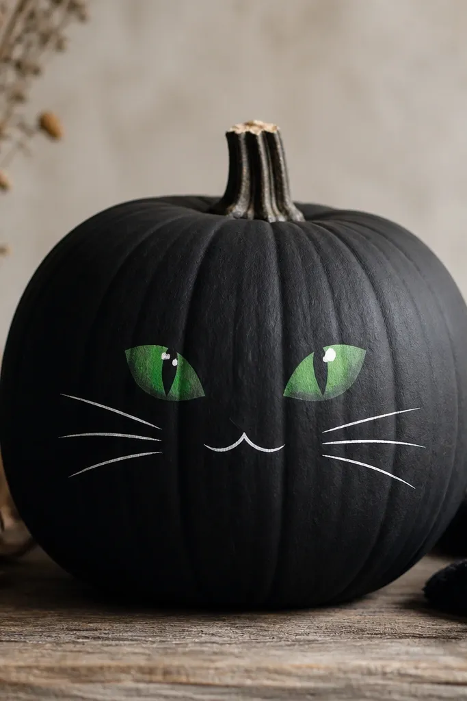
I did this on a medium white pumpkin because the paint coverage is fast and the black looks like fabric instead of “flat craft.” The eyes are deep forest green with a darker ring around the iris, then two small white dots for catchlights. That tiny highlight trick makes the eyes look alive even from across a porch. This one flatters anyone’s decor because it reads sleek and modern, and it looks great against warm wood tones and black planters.
Start by sanding the pumpkin lightly and wiping it dry. Prime with a thin coat of white or light gray, then paint the entire pumpkin matte black using a foam roller for even coverage. Next, sketch eye shapes with a pencil, then paint the iris in forest green and add a darker outer ring while the base is still slightly tacky. Finally, add two small white dots for catchlights and draw whiskers with a 10/0 liner brush; seal with matte varnish so the black stays soft, not shiny.
Pro tipLet the green iris dry 20-30 minutes before adding the darker ring so it doesn’t bleed.
AvoidSkipping primer makes the black look patchy and slightly gray at the edges.
2. Spiced Latte Gradient Ombré
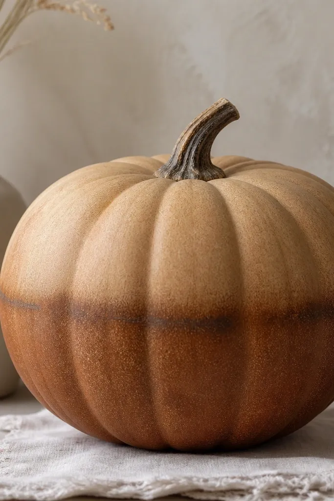
This look is my go-to for front steps because it blends into neutral fall palettes without trying too hard. I used a light cream pumpkin so the top stays warm and creamy, then built the ombré with three brown tones. The trick is keeping the transition soft so it looks like dye, not paint strokes. It flatters light skin and warm-toned interiors because the colors read cozy, not Halloween-bright.
Sand the shine off, then prime with a warm gray so the browns sit true. Paint the top third with caramel acrylic, then sponge in cinnamon from the midline down, using a barely-damp sponge so you don’t lift previous layers. Blend the boundary by dabbing back and forth until it disappears. Add a thin darker band around the middle with a small flat brush, then seal with satin varnish to keep the gradient smooth to the touch.
Use three tones on purpose: one lighter base, one mid blend, one darker anchor band.
Trying to paint a gradient in one coat makes streaks that never fully disappear.
3. Gold Leaf Stem Centerpiece
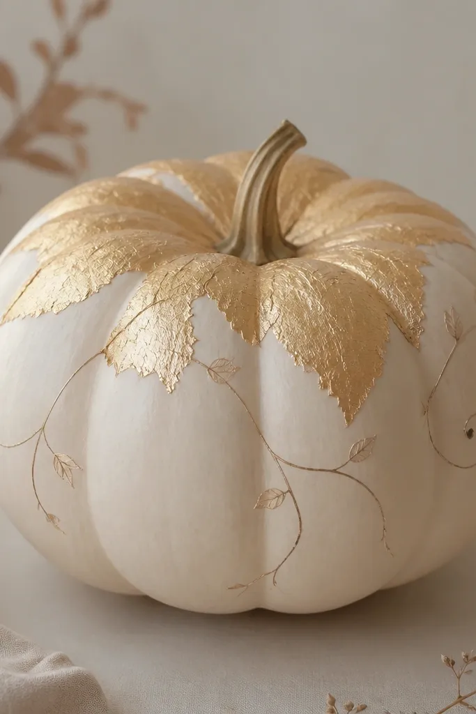
If you want “expensive” without doing a full mural, this is the one. I painted the pumpkin a creamy off-white, then created a gold leaf halo centered around the stem using metallic gold paint and a sponge. The torn-foil texture makes it feel like real leaf, and the muted vine lines keep it from looking like a sticker. It looks best on small to medium pumpkins where the stem area is the focal point.
Prime with off-white, then paint the whole pumpkin in creamy acrylic and let it dry completely. For the gold halo, dab metallic gold in a rough circle around the stem, pulling the edges outward with a sponge so it looks irregular. Add a second layer of gold only on the center for depth. Draw two or three thin vine lines in warm umber from the halo down the sides, then seal with clear satin varnish so the metallic doesn’t dull.
Pro tipDo the gold dabbing with a dry sponge, not a wet one, so the texture stays crisp.
AvoidPainting gold on top of glossy paint makes it look like a shiny patch instead of leaf.
4. Teal Geometric Tape Lines
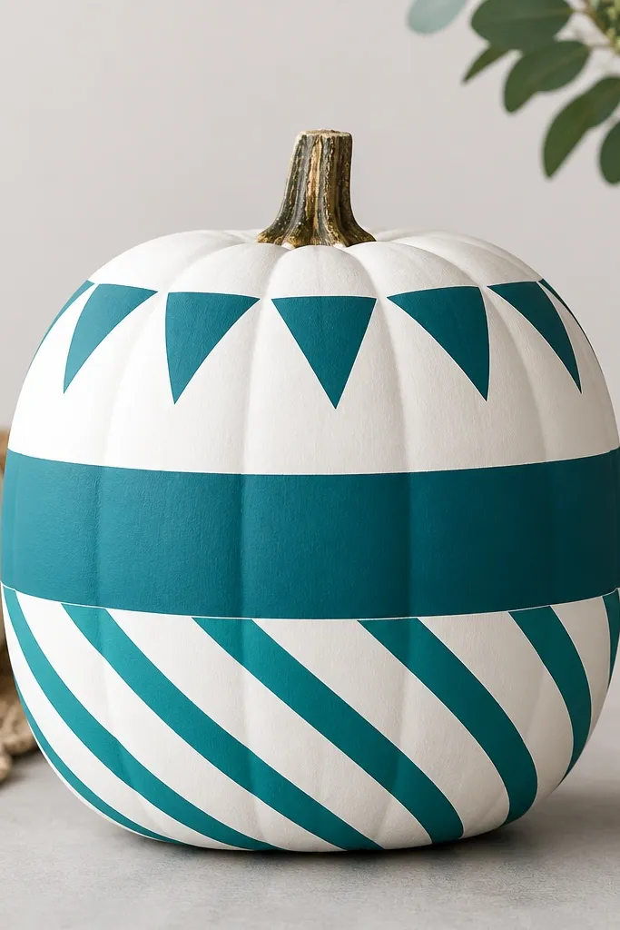
This is the cleanest look when you want “modern farmhouse” energy. I used a white base because it makes the teal pop hard without needing bright neon. Painter’s tape creates straight borders that freehand can’t match, and the geometry makes it feel intentional. This style looks great in kitchens and entryways, and it flatters people who like crisp lines more than cute faces.
Start with a smooth pumpkin or a lightly sanded one, then prime white. Paint the entire pumpkin white, then place painter’s tape to form a diagonal stripe pattern and a few small triangles near the stem. Paint teal over exposed areas, remove tape while the paint is still slightly wet, and let it dry. Add a thin black outline around one geometric section using a liner brush, then seal with satin varnish.
Press tape edges down with your fingernail so paint doesn’t creep under.
Removing tape after the paint fully cures can tear the edges and leave ragged lines.
5. Retro Checkerboard Party Pumpkins
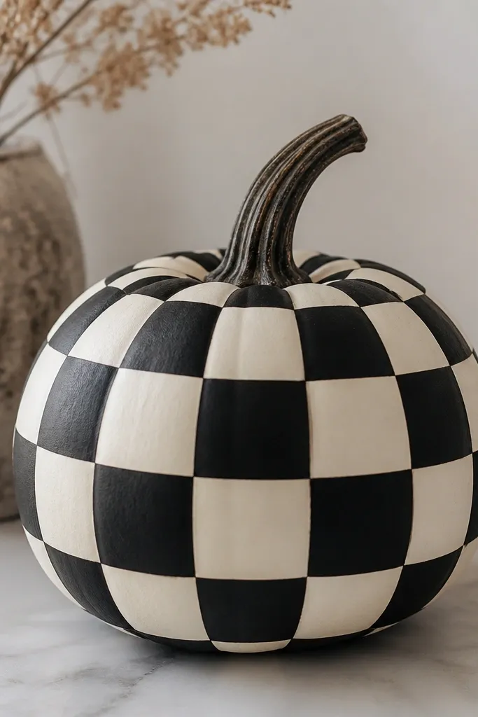
Checkerboard is forgiving in a way faces aren’t. You’re not trying to nail eyes; you’re repeating shapes, which means your mistakes blend in. I used off-white and matte black so it reads retro, not Halloween. This one looks great as a set of three sizes because the pattern scales nicely and gives you instant visual rhythm on a porch.
Sand, prime with off-white, then paint a full base layer in off-white. Measure the pumpkin’s height and pick a square size that fits (I like about 2 inches on medium pumpkins). Use a pencil to lightly mark a grid, then tape or freehand paint alternating squares in matte black. Let each coat dry, then touch up borders with a small brush. Seal with matte varnish so the black stays deep and doesn’t glare.
Pro tipUse a ruler to mark grid lines, then paint one row at a time to keep your spacing consistent.
AvoidSkipping the pencil grid leads to squares that drift and look uneven fast.
6. Watercolor Sunburst Rays
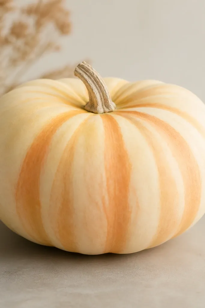
This is the look I use when I want “art print” vibes without perfect lines. I painted a light base, then built rays with watered acrylic so the edges bloom like watercolor. The center is a little darker so the rays feel like they move outward. It looks amazing with warm neutrals and terracotta planters, and it flatters both bright and muted decor because the palette is gentle.
Prime in cream, then paint the whole pumpkin in a thin, even cream coat. Mix peach and orange acrylic with a bit of water and a drop of flow aid if you have it, then dab rays using a fan brush from the center outward. Overlap rays slightly so there are no gaps, and fade the tips by lifting the brush as you go. Add a muted gold center dot ring, then seal with satin varnish for a soft sheen.
Pro tipTest ray thickness on paper first so you match the pumpkin’s curve.
AvoidUsing thick paint for watercolor effects gives you stiff lines instead of airy rays.
7. Blackboard Chalk Script

This one reads cozy and playful, and it’s also practical because the dark base hides tiny paint bumps. I used charcoal paint and then wrote with white paint in a chalk-like style so it looks handwritten. The leaves are small and slightly messy by design, which makes it feel human. It’s perfect for anyone who likes fall quotes or wants a pumpkin that works as a “decor sign.”
Sand and prime, then paint the pumpkin charcoal matte. For the chalk effect, dry-brush a slightly lighter charcoal on raised areas so it looks like a real board. Sketch lettering lightly with pencil, then fill with white acrylic using a script brush or a small flat brush. Add tiny leaf doodles in pale gray-green, then seal with matte varnish and let it dry for at least a full night.
Pro tipWrite a test line on cardboard first so your letter height matches the pumpkin’s curve.
AvoidUsing glossy top coat makes the lettering look like stickers instead of chalk.
8. Monochrome Marble Veins
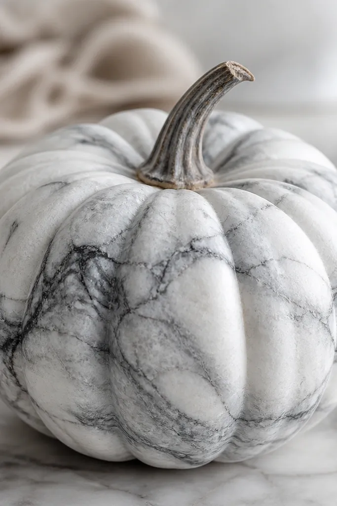
Marble is one of those looks that always looks expensive if you control the vein thickness. I used a white base and two gray tones so the veins have depth without turning muddy. The organic swirls hide small imperfections from sanding, which is why it’s great for pumpkins with natural bumps. It fits modern decor and also looks good next to metallic candle holders.
Prime with flat white, then paint the pumpkin white in thin coats. Mix light gray and dark gray paint with a little water so it flows. Use a fine liner brush to drag thin veins in random paths, then add a few thicker veins with a small round brush. Blend edges lightly by tapping with a clean damp brush so the veining feels soft, not etched. Seal with satin varnish so the marble reads smooth.
Pro tipKeep most veins thin; only add a few thicker ones so the pattern doesn’t look cluttered.
AvoidOverworking the veins makes them look like scribbles instead of marble.
9. Terracotta Face Minimalism

This is my “quick but looks styled” option. Minimal faces photograph better because the shapes stay readable from a distance, and matte terracotta looks warm under porch light. The black dots and line are placed just above center so the pumpkin looks friendly instead of creepy. It works for families because it’s not scary, and it blends with fall planters like mums and ornamental grasses.
Sand, then prime with a light base so terracotta doesn’t look patchy. Paint the pumpkin matte terracotta in two thin coats. Mark eye positions with a pencil dot guide, then paint two small black circles using a dotting tool or the end of a makeup sponge. Add a small curved smile with a liner brush, keeping it short. Seal with matte varnish and wipe any drips before they dry.
Place the eyes slightly higher than you think; it makes the face look more cheerful.
Making the smile too wide turns the whole thing into a grimace.
10. Forest Pine and Snow Caps
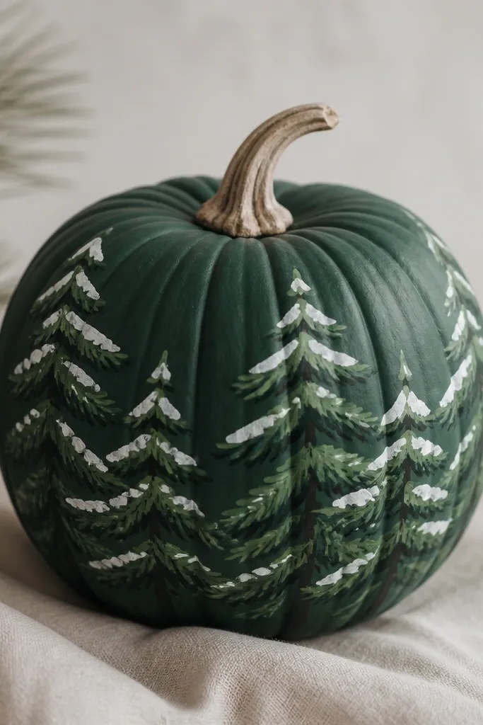
This one straddles fall and early winter. The base pine green looks grounded, and the white “snow caps” on branch tips make it feel fresh. I painted branches in layers so they have depth, not flat doodles. It flatters dark doorways and looks great with silver ornaments or frosted candles nearby.
Prime and paint the pumpkin deep pine green, letting it dry fully. Sketch a simple branch layout around the top half, then paint branch trunks in a darker green. Add lighter green needles with a small dry brush, dragging outward in short strokes. Finally, tap white paint at the upper edges of needles to create snow caps; keep it only on the top sides. Seal with satin varnish so greens stay saturated.
Pro tipUse a dry brush for needles; wet brush strokes look like blobs.
AvoidPutting snow on every side makes it look like a random white coat.
11. Candy Corn Stripes with Clean Edges
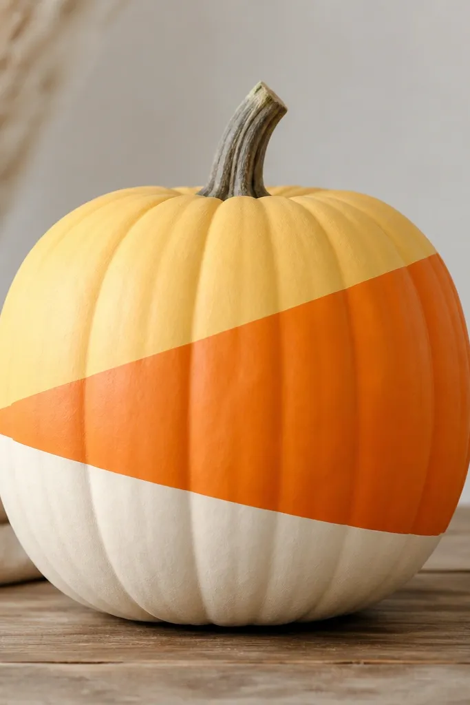
Candy corn is a classic for a reason, and it looks best when the stripes are crisp. I painted this on a medium pumpkin because the proportions look right and the diagonal lines don’t stretch. The palette is pale yellow, warm orange, and cream, and it reads like candy without becoming childish. It looks great on a porch table with cinnamon sticks and striped dish towels.
Sand, prime with white, then paint the top section pale yellow. Use painter’s tape to mask diagonal boundaries and paint the middle band warm orange, then remove tape to reveal sharp edges. Mask again for the bottom cream band and paint in thin layers. Add a tiny shadow line where the diagonals meet by dragging a slightly darker orange along the edge. Seal with satin varnish for a smooth candy-like finish.
Cut tape into shorter pieces so it sticks evenly to the pumpkin curve.
Freehand diagonals without tape usually drift and look uneven.
12. Botanical Line Art in Olive and Clay
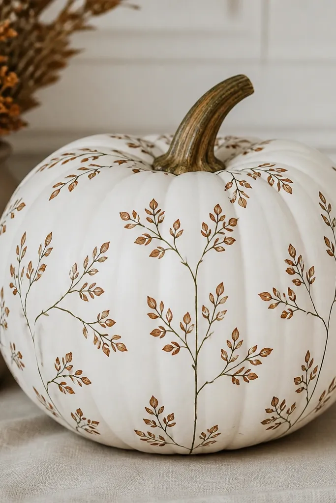
This is the look that makes your pumpkin look like part of a grown-up print, not a kid craft. White base keeps the lines crisp, and the olive plus clay gives you that dried-herb vibe. I like placing clusters on the left and right sides instead of covering the whole pumpkin, because negative space makes it feel intentional. It works for anyone who wants “fall” without orange overload.
Prime with white, then paint a smooth white base in one or two coats. Draw a light stem path with pencil, then paint line art in olive using a fine brush (liner or 10/0). Add leaves in clay brown with a small angled brush, keeping each leaf shape consistent. Build clusters near the top and midsection, leaving clean white space between them. Seal with satin varnish so the lines stay readable.
Pro tipPlan your leaf clusters on paper first so you don’t cram them too tightly on the pumpkin curve.
AvoidFilling every inch with leaves makes it look messy and reduces contrast.
13. Glazed Donut Drip
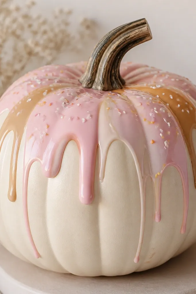
If you like playful decor that still looks clean, go glazed. I used a cream base and a two-color drip so it looks like layered icing, not one flat color. The trick is a glossy top coat on the glaze area so it catches porch light. This style flatters kitchens and snack-table setups, and it’s cute without turning into cartoon chaos.
Sand and prime, then paint the pumpkin cream and let it dry. Mix a pale pink glaze color and paint thick drips from the upper third downward, leaving gaps between drips. Add caramel glaze behind or alongside the pink in a few places for dimension, then paint tiny sprinkles with a toothpick or dotting tool. After everything dries, brush clear gloss varnish only on the glaze areas so the rest stays matte. Let it cure overnight before handling.
Do your sprinkles last with a light hand so they don’t smear into each drip.
Skipping gloss on the drip makes it look flat and chalky.
14. Smoke Ink Stippling Ghost
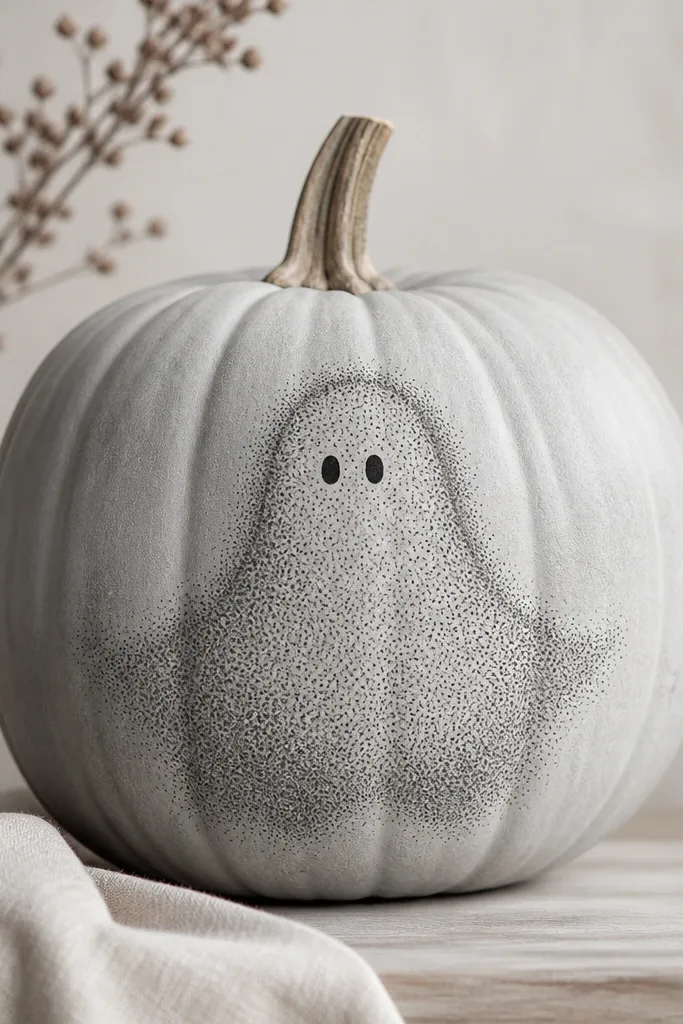
Stippling gives you a ghost that looks like it’s made of smoke instead of a sticker. I used a light gray base so the dot pattern has room to breathe. The ghost shape sits in the center and fades at the edges, which makes it look softer and more stylish than Halloween cutouts. This works well if you want spooky but classy.
Prime and paint the pumpkin light gray. Sketch the ghost outline lightly, then load a small round brush with dark gray paint and stipple inside the outline. Build the darkest area at the center and thin out the dots near the edges by using less paint. Add two tiny black eyes and a small mouth with the same stipple or a liner brush for control. Seal with matte varnish so the dots don’t become shiny.
Pro tipPractice dot size on cardboard; consistent dot pressure keeps the ghost looking even.
AvoidDragging the brush instead of tapping turns stippling into smudges.
15. Pastel Lavender Face Frame
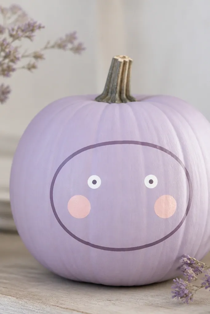
This one looks like it belongs on a boutique shelf. I used lavender as the base and a slightly deeper purple for the oval frame, then kept the face features tiny. The soft pink cheeks add warmth without making it look like a cartoon. It flatters people who like pastel decor and it photographs beautifully because the colors are gentle and clean.
Sand and prime, then paint the pumpkin lavender matte. Mask an oval frame with painter’s tape, leaving room for the face inside, and paint the frame deeper purple. Remove tape and let it dry, then add small white dot eyes and tiny purple pupils. Paint two small pink cheek circles with a sponge and a little highlight dot on each cheek. Seal with matte varnish to keep the pastel from looking shiny.
Pro tipUse the tape only for the frame; freehand the face so it looks human, not mechanical.
AvoidMaking cheeks too big makes the face look lopsided on a pumpkin curve.
16. Copper Galaxy Dots
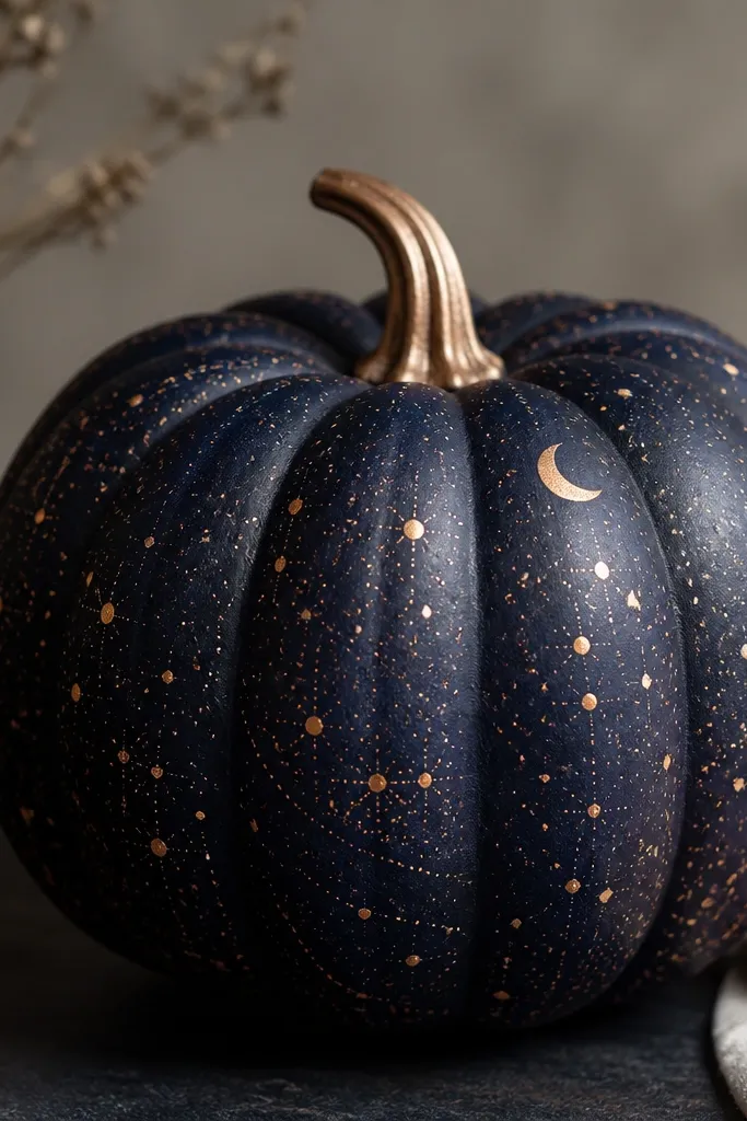
Galaxy pumpkins look dramatic without needing a full mural. I used deep navy because it makes copper metallic pop, and I kept the pattern mostly dots so it stays elegant. The larger stars near the top create a sense of depth and movement. This is a great choice for anyone decorating with black candles, dark wood, or silver accents.
Prime the pumpkin and paint it deep navy matte. Then use a toothbrush dipped in copper/bronze metallic paint to flick tiny dots across the surface. Add a few larger star dots with a dotting tool and a small liner for a faint swirl line near the center. Paint a subtle crescent highlight near the top with watered white paint so it looks like moonlight. Seal with satin varnish so metallics stay smooth and don’t shed glitter.
Pro tipCover your table with cardboard and flick away from your body so dots land where you want.
AvoidOverloading metallic paint in one area makes it look like clumps instead of stars.
17. Ombre Sunset with Tiny Clouds
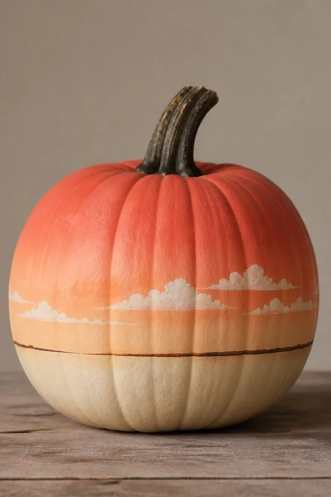
This is the “porch photo” look. The sunset ombré reads cheerful, and the tiny clouds keep it from looking like a plain gradient. I used coral, peach, and cream so it stays warm and not too pink. It flatters bright outdoor lighting and looks great with wicker baskets and neutral doormats.
Sand, then prime with white. Paint the top in coral, sponge peach in the middle, and sponge cream at the bottom, blending until smooth. Use a thin brush to paint a dark brown horizon line across the middle third. Add small cloud puffs in watered white acrylic by dabbing with a sponge or small brush, then soften edges with a lightly damp fingertip or brush. Seal with satin varnish.
Pro tipKeep clouds small and spaced; big clouds cover the pumpkin curve and look heavy.
AvoidPainting clouds with thick white straight from the bottle makes them look like blobs.
18. Monogram Initial in Matte + Glitter Outline
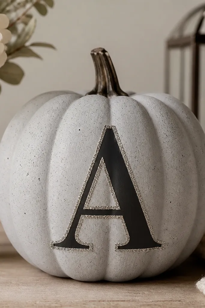
Monograms turn a pumpkin into a nameplate, and it makes sets feel intentional. I used a matte black letter because it stays readable, then added a thin silver glitter outline for that “holiday card” sparkle. The background is light gray so the letter doesn’t fight with orange decor nearby. This is best for medium and tall pumpkins where the letter can sit cleanly without stretching.
Sand and prime with light gray, then paint the pumpkin matte gray and let it dry. Lightly sketch the initial in pencil, then paint the letter matte black with a flat brush. Once dry, trace the letter edges with a thin layer of glue made for crafts or a clear adhesive medium, then sprinkle silver glitter only on the outline. Tap off excess glitter and let it set. Seal with a matte top coat over the background only, leaving the glitter outline sealed with a light clear coat to prevent shedding.
Pro tipUse painter’s tape to mask the letter edges if you want it extra crisp.
AvoidSealing glitter too heavily with thick varnish turns the sparkle dull.
19. Charcoal Faux Woodgrain Lines
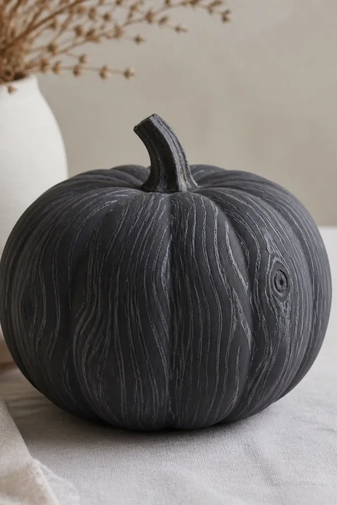
This is for people who love pumpkins but hate orange. Woodgrain turns a pumpkin into something that looks like decor, not craft foam. I used charcoal base and lighter gray lines so the “grain” shows without looking too busy. It looks great with black lanterns, dark planters, and simple greenery. It also flatters anyone who prefers neutral, moody styling.
Sand and prime, then paint the pumpkin charcoal matte. Mix a lighter gray paint and thin it so it flows in lines. Use a small liner brush to draw vertical wavy lines that curve slightly as they wrap around the pumpkin, then add a few short cross lines to mimic grain. For knots, paint small oval blobs in darker gray and drag a couple lines out from them. Seal with matte varnish so the wood effect stays flat and realistic.
Thin the paint more than you think so it lays down like grain, not like thick stripes.
Painting straight, even lines makes it look like a zebra pattern, not wood.
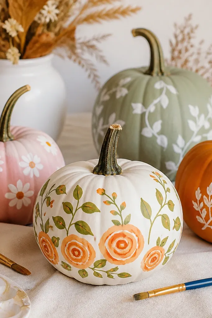
20. Retro Floral Spray Background
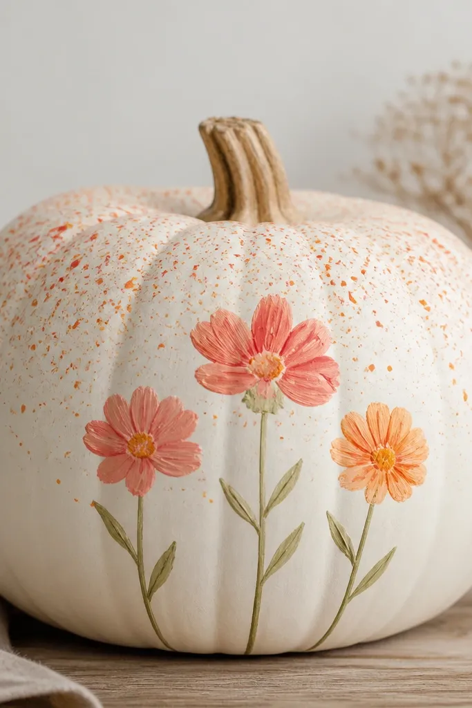
This look feels cheerful and a little retro, and it’s easier than it looks. The speckled spray background hides small unevenness, which means your pumpkin won’t look “patchy” even if coverage isn’t perfect. I use three simple flowers — one bigger center, two smaller on the sides — so it stays balanced. It’s perfect for porch tables where you want color without big murals.
Sand and prime, then paint a clean white base. For the spray, dip a toothbrush in watered orange/coral paint, then flick lightly over the top half only. Let that dry, then paint flower stems in green and add flower petals in coral with a small round brush. Add yellow centers with a dotting tool and a tiny dot of darker orange in the middle for depth. Seal with satin varnish so the speckles don’t look dull.
Pro tipSpray in one direction only so the speckles look intentional, not random confetti.
AvoidSpraying the whole pumpkin makes it look busy and kills the flower focus.