1. Matte Black Cat with White Collar
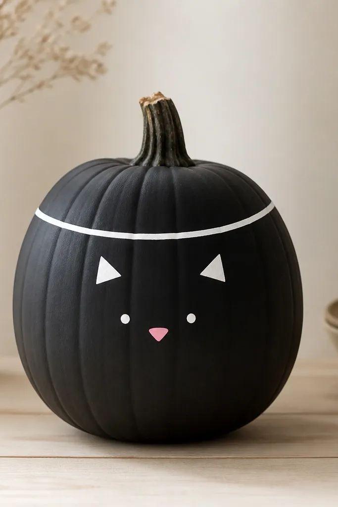
Start with a matte black base because it hides small skin imperfections and makes the white details pop. I like this look on medium to large pumpkins because the face sits comfortably without crowding the stem. For the eyes, use two tiny white dots, then add a single black pupil for a cute, not spooky, expression. This design flatters warm skin tones in photos because the contrast is strong and clean. The collar gives the pumpkin a “costume” feel, so it looks intentional even with simple lines.
First paint the whole pumpkin matte black and let it dry 20-30 minutes. Next, draw a shallow oval collar in white around the upper third, then paint two small white ear triangles near the top. Add dot eyes and a tiny pink nose using a toothpick or size 0 brush, then paint a small curved smile. Finally, tap a little white highlight on the collar edges with a foam sponge so it looks crisp rather than flat.
Pro tipUse a scrap piece of cardboard as a stand so you can rotate the pumpkin while the paint dries.
AvoidDon’t paint the eyes too large — oversized eyes look cartoonish in a bad way and cover the pumpkin’s shape.
2. Sunburst Lines in Terracotta and Cream
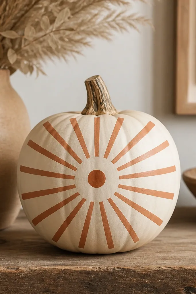
Sunburst designs look stunning because they create motion across the pumpkin’s curve. I recommend a cream base because it makes terracotta feel warm and modern instead of Halloween-cliché. This one looks great on medium pumpkins and on people’s porches where you want a fall vibe without going full spooky. It also photographs well from the side because the rays wrap around the round surface. The central dot gives it a focal point so your eye knows where to land.
First paint the pumpkin cream and let it dry completely. Then draw a center point on the front and mark 10-12 ray lines with a light pencil, spaced evenly. Paint the rays with terracotta using a flat brush, keeping each ray about 1/8 inch wide at the base. Finally, paint a small darker terracotta dot in the center and add a thin cream highlight line along the outer edge of a few rays.
If your rays drift, tape two ends of a long ruler to a board and use it as a visual guide while painting.
Skip freehand spacing — uneven rays make the whole thing look messy even if the colors are nice.
3. Ombre Sage to White Gradient
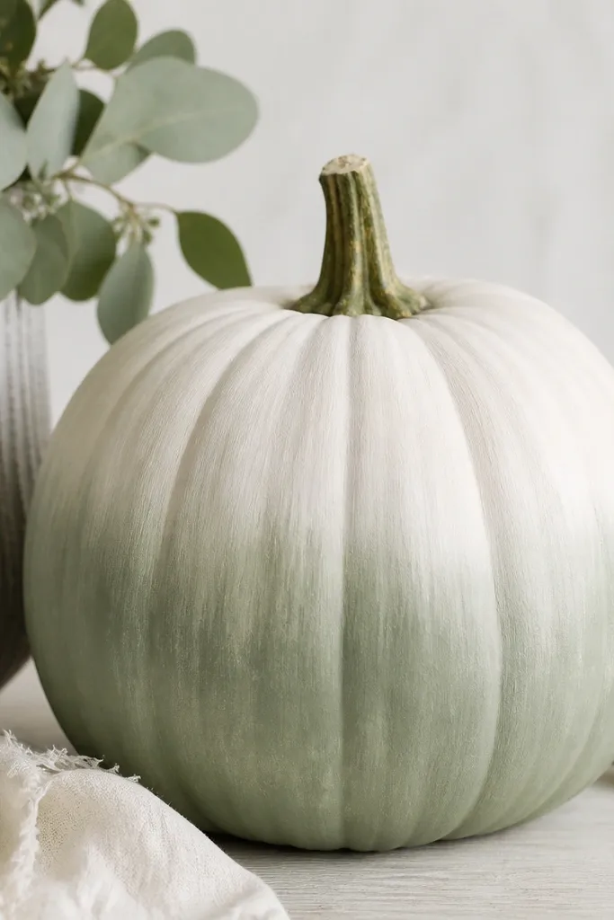
This gradient looks expensive because sage and white feel calm and modern. I’ve used it on pumpkins for dinner tables, and it reads more “decor” than “craft project.” The ombré flatters most spaces because it matches neutrals and doesn’t clash with fall florals. On photos, the smooth transition makes the pumpkin look like it came from a high-end store display. Keep the stem dark or paint it deep green so the gradient has a grounded top.
Start by painting the bottom third deep sage and let it dry 10 minutes. Then sponge or brush a medium sage band across the next third, blending upward into the white area. Finally, paint the top third white and blend where the two colors meet until the transition looks smooth. Let it dry fully, then do one more light pass with a nearly dry brush to soften any harsh edges.
Use a makeup sponge for the blend — it smooths faster than a brush for beginners.
Don’t overload paint — thick layers cause streaks and a chalky ridge at the color boundary.
4. Gold Foil Look with Acrylic Metallic Dots
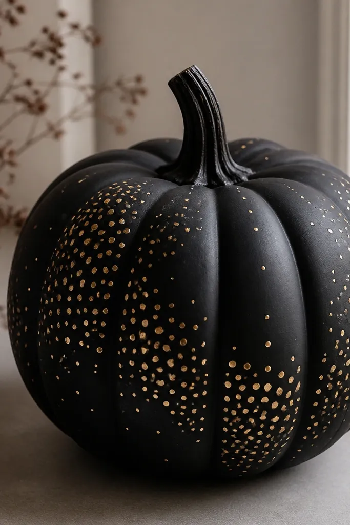
Metallic dots on a dark base look like foil without the mess of actual leafing. I like matte black because it makes gold look warm instead of yellow-green. This idea works on any pumpkin size, but it shines on medium ones because the dot clusters have enough room to look intentional. It also flatters dark entryways and matches brass hardware if you have it. The random dot sizes stop the pattern from looking like a stencil, even when you’re using a simple technique.
Paint the pumpkin matte black and let it dry. Then load a small round brush (or the tip of a dotting tool) with acrylic metallic gold and tap dots in clusters across the front. Keep the densest cluster around the center and thin it out toward the top and sides. Let it dry, then add a second layer of gold dots only on the biggest dots so they look dimensional.
Pro tipIf you don’t have a dotting tool, use the eraser end of a pencil — it makes clean, repeatable circles.
AvoidDon’t go fully uniform — perfect rows make it look like craft store stickers.
5. Vintage Floral Linework on Cream
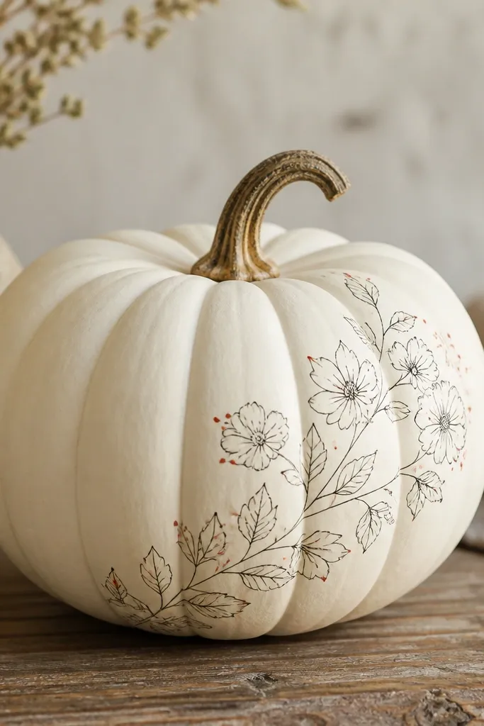
Linework looks stunning because you’re letting the pumpkin shape do the drama. Cream + black feels like vintage pottery, and the tiny red accents keep it from looking flat. This works best on pumpkins with a smoother surface so lines don’t wobble. It also pairs well with neutral fall decor — beige, wood, and dark green. If you want a look that feels “grown-up” instead of Halloween cartoon, this is it.
First paint the pumpkin cream and let it dry fully. Draw a simple vine along one side using a pencil, then outline flowers with a black paint pen or fine liner brush. Add small leaf shapes and a few red dot centers using a toothpick. Finally, let everything dry, then lightly seal with a matte spray so the ink-like lines stay crisp.
Pro tipPractice your flower in a scrap paper first — your hand learns the curve before it hits the pumpkin.
AvoidSkip thick outlines — chunky lines make the style look like kids' craft instead of vintage illustration.
6. Geometric Checkerboard in Navy and White
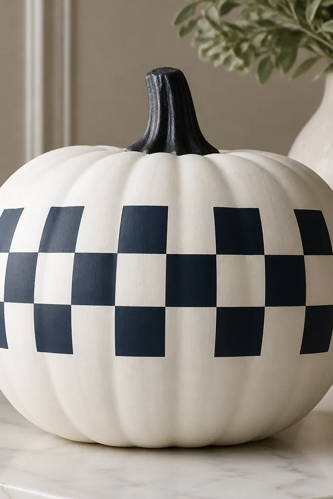
Checkerboards look clean and modern because every edge is intentional. Navy and white make it feel nautical and fall-ready without looking like a typical orange pumpkin theme. I use this when I want something that looks good from across the room, not just up close. It’s also great for beginners because tape helps you control the grid. On smaller pumpkins, keep the squares larger so you don’t run out of space.
Paint the pumpkin white and let it dry. Use painter’s tape to mark a grid — I like 1 inch squares on medium pumpkins, then adjust down for smaller ones. Paint navy in alternating squares, remove tape while paint is still slightly wet for sharper lines, and let dry. Finally, do a second thin navy coat on any squares that look thin, then seal with matte topcoat.
Pro tipPress tape down firmly along the ridge lines so paint doesn’t creep under.
AvoidDon’t remove tape after the paint fully cures — the edges can tear and look jagged.
7. Watercolor Leaves in Olive, Rust, and Mustard
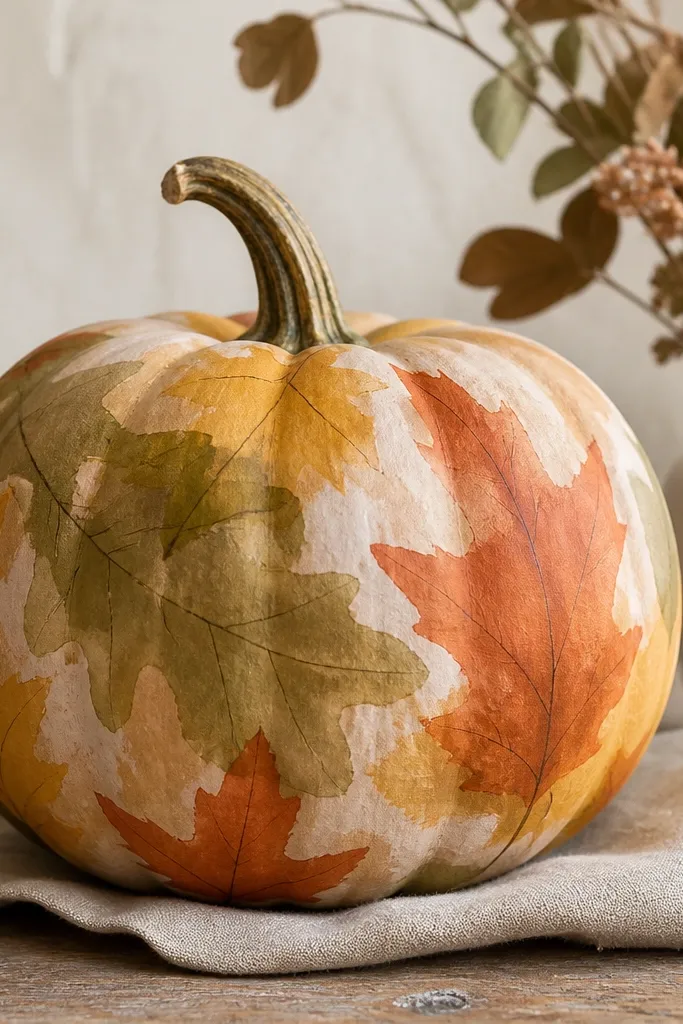
Loose watercolor leaves look stunning because they mimic real fall foliage. The key is letting edges stay soft instead of trying to make every leaf perfect. I use a light beige base because it lets olive and rust look natural. This style is forgiving on bumpy pumpkins since the paint can feather into texture. It also flatters warm, cozy setups where you mix wood, wicker, and dried stems.
Start with a light beige or warm cream base. Wet the leaf area lightly with water using a damp brush, then dab in olive for the first leaf layer and rust for the second layer. For veins, add a darker olive line once the leaf edges start to set. Finish by adding a few mustard leaves in the negative space and let everything dry without touching.
Use two brushes: one for water and one for pigment so you don’t muddy colors.
Don’t outline every leaf — outlines turn watercolor into coloring-book.
8. Minimal Face: One Eye and a Smile
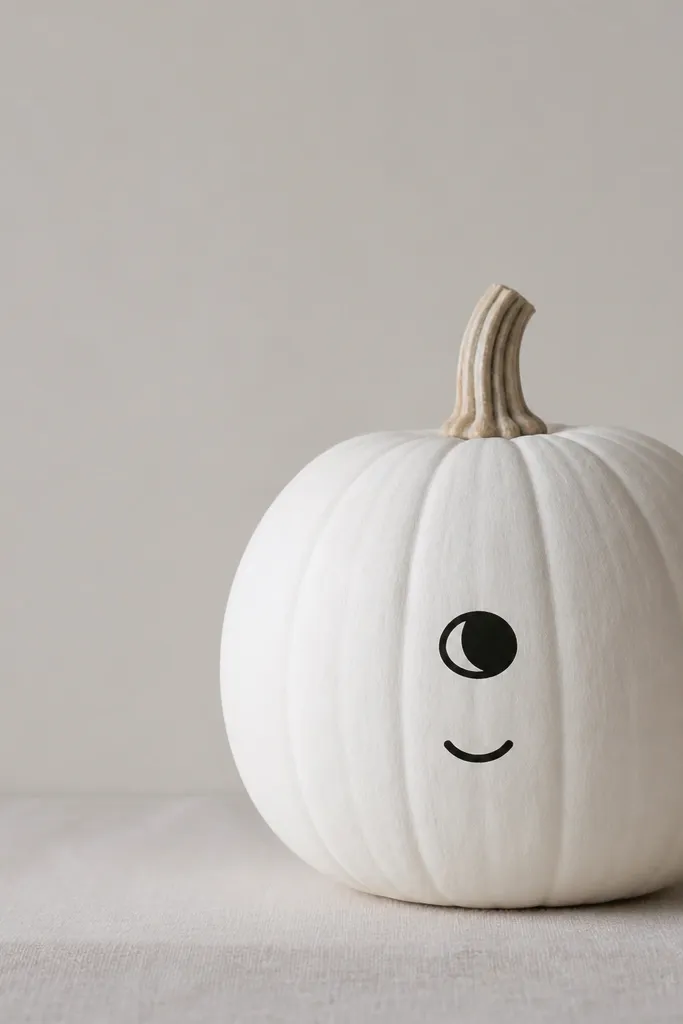
Minimal faces look good because the pumpkin shape becomes the “character.” One eye and a tiny smile gives a playful, modern feel instead of typical carving vibes. This one works on white base pumpkins because negative space stays clean in photos. I’ve used it for small entryway tables where you want decor that doesn’t scream Halloween. It also flatters anyone who likes calm aesthetics — the black marks are readable and not busy.
Paint the pumpkin matte white and let it dry. Draw a single eye — a black oval with a tiny white dot highlight — on the upper left or right side. Add a small curved smile below it, keeping the curve subtle. Let dry, then paint the stem area black or leave it natural for extra contrast.
Pro tipUse a pencil first, then trace with paint so your curve lands exactly where you want.
AvoidSkip adding lots of features — once you add eyebrows and cheeks, it starts looking cluttered fast.
9. Pastel Stripe Wrap with Metallic Thread Line
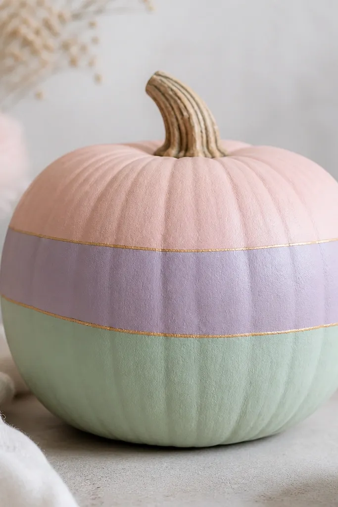
Pastel stripes look cute and surprising on pumpkins because they feel like seasonal stationery. The metallic gold thread line adds a polished detail that makes it look styled, not random. I like pastel combos on medium pumpkins because the stripes have space to breathe. This style flatters indoor setups, especially if you have light wood and neutral textiles. It also photographs well because the colors stay soft and don’t overpower fall decor.
Paint the pumpkin with a base color that matches your brightest stripe, like blush. Use painter’s tape to section horizontal bands, alternating blush, lavender, and mint. Paint each band with matte acrylic, remove tape carefully while paint is slightly tacky, and let dry. Finally, paint a thin gold metallic line across the middle band and add one or two tiny gold “spark” dots near the line.
Pro tipKeep stripe widths equal — even a 1/4 inch difference shows up in photos.
AvoidDon’t use glossy metallic everywhere — keep metallic only for the thin line so it reads intentional.
10. Marbled Pumpkin with White Swirls
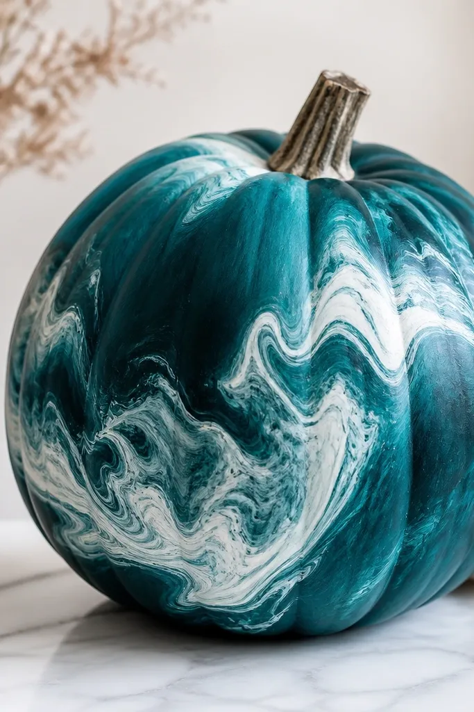
Marbling looks stunning because it creates depth without requiring perfect drawing. Teal + white feels modern and works with both boho and minimalist decor. I use marbling when I want something forgiving on uneven pumpkin skin. The swirling pattern also hides small bumps, so the final result looks smoother than you expect. It’s a great choice if you get bored with faces and you want a pattern-based pumpkin.
Paint the pumpkin deep teal and let it dry. Mix a lighter teal with white to make a “mist” color. Using a sponge or damp brush, dab on lighter teal in cloud shapes, then add white swirls with a thin brush. Drag the tip lightly through wet paint to create marbled movement, then stop before it gets muddy.
Pro tipWipe your brush tip on a paper towel often — marbling looks best when the paint is light and wispy.
AvoidDon’t keep reworking the same area — too many passes turn marbling into gray sludge.
11. Tie-Dye Pumpkin in Coral and Tangerine
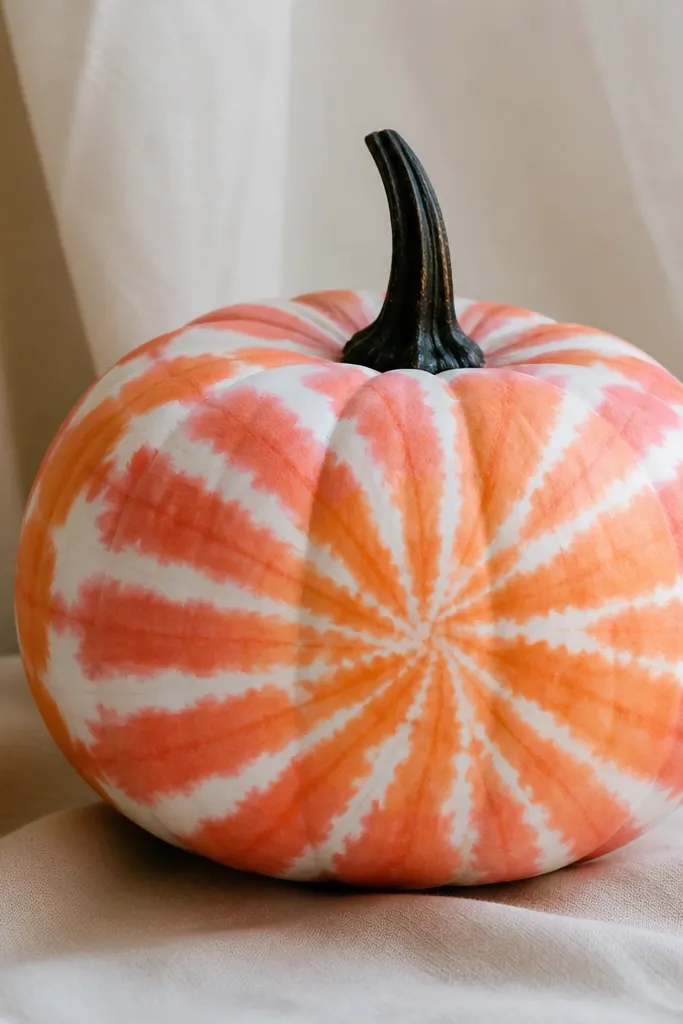
Tie-dye pumpkins look fun and bold, and the color blend makes them feel festive without carving. Coral and tangerine are flattering on warm-toned spaces because they echo terracotta and fall blooms. I use this style on medium-large pumpkins so the radiating swirls have room. It also hides brush marks because the pattern is meant to be loose. The white gaps keep the whole thing from looking like one solid orange blob.
Paint the pumpkin white first and let it dry. Paint broad coral swirls with a foam brush, then add tangerine on top where you want deeper color. Use a dry brush technique to feather the edges so they fade into white. Add a few more white gaps by wiping a damp brush through areas, then finish with a dark stem paint to ground the design.
Pro tipUse a foam brush for the swirls — it holds soft texture better than a bristle brush.
AvoidDon’t cover every inch with color — the white negative space is what makes it tie-dye.
12. Chalkboard Pumpkin with Doodles
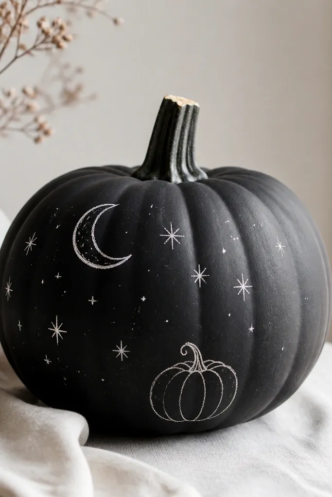
A chalkboard-style pumpkin looks great because it gives you a clean, graphic surface that still feels artsy. The matte black base makes white doodles read like real chalk marks. I like this for porch decor because it doesn’t show every tiny paint imperfection. You can keep it cute with stars and moons, or make it spooky with bats. This style also works well if you want to reuse the pumpkin for different seasons — you can repaint it later.
Paint the pumpkin matte black in two thin coats and let it dry fully. Add doodles with a white paint pen or a small liner brush, starting with one big element like a moon. Then fill with small stars and tiny icons, keeping them spaced so the pumpkin shape still shows. Let it dry, then seal lightly with matte topcoat so it stays readable.
Pro tipIf your white paint pen skips, thin acrylic with a drop of water and use a brush instead.
AvoidDon’t use glossy black — it reflects light and makes the doodles look smeared.
13. Rose Gold Geometric Half-Moon
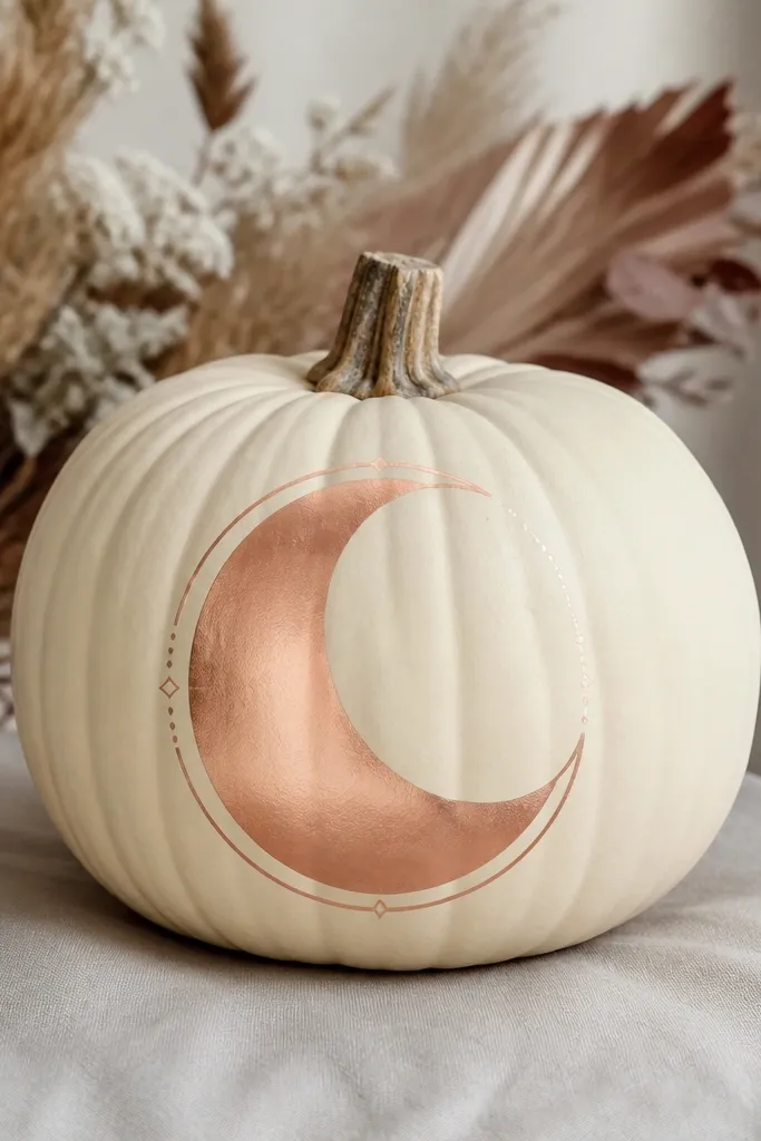
Half-moon designs are easy to place and look high-end because the shape is simple and centered. Rose gold feels warmer than silver and pairs nicely with pink, champagne, and warm white decor. I use a cream base so the gold doesn’t look too loud. This design looks great on pumpkins with a slightly wider front, like many supermarket varieties. It also photographs well because the metallic catches porch light without looking chaotic.
Start with a cream base coat and let it dry. Use painter’s tape to mask a half-moon on the front, with the flat edge aligned with the pumpkin’s widest point. Paint inside the tape with rose-gold metallic acrylic, then remove tape carefully while paint is still slightly wet. Add a few tiny dot accents near the edge, then seal with matte spray after full dry.
Pro tipWarm up metallic paint by stirring slowly, not shaking — shaking makes bubbles.
AvoidDon’t paint over metallic with matte too soon — it can dull unevenly.
14. Galaxy Pumpkin with Star Speckles
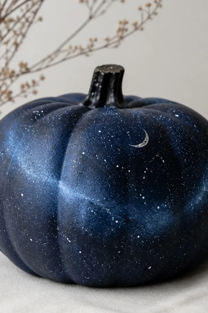
Galaxy pumpkins look stunning because the surface looks full even with simple steps. Dark navy and pale blue create a deep, night-sky effect that hides uneven pumpkin texture. I use this when I want something dramatic on a porch step or next to a lantern. It also flatters outdoor lighting because the speckles catch light from different angles. You don’t need perfect stars — the random scatter is part of the look.
Paint the pumpkin dark navy and let it dry. Add pale blue swirls with a damp brush, keeping the swirls soft and not too thick. Load a toothbrush with white paint and flick for star speckles over the whole front. Finish by adding a small crescent highlight near the top with a thin brush, then seal matte so the stars don’t smear.
Pro tipCover your work surface with cardboard — galaxy speckles travel farther than you think.
AvoidDon’t use pure black undercoat — navy gives the galaxy depth instead of looking flat.
15. Pumpkin-to-Plant Mini Terracotta Pots
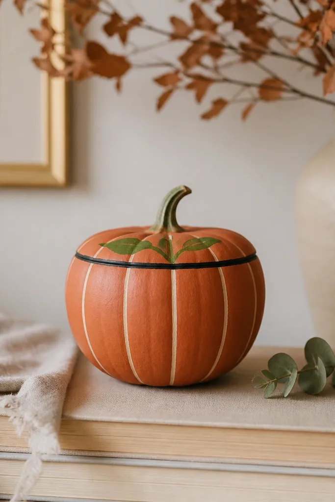
This one looks like a seasonal prop, not a plain painted pumpkin. Terracotta + green reads like a real plant pot, and it makes the pumpkin feel intentional for shelves and windowsills. I like it on smaller pumpkins because the proportions resemble a mini planter. It’s also great if your home has lots of indoor plants — the green sprout matches your decor. The black rim gives it a “store-bought” finish because it frames the top edge.
Paint the pumpkin burnt orange and let it dry. Add vertical lighter orange lines with a thin brush so it looks like pot texture. Paint a thin black rim around the top where the stem meets the pumpkin, then add a small green sprout or two leaves near the stem. Finish with a light dry-brush of cream on the highest pot ridges so it looks sun-warmed.
Pro tipUse an old makeup brush for dry-brushing — it spreads color without streaking.
AvoidDon’t skip the rim — without it, the pot illusion falls apart.
16. Classic Polka Dots in Black and White
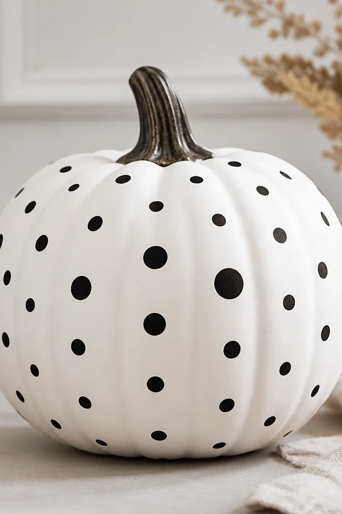
Polka dots always look clean because they’re a controlled pattern. Black and white is the easiest fall palette that still feels graphic and modern. I like this on pumpkins that have nice symmetry because the dots can follow the curve evenly. It also flatters people’s kitchens and dining tables where you want seasonal decor that doesn’t clash with dishware. The slightly larger center dots create a focal point and keep the pattern from feeling flat.
Paint the pumpkin white and let it fully dry. Mark a few dot points lightly with pencil so spacing stays consistent. Use a small round brush to paint black dots; start with the center and work outward. Add one or two slightly larger dots near the center for emphasis, then seal matte after everything dries.
Pro tipIf you want perfect spacing, use a ruler and lightly mark dot rows before painting.
AvoidDon’t press too hard with the brush tip — it makes oval dots that look sloppy.
17. French Stripe Pumpkin in Navy and Cream
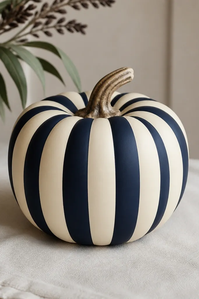
Vertical stripes make pumpkins look taller, and that’s why this feels flattering even on round ones. Navy and cream reads French café instead of Halloween, so it fits year-long farmhouse styling. I use this when I want something elegant near candles or a simple wreath. It also photographs well from the front because the stripes keep their shape. The matte finish keeps the look soft, not shiny or plastic.
Paint the pumpkin cream as your base. Use painter’s tape to section vertical stripes; I do 1/2 inch stripes on medium pumpkins. Paint navy over the taped sections, let it dry 5-10 minutes, and remove tape while paint is slightly tacky. Touch up any thin areas with a second coat, then seal matte.
Pro tipRotate the pumpkin while painting so stripe edges stay consistent around the curve.
AvoidDon’t eyeball stripe widths — one wide stripe will make the whole thing look off.
18. Autumn Ombre Chevron Border
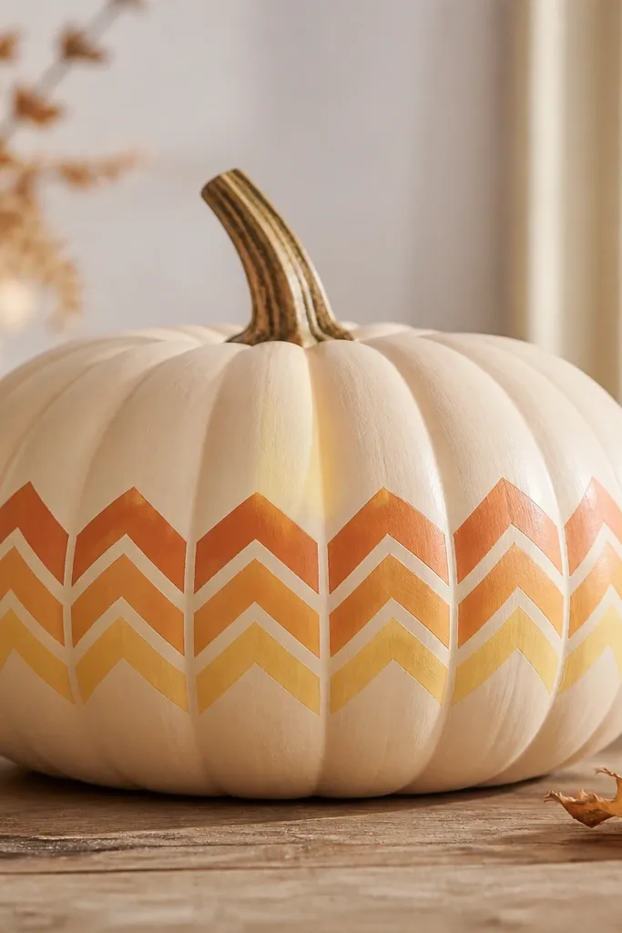
Chevrons give you structure, and an ombre chevron border gives you warmth without needing detailed art. I’ve used this design for fall dinner parties because it looks festive but not messy. The beige base keeps it calm, and the chevrons add movement across the pumpkin’s widest part. It flatters most spaces because the colors are in the same family. If you want a “pattern statement” without painting a whole scene, this is the one.
Base coat the pumpkin warm beige and let it dry. Draw a horizontal line around the middle to anchor your chevron band. Use tape or a pencil guide to create V shapes pointing up; paint chevrons with deep orange, then fade toward pale yellow by blending the last coat. Finish by removing tape carefully and adding a tiny highlight line in the pale yellow chevrons with a dry brush.
Pro tipPaint the chevrons in pairs so your fade stays consistent across the band.
AvoidDon’t make chevrons too tall — if they stretch too high, they swallow the pumpkin’s shape.
19. Black Widow Web Look with White Threads
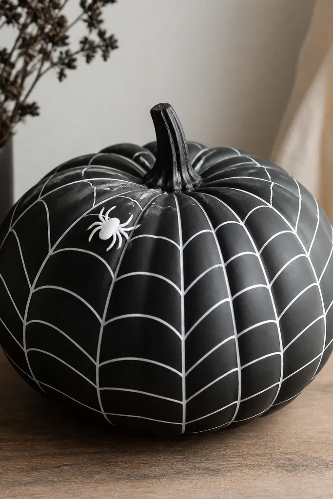
This web design is one of my favorite spooky looks because it’s graphic and still looks clean from a distance. White threads on black read crisp even if your lines aren’t perfect. I use it for porch displays because it holds up visually at night under warm light. The center spider adds the right amount of detail without turning into a full scene painting. It’s also great for beginners because the web pattern is built from repeatable lines.
Paint the pumpkin matte black and let it dry fully. Mark a center point on the front with a pencil, then draw 8-10 straight radial lines to create the web spokes. Add curved rings by drawing arcs that connect the spokes, starting near the center and moving outward. Finally, paint a tiny spider shape near the top portion of the web and seal matte so the threads don’t smear.
Pro tipUse a toothpick for the spider legs — it makes them thin and controlled.
AvoidDon’t thicken the web lines — heavy lines look like paint blobs.
20. Color-Block Pumpkin with Rounded Corners
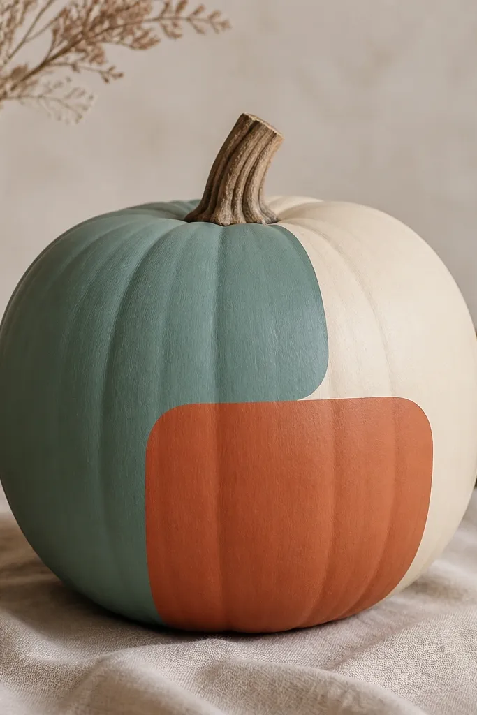
Color-block pumpkins look modern because they use shape instead of drawing. Rounded corners feel friendly and make the pumpkin look like a design object. I like muted teal with terracotta and cream because it matches fall without screaming Halloween. This works best on pumpkins with a smooth front, but scuffing helps regardless. It also flatters any decor style — from minimalist to boho — because the palette is earthy and neutral.
Paint the whole pumpkin cream and let it dry. Use painter’s tape to create rounded rectangles or slabs across the front, leaving clean gaps between blocks. Paint teal on one block and terracotta on another, then remove tape while paint is slightly tacky for sharp borders. Touch up edges with a small brush, then seal matte.
Press tape edges into the pumpkin ridges with your fingernail so paint doesn’t bleed.
Don’t stack too many tiny blocks — three big blocks look intentional, five looks chaotic.
21. Monochrome Rose Face with Blush Cheeks
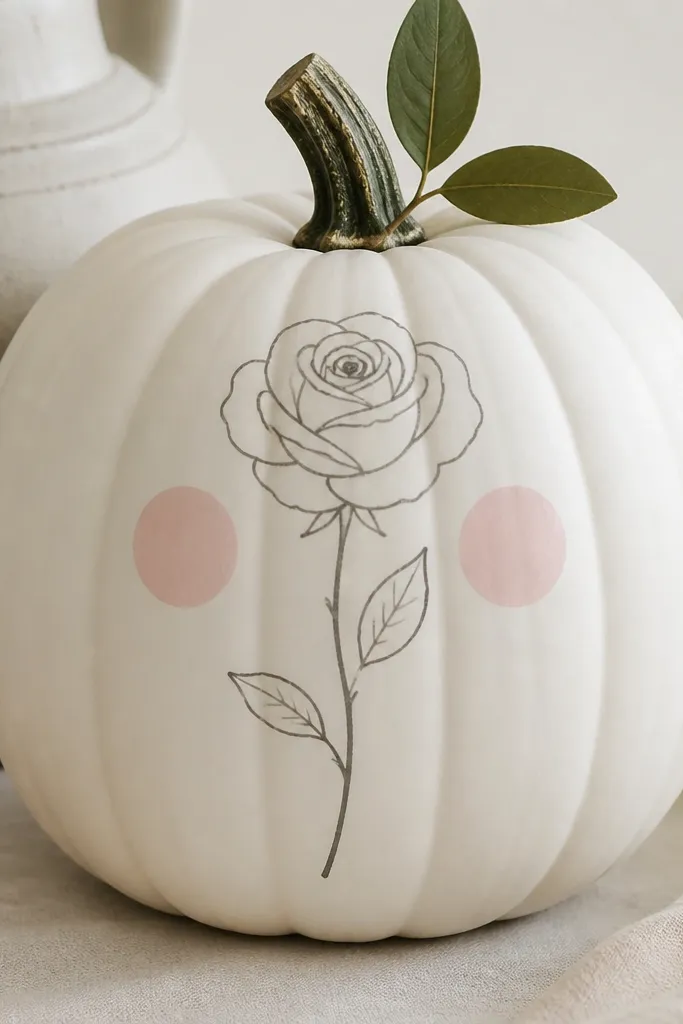
A rose face style feels sweet and unexpected, especially when you keep it monochrome. Muted gray linework looks classy, and blush cheeks bring warmth. I like this for indoor pumpkins or front steps where you want something pretty rather than scary. It flatters light-colored homes because the blush and gray soften the look. The rose line gives you a focal point, and the cheeks make it look friendly.
Base coat the pumpkin white and let it dry. Use a thin brush to draw a simple rose outline on the front, keeping petals minimal so it stays beginner-friendly. Add two small blush pink circles under where cheeks would be, then blend the edge with a damp sponge. Finish by painting a tiny green leaf near the top and seal with matte topcoat.
Keep the rose slightly off-center — it looks more natural on the pumpkin curve.
Skip heavy shading — gray smudges make it look dirty instead of soft.
22. Candy Corn Stripes with Crisp Edges
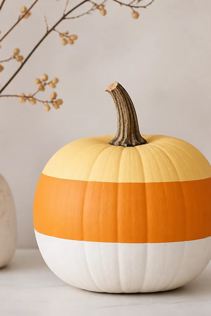
Candy corn stripes are the fastest “classic Halloween” look that still looks neat. The sharp horizontal edges make it feel store-made, and the limited colors keep it beginner-proof. I like this on pumpkins that are slightly wider because the stripes look proportional. It also works for porch decor where you want bold color without detailed painting. The matte finish makes it look like candy, not glossy craft paint.
Paint the top third pale yellow and let it dry. Mask the middle band with painter’s tape and paint it bright orange, then mask again for the bottom stripe and paint white. Remove tape while paint is slightly tacky for the crispest lines. Let it dry fully, then seal with matte spray so the colors stay even.
Pro tipMeasure stripe heights with a tape measure from the bottom edge so both boundaries line up.
AvoidDon’t use glossy paint — it looks like plastic and catches harsh light.
23. Snowy Pine Branches in White on Green
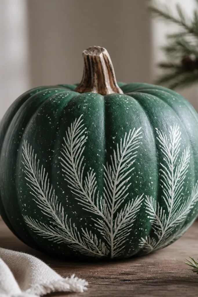
Snowy pine branches look stunning because they read like winter decor, but the pumpkin base makes it fall-season friendly. Deep green makes the white branches pop, and it’s also forgiving if your pumpkin has texture. I’ve used this on a front porch by the doormat where it blends with evergreen garlands. It flatters people who like moody greens and low-key holiday color. The tiny flecks add realism without needing detailed needles.
Paint the pumpkin deep green and let it dry. Use a stencil or freehand to add pine branch shapes in white, starting with one main branch and adding smaller offshoots. While the paint is still a little wet, tap a dry brush with white paint flecks over the branches for snow. Add a light green highlight around a few ridges with a small sponge, then seal matte.
If you don’t have a stencil, print a pine branch silhouette and trace lightly.
Don’t paint the branches too wide — thin branches look more delicate and believable.
24. Sunflower Seeds with Textured Dot Centers
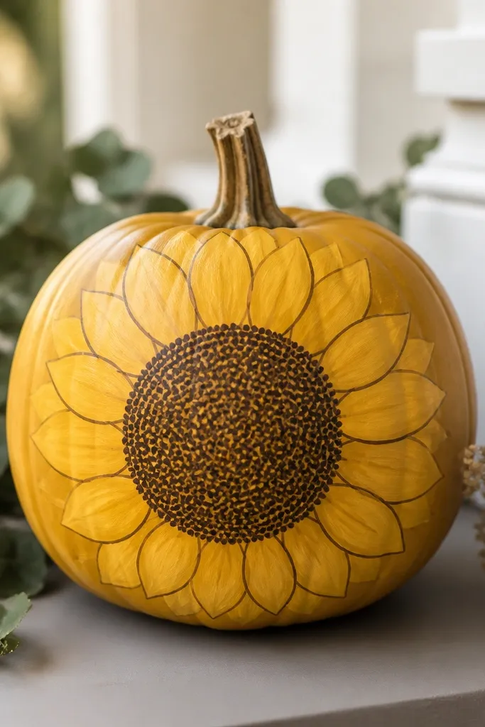
Sunflower pumpkins look stunning because they feel warm and cheerful, not spooky. The textured dot center gives a realistic seed feel, and you can do it even as a beginner. I use golden yellow petals with a slightly darker outline so the flower stays readable on the pumpkin curve. This works best on medium pumpkins where the center circle can be big enough to matter. It also flatters fall tables with neutral linens because the color is bright but not neon.
Paint the pumpkin golden yellow and let it dry. Draw a large circle for the flower center near the top half, then paint simple petal shapes around it using curved strokes. Fill the center circle with brown dots using a dotting tool or toothpick, layering until it looks textured. Add a few darker brown dots in the center for depth, then seal matte after drying.
Do the seed dots with the toothpick tip angled — it makes smaller, sharper dots.
Don’t outline every petal thickly — thin lines keep it looking like a real sunflower.
25. Porcelain Look with Gray Wash and Gold Rim
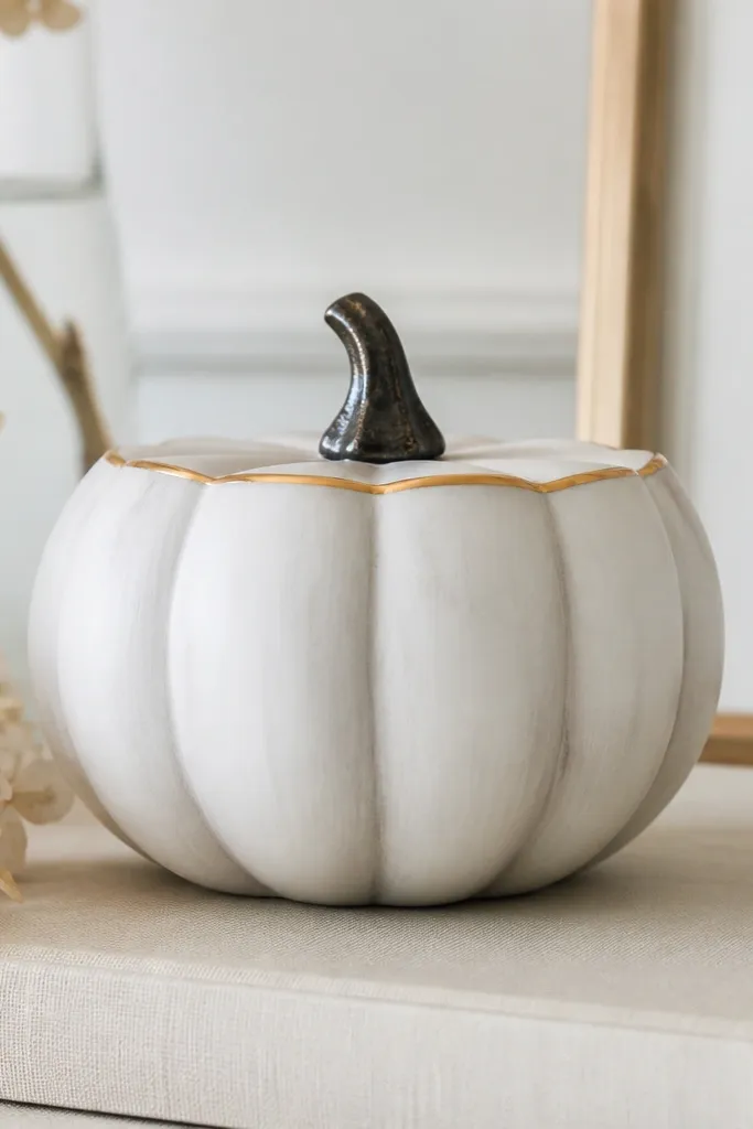
Porcelain-style pumpkins look stunning because the grooves get a subtle shadow and the gold rim makes it feel like tableware. I do this when I want pumpkins to look expensive next to candles or a ceramic bowl. The gray wash makes the ridges look intentional instead of random. This design flatters cool-toned homes too, because gray and white are neutral and gold adds warmth. Beginners like it because the “art” is mostly controlled washing, not drawing.
Paint the pumpkin white and let it dry. Mix gray acrylic with a little water to make a wash, then brush it into the pumpkin grooves so it settles naturally. Wipe the excess on the flat areas with a damp paper towel until the wash stays only in the ridges. Finally, paint a thin gold line around the top edge and let it dry, then seal matte to keep it from looking shiny.
Pro tipUse a wide brush for the wash — it spreads thinly and reduces streaks.
AvoidDon’t flood the pumpkin with wash — too much gray turns it dull instead of porcelain.