1. Sunset gradient with a simple mountain silhouette
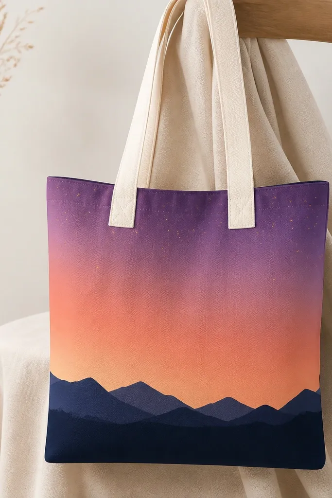
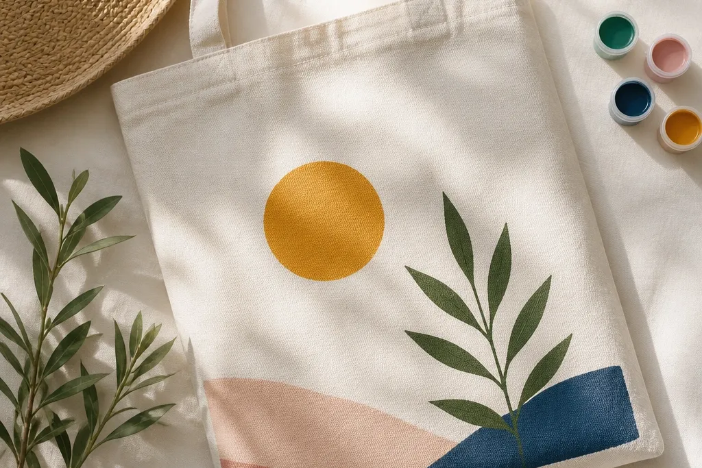
This one looks expensive because the gradient reads like watercolor, but the mountain keeps it graphic. Use coral, peach, and lavender acrylic or fabric paint, then blend the sky with a damp sponge so it stays soft. The navy mountains ground the whole bag and make the colors pop without needing extra details. I’ve done this on both light and medium skin tones of the wearer — it looks great with warm outfits because coral pulls the eye, and it also works with cooler outfits because purple shows up clearly. The silhouette style flatters people who like clean lines and don’t want tiny drawing work.
Start by taping off a rectangle on the center front so you get a tidy sky area. Paint a base layer of coral across the top third, then dab in peach in the middle and lavender near the bottom, blending with a slightly damp sponge. Let it dry completely, then paint your mountain shapes in solid navy — I use a flat brush and a steady wrist for the triangle edges. Finish by adding a few small star dots in pale yellow using the tip of a round brush.
Blend your gradient with a sponge that is barely damp, not wet, so you don’t lift paint and muddy the colors.
Skipping dry time between the gradient and mountains makes the colors bleed into each other.
2. Polka dot rainbow with a crisp black border
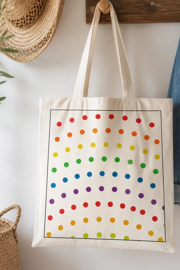
Polka dots are the fastest way to get a polished look because repetition hides small brush mistakes. You get a playful vibe without the chaos of detailed drawing. The black border makes it feel designed, like a print, not a DIY scribble. I like this for daytime errands and farmers markets because the bright dots look cheerful in sunlight. It also works for anyone who prefers bold color against neutral fabric — the tote becomes the outfit’s accent piece.
Draw a rectangle guide in the center with pencil, then lightly mark dot positions using a ruler so spacing stays consistent. Use a dotting tool or the rounded end of a makeup sponge to stamp circles — paint one color at a time so dots don’t smear. Fill the rainbow in curved rows, working from the top down, and let the paint set before you remove any tape guides. Finally, outline the rectangle with a thin black line and add a tiny black dot in each corner of the border for extra neatness.
Pro tipPress the stamp straight down and lift straight up; dragging makes oval dots and the whole pattern looks off.
AvoidTrying to paint dots freehand without spacing marks usually turns into uneven sizes.
3. Botanical branch with one-line leaves
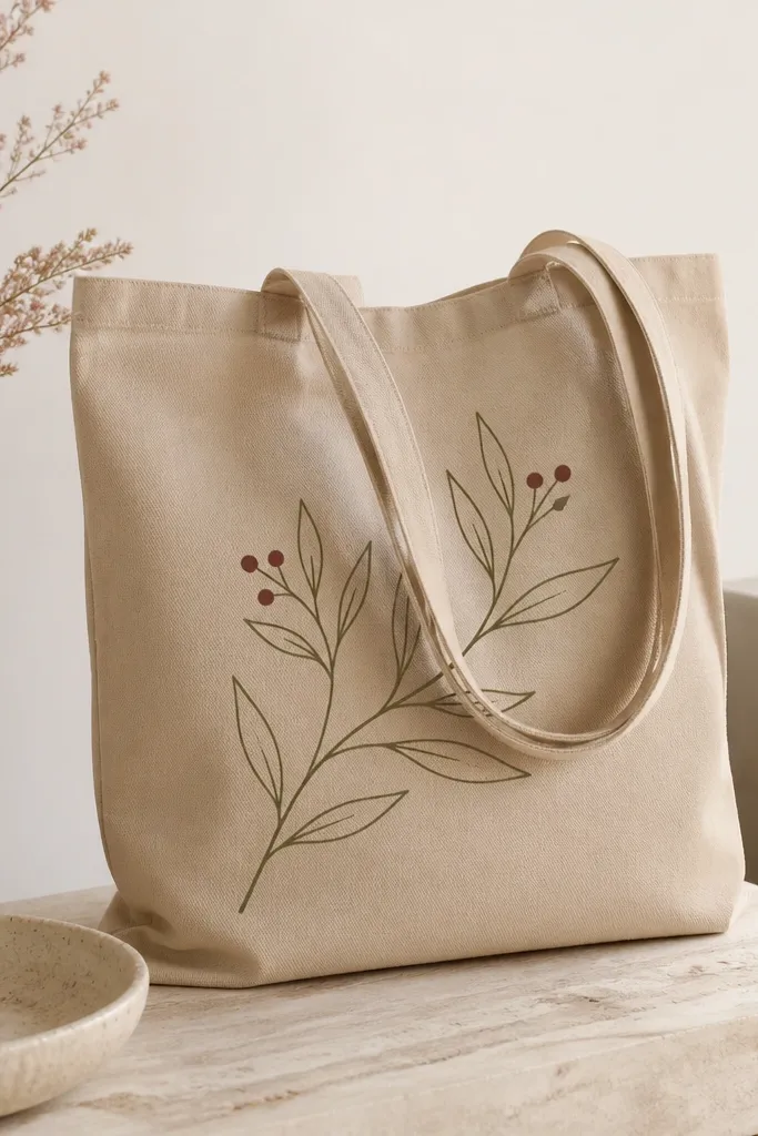
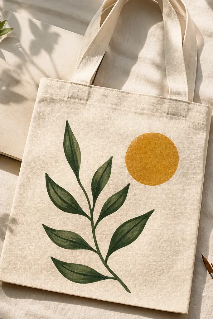
This style looks clean and grown-up because it uses line work instead of heavy fills. Thin olive and burgundy paint gives you that vintage botanical feel without needing a ton of detail. It’s flattering on tote bags because the empty space around the branch makes the design look intentional. I’ve painted this for gifts and it always feels personal because the branch shape can be slightly different each time. It also works well for people who want something subtle that still looks like art.
Start by sketching a gentle S-curve branch with pencil, keeping it taller than wide on the tote front. Mix olive paint and thin it slightly so the line flows, then use a fine liner brush to draw the main branch. Add one-line leaves by painting a teardrop outline, then leaving the center unpainted or lightly filled to keep it airy. Finish with a few small berry dots in burgundy and let everything dry before you handle the bag.
Pro tipThin your paint with fabric medium or a tiny splash of water so the brush line stays smooth, not scratchy.
AvoidFilling every leaf solid usually makes it look heavy and less like a delicate branch.
4. Abstract splash blocks with tape-masked edges
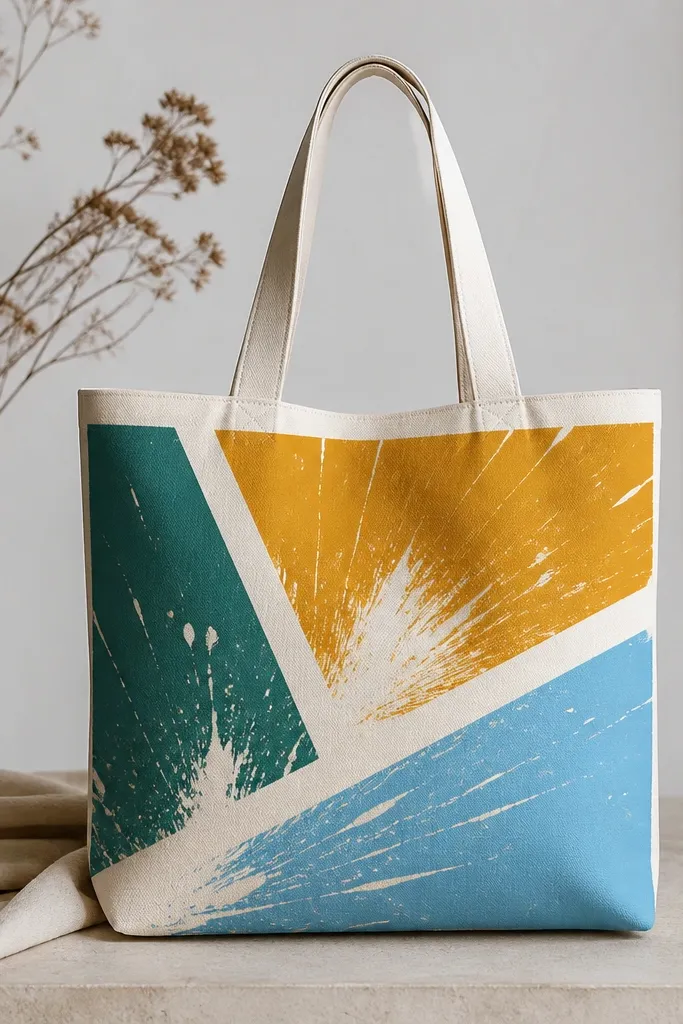
Tape-masked color blocks make abstract paint look intentional. The trick is that you’re not painting a whole mural — you’re painting a few shapes with controlled boundaries. Teal, mustard, and sky blue look great together because they’re high-contrast but still playful. I like this for summer outfits and for anyone who wants something modern without detailed drawing. The clean tape lines also flatter the tote shape because the design follows the bag’s geometry.
Tape off three to five rectangles or irregular blocks on the tote front, leaving small gaps of fabric showing between them. Paint each block with a thick coat so the color sits on top, then use a toothbrush flick for tiny splash texture inside each block. Peel tape only when the paint is dry to the touch so edges stay sharp. Add a thin white highlight line along one edge of each block using a small detail brush for a finished look.
Pro tipUse painter’s tape, not masking tape — masking tape can pull up fabric sizing and leave fuzzy edges.
AvoidPeeling tape while the paint is wet usually smears the design into thick borders.
5. Neon outline lettering with bubble fill
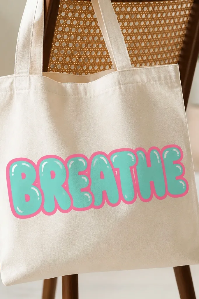
Neon outlines look bold even with simple lettering because the outline carries the design. Bubble fill keeps it fun and readable, and the white highlights make it look like it has shine. This is a great pick for beginners who can follow a stencil — you don’t need fancy drawing skills. It’s especially flattering for people who wear black, white, or denim often because neon pops against neutral fabric. The design also works well for tote bags used for school or gym because it’s high-contrast from a distance.
Print or trace a stencil word onto transfer paper, or lightly sketch the letters with pencil. Paint the inside bubble fill in teal first, keeping edges a little wider than you want. Once dry, trace the letter outline in neon pink with a thick round brush, then add a thin second neon line just inside for depth. Finish by painting tiny white highlight strokes on the top-left of each letter.
Pro tipUse a stencil for your first attempt, then freehand only after you’ve matched letter height and spacing once.
AvoidTrying to paint neon outlines too thin makes them look like a sketch instead of a graphic.
6. Monochrome butterfly wings with speckle texture
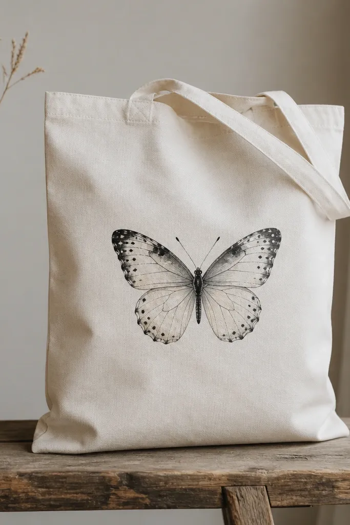
Monochrome butterflies look stunning because the negative space reads like real wing detail. Speckling adds texture without requiring perfect symmetry, and you get a delicate look that still photographs well. I’ve used charcoal gray and black on cream totes and it always looks sharp. This style flatters people who like minimal designs but still want something eye-catching. It also works for tote bags you’ll use for work or events because it doesn’t scream for attention.
Sketch the butterfly body and wings with pencil, then paint the body in solid black — keep it thin. For wings, start with a light gray wash, then add darker gray near the edges and blend with a soft brush. Tap a stiff brush lightly for speckle texture, focusing on the outer wing area. Add a few thin vein lines using a fine liner brush and let the whole piece dry before you carry the bag.
Speckle with a dry brush — if the brush is wet, you’ll get blotches instead of tiny dots.
Over-darkening the center makes the wings look muddy instead of dimensional.
7. Watercolor stripes with a wet-on-wet look
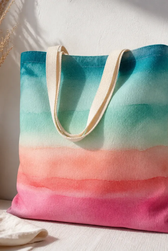
Watercolor stripes look like you used expensive paper, but you can fake the effect on fabric with the right technique. The wet-on-wet blending gives you that soft fade that hides brush marks. This style is flattering because the stripes draw the eye across your body, and the color gradients look good on both warm and cool wardrobes. I use this when I want something calming and artsy without a lot of drawing. It also works for beginners because the shape is simple — horizontal bands.
Wet the stripe area lightly with clean water using a flat brush, then paint the first stripe with diluted teal paint. Immediately add aqua at the edge and let them bleed into each other for a gradient fade. Repeat across the tote with coral to pink, keeping each stripe narrow enough to blend before it dries. Let it dry fully, then go back with a second coat only where the fabric shows through.
Pro tipPractice on paper first — the timing is the whole trick for that watercolor bleed.
AvoidLetting the fabric dry between colors kills the wet-on-wet look and makes stripes look separated.
8. Terracotta clay pot with hand-painted flowers
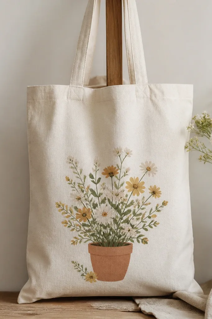
This design feels cozy because terracotta warms the whole bag instantly. The pot anchors the composition, and the flowers use simple shapes that don’t require fine detail. I like it for fall outfits and for people who want decor vibes on a wearable item. It flatters most body types because it sits low and centered, which balances the tote’s shape. The palette also looks good on skin tones across the board — terracotta doesn’t fight with anything.
Paint the pot first using terracotta and add a darker shade on one side for a curved look. Add a thin cream highlight line across the pot rim once the base is dry. Then paint stems in muted green and add flowers using small five-petal shapes in cream with a mustard dot center. Finish with two or three leaves on the outer sides so the bouquet doesn’t look like a flat sticker.
Use a small round brush for flower centers — a bigger brush makes dots look like blobs.
Skipping shading on the pot makes it look like a flat icon with no depth.
9. Geometric sunburst rays in 3 colors
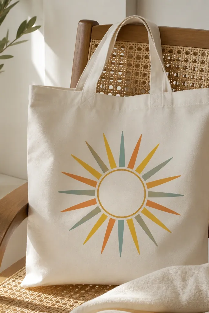
Sunbursts look bold because they create movement with repeating lines. Keeping it to three colors makes it look intentional, not cluttered. The center circle gives you a focal point, and the alternating rays create a rhythm that feels like graphic design. I’ve used this for birthday gifts and it always gets compliments because it reads clearly from across a room. It’s a great pick for beginners because straight rays are forgiving — you don’t need curves or realism.
Draw a center circle about 3 inches wide with pencil. Mark ray lines around it using a ruler so they’re evenly spaced, then paint rays in alternating colors — yellow, orange, teal. Use a thin brush for edges and a slightly wider brush for filling so rays stay solid. Outline the center circle with black or deep brown paint for contrast and let it dry.
If your rays look uneven, fill the gaps with the background color and re-paint the ray edges — it fixes a lot.
Using too many colors turns the sunburst into a messy rainbow blob.
10. Classic stripes with a hand-drawn anchor
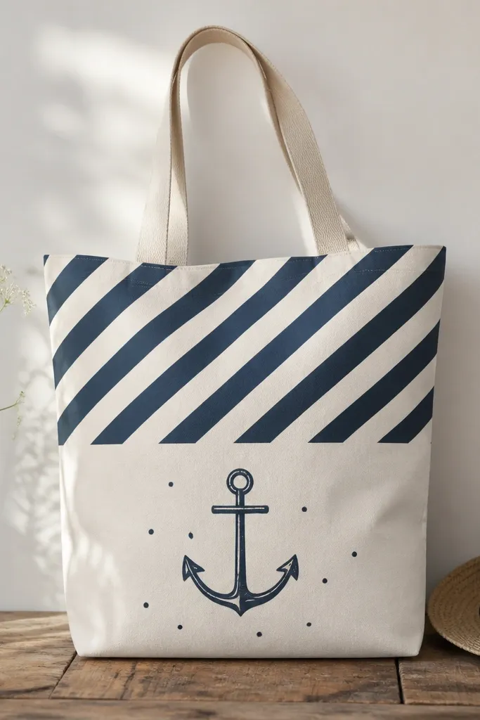
This looks like a nautical graphic tee but on a tote, and it works because the anchor detail is simple and bold. The diagonal stripes give energy, while the anchor keeps it anchored. Navy and white is the easiest color pairing to make look crisp on natural canvas. This style flatters anyone who likes clean, sporty looks. It also hides minor paint streaks better than complex illustrations because the stripes do the visual work.
Tape diagonal stripes across the upper half, spacing them about 3/4 inch apart. Paint navy over the taped sections, then remove tape once dry to keep sharp edges. After stripes dry, draw the anchor with pencil and outline it in navy using a fine liner brush. Fill the anchor with the same navy, then add a few tiny dot accents around it.
Let stripe paint cure overnight before scrubbing or folding the bag, or edges can soften.
Painting stripes too thin makes them look see-through and cheap against the canvas weave.
11. Soft ombre hearts cluster
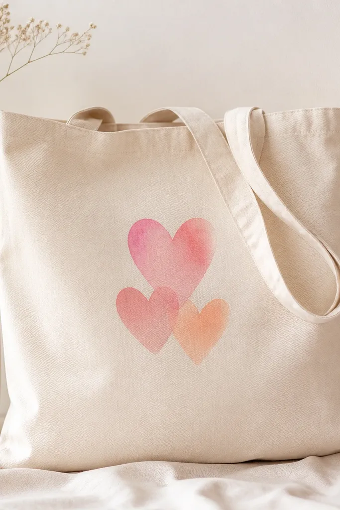
Hearts usually look cute, but ombre makes them look grown-up. The no-outline approach keeps the hearts soft and avoids that sticker look. Pink-to-peach blends make the tote feel romantic without turning it into a kids craft. I like this for date nights or weekend shopping because it looks sweet but not childish. It also flatters because the cluster sits in the middle and draws attention without covering the whole bag.
Sketch three heart outlines lightly so you know where they sit. Paint the top half of each heart with a darker pink, then blend downward into peach using a sponge or soft brush. Keep the edges slightly feathered so they look like watercolor hearts. Let dry, then add tiny white highlight strokes on the top-left side of each heart.
Use a sponge for blending; a brush makes streaks that show the stroke direction.
Adding a thick black outline makes ombre hearts look harsh and less modern.
12. Star map dots with a tiny compass rose
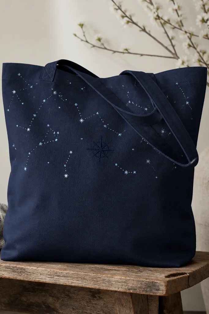
This is one of my favorite “looks like a print” designs because it uses tiny marks instead of big painting. The dots mimic stars, and the compass rose adds direction without needing realism. Pale blue and white on cream canvas feels airy and keeps the tote from looking too heavy. It’s flattering for anyone who wants a subtle design that still looks intentional up close. The best part is that the constellation placement can be imperfect and it still reads as art.
Lightly pencil a compass rose near the center, about 2.5 inches wide. Paint the compass rose spokes and circle in navy, then add 6 to 10 tiny dots in a mix of white and pale blue around it. Connect a few dots using very short lines — less than 1 inch each — so it looks like constellation hints. Dry-brush a tiny amount of pale blue near the top corners for a faint sky effect.
Use the tip of a toothpick for dots if you don’t have a dot tool — it makes them round and consistent.
Filling too many connections makes it look like a wiring diagram instead of a star map.
13. Monogram in block letters with shadow offset
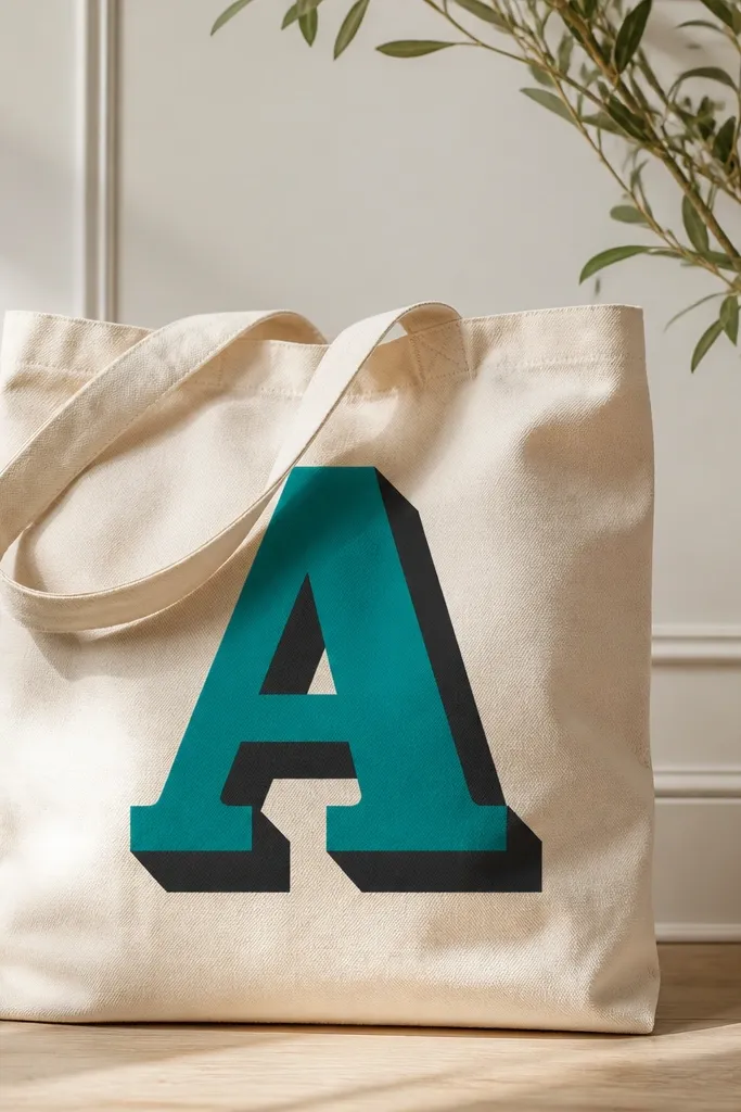
A shadow-offset monogram looks sharp because it creates depth with one extra shape. Block letters are easy to control, and teal plus black reads bold without extra decoration. This design flatters almost everyone because it’s centered and simple, and it works for work bags and personalized gifts. I’ve used it on totes for weddings and it always looks neat because the layout is controlled. It also hides small paint texture since the fill is solid.
Pick one letter and sketch it large enough to fill the center — about 6 inches tall. Paint the shadow first in black, offset slightly down-right by about 1/4 inch. Let it dry, then paint the teal letter on top, matching the edges carefully. Add a thin white highlight line along the top edge if you want a little extra pop.
Use painter’s tape as a guide for straight vertical strokes so your monogram edges stay clean.
Painting the teal before the shadow dries can cause the shadow color to creep into the edges.
14. Colorful fruit slices with glossy highlights
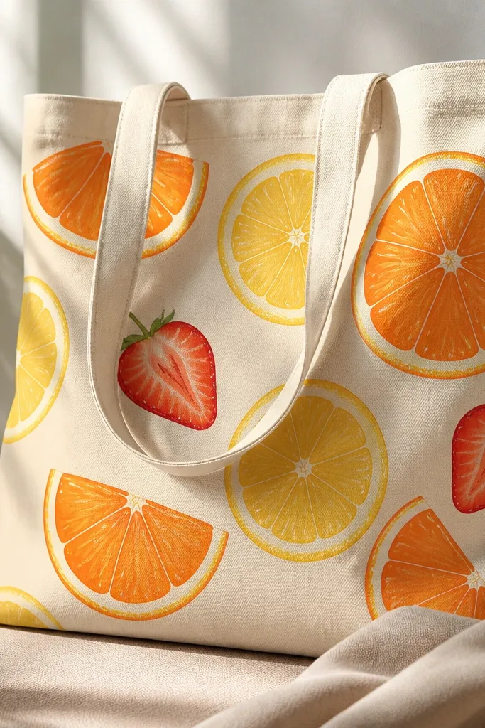
Fruit slices look fun and summery, and the glossy highlights make them look more realistic than you’d expect. You get a playful design that still looks well-done because each slice has a clear edge and internal segment lines. This is great for beach days, picnics, and anyone who loves bright color against natural canvas. It also flatters because the circular shapes create a balanced spread across the front. The technique works on beginners because you’re painting repeated shapes, not complex scenes.
Sketch 2 to 4 fruit shapes across the center, keeping them spaced so one doesn’t overlap too much. Paint orange segments using curved wedges and a slightly darker orange along the outer ring. Add lemon slices in yellow with a pale cream center, and paint strawberry halves with a red base and tiny seed dots in brown. Finish with small white highlight arcs on the upper edge of each fruit slice.
Thin your highlight paint a little so it lays on top without turning chalky.
Skipping the outer ring makes fruit slices look flat and less like real cut fruit.
15. Abstract face side profile in muted tones
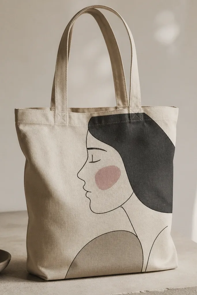
Abstract faces look artsy without requiring realism. Muted tones make it feel modern and not cartoonish, and the side profile is easier to draw than a full front face. Dusty pink cheeks soften the whole look and keep it from feeling too dark. I’ve done this on cream canvas and it looks good even in low light because the value contrast is gentle. It flatters people who like minimal fashion but want something that feels personal and slightly artsy.
Sketch the side profile with a simple pencil line — forehead, nose, lips, and chin, then add an eye almond shape. Paint the larger areas first: fill the cheek blush with dusty pink and the hair with taupe or muted black. Add a darker outline around the face features so they stay readable. Finish with tiny accent lines for eyelashes or hair texture using a fine brush.
Pro tipKeep the face one value family (beige/taupe) and add only one accent color (dusty pink) so it stays clean.
AvoidUsing bright primary colors makes the face look like a kids mural instead of a thoughtful abstract.
16. Camouflage pattern in olive and tan with soft edges
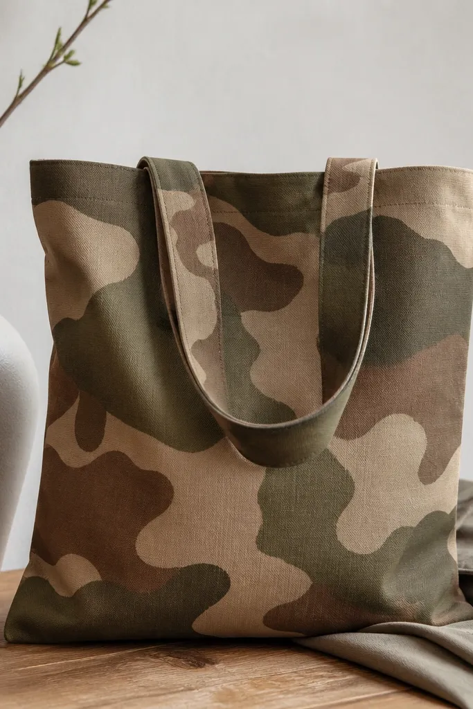
Camouflage looks cool and casual, and it’s also forgiving because random shapes hide small imperfections. Using olive, tan, and muted brown keeps it grounded and wearable. Soft edges make it look more painterly than military stencil. I like this for everyday bags because it matches denim, jackets, and neutral outfits. It flatters a wide range of styles since the palette is natural and not flashy.
Lightly sketch a rough layout in pencil with 5 to 7 blob shapes across the front. Paint the largest blobs in tan first, then layer olive blobs over them after the base is dry. Add muted brown blobs last and keep them smaller so the pattern has movement. Use a sponge to soften edges where colors meet so you don’t get hard lines between every shape.
Do one color at a time and let it dry before the next, or the pattern turns into one muddy layer.
Trying to freehand every blob in one go usually creates a lumpy, uneven pattern.
17. Tropical leaves in one corner with negative space
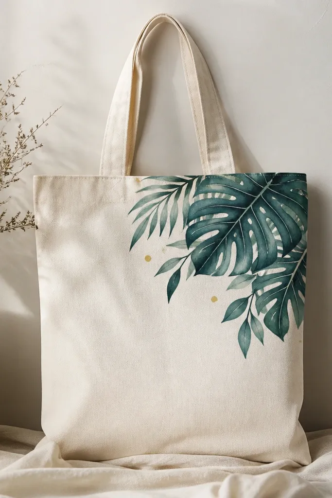
Corner-only leaf paintings look modern because negative space keeps the design from taking over. Deep green and teal gives you contrast that pops without bright neon. I like this for tote bags you carry on busy days — it still looks neat because it’s not covering the whole surface. It’s flattering because it draws the eye upward and to the side, balancing the tote handle area. Beginners like it because you’re painting a cluster, not a full scene.
Sketch a leaf cluster in the corner, about 5 inches wide, with a few leaves overlapping. Paint the main leaf shapes in deep green, then add teal veins using a fine brush. Leave the leaf centers partially blank or lightly shaded so the leaves look airy. Add 5 to 8 tiny yellow dots near the leaf tips and let everything dry before you stack the bag.
Use a reference photo for leaf vein direction, then simplify the veins to 3-4 lines per leaf.
Covering the whole tote with leaves makes it look like a fabric print you didn’t choose.
18. Pink marble effect with a white veining brush
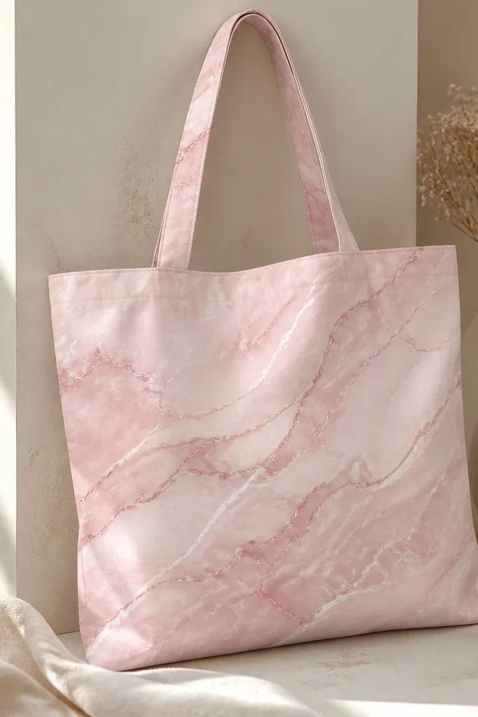
Marble effect looks hard, but it’s mostly controlled randomness. Pink marble reads romantic and modern, and the veining makes the design feel like it has texture. I’ve used this on light totes where the pink can breathe, and it always looks better than flat pink blocks because the variation catches light. It’s flattering for anyone who likes feminine color but doesn’t want hearts or flowers. The pattern also looks good from a distance because it has broad swirls, not tiny details.
Paint a base layer of soft pink across a centered rectangle about 10 inches wide. While the paint is still slightly tacky, dab in darker rose clouds with a sponge — don’t smear, just tap and swirl lightly. Then use a thin brush to draw white veining lines — thin, curvy, and spaced out, with a few thicker sections for realism. Let it dry fully, then add one more thin layer of veining if the lines look too faint.
Pro tipPractice the veining on paper first; marble lines look best when you don’t overthink them.
AvoidOvermixing the marble with a brush makes it look like streaky paint, not marble.
19. Minimal line art cat with patterned collar
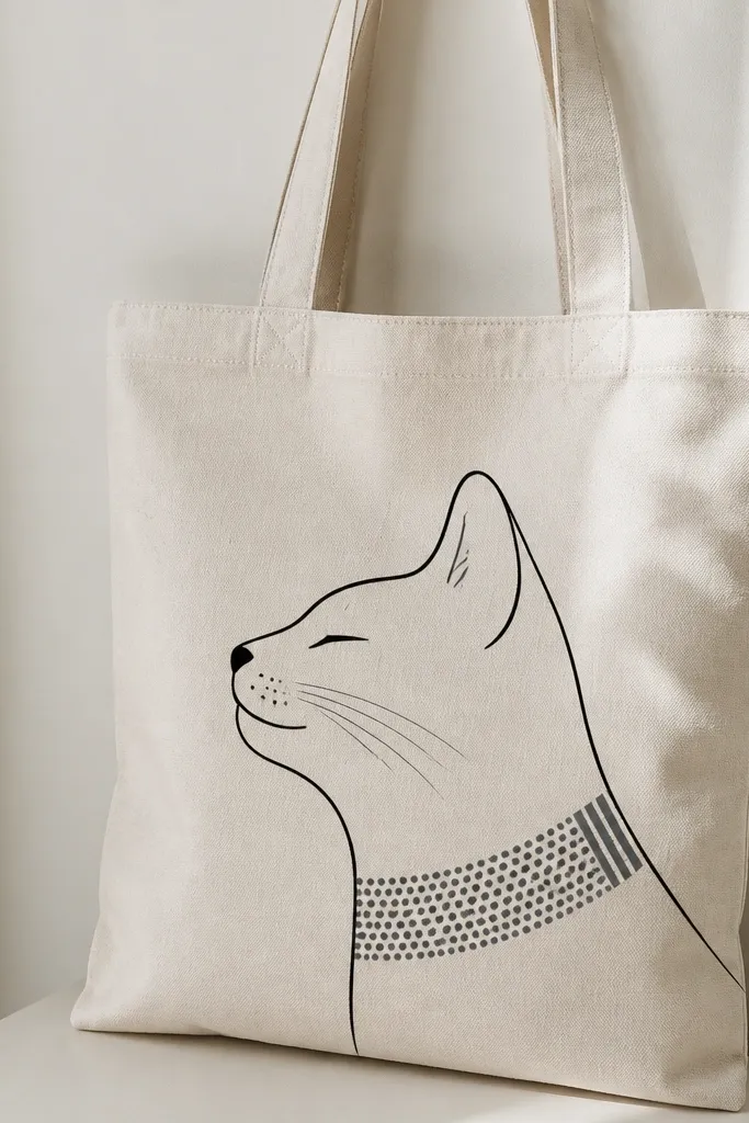
Minimal line art is forgiving and always looks clean when you keep the lines consistent. This cat design is cute without being childish because it uses a single line style and a small patterned collar. The patterned collar adds interest, but it stays contained so the tote doesn’t look busy. I’ve made versions for friends and it reads well even if the tote fabric texture shows through a little. It’s also flattering because the face sits centrally and the thin lines don’t overwhelm the bag.
Sketch the cat face with pencil — eye, nose triangle, mouth curve, and the ear outline. Paint the lines in black using a fine liner brush, then thicken only the parts you want to stand out, like the outer ear edge. Draw a collar band under the face, then fill it with a repeating pattern: tiny dots in gray and short stripes in light black. Let the collar pattern dry before you touch up any line breaks.
Keep your line width consistent by reloading paint often instead of dragging a dry brush.
Filling the whole cat shape solid usually makes it look cartoonish and harder to read.
20. Mandala ring with 1-inch segments
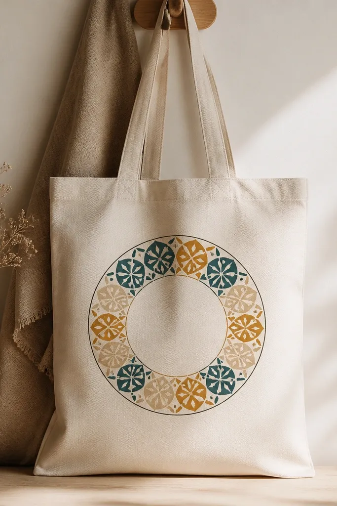
Mandala rings look stunning because they feel like pattern design, not random doodles. The secret for beginners is segmenting the ring into sections so each part is manageable. Teal and gold on cream canvas reads warm and festive without going too loud. I like this for evening events because the gold looks brighter when light hits it. It’s flattering for anyone who loves symmetrical designs but gets intimidated by full mandalas.
Draw a circle guide about 7 inches wide and mark it into 8 to 10 equal segments with pencil. Paint an outer ring in dark brown or black first, then fill each segment with a simple repeated shape — half-moons, dots, tiny triangles, or scallops. Keep each segment’s color alternating between teal and gold, with cream as the negative space inside shapes. Add a thin inner circle to frame the mandala and let it dry flat.
Use metallic gold paint sparingly; two light coats look better than one thick coat.
Trying to freehand a full mandala without segment guides makes symmetry fall apart fast.
21. Color-blocked checker stripes with uneven spacing
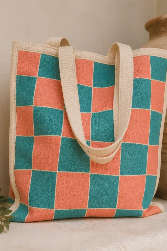
Checker stripes look graphic and modern, and the handmade unevenness makes it feel human instead of printed. Coral and teal give a fun contrast that looks great on natural canvas. This style flatters because it creates a clear focal block in the center, and the border keeps it tidy. I’ve used it on totes for markets where the bag gets handled a lot, and the simple pattern hides small scuffs. Beginners like it because it’s basically repeated rectangles.
Tape a centered rectangle on the tote front and decide your block sizes — start with about 1 inch squares. Paint the first color (coral) on the taped sections, let dry, then remove tape for the first layer only if the paint is fully dry. Re-tape for the second color’s sections or paint freehand within the grid lines. Once both colors are dry, paint a thin cream or light beige border line around the checker block.
Use a ruler and keep the grid lines faint; you want them gone after painting, not visible through the paint.
Overlapping colors while wet makes the checker turn into a single gradient mess.
22. Retro waves in navy with cream highlights
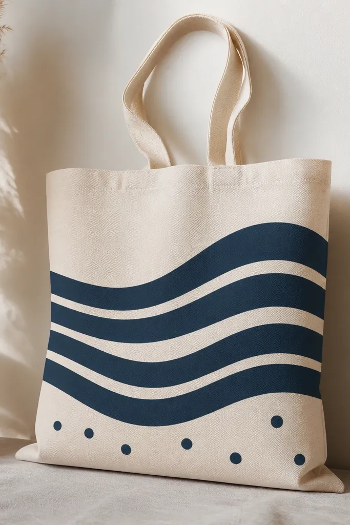
Retro waves look like mid-century wall art, and they’re easy because the shapes repeat. Navy plus cream stays classy and works with almost any outfit color. The trick is giving the waves a thick band and a thin highlight line so the design has depth. I like this for beach-themed bags because it feels playful without looking like cartoon seaweed. It’s also flattering for larger totes because the waves stretch nicely across the width.
Draw three horizontal wave bands across the center using pencil curves. Paint the thick navy bands first, then add the cream highlight lines inside each wave using a smaller brush. Let dry, then add small dot clusters — 6 to 10 dots — near the bottom band to mimic foam bubbles. Finish by outlining the outer wave edges in navy for a crisp edge.
Use the same brush angle for every wave so the curves look consistent.
Making wave lines all the same thickness makes it look flat.
23. Botanical initials with leaf frames
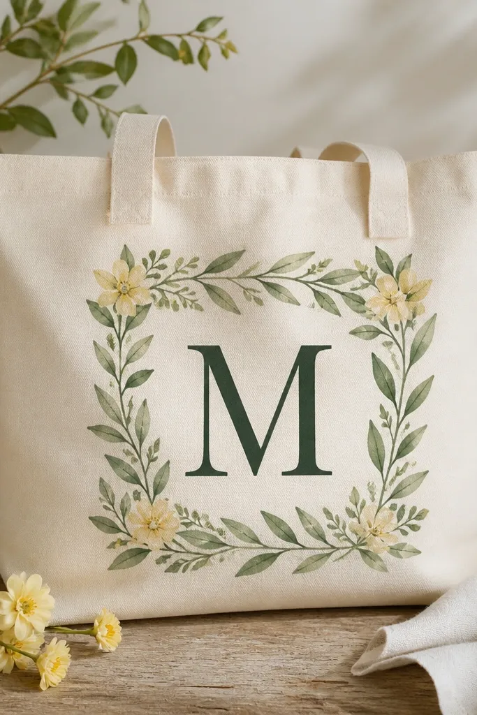
This design looks personal because it mixes a monogram with botanical framing. The initial acts like the anchor, and the leaf frame adds softness without clutter. Deep green feels classy, and the lighter green leaves keep it from looking too dark. I’ve made versions for housewarming gifts and it always gets compliments because it looks like you ordered it from a shop. It flatters because the initial is centered and the leaves sit around it like a border.
Sketch your initial big enough to fill the center — about 6 inches tall. Paint the initial first in deep green and let it dry. Then paint a simple leaf frame around it using lighter green leaves — 6 to 8 leaves total, spaced evenly. Add one small pale yellow flower in each of two opposite corners of the frame for balance.
Keep the initial edges clean by outlining with a fine brush after filling with a wider one.
Putting too many flowers makes the frame compete with the initial.
24. Ombre border fade with a darker bottom edge
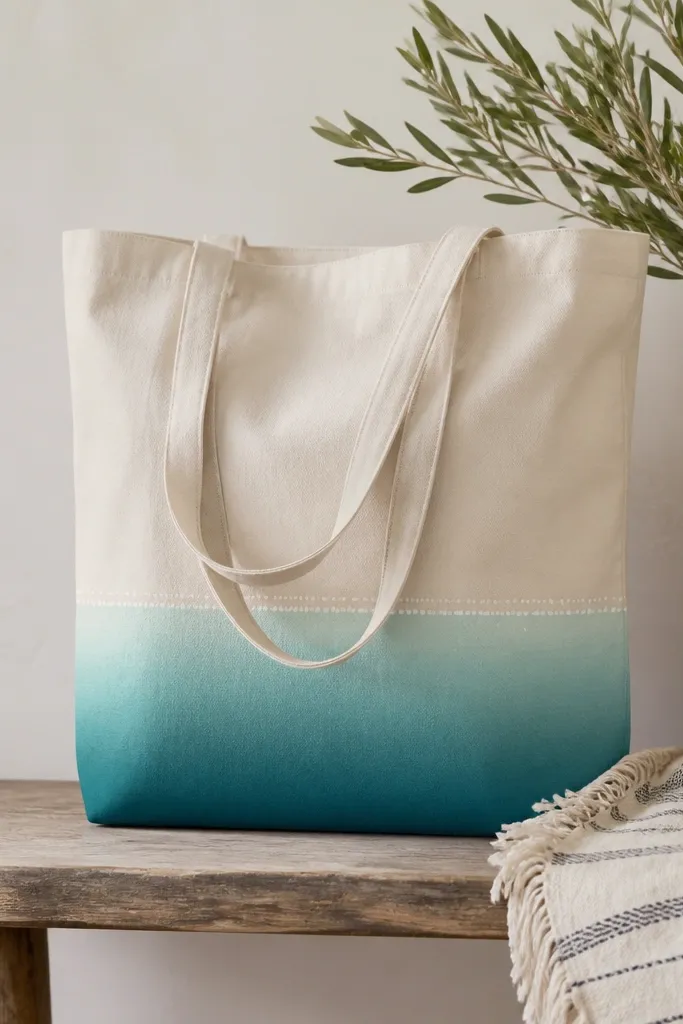
A border fade is a simple way to make a tote look designed without covering everything. The darker bottom edge grounds the bag, and the fade up the tote looks like dye on fabric. Teal to aqua is one of my favorite combos because it looks bright but not neon. This style flatters because it sits low and doesn’t fight with what you wear on top. It’s also beginner-friendly because you’re painting one controlled gradient area.
Tape a straight line across the tote about 4 inches from the bottom. Paint the bottom area deep teal first, then blend upward into aqua using a sponge — dab and fade until you hit the taped line. Remove tape only after the paint is dry to the touch. Add a tiny dot pattern along the top edge: 20 to 30 small white dots spaced evenly using a toothpick.
Use a sponge that you can rinse between colors so teal doesn’t contaminate aqua.
Freehanding the top edge usually makes the fade look uneven and messy.
25. Stamped texture flowers with layered petals
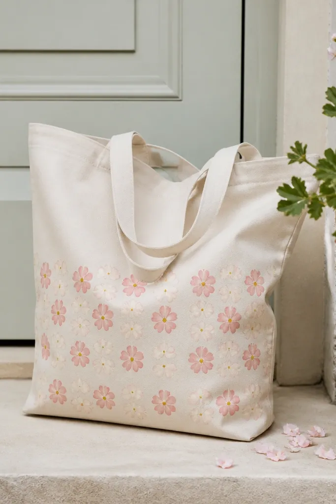
Stamped texture flowers look like fabric wallpaper, but you can build them with simple shapes. Layering two petal colors gives dimension, and the tiny centers keep it from looking flat. I like this on totes you want to feel cheerful and not too precious, because the repeat pattern hides wear. It’s flattering for everyday use because the design balances the bag without making one big focal area. Beginners can repeat a single flower shape and still get a polished result.
Start by making or buying a small flower stamp, or use a foam craft stamp with a petal shape. Paint your base petals in cream first, stamping in a grid-like spread across the lower half. Once dry, stamp a second petal layer in soft pink slightly offset for a layered look. Add a yellow dot center with a round brush, then outline a few flower centers lightly in brown for definition.
Pro tipStamp with a light, even press; too much pressure crushes the stamp edges and makes petals look smeared.
AvoidUsing one heavy coat of paint makes stamped flowers look thick and less crisp.