
1. Two-Color Sunburst with a Tiny Center Dot
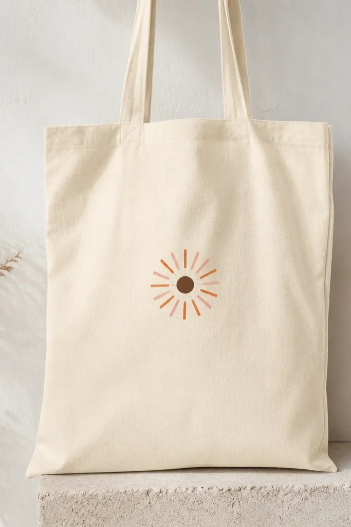
This one works because the rays create movement without needing a full scene. I paint it on natural cotton or an off-white tote so the rays pop and you don’t need opaque paint everywhere. Use a dark brown center dot to anchor the eye, which makes the whole thing look intentional even if your lines aren’t perfect. It flatters the tote shape because the rays naturally taper toward the center and don’t crowd the handles. For style, it looks great with denim, linen shorts, and gold jewelry; the color pairing reads warm and casual.
Pro tipUse a liner brush for rays so you get crisp edges without flooding the fabric.
Start by taping your tote flat on a piece of cardboard and marking a small center point 4 inches above the bottom seam. Use a ruler to draw 12-16 evenly spaced ray lines, about 2.5 inches long, then paint every other ray in orange and the rest in pale coral. Let the first color dry 10-15 minutes, then paint the center dot with dark brown. Finally, add a few tiny ray breaks with your brush tip so it looks hand-painted instead of machine-perfect.
AvoidDon’t paint the rays too long — if they hit the handle area, the design starts to look cramped.
2. Minimal Line Cat Face in Black Ink Style
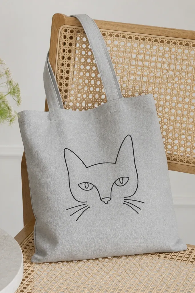
A line cat face is my go-to when I want something cute but fast. It’s forgiving because even shaky lines read like “intentional doodle” when you keep the shapes small. I like it on gray, cream, or tan totes because the black line looks like ink and doesn’t fight the fabric color. It also works for any tote size because the face sits in the center panel and leaves breathing room near the handles. If you carry it for errands, it looks cheerful without turning into a toddler graphic.
Pro tipPractice on paper first and aim for fewer lines — cats look better with a confident outline.
Start by sketching lightly with a pencil: head oval about 5 inches wide, ears about 2 inches tall. Paint over your lines with black acrylic thinned slightly so it flows like pen ink. Let it dry, then add whiskers as 6-7 short strokes per side. Finish by dotting tiny highlights in the eyes with white paint or a white gel pen.
AvoidSkip filling the face with solid black — it makes the eyes disappear and forces you into messy coverage.
3. Sponge-Painted Ombre Flower Border
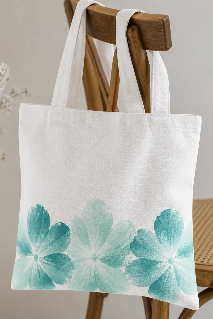
This border idea makes a small tote look styled without needing a large central image. I paint it near the bottom because the flowers can be slightly larger and still stay readable when the bag swings. The ombre color shift looks expensive because the petal edges are soft and the sponge texture hides minor brush mistakes. It’s flattering on most skin tones and outfits because teal-mint reads cool and clean rather than loud. If you wear mostly neutrals, this adds color without feeling like a themed costume.
Tape the tote to cardboard and mark a line 3 inches above the bottom seam for your border. Mix three paint tones: deep teal, medium teal-mint, and mint, then dab a makeup sponge lightly onto each petal area. Paint three flowers spaced evenly, overlapping petals slightly, then add small yellow centers with a tiny round brush. Let dry fully, then outline the flower edges with a thin mint-green line for definition.
Keep your sponge barely loaded with paint — too much paint creates muddy spots.
Don’t place the border too high — it competes with the handles and makes the tote look top-heavy.
4. Geometric Triangle Block with a Negative Space Triangle
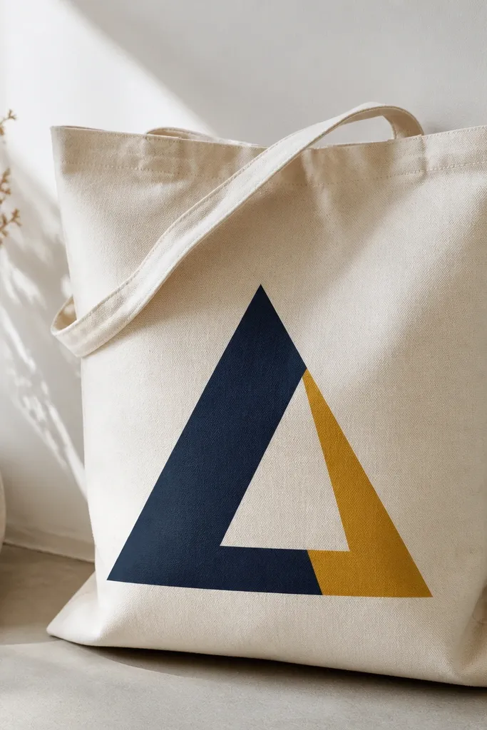
Negative space is your friend on a small tote. This design makes clean shapes look sharp even when your painting skills are still leveling up. I like navy and mustard because they look bold on beige and they pair well with white sneakers and denim. The unpainted triangle gives your eye a rest, so the whole composition feels balanced. It’s also great for people who want something graphic and grown-up without using lettering.
Pro tipPress tape edges firmly with a credit card so paint doesn’t creep under.
Draw a large equilateral triangle footprint about 6 inches tall in pencil. Mask one section with painter’s tape to preserve the negative space triangle, then paint the remaining big triangle navy. Remove tape after 10 minutes, let dry, then use tape again to block a smaller adjacent section for mustard. Finally, add a thin white line separating the two painted areas so the edges look crisp.
AvoidDon’t freehand the triangles without a light pencil guide — crooked edges look cheap fast.
5. Single Large Peony Bloom with Dot Centers
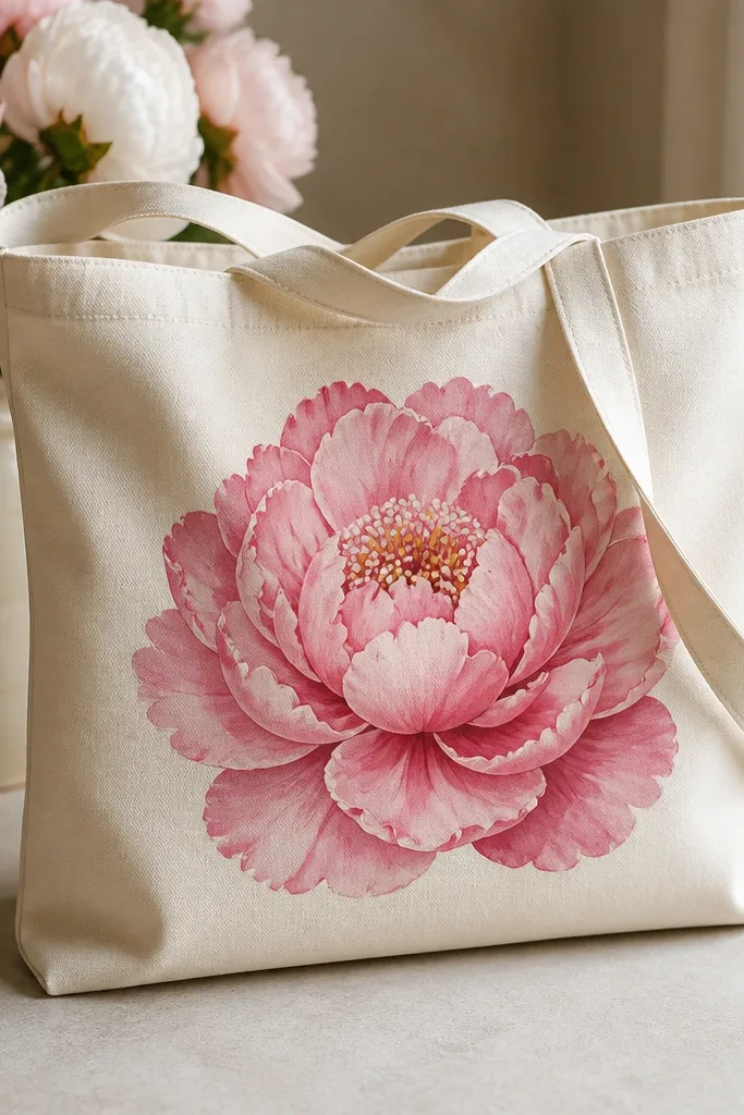
A single big bloom is one of the most flattering ways to paint a small tote because it fills the front panel without needing a whole bouquet. Peonies hide imperfections because the petal shapes overlap and create depth. I use three pink tones and a touch of muted burgundy for the petal shadow, which makes it look dimensional even with beginner brushwork. This design looks great for spring outfits and also for everyday because it’s not busy. It flatters most body types of the tote because the bloom sits centered and doesn’t fight the handles.
Start by outlining a circle-ish peony size about 7 inches across on the tote front. Paint the lightest pink petals first as curved teardrops, then layer medium pink between them, and add burgundy along the petal edges for depth. For the center, dab small dots using the tip of your brush: yellow dots with tiny white dots on top. Let each layer dry 10 minutes so the petals don’t bleed into each other, then add a few thin petal vein lines in darker pink.
Use the dry-brush edge trick: lightly drag the brush tip along the petal edge for a soft shadow.
Don’t overpaint every petal the same shade — flat flowers look like stickers.
6. Botanical Sprig with Three Leaves and One Berry
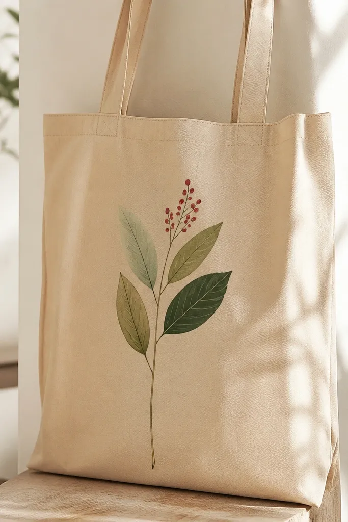
This sprig design is perfect when you want something delicate on a small tote. It looks intentional because the stem creates a vertical path, and the leaf size changes keep it from looking like a stamp. I paint it in three greens so the leaves don’t blend into one blob, and I add one berry to give the eye a “finish line.” It pairs well with neutral outfits, and it works for bags you carry to work because it’s not loud. The negative space around the sprig makes it feel airy without requiring a large canvas.
Pro tipUse a damp paper towel to wipe your brush between greens so you don’t muddy the colors.
Sketch a thin stem rising diagonally, about 8 inches long, then mark three leaf positions along it. Paint the bottom leaf in olive, the middle leaf in forest green, and the top leaf in sage; add tiny vein lines with a liner brush. Finally, paint one small berry cluster with red paint and a dark maroon dot highlight in each berry. Add a light green shadow under the stem with a very diluted green so it looks anchored.
AvoidSkip thick stems — a chunky line makes the sprig look like clipart.
7. Rainbow Arch with Uneven Brush Strokes
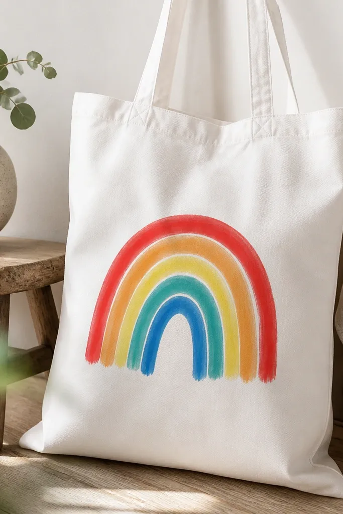
This is the “happy tote” idea that still looks handmade. The uneven brush texture is the point — it reads as cozy rather than printed. I keep the arch compact so it fits between the handles, and I use teal instead of green because it looks clean and modern. This design looks good on any tote color, but it really pops on white or oatmeal. It’s also great if you want to match it with a simple outfit and let the bag do the talking.
Pro tipUse a flat brush for banding — it gives you strong coverage without streaks.
Mark the center of the tote front and draw an arch width of about 9 inches with a height of 5.5 inches. Paint the red band first, then orange, then yellow, working one band at a time so edges don’t smear. Add teal and blue for the last two bands, keeping each band slightly thicker than the last. When everything is dry, add a thin white highlight along one side of each band using a small brush to make it look dimensional.
AvoidDon’t outline the rainbow in black — it makes the whole piece look like a craft-store sticker.
8. Stars and Moon Night Sky with Sponge Clouds
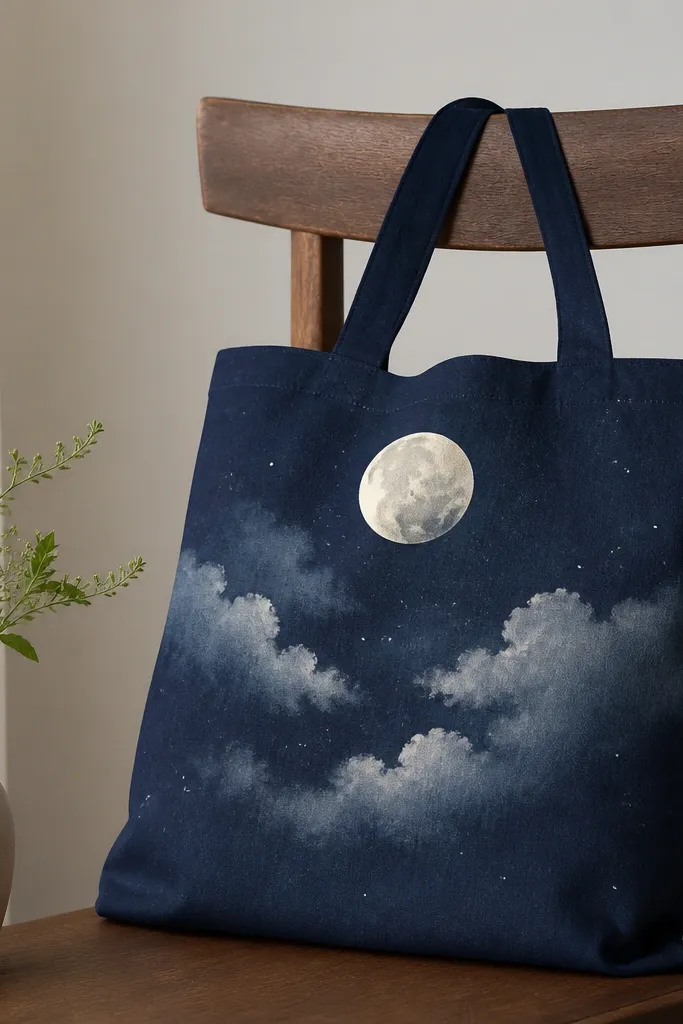
Night sky designs look high-end even when they’re simple. Sponge clouds give you texture that covers brush mistakes, and the stars are easy because you can place them as dots. I paint this on dark tote colors like navy or charcoal so the white paint pops without needing heavy coats. The moon gives you a focal point near the handles, and the clouds keep it from looking empty. It’s also a good choice if you carry the bag at night — it reads clearly in low light.
Pro tipIf your tote is light-colored, paint a light gray “sky wash” first so the stars don’t look scattered.
Tape the tote flat and place a cardboard backing. Paint the moon first: a pale cream circle about 3 inches wide, then add a slightly darker crescent edge. For clouds, dab a makeup sponge with light gray and drag it in soft arcs across the center. Add stars by flicking diluted white paint from a toothbrush — practice on scrap first so you control droplet size. Let dry, then add a few tiny star dots with a fine brush for balance.
AvoidDon’t make the clouds too dark — they swallow the moon and flatten the sky.
9. Pastel Abstract Brush Marks with One Bold Line
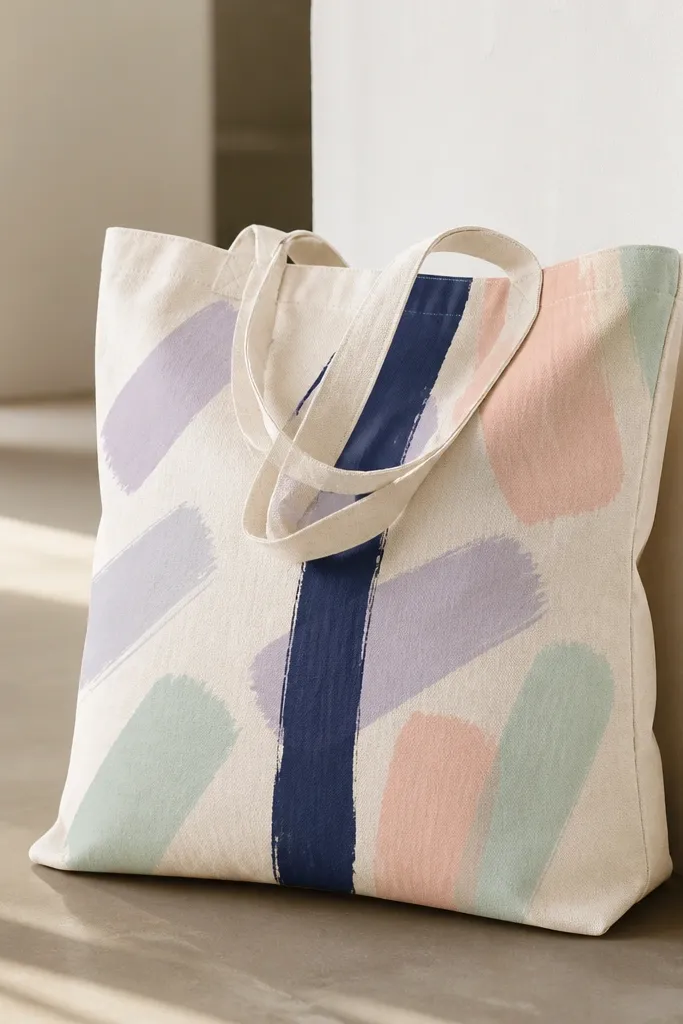
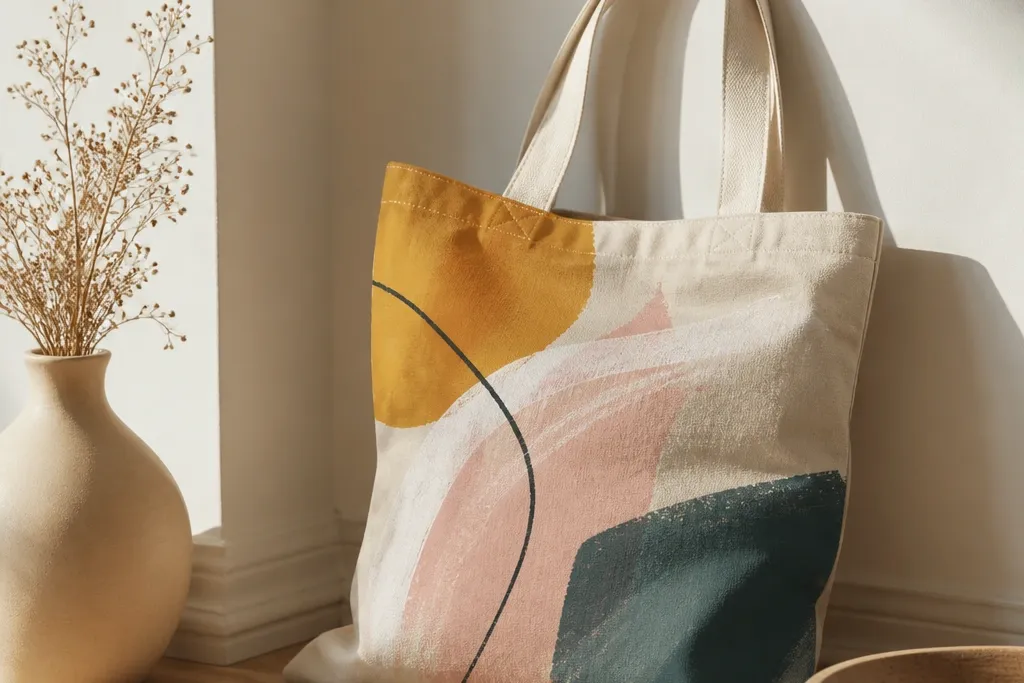
This is my go-to “messy in a good way” design. The pastel marks fill the space without requiring precise drawing, and the single bold line gives structure. I like it when I want something artsy but still wearable, because it looks like modern wall art rather than a character print. Pastels look softer on beige and oatmeal totes, while the navy line keeps it from looking too precious. It also works well for gifts because it looks thoughtful even if you don’t know the recipient’s favorite character.
Start by painting the navy line first with a ruler guide: a vertical stroke about 10 inches tall, centered on the tote front. Then add 10-14 pastel strokes around it using different brush sizes; keep them mostly in the top half so the tote doesn’t look bottom-heavy. Overlap some strokes lightly so the colors mix in a controlled way, then leave some areas unpainted for breathing room. When dry, add a few tiny white accents on top of two strokes using a dry brush technique.
Use one brush for all pastels, wash it between colors, and keep the paint thinned so strokes stay translucent.
Skip covering the whole bag — full coverage makes the tote feel heavy and hides your design.
10. Cherry Cluster with Leafy Stems
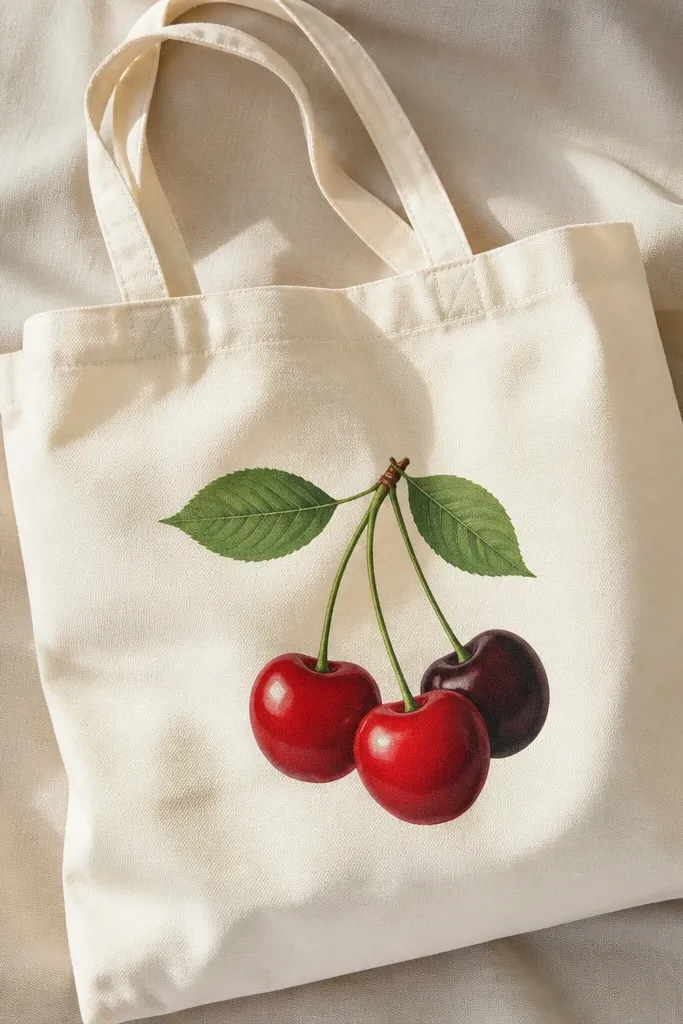
Cherries are small-space friendly because you can cluster them tightly and still read as fruit. The glossy highlights make it look more realistic without needing shading all over the fruit. I paint cherries on cream, blush, or light blue totes because the red tones look fresh. The leaves add motion and balance so the cluster doesn’t look like random dots. This style looks great with casual outfits and also works for seasonal tote gifts.
Pro tipUse a toothpick to place highlight dots precisely.
Sketch a triangle cluster size about 6 inches across. Paint two cherries in bright red and one in maroon, then add tiny white highlight spots on each cherry while the paint is still slightly tacky. Paint leaf shapes in forest green with a lighter green vein line down the center. Add a short stem connecting the cherries and a few small curved lines around them to suggest shine. Let it dry flat, then add a thin dark outline around the cherries only if your colors look too blurry.
AvoidDon’t use neon red — it reads like candy and looks harsh on canvas.
11. Stencil Butterflies with One Metallic Accent
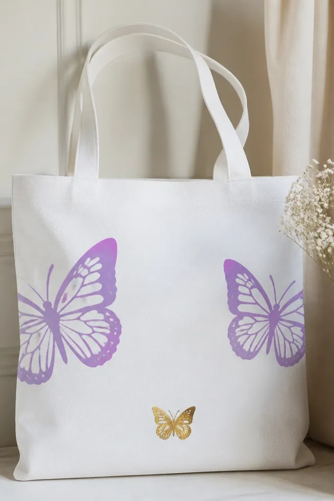
Stencils make small-space designs look clean fast, and butterflies are forgiving because symmetry isn’t required. I use two matte purple butterflies and one smaller metallic gold to pull attention without clutter. The metallic accent catches light when the bag moves, which makes the tote feel special even if the painted area is small. This looks good on white, blush, and light gray totes. It also flatters people who like feminine details but don’t want flowers everywhere.
Pro tipUse foam stencil brushes — they reduce paint pooling and keep edges sharp.
Place a cardboard backing inside the tote and hold a butterfly stencil with painter’s tape. Dab purple paint with a stippling sponge, pressing lightly so you don’t bleed under the stencil. Move the stencil for the second butterfly, then paint the small gold butterfly using metallic acrylic. After the paint dries, remove tape carefully and add tiny body lines with a fine brush. Keep the butterflies within a 9-inch wide area so you don’t hit the seams near the handles.
AvoidDon’t swipe the sponge across the stencil — dab straight down.
12. Dot Mandala Ring Around a Center Flower
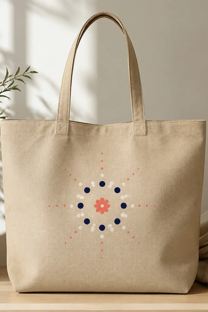
Mandala dots give you structure without needing perfect line drawing. I use a small center flower so you have a focal point, then the dot ring makes the design feel finished. Navy and white dots look crisp on warm tote colors, and coral keeps it fresh. This design is flattering because it stays centered and doesn’t get messy near the handles. It also hides uneven brushwork because dots cover tiny mistakes and create rhythm.
Pro tipIf dots look uneven, reload the tool less and tap lightly instead of pressing.
Start by painting a small five-petal flower about 2.5 inches wide, using coral with a darker coral outline. Let it dry, then use a dotting tool or the back of a paintbrush to place a ring of navy dots around it, spaced about a half inch apart. Add a second inner ring of smaller white dots for contrast. Finally, place 6-8 extra dots outside the ring in a gentle arc to mimic a mandala flourish. Keep all dots within a 7-8 inch diameter so the ring doesn’t crowd the tote edges.
AvoidDon’t make the dots too big — oversized dots flatten the design.
13. Monochrome Checkerboard Pocket Panel
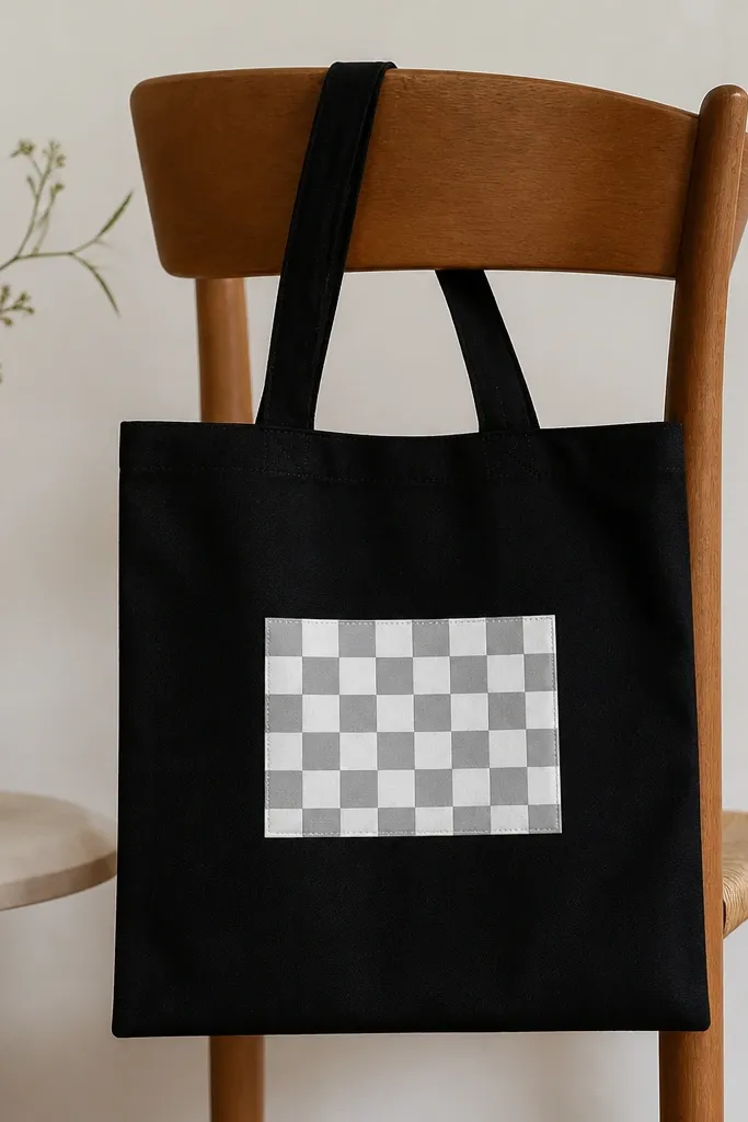
Checkerboards are simple, but they look sharp because the pattern carries the design. I like making it a “pocket panel” about the size of a small notebook so it feels intentional and not random. Monochrome (gray/white) looks clean on black and doesn’t clash with outfits. This is also a good beginner plan because mistakes can be corrected by repainting individual squares once the grid is dry. The design flatters the tote because it sits centered and keeps the bag looking structured.
Tape the tote flat and mark a rectangle about 8 inches wide and 6 inches tall, centered on the front. Draw a grid: 8 columns by 6 rows of squares, each about 1 inch, using a ruler and pencil. Paint alternating squares with light gray, then fill the other squares with white. Let dry, then go back with a thin brush to clean up edges along the pencil lines. Remove pencil marks if visible with a light eraser after paint dries fully.
Use a ruler taped to your work surface so your hand stays steady.
Skip freehand squares — wonky grids look like a rushed craft.
14. Wave Line Coast with One Tiny Boat
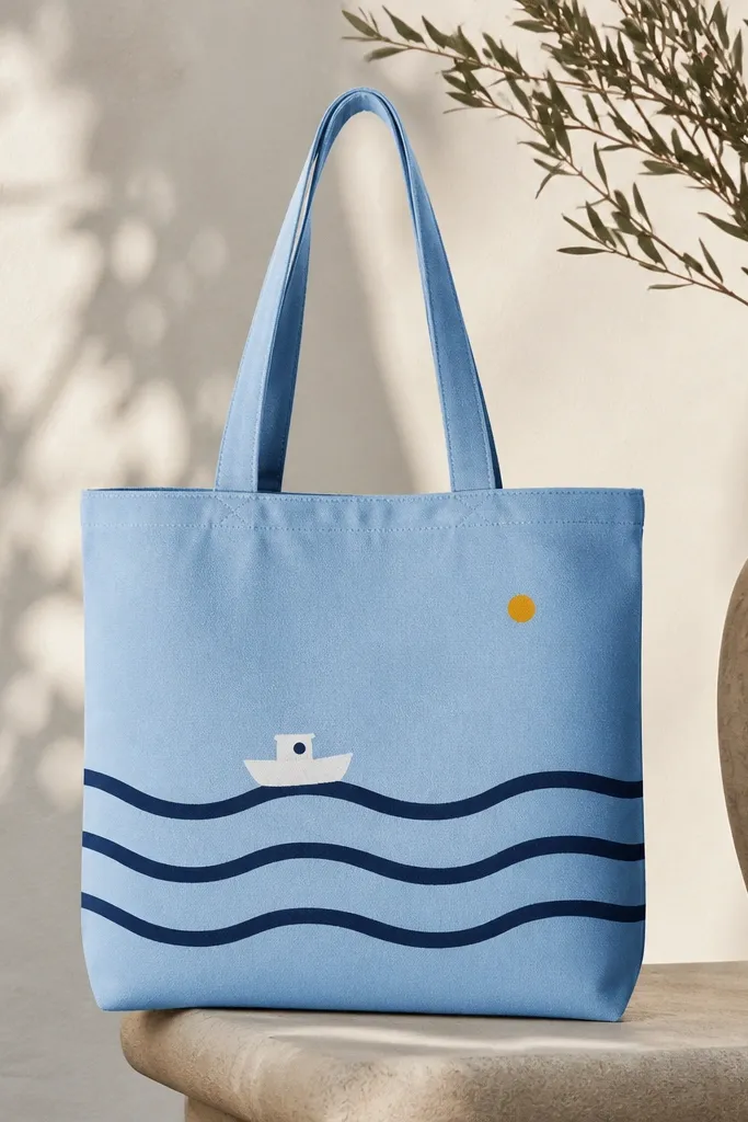
This design looks calm and graphic, and it fits small tote space because everything is stacked. The wavy lines create texture without requiring a full background, and the tiny boat adds a story beat. I use navy lines on light blue or white totes so the waves look crisp. It also works for gifts for people who like travel or beach vibes but don’t want loud prints. The composition stays low and centered, which makes it look balanced against the handles.
Start by drawing three wave lines across the lower half of the tote front, each about 8-9 inches long. Paint them in navy with a liner brush, keeping the wave peaks consistent. Above the middle wave, paint a tiny boat: a simple trapezoid hull and a small sail triangle, both in white. Add one small yellow sun dot near the top right of the design. Let everything dry flat so the brush lines don’t spread.
Practice the boat shape on scrap first — tiny boats look best with simple geometry.
Don’t add too many clouds — the waves and boat need space to breathe.
15. Lemon Slice Half with Green Leaf
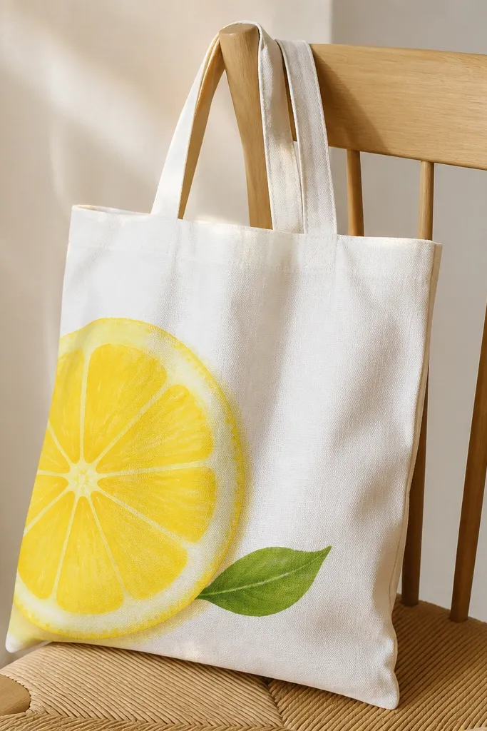
Lemon slices are bright, clean, and they read clearly even in small space. I paint only half a lemon so the curved segments fit neatly and don’t take over the tote front. Yellow works best on light backgrounds, and a touch of warm orange shading near the rind makes it look dimensional. The green leaf balances the yellow and adds a natural accent. This tote looks great for summer errands, picnics, and kitchen carry bags.
Sketch a half circle lemon about 6 inches wide, with the flat side toward the bottom. Paint the lemon in bright yellow, then add curved segment lines in slightly darker yellow/orange. Use a tiny brush to add rind shading along the outer edge. Paint one small leaf in olive with a lighter vein in sage green. Let dry, then add two tiny white highlight dashes on the lemon segments.
Use a round toothpick to carve thin segment lines if your brush is too thick.
Avoid over-shading the whole lemon — keep shading just on the rind and segment edges.
16. Bold Monogram Block Letter with Two-Tone Shadow
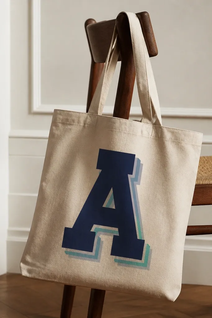
A single monogram letter makes a tote look personalized without adding complexity. The two-tone shadow is what makes it look “designed,” because it mimics depth without complicated gradients. I like block letters because they hide brush wobble and look crisp at a distance. This idea works for anyone — you can match the letter color to a favorite hoodie or shoes. It also flatters small space because the letter fills the center panel and keeps the rest clean.
Pro tipUse masking tape to block clean edges on the letter corners.
Measure a letter area about 7 inches tall and 4.5 inches wide, centered on the tote front. Paint the shadow first: lightly sketch an offset letter shape behind the main letter, then fill one shadow layer teal and the outer edge light gray. Let it dry 10 minutes, then paint the main block letter navy. Add a thin white highlight edge along one side if you want it to feel extra crisp. If paint bleeds, correct after drying with a slightly damp cotton swab.
AvoidDon’t make the shadow offset too far — it stops looking like depth and starts looking like a mistake.
17. Fruit Pop Art Dots and Thick Outlines
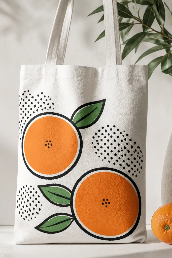
Pop art style reads well on tote fabric because thick outlines control the design. The dot pattern fills empty space without forcing full background painting, which is perfect for small tote fronts. I paint the fruit in flat orange with a slightly darker orange half-moon for the segment feel, then outline everything in black. This looks great for casual summer outfits and also works for kids' tote gifts. It’s bold, but the limited palette keeps it from feeling chaotic.
Pro tipUse a paint pen for outlines if your brush keeps wobbling.
Sketch two oranges about 3.5-4 inches wide each on the tote front. Paint flat orange circles, then add darker orange segment arcs near the top and bottom. Outline the circles, leaves, and any segment lines with black acrylic using a medium liner brush. For the dot background, add clusters of small black dots around and between the oranges, keeping them mostly on the sides to leave a clean center. Let dry flat, then go back and thicken any outline lines that look thin.
AvoidSkip thin outlines — they disappear into fabric texture.
18. Tiny Geode Panel with Purple Veins
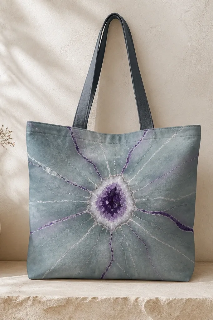
Geode panels look like you spent hours, but you can fake the crystal effect with line work. The trick is keeping the geode small and letting the vein lines do the heavy lifting. I use a teal-gray base because it looks mineral-like, then add purple veins so the whole thing pops. White highlights make it feel sparkly without needing actual rocks. This design looks great on light neutral totes and also on darker ones if you invert the base color.
Block in the geode shape first: a rough oval about 5 inches wide using teal-gray paint. While it’s still slightly tacky, paint irregular purple vein lines that radiate from one center area, like cracks in stone. Add a few darker purple lines for depth, then paint thin white highlights along the brightest veins. Let the base dry fully, then add tiny dot “sparkles” with white paint. Keep the geode within a 6-7 inch area so it stays readable and doesn’t crowd the handles.
If veins get messy, wipe them gently with a damp cotton swab before they dry.
Don’t cover the entire tote with veins — a small panel looks intentional, a big one looks chaotic.
19. Buttercream Swirl with a Single Pink Dot Sprinkle
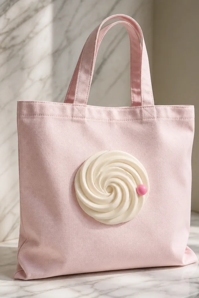
This is the “dessert but minimal” option. The swirl gives you a curving shape that looks good on tote fabric, and one sprinkle dot is enough to feel playful. I use off-white for the swirl on light pink, because it looks like frosting instead of chalk. The soft shadow is what makes it feel dimensional, even if you keep the design simple. This tote looks cute for cafes, birthdays, and everyday errands. It also flatters small space because the swirl occupies a compact center area.
Pro tipUse a small round brush and keep paint thick enough to hold the spiral shape.
Sketch a spiral about 6 inches tall, starting with a small center loop. Paint the main swirl in off-white, then add a slightly darker beige line along the inner edge for shadow. Let it dry, then add a very thin highlight line on the outer curve using white. Place one bright pink dot sprinkle near the swirl edge and add a tiny darker pink dot next to it for depth. If your tote is light, add a light outline around the swirl with a diluted beige so it doesn’t disappear.
AvoidDon’t add multiple sprinkles — too many dots turn into clutter fast.
20. Layered Leaf Monogram Frame (No Letter Inside)
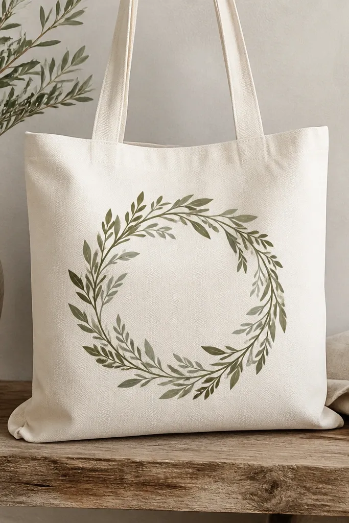
A leaf frame makes a tote look styled without needing names, dates, or lettering. Overlapping leaf layers create depth, and the empty center gives the tote a clean focal point. I use olive and sage because they look natural and they photograph well under indoor light. This works for people who want something botanical but not full-on illustrated flowers. It also flatters the tote because a frame shape balances the handles and keeps the design centered.
Sketch a rounded frame shape about 8 inches wide and 6 inches tall, centered on the tote front. Paint leaves as teardrops that overlap along the outline, alternating olive and sage for the layers. Add one darker green vein line per leaf using a liner brush. Let dry, then paint a thin dark green border line along the outside of the frame for crisp edges. Finish by adding two small leaf buds at the top corners to close the frame visually.
Work from the outline inward so the overlap looks controlled.
Skip random leaf placement — the frame needs a clear shape to look intentional.
21. Color-Blocked Heart with Offset Outline
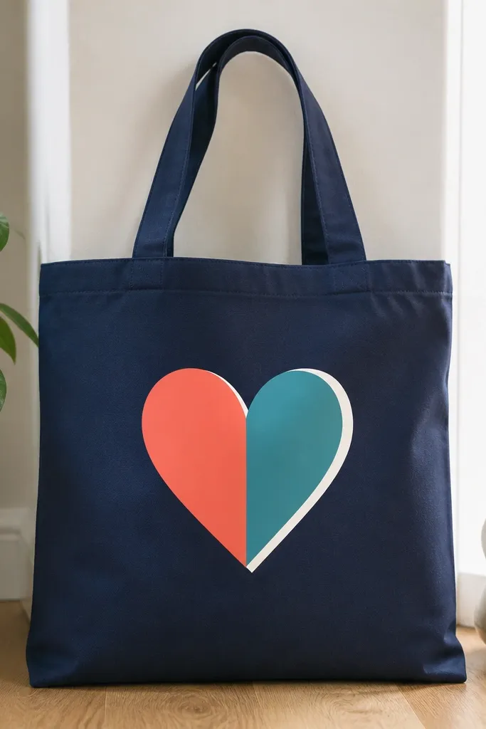
Hearts can look cheesy, but a color-blocked heart with an offset outline looks graphic and modern. The offset outline creates a “sticker” effect without needing thick paint. I like navy base totes because the coral and teal pop hard, but the same idea works on black or charcoal. This design flatters small space because the heart fits perfectly in the center panel and doesn’t need extra background. It’s also a good beginner piece because straight color blocks hide uneven brush coverage.
Pro tipUse painter’s tape for the center split — it keeps the heart halves clean.
Sketch a heart about 6.5 inches tall on the tote front. Mask a vertical line down the middle with tape, then paint the left side coral and the right side teal. Let it dry 10 minutes, remove tape, then paint a white outline around the heart. For the offset, add a second faint outline by lightly painting white in the same shape but shifted 1/8 inch to the right or down. Let dry flat before handling the tote.
AvoidDon’t use too many colors — three tones is enough for a crisp look.
22. Sunflower Head with Stippled Seeds
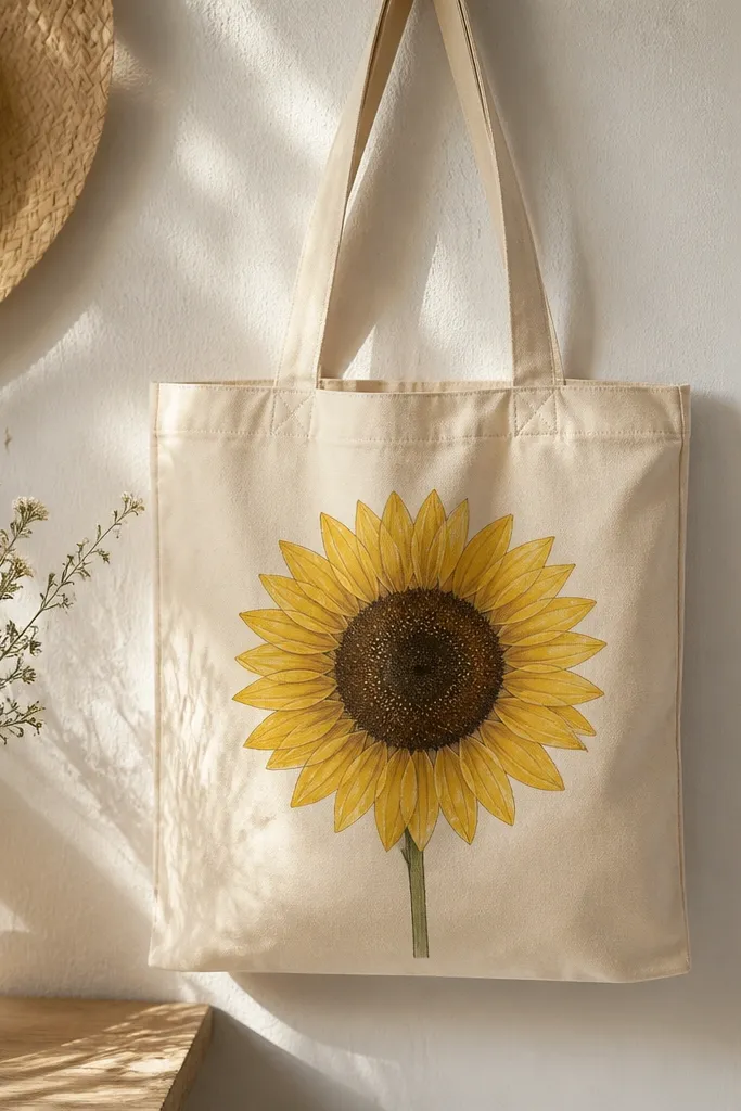
Sunflowers look bold even at small scale, and the stippled seeds make the center look alive. I paint the petals in two yellows so they don’t flatten into one bright blob. The dark center adds contrast, which helps the design pop against tote fabric texture. This tote looks great with denim jackets and simple white tees. It also flatters different body types because the sunflower sits centered and doesn’t stretch toward the handles.
Outline a circle center about 3 inches wide and a sunflower head about 7 inches across. Paint petals as teardrops radiating out, starting with lighter yellow, then adding a deeper golden shade at the base of each petal. For the seeds, use a small brush or dotting tool to stipple dark brown dots in concentric-ish rows. Paint a short stem and one leaf in green under the head. Let dry fully, then add a few tiny white specks in the seed area for sparkle.
Stipple in small sections so you don’t get tired and start clumping dots.
Avoid painting a solid dark center — stippling looks more realistic and forgiving.
23. Minimal Botanical Frame Corners
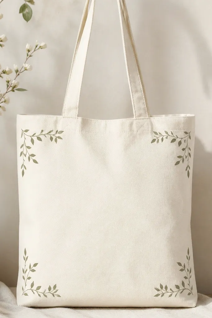
This is the “expensive stationery vibe” idea. Corner details make your tote look like it has a design border, and leaving the center blank keeps it airy on small space tote bag painting ideas. I paint thin vines in sage and olive so the corners don’t look heavy. The design flatters the tote because it guides the eye toward the center handles and keeps the front clean. It’s also perfect if you don’t want a big graphic on your bag.
Tape the tote to cardboard and mark each corner area: top-left, top-right, bottom-left, bottom-right. Sketch a small vine shape in each corner about 2.5-3 inches from the edges. Paint thin stems with diluted sage, then add two small leaves per corner in olive. Let dry, then add a tiny vein line on each leaf with a darker green. Leave the center untouched so the tote’s fabric color acts like the background.
Use a ruler to keep vine angles consistent across corners.
Don’t crowd the corners — if the vines extend too far, the tote looks busy.
24. Painted Patchwork Squares with Tiny "Stitch" Lines
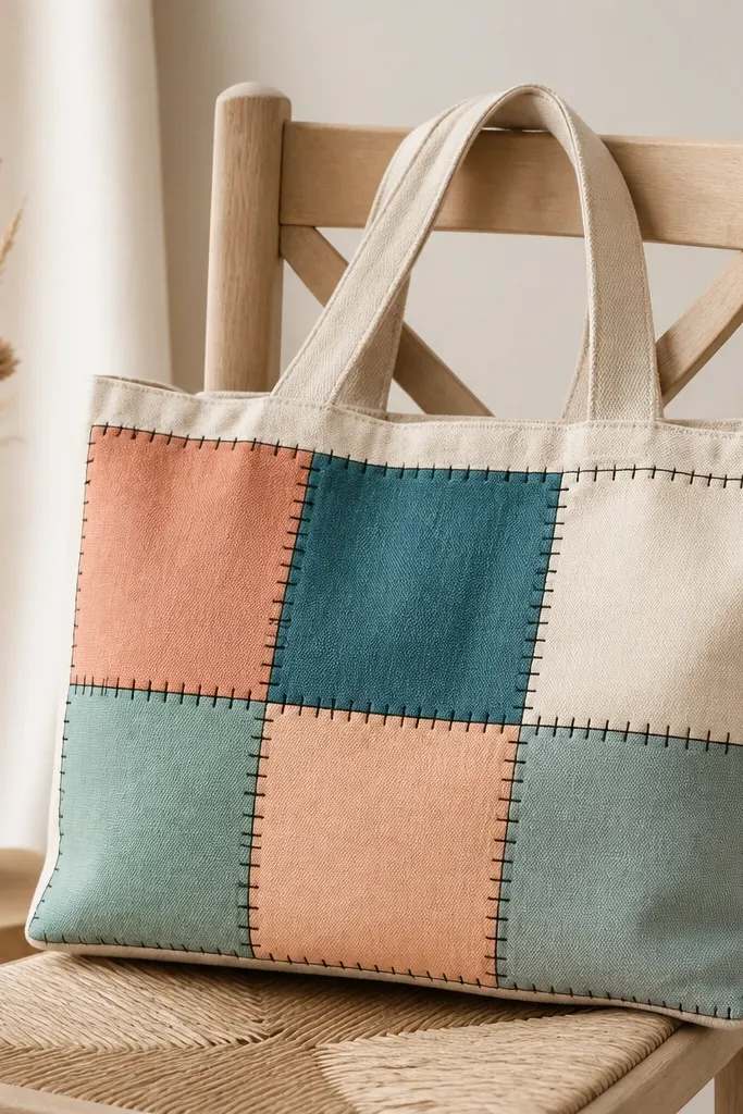
Patchwork is a small-space cheat code because it fills area with controlled shapes. The stitched outlines make the painting look like actual fabric pieces, which is why it reads as cute instead of beginner. I use muted colors because they blend nicely with tote fabric and look good in photos. This design flatters the tote because the grid keeps everything evenly distributed. It also works for gifts because it looks “custom” even though it’s simple.
Pro tipIf your stitch dots look messy, use a paint pen for the dots and a brush for the outline.
Draw a rectangle panel centered on the tote about 9 inches wide and 7 inches tall. Split it into 6 squares (three across by two down) using pencil lines. Paint each square a different muted color, using a flat brush for smooth coverage, then let dry. Outline each square with black paint, and add tiny stitch dots along the outline in pairs. Finish by adding a slightly thicker black outline around the whole patchwork panel.
AvoidSkip bright neon colors — they overpower the tote and make the patchwork look cheap.
25. Teal and Coral Waves with White Highlights
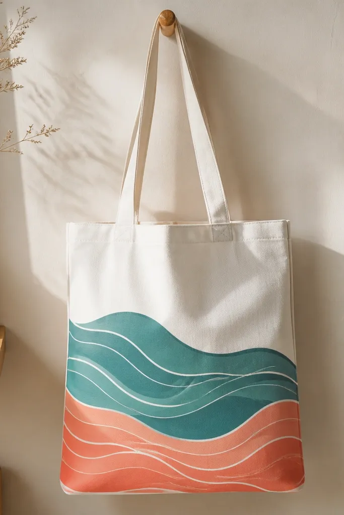
Layered waves look complex but paint in quick steps. The two colors create depth, and the white highlights make the waves look like they’re catching light. I like this design on white or pale gray totes because it stays bright and doesn’t swallow the colors. It’s great for beach style outfits and also for anyone who likes calm, graphic art. The composition works on small tote space because the wave pattern is stacked and centered.
Pro tipUse a light pencil guide for crest spacing so your highlights line up.
Mark three horizontal wave bands across the center panel, each about 3 inches tall. Paint the bottom band coral first, then the middle band teal, and the top band teal again or leave it coral depending on your preference. While bands are slightly tacky, add thin white highlight lines along the crests using a liner brush. Let everything dry flat, then add a few small wave dots at the edges to suggest foam. Keep the wave spacing consistent so the pattern looks clean.
AvoidDon’t make the waves too thick — thin waves look more “water-like” and less like stripes.
26. Potted Plant in a Slim Pot (One Line Leaves)
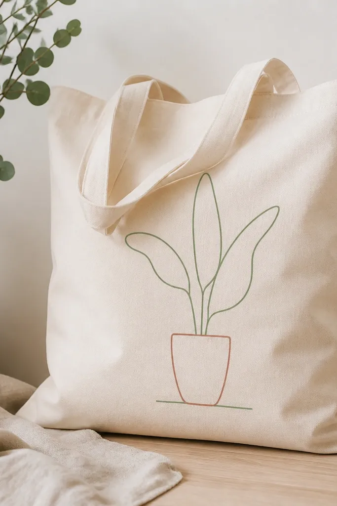
A potted plant with one-line leaves looks modern and stays readable on a small tote. The slim pot keeps the composition vertical, and the line leaves add movement without filling the whole space. Terracotta looks great against creams and light beiges, and the simple green line stays fresh. This is a good choice for people who want a plant theme but not a full illustrated jungle. It also flatters tote shapes because it doesn’t crowd the handles like big leafy bouquets do.
Pro tipThin your green paint slightly so it dries with a clean line edge.
Sketch the pot first: a rectangle with rounded corners about 3.5 inches wide and 3 inches tall, centered slightly lower on the tote front. Paint the pot terracotta and add a thin darker line across the middle for dimension. For leaves, draw three long teardrop leaves with a single continuous-ish line in green, then add one lighter vein line inside each leaf. Paint a thin dark line for soil at the bottom of the pot. Let dry flat, then add a tiny highlight dot on the pot rim.
AvoidSkip thick marker-like leaves — they make the plant look cartoonish.
27. Letterless Quote Panel Using Only Shapes
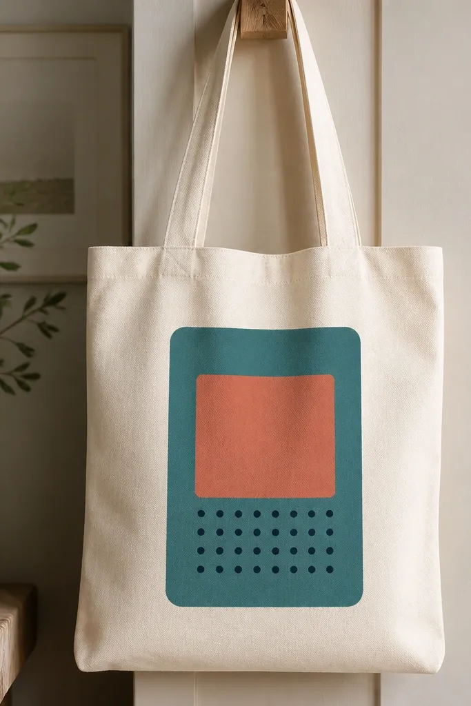
If you want the vibe of a quote without handwriting, this shape-panel idea works. The layered rectangles read like a typography block, and the dot punctuation gives it rhythm. I paint it in three colors so it looks designed but not busy. This is also great for beginners because you don’t have to worry about letter spelling or spacing. It flatters the tote by creating a clean center rectangle that balances the handle width.
Pro tipUse a small foam brush for the rounded rectangle edges so they stay smooth.
Draw a rectangle panel centered on the tote about 8 inches wide and 5.5 inches tall. Paint the largest base rectangle teal, then add a smaller coral rounded rectangle centered above it. Create dot punctuation by placing 5-7 navy dots in a curved line under the coral shape. Add one thin navy line under the dots to ground the panel. Let everything dry flat, then lightly outline the coral rounded rectangle with a darker teal for edge definition.
AvoidDon’t skip the dot punctuation — without it, the panel looks like random blocks.
28. French Stripe Band with Small Dots at One End
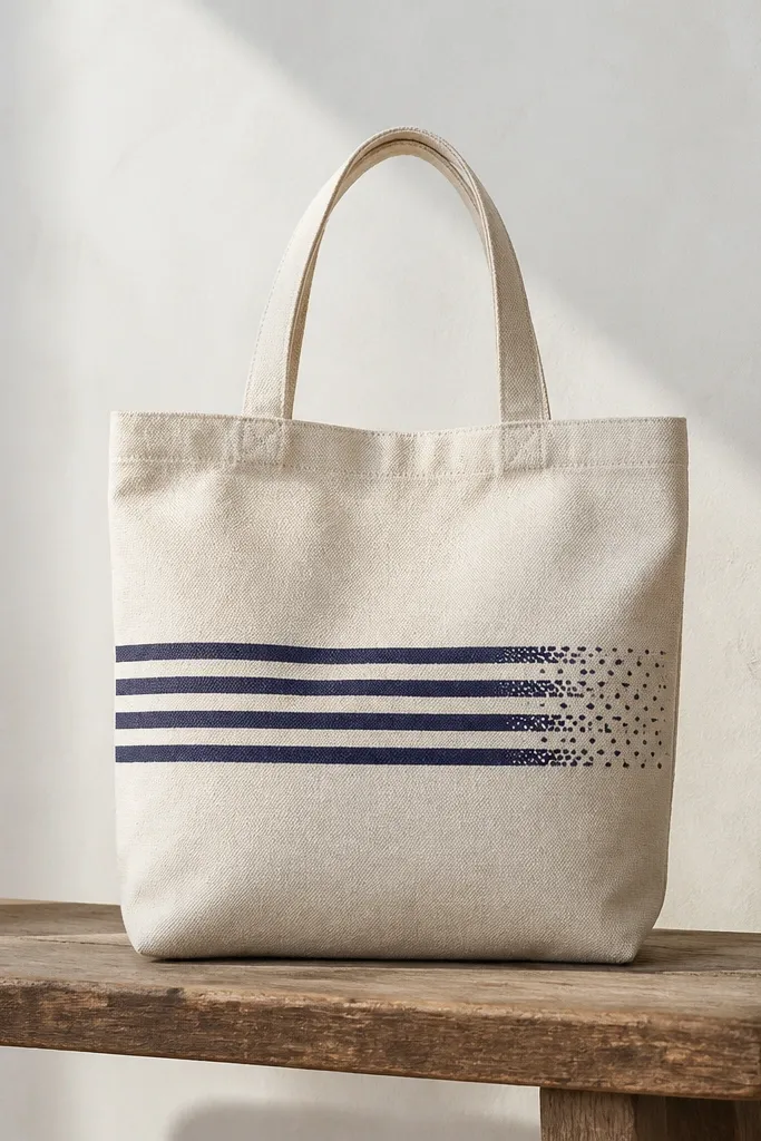
French stripes are flattering because they create a clean horizontal rhythm that sits well on tote fronts. The small dot cluster at one end adds charm and makes it look hand-painted. I use navy and cream because it stays classic and doesn’t fight other colors in your wardrobe. This design works for small space because the band is compact and doesn’t cover the entire tote. It looks especially good with striped shirts and denim.
Mark a horizontal band across the center panel about 10 inches wide and 2.5 inches tall. Draw 7-8 stripe sections with pencil, each about 1.25 inches wide. Paint alternating navy and cream, letting each stripe dry 5-10 minutes before you start the next to avoid smearing. On the right end, add a small cluster of navy dots and a few tiny downward drips using a toothbrush flick. Finish by outlining the band edges with a thin navy line for crispness.
Use painter’s tape to mask stripes if you want super straight lines.
Don’t make stripes too thick — narrow bands look cleaner on small totes.
29. Marbled Color Drop Pattern with a Single Black Outline
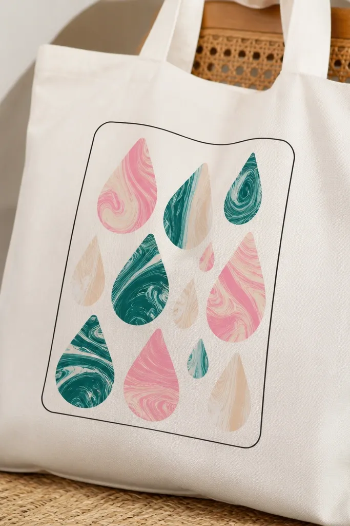
Marbled drops look artsy without needing a full background wash. The rounded rectangle outline contains the chaos so it stays neat on a small tote front. I use three colors for the marble so it stays readable: teal, blush pink, and off-white. A thin black outline makes it look more like a designed print than random paint. It also flatters outfits because the colors are soft but still noticeable.
Paint a thin rounded rectangle outline in black centered on the tote about 9 inches wide and 6 inches tall. For each drop, squeeze or brush a base color onto the tote as a teardrop shape, then lightly swirl a second color into it with a damp brush tip. Add 10-12 drops total, varying sizes from 1.2 to 2 inches tall. Finally, add a few small off-white highlights inside the drops using a dry brush. Let dry flat, then touch up outline gaps with a liner brush.
Use slightly damp paint for marbling so colors blend without turning muddy.
Skip the outline — without it, marbled drops spread and look messy.
30. Satin-Effect Ribbon Bow Using White Paint and Dry Brush
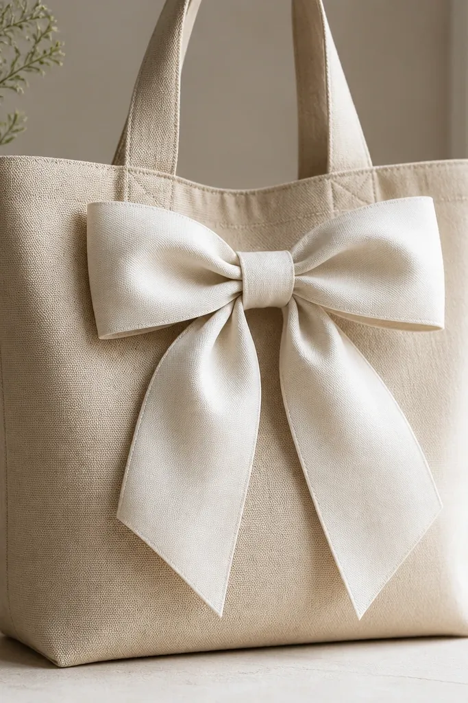
A satin-effect bow is one of those designs that looks fancy even when you’re using basic materials. The secret is dry brushing gray along one side of the ribbon folds to mimic shadow. I paint on natural canvas so the off-white reads like fabric, and the subtle gray shadow looks realistic. This design flatters the tote because it sits centered and the loops create symmetry. It also looks great for gift totes because it feels intentional and not childish.
Pro tipDry brush works best with stiff bristles and very little paint on the brush.
Sketch a bow with two loops and two tails, total height about 7 inches, centered on the tote front. Paint the whole bow in off-white first, then let it dry 10 minutes. Load a dry brush with gray (not watery), then lightly drag along the inner fold edges and under the loops to create shadow. Add a thin darker gray line at the center knot. Let dry fully, then add a tiny highlight on the outer fold with white paint using the tip of your brush.
AvoidDon’t wet your gray paint — it will sink into the canvas and look streaky.