
1. Sunburst stripes with painter's tape rays
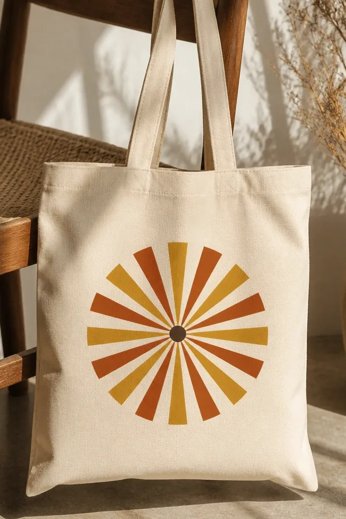
This is the look I reach for when I want a bold, graphic tote that still feels warm. The sunburst works on any skin tone because it’s color-blocked and doesn’t fight your outfit — it reads like a statement accessory. I like it most on off-white or natural canvas because the rays stay crisp instead of soaking into the fabric. Choose two warm tones that contrast slightly: mustard with terracotta, or coral with brick red. The center dot in a darker brown makes the whole thing feel finished instead of flat.
Start by slipping cardboard inside the tote so paint doesn’t bleed through. Tape a set of rays from the center outward using painter’s tape, pressing the tape down hard at the edges. Paint the first color in thin coats, wait until matte, then remove the tape carefully after the paint is just dry to the touch. Add the second color rays the same way, then finish with a small round brush dot at the center. Seal with a fabric-safe heat setting method once fully dry.
Pro tipFor ultra-clean edges, paint over the tape edge lightly with a tiny brush so the first layer fills any micro-gaps.
AvoidDon’t remove the tape when the paint is wet, or you’ll pull lines and get fuzzy edges.
2. One-line botanical sprig in sage and olive
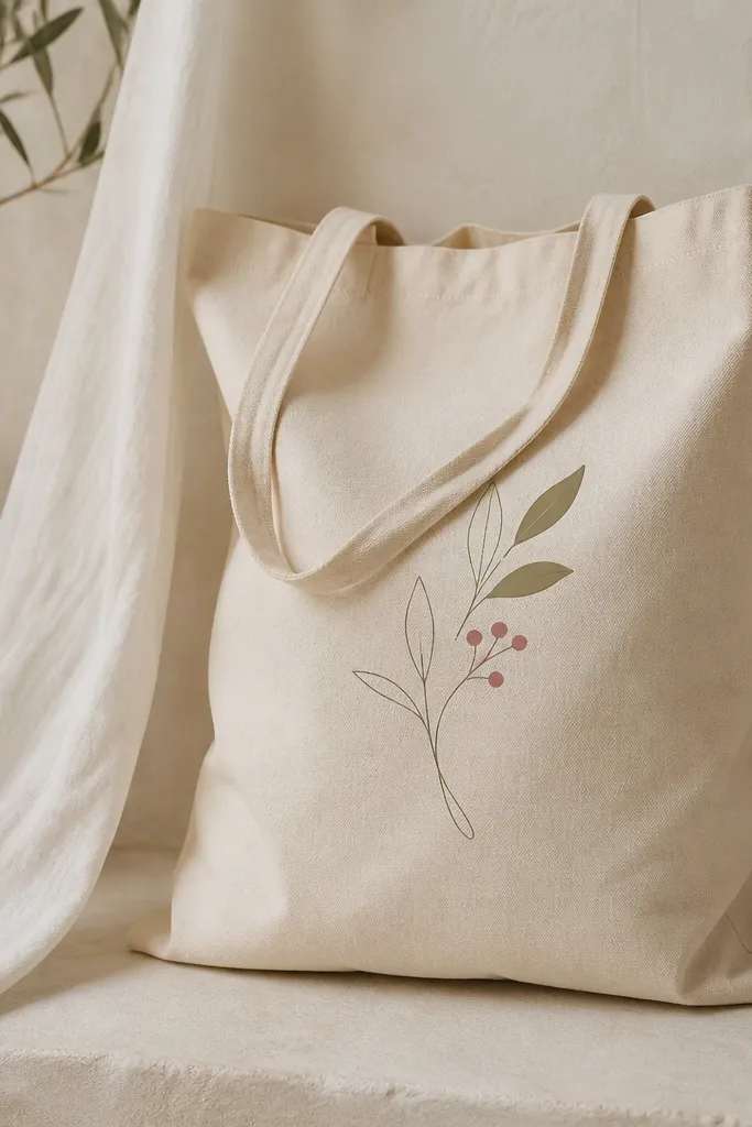
This is a style trick: a one-line sprig looks delicate but it’s actually beginner-friendly because you’re not filling large areas. The muted greens and clay-pink berries pair with everything in your closet — denim, white tees, and neutral dresses. It flatters most outfits because it’s small enough to feel intentional rather than loud. I’ve done this on both off-white and light gray totes, and the line work stays readable as long as you use a steady hand and the right brush size. Keep the leaves slightly different sizes so it doesn’t look like a repeated sticker.
Start by sketching the sprig lightly with a pencil on the tote front, then trace over the pencil with a fine liner brush dipped in thin sage-green paint. Add a second tone by loading olive paint on the brush tip and touching it to select leaf edges. Paint the berries with a small round brush using clay pink, then let it dry fully before you add any extra lines. If you want more contrast, outline only the bottom edge of a few leaves with a darker olive. Finally, heat-set or fabric-seal once the design is dry.
Pro tipPractice the exact line on paper first — tote fabric grabs slightly differently than sketch paper.
AvoidDon’t make every leaf the same shape and angle, or the sprig looks like a copy-paste pattern.
3. Oversized polka dots with sponge dab gradation
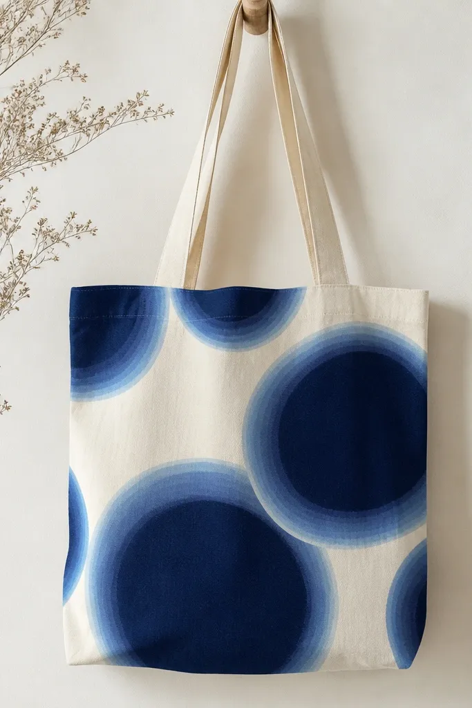
Big polka dots make a tote feel playful without needing a complicated drawing. The navy-to-blue gradation looks airy and modern, and it flatters cooler color wardrobes nicely. I use this when I want something that hides small brush mistakes because sponge dabbing creates texture. The soft halo effect is what makes it look styled instead of stamped. It also works on thicker canvas because the dots hold their shape without spreading too far.
Start by marking a dot grid lightly with chalk or pencil so the spacing looks intentional. Dab navy paint onto the fabric with a makeup sponge, pressing straight down and lifting straight up. While the dot is still slightly tacky, lightly dab indigo around the edges for a halo. Repeat with a tiny amount of baby blue only at the outer rim of each dot. Let everything dry completely, then add a final thin coat over any spots that look patchy.
Pro tipUse a paper towel to blot the sponge between colors so you don’t accidentally muddy the halo.
AvoidDon’t overload the sponge — wet paint creates puddles and turns dots into circles with messy edges.
4. Marbled rainbow stripe using a fork comb
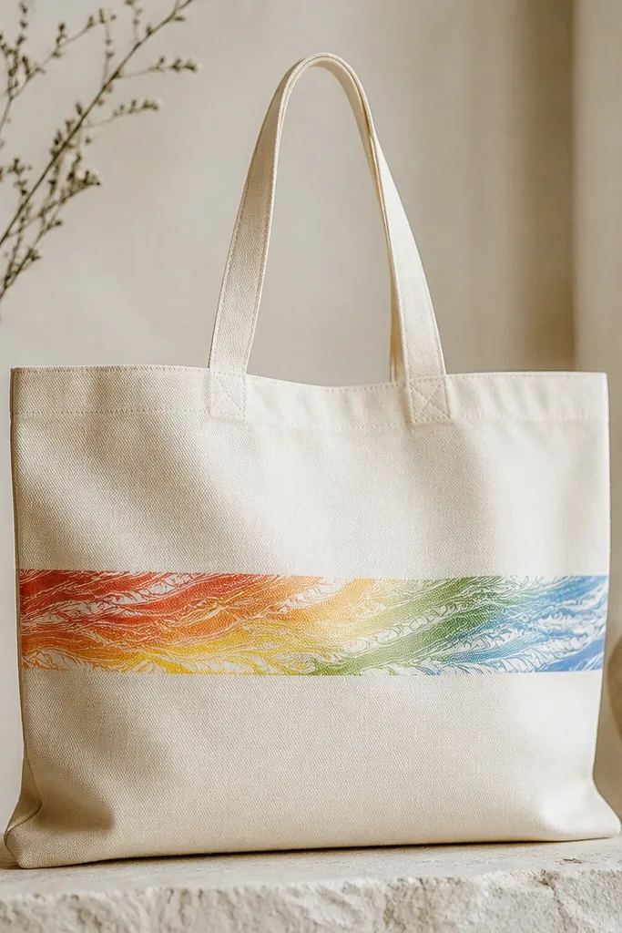
Marble effects look expensive because the texture is doing the work. This design flatters casual outfits and even looks good with a simple black dress because the stripe pulls color forward without covering the whole bag. I like it best when you keep it to one statement stripe, placed about 4-5 inches above the bottom seam. The fork-comb technique gives you that glassy marbling look without buying fancy tools. It also hides uneven paint thickness because the comb lines become the “pattern.”
Start by taping a single stripe area with painter’s tape, about 2.5-3 inches tall. Paint the rainbow bands quickly in broad strokes across the stripe, leaving them wet. Take a fork and drag it lightly through the wet paint in short vertical pulls, then repeat with a few horizontal passes so you get wave-like marbling. If you want white comb lines, tap a tiny bit of white on the fork tips before dragging. Remove tape after the paint is set to matte, then let it dry and heat-set.
Work fast — marbling looks best when the paint is still wet and glossy.
Don’t let one color dry before combing, or you’ll get muddy bands instead of smooth marbling.
5. Cat paw prints in three sizes
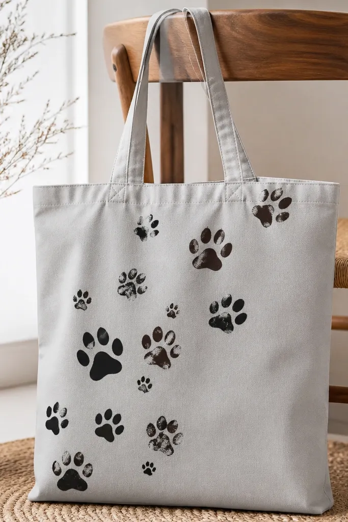
Paw prints are cute, but the version that doesn’t look like a kid’s craft has variation. Using three sizes makes the pattern feel like it has movement, and it looks good on tote bags you carry on errands because it reads fun up close. I’ve used black paint on gray and it looks sharp; dark brown on natural canvas looks warmer. This style flatters any outfit because it’s mostly neutral tones with playful shape. Keep the prints spaced so there’s breathing room — crowded paws look messy fast.
Start by making or buying a small paw stamp template, or freehand with a round brush and a tiny dot tool. Paint the largest paw first in dark brown, placing it near the bottom corner, then add medium paws above it and small paws trailing upward. Use a slightly lighter brown for one or two prints so the diagonal line feels layered. Add tiny toe-bean dots with a dotting tool while the paint is still wet. Let dry, then seal with fabric medium or heat-set.
Pro tipIf you’re freehanding, draw one paw as a reference and copy the angle — consistency is what makes it look “designed.”
AvoidDon’t use one single size and one single row — it looks like a border sticker.
6. Galaxy speckles with toothbrush splatter
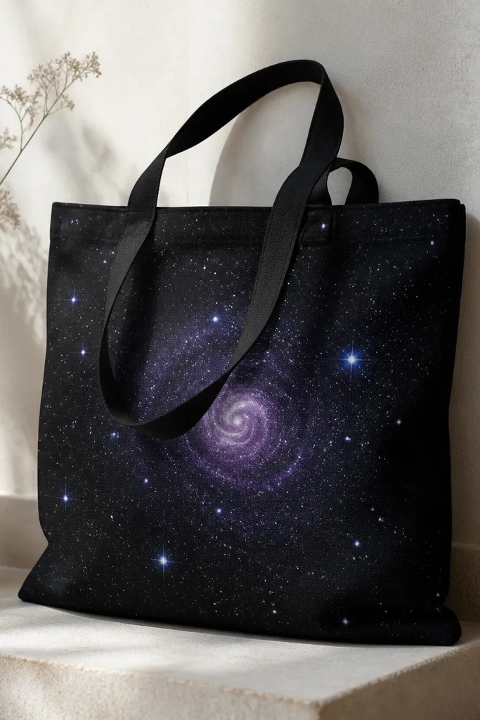
This is the easiest way to make a tote look artsy without drawing anything complicated. On a black bag, the speckles pop and look like a night sky, and the purple swirl adds depth. It flatters people with warm or cool wardrobes because the colors are concentrated — your outfit isn’t competing with the bag. I’ve done this on black canvas and it looks best when the base stays dark and clean. The trick is controlled splatter: you want dots, not paint fog.
Start by masking the handle area with painter’s tape and laying cardboard inside the tote. Dip a toothbrush in diluted white paint (add a few drops of water) and flick over the bag from 6-10 inches away. Switch to light blue for fewer, larger speckles by using a thicker mix and fewer flicks. For the swirl, paint a loose curved purple arc with a small brush, then smudge the edge lightly with a clean finger. Let it dry fully, then heat-set or apply a fabric seal.
Do a test flick on scrap fabric so you know how far the dots travel.
Don’t splatter too close — it turns into blobs that look accidental.
7. Retro wave border with dry-brush texture
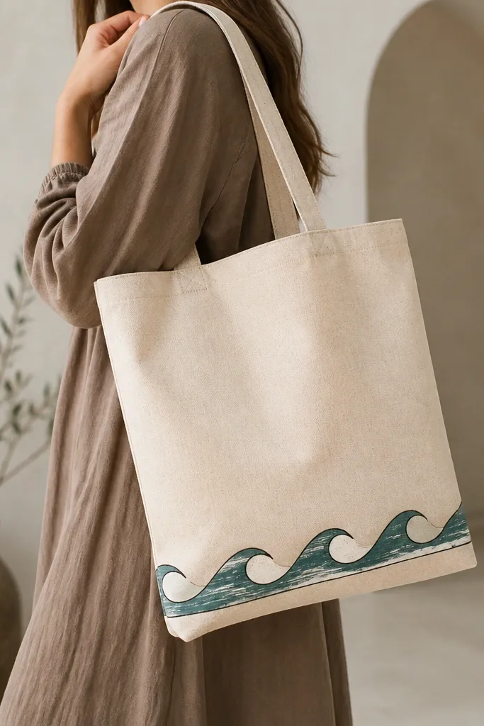
A wave border is the kind of detail that makes a simple tote look like it came from a real brand. The dry-brush texture makes the waves look vintage instead of flat, and that’s the whole point. I like teal plus off-white because it gives a coastal vibe, but you can swap to maroon plus cream for a different mood. This design works well if you carry the tote mostly with casual outfits and want the bag to add character without overpowering your look. It also hides minor hand wobble because texture forgives uneven lines.
Start by drawing a straight baseline for the border with pencil, then mark small wave peaks every 1.5-2 inches. Paint a thin teal wave pattern using a flat brush with little paint on it, then reload and keep the brush strokes light. Add off-white waves on alternating sections, still using dry-brush so the fabric shows through. Outline the top and bottom of the border with a thin black line for structure. Let dry and seal with a fabric medium or heat-set.
Pro tipUse the flat edge of the brush for the wave tips — it creates sharper peaks than a round brush.
AvoidDon’t fill every wave thickly, or the border becomes stiff and cracks at the seams.
8. Fruit slices in flat color blocks
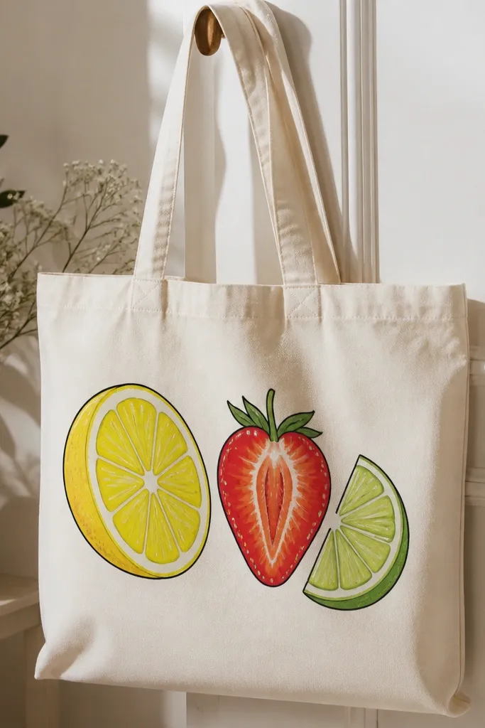
Fruit slices look cheerful, and the flat color-block version reads clean even with budget paint. The bright yellows and reds catch light and look great in daylight, which is exactly when you’ll be using the tote. I’ve done this for summer markets and it always gets compliments because the shapes are bold but the color palette stays controlled. This style flatters neutral outfits and also looks good with patterned clothes because the outlines keep each fruit separate. Make the outlines a darker shade than the fill so each slice pops.
Start by lightly sketching three slices in a diagonal arrangement on the tote front. Paint the lemon half first with bright yellow fill, then add a thin darker outline around the edges using a small round brush. Paint the strawberry half with red fill and add tiny seed dots using a dotting tool or toothpick. Add the lime quarter with green fill and a slightly darker green for the rind edge. Let dry between fruits so you don’t smear wet edges, then seal.
Pro tipOutline only after the fill dries — it keeps your outlines crisp and stops bleed.
AvoidDon’t skip outlines if you’re using lighter colors, or the fruit can look washed out.
9. Monochrome line art face in black ink paint
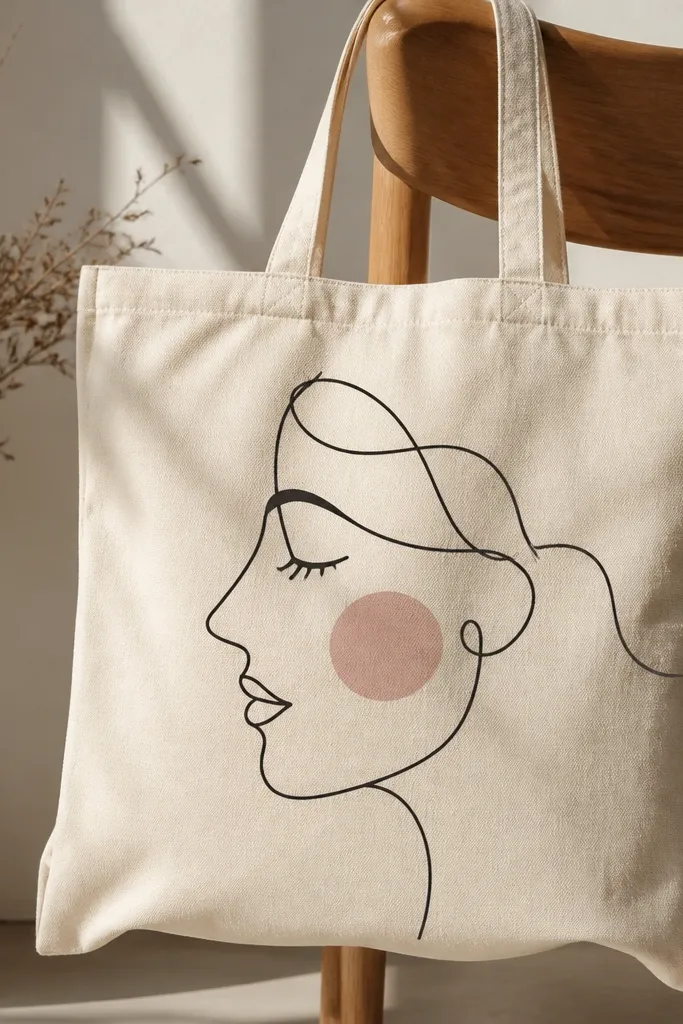
Monochrome line art looks artsy and grown-up, not childish, when the drawing is big and simple. The black ink paint gives you high contrast, and the tiny dusty pink blush makes it feel human. This design flatters almost every outfit because it’s mostly one color, and the face sits where your eye naturally lands on the bag. I’ve used this style on tote bags for gifts, and it always feels personal because the face can be as imperfect as you like. Keep the line weight consistent for a clean look.
Start by sketching a face profile with a pencil, filling about 70% of the tote front width. Trace with black paint using a liner brush, keeping the line smooth and steady. Add a few hair strokes and one or two shadow lines under the chin. Dab a tiny blush spot with a small brush using dusty pink, then add a short line for a mouth. Let dry fully and heat-set so the line stays put.
If your hand shakes, tape a ruler at the angle you’re drawing and follow it for the nose and chin line.
Don’t make tiny details — small features blur on fabric and look messy.
10. Geometric triangles with ombre corner shading
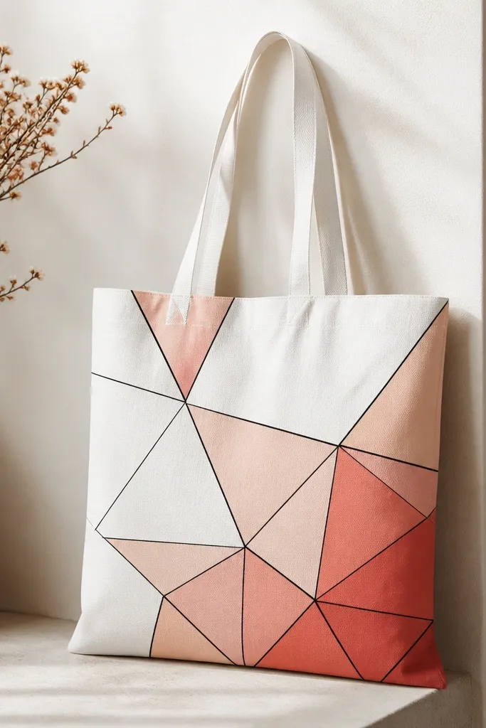
Geometric triangles look modern and tidy, and the ombre corner gives them depth without complicated blending. You get a high-end look because the shapes are separated with lines, so even cheap paint stays readable. This style works for everyday carry because it doesn’t compete with your clothes — it’s organized. I like it on light totes because you can keep the darker ombre in one corner only. If you’re worried about color matching, stick to one warm family: coral, peach, and blush.
Start by drawing a grid of triangles across the tote front using pencil, aiming for 6-8 triangles total. Paint the main triangles in alternating coral and peach, leaving some areas blank for the blush tone. Use a small flat brush and thin coats so edges stay sharp. For the ombre corner, mix blush with a bit of dark brown or terracotta and paint only the corner triangle edges, then tap outward with a sponge to fade. Outline the triangle boundaries with a thin black line for crisp separation.
Paint the lightest triangle first, then move darker — it’s easier to control mistakes.
Don’t use thick paint on every triangle, or the fabric texture will show through as bumps.
11. Tie-dye look with swirl masking and sponge layers
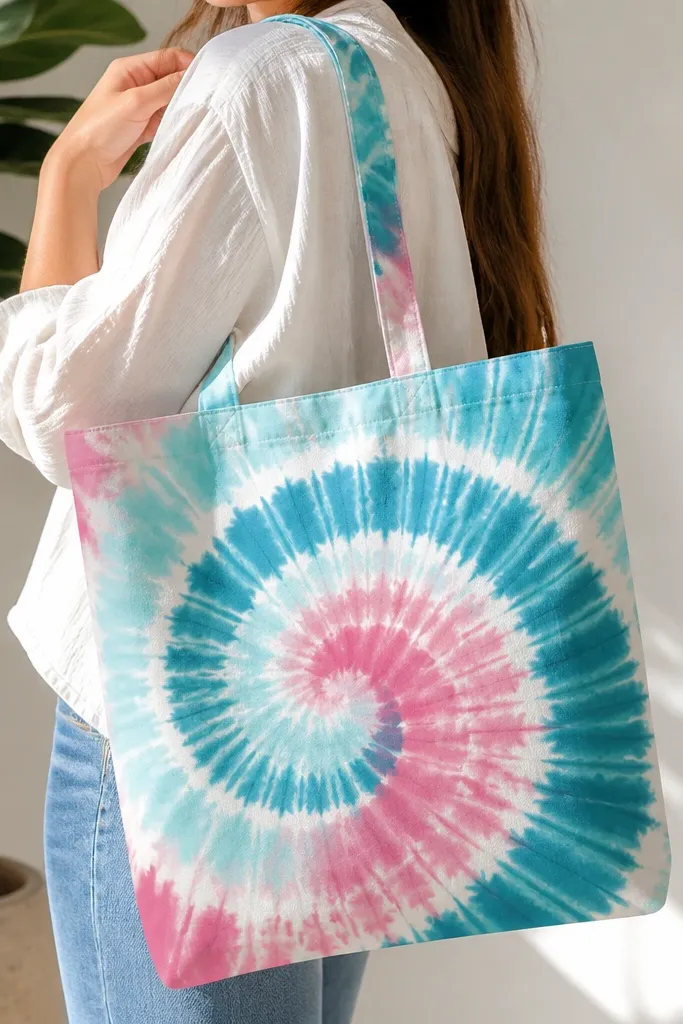
You get the fun tie-dye vibe without the mess of boiling or twisting fabric. The secret is masking: you protect the white lines so the swirl looks intentional. This design looks great on casual outfits and reads playful while still feeling clean because the colors are controlled. I’ve used it on natural canvas and it looks bright; on gray it looks moodier. The swirl center feels like motion, and the masked lines stop the colors from turning into one muddy blob.
Start by sketching a big swirl on the tote front and masking the swirl lines with painter’s tape strips, leaving a small gap width for white lines. Sponge-paint teal and aqua in separate passes, pressing gently and lifting straight up. Remove one mask section at a time after each color is dry to avoid smearing. Add pink into the outer swirl bands last, then blend the center slightly with a clean damp sponge. Let dry fully and heat-set.
Use two sponges: one for cool colors and one for pink so you don’t accidentally mix them.
Don’t remove all tape at once — you’ll drag colors and lose the clean white lines.
12. Lettering banner with block font and tiny stars
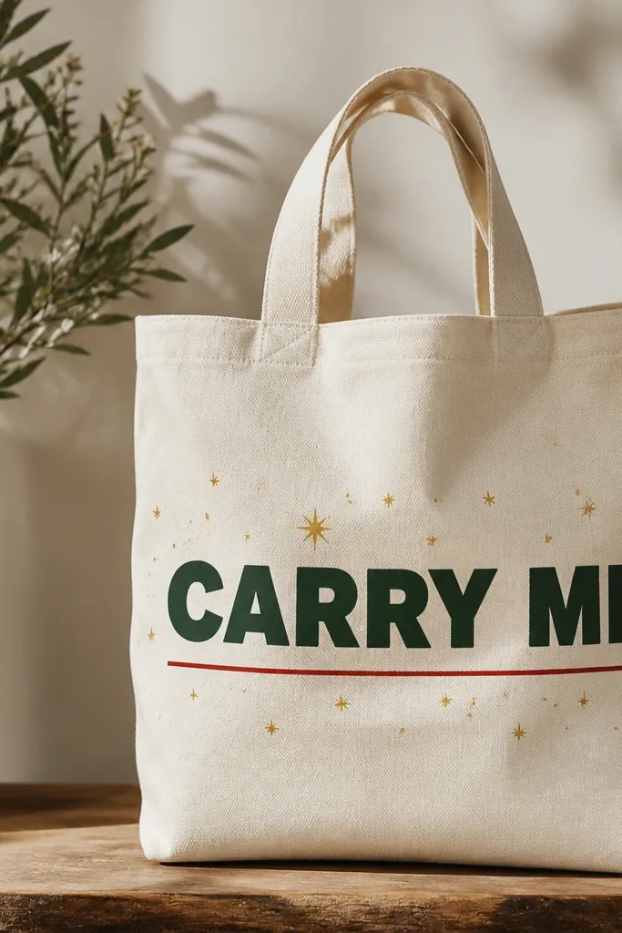
This is how you make a tote feel personal without committing to a detailed illustration. Block lettering looks bold and readable, and the tiny stars add a bit of sparkle without taking over. I like dark green and gold on cream because it feels classic and goes with both warm and cool outfits. The banner layout also flatters the tote shape — it pulls the eye across the bag front instead of down. Keep the letters thick so they survive fabric texture and still read after drying.
Start by measuring a banner area across the tote front, around 10-12 inches wide and centered at chest height when worn. Tape the top and bottom edges of the banner with painter’s tape. Paint the banner background lightly if you want contrast, then paint block letters with a flat brush, using multiple thin coats. Add tiny star dots with a toothpick dipped in gold paint. Finish with a thin red underline and remove tape when paint is matte.
Pro tipUse a scrap paper stencil for your letters so proportions stay even across the bag.
AvoidDon’t paint letters with a tiny brush — it makes uneven strokes that look cheap.
13. Botanical stamps with foam brush texture
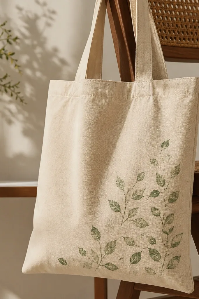
Stamp-style botanicals look like you spent more time than you did, because imperfect edges add realism. This design is great for corner placement — it keeps the bag usable for daily stuff without a huge central graphic. Muted green leaves pair with tan, navy, and black outfits, and the look stays subtle. I’ve used this on tote bags for grocery runs and it never feels too loud. The foam brush texture makes the stamp effect without needing expensive stamp pads.
Start by mixing a darker green and a lighter green paint (about 1:1 with water) so you can layer tones. Cut small leaf shapes from craft foam or use a pre-made stamp, then dip lightly in paint. Press the stamp in a corner cluster, staggering sizes so it doesn’t look like a perfect grid. Add a few stems with a thin liner brush to connect leaves. Let dry, then do a second pass with the lighter green to create highlights.
Pro tipTest your stamp pressure on scrap fabric so you don’t crush the foam and smear the leaf edges.
AvoidDon’t press too hard — it turns leaf shapes into blurry blobs.
14. Color-blocked portrait silhouette in one shape
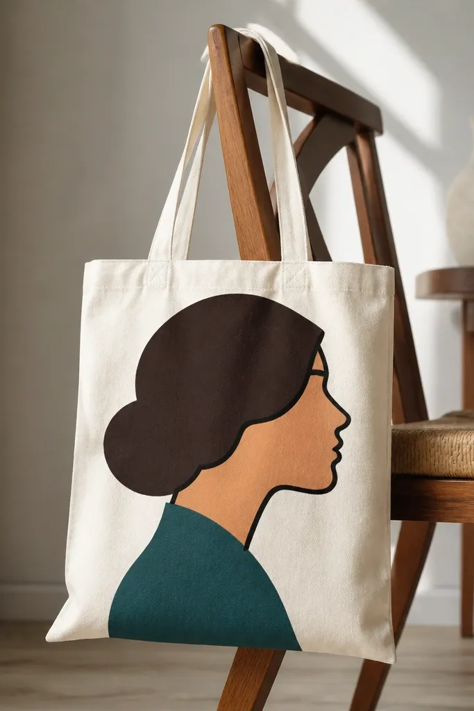
A single-piece silhouette looks striking because your brain reads it as design, not craft. The color-block approach keeps it budget-friendly since you’re not painting lots of tiny details. Warm peach and deep brown look great against off-white canvas, and teal adds a modern accent. This design flatters neutral outfits and also works as a statement bag for date nights because the shape is clean and graphic. Keep your silhouette size large — about the height of your torso — so it reads clearly.
Start by printing or tracing a simple profile silhouette onto paper, then cut it out as a stencil. Tape the stencil to the tote front and trace lightly with pencil. Paint the background shape first if you’re adding one, then paint the hair, then skin, then collar last. Use a small flat brush and thin coats so the edges stay crisp. Remove the stencil after the paint is matte and add any final outline with black paint.
Pro tipIf your stencil edges are lifting, run a thin line of paint along the stencil edge to seal it before filling.
AvoidDon’t try to paint tiny facial features inside the silhouette — the fabric texture will blur them.
15. Outline-only animals in safari palette
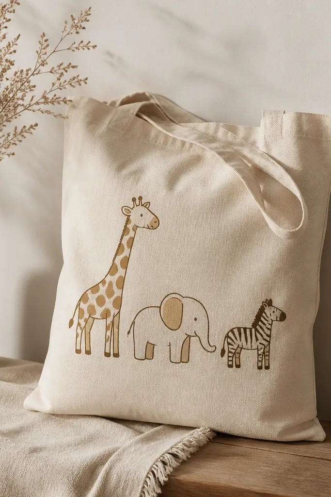
Outline-only animals look classy because the shapes do the work and you avoid heavy fill that can crack. Safari palette colors like dark brown, tan, and mustard look warm and grounded, and they pair well with denim and neutral sweaters. I like this on natural canvas because the outlines feel like a vintage field sketch. It flatters casual outfits and also looks fun for kids grown-ups — it’s playful without being cartoonish. Keep the animals spaced so each one has room to breathe.
Start by sketching a giraffe, elephant, and zebra in a loose triangle layout on the tote front. Trace with dark brown paint using a liner brush, keeping lines consistent. Add tiny fill accents only where needed: a small mane patch on the giraffe, a tan highlight on the elephant ear, and mustard stripes on the zebra body. Let dry, then add small ground dots or grass strokes with a greenish-brown. Seal the whole design when it’s dry.
Pro tipUse one brush for outlines only — cleaning paint off between colors keeps your line edges sharp.
AvoidDon’t overfill animals — too much paint turns outlines into a heavy, stiff look.
16. Confetti dots in a diagonal scatter
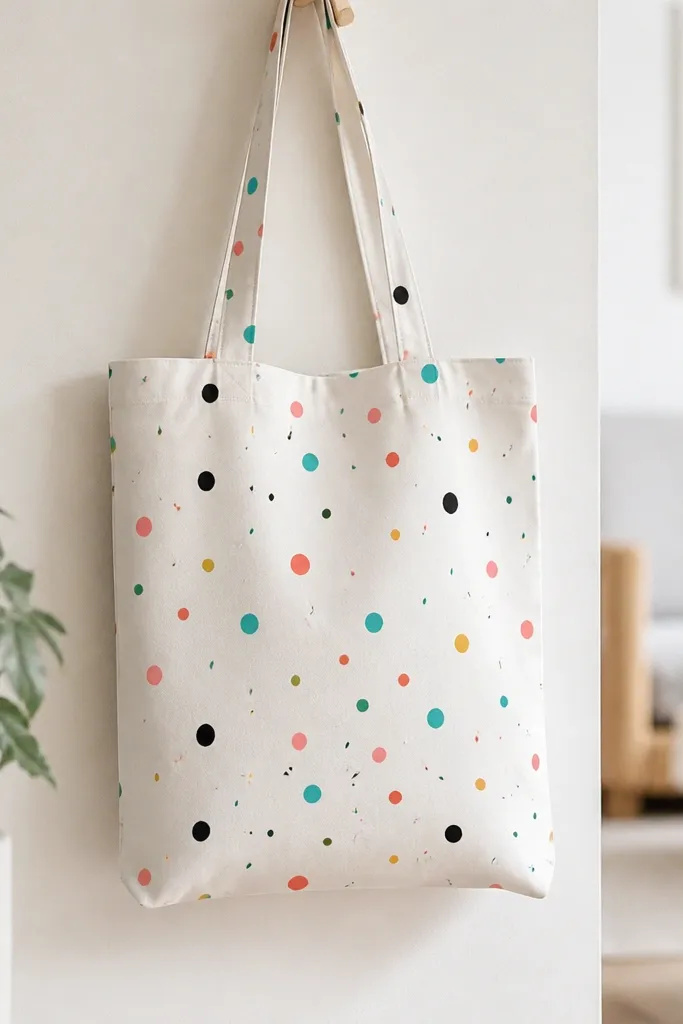
Confetti dots make a tote look festive without requiring drawing skills. The diagonal scatter is important — it creates a sense of movement and makes the tote feel designed rather than randomly speckled. This style flatters most outfits because the colors are small and the base stays light. I use it when I want a bag that looks good in photos too, since dots catch light and create texture. Keep your palette tight: 3-4 colors plus black for structure.
Start by marking a diagonal path with pencil from the top left to bottom right of the tote front. Dip a small round brush or dotting tool into paint and dab dots along that path in different sizes. Add short dashes by dragging the brush tip for 1-2 seconds, then lifting. Mix a lighter version of one color by thinning with water and lightly dab it around the main dots for a fading effect. Let dry and heat-set.
Pro tipUse a toothpick for tiny dots — it gives you sharper points than a brush.
AvoidDon’t use too many colors — a confetti bag turns chaotic fast.
17. Stencil halo circle with metallic-like gold paint
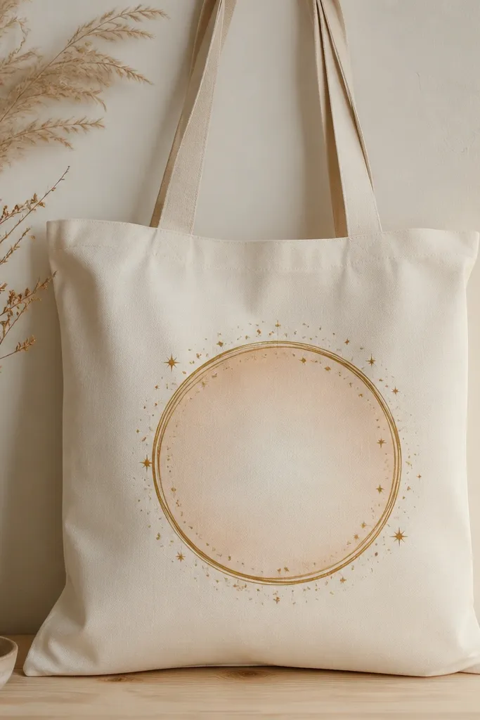
A stencil halo gives you that clean, centered look that feels like a modern print. The gold ring is the eye-catcher, but it looks best when you keep the surrounding colors soft so it doesn’t look like glitter glue. This design works for both day and night outfits: gold pops with denim and also looks sharp with black. I’ve found it especially flattering on off-white canvas because the fabric acts like natural paper. Use metallic gold paint sparingly and build it in thin coats for an even finish.
Start by taping a circular stencil in the center of the tote front. Paint the inner area with pale peach first, then let it dry. Apply gold paint only to the ring area using a sponge or stippling brush so the metallic coverage stays even. Add tiny star dots around the ring with a toothpick dipped in gold or warm yellow. Remove stencil when the paint is matte and let dry fully.
Pro tipIf your gold looks streaky, do a second thin coat instead of pressing harder.
AvoidDon’t flood the stencil — excess paint creeps under and ruins the ring edges.
18. Monogram corner cluster with tape mask
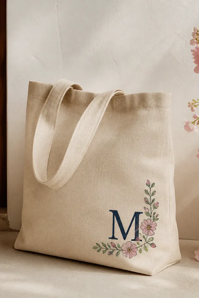
A monogram corner cluster looks intentional and makes a tote feel like it belongs to one person. The navy letters are easy to read, and the small floral marks keep it from looking too formal. I like corner placement because it keeps the design from bending too much when you grab the handles. This style flatters people who like clean accessories and want something that looks good with work clothes or casual weekend outfits. Keep florals small and scattered so the monogram stays the focus.
Start by taping a small rectangle in the corner for your monogram baseline. Paint the monogram letters with a liner brush or small script stencil, using navy paint in two thin coats. Add tiny floral marks around the letters using sage for leaves and dusty pink for petals. Use a dotting tool for the flower centers and a thin brush for small stems. Remove tape after matte, then heat-set once fully dry.
Pro tipPlan your letter size so it sits at least 1 inch away from the tote seam lines for clean coverage.
AvoidDon’t paint over the tote seam with thick paint, or the monogram can crack when the fabric bends.
19. Watercolor wash rectangle with salt texture
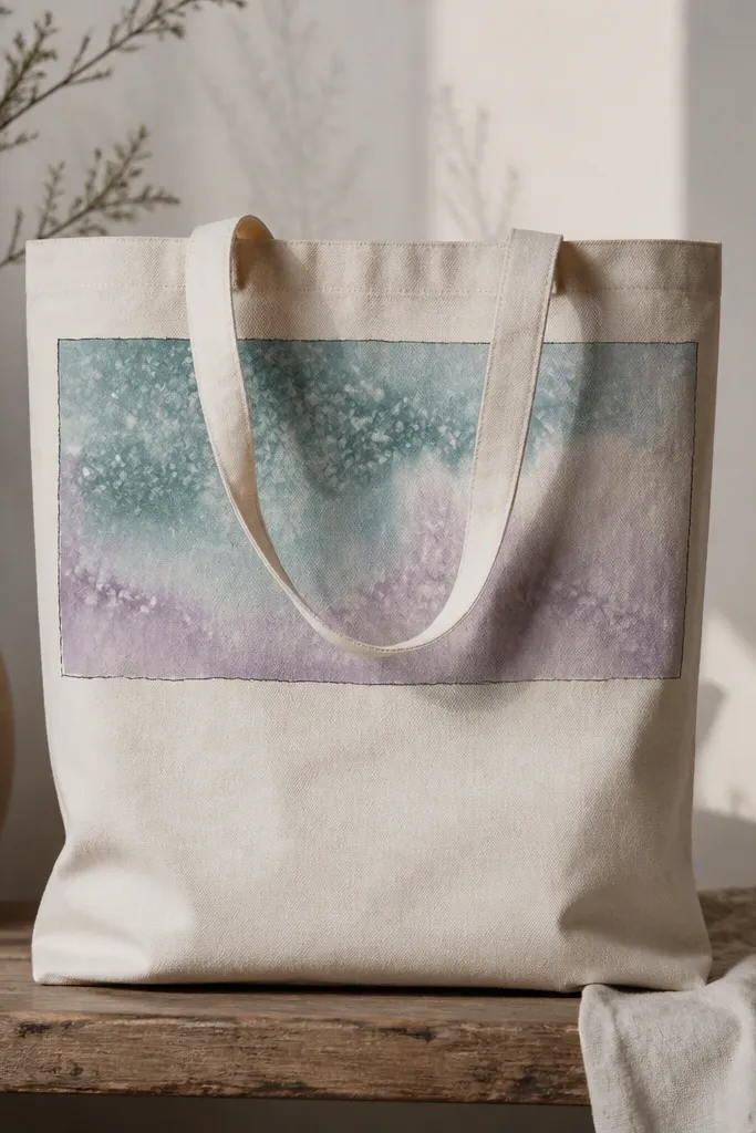
Watercolor washes look soft and artsy, and salt texture makes it look like real pigment even when you’re using cheap acrylic. This design flatters neutral outfits because the colors are diluted and dreamy, not loud. I like placing it near the top so the wash frames the bag opening area while you carry it. The black border line keeps it from looking like a random paint spill. Use teal and lavender together when you want a calm, slightly moody vibe.
Start by taping a rectangle area on the tote front and inserting cardboard inside. Mix teal and lavender paint with lots of water until it looks like tinted milk. Lay the wash in one direction, then sprinkle salt lightly while it’s still wet. Let it dry fully so the salt pulls pigment and creates speckled texture. Brush off salt gently, remove tape, then add a thin black border line around the rectangle.
Pro tipSprinkle salt unevenly so you get texture variation instead of a uniform speckle.
AvoidDon’t move the tote while the wash is wet — the pigment streaks and looks like a drip.
20. Retro sticker border using layered outlines
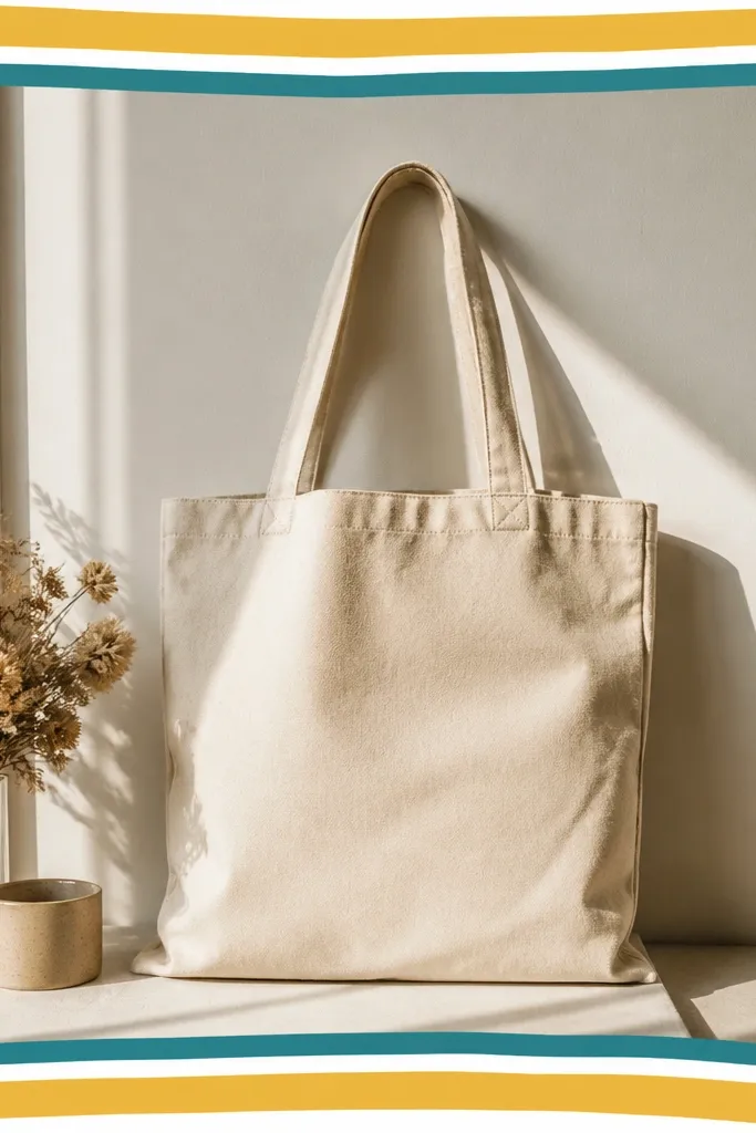
This one looks like a sticker you peeled and placed on your tote, but you paint it. Layered outlines create that “cut-out” illusion and it looks clean even with budget materials. It flatters anyone who likes graphic accessories and wants something playful but structured. I use mustard and teal because they look warm and modern, but you can swap to any two colors you wear together a lot. The corner doodles add charm without needing a full illustration.
Start by drawing a rectangle frame in pencil with about a 1-inch border thickness around the tote front. Paint the outer frame first in mustard and let it dry to matte. Paint a slightly smaller inner frame in white, then another inner frame in teal, keeping each border gap consistent. Add tiny circles or dots in the corners with a small brush. Finally, outline the whole inner frame with a thin dark line for the sticker effect.
Pro tipUse a ruler and painters tape for the border gap so your layers stay even.
AvoidDon’t rush the drying between layers, or colors bleed and the “frame” collapses.