1. Neon outline butterfly with white underpainting
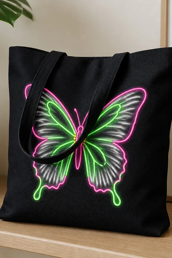
This one makes black tote bag painting ideas stand out because the butterfly reads like a sticker from a distance. Start with opaque white underpainting so the neon green and hot pink don’t turn smoky on black. I like neon green for the top wings and hot pink for the bottom wings, then add a small yellow dot row to suggest texture. It looks great on anyone’s wardrobe because it pops against dark clothing without needing a matching color outfit. The design also flatters the tote shape since the butterfly sits high on the front panel where it doesn’t get stretched as much.
Pro tipDo a quick test swipe on a scrap — if the neon looks dull, add one more thin white layer before outlining.
Start by sketching the butterfly centerline with chalk, then paint a light layer of titanium white where the wings will be. Let it dry fully, then outline the wing shapes with a fine liner brush using neon green first for the upper wings. Switch to hot pink for the lower wing outlines, keeping the lines about 2-3 mm thick. Finally, add a tiny white highlight line along the outer wing edges and place small yellow dots near the body.
AvoidDon’t flood neon paint directly onto black — it turns gray and looks cheap.
2. Sunburst rays with ombré center glow
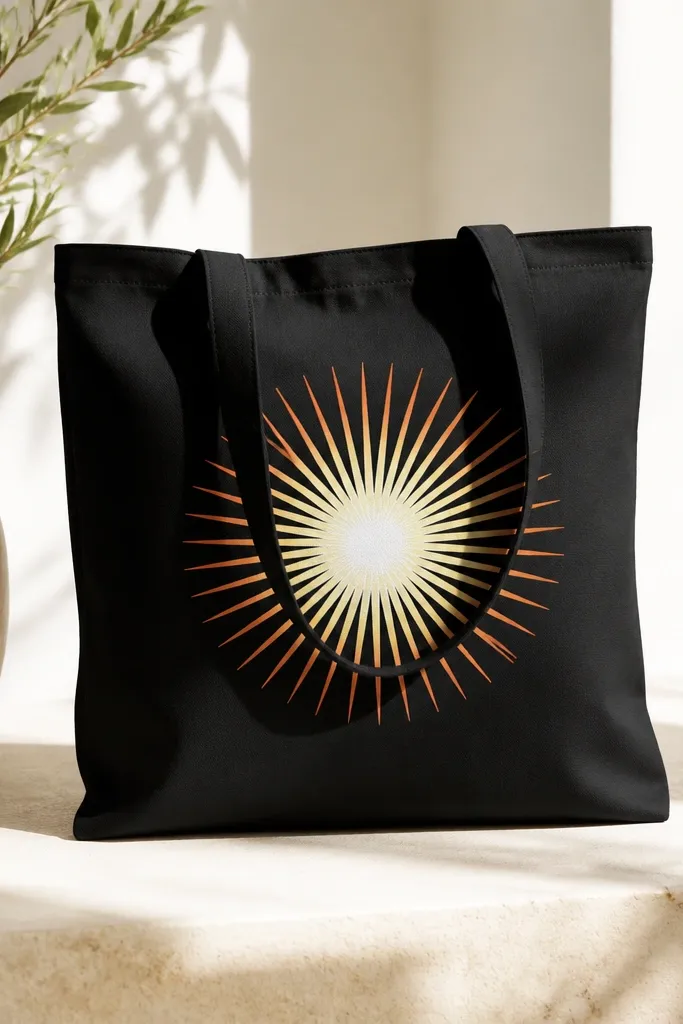
Sunburst designs are bold, but on black fabric they need a glow base to look intentional. I paint a bright white circle first, then blend yellow into orange so the rays look lit from the middle. This style works especially well if your tote is used for everyday errands because it hides minor creases — the rays are forgiving. It also flatters smaller frames since the rays pull the eye to the center and away from the bag’s edges. For skin tones, it looks clean with both warm and cool palettes — the yellow-orange mix is easy to pair with denim, black outfits, or cream sweaters.
Pro tipUse a flat brush for the rays, then clean the brush with water and re-load only a tiny bit of white for the final edge lines.
Tape a circle guide for the center using painter’s tape, then fill it with titanium white and let it dry. Draw 18-24 ray lines outward with chalk, spacing them evenly so the design looks symmetrical. Paint each ray in a gradient: use pale yellow near the center and pull orange toward the outer end. After the rays dry, add a thin second outline of white along the outside edges of the rays for a crisp finish.
AvoidAvoid uneven ray spacing — crooked spacing makes the whole tote look rushed.
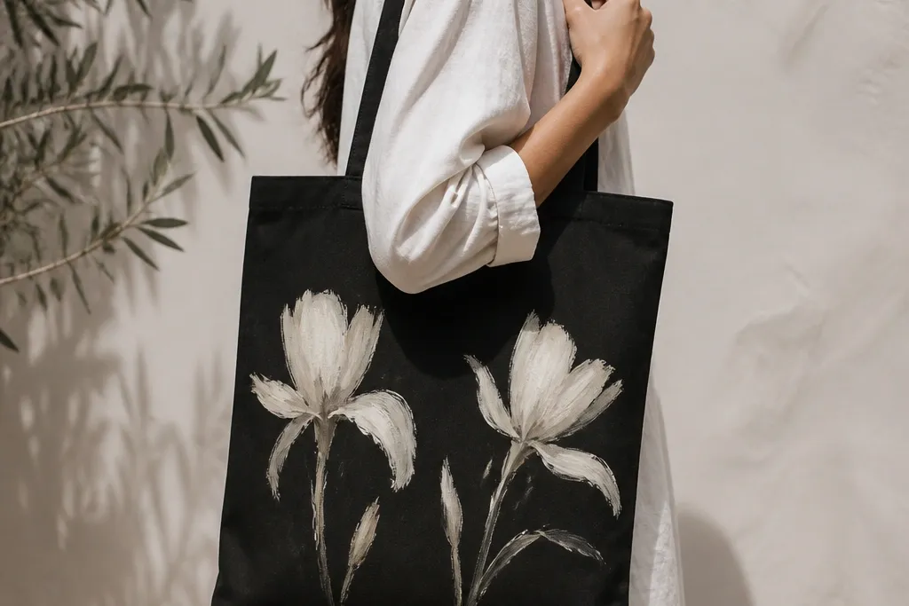
3. White daisy chain with black ink-style stems
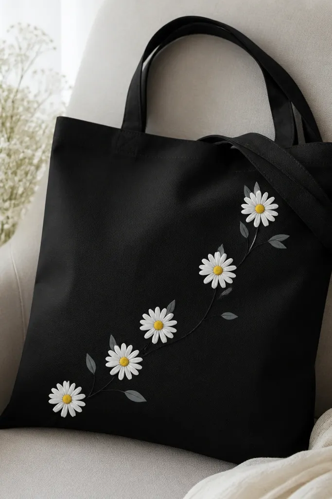
This is my go-to for a clean, wearable tote because it looks like a botanical print. The trick on black is to paint the daisies in layered whites: first a soft off-white base, then sharper white petals. Add yellow centers that are slightly muted (think marigold) so the design doesn’t look like neon candy. It flatters everyone because it’s light and airy without being fragile — the stem network gives structure and the tote still looks stylish when the fabric creases. Place it diagonally across the front so it matches the way tote bags naturally hang.
Pro tipKeep petal strokes consistent — same direction each time — and the chain will look printed rather than hand-drawn.
Start by sketching a diagonal path from the lower left to upper right with chalk. Paint the stems using a gray mix (titanium white + a touch of black) so they look like printed ink, then add small leaf shapes. For each daisy, paint a small yellow center, then add 12-14 petals in off-white. After petals dry, go back with a small round brush and add a second highlight pass in bright white on the petal tips.
AvoidDon’t use pure bright white for every layer — it can look chalky and uneven on black.
4. Galaxy nebula with star speckle and teal edges
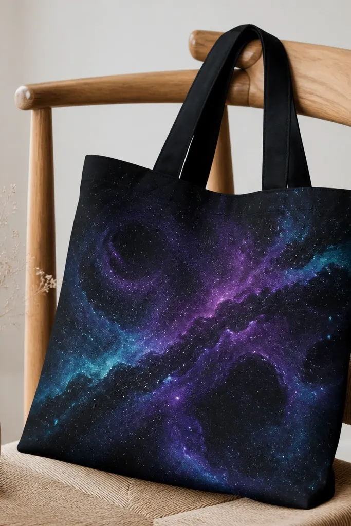
Galaxy art stands out because it’s layered and it naturally hides small imperfections. On black fabric, you’re already starting with the darkest shade, so you build the nebula with purple, indigo, and teal highlights rather than trying to paint the entire background. I like using a sponge to soften the color transitions, then adding crisp teal edge strokes so the design looks framed. This style looks great for night-out bags, concerts, and college tote use because it reads dramatic even if your tote has a bit of wear. It also flatters the tote shape because swirls guide the eye toward the center panel.
Pro tipThin your white for speckles — thick paint dries as blobs and looks like splatter.
Tape off a central rectangle area so your galaxy stays contained, then sponge on midnight blue in a rough oval. Add purple in the center and blend outward with a second sponge — don’t overwork it. Use a small brush to paint teal streaks along the outer swirl edges, then lightly blend those edges with a dry sponge. Finally, load a toothbrush with white paint thinned slightly and flick for star speckles; add a few larger dots for depth.
AvoidDon’t paint a full opaque background — it kills the galaxy depth on black.
5. Geometric checkerboard with metallic silver lines
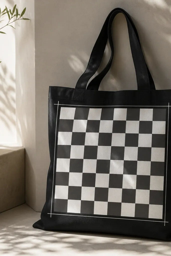
Checkerboards read instantly, and metallic lines make them look intentional on black. I paint the squares in matte white and charcoal gray so the pattern has contrast without turning neon. Metallic silver works best as a border and corner accent because it reflects light when the bag moves. This design flatters most body types because it’s structured and doesn’t rely on delicate details. If you wear monochrome outfits, the silver edge brings just enough shine without needing color matching.
Pro tipUse a ruler and press tape down firmly — paint will bleed into gaps and blur the pattern.
Measure the front panel width and decide on a square size — I use 2.5 cm squares for a tote that’s about 38 cm wide. Use painter’s tape to create a grid on the black fabric, then paint the first set of squares matte white. Remove tape carefully once the paint is tack-dry, then fill the alternating squares with charcoal gray. After everything dries, paint a thin metallic silver border around the checkerboard and add tiny silver cross marks in the four corners.
AvoidAvoid mixing metallic and matte on the same square — it looks messy and uneven.
6. Adinkra-inspired symbols in flat white blocks
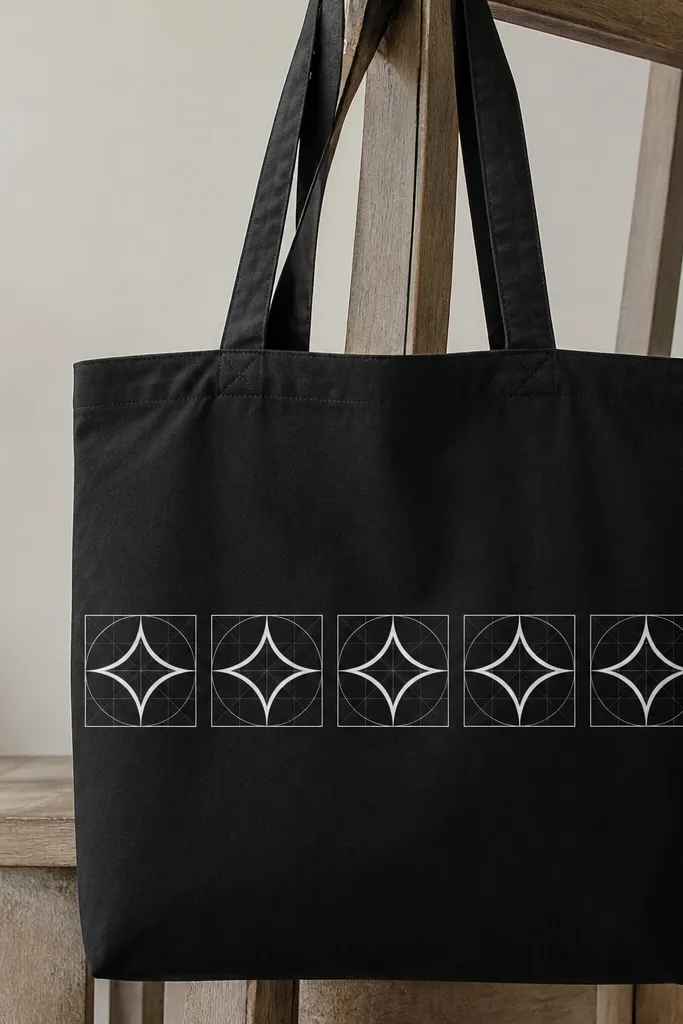
Flat symbol art looks sharp on black because it doesn’t require perfect blending. I use opaque white paint and keep the fills solid so the symbols look like graphic prints. The gray grid behind them helps spacing and makes the row feel designed, not random. This style works for people who want something bold but not loud — it’s high contrast without using bright neon colors. It also looks good on tote bags used for work or school because the design reads clean and graphic.
Pro tipUse a stencil for the symbol shapes if you’re not confident drawing straight lines freehand.
Sketch a grid on the tote front using chalk, then draw one symbol at the center of a cell. Paint the symbol fills with opaque titanium white, using a small angled brush to keep edges crisp. Repeat the symbol across the row, leaving consistent gaps between cells. When the row is dry, paint a thin gray outline around each cell to define the pattern, then remove any chalk smudges with a dry cloth.
AvoidDon’t add gradients to symbol art — it makes the edges look fuzzy on black.
7. Botanical line art with watercolor wash edges
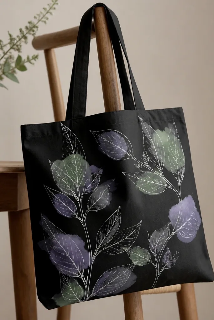
This is the style that looks expensive because it mixes crisp linework with soft color. On black, watercolor washes need a lighter base layer so they don’t disappear. I paint the leaves with thin white lines first, then add watercolor-like washes using watered-down fabric paint in pale green and dusty lavender. The result looks airy but still readable. It flatters most outfits because the palette stays muted and doesn’t fight with patterns you already wear. Place the line art near the side seam so the tote hangs naturally and the leaves follow the curve of the bag.
Pro tipUse a paper towel to blot your brush before touching the fabric — it stops tide marks.
Start by outlining the leaves and stems in bright white using a fine liner brush. Let the lines dry completely, then mix pale green fabric paint with water and a tiny amount of fabric medium. Tap the wash around the leaf edges with a sponge, keeping the center white line areas clean. Add a second wash in dusty lavender on a few leaves, then blend the wash outward with a barely damp brush for a soft fade.
AvoidDon’t paint washes over wet white lines — you’ll blur the line art.
8. Hand-lettered name in block shadow layers
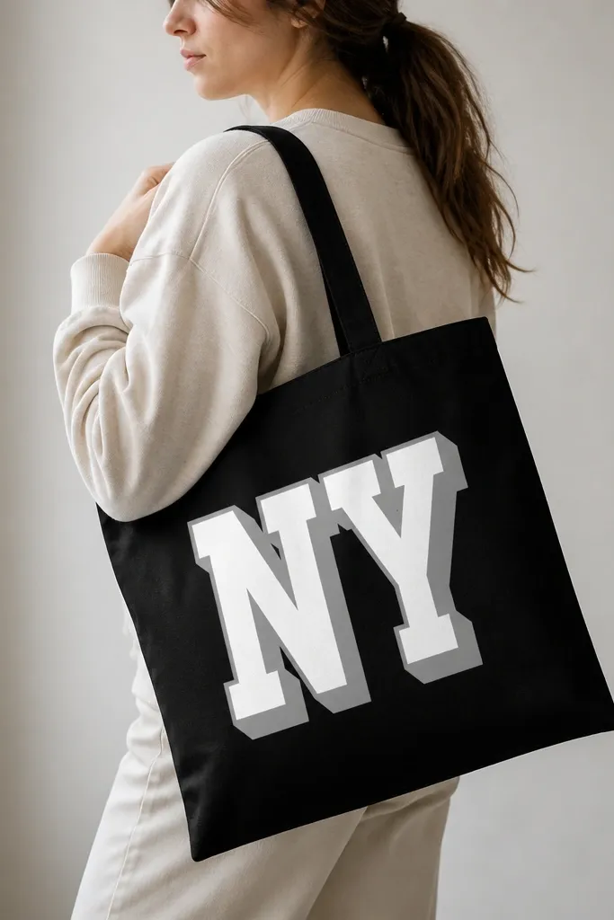
Block lettering looks clean on black because it’s all about edges and spacing. The shadow layer is what makes the words pop when the bag swings — it gives depth without needing glitter. I like bright white letters with a thick gray shadow offset down and right by about 6 mm. This style is flattering for everyone because it scales with your tote size and doesn’t depend on body shape. It also looks great for gifts since you can customize with a name, team, or event.
Pro tipUse a straightedge to keep letter tops level — even one slanted line makes the whole tote look off.
Lightly sketch the letter shapes with chalk, then paint the main letters in opaque titanium white. Let it dry, then trace the same letter outline offset down and right by a consistent amount (about 6 mm). Fill the offset area with gray made from white + black, then add a final thin highlight line at the top edge of each main letter with bright white. Finish by touching up any gaps with a small detail brush so the edges stay sharp.
AvoidAvoid thin cursive on black — it reads like scribbles unless you add a strong outline.
9. Painted fruit slices with glossy highlight glaze
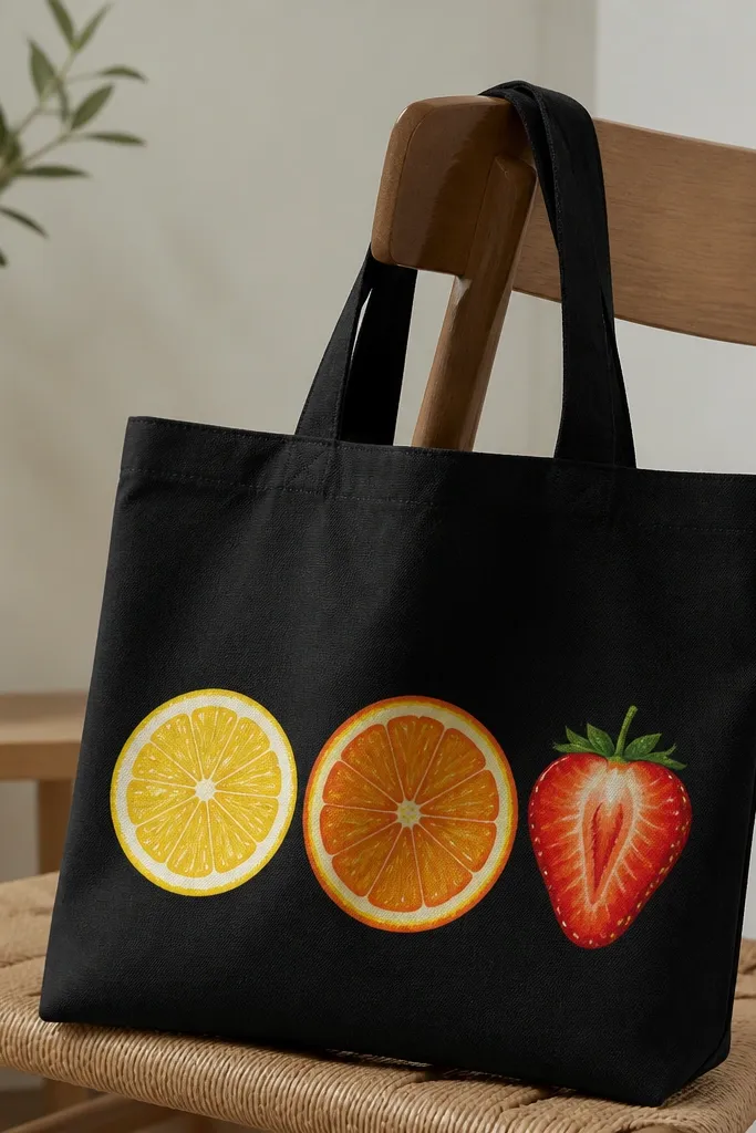
Fruit slice art is playful, and the reason it works on black is the contrast between bright base colors and small white highlights. I paint the slices in flat colors first, then add a second coat of lighter segments and a thin glossy-looking highlight line. Even without real gloss medium, those highlights catch light and make the fruit feel dimensional. This style flatters people who like fun accessories and it also looks great against neutral outfits. Keep the fruit clustered on one side of the tote so the colors don’t fight with the bag’s shape.
Pro tipThin your highlight paint — glossy highlights look best when the line is fine.
Sketch three circles slightly overlapping on the front panel, then paint the lemon slice in bright yellow and the orange slice in orange with a darker rind band. Add strawberry: paint the base in red, then dot the seed areas with small yellow dots. After the slices dry, add segment lines with a lighter shade (pale yellow for lemon, peach for orange) and outline the rind with a thin darker line. Finally, paint tiny curved white highlight strokes along the top edges of each slice and around the seed texture.
AvoidDon’t blend everything — if you smooth the colors too much, the fruit loses the crisp “slice” look.
10. Torn paper collage with layered paint edges
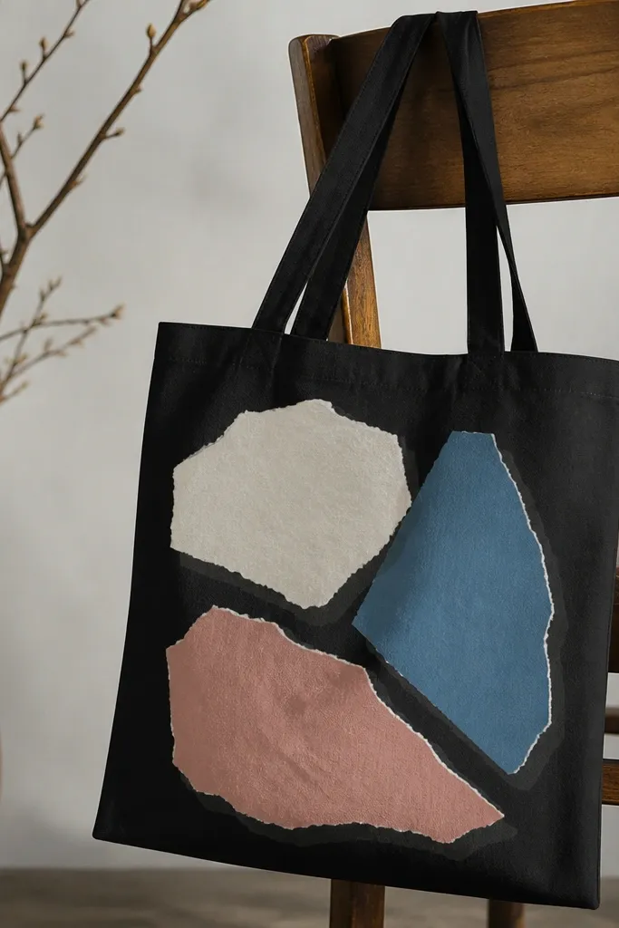
Collage-style art hides brushwork because torn edges look natural. The reason it stands out on black is that you’re creating paper-like layers with opaque light colors and deliberate shadows. I use off-white and dusty pink plus a muted blue so it feels modern, not Easter-sweet. Add a thin dark gray shadow behind each torn shape to make it lift off the bag. This flatters anyone because the rough edges create visual texture, which looks good even when the bag folds. It also works for tote bags that already have a bit of wear since texture makes imperfections less noticeable.
Cut paper shapes from kraft paper and trace around them lightly with chalk, or freehand torn shapes directly. Paint the largest off-white shape first, then smaller muted blue and dusty pink shapes on top. Use a thin brush to paint a dark gray shadow along the bottom and right edges of each shape. Let paint dry, then add a second pass on the torn edge areas with a slightly lighter shade to create the “paper fiber” look.
Use a foam brush for the shadow — it makes the shadow look soft like real paper lifting.
Avoid perfect straight edges — collage art loses its charm when it looks like a sticker.
11. Monochrome marble swirl in gray-white layers
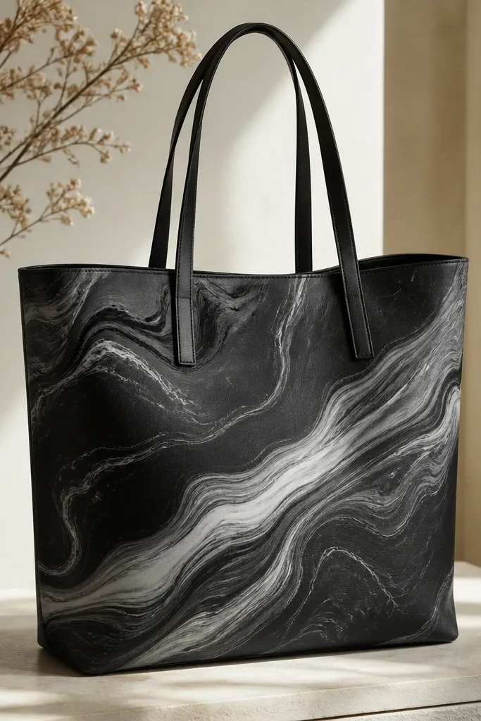
Marble looks fancy, and on black it turns even better because the dark base makes the veins pop. I keep the palette monochrome: medium gray, light gray, and bright white, plus a thin black-vein line. The secret is painting veins last so they stay sharp and don’t blur into the swirls. This design flatters most outfits because it’s neutral and doesn’t compete with jewelry or clothing prints. It also holds up to tote creasing because the pattern is continuous and forgiving.
Pro tipPractice one swirl on scrap first — marble is all about the direction of your drag.
Paint a light gray oval on the center panel, then add darker gray swirls by dragging a damp brush through the wet paint. Wait until the base is mostly dry, then add white swirls that cross the gray in a few places. Use a fine liner brush with thinned black paint to add thin vein lines that follow the swirl direction. Finish with a single thin highlight streak in bright white across one main curve.
AvoidDon’t overblend — if you keep smearing, the veins disappear.
12. Color-blocked frame with negative space center
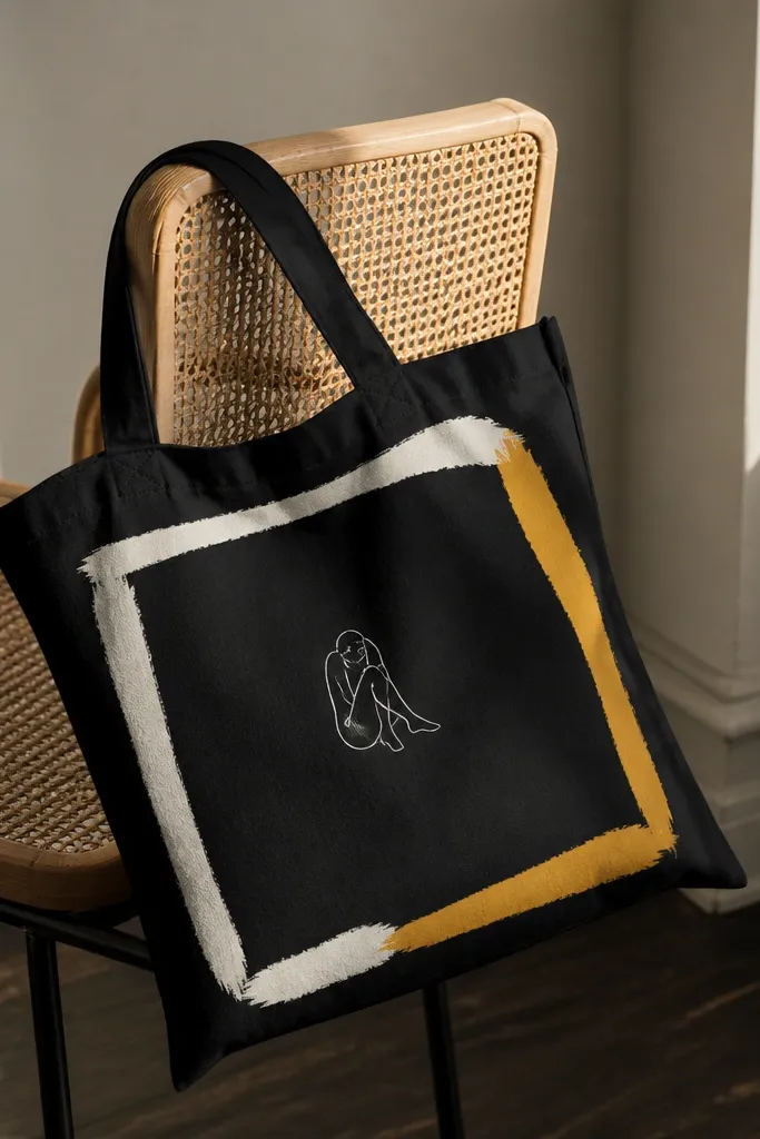
Negative space is your friend on black tote bag painting ideas stand out because it keeps the design crisp. This look uses thick color-block frames so you get structure, then leaves the center dark for contrast. I like off-white and mustard yellow because they read warm and clean, especially in daylight. The small center line drawing can be a simple flower, a star, or a tiny mountain — it stays classy because the rest is quiet. This flatters everyone since it doesn’t rely on delicate details across the whole tote. It also works well for gifts because you can change the small center drawing without repainting the frame.
Pro tipPress tape edges down with a fingernail so you get a sharp frame line.
Use painter’s tape to mark a thick border rectangle with a wide gap in the middle (about 12 cm wide). Paint the outer border in off-white and the inner border strip in mustard yellow, letting each color dry before peeling tape. In the center negative space, add a small white line drawing with a fine brush. After it dries, paint a thin white highlight line along the inner edge of the frame to give it a finished look.
AvoidAvoid thin frames — on black, skinny lines look like accidental marker work.
13. Confetti dots with ombré density
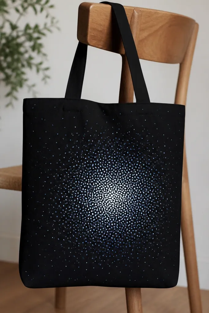
Confetti dot art is easy, but it looks high effort when you control density. On black, the dots need opaque paint and a clear density gradient so the tote looks lit from the middle. I paint white dots first, then add light blue dots as a secondary layer, with a few tiny yellow dots for warmth. This style flatters most outfits because it’s playful without being loud, and the gradient keeps it from looking random. It also hides small unevenness in tote fabric since the pattern absorbs minor texture.
Pro tipFor even dots, load the brush once and tap — don’t drag.
Pick a dot size you can repeat — I use a round stencil dot maker or a small round brush loaded with paint. Start by placing larger clusters of white dots in the center panel area, leaving more space toward the edges. Add light blue dots between some of the white ones, keeping them slightly fewer so the white leads. Finally, add a few tiny yellow dots scattered lightly near the center and peel back to a sparse edge so the gradient reads.
AvoidAvoid one-size-everywhere dots — it looks flat and like accidental splatter.
14. Roses with black-and-white ink shading
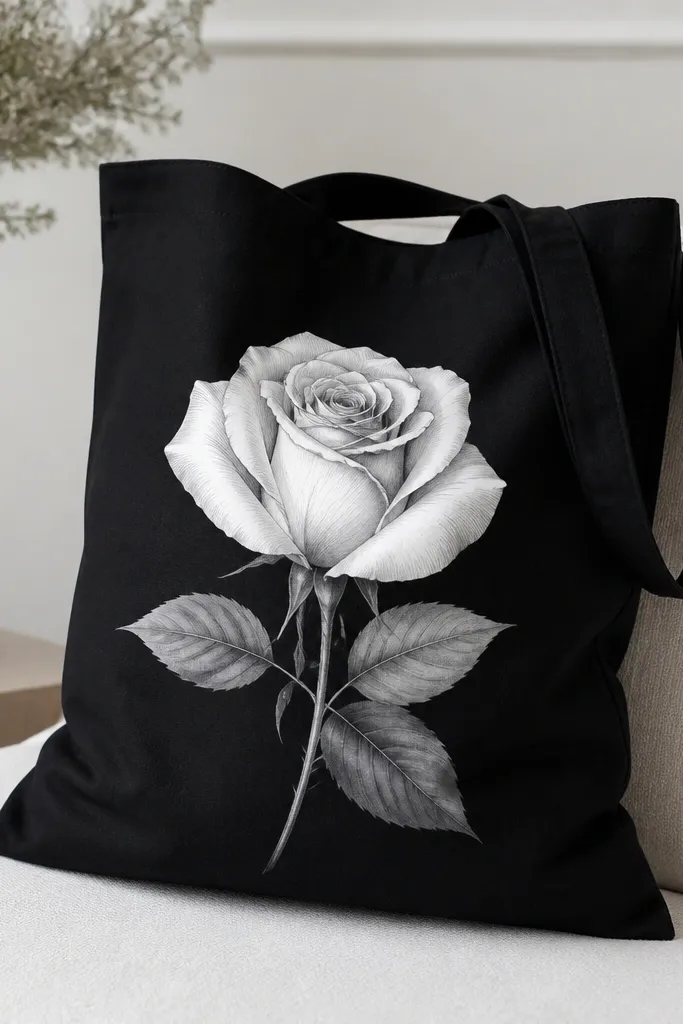
A monochrome rose looks dramatic on black because the contrast is all in the shading lines. I paint the rose petals in bright white, then add black ink-style contour lines that follow the petal curves. The leaves get a softer gray wash so they don’t steal attention from the bloom. This style flatters anyone who likes gothic or minimalist aesthetics but still wants it to feel feminine. It also looks great for formal events like weddings, because it reads like printed art rather than playful paint.
Pro tipUse a smaller brush than you think you need — ink shading looks clean only when the lines stay sharp.
Sketch the rose and leaf shapes in chalk, then paint the rose petals in opaque titanium white. After the petals dry, use a very thin black paint line to add contour strokes on each petal — keep them close together near the center. Add a light gray wash to the leaves and vein lines with a small brush. Finish by adding a couple of bright white highlight streaks on the outer petals so the rose looks layered.
AvoidDon’t overpaint the petals with gray — it makes the rose look muddy instead of inked.
15. Tropical palm silhouettes with sun halo
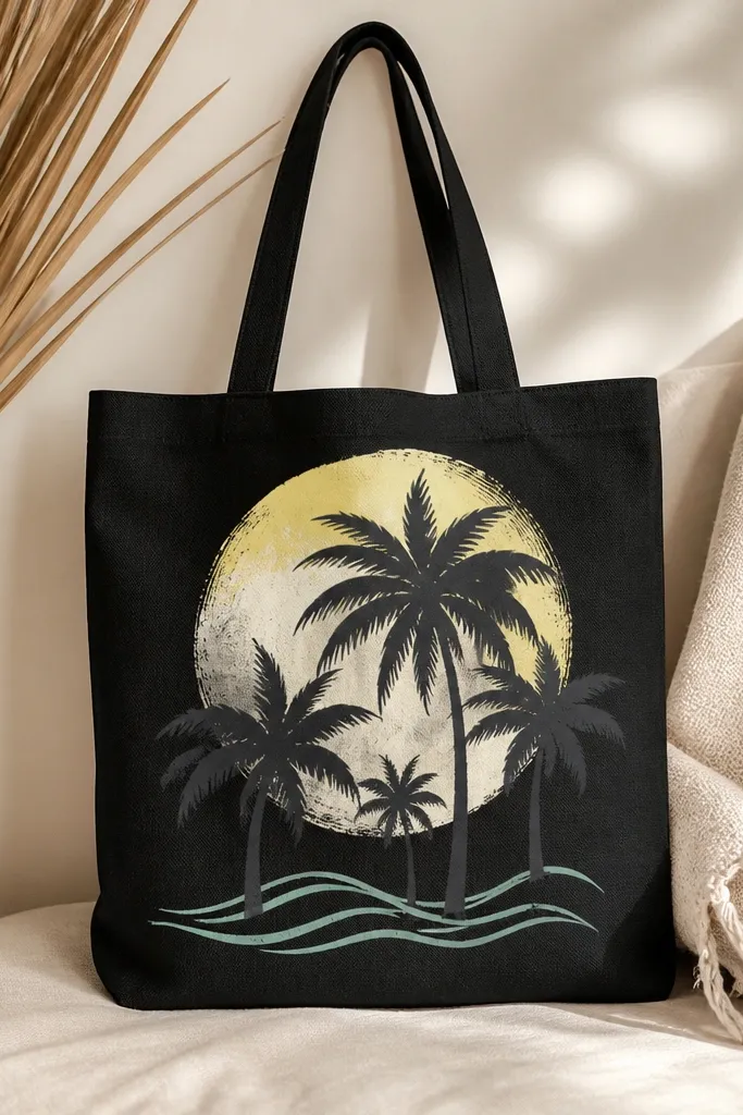
Palm silhouettes work because they’re graphic, and the halo makes them feel like a scene. I paint the palms in deep gray so they’re visible on black without turning harsh, then build a sun halo with pale yellow and a bright white ring. Add a couple of mint wave lines near the bottom for a light pop. This design stands out because the halo gives a clear focal point, even when the tote is partially folded. It flatters people who prefer simple shapes and it looks good with summer outfits, but it also looks good year-round with black jeans and sneakers.
Pro tipKeep the palms mostly silhouette — too many individual leaf lines can get lost on fabric.
Paint a bright white circle or ring behind the palms first, then fill a wider area with pale yellow so it glows outward. Sketch palm trunks and fronds in chalk, then paint the silhouettes in deep gray. Add mint wave lines along the lower edge of the scene, then dot a few tiny white highlights on the fronds. Let it dry, then go back and thicken the outer edge of the palms with a slightly darker gray for crisp separation.
AvoidAvoid using pure white for the palms — it looks like a sticker and not a scene.