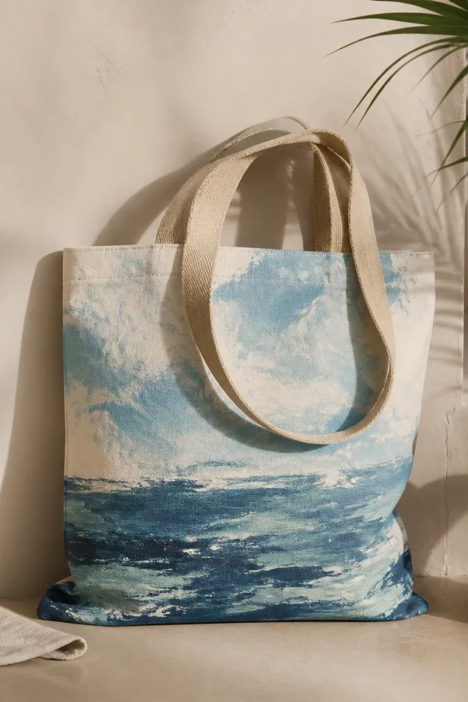
1. Sunset gradient with stitched border tape
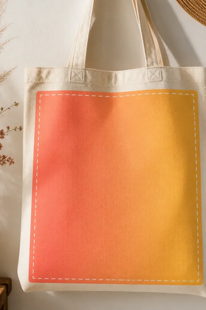
This one looks expensive because the gradient is smooth and the border gives it structure. I paint the sky area about 8 inches wide, then let it fade into the tote’s natural cream so it never looks muddy. Use coral, tangerine, and a warm yellow — they pop on light skin because they don’t pull cool. It flatters everyone because it frames the bag front like a small art piece, not a loud pattern. It also works year-round because the background stays neutral and the sunset is stylized, not literal.
Pro tipWipe your sponge on a paper towel between colors so you don’t get gray blends.
Start by taping a rectangle in the tote center using 1/8 inch painter’s tape, leaving a 1/2 inch margin. Sponge-paint the top with coral, then blend into tangerine in the middle and warm yellow at the bottom using a makeup sponge with light pressure. When it’s dry to the touch, remove the tape to reveal sharp edges. Finally, paint short white “stitch” marks along the border — keep them about 1/4 inch long and slightly uneven so it looks hand-done.
AvoidDon’t flood the canvas — thick paint makes the gradient look patchy and can crack after drying.
2. Lemon branch line art on natural canvas
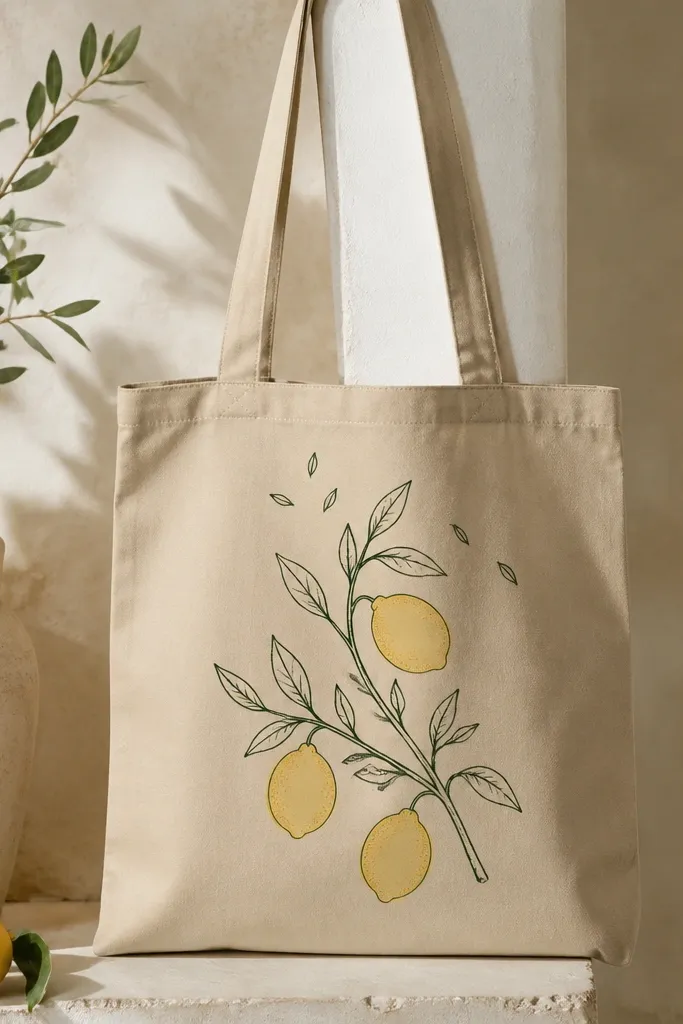
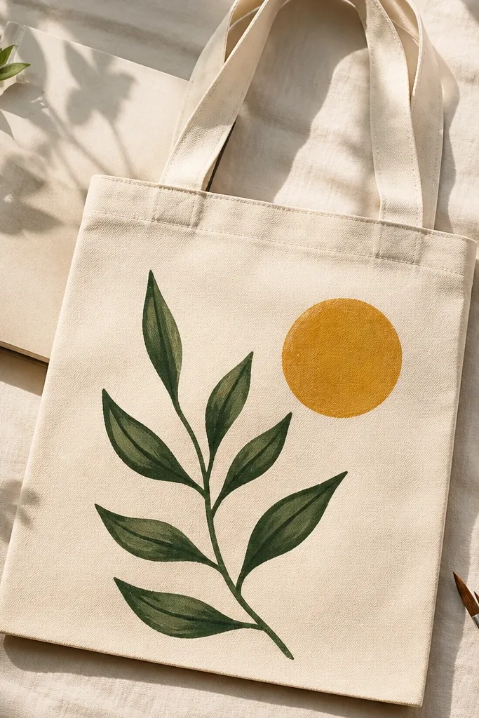
Lemon line art is the fastest way to make a tote feel like summer without turning into a full-on beach costume. The key is keeping the drawing thin and letting the canvas show through in the negative space — that’s what keeps it looking clean instead of cartoonish. I use olive green for leaves and a buttery yellow for lemons, then add tiny stipple dots for shadow. This color combo flatters warm undertones and looks great with beige, denim, and white summer outfits. For year-round wear, keep the branch off-center so it reads like a design detail, not a seasonal theme.
Start by sketching the branch lightly with a pencil and then tracing over it with a fabric paint marker or a fine liner brush. Paint the lemons in two passes: base yellow first, then add a slightly deeper yellow (or a touch of orange) for the lower half. Add small stipple dots using the tip of a brush to create a citrus texture. Let it dry overnight, then seal with a fabric medium or clear fabric sealer according to your paint instructions.
Practice your lemon outline on scrap canvas first — the curve of the lemon is where most people lose the “clean” look.
Avoid thick outlines; they make the whole bag look like it was printed instead of painted.
3. Ocean wave bands with dry-brush highlights
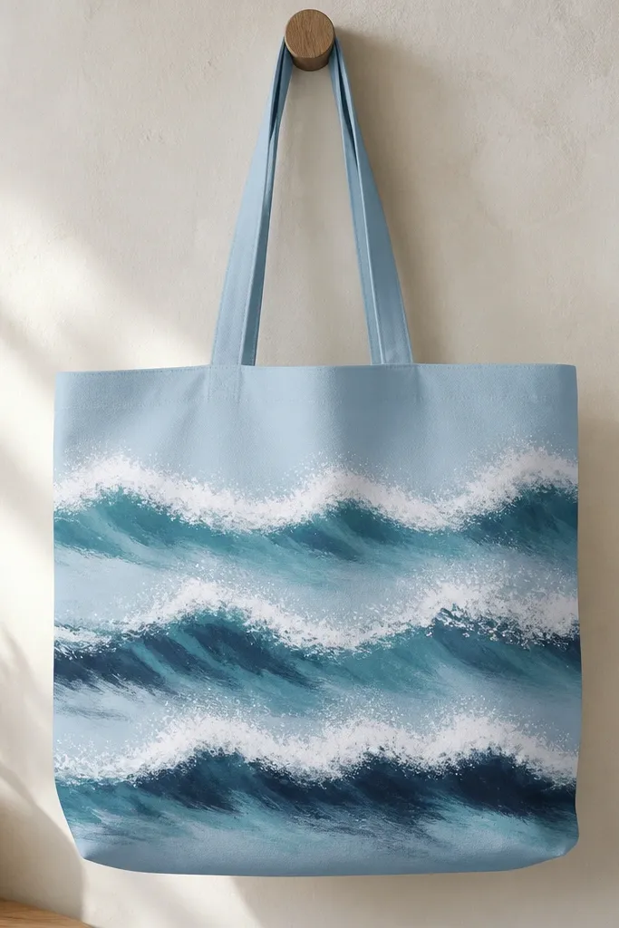
This design stays summer year-round because it’s color-calm and the waves are graphic, not literal. I paint bands across the bottom third, then layer highlights so the crests look like foam instead of flat white paint. Teal and navy look great against medium to dark skin tones because they don’t wash out like bright neon does. It also flatters different body types because the horizontal motion visually widens the bag front. If you wear mostly earth tones, this tote adds movement without clashing.
Pro tipKeep your sponge or brush slightly angled so the foam looks like it’s catching light, not like random streaks.
Start by painting the bottom area with a base teal band about 7 inches tall, then let it dry. Add a second band in slightly darker navy above it, leaving a thin gap for wave separation. Use a flat brush loaded with white paint, then wipe most paint off on a paper towel and drag it lightly to create dry-brush crest texture. Finish with a few extra foam lines on the top band using a small liner brush.
AvoidDon’t blend the wave bands too much — you want visible layers for that seaside graphic look.
4. Tropical palm silhouette with negative space sun
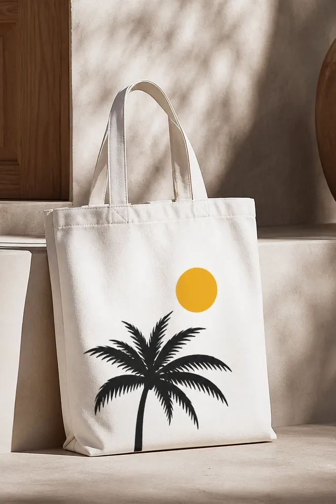
Silhouettes read bold and clean from far away, which matters when you’re carrying the bag in bright sunlight. The trick here is using negative space for the sun, so you don’t end up with a messy yellow blob around the edges. I use a matte black palm for contrast and a bright but not neon yellow circle for the sun. This looks great with both light and deep skin tones because the contrast is strong and straightforward. It’s also year-round because the design is minimal — one palm, one sun — not a full tropical collage.
Pro tipUse painter’s tape for the sun circle — freehand circles always look wobbly on tote fabric.
Start by marking the sun circle on the tote with painter’s tape circles or a stencil, then paint the surrounding area black. After the black dries, remove the tape to reveal the clean yellow circle. Paint the palm fronds by loading a round brush with black and pulling long strokes outward from the trunk base. Add a thin shadow line under the fronds with diluted black so the silhouette doesn’t look like it’s floating.
AvoidAvoid glossy black paint; it reflects light and makes the silhouette look uneven.
5. Pastel seashell clusters with pearl dot accents
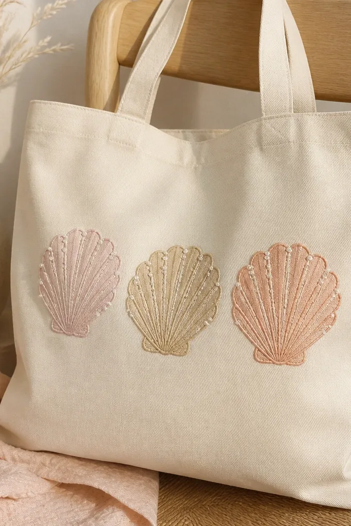
Shell clusters look soft and pretty, and they work year-round because pastel colors don’t shout like bright beach neon. I paint shells in three colors and keep the background untouched so the tote stays light and airy. The pearl dot accents make the shells look like they have texture even from a distance. This style flatters people who like feminine details without going full floral. It also pairs well with simple outfits — white tee, denim shorts, or a neutral sweater.
Start by sketching three shell shapes in a loose triangle on the tote front. Paint the largest shell first using sandy beige, then the middle shell in pale pink, and the smallest in light peach. Add ridges with a thin liner brush by dragging short curved lines from top to bottom. Finish with tiny white dots for “pearls” using a dotting tool or the eraser end of a pencil dipped in paint.
Let each shell dry before adding ridges so the ridges don’t smear into the base color.
Don’t outline everything in dark paint — it turns pastels into cartoon and looks cheap fast.
6. Retro striped beach bag look with scalloped top edge
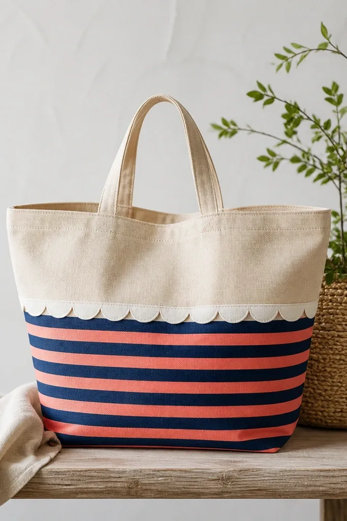
Stripes are the quickest way to make a tote look like a designed product. Scallops add a playful touch without needing a bunch of motifs, and they read summer even when you wear the bag with fall layers. I like navy plus coral with white scallops because it’s classic and doesn’t depend on trendy colors. This combo looks good against all skin tones because the palette is bold but balanced. It also works year-round: stripes feel nautical, not seasonal, if you keep them to the lower half.
Start by masking the lower half with painter’s tape so you only paint stripes where you want them. Paint alternating stripes in navy and coral, each about 1 inch wide — keep a ruler handy. After the stripes dry, paint a white scalloped band across the top edge of the stripe area by drawing half-circles with a small cup or stencil. Use a thin brush to clean the scallop edges and remove tape while the paint is still slightly tacky for crisp lines.
Use a damp cloth to wipe tape edges if you get paint creep — it saves clean lines.
Avoid uneven stripe widths — it makes the whole tote look like a rushed craft.
7. Monochrome wave map with coordinate numbers
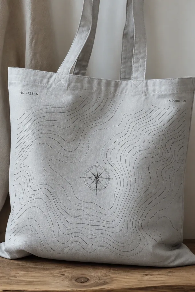
If you want beach vibes that still feel grown-up, go monochrome. This design looks like a travel map and works year-round because it’s mostly black on neutral. I add coordinate numbers to make it feel specific without naming a place that can date your tote later. On my skin (and on friends'), the black-on-gray contrast looks sharp and doesn’t wash out like bright pastels can. It also flatters smaller frames because the details are compact and controlled.
Pro tipUse a fine liner brush and reload less often — big paint loads make the lines wobble.
Start by drawing a light grid on the tote with pencil so your wave lines stay evenly spaced. Paint wave contours in black using a small angled brush, keeping each line about 1/8 inch apart. Add a thin compass rose at center using a liner brush and paint the points in black. Finally, paint coordinate-style numbers near the top corners — keep them small, about 1/2 inch tall, so they feel like map markings.
AvoidDon’t make the waves too thick; thick lines turn into a blob when the tote stretches in use.
8. Watercolor-inspired coral reef splashes
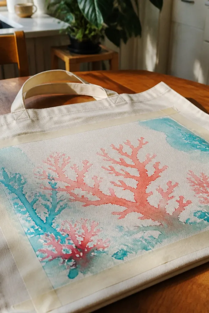
Watercolor-inspired reef art looks airy and modern, and it hides small imperfections because the edges are intentionally soft. I keep the background white and let the paint bleed slightly for that watery look, but I still use tape to control the overall shape. Coral and turquoise is the classic combo, but I add a tiny touch of deep green for seaweed so it doesn’t feel flat. This style looks great on people who like color but want it subtle. It also feels year-round because the palette is like a sunset ocean, not a bright cartoon beach.
Start by taping off a loose reef shape in the lower half of the tote using wide painter’s tape. Mix your paint with a little fabric medium or water if your paint label allows thinning, then dab coral shapes in with a medium round brush. Add turquoise splashes around the coral using a toothbrush flick — practice on scrap first. Finish with two or three dark green seaweed strokes at the bottom for grounding.
Work in small sections so the paint stays moveable — rushing makes it dry into hard edges.
Avoid fully soaking the fabric; over-wet canvas makes paint bleed where you didn’t plan it.
9. Straw hat + sunglasses still life on the front pocket area
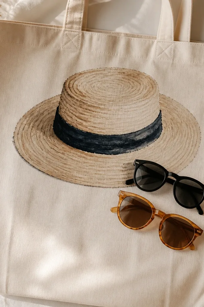
Still life art makes a tote feel intentional and wearable, not just themed. I place the hat and sunglasses near the top center so it looks like a “front panel” when the bag hangs from your shoulder. The straw color reads warm and flattering, and the dark sunglasses anchor the composition. This style works for people who want beach details but prefer a cleaner look than waves and shells. It’s year-round because sunglasses and hats are seasonal accessories, not seasonal motifs.
Start by sketching the hat brim and crown lightly with pencil on the front panel area. Paint the straw with a light tan base, then add darker tan lines radiating outward from the center for texture. Paint the hat band in dark brown or black, then add a thin highlight line with a lighter shade. For the sunglasses, paint the frame black or deep charcoal and fill the lenses with amber tinted paint; add a tiny white highlight dot on each lens.
Use a small round brush for the straw lines — the thinner you go, the more it looks like texture.
Don’t place the art too low; it gets stretched and distorted when the tote is full.
10. Beach towel border pattern with tiny hanging tags
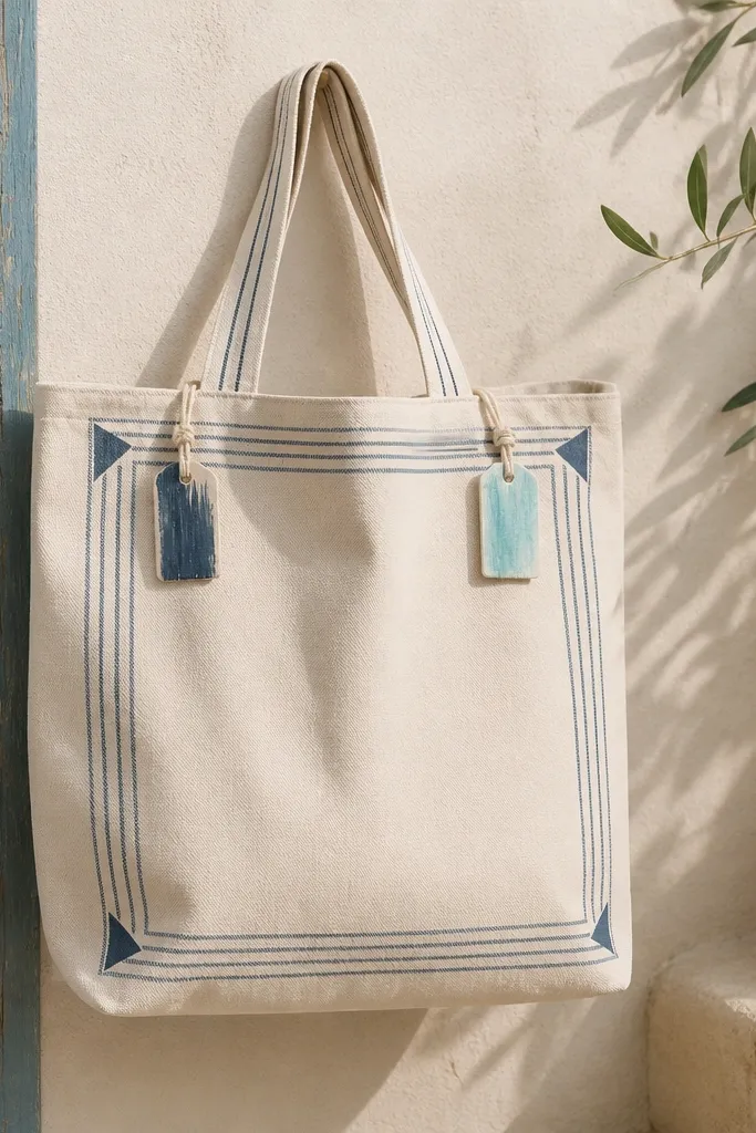
This is one of my favorites because it looks like a product design, not a random illustration. The border gives a frame, and the tiny tags add a playful detail that still reads clean. I use a limited palette — navy, white, and a single accent color like coral or turquoise. Limited color is what makes it look tidy instead of chaotic. It flatters a wide range of outfits because the design stays graphic and doesn’t compete with patterns. For year-round wear, keep the border height under 3 inches so it feels like an accent.
Pro tipPress tape down hard around corners so the border doesn’t bleed and blur.
Start by painting a thin navy border around the tote front about 1 inch from the edges. Add alternating stripes within the border using painter’s tape to keep widths even. Paint small corner triangles in white and coral on each side of the border to mimic towel corners. Finally, paint two tiny rectangular tags at the top corners — one coral, one white — and add a short line “string” to connect them to the border.
AvoidAvoid adding too many pattern elements; a busy border looks messy on tote fabric.
11. Color-block wave arch with crisp masking
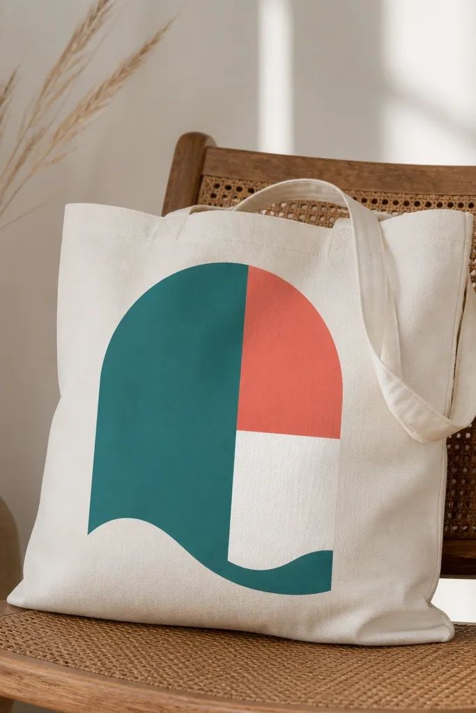
Color-blocking looks bold and modern, and it stays summer year-round because it’s abstract. The arch shape flatters the tote when it hangs, because it creates an upward curve that looks good against the natural fold lines. I choose teal and coral with white negative space so the tote stays bright but not neon. This design looks best on light to medium skin tones because the colors pop cleanly without washing out. It also works well if you want a tote that doesn’t scream “beach” while you’re running errands.
Start by drawing an arch outline in pencil, about 10 inches wide and 7 inches tall. Mask the arch area with painter’s tape and fill the top section with teal, then the middle section with coral, leaving a white strip for separation. For the wave cutout, paint a thin white wavy line at the bottom of the arch using a stencil or a taped curve guide. Remove all tape slowly while the paint is still tacky for the cleanest edges.
Use a foam brush for the blocks — it leaves fewer streaks than a bristle brush.
Don’t skip the pencil sketch; freehand masking makes the arch look lopsided.
12. Sea glass effect with translucent layers
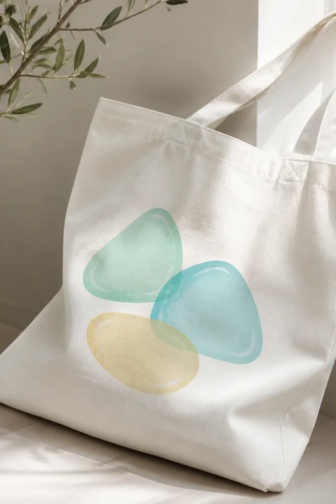
Sea glass is the trick when you want ocean color that doesn’t look like a kids' craft. The translucent look comes from layered paint — you build up color lightly so the canvas still glows through. Mint and aqua feel fresh against cream totes and look good with both warm and cool outfits. I add a thin white highlight line on each piece so it looks like light is hitting the glass. It’s year-round because the colors are soft and the shapes are abstract.
Start by sketching 3-5 rounded sea-glass shapes with pencil. Paint the first layer with very light mint or aqua, diluted slightly if your fabric paint label allows thinning with medium. After it dries, add a second layer in a deeper version of the same color so the center is richer. Finish by dragging a thin white line along one edge of each shape for highlight, then seal once fully dry.
Keep your first coat thin — thick coats kill the glassy look.
Avoid using opaque white as the base; it makes the sea glass turn chalky.
13. Nautical knots and rope lines in muted navy
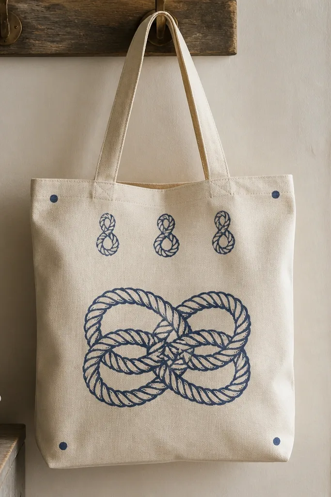
Rope and knots make a tote feel nautical without using waves or shells, which is why it reads year-round. Muted navy looks more grown-up than bright cobalt, and it doesn’t fight with regular clothing colors. The knot at center gives a focal point even if your tote stretches a little when full. This style flatters taller frames because the rope lines can be drawn vertically and stay crisp. I also like it for people who want beach decor but hate bright prints.
Start by drawing the knot shape in pencil — a simple overhand knot or figure-eight knot works best. Paint the rope in muted navy in 2 layers: base rope thickness first, then a darker navy for shadow lines along one side of the rope. Add two small loop details above the knot to fill negative space. Finish with tiny anchor dots in the corners using a dotting tool — keep them under 1 inch.
Use reference photos for rope — the twist direction makes it look real.
Avoid painting the knot as one flat blob; add shadow lines so it has rope texture.
14. Tropical fruit scatter with one big hero fruit
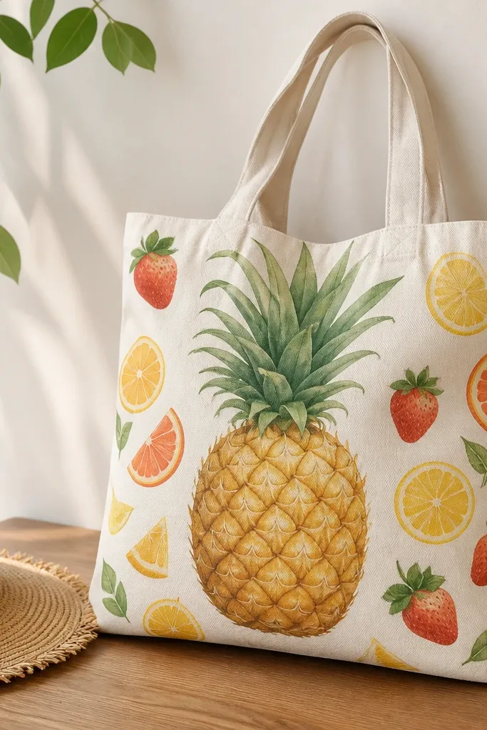
This design is playful but still wearable because you pick one hero fruit and repeat smaller pieces around it. I use a pineapple as the anchor since it has strong shape lines and reads clearly from far away. Keep your fruit colors consistent: pineapple in warm yellow-green, strawberries in deep red, and citrus slices in orange-yellow. This flatters most skin tones because the colors are saturated but not neon. It’s year-round because the background stays cream and the fruit scatter feels like a pattern detail, not a full print.
Pro tipPlan your spacing with paper cutouts before you paint — it saves you from overcrowding.
Start by painting the pineapple first at center — about 6 inches tall. Paint the base yellow, then add green scales by using a flat brush to dab small angled marks. After it dries, place 4-6 smaller fruits around it using a light pencil guide so spacing looks intentional. Use strawberries with small seed dots and citrus slices with simple wedge lines. Seal everything after full dry time so the berries don’t scuff.
AvoidDon’t add too many fruits — more than 7 pieces starts to look cluttered on a tote.
15. Monogram wave stripe combo for easy personalization
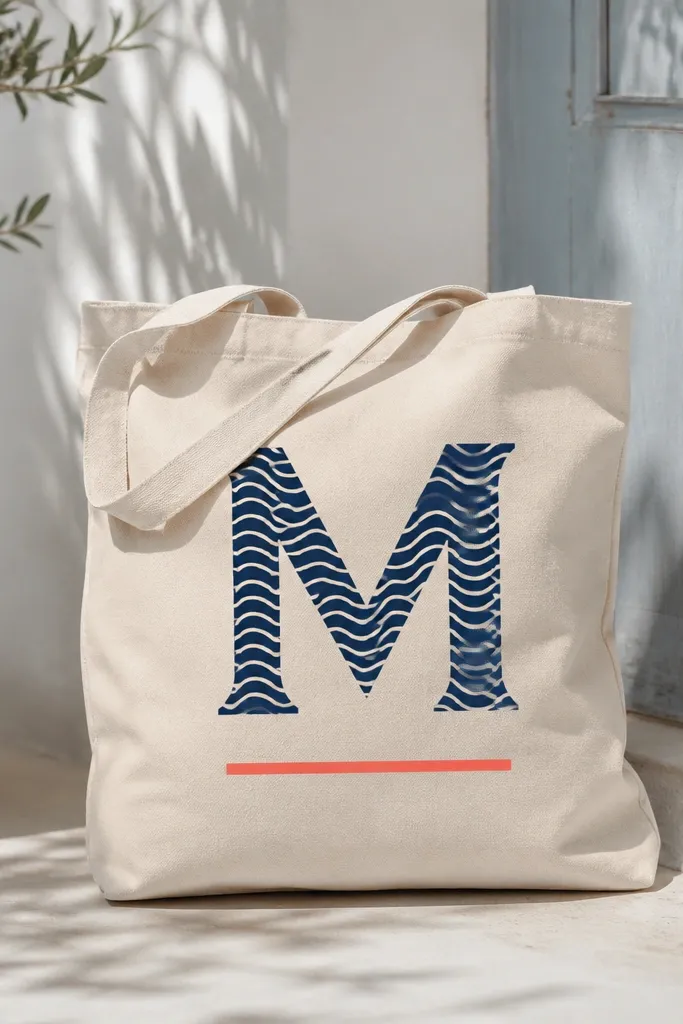
Personal monograms look best when the design is simple enough to stay readable when the bag is full. This one uses a wave stripe fill inside the letter so it feels beachy without covering the whole tote. I paint the letter in navy, then fill it with alternating teal and white wave stripes that move horizontally. The coral underline adds warmth and keeps it from feeling too cold. It flatters everyone because the letter gives a clean vertical line, which is flattering on most body proportions. For year-round use, keep the accent color to one small detail like the underline.
Start by choosing a letter size about 7 inches tall and masking it with painter’s tape or a vinyl stencil made for fabric. Paint the letter navy first and let it dry. Then mask stripes across the letter area — about 1/4 inch wide — and paint teal and white in alternating bands. Remove masking carefully, then add a small coral underline under the letter with a ruler guide.
Use a stencil for the monogram — freehand letters on canvas look uneven fast.
Don’t over-thicken the letter paint; thick monograms crack when the tote flexes.