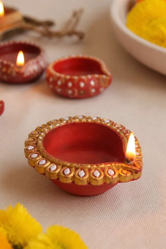
1. Gold Rim Polka Dot Diya
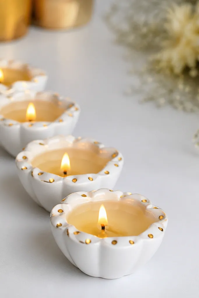
This one looks like a store-bought candle holder because the pattern is controlled and the rest stays blank. Paint the diya white first, then add gold polka dots only on the rim — the dots catch light and make the shape look rounder. I’ve used this on both small clay diyas and slightly taller metal cups; the rim area always reads clearly from a distance. It suits warm-toned spaces, and it also flatters cool-toned decor because white keeps it fresh. For beginners, it’s forgiving because you can fix dot spacing with a cotton bud.
Step 1: Clean the diya and let it dry fully, then paint the entire outer surface with white acrylic. Let it dry for 30-45 minutes, then do a second thin coat if the surface looks uneven. Step 2: Dip a dotting tool or the end of a bobby pin into gold acrylic and press dots only along the rim — keep them about 1 cm apart. Finally, let it cure overnight and place the diyas on a tray so you don’t smudge the gold.
If the gold looks too thick, thin it with a drop of water so the dots stay crisp.
Don’t paint gold over wet white — it turns patchy and looks streaky.
2. Marble-Effect Diya with White + Charcoal Swirls
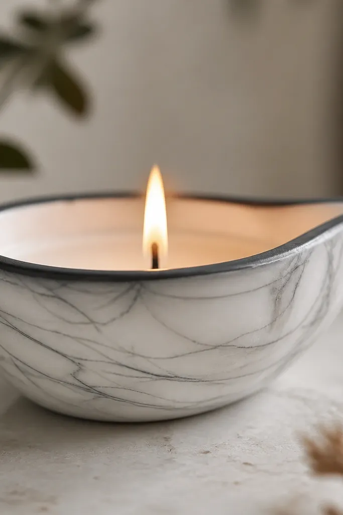
Marble effect looks fancy because it mimics natural stone movement. White gives you the clean “gallery” look, and charcoal lines add contrast without needing heavy embellishments. I like this for neutral homes — it looks good on beige, grey, and black trays. It also looks great for evening events because the pattern reads under warm light. This design flatters smaller diyas because the veining makes them look more substantial.
Step 1: Paint the diya fully in matte white acrylic and let it dry completely. Step 2: Thin charcoal acrylic so it flows, then use a sponge corner to dab a few soft grey patches near the middle. Step 3: Use a fine liner brush to drag 3-5 thin swirls from top rim area downwards, then soften the edges with a slightly damp brush tip. Finally, seal with a matte clear spray so the swirls don’t smear.
If you mess up a line, wipe with a damp cotton bud before it dries and repaint that section.
Don’t use thick paint for the veins — it looks like graffiti instead of marble.
3. Leaf Lace Wrap Diya
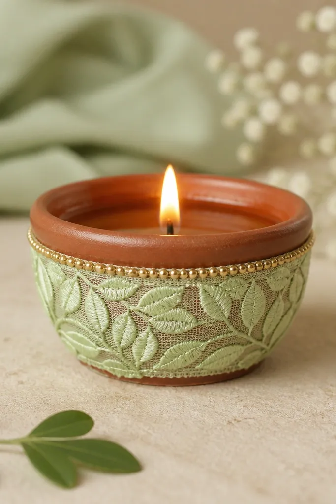
This is my go-to when someone wants “pretty” without painting skills. The leaf lace gives texture and shape, and the pale green tone looks natural against gold or brass. It flatters warm skin tones in a photo because greens look fresh under indoor lighting. For festive tables, it looks like a mini garden theme. I’ve also used it for wedding reception centerpieces because the lace stays classy even up close.
Step 1: Measure the diya circumference and cut lace so it wraps once around the middle with a tiny overlap of 1-2 cm. Step 2: Apply hot glue or fabric glue at the overlap points only, then press and hold for 20 seconds. Step 3: Add a thin gold paint line or gold ribbon band just above the lace edge. Finally, wrap a short jute twine loop around the base as a small anchor if the diya is light.
Pro tipChoose lace that has leaves printed in one direction so it looks intentional, not random.
AvoidDon’t glue lace across the rim — it makes the flame area messy.
4. Terracotta Ombre Diya
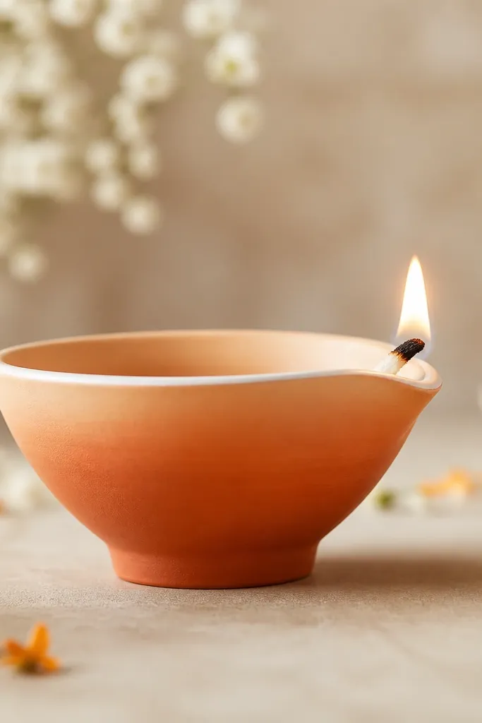
Ombre looks smooth even if your brush skills are basic, because the blend hides small imperfections. Terracotta to peach is warm, earthy, and it looks amazing on wooden tables. I’ve used this for Diwali dinners where people want “traditional but not loud.” The white rim line makes the diya look neat and gives the flame area a clean frame. This design flatters both short and tall diyas because the gradient stretches the shape visually.
Step 1: Paint the base outer surface terracotta (a warm clay red) and let it dry. Step 2: Mix terracotta with white to create a lighter peach and paint the upper half, then blend where they meet using a dry sponge. Step 3: Add a thin white line along the rim with a small liner brush. Let it dry, then apply a second coat only where the gradient looks patchy.
Pro tipUse a dry makeup sponge for blending — it avoids harsh brush strokes.
AvoidDon’t paint ombre in one heavy coat — it dries uneven and chalky.
5. Red and White Striped Rim Diya
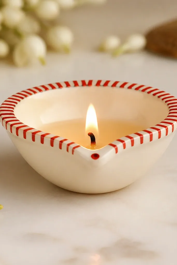
This is a graphic look that reads clearly from across the room. Keeping the body cream keeps it elegant, and the striped rim gives motion like festival wrapping paper. It works well for beginners because stripes are easy to measure and you can redo a stripe without ruining the whole diya. Red and white also match almost any decor theme, from traditional marigold to modern monochrome. I like it for small diyas because the rim design makes them look intentional.
Step 1: Paint the diya body cream or off-white and let it dry. Step 2: Use masking tape to create a straight band around the rim — press it gently so the edge is clean. Step 3: Paint alternating red and white stripes within the taped band, then remove tape while paint is slightly tacky. Finish by adding one small red dot on the front center of the diya with a toothpick.
Make stripes about 4-5 mm wide so they look neat, not chunky.
Don’t freehand the tape line — crooked stripes make the whole diya look rushed.
6. Temple-Style Dotwork Diya with Gold Center
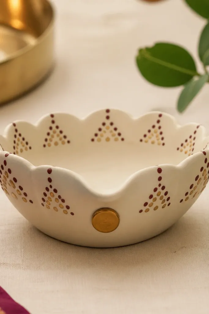
Dotwork feels traditional but looks clean when you keep dot sizes consistent. The off-white base makes maroon and bronze look rich without needing glitter. I’ve done this for friends who can’t draw — dot patterns are repeatable and forgiving. It flatters warm indoor lighting because dots sparkle a bit and the maroon gives depth. The gold center dot acts like a focal point so the diya doesn’t look empty.
Step 1: Paint the diya off-white and let it dry. Step 2: With a fine dotting tool, make a ring of tiny maroon dots along the rim, then add a second inner ring with bronze dots. Step 3: On the front center, place a gold dot and add small dot clusters on either side like mini arches. Finally, let it dry fully and seal with matte spray so dots don’t smear.
Practice dot spacing on paper first — keep dots the same size for a “temple” feel.
Don’t overload dots with paint — thick dots look like blobs.
7. Mini Rangoli Rim Diya
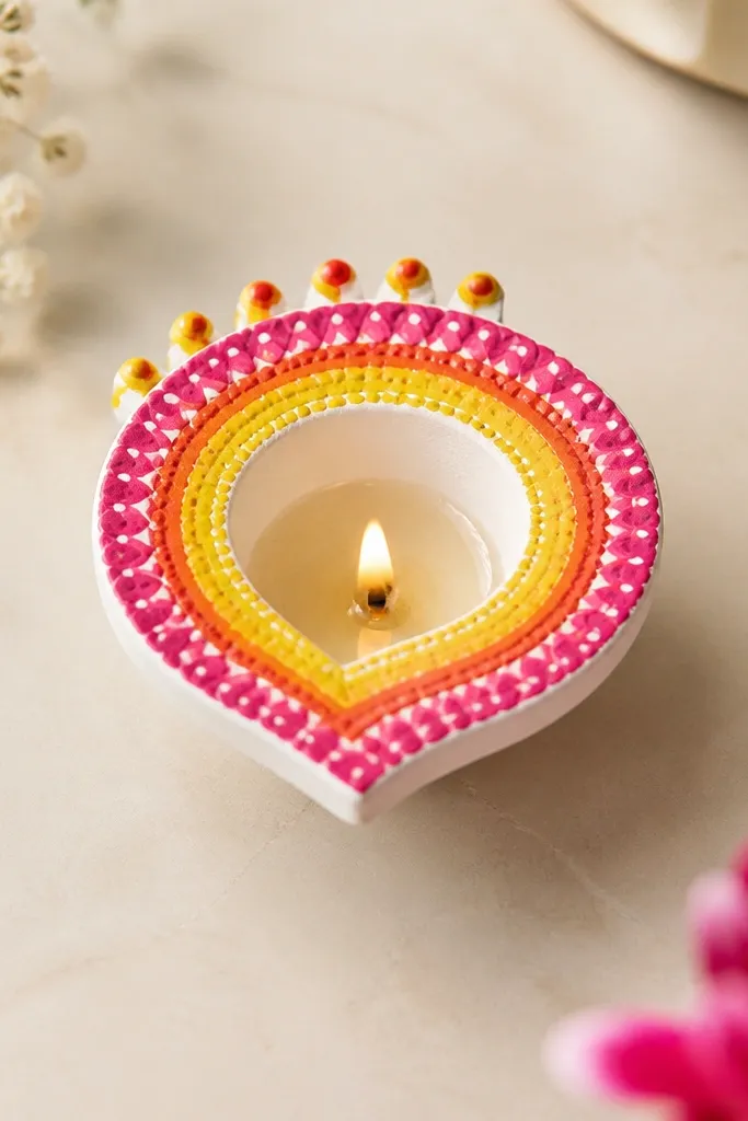
Rangoli on a diya rim looks like you shrank a festival design into something you can light. The rim is the perfect size for concentric circles and petal dots, so you get a full look even on small diyas. I’ve used bright pink, orange, and yellow because warm colors pop under diya flame. This style suits people who want color but don’t want to glue a lot of stuff. It also photographs well because the rim pattern is sharp.
Step 1: Paint the diya white and let it dry. Step 2: Use a compass-style method — trace a circle shape on the rim lightly with pencil, then paint concentric circles starting with yellow at the outer edge, then orange, then pink. Step 3: Add 6-8 tiny petal shapes around the top edge using a toothpick tip. Finally, add a single black dot in the center and let everything dry before sealing.
Pro tipUse a toothpick for petal tips — it makes points naturally thin.
AvoidDon’t paint directly over pencil marks that are still visible — they’ll ghost through.
8. Black Base with Gold Crackle Top
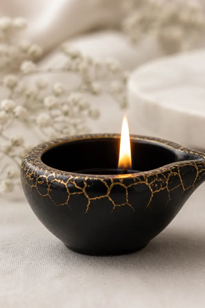
Crackle effect makes a simple diya look old and expensive. Matte black is the anchor, and gold crackle on top reads like antique pottery under warm light. I like this for modern decor because it doesn’t scream “festival,” it just looks stylish. It also flatters people who prefer darker aesthetics — the gold lines give warmth without loud red. This design is great when you want drama but still keep it beginner-friendly.
Step 1: Paint the whole diya matte black and let it dry fully. Step 2: Apply crackle medium (or crackle top coat kit) on only the top rim and upper cup. Step 3: Spread gold acrylic over it while the crackle base is still in the working stage, then let it dry until the cracks form. Finally, seal lightly with a clear matte coat so the gold doesn’t rub off.
Pro tipUse thin layers for crackle — thick paint can turn into a single ugly patch.
AvoidDon’t crackle on the wick opening area — flakes can fall into the flame zone.
9. Pastel Color Block Diya
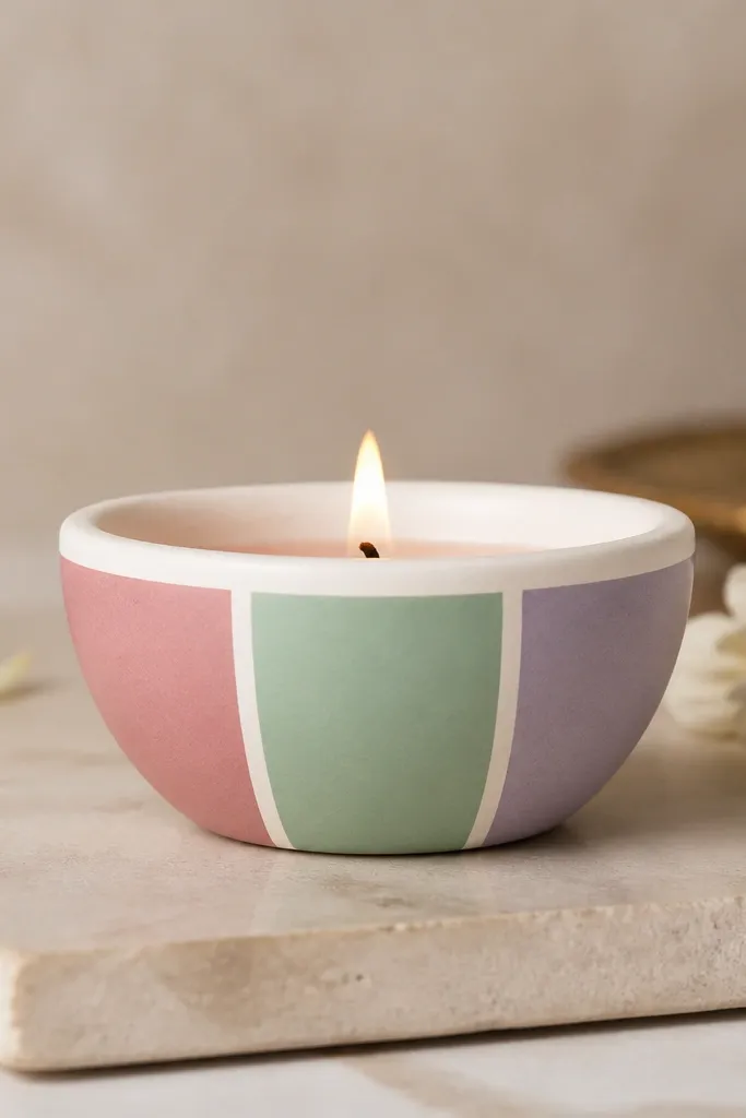
Color blocks look clean because they have hard edges, and clean edges hide beginner brush wobble. Pastels make the diya feel soft and calm, which is great for spring events and birthday tables. I’ve used dusty pink, mint, and lavender because they look good together on both warm and cool backgrounds. This is flattering in photos because pastel tones don’t glare under overhead lights. You’ll also find it easy to match to your table runner.
Step 1: Paint a white base coat and let it dry. Step 2: Mark three vertical sections with masking tape, then paint each section a different pastel color. Step 3: Remove tape after the paint is tacky so you get sharp lines. Finally, add a tiny gold dot on the front center for a “finished” look.
Pro tipPress tape edges firmly with a fingernail so paint doesn’t bleed under.
AvoidDon’t rush tape removal when paint is fully wet — it smears the edges.
10. Jute Twine Bow Diya
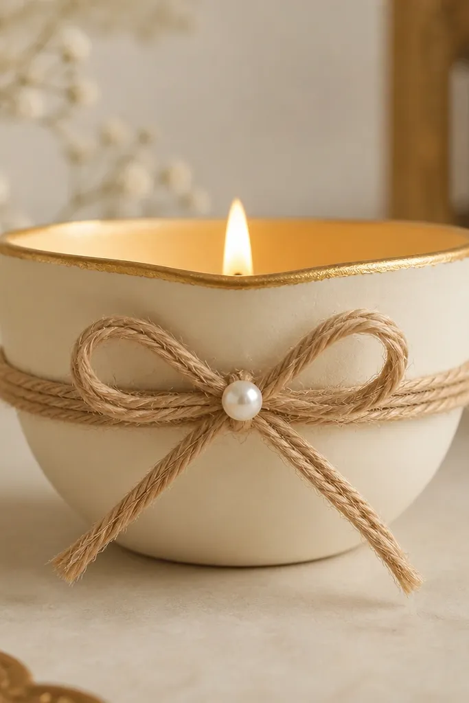
This looks cozy and handmade because jute has texture and the bow gives shape. Cream paint keeps it clean, and a gold rim adds a little shine so it doesn’t feel too rustic. I like this for home decor because it blends with wood, cane, and linen. It also looks good on medium to dark wood tables where lighter diyas pop. For beginners, it’s easy because you’re not drawing anything — you’re tying and positioning.
Step 1: Paint the diya cream and add a thin gold line along the rim. Step 2: Cut a length of jute twine, wrap it around the diya middle, and tie a bow with two loops about 3-4 cm each. Step 3: Hot glue the bow tails at the back so they stay flat. Finally, place one small pearl or gold bead at the center where the loops meet.
Use jute twine that’s not too thick — thin twine makes a neater bow.
Don’t glue the bow too high — it crowds the flame view.
11. Beaded Side Border Diya
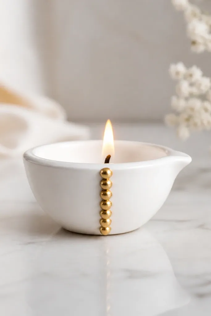
A single vertical bead border looks classy because it creates a line without clutter. It’s also beginner-friendly because you’re repeating one action: glue a bead, move down, glue the next. I’ve used this for formal dinner settings because it reads polished even without bright colors. It flatters slimmer visual lines on the diya shape, making it look taller. The plain white base helps the beads stand out.
Step 1: Paint the diya white and let it dry. Step 2: Plan the bead line placement by drawing a faint pencil line on the side where you want the border. Step 3: Apply a thin line of hot glue along that pencil line and press small gold beads in sequence, about 5-7 mm apart. Finally, leave the rim edge clear and seal with a clear matte spray when glue is fully set.
If beads fall, switch to a stronger craft glue instead of hot glue for the bead body.
Don’t put beads all around — it turns into a heavy look quickly.
12. Terracotta with Hand-Painted Tiny Flowers
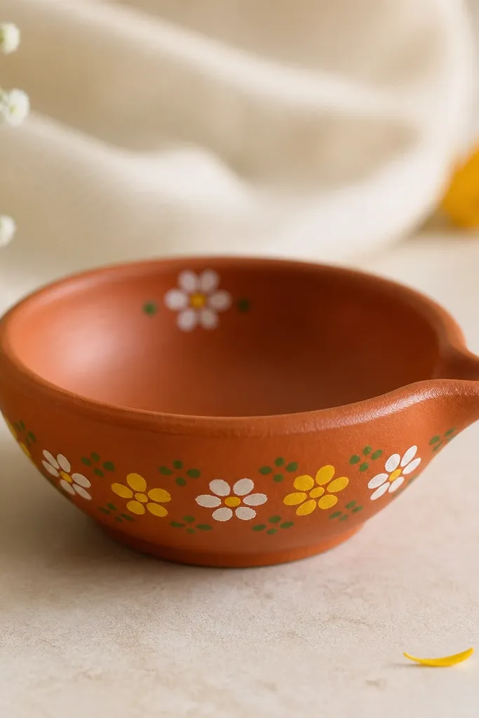
Tiny flowers look charming because they mimic hand-painted pottery. Starting with terracotta gives you an earthy base that makes colors pop — especially white and sunny yellow. I’ve used this for daytime gatherings because it feels fresh and not too festive. It flatters warm undertones and looks good on shelves with plants. This design is also forgiving: even if flowers aren’t perfectly symmetrical, the charm still reads as intentional.
Step 1: Paint the diya terracotta and let it dry. Step 2: Use a small dot-and-line technique: make five petal dots around a tiny center dot for each flower, then add two small green leaf dots under the flower. Step 3: Place three flowers around one side and one near the rim for balance. Finally, outline the centers with a thin yellow-gold dot so they look brighter under flame.
Use a toothpick for petal dots — it keeps petals small and round.
Don’t make flowers too big — large flowers on a diya rim can look crowded.
13. Blue and Silver Foil Accent Diya
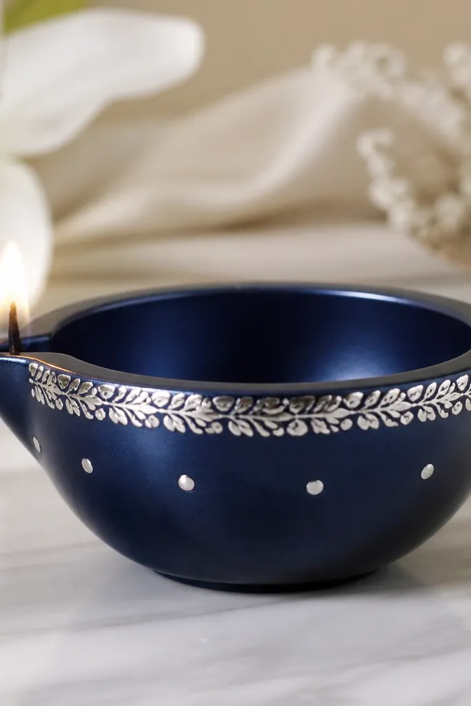
Metallic foil accents make a simple diya look like it belongs in a modern centerpiece. Navy and silver is a strong combo that looks crisp under warm flame because silver reflects light and navy absorbs it. I’ve used this when I wanted a cooler color scheme for a party — it stands out without being neon. It flatters people who like minimal decor since the design uses only two elements. Also, foil is fast: you don’t need heavy painting skill.
Step 1: Paint the diya navy and let it cure for an hour. Step 2: Apply craft glue or foil adhesive in a thin band around the rim, then press silver leaf or foil strip along that band. Step 3: Add 5-6 small silver dot accents on the side using silver acrylic or metallic paint. Finally, seal with clear varnish so the foil doesn’t snag on fingers.
Pro tipPress foil with a soft cloth — it prevents creases.
AvoidDon’t seal immediately over wet glue — the foil can shift.
14. White Lace + Red Mini Hearts Diya
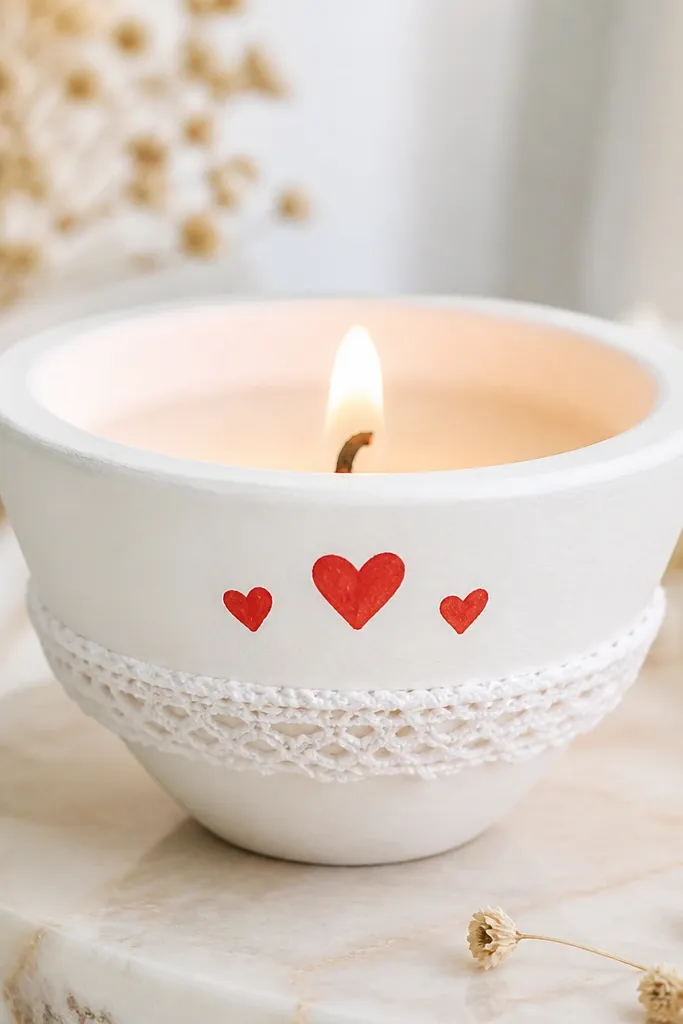
This is sweet without being childish. The lace band gives texture, and the red hearts add a clear focal point that looks cute in photos and in person. I like it for housewarmings and small gatherings because it feels personal and warm. White lace also balances red so it doesn’t look too loud. It flatters most color palettes because white is neutral and red is the only strong color.
Step 1: Paint the diya fully white. Step 2: Cut lace to wrap the middle and glue only the ends so it stays smooth. Step 3: On the front, paint two or three small red hearts with a toothpick, spacing them like a tiny cluster. Finally, let dry and keep the rim area untouched for a clean flame.
Pro tipMake hearts about 1 cm wide so they look delicate, not chunky.
AvoidDon’t use thick lace — it bulks and makes the diya look uneven.
15. Rangoli Chevron Diya (V-Pattern)
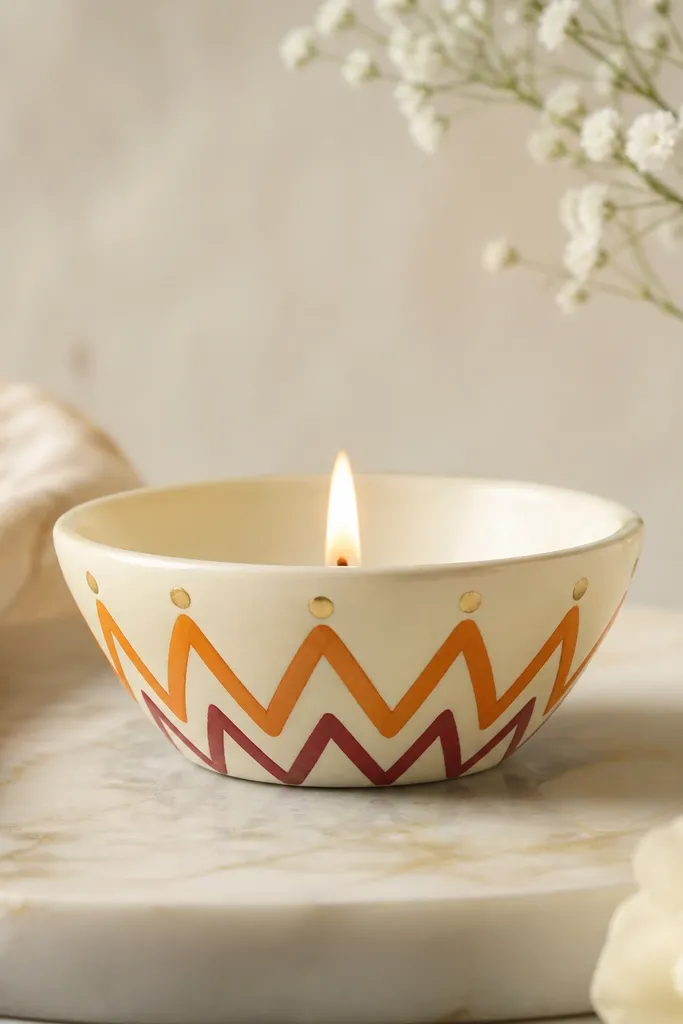
Chevron patterns read as energetic but still clean when you limit the colors. Using orange and maroon on cream gives a rangoli vibe without needing lots of tiny dots. I love this for beginners who want something graphic, because you only repeat one V shape. It looks great on both short and tall diyas; the pattern stretches nicely down the front. Under warm light, the gold dots add sparkle at the top of each V.
Step 1: Paint the diya cream and let it dry. Step 2: Draw a light pencil guide for the chevrons — start near the rim and taper toward the middle. Step 3: Paint each V with orange, then outline the inside with maroon so the V edges look crisp. Step 4: Add a gold dot at the top point of each V, then seal with matte clear coat.
Pro tipUse a ruler to keep chevrons aligned — even a small misalignment shows on patterns.
AvoidDon’t blend colors together on chevrons — it ruins the sharp V look.
16. Saffron and Green Border Diya
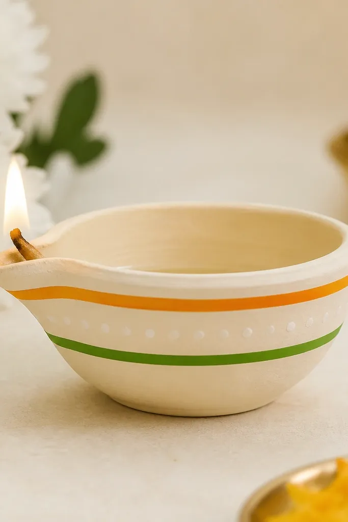
This design looks like simple festive trim on a garment: clean lines with tiny separators. The saffron and green combo is instantly recognizable, but keeping it to two lines keeps it from getting messy. I’ve used it for Ganesh and general puja setups because it stays respectful and not overly decorative. It also works well for beginners because you only paint straight lines and dots. The white dot separators make the lines look intentional.
Step 1: Paint the diya matte cream and let it dry fully. Step 2: Use a liner brush to paint a thin saffron line just under the rim, then add a second thinner green line about 2 cm below it. Step 3: Fill the gap between lines with small white dots using a toothpick. Finally, add a tiny green dot on the center front as a finishing mark.
Pro tipThin your paint slightly so lines stay smooth instead of chalky.
AvoidDon’t make the borders too thick — thick lines look like marker strokes.
17. Rose Pink Gradient with Gold Stipple
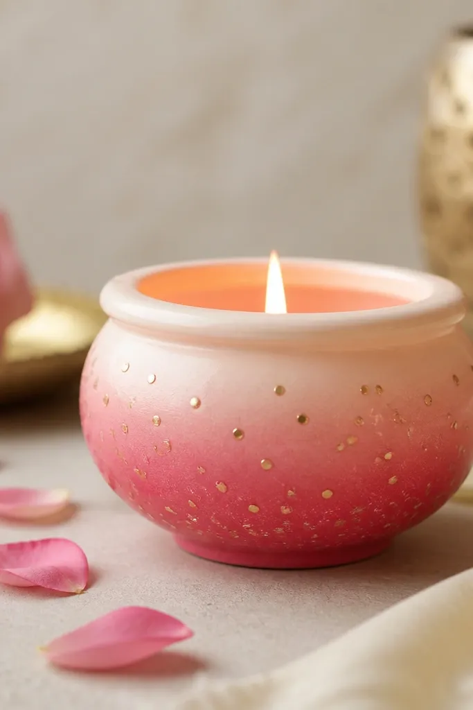
This is a soft, romantic design that looks expensive because gold stipple adds sparkle without full glitter mess. The gradient keeps it elegant, and the gold dots are placed loosely so it feels airy. I’ve used it for birthdays and small gifting because it looks pretty even with minimal other decor. It flatters most skin tones in photos because pink is flattering, and gold adds warmth. Beginners like it because stipple is forgiving — you can cover uneven spots with dots.
Step 1: Paint the bottom half rose pink and blend upward into pale cream using a sponge. Step 2: Load a small brush with gold acrylic and tap to create stipple dots, focusing on the lower half so the top stays light. Step 3: Add 3-4 slightly bigger gold dots near the front center to create a focal point. Let it dry, then seal with matte spray so dots don’t rub off.
For stipple, use the side of the brush and tap lightly — it creates round dots.
Don’t use craft glitter directly — it sheds and ruins the look.
18. Coconut Shell Style Diya with Sand Texture
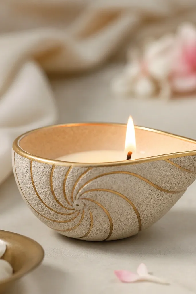
Texture makes diyas feel handmade in a good way. This coconut shell style uses sand texture so the diya looks like it has natural pores, and the painted shell lines guide the eye. It looks great in beach-themed decor and also on earthy tables with terracotta and wood. The gold rim gives you a clean festive highlight without adding heavy decoration. It flatters neutral spaces because the beige tones blend and the shell lines add detail.
Step 1: Paint the diya with beige acrylic and let it dry. Step 2: Mix white glue with fine sand (the kind used for craft) and spread a thin layer over the lower half, avoiding the rim. Step 3: After it dries, paint thin light brown spiral lines to mimic shell ridges, then add a gold line around the rim. Finally, brush off loose sand and seal with clear matte varnish.
Pro tipUse fine craft sand, not beach sand — beach sand has particles that look gritty and uneven.
AvoidDon’t cover the rim texture — it can flake into the flame area.
19. Satin Ribbon Band Diya with Pearl Dot
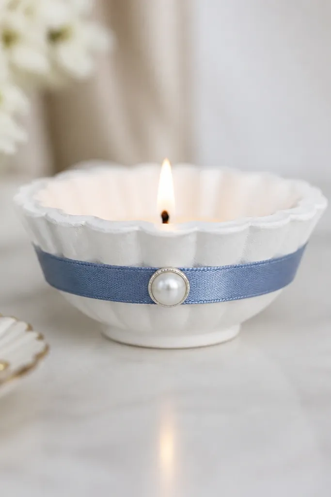
Ribbon makes a diya look dressed up instantly, and satin looks smooth in candlelight. Dusty blue is a calm color that still feels festive when paired with a pearl. I’ve used this for baby showers and winter parties because it reads soft and clean. The pearl dot adds a tiny highlight that makes the whole thing look intentional. It’s also beginner-friendly: the only “design” is the ribbon placement.
Step 1: Paint the diya white and let it dry. Step 2: Wrap a 1 cm wide satin ribbon around the middle and glue the ends at the back so the front stays smooth. Step 3: Place a pearl bead (or small pearl sticker) right at the center front where the ribbon meets. Finally, tie a small knot if you want extra dimension, but keep it flat so the diya sits stable.
Pro tipPress ribbon with a warm iron on low heat through a cloth so it lies smooth.
AvoidDon’t use slippery ribbon without pinning — it shifts and makes the band look crooked.
20. Green and Yellow Marigold Dot Diya
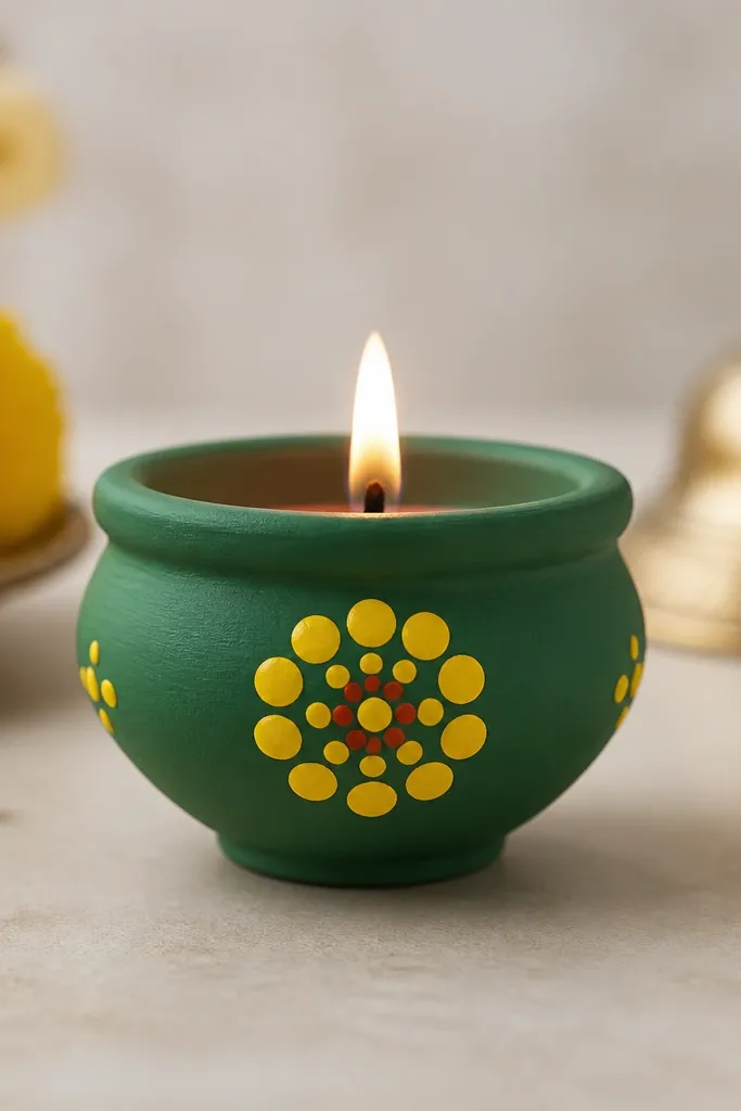
Marigold dot flowers look bright without needing full painting skills. Green is the perfect backdrop because it makes yellow pop and it also feels fresh for daytime decorations. I’ve used this for pooja trays where people want something cheerful but not too busy. The petal dots are consistent, so the diya looks neat even if you’re new to painting. It flatters warm lighting and looks great against dark trays.
Step 1: Paint the diya matte green and let it dry. Step 2: On the front center, paint a small orange dot center first. Step 3: Add 10-12 yellow dots around it to form petals — keep dots evenly spaced like a flower. Step 4: Add tiny red-orange dots inside the center for depth. Seal when fully dry.
Pro tipUse a toothpick for dots and keep your hand steady by resting your wrist on the table.
AvoidDon’t paint the whole diya yellow — the flower needs contrast to look like marigold.
21. Mirror-Work Accent Diya with Sea Glass Look
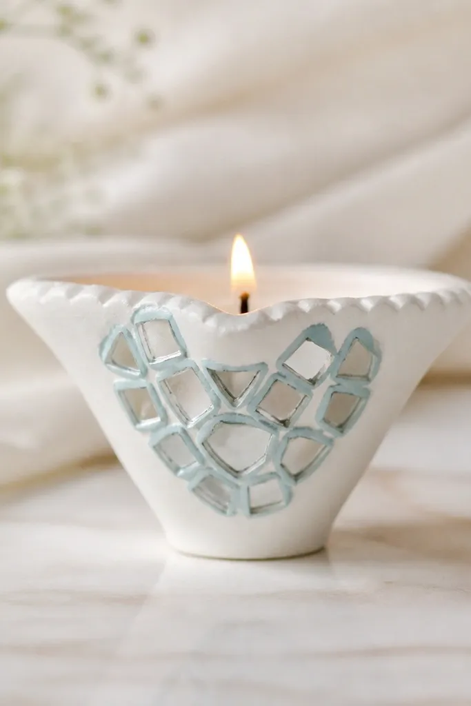
Mirror-work catches flame light and makes diyas sparkle without glitter fallout. I like a white base because it lets the mirror pieces stand out, and the light blue border makes the mirror look like sea glass. This is a great option if you want a clean, modern festive look. It flatters indoor settings because the sparkle is subtle but constant. Beginners can do it if they place mirror pieces in a small cluster rather than covering the whole diya.
Step 1: Paint the diya white and let it dry. Step 2: Pick a small cluster shape, like a heart or leaf, and outline it lightly with light blue paint. Step 3: Apply craft glue within the outline and press small mirror pieces or mirror tiles, starting at the edges. Step 4: Let dry overnight, then seal around the cluster with a thin clear varnish.
Wear gloves when cutting or handling mirror pieces — edges can be sharp.
Don’t glue mirror pieces too near the rim — uneven edges can look messy under flame.
22. Chocolate Brown with Tan Mini Geometric Tiles
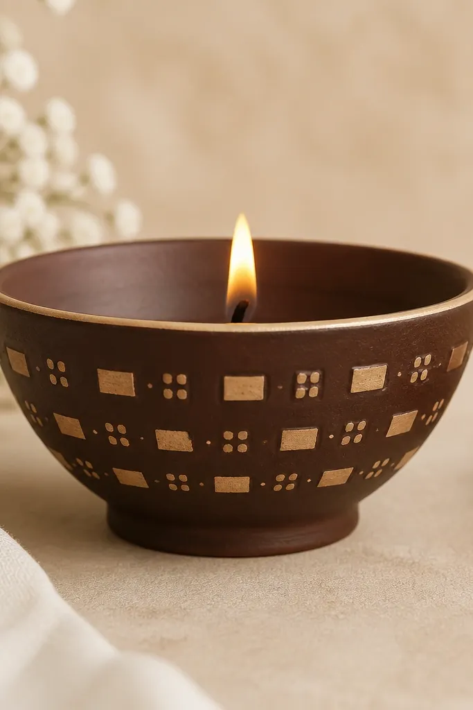
Geometric tile patterns look like miniature decor pieces, not craft projects. Chocolate brown gives depth, and tan shapes look like stone or wood grain under warm light. I like this for winter decor because brown and beige feel cozy. It also flatters people who want something different from red and gold — still festive, but calmer. The design is beginner-friendly because you repeat a simple rectangle shape.
Step 1: Paint the diya chocolate brown and let it dry. Step 2: Use a liner brush to paint a thin beige line around the rim. Step 3: On the front, paint 6-8 tan rectangles arranged like tiles, leaving small gaps between them. Step 4: Add one tan dot in each gap so the pattern looks intentional, not like random blocks. Seal with matte clear coat.
Use painter’s tape to mark rectangle edges if your freehand rectangles wobble.
Don’t make rectangles too big — the diya is small, and large tiles look chunky.
23. White Base with Blue Starry Speckle
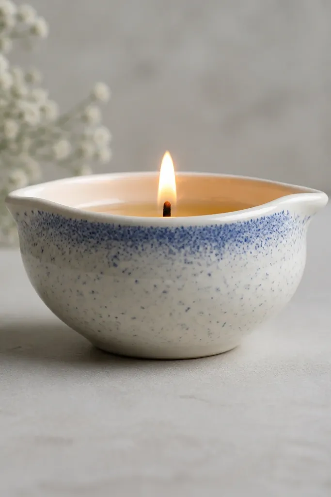
Speckle looks like stars and it’s surprisingly elegant when you keep it subtle. A white base makes the speckles crisp, and different blue shades create a depth effect. I’ve used this for night-time events because it looks like a tiny sky when the flame glows. It flatters minimal decor, and it’s perfect if you want something that doesn’t demand drawing. Beginners like it because speckling is forgiving and quick.
Step 1: Paint the diya white and let it dry. Step 2: Thin two shades of blue acrylic — one medium blue, one deeper navy. Step 3: Load a toothbrush with paint, hold it over the diya, and flick gently with your thumb to create speckles. Step 4: Add a denser speckle cluster near the top rim for a “galaxy” look, then let dry and seal with matte spray.
Practice the flick on paper first so you get the right speckle size.
Don’t overdo the speckles — too many dots make it look dirty.
24. Rose Gold Foil Line Diya
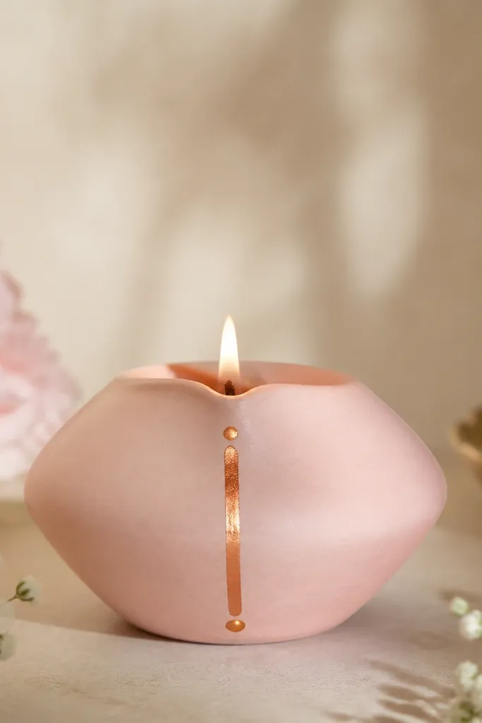
A single rose-gold vertical line makes a diya look tall and sleek. The light pink base keeps it soft, and rose-gold foil adds a warm metallic glow that looks good on festive tables. I like this for gift trays because it looks neat without heavy decoration. It also flatters short diyas because the vertical element stretches the visual. This is one of the easiest “wow” designs because you’re doing one line and a few dots.
Step 1: Paint the diya light pink (a pale rose shade) and let it dry. Step 2: Apply adhesive or craft glue in a straight vertical line on the front, about 1 cm wide. Step 3: Press rose-gold foil over the glued line and smooth with a soft cloth. Step 4: Add small rose-gold dots near the top rim and near the base for balance, then seal lightly.
Pro tipUse a pencil to mark the line position first — foil follows the guideline.
AvoidDon’t press foil too hard — it can crease and look wrinkled.
25. Monochrome Black Rose Diya
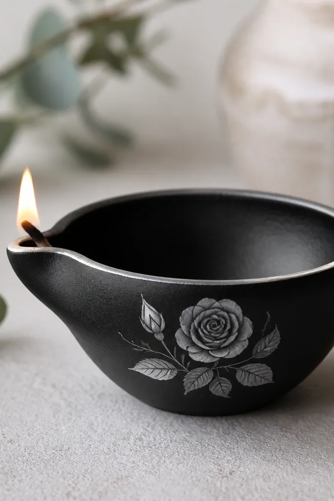
Monochrome designs look high-end because they avoid color chaos. Black plus charcoal and silver reads like luxury stationery, especially under warm diya flame. I’ve made these for people who love modern decor and don’t want bright festive colors on their table. The rose motif gives a focal point, and the silver rim outline keeps it sharp. This design flatters both small and medium diyas because the rose is compact and centered.
Step 1: Paint the diya matte black and let it dry. Step 2: Outline a small rose on the front using a thin pencil, then paint petals with charcoal and add silver highlights on a few petal edges. Step 3: Paint a thin silver line around the rim for a clean border. Step 4: Let everything dry and seal with matte clear spray so the silver doesn’t rub off.
Use a size 0 or 00 liner brush — rose details need a fine tip.
Don’t use glossy black — it reflects light in a way that makes the rose look flat.