
1. Two-Tone Stripe Tote with Tape-Perfect Edges
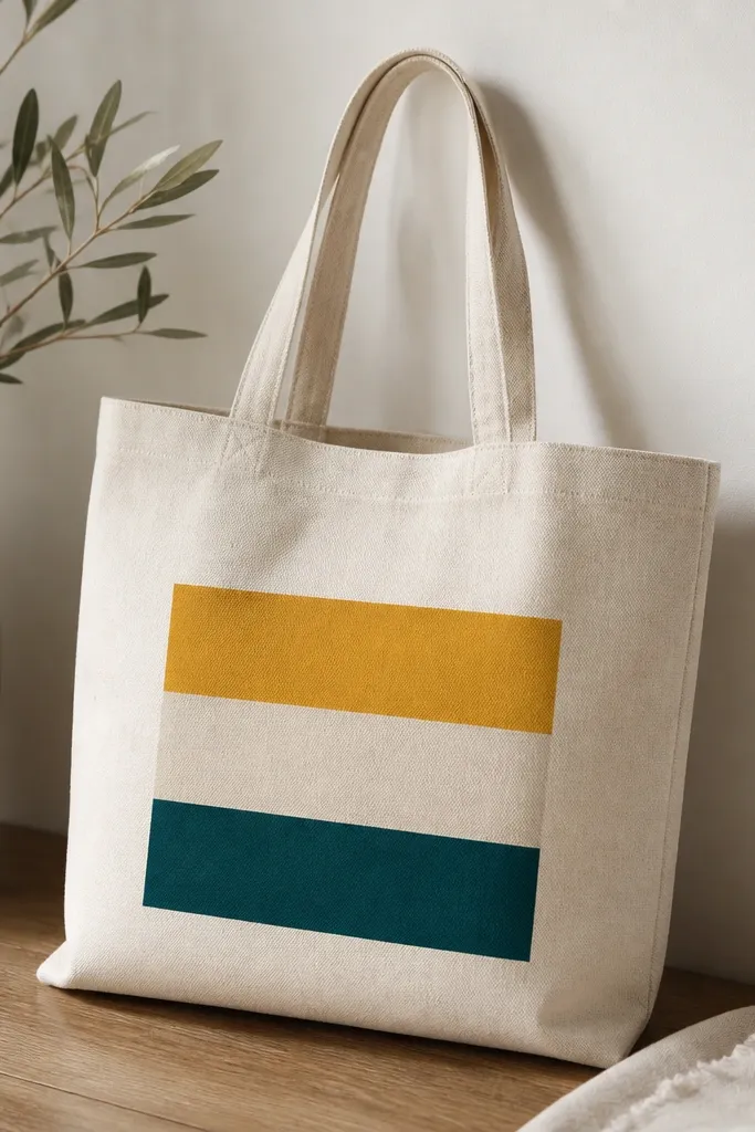
This look flatters most body types because it creates a clean visual line across the bag, and the stripes sit at a natural “sweep” height when you hold it at your side. I like mustard and deep teal because they read warm and cool at the same time, which looks good against lots of skin tones and outfits. Use a mid-height stripe band for everyday wear so it doesn’t crowd the bag’s opening seam. The crisp tape edges also look more expensive than freehand stripes.
Pro tipUse a foam brush for stripes — bristles leave streaks on canvas weave. Keep the paint slightly thicker than you think so it won’t bleed under tape.
Start by ironing the tote so the canvas sits flat. Measure the front panel width and mark three stripe zones with a pencil, then apply painter’s tape along each boundary, pressing down hard with your fingernail. Paint the first stripe with a foam brush, let it dry 10-15 minutes, then paint the second color and third stripe in the same way. Peel the tape while the paint is still slightly tacky, then let the whole tote cure 24 hours. Finally, heat-set if your paint instructions allow it.
AvoidSkipping tape pressure is the fast way to get fuzzy borders that look like a craft fail.
2. Sunburst Centerpiece Tote with Sponge Rays
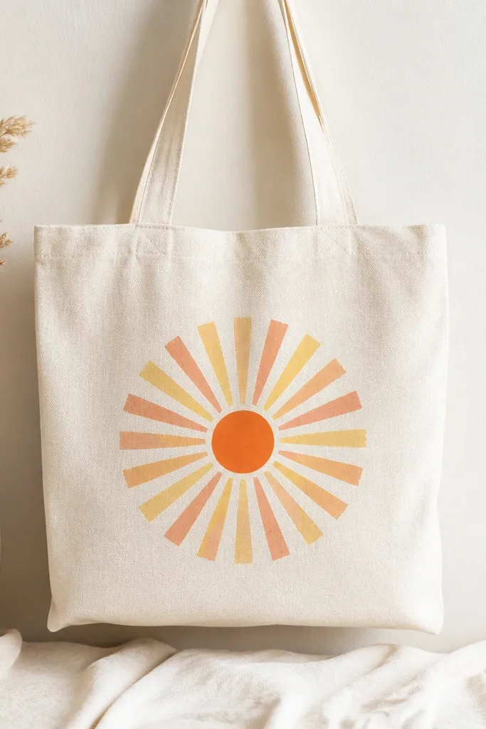
Sunbursts look cheerful without being childish, and the centered placement keeps it balanced on your frame. The warm palette (orange, peach, yellow) looks especially good with neutrals like denim, black pants, or cream dresses. The soft sponge edges make it forgiving, so you don’t need perfect lines. It also hides tiny brush marks because the rays are intentionally blended.
Pro tipPractice the tapping pressure on scrap fabric first; you want visible texture, not big blobs.
Sketch a small circle about 3 inches wide in the center of the tote front, then lightly dab a base of light orange inside. Load a makeup sponge with yellow paint and tap to form rays outward, keeping each ray about 1/2 inch wide. Switch to peach and then terracotta for alternating rays, working from the center out so colors don’t muddy. Let it dry between color changes if you want sharper bands. Add a thin circle outline in a darker orange with a small round brush once the rays are set.
AvoidOverworking the sponge after paint starts drying makes the rays look smeared.
3. Lemon Slice Outline Tote with French-curve Lines
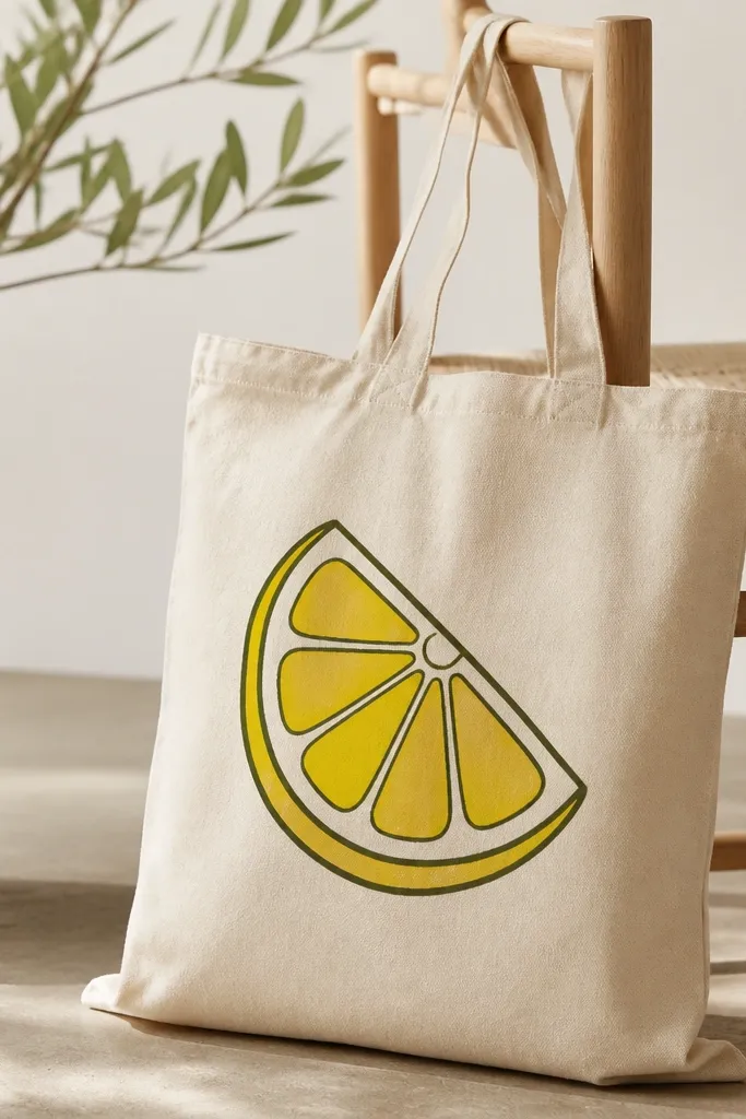
An outline lemon reads crisp and modern, and it looks great with monochrome outfits because the drawing gives your tote a focal point. The dark olive outline keeps the yellow from looking flat, and it flatters anyone who wears earth tones. I’ve used this with both warm and cool skin tones and it always feels balanced. It’s also easy to scale up or down depending on your tote size.
Pro tipUse painter’s tape to mark where your lemon will sit so it doesn’t drift when you move the bag.
Trace a lemon slice shape using a printed template or a simple circle with wedge lines. Outline the rind first in dark olive with a size 2 liner brush, keeping the line thickness consistent. Fill segment areas with bright yellow, leaving thin olive lines as separators so it stays graphic. Add a small off-white highlight dot and a few short rind texture marks. Let it dry, then paint a thin olive border around the lemon if you want extra definition.
AvoidThick paint lines that dry raised can crack when you fold the tote.
4. Watercolor Wash Tote with Bleed-Resistant Edges
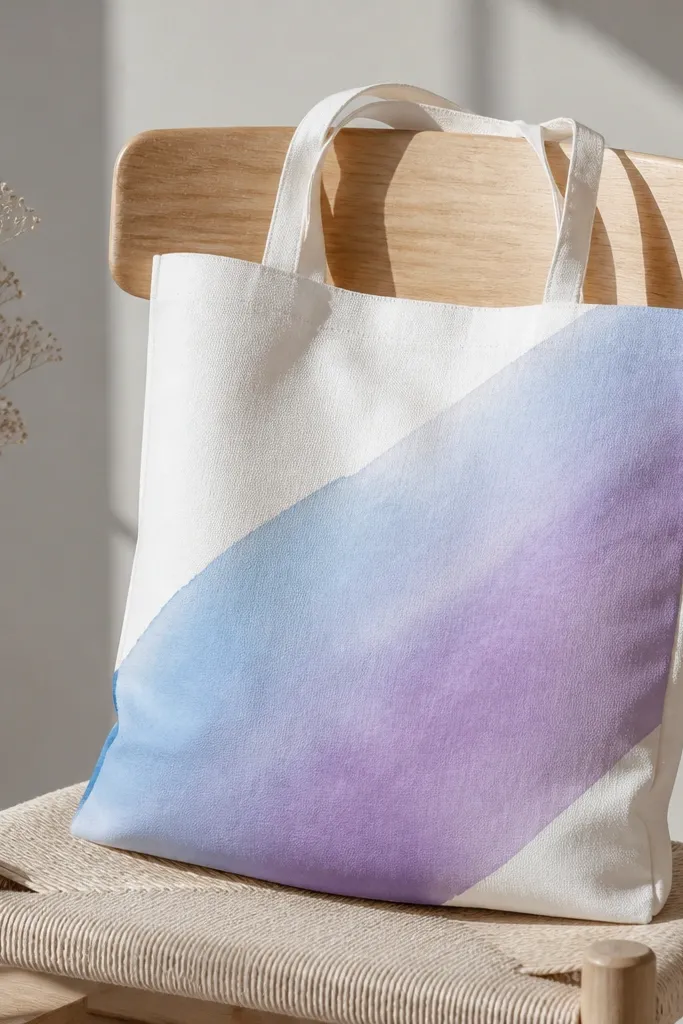
Watercolor washes look airy and flattering because they don’t demand perfect drawing. The diagonal angle makes the bag look more dynamic, and it works well when you wear it crossbody or on your shoulder. Light blues and lavender look especially good with gray, navy, and white outfits. The clean border keeps it from looking messy, even when the wash is soft.
Pro tipUse two brushes: one for water and one for paint so you don’t accidentally dilute your colors.
Tape a rectangle or rounded shape on the tote front using painter’s tape, pressing the edges firmly. Mix paint with fabric medium or fabric paint thinned with water according to your product directions until it looks like tinted milk. Wet the taped area lightly with clean water using a wide brush, then drop in the blue and let it spread. Add lavender at one corner for a gradient effect, then tilt the tote slightly to guide the flow. Remove tape after 5-10 minutes when the paint is set but still soft, then let cure 24 hours.
AvoidPainting over dry, unsealed canvas without thinning — it turns into grainy spots instead of a smooth wash.
5. Retro Checkerboard Tote in Black and Cream
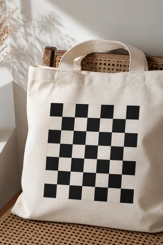
Checkerboards look bold, and they hide small imperfections because the pattern repeats. Black and cream is the most forgiving combo for everyday outfits, and it looks good on anyone because it doesn’t depend on skin tone. The centered grid also makes the tote look structured, even if the bag is soft. If you want a tote that reads “intentional” in photos, this one does it fast.
Pro tipA small metal ruler helps you mark straight grid lines without guessing.
Measure the front panel and decide on square size, like 1.25 inches per square for a medium tote. Draw a grid lightly with pencil, then paint the first row in cream. Use a thin brush to fill black squares, following the grid lines so you don’t have to outline everything. Let each color dry for 20 minutes before painting the next row to prevent smearing. Once finished, add a final thin cream border around the checker area if you want it to look framed.
AvoidSkipping pencil grid marks — freehand checkerboards almost always drift.
6. Botanical Sprig Tote with One-Color Stamping
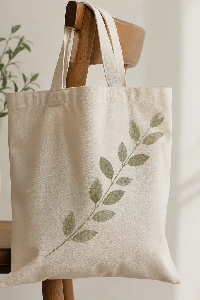
A single botanical sprig looks classy without feeling too formal, and it works with casual outfits like jeans and tees. Sage green is flattering because it sits between yellow and green — it looks good next to warm and cool wardrobes. The diagonal placement makes the tote feel like it has motion. One-color designs also look tidy when you’re not using fancy paint techniques.
Pro tipSeal the stamp edge with tape before painting if foam frays — frayed edges create fuzzy leaf shapes.
Make a DIY leaf stamp using craft foam cut into leaf shapes, or use a purchased leaf stamp. Lightly sketch the stem line diagonally from upper left toward lower right. Stamp leaves along the stem, spacing them about 1 inch apart, and keep the stamp angle consistent. Fill any gaps with a fine brush for extra leaf definition. Once the sprig is dry, add a few tiny dots near the leaves to suggest buds.
AvoidUsing too much paint on the stamp — it floods the canvas and blurs the leaf edges.
7. Abstract Rainbow Arches with Dry-Brush Texture
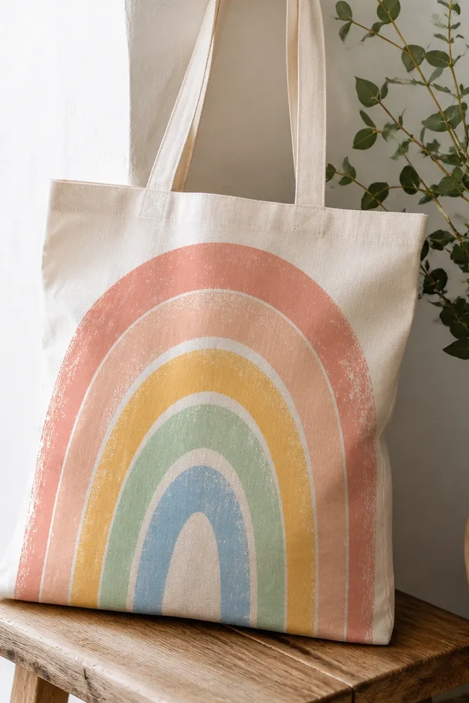
Arch shapes are flattering because they frame the body when the tote hangs from your shoulder. This rainbow palette reads modern when you keep the arches slightly uneven and textured instead of perfectly smooth. It also looks great across many skin tones because the colors are bright but not neon. Dry-brush texture hides small canvas bumps and makes the design feel handmade in a good way.
Pro tipIf your dry-brush looks too light, add a second pass instead of loading more paint at once.
Lightly draw five arch curves across the tote front using a plate or a flexible tape measure as a guide. Load a flat brush with paint, then wipe most of it off on a paper towel so the brush is nearly dry. Paint each arch with light strokes, letting the canvas texture show through. Work from top arch to bottom arch so you don’t smear wet paint. Add a thin white highlight line on the inside edge of each arch after everything dries.
AvoidTrying to make the arches too symmetrical — even slight variation looks more natural.
8. Cat Face Mini Tote Tag Style
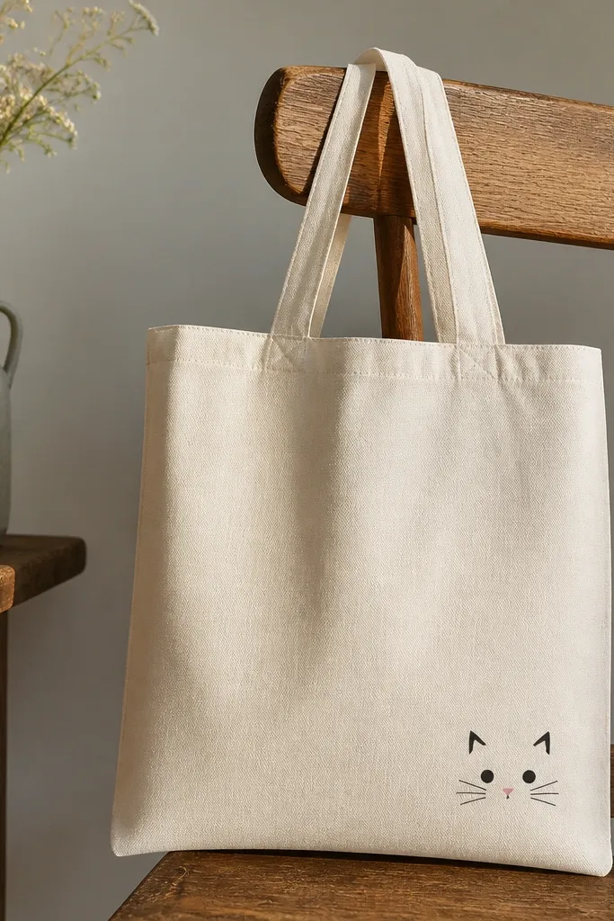
Small, character-style drawings look cute without overwhelming the bag, and they work well if you like minimalist outfits. The black linework with a small pink nose adds contrast that stands out on both light and medium skin tones in photos. Placing it near the bottom right makes it feel like a “tag,” which looks intentional and not like a random doodle. It also reads well from far away because the features are simple.
Pro tipIf your lines wobble, use a ruler edge for whiskers — even 1/8 inch straight lines look clean.
Draw a circle about 2.5 inches wide, then add triangle ears on top. Outline the face in black first, then fill the ears and face with a light gray or warm beige. Paint the nose a tiny dot of dusty pink, then add two short whisker lines on each side. Use a white gel pen or off-white paint to add a small highlight in the eyes. Let it dry fully before adding any extra details so you don’t smear the outline.
AvoidUsing tiny brushes that splay bristles — it makes whiskers look thick and messy.
9. Geometric Triangle Pattern with Fabric-Medium Acrylic
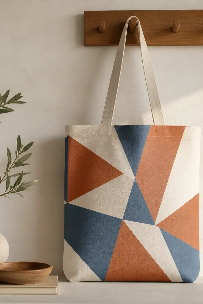
Geometric triangle patterns look modern and pair well with structured outfits because the shapes feel “designed.” Terracotta and muted blue are a friendly combo that doesn’t clash with most wardrobes. The overlapping layout flatters because it keeps your eye moving across the bag instead of getting stuck in one spot. Matte finishes also photograph well and hide small canvas texture.
Pro tipKeep triangle borders thin — thick borders make it look like a kids' craft poster.
Mix acrylic paint with fabric medium until it flows like heavy cream. Sketch a triangle layout on the tote front, leaving small gaps for negative space. Paint the largest triangle first (terracotta), then fill the overlapping shapes (cream and muted blue). Use masking tape for straight edges if you want crisp corners, and remove tape after 10 minutes. Let dry, then outline triangle edges with a thin brush in a darker brown for definition.
AvoidPainting directly from a thick acrylic jar without thinning — it cracks and feels stiff after washing.
10. Polka Dot Grid Tote with Two-Size Dots
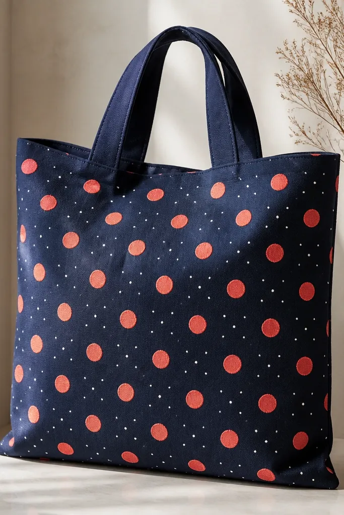
Polka dots make a tote look playful while still feeling organized, especially when you use a grid. Coral and white looks bright next to denim and also pops against darker clothing. The two-size dot trick keeps it from looking childish and adds rhythm. It flatters because the repeating circles pull the eye around the bag without creating hard visual breaks.
Mark a grid with light pencil dots using a ruler, like 1.5 inches between columns and rows. Choose two dot sizes, such as 1/4 inch for small dots and 3/8 inch for big dots. Dip a round sponge applicator or use a dotting tool to paint the dots, starting with the larger dots so you don’t smear them. Let dry between colors, then add the smaller dots in the second color. Once fully dry, check the spacing and add any missing dots.
Use a cotton swab for touch-ups so you don’t disturb surrounding dots.
Trying to paint dots with a brush tip — it leaves ovals and inconsistent edges.
11. Galaxy Night Sky Tote with Star Speckle
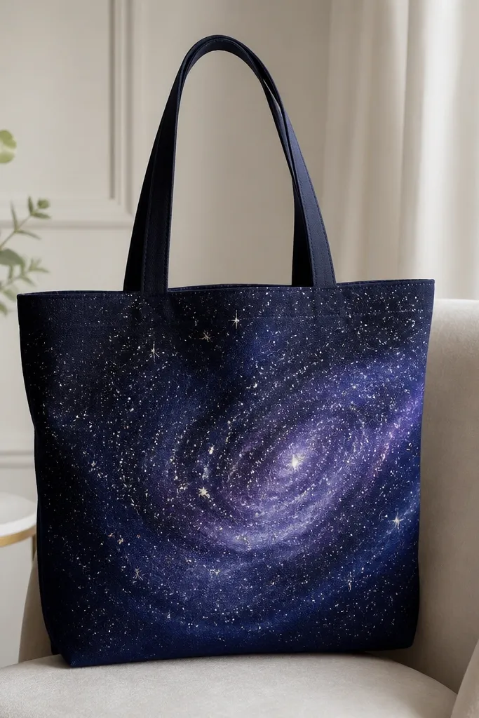
Galaxy designs look amazing because they create depth, even on a plain tote. Indigo and purple read flattering with both warm and cool outfits, and they hide minor brush strokes better than bright colors. I like this for evening events, because the metallic speckles catch light when you walk. If your tote is natural color, you’ll still get the look by painting a deep navy base first.
Pro tipCover the tote opening and strap with plastic wrap so speckle doesn’t land where you don’t want it.
Paint a full base circle or rectangle in deep navy across the tote front and let it dry. Sponge in indigo and purple in circular swirls, then blend slightly by dabbing with a clean sponge. For stars, load an old toothbrush with white and silver paint, then flick over the surface while holding the tote over a scrap box. Add a few larger “star” dots by tapping with a pencil eraser. Let it cure 24 hours, then heat-set if allowed.
AvoidFlicking too close — it makes star splats huge and messy.
12. Cherry Blossom Branch Tote with Fine Liner Leaves
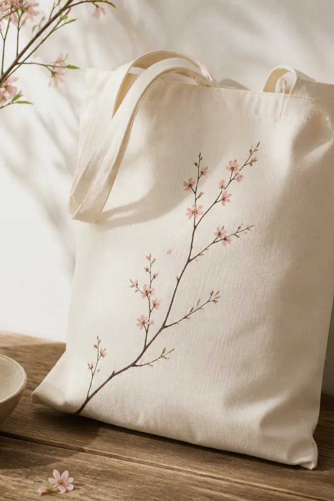
Line art branches look elegant because they don’t take up much space, and they make the bag feel lighter visually. Pink blossoms on natural canvas look good with cream, beige, and denim, and they flatter different skin tones because the pink is soft rather than hot. This design is especially flattering if you wear simple solid tops, because the branch becomes your focal point. The airy spacing also means it won’t look crowded as you carry it.
Pro tipUse a liner brush you trust — cheap bristles fray and ruin the twig line thickness.
Draw a gentle branch curve with a thin liner brush in dark brown, then add small twig offshoots. Paint blossoms by dabbing tiny five-petal shapes in pale pink, leaving small gaps between clusters. Add dot centers in a warm yellow, then add a few tiny leaf marks in sage green. Work from the branch out so you keep the core line clean. Let everything dry, then add a couple of slightly darker pink blossoms for depth.
AvoidCovering the whole tote front — leave breathing room so the line art stays crisp.
13. Monochrome Face Profile with White Highlights
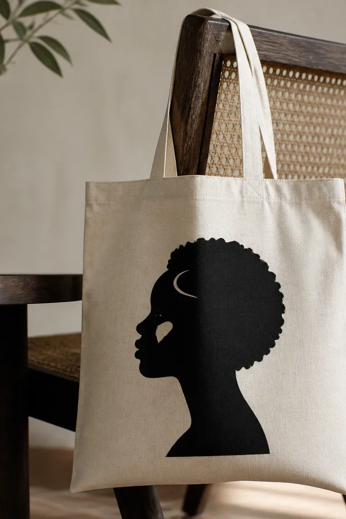
A monochrome face profile looks bold and editorial, and it works well if you like minimal style. Black silhouette against natural canvas is flattering in photos because it creates strong contrast without needing bright colors. White highlights add dimension and keep it from feeling flat. This design also hides small mistakes because the silhouette is meant to be graphic, not painterly.
Pro tipUse masking tape to mark the profile outline if you’re nervous about freehand curves.
Sketch a simple side profile silhouette about 5 inches tall and centered on the tote front. Fill the silhouette with black paint using a flat brush, working from the outline inward. Let it dry completely so you don’t smear edges. Paint two small white highlights: one on the cheek and one along the hairline, using a tiny round brush. Add one thin white line to suggest a collar or shoulder fold if you want extra detail.
AvoidPainting white highlights too large — they look like correction marks instead of highlights.
14. Botanical Border Frame with Tape Outline
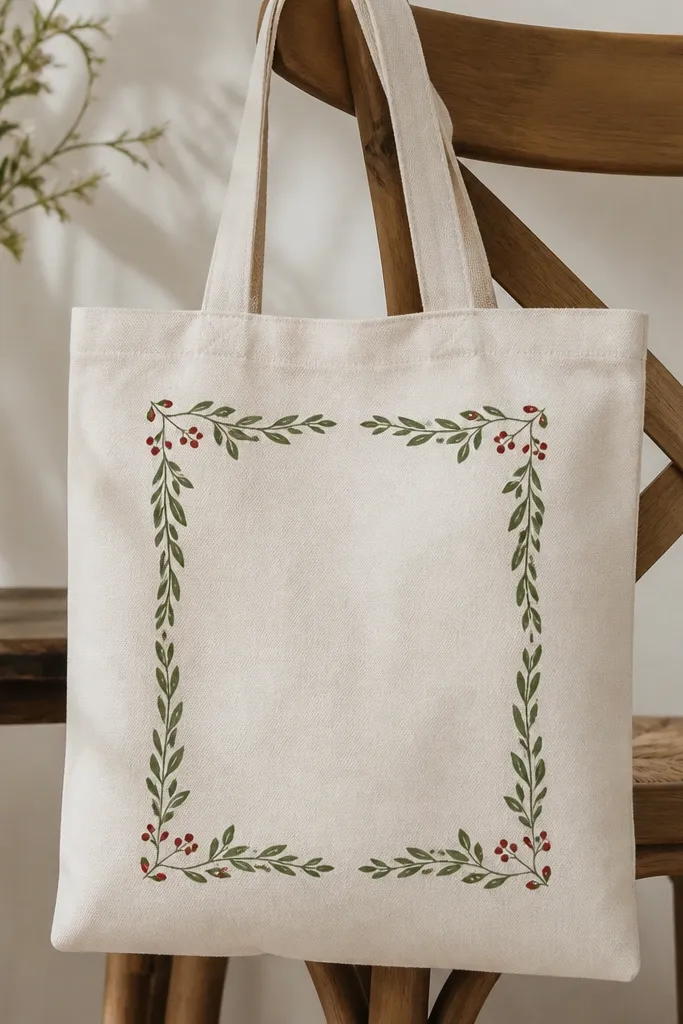
A border frame makes a tote look like printed art because it gives the design structure. It’s flattering because the frame pulls attention to the middle, and the tote stays readable even when it’s packed. I like green and a muted red for berries because it matches lots of seasonal wardrobes. The clean taped corners help this look feel intentional, not doodled.
Pro tipPaint the frame line in two thin coats to avoid drips on canvas texture.
Tape a rectangle frame in the tote center, leaving about 2 inches from the tote edges. Paint the frame line in dark green, then remove tape carefully after it dries slightly. Add small leaf shapes along the top and sides using a leaf stencil or a foam stamp. Paint tiny berry dots in muted red, then add one or two berries near the corners for balance. Let cure fully before you remove any additional masking.
AvoidLetting border paint dry with tape still on it — it can peel and leave ragged edges.
15. Tie-Dye Inspired Ombre Swirl Tote
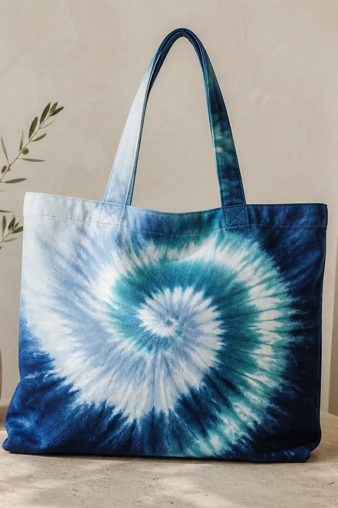
This swirl looks flattering because it gives movement and makes the tote look full even when the bag is empty. Blues feel cool and crisp, and they pair with everything from black leggings to beige shorts. The ombre effect also hides brush marks because the colors blend intentionally. It’s beginner-friendly if you accept that swirls are supposed to look hand-painted.
Pro tipUse a damp sponge, not wet — you want soft blending without muddying the whole swirl.
Lightly draw a small swirl center and outline a loose spiral path. Paint the center with light blue, then blend teal around it while the paint is still slightly wet. Add deep navy on the outer spiral turns, using a wide brush to pull color outward. Use a damp sponge to soften the transitions where colors meet. Let it dry, then add a thin white curve along one spiral edge once it’s stable.
AvoidUsing only one brush and going back over dried sections — it creates hard, chalky lines.
16. Chocolate Drip and Heart Tote (Valentine Without the Cliché)
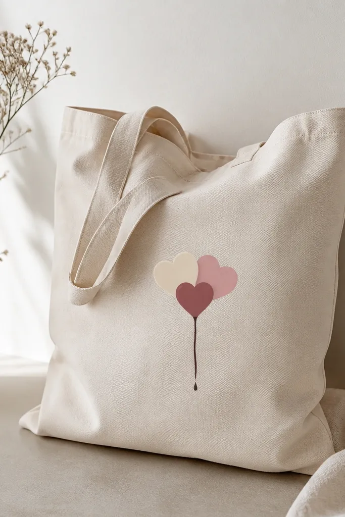
This design works because it’s playful but controlled, and the drip makes it feel handmade instead of printed. Cream and dusty pink hearts look good on natural canvas and pair nicely with warm-toned outfits. The small size keeps it from feeling like a kids' craft, and the drip adds a fun “motion” cue. It flatters because the heart cluster sits high enough to look intentional when the tote hangs.
Pro tipFor drips, gravity is your friend — pull the brush down lightly and let the paint taper.
Sketch three overlapping hearts, about 4 inches across total, and center them on the tote front. Paint the hearts in cream, dusty rose, and pale pink, leaving a little canvas showing between them for separation. Mix a thin chocolate-brown paint and paint a small drip line starting under the lowest heart, with 3-4 drips of different lengths. Add a tiny dot highlight at the end of one drip to suggest gloss. Let cure 24 hours, then heat-set if your paint label allows it.
AvoidThick drip paint — it stays raised and cracks when the tote folds.
17. Gold Foil Leaf Accent Tote with Matte Base
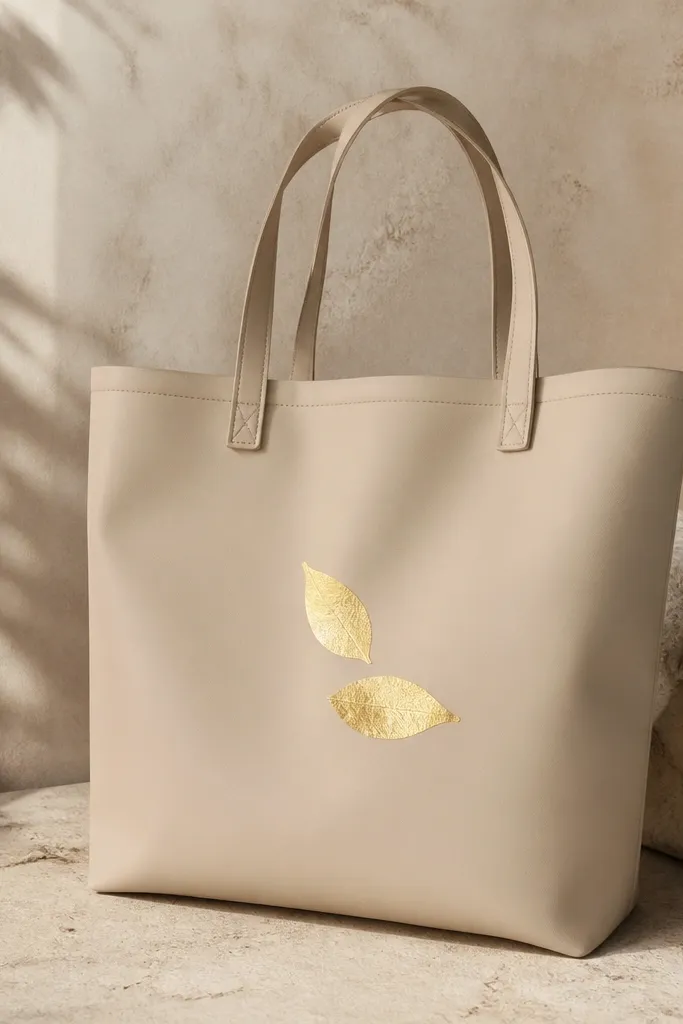
Gold leaf accents look expensive on simple totes, and the matte base keeps the whole thing from feeling too flashy. Warm beige is forgiving and flatters most wardrobes, and it looks especially good with gold jewelry. This is a great option if you want “decor” without lots of color mixing. The leaf shapes also look good on people who prefer clean, minimal art.
Pro tipPractice one leaf on scrap fabric so you know how much adhesive you need.
Paint the tote front with warm beige fabric paint and let dry fully. Use a leaf stencil to trace two leaf outlines in fabric adhesive or foil transfer medium where the gold will go. Apply gold foil carefully, pressing with a soft brush and brushing off excess. Add a thin outline around the leaf in a darker brown so it looks crisp. Let cure, then seal with a fabric-safe matte sealer if your foil system requires it.
AvoidUsing glossy sealer over matte paint — it makes everything look shiny in a cheap way.
18. Marbled Color Block Tote with Plastic Wrap Veins
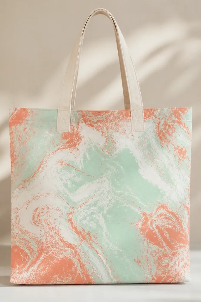
Marbling is flattering because each tote looks slightly different, and the organic veins make it look like you paid for custom art. Mint and coral feel fresh and work with both spring and summer outfits. The marbled block also hides uneven coverage, which makes it forgiving for beginners who still find painting intimidating. It looks great when the tote is carried low or with a simple outfit because the color block is visually interesting.
Pro tipUse thicker paint or fabric medium so the marbling doesn’t sink into the canvas too fast.
Tape a rectangle on the tote front and paint a base layer of white. Drop mint and coral paint into the wet base in small puddles, then immediately press plastic wrap over the rectangle. Twist the plastic wrap gently to pull color into veins, then lift it carefully. Repeat once if you want deeper marbling, then remove tape after 10-15 minutes. Let cure fully before you handle it like normal.
AvoidOver-swirling — too many twists turn marbling into muddy gray.
19. Monogram Initial Tote with Bubble Outline
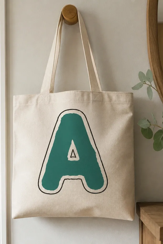
A monogram is the fastest way to make a tote feel personal, and it looks good from a distance because the shape is bold. Teal reads flattering against both warm and cool outfits, and the white bubble outline keeps it from looking too serious. This also works for different body types because the big letter pulls the eye up and balances your silhouette. The bubble outline adds softness without losing structure.
Pro tipIf you’re shaky, print the letter in the size you want, tape it under the tote, and trace the outline through the fabric after you wash and iron it.
Choose a letter and lightly sketch it centered on the tote front, about 7 inches tall. Fill the inside with teal fabric paint using a flat brush, then let dry. Paint a white bubble outline around the letter by going over the edge with a slightly thicker stroke, keeping spacing consistent. Add a thin black line just outside the bubble outline for definition. Let cure 24 hours, then heat-set if your paint allows it.
AvoidSkipping the outer black line — without it, teal and white can blend on canvas.
20. City Skyline Stencil Tote with Night Window Dots
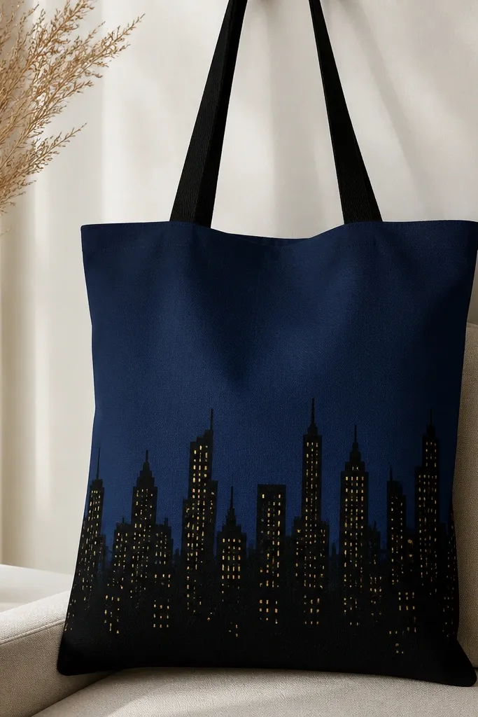
A skyline makes a tote feel grown-up and graphic, and it looks great with denim jackets and sweaters. The navy sky gives depth, while the black skyline keeps the composition grounded. Yellow window dots add warmth and contrast, which flatters most skin tones in photos. The stencil approach also makes it realistic even if your freehand drawing isn’t your strength.
Pro tipHold the stencil in place with low-tack tape so it doesn’t shift mid-stroke.
Paint a deep navy rectangle in the top half of the tote front and let dry. Use a skyline stencil to apply black paint across the bottom third, keeping the stencil flat so edges are sharp. While the black is still slightly tacky, dab tiny yellow dots for windows using a dotting tool or the tip of a cotton swab. Add one or two “taller” buildings by painting extra rectangles beyond the stencil if you want personality. Let it cure and heat-set if allowed.
AvoidDragging a brush over stencil edges — it leaks paint and makes the skyline look blurry.
21. French Stripe with Tiny Stars Accent Tote
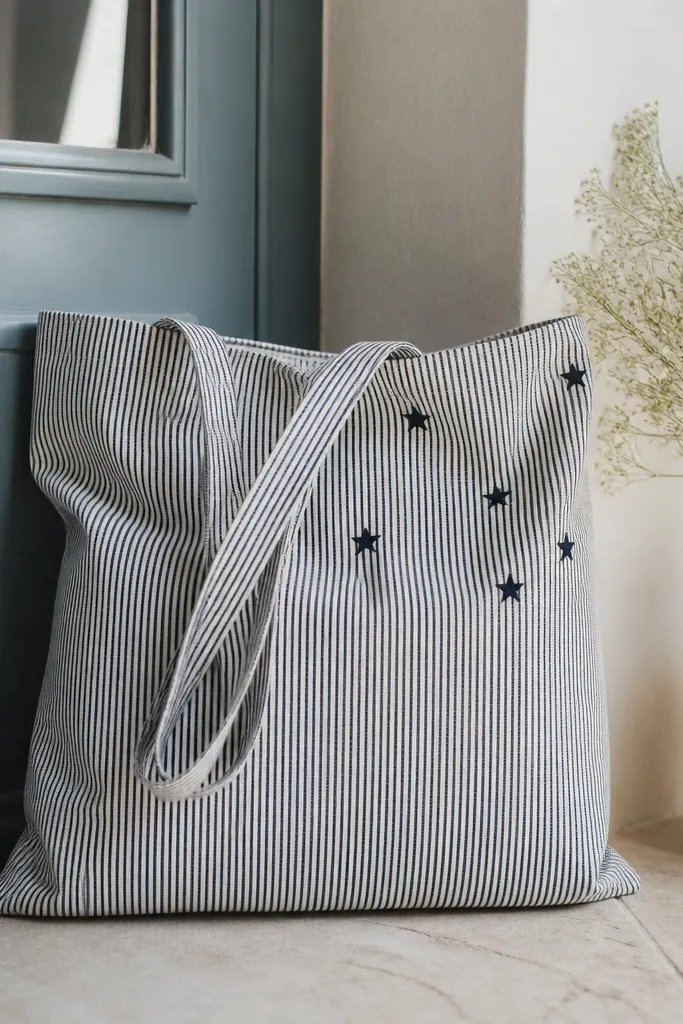
Vertical stripes make a bag look longer and slimmer, which I like when the tote sits against my body. Navy and white also look crisp with everything, and the stars add just enough whimsy without turning it into a theme party bag. This is flattering for people who prefer simpler designs because it reads as clean pattern work. The small stars also hide minor paint texture from canvas.
Mark vertical stripe boundaries with pencil, then tape them using painter’s tape. Paint alternating narrow stripes in navy and leave the other stripes as canvas or paint them white, depending on your starting tote color. Remove tape after 10 minutes so the edges stay sharp. For stars, use a small star stencil and dab with a sponge brush in navy or gold depending on your palette. Let dry fully and cure 24 hours before washing.
Keep stripes the same width — even a 1/8 inch difference shows up fast on tote photos.
Using too-thin paint for stripes — it seeps under tape and makes stripes look uneven.
22. Fabric Paint Marble Flower Tote with Palette Knife Petals
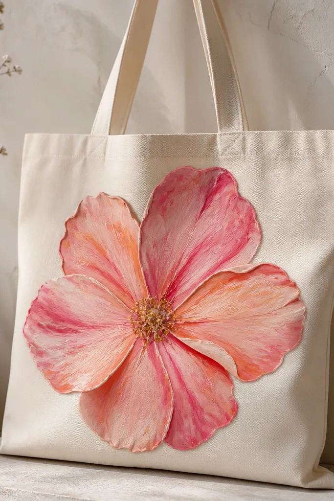
A big flower looks bold and flattering because it gives a clear focal point and makes the tote feel like a wearable artwork. Marbled petals in pink and peach look good against natural canvas and also pair nicely with neutral makeup tones and warm hair colors. The slightly sculpted texture from a palette knife looks handmade and adds dimension when light hits it. If you want “wow” without complicated drawing, this is it.
Sketch a simple flower outline with 8 petals, centered on the tote front. Mix paint with fabric medium until it spreads smoothly. Load two colors at once on a palette knife, then spread a petal shape in a controlled swipe, dragging lightly to create marbling. Repeat for each petal, rotating your palette colors so you get variation. Outline the flower center with a darker pink and add a few small dot highlights.
Use a scrap cardboard under the tote when spreading petals so you don’t glue paint to the back panel.
Overloading the petal with thick paint — it stays tacky too long and can crack.
23. Color-Block Pocket Look Tote with Faux Stitching
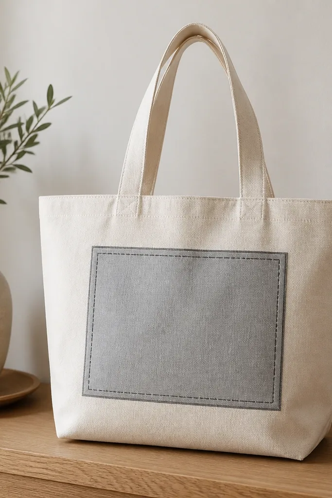
Faux pockets look surprisingly realistic, and they flatter because the rectangle framing adds structure. Light gray with darker gray stitching works with everything from black outfits to denim blues. This design is also great for people who like tidy graphics and don’t want to paint complex art. The dashed stitch lines make it feel like an actual sewn detail, not a flat graphic.
Pro tipUse masking tape only for the pocket outline; skip it for stitching so you don’t get thick tape edges.
Tape a pocket rectangle on the front panel, about 7 x 5 inches, with rounded corners. Paint the pocket fill in light gray, then remove tape after 10 minutes. Paint a border line around the pocket in darker gray using a small flat brush. Add dashed stitching by tapping a toothpick or using a dotting tool along the border, spacing dashes about 1/4 inch apart. Finish by adding two small “pocket opening” lines near the top edge if you want realism.
AvoidMaking dashes too big — it looks like marker art instead of stitched fabric.
24. Neon Outline Flower Tote with Black Base Line
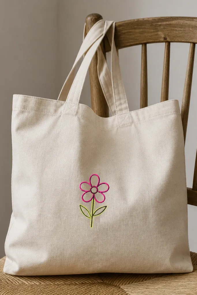
Neon outlines look electric in photos while still staying clean in real life when you use black as the base. The neon pink and yellow are flattering with both warm and cool wardrobes because the black anchors the colors. Keep the flower small and centered so it reads like a design detail, not a poster. This one also works well on natural or off-white totes.
Pro tipNeon paint is thin — do two light coats instead of one thick coat.
Sketch a simple flower with five petals about 4 inches wide. Outline the entire shape first in black paint, then let it dry. Trace the petal outlines with neon pink, then add a neon yellow center circle. Add tiny neon dots around the flower center for pollen. Let cure for 24 hours, then heat-set if allowed.
AvoidSkipping black underlayer — the neon can look weak and chalky on canvas.
25. Dip-Dye Bottom Hem Tote with Paint Drips
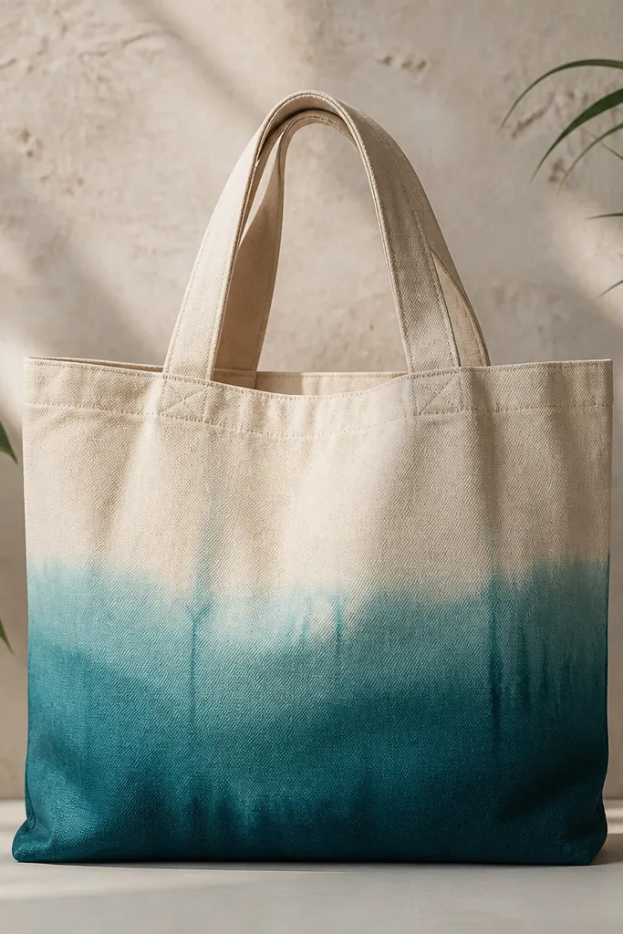
Dip-dye looks flattering because it creates a vertical gradient that visually lengthens the bag. Aqua to teal reads fresh and looks good with white sneakers, denim, and summer dresses. The natural canvas top keeps the tote casual and not overly busy. Drips add character, and you can control how messy you want it by how long you dip.
Pro tipKeep a paper towel under the tote when you lift it so drips don’t pool into one big blob.
Pour thinned teal fabric paint into a shallow tray so the liquid depth is about 1 inch. Tape off the tote top so only the bottom edge gets color, then dip the bottom 2-3 inches into the paint for a light gradient. Lift, let it drip for 10 seconds, then dip slightly deeper for the darker section. Use a small brush to paint a few intentional drips where you want them. Let dry completely and cure 24 hours before washing.
AvoidDipping too deep on the first try — you lose the gradient and it looks like a stain.



