1. Cream + Black Paris Sign on a Stencil
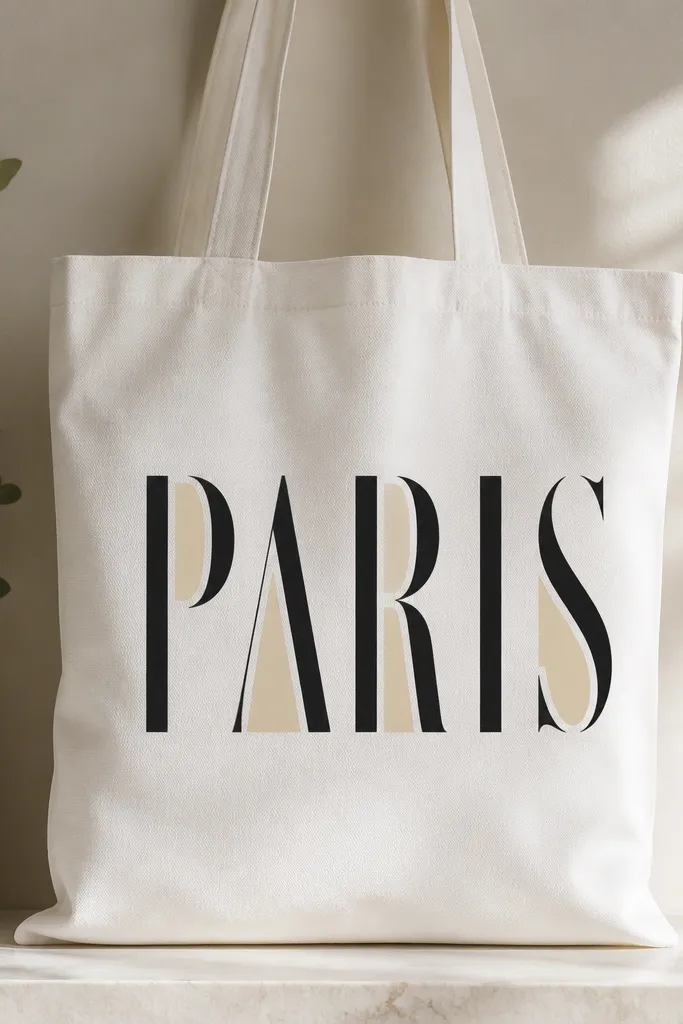
Step 1: Cut a reusable stencil from cardstock or buy a stencil pack, then tape it to the tote front. Lightly brush a fabric primer or thin coat of acrylic medium, let it dry, and then sponge on cream background color. Step 2: Apply black paint with a small foam dabber, not a brush, so the stencil edges stay crisp. Step 3: Remove the stencil while the paint is still slightly tacky for the cleanest lines, then add a thin cream “shadow” pass behind two or three letter strokes with a small flat brush.
Start with a cream base so the tote looks intentional instead of “painted on.” Then stencil black lettering with a medium-weight acrylic so it stays opaque after drying. I like tall serif letters because they frame the tote like a poster, and the black reads sharp even from across the room. The cream shading behind a few letter sections makes it feel designed, not flat. This works especially well on people who wear warm neutrals, because the cream echoes off skin tones and doesn’t clash with gold jewelry.
AvoidDon’t use a watery black wash for text; it spreads into fuzzy edges and looks like marker.
Pro tipThin your paint with acrylic medium until it looks like heavy cream, not milk — that consistency prevents drips.
2. Monochrome Botanical Linework with One Olive Accent
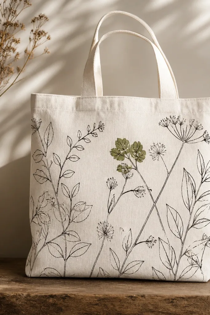
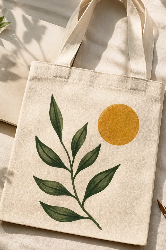
Step 1: Sketch a simple stem arrangement on paper first, then lightly pencil the layout on the tote. Paint the stems and leaf outlines with charcoal using a 10/0 liner brush. Step 2: Choose one leaf cluster and fill only that area with olive paint using a tiny round brush. Finally, add a few short highlight strokes in off-white on the olive leaves to mimic light.
Linework looks expensive when it’s disciplined: one pen-like color for outlines, one small filled area for focus. Charcoal acrylic gives you the “ink” look without the streaks of cheap craft paint. The olive accent makes the design feel styled because your eye lands on the filled leaves first, then travels along the lines. This style flatters almost anyone because it stays neutral, and it also hides small hand tremors by repeating leaf patterns. I’ve used this on totes for weddings and it photographs beautifully in daylight.
AvoidDon’t outline the whole bag in heavy strokes; thick lines make it look like a kid’s craft.
Pro tipUse a scrap paper “test strip” to check if your paint line is too thick before you hit the tote.
3. Terrazzo Speckles with a Glossy Finish
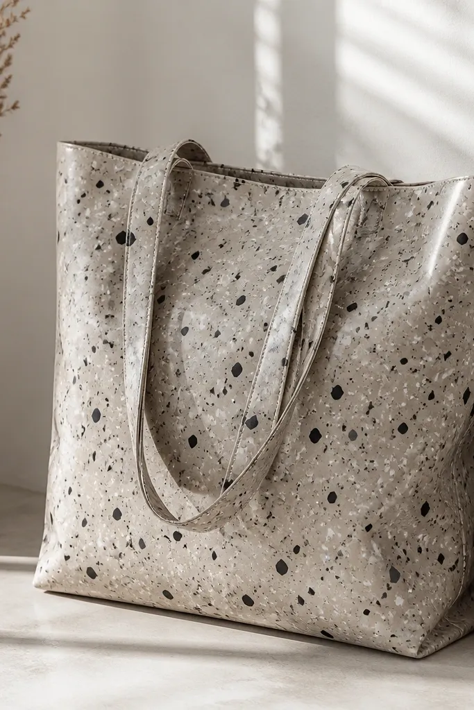
Terrazzo looks pricey because it’s random but controlled. Use a base color that matches your wardrobe, then layer small speckles in 2 to 3 tones. The trick is varying dot sizes so it doesn’t look like a stamp pattern. I also seal with a light gloss medium so the tote surface catches light, like store-bought decor. This looks great on darker outfits and makes the tote feel “designed” even with minimal imagery. It’s also forgiving if your hand shakes, because the texture hides it.
Step 1: Paint the tote base (warm gray or creamy beige works best) and let it dry fully. Step 2: Dip a stiff toothbrush into black acrylic thinned slightly with water or medium, then flick over the tote to create medium dots. Step 3: Switch to a smaller brush for tiny white flecks and add a few larger off-black dots for contrast. Step 4: Seal with a fabric-safe gloss medium in thin coats.
Tape off the handles and bottom edge so your speckles stop cleanly where you want them.
Don’t overdo the speckles until the base disappears; the base is what makes it look like terrazzo, not confetti.
4. Sunset Gradient Arch with Tape-Cut Edges
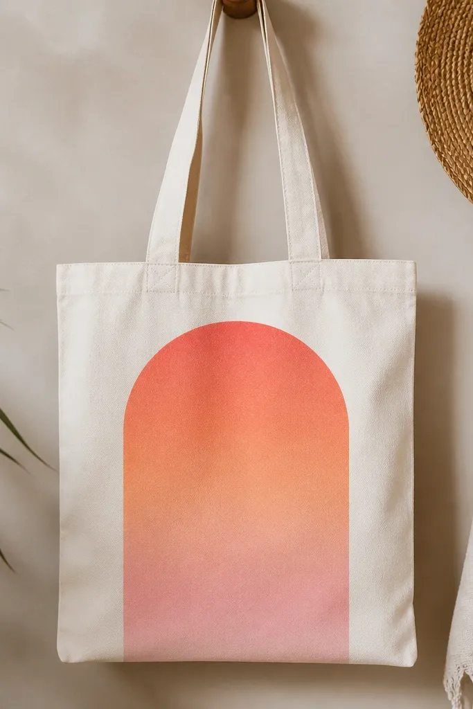
Step 1: Lightly sketch an arch centered on the tote, then cut painter’s tape strips to follow the arch curve. Press the tape firmly so pigment doesn’t creep under it. Step 2: Sponge in the darkest coral at the bottom of the arch, then add peach in the middle, and soft pink at the top, blending with a damp makeup sponge. Step 3: Peel tape after the top color is dry to the touch. Step 4: Add a thin off-white highlight line along the inside edge of the arch.
A gradient looks expensive when it has clean boundaries. I paint big arches because they create a focal frame and look good on tote fronts. Use a tape mask for the arch outline so your color stays inside crisp lines, then blend the gradient by layering semi-transparent paint. Coral, peach, and soft pink read warm and flattering, especially with denim or tan coats. The shape also makes the bag feel “structured,” which is the expensive look — not the paint type.
AvoidDon’t use a single thick coat for the gradient; it dries streaky and looks cheap.
Pro tipBlend while each layer is still slightly tacky so the gradient transitions without a visible line.
5. French Cafe Window with Tiny Curtain Details
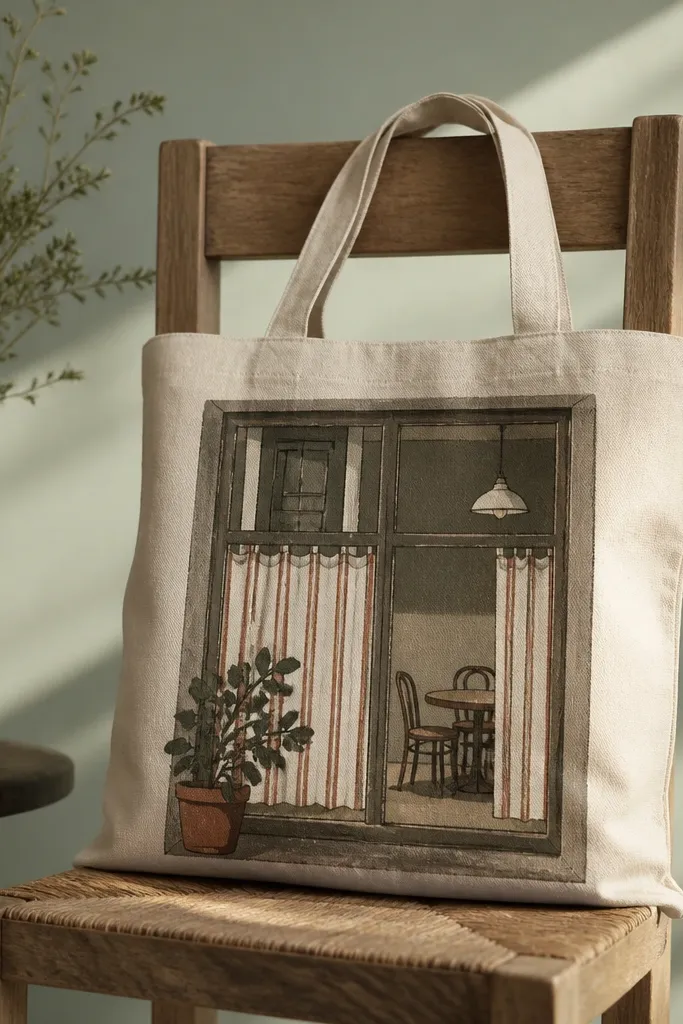
Scenes look expensive when they’re simplified. I paint a single window frame and keep the background minimal, so your tote still reads clean. Muted brown plus cream and rust stripes feel vintage without getting cluttered. The tiny curtain stripes add charm because they’re small, controlled marks, not big blobs. This works for people who like cozy neutrals and want a tote that looks like decor when it hangs on a chair. It also hides imperfect drawing because the frame and stripes give the eye structure.
Step 1: Paint the window frame first using a small angled brush — muted brown with a slightly darker inner edge. Step 2: Add two vertical curtain stripes in cream and rust, leaving thin gaps so the tote fabric shows through for light. Step 3: Paint a simple potted plant base with dark green silhouette at the bottom and one tiny leaf cluster. Step 4: Add a soft gray dot pattern inside the window to suggest light outside.
Dry-brush a tiny bit of white on the window frame edges for a subtle highlight.
Don’t paint full scenery like a postcard; too many elements make tote art look busy and less “premium.”
6. Black Cherry Lips with Glossy Highlight Dot
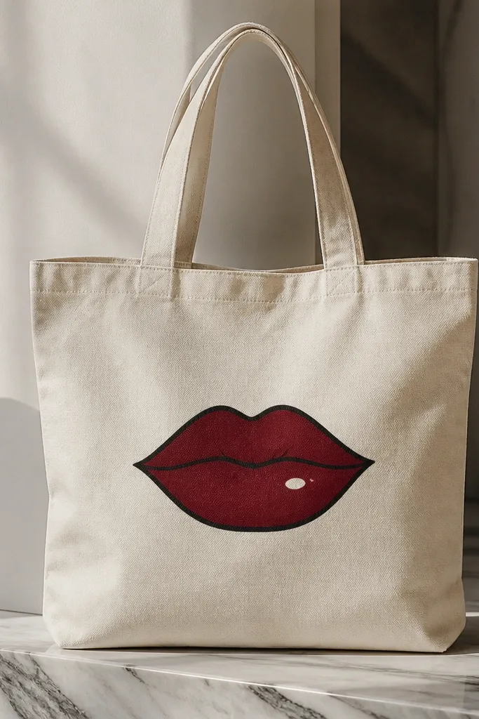
Step 1: Sketch the mouth shape lightly with pencil, then outline with black acrylic using a liner brush. Step 2: Fill the lips with cherry red, leaving a tiny lighter patch near the center for dimension. Step 3: Add a thin darker maroon line at the corners and along the lower lip edge. Step 4: Place one small white dot near the highlight area, then seal with a fabric-safe gloss medium to make it look wet.
Lips look bold and expensive when the shading is simple and the highlight is placed like real light. Use deep cherry red and add a slightly darker ring around the edges, then finish with one tiny white dot on the lower lip. The black outline makes it pop and keeps the design crisp on tote fabric. This style flatters almost every skin tone and looks especially good with gold hoop earrings and red nail polish. It also photographs well because the glossy dot catches phone flash.
AvoidDon’t blend the highlight into the paint; keep the white dot sharp so it reads like gloss.
Pro tipPractice the lip shape on paper with the same brush size before you paint the tote.
7. Art Deco Geometric Panel in Gold + Ink Black
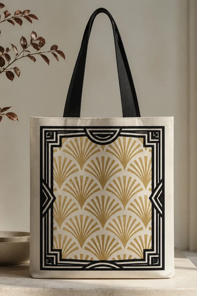
Step 1: Tape a rectangle frame on the tote front using painter’s tape, then paint the inner area black. Step 2: Use a ruler to map fan shapes inside the rectangle, then paint gold triangles and half-circles with a flat brush. Step 3: Add thin black line details with a liner brush, matching the width of your thick lines. Step 4: Let it dry, then remove tape slowly to avoid tearing the paint edge.
Art deco looks expensive because it’s strict symmetry and clean line weight. Thick ink-black lines with gold accents mimic vintage posters and signage. Use a metallic gold acrylic that dries with a slight sheen so it looks like foil under daylight. The panel format — centered and framed — makes the tote feel like a wall print you can carry. This works great if you like statement accessories because the design holds its own without needing extra colors. It also hides small brush imperfections because the geometry is repetitive.
AvoidDon’t freehand straight lines; wobbly geometry screams “handmade,” not “designed.”
Pro tipIf gold looks patchy, add a second thin coat after 10 minutes instead of one heavy coat.
8. Botanical Watercolor Washes with Salt Texture
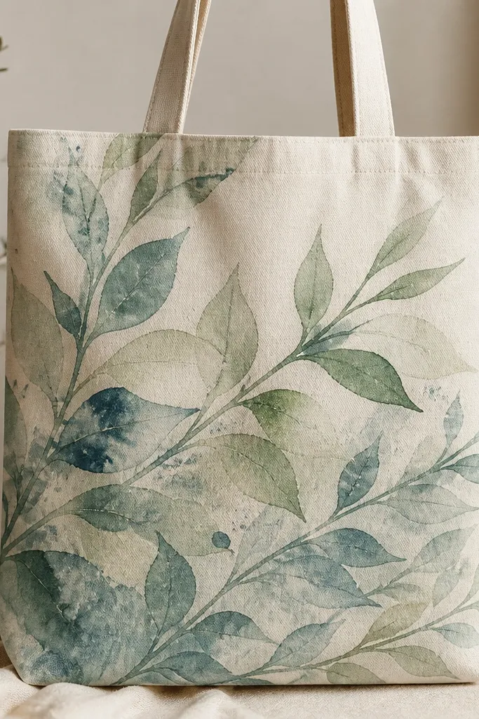
Step 1: Lightly pencil a simple leaf cluster in one corner, then wet the area with clean water using a soft brush. Step 2: Drop in diluted teal and sage paint, then while it’s still wet, sprinkle coarse salt on the darker areas. Step 3: After 10-15 minutes, brush off the salt and let the paint dry fully. Step 4: Add a few thin stem lines in dark green for structure.
Watercolor-style painting looks expensive when the texture is intentional. I use diluted acrylic (or watercolor fabric paint) for translucent leaf washes, then add salt granules so you get natural speckles that look like paper bloom. Muted teal and sage keep it calm and classy, and the lightness of the wash lets the tote color contribute. This is one of the best styles for beginners because the “mistakes” blend into texture. It also looks great for spring outfits and casual weekend bags.
AvoidDon’t over-saturate the whole tote; keep the wash area small so it stays airy.
Pro tipUse coarse salt, not table salt — the larger grains create bigger speckle marks that read as texture.
9. Monogram with Shadow Offset Behind Letters
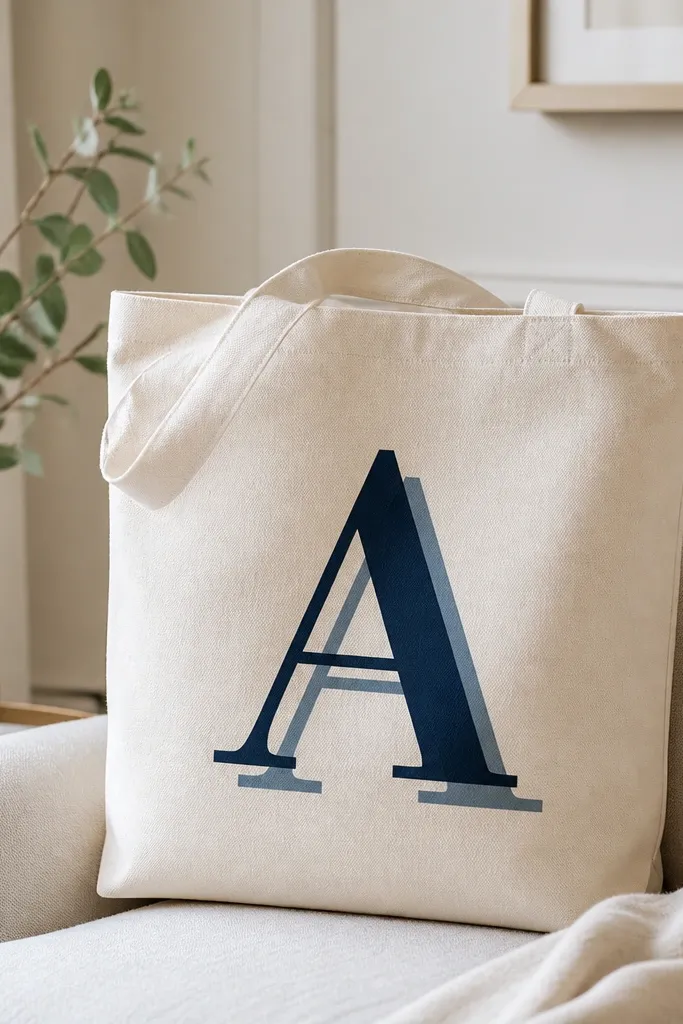
A monogram looks expensive when it has depth. The offset shadow gives the letter a poster-like 3D effect, even though it’s just paint layers. Deep navy is my go-to because it reads classy on cream totes and doesn’t look childish. The shadow color should be a half-tone lighter than the main letter so it stays subtle. This style looks good on totes you use daily because it’s readable, clean, and doesn’t require background clutter. It also flatters people with cooler wardrobes since navy works with silver jewelry.
Step 1: Choose one letter (single letter, not a full name) and use a stencil or printed font as a guide. Paint the shadow first in lighter navy at a slight offset down-right. Step 2: Once dry, paint the main letter in deep navy on top, filling edges carefully. Step 3: Add a thin off-white highlight line along one side of the letter to mimic light. Step 4: Let it cure for a day before heavy use.
If you freehand, draw the letter on paper first and use transfer paper so your curves stay smooth.
Don’t use the same exact shade for shadow and letter; it looks flat and cheap.
10. Portrait Silhouette in Soft Gray with One Black Bow
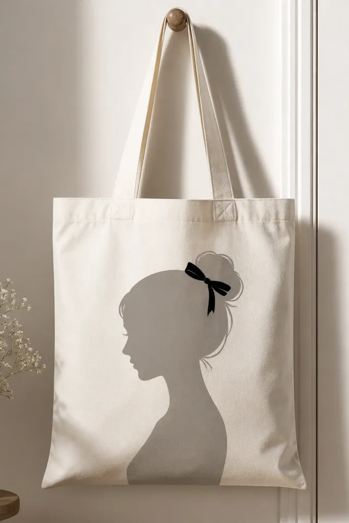
Silhouettes look high-end because the shape does the work. Soft gray keeps it modern instead of goth, and the single black bow adds a focal point without turning it into a cartoon. I paint silhouettes with a brush that can make smooth curves, then clean edges with a damp cotton swab. This style is flattering because it’s minimal — it doesn’t compete with your outfit, and it looks good in both daylight and evening lighting. It also works for gift totes because it feels personal without needing a detailed face.
Step 1: Print or trace a silhouette template onto transfer paper and position it on the tote. Step 2: Paint the silhouette in soft gray, applying in two thin coats so the fabric doesn’t show through. Step 3: Paint the bow in black and keep it small so it stays elegant. Step 4: Clean the silhouette edge with a cotton swab dipped in water (if acrylic is still workable) or a bit of matching tote-color paint if it has fully dried.
Add a faint off-white highlight along the jawline for a subtle dimensional look.
Don’t add too many facial details; the silhouette should stay clean.
11. Stripey Scarf Effect Using Tape and Fabric Paint
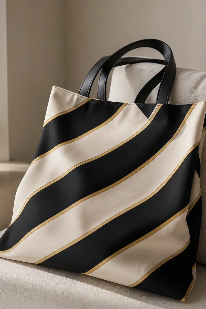
Diagonal stripes look expensive because they create motion and structure. When the stripes are even and the lines are thin, your tote reads like a designer scarf print. I use muted cream and ink black, then add ultra-thin gold lines between stripes to make it feel like jewelry. The scarf-effect placement — across the center — flatters most body shapes because it draws the eye horizontally and keeps the tote looking balanced. It also hides uneven tote fabric since the stripes create a pattern that forgives small texture.
Step 1: Tape off a diagonal band across the tote front using painter’s tape, then paint the first base color (cream) and let it dry. Step 2: Add tape strips for the black stripes, spacing them the same width each time, and paint black in thin coats. Step 3: Remove tape carefully and paint gold lines with a liner brush between the black and cream sections. Step 4: Seal with fabric medium so the stripes stay crisp.
Press tape down with the back of a spoon so paint doesn’t creep under it.
Don’t eyeball stripe widths; uneven spacing makes it look like a student project.
12. Gallery-Style Frame Border with Single Center Motif
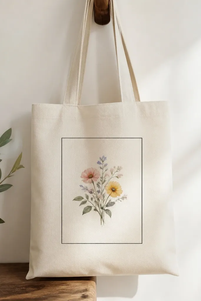
A simple frame makes anything look curated. The key is keeping the border thin and even, then placing one small motif in the center so the composition feels like a print. I use a black border and one watercolor flower cluster in muted pink and sage. The negative space matters; it’s what makes it look expensive instead of crowded. This style works with almost any outfit because it stays neutral and tidy. It also looks great on totes with bold fabric texture since the frame gives the eye a reference point.
Step 1: Measure a margin with a ruler and tape a clean rectangle border on the tote front. Step 2: Paint the border black with a flat brush and remove tape while still slightly tacky. Step 3: Inside the frame, paint a tiny cluster of 3 flowers with diluted pink paint, then add sage leaves. Step 4: Add one thin black stem line and a small off-white highlight on petals.
Use a ruler even if it feels fussy; straight borders are the whole expensive vibe.
Don’t thicken the border; thick outlines look like coloring book pages.
13. High-End Marble Vein Panel in Taupe and White
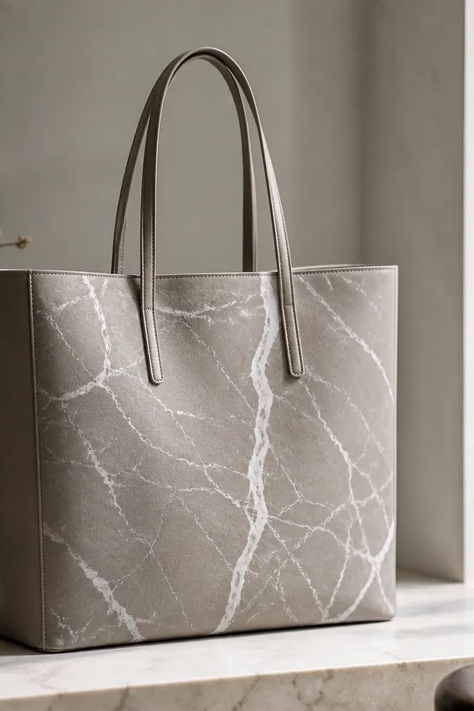
Step 1: Paint a smooth taupe rectangle panel centered on the tote. Use a foam roller or sponge for even coverage, then let it dry. Step 2: Dip a dry liner brush in white paint and drag lightly to create vein lines, then add light gray veins in between. Step 3: Use a damp cotton swab to soften the ends of a few veins so they fade like real stone. Step 4: Seal with a fabric-safe satin medium.
Marble looks expensive because your brain reads it as stone, not paint. The trick is to build a smooth taupe base and then add branching veins with a dry brush — not long wet strokes. Keep the veins thin and varied, with some that fade out, so it doesn’t look like scribbles. Taupe and white look classy on almost every skin tone and wardrobe color, and the panel layout makes the tote look like a design object. It also hides brush marks because stone texture is naturally imperfect.
AvoidDon’t paint veins with full opacity everywhere; flat white veins look fake.
Pro tipIf your veins look too strong, lightly dab with a dry paper towel while paint is still wet.
14. Soft Black Ink Splash with Controlled Drips
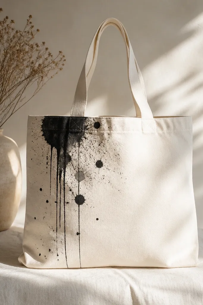
Step 1: Put cardboard inside the tote and cover the handle area with tape so you don’t stain anything. Step 2: Dilute black acrylic with a bit of acrylic medium until it flows like ink. Step 3: Tap a toothbrush to create a few speckles, then tilt the tote slightly and touch a brush to create 2-4 thin drips. Step 4: Let it dry fully, then add a tiny white speck highlight on the splash edge.
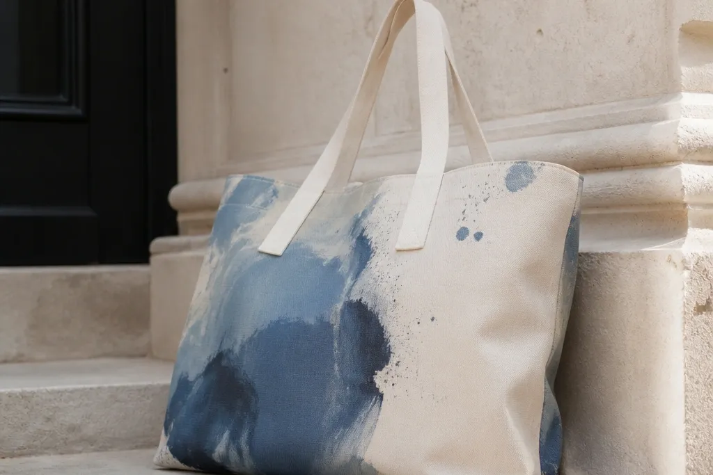
Ink splashes look expensive when the drips are controlled and the splash area is placed with intention. I keep the tote mostly clean and let the splash sit in one corner or along one side seam. Use black acrylic diluted to an ink-like consistency, then flick for dots and use a brush tip to guide a few thin drips. This style reads artsy but still wearable, and it pairs well with monochrome outfits. It also flatters people who prefer minimal designs because it’s bold without being busy.
AvoidDon’t splash all over the tote — it turns into messy street art instead of a styled print.
Pro tipDo a test splash on paper first; the flick strength changes dot size a lot.
15. Raspberry Dot Border with Tiny Pearl Highlights
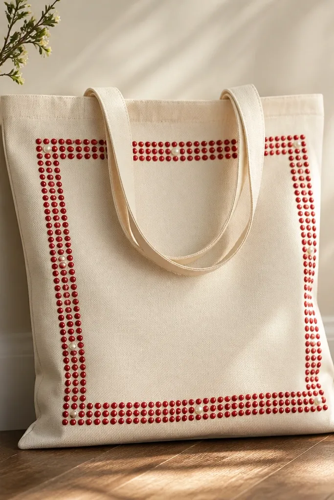
Borders make a tote look finished because they frame the design area. Raspberry dots feel playful, but the pearl-like white highlights make it look like a decorative accessory instead of random dots. I paint the border with a dotting tool so the spacing stays even, then add only a few tiny pearl highlights so it doesn’t get cutesy. This works well if your tote is plain and you want a clean centerpiece that still feels fun. It also looks great for summer because raspberry pops without needing more than one color family.
Step 1: Measure a border area and use painter’s tape to mark a rectangle or rounded rectangle on the tote front. Step 2: Use a dotting tool or the back of a small paintbrush to place raspberry dots along the border, keeping them aligned. Step 3: Remove tape and add tiny white dots on 10-15 of the raspberry dots as highlights. Step 4: Seal carefully with fabric medium to prevent the dots from smearing.
If dots blend, wait 2-3 minutes longer before adding the white highlights.
Don’t overfill the border; too many dots make it look like a pattern printed on fabric instead of painted.
16. Cream Tote with Charcoal "Museum Label" Typography
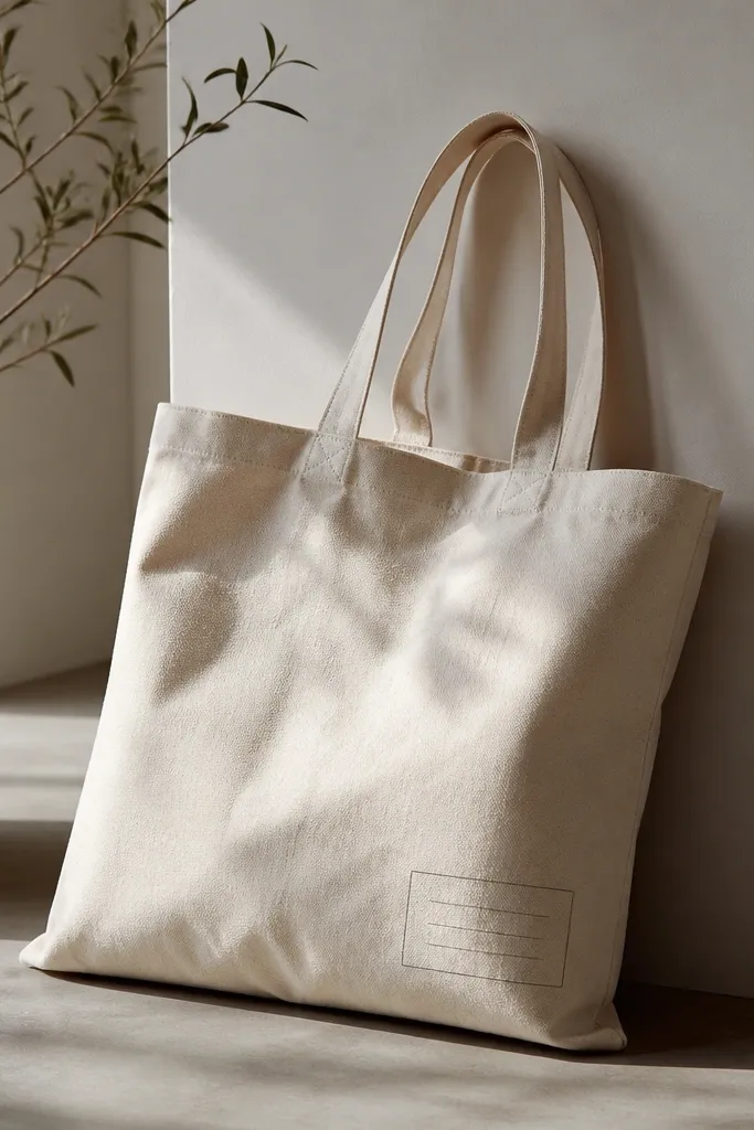
Step 1: Pick a font style that resembles typewriter or serif label text, then print it and trace the letters lightly onto the tote. Step 2: Add a thin rectangle border around the text block with a ruler and painter’s tape. Step 3: Paint the text with charcoal acrylic using a fine liner brush, letting each line dry before the next. Step 4: Add a tiny off-white dot or short line accent next to the “date” line.
Typography looks expensive when it follows layout rules. I use a small “museum label” block: title line bold, artist line smaller, date line smallest. Charcoal on cream feels like ink on paper, and the thin border makes it look intentional. This style flatters because it’s readable and doesn’t cover the whole tote, so the bag still looks clean when carried. It also works for people who want a design that feels grown-up without being loud. You can personalize it with your own phrase too.
AvoidDon’t stretch letters to fit; warped type looks messy and cheap.
Pro tipKeep your text block small — about the size of a postcard corner, not a full page.
17. Peach Abstract Wave with White Cutout Lines
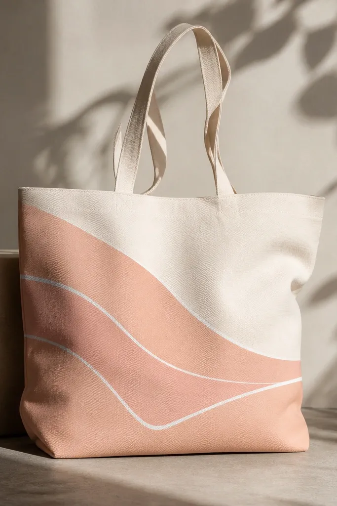
Abstract waves get the expensive look when the lines are sharp and the palette is warm. Peach + cream + off-white is a classy combo, and the white “cutout” lines create a graphic effect that feels like design studio work. I paint the wave first, then use tape or a fine brush to carve narrow white lines so the wave looks layered. This style is flattering because the wave movement makes the tote look dynamic even when it’s flat. It also hides minor unevenness in the tote fabric because the wave shape draws attention.
Step 1: Draw a sweeping wave curve across the tote using pencil, then tape a few narrow strips along where you want the white cutout lines. Step 2: Paint the wave in peach with a flat brush, working from the center outward. Step 3: Remove tape while paint is still tacky so edges stay clean. Step 4: Add a second thin peach shadow under part of the wave with a darker peach tone for depth.
Use painter’s tape for the cutouts; trying to freehand thin white lines looks wobbly fast.
Don’t make the wave too thick; thick waves look like a sticker stuck on fabric.
18. Navy Starry Night with Gold Dot Constellations
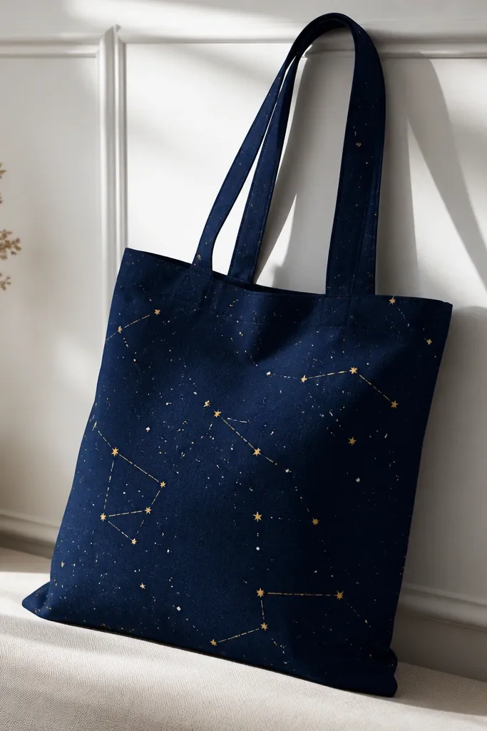
Starry night looks expensive because it has depth — dark base, then tiny points of light. Navy acrylic wash gives you a rich background, while gold dots mimic twinkle and feel festive without being childish. I keep the constellation lines minimal and only connect a few stars, so it stays stylish. This style flatters because it works with cool-toned wardrobes and looks great with silver accessories. It also hides brush streaks because star patterns naturally break up texture.
Step 1: Paint a navy wash over the tote front, then add a slightly lighter navy gradient by dry brushing at the top. Step 2: Dip a toothbrush in watered-down gold acrylic and flick for tiny gold dots. Step 3: Add a few white dots for contrast using a small brush tip. Step 4: Use a fine liner brush to connect 4-6 stars with thin gold lines, then seal with satin medium.
If gold looks too thick, mix it with a bit of acrylic medium instead of water.
Don’t draw long constellation lines; heavy lines kill the twinkle effect.
19. Olive and Bone Geometric Half-Moon Panels
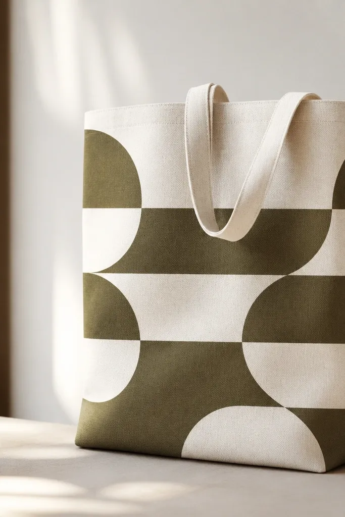
Step 1: Tape half-moon shapes onto the tote front using curved paper templates. Paint the first layer bone, let it dry, and remove tape. Step 2: Tape the next half-moon layer offset slightly and paint olive. Step 3: Add a third tiny half-moon accent in a lighter bone or pale cream. Step 4: Reinforce edges with a thin brush line if any paint crept.
Geometric half-moons look expensive when the shapes are clean and the palette is earthy. Olive and bone are calm, mature colors that pair with almost anything, and the diagonal stacking gives movement. Tape edges matter here — crisp lines are the difference between “craft” and “designed.” This style flatters because it looks balanced and doesn’t overwhelm the tote front. It also photographs well because the matte colors create soft contrast.
AvoidDon’t blend colors together at the edges; clean separation is the whole point.
Pro tipUse paper templates so your half-moon curves stay consistent across layers.
20. Taupe Abstract Face with One-Line Eyes
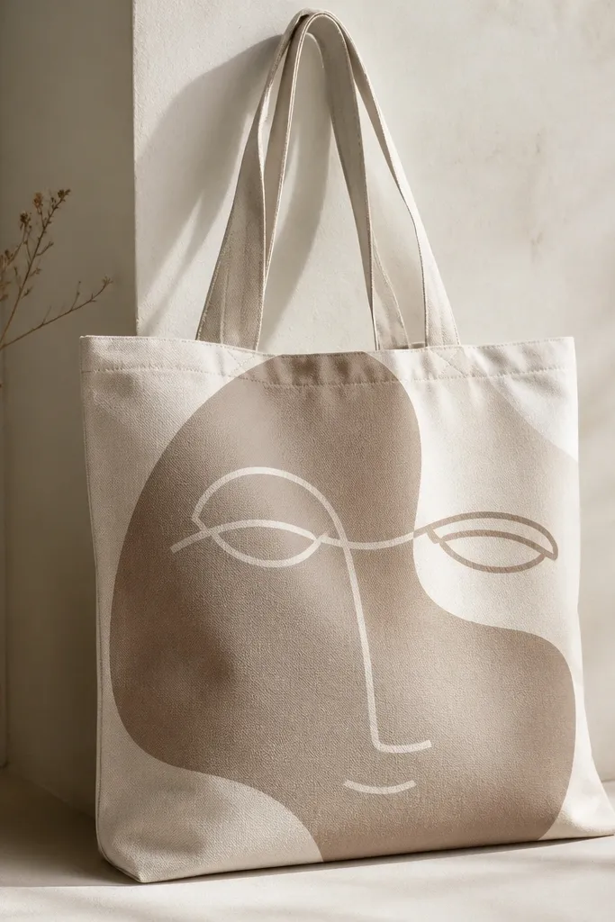
Abstract faces look high-end when the features are minimal and the background stays calm. I paint the face shape in taupe, then draw one-line eyes and a tiny mouth curve in charcoal. The simplicity keeps it from looking like a kids' portrait, and the neutral palette makes it wearable for everyday. This style flatters because it frames your outfit rather than competing with it, and it also works for both warm and cool wardrobes. It’s also forgiving if your line isn’t perfect — the “imperfect” look is part of the vibe.
Step 1: Block in a face silhouette using a flat brush in taupe, centered on the tote. Step 2: Use a liner brush to draw one continuous line for the eyes, then break it for a small nose dot. Step 3: Add a curved mouth in charcoal and a small blush patch in pale rose near one cheek. Step 4: Highlight the forehead and cheek with off-white dry-brushing so the face has shape.
Keep the face bigger than you think — about the size of a paperback cover front panel.
Don’t add full eyebrows and eyelashes; too much detail makes it read as caricature.
21. Gold Foil Look with Acrylic Metallic and Dry Brush
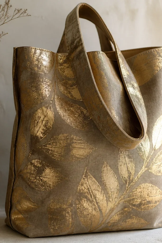
Step 1: Paint a base panel in warm gray or mocha where the gold pattern will sit. Step 2: Lightly sketch leaf veins or a simple branch shape with pencil. Step 3: Dip a dry brush in metallic gold acrylic, wipe most off on a paper towel, then brush over the leaf shape with short strokes. Step 4: Add a second pass in a slightly darker metallic gold for depth, then seal lightly.
You can fake the foil look with metallic acrylic and dry brushing. I start with a muted base color like deep mocha or warm gray, then apply metallic gold in dry brush passes so it looks textured, not painted smooth. Uneven metallic coverage reads like foil because light hits the raised brush texture. This style looks expensive on neutral outfits and adds a “special event” feel without glitter mess. It also flatters because gold reflects warmth and makes the tote look more polished in photos.
AvoidDon’t paint metallic gold like regular paint; thick metallic layers look chunky and cheap.
Pro tipDry-brush in multiple thin passes instead of one heavy coat to avoid streaky blobs.
22. Chalky Pastel Cloud Corners with Soft Edge Blending
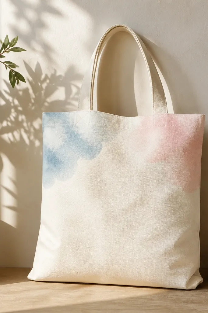
Cloud corners look expensive when the edges fade smoothly. I use chalky pastel tones because they feel airy and editorial, and the fade makes the tote look like it has printed graphics. Light blue and blush are the best combo for a clean, expensive look. Keep the clouds in the corners so the center stays open, which makes the tote feel less busy. This style flatters because it looks gentle and bright on neutral outfits and doesn’t overwhelm smaller frames. It also hides small fabric wrinkles since the soft blending covers texture.
Step 1: Mix acrylic paint with a tiny amount of white and fabric medium to get a chalky opacity. Step 2: Use a sponge to apply the cloud color in corner shapes, then blend edges with a barely damp sponge. Step 3: Add a second cloud layer slightly lighter to create depth. Step 4: Outline only the darkest cloud edge with a thin line of deeper pastel so the clouds stay readable.
Use a makeup sponge, not a brush, for the cloud edges — the sponge gives that soft fade fast.
Don’t outline every cloud bump; too many lines make it look like stickers.
23. Minimal Black and White Portrait Frame Stamp
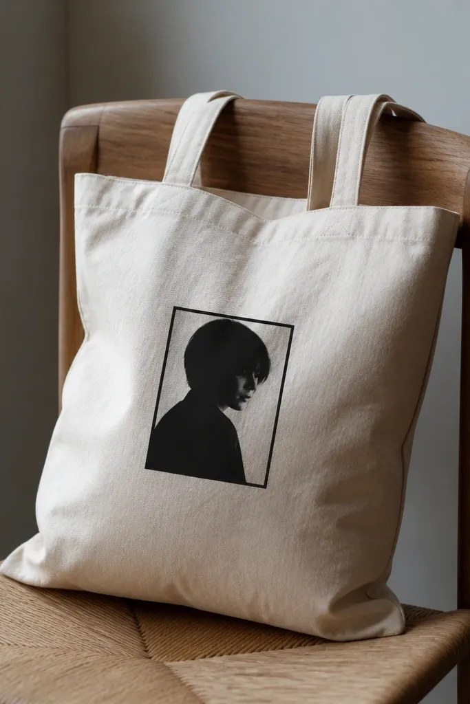
This look comes from making one element feel like a printed piece. I use a monochrome face silhouette inside a thin frame, then keep everything else blank. Black and white reads crisp on fabric, and the frame line makes it feel like museum merch. The design flatters because it stays compact and clean, so it doesn’t fight your outfit. It also looks expensive in motion — when the tote swings, the frame stays sharp while the rest of the tote is calm.
Step 1: Create a stencil of a portrait silhouette or use a cut paper stencil to match your face shape. Step 2: Paint the frame line first in black using painter’s tape for straight edges. Step 3: Fill the silhouette area in black, then add a tiny gray wash for mid-tone if you want more depth. Step 4: Seal and let it cure fully so the frame line stays crisp.
Print your stencil at the exact size you want on the tote, then test on paper first.
Don’t use multiple shades inside the portrait if you’re rushing; it turns into muddy gray fast.
24. Striped Candle Label with Faux Paper Texture
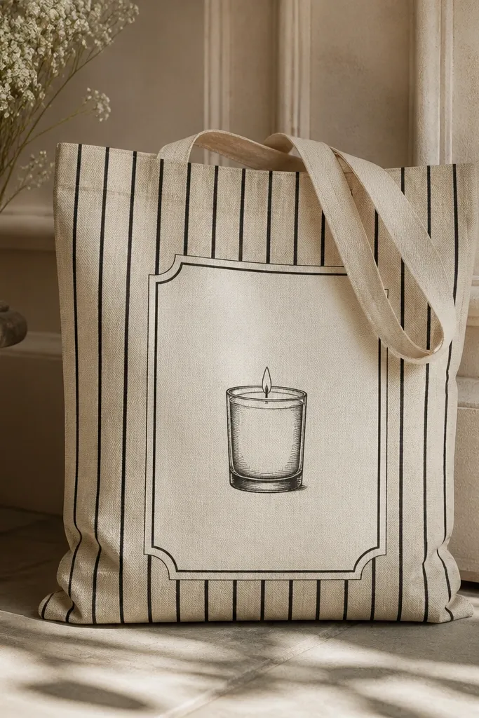
Step 1: Paint a label rectangle area on the tote in off-white, then lightly stipple a thin layer of beige over it for texture. Step 2: Tape thin vertical stripes across the label and paint alternating black and off-white bands. Step 3: Paint a small candle icon in black near the top, then add a tiny flame in warm gold. Step 4: Add a thin black border around the label and seal.
Label art looks expensive because it mimics packaging. Vertical stripes plus a tiny icon reads like a product label, not random decoration. I add faux paper texture by stippling a slightly different shade over the base so it looks like printed paper. The cream and black combo is classic and works with almost any outfit, and it’s easy to scale up or down. This style flatters because it’s tidy and keeps the center area organized. It’s also a great way to personalize gifts without painting a whole scene.
AvoidDon’t make the label too large; packaging scale is what makes it feel store-bought.
Pro tipStipple with a toothbrush for paper texture — keep it light so it doesn’t look like pitting.
25. Mint Green Line Art Frame with White Space
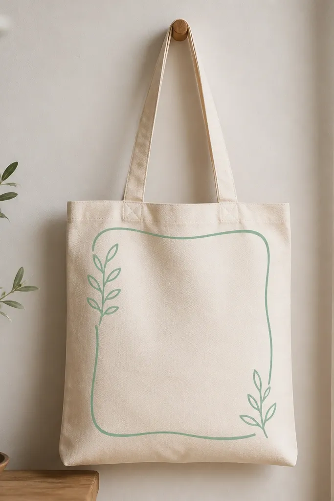
Line art with lots of white space looks expensive because it looks breathable. Mint green is fresh without screaming, and it pairs nicely with cream totes and light denim. I draw a thin frame by hand, then add a few tiny leaf doodles inside — just enough to look intentional. The key is using a liner brush and keeping your lines consistent in thickness. This style flatters because it doesn’t add visual weight, so it looks good on smaller totes and on people who prefer minimal accessories. It also stays stylish even if the tote gets scuffed in daily use.
Step 1: Lightly pencil a rectangle or rounded frame on the tote front, leaving a wide margin around it. Step 2: Paint the frame with mint green using a 10/0 liner brush, going slow and letting the paint flow. Step 3: Add 3-5 small leaf doodles in the same mint, spaced evenly. Step 4: Let it dry and add one tiny off-white highlight dot inside one leaf for dimension.
If your line breaks, reload the brush and continue from the break — don’t try to cover it with a blob.
Don’t overpaint the leaves; too many details make it look like a coloring page.