1. Terracotta Jar Trio With Off-White Dry-Brush
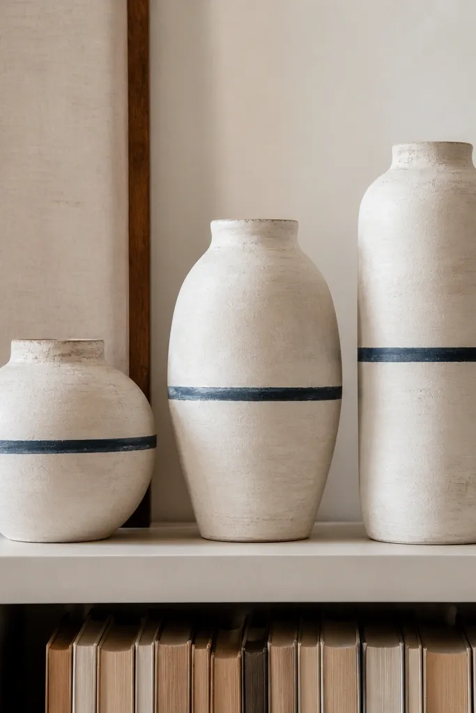
This one works because terracotta already has warmth, and the off-white dry-brush makes the curves look dimensional instead of flat. I use three jars in sizes around 4 inches, 6 inches, and 8 inches tall, so they create a vertical rhythm on a slim shelf. The ink-blue band gives a clean line that reads “intentional” from across the room. It looks best when your room has wood tones or beige walls, because the warm terracotta and creamy paint blend without turning orange. If your space has lots of dark furniture, the off-white highlights brighten it without looking stark.
Start by sanding the jar surfaces lightly so the paint sticks, then wipe with a damp cloth and let dry. Paint the jars with off-white using a foam roller or a small brush, and let the first coat dry before a second coat. Once dry, load a dry brush with a tiny bit of off-white and drag lightly over the raised areas to create highlights. Finish by masking a thin 1/4-inch ink-blue band with painter’s tape, then seal everything with a matte or satin clear coat.
Pro tipUse a makeup sponge to dab the dry-brush effect on the bottom third so the jar looks naturally aged instead of streaky.
AvoidDon’t overwork the dry-brush — if you keep going until it’s uniform, you lose the textured look that makes it feel handmade.
2. Mini Arched Shelf Backdrop With Two-Tone Stencil
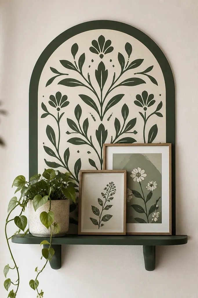
A small painted backdrop behind decor makes everything look curated because it gives your items a consistent “stage.” The arched shape frames a plant and visually lifts it, which matters in small spaces where everything sits too low. I paint the panel cream, then use deep green for the stencil so it looks sharp even under dim lighting. This style looks great if your decor leans neutral — it adds shape without adding clutter. For rooms with pale walls, the green stencil adds contrast without making the shelf area feel heavy.
Measure the back panel area behind your shelf and cut a scrap of plywood or MDF, leaving a 1/8-inch gap for snug placement. Paint the entire panel cream and let it cure long enough that your stencil edges don’t smear. Apply painter’s tape around the arch outline, then stencil a repeating motif using deep green paint and a stencil brush or sponge. Peel the tape while the paint is slightly tacky so edges stay crisp. Mount the panel behind the shelf with double-sided foam tape for a clean look.
Pro tipPress your stencil with a scrap cloth between dabs — you’ll get solid paint coverage without bleed.
AvoidSkip cheap craft paint for stencils; it often seeps under the stencil and makes the pattern look fuzzy.
3. Painted Cork Coasters in a Grid Pattern
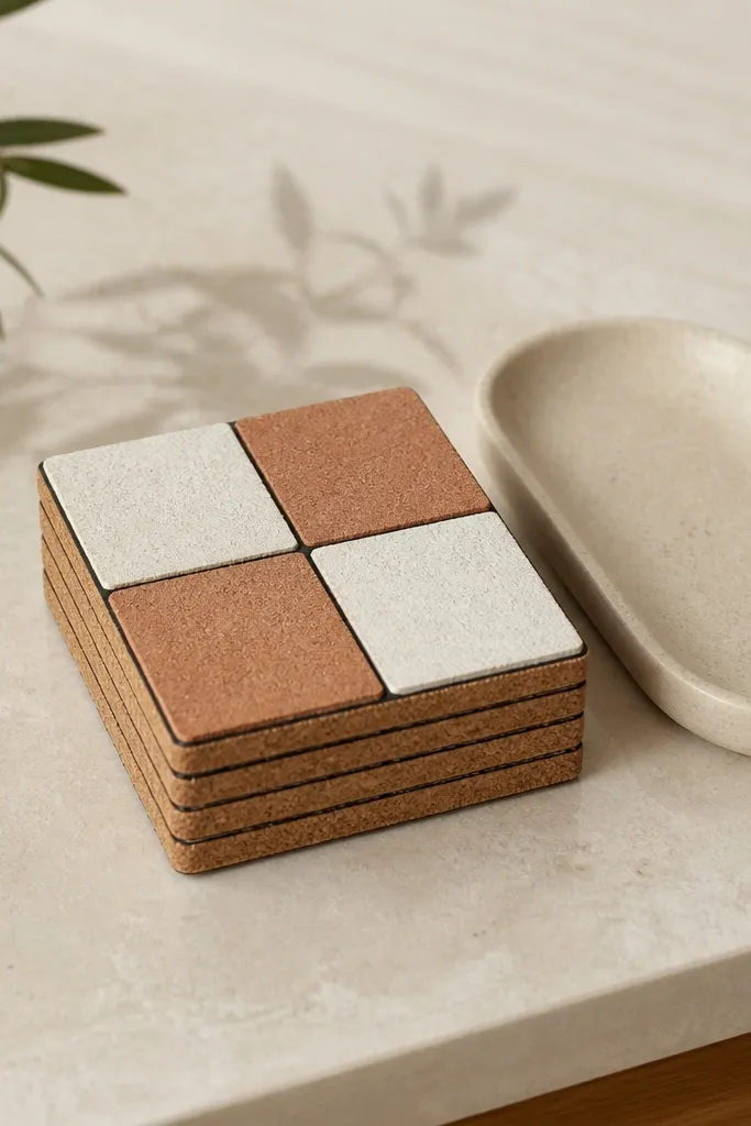
Coasters are small, but painting them changes the whole vibe because they’re visible every day. The grid pattern looks tidy and calm, and the thin black lines make the colors read “designed” instead of random. I like eggshell white paired with muted clay (a terracotta-red brown) for a warm aesthetic that doesn’t feel loud. This works for anyone who has a small coffee corner and wants it to look styled without hanging anything. It also flatters darker wood tables because the light squares pop.
Start by cleaning cork coasters and letting them dry fully. Paint the base squares in eggshell white and clay using a small foam brush for even coverage. Use painter’s tape to mask a straight grid, then paint the black lines with a fine brush. After the paint dries, seal with a clear water-based topcoat in satin so drinks don’t ruin the finish. Let the sealed coasters cure overnight before stacking.
If your black lines look shaky, tape the line first, then run the brush in one slow pass only.
Don’t skip sealing — unsealed paint on coasters chips fast, especially with hot mugs.
4. Narrow Entry Tray With Faux Enamel Edges
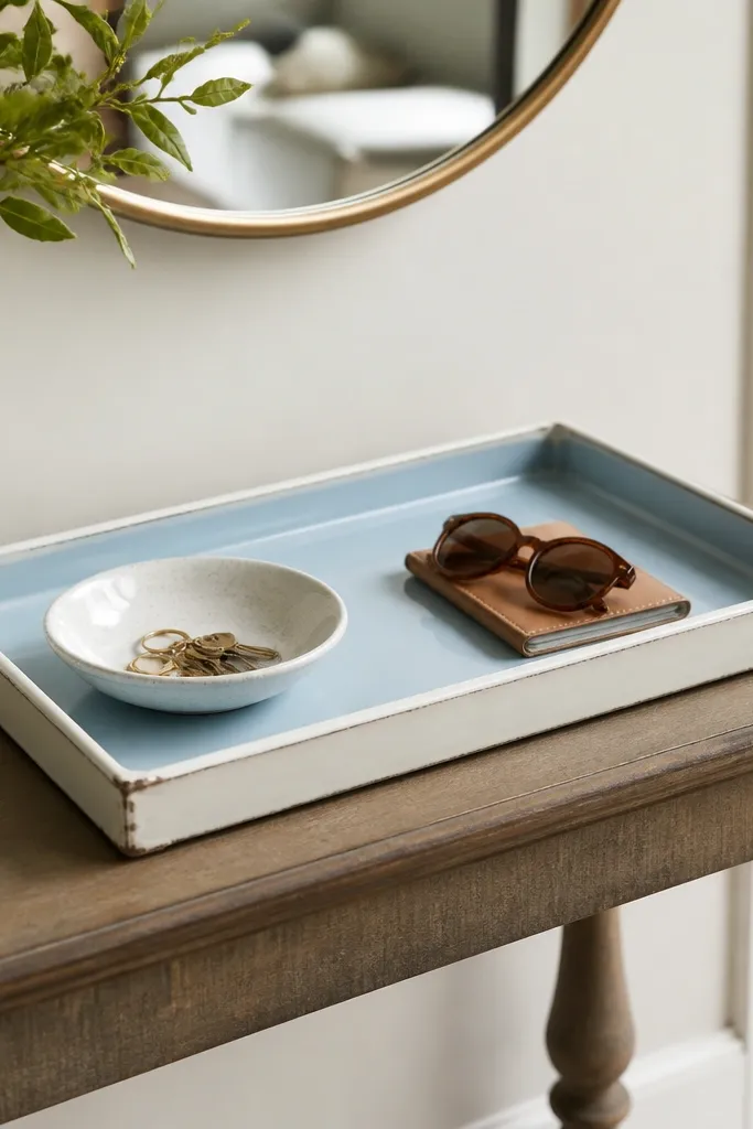
This is for the narrow-entry problem where you need a landing spot but the decor always looks messy. A painted tray pulls keys, lip balm, and small items into one tidy zone, and faux enamel edges look clean even at a glance. I paint the tray base in pale blue, then add a glossy white border so it catches light like ceramics. The slight distressing at the corners keeps it from looking too perfect or too new. It looks best when your hallway has beige, gray, or warm wood tones; it adds color without shrinking the space.
Sand the tray lightly, then paint the base pale blue with two thin coats. Once dry, measure the border and use painter’s tape to mask a border width about 3/4-inch from the outer edge. Paint the border with glossy white enamel-style paint, then remove tape while paint is still slightly tacky for sharp edges. Add tiny corner distress by rubbing a piece of sandpaper on the top edge only — one or two passes per corner is enough. Seal the whole tray with a clear topcoat that matches the sheen you want.
Pro tipIf your tray has raised lettering, paint around it first, then do the border so the letters stay readable.
AvoidDon’t use matte clear coat on tray projects — it kills that enamel glow and makes the color look flat.
5. Sponged Wall Planter Accent With Two Shades of Green
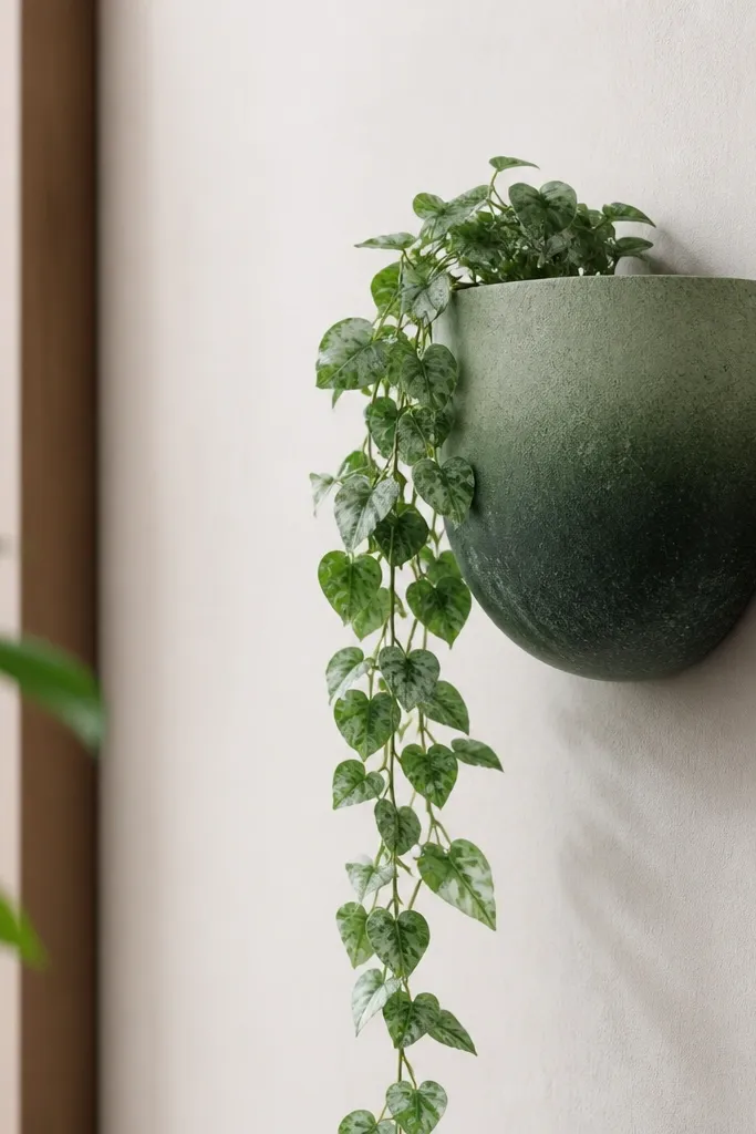
A sponge-painted planter looks alive because it has tiny variations that mimic natural leaf color. Two green shades (sage and forest) keep it from looking like a single block of paint, and the texture hides minor bumps on the planter. This is a smart choice for renters because you can paint over it later without major construction. It works well in small spaces because it adds color upward without taking floor area. If your room has plants already, this makes them feel intentional instead of random.
Start with a clean, dry planter and prime if the surface is glossy plastic or sealed wood. Paint a base coat in sage, then let it dry fully. Load a sea sponge with forest green and dab lightly in an uneven pattern, focusing on the upper half and leaving some sage showing. Add a second dabbing pass only if you want deeper contrast, then let it dry. Seal with a clear matte or satin coat for a durable, plant-friendly finish.
Pro tipPractice on a scrap piece of cardboard first — you’ll learn how much paint to load so it doesn’t look streaky.
AvoidDon’t flood the sponge with paint; thick blobs show and look like mistakes instead of texture.
6. Picture Frame Corners in Gold Leaf Paint
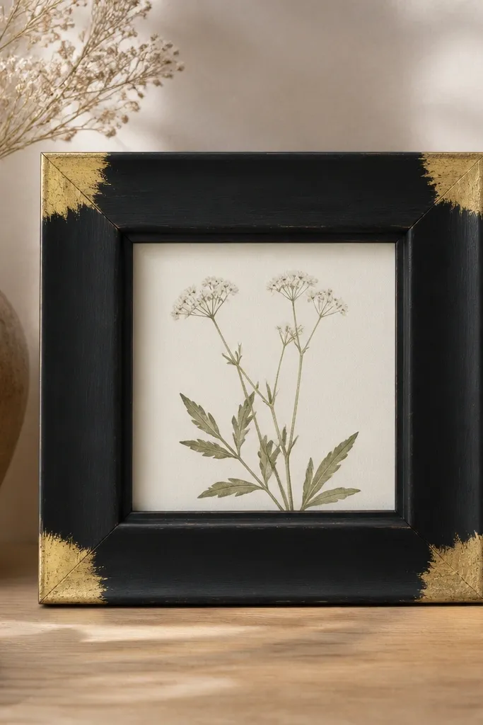
Painting only the corners is one of the easiest ways to make a frame look expensive. The matte black base makes the gold corners pop, and because the gold is limited to small areas, it doesn’t overpower a small wall. This is great for anyone who has plain frames stacked in a drawer and wants a quick upgrade. It also works with almost any print — neutrals, florals, even black-and-white photos. If your skin tone leans warm, gold corners look especially flattering in the same room because the tones match your undertones.
Sand the frame lightly, then paint the whole frame matte black and let it dry. Use painter’s tape to mark each corner area — about a 1-inch square in from each edge. Apply gold leaf paint or metallic gold acrylic over the taped areas, using a small sponge or fine brush for control. Remove tape while paint is still slightly tacky so edges stay crisp. Seal lightly if your gold paint needs protection, and mount the frame with a level so it hangs straight.
Pro tipIf your gold paint looks uneven, do two thin coats instead of one thick coat.
AvoidDon’t paint gold over glossy black without sanding — the gold can peel in spots.
7. Painted Pegboard Hooks in Soft Rose and Chalk White
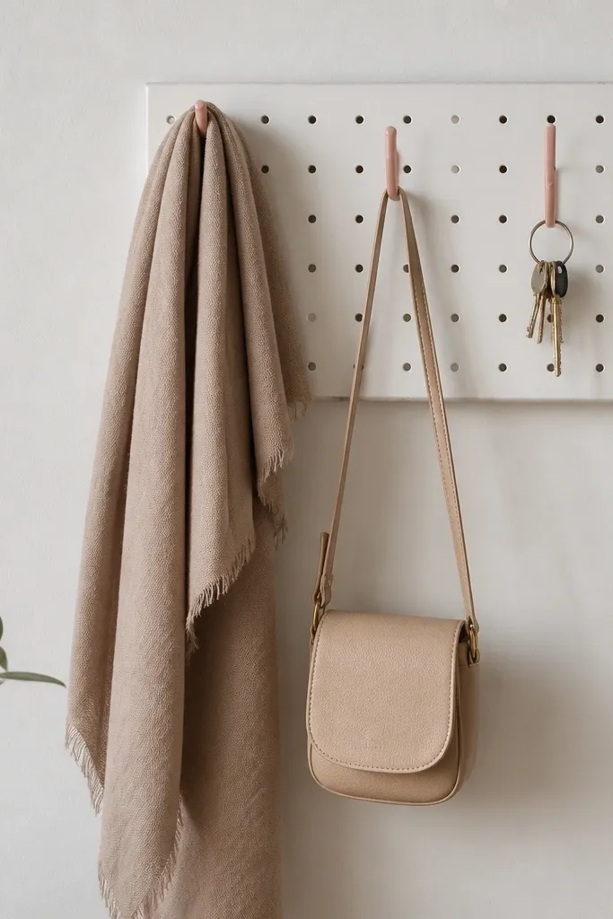
Pegboard hooks are a small-space lifesaver because they turn wall space into storage you can see. The look gets better when the pegboard is chalk white and the hooks are soft rose — it reads clean but still warm. I like this color pairing because it doesn’t clash with wood floors and it doesn’t scream for attention like bright pink. It’s also friendly on small entryways where you need organization without a bulky cabinet. The rose hooks add a gentle accent that looks good near mirrors and light switches.
Cut or buy a small pegboard section that fits your wall niche, then sand and clean it. Paint the pegboard chalk white and let it dry completely. Remove hooks if possible and paint them soft rose in thin coats, letting each coat dry before the next. Reattach hooks, then add a couple of small storage items like a key ring and a compact tray beneath. If you mount directly, use wall anchors and check level twice — pegboards are unforgiving when they tilt.
Use a small foam roller for the pegboard so the paint goes on evenly without streaks.
Don’t skip priming if the hooks are metal — unprimed paint chips fast from daily touch.
8. Table Lamp Shade With Tape-Stripe Bottom Band
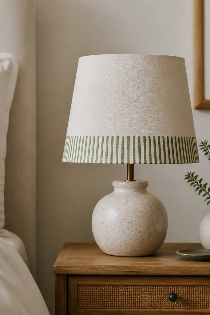
A lamp shade is one of those small upgrades that changes the whole room because it controls what color light hits the walls. Tape-stripe paint at the bottom band adds pattern without covering the whole shade, so the room still feels airy. I use cream and muted olive because the olive looks grounded under warm bulbs, not neon. This works especially well in bedrooms where you want calm visuals at night. If your bedding is white or beige, the olive band looks intentional and soothing.
Unplug the lamp and cover the base with plastic so no paint drips. If the shade is fabric, use fabric paint and test a small spot first. Mask a band near the bottom edge with painter’s tape, leaving about a 2-inch height band. Paint alternating stripes in cream and olive, letting each stripe dry before removing tape. After it dries, seal lightly with a fabric-friendly sealant and let cure overnight before turning the lamp on.
Pro tipPress tape down with a fingernail along the edge to prevent paint bleed.
AvoidDon’t paint too close to the top seam — any unevenness shows when the light hits it.
9. Scrap Wood Wall Ledge With Chalky Blue Dry-Brush
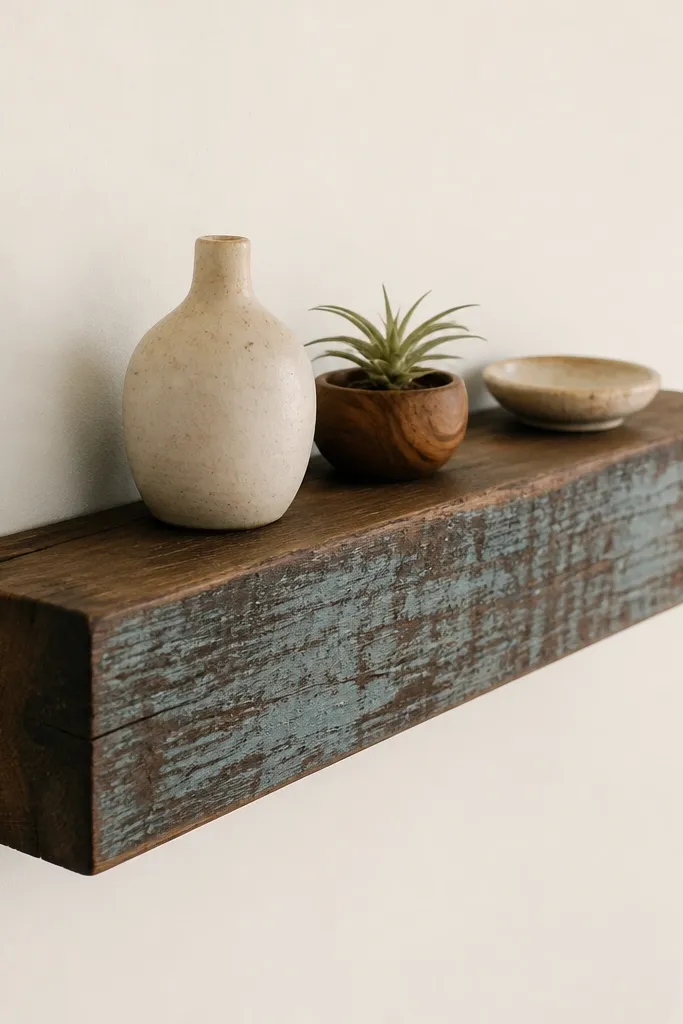
A tiny ledge feels like built-in decor when it’s painted with texture instead of a flat solid color. The chalky blue dry-brush gives a weathered look that pairs well with small objects like mini frames and a single candle. I like this approach because it hides uneven grain and makes cheap wood look styled. It also doesn’t take space because it lives on the wall and holds just a couple of items. For small rooms with lots of straight lines, the dry-brush texture softens everything.
Sand the scrap wood face and remove dust. Paint a base layer of warm white or light gray, then let dry. Use a dry brush with chalky blue and lightly sweep across the wood grain so the base still shows in streaks. If you want more depth, add a second dry-brush pass only on edges and corners. Install the ledge with a level and wall anchors, then style with two objects spaced about 2 inches apart.
Pro tipDry-brush in the direction of the grain so the texture looks natural, not random.
AvoidDon’t fully cover the wood — if you hide all grain, the piece reads like a cheap painted plank.
10. Painted Glass Vases With Frosted Band Effect
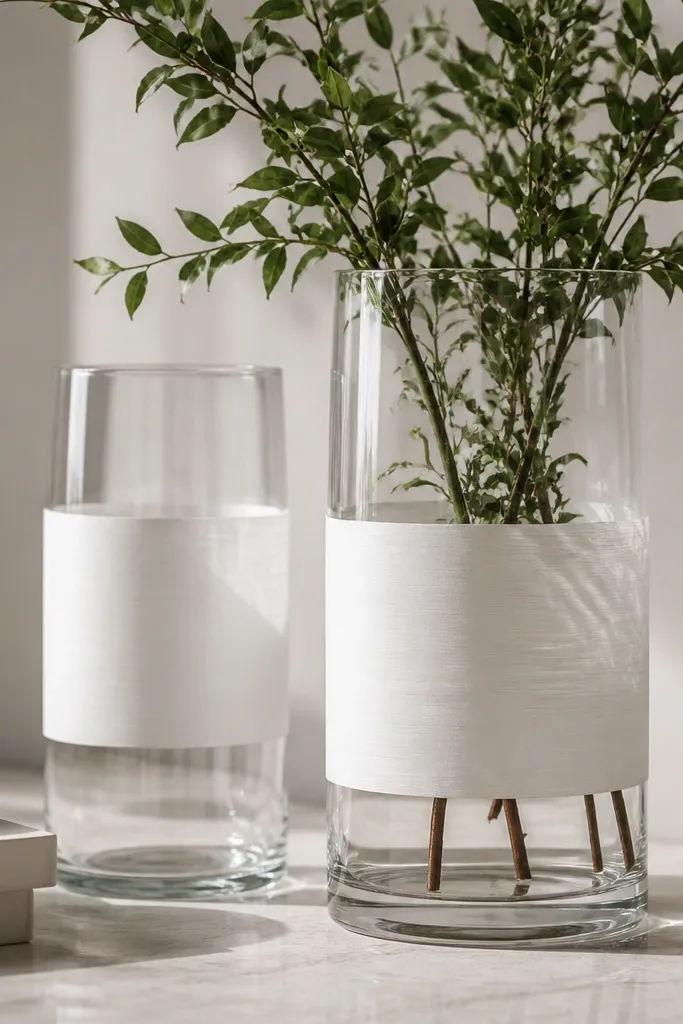
Clear glass plus a frosted band looks clean and expensive because it mixes transparency with softness. The frosted middle makes flowers look fuller even when you use a small bouquet. I paint only a band so the vase doesn’t look like a jar — it stays airy, which matters in tight rooms. White frosting paint also brightens the space because it diffuses light. This style looks great with any flower color, but it’s especially flattering with red, peach, and soft pink blooms.
Clean glass with rubbing alcohol so paint sticks. Mask a band around the vase using painter’s tape, keeping it about 3-4 inches tall depending on vase height. Use glass paint or frosted finish paint and apply in thin coats; thick coats take longer to dry and can look uneven. Let it dry, then remove tape carefully while paint is still slightly tacky. Place the vase on a tray so any drips or condensation don’t stain surfaces, and avoid touching the painted band until cured.
Pro tipIf your frosted band looks too bright, add a second lighter pass instead of thickening the first coat.
AvoidDon’t use regular wall paint on glass — it cracks and peels the first time the vase gets condensation.
11. Door-Size Mirror Frame With Two-Color Ombre Paint
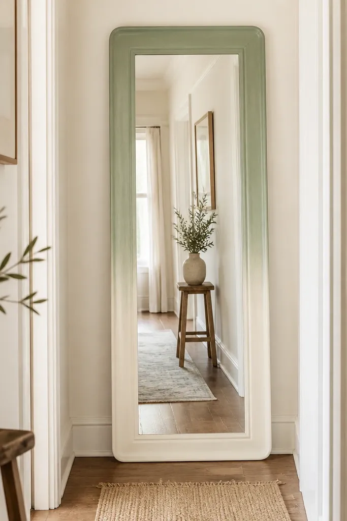
In a small space, a mirror already earns its keep. Painting the frame with a gentle ombre gives the mirror presence without adding extra objects that crowd the floor. I use cream to muted sage because it looks airy in hallways and doesn’t fight with wall colors. The ombre also hides scuffs on older frames — you get a clean gradient instead of obvious wear. This looks best when your hallway is narrow and you need the mirror to feel like decor, not an afterthought.
Remove the mirror frame if possible and sand the surface lightly. Prime if the frame is bare wood or glossy material. Paint the bottom in cream and blend upward by applying sage in a gradient using a wide brush. For a smoother ombre, wipe the blending area with a damp cloth after each pass and let it set before the next layer. Finish with a clear coat that matches your look — satin for a soft glow, matte if you want it less reflective.
Pro tipUse painter’s tape to block off the mirror glass so you don’t scratch it while blending the gradient.
AvoidDon’t rush the blending — if the paint skins over, you’ll get hard stripes.
12. Painted Candle Holders in Matchbook Geometry
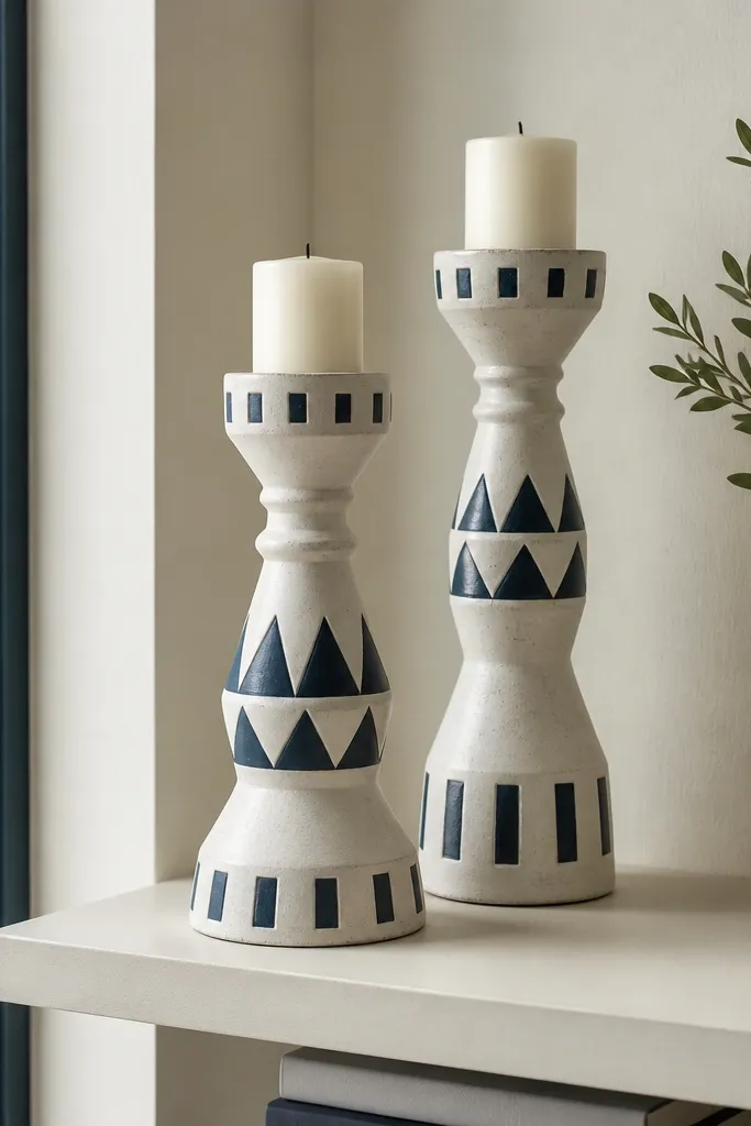
Geometry on candle holders looks crisp because candlelight already creates moving highlights. I paint a white base, then add navy shapes in small blocks so the design reads clearly even from a distance. This is a good choice for small shelves because the design stays compact and doesn’t take up more space than the candle itself. It also flatters warm skin tones in photos because navy and white contrast nicely. If your decor is mostly solids, geometric paint adds interest without needing patterned curtains.
Clean the candle holders and sand lightly to remove shine. Prime if needed, then paint the entire holder white. Use painter’s tape to mask triangles and rectangles — keep each shape about 1 inch to 1.5 inches so it stays “matchbook scale.” Paint navy shapes in thin coats, remove tape, and let dry fully. Seal with a clear coat rated for decor surfaces, then arrange the holders with one taller candle and one shorter so the shapes align visually.
Pro tipTake a quick photo before sealing; you can spot crooked tape lines instantly on camera.
AvoidDon’t paint geometric shapes with a big brush — it bleeds under tape and ruins the sharp edges.
13. Mini Tray Wall Art Using Tape and Chalky Paint
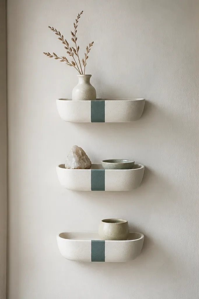
If your small space feels empty, wall art is the obvious fix, but it often gets crowded fast. These mini trays act like art without needing frames, and the single thick stripe keeps the design readable. I use chalky white and dusty teal because teal adds personality while still looking calm. The trays also give you a place to set tiny items, like a rolled note or a small key, if you mount them near your entry. This style flatters small rooms that have lots of plain walls and simple furniture because it adds one strong graphic element.
Find three matching shallow trays, then clean and sand their outer surfaces. Paint the trays chalky white and let cure. Mask one thick stripe with painter’s tape across each tray, keeping the stripe width around 1.25 inches. Paint dusty teal over the tape, remove carefully, and let dry. Mount the trays vertically with hardware that matches your wall type, then hang them so the stripe lines line up across each tray.
Pro tipUse the same tape placement measurements for all three trays so the stripes look aligned instead of random.
AvoidDon’t use glossy paint on trays meant for wall display — glare from windows makes the stripe look messy.
14. Painted Drawer Pulls for a Tiny Vanity Upgrade
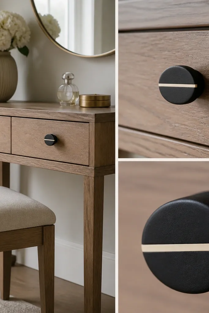
This is the fastest “paint decor” win I’ve done in a small bathroom. Drawer pulls are tiny, but they’re seen up close every day, so the finish has to look clean. Matte black with a thin cream line looks modern and doesn’t fight with sinks, mirrors, or tile. It also works for anyone who has a small vanity where the hardware makes the whole piece feel outdated. If your bathroom has white fixtures, the cream line ties the hardware to everything else.
Remove the pulls and clean them with degreaser, then sand lightly if they’re glossy metal. Spray paint matte black in thin coats, letting each coat dry before the next. After the black cures, mask a thin center line using painter’s tape and paint cream acrylic over it. Peel tape after the paint becomes tacky so the line stays sharp. Reinstall pulls and tighten evenly so drawers glide smoothly.
Label the pulls with masking tape on the back so you don’t swap left and right during reinstall.
Don’t paint over grime — oily hardware makes the line look patchy and peels sooner.
15. Sponge Distressed Nightstand Top With Warm White Base
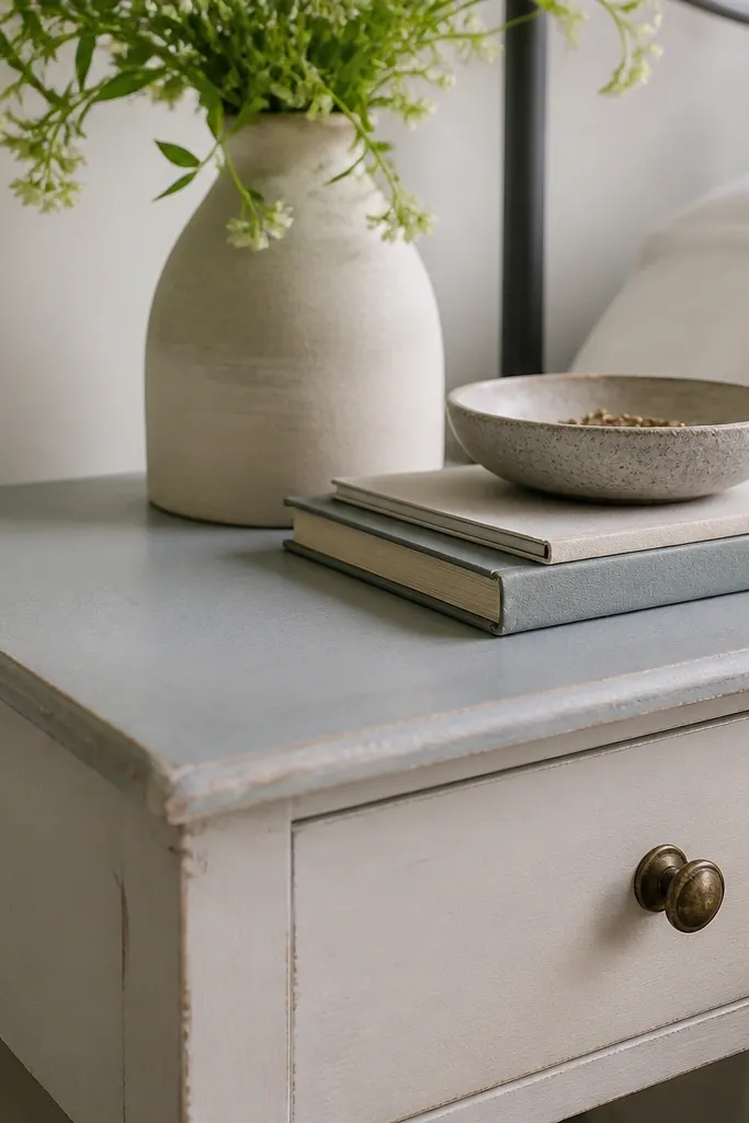
This is the “small space upgrade” that changes the whole mood because the nightstand top is where your eyes land first in the morning. Warm white as a base keeps it soft, and sponge distressing at corners makes it look lived-in instead of newly painted. I use a darker gray-blue for the distressed layer because it’s calmer than pure black and still reads as contrast. This looks great in bedrooms with neutral bedding because it supports cream sheets and light wood floors. If you have a darker headboard, the warm white nightstand balances it without looking stark.
Sand the nightstand top lightly and wipe dust off. Paint warm white as the base coat, then let it dry fully. Add a second color layer — gray-blue — over the areas you want distressed, like corners and drawer edges. Once dry, use a slightly damp sponge to rub off the top layer in small patches until the warm white shows underneath. Seal the top with a clear protective finish so it survives daily use from cups and skincare bottles.
Pro tipWork in small sections and stop often; distressing looks best when it’s uneven but controlled.
AvoidDon’t distress the whole surface evenly — it turns into a worn-out look instead of a styled one.