1. Vanilla Bean Dome Squishy

Start by cutting three circles: 10 cm, 9.2 cm, and 8.4 cm in cream cardstock. Fold each circle into a gentle dome by scoring lightly around the edge and shaping over a bowl, then glue the largest to the inside rim of the next size so it builds depth. Cut a 1 cm wide gold spiral strip from paper, then glue it along the center from top to bottom, leaving a 2-3 mm gap from the outer edge so it doesn’t flatten. Paint a thin shadow ring behind the spiral using a light brown watercolor wash, then add a small white highlight stroke on the left with a gel pen. Finish by sealing everything with matte Mod Podge sprayed from 20-25 cm away.
This one looks real because the silhouette is a simple dome with a controlled highlight. I use warm off-white cardstock for the base and add a thin strip of soft gold paper for the “vanilla bean” swirl. The key is that the swirl sits slightly inset, so the light catches the raised paper edges. It flatters any room color because the cream reads neutral — I’ve made this in both ivory and pale beige and it still looks like a squishy treat. For photos, it looks best with light coming from the left side so the highlight band shows.
AvoidAvoid gluing the swirl flush to the surface — if it lies flat, it reads like a sticker, not a plush texture.
Pro tipHold a phone flashlight from the left while you build so you can see where your shadow strip needs to go.
2. Strawberry Shortcake Stack
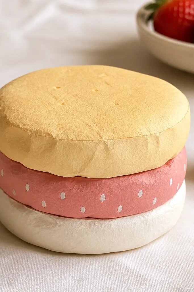
Cut three rounded rectangles (or rounded circles) sized 12x9 cm, 11x8 cm, and 10x7 cm in sponge cream, strawberry pink, and vanilla cream. Score and fold each piece along a center line so they curve upward, then glue the smallest on top of the middle and the middle on top of the largest. For the strawberry seeds, punch or hand-cut tiny 2-3 mm white circles, then glue them into a loose pattern across the pink layer. Add a thin darker pink shadow band under the top layer using watered-down red-brown paint. Finish with a matte seal and set it against a textured backdrop like linen so the layers read as “soft.”
This stack looks like a squishy dessert because it has three clear height levels and a soft color gradient. I use blush pink for the strawberry layer and keep the sponge layer slightly warmer than the base so the colors separate. The seeds are tiny circles that catch light — even in low lighting they show depth. I’ve made it for kids' desks and for my own shelf, and it always looks sweet without being childish. The styling principle is contrast by tone, not by bright saturation.
AvoidDon’t make the sponge and base the exact same color — the stack collapses visually.
Pro tipUse a colored pencil for the shadow band instead of black paint; it keeps the dessert vibe and looks more like foam depth.
3. Mint Chip Ice Cream Scoop
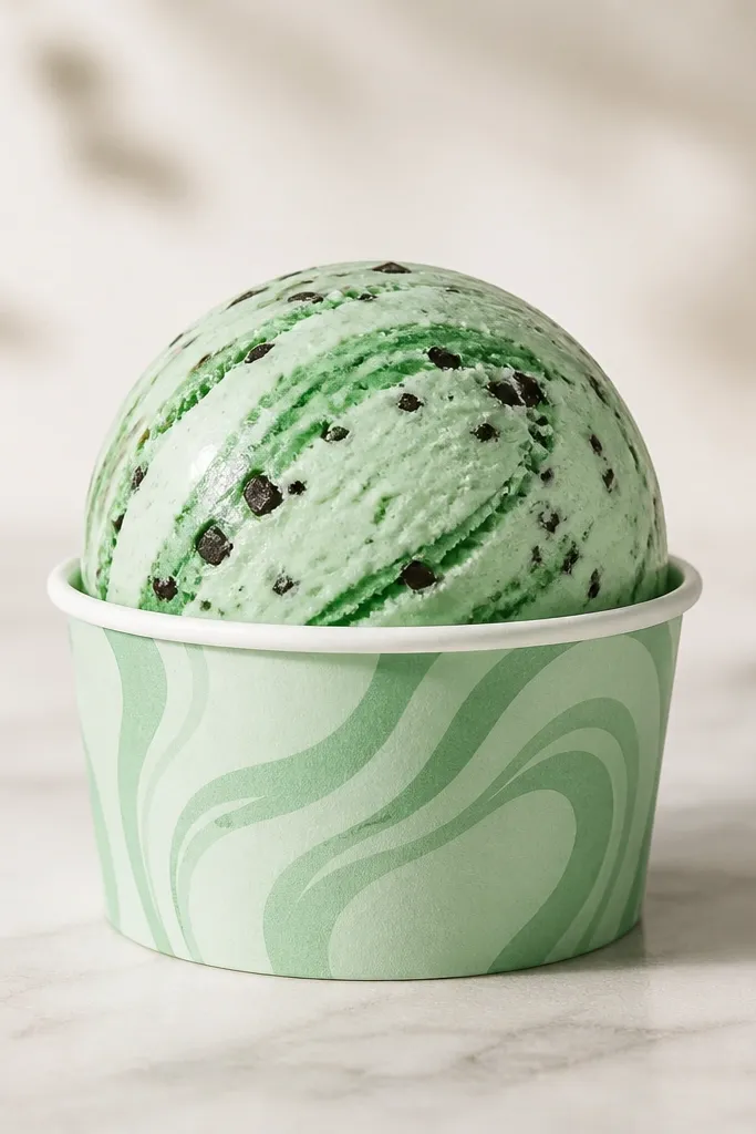
Cut four ovals: 9x6 cm, 8x5.5 cm, 7x5 cm, and 6.2x4.3 cm in mint cardstock. Curl them into scoops by pressing over a rounded mug, then glue them from largest to smallest so the top rises. Cut a thin curved strip of darker mint paper and twist it slightly to form the scoop swirl, then glue it along the center. For chips, cut 3-4 mm irregular rectangles from dark green paper, then scatter them near the swirl. Paint a soft gray-green shadow along the underside rim with a dry brush, then seal matte so the highlight stays crisp.
Ice cream sells itself because scoops have a recognizable curve and a rim shadow. I build the scoop from layered ovals so the top looks domed while the bottom rim stays thick. The mint color looks “real” when you add slightly darker green for the swirl and use tiny chip flecks for texture. This one looks great on pale skin tones in photos because the cool mint balances warm undertones. It also works as a desk accessory because it sits upright without looking floppy.
AvoidSkip tiny glitter paper for the chips; it reflects too harshly and makes the whole piece look cheap.
Pro tipIf your scoop looks flat, add one more oval layer behind the top — even a 2-3 mm lift changes the read.
4. Blueberry Pancake Stack
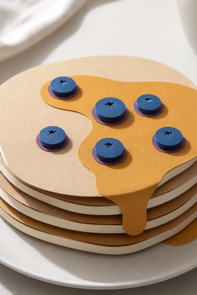
This one mimics squishmallow softness by using syrup as a glossy visual cue and blueberries as a depth cue. I use warm golden paper for the pancake and a slightly darker brown for the underside edges, so each layer reads as a thick cushion. Blueberries are layered circles: one dark indigo base with a lighter blue ring on top. The effect is playful but still clean, which matters if you’re using these as room decor. In photos, the syrup smear is the star because it creates a directional highlight.
Cut three pancake layers from 160-180 gsm paper: top 11 cm round, middle 10 cm, base 9 cm, each with a 1 cm “flap” around the edge for gluing. Fold each layer into a shallow bowl shape using a spoon to curve the paper. Glue the base flap to form a thick center, then stack middle and top with slight offsets so shadows show. Add blueberry circles by gluing 8-10 dark indigo circles, then topping each with a lighter blue ring. Paint a syrup smear with diluted honey-gold acrylic, then dry with a tissue to keep it semi-matte. Seal everything with a matte spray.
Make syrup thicker at the edges — it reads like it dripped, not like a flat line.
Don’t glue blueberries directly on the top edge; inset them by 3-4 mm so the rim shadow shows.
5. Peachy Bum Bum Keychain
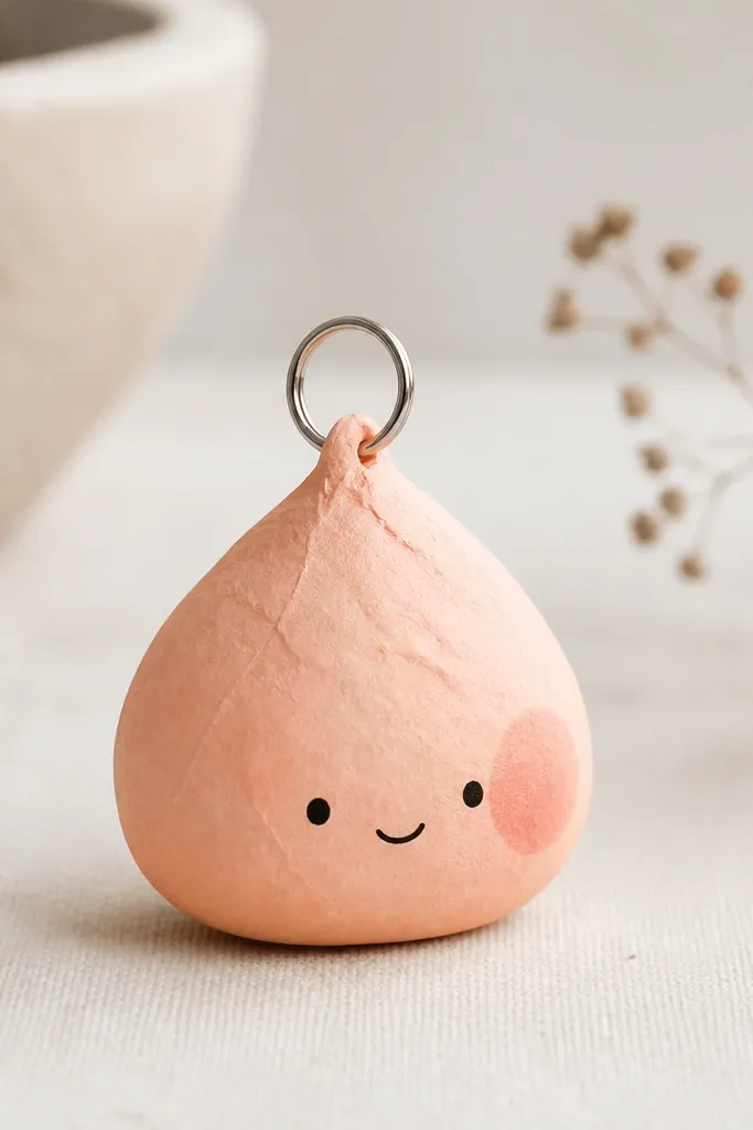
This is a paper squishy idea that behaves like an actual squishy because it’s small and thick enough to hold its curve. I keep the body to about 7-8 cm tall so it doesn’t sag. The “blush” spot is made with a darker peach watercolor patch — it looks like softness compressing under light. A tiny face helps it read as a character without needing bulky details. This one looks best on warm backgrounds and works as a bag charm.
Cut a body template: a teardrop-like oval 7.5 cm tall, plus two identical back pieces to thicken it. Layer the front to the back with 2-3 mm offset so you get a rim depth. Punch a hole at the top center, glue a small cardstock tab behind it, and thread a keychain ring through the tab for strength. Add a blush patch by painting a small circle with watered-down dark peach, then let it dry fully before sealing. Finish by drawing a simple smile and dot eyes using a 0.3 mm pen.
Use a hole punch, not scissors, so the top stays clean and the ring doesn’t tear paper fibers.
Skip thin glue on the keychain tab; it soaks the paper and makes the hole weak.
6. Cotton Candy Cloud
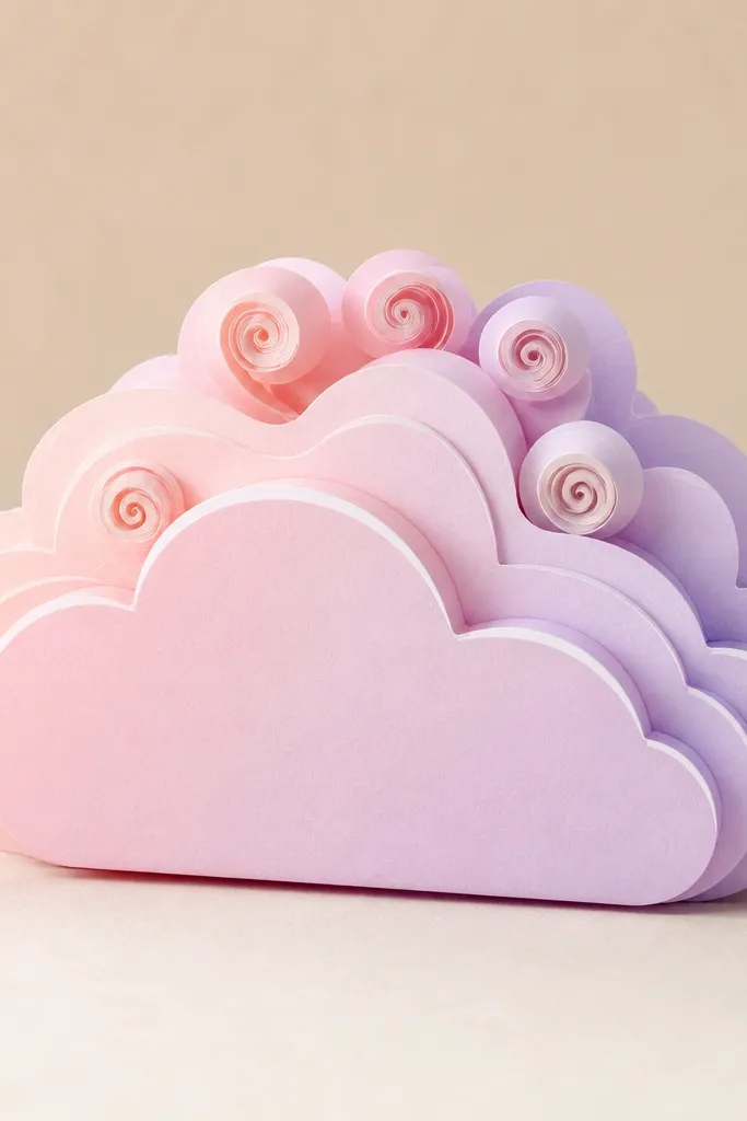
Cotton candy clouds look real because clouds are all about layered edges and soft gradients. I build the cloud with a scalloped outline so it naturally casts tiny shadows. The gradient edge is made by blending two paper colors with a dry brush, then sealing so it doesn’t smear. This color combo looks great with cool-toned rooms and even better against dark backgrounds in photos. The face is optional, but when you add it, keep it minimal — two dot eyes and a small blush crescent.
Draw a cloud outline about 12 cm wide with 6-7 scallops, then cut it from pale lavender cardstock. Cut two more clouds slightly smaller, then stack them with glue only along the middle so the edges rise like fluff. Make the gradient edge by brushing a thin layer of pink watercolor from one side to the other, letting it fade before it reaches the center. For the cotton strands, roll thin strips of white paper into tight coils and glue them on top. Add a curved highlight stroke with white gel pen along the front edge, then seal matte.
Blend watercolor on a scrap first so you know how fast your paper absorbs it.
Don’t overfill the cloud with strands; too many coils flatten the silhouette.
7. Chocolate Chip Cookie Roll
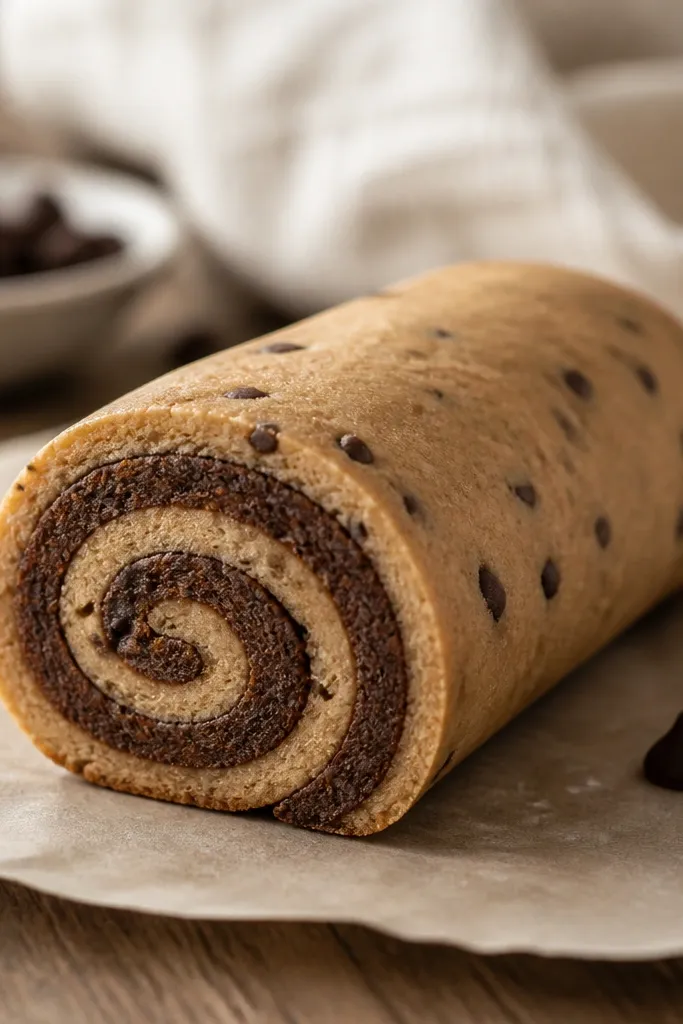
A roll shape is the fastest way to get 3D realism from paper because the cross-section already tells your brain “volume.” I use a light brown outer layer and a slightly darker inner swirl so the cut face looks like dough layers. Chocolate chips are small irregular dots, but placed mostly along the outer edge so they look embedded. This one looks good on warm skin tones and warm photo lighting because brown tones read cozy. If you want “squishy” without a lot of carving, this is the move.
Cut a strip about 20 cm long and 6 cm wide in light brown cardstock. Score it every 2 cm lightly and roll it into a tube, gluing the seam to form the outer body. For the cross-section face, cut a circle 6 cm wide, then cut a crescent swirl using darker brown paper and glue it into the center. Scatter 3-5 mm chip dots around the outside of the strip before rolling, so they sit across the curve. Glue the cross-section face to one end and add a thin shadow ring around the join with a gray-brown pencil. Seal matte to keep the chips from looking shiny.
Roll it tight and hold for 30 seconds at the seam; loose rolls look like paper tubes, not dough.
8. Ramen Noodle Bowl Buddy
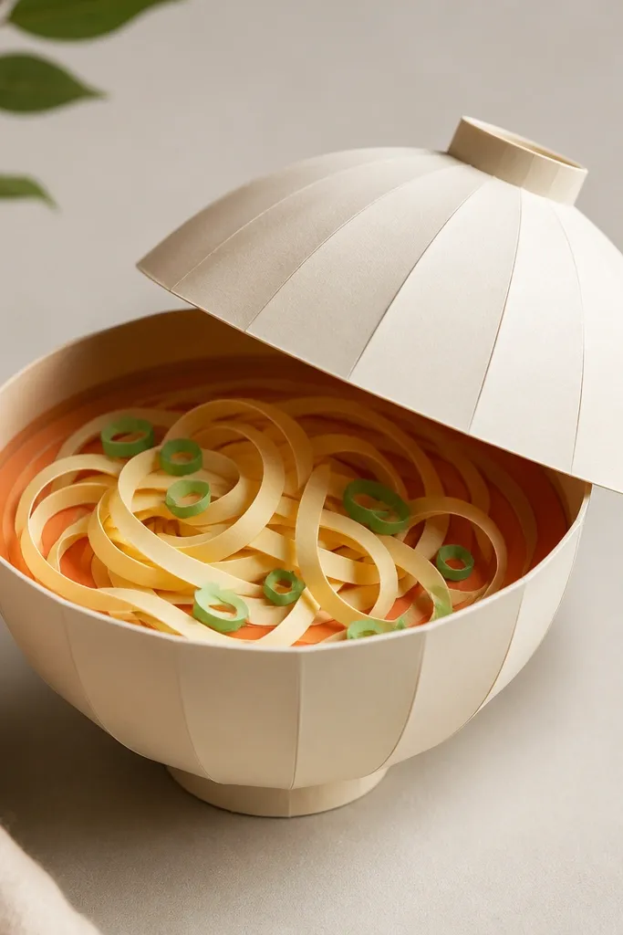
Cut a bowl base from 180 gsm paper as a circle with a 1.5 cm rim, then fold it into a shallow dome. Cut the top lid shape slightly smaller and glue it so you get a thick rim. For broth, brush orange watercolor inside the bowl, then layer a light yellow paper circle behind it so the center glows. Cut 18-22 noodle strips from cream paper, curl them around a pencil tip, and glue them in a loose spiral. Add garnish by cutting tiny green circles and placing them near the rim. Seal with matte so the broth stays soft.
This looks real because the bowl has a rim shadow and the noodles have height. I build the broth as a gradient using two paper tones plus a painted wash, so it reads like liquid thickness. The noodles are thin strips curled with a pencil — they catch light at their edges and feel airy. This is a great option if you want something character-like but still “squishy.” It also photographs well because the warm broth creates a natural focal point.
AvoidDon’t use bright neon orange; it reads like craft paint, not broth.
Pro tipCurl noodles before gluing so the curls keep their shape while the glue dries.
9. Sushi Roll Nigiri Stack
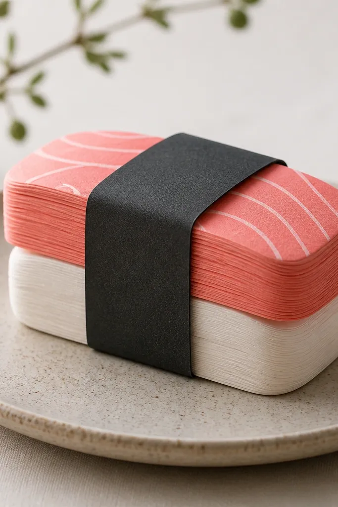
Cut three layers for each sushi piece: rice (light cream), salmon (salmon pink), and seaweed (dark teal). Make the rice layer 8 cm long and 5 cm wide, then make salmon 7.5x4.7 cm, then seaweed 7x4.3 cm. Fold the rice layer into a slight curve over a spoon, glue salmon on top, then glue seaweed on the very top. Repeat three heights and stack them with 3-4 mm offset so shadows show between layers. Add a tiny highlight line on each seaweed strip with a light gray gel pen. Seal matte and place on a neutral mat for contrast.
Nigiri stacks look like squishmallows when you keep the edges rounded and show thickness at the sides. I use two shades of pink for the salmon so the top looks richer and the underside looks softer. The seaweed strip is dark teal-black, but I lighten the center with a thin gray pencil line so it doesn’t look like a sticker. This piece is great for desk decor because it’s compact and reads clearly from a few feet away. The styling principle is edge depth — you need visible side layers.
AvoidAvoid flat-gluing the rice; if it doesn’t curve, it reads as a cutout.
Pro tipUse a ruler to keep layer sizes consistent — tiny size shifts are what make it look “handmade but real.”
10. Rainbow Macaron Duo
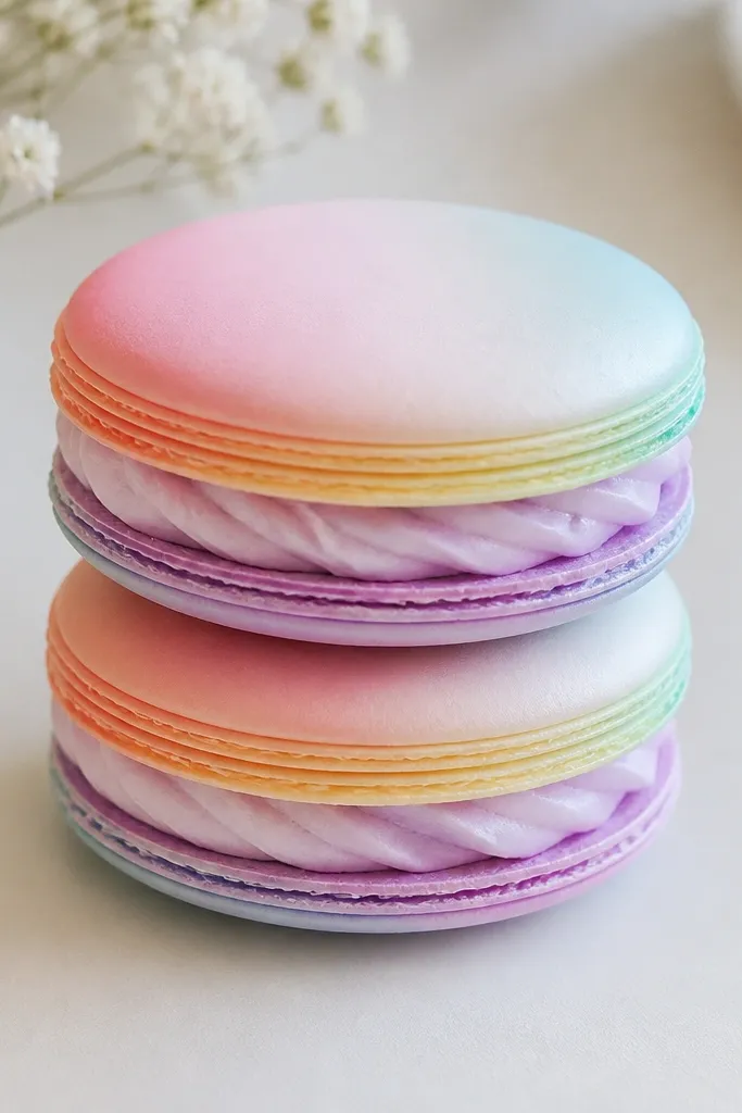
Cut two circles for each macaron shell: 9 cm and 8.6 cm, for a slight thickness. Color the outer ring with a rainbow marker set or colored pencils, then blend with a dry brush so it looks like a smooth macaroon shell. Glue a folded filling strip between the shells: cut a 26 cm long strip and fold it into a loose spiral 1.5-2 cm tall, then glue it around the inner circle. Add a tiny swirl on the filling using a lighter shade of the filling color. Stack the top shell slightly off-center so a shadow shows at one side. Seal matte and set against a white or pastel background.
Macarons look like squishmallows because they have a crisp shell edge plus a thick filling center. I use a gradient ring around the edge and keep the center slightly lighter, which creates a “shell thickness” look. The filling is built from a folded paper strip that makes it look plush instead of flat. This duo is also forgiving if your cuts are not perfect — the round shape hides small errors. In photos, the rainbow ring makes it pop without needing heavy embellishments.
AvoidDon’t make the filling too thin; thin filling kills the plush illusion.
Pro tipBlend outward from the center; it keeps the shell looking smooth instead of banded.
11. Toffee Popcorn Box
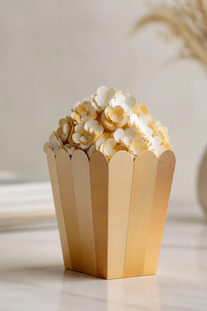
Build the box from a 20x12 cm rectangle paper with a 2 cm tuck flap, then fold into a shallow container. For the domed top, cut three circles in toffee-gold paper: 10 cm, 9.2 cm, and 8.4 cm, then curl them over a bowl and stack like the vanilla dome idea. Glue the domed top onto the box rim. For popcorn kernels, punch small circles in light cream, then glue a slightly darker circle behind each so you get a shadowed bump. Glue kernels mostly near the center so the top reads as full. Seal matte and add a tiny “steam” curl on one side using a thin strip of translucent vellum.
A box shape gives you built-in structure, and the domed top gives you the squishy look. I use warm toffee colors and keep the kernels slightly raised so the top surface looks puffed. The kernels are made from layered paper dots with a tiny darker shadow behind them, which makes them look like they sit in buttered popcorn. This works well on desks because it looks like a real snack container, not just a craft. The styling principle is “surface texture” — you need raised details, not printed ones.
AvoidDon’t use glossy craft paper for the toffee — it reflects light like plastic.
Pro tipIf kernels look flat, press a few down with the back of a spoon to curve them upward before gluing.
12. Citrus Sorbet Slice
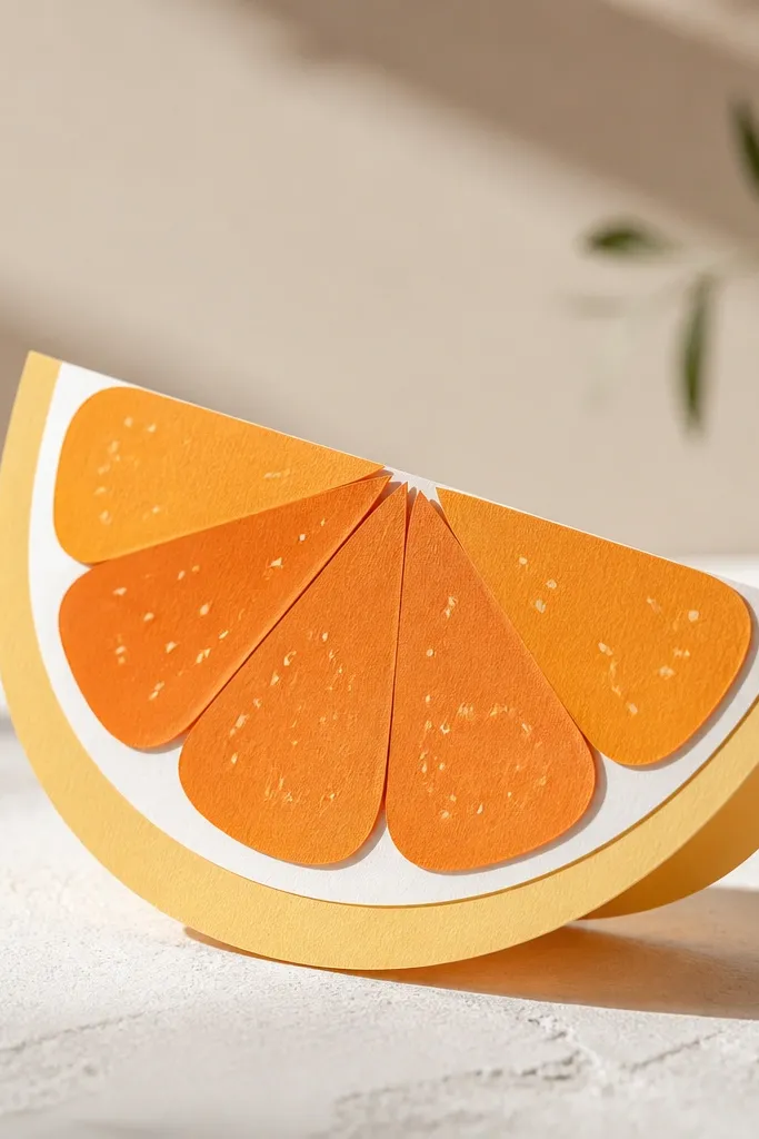
Cut the rind as a curved band from pale yellow cardstock, about 3 cm tall, using a template that matches a pie slice shape. Make the interior segments from layered orange cardstock: cut three crescent shapes sized 9 cm, 8.5 cm, and 8 cm along the curve, then stack them so the center pops forward. Glue segments to the rind, then paint a thin white highlight along the outer edge with a gel pen. Add seed dots by gluing tiny 2-3 mm dark orange circles in a loose cluster near the center. Paint a light shadow under the rind using diluted brown watercolor. Seal matte and display on a light wood surface.
A slice is one of the easiest ways to make paper look like foam because the rind and interior create obvious depth. I cut the rind as a thick curved band and the interior as stacked segments, then paint a white edge highlight that mimics the bright foam rim. The tiny seed dots make the slice look “juicy,” and the layered interior gives that soft wobble look. This piece looks great in kitchens and bathrooms because citrus tones match the clean vibe. The styling principle is edge contrast: bright rim, softer center.
AvoidDon’t make the interior perfectly flat; stack it so the center segment sits 3-4 mm forward.
Pro tipUse a white gel pen on the edge after sealing — it stays crisp and doesn’t soak in.
13. Matcha Mochi Ball Trio
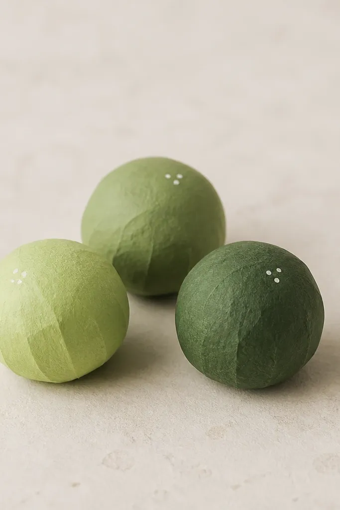
Cut three circles at 6 cm diameter in different greens: pale matcha, medium green, and deep green. Fold each circle into a ball dome by scoring lightly around the outer edge and gluing it into a sphere shape using small tabs. Glue a darker green shadow patch on one side of each ball using watercolor or colored pencil, then add one small highlight dot with a white gel pen on the opposite side. Connect the trio by making a small base strip and gluing balls at slight different heights. Seal matte so the highlight stays visible. Add a tiny “crease line” on one ball using a thin pencil line so the surface feels soft.
Three mochi balls work because they create a natural grouping for your shelf and each one can have a slightly different shade. I use matcha green cardstock and then add a darker green “compression” patch on one side to mimic how foam squishes under light. The highlights are tiny dots placed consistently near the same direction, which makes the set look intentional. This is a beginner-friendly option because you can reuse the same template and just change the shade. It also photographs well because the balls read as round even if your edges aren’t perfect.
AvoidAvoid using black for shadows; brown-green reads like food and foam depth.
Pro tipKeep highlight dots the same size across the set — it reads like the same lighting and makes it look more real.
14. Black Forest Cake Wedge
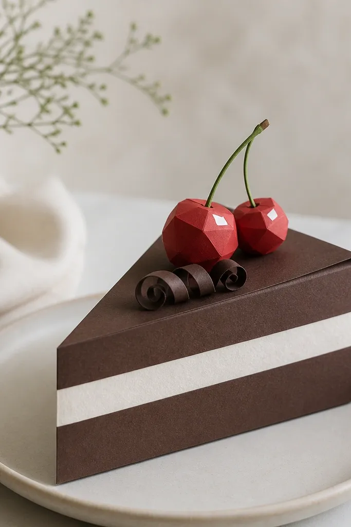
Cake wedges look real because they have sharp layer lines paired with soft top texture. I make the chocolate layers from deep brown cardstock and add a thin lighter brown edge so the layers show thickness. The whipped cream strip is pale cream with a soft gray shadow under it, which gives it that airy squishy look. Cherries are just layered circles, but the highlights sell it. This is a great centerpiece piece because it stands up and looks like a real dessert plate item.
Cut a wedge shape about 12 cm long with a 6 cm base and 5 cm height from deep brown cardstock for the outer layer. Cut two more wedge layers slightly smaller and stack them with glue, leaving 2-3 mm visible edges at each level. Add a whipped cream top strip using pale cream paper, then paint a light gray shadow under the strip with a dry brush. Make cherries by cutting two red circles per cherry, stacking one slightly offset, then adding a white highlight dot on top. Add a chocolate curl by rolling a thin strip of dark paper into a loose spiral and gluing one end. Seal matte and place on a white plate for strong contrast.
If your wedge looks too flat, add an extra inner layer so the sides show 6-8 mm of thickness.
Don’t skip side edges; flat sides make it look like a paper model, not a plush slice.
15. Cherry Blossom Mochi Pocket
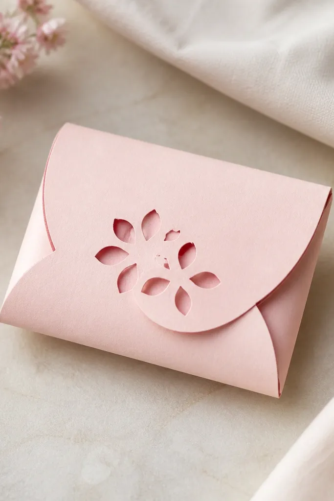
Cut a rounded rectangle about 10x7 cm, then cut a matching back piece. Fold the front into a pocket by gluing only the sides and bottom, leaving the top open. Create the petal layer by cutting 10-12 small petal shapes in light pink paper and 10-12 matching shapes in darker pink for shadow backing. Glue dark petals behind light ones to create a raised edge effect. Outline the pocket seam with a thin darker pink watercolor line and add a tiny white highlight along the top fold. Seal matte after the paint dries, then test how much fits inside by sliding a strip of paper in.
This one looks like a squishy because it’s a pocket shape with a soft opening seam. I use blush pink cardstock and add petal cutouts that sit on raised layers, so the petals cast tiny shadows. The seam is outlined with a darker pink watercolor line — it’s the seam that makes it feel like foam. This is also functional: you can hide a tiny note or a candy wrapper inside. It flatters anyone’s desk aesthetic because pink stays friendly and doesn’t fight your other decor.
AvoidAvoid flooding glue near the top opening; it warps the paper and makes the pocket curl.
Pro tipUse a bone folder on the fold edges so the pocket top stays crisp and doesn’t look wavy.