1. Creamy Ghost Face Minis
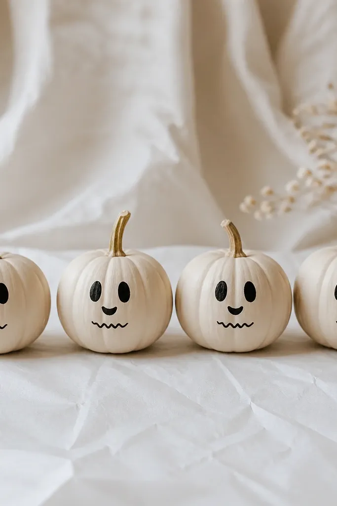
I love this one because it reads spooky from across the room, but the faces are tiny and sweet up close. Paint the pumpkins a creamy off-white (not bright white) so the black features look soft instead of harsh. This works best on minis because the ghost outline naturally follows the pumpkin curve. If you like neutral decor, it also pairs with beige, gray, and dark wood without fighting your existing style.
Pro tipIf your black paint looks streaky, thin it with a drop of water and add two thin passes instead of one heavy one.
Start by painting each mini pumpkin a solid cream coat using a small flat brush, then let it dry 20 to 30 minutes. Next, use a 10/0 liner brush to add two small black eye dots and a curved smile. Add a slightly thicker black line for the ghost outline if you want more contrast, then let the faces dry fully. Finally, seal with a matte clear spray from about 10 to 12 inches away in two light coats.
AvoidAvoid painting the eyes too big — big circles make the ghost look like a cartoon sticker.
2. French Tip Pumpkin Nails
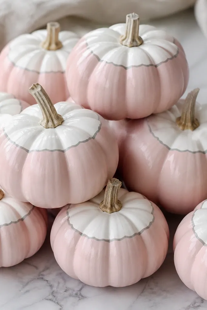
This looks like tabletop manicure decor, and it’s surprisingly flattering because it uses clean shapes. The blush base makes the pumpkins look more “soft” than “Halloween,” so it fits well in kitchens, bathrooms, and entry tables. It also hides small imperfections on the pumpkin skin because the half-moon tip draws the eye upward. If you wear warm neutrals or blush-toned clothing, this color combo matches your palette instantly.
Paint the entire mini pumpkin blush pink and let it dry completely. Then, hold the pumpkin steady and paint a white half-moon at the top third, following the curve. Add a super thin gray line under the white tip if you want extra definition, then let it dry. Seal with a satin clear coat so the finish looks like actual nail polish.
Use painter’s tape to mask a clean half-moon if you’re nervous — press it lightly so you don’t tear the pumpkin skin.
Don’t freehand the tips with a wide brush; thick paint makes the line look like frosting.
3. Mustard Mini Tiles
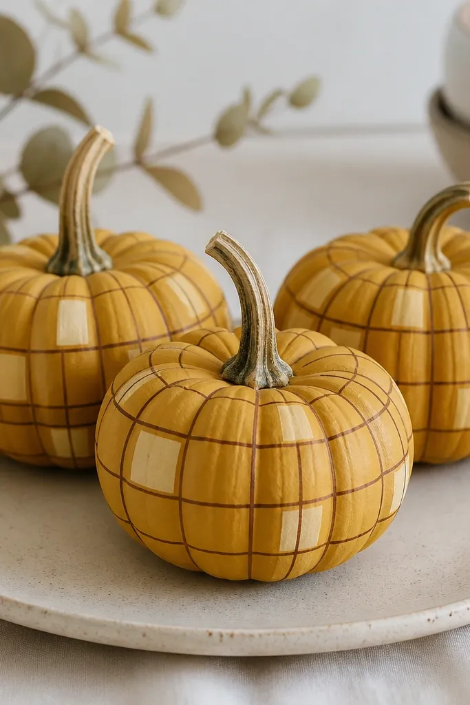
Tile patterns look high-end in tiny scale because the lines create structure. Mustard and dark brown read cozy and warm, and they sit nicely with rustic wood, cream linens, and black metal candle holders. This design hides small dents because the grid turns texture into part of the artwork. It’s also a great choice if you want Halloween decor that feels like fall home decor instead of costumes.
Pro tipMark your grid lightly with a pencil first if your hands shake; wipe off any pencil marks before sealing.
Base coat the pumpkin mustard yellow and let it dry fully. Use a fine liner brush to draw a simple grid — aim for 3 to 5 lines across the body depending on the pumpkin’s width. Fill a couple squares with a lighter mustard or cream using a tiny dot of paint, then outline those filled squares with the dark brown. Seal with matte clear so the grid stays crisp.
AvoidSkip watery paint for the lines; it bleeds into the pumpkin texture and blurs the grid.
4. Black Cat Side Profile
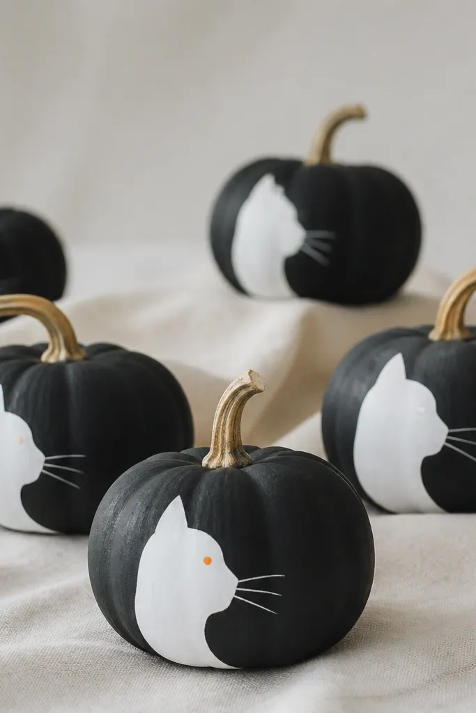
A side-profile cat looks classy even when it’s tiny, and black-on-black with a white accent keeps it modern. The charcoal base makes the pumpkin feel like a little sculpture, not a craft project. This is flattering for small spaces because the single face detail sits where your eye naturally lands. If your decor leans modern or you own black frames and lanterns, this will match immediately.
Pro tipDo the cat in two passes: block the silhouette first, then add whiskers and the eye.
Paint the mini pumpkin charcoal black and let it dry. Then paint a white cat profile on one side using a liner brush, keeping the head roughly the top third of the pumpkin. Add a small orange dot eye on a few for extra personality. Finish with a few whisker strokes and a tiny tail curl if you have room. Seal with matte clear to remove any shine that can make the cat look messy.
AvoidDon’t paint the cat face centered on the pumpkin; side placement looks more intentional.
5. Pastel Ombre Dip-Dye
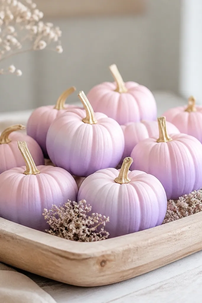
Ombre on a pumpkin curve looks like it’s glowing, and it’s one of the easiest ways to make minis look designer. Pastels feel cute in small spaces because they don’t overwhelm counters, shelves, or coffee tables. The fade also hides slight brush marks because the transition blends. This works beautifully if your home has light walls, white cabinets, and neutral baskets.
Paint a pale pink base on the top half of each pumpkin. Then, while the paint is slightly tacky, add lavender to the bottom half and gently blend the middle with a damp brush using small circular motions. Keep pressure light so you don’t pull paint off the pumpkin skin. Let dry, then add a second thin layer at the lavender end if the fade looks too faint. Seal with satin clear for a soft glow.
Blend with a clean, barely damp brush — too wet makes the colors run together into one flat blob.
Avoid darkening the bottom too much; deep purple makes it feel like a different theme.
6. Gold Foil Dot Constellations
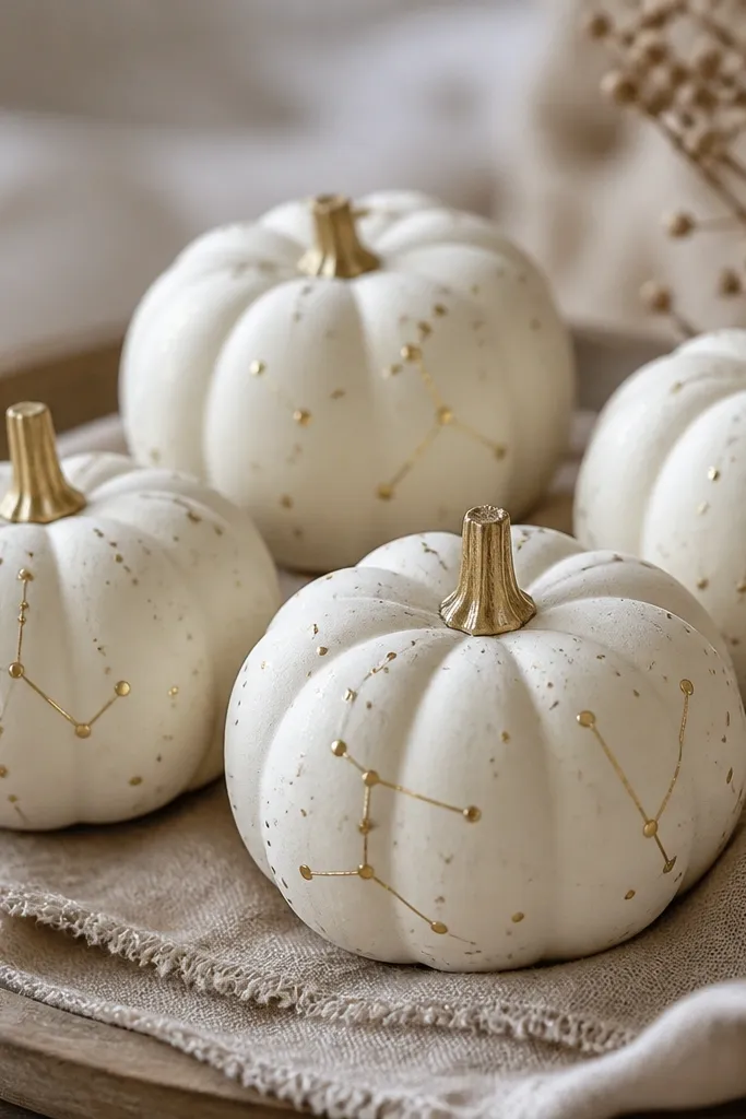
This is my go-to when I want “pretty” without characters. Cream plus gold reads festive and calm, and it looks great next to candles and glass cloches. The dot pattern also forgives imperfect pumpkin shapes because the dots land anywhere. It suits small spaces because it doesn’t take up visual weight like big pumpkins or chunky wreath pieces.
Pro tipIf you use metallic paint, stir it well and do two light coats on the dots for smooth shine.
Base coat the pumpkins cream and let them dry. Use a small sponge or the end of a makeup brush to dab gold acrylic paint dots — vary sizes so it doesn’t look like a sticker sheet. Add a few thin lines with a liner brush to connect 2 to 3 dots per pumpkin. Let everything dry 1 hour, then seal with matte clear to protect the gold without making it shiny.
AvoidSkip heavy clear coat right away; it can dissolve metallic specks into a dull haze.
7. Terracotta Line Art Leaves
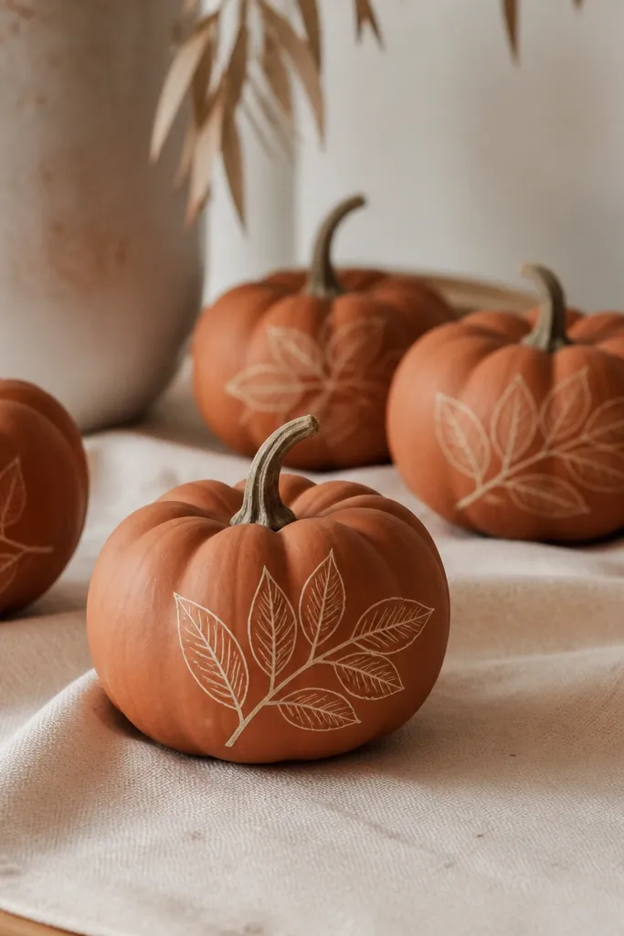
Line art makes minis look more like decor than kids' crafts. Terracotta and cream are warm together and feel grounded, especially with natural wood and woven baskets. Because the lines are thin, the pumpkin’s curve becomes part of the drawing instead of something you fight. This style looks great for fall dinners and also works beyond October.
Pro tipPractice one leaf on scrap paper first so you get a rhythm for the veins before you touch the pumpkin.
Paint the pumpkins terracotta orange in two thin coats. Use a liner brush to add cream leaf outlines on one side — start with the main leaf shape, then add a stem and 3 to 5 vein lines. Add a second tiny leaf near the top if the pumpkin has space. Let dry, then seal with matte clear to keep the line art crisp.
AvoidDon’t flood the lines with paint; thick lines cover the pumpkin texture and look sloppy.
8. Charcoal Marble Swirls

Marble paint looks expensive in miniature because the swirls create depth. This one fits modern homes — think gray walls, black hardware, and minimalist shelves. The smoky palette also hides any minor streaks from your base coat. It’s perfect when you want Halloween-adjacent decor that still feels like everyday style.
Pro tipUse a paper towel to wipe most paint off your brush — marble needs faint lines, not thick strokes.
Base coat the pumpkin in medium gray and let it dry. Dip a liner brush into dark charcoal and flick thin curved lines, then drag the lines lightly with a dry brush to create a marble swirl. Add 2 to 3 tiny white streaks for highlights. Keep the swirls mostly on the front so they look intentional when grouped. Seal with satin clear for a marble sheen.
AvoidAvoid looping swirls everywhere; too many lines make it look like messy paint splatter.
9. Spooky Stripe Minimal Faces
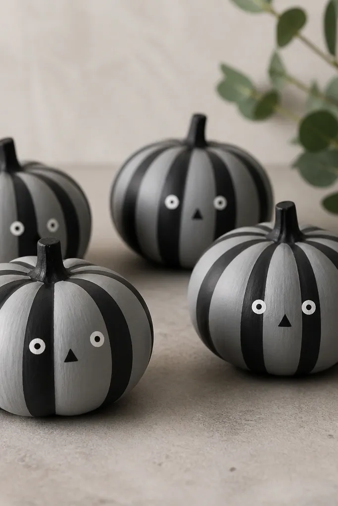
Stripes plus a tiny face reads cute instead of creepy. The gray base makes it feel neutral, and the black stripes pull the whole set together when you mix it with other fall decor. Minimal features look clean at close range, which matters when you’re decorating a small shelf. This style flatters anyone who likes simple, graphic designs more than ornate carving.
Paint the pumpkin light gray and let it dry. Then add black stripes around the widest part of the pumpkin — start with 4 stripes and adjust to the size. Next, paint two small white eye dots and a tiny black triangle nose. Add a short curved mouth line if you want. Seal with matte clear so the stripes stay crisp.
Wrap painter’s tape around the pumpkin lightly for straight stripes, then remove while the paint is still slightly tacky.
Skip thick stripes; wide bands look clunky on 2-inch pumpkins.
10. Teal Pumpkin with White Lace Dots
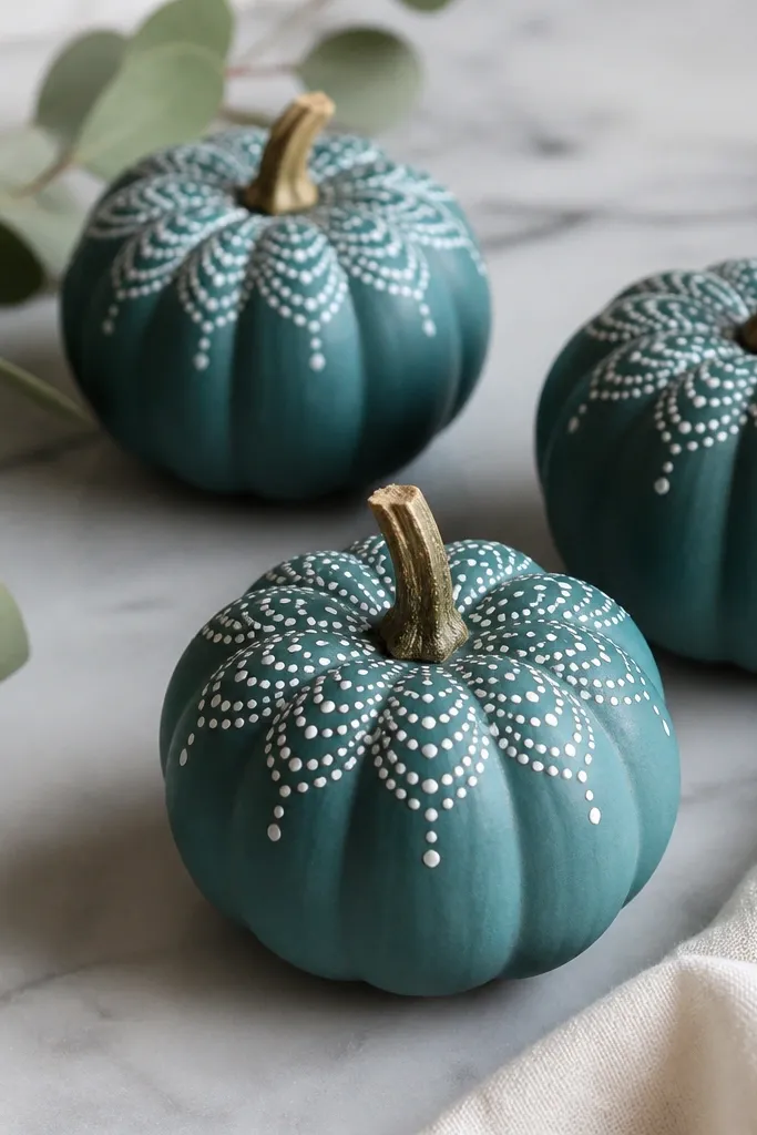
This one feels fancy without being complicated. Teal is a standout color that still works in fall because it pairs well with gold and cream. The white dot arches create a lace effect that looks delicate in small scale. It also looks good with velvet, knit throws, and brass picture frames.
Paint the mini pumpkin teal and let it dry fully. Use a toothpick or the end of a small dotting tool to place white dots in curved arches near the top third, starting around the stem. Add a few dots trailing downward in a gentle S-shape. Keep the dot spacing consistent so the lace looks intentional. Seal with matte clear to prevent the dots from looking glossy and plastic.
Use a scrap cardboard test first to get dot size right before you place them on the pumpkin.
Don’t crowd the dots — too many makes it look like a speckled mess.
11. Blackboard Pumpkin Labels
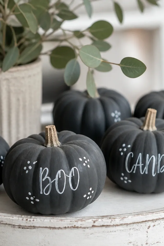
Chalkboard style makes minis look like they belong on a kitchen shelf. Slate gray gives a grounded base, and white lettering pops without needing extra colors. This is ideal if you want a theme but don’t want spooky faces. It also works for small spaces because the text creates a focal point where your eye naturally stops.
Pro tipWrite with a pencil first on the dry paint so you don’t fight the curve of the pumpkin.
Base coat the mini pumpkins slate gray and let dry. Use a fine liner brush with white acrylic to write short words like BOO, CIDER, or CANDY — keep letters under 1 inch. Add tiny dots or a small line border around the text for structure. Let dry, then seal with matte clear. If you want a more chalky look, you can skip glossy sealers and use a matte spray only.
AvoidAvoid using paint pens on textured skin; the ink skips and makes uneven letters.
12. Candy Corn Color Blocks
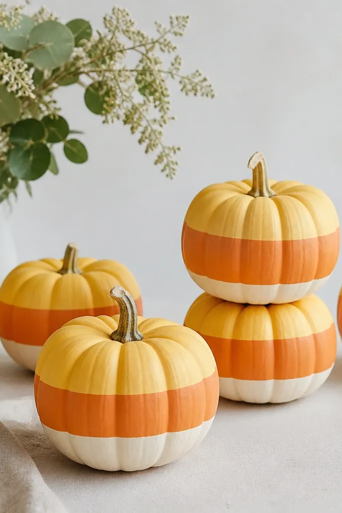
Candy corn blocks look instantly recognizable and still fit a small space because the design is simple and bold. The three-color layout gives you a strong visual even if you only have a handful of minis. Keeping the edges sharp is what makes it look like candy, not messy paint. This is perfect for kitchens and entry tables where you want fun but clean decor.
Paint the top third pale yellow and let dry. Mask the next band with painter’s tape and paint the middle orange, then remove tape while the paint is still a little wet for clean lines. Paint the bottom band cream and let everything dry. Touch up edges with a fine brush after dry. Seal with satin clear for a slightly sweet sheen.
Use low-tack tape and press it lightly; strong pressure can lift paint off the pumpkin.
Avoid blending the colors — candy corn needs hard edges.
13. Monochrome Rose Buds
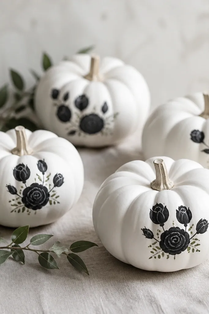
This style is my favorite for people who want Halloween minis that look like spring decor. Monochrome white and black makes the roses look like botanical ink drawings. It’s flattering on small pumpkins because the rose cluster only needs a small area to read clearly. If your home is mostly neutral, this one won’t clash with your existing seasonal colors.
Pro tipMake petals by pulling short strokes outward, not by trying to fill the whole petal shape at once.
Paint each mini pumpkin matte white and let dry. Use a liner brush to paint one rose bud on the front side — start with a small spiral center, then add overlapping petal arcs around it. Add a tiny green dot at the rose base for life and balance. Let dry, then seal with matte clear so the petals look crisp. Place the pumpkins in a single color group for a clean look.
AvoidDon’t add too many roses; one bud per pumpkin looks intentional.
14. Tiny Zodiac Constellation Signs
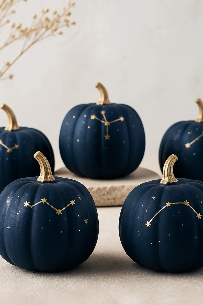
Navy plus gold is a mood, and it looks great in small spaces because it feels like mini night sky art. The constellation symbols are small, so you can display them on a narrow shelf or in a tray without it looking cluttered. This style works especially well if you already have dark decor like black frames or navy candles. It’s also a fun option if you like personal meaning without carving anything.
Paint the pumpkin deep navy and let dry. Add gold star dots using a sponge dab or dotting tool, placing 5 to 8 stars per pumpkin. Then draw a simple constellation line — keep it minimal with 1 to 2 short curves or angles. Add a tiny zodiac glyph or two-letter abbreviation if you want, but keep it small. Seal with matte clear so the stars don’t glare.
Keep one constellation per pumpkin — too many symbols make the design noisy.
Avoid metallic silver on navy; it looks icy and less cozy than gold.
15. Orange Wash with White Polka Dots
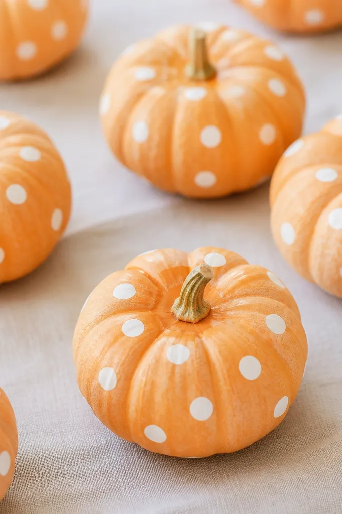
A wash keeps the pumpkin looking natural, and the polka dots make it playful without turning into a cartoon. This design is forgiving because the wash shows the curve and texture, which looks charming rather than sloppy. It’s flattering in bright kitchens and with gingham fabrics because the dots echo classic patterns. If you want something cute that doesn’t scream theme, this is it.
Pro tipLet the wash dry fully before dotting; wet paint makes dot edges blur.
Mix your orange paint with a little water to create a wash, then brush it on thinly so you can still see the pumpkin skin. Let it dry and decide if you want a second wash layer — two thin coats look better than one heavy coat. Add white polka dots with a dotting tool, spacing them evenly but leaving some blank spots for breathing room. Darken the stem area with a small brush if it washed out. Seal with matte clear so the wash stays soft.
AvoidSkip large dots; big circles take over a mini pumpkin.
16. Sage Green Pumpkin with Tiny Scallops
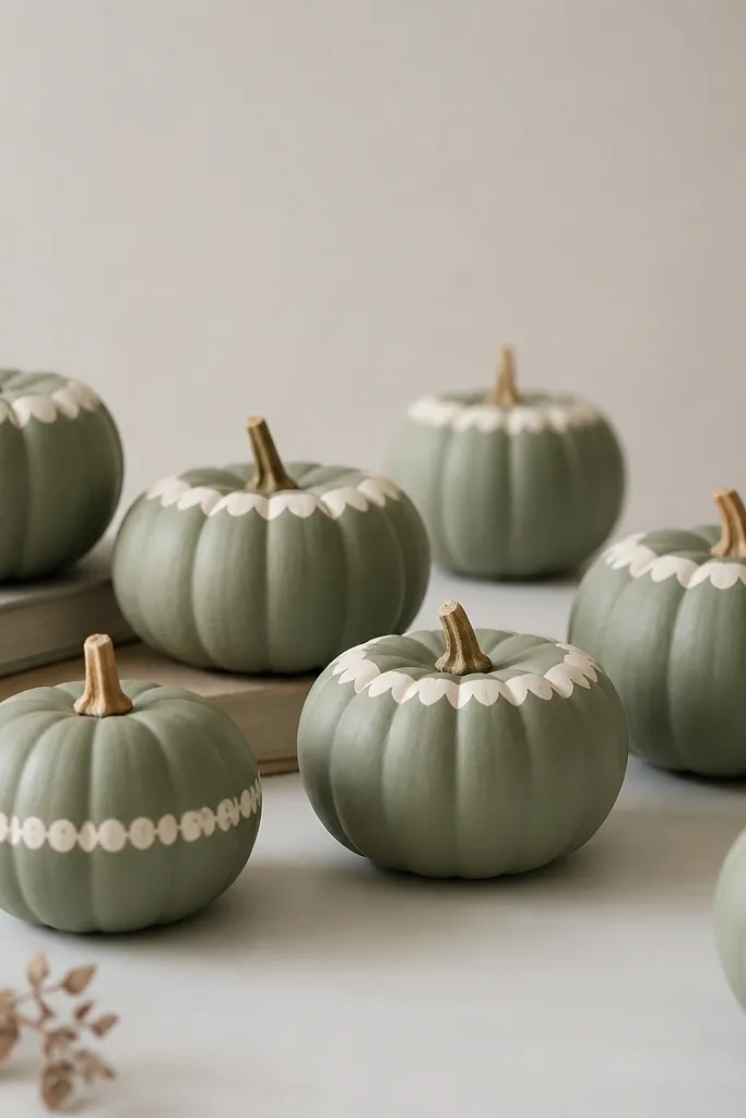
Sage green is calm and looks good with neutral fall decor. The scallop edge detail feels cozy and handmade, and it looks intentional even when you only paint a few minis. Because the scallops hug the curve, they look neat and tidy in close-up photos. This style flatters people who like “soft fall” instead of loud Halloween colors.
Pro tipStipple the scallop color lightly first, then refine a few with a brush so the edge looks organic.
Paint the pumpkins sage green and let dry. Use a small round brush to create cream scallops along the top rim — each scallop is a tiny U-shape. If you want a second detail, paint one scallop row around the middle, spaced evenly. Let everything dry, then seal with matte clear to keep it looking like fabric rather than glossy paint.
AvoidAvoid over-thick scallops; they look like frosting on tiny pumpkins.
17. Blush Pumpkin with Tiny Heart Vines
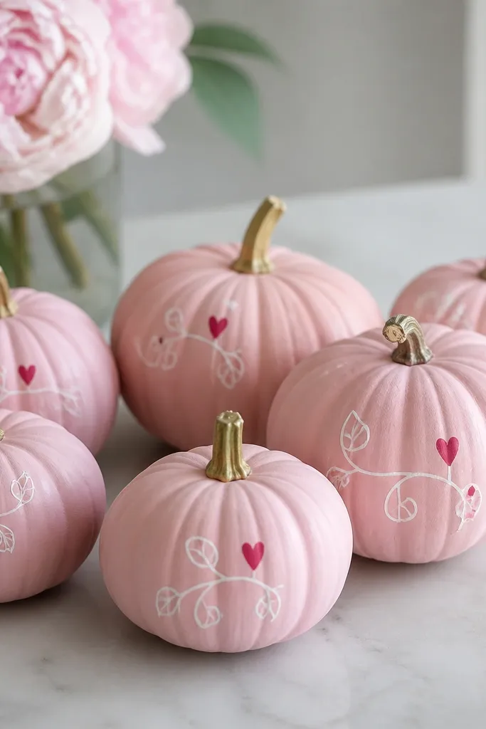
It’s sweet, but it’s still fall because blush works with warm copper and autumn neutrals. The heart vines give you a romantic accent that reads cute even in a small bowl or tray. This design works on minis because the hearts can stay small, which keeps the look delicate. If you decorate for date nights or cozy evenings, this style is perfect.
Pro tipUse two heart sizes in the same pumpkin — one small, one slightly bigger — for a more natural hand-drawn feel.
Base coat the mini pumpkin blush pink and let it dry. Use a liner brush with white paint to draw a vine line that curves diagonally across one side. Add small red hearts along the vine — two teardrop shapes meeting at a point — and keep them 1/4 inch wide. Let dry, then seal with matte clear. Arrange the set so all vines face the same direction for a cohesive look.
AvoidDon’t make the hearts perfectly symmetrical; symmetry makes it look printed.
18. Classic Jack-O-Lantern Smiles, Mini Scale
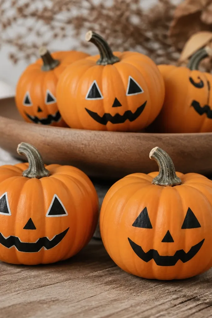
This is the one people ask for because it looks like traditional Halloween, just smaller and cuter. Painting the faces instead of carving keeps the minis from collapsing as fast, which matters in small spaces. Orange base plus black features looks bold in any room, even if your shelf is busy. It also flatters warm skin tones and wood decor because the palette is classic.
Pro tipSketch the face lightly with pencil first so the triangles sit at the same height.
Paint each mini pumpkin a solid pumpkin orange and let it dry. Use a black liner brush to draw two triangular eyes and a jagged smile, keeping the mouth around the center of the pumpkin. Add a thin orange highlight line around the eyes if you want more depth — just a small stroke. Let dry fully, then seal with matte clear. For display, place them in a shallow tray so they don’t roll.
AvoidAvoid using thick black paint for the eyes; it looks like blobs instead of carved triangles.
19. Gold Leaf Vein Texture
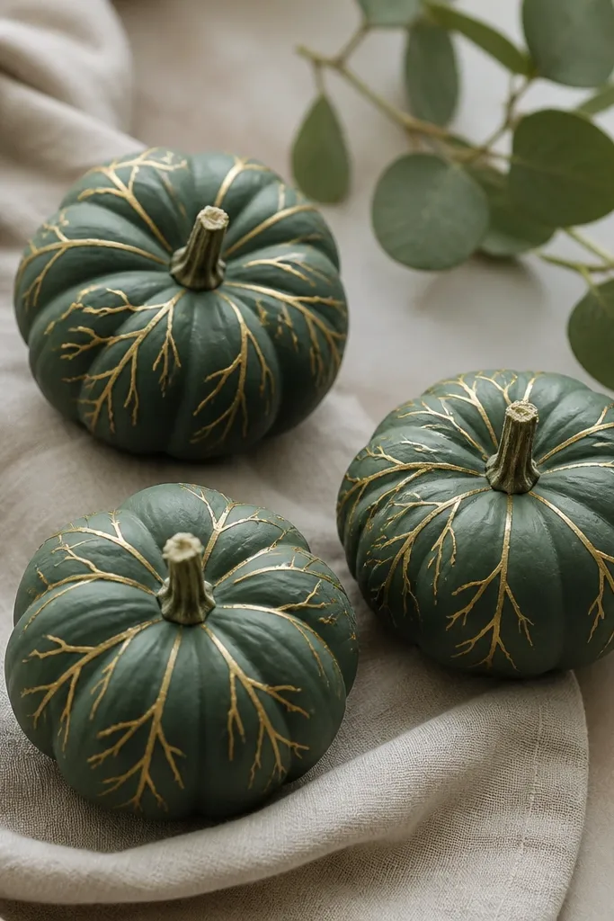
Leaf vein texture feels luxe and it looks great in small groupings because the pattern creates movement. Deep green is a great change from orange-only decor, and gold lines make it feel like autumn foliage. This design flatters dark shelves and brass accents because the gold catches light without being loud. It’s also a smart pick when you want Halloween nearby but not in your face.
Pro tipIf gold paint looks too opaque, mix gold acrylic with a tiny bit of clear medium so it lays thinner.
Paint the mini pumpkin deep green and let dry. Use a fine liner brush to draw a main vein line starting near the stem, then branch out 3 to 5 thinner lines on each side. Add a couple tiny diagonal vein lines for realism. Keep the gold lines thin so they look like painted leaf skeleton. Seal with matte clear so the gold stays crisp.
AvoidSkip wide gold strokes; thick lines turn it into a cartoon leaf.
20. White Snowy Pine Tips
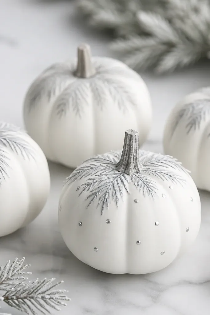
This one reads wintery, so it’s a smart bridge if your decor goes from fall into winter. White pumpkins with gray pine tips look clean and airy in small spaces because they don’t add heavy color blocks. The snowy look also hides tiny paint gaps because the overall finish is light. If you keep a neutral seasonal palette, this style fits right in.
Pro tipUse a fan brush for pine needles if you want faster, softer strokes.
Paint the mini pumpkins matte white and let dry. Use a small liner brush to paint short pine needles in light gray near the top — start with a small branch shape, then add needle strokes outward. Add tiny silver dots at the needle ends if you want sparkle. Let everything dry, then seal with matte clear to avoid glare. Arrange on a tray with a bit of faux snow or white paper shred.
AvoidDon’t use bright silver glitter — it makes the pine look harsh.
21. Copper Metallic Chevron Stripes
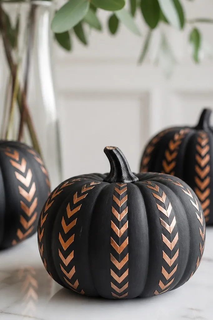
Black base plus copper chevrons gives you a modern, party-ready look. Metallic copper makes the pumpkins feel like decor you’d buy, not make, especially when the lines are sharp. The chevron direction adds motion and draws the eye upward, which helps when you’re styling a small shelf. This looks great with black candles, copper trays, and dark winter coats in your entry area.
Paint the mini pumpkins matte black and let dry. Use painter’s tape to mask chevron angles, or freehand with a ruler guide — either way, keep lines evenly spaced. Paint copper metallic acrylic in thin coats over the chevrons, then remove tape carefully after paint sets but before it fully cures. Let dry, then seal with satin clear for a metallic sheen. If any lines bleed, touch up with black using a fine brush.
Metallic paint looks best in thin layers — two light coats beat one thick coat every time.
Avoid chevrons that curve — straight lines make it look intentional.
22. Rainbow Candy Swirl Accent
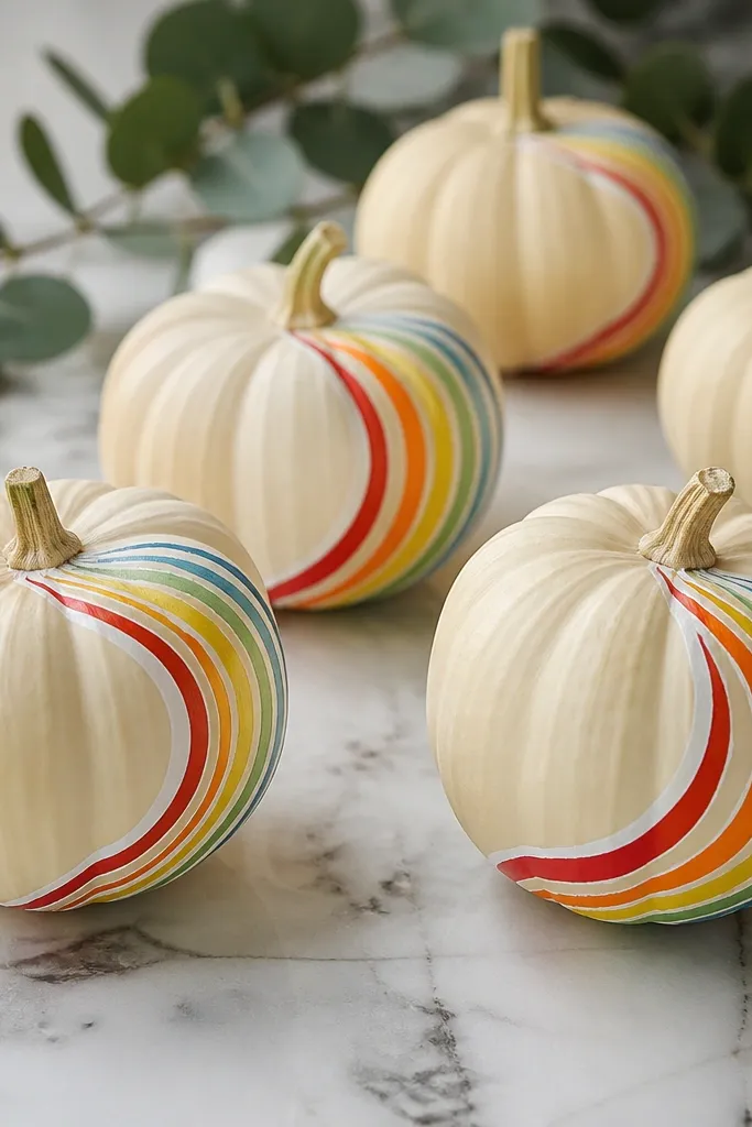
A single rainbow swirl gives you color without turning the whole set into chaos. The cream base keeps everything bright and lets the swirl pop, which is great for small spaces where you want one focal detail per pumpkin. This style is playful and works for fall parties, but it still feels clean because the swirl is controlled. It also looks cute next to striped dish towels and colorful mugs.
Pro tipUse tape to protect the rest of the pumpkin while you paint the swirl — it prevents accidental color smudges.
Base coat the mini pumpkin cream and let dry. Draw one curved swirl path with a pencil lightly, then paint the thick line in red first. After it dries a minute, add thin parallel lines in orange, yellow, green, and blue following the same curve. Add a thin white highlight line to one side of the swirl for shine. Seal with satin clear so the colors look fresh.
AvoidSkip multiple swirls on one mini; one swirl looks designed.
23. Monochrome Striped Pumpkin Bands
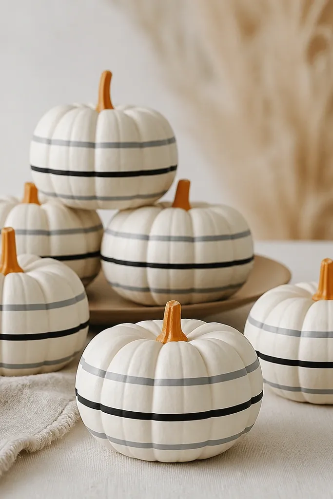
Horizontal bands make minis look taller and more structured, which helps when you’re stacking them in a tray. Off-white plus gray and black is a safe palette for small spaces because it blends with nearly everything you already own. The natural orange stem adds warmth and keeps the design from feeling too flat. This style also photographs well because the stripes create crisp contrast.
Pro tipThin bands look better than wide bands on minis — aim for 1/8 inch to 1/4 inch depending on size.
Paint the pumpkins off-white and let dry. Use a ruler and pencil to mark 5 to 7 band lines lightly around the pumpkin, then paint thin gray bands first. Add black bands between the gray ones, keeping widths consistent. Let dry fully, then seal with matte clear to keep the stripes looking like printed fabric. Leave the stem natural or lightly touch it with a matching orange glaze if it looks faded.
AvoidAvoid uneven spacing; random gaps make it look like accidental paint drips.
24. Spiced Stripe Scandi Mini Pumpkins
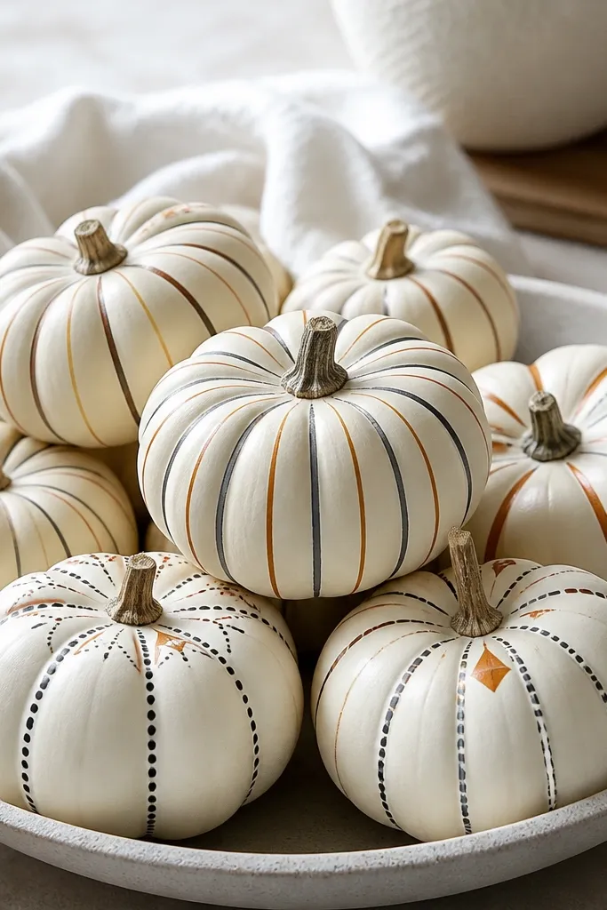
Scandi-style stripes look neat and calm, and they hold up in small spaces better than busy character pumpkins. The warm cream base keeps it cozy, while rust and black bring fall color without going full orange overload. Triangle accents near the stem add personality without clutter. This is great if your decor includes knit textures, simple ceramics, and wood cutting boards.
Pro tipMake one pumpkin a “perfect sample” first, then copy the spacing on the rest so the set looks uniform.
Paint the mini pumpkins warm cream and let dry. Add thin rust stripes using a liner brush — keep them straight and evenly spaced around the body. Add one black stripe as an anchor, then paint a tiny rust triangle near the top like a small flag. Finish with a tiny dot border around the triangle if you want extra detail. Seal with matte clear so it looks like painted pottery.
AvoidSkip glitter on this one; glitter makes the clean Scandi lines look messy.
25. Sage Pumpkin with Tiny White Eyelet Panels
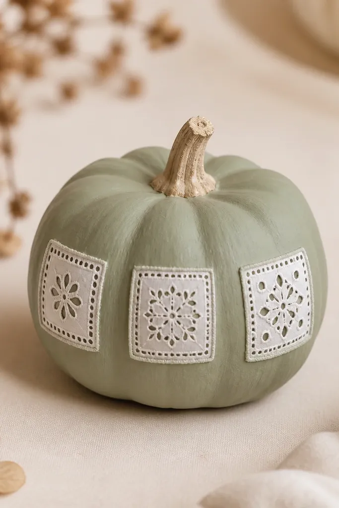
This one looks like craft-store lace got turned into paint. I use a sage base because it stays calm next to all the classic orange pumpkins without looking bland. The eyelet pattern gives you texture even from a foot away, which matters when you’re painting mini pumpkins in a tight shelf space. It also photographs well because the white panels catch light while the sage stays soft and muted. If you want “cute” without going full cartoon, this is the route.
Pro tipUse craft foam if you want the panels to feel slightly raised. Faux lace looks more delicate but needs a lighter hand with glue so it doesn’t wrinkle.
Start with a mini pumpkin that has a smooth skin. Wipe it with a damp cloth, then dry it fully so the paint doesn’t fisheye. Paint the whole pumpkin sage and let it dry completely. Cut small rectangles of thin white craft foam or faux lace fabric (about 1/2 inch wide each) and brush a thin layer of white glue on the back, then press them on in a vertical row. Use a fine liner brush to add a tiny stitched outline around each panel and dot a few micro “holes” with the tip of a toothpick for the eyelet look.
AvoidSkip thick glue — it makes the mini panels slide and the holes look muddy.