1. Black-Pine Evergreen Silhouette
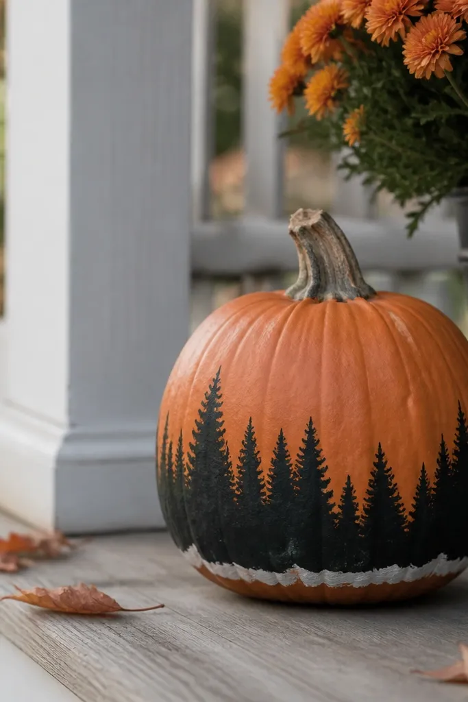
This one looks sharp because the pine shapes are simple and high-contrast. I paint the trees in deep charcoal-black, then I add a few offshoot branches in the same color so it reads as needles, not blobs. The off-white snow stripe at the base makes the pumpkin look like it’s sitting in a winter scene, even while the orange skin is still visible in the background. It flatters most spaces because it doesn’t fight your door color — black and evergreen green work with nearly any front step palette.
Start by priming the whole pumpkin with a thin coat of white or light gray primer so the black stays clean. Then sketch a horizon line about 2 inches from the bottom and paint pine silhouettes upward, using a small round brush. Keep the trees slightly uneven in height — I usually go from 2 to 3.5 inches tall depending on the pumpkin size — so it looks natural. Finish by dragging a dry brush of off-white across the bottom edge for a snow effect and seal with a matte outdoor clear coat if it’s outside.
Pro tipFor the snow stripe, load your brush lightly and wipe most paint off on a paper towel — you want texture, not a solid band.
AvoidDon’t paint full, solid trees all the way to the top — the design gets heavy and looks like a sticker.
2. Evergreen Wreath Center Medallion
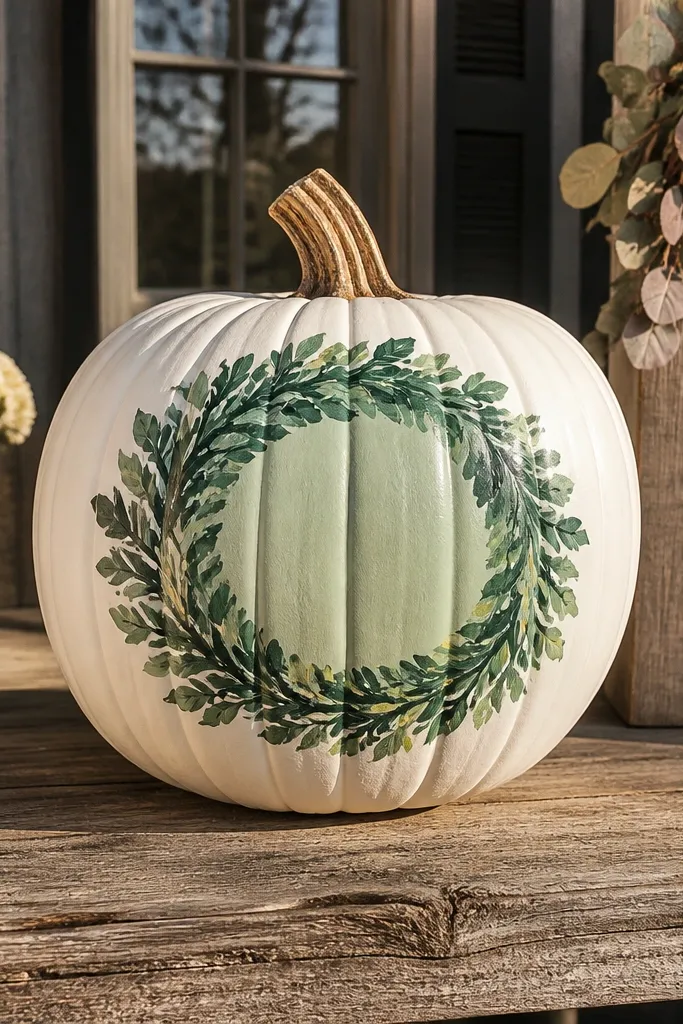
This design reads “holiday” without needing a face, and it looks great on a single statement pumpkin. The wreath ring creates a focal point that’s flattering on rounder pumpkins, because your eye stays centered instead of wandering around the ridges. I use three greens — deep evergreen, forest green, and a lighter sage — so the wreath has depth even from across the porch. The cream medallion keeps it warm and friendly, especially if your home has cool-toned siding.
Prime the pumpkin with a light base, then draw a faint circle centered on the front using chalk or a pencil. Paint the wreath ring first in deep evergreen, leaving a small gap for highlights. Layer forest green on the outer edge and sage on the inner edge, then dot tiny rust berries in a line at the top right and bottom left. Add a simple cream medallion in the center — I do a rounded rectangle or small oval — and seal with matte finish.
If your circle looks wobbly, tape a paper plate to the pumpkin as a guide for the outline.
Skip glitter pens here — they catch light unevenly and make the wreath look messy.
3. Pine Needle Dry-Brush Texture
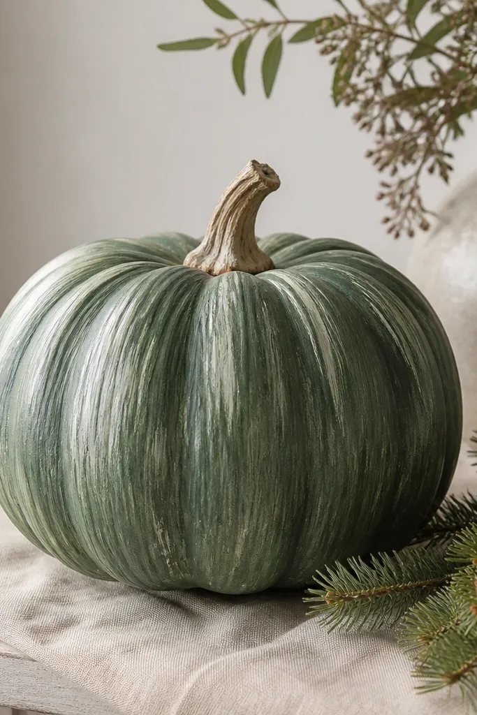
This is my go-to for people who want “evergreen” but hate detailed drawing. Dry-brush texture gives you needle-like movement without you needing to paint individual needles. It looks especially good on tall pumpkins because the texture naturally follows the ridges, so the whole piece looks dimensional. The off-white highlights on the upper half mimic sun hitting snow-dusted needles, which makes it feel seasonal from fall into winter.
Prime with a light base, then mix your mid-green (forest or evergreen) with a little matte medium so it dries without shine. Load a flat or angled brush with paint, then wipe almost all paint off on a paper towel. Brush in short, slightly upward strokes following the pumpkin’s shape, starting near the center and working outward. Add off-white on the upper third with the same dry-brush method, then seal with matte outdoor clear coat.
Practice on a spare cardboard scrap first — you want the brush to leave texture, not solid stripes.
Don’t apply thick paint — thick layers crack on the pumpkin’s ridges.
4. Rust + Evergreen Stripe Cascade
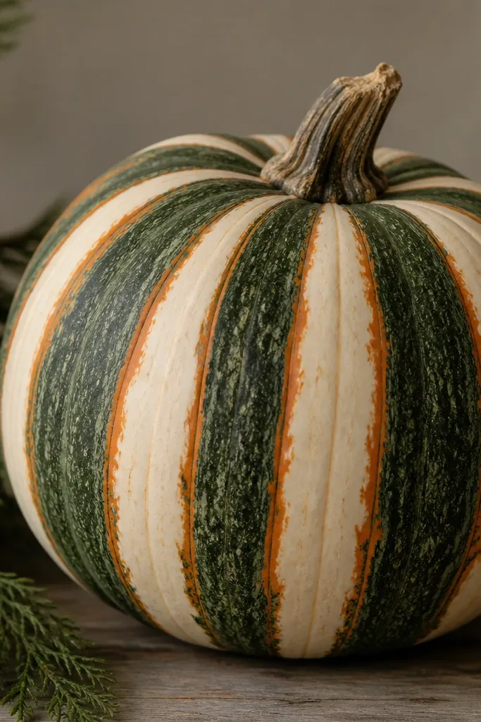
This one looks modern, and it’s the easiest way to make a painted pumpkin feel “designed” instead of spooky-only. Evergreen stripes read like winter foliage when you keep the palette tight: evergreen green, rust, and cream. The diagonal flow flatters the pumpkin’s shape by pulling the eye downward, which looks good on both small and medium sizes. If your porch decor has wood tones, the rust lines make everything feel connected.
Prime, then paint a wide diagonal evergreen band starting near the stem and ending about 1 inch above the bottom. Use painter’s tape for crisp dividers, placing it in 1/2-inch intervals, and paint rust between the evergreen stripes. Once the paint dries, remove the tape while the paint is still slightly tacky so edges stay clean. Add tiny cream highlight lines on just one side of each stripe using a liner brush, then seal.
Pro tipUse painter’s tape only for the first pass; for the highlights, freehand with a steady hand.
AvoidDon’t use neon green — it looks like craft paint and loses the evergreen vibe.
5. Snowy Cabin Window Frame
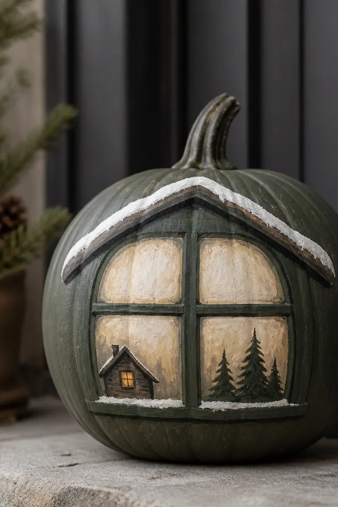
This design works because it adds architecture, not just color. The dark green window frame makes the pumpkin look like a winter scene you can hang on your porch, and the cream panes keep it bright so it doesn’t feel too heavy. I like it on medium pumpkins because the window proportion looks balanced on that size. The tiny cabin silhouette gives a cozy vibe without needing a full mural.
Prime with cream or light gray. Paint a dark evergreen rectangle window centered on the pumpkin, leaving a 1 inch border around it. Inside, paint two cream “panes” separated by a thin vertical line, then add a small cabin roof in deep brown or charcoal. Dust off-white snow along the roof edge with a dry brush, then seal with matte outdoor clear coat.
For the frame, use a brush with a pointed tip and keep your strokes in one direction to avoid streaks.
Don’t paint the window too large — if it covers all the pumpkin, it loses the seasonal charm.
6. Evergreen Monogram with Pine Sprigs
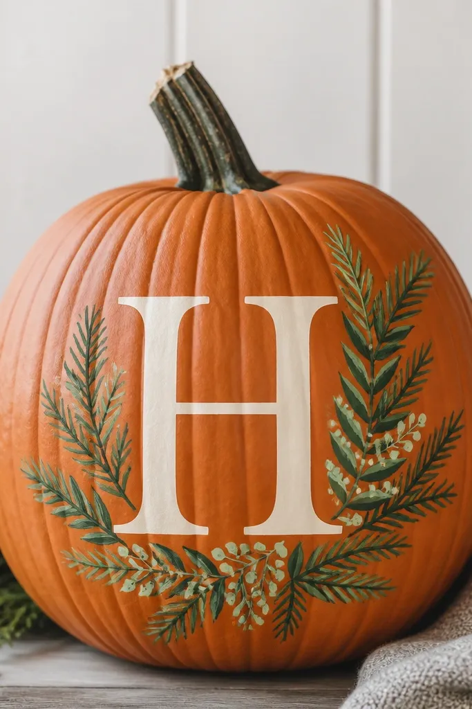
Personal letters look elevated on pumpkins when the colors stay calm. The cream monogram is a clean focal point, and the pine sprigs around it add movement without clutter. This works best when your letter is big — you want it readable from 6 to 8 feet away under porch lights. It flatters most skin tones in photos because it’s light and neutral, not harsh orange-heavy.
Prime the pumpkin and lightly sketch your letter size centered on the front. Paint the monogram in cream with a smooth coat, then outline it in deep evergreen for crisp edges. Add pine sprigs in clusters — I do three sprigs on the left, two on the right — using two greens: one dark for depth and one lighter sage for highlights. Finish with tiny off-white dots as “snow” on the sprigs, then seal.
Pro tipTrace the letter lightly with transfer paper so your curves don’t wobble.
AvoidAvoid thin metallic paint — it chips faster on pumpkins.
7. Gradient Evergreen Ombre Top
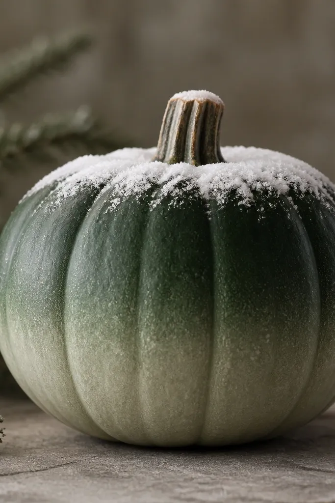
Ombre looks expensive when you keep it simple and smooth. This design uses evergreen at the top where shadows naturally sit near the stem, then fades into lighter sage as you go down. It’s flattering on tall pumpkins because the gradient follows the vertical shape, and it looks good in both daylight and evening light. The thin off-white snow cap at the top makes it feel winter-ready without painting a full scene.
Prime, then paint the top third deep evergreen. Rinse your brush or switch to a clean one and blend downward with forest green, then blend again with sage toward the bottom. Work in small sections, blending while the paint is still slightly wet so you don’t get hard lines. Add a narrow off-white band around the stem area like a snow cap, then seal with matte.
Pro tipUse a damp sponge to blend the middle transition if your brush strokes show.
AvoidDon’t rush the blending — dry paint creates stripes that look amateur.
8. Evergreen Lattice with Rust Corners
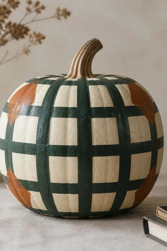
This is the pumpkin version of a cozy farmhouse pattern. The lattice grid gives structure, and rust corner blocks keep the design warm against the orange or cream base. I like it on pumpkins with strong ridges because the grid lines catch the texture and look dimensional. It also looks great next to plaid pillows because the colors line up instead of competing.
Prime with a light cream base so the lattice doesn’t look muddy. Mark a grid with light pencil lines, leaving about 1 to 1.25 inches between lines depending on pumpkin size. Paint lattice squares in deep evergreen, then fill the four corners with rust. Use a liner brush for the grid edges so lines stay crisp, and add a tiny off-white highlight along the top edges of a couple squares. Seal with matte outdoor clear coat.
Pro tipIf you’re nervous about straight lines, draw the grid first on paper and measure spacing to match your pumpkin width.
AvoidDon’t paint the grid too thick — thick lines swallow the pattern.
9. Pine Branch Frame Around a Face-less Center

This design flatters pumpkins that already have a nice shape, because you don’t cover the whole surface. The branch frame adds depth around the edges while keeping the center clean, which looks calm and intentional. I paint the branches in a mix of dark and medium greens so the frame feels layered, not flat. The off-white snow flecks make it read wintery without turning it into a full mural.
Prime the pumpkin with a cream or light gray base. Paint a loose oval or circle frame around the front edges with deep evergreen, letting some branches curve inward. Layer medium green on top of the deep base along the inner edges of the branches. Add off-white snow flecks by tapping your brush lightly — keep it concentrated near the top and right side. Leave the center mostly unpainted except for a gentle glaze so it doesn’t look empty. Seal.
Pro tipPaint the frame first, then decide where the snow flecks land based on where the branches point.
AvoidDon’t fill the center completely — the breathing room is what makes it look clean.
10. Evergreen Chalkboard Style with White Snow Writing

Chalkboard style is one of the best ways to make pumpkins look like decor, not kids' craft. The deep evergreen background makes the white lettering pop, and it reads well from a distance under warm lights. I’ve used this for both single pumpkins and a matching set, and the look stays cohesive because the lettering style is consistent. It flatters any porch because it doesn’t clash with door colors — it’s basically a dark neutral.
Prime, then paint the entire pumpkin with a deep evergreen base in matte finish. Let it dry fully, then practice your lettering on paper first. Use a thin liner brush or paint pen to write one short phrase across the center — I like “STAY WARM” or just “NORTH” — in off-white. Add tiny snow dots and short dash marks around the letters for a winter effect. Seal with a matte clear coat so it doesn’t turn glossy.
Do your first letter in pencil light — you can wipe it off with a damp rag before paint sets.
Skip thick cursive swirls — they crack on the pumpkin ridges.
11. Snowy Evergreen Crest Emblem
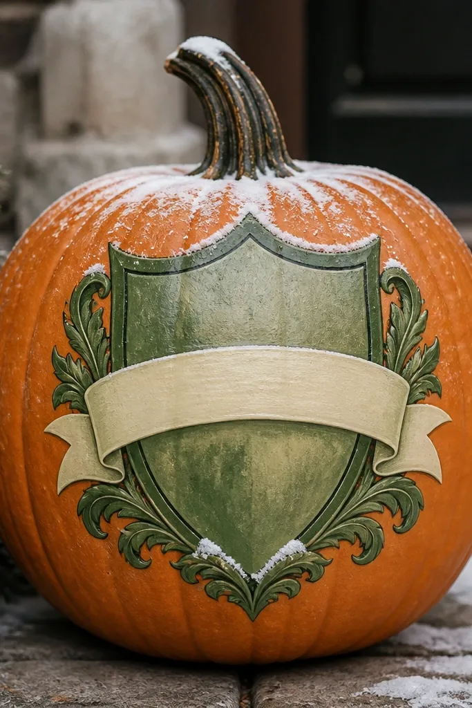
Crest designs look detailed without being fussy because the shapes guide the eye. The shield outline frames the pumpkin face area and makes the whole piece feel like it belongs on a sign. I keep the crest colors to three greens plus cream and rust, so it stays readable. This flatters medium to large pumpkins because the shield needs space for clean corners and curves.
Prime and sketch the shield shape centered on the front. Paint the outer crest in deep evergreen, then fill the inner sections with forest green and sage. Add a cream banner in the middle with a short word or simple line — I do “HOPE” or “STAY” depending on the season vibe you want. Dust off-white snow along the outer edge with a dry brush. Seal with matte outdoor clear coat.
Pro tipUse a stencil for the shield outline once, then freehand the inner details for a hand-painted feel.
AvoidDon’t add too many tiny icons inside — two or three details look better than ten.
12. Evergreen and Cream Stripe Chevrons
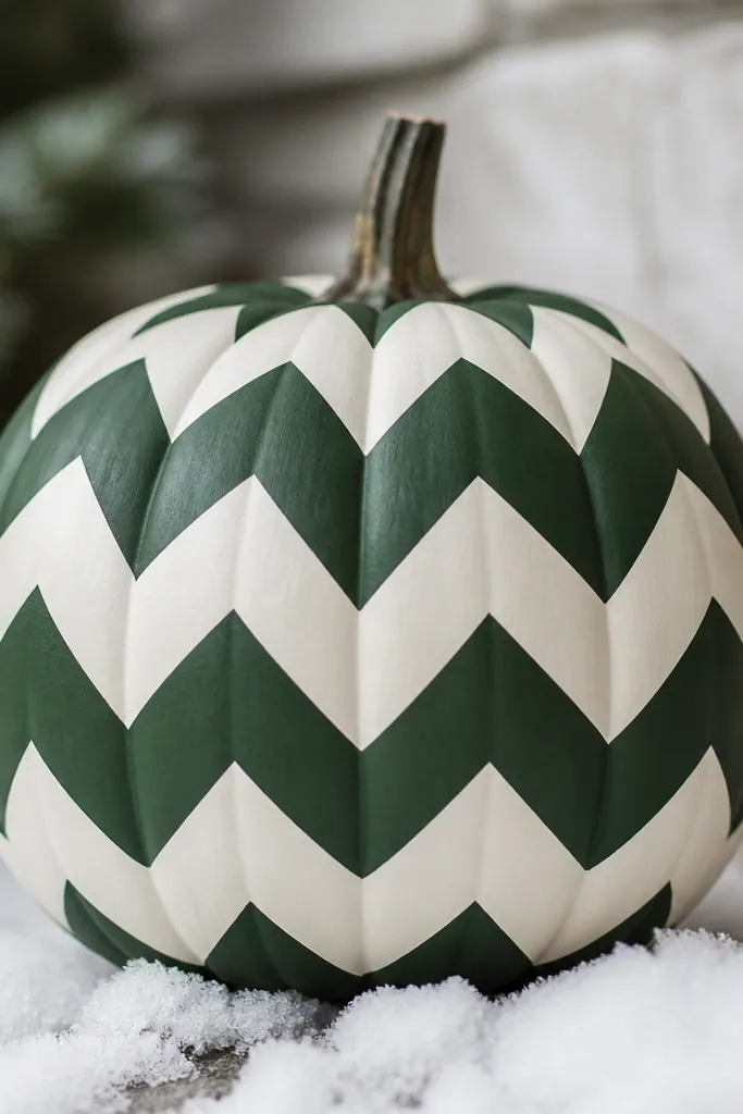
Chevrons give you instant movement. When you use evergreen and cream, it looks crisp and graphic, and it holds up even if your pumpkin has uneven ridges. This design is flattering on pumpkins that sit on the ground because the chevrons pull the eye toward the center while still reading from the sides. It also plays well with string lights because the stripes catch highlights differently across the surface.
Prime with cream, then mark chevron angles across the front using a ruler. Paint the first stripe in deep evergreen, then use tape for the cream negative spaces if you want razor edges. Build the pattern downward in 1-inch-ish sections, keeping the chevrons aligned with the pumpkin’s curve. Add a small off-white snow pile at the bottom by dabbing paint and smoothing the top edge. Seal with matte.
If tape lifts paint on your primer, lightly re-prime those spots before chevrons.
Don’t make the chevrons too thin — thin stripes hide your hand-painted texture and look printed.
13. Pine Branch Shadow Angle
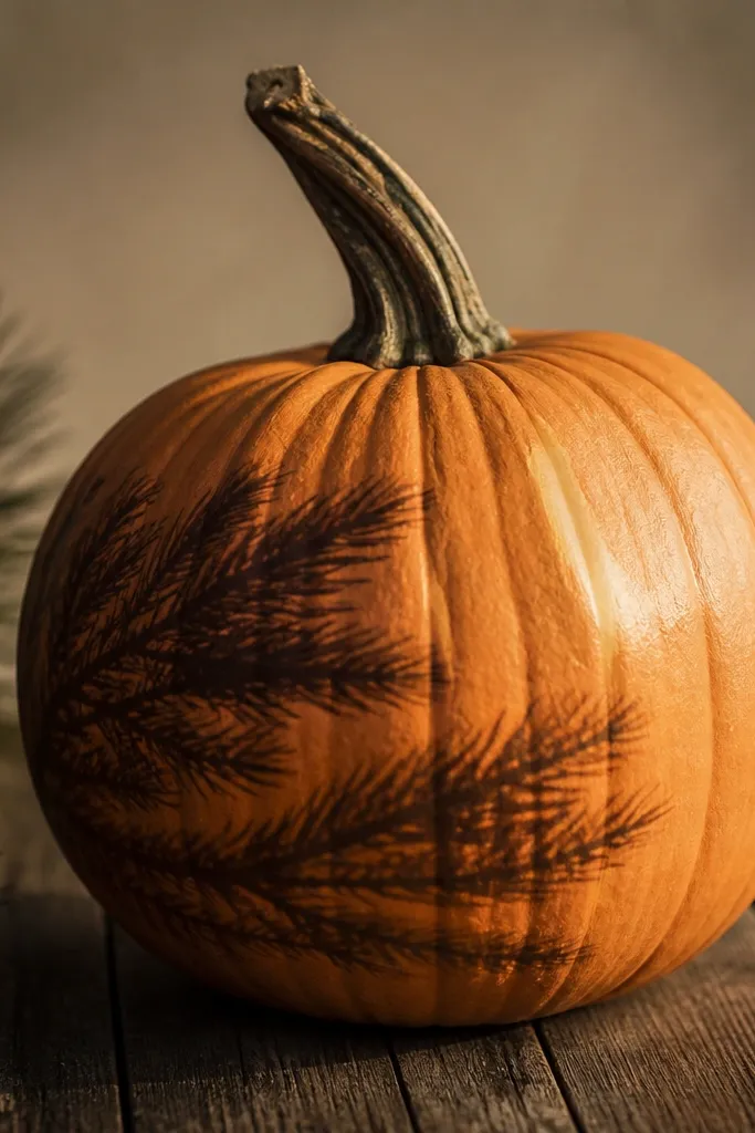
This one looks like a real shadow, which is why it feels more grown-up than typical pumpkin faces. I paint a branch silhouette at an angle so it looks like it’s cast across the pumpkin surface. The soft edge blend makes it feel believable, and the cream highlight stroke adds just one clean moment of brightness. It flatters pumpkins that have a strong side ridges pattern because the shadow follows the texture and looks natural.
Prime and base coat the pumpkin in a mid-green glaze, keeping it thin. Paint a pine branch silhouette in deep evergreen on one side, starting near the upper third and angling down toward the center. Soften one edge using a slightly damp brush so it looks like shadow rather than a sticker. Add one small cream highlight stroke along the opposite edge of the branch. Seal with matte so the shadow stays soft.
Use a liner brush for the main branch, then a small round brush for a few twig offshoots — keep it sparse.
Avoid hard outlines — crisp edges look like vinyl decals on pumpkins.
14. Evergreen Snowflake Burst
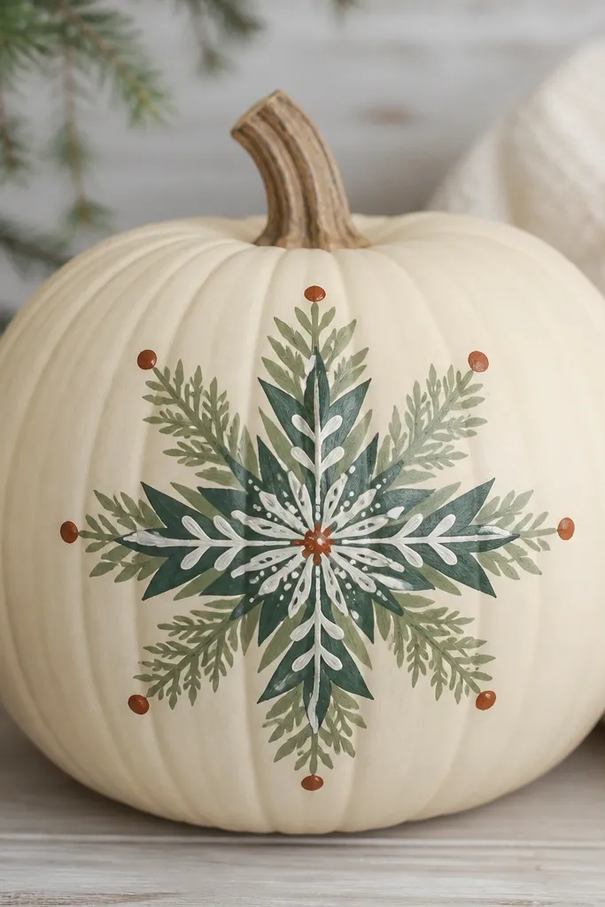
Snowflakes on pumpkins look best when they’re layered, not one flat shape. This version uses evergreen shades for the “wreath” feel and off-white for the snowy highlights, so the center looks dimensional. I add rust dots at select tips to tie it into fall color without making it orange-heavy. It flatters a wide range of pumpkin sizes because the burst pattern scales well — just keep the center bigger than the outer tips.
Prime, then paint a small circle center in deep evergreen. Draw a snowflake with 6 arms using off-white for the main lines, then thicken the arms with sage so it looks layered. Add smaller branch details in forest green along each arm, keeping them symmetrical. Dab rust dots at the outermost tips and add a few off-white dots around the center like falling snow. Seal with matte outdoor clear coat.
Pro tipUse a paper snowflake as a reference for arm spacing, then redraw it larger on the pumpkin.
AvoidDon’t overfill the snowflake — too many tiny lines blur on curved surfaces.
15. Evergreen Garland Ribbon Loop
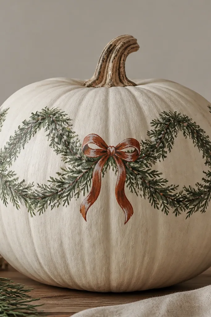
This design looks like porch decor because it mimics a garland you’d hang on a mantel. The ribbon loop gives you a natural curve that follows the pumpkin’s shape, so it looks good even when the ridges are strong. I use deep evergreen for the outer ribbon, sage for the inner folds, and rust for the bow so it feels fall-to-winter consistent. It flatters pumpkins with a wider top because the loop has room to breathe.
Prime the pumpkin, then paint a base layer of light cream so greens stay clean. Sketch a loop ribbon across the top half — one big arc from left to right with a knot near the center. Paint the outer edge of the loop in deep evergreen, then add inner fold lines in sage. Make a small rust bow with two loops and a short knot, then add off-white dusting along the fold lines using a dry brush. Seal with matte to keep it looking soft.
Pro tipFor bow loops, paint one side first, let it dry, then mirror it so the knot sits centered.
AvoidSkip shiny craft paint here — it turns the “fabric” look into plastic.