1. Smoked Gold Half-Moon Edge
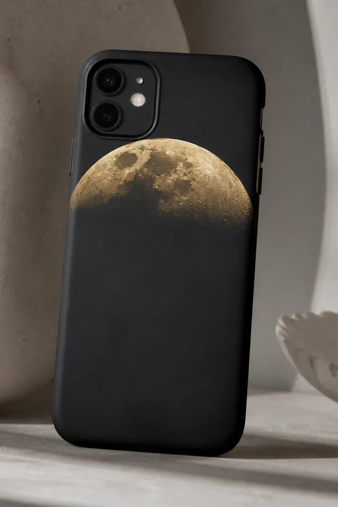
This one looks expensive because it creates a “jewelry edge” effect without covering the whole case. Start with a black base (matte) and paint a half-moon near the top using a metallic gold acrylic. Then blend the gold into the black with a dry brush so it fades like smoke. It flatters most skin tones because the contrast is strong but controlled, and it looks clean for work or dinner. The styling principle is a strong shape plus a gradient — your brain reads it as intentional design rather than random paint.
First, scuff the case, wipe with alcohol, and paint the entire case matte black. Let it dry, then apply painter’s tape to mark a curved line where the half-moon ends — I aim for about a 1.2 inch (3 cm) tall arc from the left to right edges. Paint the half-moon with metallic gold, then immediately blend the outer edge with a dry, almost-dry flat brush so no hard line stays. Finally, remove the tape after the gold is tacky, not fully wet, and spray a matte clear coat once everything cures overnight.
Pro tipUse a small piece of tape to mask just the camera bump area so you don’t accidentally get gold on the lens rim.
AvoidSkipping a dry-brush blend leaves a flat gold sticker look.
2. Cream Marble Swirl with Thin Black Veins
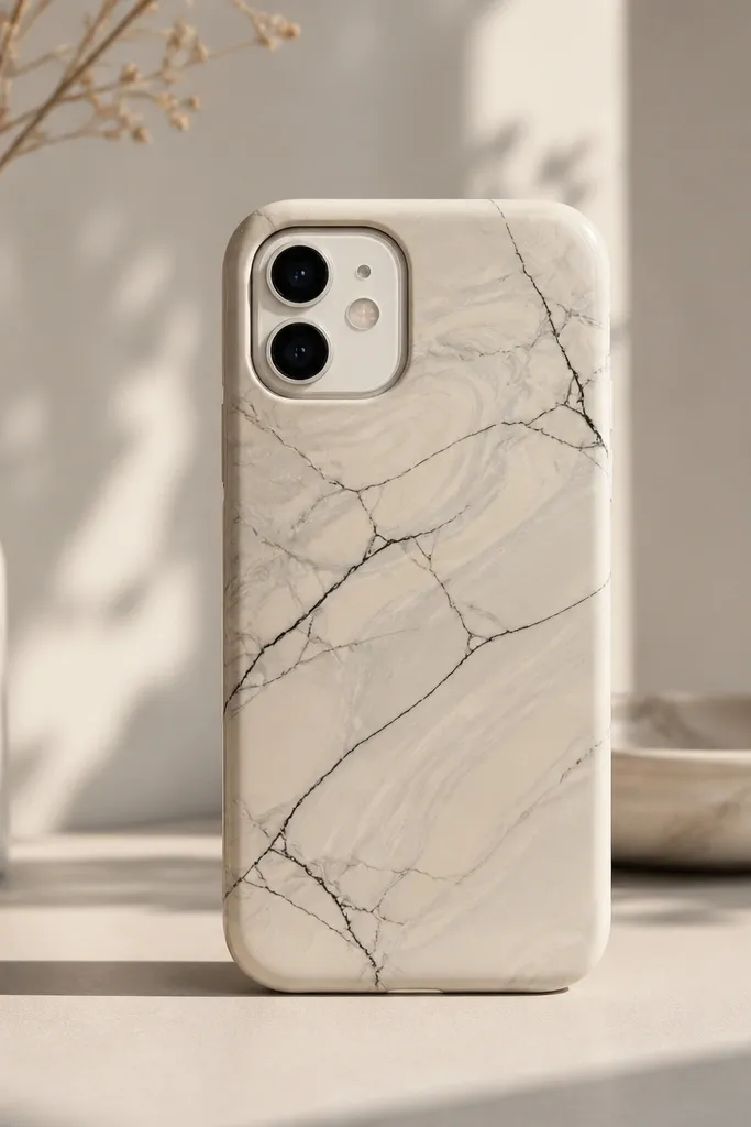
Marble looks expensive when the veins are thin and consistent, not thick and scribbly. Use a cream base because it photographs warm and hides tiny brush marks better than white. Add soft gray swirls, then drag thin black lines through them with the tip of a fine liner brush. This design works for neutral outfits and looks great on medium to deep skin tones because the cream reads warm and luxe. The styling principle is restraint: lots of air between veins and a gentle swirl, not full coverage chaos.
Start by painting the case a flat cream (I use a light ivory acrylic). After it dries, dab gray paint in 3-4 loose blobs, then swirl them with a cotton swab in circles until you get cloudy movement. Take a fine black liner brush and add 6-10 thin vein lines that start and stop — don’t run them all across the case. Add one or two tiny “breaks” in the lines for realism, then seal with a clear coat that dries satin or glossy depending on your preference.
Mist a little rubbing alcohol onto your cotton swab before swirling gray — it makes the marble look softer.
Thick black veins make it look like a kid’s marble craft.
3. Sage Gradient with Speckled Stardust
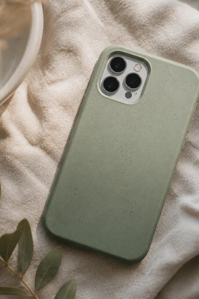
Gradient + speckle reads “expensive” because it mimics premium finishes like terrazzo or ink-on-paper. Sage looks modern and flattering because it doesn’t fight with warm or cool jewelry. Paint a vertical gradient first, then add speckles using diluted paint so the dots look airy. This one looks great in daylight and looks especially good with gold rings and neutral nails. The styling principle is light scatter — tiny dots make the surface look textured without looking busy.
Paint the bottom half of the case deep sage, then blend upward with a damp sponge so it fades to pale sage at the top. Use a reference: aim for roughly a 70/30 split where the darker area is about two-thirds of the height. Once dry, dilute white acrylic with water until it’s the consistency of skim milk. Dip a toothbrush, then tap it gently over the case to create speckles — keep your wrist 6-8 inches (15-20 cm) away for even spacing. Seal with clear coat after it fully dries.
Do one test tap on scrap paper first so you know how big the dots land.
Using paint too thick makes speckles turn into blobs.
4. Pearl Dot Border Frame
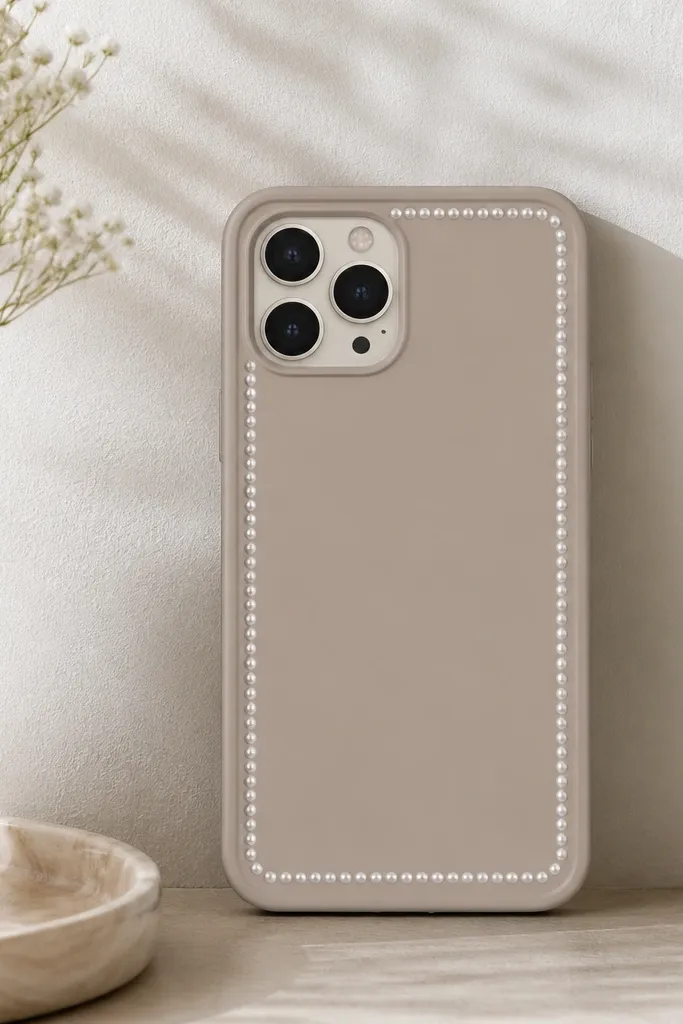
A dot frame makes a basic case look like it has a custom design because it creates a “gallery” border. I like using a dark background (navy or espresso brown) because the dots pop and look like pearls under light. Use a metallic or pearl white paint so the dots catch tiny highlights instead of looking flat. This is flattering on any skin tone because it’s high-contrast and tidy, and it works for both casual and formal outfits. The styling principle is a perfectly even grid — your phone looks styled because the border is controlled.
Paint the whole case your base color (try deep navy). Once it dries, measure a border inset of about 3-4 mm from the outer edge and lightly mark with pencil on the back side only (so it won’t show). Use a dotting tool or the end of a rounded toothpick to place pearl white dots along the border — keep spacing around 6-8 mm apart. Work one side at a time, then fill corners with 3-4 dots to complete the frame. Let it dry fully, then add clear coat in two light passes.
If dots look uneven, rotate the case 90 degrees and place the next row — it fixes your hand angle.
Freehanding the border without measuring makes it look crooked and cheap.
5. Tangerine Polka Pop with Black Outline
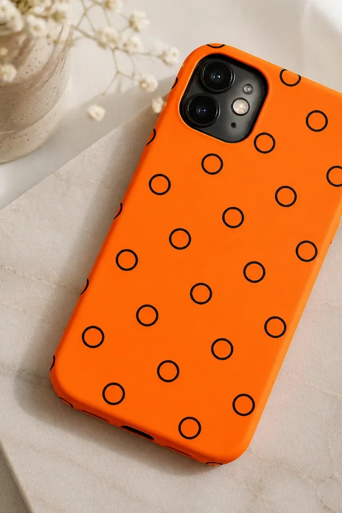
This one looks expensive because each dot has a crisp outline, so the pattern reads like graphic design. Tangerine is bold but still flattering since it warms the whole phone look. Use a solid tangerine base, then paint dots in white and trace a thin black ring around each. It looks great with denim, white sneakers, and gold hoops, and it holds attention in photos. The styling principle is sharp linework and repeatable spacing.
Paint the case tangerine and let it cure until it’s not tacky. Use a round stencil or a bottle cap to lightly mark 10-16 dot centers — aim for even spacing across the surface. Paint the dots white first, then use a small liner brush to add a thin black ring around each dot. Let the black dry, then seal with a clear coat that doesn’t yellow. Keep the camera cutout area clean by masking it with small tape pieces.
Pro tipThin your black paint slightly so the ring stays crisp instead of chunky.
AvoidSkipping the outline makes polka dots look like a sticker.
6. Wine Red Lipstick Swirl
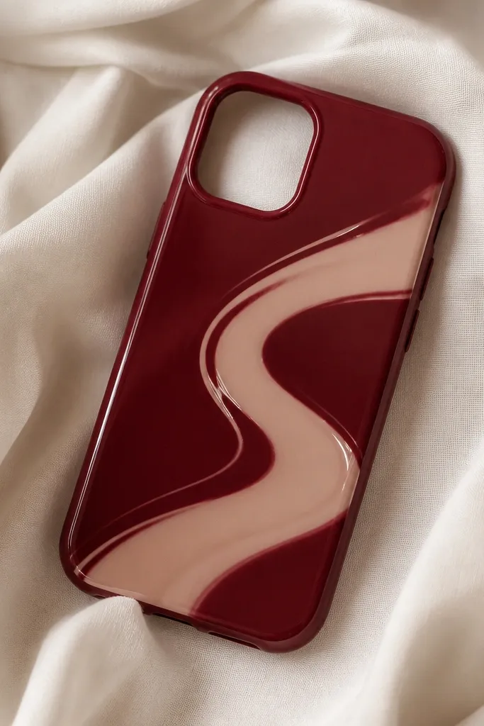
This design feels luxe because it’s glossy-looking even on a matte base. Use wine red as the main color, then add a nude swirl that mimics the smear of lipstick. I like adding 2-3 tiny highlight strokes in a lighter nude or white so it catches light when you move your phone. It’s flattering and fun for nights out, especially with warm-toned makeup. The styling principle is asymmetry with intentional highlights — it looks artistic but still neat.
Paint the whole case wine red matte. After it dries, load a small liner brush with nude acrylic and draw an S-shaped smear across the middle — keep the ends tapered so it looks like a swipe. Add a second lighter nude pass on top of the first line to create depth. Finish by dabbing tiny highlight dots with a toothpick on the upper edge of the swirl. Seal with clear coat; if you want extra shine, use a satin clear instead of matte.
Pro tipPractice the swirl on paper first so your line doesn’t wobble on the case.
AvoidOverloading the nude paint makes it turn into a blob.
7. Midnight Checkerboard Corners
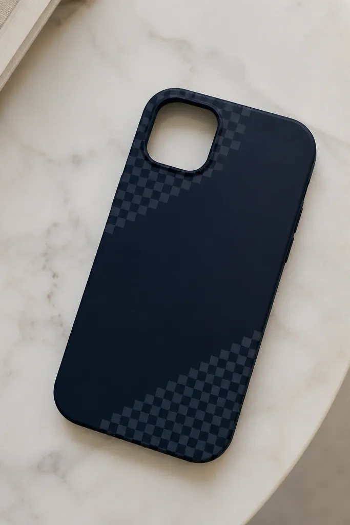
Checkerboard looks expensive when it’s small-scale and placed like an accent, not when it covers the whole case. Midnight navy with tiny white and light gray squares reads modern and clean. The corner placement makes it look like a design detail from a brand, not a craft project. This one suits cool undertones and looks sharp with silver jewelry. The styling principle is negative space — the plain areas make the pattern feel intentional.
Start with a solid midnight navy base and let it fully dry. Use tape to mask a corner area roughly 1 inch by 1 inch (2.5 cm by 2.5 cm). Inside that taped square, paint tiny alternating squares: white and light gray, about 6-7 mm each. Let those dry, then remove tape carefully so the edges stay clean. Repeat the same checkerboard in the opposite corner, then clear coat once everything cures.
Pro tipUse a ruler to mark square lines lightly on the taped area before painting — it keeps the grid straight.
AvoidPainting a full checkerboard across the case makes it look costume-y.
8. Gold Foil Leaf Accent with Black Base
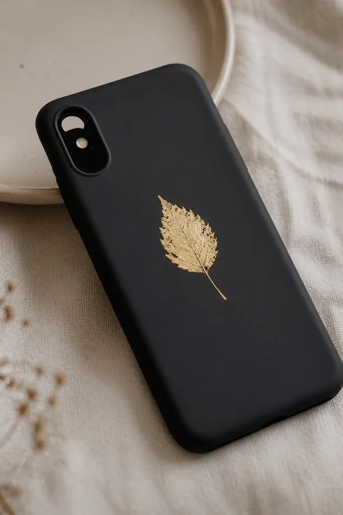
Gold leaf accents look pricey because they have irregular texture — the surface isn’t perfectly smooth. Pair matte black with gold so the leaf pops without needing a busy background. You can paint a leaf shape with metallic gold and then add a little texture using foil or a sponge. This looks great on deeper skin tones and also looks stunning with black outfits because the phone becomes a small accessory. The styling principle is one statement element with texture, not a pattern everywhere.
Paint the case matte black and let it dry fully. On the center of the case, lightly sketch a leaf shape with pencil. Paint the leaf with metallic gold acrylic, then dab a tiny amount of gold paint around the edges with a sponge so it looks uneven. Press a small piece of gold foil gently on top of the wet paint for a realistic shine, then seal with a clear coat over the whole case. Keep the leaf about 1.5 inches (4 cm) long so it doesn’t overpower the phone.
Pro tipIf foil sticks too much, press it once and lift — don’t rub or you’ll smear it.
AvoidPutting foil on a glossy base makes it look like a cheap sticker.
9. Sunset Ombre with Tiny White Clouds
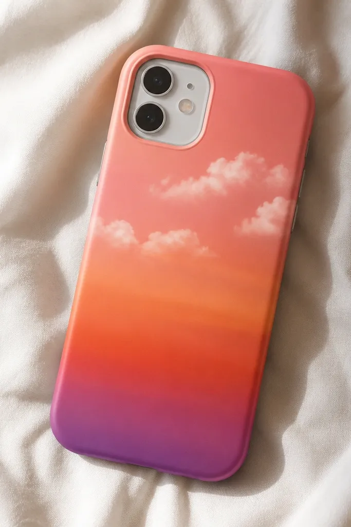
Sunset gradients are crowd-pleasers, but the expensive look comes from adding small clouds that sit on top like a scene. Use coral, pink, and a hint of purple so the colors blend like evening sky. The clouds should be tiny and spaced so they don’t cover the gradient. This looks great for summer bags and holiday nights, and it flatters warm and neutral undertones. The styling principle is layered atmosphere — gradient first, then cloud accents.
Paint the bottom third of the case coral, then blend up into pink, then deep orange, then a thin purple band near the top. Use a makeup sponge for blending and work slowly — you want soft transitions, not streaks. Once dry, load a small brush with white paint and dot 6-8 cloud puffs across the upper area — each cloud should be 8-10 mm wide. Add a second pass of white on the top edges of the clouds to give volume. Clear coat after everything dries fully.
Pro tipKeep clouds clustered near the top third so the gradient stays the main event.
AvoidBig clouds covering the center make it feel like a cartoon.
10. Rose Quartz Blush with Cracked Lines
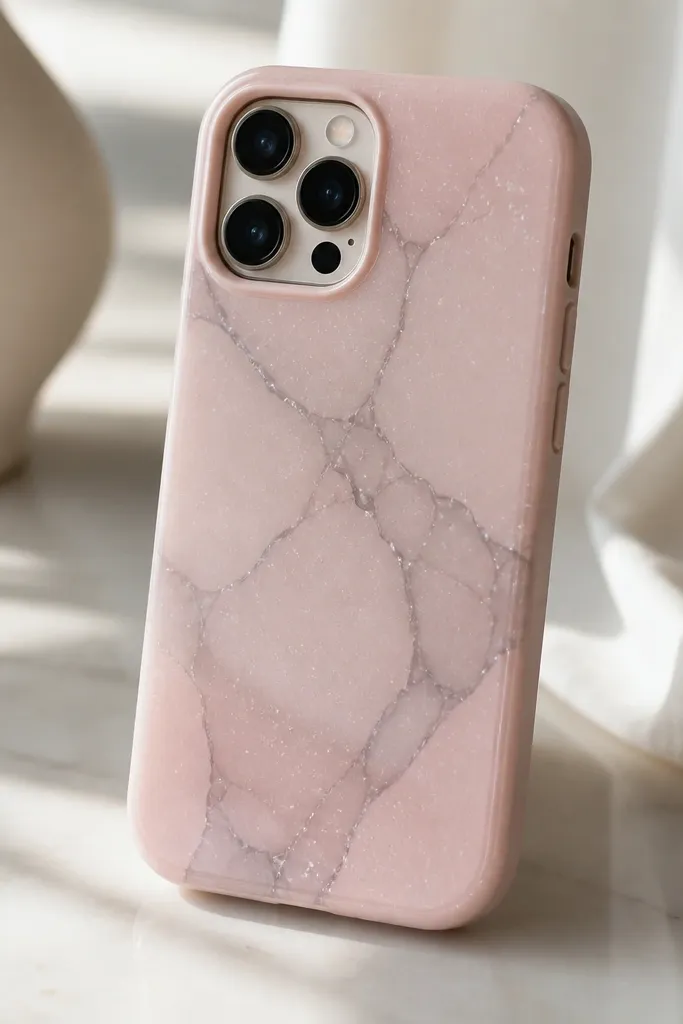
Rose quartz looks fancy because it mixes soft color with stone-like cracks. Use a blush pink base and then paint thin gray “crack” lines that branch in a few directions. Add tiny sparkle dots in pale silver so it looks like light hits the stone. This design flatters fair to medium skin tones and looks pretty with silver rings and nude nails. The styling principle is stone realism through thin, varied line thickness.
Paint the case blush pink and let it dry. Mix gray paint with a little water so it’s semi-transparent, then paint 10-14 thin crack lines — vary thickness by pressing harder on some lines and lighter on others. Add 4-6 tiny dots of pale silver near the crack intersections like sparkle trapped in the stone. If you want extra depth, trace one crack line again with a slightly darker gray. Seal with clear coat in two light layers so the cracks don’t dull.
Use a toothpick to place sparkle dots — it makes them small and sharp.
Drawing cracks in the exact same style everywhere makes it look fake.
11. Navy Nautical Stripe with Brass-Look Buttons
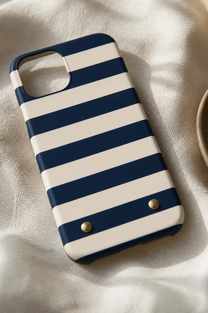
Nautical stripes look expensive when they are straight, evenly spaced, and paired with a metallic detail. Use navy and cream stripes, then add two small “brass button” circles near the bottom edge. The metallic circles make the case feel like a tailored accessory. This works with both casual outfits and office wear because the colors are classic. The styling principle is precision stripes plus one metallic focal point.
Mask the case with painter’s tape to create alternating stripes about 6-8 mm wide. Paint the first stripe navy, let it dry a bit, then remove tape to check edges — fix any bleed with a micro brush. Continue until you have 5-6 stripes total, then let it fully dry. Paint two circles near the bottom with metallic brass acrylic, then add a second coat for a stronger shine. If you want them to look slightly raised, add a thin layer of dimensional paint on top of the circles after the base dries.
To keep stripes crisp, press tape firmly along edges but don’t stretch it.
Freehand stripes turn into wavy lines that scream craft.
12. Matte Black Base with Neon Edge Glow
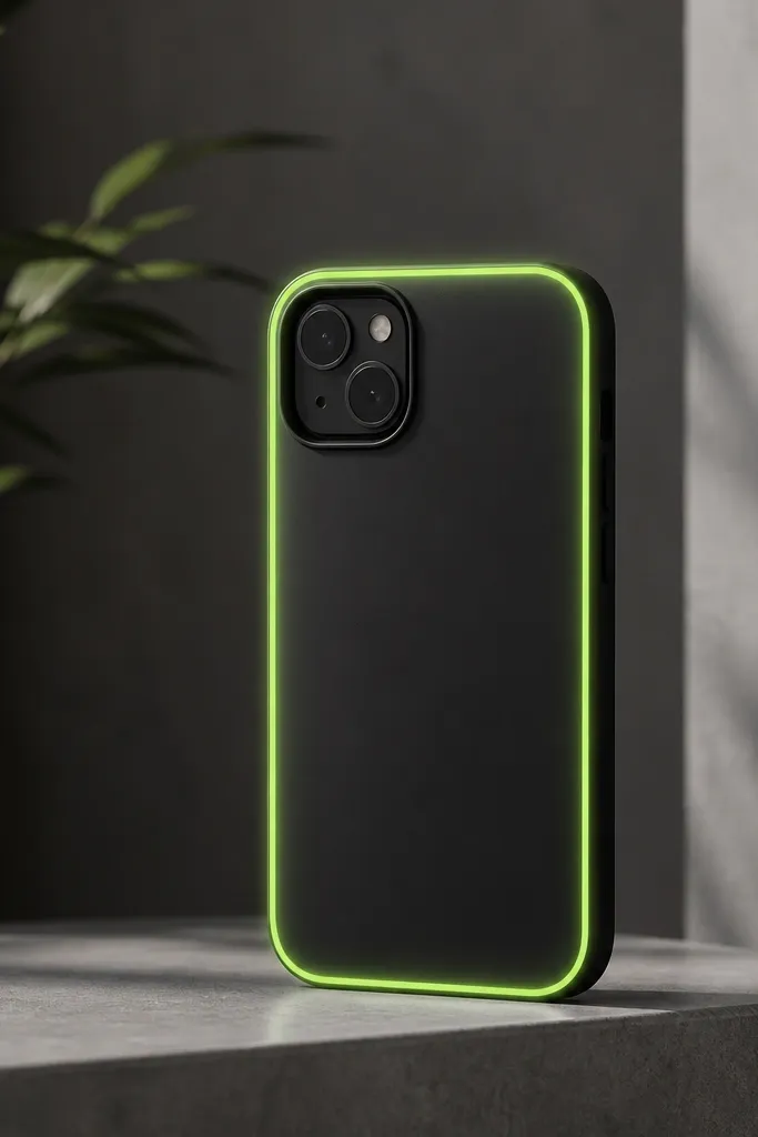
A neon edge glow looks expensive because it mimics the look of backlit design. Keep the neon line thin and let it fade into the black so it reads like light, not marker. Neon pink or neon lime works, but neon pink is the most flattering with everyday outfits. This design looks sharp in photos and stands out without covering the whole case. The styling principle is a controlled border — one thin line, then a soft gradient blur.
Paint the entire case matte black and let it dry completely. Use tape to mask a border inset about 2-3 mm from the outer edge. Paint the border neon pink and immediately use a small sponge to blur the inner edge so the glow fades inward. Remove tape carefully once the paint is tacky. Seal with matte or satin clear coat, but test first on scrap because some neon pigments can dull under certain clears.
Pro tipIf the neon looks streaky, do two thin coats instead of one thick coat.
AvoidThick neon outlines look like a kid’s night light craft.
13. Pastel Confetti with Clear Gloss Spots
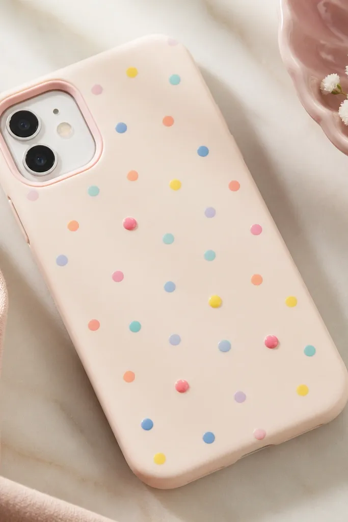
Confetti looks high-end when the dots are small and spaced, and when a few spots have a glossy raised finish. Use a soft pastel base like powder blue or pale mint, then add dots in 5-6 colors — white, coral, lavender, butter yellow, and soft pink. For the “expensive” part, pick only 6-10 dots to make glossy and slightly raised with dimensional paint or clear gel medium. This looks cute for spring and birthday photos, and it flatters most skin tones because the colors are light. The styling principle is selective shine — not every dot needs to be raised.
Paint the case a pastel base and let it dry. Use a toothpick to place tiny dots (about 2-3 mm wide) across the case, leaving open space between clusters. Choose 6-10 dots and cover just those with a thin layer of clear gel medium or dimensional paint. Let the raised dots cure so they feel smooth, not sticky. Seal the whole case with a clear coat that won’t melt the raised finish.
Pro tipIf you use gel medium, apply it with a pin so it doesn’t spread into neighboring dots.
AvoidPutting dimensional gel over every dot makes the case bulky.
14. Monochrome Botanicals with White Negative Space
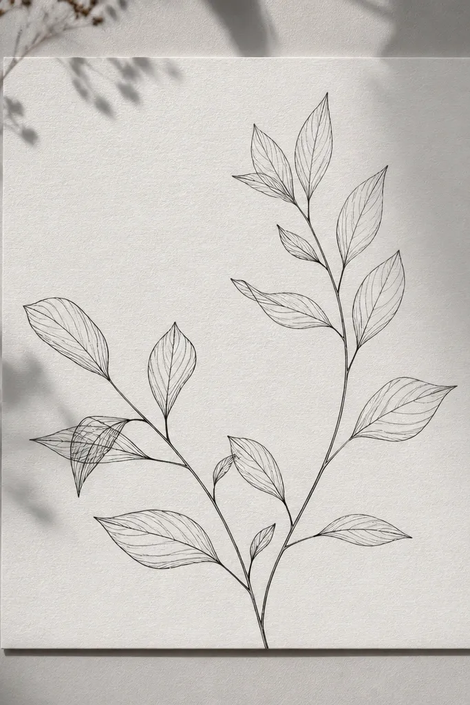
Botanical line art looks expensive when you keep it monochrome and let the background do the work. Use a soft gray base, then paint black leaves and stems with a fine liner brush. The white negative space matters — it keeps the design airy and clean. This looks especially good for people with warm undertones because gray balances without going harsh. The styling principle is line control: thin lines, lots of breathing room, no heavy shading.
Paint the case soft gray and let it dry. Use painter’s tape to mask a strip if you want the botanical to sit in one band, about 1.5 inches tall. With a fine liner brush, paint leaf shapes and a few stems that curve naturally — keep line thickness consistent. Leave blank areas so the gray background shows through like paper. Add one small cluster of 3 leaves near the bottom for balance, then clear coat after it dries.
Hold the phone case at an angle and paint in short strokes so leaf tips stay sharp.
Filling leaves with thick paint makes it look like a sticker.
15. Chocolate Brown Gradient with Cream "Stitch" Border
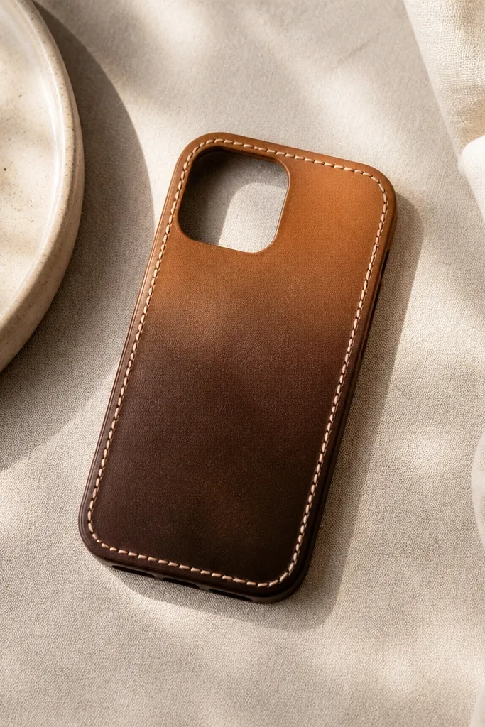
This one looks like a custom leather accessory because of the stitch border. Start with a chocolate-to-caramel gradient so it mimics leather wear patterns. Then paint a cream stitch line around the edge using tiny repeated marks, like a sewing pattern. It’s flattering with both casual and dressy outfits, especially if you wear brown or tan bags. The styling principle is a leather-like gradient plus a structured border detail.
Paint the bottom of the case chocolate brown and blend upward to caramel using a sponge. Let it dry fully so the gradient doesn’t smear. Mask a thin inset border about 3 mm from the edge and paint a cream line along it. Then use a dotting tool to add small “stitch” ticks along the line — about every 6-7 mm, alternating sides. Remove tape once tacky and finish with clear coat that gives a smooth, slightly satin surface.
Pro tipIf your stitch ticks look too big, use the tip of a toothpick instead of the dotting tool.
AvoidA single continuous cream line without stitch ticks looks flat and cheap.