1. Cream Puff With Glossy Vanilla Veins
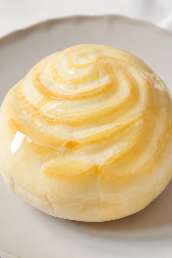
Start by tracing a circle template onto 2mm EVA foam and cutting it. Cut a second circle from 120-160 gsm ivory paper that will wrap the sides, then lightly score a small section so it curves without creasing. Add your vanilla veins on the top paper layer first, then glue the top to the foam. Wrap the side paper around the foam, press seams to the back, and smooth with your fingers. Finish by brushing a thin coat of gloss Mod Podge over the top only, then add a tiny dab of gloss on the left highlight area.
This one looks expensive because the top has a pastry-like sheen and a few controlled highlights, not random sprinkles. I use a warm ivory cardstock base, then add thin, slightly darker cream lines drawn with a gel pen or printed pattern. The glossy finish makes the veins look like icing, and the rounded silhouette reads plush even though it’s paper. It looks best on kids with warm skin tones because the ivory and honey-gold hues photograph cleanly, but it works for any kid because the color contrast is mild and “bakery” themed. Keep the puff shape puffy — if it’s too flat, it stops looking like a squishy.
AvoidDon’t add heavy glitter or chunky sprinkles; they catch light unevenly and make the squishy look cheap.
Pro tipUse a white gel pen to add one small “shine dot” on the top — it sells the dessert look instantly.
2. Strawberry Shortcake Slice With Layered Whipped Cream
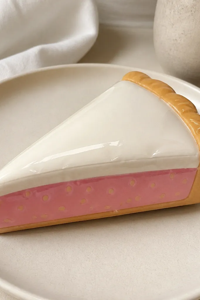
Cut a wedge from 2mm foam for the main body, then cut two matching wedges from cardstock for the top and side wrap. On the top wedge, draw strawberry seeds with a fine black pen and add a few darker pink blotches for realism. Layer whipped cream paper under the strawberry piece by gluing a thin strip around the sides, leaving a 3-5 mm “cream edge” visible. Wrap the sides with tan cardstock and glue the seam to the back. Seal the top with gloss laminate or a thin gloss Mod Podge coat, then press it flat under a book for 10 minutes.
This squishy looks pricey because it has clear layer separation like a bakery package photo. I build it with a wedge shape and keep the layer colors distinct: whipped cream in buttery white, strawberry in muted coral-pink, and crust in warm tan. The glossy top makes the strawberry look like jam instead of flat paper. Kids love it because it’s easy to understand, and it looks cute on backpacks when you clip it to a zipper pull. The color palette flatters most skin tones and looks great under daylight because the pink is not neon.
AvoidDon’t let the layers overlap randomly; messy edges make it read like a collage.
Pro tipKeep the strawberry seeds small (like pepper dots), not big circles — small dots look like real fruit.
3. Matcha Mochi With Dusty Green Velvet Finish
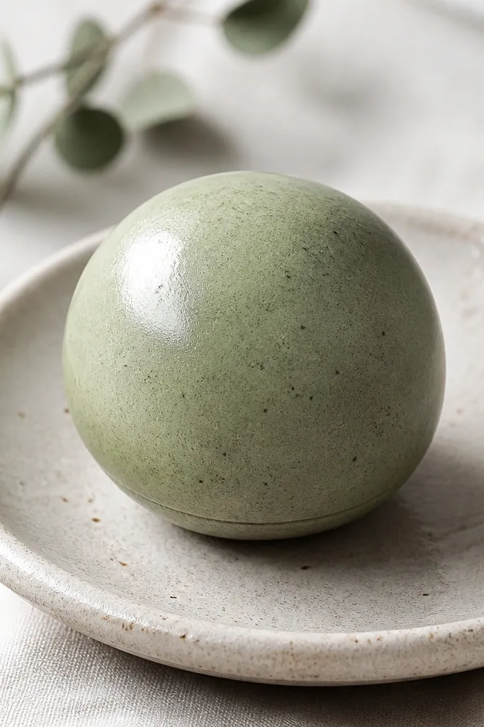
Cut a circle from 2mm foam and another circle from 120-160 gsm sage paper for the top. Add the darker matcha specks with a brown-green marker or paint dotter, keeping them sparse. Create the side wrap by cutting a strip of sage paper long enough to circle the foam with a slight overlap. Glue the strip around the foam and keep the seam at the back. Seal with a satin finish spray or a very light gloss coat mixed with a touch of water, then let it dry flat.
Matcha looks expensive when it’s not bright green. I use a muted sage cardstock and add a few darker speck marks so the surface looks like powdered tea. The key is the finish: a satin or semi-gloss seal looks like mochi skin, while full shine can look toy-plastic. It photographs beautifully against neutral backgrounds and makes kids' hands look extra cute holding it because the color is soft. This works well for kids who like calming colors, and it also pairs nicely with pastel outfits.
AvoidDon’t overdo the specks; too many dots make it look like dirt.
Pro tipDust a tiny amount of cornstarch-like powder effect using a dry paintbrush for a powdery look (use sparingly).
4. Mini Chocolate Bar With Foil-Look Edges
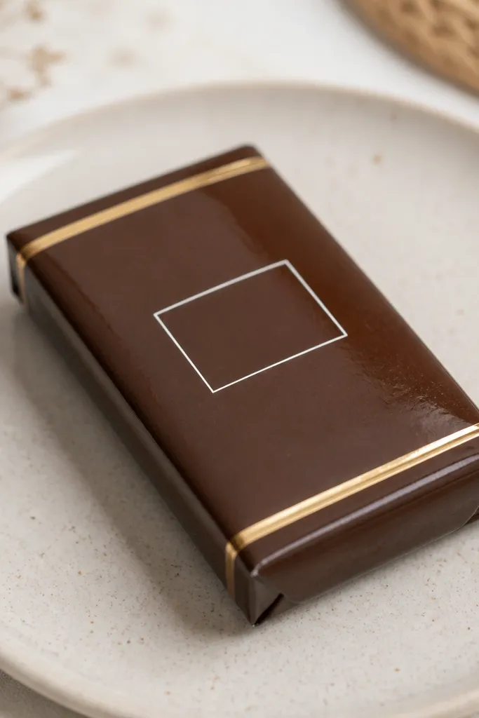
Cut a rectangle from 2mm foam, about 6 cm by 3 cm for a kid-friendly size. Cut a top piece from dark brown cardstock and a side wrap strip from 120-160 gsm brown paper. Add gold bands by gluing thin strips of metallic gold paper to the side wrap before wrapping it around the foam. Glue the side wrap, then attach the top panel. Seal the top and the gold bands with gloss laminate or gloss Mod Podge, then trim any uneven edges with a craft knife.
Chocolate bar squishies look expensive because of the clean geometry and the contrast between deep brown and gold. I keep the design minimal: a central label panel and thin foil bands on the sides. The foam base gives it that soft “squish,” but the glossy brown top makes it look like wrapped candy. This one looks great for photo props because the gold edges catch light in a crisp line. It suits kids who like darker colors, and it pairs well with silver accessories.
AvoidAvoid thick glue blobs on the top; they leave bumps that ruin the bar’s clean look.
Pro tipUse metallic gold paper that has a smooth finish, not glitter — glitter makes the edges look messy.
5. Blueberry Yogurt Cup With Tiny Lid Shine
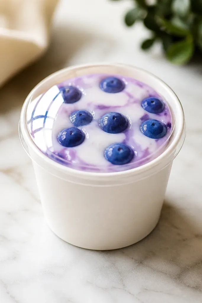
Cut a cup body from foam by tracing a circle base and cutting a slightly smaller inner circle for the opening. Wrap the sides with pale cream paper, leaving the top open. For the top, cut a circle from cardstock and add a yogurt swirl line with light blue marker, then glue clear laminate over it. Add blueberry dots on the laminate side using a thick blue gel pen or paint, then seal with one more thin gloss layer. Attach the lid to the cup rim, leaving a smooth edge all the way around.
Cups look expensive when they have a “see-through” lid effect. I do this by using a clear plastic sheet or clear laminate over the top, then tinting the inside with light blue and purple watercolor or marker. The berries look like real fruit because I add tiny gloss dots on top of each one. Kids love it because it feels like a real snack, and it’s easy to clip to lunch bags. The cool blue palette also looks great on kids with warm or cool skin tones because the contrast is gentle.
AvoidDon’t use matte paper on the lid; matte kills the “snack packaging” effect.
Pro tipAdd one long highlight streak on the lid with a white gel pen — it instantly makes it look like plastic.
6. Pink Donut With Realistic Sprinkles (No Chunky Glitter)
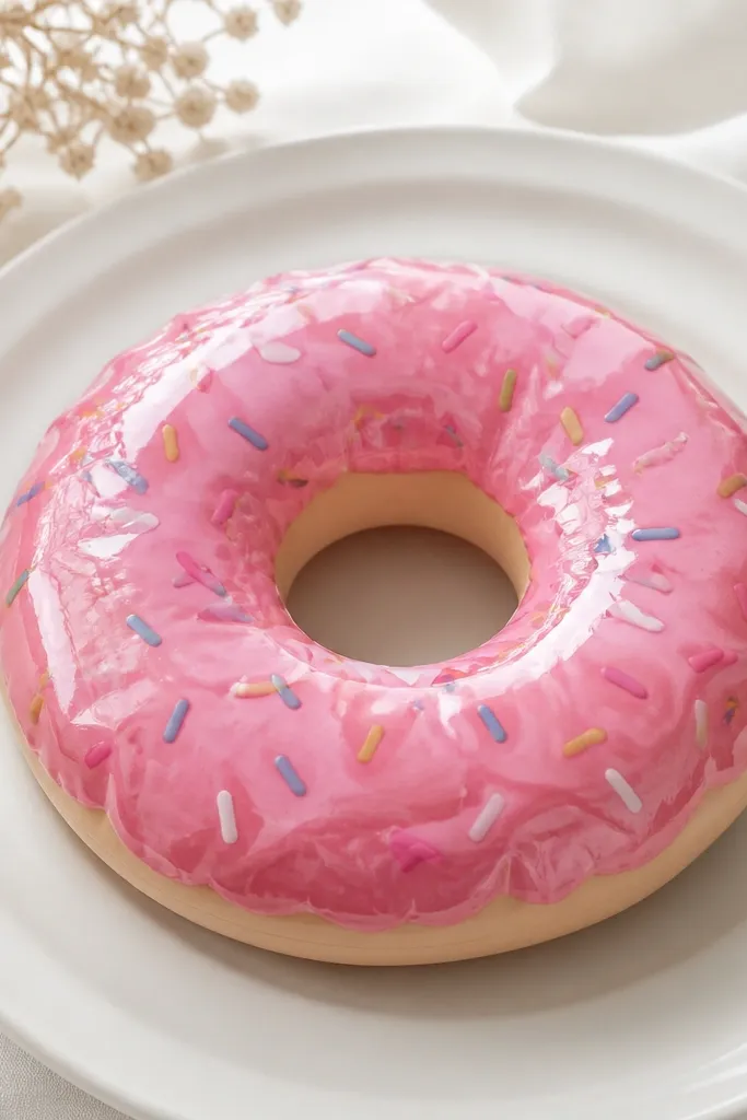
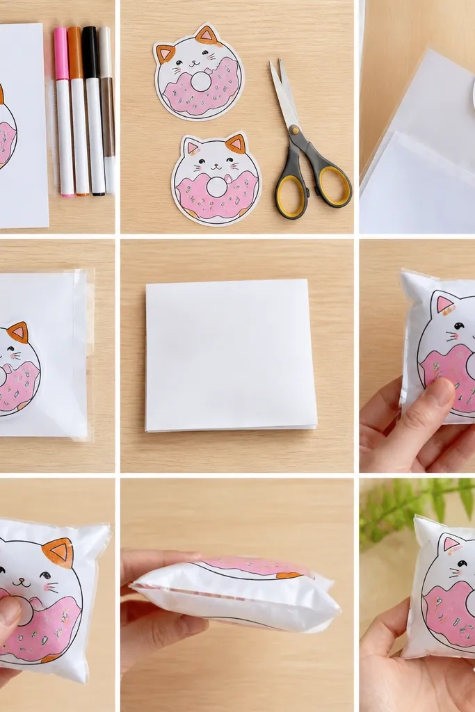
Cut a donut shape from 2mm foam using a ring template. Cut the top glaze piece from 120-160 gsm pink paper that fits the donut ring, and cut a thin side ring wrap from the same paper. Shade the outer edge with a darker pink marker and blend gently with a paper stump or clean finger. Draw sprinkles with a fine gel pen, then glue the top glaze onto the foam. Seal with gloss laminate, then lightly press and dry under a book.
This donut looks expensive because the sprinkles are fine and the glaze has shading, not just one flat pink. I use a light pink base, then add a slightly darker pink along the outer ring so it looks curved. Sprinkles are drawn with a fine-tip marker or gel pen so they stay consistent and delicate. The glossy seal makes the glaze look like a real coating. It’s flattering for kids because pink reads cheerful in photos, and the donut shape makes it easy for small hands to hold.
AvoidSkip craft glitter — it makes sprinkles look chunky and uneven.
Pro tipUse a ruler to keep sprinkle angles consistent; the pattern looks “designed” instead of random.
7. Gold-Trimmed Heart With Glossy Candy Coating
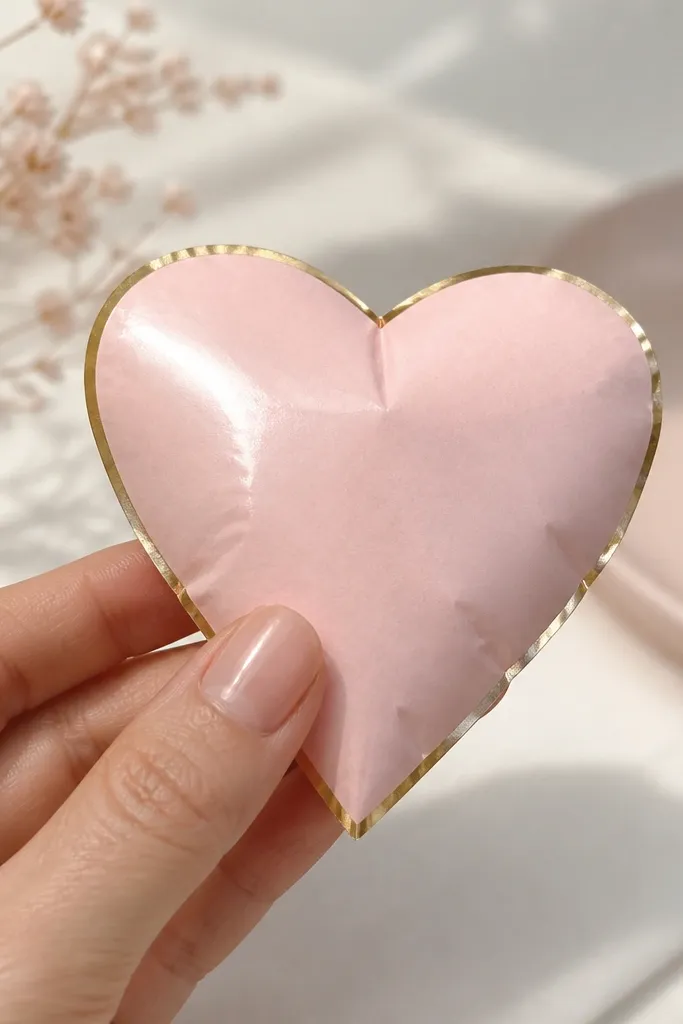
Trace a heart template onto 2mm foam and cut it cleanly. Cut a matching heart from blush cardstock for the top, then cut a thin border strip from metallic gold paper. Glue the gold border to the foam edges first, then attach the blush top. Seal the top with clear gloss laminate, smoothing from the center outward to avoid bubbles. Finally, add a white gel pen highlight dot and one short line to mimic glare.
Hearts look expensive when they’re symmetrical and framed. I cut the heart carefully, then add a gold border strip that follows the outline so the shape reads “gift tag” quality. The blush pink should be light enough to show the gloss reflection, not a heavy magenta. A tiny highlight dot sells the candy coating effect. This is perfect for kids making gifts for grandparents because it’s simple, readable, and looks good even when photographed from above.
AvoidDon’t use thick foam on tiny hearts; it makes the shape look bulky and less polished.
Pro tipIf your heart edges look uneven, trim only the foam first, then cut the paper to match — it keeps the border crisp.
8. Rainbow Macaron Set (3 Sizes, One Style)
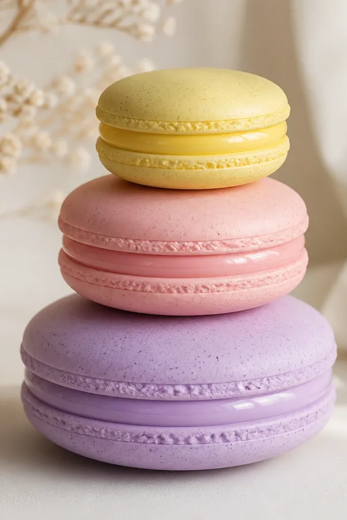
Macarons look expensive because they’re all about texture and neat piping. The trick is to keep the shells slightly matte and the filling glossy. I use pastel shells (peach, mint, lavender) with tiny specks for realism, then add a thicker glossy filling circle that sits slightly above the shell. Grouping three sizes makes it look like a set you’d buy, not a single craft. Kids love stacking them for pretend bakery play. The soft pastels also photograph well for kids of any skin tone because they don’t fight the light.
Pick three macaron templates: small (4 cm), medium (6 cm), large (8 cm). Cut each shell top from 160 gsm pastel cardstock and each filling circle from 2mm foam or thick cardstock. Add faint specks with a light marker to the shell, then glue the filling circle centered. Seal the filling with gloss laminate so it reflects, while keeping the shell matte (no gloss over the shell). For the bottom, add a matching shell cutout and glue edges, leaving the top clean.
Use a circle punch for the filling so it stays perfectly centered.
Don’t gloss the entire shell; shiny shells look like cheap stickers.
9. Orange Slice With Pith Lines and Glassy Seal
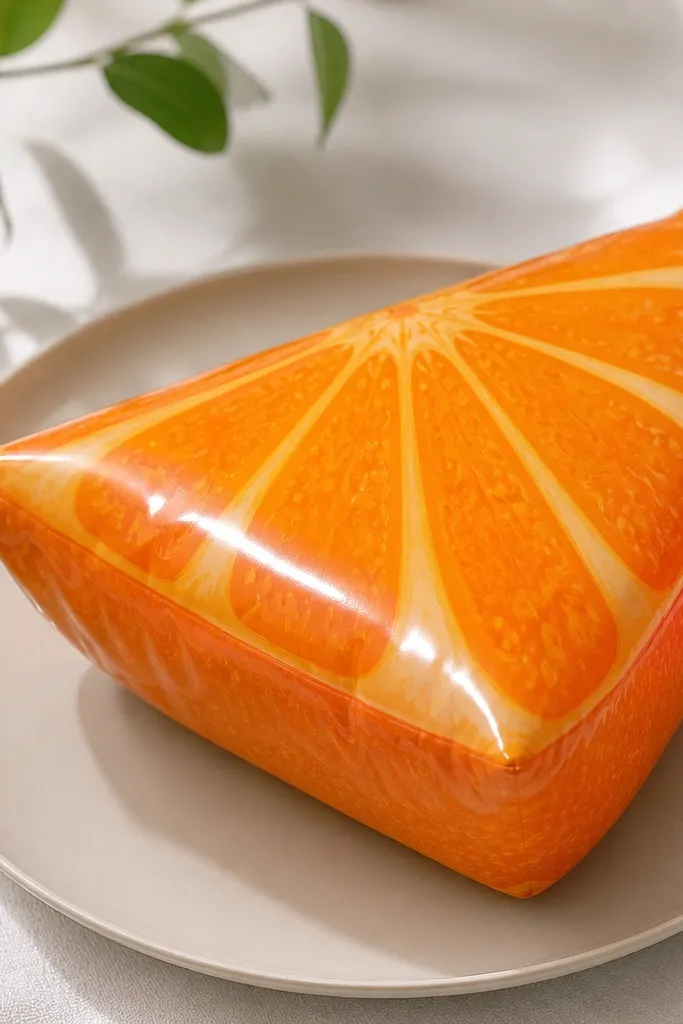
Orange slices look expensive when the pith lines are crisp. I draw thin pale lines from the center to the rind edge, then add small segment borders so it looks like a real fruit cross-section. The glossy seal makes the slice look like it’s under clear candy coating, which is the “expensive dessert photo” vibe. It’s also one of the easiest squishies to customize — swap orange for lemon or grapefruit and keep the same structure. For kids, it’s fun because it feels like a pretend snack plate.
Cut a wedge from 2mm foam, then cut a top piece from bright orange 160 gsm cardstock. Add pale pith lines by drawing thin off-white lines with a fine pen, then draw segment borders with a slightly darker orange. Cut a side wrap strip from 120-160 gsm orange paper and glue it around the foam with the seam on the back. Seal the top with gloss laminate and press it flat. Add two tiny highlight streaks with white gel pen on the upper left.
Keep pith lines consistent thickness — uneven lines make it look like a child drawing instead of a designed illustration.
Don’t use thick marker strokes; they create a bumpy texture under the gloss.
10. Lavender Soap Bar With Marbled Swirls
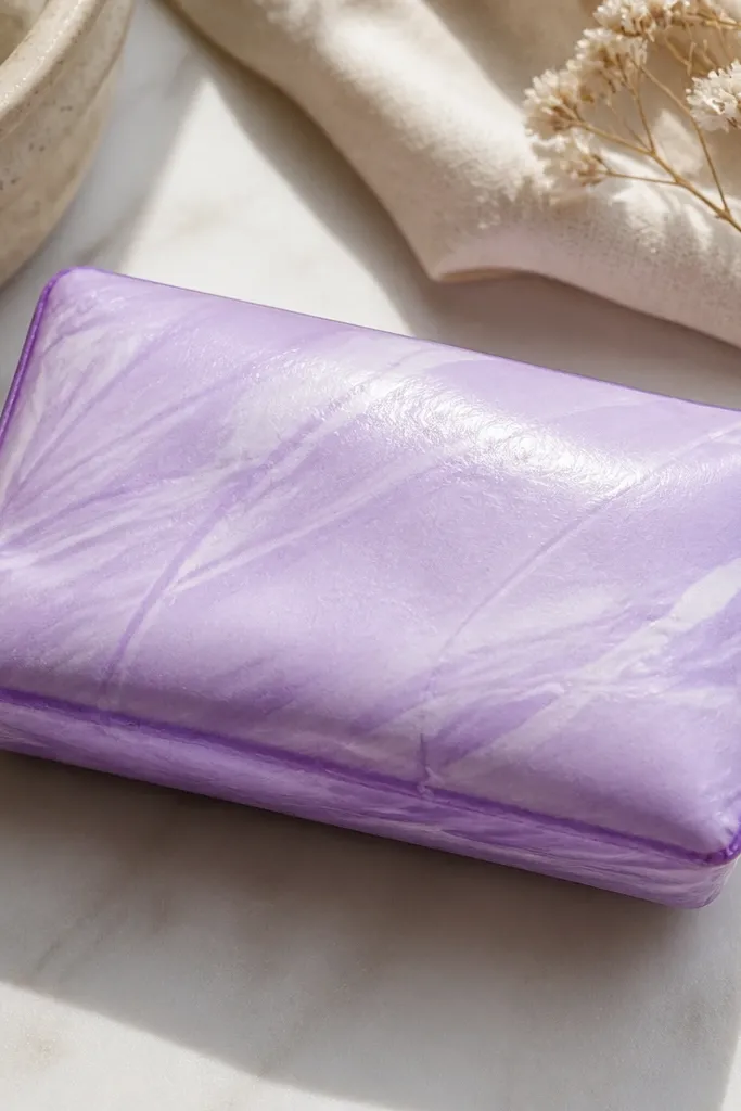
Cut a rectangle from 2mm foam, then cut a top rectangle from 160 gsm lavender cardstock. Make marbling by scribbling watered-down white and pale purple lines, then gently blend with a cotton swab for feathered edges. Add darker purple shading along the left and right edges with a light hand. Wrap the sides with 120-160 gsm lavender paper and glue the seam on the back. Seal the top with satin Mod Podge or a semi-gloss laminate, then let it dry without pressing too hard.
Soap bars look expensive because they have clean edges and controlled marbling. I keep the base lavender smooth, then add a few marbled swirls with watered-down purple and white paint. The finish is semi-gloss so it looks like soap, not candy. Kids can hold it like a pretend bathroom item, and it looks cute on a vanity display. The lavender also flatters a lot of skin tones in photos because it’s soft and not overly saturated.
AvoidSkip heavy glitter on soap; it looks like craft glitter instead of a finished product.
Pro tipUse a cotton swab, not a brush, for the blended part — it gives you softer swirls.
11. Brown Sugar Cinnamon Roll With Thick Icing Coil
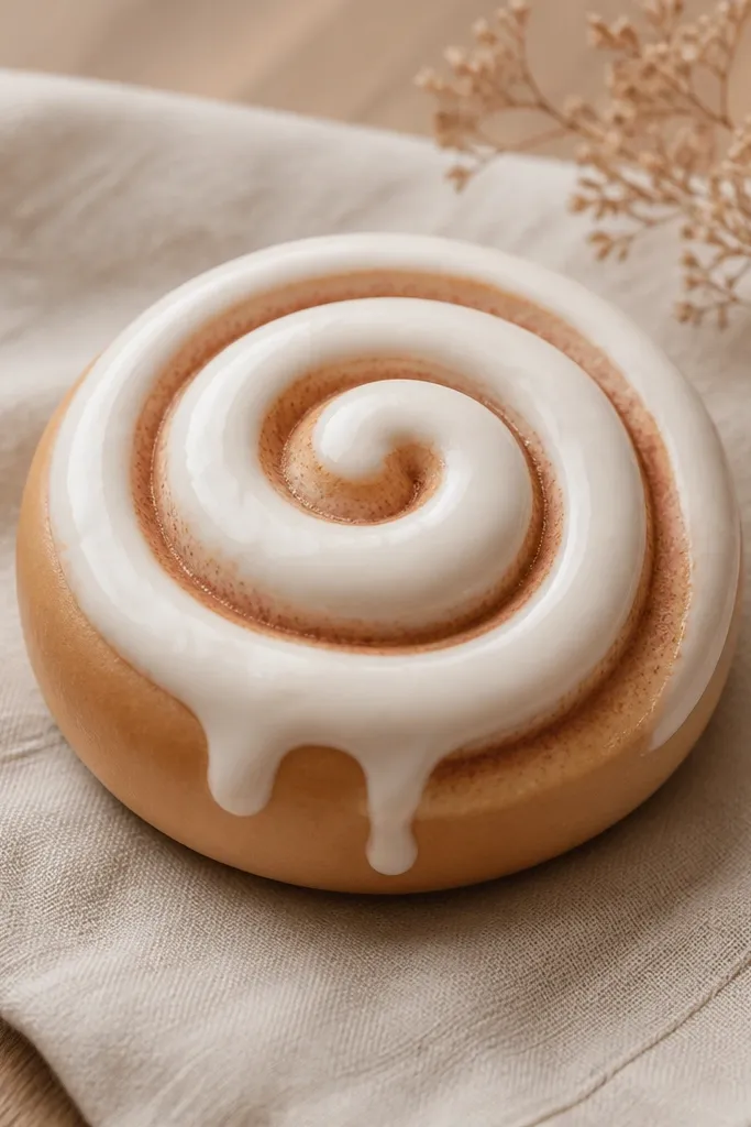
Cut a round cinnamon roll shape from 2mm foam, then cut a top circle from tan cardstock for the base. Draw spiral segments using a darker brown marker, keeping the lines evenly spaced. Build the icing coil by cutting a thin strip from 2mm foam or using thick white cardstock, then coil it around the top spiral and glue it in place. Add two tiny icing drips by cutting small teardrops and gluing them at one edge. Seal over the whole top with gloss laminate, focusing on the icing so it shines.
The expensive look here is the icing thickness. I make the icing as a raised coil using foam or thick cardstock, so it casts a tiny shadow. The cinnamon roll base has warm brown segments, and a glossy seal makes the icing look wet. Kids like it because it’s recognizable, and it photographs well because spirals pull the eye. It also works for kids who prefer neutral colors since the palette is warm and cozy.
AvoidDon’t flatten the icing; if it’s flat, the shadow disappears and it looks like a sticker.
Pro tipMake the icing coil slightly thicker than you think — the raised look is what reads “store-bought.”
12. Ocean Jellyfish With Iridescent Paper Tentacles
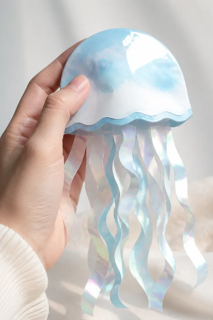
This one looks expensive because of the iridescent tentacles. I use holographic or pearlescent paper for the tentacles, then keep the body soft and glossy so it feels like a floating jelly. The silhouette is airy, but the foam base gives it that squishy volume. Kids love it because it’s playful, and it looks especially good in photos against a plain wall since the tentacles catch light. It also works for kids who like sea themes without needing complex painting.
Cut a jellyfish body from 2mm foam — a teardrop shape with a flat bottom. Cut a matching top body from 160 gsm light blue or white cardstock. For tentacles, cut thin strips (about 6-8 mm wide) of iridescent paper and curl them slightly by wrapping around a pencil. Glue tentacle strips to the underside of the foam and trim to equal lengths. Seal the body top with gloss laminate, then add a small white highlight dot with gel pen.
Curl tentacles in two directions so they look layered instead of all hanging straight.
Don’t use thick glitter paper for tentacles; it sheds and looks rough under light.
13. Cherry Pop Tart With Crinkly Edge Texture
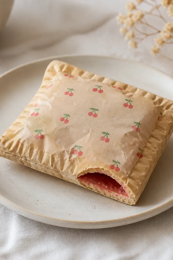
Pop-tart squishies look pricey when the filling is centered and the edge texture is crisp. I build the base in warm beige, then add a cherry layer with a deep red center and smaller red dots that mimic fruit pieces. The top “glaze” is glossy and smooth, and the crinkled edges are made with a simple paper technique. This is great for kids who like snack food crafts, and it holds up well in hands because the foam core keeps it soft.
Cut a rectangular pop-tart shape from 2mm foam. Cut a top piece from 160 gsm beige cardstock and a bottom piece for backing. On the top, draw a cherry filling rectangle using marker or paint, add small cherry dots, and outline the edges with a darker red line. For the crinkly edge, lightly score small lines along the top paper edge every 3-4 mm, then fold outward slightly before gluing. Seal the top with gloss laminate and attach the bottom piece, keeping the seam on the back.
Use a white gel pen to add one thin glaze highlight line across the center — it makes it look coated.
Don’t leave the cherry layer too watery; wet paint smears under laminate.
14. Peach Blossom Cupcake With Petal Gradient
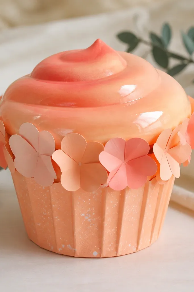
Cut a cupcake base from 2mm foam, then cut a wrapper piece from patterned paper with tiny speckles (or make speckles with a white gel pen). For the frosting top, blend three peach shades on 160 gsm cardstock with colored pencil, then add a few curved frosting lines. Glue frosting on top, then add petal strips around the sides by tucking them under the wrapper edge. Seal only the frosting with gloss laminate so the wrapper stays textured. Finish by adding a tiny dot of white gel pen on the frosting highlight spot.
Cupcakes look expensive when the frosting has a gradient and the wrapper has texture. I use peach tones from pale cream to warm peach, then blend with colored pencil for a smooth “frosting swirl” look. Around the wrapper, I glue tiny petal strips cut from lighter pink paper so the edges look like real cupcake liners. The frosting gets gloss so it reflects like sugar icing. This one flatters kids because peach works with a wide range of skin tones and looks bright without being loud.
AvoidDon’t gloss the wrapper; glossy wrapper paper looks like cheap sticker stock.
Pro tipBlend frosting colors on a scrap first — you want smooth gradients, not patchy pencil blobs.
15. Mint Candy Cane With Candy Shine Stripes
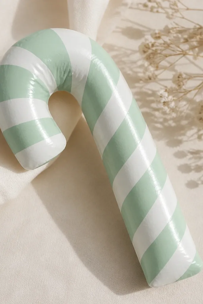
Candy canes look expensive when the stripes are clean and the shine looks continuous. I cut the cane shape from foam, wrap it, then add diagonal stripes with crisp edges using painter’s tape as a guide. The glossy seal makes the stripes look like candy wrapping. Kids love this because it’s instantly recognizable, and it’s easy to make in batches for holiday gift tags. It also looks great in winter photos since mint contrasts nicely with warm backgrounds.
Cut a candy cane silhouette from 2mm foam and sand the edges lightly with a file if needed. Wrap with 120-160 gsm white paper, then apply painter’s tape stripes at a 45-degree angle while the paper is still dry. Paint or marker-fill mint green between tape lines, then remove tape carefully once dry. Seal the whole cane with gloss laminate so the stripes look like real candy wrap. Add a single highlight streak with a white gel pen along the curve.
Use thin painter’s tape (about 3-5 mm wide) so stripe lines stay narrow and realistic.
Don’t freehand stripes; wobbly stripes are what makes it look homemade.
16. Grape Ice Cream Ball With Purple Drip Topcoat
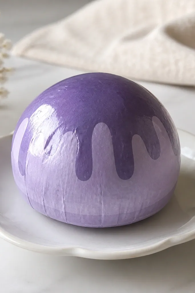
Cut a circle scoop from 2mm foam, slightly wider than you want the final size, because the paper wrap adds thickness. Cut a top wrap from 160 gsm lavender cardstock and glue it around the foam. Add grape drips on the top by dotting deeper purple paint or marker, then dragging lightly with a toothpick for a drip tail. Seal with gloss laminate, then add one highlight spot with white gel pen. If the drip edges look messy, lightly wipe with a damp cotton swab before sealing.
Ice cream squishies look expensive when the scoop is round, the color is smooth, and the drip pattern is controlled. I use two purples: a soft lavender base and a deeper grape-purple drip. The drip is painted or stamped in small sections so it doesn’t cover the whole scoop. Gloss makes it look like frozen dessert packaging. It’s a hit for kids who like purple, and it looks good on both warm and cool skin tones because the lavender is neutral enough.
AvoidDon’t seal before the drip ink dries; it will bleed under laminate.
Pro tipKeep drips to three or four sections; too many makes it look like a spill.
17. Rosy Blush Powder Compact With Faux Engraved Logo
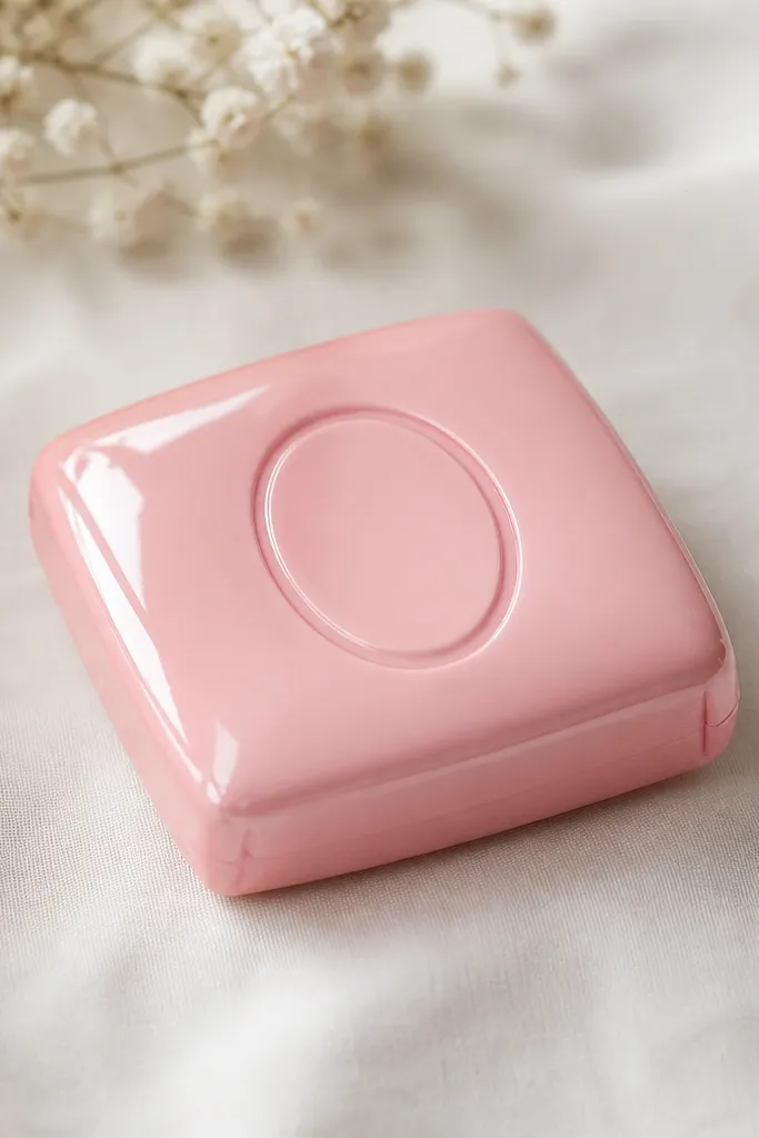
Cut a square from 2mm foam, then cut a matching top from 160 gsm rosy pink cardstock. Make an engraved logo by drawing an oval in darker pink and then tracing around it with a ballpoint pen to create shallow indent lines on the paper. Glue a thin ring border around the logo with a slightly darker shade for depth. Wrap the sides with 120-160 gsm paper and keep seams on the back. Seal the entire top with gloss laminate and add a tiny white highlight streak near one corner.
A compact looks expensive because it has a clean shape and a “product photo” finish. I use a square foam base, then wrap it in rosy pink paper and add a slightly darker engraved-looking logo panel. The shine is important: gloss makes it feel like makeup packaging. Kids can decorate it with their favorite initials or a simple heart emblem without needing perfect drawing skills. This is also a great one for kids with darker or lighter skin tones because the rosy pink reads flattering in photos regardless of background color.
AvoidSkip thick sticker letters on top; raised stickers look cheap under gloss.
Pro tipPress the logo indent lines gently — deep dents can crack under laminate.
18. Butter Yellow Popcorn Bucket With Glossy Butter Drizzle
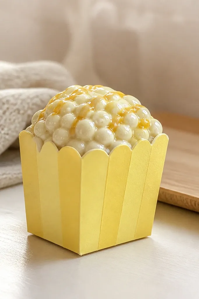
This looks expensive because it mixes a simple shape with a shiny “drizzle” detail that reads like food. I keep the bucket bright butter yellow and use off-white dots for popcorn so it stays clean and not cluttered. The butter drizzle is drawn in thin lines and sealed glossy, which makes it look like melted butter. Kids love the bucket because it feels like a treat. It also looks good in photos because yellow is bright and the off-white dots give texture without looking messy.
Cut a bucket body from 2mm foam using a curved template (a tall trapezoid with a flat base). Wrap the body with butter yellow paper and glue the seam at the back. For the top, cut a circle from 160 gsm off-white or pale yellow paper and glue it on. Add popcorn texture by dabbing small off-white dots with a marker or sponge, then draw one or two thin golden drizzle lines across the top. Seal the top with gloss laminate and let it dry flat.
Use a sponge to place popcorn dots; it makes them look rounded instead of perfect circles.
Don’t crowd the top with too many drizzle lines; three thin lines looks designed.
19. Sunset Macaron Heart With Peach-To-Lavender Fade
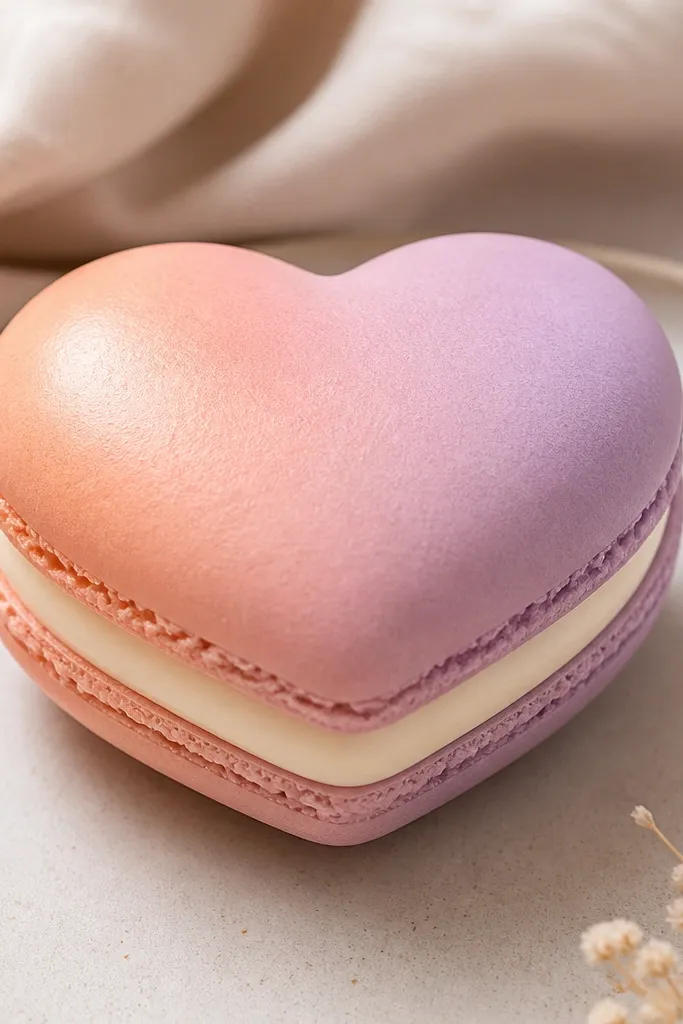
Cut a heart shape from 2mm foam and cut a matching heart from 160 gsm paper for the top shell. Create the gradient by blending peach and lavender with colored pencil or alcohol markers, starting peach at the top and fading to lavender at the bottom. Add a raised filling center by cutting a smaller heart from 2mm foam or thick cardstock and gluing it centered. Seal only the filling with gloss laminate, leaving the gradient shell semi-matte. Finish with a small white gel pen highlight on the filling edge.
This heart looks expensive because the gradient is smooth and the filling is raised. I do a peach-to-lavender fade on the shell so it looks like sunset frosting, then I add a pale cream center with gloss so it looks like filling. The raised filling casts a small shadow, which is what makes it feel plush. Kids like it because it’s both cute and “aesthetic” without being complicated. The warm-to-cool gradient also looks great in photos under warm lighting.
AvoidDon’t gloss the gradient shell; full gloss makes gradients look printed instead of painted.
Pro tipBlend the gradient on a scrap first so you know how the color transitions look before you commit.
20. Chocolate Truffle With Gold Speck Dust
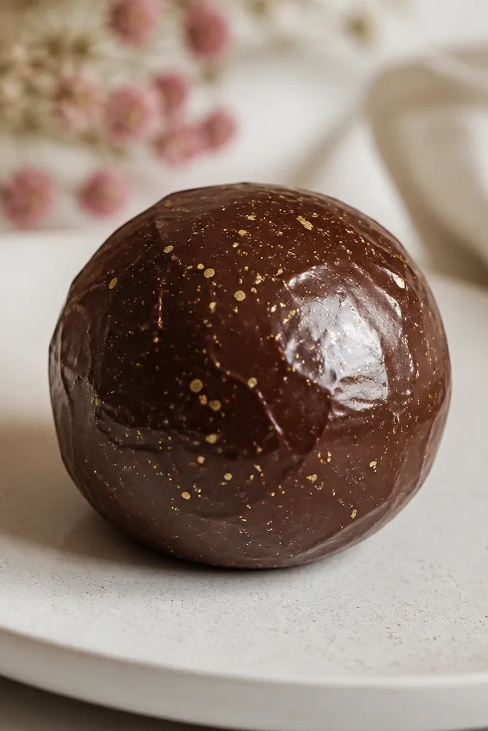
Truffles look expensive because they’re simple and have just enough sparkle. I use a deep brown base, then add tiny gold specks that look like cocoa dust with a shimmer — not glitter chunks. The glossy seal makes the surface look like a real coated truffle. Kids love it because it’s small, round, and easy to hold. It also photographs well against dark backgrounds because the gold specks pop without needing loud colors.
Cut a circle truffle from 2mm foam and cut a matching top circle from 160 gsm dark brown cardstock. Add gold specks by tapping metallic gold paint or a gold gel pen across the surface with a toothbrush, keeping the specks sparse. Glue the top onto the foam and wrap the sides with 120-160 gsm brown paper. Seal with gloss laminate and press flat. Add one small highlight dot with white gel pen, placed opposite the specks so it reads like light.
Gold specks look best when they’re uneven sizes — aim for tiny and a few slightly larger ones.
Avoid big glitter flakes; they look like craft supplies.
21. Marshmallow Snowman With Frosty Edge Seal
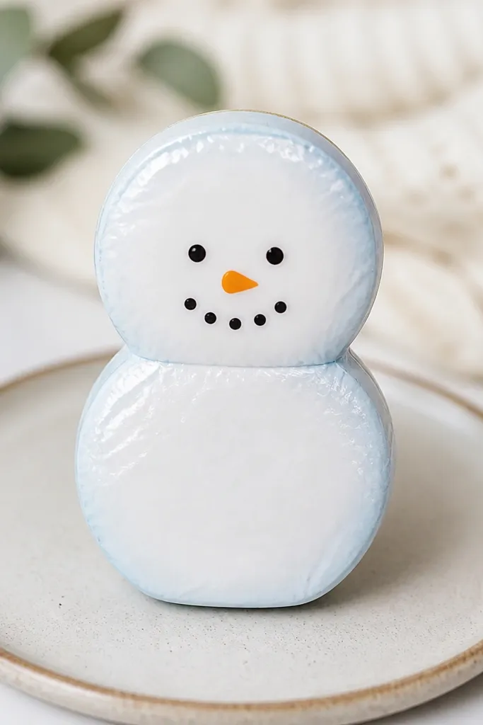
Cut two circles from 2mm foam for the body and cut matching top circles from white 160 gsm cardstock. Shade the sides of the foam and paper lightly with light blue pencil, focusing on the outer edges. Glue the circles together, then wrap the seam with a thin strip of white paper. Draw the face with a fine black marker and add an orange triangle nose from cardstock. Seal the top with gloss laminate and add a few tiny white gel pen “frost” dots around the edges.
This snowman looks expensive because the edges look frosty and the face stays clean. I shade the sides with a light blue pencil so it looks like winter light catching the marshmallow. The top gets gloss so it looks like a sealed candy marshmallow. The simple face keeps it readable and prevents the design from looking childish. Kids love it for winter crafts, and it looks good for photos because white + blue contrasts strongly and stays crisp.
AvoidDon’t add lots of glitter snow; it looks messy under gloss.
Pro tipUse a fine-tip marker for the eyes; thick lines make it look like a coloring page.
22. Cookie Sandwich With Chocolate Chip Topcoat
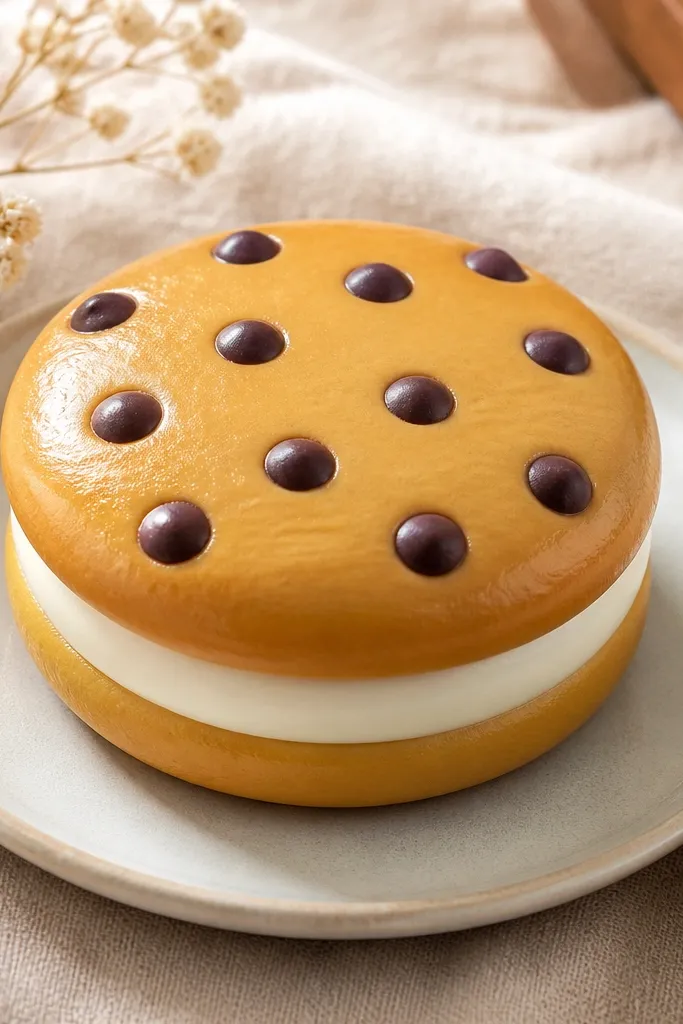
Cookie sandwiches look expensive because of the neat repetition. I draw chocolate chips as small teardrops with consistent spacing, then I seal with gloss so the chips look glazed. The filling layer is a slightly raised cream or caramel strip that gives the sandwich depth. It’s a great “starter” squishy because the structure is simple and the design is repeatable. Kids can customize it with different filling colors, and it still looks clean in photos.
Cut two circles from 2mm foam for the cookies and cut a thin ring strip from thick cardstock for the filling. Cover the top cookie with 160 gsm paper and draw evenly spaced chocolate chips using a small round stencil or by counting spacing with a ruler. Add a darker brown outline around the cookie edge to define the shape. Glue the filling ring between the cookies, then attach the second cookie. Seal the top cookie with gloss laminate and lightly press edges so it stays smooth.
Draw chips first on paper, then seal — sealed chips look sharper and don’t smear.
Don’t use marker scribbles for chips; chips need crisp shapes to look realistic.
23. Berry Jam Jar With Tiny Label and Clear Lid
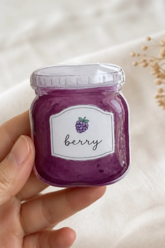
Cut a jar body from 2mm foam with a rounded rectangle shape and a slightly smaller top opening. Wrap the sides with thick cardstock colored berry purple. For the jam layer, cut a circle or oval from purple paper and glue it inside the jar opening. Make a lid by cutting a jar-top circle and covering it with clear laminate, then glue it on. Add a small label panel on the front using matte white paper, and seal the label edges only, not the label surface.
This jar looks expensive because it has a clear lid and a small label, like a real pantry item. I use deep berry purple for the jam and add tiny dots that look like fruit pieces. The lid is clear laminate so it catches light, and the label stays matte so it doesn’t glare. Kids like it because it looks like something they could find in a kitchen. It also looks good for a range of skin tones because purple is deep and the label is bright.
AvoidDon’t cover the label with gloss; glare makes it unreadable in photos.
Pro tipWrite the label with a black gel pen — it stays crisp under light and looks like packaging.
24. Peachy Cloud With Satin White Shine
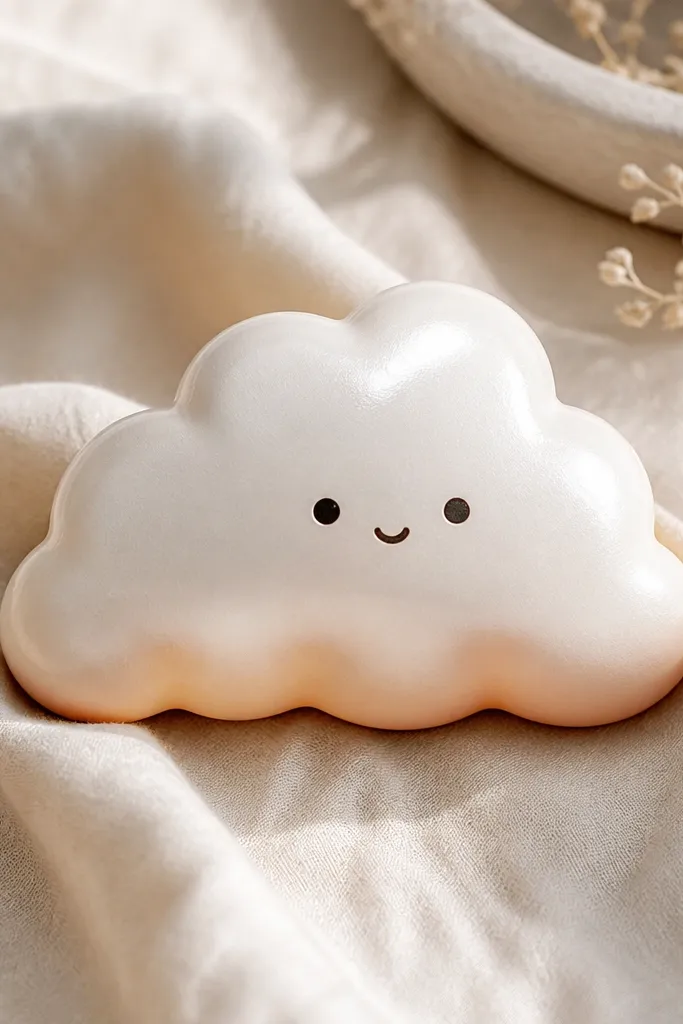
Cut a cloud shape from 2mm foam using a paper template with smooth curves. Cut a matching cloud top from 160 gsm white cardstock and add peach shading only along the bottom edge with colored pencil. Glue the top onto the foam, then wrap the sides with thin white paper to hide the seam. For the face, place two small dark dots and a tiny curved line in the center. Seal the top with satin Mod Podge or semi-gloss laminate, then add one white gel pen highlight line across the upper curve.
Cloud squishies look expensive when they blend shading and keep the outline smooth. I use white paper with a satin finish so the cloud doesn’t look like a sticker. The peach shading sits only on the lower edge, which makes the cloud look like it’s lit from above. A simple face keeps it friendly without clutter. This fits kids well because it’s light and easy to hold, and it looks cute against bedrooms because the colors are soft and calm.
AvoidDon’t use matte paper with no seal; unsealed paper drinks light and looks flat.
Pro tipKeep the peach shading to about 5-8 mm from the bottom edge so it looks intentional.
25. Gummy Bear With Layered Color Bands
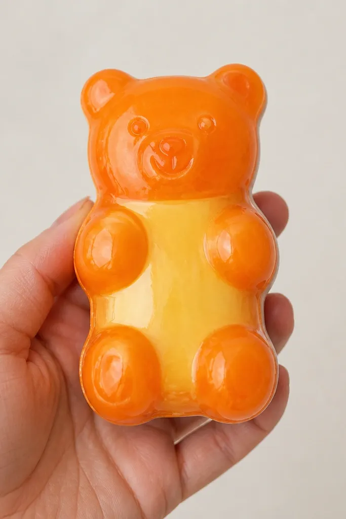
Cut the gummy bear outline from 2mm foam and cut a matching top shape from 160 gsm orange cardstock. Cut a belly piece from lighter yellow paper and glue it onto the orange top before sealing. Add small white highlights on the shoulders with a gel pen so the gloss has something to reflect. Wrap the sides with 120-160 gsm orange paper and keep the seam on the back. Seal the entire top with clear gloss laminate, then attach a matching back piece for a clean edge.
Gummy bear shapes look expensive because the body is glossy and the colors are layered. I make a body with a darker translucent-looking orange and a lighter yellow belly panel, so it reads like a real gummy. The glossy finish is the whole point here — it turns paper into “candy packaging” in photos. Kids love it because it’s fun and squishy-looking, and it’s easy to customize with different bear colors. It works across skin tones because the bright candy colors pop without needing fancy backgrounds.
AvoidDon’t overoutline the bear; thick lines make it look like a coloring page.
Pro tipFor extra realism, draw tiny “gummy bubbles” using a clear gel pen — very small and sparse.