1. Cream Capsule Squishy With Flat Front Label
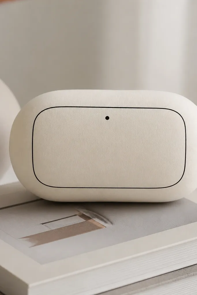
This one looks modern because the silhouette is simple and the only “detail” is a label panel. Use warm cream cardstock for the shell and keep the label in a slightly brighter off-white so it reads intentional instead of accidental. I’ve made this for people who like neutral decor — it sits on a desk like a tiny object, not a toy. It also flatters anyone’s hands because the front stays flat while the sides compress, so it feels satisfying without deforming the label. If you want it to match beige outfits, pair it with a black label border and a single gray dot.
Pro tipPrint the label panel at the same scale as the shell and do a 1 cm test square check before cutting the real pieces.
Start by printing the capsule template and cutting the two shell faces from cream cardstock. Score all fold lines with a bone folder, then assemble one side using the template’s glue tabs so the capsule closes into a smooth tube. Cut a compress insert from thin foam sheet or folded batting — aim for a piece that’s about 3-4 mm smaller than the inner opening on all sides. Slide the insert inside, then close the second face last, pressing along the hinge line for a tight seal. Finish by adding the label panel: glue only the edges, not the center, so it doesn’t bubble when you squish.
AvoidAvoid glossy cardstock for the label — glare makes the border look messy and cheap under indoor light.
2. Monochrome Dot Micro Squishy
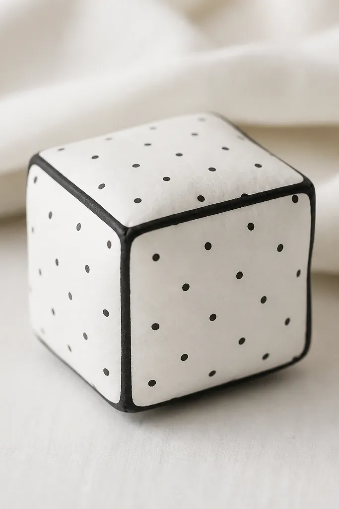
This design reads minimalist because the pattern is controlled: small dots, consistent spacing, and a single-color outline. Use matte white cardstock and stamp or print tiny black dots at the same size across every panel. I like this for gifts because it feels graphic — even without a character or cute face, it still looks like a finished object. It flatters cooler skin tones when held next to a hand because the black-and-white contrast stays crisp. It also works well for people who hate “busy” crafts since the only variation is dot density.
Pro tipUse a fine-tip black marker for the outline and keep it to a 1-2 mm line width so it stays graphic, not sketchy.
Cut the cube panels from white cardstock and apply the dot pattern before assembly. If you’re printing dots, print a single sheet, then cut panels from that sheet so the dot grid aligns. Assemble the cube shell using the template’s tabs, then crease the edges hard so the rounded corners stay smooth. Make the compress layer from thin felt or cotton batting folded to about 5 mm thickness — you want it springy, not chunky. Insert and close the last face, then lightly press each edge for 20-30 seconds so the dots don’t crack or lift.
AvoidSkip random dot sizes — mixed dot scales make it look like a kid’s sticker instead of a designed pattern.
3. Slate Gray Half-Moon Squishy
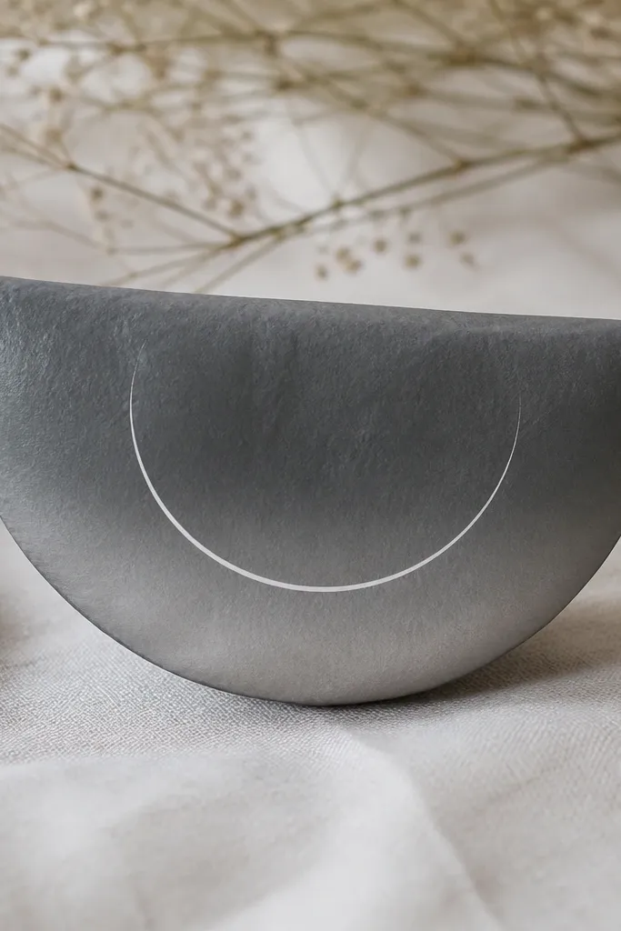
Half-moons look modern because the shape is architectural and the negative space feels intentional. Use slate gray cardstock for the shell and add a simple gradient with a light hand using gray marker or diluted ink — keep it subtle. The small white crescent line in the middle gives it a “designer” feel without adding clutter. This is a great match for people who wear gray, navy, and black because the squishy looks like a mini accessory. When you squish it, the curved side compresses evenly, so it never warps into a lopsided blob.
Cut the half-moon shell faces and apply your gradient to the outer face only. Let the ink dry fully, then score and fold using the template’s crease marks. Assemble the shell with tabs, then cut an insert from thin foam sheet sized so it sits 2-3 mm away from the edges. Glue the inner insert lightly on one side only, then close the second face so the foam compresses freely. Add the white crescent line last with a pen or paint marker, and keep the line thickness consistent across the curve.
Do the gradient with a dry brush or sponge — wet ink soaks into paper and makes edges look uneven.
Don’t color the inside face heavily — it shows through when the squishy compresses.
4. Blush Minimal Heart With Tiny Stem
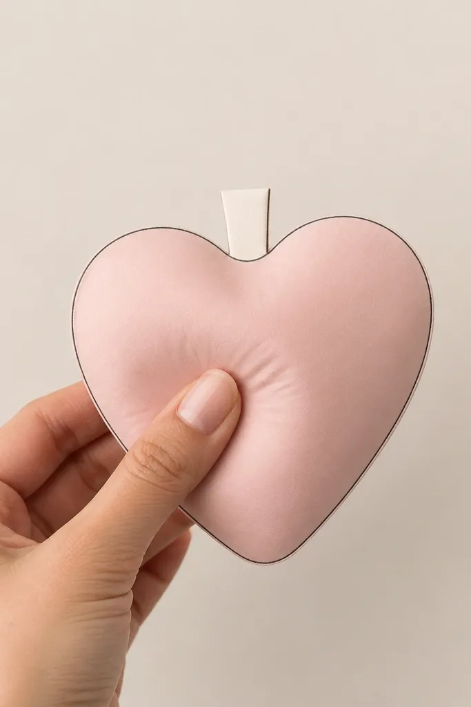
A heart can look modern if you remove the usual details and keep the linework thin. Use blush cardstock and outline in a muted gray so it doesn’t read as “valentine candy.” The tiny stem is a little unexpected, and it gives the piece a product-design vibe. I’ve made this for birthdays and anniversaries when someone likes cute but hates loud. It also looks good on warm undertones because blush matches the natural flush in skin. When you squish it, the heart keeps its shape because the insert is centered and the outline stays on the outer faces.
Pro tipUse a gray pencil to sketch the outline lightly first, then trace with a fineliner for a clean curve.
Cut two heart shells from blush cardstock and one small stem piece from off-white. Score the heart edges gently — too hard and the heart will crack at the points. Assemble the heart shell first, leaving the top area open for the stem tab. Insert the compress layer — thin batting rolled into a tight pad works well — then slide in the stem tab and glue it between the shell layers. Close the final face and press the heart outline area for 30 seconds so the gray outline stays crisp and flat.
AvoidAvoid thick marker outlines — they make the heart look like a poster instead of a minimal object.
5. Forest Green Origami-Style Triangle Squishy
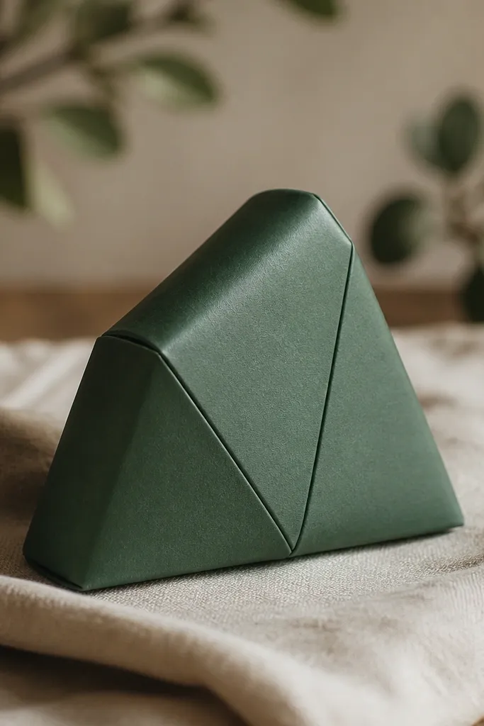
Triangle prisms look modern because the geometry reads crisp even when the object squishes. Use forest green matte cardstock and add a faint crease pattern using a scoring tool — keep the creases shallow so they don’t tear. For contrast, I like one face cut from a darker green satin paper so the top edge catches light when you handle it. This design suits people who like outdoorsy colors but still want a clean aesthetic. The squish is satisfying because the insert supports the triangle shape instead of collapsing inward.
Cut the three prism faces and score the internal fold lines before assembly. Fold along the lines so the origami-style creases form a consistent direction across all faces. Assemble the prism with tabs, making sure the triangle points meet tightly at the corners. Add the compress insert as a thin foam triangle — I usually trim foam sheet with scissors so it fits with a 1-2 mm gap from each face. Close the final seam and press the corners gently so the points keep their sharp shape.
Use a ruler edge when scoring — uneven scoring makes the geometry look handmade in a bad way.
Don’t use bulky foam — it rounds off the triangle points and ruins the modern look.
6. Sand Beige Side-Fold Rectangle Squishy
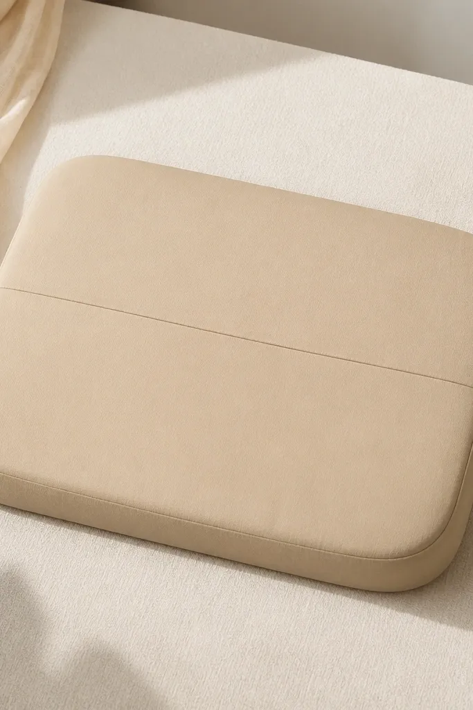
Rectangles read minimalist because they’re predictable and easy to style on shelves. This one uses a side-fold construction that makes a visible but clean seam line, like a product label. Choose sand beige cardstock and keep the finish matte so it doesn’t look shiny or cheap. It’s great for desk decor because it looks like a small storage object, not a craft. It also looks good with warm-toned interiors and outfits, especially with wood and cream palettes. The seam line helps the squish travel through the middle, so it feels even when you press it.
Print the rectangle template and cut two outer faces from sand cardstock. Score the middle seam line and the side hinge lines, then fold carefully so the seam stays straight. Assemble one outer face to the inner structure using glue tabs, then insert a compress strip cut to the rectangle’s inner size. I use layered cotton batting — fold it once more than you think, then trim so it sits snug. Close the second face, align the corners, and press along the seam line first, then the edges.
Add a tiny 5 mm “date stamp” square in darker beige on one corner if you want a modern designer feel.
Avoid uneven trimming on corners — rounded corners must match on both faces or the seam looks crooked.
7. Ice Blue Window Frame Squishy
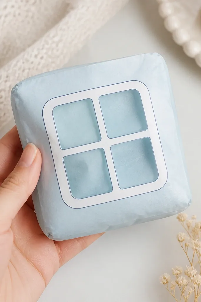
This squishy looks modern because it has a frame within a frame — a simple window shape that reads like architecture. Use ice blue cardstock for the shell and white or very pale gray for the window frame. For the inner “glass” layer, use vellum or thin acetate so the light catches when you squeeze it. I like this for gifts because it feels special without adding character faces. It also flatters people with cool undertones since the blue stays crisp and clean. When you press it, the translucent panel flexes slightly, giving a satisfying tactile contrast.
Pro tipUse vellum for the inner layer if you want a soft glow; use acetate if you want sharper light reflections.
Cut the window opening on the front shell face and keep the frame borders intact. Glue the translucent inner layer behind the opening using a thin glue line around the frame, then let it dry flat. Assemble the outer shell and insert a compress pad sized to cover the window area evenly. The compress should be thinner directly behind the window so the “glass” doesn’t bulge. Close the back face and press around the frame edges first, then the rest of the panel to distribute compression.
AvoidDon’t use thick plastic — it makes the window look warped and the squish feels stiff.
8. Charcoal Minimal Cloud Puff
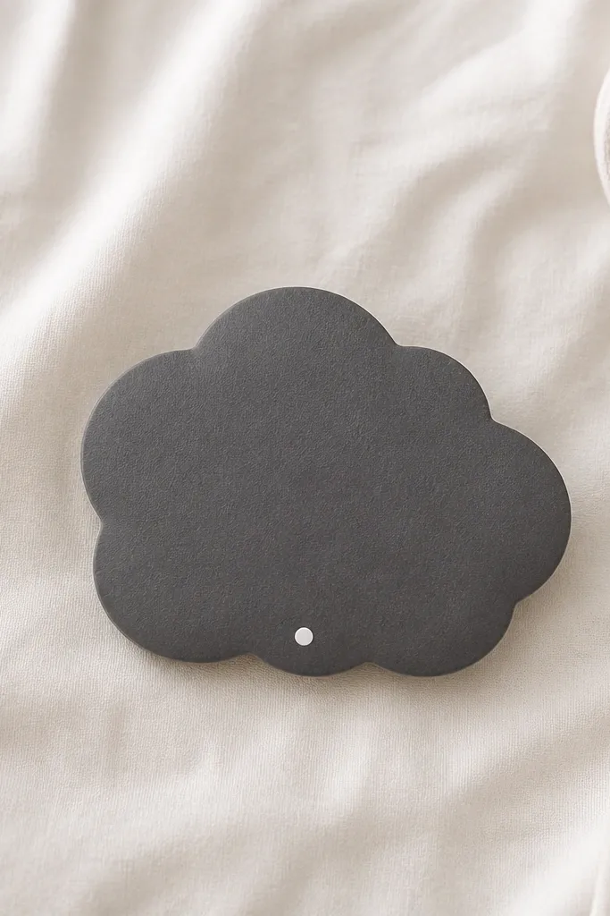
A cloud shape can look modern when it’s monochrome and smooth. Use charcoal gray cardstock and skip the usual rainbow or cute face. The single white dot gives it a tiny “signal” detail, like a product mark. This is a good pick for people who want cozy vibes without pastel noise. It looks great on warm skin tones because charcoal brings balance and the white dot pops. The cloud squishes nicely because the insert fills the bumps evenly, so you don’t get a flat pancake effect.
Pro tipIf your cloud bumps look jagged, sand the cut edges lightly with a nail buffer before assembly.
Cut two cloud shells from charcoal cardstock and score the fold lines so the bumps keep their round profile. Assemble one side with tabs, then add an insert made from thin foam or batting cut to the cloud interior. I trim the insert so it leaves a 2 mm border around the edges — that keeps the outer shell from bowing. Close the second face and press along each bump lightly, moving from top to bottom. Add the white dot with a paint marker — keep it small, about 3-5 mm, and place it slightly off-center.
AvoidAvoid adding multiple dots or a full face — it turns into a cartoon and kills the minimalist read.
9. Magenta Striped Roll Squishy
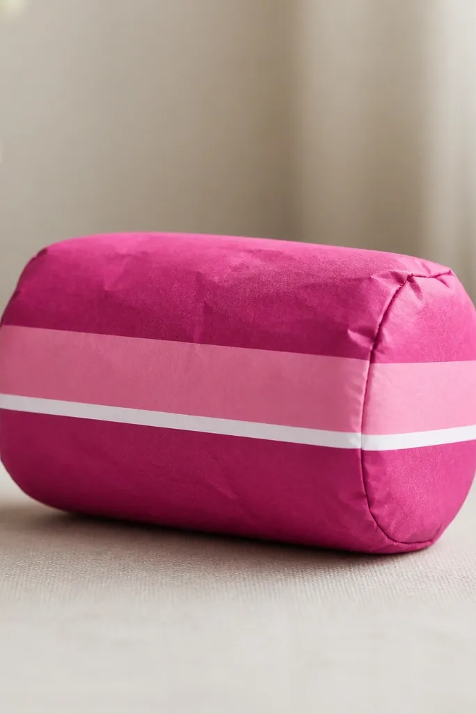
Roll shapes look sleek when stripes line up across the seam. This design uses only three stripe bands, so it stays modern rather than busy. Use deep magenta matte cardstock, lighter pink for the middle band, and a thin white divider for crisp separation. I like it for people who wear bright colors but still want a clean object that doesn’t look childish. It also looks good in photos because the stripes create clear lines. When you squish it, the roll compresses evenly and the stripe alignment makes it look intentional.
Print or cut the striped panels so the stripes run horizontally across both shell faces. Score and fold along the template lines, then assemble the shell so the stripe pattern matches at the seam. Add a compress insert cut as a short cylinder or folded batting rectangle — keep it snug but not tight. Place the insert centered so the stripes compress without wrinkling at one end. Close the final face and press the seam until the glue sets, then check stripe alignment by sighting across the top edge.
Use a cutting mat and rotary cutter for the stripes so the edges stay straight and the white divider line looks sharp.
Don’t eyeball stripe widths — even a 1-2 mm mismatch shows up fast on a roll shape.
10. Olive Leaf Minimal Squishy With One Stem Line
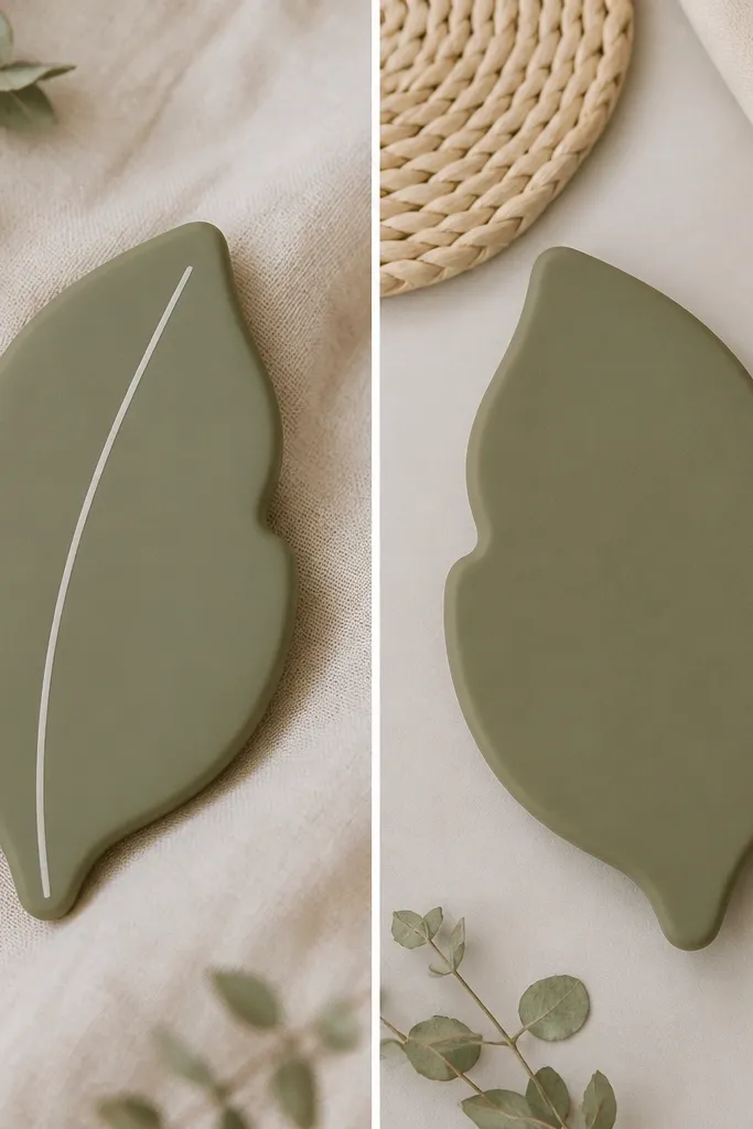
Leaf shapes can go tacky when you add too many veins. This one stays modern because it uses a single stem line and a clean outline. Choose muted olive cardstock and an off-white line for the stem so it looks like a simple botanical label. I’ve made this for housewarming gifts because it matches lots of neutral decor and feels thoughtful without getting sentimental. It flatters anyone because olive works across warm and cool palettes. The squish is stable since the insert is tapered to follow the leaf’s shape, so the tip doesn’t collapse first.
Cut two leaf shells and score fold points so the leaf shape stays symmetrical. Assemble the shell with tabs, then cut a tapered insert from thin foam or batting — taper it so it’s slightly thinner at the tip. Glue the insert lightly at the base only, then close the second face. Add the stem line after assembly with a fine liner, starting at the base and ending just shy of the tip. Keep the line thickness consistent and add one small off-white dot near the base if you want a tiny signature detail.
If your leaf tip looks soft, add a second thin batting layer only at the tip area before closing.
Avoid printing a detailed leaf texture — it reads like scrapbook paper and kills the minimalist look.
11. White Dot Grid Tiny Pillow Squishy
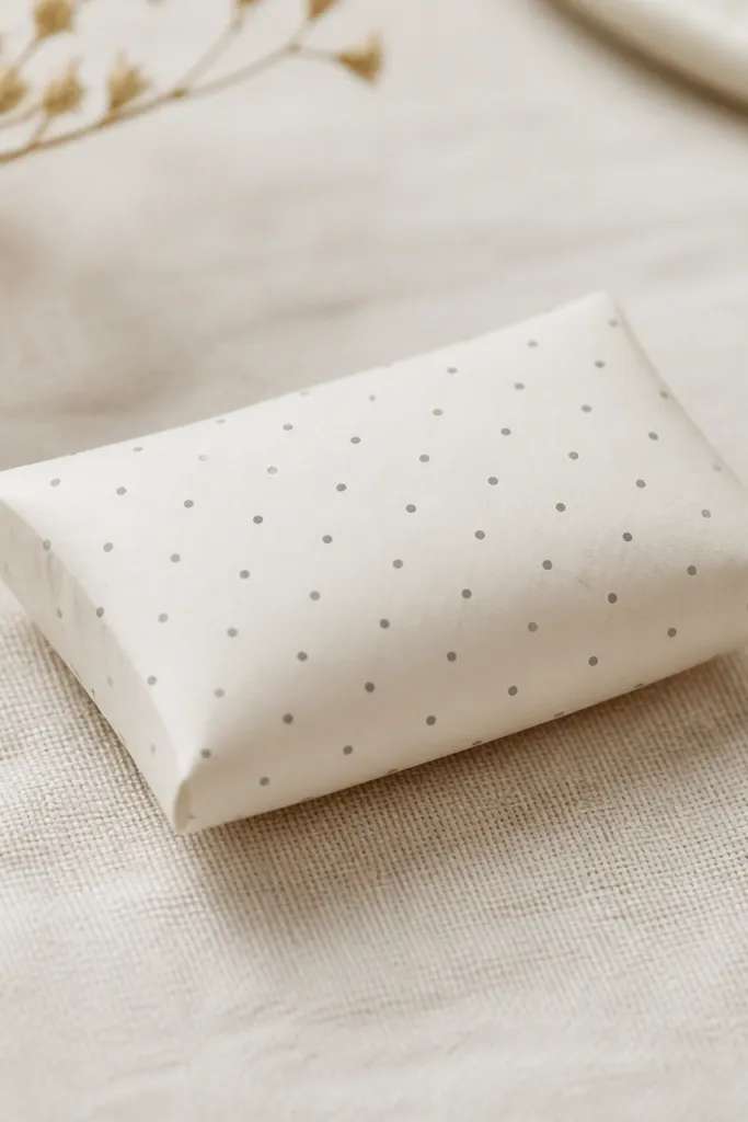
Pillow squishies look cozy and modern at the same time when the pattern is controlled. A dot grid feels calm and design-y because it’s math-like, not random. Use warm white cardstock and gray dots at a consistent size — I like a 2-3 mm dot spacing. This is a great desk accessory for anyone who likes clean minimal decor but still wants something fun to squish. It also photographs well since the dot pattern gives texture without color clutter. The pillow shape compresses in the center, which feels better than a flat rectangle when your hands get tired.
Cut the pillow faces from warm white cardstock and apply the dot grid before assembly using a stencil or printed guide. Score the fold lines and assemble the pillow with the template’s side tabs so the edges stay even. Make the compress insert from folded batting — start at about 8-10 mm thick, then trim until the pillow looks plump but not overfilled. Insert and close the last seam, then press along the perimeter to set the shape. If you want extra squish, add a thin second batting layer inside the center only.
Use a pencil to mark the dot grid lightly on the back side so your stencil lines up perfectly across both halves.
Skip glitter or metallic dots — they shed and make the squishy look messy fast.
12. Navy Corner Accent Square Squishy
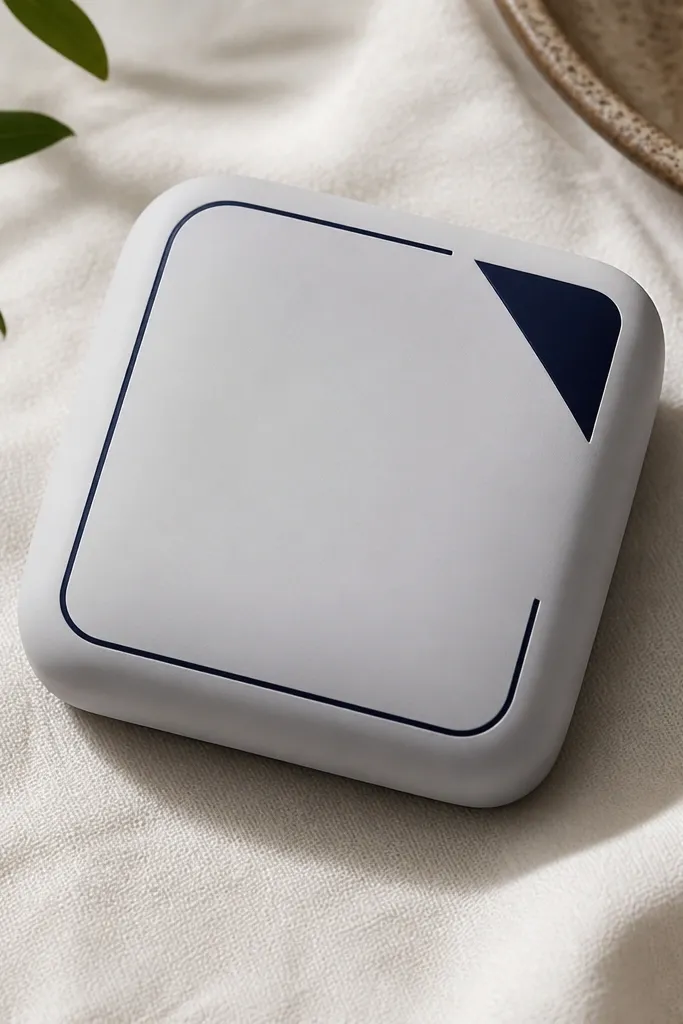
Corner accents look modern because they create a graphic “move” without covering the whole surface. Use light gray cardstock for the shell and navy for the triangle accent. Keep the accent small — about one quarter of the face — so it reads like design, not decoration. This one flatters most outfits because gray is neutral and navy is the kind of color that matches denim, black, and navy sweaters. It also gives you a clear highlight when you squish it, since the navy triangle compresses and catches light. The square form keeps the squish symmetrical, so it never feels lopsided.
Pro tipIf your triangle looks wobbly, trim it twice — first rough, then final trim with a fresh blade.
Cut two square shells from light gray cardstock and round the corners slightly so the edges don’t look sharp. Assemble the shell structure first, then add the navy corner triangle on the front face using a crisp paper triangle cut with a ruler. Add a thin navy border line using a fineliner that stops near the opposite corner — follow the template guide if you have one. Insert a compress pad cut to the interior square, leaving a 2 mm border around the edges. Close the back face and press the front corner where the triangle sits so it stays flat and doesn’t lift.
AvoidDon’t add multiple corners or extra lines — that turns it into scrapbook style instantly.
13. Rust Terracotta Minimal Arch Squishy
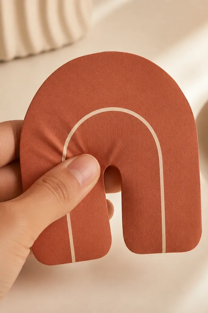
An arch shape is modern because it reads like a symbol — clean, graphic, and easy to scale. Use terracotta cardstock for the outer shell, then add one off-white arc line inside to create depth. Keep the inside line centered and thin, around 2 mm, so it doesn’t look like a child’s drawing. This is a great option for warm decor lovers because terracotta looks good with beige, wood, and gold accents. It also looks great in warm indoor lighting since the matte surface absorbs light and avoids glare. The arch squishes without deforming the curve because the insert follows the inner arch contour.
Cut two arch shells and score the fold line along the flat back edge. Assemble the outer shell first, then cut the inner insert using the template’s inside arch outline. For the insert, use thin foam sheet or batting and trim until it fits with a 1-2 mm gap at the arch edges. Close the back face and press along the flat edge so the arch stays smooth. Finally, draw the off-white inner arc line with a paint marker — let it dry before you squish it so it doesn’t smear.
Use a ruler with a flexible curve if your arch line looks uneven; straight edges ruin the symbol look.
Avoid adding shading on the arch — gradients make it look like a printed sticker instead of a handmade object.
14. Black-and-White Stripe Keychain Squishy
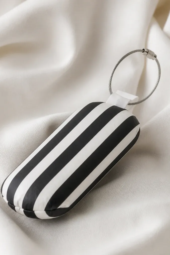
This one is modern because it’s functional and graphic. Vertical stripes look crisp and intentional, and the keychain loop adds a real-world use. Use thick black cardstock for the stripes and white cardstock for the base, keeping the stripe width consistent at about 3-4 mm. I’ve made these for coworkers and they get picked up constantly because the size is right for a pocket. It also flatters hands of all sizes since it’s small and compresses quickly. The reinforced tab keeps the loop from tearing, which matters after a week of use.
Cut shell faces with vertical stripes already applied so alignment stays perfect when you wrap the shape. Assemble the body and insert a compress pad sized to the inside — thin batting works better than thick foam for keychain-sized pieces. Reinforce the loop attachment by adding a small extra cardstock patch over the tab area before you glue the loop in place. Close the final seam and press until fully set. Test the loop by pulling gently — if it shifts, add a second inner reinforcement strip.
Use a metal keyring with a smooth hinge so it doesn’t snag the paper edge when you spin it.
Don’t skip reinforcement — keychain squishies fail at the loop tab first.
15. Pastel Gray Marble Vein Squishy
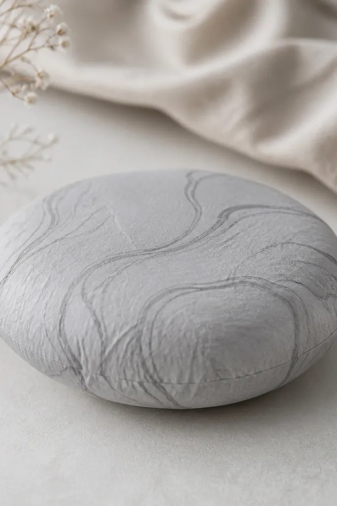
Marble looks modern when the colors stay within one family and the veins are thin. This squishy uses pastel gray cardstock and adds darker gray vein lines with a watered brush or ink pen, then keeps everything else blank. It’s a good pick for people who love texture but don’t want patterns like dots or stripes. The marble finish also looks good against skin because the contrast is soft, not harsh. When you squish it, the veining shifts slightly with the paper — that movement is what makes it feel alive. Keep the design plain so the texture becomes the only “detail.”
Start with a single shell face and create the marble effect before cutting if possible, then cut from the marbled sheet so both halves match. Use watered gray ink and a fine brush — drag lines lightly, then add a few breaks so it doesn’t look like a printed pattern. Let the ink dry completely under something flat so it doesn’t warp. Assemble the shell faces and insert thin batting or foam that fills the center first, then tapers slightly toward the edges. Close the second face and press evenly so the marble lines don’t crack at fold points.
If you see pooling, blot with a paper towel right away and keep the surface matte.
Avoid heavy black marbling — it reads like imitation stone and looks too busy.