1. Cream Cloud Belly Squishy with Inner Support Panels
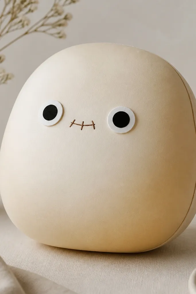
This one looks the most “toy-real” because the belly is built as a dome, not a flat oval. I use cream cardstock (120-160 gsm) for the outer shell and add inner support panels in lighter printer paper (80-100 gsm) to keep the curve from collapsing. The warm cream color flatters most rooms because it doesn’t fight daylight — it reads cozy next to wood desks and beige walls. If you like a clean face, keep the mouth small and the blush minimal so the whole thing doesn’t look like a cartoon sticker. The styling principle is simple: outer shell holds the shape, inner panels stop sagging, and the face sits on raised pads so it pops.
Start by cutting a dome-shaped body pattern: two identical outer halves, each about 7 cm tall and 5.5 cm wide. Score the fold lines lightly with a ruler edge, then fold using your fingernail so the crease stays matte. Cut two inner support panels that match the belly curve, then glue only the panel edges to the inner side of the shell — leave the center free so it can puff. Finally, attach the eyes and mouth on small foam-free paper pads (a folded strip works) so the face reads raised in photos.
Pro tipIf your first dome looks too flat, add one more inner support panel on the back half only.
AvoidDon’t run glue across the curved center — it stiffens the bend and makes the squish look creased.
2. Pastel Rainbow Loaf with Offset Fold Lines
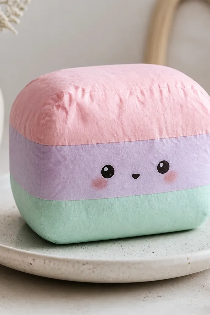
This loaf style looks extra cute because the fold seam is offset, so it doesn’t look like a perfect sticker outline. I make the rainbow bands with matte cardstock so the color stays soft under overhead lights. The offset seam flatters small decor spaces because it adds movement — your eye doesn’t land on one strict line. For faces, keep the nose tiny and the blush close to the eyes; big blush circles make paper squishies look like cheap stickers. The principle here is visual: offset seams hide the construction and make the body look intentionally “molded.”
Cut three band strips (each about 1.8 cm tall) for pink, lavender, and mint, then glue them to a single outer shell sheet so the colors wrap smoothly. Create the loaf body by cutting two mirror halves, then score fold lines that are offset by 2-3 mm from the center. Glue the seam edges only, holding the shape as it dries so the loaf stays rounded. Add the face after the body is formed; place eyes about 1.2 cm apart and keep the nose centered between them.
Use a white gel pen to add a tiny highlight dot on each eye circle — it makes the eyes look “wet” without using glossy paper.
Don’t center the seam perfectly — it makes the toy look like a flat cutout.
3. Mint Heart Pocket Squishy with a Hidden Note Slot
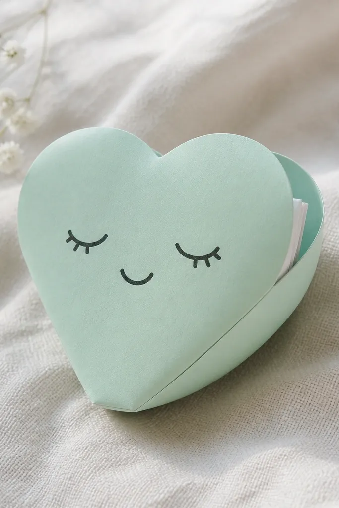
This one is both cute and useful, and the pocket makes it feel like a gift even when it’s just desk candy. I use mint cardstock for the heart shell and a slightly stiffer backing paper for the pocket flap so it opens without tearing. The soft heart shape looks good on people who like gentle colors — mint reads clean on warm skin tones and looks calm in photos. For the face, go with small sleepy eyes and a curved mouth; big open eyes can make the heart look surprised rather than cozy. The principle is functionality plus squish: a pocket flap adds thickness, which helps the heart keep its rounded “toy” edge.
Cut two heart halves, each about 8 cm tall, and add a pocket flap panel on the back half that’s 6 cm wide. Score the flap fold lightly and test it with a dry fold before gluing. Glue the pocket edges only, then build the front face separately: eyes, cheeks, and mouth on the front half before assembly. Assemble by gluing the outer perimeter edges, leaving the pocket opening free. Slide a tiny note in after it fully dries so you don’t warp the flap.
Pro tipBurnish the flap fold with a scrap of plastic (like an old gift card) for a smooth opening.
AvoidDon’t use super-thin paper for the pocket flap — it creases badly and tears at the fold.
4. Chocolate Cookie Squishy with Crinkle Texture Edges
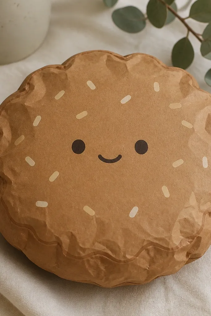
Cookie squishies look real because the edges are messy in a controlled way. I tint the brown cardstock slightly darker on the edge by using a brown pencil lightly around the perimeter, then I add a crinkle texture by lightly brushing a damp sponge over the outer rim and letting it dry flat. The result is a soft, lived-in cookie look without using fabric. This shape flatters any color palette because chocolate brown works with pink, cream, and mint accents. The principle is texture: a gentle crinkle at the edge tricks your eye into seeing softness.
Cut a circle body about 7 cm across, then cut a second circle for the back. Lightly pencil the edge darker, then dab a tiny amount of water on a sponge and tap only the outer 5 mm of the front circle. Let it dry completely before you glue anything so you don’t warp the paper. Shape the squish by folding the circle into a shallow dome and gluing the inner perimeter while holding the curve. Draw sprinkles and a face after drying; keep the face small so it doesn’t fight the texture.
Use a fine-tip marker for the mouth so it stays crisp against the textured edge.
Don’t over-wet the rim — it buckles and makes the cookie look warped.
5. Coral Blush Bunny with Floppy Ear Angle
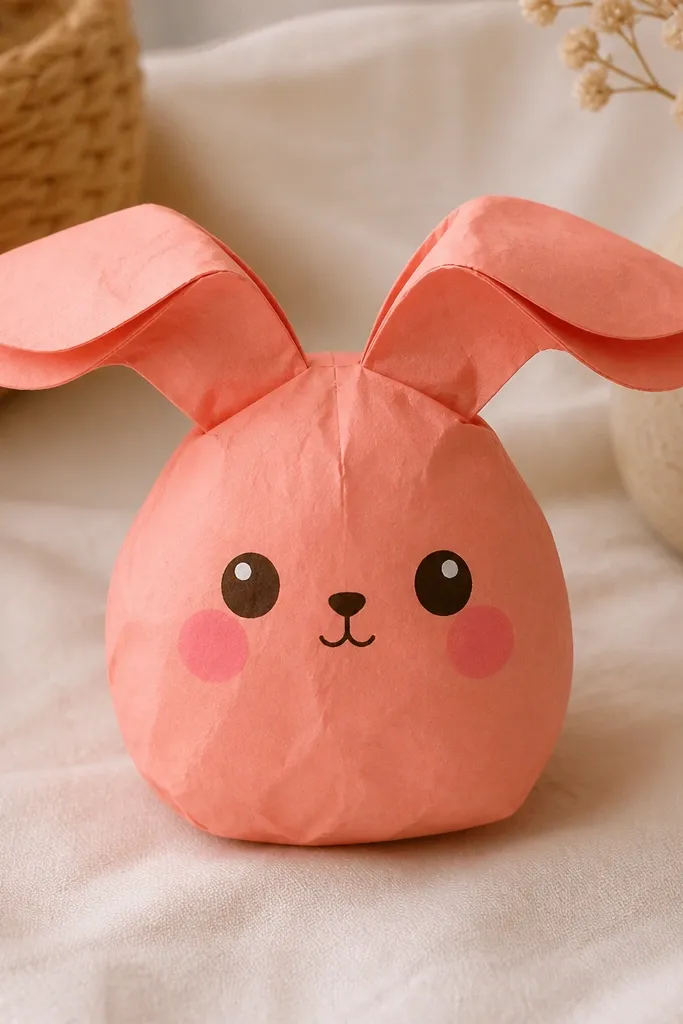
Bunny squishies look expensive when the ears have an angle, not straight up. I build the ears as layered panels: a coral outer ear and a lighter coral inner ear so you see a soft shadow when the ears tilt. That shadow makes the bunny look dimensional even though it’s paper. Coral also flatters warm-toned rooms and looks great next to gold frames. The face should stay simple: small nose, small mouth, and blush placed low enough that it looks like a toy expression. The principle is depth through layering, especially at the ears.
Cut two body halves and two ear pieces per side. Make ear panels with a 1 cm wide base that you fold to create a slight “flop” angle. Glue the lighter inner ear to the back side of the outer ear, then assemble the ear base onto the body before you close the shell. When you glue the body halves, tack the ear base in place so it dries at the tilt you want. Finish by adding eyes and blush; keep the eye size about 8-10 mm for a cute proportions balance.
Place a small piece of scrap paper behind the ear base while drying — it holds the angle so it doesn’t spring upright.
Don’t glue both ear halves flat at the same angle — it removes the shadow line and kills the dimensional look.
6. Sky Blue Donut with Hole Backing Trick
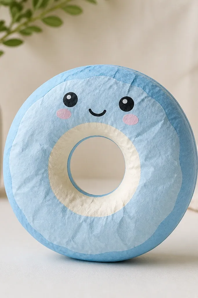
Donuts are where people mess up the most because the center hole collapses and the inner ring looks jagged. I fix that with a backing trick: a thin inner ring that stays flat while the outer donut domes. Use sky-blue cardstock for the outer and cream cardstock for the inner ring so the hole reads clean. This color combo looks cheerful without being loud, and it photographs well in both daylight and warm lamp light. The principle is structural separation: the hole stays crisp, while only the outer shell gets the squish.
Cut an outer donut ring and an inner ring circle, both about 8 cm outer diameter with a 3.5 cm hole. Dome the outer ring by scoring two opposite fold lines, then glue the seam edges while holding the curve. Keep the inner ring flat by gluing it to the underside of the outer ring around the inner edge. Add the face on the front top after assembly so it sits on the dome. For clean edges, press the inner ring gently with a dry cloth while drying.
If the hole looks too thin, widen the inner ring by 2-3 mm before assembling.
Don’t try to dome the inner ring — it warps and makes the hole look uneven.
7. Lilac Cupcake Squishy with Piped-Frosting Strip
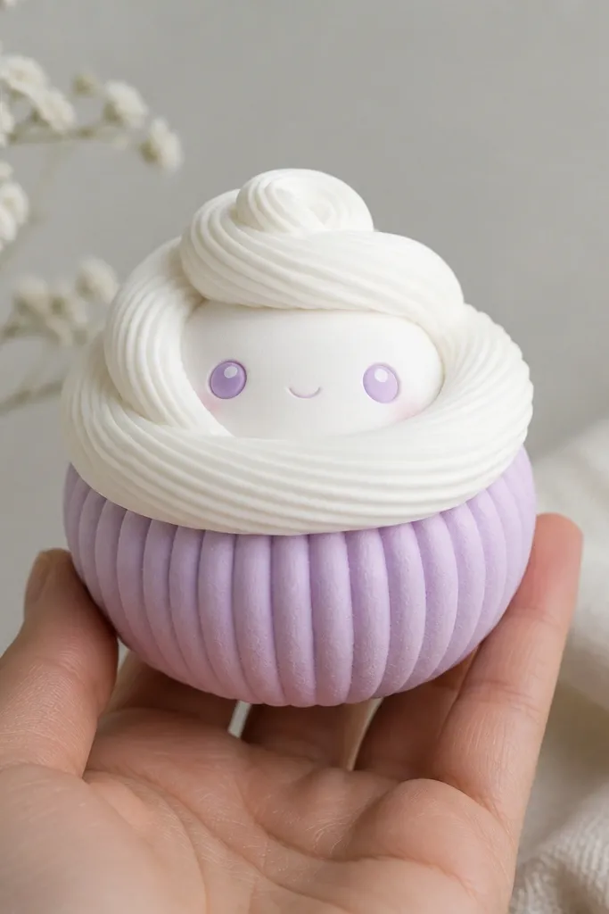
Cupcakes look adorable when the frosting has ridges instead of being a flat circle. I use a frosting strip method: a white or off-white cardstock strip that I cut into small ruffles, then curl slightly so it reads like piped frosting. Lilac cupcake bodies look soft and flattering next to neutral backgrounds like beige curtains or a light wood shelf. The face should sit on the frosting ridges with a tiny raised platform so the eyes don’t sink into the texture. The principle is adding one “feature” texture while keeping everything else smooth.
Cut a cupcake base dome about 7 cm tall from lilac cardstock. Make the frosting by cutting a strip about 22 cm long and 1.2 cm wide, then snip 2-3 mm fringe along one edge. Roll the strip lightly around a pencil to create gentle curls, then glue the strip around the top edge of the dome. Place a small circle of paper (about 2 cm) under the face so the eyes sit higher. Draw eyes and a smile after the frosting is glued so you can place them centered.
Pro tipUse a ruler to keep the frosting strip height consistent around the top.
AvoidDon’t glue frosting directly at the fold seam — it makes the dome look lumpy.
8. Yellow Sunshine Chick Squishy with Beak Layer
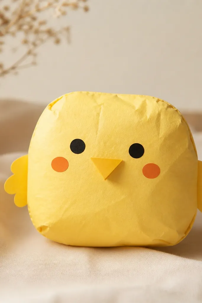
A layered beak is the trick that makes paper squishies look like toys, not drawings. I use bright yellow cardstock for the body and a slightly deeper yellow for the beak so there’s a clear value difference. The chick shape flatters most skin tones because yellow brightens the face area in photos. Keep the wings small and tucked so you don’t fight the dome shape. The principle is value contrast: darker beak + simple face = instant depth without extra materials.
Cut a chick body from yellow cardstock in two matching halves, then score and fold into a dome. Add small wing tabs on the sides using thin paper strips (about 1 cm wide) so they don’t bulk up too much. Cut the beak as a separate triangle and glue it on top of the face area after the dome is assembled. Place eyes about 1 cm apart and add cheek dots with a light orange pencil. Glue the beak only at the base so the tip stays slightly lifted.
Use a craft knife to cut the beak tip cleanly — paper scissors leave fuzz that shows in close-up photos.
Don’t print the beak and face as one flat piece — the lack of layering makes it look like clipart.
9. Mint Green Star Squishy with Folded Point Support
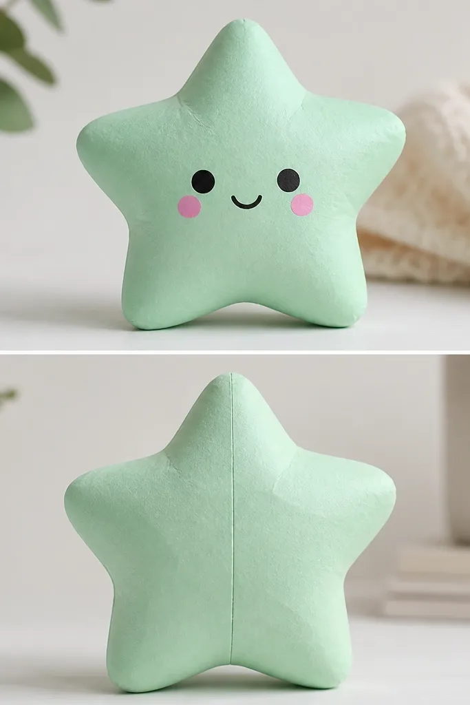
Stars are tricky because points want to stay sharp, and sharp points look like a paper ornament, not a squishy. I fix that by building point support: folded inner tabs that round the tips. Mint green keeps the vibe calm and works well for baby showers, desk decor, and pastel rooms. The face should be on a slightly flatter front panel compared to the domed sides so the eyes don’t warp. The principle is shaping the geometry: you’re rounding points by supporting them from inside.
Cut two star outlines from 120-160 gsm cardstock, then score each arm fold line lightly. For each point, cut a small inner tab shaped like a narrow wedge, then fold it so it rounds the tip. Glue inner tabs to the inside of one star half, then assemble the two halves by gluing perimeter edges only. Hold the points gently while drying so they stay rounded. Draw the face on the front after assembly; keep the eye circles small so they fit the star’s angles.
Pro tipIf your points look too flat, add a second inner tab to only the two outermost points.
AvoidDon’t fold star arms too hard — the crease turns shiny and ruins the squish look.
10. Peach Macaron Squishy with Two-Tone Edge Band
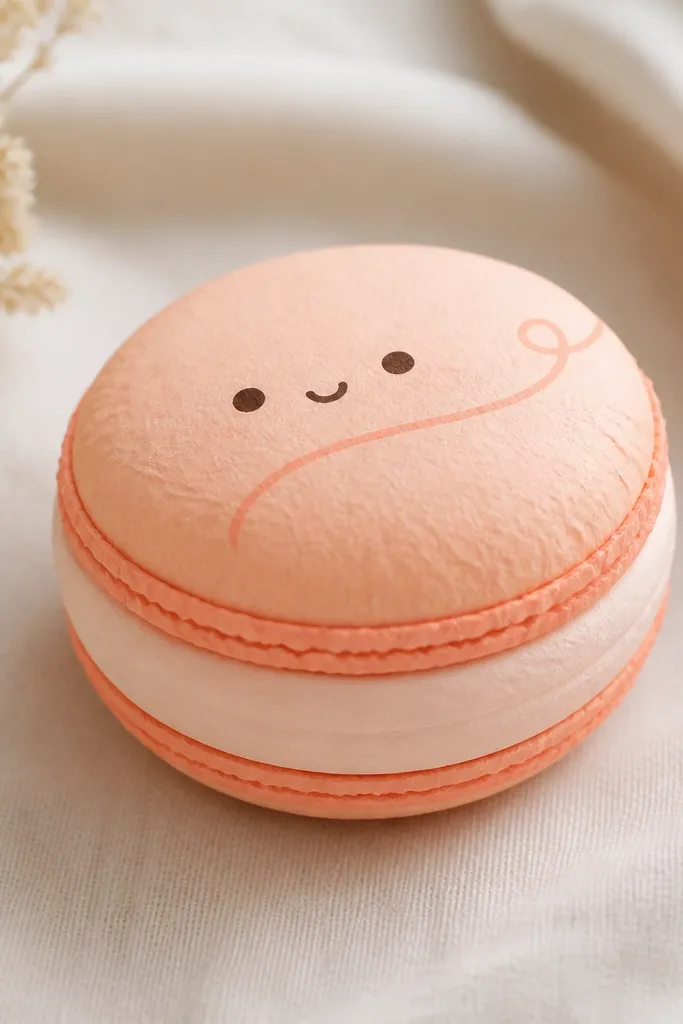
Macarons look best when you show the “filling” as a band, not as a flat line. I use two-tone construction: the shell is peach cardstock, and the filling is a lighter cream strip that wraps around the inside edge. This gives you that soft stacked look even though it’s paper. Peach also looks warm beside cool backgrounds like gray walls, and it makes the face look friendly. The principle is thickness illusion: a visible band makes the object read as layered, not printed.
Cut two macaron top shells from peach cardstock, each about 7 cm wide, and cut a filling band strip about 7.5 cm in outer width. Score and dome the top shell slightly, then glue the filling band to the underside around the perimeter. Assemble a second shell on top or behind depending on how thick you want it, keeping the filling visible. Add a tiny swirl detail and face on the top shell; place eyes slightly above center so the cheeks sit on the rounded area. Press the edges with a flat tool while drying to keep the rim crisp.
Use a slightly textured paper for the shells so the edge doesn’t look too smooth and toy-like.
Don’t skip the filling band — without it, macarons look like flat circles with a face.
11. Burgundy Velvet Rose Squishy with Rolled Petal Strip
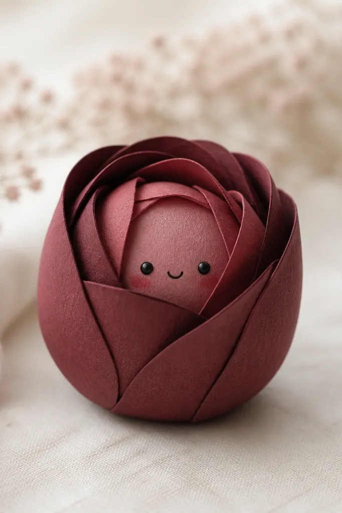
If you want “soft toy” vibes with drama, make the rose bud. I roll petal strips into tight spirals, then glue them to a domed base so the petals puff outward. The burgundy color reads deep and looks great next to cream, beige, and black frames. For the face, keep it tiny and place it slightly lower than you think — roses already draw attention, and big eyes can overtake the flower shape. The principle is controlled curls: rolled petals create volume while the dome base keeps the squish stable.
Cut a domed base from burgundy cardstock in two halves. Cut 3-4 petal strips, each about 1 cm wide and 8-9 cm long, from burgundy and a slightly lighter shade. Roll each strip around a pencil for a consistent curl, then glue the rolls onto the front dome in a spiral pattern. Add one small highlight petal roll in the center for depth. Draw the face on the front where the spiral leaves a flat-ish spot so eyes don’t warp.
Pro tipCut petal strips with the paper grain running lengthwise so curls stay even.
AvoidDon’t glue petals too close to the edges — it makes the bud look flattened and wide.
12. Skyline Cityscape Squishy with Window Dot Pattern
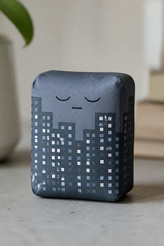
This one is for when you want squishy cuteness without cartoon faces dominating the whole piece. I use a rounded rectangle body so the “city” details wrap in a soft way. The window dot pattern gives texture without adding bulk, so it stays squishy. Sky-themed colors look clean in daylight, and the window dots make it feel playful instead of childish. The principle is surface detail: you add interest on the flat front panel while keeping the structure rounded.
Cut two rounded-rectangle halves from 120-160 gsm cardstock, about 9 cm tall and 5.5 cm wide. Score a center fold line lightly, then dome the rectangle by gluing the seam edges only. On the front panel, use a white gel pen to place tiny dot windows in a grid — 6 columns by 3 rows works for this size. Add shading with a light gray pencil under the dots so they pop. Draw the face near the top, keeping eyes small and close together so the city pattern stays the main character.
Pro tipUse a ruler to space the windows — crooked grids look like “sticker sheet” work in close-up photos.
AvoidDon’t cover the entire body with pattern — leave some plain areas for the squish to read as soft.
13. Charcoal Bear Squishy with Fur Grain Pencil Shading
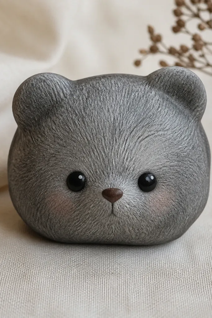
Bear squishies look more realistic when you shade fur grain lightly, not when you try to color it solid. I use charcoal or very dark gray cardstock and then add fur texture with a soft pencil, making short strokes that follow the curve. This method hides fold lines because the grain breaks up the shiny crease. Dark colors also make the face pop sharply in photos, especially if you use crisp white eye highlights. The principle is texture camouflage: shading blends seams and makes the paper look like plush.
Cut two bear body halves from charcoal cardstock and assemble into a dome. On the front, plan where the cheeks and forehead will be, then shade with a 2B pencil using short strokes. Keep strokes lighter near the center so you get a plush highlight effect. Draw the eyes with black marker, then add white gel pen dots for shine. Add blush with a warm brown or light pink pencil, and keep it small so the fur texture stays visible.
Pro tipTest your pencil pressure on scrap — too heavy makes the surface look dusty and uneven.
AvoidDon’t use felt-tip ink for fur — it bleeds into paper fibers and looks messy.
14. White Vanilla Swirl Squishy with Paper Rolled Border
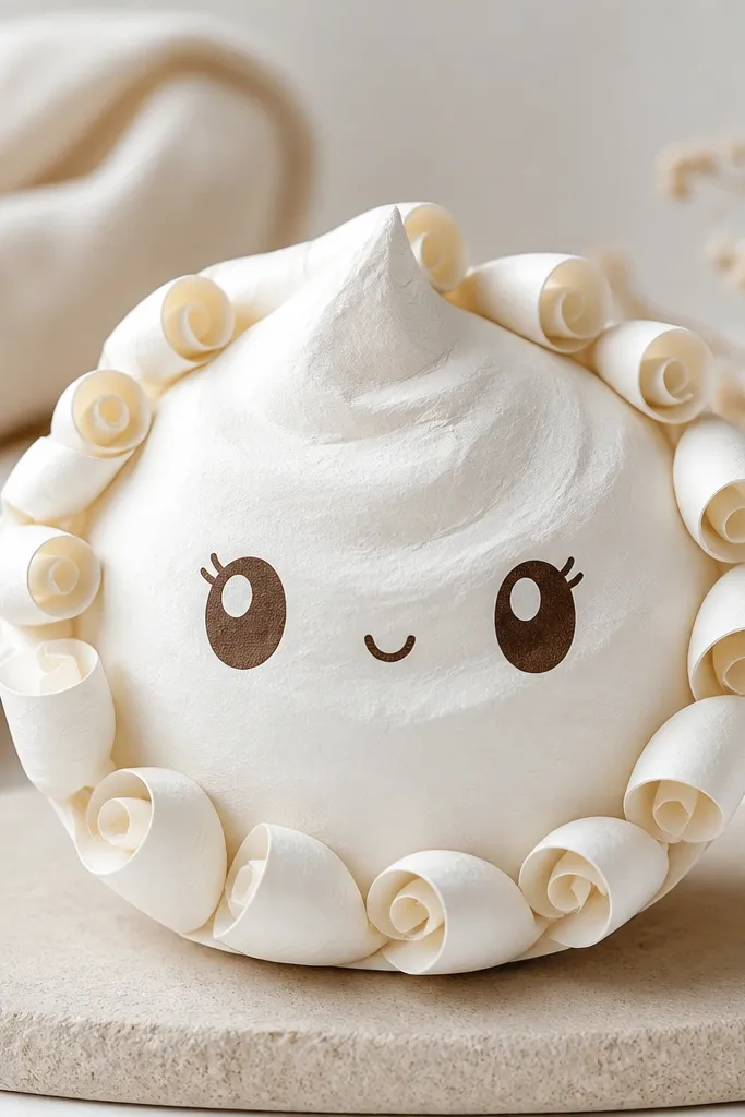
Swirl borders are a shortcut to “soft” because curls catch light and look dimensional. I use white cardstock for the body and make a rolled border with thin strips (about 4-5 mm wide) that I curl around a toothpick. The border adds a bouncy rim so the squishy looks padded even if the center is simple. This works especially well if your room lighting is bright — the curled rim creates little highlights that make the paper look like plush. The principle is rim volume: add softness where your eye touches first, around the edge.
Cut two body halves from white cardstock and assemble into a dome. Cut a thin strip strip for the border and curl it around a toothpick, then glue it around the perimeter while the curl holds. Keep the border slightly taller than the dome so it doesn’t flatten. Draw the face on the center top after the border sets so placement stays easy. For the swirl, add a spiral line with a light brown pencil and then trace lightly with a gel pen for definition.
Pro tipGlue the border in small sections — 2-3 cm at a time — so the strip doesn’t unroll.
AvoidDon’t use thick paper for the border — it becomes stiff and kills the squishy feel.
15. Teal Octopus Squishy with Paper Tentacle Strips
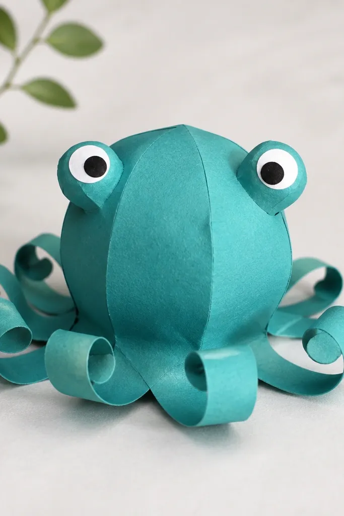
Octopus squishies look playful when the tentacles are thin and curled, not chunky. I cut 8 tentacle strips from teal cardstock and curl them around a pencil so they form loops that keep their shape. The body is a dome in the same teal, but I use slightly lighter teal for the eye stalk bumps so the face stands out. This design flatters desk setups because it adds movement without taking up much shelf space. The principle is motion illusion: curled thin strips read as soft tentacles.
Assemble a teal dome body from two halves, about 8 cm tall. Cut 8 tentacles strips, each about 10 cm long and 3-4 mm wide, then curl them tightly around a pencil. Glue tentacle bases to the underside of the dome, spacing them evenly. Build eye stalks by folding small paper tabs into bumps and gluing them where the eyes will sit. Add eyes and a tiny smile on top; keep the mouth small so the tentacles stay the visual weight.
Pro tipIf tentacles spring back, hold them for 10 seconds while the glue sets.
AvoidDon’t make tentacles wide — wide strips look like cardboard tubes, not plush.
16. Pink Strawberry Squishy with Seed Dot Emboss Effect
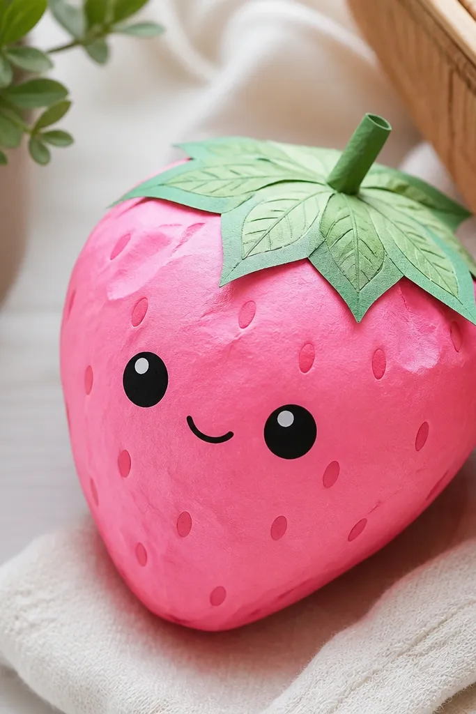
Seed dots are where strawberries get real, and you can make them feel raised with an emboss trick. I use pink cardstock for the body and darker pink for the seeds, then I slightly push each seed dot from the back so it forms a tiny bump. That tiny bump catches light and makes the seeds look like textured plush. Green leaves add contrast and make the face look sweeter. The principle is light play: raised dots create shadow micro-contrast even on flat paper.
Cut two strawberry body halves and assemble into a dome. Add a green leaf top by layering two leaf pieces, one slightly behind the other. Draw seed dots on the front with a pencil first, then trace with a fine marker or darker pink gel pen. To emboss, flip the piece and press gently on each dot location with the eraser end of a pencil. Draw the face on the front after embossing so the bumps don’t smear your lines.
Press from the back with a soft touch — you want a bump, not a crease line.
Don’t draw seeds with thick paint — it dries glossy and looks like craft glitter.
17. Black-and-White Checker Puff Squishy with Matte Eye Stickers
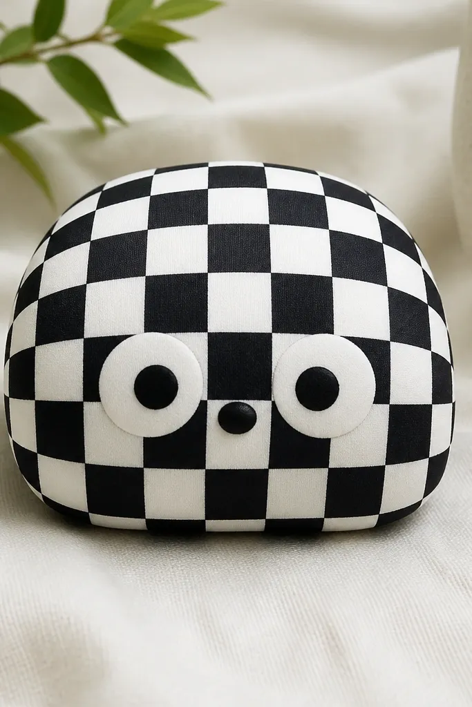
Checker patterns are hard because paper curves want to warp alignment. The trick is to build the checker on a flat panel first, then dome the assembled body — you get clean squares without the pattern stretching. I use matte black and matte white cardstock so the check doesn’t glare under photos. The face uses matte eye sticker circles so the eyes stay soft, not glossy. This design looks sharp in monochrome rooms and flatters people who like bold contrast. The principle is pattern control: align on flat, dome after, hide seams with the pattern.
Cut a front panel strip with checker squares sized 6-7 mm each, then glue it onto the outer shell before assembling. Build the body dome from two outer halves and score lightly, keeping the checker panel on the front half only. Assemble by gluing perimeter edges and pressing the seam area until it sets. Add eyes as separate matte circles so they sit on top of the checker and don’t look printed. Place the mouth low enough that the checker squares don’t distract from it.
Pro tipUse a craft knife and ruler for square edges — even a 1 mm drift shows badly on curves.
AvoidDon’t print or draw the check after the dome is formed — the lines distort and look cheap.
18. Sunflower Cookie Squishy with Petal Cutouts
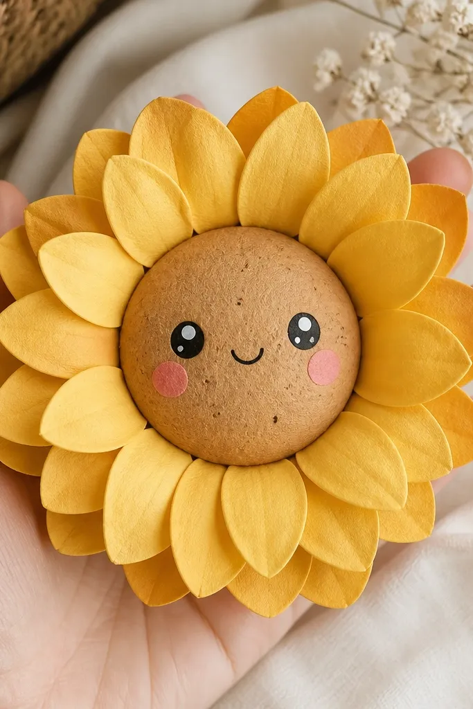
Sunflowers look like actual plush when the petals are cut as separate pieces and slightly curled. I use yellow cardstock for the petals and a darker golden cardstock for the center disk. The face sits in the center disk, which keeps it stable and easy to assemble. This design flatters warm color palettes and looks great on bright desks because it pops without needing neon. The principle is modular construction: separate petal pieces create dimensional edges that read as soft.
Cut a center disk about 6 cm wide and two dome shells for the disk base. Cut 12-16 petal shapes from yellow cardstock, then curl each petal edge slightly with a pencil. Glue petals around the center disk while it’s flat, then assemble the back support so the whole thing domes. Add a second center layer if you want extra thickness, then draw eyes and freckles on the top layer. Keep the petals evenly spaced so the face stays centered in photos.
Curl petals in alternating directions for a more natural sunflower look.
Don’t glue all petals flat — a flat ring makes it look like paper decoration, not plush.
19. Gray Marble Cat Squishy with Vein Pen Lines
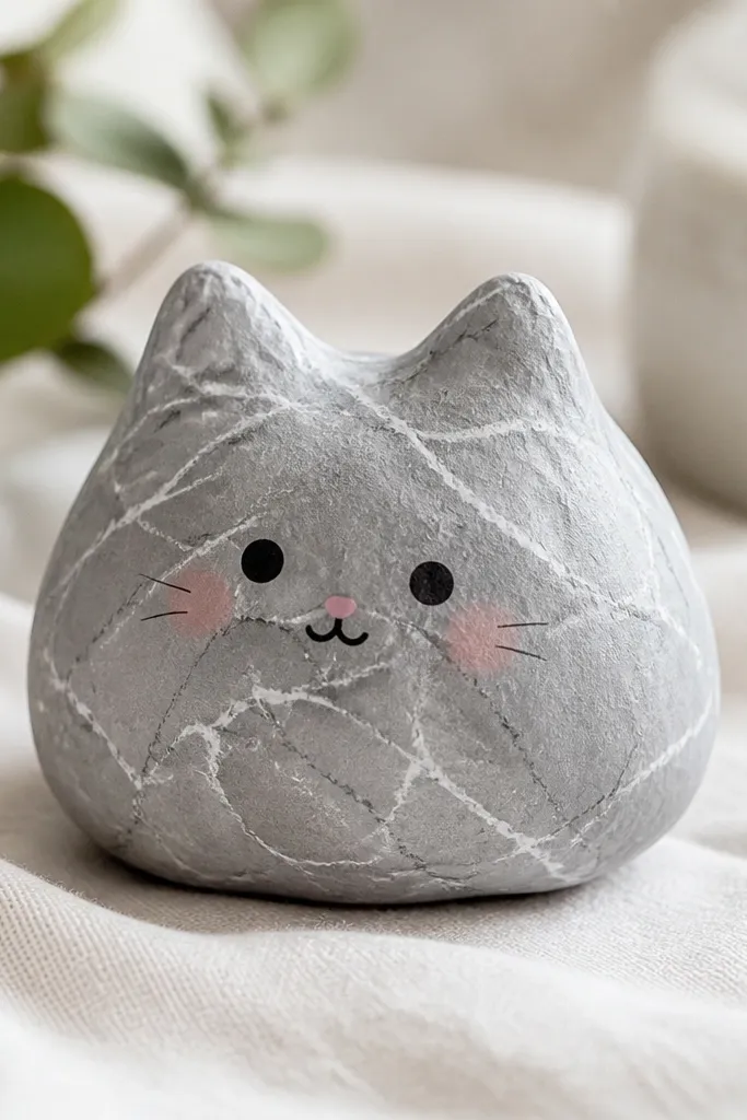
Marble patterns make paper squishies look high-end when the veins are thin and slightly uneven. I use gray cardstock for the base, then draw vein lines with a light gray pencil and trace select lines with a white gel pen for highlights. The cat ears are rounded so the whole piece stays squishy, not origami-sharp. This works well for people who like neutral decor because the marble pattern softens the gray instead of making it harsh. The principle is controlled irregularity: thin veins + tiny highlights create depth without clutter.
Cut two cat body halves from gray cardstock and assemble into a dome with scored folds. Draw marble veins lightly with pencil first, then trace some veins with a white gel pen for a highlight effect. Add ears by folding small ear tabs so the tips stay rounded, then glue ear bases before closing the body. Draw eyes and nose on the front; keep blush as a small oval behind the cheeks so it doesn’t cover the marble pattern. Press the body gently while drying so the marble lines don’t crack at the seam.
Use gel pen sparingly — three to five highlight veins look better than covering the whole surface.
Don’t use thick white paint for veins — it dries flat and looks like marker scribbles.
20. Royal Blue Penguin Squishy with Belly Panel Contrast
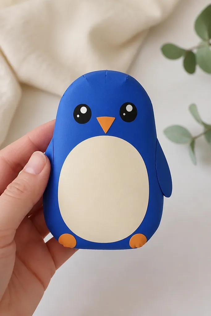
Penguins look cute because the belly panel creates instant character shape. I use royal blue cardstock for the outer dome and a cream belly oval cut from slightly lighter paper, so the contrast stays crisp. The belly panel also hides seams — you place the seam under the belly for a cleaner build. Royal blue is bold in a good way; it looks striking next to warm wood and bright white walls. The principle is contrast placement: put the high-contrast area where construction usually shows.
Assemble a royal blue dome body from two halves and keep the seam on the back. Cut a cream belly oval about 4.5 cm wide and glue it centered on the front, covering the seam line area. Add wings by drawing simple curve shapes on the sides or cutting small wing patches and gluing them near the seam edges. Draw the face: eyes about 1.1 cm apart, beak triangle centered between them, and tiny feet dots at the bottom. Add a thin outline around the belly with a pencil or fine marker so it reads clean even on textured paper.
If your belly oval curls at the edges, press it under a book for 10 minutes before gluing.
Don’t glue the belly too close to the dome edge — it lifts and makes the penguin look uneven.