
1. Cobalt Wave Band with Cream Rim
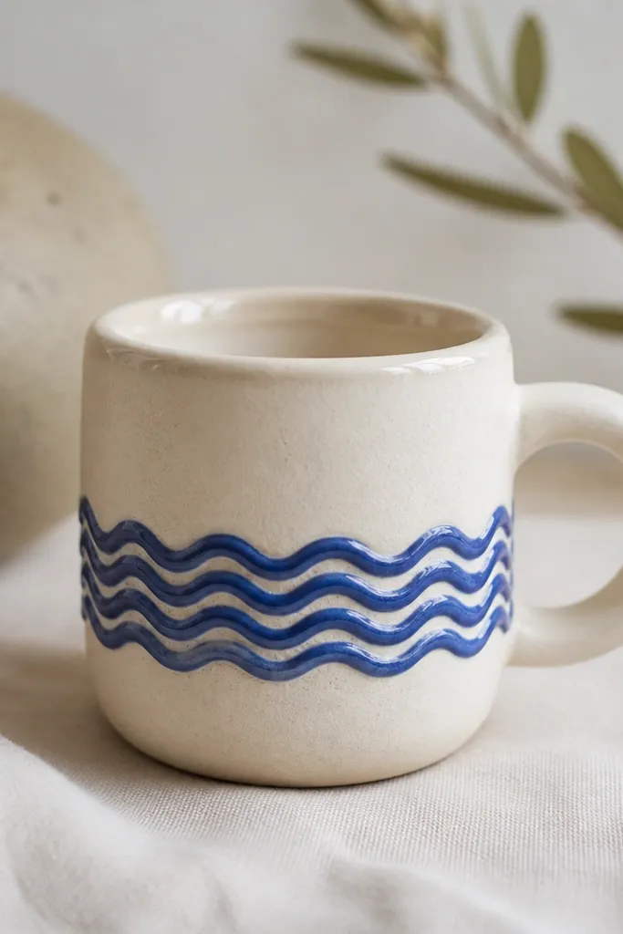
This design works because the wave band gives you a single visual job for the eye. I build the mug in a warm cream clay or slip, then add cobalt wave marks that stay crisp instead of feathering. The contrast makes the mug look intentional even if the rest is simple. It flatters people who like cleaner shapes because the band frames the hand area and makes the handle feel part of the pattern, not an afterthought. For skin tone and styling, it looks best with warm-toned woods and beige linens since the blue reads cooler and the cream keeps it cozy.
Start by throwing or hand-building your mug and trimming the rim so it is 1-2 mm thicker than the wall. Let it dry to leather-hard, then use a flexible stencil or a carved wave tool to press a straight band around the mug at mid-height. Paint or brush cobalt underglaze into the pressed grooves, then wipe the tops of the waves clean so only the grooves hold color. Fire to bisque, then glaze the entire body with a matte cream glaze and gloss only the rim lip so the waves stay the star.
Pro tipDo a quick test tile with the wave texture so you see how cobalt behaves on your clay body before committing to the mug.
AvoidAvoid flooding the wave grooves with too much underglaze, because it runs and turns the band into a blurry stripe.
2. Iron-Red Sunburst with Matte Black Base
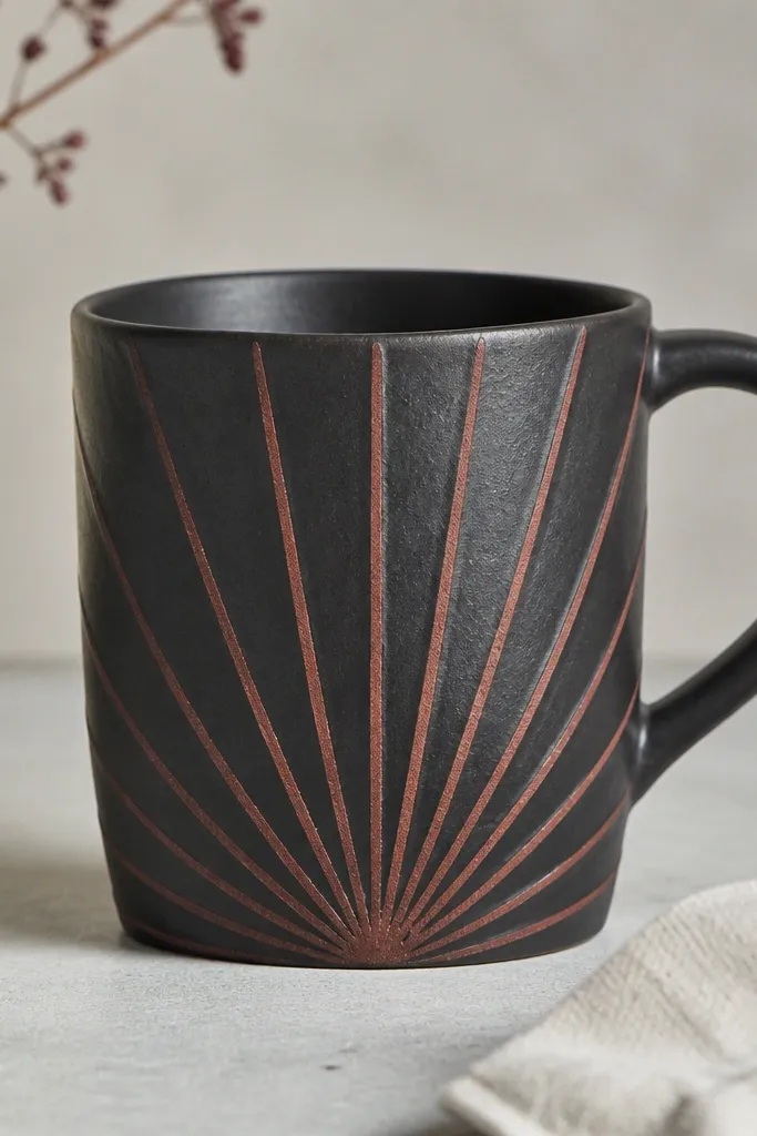
This mug reads dramatic in photos because the base is matte and the sunburst is a warm, high-energy color. I use a near-black glaze or underglaze background so the iron-red rays look like they’re glowing rather than sitting flat. The sunburst pattern flatters most hand sizes because it keeps attention on the front panel where you grip, and the dark sides hide minor imperfections. It also pairs well with gold cutlery, black nails, and dark wood trays because the red warms up the whole setup.
Start with a dark clay body or cover the bisque with a dark underglaze wash. At leather-hard stage, mark a center point on the front and carve or press 12-16 thin rays using a needle tool, keeping them evenly spaced. Brush iron-red underglaze into the carved lines, then wipe the surface around the rays so the background stays solid. After bisque firing, glaze the whole mug with a matte black glaze, and leave the rays unglazed or apply a very thin transparent coat over them to keep the red saturated.
Keep the rays narrow and evenly spaced; wide rays look like flames and lose the clean sunburst look.
Don’t use a glossy black glaze under iron-red if you want crisp lines, because gloss emphasizes glaze drips and makes the rays look messy.
3. Sage Checkboard Panels
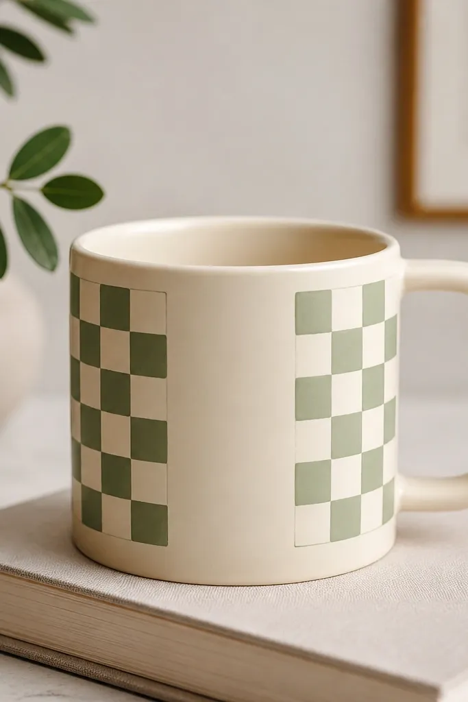
Checkboards look polished when the grid stays straight, and this one is built to stay straight. I like sage-green checks because they feel calm but still look graphic against a neutral mug. The mug flatters people who wear neutrals and soft colors because the sage doesn’t fight your wardrobe. In a cabinet, it looks tidy; on the counter, it looks styled even with plain coffee. The key is that the pattern is contained in panels, so your mug doesn’t become one big busy block.
Begin by bisque-firing your mug, then dry it completely before any underglaze work. Use a ruler to mark two vertical panels, leaving a 1 cm “border” of plain clay on each side. At leather-hard stage, you can lightly score the grid lines so the underglaze doesn’t bleed; at bisque stage, use a fine liner brush and steady your wrist on the table. Paint alternating squares in sage underglaze, then outline the grid with a thin pale cream line so the checks stay crisp after firing.
Pro tipPaint one test panel on a scrap tile and measure the fired check size; shrinkage changes the grid spacing.
AvoidAvoid freehand checks that don’t line up — even one drifting corner makes the whole mug look like a school project.
4. Pressed Leaf Vein Sleeve
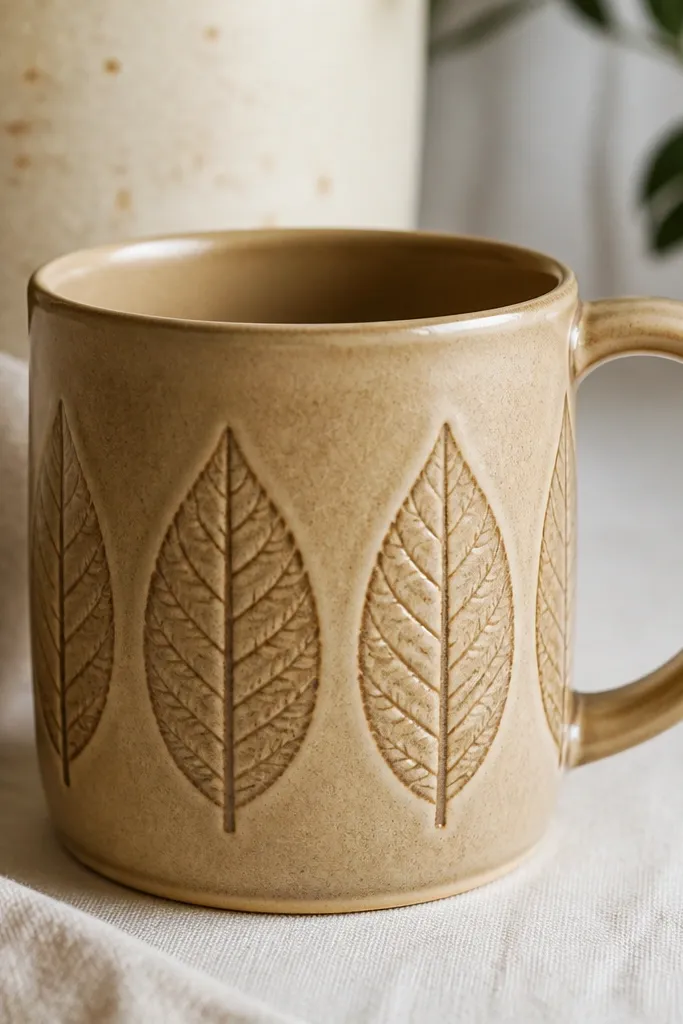
This is the mug for when you want texture you can feel, not just a painted design. A pressed leaf vein sleeve looks high-end because the relief catches light from different angles. I keep the leaves in a narrow band so the pattern reads intentional rather than chaotic. It flatters anyone who likes tactile things — it feels good in the hand and looks good next to a linen napkin or a ceramic spoon. The satin glaze makes the veins shadow naturally without needing heavy color.
Roll out or build your mug body, then compress the surface so the texture doesn’t distort. At leather-hard, press a real leaf or a leaf-vein texture roller into the clay in a repeating band around the midsection, overlapping slightly for a continuous look. Use a soft sponge to remove loose crumbs so you don’t get gritty texture where you don’t want it. After bisque, glaze with a satin clear or satin tinted base; the glaze will pool into the veins and darken them slightly for depth.
Use the same leaf orientation each time so the veins all point the same direction; it keeps the band calm.
Don’t press too deep. Deep texture can crack at the rim or look dull after firing.
5. Terra Cotta Drip Collar
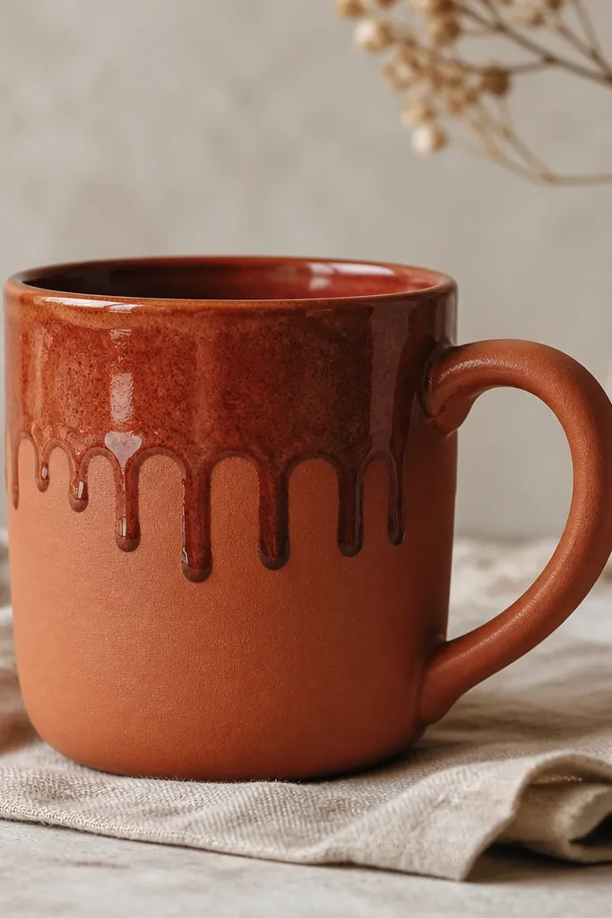
Drips look fancy when they’re controlled like jewelry, not random. This collar design frames the mug and makes the top feel thicker and more finished. I pair terra-cotta and glossy reddish glaze because the gloss catches candlelight and makes the drips look intentional. It flatters people who like warm, earthy palettes, and it looks great on dark countertops. The drip placement also hides minor tool marks near the top where hands usually notice.
Make your mug with a smooth body and slightly rounded shoulders so the drip has somewhere to land. Bisque fire first, then brush a thickened terra-cotta glaze along a horizontal line around the mug at the top third. Use a small sponge or a thick liner brush to encourage teardrop shapes — stop short of the handle and leave a 5 mm gap. Fire again, and check the first test batch because drip behavior changes with glaze thickness and room temperature.
For cleaner drips, thin your glaze slightly with the manufacturer’s recommended reducer so it flows just enough to form teardrops.
Avoid painting drips all the way down the mug; you want one collar, not a full run that looks messy.
6. Speckled Snow Glaze with Hand-Painted Berries
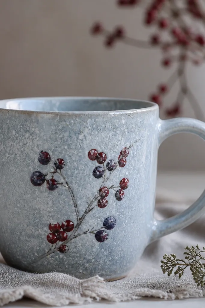
This mug is airy and cozy because the speckled glaze gives you movement even when the painting is minimal. I like berry clusters because they’re small enough to stay cute but bold enough to read from across a room. The deep red and purple against a cool speckle background looks balanced, not loud. It flatters light skin tones and cool-toned kitchens because the colors feel wintery. In a mug row, this one stands out without needing big shapes.
Start with a pale blue-gray base glaze or tinted clear so the speckle shows up as “snow.” Bisque fire, then apply a speckled glaze that you know produces pinpricks rather than big blobs. Before the final glaze, paint berry clusters with underglaze or ceramic paint: three small circles with a tiny stem, then add a darker center spot. Finish with a clear glaze coat if your paint requires it, keeping the berries slightly raised by not overworking the brush.
Use a toothpick to add two tiny highlight dots per berry; it makes the berries look like actual glaze fruit.
Don’t outline every berry in a thick line. Thin, suggestive marks look more handmade and less cartoonish.
7. Matte Sand Background with Burnished Gold Lines
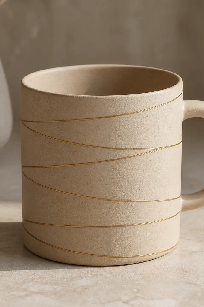
Gold lines on a matte sand base look expensive because the gold catches light while everything else stays quiet. I use burnished or metallic linework because it creates a clean sheen that doesn’t need heavy color. This mug flatters people who like minimal styling and neutral outfits. It looks great with white candles, beige dish towels, and simple stoneware plates. The spiral also makes the shape feel longer and more elegant in photos.
Bisque fire your mug, then apply a matte sand glaze to the whole surface. Let it cool fully before linework. Using a fine liner brush, paint a spiral path starting near the base and winding up to the handle area, keeping the line thickness consistent (about 1-2 mm). If you want burnished effect, apply metallic slip or metallic paint intended for glazing, then lightly buff once it’s dry but not fully set, so the surface turns glossy.
Pro tipTape a paper strip around the mug as a guide so your spiral stays centered and doesn’t drift off the handle.
AvoidAvoid thick metallic lines. They look like stickers once fired, not like hand-drawn detail.
8. Marbled Clay Panels with a Single Teal Stripe
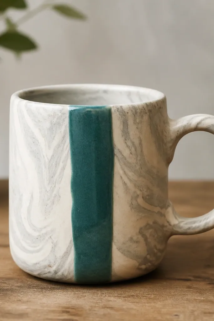
Marble looks best when you keep the decoration simple. The marbled clay gives you soft movement, and the single teal stripe adds a confident focal point. I like this for aesthetic handmade mug lovers who want color but don’t want a busy surface. It flatters most mugs shapes because the stripe visually straightens the front panel. Teal also looks good with silver jewelry and cool kitchen lighting, which makes the mug feel “put together” even in low light.
Make or buy a marbled clay slab and build your mug so the front panel shows the strongest swirl. At leather-hard, attach a thin strip of teal-colored clay or slip line down the center front, 6-8 mm wide. Score and slip the contact points so it bonds cleanly. After bisque firing, glaze with a transparent satin glaze over everything so the marble stays soft and the teal stripe looks slightly brighter.
Pro tipChoose one “hero” swirl panel and position it before you assemble the mug; you can rotate the body slightly during building.
AvoidDon’t add extra colors around the stripe. One stripe keeps the look calm and intentional.
9. Cord-Wrapped Handle Accent in High-Gloss Red
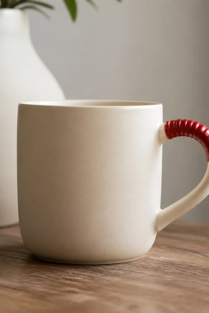
This design is for people who love a detail you notice only after you pick the mug up. The cord wrap texture on the handle makes the handle feel handcrafted and gives the mug a signature. I use high-gloss red on just that small area so it doesn’t overpower the whole mug. It flatters smaller hands because the accent sits where your fingers naturally touch near the top of the handle. In styling, it looks great with white ceramic trays and red nail polish.
Build your mug and form the handle, then let both reach leather-hard. Wrap a thin cord around the handle top section and press lightly so you get an imprint; remove the cord without stretching the clay. Smooth the edges of the imprint with a damp sponge so it looks intentional, not torn. Bisque fire, then brush glossy red glaze or underglaze only into the cord texture and glaze the rest of the mug matte cream.
Use a smooth cotton cord, not a fuzzy one. Fuzz transfers into the clay and makes the texture look messy.
Don’t glaze the cord accent too thick. Thick gloss can pool and drip into the handle curve.
10. Geometric Cutout Shadowline with Clear Gloss
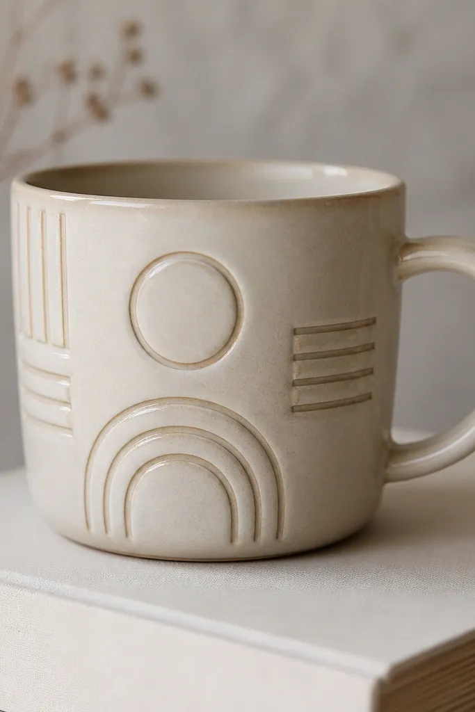
Shadowline designs look crisp because the “drawing” is the negative space. The recesses create depth that you can see even from the side, which is why this mug looks good on shelves. I like geometric shapes because they frame the mug without needing a lot of color. It flatters most interiors since the palette can stay neutral and still look modern. Pair it with simple table settings and it looks like you bought it from a studio, not made it at home.
At leather-hard, sketch three shapes across the front panel: a triangle, a small rectangle, and a narrow zigzag band. Use a craft knife to cut shallow recesses, keeping the depth about 2-3 mm so they survive handling. Smooth the edges lightly so they don’t crumble. Bisque fire, then glaze with a matte off-white base and apply a clear gloss only over the recess areas so the shadows stay defined.
Pro tipTest one shape on a scrap tile at the same depth; if it slumps in firing, reduce the depth by 1 mm.
AvoidAvoid deep cutouts. They weaken the mug and can chip at the edges.
11. Waffle Texture Band with Honey Gloss
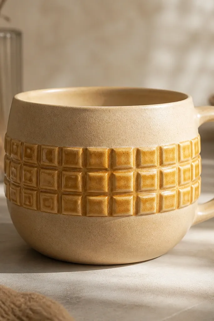
Waffle texture looks like comfort food and it photographs like luxury because the raised squares catch highlights. The honey gloss turns the texture into something dimensional, not flat. I use this when I want a mug that feels handmade but still clean, with one clear focal zone. It flatters people who like warm neutrals and it looks great with amber tea, cappuccino foam, or even plain water on a desk. The band also hides small uneven spots in the mug body because the texture draws the eye.
Form your mug and keep the body smooth. At leather-hard, press a waffle texture tool or stamp into a band around the midsection, making sure the stamp lines up so the squares stay even. Use a soft brush to remove crumbs from the recesses so the glaze isn’t gritty. Bisque fire, then glaze the mug with satin clear or satin beige, and paint honey gloss only on the waffle band. Fire again so the honey gloss pools in the squares and turns the texture shiny.
Pro tipKeep the band height around 5-6 cm. A small band looks intentional; a huge band can overwhelm the mug.
AvoidDon’t glaze honey gloss over the entire mug if you want a refined look. It turns the whole surface shiny and less handmade.
12. Brushstroke Ombre from Cocoa to Cream
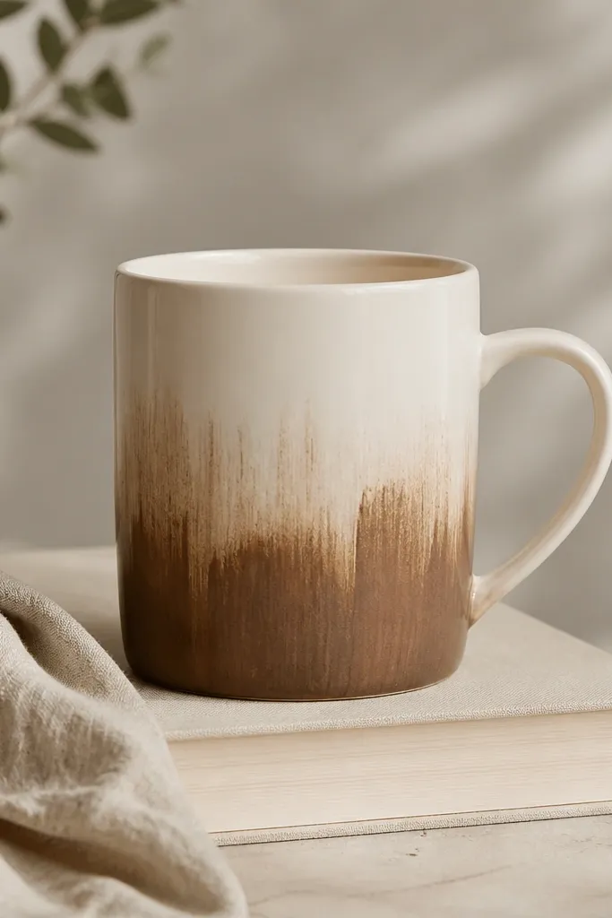
Ombre works when the brushstrokes look like brushstrokes, not like a poured gradient. This one has visible streaks that keep it human, which is what makes the mug feel handmade rather than printed. I do cocoa to cream because it pairs with almost any kitchen palette, and it looks good with latte art. It flatters smaller mugs because the vertical fade makes the mug look taller. The rim stays cream so the top stays bright and clean in daylight.
Bisque fire your mug and apply a cream base glaze. After that glaze is dry but before the final firing, paint cocoa underglaze in a vertical band that covers the lower half. Blend upward with a damp brush, but don’t erase all the streaks — keep 60-70% of the brush marks visible. Finish by glazing the rim with cream only, then apply a clear coat over the whole mug so the cocoa locks in and doesn’t look chalky.
Pro tipUse a flat brush about 6-8 mm wide so your strokes are chunky enough to show texture after firing.
AvoidAvoid over-blending. If you smooth every streak, the ombre looks like a computer gradient.
13. Peach Blush Dots with Tiny Black Stems
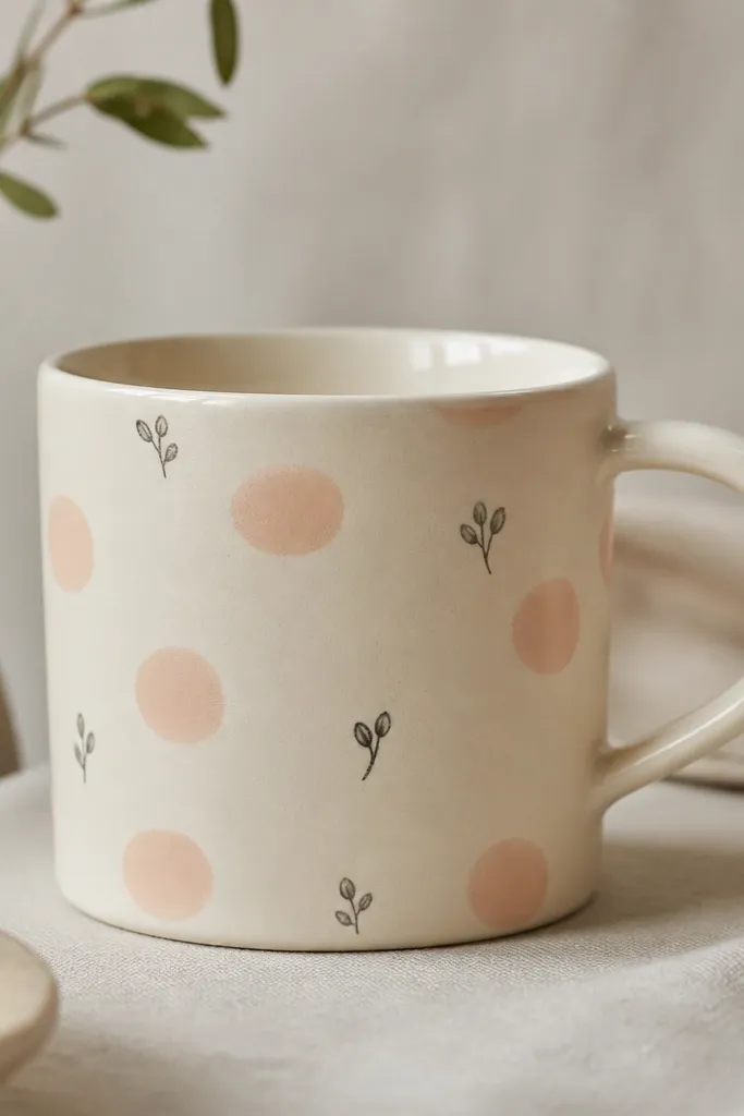
Dot flowers look sweet without being childish when you keep the stems tiny and the dots slightly irregular. This design feels light and friendly, and the peach blush color makes it look good in spring and summer tables. It flatters people who like soft makeup tones and warm clothing colors because peach sits naturally with skin warmth. I also like it for gift mugs because it’s easy to repeat and still looks different each time. The matte dot texture keeps it from looking like a sticker.
Bisque fire your mug and glaze the body with a pale cream matte glaze. Use a fine dotting tool to place peach underglaze dots in a loose cluster pattern across the front panel, leaving negative space around the handle. Add tiny black stems with a liner brush — just a few curves and two micro leaves per cluster. Let it dry fully, then gloss only the rim and handle area with a thin clear gloss so the dots stay matte and soft.
Make three dot sizes: small, medium, and one bigger “anchor” dot. It makes the pattern look designed instead of random.
Avoid perfectly uniform dots. Exact circles everywhere look printed.
14. Crescent Moon Cutouts and Midnight Blue Rim
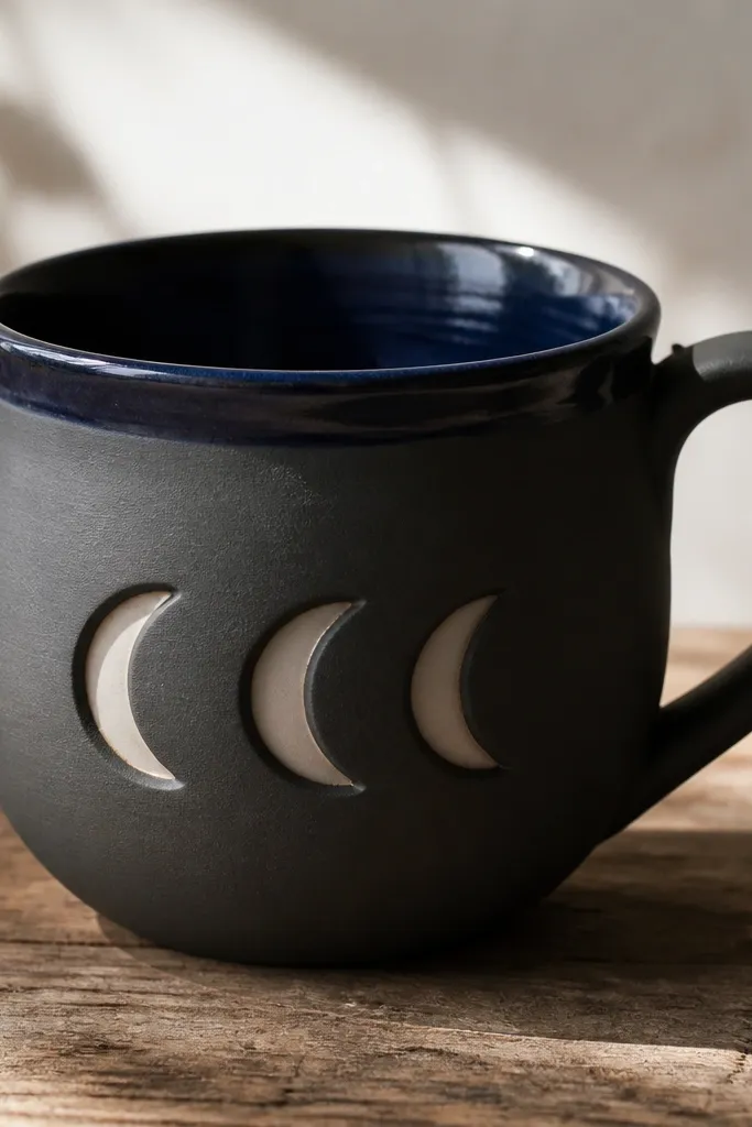
Crescent cutouts look sharp because the shape repeats and the rim color frames the silhouette. I like midnight blue on the rim because it makes the top feel finished and gives you a strong band of color in photos. The crescents also flatter the mug shape by adding rhythm to the front panel without covering the whole surface. It looks great for nightstand coffee, bedtime tea, and anyone who likes moody decor. The shadows from the cutouts make the mug read dimensional even under overhead kitchen lights.
At leather-hard, mark three crescent moons stacked vertically on the front panel, each about 3-4 cm tall. Use a small craft knife to cut shallow openings, keeping the edges clean and not too thin at the tips. Bisque fire, then glaze the mug body in dark gray satin or matte. For the crescents, use a lighter interior glaze or leave a space for a contrasting glaze so the cutouts show through. Finish by glazing only the rim lip and inner rim with midnight blue glossy glaze.
Pro tipIf crescents look too fragile, thicken the crescent edge with a thin coil at leather-hard before cutting the final shape.
AvoidDon’t cut all the way through. You’ll weaken the mug and the crescents can chip during handling.
15. White Slip Calligraphy Loop on Dark Clay
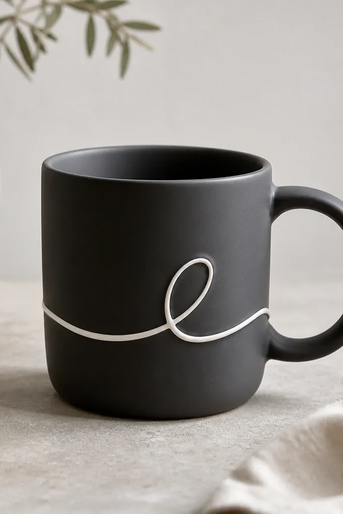
Calligraphy loops look stylish because they give movement without requiring a full word. I use white slip on dark clay because it pops immediately and reads like studio lettering. The loop sits on the front where your eye lands, so the mug looks custom even if you make it for a friend. This design flatters people who like bold contrast and it looks especially good with black coffee and dark roast beans in the photo. It also matches a lot of home aesthetics because the palette stays simple.
Start with dark clay or apply dark underglaze to bisque. At leather-hard, score the front lightly where the calligraphy line will go, then apply white slip along your drawn curve. Use a small slip trailing bottle or a fine brush, and keep the line thickness consistent at about 3-4 mm. Let it dry slowly so it doesn’t crack, then bisque fire again if needed. Glaze the mug with a matte clear over the dark body to keep the line crisp and raised.
Practice the loop on paper first and keep one continuous stroke. Stop-start letters look clunky on mugs after firing.
Avoid painting the slip too thick everywhere. Thick slip can blister and turn into lumps.



