1. Cocoa-Splash Painted Rim Band
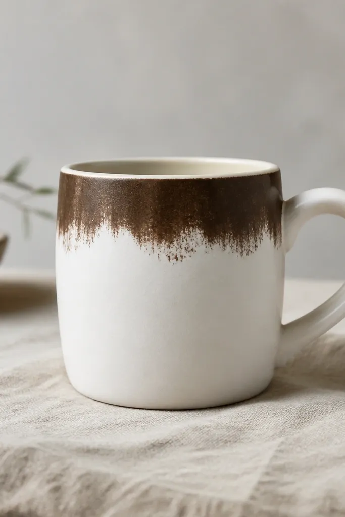
Start by masking a straight line about 1 inch below the rim with painter’s tape, pressing the tape down firmly around the curve. Paint the masked band with espresso brown using a flat brush, then immediately soften the outer edge by dragging a dry brush lightly across it. Let it dry fully, then peel the tape to reveal a crisp boundary. If you want extra depth, add a second lighter layer (warm taupe) only on the fade zone, not the center.
This one looks expensive because the rim is the first thing your eye hits when you lift the mug. I use a deep espresso or cocoa acrylic-ceramic paint for the band, then I fade it outward with a dry brush so the edge looks like a coffee splash. It flatters most skin tones because it has warm neutrality, and it looks especially good with gold rings and warm-toned nails. Keep the handle clean and unpainted so the mug doesn’t feel visually heavy. It works for casual mornings, birthday gifts, and anyone who likes a minimalist look but still wants personality.
AvoidDon’t paint the band too thick or it will look like a sticker job, not intentional art.
Pro tipUse a foam brush for the splash edge; it gives a more organic fade than bristle brushes.
2. Navy Dot Constellation with Cream Frame
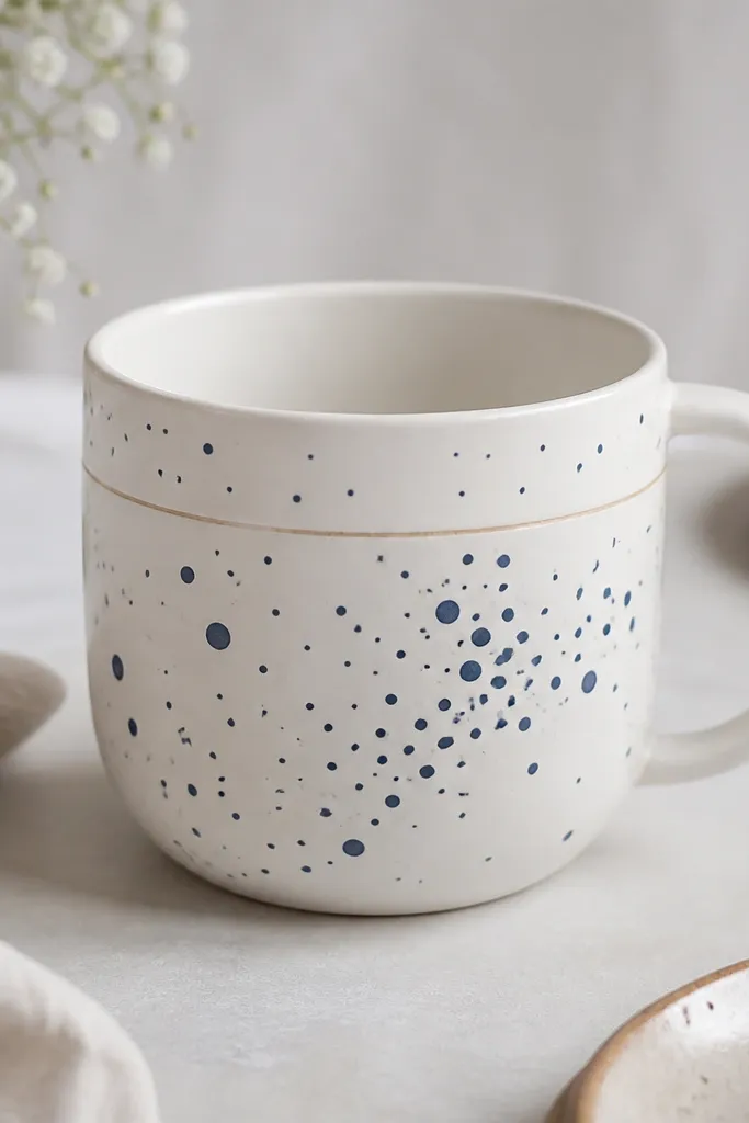
Dots are beginner-friendly because they hide shaky hands. I like navy because it reads clean and calm, and it pairs well with almost any kitchen color. The cream frame makes the dots look designed rather than random, and it flatters people who like cool tones without going too dark. This style looks great for desk mugs and holiday gifts, especially for friends who wear navy, denim, or silver jewelry. The best part is that it hides small mistakes — a stray dot just becomes part of the “constellation.”
Start by outlining a soft rectangle or oval area with a pencil guide at the top half of the mug, keeping it centered. Paint a thin cream line border first using a fine liner brush, then let it dry. Next, add navy dots in three sizes: small pin dots, medium circles, and a few larger anchor dots. Finish by spacing the dots so they cluster near the center and taper off toward the sides.
Dip a round toothpick for tiny dots and a small sponge tip for medium dots — it keeps sizes consistent.
Don’t make every dot the exact same size; it looks like a pattern printed from a template.
3. Terracotta Hand-Stamped Leaves
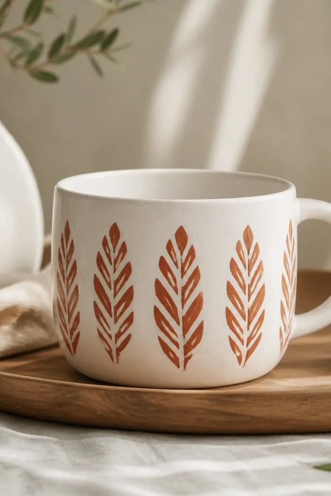
Start by picking a leaf stamp or cutting one from a craft foam block if you’re making your own. Lightly sketch a vertical guideline on the mug so your pattern stays centered. Stamp the first row near the top, then align each next stamp with the leaf’s stem edge so the gap stays even. Work around the mug in a spiral, letting the terracotta dry between rows so the edges don’t smear.
Stamped leaves look like you bought them from a craft market because the texture reads tactile. Terracotta is warm, forgiving, and it makes the mug look cozy even when the rest of your decor is modern. I usually stamp in a single direction so the leaves look like a flowing vine without needing complicated drawing. This suits warm undertones and earthy wardrobes, and it also looks great with rustic wood trays. It’s one of my favorite beginner handmade mug ideas because you can get a polished pattern even if you’re not a “painter.”
AvoidDon’t press too hard; over-pressing spreads the paint and makes leaves look muddy.
Pro tipDo a quick test stamp on paper first to dial in ink thickness and avoid blotchy edges.
4. Black Marker Faux Calligraphy Banner
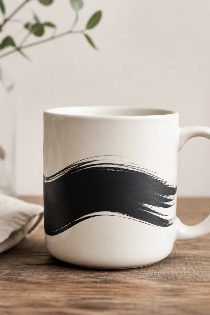
This is the mug I make when someone says they want “calligraphy” but they don’t want to ruin expensive supplies. Black marker faux calligraphy looks bold and graphic, and you get that thick-thin motion by using a brush-tip marker and rotating your wrist as you write. It flatters most settings because black and white is clean, and it looks especially good with neutral kitchens and Scandinavian-style decor. Keep the banner short so it reads instantly when you set the mug down. It’s also a great “fill-in” idea for beginners because you can practice the exact phrase on scrap paper first.
Start by writing your word on paper with a brush-tip marker, then lightly trace the shape onto the mug with a pencil. Draw a banner line first — a curved underline — then build thick strokes above it. Add small “tails” where the letters turn to mimic calligraphy movement. Let the marker dry fully, then seal with a clear ceramic sealer made for markers or use heat-set instructions from your marker brand.
Use painter’s tape as a guide strip for the banner baseline so your word doesn’t sag.
Don’t use water-based markers without sealing; they smear fast when the mug gets wet.
5. Rainbow Ombre Inside-Only Mug

Start by pouring off any dust and wiping the inside with rubbing alcohol, then let it dry. Tape off the rim edge so you don’t paint over where the mouth touches, leaving the inside bottom area exposed. Paint a tight red band at the very center, then blend outward to orange, yellow, and blue using a damp clean brush for smooth transitions. Finish with a soft fade near the rim and let it cure fully before washing.
This is a sneaky-good beginner handmade mug idea because it’s forgiving and looks like a secret detail. By painting only the inside, you avoid dealing with drips running down the exterior, and your hands don’t touch the paint. The rainbow ombre reads cheerful without needing complex shapes, and it looks great with warm drinks because the colors glow against the liquid. This style flatters people who love playful aesthetics but want their kitchen to stay minimal on the outside. It also makes a mug feel personal even when you keep the outside plain.
AvoidDon’t paint too high up the inside; thick paint around the rim area makes it feel cheap and harder to clean.
Pro tipUse a sponge for the first color blocks, then switch to a soft brush for blending so it stays smooth.
6. Gold Leaf Accent with Matte Black Base
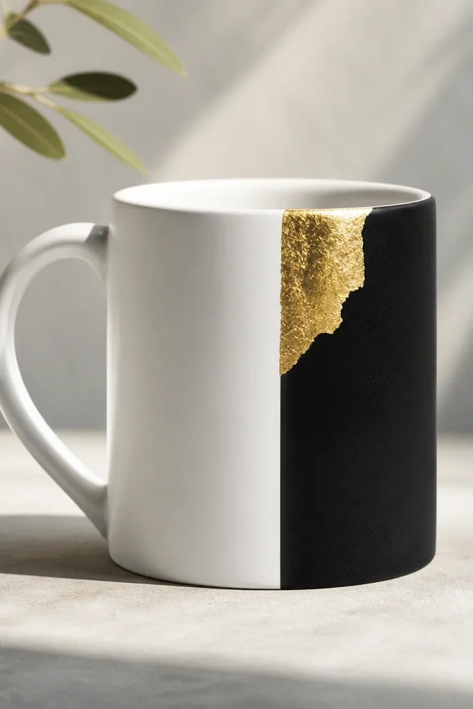
Gold leaf makes almost anything look like it came from a boutique, and you don’t need to cover the whole mug. I pair matte black with gold because the contrast is sharp and flattering — it reads high-end in both daylight and lamp light. The white negative space keeps it modern instead of busy. This suits people who like monochrome outfits and warm jewelry tones, and it looks great for winter gifts. Keep the gold patch small so it looks intentional, not accidental.
Start by painting a matte black panel about 2 inches wide on one side of the mug, using painter’s tape to keep the edges straight. After the black dries, apply a thin layer of gold leaf adhesive to a small area near the top of the panel. Press gold leaf onto the tacky adhesive, then gently brush away excess leaf with a soft dry brush. Seal the gold with a clear top coat made for gold leaf so it doesn’t flake.
Tear gold leaf by hand instead of cutting — it creates more natural edges.
Don’t use glossy black; it makes the gold look like it’s stuck on instead of part of the design.
7. Marbled Clay Coaster-Style Mug Wrap
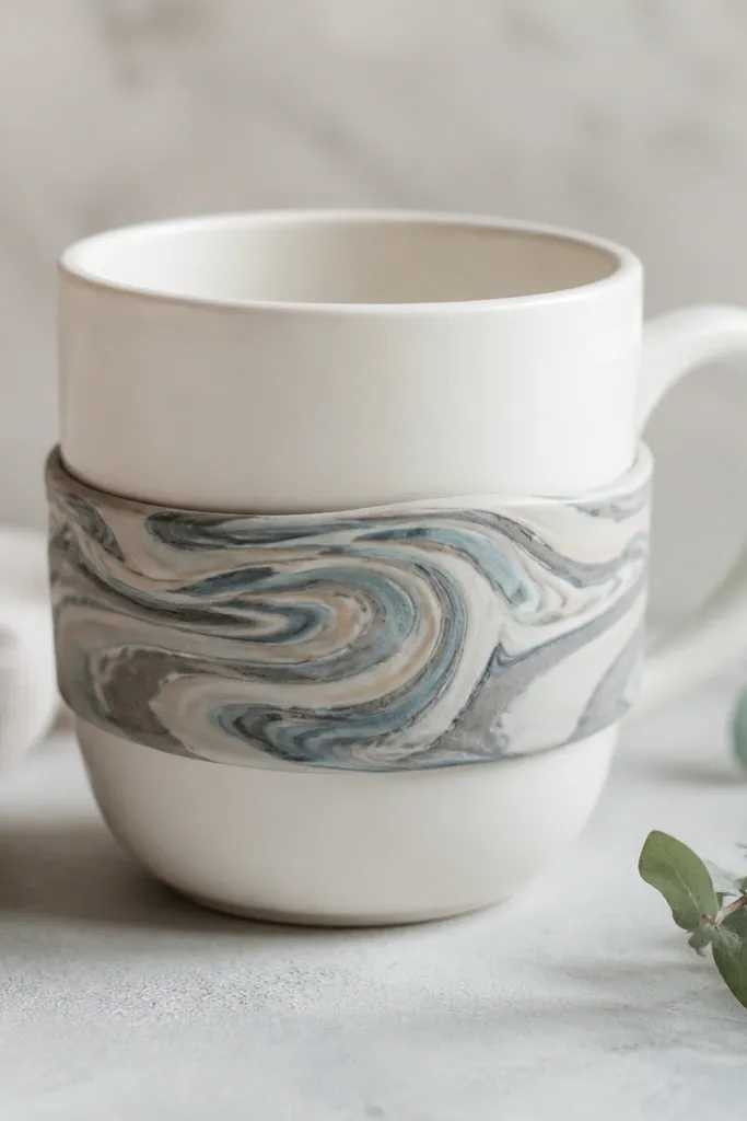
If you want texture that looks like store-bought ceramics, polymer clay wrap does that. The marbling reads rich even with simple colors, and the raised cuff catches light as you move the mug. I use this for mugs that sit on shelves or desks because the texture is the “wow” moment. It flatters cool undertones when you use grey and pale blue, and it looks cozy with warm decor when you add cream and taupe. The key is keeping the wrap narrow so it doesn’t feel bulky in your hand.
Start by rolling polymer clay into a thin sheet, then marble it by layering thin snakes of cream, grey, and pale blue and twisting gently. Roll the marbled sheet into a band that fits around the mug’s middle, trimming the seam so it meets cleanly. Bake the clay according to your brand instructions, then attach it to the mug with a thin layer of ceramic-safe adhesive. Add a clear top coat or glaze sealer if your method allows.
Lightly sand the seam after baking for a smoother, more professional join.
Don’t make the band wider than 1.25 inches; extra width looks like a craft project instead of design.
8. Washed Denim Stripe with Fabric-Paint Fade
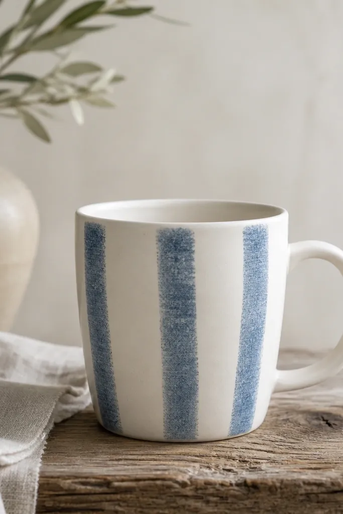
Denim stripes make a mug feel wearable, like it matches your clothes. I do this with fabric paint because it dries with a softer, slightly textured look that resembles washed denim. The striped vertical layout makes the mug feel taller and slimmer, which is flattering for wider mugs. It also pairs beautifully with rustic wood, white dish sets, and silverware. This idea is great for beginners because stripes are easy to align and you can fade edges to hide brush marks.
Start by taping three vertical stripe areas on the mug with equal spacing, leaving a thin white gap between each stripe. Paint the stripes light blue first, then while still slightly damp, dab a darker blue along one edge and blend outward with a sponge. Add a tiny bit of white dry brush at the fade points so it looks sun-worn. Let everything cure fully, then seal if your fabric paint brand requires it.
Use a small makeup sponge for the blend — it gives the denim fade without streaks.
Don’t paint over tape too thick; the paint can bleed and blur the stripes.
9. Teal Checkers with White Negative Space
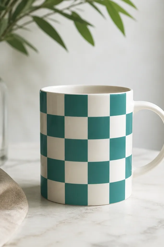
Start by measuring the mug’s front height and dividing it into equal squares, like 12 squares tall by 4 squares wide based on your mug size. Lightly mark the grid with pencil, then tape along the grid lines using thin strips. Paint alternating squares teal, leaving the others white. When the paint is dry, remove tape carefully and touch up any tiny edges with a fine brush.
Checkers look sharp because the pattern forces order. Teal is a flattering middle ground — it’s not as harsh as bright green and not as heavy as deep blue. Keeping the white gaps makes it feel fresh and summer-ready, and it looks great for tea mugs and coffee mugs alike. This style flatters small hands too because the pattern doesn’t add bulk around the grip. It’s also a great beginner handmade mug idea because you can use a grid guide and repeat it until you’re done.
AvoidDon’t freehand checks; uneven squares make the whole mug look rushed.
Pro tipUse a ruler and a light pencil — the grid is your friend, and it disappears under the paint.
10. Pressed Flower Silhouette Transfer
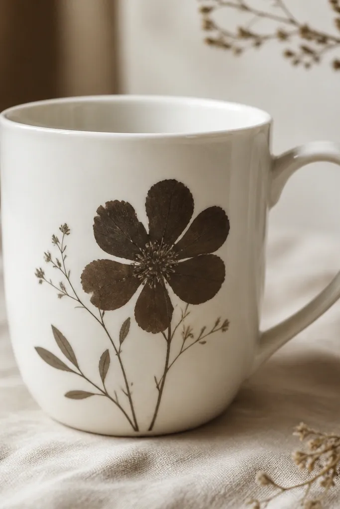
Pressed-flower silhouettes look delicate without needing fine drawing skills. I love using dark brown ink or paint because it feels natural and not overly “crafty.” This works best when you choose one flower and keep the composition simple: big bloom in the middle, small leaves tucked around. It flatters anyone who likes botanical decor and neutral palettes. The silhouette also hides minor imperfections because the shape is the point, not perfect lines.
Start by pressing a real flower between paper for at least a week so it flattens well. Place the flower on the mug and use a silhouette transfer method: either rub transfer medium over the back of the flower or use a transfer gel kit you already have. Apply pressure evenly with a brayer or the back of a spoon, then lift carefully to reveal the imprint. Touch up missing areas with a fine brush and seal with a ceramic sealer made for your medium.
Pick flat flowers like daisies, Queen Anne’s lace, or small pansies — they imprint cleanly.
Don’t use thick petals; they create blurry shapes that look like smudges.
11. Monochrome Stripe + Tiny Heart Cluster
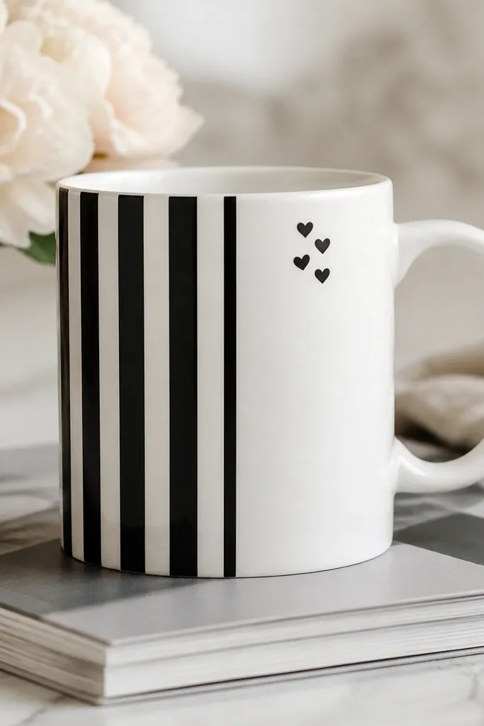
This design works because it mixes structure and charm. The stripes give you a strong, graphic backbone, and the tiny heart cluster adds a personal, friendly touch without clutter. I use black because it’s the easiest to read and the most forgiving when you’re sealing. The heart placement near the top makes the mug feel cute when you’re looking at it from across the room. This is a great beginner handmade mug idea for gifts because you can swap hearts for initials, stars, or tiny dots.
Start by masking half the mug for stripes, leaving the other half clean white. Paint alternating vertical stripes in black, using a consistent stripe width like 1/4 inch so it looks intentional. Let it dry, then remove tape and paint a cluster of four tiny hearts near the top of the blank side using a small dot tool or a toothpick. Add one slightly larger heart in the middle for a focal point.
Use a dot-and-draw method for hearts: two dots for the lobes, then connect with a gentle V line.
Don’t place hearts at the bottom; it makes the design feel like an afterthought.
12. Pastel Wash Background with White Line Art
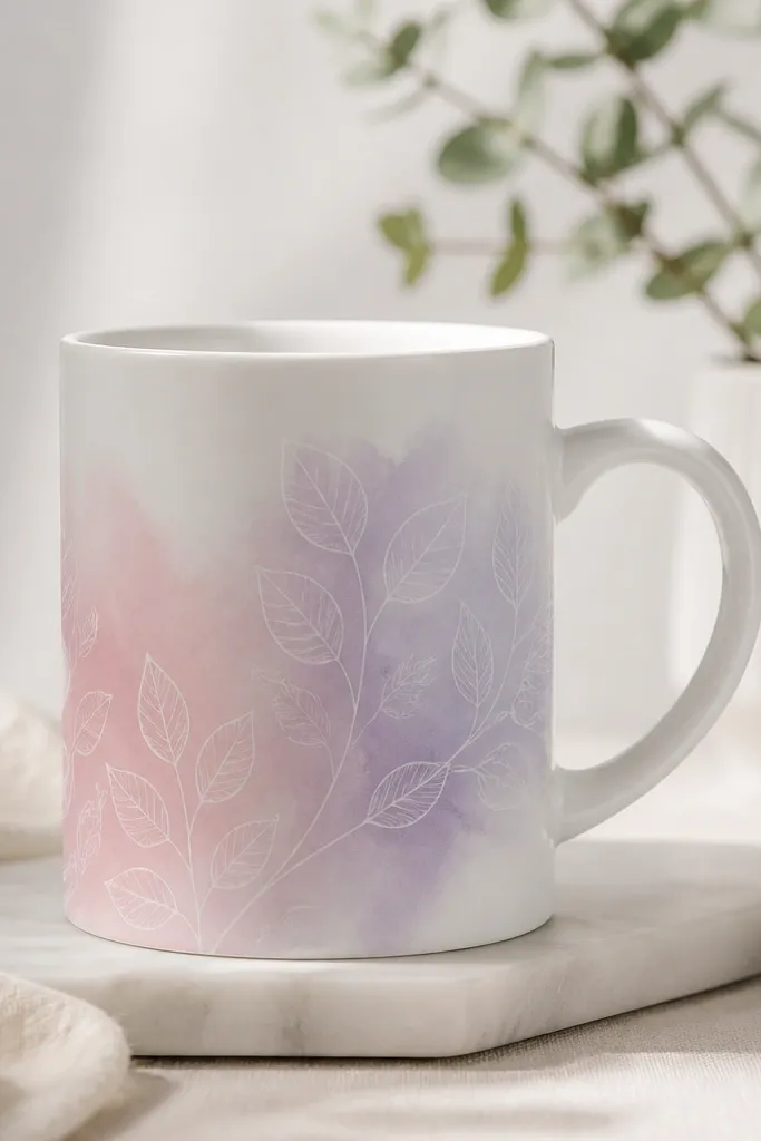
Start by painting a loose oval wash behind the handle area using diluted pastel paint (pale pink, lavender, or mint) with a wide brush. Keep the edges feathered so it looks like watercolor, not a solid sticker. Let it dry, then use a fine liner brush with white paint to draw simple leaf stems and maybe one curled vine. Add a second small cluster near the opposite side so it balances visually.
A pastel wash is a beginner trick that makes everything look more “designed” because it creates a smooth background field. White line art on top looks crisp and modern, especially if the wash is light enough to show the white lines clearly. I like this for spring gifts and for people who like gentle color rather than bold patterns. It also flatters most kitchens because the outside still looks clean and airy. The styling principle is layering: soft color first, then crisp lines.
AvoidDon’t use white paint too thick; it can turn chalky and feel heavy.
Pro tipDilute paint with a few drops of water or medium until it looks like creamy milk, not like thick frosting.
13. Chalkboard-Style Label Panel

A chalkboard label makes your mug feel interactive, which is why it always looks charming in real life. The matte black panel keeps it grounded, and the lighter “chalk” writing reads like a shop mug. I use this idea for mugs that get rotated in kitchens because you can change the message later. It flatters people who like farmhouse decor but still want something cleaner than full rustic patterns. Keep your writing short so it stays readable and doesn’t smear when you wash.
Start by taping a centered rectangle on the mug front, about 2 inches wide and 3 inches tall. Paint the rectangle with chalkboard paint or matte black ceramic paint and let it dry fully. Once dry, write your message with chalk-style marker or light acrylic/ceramic paint that mimics chalk. Seal only if your paint system recommends it; some chalkboard finishes stay chalky with the right seal.
Write with a stencil first if your letters wobble — no shame, it looks clean either way.
Don’t paint the panel glossy; the shine makes it look like a decal instead of a chalkboard.
14. Vintage Map Coordinates Stripe
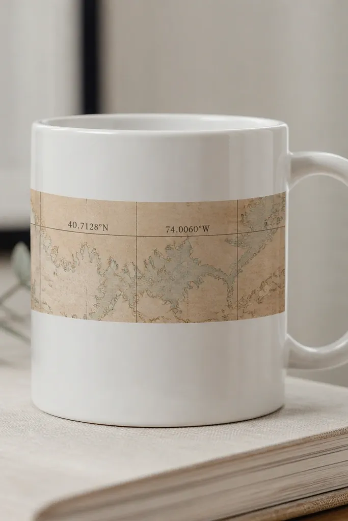
Start by finding a simple map print or using printable map-style paper with coordinates you like. Cut a strip to fit the mug front, leaving a 1/8 inch overlap on both sides. Apply a thin layer of decoupage medium or Mod Podge dishwasher-safe version onto the mug, then press the strip down smoothly and remove bubbles. Seal over the top with multiple thin coats, letting each coat dry before the next.
Map coordinates feel personal without needing big drawings. I like doing a single horizontal band because it looks like a label on a suitcase — simple, readable, and classy. The aged palette (faded teal, sepia, muted brown) works well for gifts for travel lovers and couples. It also flatters darker hair and warm undertones because the colors sit in the same warm family. The styling principle is restraint: one band, one text block, no extra icons unless you have room.
AvoidDon’t use regular paper without sealing — it wrinkles and the edges lift.
Pro tipUse a craft knife and ruler to trim the edges after the first glue layer sets so it looks perfectly straight.
15. Beige Linen Look with Fabric-Texture Medium
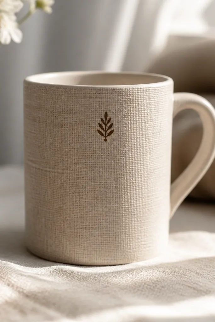
Start by wiping the mug with rubbing alcohol so the texture medium sticks. Apply fabric texture medium in a thin layer across the mug front using a palette knife or sponge, then lightly dab to create linen-like grain. Let it dry as directed, then paint a monogram near the top with a fine brush using dark brown ceramic paint. Seal everything with clear coat so the texture doesn’t snag on hands.
If you want that “expensive handmade” feel without complex painting, use texture medium to mimic fabric. The beige linen look makes the mug feel warm and cozy, and it’s flattering in most homes because it matches neutral dishware. I pair the texture with a simple monogram in dark brown so the design reads from across the room. This is a great choice for people who like quiet aesthetics and for gifts where you want personalization. The styling principle is texture first, then one clean focal mark.
AvoidDon’t cover the entire mug with thick texture; heavy ridges feel rough and look messy.
Pro tipPractice your monogram on a scrap mug or plate — texture can absorb paint and dull thin lines.
16. Geometric Triangle Accents in Sage and White
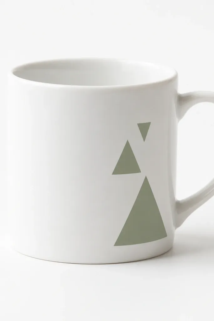
Start by taping triangle shapes onto the mug front, using thin painter’s tape to trace angles like 45 degrees. Paint the triangles sage green with a small flat brush, and remove tape while paint is still slightly tacky to get sharp edges. Add one thin off-white line between two triangles if you want more contrast. Let it cure fully, then seal as your paint instructions say.
Geometric triangles look modern and clean because the shapes are simple and the negative space stays calm. Sage green is soft and flattering for everyday use, and it makes the mug feel fresh without looking childish. I like placing triangles near the handle because it balances the mug’s silhouette — you see it when you pick it up. This is a strong beginner handmade mug idea because you can get perfect-looking edges with tape and a steady hand. It also pairs well with minimalist desk setups and neutral outfits.
AvoidDon’t add too many triangles; three is enough for a classy look.
Pro tipUse tape to define the edges, but paint with light pressure so the paint doesn’t seep under the tape.
17. Faux Porcelain Decal with Black Script
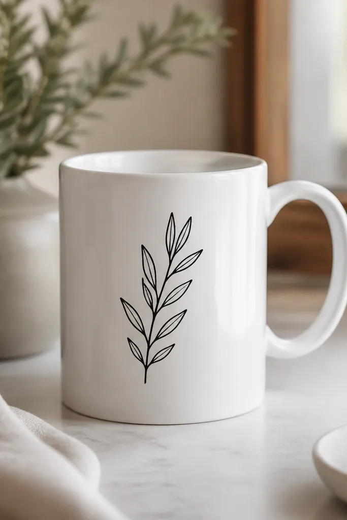
This idea gives you the look of store-bought porcelain even when you’re starting from scratch. Black script reads elegant, and the decal placement near the center keeps it balanced and easy to read. I like this for wedding gifts, housewarming presents, and anyone who likes typography over illustrations. The key is using a decal system or transfer method that you can seal properly, so the design doesn’t crack or peel after the first few washes. It flatters most aesthetics because it’s simple and high-contrast.
Start by printing your script on decal paper made for ceramics or using a transfer gel kit. Cut the design with a small margin so you don’t get excess film. Apply the decal to a clean, dry mug and smooth it from the center outward to remove bubbles. Seal with the matching clear top coat and cure it in the oven if the system requires heat-setting.
Trim tiny tails carefully; decals that overlap the mug curve look thick and cheap.
Don’t skip sealing if your transfer method calls for it — unsealed transfers peel.
18. Monochrome Striped Handle Sleeve
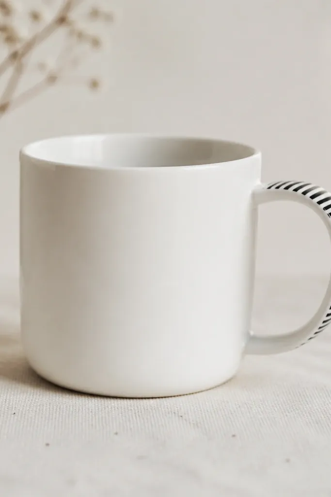
Start by taping a narrow band that matches the handle curve, usually about 1 inch tall. Paint alternating black and white stripes on the taped band, using a small brush to keep the edges clean. Let it dry, remove tape, and then do a second pass on any thin spots. Seal the stripes so they don’t wear off where the hand touches.
This is a fun beginner handmade mug idea because it adds personality without covering the whole surface. Stripes on the handle create a graphic accent you notice when your hand wraps around it, so it feels more interactive than a full-body design. I like monochrome stripes for a clean look that matches anything, and it flatters most kitchens because it doesn’t bring in new color families. It’s also great for people who want “minimal but not boring.”
AvoidDon’t paint stripes too close to the mug rim; the rubbing area makes them fade unevenly.
Pro tipIf your mug gets washed a lot, add an extra thin clear coat over the stripes to protect the paint.
19. Color-Block Bottom Hem in Coral
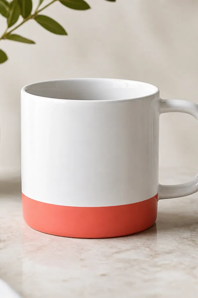
Color-block hems look neat because they mimic clothing details. Coral is flattering on many skin tones and it gives a warm “sunset” feel without being loud. I like placing the block at the bottom because it hides any minor scuffs on the base and keeps the design calm when you’re drinking. This idea works for beginners because it’s one shape, one color, clean masking. It also looks great with minimal table settings and neutral dishware.
Start by measuring where the bottom of the mug starts to curve, then place painter’s tape about 1 inch above that point. Paint the exposed area coral with a medium brush in two thin coats for an even finish. Let the first coat dry fully so you don’t get streaks. Peel tape to reveal a straight top edge, then seal with ceramic top coat if required.
Press tape firmly along the curve with your thumb so paint doesn’t creep underneath.
Don’t use a single thick coat; it chips at the edge faster.
20. Mossy Green Brushstroke Background with White Dots
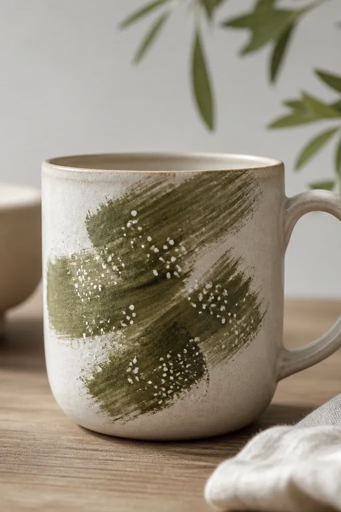
Start by painting irregular brushstroke patches in mossy green across the front, leaving plenty of white space between strokes. After it dries, dip a small dot tool or toothpick into white ceramic paint and add dots on top of the strokes and a few in the white gaps. Keep dot size varied — mostly small dots with a few slightly larger ones as accents. Seal when fully cured so the dots don’t fade.
Brushstroke backgrounds feel artsy but still beginner-friendly because you’re not drawing perfect shapes. Mossy green is a grounded color that looks good in both modern and rustic kitchens. The white dots add rhythm and make the brushstroke texture look intentional, not accidental. I like this for people who like nature-inspired decor but don’t want full-on botanical illustrations. It flatters because green tends to sit well next to warm neutrals like cream, tan, and light wood.
AvoidDon’t cover every inch; too many strokes make it look like a mistake.
Pro tipWait for the green to dry before dotting; dotting into wet paint turns dots into smears.
21. Silver Metallic Starburst Center
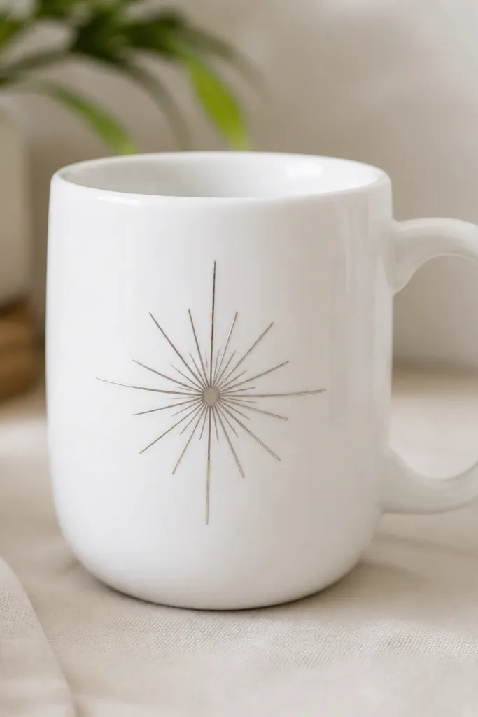
A single starburst is the fastest way to make a mug look like it has a “theme” without a lot of work. Silver metallic paint catches light and makes the mug feel special, especially at night or under warm bulbs. I keep it centered because it looks balanced and reads clearly when you’re holding the mug. This flatters anyone who likes clean, graphic design and it looks great with black, navy, or grey outfits. The styling principle is one focal point, no distractions.
Start by drawing a light pencil circle in the mug center, about 2.5 inches wide. Paint a silver metallic starburst by creating 10 to 14 thin rays that start at the circle edge and point outward. Use a fine liner brush and keep each ray about the same width. Let it cure fully, then add a clear top coat so the metallic doesn’t scratch off.
Do a few dry practice rays on paper first so your hand learns the pressure for even lines.
Don’t outline the starburst with black; it can make metallic paint look dull and heavy.
22. Terracotta and Cream Geode Paint Slice
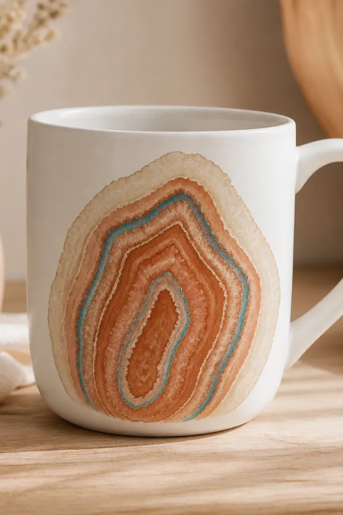
Start by sketching a geode half-slice shape on the mug front, keeping it centered and about 3 inches tall. Paint the outer edge with cream and let it dry. Layer terracotta inside, using a sponge or small brush to create uneven bands like rock striations. Finish by drawing thin teal lines along the inner boundary and adding a tiny highlight dot near the center.
Geode slices look like you spent hours because the layers create depth, but you can do them with simple paint shapes. I use cream as the outer glow, terracotta for the main interior, and a thin teal line for the crystal edge. This color combo warms up the mug and looks great with both boho and modern decor. It also flatters because the shape curves around the mug surface naturally — you don’t need perfect symmetry. It’s a solid beginner handmade mug idea if you’re comfortable painting curves.
AvoidDon’t overload with too many tiny lines; it turns into clutter fast.
Pro tipUse a sponge for the inner bands; it creates that mineral texture without advanced brushwork.
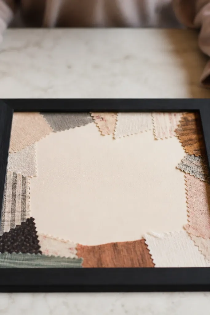
23. Fabric Scrap Patchwork with Heat-Set Adhesive
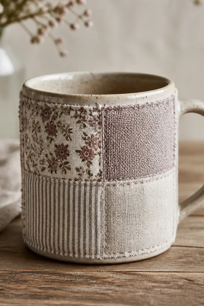
Start by cutting fabric scraps into 2 to 3 inch squares and ironing them flat. Use heat-set fabric adhesive or a fabric glue made for ceramics, then apply a thin layer to the mug front. Press the patches down in a small grid pattern, starting with the largest piece and filling around it. Once set, trim any edges that hang over the mug curve and seal over the top with a clear top coat compatible with fabric.
Patchwork mugs look like you’re wearing your mug, in the best way. Fabric adds depth and soft texture, and it hides small surface flaws on the mug itself. I keep the palette muted — think faded florals, thin stripes, and oatmeal solids — so it looks grown-up, not costume-like. This idea flatters people who like cozy textures and it fits well for autumn and winter gifts. The styling principle is mixing scale: one small print, one stripe, one solid block.
AvoidDon’t use shiny polyester scraps; they reflect light and make patch edges look cheap.
Pro tipPre-wash and dry your fabric scraps so colors don’t bleed after sealing.
24. Embossed Polymer Clay Initial + Tiny Dots
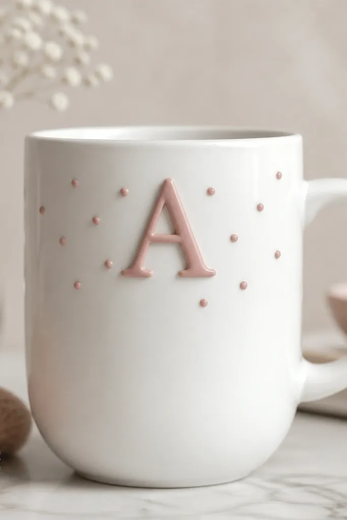
Raised initials are personal without needing fancy handwriting skills. The clay emboss gives you a dimensional look that paint alone can’t match, and the tiny dots add charm without filling the whole mug. I like soft rose or muted sage for the initial because it looks gentle and modern, not loud. This flatters gifts — you can match the color to the recipient’s favorite sweater or wedding theme. It also looks good on both matte and glossy mugs because the raised texture catches light.
Start by rolling polymer clay into a thin sheet and cutting out one initial shape using a stencil. Gently press the initial onto a small sheet to create a clean raised edge, then add tiny dot accents around it. Bake the clay, then paint it with your chosen color if needed. Attach the baked pieces to the mug with ceramic-safe adhesive, then seal around the edges so the bond stays smooth.
Use a craft knife to clean the stencil edges before baking; it makes the initial look crisp.
Don’t place the clay too low; raised pieces near the bottom get scuffed first.
25. Copper Outline Line Art on White
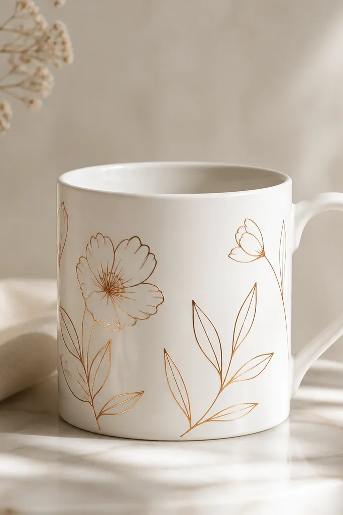
Start by sketching two or three simple motifs on the mug in pencil — like one flower, two leaves, and maybe a tiny bud. Trace the lines with copper metallic paint using a fine liner brush, keeping the lines consistent in thickness. Let it dry, then add a second pass only where lines need reinforcement. Seal once fully cured to protect the metallic outline.
Copper outline line art looks like modern pottery because it’s minimal and metallic. The trick is to use outlines only, not filled shapes. Copper flatters warm kitchens and gold-toned accessories, and it reads well on camera because the lines catch highlights. This is one of my favorite beginner handmade mug ideas because it looks impressive even when your drawing is simple. Keep the motifs small and spaced out so the mug stays airy.
AvoidDon’t fill the shapes with copper; it turns metallic too heavy and can look messy.
Pro tipPractice on paper first with the same brush so you learn the exact paint flow before touching the mug.