
1. Charcoal + Oat Rim Lip Repair (the "coffee bar" look)
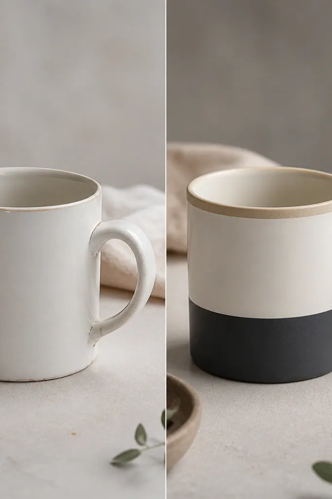
This is the transformation I reach for when a store mug has good shape but feels wrong at the lip. I use a charcoal base on the lower body because it hides tiny scuffs and makes the mug look grounded, then I add an oat-toned rim so the lip reads warmer against skin and doesn’t feel stark. The after result looks intentional even if the original mug wasn’t perfect. This style flatters people with light or medium skin tones because the oat rim makes the mug look cozy in photos and in hand. It also looks great on white or light wood shelves because the charcoal band gives you contrast without being loud. For everyday use, the thicker rim effect is what makes it feel like a handmade mug, not a painted one.
Start by washing the mug with dish soap, then wipe with rubbing alcohol on a lint-free cloth and let it fully dry. Sand just the rim area with 600-grit paper until it feels smooth, then wipe again with alcohol. Paint a thin charcoal band on the lower third and let it dry hard to the touch. For the rim, build in two thin coats of oat color, staying off the very edge of the lip by about 1 mm, then seal with a food-safe ceramic topcoat. After curing, lightly sand the topcoat on the rim once with 1000-grit so it feels smooth when you sip.
Pro tipIf your mug lip feels sharp, add the rim color with 2 thin coats instead of one thick coat. Thick paint can dry with texture that you’ll feel every sip.
AvoidDon’t paint onto the inner drinking edge — it looks messy and it wears faster.
2. Sea Glass Speckle Over White (handmade texture without drama)
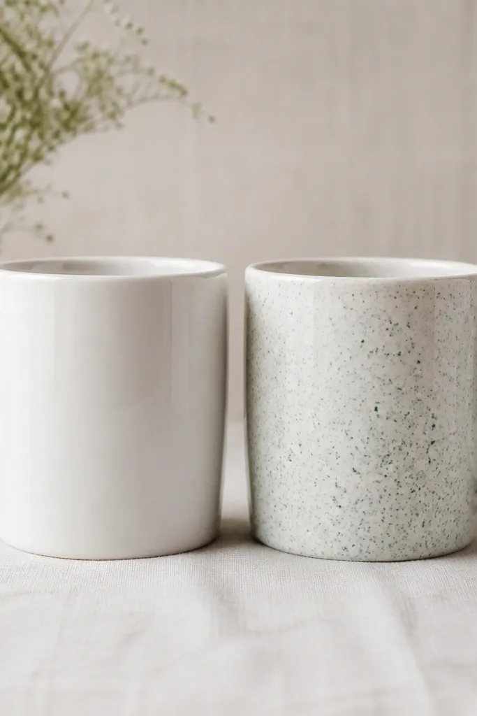
If you want the “handmade” vibe but you don’t want to commit to bold patterns, sea glass speckle is the move. I paint a mostly-white base and then add tiny mint and frosted teal dots with a stiff brush and a quick flick so the speckles land irregularly. The effect looks like kiln-made texture, but it’s controlled enough to stay classy. This styling flatters cool undertones on skin because the mint tones keep everything fresh, not yellowed. It also looks good with stainless steel kitchens and gray cabinets because the speckles echo the calm color palette. For photos, the speckle catches light in a soft way, so it doesn’t look flat like a single-color mug can.
Start on a clean, de-greased mug — alcohol wipe twice, then let it dry completely. Lightly scuff the glossy glaze with 800-grit paper so paint grips, then wipe dust off. Apply a matte or satin white base coat in a thin layer, then let it cure per the product directions. For the speckles, load a small amount of mint and seafoam paint, tap the brush over the mug while rotating it, and keep the density heaviest on the lower half. Seal with a food-safe topcoat and cure fully before washing.
Pro tipPractice your speckle density on paper first — you want “sparks,” not a peppered mess. One minute of test beats hours of repainting.
AvoidSkip heavy speckle coverage near the rim — it makes the lip look busy and can feel rough.
3. Terracotta Brush Strokes + Cream Handle (warm, wearable color)
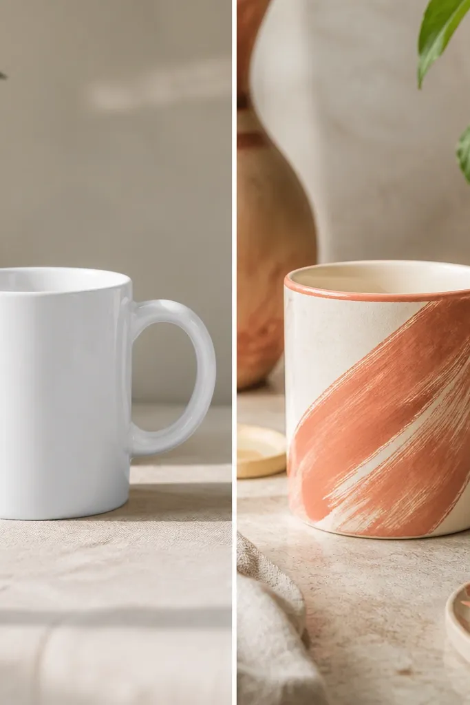
This is my go-to for making a plain mug look like it came from a maker’s table. Terracotta brush strokes add movement, and the cream handle makes the grip feel softer visually. I keep the strokes diagonal so your eye travels upward, which makes the mug look taller and more “designed.” Warm colors like terracotta flatter olive skin and dark hair because they add warmth without clashing. For styling, this mug looks amazing next to brass spoons and linen napkins because the palette matches real-world materials. It’s also forgiving — if your brush lines aren’t perfect, the handmade look reads as intentional.
Clean and de-grease the mug, scuff-glaze with 800-grit, and wipe dust away. Paint a thin cream base on the handle only, staying inside the handle shape so it doesn’t smear onto the mug body. Apply terracotta brush strokes diagonally across the body in 2 layers: first a lighter wash, then a thicker stroke band where you want depth. Add a thin terracotta line under the rim to tie it together, then seal the whole mug with a food-safe ceramic topcoat. After curing, check the handle feel by running a finger along it — if it feels tacky, you need more cure time before use.
Pro tipUse a flat brush for the main strokes and a smaller brush for the edges. Clean edges make the whole mug look intentional.
AvoidDon’t seal before the paint fully dries — you’ll trap soft paint and it can smear later.
4. Upcycled Map-Grid Pattern (modern, graphic, surprisingly calming)
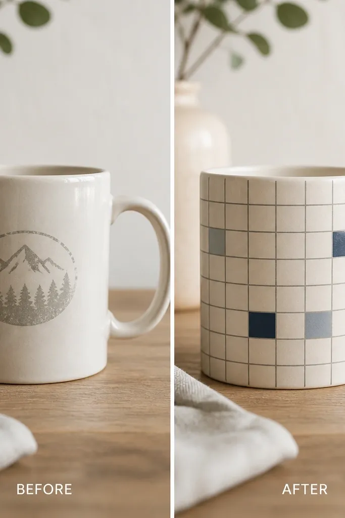
This one is for people who like clean lines but hate when DIY looks childish. I cover the body with a thin grid pattern using a steady hand and masking tape, then I add a few muted navy blocks to break the monotony. The trick is keeping the lines narrow and the colors low-saturation, so it reads modern instead of craft-store. This mug flatters almost any skin tone because the palette is neutral and navy, not warm orange. It also looks great for home offices and kitchens with lots of white and gray because it adds structure. When the topcoat is satin instead of high-gloss, it looks more like a studio piece.
Start by removing any old printed logo with gentle sanding and alcohol wipe — you want the surface uniform. Mask off a straight band near the top and bottom so your grid has clean borders. Use a ruler and pencil to lightly mark line positions, then apply thin painter’s tape strips for the verticals, paint the navy blocks with a small foam brush, and remove tape while paint is still slightly wet. Fill the rest with washed gray lines, then seal with a satin food-safe topcoat. Let it cure fully before stacking with other mugs so the finish doesn’t get fingerprints.
If your tape lines wander, press the tape down with a credit card edge. It keeps the border razor-straight.
Don’t use thick craft paint for the grid lines — it dries raised and looks clunky.
5. Cherry Red + Tiny Gold Dots (the "special occasion" mug)
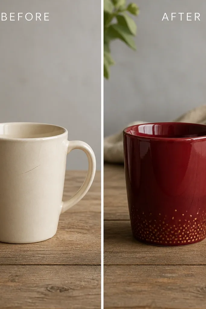
Cherry red is bold, but it looks expensive when you keep the accents small. I paint the whole body cherry red, then add tiny gold dots near the lower edge so your eye catches sparkle when the mug moves. The gold ring at the handle base makes the mug feel balanced, like it was made as a set. This design flatters warm skin tones and also looks stunning against dark wood tables. It’s perfect for tea, cocoa, or any drink you only make when you want it to feel special. The handmade look comes from the dot placement — slightly uneven, never perfectly patterned.
Clean the mug thoroughly, scuff-glaze lightly, and wipe with alcohol. Apply cherry red in thin coats, two passes minimum, until the coverage looks even and not patchy. For the dots, use a fine dotting tool or the end of a stylus and place gold dots only in a band 1-2 cm above the base. Add a thin gold ring at the handle base with a small liner brush, then seal with a clear food-safe ceramic topcoat. Cure fully, then wash once by hand before using with hot drinks.
Pro tipUse a magnifier or phone camera to check dot spacing. Your eye lies when you’re close to the mug.
AvoidSkip glittery gold finishes — they shed and feel gritty after a few washes.
6. Fabric-Ribbon Transfer Style (reads handmade even if you're not a painter)
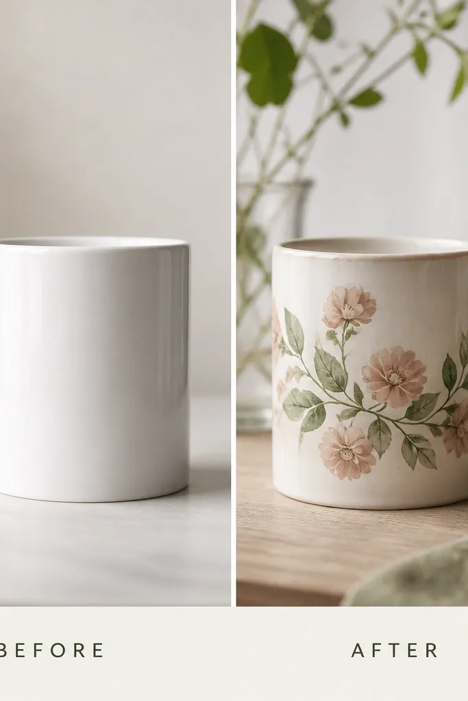
If you want the handmade look without freehand painting, ribbon-style transfers work. I use a printed ribbon design and seal it so it reads like it’s part of the glaze, not a sticker. The key is choosing colors that look like aged paper — dusty pink and muted green — so it doesn’t look like modern office graphics. This mug looks great on people who like soft neutrals and floral details without going full grandma. It also looks good with beige mugs, cream linens, and light wood because the transfer has that worn-in softness. The handmade feel comes from the matte/semi-matte topcoat, which reduces the slick factory shine.
Start with a plain mug that has minimal texture so the transfer lays flat. De-grease and scuff lightly with 1000-grit, then wipe clean. Cut the ribbon transfer band to wrap around the mug without overlapping, then apply using a ceramic transfer medium or the specific product your transfer paper requires. Smooth it from the center outward so you don’t trap bubbles — I use a soft silicone brush. Seal in multiple thin coats, letting each coat dry fully, then cure before first wash. Keep the rim area clear so you don’t get transfer edges where you sip.
Pro tipUse a hairdryer on low for 10-20 seconds while smoothing to help the transfer relax. Don’t overheat the ceramic.
AvoidDon’t wrap the transfer onto the inside rim — edges lift and look obvious.
7. Sage Wash + Uneven Edge Fade (quiet, spa-like, not bland)
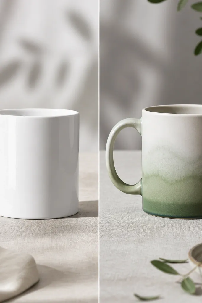
Sage wash with an uneven edge looks like a studio glaze even when you’re doing it at home. I paint a thin sage layer across the lower third and drag a dry brush upward so the fade isn’t straight or perfect. That irregular edge gives it depth and keeps it from looking like a painted block. Sage flatters light and medium skin tones because it doesn’t pull warm or yellow. It also works with almost any kitchen color, especially whites, natural wood, and brushed nickel hardware. If you drink tea in the mornings, this mug makes the whole routine feel calmer without screaming for attention.
Clean and de-grease, then scuff the glossy glaze lightly with 800-grit. Brush a thin sage wash on the lower third, then while it’s still damp, use a dry brush to lift pigment upward in soft streaks. Build a slightly darker band at the very bottom edge so the gradient has weight. Let it dry fully, then apply a matte or satin food-safe topcoat in 2-3 thin layers. After curing, check for any sticky spots — those need another thin topcoat pass.
Keep a paper towel handy and wipe your brush before you lift the fade. Dry brush control is what makes the edge look natural.
Don’t use thick paint for the wash — it dries chalky and the fade turns muddy.
8. Gold Handle Accent + Matte Body (clean lines, grown-up look)
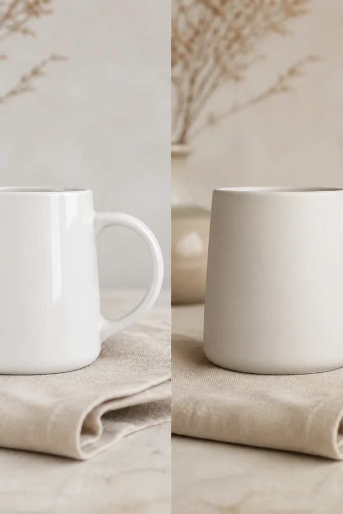
This is the transformation I make when someone says they want “something subtle but not boring.” I keep the body matte off-white so it doesn’t reflect light harshly, then I add a thin gold accent exactly where your fingers naturally brush the handle. That tiny touch makes the mug feel designed without turning it into a loud statement piece. It flatters people who like minimal decor and also looks great in kitchens with black hardware. The matte body helps the gold look warm, not shiny and cheap. For photos, it reduces glare and makes the mug look like it belongs on a styling set.
Start by cleaning and scuffing with 1000-grit so the matte paint and topcoat grip. Paint the entire body off-white in 2 thin coats and keep it smooth. Mask the gold zone on the handle interior with painter’s tape, then paint a thin gold line and a short gold dot cluster near the handle base. Remove tape while paint is slightly wet for clean edges. Seal with a satin food-safe topcoat to keep the matte body looking even and to protect the gold accent from wear.
Pro tipApply gold accents with a liner brush, then lightly tap the brush on scrap paper to remove excess paint. Too much paint makes the line wobble.
AvoidDon’t skip masking — gold bleeds fast and the mess is hard to fix after it dries.
9. Before/After Chip Cover with Porcelain Filler (repair that looks intentional)
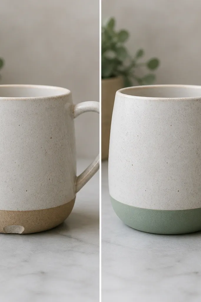
A chipped mug can still look handmade after repair, and I say that because I’ve done this on mugs I couldn’t stand to throw out. The secret is using porcelain filler to rebuild the missing edge, then sanding it flush so your paint doesn’t sit on a bump. Once you paint the repaired area into a deliberate color band, it stops looking like damage and starts looking like design. This works for mugs with small chips on the lower rim, handle base, or a corner — the spots people notice first. It looks best with simple color transitions like a band, wave, or dot cluster because your repair line becomes part of the pattern. The handmade feel comes from the repaired surface being smooth before color goes on.
Clean and dry the chipped area, then rough up the chip edges lightly with 600-grit so filler bonds. Mix porcelain filler to a smooth paste, press it into the chip, and scrape it flat with a plastic card. Let it cure fully, then sand starting at 600-grit and move to 1000-grit until it feels level with the surrounding ceramic. Paint a color band that covers the repaired zone — I like charcoal or terracotta because they hide tiny transitions — and seal with a food-safe ceramic topcoat. Cure thoroughly before washing and do a hand-wash test first.
Pro tipRun your finger over the repair in good light. If you feel a ridge, sand one more pass before paint.
AvoidDon’t paint over a rough chip edge — it lifts and you’ll see the crack line again.



