
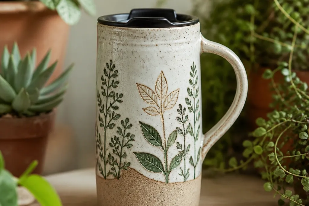
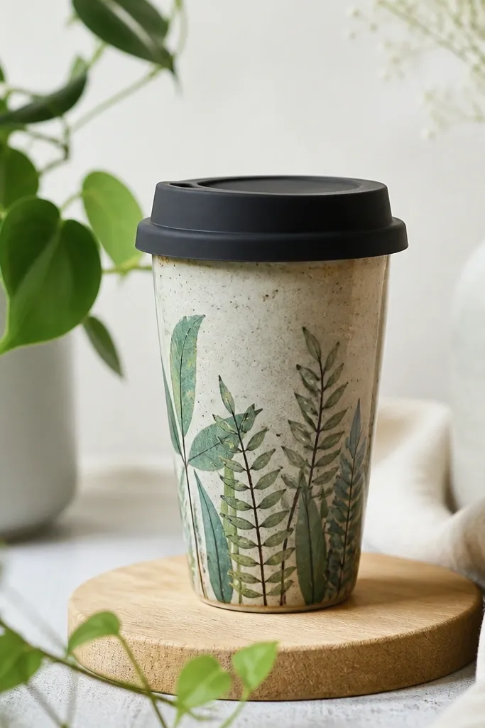
1. Sage Leaf Side Panel on Speckled Cream
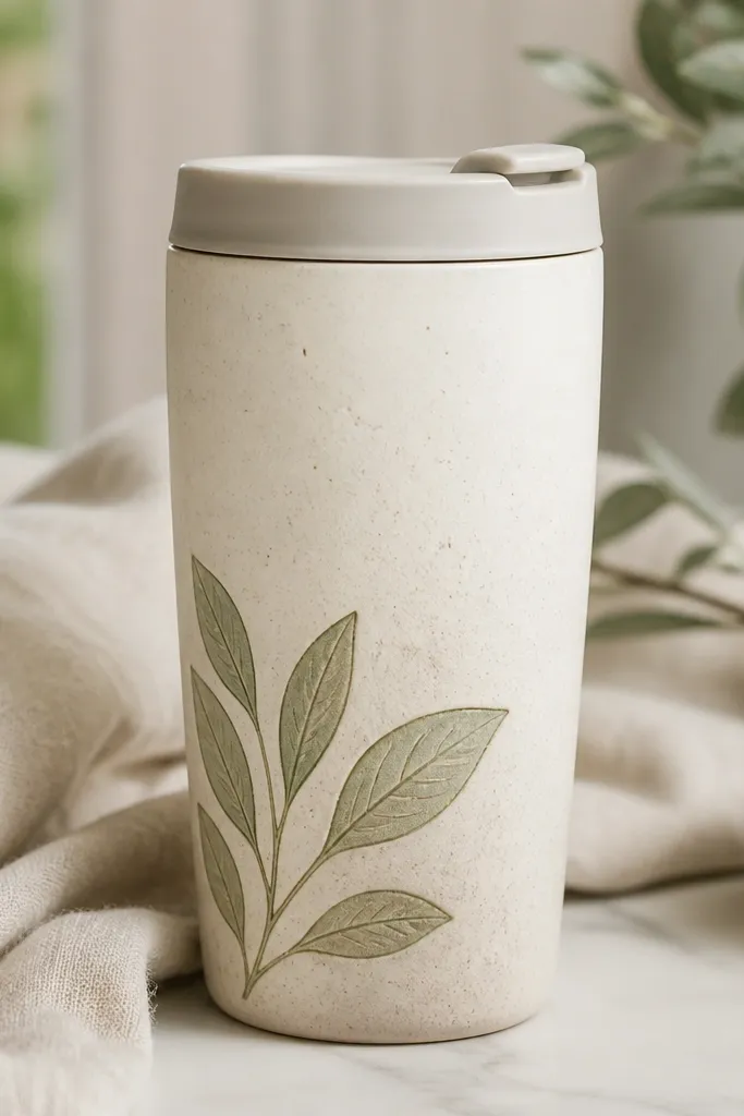
Start by marking a guide line with painter’s tape where the plant cluster will sit, leaving 2-3 cm below the lid ring. Wipe the mug with isopropyl alcohol, then trace your leaf shapes lightly with a pencil so you don’t overshoot. Paint the first layer in sage green and let it dry fully, then add veins with a smaller brush and darker olive paint. If you’re using decals instead of paint, place the decal on the side panel first, smooth from the center outward, and trim only after it’s seated. Finally, heat-set or fire according to your ceramic product instructions, then keep the top area bare so condensation doesn’t hit the design.
This one is for the “I want it pretty, but I want it to look grown-up” crowd. The speckled cream glaze hides tiny paint imperfections, so your leaves don’t have to be perfect to look intentional. I used a muted sage green for the main leaf shapes and a darker olive for the veins, then kept the cluster about the width of a credit card on the mug’s side panel. It flatters most skin tones because the greens sit cool and calm against warm cream. For styling, it looks best with beige sleeves, a light denim jacket, or a tan tote, because the mug reads like part of your outfit instead of a loud accessory.
AvoidDon’t paint right up to the lid ring — steam makes the finish look cloudy and can lift edges.
Pro tipUse a flat brush for the leaf silhouette and a liner brush for veins; the contrast makes the leaves look dimensional.
2. Tiny Ferns in a Vertical Stripe on Gloss Black
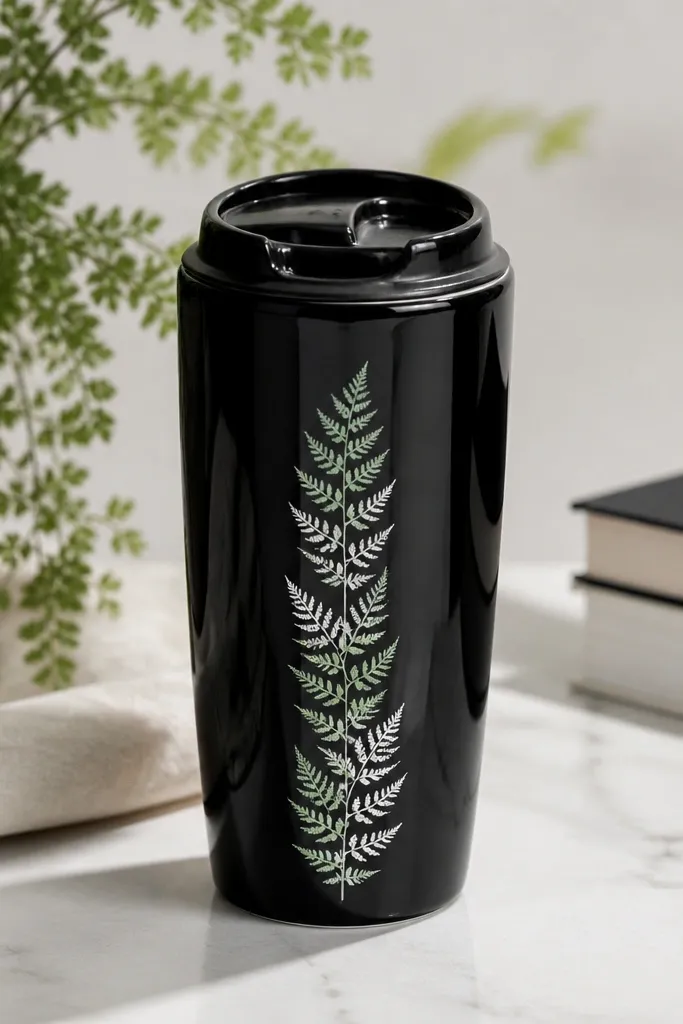
Start by cleaning the mug thoroughly and letting it dry so the glossy surface doesn’t resist your transfer. Tape a 1 cm wide “stripe” guide on the mug so the fern fronds stay aligned as the mug curves. Add fern fronds using a stencil: dab mint ink/paint first, then add a thin white highlight line on select frond segments. Let it dry, then heat-set/firing as instructed for your medium. Leave the lid ring area untouched, and keep the stripe centered so your thumb doesn’t rub directly over the painted fronds.
Gloss black is dramatic, and I like it because the plants look like ink illustrations instead of craft projects. I went with a narrow vertical stripe, not a big bouquet, because small fern fronds stay neat when they wrap around the mug. The fronds are pale mint and a touch of white, which pops hard against black without looking neon. This style flatters people who like minimal outfits — black plus pale greens reads clean with gray hoodies, black jeans, and even a simple white tee. If you carry your mug daily, the high-contrast design also helps you spot smudges fast, so you clean it before it looks messy.
AvoidSkip freehanding tiny fronds without a guide stripe — they drift and end up looking uneven.
Pro tipIf your stencil fronds look too thick, lighten the paint with a tiny amount of medium so the lines stay delicate.
3. Terracotta Pot + One Trailing Plant on Matte Oat
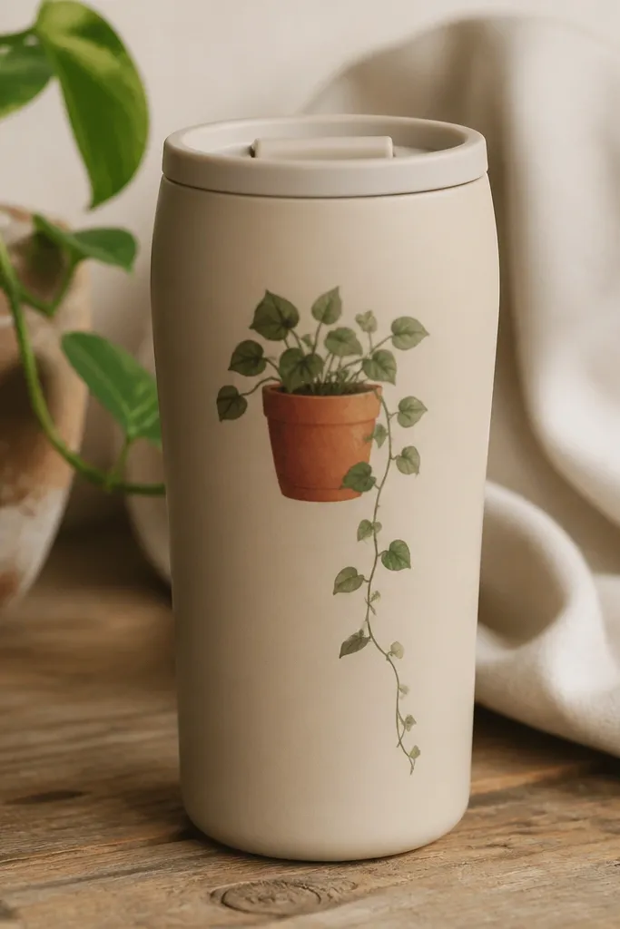
This is the mug I make when I want cozy, not busy. Matte oat is forgiving and hides brush texture, so your terracotta pot can look hand-painted without looking sloppy. I paint a simple pot in terracotta, then add one trailing plant that curls down in a single direction — that keeps the design calm and easy to read. Warm tones like terracotta look great with medium to deep skin tones because the colors feel natural and sunlit. It also looks great with linen, cream knits, and warm-toned bags, because the mug matches the vibe of slow mornings.
Begin by sketching the pot shape so it sits slightly above the mug’s widest point; that makes the vine curl look intentional. Paint the terracotta pot first and let it dry, then add a muted green stem and a few leaf pairs along the curve. Use a damp cloth to wipe any paint that creeps toward the lid area, since you want a clean transition to the blank ceramic. If you’re using ceramic decals for the pot, press it down firmly, then paint the vine by hand so it still looks custom. Finish with heat-setting/firing and keep the top 2-3 cm free of paint so condensation doesn’t mess with the glaze.
Add one tiny darker green leaf near the bottom curl — it gives the whole design a “weight” that looks professional.
Don’t add lots of extra leaves — one trailing line looks better than a crowded cluster.
4. Watercolor-Style Monstera Splash on Light Blue
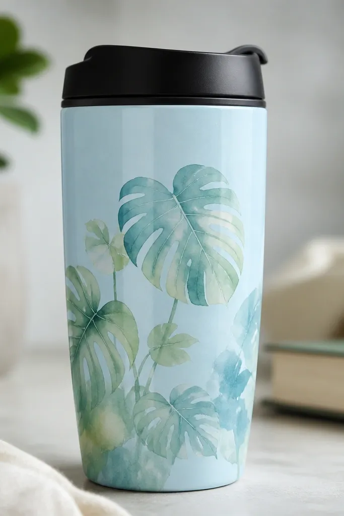
Light blue and watercolor-style monstera is the combo that makes people stop and ask where you bought it. I keep the monstera shapes semi-transparent with watered-down green and a hint of teal, so the leaves look like they’re floating on the glaze. The effect is airy, and it looks especially good on mugs with a smooth, glossy finish because the washes catch the light. This style flatters cool-toned wardrobes — think white sneakers, navy tote bags, and silver jewelry. If you like a “soft art” look rather than sharp line work, this one hits the sweet spot.
Start by drawing the monstera silhouette lightly so the cutouts land in the right spot on the curved mug. Mix your paints with water or ceramic medium to get a wash consistency, then paint the leaf base first with diluted green. Add teal in the leaf shadows, then use a clean damp brush to blend edges for that watercolor feathering. Let it dry completely, then go back with a darker green for the main veins and the deepest cutout lines. Heat-set/firing per your ceramic paint instructions, and keep the design border at least 2 cm away from the lid ring so steam doesn’t blur the wash.
Do one test leaf on a spare tile or old mug before you commit — watercolor washes behave differently depending on how matte your glaze is.
Don’t use heavy paint for the first layer — thick blobs kill the watercolor effect fast.
5. Bold Circle Vines on Olive Green
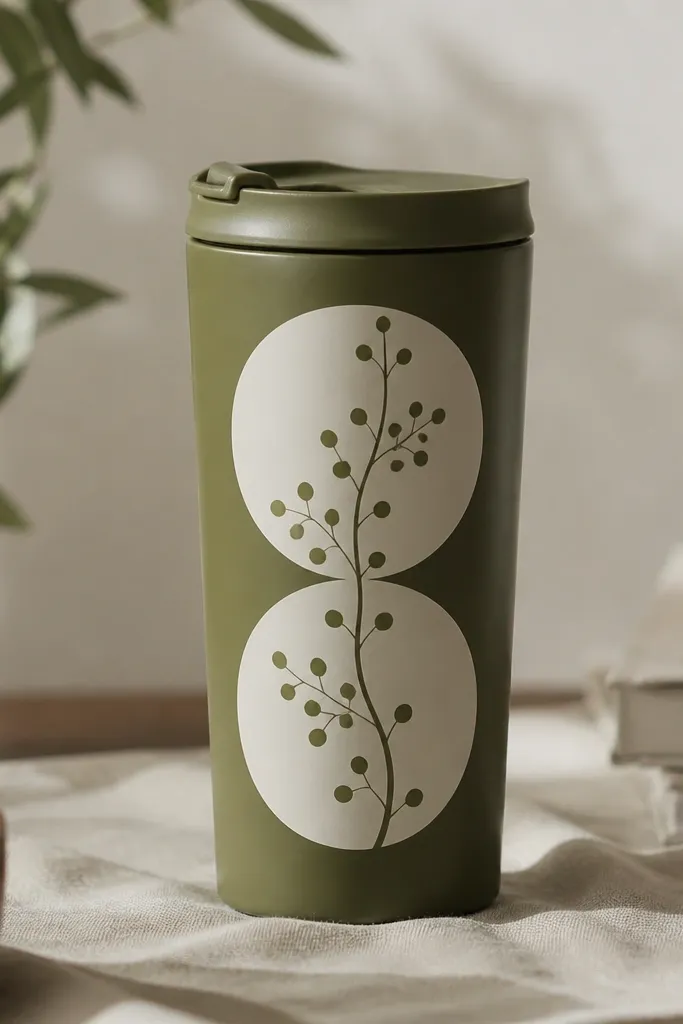
Clean the mug, then tape off two circle areas with painter’s tape or use a circle template to draw guides. Paint the circles off-white first and let them dry so the vine lines don’t bleed into wet edges. Next, draw a simple vine path with a pencil and outline it with thin off-white or cream paint, then add small leaf dots along the path. If you want extra crispness, use a fine liner brush and let each leaf dot dry before adding the next. Heat-set/firing as directed, then seal only if your medium requires it — keep the lid ring area free of any coating that could feel tacky when it gets wet.
This is the mug for clean graphic lovers. Olive green is already a plant-adjacent color, so the vine looks natural, not forced. I used off-white circles like frames, then put thin vine lines and tiny leaf dots inside — it reads like modern botanical art. This design is flattering because the off-white breaks up the darker mug and makes your hand look brighter when you hold it. It looks best with earthy outfits: brown leather, camel coats, and dark green sweaters. It also hides small scuffs better than super light colors.
AvoidDon’t skip letting circles dry — if they’re wet, the vine outline smears and looks cheap.
Pro tipIf your vine lines look wobbly, rest your wrist on the table edge and move your whole arm instead of your hand.
6. Pastel Succulents in a Row on White
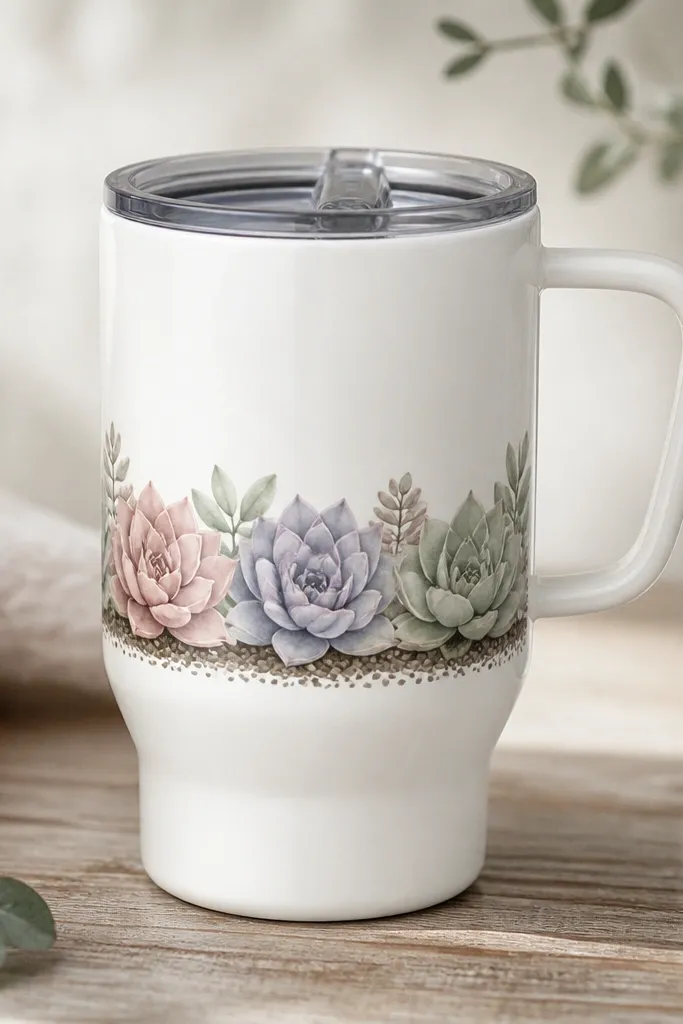
Start by cleaning the mug and marking a horizontal guide line where the succulent row will sit, centered vertically. Paint the soil base first as small dots or a thin line in warm brown, then add each succulent shape with a different pastel color. For each succulent, layer a lighter center shade and a slightly darker edge shade so they look dimensional. Let each color dry before adding the next layer so you don’t get muddy blending. Heat-set/firing as directed, then keep the design below the lid ring by 2-3 cm so condensation doesn’t dull the pastels.
This is the one I made for a friend who loves cute but hates loud. White ceramic makes pastel succulents look fresh, not childish, because the colors are muted. I paint three to five succulents in a row, all roughly the same height, then add tiny soil dots at the base. The mug looks great with light neutrals and pastel outfits — think cream cardigan, pale pink scarf, or a light gray sweatshirt. It’s also easy to keep clean visually; if a spot happens, it doesn’t blend into a dark background.
AvoidDon’t use bright neon pastels — they look harsh on ceramic and make the whole design feel store-bought.
Pro tipUse a small sponge or stipple brush for succulent texture — it makes the leaves look like they’re stacked.
7. Black-and-Gold Eucalyptus Sprig on Ivory
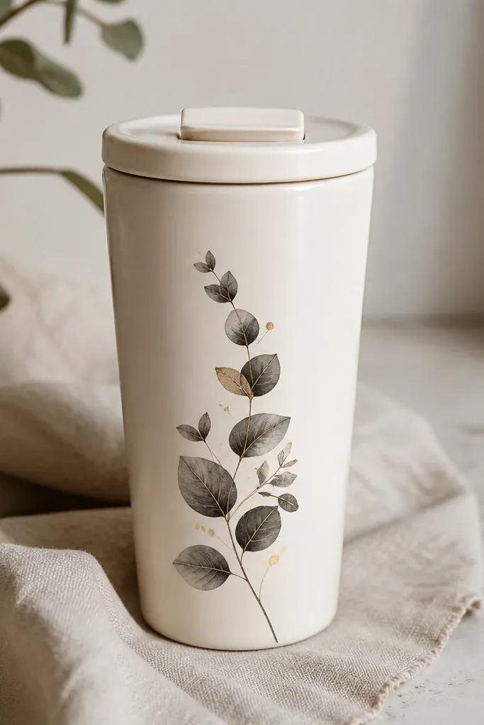
Clean the mug and lightly sketch a diagonal sprig line on the side panel. Paint leaf shapes in matte black first, then add gold accents on the top edge of a few leaves using a fine brush. Let black dry fully so the gold doesn’t smear into it. If you’re using gold paint, shake well and apply thin coats; thick gold turns dull and can crack after firing. Heat-set/firing per the paint’s directions, then leave the top area near the lid ring completely plain so the gold doesn’t get hit by steam and water spots.
If you want “special” without going overboard, this is it. Ivory glaze gives you warmth, and the black-and-gold eucalyptus sprig looks like wedding stationery translated onto something you carry every day. I keep the sprig narrow and slightly diagonal — it feels elegant because your eye follows the line. This one flatters almost everyone because black and gold work with both cool and warm skin tones. Style it with simple outfits and gold hoops or a thin bracelet; the mug looks like part of your jewelry set.
AvoidDon’t cover the whole mug in gold — small accents look sharp; large areas look messy fast.
Pro tipDo gold last in thin coats — two light passes look better than one thick coat.
8. Chalky Terrarium Frame on Taupe
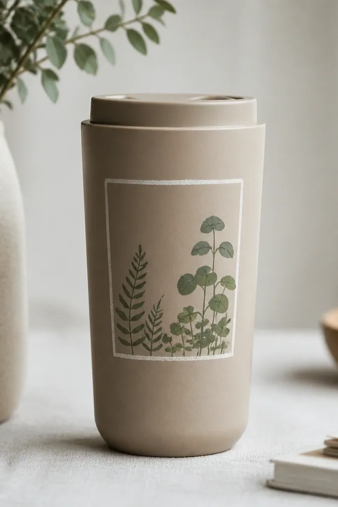
Clean the mug and choose a side panel that stays visible when you hold it. Paint a chalky white rectangle frame first, leaving a small margin from the edges so it doesn’t look cramped. Inside the frame, add simple plant shapes with two greens — one light, one darker — and keep them separated so the mug doesn’t look like one blob. Let everything dry fully, then heat-set/firing per instructions. Keep the frame bottom above the lid ring by 2-3 cm so condensation doesn’t blur the chalky paint.
Taupe is underrated. It gives you a muted background that makes chalky plant art look like a little sketch you’d want to hang on your wall. I framed the plants inside a simple rectangle like a terrarium, then used chalky white paint for the frame and soft greens inside. The look is cozy and calm, and it hides minor brush texture better than glossy mugs. This flatters people who wear lots of earth tones because the mug doesn’t fight your clothes. It also feels right for desk setups — it looks good next to notebooks, not just in your bag.
AvoidDon’t make the frame too close to the lid — the top steam zone ruins chalky finishes.
Pro tipIf chalky paint looks streaky, thin it slightly with ceramic medium and do two coats instead of forcing one thick coat.



