
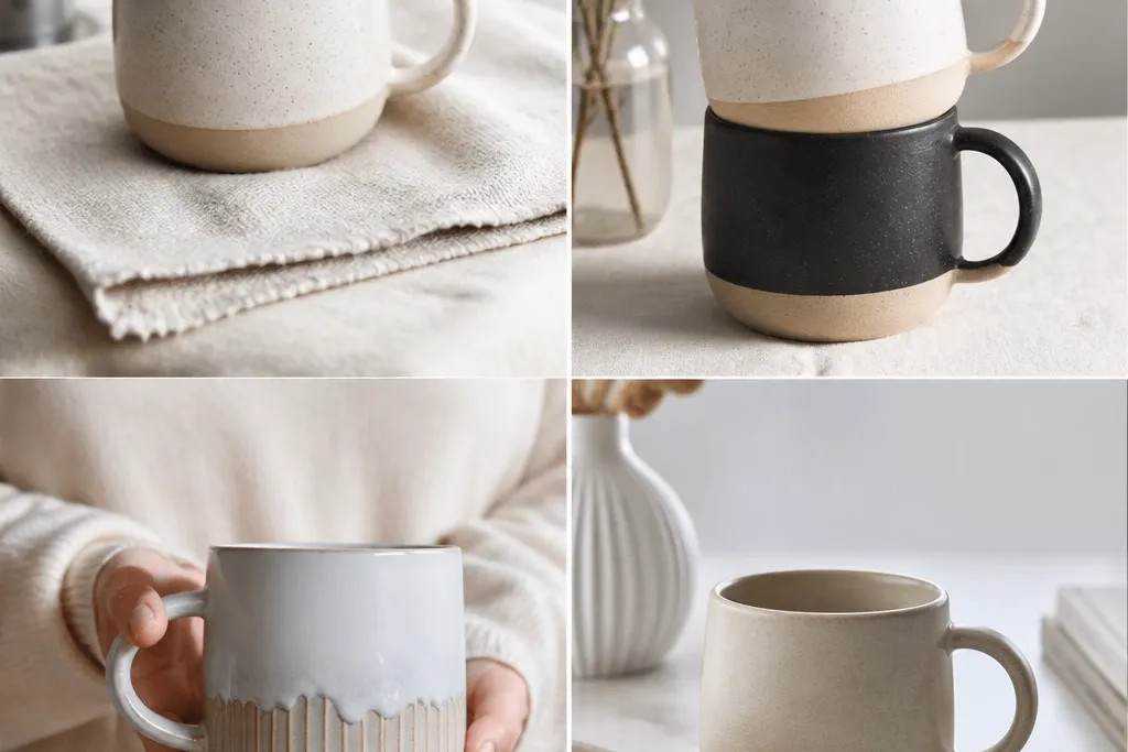
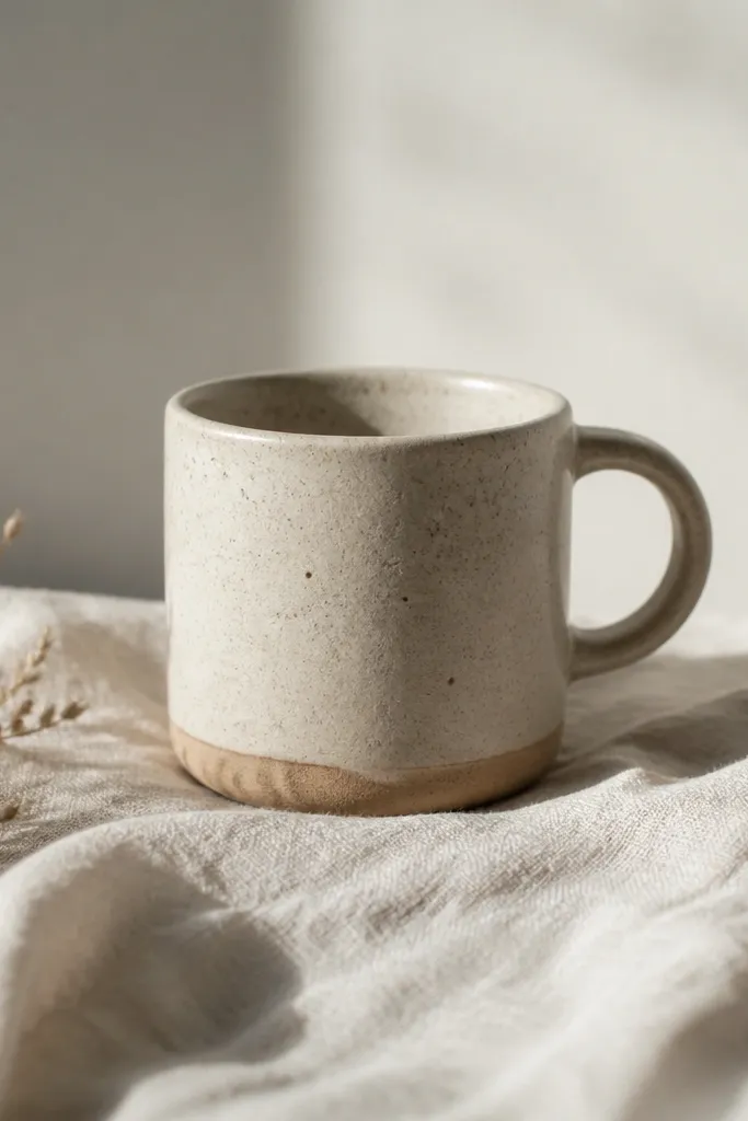
1. Chalky Sand Band with a White Rim
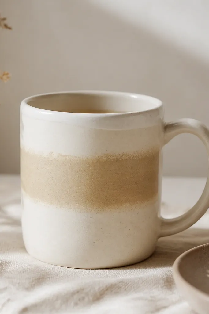
This look is modern minimalist handmade mug energy without trying too hard. The chalky sand band reads warm against a white rim, and the slight hand variation keeps it from feeling factory-perfect. I like it most on mugs that are already matte or semi-matte, because the paint texture blends into the surface instead of sitting on top. It flatters warm skin tones and kitchens with beige, wood, or linen — the colors feel cozy rather than cold. If you drink light roasts, the sand band makes the coffee look darker and more defined in the mug.
Start by cleaning the mug with rubbing alcohol and letting it fully dry. Tape a strip of painter’s tape around the mug at the height you want, leaving about 1.5 cm of rim-to-band space above and below. Paint the sand beige band in two thin coats, letting each coat dry to a matte finish. Remove the tape while the last coat is slightly tacky so the edge looks soft, not razor-sharp. If your mug is glossy, lightly scuff with fine sandpaper (around 400 grit) before painting so the band doesn’t peel.
Seal only if your paint system calls for it — I’ve seen “extra sealant” make matte designs look cloudy. Use a damp cloth for touch-ups, not soaking.
Don’t paint a thick first coat; it will crack or look like plastic on the glaze.
2. Deep Olive Handle Wrap
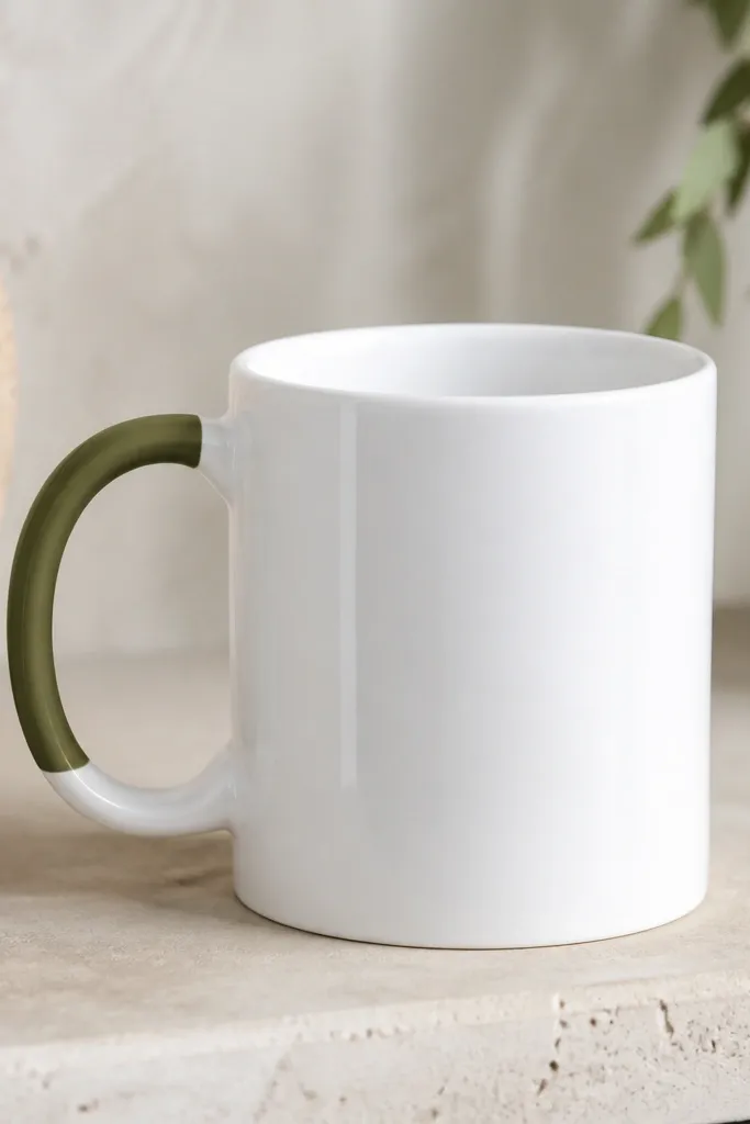
A handle-only design is the fastest way to keep a mug looking modern and intentional. Deep olive is a dark, calm accent that makes the rest of the mug feel brighter by comparison. This is the mug I reach for when my dish set is mostly neutral — it adds mood without adding clutter. It also photographs well because the handle wrap creates a clear focal point. In person, the olive reads more grounded than black, and it hides tiny chips better than lighter colors.
Use ceramic paint rated for mugs, and start by masking the cup body with heat-resistant tape or painter’s tape. Tape a straight line where you want the wrap to end so you get a clean edge. Paint the handle with a small foam brush, working in short strokes so the coverage is even but not streaky. Let it dry, then do a second thin coat only if you can see the white base through it. Finally, cure/bake the mug for the exact time your paint brand specifies before you wash it.
If you want extra clean lines, use the edge of a plastic card to press tape down hard before painting.
Don’t brush paint over the handle curve in one heavy pass — drips collect at the underside.
3. One-Line Minimalist Face in Black Slip
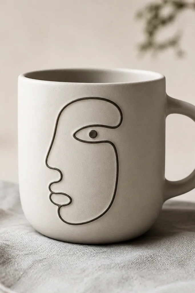
This is the style I make for people who love modern art but hate clutter. The single-line face keeps the visual idea simple, and the black ink or slip makes it readable from across the table. I like it on matte clay or matte glaze because the line looks like it was drawn into the surface. It’s also forgiving: if your line thickness varies a little, it still looks hand-done and calm. This mug works beautifully for anyone who likes graphic stationery vibes.
Pro tipPractice on a scrap tile first — the only trick is keeping the line speed steady.
If you’re hand-building, roll a small slip or use black ceramic slip and load it into a piping bag with a fine tip. Lightly sketch the face with a pencil on the mug while it’s dry. Pipe the line in one steady motion, then stop and lift the tip cleanly. Let the slip dry until it turns dull, then glaze over it carefully if your process allows, or fire with the slip as designed. If you’re painting instead of slip, use a liner brush and ceramic ink, then cure fully.
AvoidAvoid multiple outlines; two passes make it look like a child’s drawing.
4. Tiny Dot Grid in Warm Gray
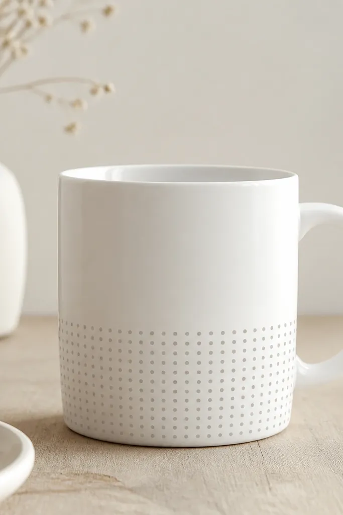
Dot grids look minimalist when they’re restrained — small dots, consistent spacing, and lots of breathing room. Warm gray keeps the dots from looking harsh like pure black. I’ve used this on mugs for guests because it feels “designed” even when you’re not spending hours. It also makes the mug look more expensive because the pattern reads as intentional geometry. The warm tone flatters wood tables and light walls, and the matte dots hide finger smudges better than glossy decals.
Pro tipIf dots start to drift, stop and let the mug dry; wet dots merge fast and ruin the grid.
Make a simple dot layout by marking a few reference points with a pencil on the mug. Use a dotting tool or the end of a ballpoint pen wrapped in tape to control dot size. Tap the tool straight down for uniform circles, and keep the grid to one band on the lower third. Let the paint dry fully, then check spacing in daylight from straight on. Cure/bake the mug after the final coat so the dots survive daily washing.
AvoidDon’t cover the whole mug — a full wrap makes it look like a wrapping paper pattern.
5. Matte Black Rim Dip
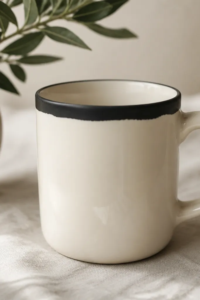
A rim dip makes the mug feel graphic and high-contrast without needing a big mural. Matte black absorbs light, so it looks modern in both morning sun and evening lamp light. Keep the interior unpainted so the coffee color stays clean and the mug feels practical. This style fits people who like Scandinavian basics and anyone with black utensils or a black coffee scale. It also hides small chips at the rim better than glossy paint because matte shows less glare.
Pro tipDo a test rim on a cheap mug first to learn how much paint soaks into your glaze.
Mask the interior lip with a thin strip of tape so paint stays only on the outside rim. Dip a foam brush into matte black ceramic paint and wipe off excess. Paint a narrow band around the rim, about 5-7 mm tall. Use a damp paper towel to clean any accidental paint on the inside before it cures. Cure according to your paint instructions, then wash only after it’s fully cured.
AvoidDon’t paint too wide — a thick rim band makes the mug look like it’s been stained.
6. Raised Clay Stripe with a Glossy Top Coat
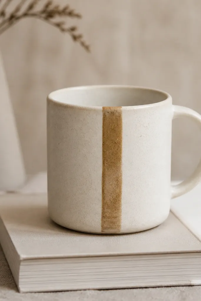
Texture reads minimalist when there’s only one element. A raised stripe catches the light differently every time you rotate the mug, so it feels handmade even if you keep the palette plain. I make this for stoneware because the contrast between matte body and glossy stripe looks intentional. It’s also comfortable in-hand because your fingers feel the ridge lightly, not sharply. This design suits people who like tactility — the kind of mug you want to hold while you sip slowly.
Pro tipUse a small piece of plastic wrap under your smoothing tool so you don’t pull glaze off later.
Start with a slip-thickened stripe: roll a thin coil of clay or mix slip with clay powder until it spreads like thick yogurt. Apply the stripe to the mug’s dry surface and smooth the sides with a damp silicone shaper so it’s even. Let it firm up before firing. If you’re glazing, paint a clear glossy glaze only on the stripe and leave the rest matte or satin. After firing, check the stripe height by running your fingertip — you want a gentle ridge, not a snag.
AvoidDon’t make the stripe too thick; thick ridges feel rough and collect coffee stains.
7. Washed Terracotta Half-Moon
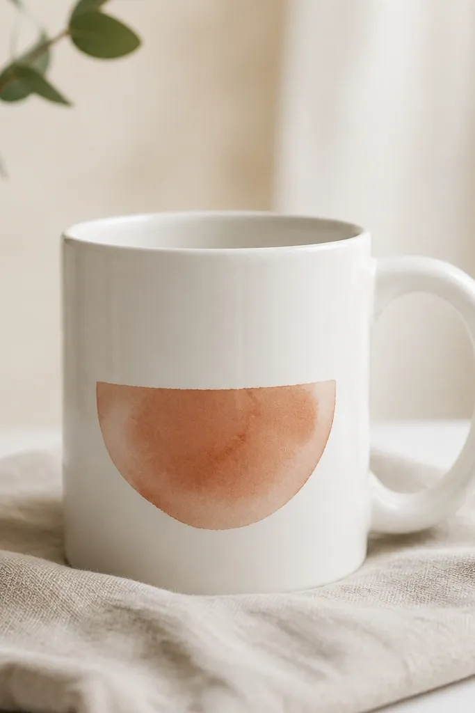
The half-moon is a minimalist shape that still feels warm and human. Terracotta reads cozy, but the washed effect keeps it from looking like a sticker. I like this on mugs with a slightly warm white base because the terracotta blends rather than shouting. It flatters hands and mugs that get photographed — the wash creates soft gradients that look good in natural light. If your kitchen leans neutral, this mug adds color without turning into decor clutter.
If you’re painting, thin terracotta ceramic paint with a compatible medium so it behaves like watercolor. Mask a curved area with a flexible stencil or a paper template held against the mug. Apply the lightest wash first, then add a second darker layer only in the center of the half-moon. Let it dry between layers so you control the gradient. Cure/bake fully so the wash stays fixed and doesn’t ghost when wet.
Spritz a tiny amount of water on a test tile to see how your paint blooms before you commit to the mug.
Don’t use regular craft acrylic; it will smear when the mug gets wet.
8. Monochrome Marble Transfer Band
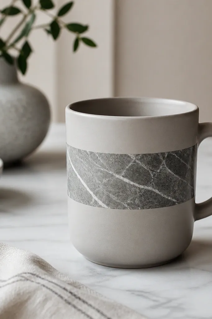
Marble patterns can look busy, but a single band keeps them modern. Monochrome veining looks clean because it stays in one value range. I made this after buying a set of cheap mugs and getting tired of their blank sides; the band turned them into a cohesive set. The marble band also makes the mug feel less “DIY” because the veining pattern creates depth. It suits people who like minimal design but still want texture.
Pro tipBefore you stick it, hold the decal up to the light and check how the pattern aligns — a tiny shift looks obvious on marble.
Cut a marble-pattern decal or transfer strip to fit a horizontal band around the mug. Clean the mug with alcohol and let it dry. Apply the band straight, using a ruler to keep it level — the band should sit about 3.5 cm below the rim. Press from the center outward to prevent bubbles, then smooth edges with a soft cloth. Seal only if your transfer system requires it, then cure/bake exactly as directed.
AvoidDon’t overlap edges; the seam shows and kills the marble illusion.
9. Gold Foil Corner Mark
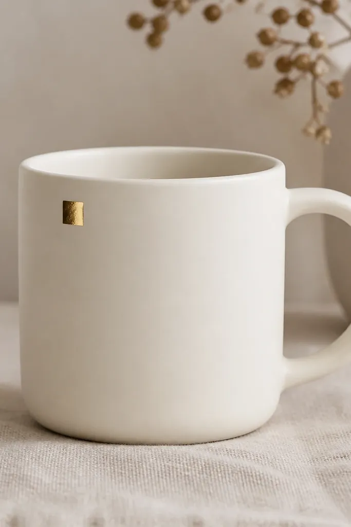
A corner mark is a minimalist move that feels like stationery. The gold foil hits in small bursts, so it looks cozy instead of flashy. I like this for gift mugs because it looks intentional even if the mug is simple. It also flatters kitchens with brass hardware or warm light bulbs — the gold matches the glow. Keep it small — the moment you scale up, it turns into a decorative plate.
Clean the mug with alcohol and let it dry fully. Apply a thin layer of foil adhesive only where the square will go, about 1.2 cm by 1.2 cm. Wait until the adhesive turns tacky as your product describes. Lay gold foil over the area and press gently with a soft cloth. Burnish lightly, then remove excess foil with a gentle tap. Cure or seal only if your foil adhesive system says so.
Practice on a scrap ceramic tile first — foil likes to stick harder on some glazes than others.
Don’t wipe the adhesive with wet paper; it smears and makes the gold look muddy.
10. Sage Line Around the Base
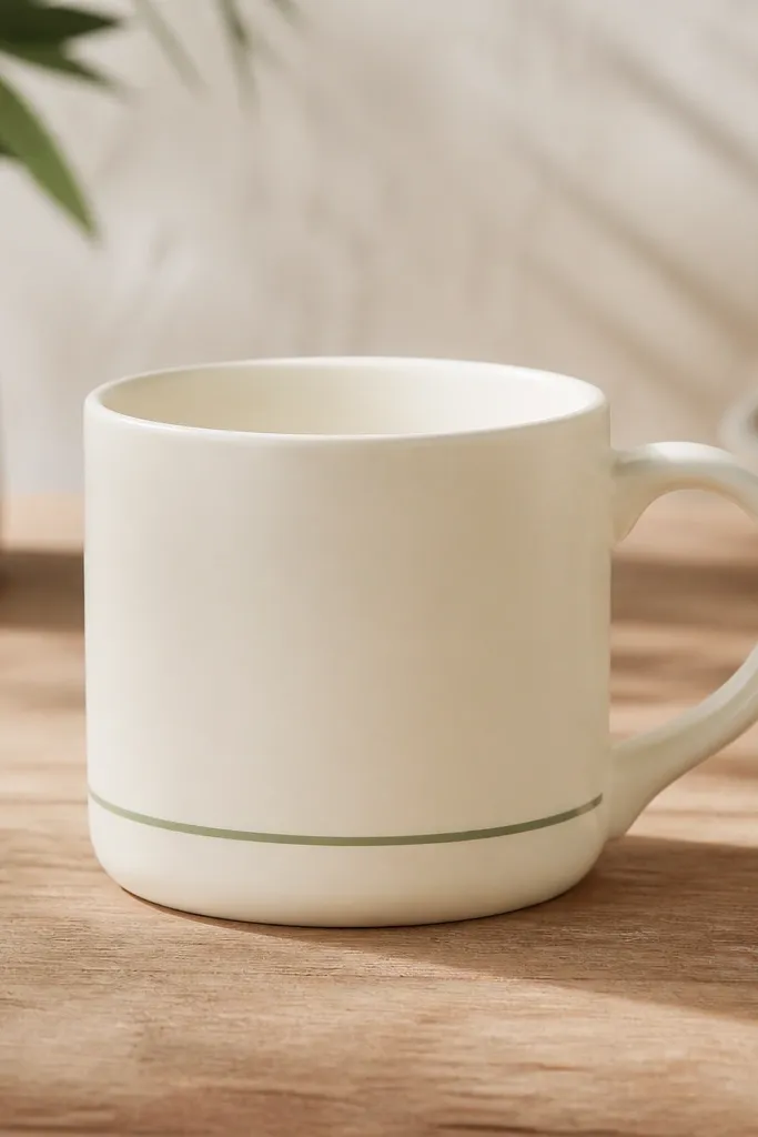
A base line makes the mug feel grounded. Sage is soft enough to read calm, but it still shows clearly against cream. This look works for people who want modern minimalist handmade mug style without drawing — it’s basically design through placement. I’ve used it on mugs I plan to keep in rotation because the line doesn’t fade as visually fast as big painted areas. It also pairs well with neutral dish sets and light wood counters.
Measure the mug circumference and pick a line height around 2 cm above the base. Use a strip of painter’s tape to create a straight line, pressing it around the mug. Paint with a fine brush or use a vinyl stencil for a consistent thickness, then let it dry. Remove tape carefully to keep the edge clean. Cure/bake based on your paint system, then wash after fully cured.
For the crispest line, use thin tape and pull it off at a slight angle while the paint is still a bit tacky.
Don’t freehand the line; even a little wobble makes it look cheap.
11. Ink-Stamped Leaves in One Color
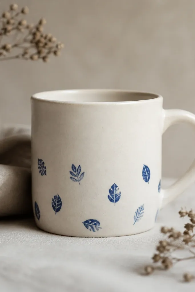
Stamping looks minimalist when it uses one color and a light density. Deep blue leaves feel fresh, but the one-color approach keeps it from becoming a pattern overload. I like this for mornings because it adds a hint of nature without turning the mug into a botanical poster. The imperfect stamp edges make it feel handmade, not printed. It’s also friendly for gifting because you can personalize the leaf placement without changing the overall style.
Pro tipWipe your stamp edge with a slightly damp cloth between stamps so the next leaf doesn’t pick up extra paint.
Make a stamp by carving a simple leaf shape from foam or use a rubber stamp made for ceramics. Clean the mug, then apply a thin coat of ceramic paint mixed with a stamping medium if you have one. Press the stamp lightly — you want the outline, not a thick blotch. Work from the bottom up and stop when you see balance; leave at least a 2 cm blank area around the handle. Cure or bake after the final coat, and test one stamp on scrap before committing.
AvoidDon’t stamp too dark in one press; it bleeds and looks like a bruise.
12. Single Letter Monogram in Matte Charcoal
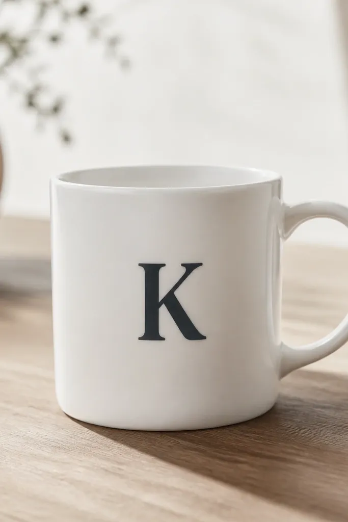
A single letter gives you that modern minimalist handmade mug look instantly. Matte charcoal is my go-to because it’s softer than black and still crisp. Centering the monogram makes the mug feel clean and designed, like it belongs with a matching set. This is the style I use for couples too — one mug with an initial each, different letters, same placement. It works for any skin tone and any morning color palette because charcoal stays neutral.
Pro tipIf you want it to look extra sharp, use a stencil made from vinyl or thin plastic so paint doesn’t creep under the edges.
Choose a letter style that’s simple — block serif or a clean sans-serif. Print the letter as a stencil, cut it out, and tape it to the mug. Use a foam dabber to fill the letter with matte charcoal ceramic paint so you don’t get brush streaks. Let it dry, then remove the stencil carefully. If you see gaps, add a second thin coat. Cure/bake fully before washing.
AvoidDon’t use glossy paint for the monogram; it shows every smear and fingerprints.
13. Thin Vertical Stripe in Porcelain White Glaze
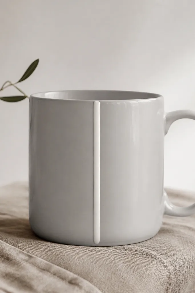
A thin vertical stripe makes a mug look tall and modern without taking over. When the stripe is a slightly different glaze sheen, it catches light in a way that feels handmade even if the shape is simple. I like porcelain white on gray because it looks like a highlight, not a loud color block. This design flatters long hands and slender wrists because it visually pulls attention upward. It’s also great for people who want minimalist but don’t like flat paint.
Pro tipMeasure the stripe width with a ruler — thin stripes make small mistakes obvious.
If you’re glazing from scratch, apply a clear base glaze to the mug first. Mask a narrow center line with glaze tape, about 6-8 mm wide. Paint the porcelain white glaze only in the masked line, then remove tape once the glaze is set enough not to run. Fire according to your kiln schedule. If you’re upcycling, use ceramic paint plus a textured medium to mimic the raised look, then cure.
AvoidDon’t glaze the stripe too thick; it can crawl during firing and widen.
14. Rope Texture Band Made from Fabric-Cord Impressions
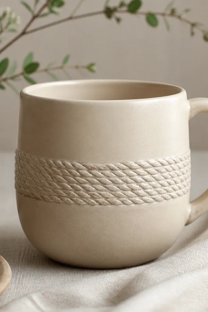
Texture bands are a minimalist cheat code because they add interest without adding color. Rope texture looks cozy and tactile, and it reads modern when the rest of the mug stays plain. I’ve made this with stoneware because the clay holds the rope ridges cleanly after firing. It’s flattering for anyone who likes “handmade” but not “busy,” and it feels great to grip. In photos, the rope texture creates shadows that make the mug look expensive.
Pro tipPress the cord once with consistent pressure — multiple presses can flatten the rope pattern.
Roll out a slab or build your mug and keep the surface leather-hard. Cut a strip of twisted fabric cord (or use a braided cotton cord) and press it lightly around the mug where you want the band, about 2.5-3 cm tall. Use a damp sponge to clean the edges so the band stays neat. Slip and smooth the ends so you don’t get frayed rope marks. After texture, dry fully before firing. Glaze over the band lightly if you want a softer look, or leave it semi-matte for more contrast.
AvoidDon’t press cord onto wet clay; it smears and turns into a messy groove.
15. Two-Tone Vertical Blocks in Mist Blue and Bone
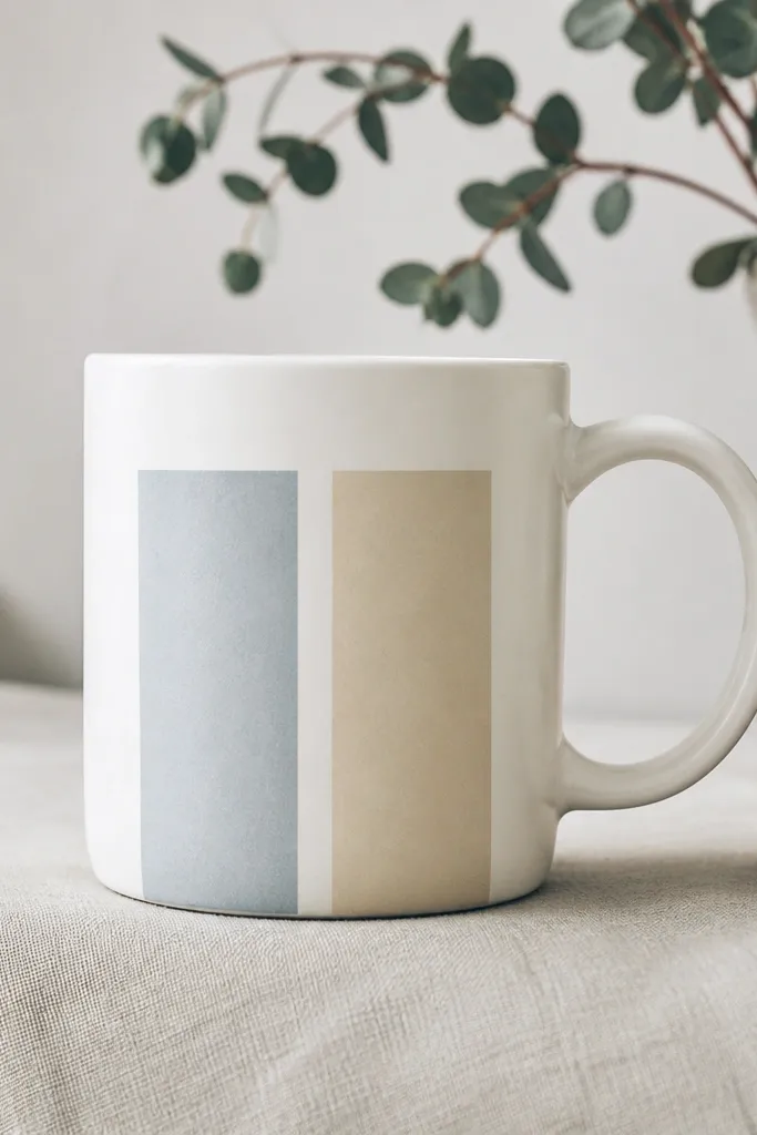
Two-tone blocks look crisp and modern when you keep the gap between colors intentional. Mist blue adds calm and feels fresh with morning light, while bone beige keeps it warm. This style reads clean because it’s basically negative space design. I like it for people who want color but hate patterns — it’s geometric and controlled. It also pairs well with light gray counters and white dish sets without clashing.
Pro tipUse a small angled brush for the tape edges, then fill the center with a foam brush for smooth coverage.
Mask two vertical rectangles with painter’s tape, leaving a 2-3 mm gap between them. Paint the bone beige first and let it dry, then paint the mist blue. Use thin coats and keep the edges sharp by pressing the tape down firmly around the curve. Remove tape when the paint is slightly tacky so the tape edge doesn’t leave a raised ridge. Cure/bake fully so the blocks survive washing.
AvoidDon’t paint over tape with a dripping brush; it creeps under and makes the blocks look fuzzy.
16. Minimal Spatter in Burnt Umber
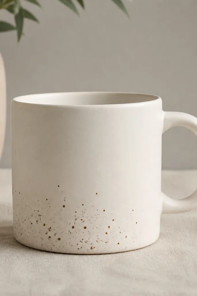
Spatter can look artsy, but sparse spatter reads minimalist. Burnt umber is earthy and forgiving, and it makes the mug feel handmade without needing a big graphic. I use this when I want a mug that looks good even if it gets a little lived-in — the tiny dots hide small wear and wipe marks. It also looks great in warm daylight because the specks catch micro-shadows. This design flatters people who like pottery aesthetics but want a cleaner, calmer version.
Pro tipTest your flick distance on a scrap tile; 10-15 cm usually gives tiny dots.
Dip a stiff toothbrush into diluted burnt umber ceramic paint. Hold the mug over a paper-lined tray and flick the brush lightly so you get small dots, not splatters. Keep the spatter band narrow — about 3-4 cm tall near the bottom, and stop around 1 cm above the base. Let it dry, then add a second light pass only if you want more density. Cure/bake fully as directed by the paint brand.
AvoidDon’t overdo it; heavy spatter looks like a mistake, not design.
17. Monochrome Stripe Decal + Matte Seal
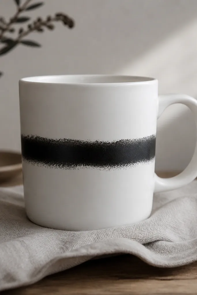
Using a stripe decal is how you get “modern minimalist” fast without losing the handmade feel. If you pair it with a matte finish, the stripe stops looking like a glossy sticker and starts looking like part of the mug. I like black stripes on white because they stay readable and don’t clash with coffee steam or kitchen lighting. This style suits anyone who wants clean lines and hates uneven brushwork. It also works well for matching sets — you can keep the same decal style across multiple mugs.
Choose a mug-safe stripe decal in black or charcoal. Clean the mug with alcohol, then wipe dry with a lint-free cloth. Apply the decal around the midline at a consistent height, smoothing from the center outward to remove bubbles. Let it set for the recommended time. If your system allows, apply a matte mug-safe seal coat after it’s dry, then cure/bake again if the instructions require it.
Use a ruler and a strip of removable tape as a guide so the stripe lands level on every mug.
Don’t skip the smoothing step; trapped air shows as tiny bubbles and looks cheap.
18. Ceramic Painting with Faux Enamel Edge
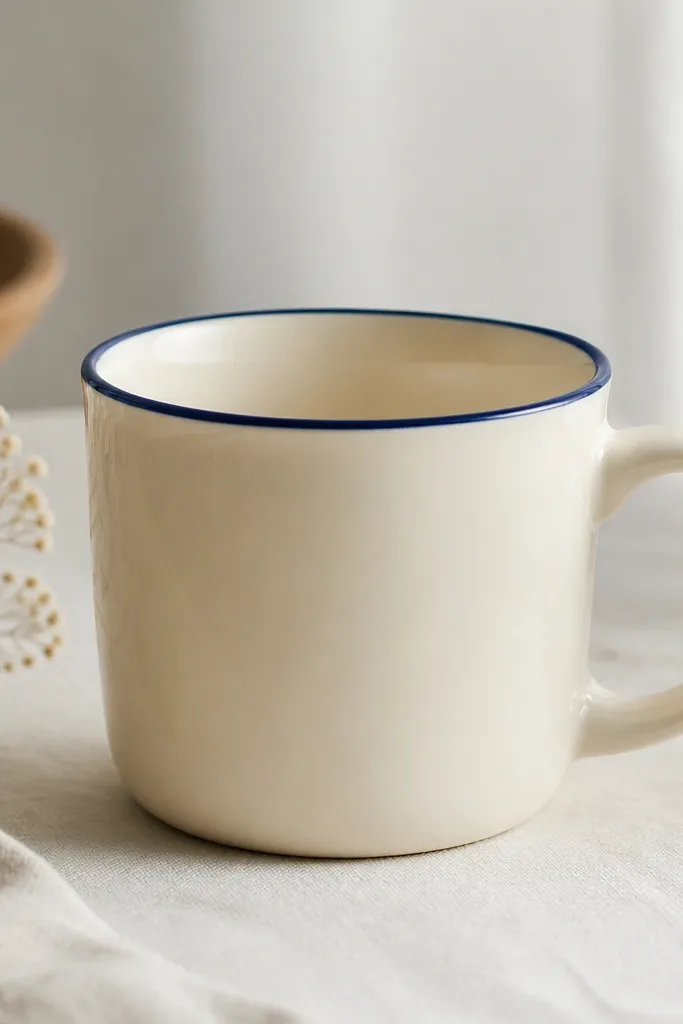
Faux enamel edges look like a store-bought pottery glaze because the line is opaque and smooth. Muted navy is calmer than bright cobalt, and it still reads modern. I like this design on mugs with a slightly rounded rim because the border catches light as a clean ring. It flatters people with warmer or neutral palettes because navy anchors the mug without feeling harsh. This is also a great style for beginners because the design is simple and controlled.
Pro tipIf your paint is too watery, it will run down the curve — thicken it with a compatible medium instead of adding water.
Mask the inside rim so you only paint the outside edge. Paint an opaque muted navy ceramic paint with a small fine brush, keeping the line thickness around 2-3 mm. Let it dry, then do a second coat only if the first looks translucent. Remove tape carefully after the second coat is touch-dry. Cure/bake fully, then wash after it cools to room temperature.
AvoidDon’t use thin craft paint; you’ll end up with a streaky line that shows the brush.
19. Tiny Raised Heart Stamp on the Side
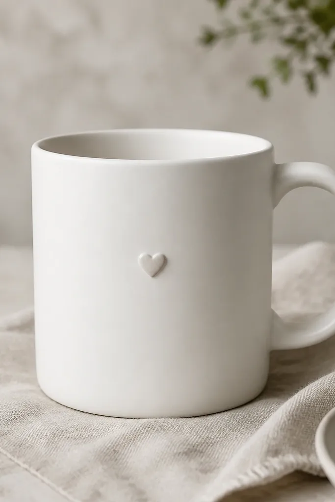
A tiny raised heart is sweet without turning into a cartoon. It’s minimalist because it’s one small element placed where your thumb naturally rests. I like it on matte glaze because the heart’s sheen difference creates contrast without loud color. This design works especially well for couples or anniversaries because the heart feels private, not loud. It also feels comfortable in-hand — you can feel the heart without it being sharp.
Pro tipPractice on a scrap mug handle or clay slab so you know how deep the stamp reads after firing.
Start with a dry, leather-hard mug surface. Use a small metal or rubber heart stamp, press gently once, and keep it centered at about halfway down the mug’s side. If the heart is too shallow, mix a bit of slip and dab it into the stamp impression before firing. Smooth the surrounding area so the heart edges are clean. Glaze the mug normally, then decide whether to leave the heart unglazed for a different texture contrast. Fire and cure based on your clay and glaze instructions.
AvoidDon’t press hard; deep stamps become sharp edges that feel awkward to hold.
20. Upcycled Map Coordinates on a Plain Mug
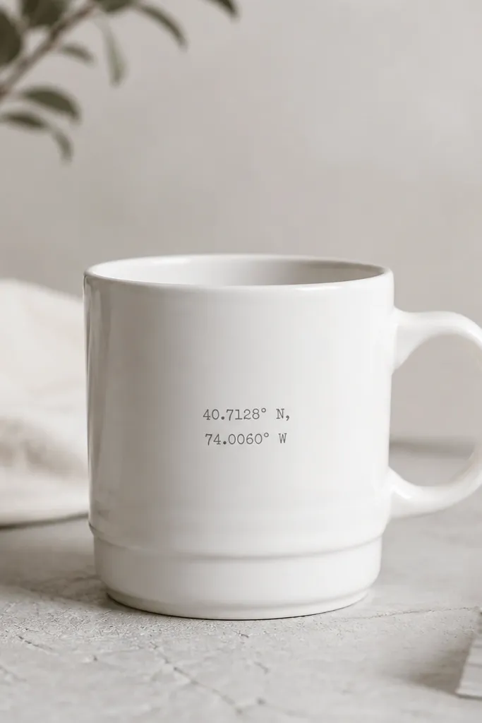
Coordinates are personal, but they can still be modern minimalist if you keep the typography small and the color muted. I’ve done this on blank thrift mugs because the mug shape is already simple, and the added text feels like a quiet detail. Muted gray keeps it calm and doesn’t compete with coffee steam. It also makes the mug look intentional even if you don’t add a second design element. This style is great for travel lovers who want meaning without cartoon landmarks.
Pro tipChoose one decimal place or one format and stick to it; mixed formatting looks messy on a minimalist mug.
Pick a mug that’s smooth and off-white so the text stays readable. Print coordinates in a typewriter-style font, then use a ceramic-safe transfer method or heat-set decal made for mugs. Position the text about 4 cm above the base so it sits in the “view” area when you hold the mug. Apply the transfer carefully, smoothing from center outward. Cure/bake if required, then seal only if the transfer system calls for it.
AvoidDon’t use regular inkjet paper transfers without mug-safe curing — the text smears after the first few washes.



