1. Sun-bleached stripes with wave corner
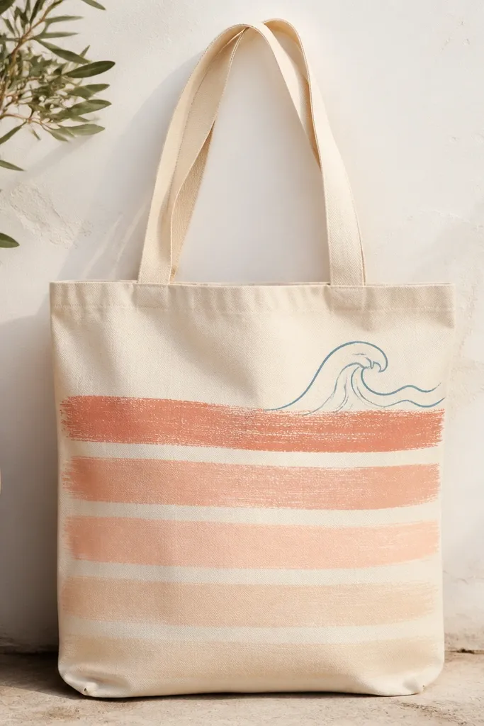
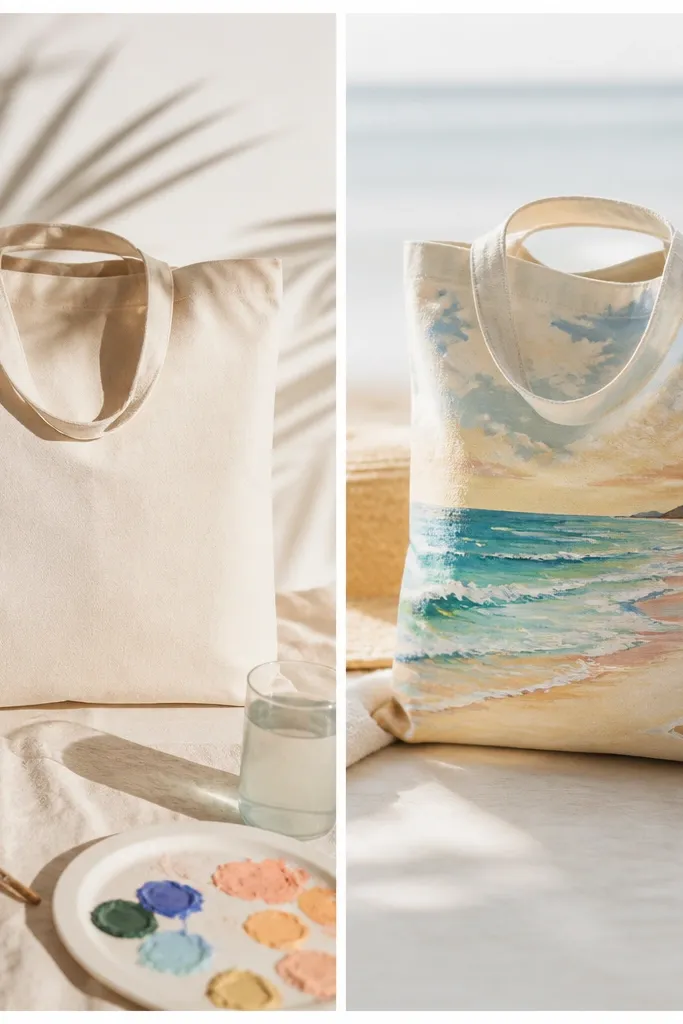
I painted this tote when I wanted “beach transformation” without doing tiny details that take forever. The stripe fade reads like sun-bleached fabric, and the wave corner anchors the whole bag so it doesn’t feel empty. I used coral, blush, and a pale peach so the tote works on both warm and cool skin tones — it looks good against my fair arms and also pops on deeper tones. The design flatters anyone because it draws the eye across the bag width, not down in a way that can make taller frames look narrower.
Start by marking six evenly spaced stripes across the front panel using a washable chalk pencil. Paint the stripes with a foam brush — keep each pass thin, then go back once after it dries so the fade looks smooth. For the wave corner, draw a simple S-curve in light blue, then dry-brush white along the crest. Let everything cure fully, then seal the tote with a fabric paint sealer on the front only.
Use a hairdryer between stripe layers so the fade stays soft instead of leaving hard bands.
Don’t paint thick stripe layers — they dry bumpy and crack when the bag folds.
2. Tropical parrot perched on a palm silhouette
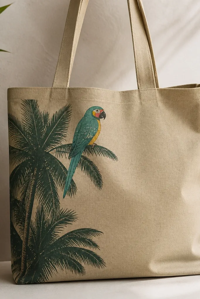
This one is my go-to when I’m bringing the tote to a dinner or a beach bar. The palm silhouette gives you one bold shape, and the parrot adds the color hit that makes the whole bag look like art. I chose teal, lemon yellow, and a small red cheek because those colors look punchy without turning muddy on canvas. It flatters most body types because it’s vertical enough to feel styled, but the palm silhouette keeps it balanced on the side of the bag.
Begin by painting the palm silhouette first using a flat brush and deep green mixed with a touch of black for depth. Then lightly sketch the parrot in pencil — head over the top edge of the palm, body angled slightly toward the center. Fill the parrot’s body with teal, belly with lemon yellow, and add red only on the cheek patch and a tiny wing accent. Finish with white speckles on the feathers and seal after full dry.
If you’re worried about drawing, trace a simple parrot photo onto transfer paper, then sketch the outline only.
Avoid using pure black for the palm tips — it looks harsh and makes the parrot look pasted on.
3. Sea glass gradient with bubble dots
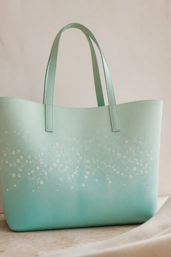
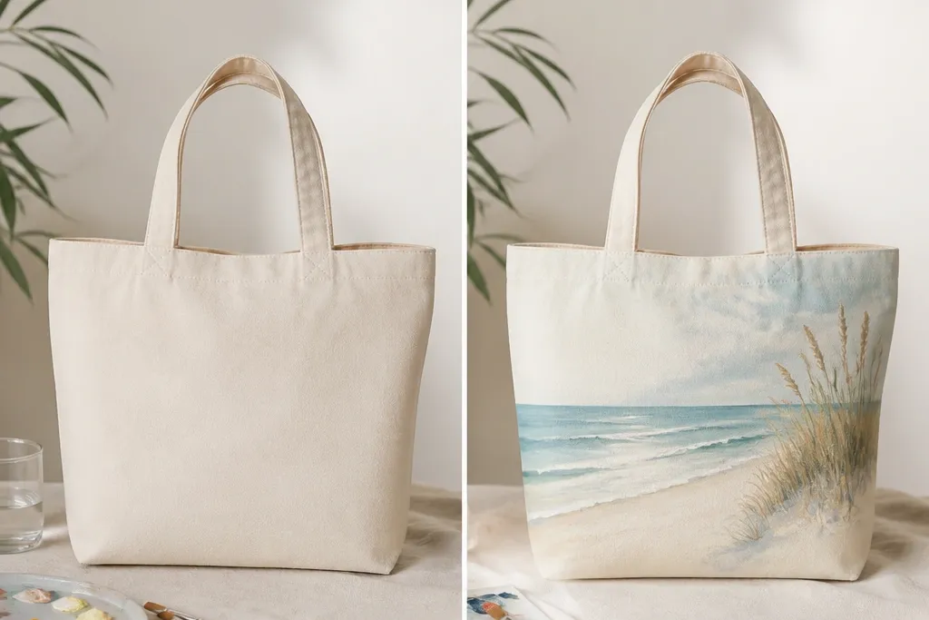
This design looks like the tote was found in a beach house — calm, glossy, and quietly pretty. The sea glass gradient hides small brush mistakes because the color blends visually, and the bubble dots add movement. I like this for people who want beach vibes without loud imagery; it flatters cooler undertones and also looks great with warm outfits because the white bubbles brighten everything. The gradient placement also makes the bag feel longer, which is nice for shorter frames since it pulls the eye upward.
Paint the bottom third in aqua, then blend upward into seafoam using a damp foam brush. Work in small sections and overlap slightly so you don’t get a hard line. Add bubble dots with a fine brush or paint marker in white — vary dot sizes from pinhead to pea size. Let it dry, then seal with a flexible fabric medium so the bubbles don’t smear when the bag rubs against clothing.
Pro tipSpritz a tiny amount of water on your foam brush before blending for a smoother gradient.
AvoidDon’t skip sealing — unsealed dots can turn matte and dull after a few washes.
4. Nautical rope frame around a compass
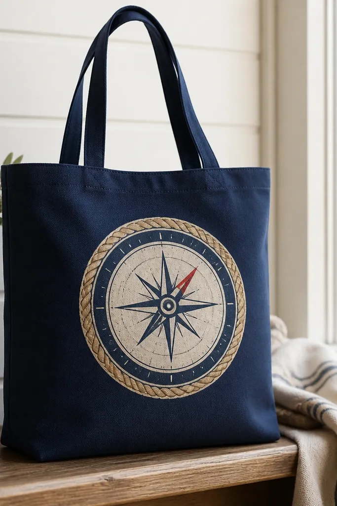
Dark tote + light rope is the quickest way to make your work look “designed,” not DIY. The rope frame gives structure, so the compass doesn’t float in the middle. I used navy because it makes the cream dial look crisp, and the red needle adds just enough warmth to keep it from feeling cold. This style flatters almost everyone because the frame pulls attention to the center and keeps the bag from looking too busy.
Tape off a rectangle in the center front so you have a clean area for the compass. Paint a rope border around the taped edges using a thin round brush and tan paint, dragging slightly to mimic rope strands. Inside the frame, paint the compass ring in blue, then the dial in cream. Add the needle in red and outline the compass with a darker blue for definition.
Keep your rope lines slightly imperfect — perfect rope looks like a graphic sticker instead of paint.
Don’t over-thicken the rope border; thick paint makes the edges crack when folded.
5. Wave wash background with white sailboat silhouette
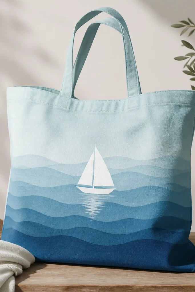
This one is for days when you want beach transformation that looks airy instead of loud. The wave wash is your texture, and the white sailboat silhouette stays readable from across a parking lot. I painted the sailboat pure white and kept the waves darker so contrast stays strong. This design flatters people with small or medium bust proportions because it centers the visual weight on the bag front instead of making the whole outfit look bottom-heavy.
Paint a full background wash in light aqua first, then add three wave bands using a medium blue — each band should fade as it goes upward. Use a sponge or foam brush to stamp the wave edges so they look soft. Place the sailboat in the middle, with the mast slightly off-center for a natural look. Add a thin gray shadow under the boat so it sits on the waves, then seal the whole front.
Pro tipDry-brush a little extra white on the wave crests after the base dries for extra realism.
AvoidDon’t outline the sailboat with black — it looks like a kids' craft and kills the airy vibe.
6. Starfish and shells in sand-tone clusters
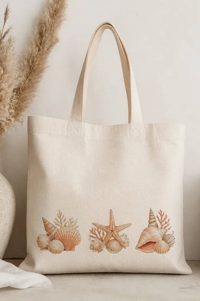
I like this design for casual errands because it looks like you’re carrying beach finds, not a big illustration. Painting shells and a starfish in sand tones keeps it warm and wearable, especially if your closet already has neutrals. The clusters near the bottom front help the design look grounded and it doesn’t compete with your outfit. It flatters most skin tones because it uses cream and beige that match natural hair and clothing neutrals without looking washed out.
Sketch three clusters with pencil — leave breathing space between them. Paint the largest shell first in a base beige, then add thin lines with a slightly darker tan. Add the starfish using peach with tiny dots in cream for texture. Finish with small shell edges and a few muted coral accents, then seal to protect the fine lines.
Use a liner brush for shell ridges and keep each line short so it looks like texture, not stripes.
Avoid placing clusters too high — when the bag hangs, top-heavy art disappears into your body.
7. Beach skyline at dusk with gradient horizon
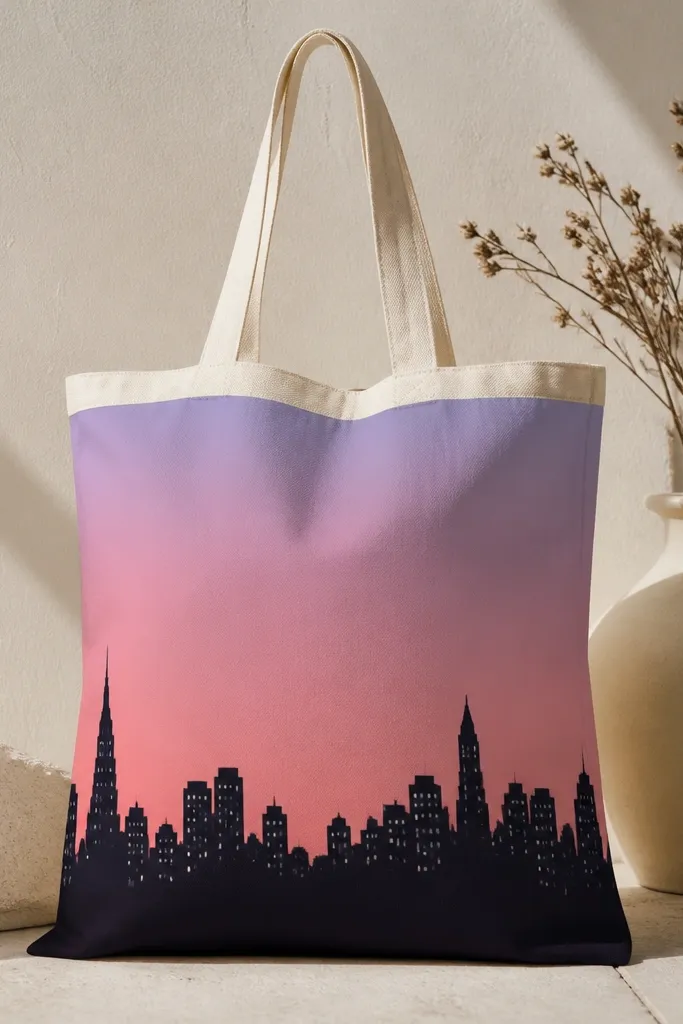
This is the tote I bring when I want the bag to look moody and photogenic. The gradient horizon does the heavy lifting, and the skyline silhouette keeps it from looking like a generic sunset print. I used dusty pink and lavender because they look good against cream and they don’t fight with warm or cool outfits. The skyline is also flattering because it gives a natural “horizon line” that visually aligns with your torso.
Paint the entire sky area with a gradient: pink at the top, lavender toward the middle, then a thin muted purple band near the horizon. Use a sponge to blend the colors so you don’t get streaks. Once dry, paint a skyline silhouette in deep charcoal along the bottom third. Add small white window dots randomly on two or three buildings, then seal.
Pro tipMask the skyline edge with painter’s tape for a crisp horizon if you want a cleaner look.
AvoidDon’t use bright neon pink — it looks out of place against the muted dusk palette.
8. Lemon and mint watercolor border
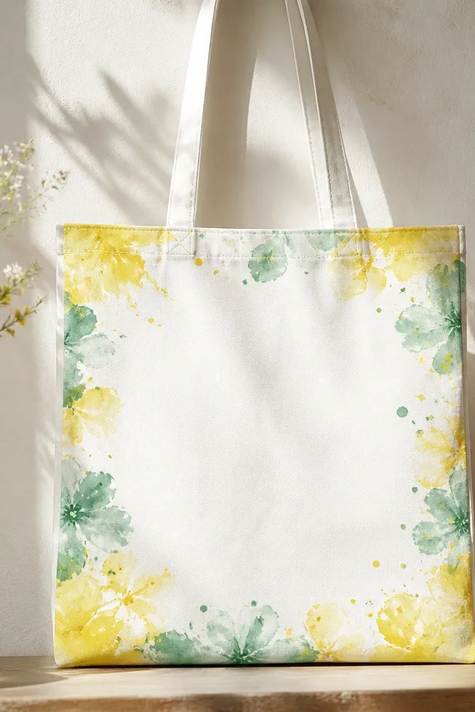
This design makes the tote feel like a gift wrap, but it still reads as beach transformation because of the color choices. The blank center is key — it keeps the border from looking busy and lets your outfit be the main event. Lemon and mint look great on both light and dark skin because the high contrast between yellow and green is easy on the eye. I also like it for people who don’t want figurative art; it’s decorative without being a full picture.
Leave a 2-inch blank center by tracing a rectangle with chalk. Paint a loose border with watered-down fabric acrylic: lemon yellow on the top and right edges, mint blooms on the left and bottom. Add tiny splatter dots with a toothbrush — tap lightly so the specks are small. Let it dry, then seal the border area carefully so the watercolor doesn’t lift.
Pro tipUse thinner paint for the border so it looks like watercolor instead of marker lines.
AvoidAvoid filling the center — it makes the tote look like a craft sheet when you carry it.
9. Monogram anchor with coral highlights
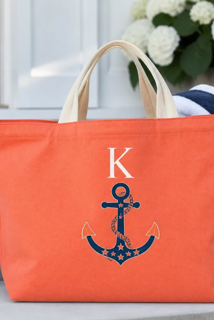
Monograms are personal, and they make the tote look like you bought it from a boutique. I painted this one for myself and it gets grabbed constantly because it matches my summer outfits without needing extra accessories. The navy anchor gives structure, and coral highlights make it feel beachy instead of strictly nautical. This flatters most people because it’s centered and clean — no visual clutter around the sides.
Paint the anchor first in navy using a stencil if you need it, then add coral highlights on the rope and anchor arms. Place a single monogram letter above the anchor in white — keep it one size so the layout stays balanced. Add 3-5 small white star dots around the anchor for movement. Let everything cure, then seal to keep the highlights from cracking.
If your tote is already bright coral, use a navy base coat in a thin layer first so the anchor has a smooth surface.
Don’t use metallic paint for the monogram — it flakes when the bag flexes.
10. Seashell mandala in one color family
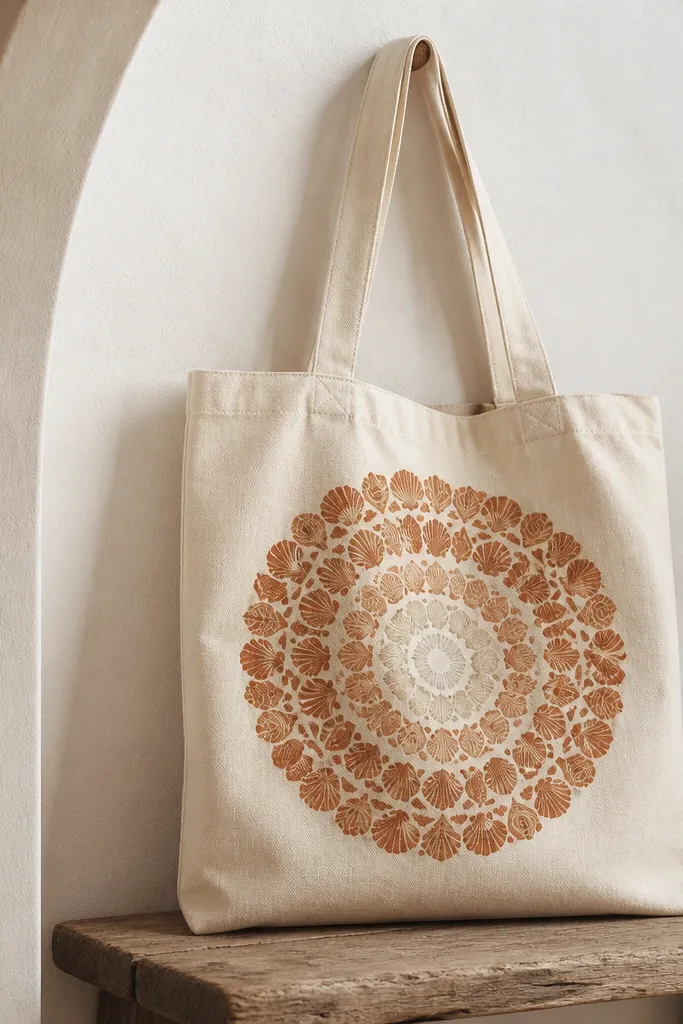
This one looks detailed, but it’s actually simple because you repeat one shell pattern. Using a single color family keeps it cohesive and stops the tote from looking like a patchwork. I used terracotta and warm tan because they look like beach sand after sunset, and cream in the center brightens everything. It flatters anyone because the mandala pulls attention to the middle and creates a tidy focal point.
Draw a circle guide in the center lightly with chalk. Paint the outer ring with shell shapes in terracotta, then fill inward with warm tan shell shapes. Add a cream center dot and a few tiny shell ridges in darker terracotta for depth. Seal after the final layer dries fully, and avoid overworking the pattern once it starts to look muddy.
Pro tipUse a paint marker to add the tiny ridges after the main shells dry; it stays crisp.
AvoidAvoid mixing too many colors — the mandala loses its calm look.
11. Color-blocked tide pools with tiny fish
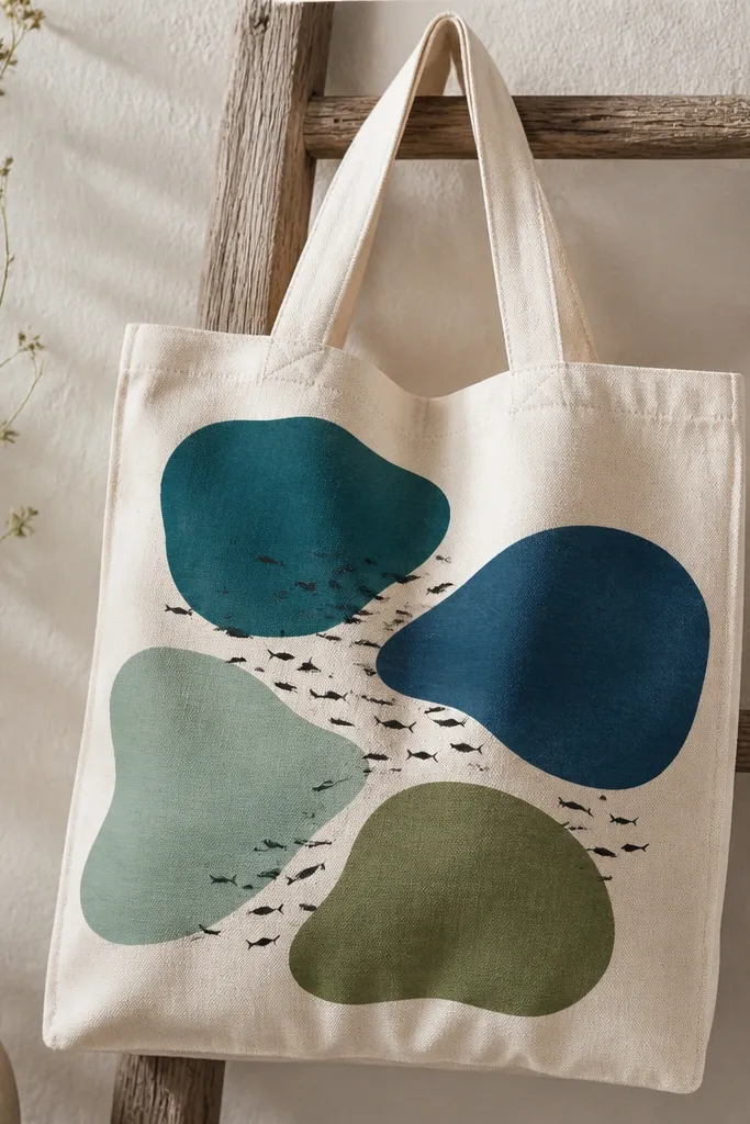
This is beach transformation for people who like graphic design. The tide pool shapes create structure, and the tiny fish give it life without turning into a full scene. I kept the fish in near-black so they read clearly on all the water colors. It flatters different body types because the irregular blocks spread out across the bag front instead of stacking everything in one spot.
Sketch four irregular pool shapes on the tote front using chalk — leave small gaps between them. Paint each pool with a foam brush so the edges look slightly soft. Add the fish silhouettes with a fine brush in dark paint and vary sizes so it feels natural. After everything dries, outline a few pool edges lightly in a darker shade to make the pools pop.
Pro tipLet one pool color bleed a hair into the gap — that small imperfection makes it look hand-painted, not sticker-like.
AvoidDon’t outline every pool edge heavily; it makes the bag look like a coloring page.
12. Palm frond stencil with crisp negative space
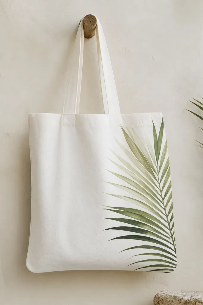
Negative space is the difference between “cute craft” and “I want that.” This tote uses a stencil for the palm frond so the leaves look crisp, and the blank white center keeps it modern. I used two greens — light leaf green and darker forest green — so the fronds have depth. This looks great on everyone because the design is clean and doesn’t fight with patterns in your outfit. If you’re carrying the bag on your shoulder, the frond placement stays visible.
Tape a stencil to the tote front where you want the frond, making sure the top edge sits above where your hand usually grabs the bag. Dab paint with a stencil brush — don’t drag, or it will seep under the edges. Add a second pass in darker green only on the inner leaf veins and a few tips. Peel the stencil straight up, then seal once fully dry.
Pro tipWarm the stencil slightly under a lamp for 30 seconds so it sticks better and edges stay sharp.
AvoidDon’t use too much paint on the stencil brush — it bleeds and ruins the crisp look.
13. White dot terrazzo with ocean-blue specks
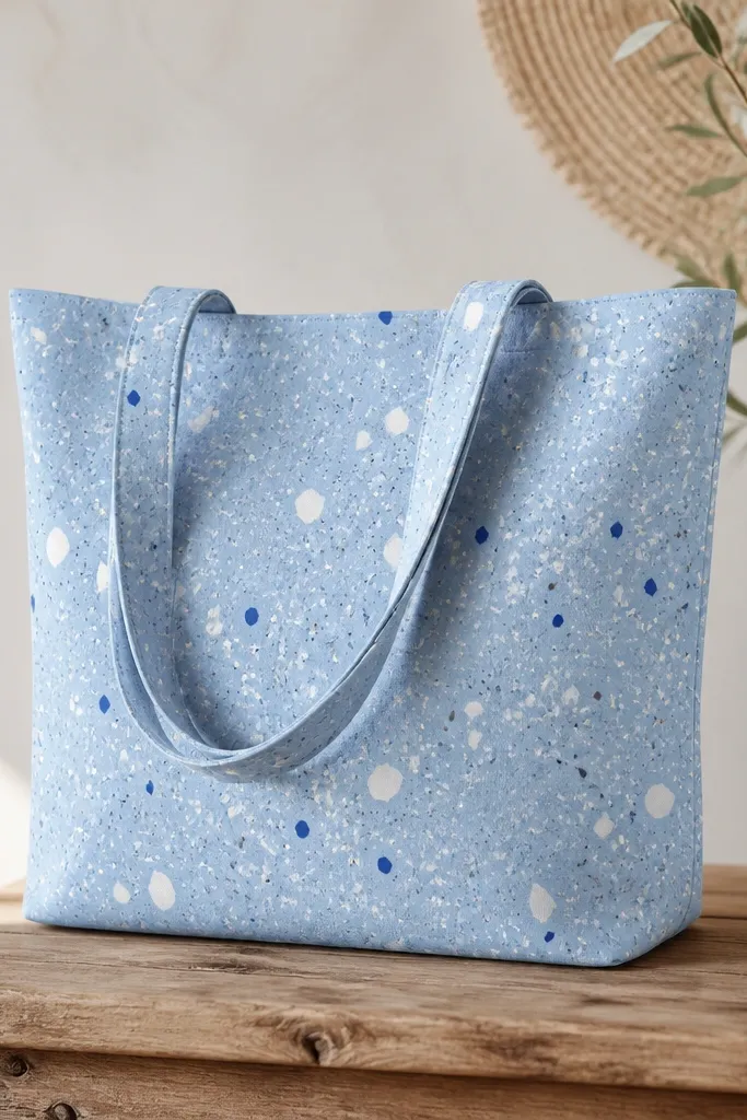
Terrazzo dots are the easiest way I’ve found to make a tote look like beach transformation without painting a picture. The pattern hides minor mistakes because the eye reads it as texture. I used a light blue base so the tote feels coastal even when you’re wearing neutrals. This style flatters everyone because it’s all-over and doesn’t demand a perfect placement. It also looks good on camera because the dot texture catches light.
Paint a solid base in light ocean blue using a foam brush and let it dry completely. Then use a toothbrush and white paint to flick tiny dots — practice on paper first so dot size matches what you want. Add a few larger white “chips” using a sponge corner with a light dab. Finish with a handful of gray specks and a few ocean-blue specks for depth, then seal.
Pro tipKeep your toothbrush dry and your paint thick — thin paint makes big splats.
AvoidAvoid painting dots over wet base — it smears and looks like smudges.
14. Beach bag "found object" labels with doodled stamps
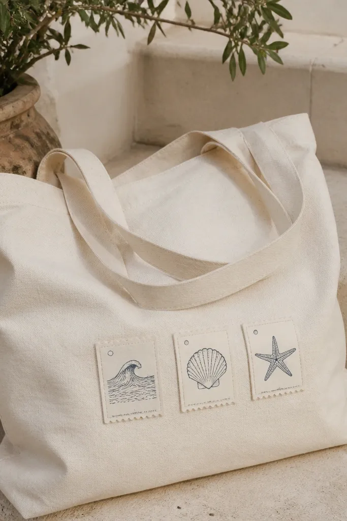
This design makes your tote look like it came from a beach museum gift shop. The trick is keeping the labels small and using stamp-style icons so it feels like a set. I used muted creams and soft sand tones so the tote stays wearable, then added dark navy for the stamp outlines. It flatters most people because the labels are clustered and don’t overpower your outfit. It’s also great if you don’t want to commit to a big graphic.
Paint three small rectangles on the front — I place two across the upper half and one lower right. Fill them with muted cream and let dry. Draw stamp icons inside each rectangle using navy paint: wave lines for the first, shell ridges for the second, starfish for the third. Add tiny faux “dates” in small numbers around the icons, then outline the rectangles with a thin navy line.
Pro tipUse a reference photo of old postage stamps for the rough proportions of the icons.
AvoidDon’t use bright neon for the label fills — it makes the “found” look disappear.
15. Sun and moon split design with ocean line
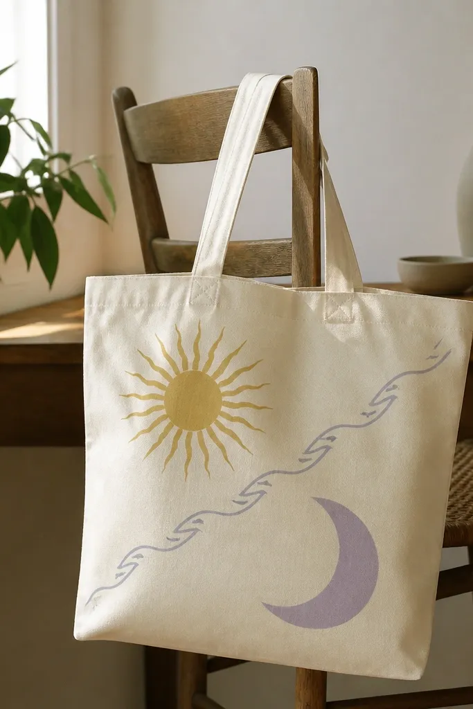
This is a fun beach transformation that still feels balanced and grown-up. The sun and moon split keeps the tote graphic, and the thin ocean line ties both halves to the beach. I used yellow with a soft orange tint for the sun and lavender with a hint of gray for the moon. It flatters because the diagonal split draws the eye upward and doesn’t bunch color in one area. It also works on different outfit colors because cream acts as a neutral base.
Sketch a diagonal line across the front and decide which side gets the sun. Paint the sun on one side with yellow and add short rays with a smaller brush; keep rays uneven for natural charm. Paint the moon on the other side in lavender and add a darker crescent shadow. Draw a thin wave line along the diagonal separation — use light blue and add tiny white highlights, then seal.
Let the diagonal line dry before you paint the sun or moon so colors don’t bleed across the split.
Avoid thick outlines around both shapes — it makes the design look like a sticker.
16. Monochrome ocean waves with one coral accent
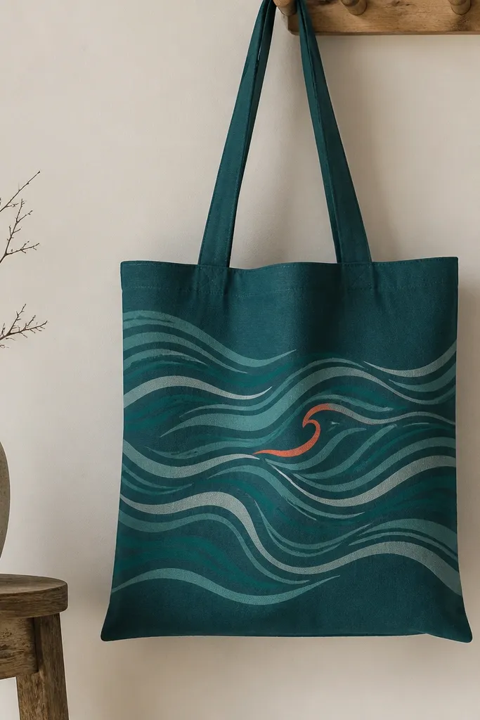
If you want beach transformation that looks grown-up, this is it. Monochrome waves let your tote look calm and classy, and that one coral accent makes it feel like summer without shouting. I painted the waves with layered strokes in light teal, then added a few gray breaks so the water feels dimensional. This flatters people who like minimal designs because it doesn’t fight with patterns in your clothes. It also looks good in photos because the wave lines create texture.
Paint a deep teal base or start with a teal tote. Use a liner brush to paint five to seven wave lines horizontally across the middle — keep spacing uneven. Add breaks in the lines with a dry-brush technique so some parts look lighter and airy. Mix a small amount of coral paint and paint one crest thicker than the others, then add a tiny white dot highlight at the tip. Seal after the full dry time.
Pro tipUse a damp paper towel to wipe your brush before each new wave line for smoother fade.
AvoidDon’t paint every wave crest the same thickness — it makes the pattern look flat.
17. Beach flower garland with trailing vines
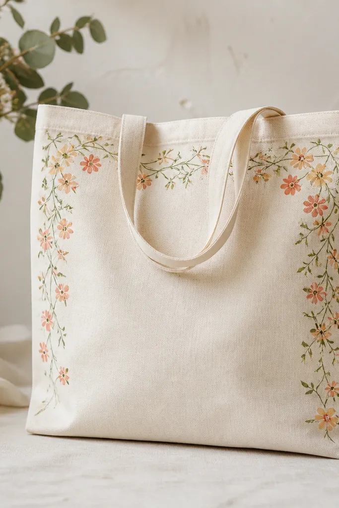
This tote is for the “I want it to look like summer, but still delicate” crowd. The garland placement along the top and sides makes the bag feel framed, and the trailing vines add motion. I painted tiny flowers in coral and peach with pale yellow centers so it looks sunlit instead of flat. It flatters because it creates a gentle outline around your torso area when the bag hangs from your shoulder. If you like feminine details without big pictures, this one hits the sweet spot.
Sketch a light vine line along the top edge of the tote front, then let it trail down the right side about 4-5 inches. Paint the vine in medium green and add smaller leaves with a light green highlight. For flowers, paint five petals in coral or peach, then add a yellow center dot. Add a few tiny white specks in the petals for a “glossy” look. Seal the whole front after it dries.
Pro tipUse a size 2 round brush for petals so they stay rounded, not blobby.
AvoidAvoid overloading flowers with too many layers — thick petals crack when the bag bends.
18. Shell outline line art with watercolor wash fill
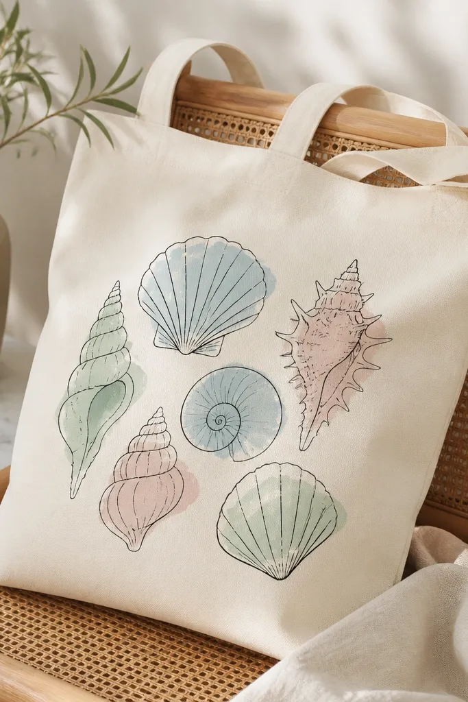
This design looks custom because it mixes crisp line art with soft wash color. The black outlines make the shells readable, and the translucent fills make the tote feel airy, like actual shells in daylight. I used black-brown instead of harsh black for the outlines so it looks warmer and less stark. It flatters because the shells stay centered and organized, which looks good on smaller frames and also on larger bags where you want a clear focal point.
Draw three shells in the center front with a pencil guide, then outline with black-brown fabric marker or thin brush. Mix your wash colors by thinning fabric acrylic with a fabric medium so they look like watercolor. Fill each shell with pale blue, seafoam, and blush — keep the wash edges soft by not overworking. Let it dry between shells, then go back with a tiny white highlight line on one ridge per shell. Seal once fully cured.
Pro tipThin your paint enough that the canvas texture shows through a bit — that’s the “watercolor” look.
AvoidDon’t flood the outlines with thick paint; it blurs the edges and kills the line-art effect.
19. Coastal map grid with compass rose corners
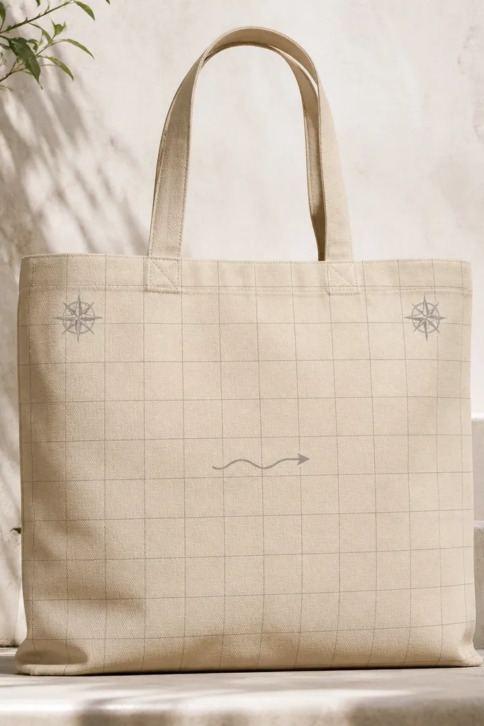
This is the one I painted when I wanted beach transformation that feels like a real artifact. The faint grid gives it structure, and the compass rose corners keep it nautical without covering the whole bag. I used gray lines and a cream base so it looks subtle and not like a poster. This flatters because the design is light and leaves room for your outfit — it works even with busy prints. It also makes the tote feel special because you notice it more as you walk past.
Use a ruler to draw a light gray grid across the front panel, keeping lines about 1 inch apart. Leave a clear band in the center for a simple wave arrow. Paint a small compass rose in each top corner using a fine brush and a darker gray — add tiny tick marks for the detail. Draw a wave arrow pointing toward the center using light blue, then add one coral dot at the arrow tip. Seal the lines carefully so they don’t smear.
Pro tipMist the painted surface lightly with water before grid lines if you want the gray to look faded like old maps.
AvoidAvoid dark grid lines — they make the tote look like graph paper.
20. Saltwater Ombre with Hand-Painted Zipper Pouch Pocket
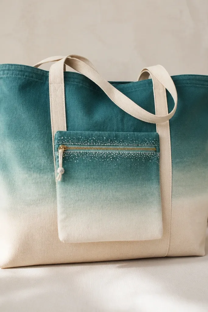
This design turns the tote into a beach tool, not just a pretty bag. I painted the ombre first, then added a zipper pouch pocket that matches the fade so it looks intentional from across the sand. The salt speckles make it feel like actual water residue, and they hide small paint imperfections better than solid color. A zipper pocket also keeps sunscreen, lip balm, and charging cables from sliding around. I use this tote for day trips because the pocket stays flat and the gradient makes it easy to find things by color contrast.
Cut a zipper pouch pocket from medium-weight canvas or duck cloth, about 7 inches wide and 5 inches tall. Sew it onto the tote front with a straight stitch along the top edge, then install a 6-inch zipper so the teeth sit about 1/4 inch below the top seam. Paint the tote with watered acrylic or fabric paint in horizontal bands, blending with a damp sponge from top to bottom — deep teal at the handle line, then sea green, then seafoam, ending near the bottom hem. Before the paint dries fully, dab a toothbrush with white paint and flick tiny speckles around the zipper area to mimic salt residue, then seal the whole front with fabric medium or a heat-set method your paint brand allows.
Use a damp sponge for blending — if the sponge is wet enough to drip, the ombre will streak instead of fade. Let the ombre dry completely before you stitch or you will trap moisture under the pocket seam.
Skip painting the pocket and tote separately — matching the ombre direction matters, so paint them together in one session.