1. Stem-Halo Minimalist White Pumpkin
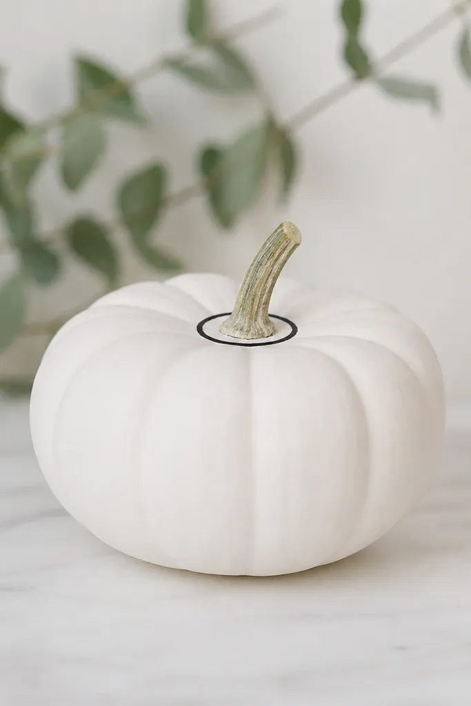
This one looks expensive because it uses restraint. The base is flat white, then you add a single thin black circle right where the stem meets the pumpkin body. Black lines make white feel crisp, and the halo placement pulls the eye upward, which looks flattering on smaller pumpkins and on porches with tall decor. I’ve used this style with both warm and cool lighting; the black ring stays readable either way.
Start by spraying the mini pumpkin with flat white and letting it dry 30-45 minutes. Use a fine liner brush or a 00 brush with black acrylic to paint a ring about 1/4 inch wide around the stem base, keeping the circle slightly imperfect for a hand-done look. Then add two tiny dots on the ring — 1 at 10 o’clock and 1 at 2 o’clock — to give it a finished feel. Finally, let the details dry fully and spray a matte clear coat from 10-12 inches away.
If your ring looks wobbly, place a piece of painter’s tape as a guide for one pass, then remove it before the paint dries.
Don’t thicken the ring — a fat outline turns it into a cartoon instead of a classy accent.
2. Faux Porcelain Speckle (Off-White) Pumpkin
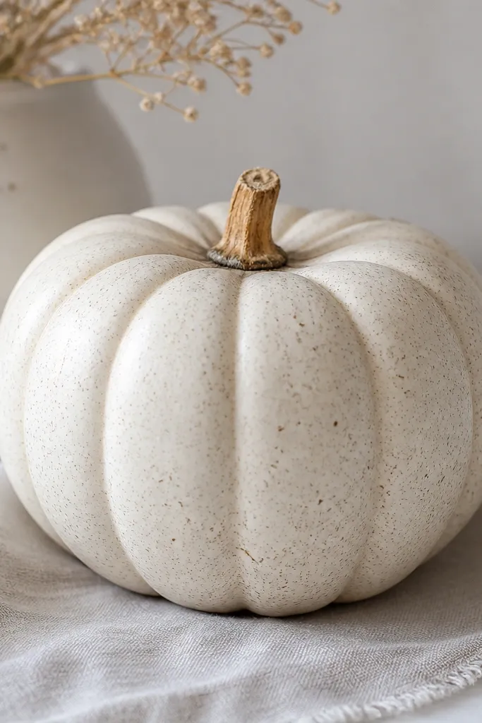
Speckle is the cheat code for texture without heavy brushwork. After the pumpkin is painted off-white, you add micro dots in warm gray and beige so it looks like it’s naturally mottled. This style works great if your porch decor is neutral - cream cushions, tan baskets, or white lanterns — because it doesn’t compete with anything. It also photographs well because the dots catch light instead of creating harsh glare.
Start with flat white spray, then wait until it’s fully dry. Mix a tiny amount of beige acrylic into off-white, and lightly dry-brush the surface so it’s not perfectly uniform. Dip the tip of a small stiff brush into warm gray acrylic, then tap the brush over a scrap paper until you get fine specks, not blobs. Then repeat with beige specks at lower density, focusing on the lower half of the pumpkin belly.
Wear a glove and keep the speckle layer thin; you can always add a few more dots, but you can’t undo big ones.
Don’t use pure black dots — warm gray looks more like porcelain and less like marker.
3. Black Script "Cozy" Pumpkin (Single Word)

This is the easiest way to make your white pumpkin feel personal without turning it into a sign. A single black word reads stylish because it creates a focal point, while the rest stays clean white. I like “cozy,” “hello,” or “gather” because they fit the season without getting cheesy. This works especially well on tiny pumpkins because the lettering scale stays bold and legible.
Paint the pumpkin with flat white spray and let it cure at least an hour. Lightly sketch the word placement with a pencil so the letters sit centered on the belly curve. Use black acrylic with a fine liner brush for downstrokes and a slightly wider brush for thicker parts of the letters. Finish with a short underline or a single flourish near the end of the word, then seal with matte clear coat.
If your handwriting is shaky, practice the word on paper first and match the height to the pumpkin belly by holding the brush at the final distance.
Don’t add multiple words; three lines of text makes mini pumpkins look crowded.
4. Gold Line Art Pumpkin (One Continuous Stripe)
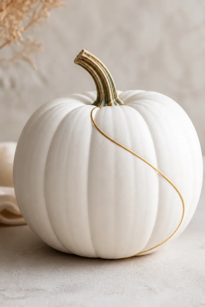
Gold line art is what makes white pumpkins look like decor from a boutique store. The trick is using one continuous stripe so it feels intentional and airy. I like metallic gold acrylic or metallic gold paint marker because it lays down smoothly and dries with a subtle sheen that reads fancy under porch lights. This style flatters most pumpkin shapes because the diagonal line elongates the body.
Start with a flat white base and let it dry completely. Use a gold paint marker or a small angled brush with metallic gold acrylic to draw a diagonal path across the pumpkin — begin near the stem, then curve gently over the belly. Keep the line thickness consistent, about the width of a toothpick. Let it dry 20-30 minutes, then add two tiny gold dots at the ends of the stripe for balance. Seal with matte clear coat, but keep it light so the gold stays slightly luminous.
If your gold line looks patchy, do two thin passes instead of one heavy pass.
Don’t cover the whole pumpkin in gold — it turns into a costume look fast.
5. Minimal Wreath Circle on the Belly
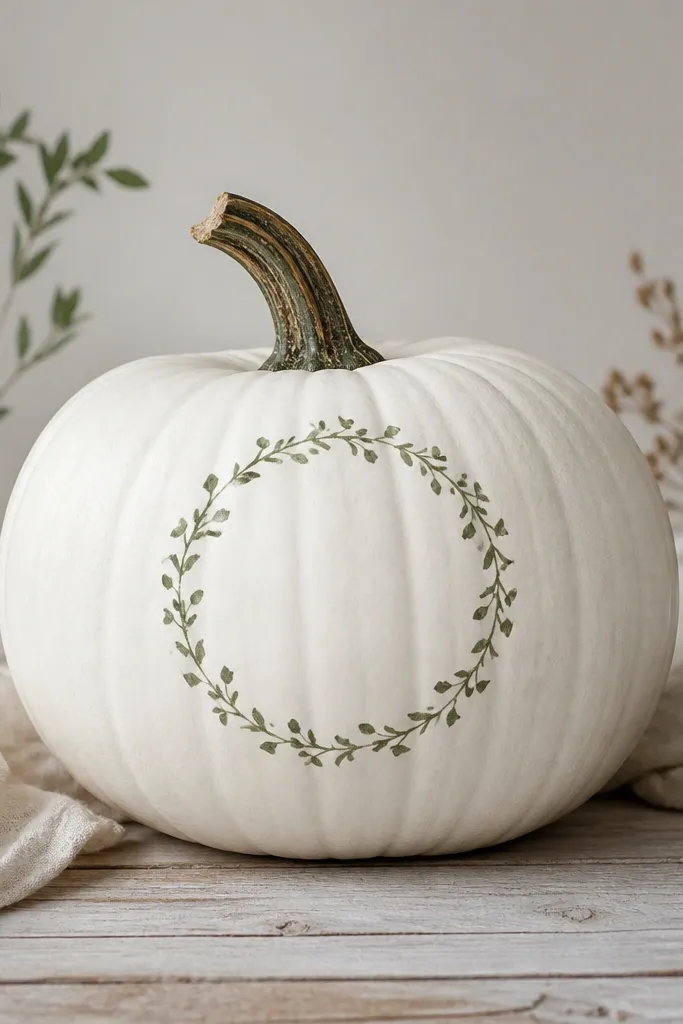
A belly wreath makes the pumpkin look like a tiny centerpiece without adding bulk. The green stays gentle against white, and the circle shape matches the pumpkin’s natural roundness. I use a muted sage green so it doesn’t fight with fall oranges in the rest of your porch setup. This is also a great option if you want something that looks good from across the yard — the circle is easy to read at a distance.
Spray the pumpkin with flat white and dry it well. Mix sage green acrylic (a little green plus a touch of beige) and paint a thin circle about 2 inches wide centered on the belly. Then add small leaf marks around the circle using a tiny flat brush, alternating leaf direction so it looks like a wreath. Finish by adding 3 tiny berries dots in muted cranberry-red or keep it all sage if you want calmer tones. Seal with matte clear coat once everything is dry.
Pro tipPaint the circle first, then fill the leaves outward so the spacing stays even.
AvoidDon’t use neon green — it looks cheap against white and clashes with most porch palettes.
6. Soft Marble Veins (Gray on White)
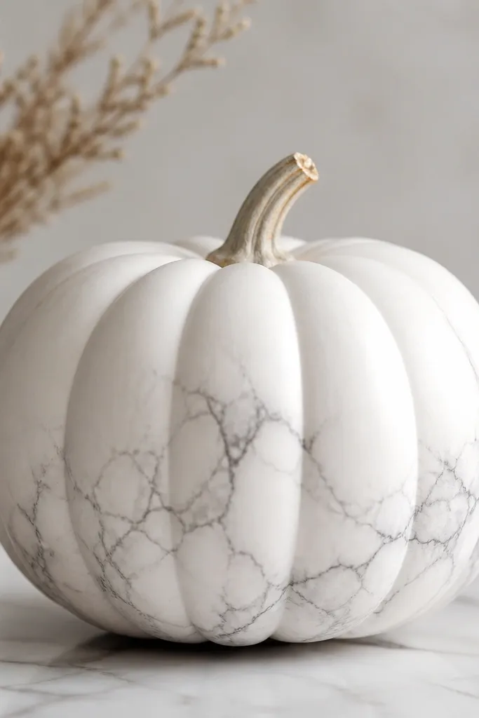
Marble veins turn a plain white pumpkin into something that looks like ceramic. The key is keeping the gray light and letting the white base show through so it doesn’t look like dirty paint. This style looks great if your decor has black-and-white accents, or if you’re mixing white pumpkins with gray planters and metal lanterns. It also hides small imperfections because the veining draws attention away from tiny dents.
Start with flat white spray as your base. Using a liner brush, paint thin gray lines with a mix of light gray acrylic and a touch of white so it stays soft. Drag the tip of the brush lightly to create broken veins — marble isn’t smooth, so avoid perfect straight lines. Add a few thicker lines, but keep most veins hair-thin. Let it dry, then seal with matte clear coat to protect the surface.
Pro tipPractice on paper first and aim for “whisper lines,” not bold strokes.
AvoidDon’t make the gray too dark — dark veins look like cracks, not marble.
7. One-Color Buffalo Check Accent
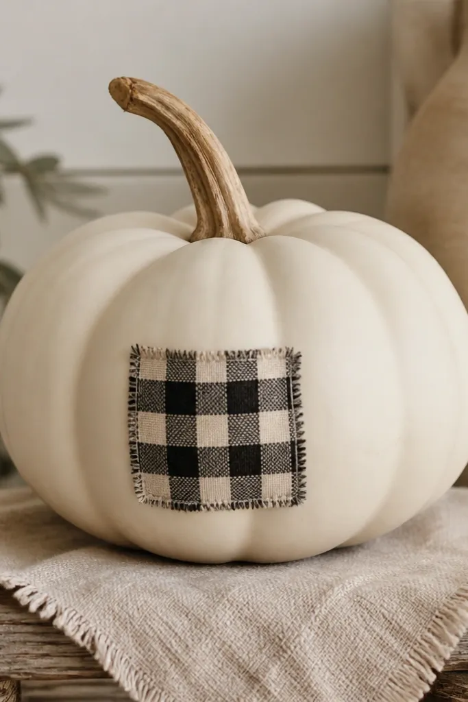
Buffalo check feels cozy, but using it as a small accent keeps the look clean. I paint check lines in muted black or dark charcoal on top of the white base, then I keep the check area to about a third of the pumpkin. This works when you want fall vibes without turning every pumpkin into the same pumpkin-shaped cliché. The check pattern also makes the pumpkin look more “styled” even if the rest of your porch is simple.
Spray the pumpkin flat white and let it dry. Mark a rectangle on the belly (about 2 inches tall) with light pencil lines. Paint horizontal and vertical grid lines in charcoal acrylic, then fill alternating squares by leaving the white as the lighter squares. Use a ruler or the edge of a small craft stick for straight lines, and let each pass dry before adding the next so colors don’t smear. Seal with matte clear coat.
If you want it softer, use gray instead of black for the grid lines.
Don’t paint the check edge-to-edge — small accents look intentional; full coverage looks busy.
8. Tiny Crochet-Pattern Dots (Matte Texture)
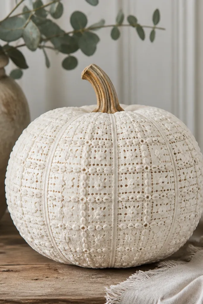
This one tricks your brain into thinking the pumpkin has fabric texture. Instead of painting big shapes, you build a tiny dot-and-stitch pattern with dimensional paint or by layering small dots. It looks adorable on a shelf or grouped in a basket because you can see the texture up close. I use this style when the rest of my decor is plain — it adds interest without adding color.
Base coat with flat white spray, then wait until it’s fully dry. Use dimensional fabric paint in white (or slightly off-white) and outline a light grid on the belly with a pencil. Add small raised dots along the grid intersections, then connect groups with tiny short lines to mimic crochet stitches. Let it dry overnight so the texture sets hard. For protection, I skip heavy clear coat because it can flatten the raised dots; instead, I handle gently and keep it indoors if possible.
Dimensional paint works best when the surface is completely dry and slightly cool to the touch.
Don’t rush the drying — if you seal too soon, the finish can crack or smear.
9. Pastel Ombre Fade on the Belly
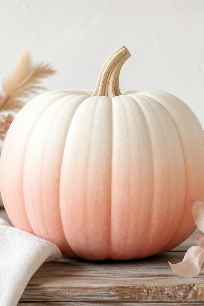
Ombre looks modern on white pumpkins because it blends like painted pottery. I like blush-pink and pale peach because they read warm and cozy without clashing with traditional fall colors. The fade looks best when it stays concentrated on the belly curve — top stays white, bottom gets color. This is a strong choice if your porch has lots of neutrals and you want one gentle pop that doesn’t scream orange.
Spray the pumpkin flat white and dry it. Mix blush pink acrylic with water until it’s the consistency of thin yogurt. Sponge the color onto the lower belly using a makeup sponge, then blend upward by dabbing rather than rubbing. Rinse the sponge, then add a lighter layer closer to the white area to smooth the transition. Let it dry, then add a second ombre pass if you want more color depth.
Pro tipUse multiple thin sponge layers — one thick layer usually looks streaky.
AvoidDon’t paint ombre all the way up to the stem; it makes mini pumpkins look messy.
10. Matte Black Dot Constellation
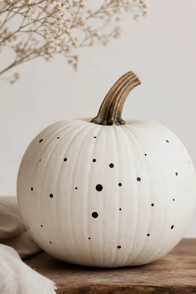
Dot constellations look playful and clean because they use repetition without a big pattern block. Matte black dots against white keep it modern, and the spacing gives you that “designed by accident” charm. I’ve used this when my porch decor is mostly gray and cream — it adds a little contrast without adding bright color. It also looks good from a distance because the dot cluster becomes a shape.
Start with flat white spray and dry it thoroughly. Use black acrylic and a round dotting tool or the eraser end of a pencil (wrapped in tape so it doesn’t smear) to place dots. Build a small cluster in the center belly, then add a few stray dots near the top and sides for balance. Keep most dots the same size and use 2-3 slightly larger dots to create a focal point. When dry, seal with matte clear coat.
Pro tipPlan your dot layout by lightly sketching 1-2 guide circles with pencil first.
AvoidDon’t make the dots perfect and evenly spaced — real constellations have gaps.
11. Leaf Silhouette in Sage (One Side)
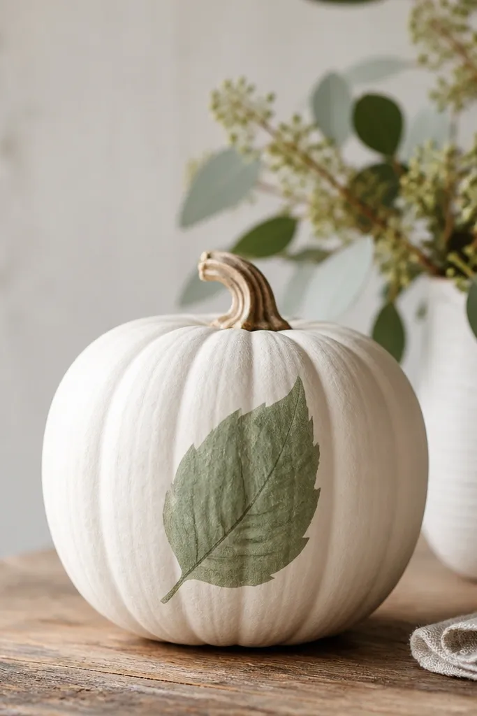
One leaf silhouette makes a white pumpkin look like a botanical illustration. Sage green is soft against white, and the darker vein adds depth without needing gold or multiple colors. Painting it on one side keeps the design dynamic, and it flatters the pumpkin’s roundness by leaving one side clean. This works beautifully with farmhouse planters, woven baskets, and neutral doormats.
Spray the pumpkin flat white and let it dry. Mix sage green and paint a leaf shape that starts near the middle of the pumpkin and curves slightly toward the bottom. Add a darker green line down the center vein, then add two or three smaller side veins. Keep the leaf edges crisp by using a liner brush and letting each edge dry for a minute before adding the next stroke. Seal with matte clear coat.
If your leaf outline looks shaky, use a real leaf as a stencil by tracing its shape lightly with pencil.
Don’t fill the whole pumpkin with leaves; the single silhouette reads more high-end.
12. Tiny Black Scallop Border (Crisp Frame)
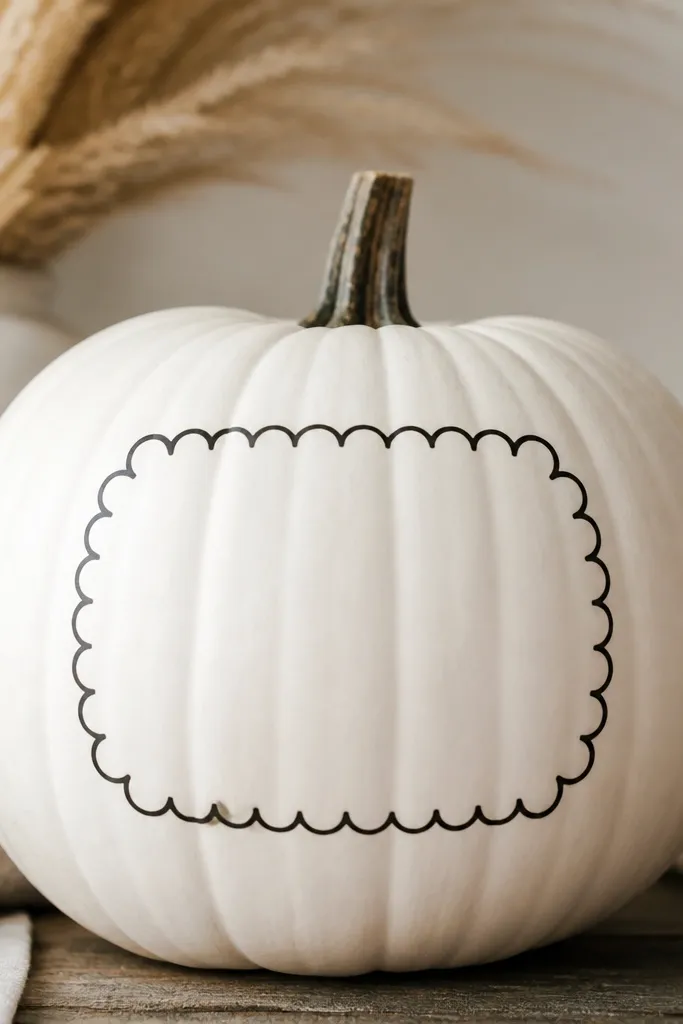
Scallops add a decorative frame without using lots of color. A thin black border gives your white pumpkin a “stationery card” look, and that reads cute even when the pumpkin is small. I like this for grouped sets because the border makes every pumpkin feel coordinated. It also hides minor paint texture — the scallops pull attention to the shape line instead of the surface.
Paint the pumpkin with flat white spray. Mark an oval on the belly with pencil about 2-2.5 inches wide. Then paint half-moon scallops along that oval using black acrylic and a small round brush: each scallop should touch the next. Leave a tiny gap at the ends so the border doesn’t look like a sticker. Let it dry and seal with matte clear coat.
Use the same brush size for every scallop so the pattern looks intentional.
Don’t make the scallops big — mini pumpkins need small scallops to look neat.
13. Gold Leaf Stem Accent (No Full Gold Coverage)
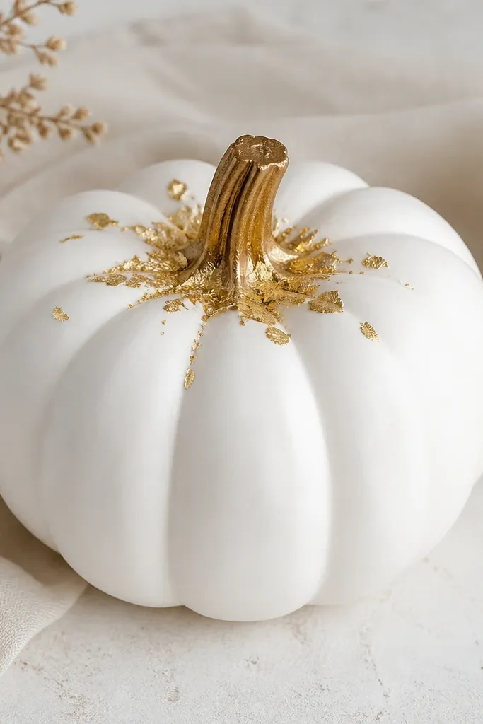
Gold leaf looks like real craft because it’s irregular. When you keep it only near the stem, it reads like a finishing detail instead of glitter chaos. This style is gorgeous in mixed lighting because gold catches highlights without covering the whole pumpkin. I use it when I want the set to look elevated but still simple enough for a weekend project.
Base coat with flat white spray and let it dry fully. Brush thin craft adhesive (or gold leaf size if you have it) around the stem base area only, staying within a 1-inch circle. Press gold leaf pieces gently on top, then use a soft brush to remove excess flakes. Add a few tiny flakes along the top ridges for movement. Leave it untouched until the adhesive sets, then finish with a light matte clear coat if needed (test on a scrap first).
Tear gold leaf into smaller pieces — small flakes look more natural on the curved stem area.
Don’t spray glue or clear coat heavily — it dulls gold leaf fast.
14. Blush Cheek Dots (Face That Stays Cute)

This is the “adorable but not childish” face style. White pumpkins already read calm, and adding two dot eyes plus a small mouth keeps it sweet. Blush cheeks in pale pink make the face look friendly, especially under warm porch lights. This style flatters mini pumpkins because the face sits naturally on the belly and doesn’t need extra space.
Spray the pumpkin flat white and dry it. Paint two tiny black dot eyes about 1 inch apart near the top third of the belly. Add a small curved mouth in black using a liner brush. Dab blush pink acrylic or makeup blush (set with clear acrylic spray) on a cotton swab to form soft cheek circles. Let it dry and seal with matte clear coat so the blush doesn’t rub off.
Pro tipUse a cotton swab for blush so the edges stay soft, not like a sharp circle.
AvoidDon’t add big smile lines or heavy eyebrows; it shifts from cute to cartoon.
15. Thin Black Stripe + Tiny Dot Accent
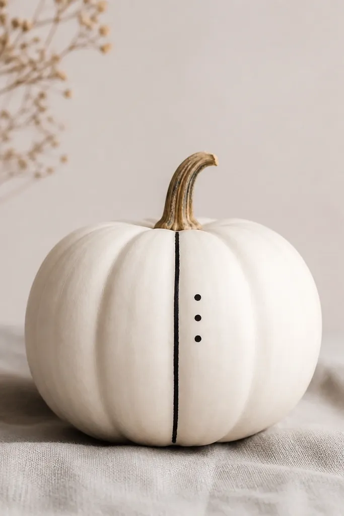
A single stripe makes the pumpkin look graphic and modern. Keeping the stripe thin keeps it delicate, and the three-dot accent balances the composition without clutter. This style works if your porch has black metal pieces, because the dots and stripe match that hardware color. I like it for mini pumpkins because the pattern stays bold but not overpowering.
Base coat with flat white spray. Paint a thin vertical stripe down the center belly with black acrylic, keeping it about 1/8 inch wide. While the stripe is still slightly tacky or after it dries, paint three small dots to the right of the stripe in a diagonal line. Make two dots smaller and one slightly larger for a natural focal point. Seal with matte clear coat.
For a perfectly straight stripe, tape a thin strip of painter’s tape down the center and paint over it, then remove while paint is wet.
Don’t add multiple stripes; it gets busy fast on small pumpkins.
16. Cream Lace Border Look (Painted Pattern)
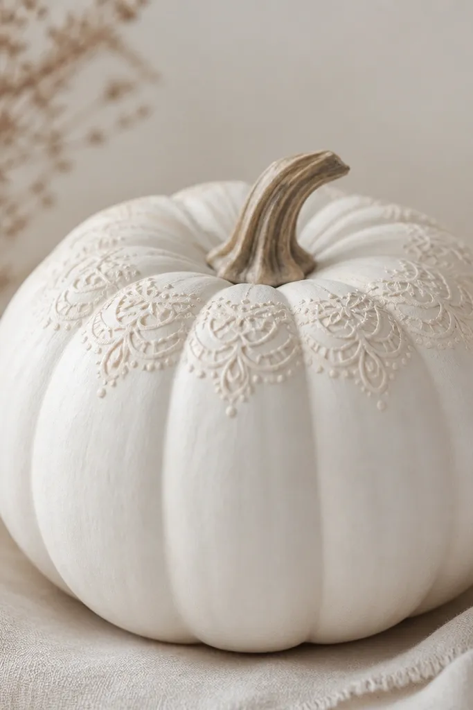
Lace borders look sweet because they mimic fabric without needing actual ribbon. This style works when you want your white pumpkins to look cozy and soft, not sterile. I use a creamy off-white lace pattern so it blends with the base and catches light like raised knit. It’s also forgiving on textured pumpkins because the lace pattern hides unevenness.
Spray the pumpkin with flat white and let it dry. Mix off-white acrylic by adding a tiny bit of beige to white, then load it on a small liner brush. Paint a repeating lace motif around the top ridges: small loops, then tiny dots between loops. Work in sections so the pattern stays consistent — do one band, let it set 10 minutes, then continue. Finish with a matte clear coat so the pattern doesn’t smear.
Pro tipUse a reference photo of lace and copy one section at a time so the repeats look even.
AvoidDon’t use bright pure white lace paint over the base; it looks like a sticker layer.
17. Monochrome Stripe Ridges (Dry Brush Over Texture)
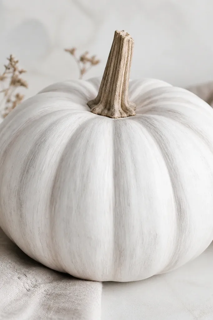
This is the quickest way to make a white pumpkin look like it has depth. Instead of painting a flat design, you let the pumpkin’s natural ridges do the work while you accent them with light gray. It looks great on pumpkins that already have a nice ridge shape, and it looks classy even if you’re not good at drawing. The monochrome effect also pairs well with any decor color because it’s basically just white and gray.
Start with flat white spray. Dip a dry flat brush into light gray acrylic, then wipe off most paint on a paper towel so the brush is almost dry. Drag the brush lightly along the ridges — you want a whisper of gray, not a solid stripe. Rotate the pumpkin and repeat until the ridges show subtle variation. Let it dry, then add matte clear coat.
If you accidentally add too much gray, go back with a tiny bit of white paint on a dry brush and soften it.
Don’t soak the ridges with paint; wet paint makes the pumpkin look streaky.
18. Mini Chalkboard Label on White Pumpkin
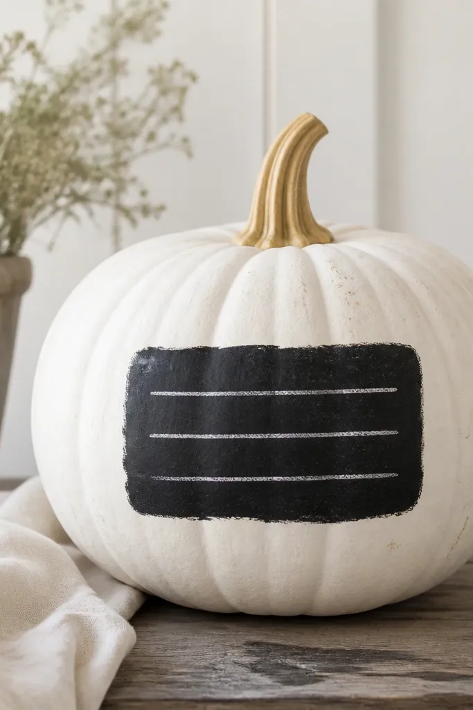
Chalkboard labels make white pumpkins feel like part of your home decor instead of a craft project. The black rectangle gives you contrast, and the white “chalk” lettering keeps it seasonal without looking cluttered. I like this for grouped pumpkins because each label can say something different and still look cohesive. It’s also friendly for guests because it reads clearly from across a table.
Spray the pumpkin flat white and let it dry. Paint a small rectangle on the belly with matte black acrylic, leaving a thin white border around it. Let the black dry fully. Then use a white paint pen or white acrylic with a liner brush to write one short line — like “pumpkins,” “hello,” or a date — centered inside the rectangle. Seal lightly with matte clear coat, but avoid heavy spraying over the chalk text since it can dull the lettering.
If your black rectangle bleeds into the white, use thin paint and let each coat dry before adding another layer.
Don’t write more than one line — mini labels look messy when the text crowds.
19. Monogram Heart Corner (Valentine Style for Fall)
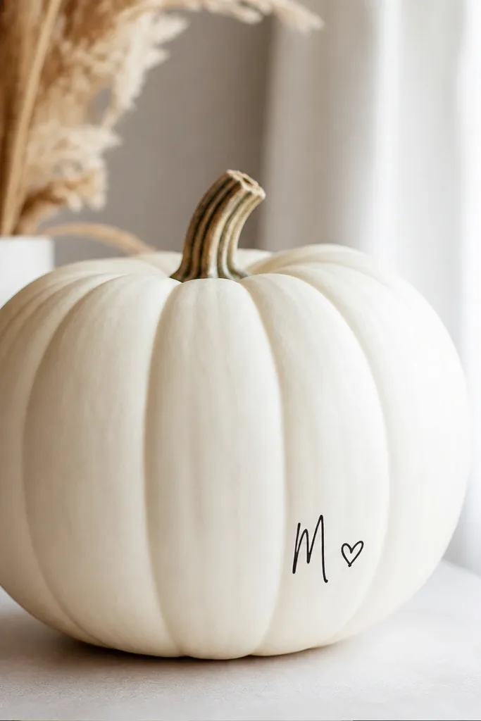
A monogram heart corner gives you that personal touch without covering the whole pumpkin. The design sits in one corner, so the rest of the pumpkin stays clean white and airy. I like using black for the monogram and a muted blush or dusty rose for the heart so it feels seasonal and not too holiday-specific. This looks great when you’re stacking pumpkins with matching napkins or monogrammed decor.
Spray the pumpkin with flat white and dry it. Decide where your “corner” is based on how you’ll display the pumpkin — I place mine on the upper left side of the belly. Lightly pencil a small heart shape and a single-letter monogram next to it. Paint the monogram in black acrylic using a fine liner brush, then paint the heart in dusty rose. Add a tiny underline dash under the heart, then seal with matte clear coat.
Pro tipWrite the letter on paper first and match the stroke thickness to your brush tip size.
AvoidDon’t use bright red for the heart — dusty rose reads softer and more “aesthetic.”
20. Two-Tone Ridge Fade (White to Mist Gray)
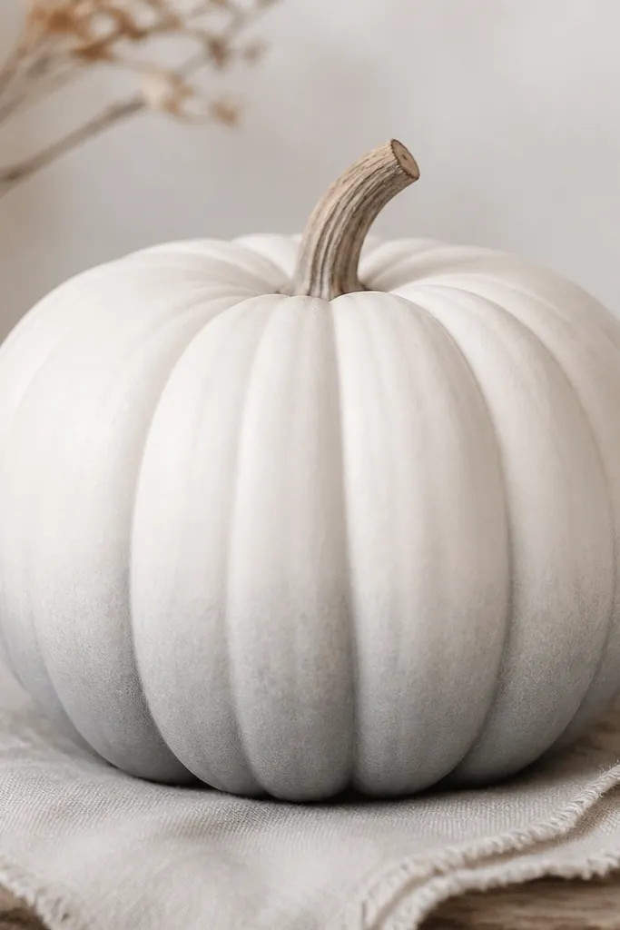
This gives you a built-in gradient that looks intentional and smooth. Because the fade follows the ridges, it feels like painted ceramic rather than a flat sticker job. I use mist gray because it’s gentle and doesn’t look dirty, even when your porch gets dusty. This style looks especially good with white candles, gray planters, and woven textures.
Base coat the pumpkin with flat white spray. Load a dry brush with mist gray acrylic and lightly drag it along the lower ridges only, blending upward as you go. Work around the pumpkin in small sections so the fade doesn’t get too dark in one spot. Add another super-light pass if you want the gray to show more, keeping it subtle. Seal with matte clear coat once dry.
Keep a paper towel nearby and wipe your brush between sections — that prevents dark patches.
Don’t create a hard line between white and gray; blend it with a lighter hand.