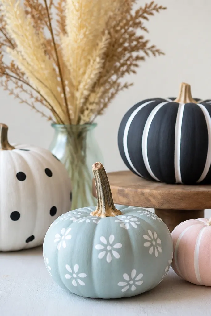
1. Monochrome Black Cat Pumpkin
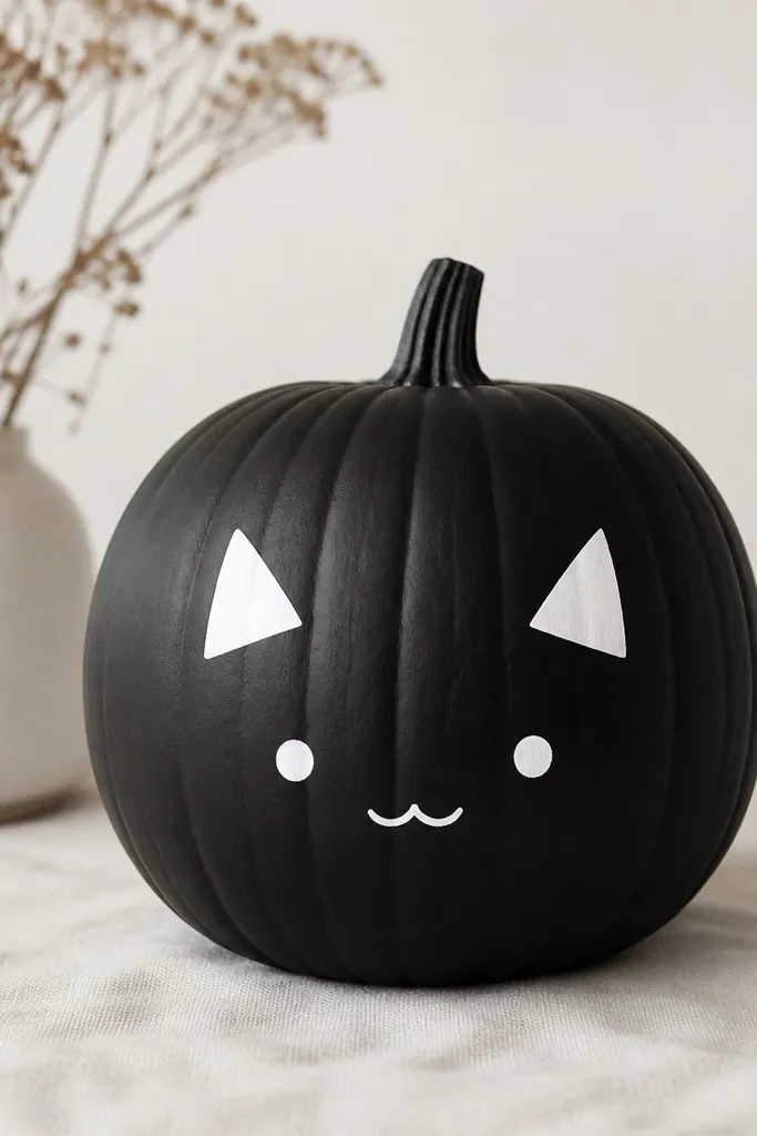
This look is my go-to when I want “cute” without fragile details. The black paint hides small skin imperfections, and the white face pops hard against orange only at the edges. I do this on medium pumpkins because the face sits nicely around the widest point and looks balanced from standing height. It also works for warm and cool home decor since black and white read neutral.
Pro tipIf your lines wobble, paint the face first with pencil-light sketch marks, then cover the marks with paint only after you like the placement.
Start by wiping the pumpkin with a damp cloth, drying it fully, then spray a thin layer of primer over the whole surface. After it dries, paint the pumpkin matte black with two thin coats using a flat brush, letting each coat dry before the next. For the face, use a small round brush to paint two white triangles for ears, then add a white oval for the face. Finish with two tiny white dots for eyes and a small curved line for the mouth, then let it dry overnight before sealing.
AvoidAvoid thick paint in the ear corners; it bulges and makes the face look lumpy.
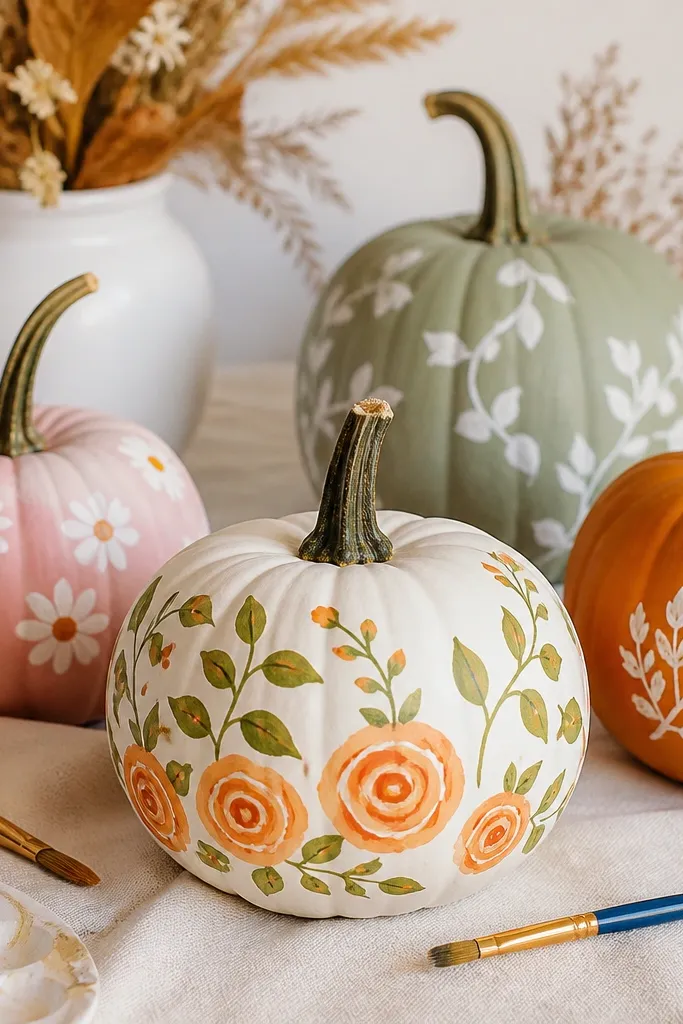
2. Cream + Copper Swirl Minimal Pumpkin
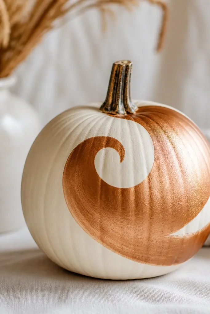
This is the “one pumpkin looks expensive” style. Cream hides the orange tone while copper adds that warm shine without needing gold leaf or glitter. I like it on small to medium pumpkins because the swirl has enough room to breathe, and it looks intentional instead of cramped. It flatters anyone’s decor because cream and copper match wood, brass, and neutral fabrics.
Pro tipTo get that smooth metallic finish, stir the metallic paint well and wipe excess off the brush on the side of your palette.
Prime the pumpkin, then paint it in a smooth cream acrylic base with two thin coats. While the cream is fully dry, map a swirl line lightly with a pencil — start near the stem, curve out, then taper toward the bottom. Paint the swirl with metallic copper craft paint using a small angled brush, keeping the line about 1/4 inch wide. Add a second pass to even the edges, then seal with a clear matte or satin coat so the copper doesn’t get cloudy.
AvoidSkip glitter on this one; it catches dust and makes the swirl look messy fast.
3. Pastel Polka Dot Party Pumpkins
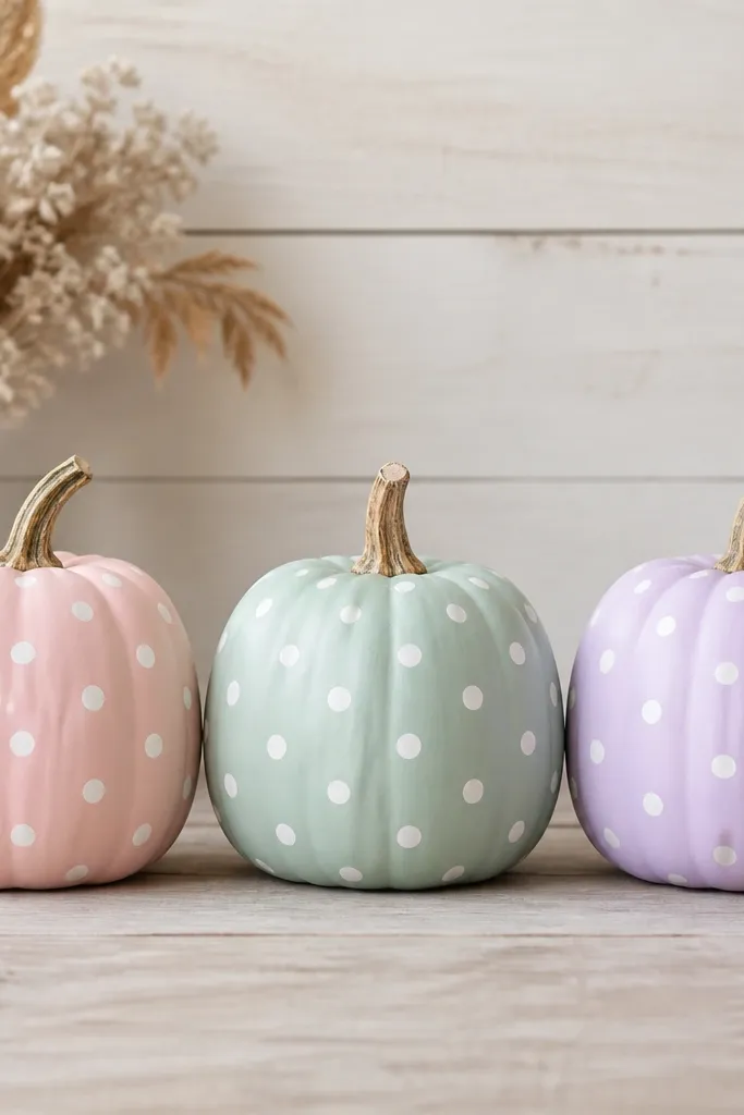
Polka dots are low maintenance because you’re repeating a shape, not drawing a scene. Pastels keep it soft for indoor tables and kids' parties, and white dots look crisp even from a distance. I’ve used this on medium pumpkins and it looks best when the dots are about the size of a dime. It’s friendly for most color palettes because you can match the pastel to napkins or flowers.
Paint the pumpkin base color in two thin coats and let it dry completely. Use a dotting tool or the eraser end of a pencil to stamp circles, but start with a test dot on scrap paper. Work from the top down: stamp the first row lightly, then line up the next row so the dots sit between the gaps. Keep your pressure consistent so dot size stays even, then touch up any thin spots with a small brush after the base stamping is dry. Seal once everything is dry to protect the dots from scuffing.
Use painter’s tape to mask a straight “start line” for the first row of dots so the pattern doesn’t drift.
Don’t press too hard with a pencil eraser; it can dent the paint and leave uneven edges.
4. Terracotta Face with Simple Eyes
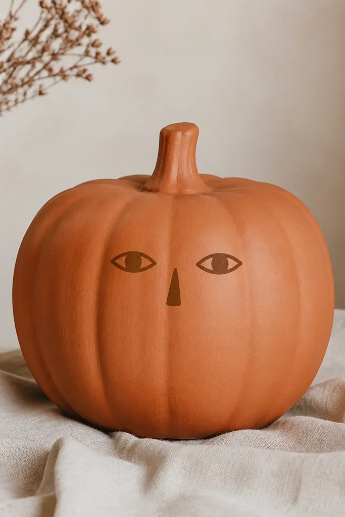
This look looks handmade because the colors feel like pottery. Terracotta plus darker brown gives depth without needing black outlines, and the face stays cute even if your lines aren’t perfect. I like it on slightly bumpy pumpkins because the paint texture makes the “clay” effect stronger. It also works for people who want Halloween that isn’t cartoony.
Prime the pumpkin, then paint all over with terracotta acrylic in two thin coats. After it dries, use a darker brown paint to block in the eye shapes — almond ovals — and place them slightly above the center line. Add a small nose triangle or curved dot below, then finish with a short mouth line that’s about the same width as one eye. Let it dry, then seal with a satin clear coat so it looks like painted ceramic instead of glossy plastic.
If you want extra warmth, add a tiny dab of off-white to the terracotta for highlights on the cheek area.
Avoid sharp black outlines; they can make the face look like a sticker instead of a painted sculpture.
5. Navy Stripe Pumpkin with One Gold Accent
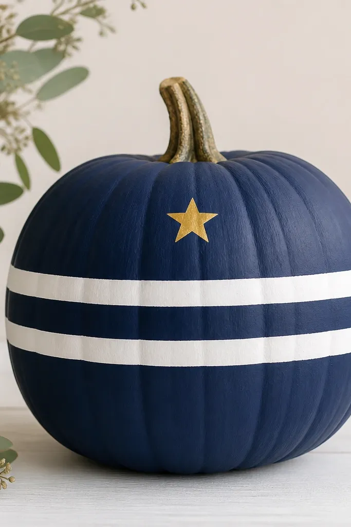
Stripes look polished fast because you’re repeating straight lines, and navy + white reads classic even when it’s just paint. The one gold star keeps it festive without turning the pumpkin into a glitter mess. I’ve done this on large pumpkins where the stripes can span the full width and look graphic, not busy. It’s a strong pick for front steps because it looks crisp in daylight and still holds up at night.
Pro tipCut tape edges clean with a craft knife so the white paint doesn’t creep under and blur the stripe edges.
Prime, then paint the pumpkin navy in two thin coats, letting it dry fully between coats. Use painter’s tape to mark three stripe bands — keep the bands about 1 inch tall depending on pumpkin size. Paint the exposed bands with white acrylic, remove the tape while the white is still slightly tacky, then let it cure. Add the gold star using a small stencil or by drawing one with a fine brush, then seal with a satin clear coat.
AvoidDon’t freehand the stripes; crooked tape lines are easier to fix than crooked brush lines.
6. Whiteboard Pumpkin with Chalk Lettering
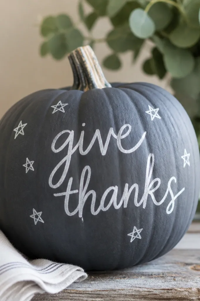
This one is for people who want to change the message. The slate gray base looks like a mini chalkboard, and chalk-style lettering reads great from across a room. I’ve made these for Thanksgiving place settings and for Halloween door decor, and it always gets compliments because it looks interactive. It’s flattering in any home style because the palette is simple and the typography does the work.
Pro tipPractice your letter height on paper first — aim for letters that are about the width of your thumb on a medium pumpkin.
Prime the pumpkin, then paint it slate gray in two coats. Let it dry fully, then write your message using a chalk marker or a white paint marker for consistency. If you want a chalky look with paint, dab white acrylic with a sponge brush instead of dragging it — that gives a softer edge. Add small star doodles around the text with the same white paint, then seal lightly with a clear coat that’s safe for painted surfaces. If you plan to update the lettering often, use chalk marker instead of paint for the letters and skip heavy sealing.
AvoidAvoid writing too close to the stem; paint there can crack when the pumpkin flexes.
7. Sunflower Gradient Pumpkin
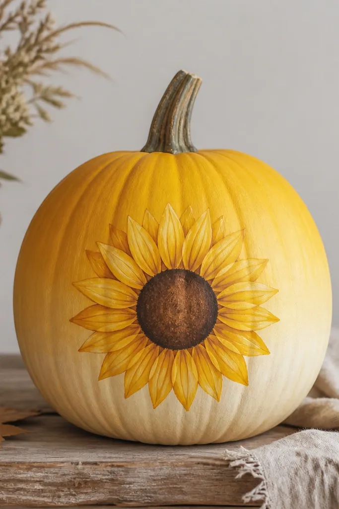
Sunflowers give big impact with minimal drawing. The gradient hides uneven texture and makes the pumpkin look like it has a glow. I use this when I want a cheerful fall display that doesn’t read “spooky,” and it works for both porch decor and dining tables. The yellow tones look best against green plants, wood benches, and cream walls.
Prime the pumpkin, then blend a yellow gradient using a sponge — start with deeper yellow near the stem and fade toward lighter yellow at the bottom. Add two thin coats if you need coverage, letting each dry. For the flower, paint a brown circle center first, then dot small brown highlights around it. Paint petal shapes with a flat brush, keeping them evenly spaced around the center. Seal after everything dries so the gradient doesn’t scuff when you move the pumpkin.
Use a makeup sponge for blending — the small pores help the color transition look natural instead of streaky.
Skip water-thinning your acrylic — it makes the gradient look patchy and takes longer to dry.
8. Rag Texture Pumpkin in Rust and Beige
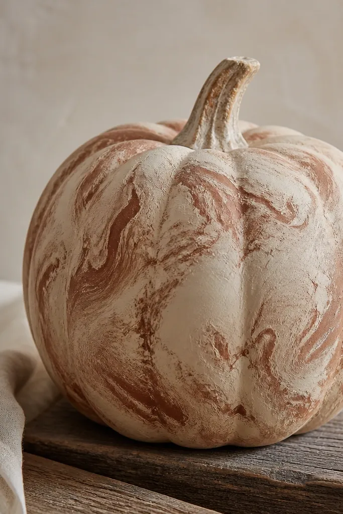
Rag texture is my favorite low maintenance method because it hides every tiny bump in the pumpkin skin. Beige gives you a calm base, and rust adds warmth like aged pottery. This style looks best when you embrace the imperfect texture — it reads intentional. I’ve done it on larger pumpkins and it looks great in clusters because the surface catches light differently from every angle.
Prime, then paint the pumpkin beige as your base coat. Once dry, tear a piece of cotton rag and dip it lightly into rust paint, then dab off excess on a paper plate — you want color on the rag, not puddles. Press and lift randomly in swirls, overlapping lightly so you don’t get harsh bands. Let it dry, then add one more light rust pass only where you want deeper contrast. Seal with a satin clear coat so the texture stays soft and doesn’t turn glossy.
If your rag leaves streaks, switch to a different rag piece and keep the paint load lighter.
Don’t fully cover every inch in rust; leaving beige showing keeps the texture from looking muddy.