1. Black Cat Moon Faces
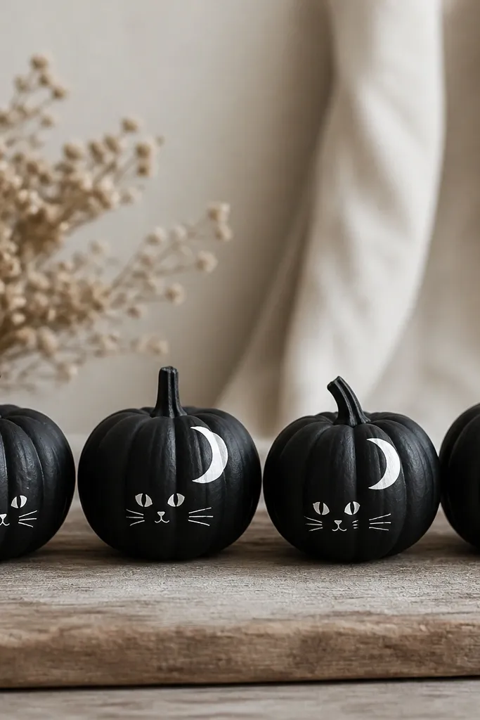
I do this one when I want Halloween that still looks cute on a front porch. The pumpkins are painted matte black (two thin coats), then I add a white crescent moon and a small cat face. The contrast makes the faces look crisp even if your pumpkins have minor dents. This design flatters most skin tones in photos because the black-and-white reads high-contrast and clean. It also looks great next to warm lights because the matte finish kills glare.
Pro tipUse a scrap piece of cardboard under your brush hand so you don’t drag black paint onto the face.
Start by painting the whole pumpkin matte black with a foam brush. While it dries, sketch a crescent moon near the top third and the cat face centered under it using a pencil. Paint the crescent and cat features with white acrylic and a small round brush; do whiskers last with light pressure. Let it dry 30-45 minutes, then add a second white coat only on the moon edges so they stay sharp.
AvoidSkip glitter for this one — it looks messy on matte black and catches on the pumpkin’s bumps.
2. Gold Leaf Speckle Gradient
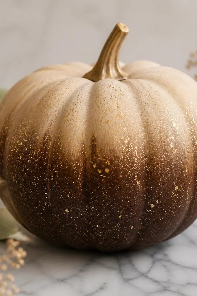
This is my “fancy without effort” look. You get a smooth gradient base (brown to cream) and then gold speckles that look like leaf fragments. I’ve used it on medium and large pumpkins and it still reads clean because the speckles break up any uneven skin. This one flatters warm-toned decor — it pairs with tan throws and brass candle holders. The metallic hits in evening light, but the brown base keeps it from looking too flashy.
Pro tipPractice the flick on a paper towel first so you don’t splatter big dots.
Paint the bottom half chocolate brown, then blend upward into cream using a damp sponge so the transition isn’t a hard line. Once dry, load a toothbrush with gold acrylic paint thinned slightly with water. Hold the toothbrush about 8 inches away and flick lightly to drop speckles; do two passes for coverage. Finish with a matte clear coat if you want it to look like stained finish instead of shiny paint.
AvoidDon’t use metallic spray paint for the speckles — it clumps and creates thick blobs that look like drips.
3. Tape-Striped Candy Corn
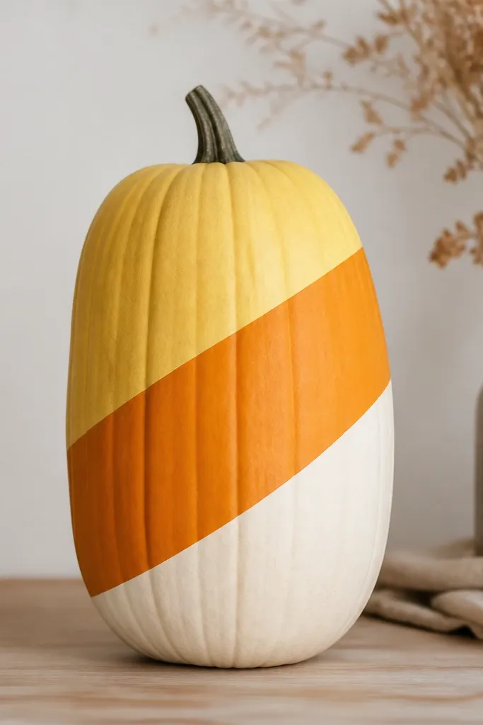
Candy corn is the design that always gets compliments because it’s instantly recognizable. I like the diagonal version because it elongates the pumpkin and looks cleaner than the classic triangle stack. The tape gives you straight edges even if your freehand is wobbly. It also looks good in group displays because every pumpkin matches the same color rhythm. If your decor is neutral, this adds fall color without turning your porch into a Halloween theme park.
Start by painting the base cream and letting it dry fully. Use painter’s tape to mask diagonal stripes; press the tape edges down firmly with a fingernail so paint doesn’t bleed. Paint the first stripe pale yellow, let dry, then remove tape and re-mask for the orange stripe. Finally, touch up any tiny gaps with a small brush and repeat a second thin coat on each color for even coverage.
Remove tape while the paint is still slightly tacky to keep edges razor sharp.
Don’t overload the brush on taped areas; thick paint creeps under tape and ruins the line.
4. Matte White Pumpkin with Black Dot Grid
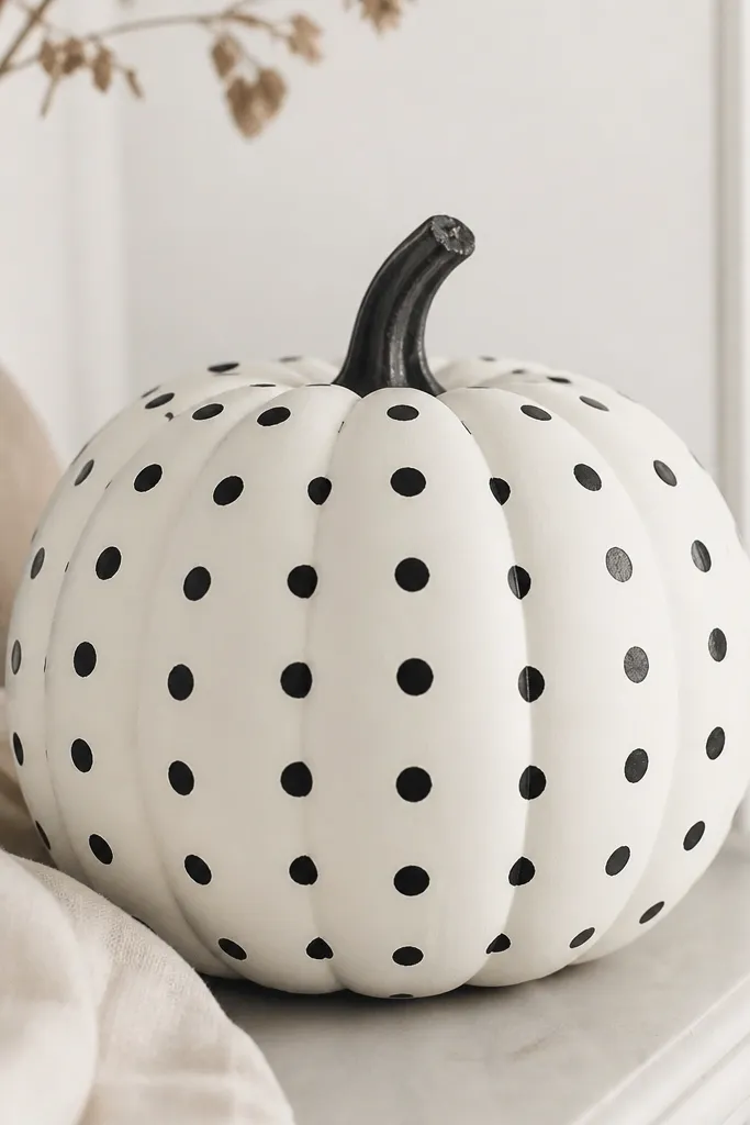
This design looks modern and expensive because it’s simple and controlled. The white base makes the dots pop and hides small dents, which is why it works on cheaper pumpkins. I’ve done this on both small and medium sizes; the dot spacing scales well. It flatters darker doorways because the white reads bright and clean. In daylight, it looks graphic; at night, it still holds up because it’s matte.
Paint the pumpkin matte white with two thin coats. While it dries, measure a dot grid by lightly marking four corner guide points with a pencil. Use a dotting tool or the eraser end of a pencil to stamp black dots; keep your hand steady and rotate the pumpkin instead of your wrist. Let it dry, then do one more pass to fill any thin dots.
If your dots smear, wait longer between coats — matte paint dries slower than you expect.
Avoid using glossy white — the dots look like stickers instead of paint.
5. Terracotta Face with Blush Cheeks
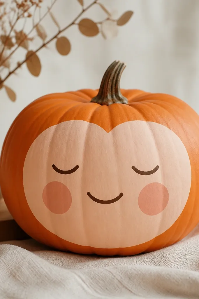
I love this one because it turns a basic pumpkin into a friendly character. The terracotta base gives warmth, and the blush cheeks make the face look soft instead of spooky. It’s flattering in photos because the warm tones read skin-like and don’t clash with most fall palettes. You can make it look cuter or more serious just by changing eyebrow angle. This is also my go-to for people who hate haunted faces but still want Halloween energy.
Pro tipUse a reference photo and copy the eyebrow shape first — it controls the whole mood.
Paint the whole pumpkin terracotta orange, then block in a lighter peach oval for the face using a flat brush. Add blush cheeks with a small sponge and light pink paint, dabbing rather than brushing. Use dark brown for eyes and mouth; keep them small and centered so the face stays balanced on the curve. Finish with a tiny nose dot and a light highlight on the forehead with diluted white paint.
AvoidDon’t paint the eyes too large; big eyes make it look like a sticker, not a painted face.
6. Leaf Vein Wash with Olive Outline
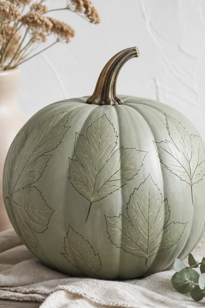
This one looks like watercolor on a gourd. The sage base is calm, and the olive outline makes the leaf shape feel intentional. I’ve done it on pumpkins that aren’t perfectly smooth, and the wash hides minor texture because the paint is semi-transparent. It flatters farmhouse decor and also works on darker front doors because the leaf reads bright. If you like fall that feels more garden than Halloween, this is it.
Pro tipThin your paint with water until it looks like tinted milk, not watery clear.
Paint the entire pumpkin sage green and let it dry. Sketch a single leaf shape across the front with pencil and outline it in olive paint using a fine liner brush. Mix a lighter green with water for the leaf veins and paint thin lines from the center out. Add a second layer of outline if needed, then seal with matte spray.
AvoidSkip thick outlines; they look heavy and cheap on the curved surface.
7. Tiny Stitch Lines (Sewn Pumpkin)
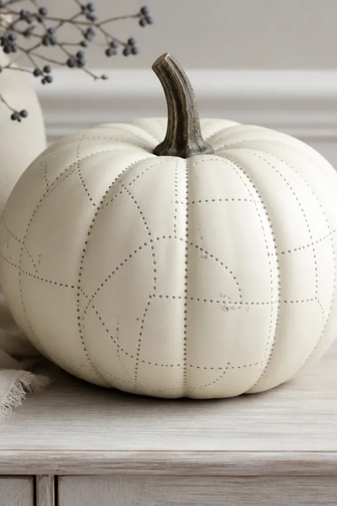
This gives you that cozy “handmade” look without sewing anything. The trick is using paint to imitate stitch marks: small dots with a light gray thread color. It works on cream, tan, or even muted orange bases. I’ve used it for fall shelves and it looks good because the design is detailed at close range but simple from a distance. It also flatters warm skin tones in photos because the palette is neutral and soft.
Paint the pumpkin cream and let it dry fully. Use painter’s tape to create patch shapes (square-ish panels) and paint each panel in light tan or the same cream shade for subtle contrast. Remove tape, then use a fine brush to draw stitch lines around the panel edges as short dashes. Add a second row of tiny dots along the line to mimic thread spacing.
Use a pencil first to mark the stitch rhythm; it keeps spacing even.
Don’t freehand long stitch lines in one stroke — break them into short segments.
8. Sunburst Rays in Burnt Orange
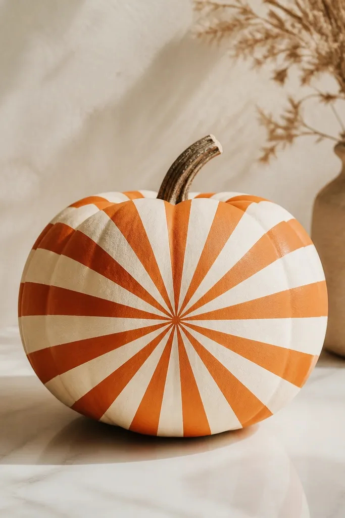
Sunburst patterns look cheerful and graphic, and they’re way easier than they seem. The cream base makes the rays pop, and burnt orange feels fall without going full Halloween. I’ve used this on both smooth and slightly bumpy pumpkins; the rays hide unevenness because your eye follows the pattern. It flatters any porch styling with neutrals and black accents. If you want your pumpkins to look like decor, not crafts, this is the one.
Pro tipKeep ray widths consistent by measuring with a ruler once, then eyeball the rest.
Paint the pumpkin cream and let dry. Mark a center point on the front with a pencil dot. Use painter’s tape to mask ray lines — I do 10-12 rays on a medium pumpkin — then paint burnt orange over the exposed areas. Remove tape while paint is still tacky and touch up ray edges with a small brush.
AvoidAvoid thin, watery orange — it leaves streaks inside the masked rays.
9. Spiral Swirl Ombre (Teal to Cream)
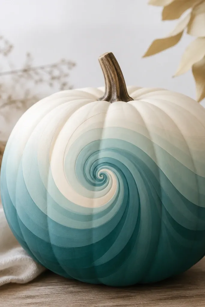
This looks like a candy swirl and it photographs beautifully. The teal-to-cream ombre gives depth, and the spiral pattern pulls attention upward. I like it on taller pumpkins because the spiral has room to breathe. It flatters cool-toned decor — think white lanterns, silver beads, and blue-gray textiles. The smooth finish also hides small surface imperfections.
Pro tipUse a small foam brush for the spiral so the paint stays smooth on the curve.
Paint a base cream. Mix teal with a little white to create a few shades: dark teal, medium teal, and pale teal. Use a pencil to lightly draw a spiral line from bottom to top; then paint the spiral in bands, using the darkest shade at the bottom and stepping lighter as you move up. Blend edges with a damp sponge so the bands don’t look like stripes.
AvoidDon’t rush blending; dry paint blending leaves hard lines.
10. Vintage Rose on a Blush Base
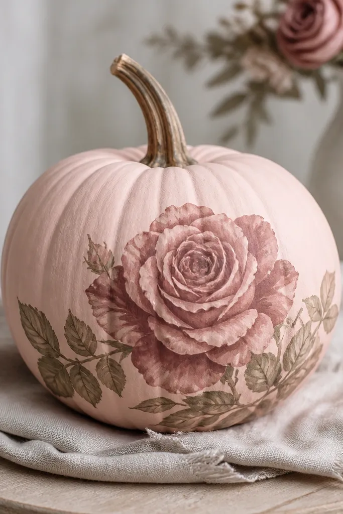
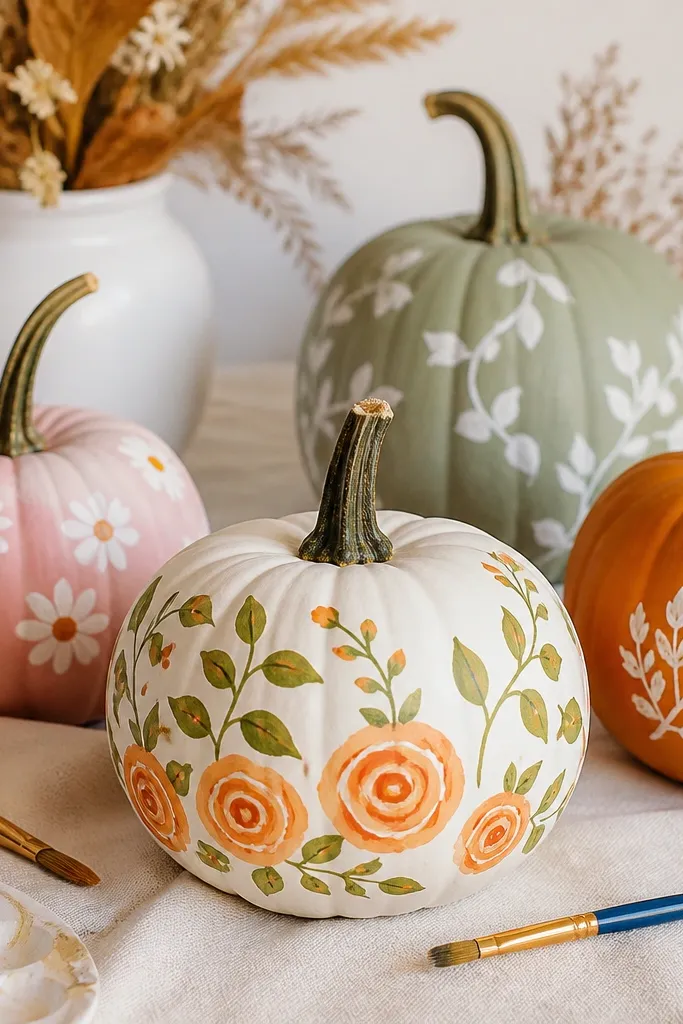
I do this when I want fall decor that still looks romantic. The blush base is gentle, and the rose colors are muted so it doesn’t look like a kid’s craft. This design looks best on medium pumpkins with a clear front — it gives you space for one focal flower. It flatters neutral wardrobes and warm lighting because the mauve tones read soft. It also looks classy when you stack pumpkins on a coffee table.
Paint the pumpkin blush pink and let it dry. Sketch a rose outline with pencil — one big bloom centered slightly low. Paint petals in dusty red, then layer mauve shadows where petals overlap. Add two small leaves in muted green and finish with a tiny highlight using diluted white paint.
If you can’t draw petals, trace a rose outline from a printed coloring page onto parchment, then transfer lightly with pencil.
Avoid bright neon pink — it makes the rose look cartoonish and cheap.
11. Cheeky Polka Stripe Combo
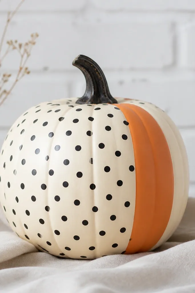
This one is playful but still clean because the pattern is controlled. The stripe gives structure, and the polka dots add texture without needing fancy art skills. I like it for people who want something fun that doesn’t look messy. It also works with black-and-white kitchens or decor because the dots keep the palette graphic. The stripe makes the pumpkin look taller and more intentional.
Pro tipUse a ruler to set stripe width; it makes the whole design look planned.
Paint the whole pumpkin cream. Tape off a vertical stripe about 2 inches wide and paint it orange; remove tape after it dries a bit. Let the orange stripe dry completely, then paint small black dots across the remaining cream using a dotting tool. Finish by going back and cleaning dot edges near the stripe with a tiny brush so the border is crisp.
AvoidDon’t let dots overlap the stripe edge — clean borders read more expensive.
12. Monochrome Marble Look
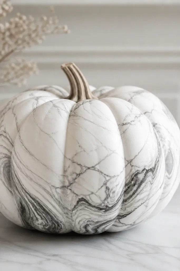
Marble is a cheat code. It hides uneven paint coverage and turns a basic gourd into something that looks like store-bought decor. The monochrome palette is easy to match with any fall setup. I’ve used this on pumpkins that have small dents because the swirls distract your eye. It also photographs well under warm lights since the gray lines add depth without glitter.
Pro tipWork in small sections so the gray doesn’t fully dry before you blend.
Paint the pumpkin white and let it dry. Mix gray paint (start with light gray) and dilute it slightly. Drag a fine brush through the gray paint to create thin veining lines; then add a few thicker swirls where the curves would naturally catch light. Blend the edges with a dry brush so the marbling looks soft, then seal with a matte clear coat.
AvoidSkip heavy black marbling — it looks like cheap imitation stone and overpowers the pumpkin.
13. Gold Outline Chevron
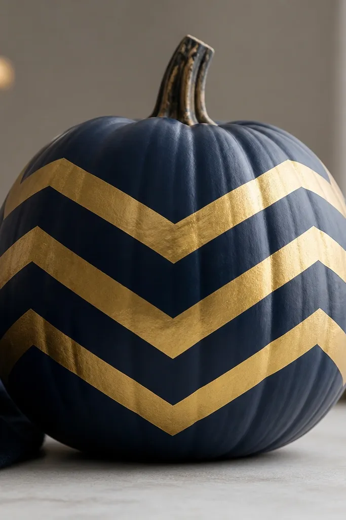
Navy plus gold looks expensive every time. The chevrons add movement, and the gold outline keeps the design sharp on a curved surface. I like this for adult Halloween decor because it doesn’t scream candy or cartoon. It flatters dark entryways and looks great next to black planters. The matte navy background also helps the gold stand out without looking shiny everywhere.
Paint the pumpkin matte navy with two thin coats. Use painter’s tape to mask chevron shapes in a row across the front — I do 5-6 chevrons on a medium pumpkin. Paint the exposed chevron sections gold acrylic and let it dry. Remove tape carefully, then go back with a fine brush to sharpen the gold edges where needed.
Gold paint dries darker than it looks wet, so check after 10 minutes before adding a second coat.
Don’t use metallic spray over tape — it can seep under and blur the chevrons.
14. Rainbow Gradient Dots (Mini Confetti)
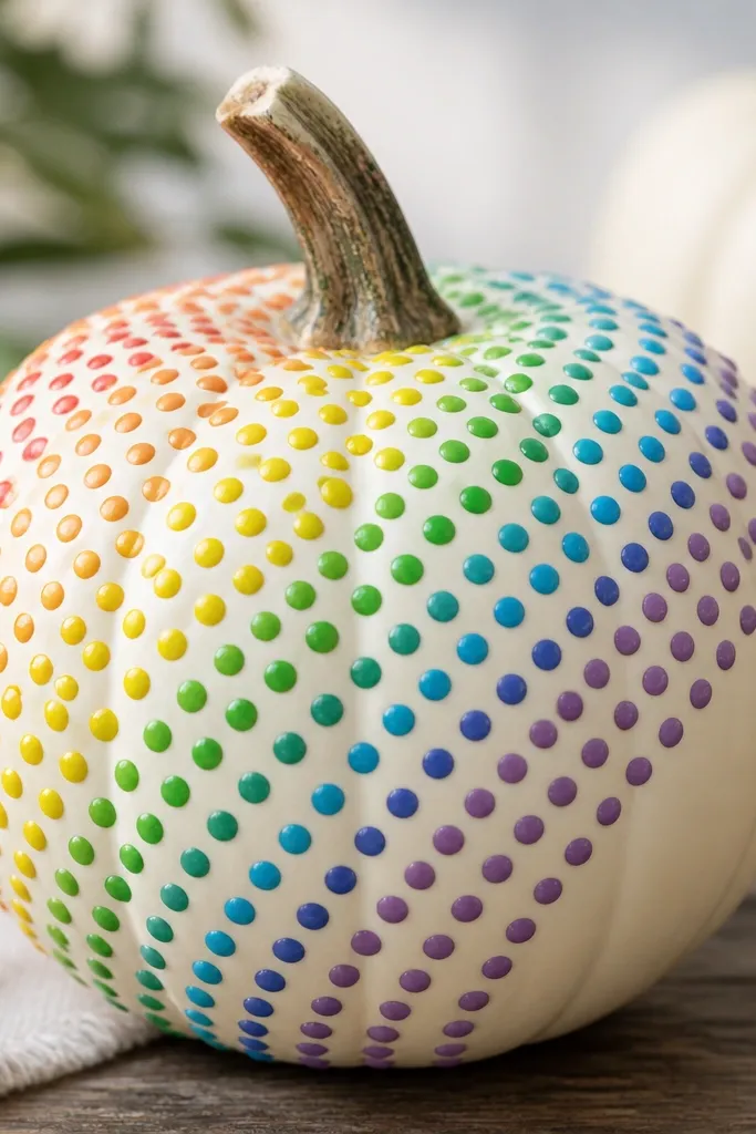
This looks like confetti and it’s the easiest way to get a “full pumpkin” design without drawing. The dots are small, so you don’t have to worry about perfect curves. I do it on cream or off-white bases because colors look brighter and cleaner. It flatters bold fall outfits and also works with colorful seasonal decor. If you hate spooky themes, this gives you festive energy with zero creepiness.
Pro tipIf your dot tool is too big, use the eraser end of a mechanical pencil for smaller circles.
Paint the pumpkin off-white. Plan a diagonal rainbow path with pencil so the colors flow across the curve. Use five to six colors: yellow, orange, red, pink, purple, and blue — each as a separate dotting step. Stamp dots with a dot tool, keeping the spacing the same, then add a final row of darker dots to anchor the design near the bottom.
AvoidDon’t mix colors on the pumpkin while stamping — you’ll get muddy dots.
15. Two-Tone Triangle Patchwork
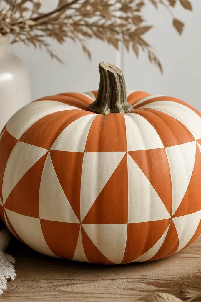
Patchwork triangles look like you bought a fabric pattern and transferred it to the pumpkin. It’s also super forgiving because small paint gaps are less noticeable when everything is geometric. I use burnt orange and cream so the contrast stays warm and fall-friendly. This design looks good on any pumpkin size, but it shines on rounder ones where triangles can repeat evenly. It fits modern farmhouse decor and also holds up in a cluttered fall table display.
Paint the base cream. Use painter’s tape to form triangle sections; press tape edges down hard. Paint alternating triangles burnt orange, remove tape, and let dry. Repeat with a second layer on orange triangles for full coverage, then clean any tiny bleeds with a cotton swab dipped in cream paint.
Take a photo from far away before sealing so you can spot uneven triangle edges early.
Skip freehand triangles — uneven shapes read cheap fast.
16. Blackboard Pumpkin Labels
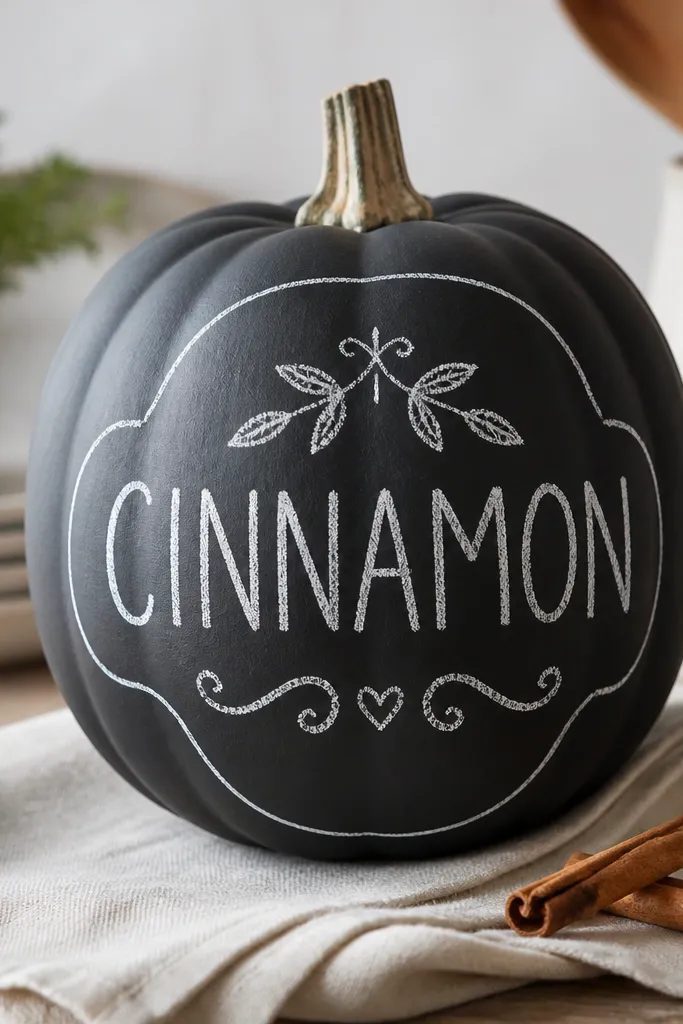
This one looks like a market sign you can move around. Matte black hides dents and gives you a blank canvas for chalk-style lettering. I like it for families because it invites “fill in the names” each year. It flatters kitchens and entryways with dark accents, and it looks sharp under warm string lights. The best part is the lettering can be messy and it still looks intentional because chalky fonts forgive irregular lines.
Pro tipFor lettering, practice the word on paper first and copy the spacing onto the pumpkin.
Paint the pumpkin matte black and let it dry fully. Add a thin border line in white acrylic using a liner brush. Write one word in all caps with a chalk-like look — I do 'CINNAMON' or 'PUMPKIN SPICE' — then add small doodles like a leaf or tiny star. Let dry, then seal with matte spray so the writing doesn’t smear.
AvoidDon’t use glossy black — it reflects and makes the writing hard to read.
17. White Pumpkin with Terracotta Chevron Band
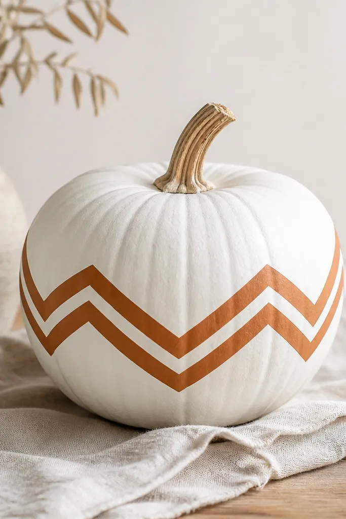
This is the cleanest “one statement band” design I’ve done. A single chevron band makes the whole pumpkin look designed, without covering every inch. White base keeps it bright and neutral, while terracotta adds fall warmth. It flatters small spaces because the design is simple and doesn’t compete with other decor. It also looks great with woven baskets and neutral placemats.
Paint the pumpkin matte white. Measure the middle height and mark a straight line around the pumpkin with pencil so your band sits evenly. Mask the band with painter’s tape and paint terracotta. Remove tape, then add a second pass to sharpen chevron edges; for chevrons, paint small V shapes using a fine brush and steady hands.
Use a piece of string as a flexible measuring tool to keep the band level around the curve.
Don’t wrap tape too loosely — uneven tape makes the band look crooked.
18. Pastel Ghosts with Soft Eyes
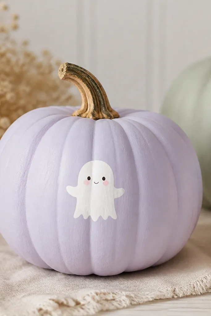
This is a Halloween look that doesn’t feel harsh. Pastel lavender or dusty blue makes the ghosts feel sweet, and the soft eyes keep it from looking scary. I’ve used it for front steps where kids run by, and it stays friendly from every angle. It flatters light-colored decor and looks great next to white candles. The matte base also makes the ghost shapes feel like painted ceramic.
Pro tipMake ghosts slightly different sizes so it looks playful, not like stamps.
Paint the pumpkin dusty lavender with two thin coats. Sketch 3 small ghost shapes across the front (top, middle, bottom) and paint them white with a flat brush. Add faces with tiny dots for eyes and a small curved mouth in pale pink. Use a light gray wash around the ghost edges if you want a subtle shadow, then seal matte.
AvoidAvoid black faces — they instantly shift the vibe from cute to spooky.
19. Rustic Stripe + Twine Bow
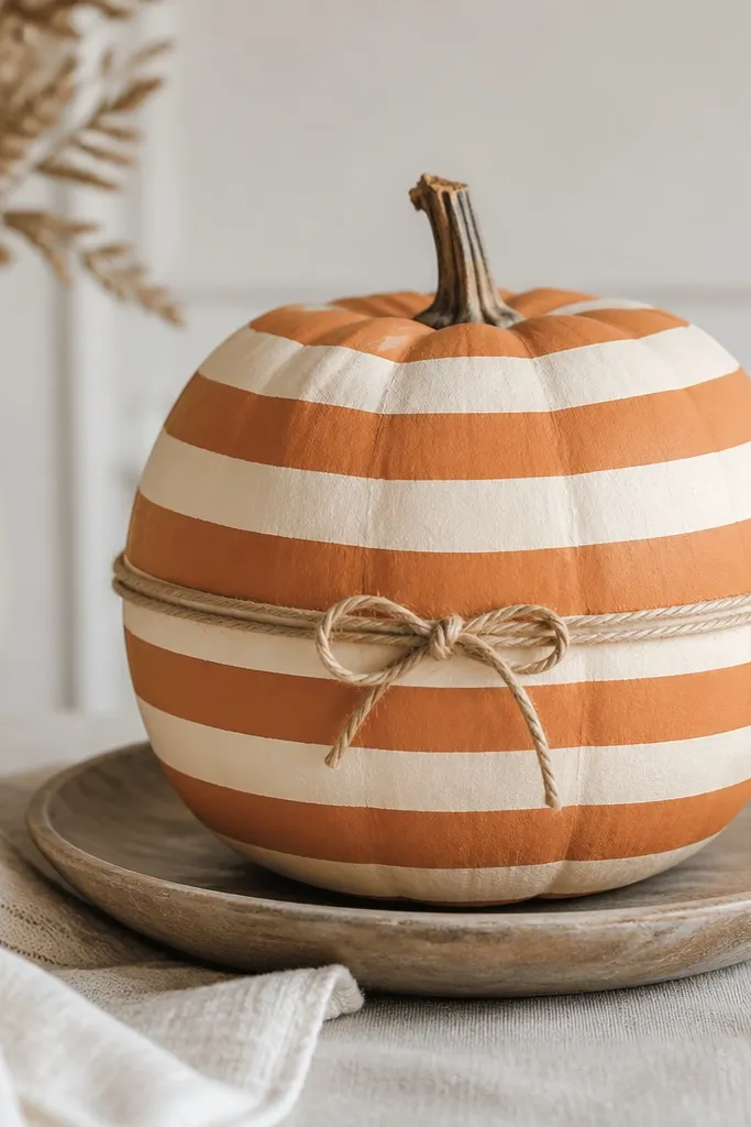
This one mixes paint and texture for that “I made this” look. Horizontal stripes keep it simple, and a twine bow adds dimension without spending money on ribbon. I like it on medium pumpkins because the stripe rhythm looks balanced. The muted orange and cream combo works with almost any fall palette. It also photographs well because the twine catches light and adds depth that flat paint can’t.
Paint the pumpkin muted orange, then use painter’s tape to mask 3-4 horizontal stripe bands. Paint stripes cream and remove tape carefully. Wrap twine around the pumpkin center and tie a small bow; glue the ends under the bow with hot glue. Paint a tiny knot detail on the bow center in cream or brown so it looks tidy, then seal the painted areas only (keep spray away from twine if it soaks).
Let paint dry overnight before sealing so the twine doesn’t pick up tackiness.
Don’t use shiny satin ribbon — it looks out of place against matte paint and cheapens the rustic vibe.
20. Cinnamon Stick Border
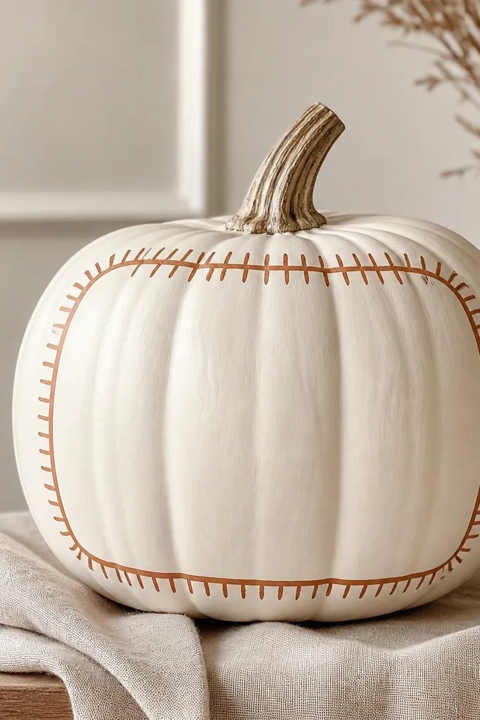
This is a great option when you want fall scent vibes without buying expensive decor. A cream base keeps it clean, and the cinnamon border looks like a frame you’d see on a greeting card. The trick is painting short stick-like strokes so it resembles cinnamon sticks from a distance. It flatters warm kitchens and works with wood trays and ceramic dough bowls. It also scales well: small borders look subtle, wider borders look bold.
Pro tipUse a slightly dry brush for the border so the edges look textured, like paint on paper.
Paint the pumpkin matte cream. Use a thin brush to draw a border rectangle or rounded frame around the front — I place it about 1 inch in from the edges. Paint cinnamon-brown “stick” strokes along the border, alternating direction so they look like layered sticks. Fill the center with a small word like 'SPICE' in dark brown or leave it blank for a calmer look.
AvoidSkip full coverage brown — it turns into a flat pumpkin instead of a framed design.
21. Houndstooth Check in Black and Cream
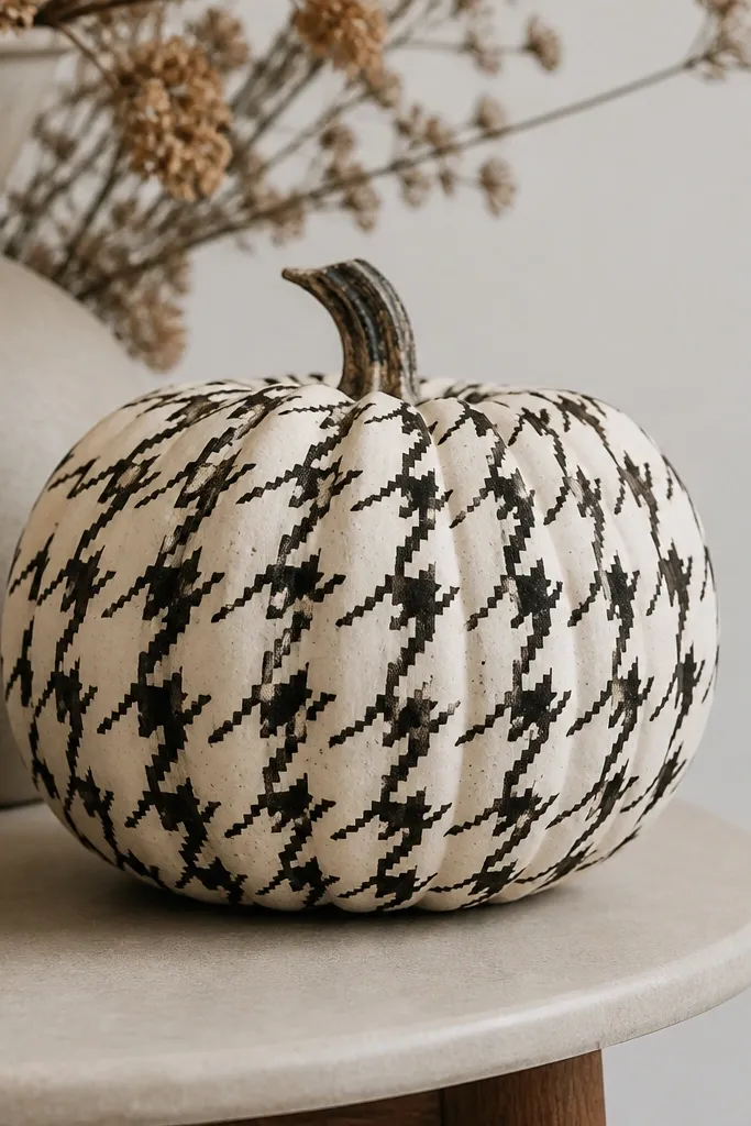
Houndstooth is one of the easiest “designer” patterns to fake because it’s made of repeated units. The black-and-cream palette is classic and looks good in any fall color scheme. I use it on pumpkins because the curved surface actually makes the checks feel like they flow. It flatters minimal decor and looks sharp next to black lanterns. The pattern also hides small paint imperfections since the eye reads the repetition.
Pro tipDo one row at a time and keep your wrist anchored; it keeps checks consistent.
Paint the pumpkin cream and let it dry completely. Draw a light grid with pencil — enough to guide repeating shapes. Use a fine brush to paint small angled black shapes and tiny dots inside each cell to form the houndstooth texture. Let dry, then add a second thin layer of black in the darkest parts so the pattern reads clearly.
AvoidDon’t use thick paint for the checks — it smears on the curve and looks sloppy.
22. Galaxy Pumpkin with Star Dots
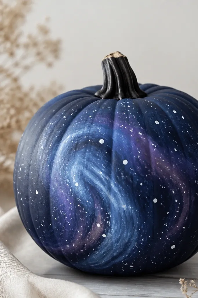
Galaxy pumpkins look magical because the base is dark and the highlights are scattered. I love doing this for night-time displays since the star dots catch light from lanterns. The swirl of purple and blue makes the pumpkin feel deep even if you only paint a few shapes. It flatters modern decor and also pairs with silver or gray accents. If you want something that feels like art, this one delivers.
Pro tipUse a paper plate to flick paint so cleanup is easy.
Paint the pumpkin dark navy. Dab on purple and blue in a few swirled patches using a sponge, then blend the edges with a dry brush. Flick white paint with a toothbrush for stars; vary sizes by changing how much paint is on the brush. Finish with a few tiny light-blue dots for depth, then seal with matte.
AvoidDon’t overdo the purple — too much makes it look like a bruise instead of a galaxy.
23. Candy Stripe Candy Cane (Red and Cream)
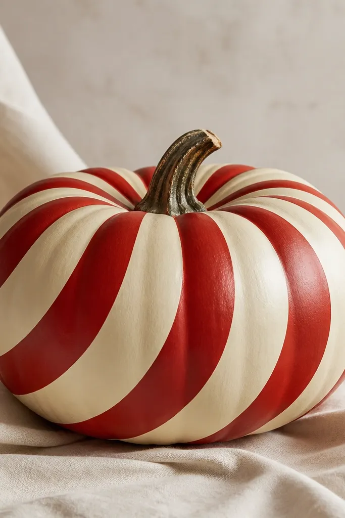
Candy cane stripes are instantly festive and they look clean if you keep the stripes thick and your edges sharp. Cream and red is a classic fall holiday combo that also works with winter decor. I like it on pumpkins that are slightly tall because the stripes look like they’re twisting upward. It flatters bright outdoor lights because the red pops hard against cream. This design makes a porch feel seasonal even if you’re skipping full wreaths.
Pro tipTwist the tape path to match the pumpkin’s natural curve so the stripes look wrapped, not straight.
Paint the pumpkin cream. Use painter’s tape to mask 4-6 curved stripe paths; overlap tape edges slightly to prevent bleed. Paint red acrylic over the taped areas and let dry. Remove tape while tacky, then touch up the stripe edges with a small brush and add a second thin red coat where coverage is light.
24. Botanical Line Art in Sage Ink
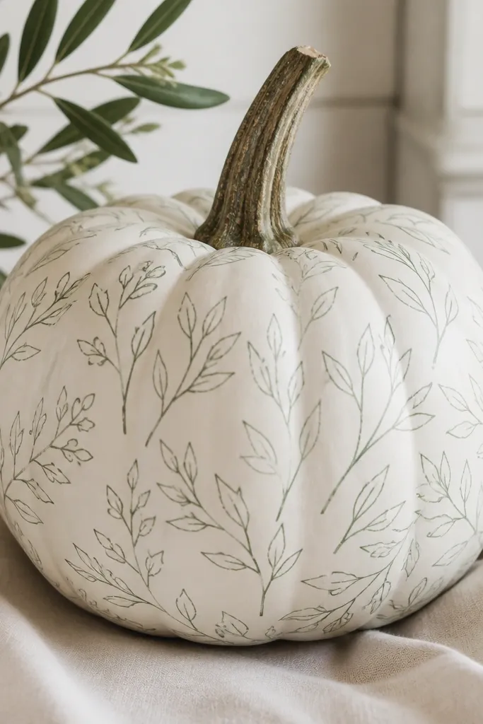
Line art always looks more expensive than filled patterns because it reads intentional and airy. The white base keeps it fresh, and sage-green ink-style lines feel botanical without looking like a cartoon. I’ve done this on pumpkins that have small dents; the line art distracts and makes the surface feel like paper. It flatters minimal decor and works well in front of wood shutters. The best part is it’s beginner-friendly because mistakes are easy to cover with more white paint.
Paint the pumpkin white and let it dry fully. Lightly sketch 2-3 leaf stems across the front with pencil, then trace over with sage-green acrylic using a fine liner brush. Add small details like veins with one or two thin lines, and include tiny dots for flower clusters. Let dry, then seal with matte spray in light coats.
Keep a damp paper towel nearby and wipe your brush tip often to keep lines crisp.
Don’t press hard on the brush — it leaves blobbed lines that look cheap.
25. Terracotta Polka Dots with Burnt Umber Center
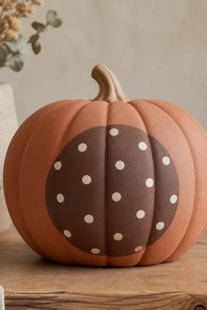
This is a clean pattern that looks like pottery. The terracotta base warms up the whole pumpkin, and the burnt umber circle creates a focal point so it doesn’t look like random dots. I like it for medium pumpkins because the medallion can be big and readable. It flatters warm and neutral decor and looks great on wooden risers. In photos, the medallion keeps the pumpkin from looking flat.
Pro tipIf your circle looks uneven, paint over the outline with terracotta and try again — circles forgive in this style.
Paint the pumpkin terracotta orange and let dry. Use a compass or a cup to trace a circle in the center, then paint it burnt umber. Once dry, stamp small cream polka dots around the circle, keeping spacing even. Fill any thin dots with a second coat, then seal with matte spray.
26. Sunflower Face with Tiny Cheeks
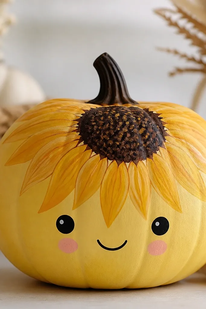
Sunflowers make pumpkins feel like late summer, not just Halloween. The dark brown center anchors the face, and the petals give you an easy “hair” shape. The tiny blush cheeks make it cute without turning it into a cartoon mask. This design flatters warm skin tones in photos and looks great next to tan planters and wicker baskets. It also hides imperfections because petals cover surface bumps.
Paint the pumpkin warm yellow and let it dry. Sketch a sunflower center circle near the top and paint it dark brown. Add petal shapes around it in yellow-orange, using a small flat brush and repeating strokes. Finish with a face: eyes in dark brown, a small smile, and blush cheeks in light pink near the bottom third.
Use a stencil for sunflower petals if your brush work is shaky — the symmetry is worth it.
Don’t paint the petals too thick — thick edges crack as the pumpkin dries.
27. Ombre Terracotta to Cream Dip Dye
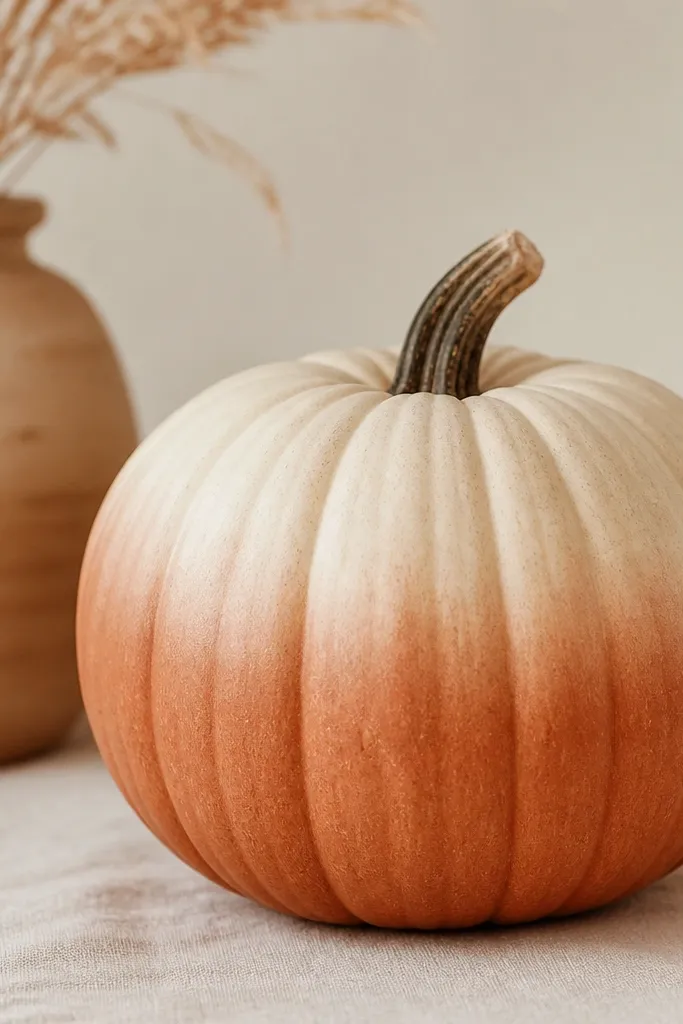
Dip-dye ombre looks like fabric and it’s super forgiving on uneven pumpkin skin. The terracotta-to-cream fade makes the pumpkin look smooth and styled. I like this for people who want a calm fall look that isn’t themed. It flatters almost every porch palette because cream and terracotta fit with wood, black, and olive. It also looks good from far away because the fade is the main feature.
Paint the pumpkin terracotta orange and let it dry. Mix a lighter terracotta by adding white, and paint the top third with the lighter mix. Blend where they meet using a damp sponge in upward strokes until the transition disappears. Add one more thin coat of the top cream if you want it brighter, then seal matte.
Blend with a sponge, not a brush — sponges erase brush streaks fast.
28. Charcoal Chalky Letters (Pumpkin Quote)
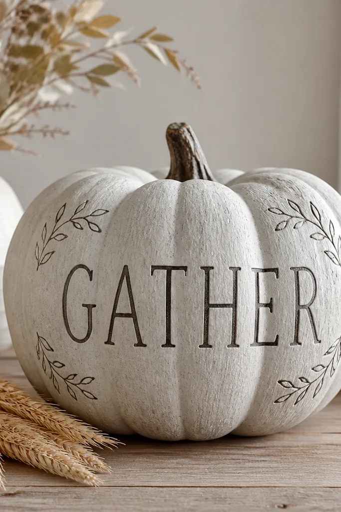
This looks like a chalkboard sign but painted and permanent. The pale gray base gives you a soft neutral that doesn’t scream orange. Charcoal letters look classy and readable from a distance, especially if you keep the font bold and simple. I’ve used it on pumpkins placed on side tables where people get close enough to read. It flatters modern farmhouse decor and pairs with black metal candle holders.
Pro tipIf your letters wobble, outline them once with a steady hand, then fill in — the outline hides shaky interiors.
Paint the pumpkin pale gray and let it dry. Use a pencil to write one word across the front; keep it big and centered. Paint the letters in charcoal with a flat brush or small liner brush, then add small leaf doodles in the corners with a lighter gray. Let everything dry, then spray matte clear in two light coats.
AvoidDon’t pick a thin, light gray for letters — they disappear on the pumpkin’s texture.
29. Rosemary + Sage Corner Sprigs
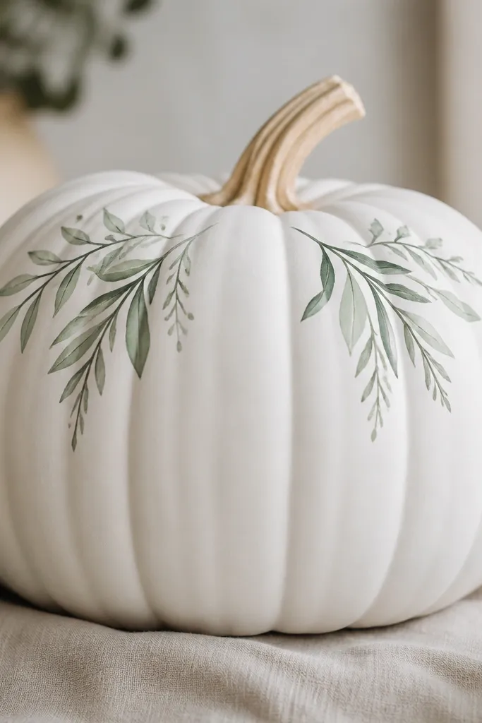
Corner sprigs are one of my favorite tricks because they keep the design minimal. You paint only a small area and leave the rest clean, which hides messy coverage. Sage and rosemary greens look fresh even when the rest of your decor is dry and neutral. This design flatters people who like subtle fall styling and don’t want loud colors. It also looks good on pumpkins you stack, since only the top front details show.
Pro tipUse a toothbrush for tiny dot clusters — it’s faster than hand painting each dot.
Paint the pumpkin white. Lightly sketch two diagonal sprigs in the top corners, then paint the main stems in dark green. Add small leaves in sage green using short brush strokes, and add tiny dots between leaves to mimic seed clusters. Let it dry and seal with matte clear so the greens don’t dull.
AvoidSkip full leafy coverage — it makes the pumpkin look busy and messy.
30. Black and White Face Masks (Half-Panel)
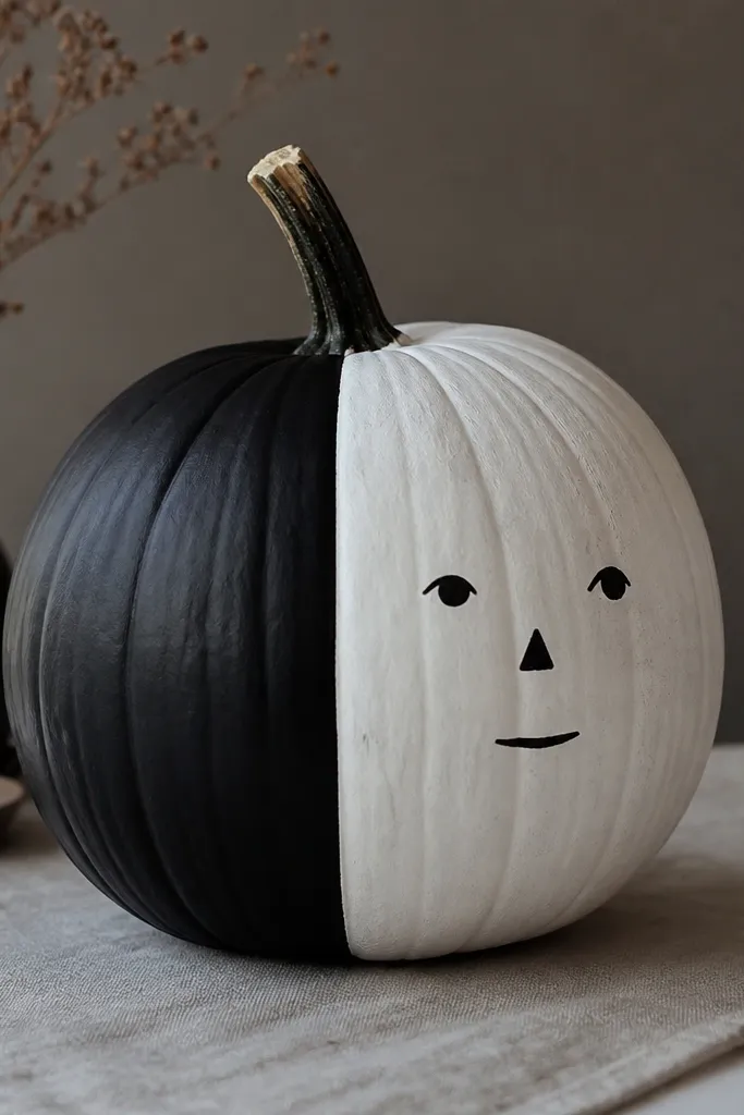
Split-panel faces look graphic and modern because the contrast does the heavy lifting. I paint the pumpkin into two halves and only draw the face on the lighter side. This makes the face readable even if your lines aren’t perfect. It flatters any fall decor with black and white, and it’s especially good for minimalist shelves. The design also looks clean from angles because the split stays obvious.
Pro tipMake the split slightly off-center; it looks more intentional and less like a sticker.
Paint the pumpkin white first and let it dry. Mask one side with painter’s tape and paint the other side black. Remove tape carefully and let the black dry fully. Draw the face on the white side with black paint: eyes as small ovals, nose as a tiny triangle, and mouth as a short curve. Seal with matte spray.