
1. Neon Ghost With a Glow Window
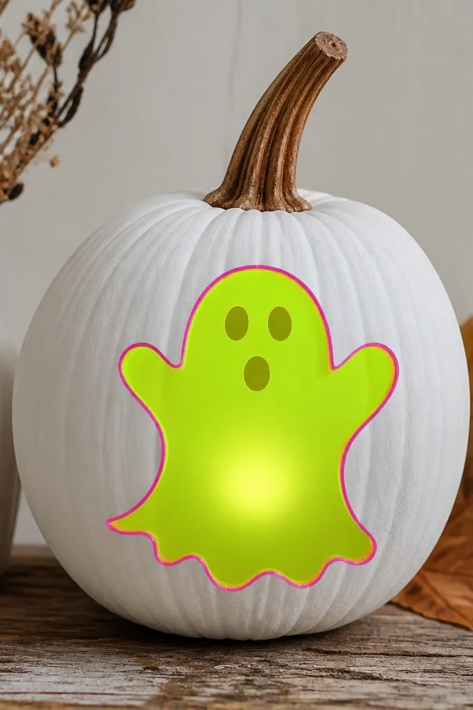
This one wins because the ghost reads instantly and the glow looks like it’s coming from inside the shape. I start with a smooth off-white base so the warm LED light turns creamy instead of orange. The ghost is neon-green acrylic, then I add thin hot-pink lines only along the shoulders and wavy bottom edge. It looks best on medium pumpkins because the ghost body fills the center and doesn’t get stretched on the sides. The styling principle is contrast control: bright color for the silhouette, light base for diffusion, and small hot-pink accents for “neon” drama.
First, paint the entire pumpkin off-white and let it dry fully. Then trace a ghost using a stencil or print one and tape it on; paint the ghost neon-green in two thin coats. Leave a small circle unpainted or very lightly painted directly over where your tea light will sit. Next, paint the hot-pink highlights with a liner brush, keeping lines under 1/8 inch wide. Finally, seal with a matte clear coat so the ghost looks like painted signage, not wet plastic.
Pro tipIf your glow looks too yellow, mix a tiny amount of blue acrylic into white paint for the base layer so the LED reads cooler.
AvoidDon’t flood the ghost with thick paint over the light window — it kills the glow.
2. Stained Glass Pumpkins With LED Strip Lines
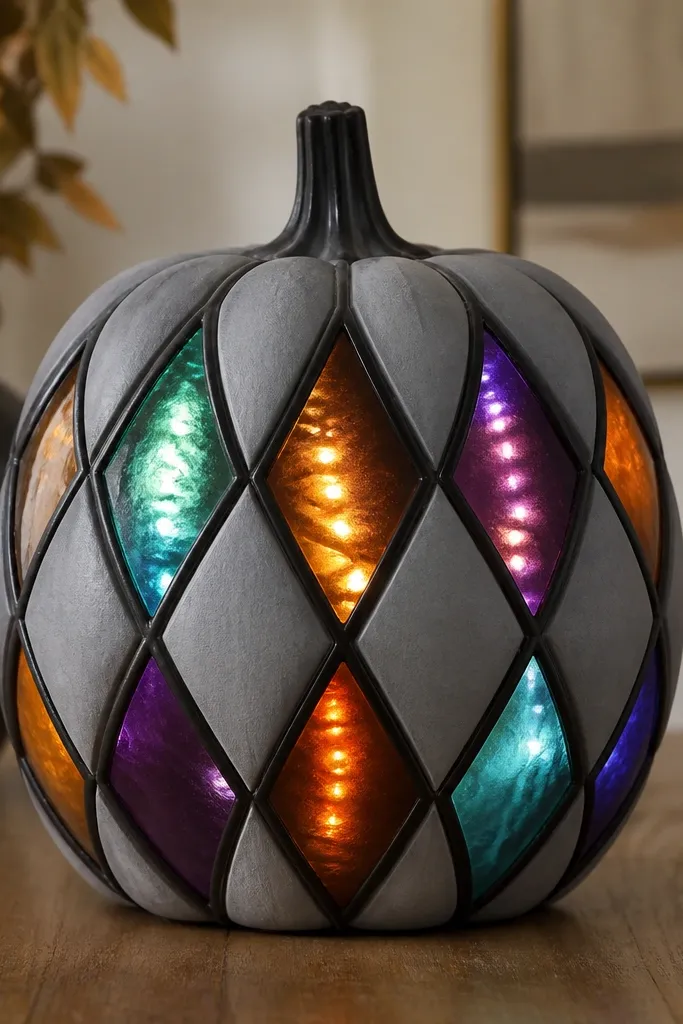
Stained glass looks fancy but it’s pretty forgiving if you use the right materials. The trick is translucent color over a light base and black “lead” lines that catch the light. I use pale gray as the base because it keeps teal and purple from turning muddy. The effect is crisp and decorative, and it photographs well under porch lighting. This design flatters pumpkins with a flatter front section because the diamond grid stays even. The styling principle is that dark lines are for structure, while color stays semi-sheer so the LEDs pass through.
Start by painting the pumpkin pale gray and letting it dry hard. Then draw a diamond grid with a washable marker, keeping each panel about 2 inches across on a medium pumpkin. Paint the “lead” lines with black acrylic in a smooth, slightly raised look using a fine brush or squeeze bottle paint. For the stained panels, mix acrylic paint with a clear gel medium until it looks like tinted milk, then fill each diamond. Place an LED strip behind the center area and test brightness before sealing. Finish with a clear coat; gloss makes the glass look brighter, matte makes it look more like real stained glass.
Pro tipDo one color at a time so the gel medium doesn’t smear; wait 10-15 minutes between panel colors.
AvoidDon’t use fully opaque paint in the panels — it turns the LEDs into a faint glow.
3. Constellation Sky With Star Pop Lights
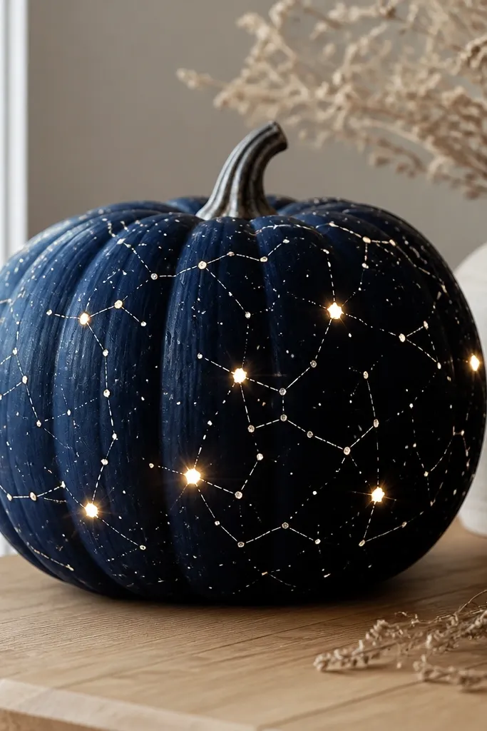
This is my go-to for a clean, modern contest look. The navy base makes white paint pop hard, and the stars look like they’re floating. I use a mix of matte navy and a light dusting of silver glitter only on the brightest “anchor” stars. It flatters almost every pumpkin shape, especially round ones, because the sky doesn’t need to follow a face. The styling principle is scale: tiny dots for most stars, a handful of bigger points where you want the eye to land.
Paint the whole pumpkin deep navy and let it dry. Use a reference star map or just freehand dots with a toothpick dipped in white paint. Connect a few dots with thin silver lines, then add 6-10 slightly larger star dots where your light source will line up. If you’re using a puck light, position it behind the center and mark that spot before painting. For extra glow, paint those “anchor” stars with a white gel medium and let it stay slightly raised. Seal with matte clear to keep the stars from looking like plastic.
If you have a stencil for stars, use it for the small dots and freehand only the connecting lines.
Don’t put big glitter everywhere — it turns the sky into a cheap disco.
4. Candy Corn Stripes With a Warm Inner Glow
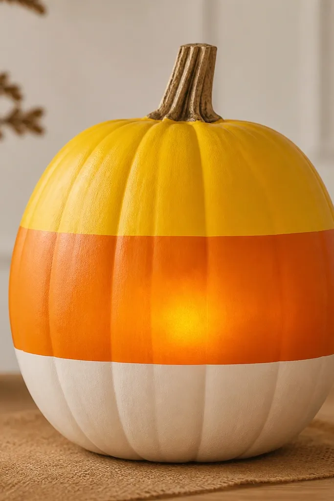
Candy corn stripes are simple, but the glow makes them look like candy itself. I paint clean bands because judges read clean edges from far away. The warm inner light turns the yellow and orange into a caramel tone, which looks extra cozy on tables. This works best when the pumpkin has an even surface, but you can fix minor bumps by painting slightly thicker in those spots. The styling principle is edge discipline: crisp separators make the glow look intentional.
First, paint a smooth base layer of off-white where the bottom stripe will start. Then tape off two bands using painter’s tape, leaving the center stripe for last. Paint the top band bright yellow, the middle stripe orange, and the bottom band off-white, letting each coat dry before removing tape. Place a battery tea light behind the taped seam area so the brightest glow sits between yellow and orange. If you want extra candy depth, add a thin translucent orange glaze over the yellow stripe after it dries. Seal with matte clear so the stripes keep a candy-like finish.
Pro tipPress the tape down firmly with a credit card so you get razor edges.
AvoidDon’t rush tape removal — peeling too early smears the stripe edges.
5. Black Cat Silhouette With Moonlight Rim
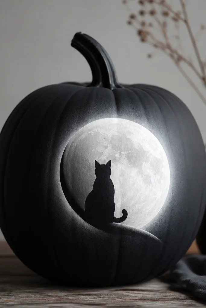
This design looks dramatic without needing tiny details. The cat silhouette is all about solid shapes, and the moon rim gives you that “glowing night” effect. I paint the pumpkin in charcoal or deep gray, then do a big crescent moon in matte white with a slightly imperfect texture so it looks like moonlight, not a sticker. The cat is glossy-black for a strong contrast against the moon. It flatters smaller pumpkins because the silhouette stays readable. The styling principle is one hero element: moon and cat only, with glow kept to a controlled rim.
Paint the pumpkin charcoal and let it dry. Sketch a crescent moon on the upper side and paint it matte white. Use a stencil or printed cat outline to paint the cat in glossy-black, keeping the silhouette edges clean. Now add the rim glow: paint a thin ring of white acrylic around the crescent area, then gently blend outward with a damp sponge. Position a tea light behind the moon side so the ring catches the light. Finish with matte clear over the background, but keep a light gloss layer only on the cat so it reflects slightly.
Use a makeup sponge for the rim blend; it gives a soft moon haze without streaks.
Don’t paint the entire pumpkin white — it makes the cat look flat and kills the night vibe.
6. Pumpkin Face With Light-Up Eyes and Freckle Dots

This is the easiest crowd-pleaser because people instantly recognize a face. The trick is to make the eyes do the glow work, not the whole pumpkin. I keep the base orange and paint the face in creamy whites and soft browns, so it looks like a cartoon that came to life. Freckle dots add texture and hide uneven surfaces. It looks best on medium to large pumpkins because you need enough room for the eyes and nose. The styling principle is focal lighting: two bright eye zones, everything else stays softer.
Start by painting a light base around the face area — I use a creamy off-white patch so the LED looks brighter. Paint the eye whites as thick circles, then leave a tiny center spot where you’ll place a small LED or where the tea light sits behind. Add brown freckles with a toothbrush dipped in watered brown paint, tapping lightly for dotty specks. Paint the nose and smile in a warm cocoa brown. Seal and test the eyes before final closure so you can adjust where the light sits.
If your eyes look dim, add a second thin coat of white only on the inner glow zone.
Don’t outline the whole face in black — it makes it look like a Halloween mask.
7. Geometric Lines With a Battery Tea Light Center
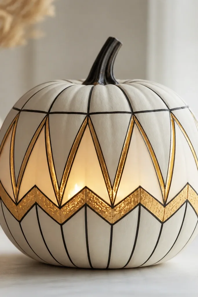
Geometric line art is clean, modern, and very contest-friendly because it reads even from the side. I use a white base so the gold metallic paint reflects the light instead of absorbing it. The black lines define the shapes, and the metallic gold sits in the brightest zones where the LED shines. This design flatters tall pumpkins because you can stretch triangles vertically. The styling principle is light mapping: you place the tea light where you want the gold to look brightest.
Paint the pumpkin solid white and let it dry completely. Use painter’s tape to create triangles and zigzags; press the tape down hard on the curves. Paint the negative spaces black, then remove tape and fill the gold areas with metallic gold acrylic. Place a tea light behind the center and mark that spot on the pumpkin with a pencil so your gold lines line up. Add a few small gold dots or short dashes to keep the composition from feeling empty. Seal with a satin clear coat if you want the gold to sparkle under light.
Pro tipKeep your tape shapes big. Small tape angles pull away on pumpkin curves and ruin the lines.
AvoidDon’t use silver metallic — it looks icy next to warm LEDs and can look cheap.
8. Mermaid Scales With Teal Glow Strips
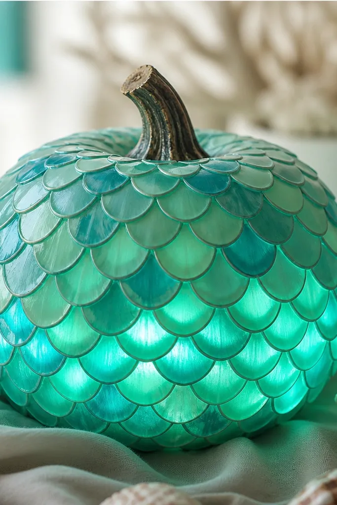
Mermaid scales look hard, but the method is simple and the glow makes it look like real texture. I paint a seafoam base, then add scale shapes in two teal shades so the light creates depth. The LED strip placement matters — you want it low enough that the scales look like they’re catching light as they rise. This flatters pumpkins with a visible “front” curve because the scales need a consistent direction. The styling principle is layered texture: overlapping shapes plus a light source that hits from below.
Start with a seafoam green base and let it dry. Use a small sponge or a scale stencil to paint overlapping scales in darker teal; keep scale rows slightly angled upward. Add a lighter aqua highlight on the top edge of each scale so the glow has something to bounce off. Install an LED strip around the lower third behind the paint area, then test brightness before you seal. If you want extra glow, paint a thin translucent glaze over the scale highlights only. Seal with satin clear to keep the scales from looking chalky.
Paint the scales in batches of 4-5 rows so your hand stays consistent and the edges don’t wobble.
Don’t make every scale the same exact shade — the texture disappears when the light hits.
9. Vintage Library Pumpkins With Warm Amber Lights
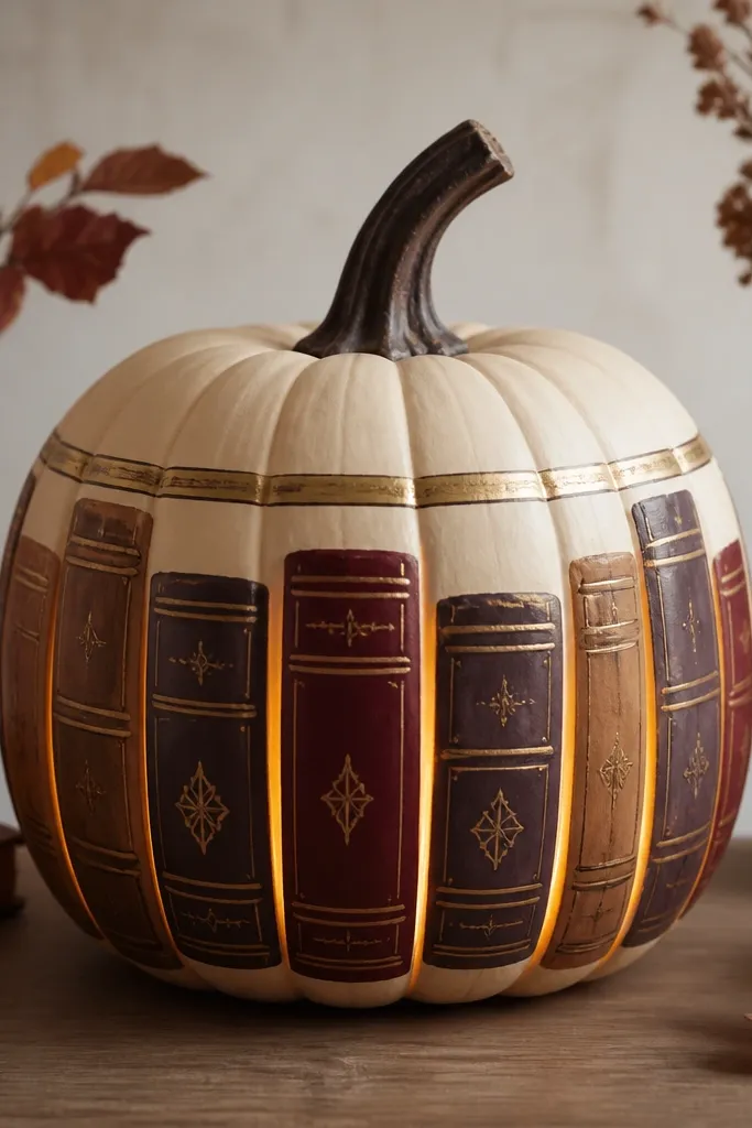
If you want something different from the usual spooky faces, this one looks like a cozy vignette. I paint book-spine panels so the pumpkin becomes a little “shelf” object, and warm amber light makes the colors feel aged instead of neon. The cream base keeps the glow soft, and muted browns stop the design from looking like a costume. This flatters people who like traditional decor because it looks at home on mantels and dining tables. The styling principle is warm palette + controlled highlights: amber lights with cream diffusion and only small gold accents.
Paint the pumpkin cream and let it dry fully. Tape off vertical book-spine sections, then paint each panel in a mix of muted burgundy, espresso brown, and dusty tan. Add a thin gold label strip across 2-3 spines using a small flat brush. Place a tea light inside and position it behind the center spines so the glow lights the “book titles.” For extra realism, add a tiny dot or stripe pattern on one spine using watered-down paint. Seal with matte clear so the “paper” look stays soft.
Pro tipUse painter’s tape for straight spine edges, then touch up with a damp brush instead of repainting the whole section.
AvoidDon’t use bright primary reds — they look like cheap craft paint under amber LEDs.
10. Floral Outline With Backlit White Blossoms
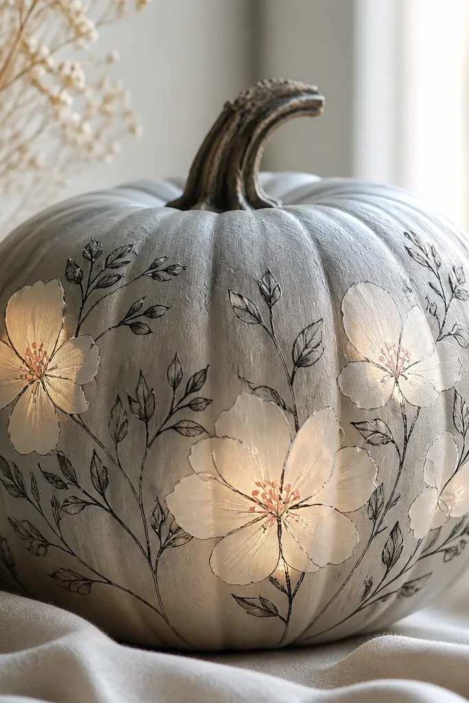
Floral outlines look surprisingly classy under light because the glow turns the petals into a soft lantern effect. I do thin black outlines so the design has structure, then I paint blossoms in semi-translucent white to let the LED shine through. Tiny pink centers keep it from looking sterile. This is great for people who want pumpkin painting ideas with lights that look like decor, not just Halloween. It flatters fair skin tones and cool-toned outfits because the palette is neutral with gentle pink. The styling principle is line + backlight: crisp outlines, then glow-only in the petal fill.
Start with a light gray base and let it cure. Trace a floral pattern with transfer paper or pencil, then outline with black acrylic in a thin liner brush. Mix translucent white by adding a little clear gel medium into white acrylic until it looks milky, not chalky. Fill only the blossoms with translucent white, leaving the background fully opaque. Place a tea light behind the blossom cluster and test the glow through the petals. Add small pink dots in the centers once the white is dry, then seal with matte clear.
If the blossoms look dull, add a second thin translucent layer rather than thick paint.
Don’t shade the whole flower with opaque white — it turns off the backlight effect.
11. Candy Skull With Glow Lines and Silver Dust
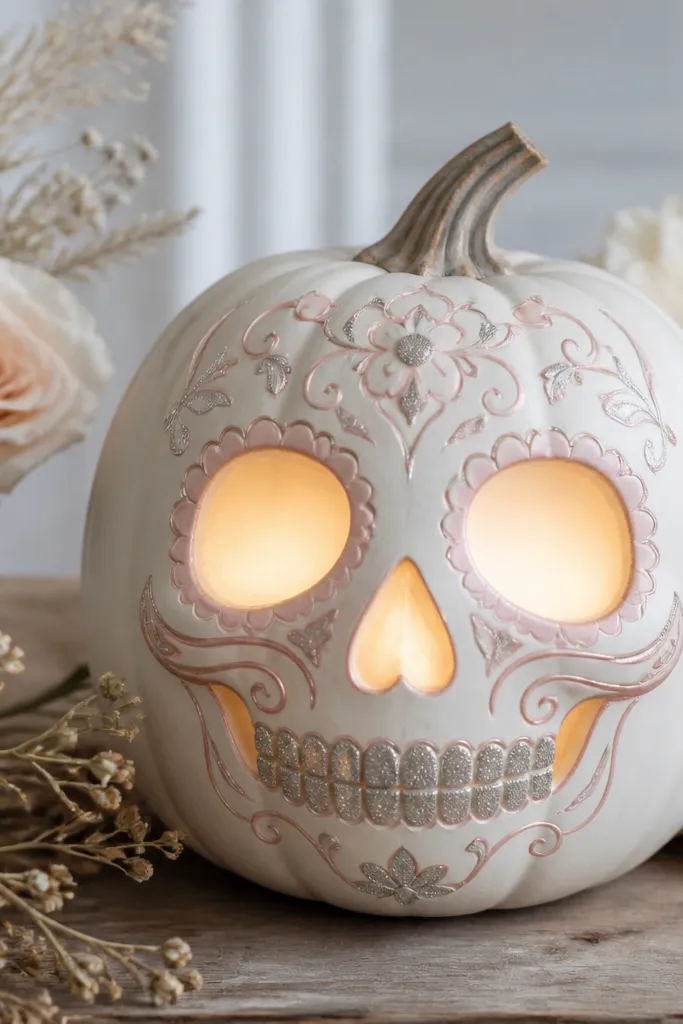
Candy skulls look edgy but still clean, and the lights make the “sugar” effect believable. I paint the base white, then use pastel pink and soft gray for features so it doesn’t look like a cheap stencil. The glow lines are thin — I keep them to cheek arcs, teeth outlines, and the inner eye socket area. This design looks best on round pumpkins where the skull proportions stay balanced. The styling principle is restraint: glow in lines and edges, not full opaque blocks.
Paint the pumpkin a smooth white base and let it dry. Use a printed skull outline and transfer it onto the surface. Paint the eye sockets with a semi-translucent gray or pale blue mix so the LED glow passes through. Add thin pastel pink lines along the nose and cheek arcs, using a liner brush. For teeth, paint small rectangles in white and add a tiny silver dust line at the bottom edge with a dry brush. Place a tea light behind the face center and seal with a matte clear coat that won’t yellow.
Pro tipUse a dry brush for the silver dust so it stays speckled instead of streaky.
AvoidDon’t cover the whole skull in glitter — it looks messy under warm light.
12. Haunted House Windows With Stacked Light Frames
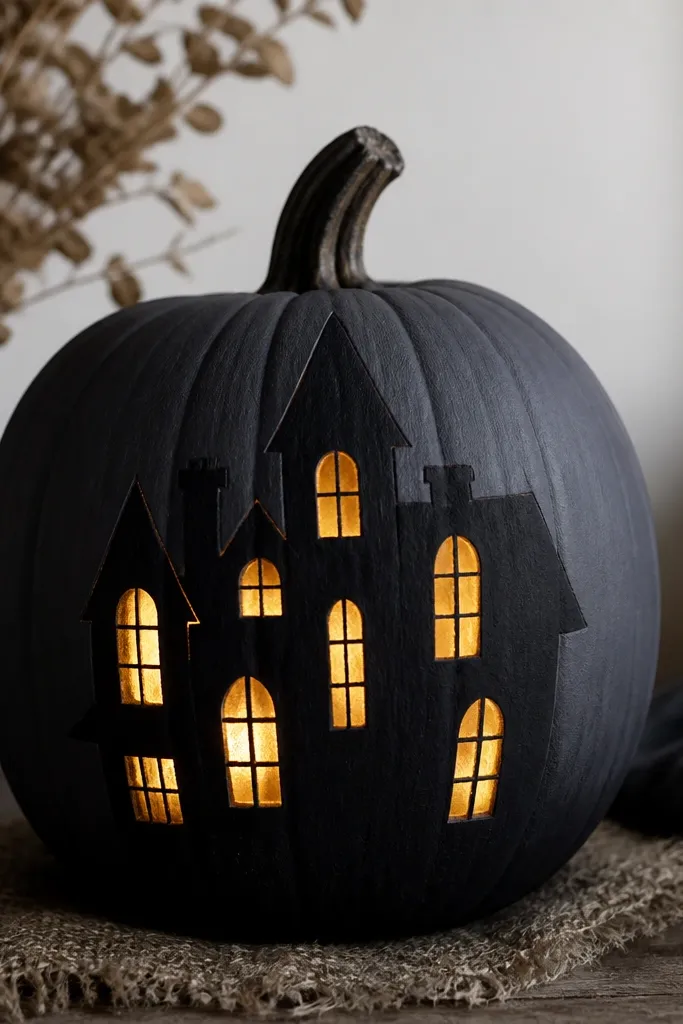
This one reads like a little scene, not a flat design. The stacked window frames make the glow feel deeper, and it looks great on porch steps. I use charcoal paint as the background because it makes whites look bright and keeps the scene from washing out. The windows are painted in layers — solid white, then a translucent wash — so the LED looks like it’s shining through glass. This flatters slightly larger pumpkins since the “house” needs space for the roof and windows. The styling principle is depth by layering: multiple paint passes for the window area only.
Paint the pumpkin charcoal and let it dry. Sketch a simple house shape with a roof line and chimney, then paint the house silhouette in a slightly lighter gray for dimension. For the windows, draw rectangular frames with a white acrylic and paint them solid first. Next, mix translucent white or light blue and do a thin wash inside each window frame so light passes through. Install a tea light behind the window cluster and test — you want the brightest glow in the center windows. Seal with matte clear so the scene looks like painted decor, not shiny plastic.
Pro tipUse a ruler for window frames. Even slight misalignment reads as “kid craft” from far away.
AvoidDon’t use pure black for every line — it makes the windows dim and flat.
13. Minimal Witch Hat Accent With One Bright Star
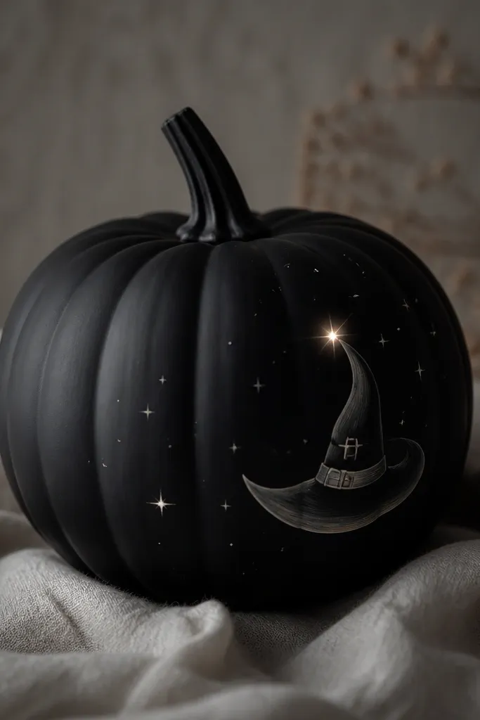
Minimal designs win when the lighting is the centerpiece. I keep the pumpkin mostly matte black, then paint one witch hat and one star in off-white that glows strongly behind a tea light. The hat is simple — no busy patterns — because the glow makes it feel intentional. This flatters small-to-medium pumpkins because the elements can stay centered and not compete with the pumpkin’s natural ridges. The styling principle is negative space: let the glow do the work and keep paint coverage low.
Paint the whole pumpkin matte black and let it cure. Mark a star position on the upper side where you plan the light window. Paint the star in thick off-white acrylic, then leave a tiny center dot lighter so the LED brightens the middle. Paint the witch hat using a stencil: a triangle hat with a small band and a tiny buckle detail in metallic gold. Place a tea light behind the star area, not behind the hat, so the brightest point is the star. Seal with matte clear to keep the minimal look sharp.
For the star center, dab on white acrylic with a foam applicator so it looks like it’s radiating.
Don’t add lots of extra stars — too many glowing points makes it look cluttered.
14. Orbit Planets With a Puck Light Glow Core
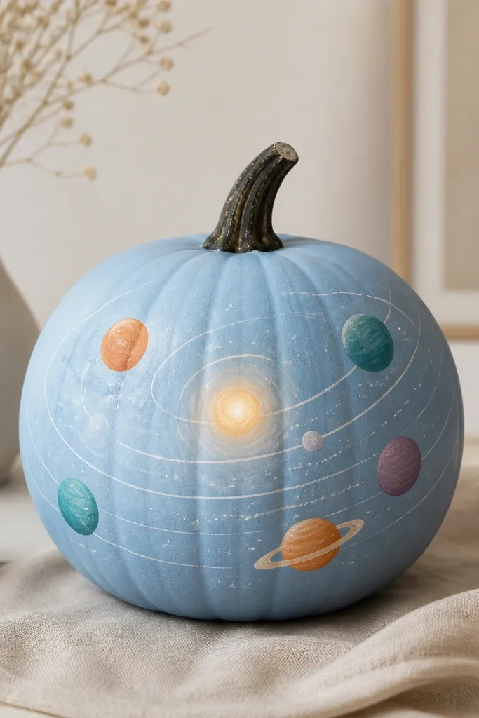
Orbit art looks like a science poster, and the glow core makes it feel dimensional. I use a sky-blue base so planets look saturated without needing neon. The orbit lines are thin white, and the planets get a single highlight stroke so they look like spheres. This flatters pumpkins with a fairly smooth front because the orbits should curve cleanly. It also photographs well in dim light, which matters for contests. The styling principle is a single glow core and consistent line weight across orbits.
Paint the pumpkin sky-blue and let it dry. Draw 2-3 orbit paths with a thin brush or fine paint marker, keeping line thickness consistent. Place a puck light behind the center and mark that area on the pumpkin so your brightest orbit crosses there. Paint planets as circles in teal, muted purple, and a warm orange; add a small lighter highlight on each planet toward the same direction. Keep planet sizes varied but not chaotic: one large, one medium, and one small. Seal with satin clear so the highlights catch the light without turning glossy.
Pro tipIf your orbit lines wobble, tape a flexible strip of paper along the curve as a guide.
AvoidDon’t use thick black outlines around planets — it makes them look like stickers.
15. Halloween Town Skyline With Foggy Glow Base
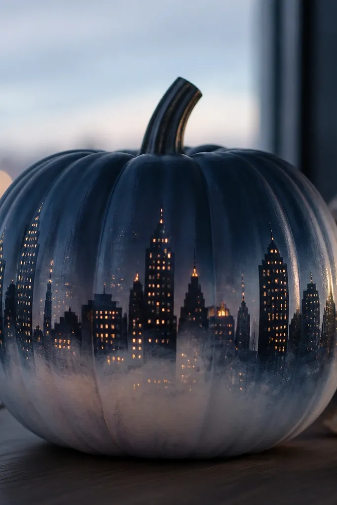
A skyline silhouette looks like a nighttime street scene, and the foggy glow at the bottom is what makes it feel atmospheric. I paint the background navy, then build buildings in layered dark grays so the skyline has depth. The glow area is a translucent white haze across the lower third, which diffuses the light into a soft “fog.” This flatters pumpkins with a clear front face because the skyline needs a stable horizon line. The styling principle is horizon fog: keep most details dark, and let light bloom at the bottom.
Paint the pumpkin dark navy and let it dry. Mark a horizon line around the lower third and paint building silhouettes above it in layered dark gray tones. For windows, use a tiny dotting tool or toothpick to place small white dots; leave some dots aligned with where the LED sits behind. Now create the fog: mix translucent white (white acrylic + clear gel medium) and sponge it across the lower third so it looks smoky, not solid. Place a tea light behind the center and test from different angles to see if the fog spreads nicely. Seal with matte clear so the fog stays soft.
Use a makeup sponge for fog — it keeps the texture random like real mist.
Don’t paint the fog as a solid block — it looks like spilled paint instead of atmosphere.