1. Midnight Witch Cat with Moon Halo
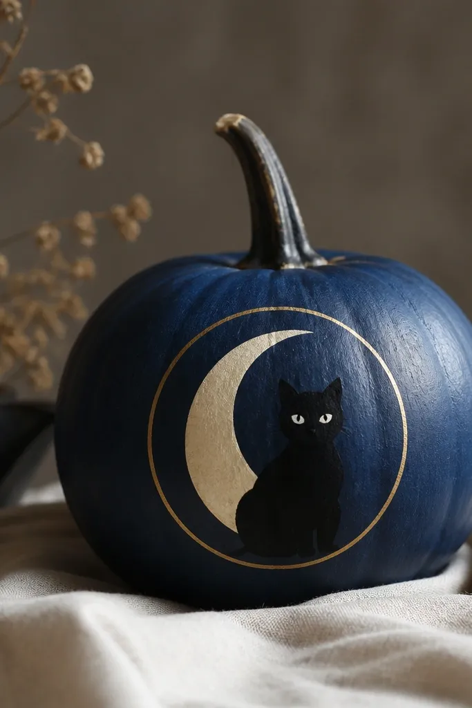
This design wins because the silhouette reads instantly. The pumpkin is painted a deep navy, then the cat body and tail are solid black with clean negative space for the face. The moon halo is a simple pale cream ring with a thin gold line on the outer edge, which makes the whole piece pop without getting busy. It looks great on medium-to-small pumpkins because the cat fits the curve and the moon sits in the upper third. If your contest crowd skews toward spooky but polished, this hits that sweet spot.
Start by painting the entire pumpkin navy and let it dry fully. Transfer a simple cat outline (or freehand a cat in profile) and fill it in with black acrylic, then paint the eyes white and add tiny pupils in charcoal. Paint the moon as a cream crescent centered on the top third, then trace a second slightly larger circle as a halo ring. Finish with a gold line around the outer ring using a liner brush, and add a few short star dots with a toothbrush flick.
Use a liner brush for the gold ring — it should look like a single unbroken line, not a blob.
Don’t add too many stars; 10-15 dots look intentional, 50 looks messy fast.
2. Candy Corn Fade Ombré Ridges
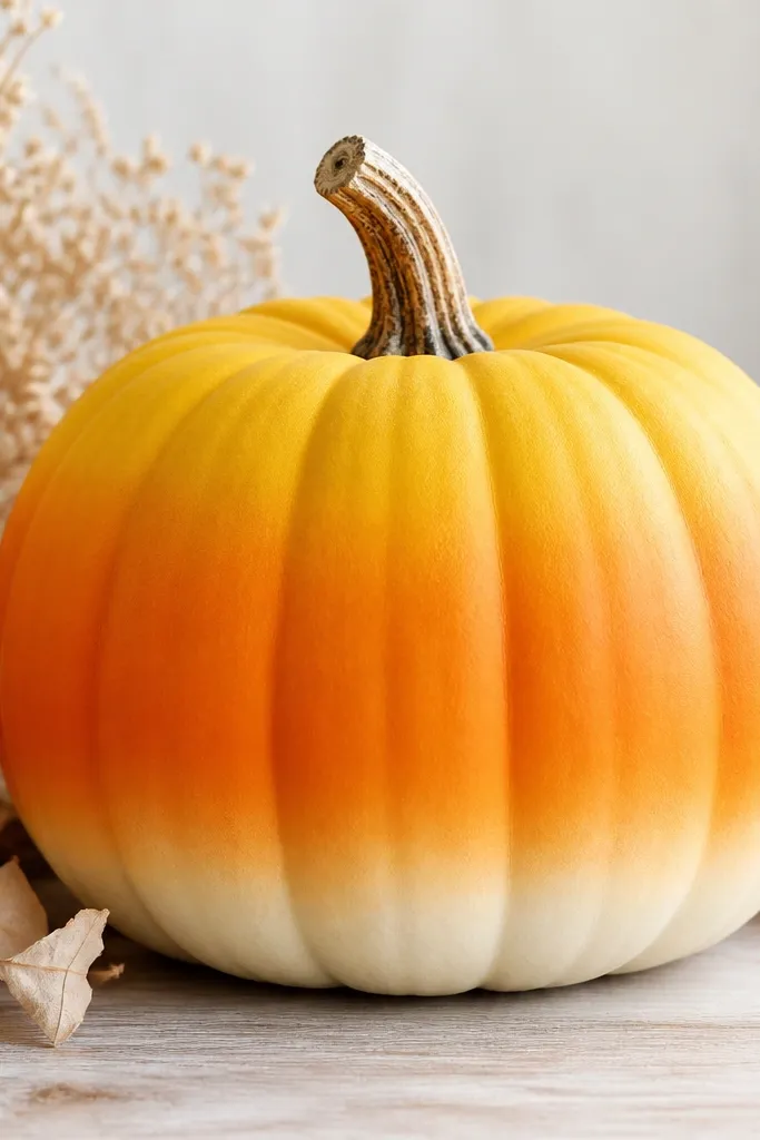
This one wins on color alone because it reads like candy from across the room. You paint a true ombré from yellow to orange to cream, then you reinforce the vertical ridges with lighter strokes so it still looks dimensional. I like it on pumpkins with deeper grooves because the ridge highlights catch the light. Warm skin tones and golden hair styles look extra good next to it because the palette is already flattering and bright. It’s also beginner-friendly if you take your time on the blend.
Base coat the top third with warm yellow, pulling the paint down into the middle with a damp sponge so the edges fade. Add orange in the middle band, then blend it into yellow and cream using a dry brush technique. Paint the bottom third creamy white and feather the top edge upward so you get a smooth transition. Finally, use a small flat brush to lightly trace each pumpkin ridge with a slightly lighter version of its band color, keeping the strokes narrow.
Blend with a slightly damp sponge, not wet paint — damp gives control and prevents streaks.
Don’t paint thick bands; thick paint makes hard lines that look like you cut it with tape.
3. Botanical Black and Sage Minimal Vines
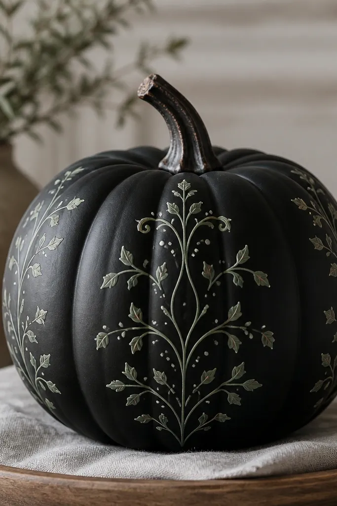
Minimal vines score well in contests because judges notice clean spacing. The black base makes every line look crisp, and the sage leaves look fresh instead of Halloween-y. I keep the vine thickness consistent: thin stems, slightly thicker leaf fills, and a few tiny white dots for highlight. This style flatters nearly every skin tone because it’s neutral and not overly saturated. It also photographs beautifully because matte black reduces glare.
Paint the pumpkin matte black and let it cure at least an hour. Lightly sketch a central vine line with pencil, then add two side branches that mirror each other. Paint stems in sage green with a fine liner brush, then fill leaves with sage and add a darker sage vein line for depth. Add small white dot clusters near leaf tips and along the opposite side to balance the composition.
Pro tipUse painter’s tape to mask a straight “center path” while you sketch — it keeps symmetry without overthinking.
AvoidDon’t use chunky craft glitter in minimal designs; it destroys the clean look.
4. Art Deco Roaring 20s Fan Pattern
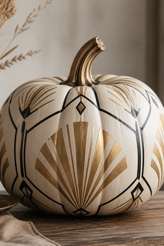
Art Deco looks expensive because it’s all about sharp geometry and repeating rhythm. The cream base makes gold look like real metal, and the black outlines keep the pattern readable. I like this on larger pumpkins because you can spread the fan pattern across more surface area without cramming. It also pairs well with warm-toned clothing — the cream and gold look like fall jewelry. If your goal is “contest winner that looks store-bought,” this is it.
Start with a smooth cream base coat, then let it dry completely. Draw a vertical center line and two diagonal lines to map the fan layout. Paint gold fan arcs in sections, then outline edges with black using a fine brush or a 10/0 liner. Add small black diamond accents at the ends of arcs and fill corner gaps with tiny gold dots. Finish by tracing a thin gold border around the widest fan band.
Pro tipUse a ruler and keep your fan arcs equal width — uneven fans scream DIY, even if the colors are right.
AvoidDon’t freehand the geometry without guides; wobbly lines kill the Deco vibe.
5. Spooky Victorian Portrait Pumpkin
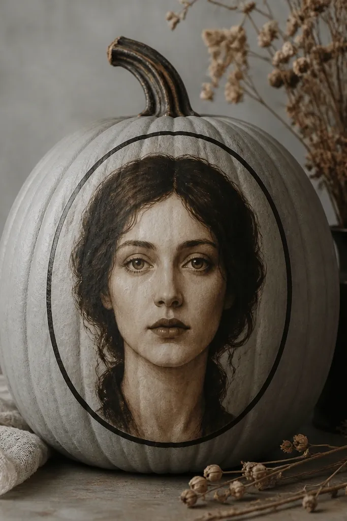
A portrait style stands out because it turns the pumpkin into a “prop,” not just a decoration. The trick is keeping the portrait limited: one central face, an oval frame, and a few shading strokes. I use pale gray for the base, then build hair and facial shadows in sepia brown so it looks like an old photograph. This style looks great on pumpkins with a strong top-to-bottom shape because the oval frame naturally follows the curve. It also looks classy next to porch lanterns.
Base coat the pumpkin pale gray and dry-brush a light sepia wash over the lower half. Draw an oval portrait frame centered on the pumpkin and paint it with black. Paint the face with sepia tones: lighter under-eye and cheek highlights, darker shading around hairline and jaw. Add dark hair framing with broad strokes, then finish with a small highlight line on the forehead and nose bridge using off-white paint.
Pro tipPrint a grayscale face reference and place it under your pumpkin — trace the oval and major shadow shapes only.
AvoidDon’t chase realism with tiny features; vague shadows with strong contrast look more artful.
6. Lemon Pepper Jack-O-Lantern Smile
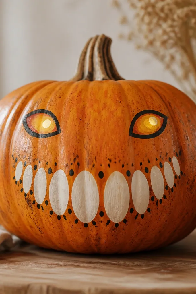
This is the cleanest way I’ve found to make a jack-o-lantern look modern. Instead of messy jagged cuts, you paint a smooth smile and controlled teeth shapes, then add “pepper dots” for texture. The base is warm orange, but the eyes and mouth highlights are lemon yellow, which gives a fresh punch under warm light. It flatters people who like funny over scary because the face is friendly, not horror. On medium pumpkins, the grin sits right at eye level for best readability.
Paint the pumpkin warm orange and let it dry. Use a pencil to map a centered smile, then paint teeth with off-white rectangles and triangles, leaving slight gaps for a “shadowed” look. Add lemon yellow for the eye shine and one small highlight dot on each eye. For texture, flick tiny black pepper dots with a toothbrush around the mouth area, keeping them denser near the cheeks and lighter near the chin.
Keep the teeth shapes consistent — even spacing makes it look designed, not accidental.
Don’t use pure white everywhere; it looks chalky. Off-white looks softer.
7. Galaxy Swirl with Starburst Specks
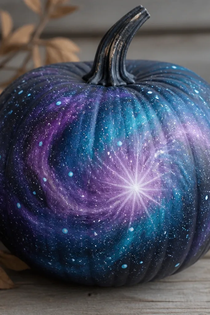
Galaxy pumpkins always get stopped by judges because the colors look like depth, not flat paint. The key is swirling with two or three tones only: deep purple, teal, and a mid violet. The starburst center gives you a focal point so it doesn’t look like random scribbles. This style looks best on pumpkins with smooth curves because the swirl flows with the surface. It also looks great with silver accents because the specks mimic starlight.
Base coat the pumpkin deep purple. Load a brush with teal and paint broad curved swirls, then add mid violet between swirls to blend. Use a small fan brush for a few soft feather edges so the colors transition. Create a starburst by placing a bright light-blue dot at the center and dragging short lines outward with a liner brush. Finish with white and light-blue specks flicked with a toothbrush.
Practice one swirl on paper first — your brush pressure controls whether it looks smoky or scribbly.
Don’t add glitter on top of galaxy specks; it turns the whole thing into one sparkle blob.
8. Harvest Plaid with Tartan Bands
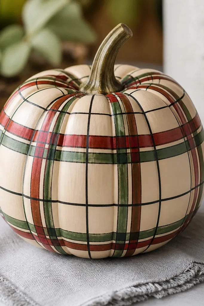
Plaid looks classy because it has a built-in structure. The cream base keeps it warm and fall-ready, while red and green tartan gives that cozy harvest vibe. I add black grid lines so the checks read clearly from a distance, even in dim porch lighting. This style looks great on taller pumpkins because the plaid bands can wrap naturally from top to bottom. It also pairs well with scarves and knit textures.
Paint the pumpkin cream and let it dry. Plan three horizontal bands with pencil marks, then paint red stripes across each band. Add green stripes crossing the red and keep the spacing even. Use black paint to draw thin grid lines at every intersection, following the pumpkin’s curve. Finally, lightly trace ridge lines with a darker green or brown so the plaid looks wrapped, not pasted on.
Pro tipUse a small strip of painter’s tape to guide your first stripe — it saves you from crooked plaid.
AvoidDon’t go thick on grid lines; thick black makes it look like a kid project.
9. Copper Foil Leaf Cutout Look
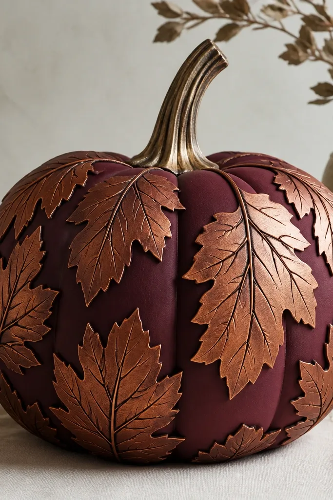
This one looks expensive because it uses layered leaf shapes and metallic color without needing real foil sheets. The burgundy base makes copper look warm and antique, and the leaf veins add detail that reads even from far away. I like it on pumpkins with flatter sides so the leaf layers don’t warp. It flatters people who like darker fall palettes and looks sharp next to black lanterns. If your contest allows mixed media, this is a strong choice.
Base coat the pumpkin burgundy and let it dry. Cut leaf shapes from thin craft foam or cardstock, then paint them copper and let dry. Position the leaves in a cluster around the center and glue them down with a strong craft adhesive. Paint a few vein lines on the leaves with a darker copper or brown, then add tiny highlights with a lighter copper on leaf edges. Seal the whole pumpkin with a matte clear coat so the metallic doesn’t smear.
Pro tipKeep leaf edges slightly uneven — perfect symmetry can look plastic.
AvoidDon’t use glossy clear coat; it makes copper look like wet paint under light.
10. French Lavender Field Topper
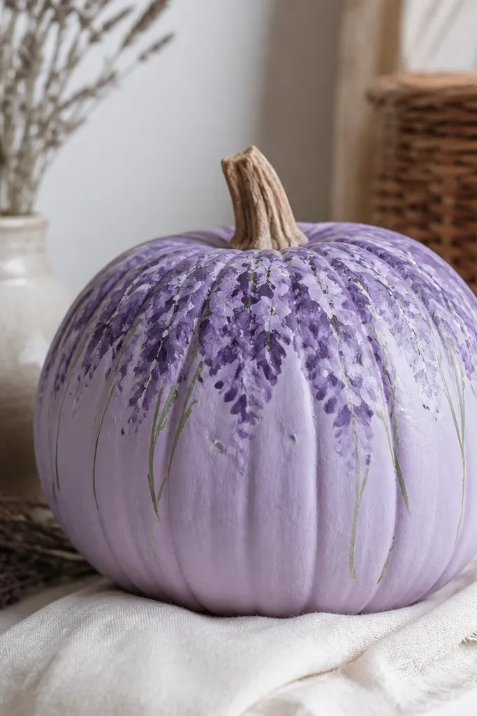
Lavender on a pumpkin is a surprise in the best way. The pale lavender base gives you a calm, pretty look that still reads as fall when you add green stems and a few brown shading strokes. I keep the “flowers” as clustered brush marks, not individual tiny buds, so it looks painterly and not like you’re fighting the pumpkin texture. This works beautifully for medium pumpkins because the top half can carry the flower mass. It’s also a hit for contests that like non-traditional Halloween color.
Paint the pumpkin pale lavender and let it dry fully. Sketch a loose horizon line where the flower field starts. Add darker purple clusters by tapping a fan brush or sponge upward in short strokes, then blend edges with a lighter purple. Paint a few thin green stems with a liner brush and add tiny white dots between clusters for highlights. Finish with a brown wash at the bottom edge to ground the composition.
Use two shades of purple only — more shades make it look muddy fast on curved surfaces.
Don’t paint every bud; clusters read better and take less time.
11. Retro Sunburst with Checker Border
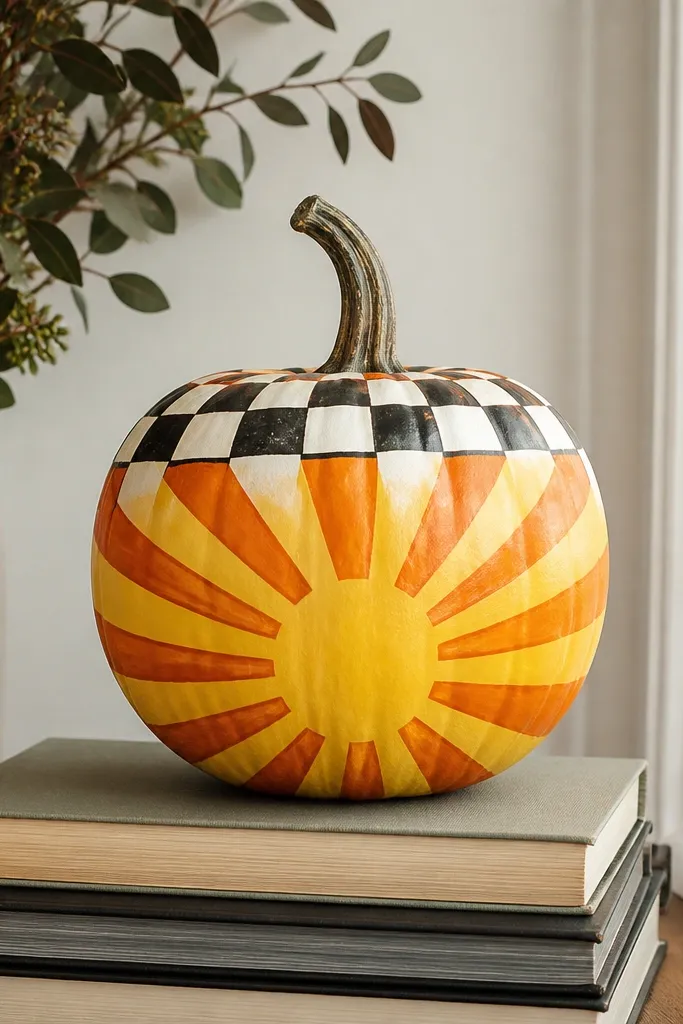
Retro sunbursts win because they look like posters. You get bold rays that wrap the pumpkin, and the checker border gives a crisp frame so it doesn’t feel random. The palette is simple: bright yellow, orange, and black-and-white checks. This design looks great on larger pumpkins because you can fit the rays across more ridges without compressing. It also flatters photos because the high contrast stays readable through camera blur.
Base coat the pumpkin bright yellow. Paint orange rays radiating from a center dot, keeping each ray width consistent and letting them follow the pumpkin curve. Add a checker border around the upper third using small squares painted with a stencil or tape-guided grid. Use black paint to outline the checker border so it looks like a frame, not stripes. Add two small red dot accents near the center for a retro punch.
Make your checker squares about the size of a pencil eraser — small enough to look neat, big enough to stay clean.
Don’t freehand the checker border; it will drift and look uneven.
12. Snowy Owl with Frosted Feathers
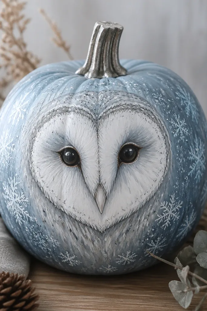
This is my go-to for “cute but not childish.” The icy base makes the white owl pop, and the feather strokes are drawn with light gray so they look frosted instead of flat. The eyes are the star: pale yellow with tiny black pupils and a small white highlight. This style works well on pumpkins that have a round face area, since it frames the owl in the middle. It also looks great with silver or white porch decor.
Paint the pumpkin icy blue-gray and let it dry. Draw an owl face circle in the center and paint it white, leaving a slight gap for a darker outline. Add feather texture around the face with short strokes in light gray, following the pumpkin’s curve. Paint eyes pale yellow, then add black pupils and a small white highlight. Finish with a few snowflake-like specks using a toothpick dipped in pale blue paint.
Use a sponge to lightly fade the edges of the owl face so it looks like it’s emerging from the “snow.”
Avoid using thick black around the owl; it makes it look like a cartoon sticker.
13. Geode Crystal Facets
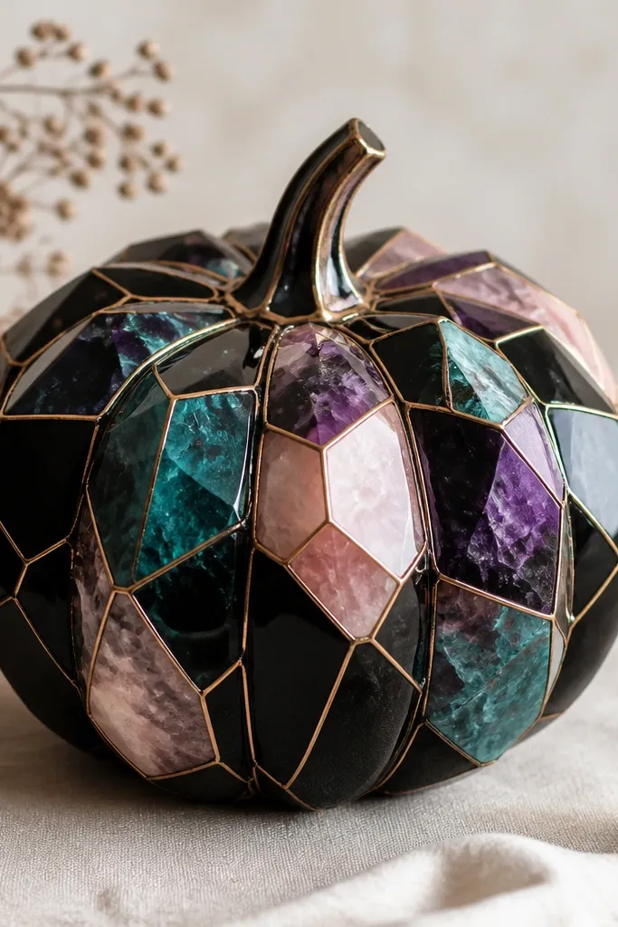
Geode pumpkins score because they look like real stone. The black base makes the colors glow, and gold lines between facets create that “mineral vein” effect. I keep the facet count moderate — too many shapes looks chaotic on a curved surface. Teal and purple are the easiest combos because they blend well and photograph with depth. This design looks best on medium-to-large pumpkins with strong ridges, since the facets can follow the grooves. It also pairs well with warm autumn lighting.
Paint the pumpkin matte black and let it dry. Sketch a rough geode shape in the center with pencil, then divide it into 8-12 facets. Fill facets with teal, purple, and light pink acrylic using flat brush strokes, keeping edges clean. Paint gold lines along the facet borders with a liner brush, then add a few white highlights on select facet edges for sparkle. Seal with matte clear coat so the gold stays crisp.
Pro tipDo facet lines first in pencil — it stops you from painting over mistakes.
AvoidDon’t blend all colors together; geodes need hard facet edges.
14. Pumpkin Shakespeare Script with Wax Seal
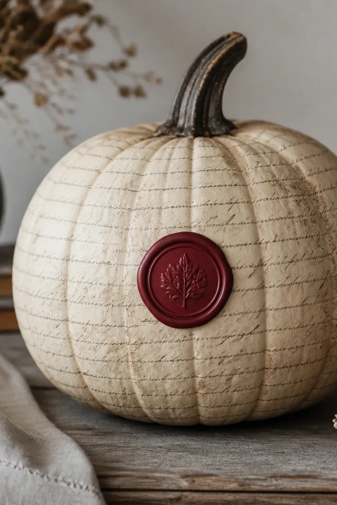
This is the most “bookish” look that still reads well in a contest. The parchment beige gives you a warm paper vibe, and the script lines add texture without needing tiny drawings. A dark red wax seal in the center makes it feel like an invitation, not Halloween craft. I like it on pumpkins that are more oval than tall because the script wraps evenly. It also looks good with gold glitter accents if your contest allows small amounts.
Paint the pumpkin parchment beige and let it dry. Lightly draw or transfer script lines using a stencil or printed text reference, then paint with thin black lines so the script stays legible but not overwhelming. Add a subtle darker wash near the bottom to mimic aged paper. Create a wax seal circle in dark red and stamp a simple emblem using a craft stamp or a DIY stencil. Finish by adding a thin gold line around the seal edge.
Pro tipKeep your script lines spaced so you can still read the overall texture from a distance.
AvoidDon’t cover every inch with dense writing; it turns into a black blob on the pumpkin curve.
15. Orange Blossom Wreath Pumpkin
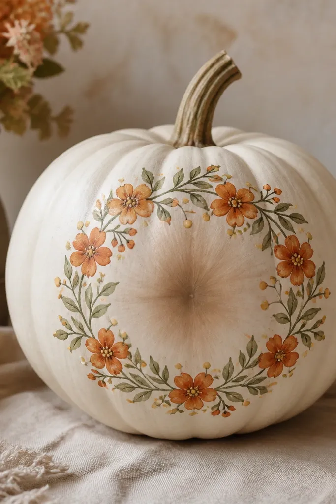
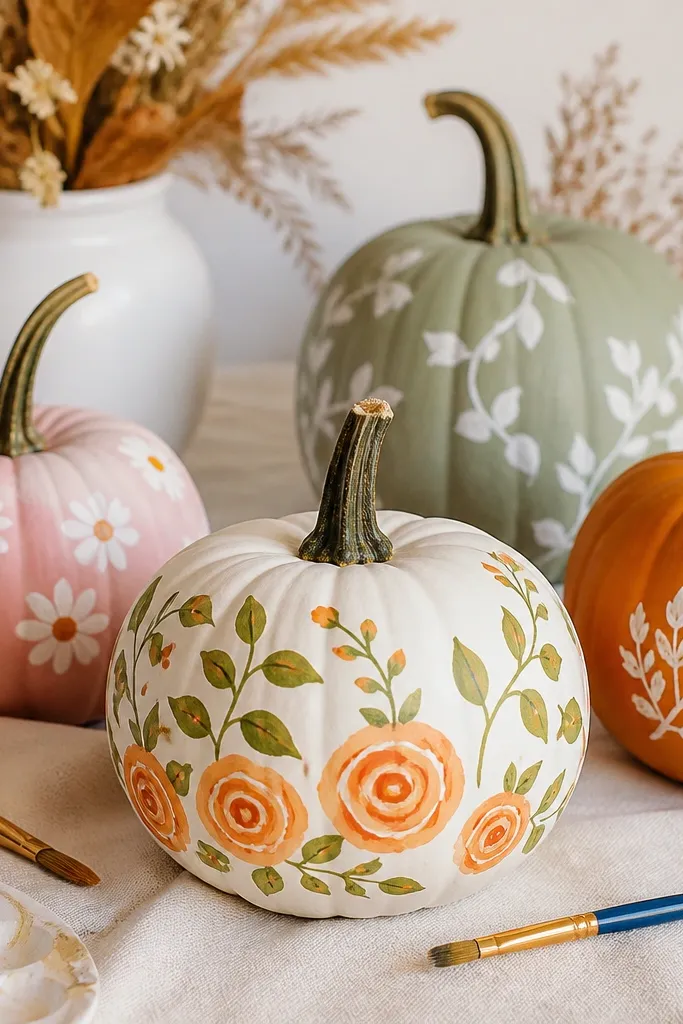
This look is fresh and pretty, and it wins when the contest includes non-scary designs. The cream base makes the orange blossoms feel like they belong in a spring wreath, and the green leaves add contrast. I keep the blossoms small and repeat them in a wreath shape so the design is balanced. It flatters warm and cool skin tones because cream works with everything, and the orange flower color is universally flattering in photos. If you want “falls into fall” without being spooky, this is a strong pick.
Base coat the pumpkin soft cream. Sketch a wreath circle centered on the pumpkin and mark 10-14 blossom positions. Paint blossoms in bright orange with five petal shapes each, then add tiny yellow pollen dots in the center. Paint small green leaves between blossoms and add a darker green vein line. Add a light brown shadow under the wreath to ground it, then outline the wreath with a thin orange-brown line for separation.
Use a toothpick for pollen dots so they stay round instead of smeared.
Don’t paint flowers too large; on pumpkins, big blossoms look like stickers.
16. Monochrome Ghost Face with Soft Shading
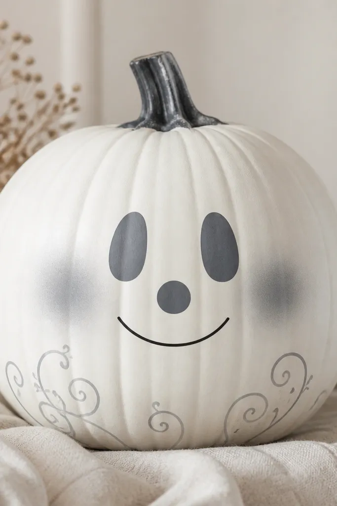
Monochrome ghost faces look cleaner than multi-color ghosts. You get a modern, slightly eerie vibe by using only white, gray, and black. The trick is shading — use gray in the cheeks and around the mouth so the face has shape instead of flat paint. This design looks great on white or pale pumpkins because it hides imperfections. It also photographs well because the matte finish reduces glare and keeps the face readable.
Paint the pumpkin matte white and let it dry. Lightly sketch a ghost outline and face area with pencil. Fill the face area with gray shading around the eyes and cheeks, then add a soft gray shadow under the mouth. Use black paint for the eyes and a simple line smile, keeping edges smooth. Add a few gray swirls near the lower edge with a thin brush and seal with matte clear coat.
Pro tipUse a makeup sponge for the gray shading; it gives a smooth blur that looks expensive.
AvoidDon’t outline everything in black; it makes it look like a Halloween coloring page.
17. Neon Outline Jack with Blacklight Glow Look
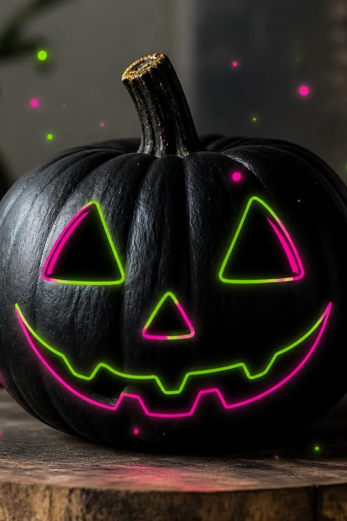
This design screams contest energy because it pops under colored porch lighting. The black base makes neon colors look brighter, and the thin outline style keeps the face modern. I paint the jack face as a continuous line with minimal fill so the neon reads clearly. It’s especially flattering next to dark outdoor decor and looks striking in photos taken at dusk. If your contest setup includes warm lights, this still works because the neon is high contrast.
Paint the entire pumpkin matte black. Outline the jack face shape in neon green, then add neon pink for the mouth and eye accents. Keep line thickness consistent, about the width of a pencil lead. Add small neon dots around the head using the tip of a liner brush, placing them more densely near the cheeks. Finish with a matte clear coat that won’t turn neon colors dull.
Pro tipTest your neon paint on scrap first — some brands need a second coat to look bright.
AvoidDon’t fill big neon areas; neon paint can look streaky when laid thick.
18. Tuscany Terracotta Waves
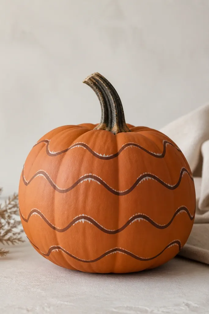
This is the “I painted it with intention” look. Terracotta waves look like ceramic and give the pumpkin a handcrafted pottery feel. The color combo is simple: terracotta base, darker brown wave lines, and thin white highlights on the top edge of each wave. I like this on pumpkins with medium ridges because the wave lines can align with the natural contours. It flatters people who prefer warm, earthy decor and it looks great with straw bales and wooden signs.
Base coat the pumpkin terracotta orange and let it dry. Draw 5-7 horizontal wave bands with pencil, spacing them evenly. Paint the wave troughs and crests in darker brown, then add thin white highlight lines along the wave crests. Use a small flat brush so the waves stay smooth and evenly curved. Finish by lightly dry-brushing terracotta-brown around the edges so the center looks like the focal point.
Keep waves symmetrical around the center — even if the pumpkin curves, the rhythm should match.
Avoid shaky wave lines; wobbly waves look rushed even if the colors are right.
19. Rainbow Striped Ombre with Gold Dot Confetti
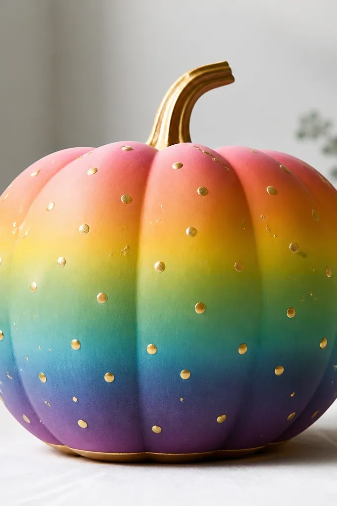
This one is for contests where judges respond to color harmony. The rainbow ombré makes the pumpkin look like a gradient art print, and the gold dots add a “confetti” finish without covering the design. I use horizontal stripes because they wrap cleanly around the pumpkin and keep the gradient from looking chaotic. It’s flattering with neutral outfits because the pumpkin acts like a bright accessory. Also, gold dots hide tiny paint imperfections better than solid glitter.
Paint a base gradient starting at the top with red that fades into orange, then yellow, then green, then blue, then purple near the bottom. Use sponge blending between colors so you get soft transitions. Add a thin gold line near the bottom edge with a liner brush. Dip a toothbrush in metallic gold paint diluted slightly with water and flick small dots across the midsection. Seal with matte clear coat so the gold stays neat and doesn’t look smeared.
Pro tipDilute metallic paint slightly so dots look like dots, not coins.
AvoidDon’t stack too many rainbow bands; 6-7 stripes looks intentional, 10+ looks like wallpaper.
20. Celtic Knot Frame with Green Glow Edge
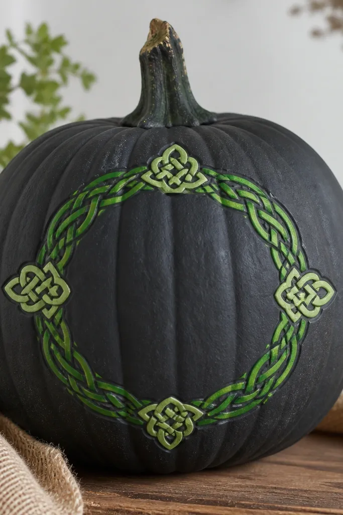
Celtic knots read as “craft” in a good way when you keep them framed. The charcoal base makes the green pop like a glow, and the knot pattern gives a sense of order. I keep the knot inside a rectangular or oval frame so it doesn’t spread too far over the pumpkin curve. This works well on pumpkins that are wider, since the knot frame can be centered and easy to read. It also looks sharp next to black planters and dark outdoor lighting.
Paint the pumpkin deep charcoal and let it dry. Draw an oval frame on the center using pencil, then transfer a simple Celtic knot design inside the frame (stencil helps). Paint the knot with bright green, then add lighter green highlights on the upper edges of the knot lines. Add small end caps where the knot crosses the frame corners to make it feel complete. Finish with a thin second outline just outside the frame in a slightly neon green.
Pro tipStencil the knot lightly first, then trace the lines with paint — it keeps spacing consistent.
AvoidDon’t let the knot lines break at random — gaps look like accidental smudges.
21. Sunflower Center with Black Seeds Texture
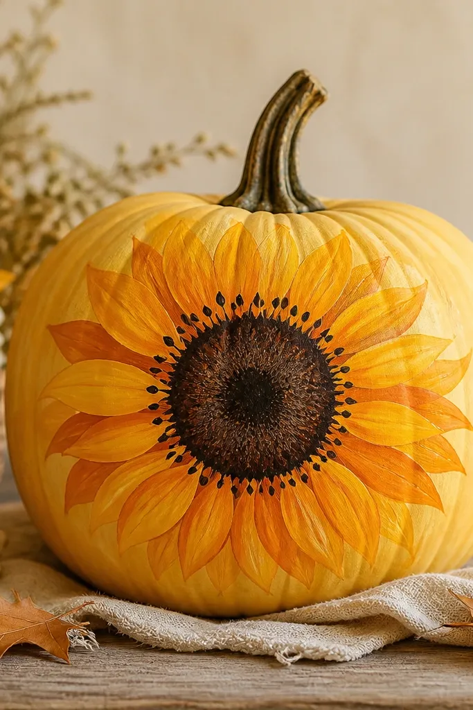
Sunflower designs win because they have a clear center focus and strong color. The layered petals create depth without needing extreme realism, and the seed texture gives a tactile feel even though it’s paint. I paint petals in two tones — golden yellow and deeper orange — so the flower looks dimensional. This style flatters people with warm undertones because the yellows look like sunlight. It also works on pumpkins of many sizes since the flower can scale to the center.
Base coat the pumpkin warm yellow and let it dry. Draw a circle in the center for the sunflower head and paint it dark brown. Paint petal shapes around the circle in golden yellow, then add a second ring of petals in deeper orange slightly overlapping. Create seed texture by dabbing small black dots with a stippling brush or the tip of a foam applicator. Add a few tiny white highlights on select seeds for a glossy seed effect.
Pro tipDab seeds in a tight grid — random dots look flat, grid dots look intentional.
AvoidAvoid using one flat yellow for all petals; two tones make it look like a real flower.
22. Sky Blue Watercolor Wash with Drip Stars
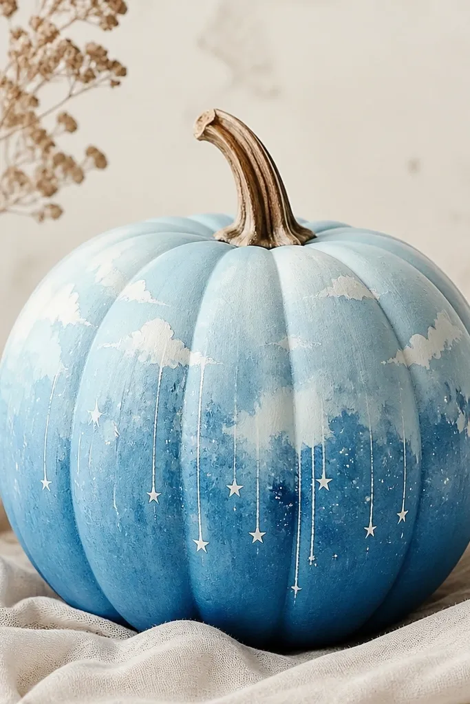
Watercolor pumpkins look airy and modern, which judges notice quickly. The sky blue wash gives you movement, while the drip stars add a playful Halloween twist. I keep the watercolor effect controlled by using watered acrylic and letting it pool lightly in the low ridges. This style looks best on pumpkins where the ridges can hold the “water” shape, so the wash looks intentional. It’s also flattering alongside cool-toned decor like white ceramic or silver frames.
Base coat the pumpkin with a light sky blue and let it dry. Water down a darker blue acrylic and paint soft cloud-like patches, then blend edges with a damp sponge. Add a few thin white “drip star” lines from the center using a liner brush, then tap small star dots at the top of each drip. Use a toothbrush flick with watered white paint for extra star specks. Seal with a matte clear coat to lock in the watercolor edges.
Pro tipWork in small sections and don’t overblend — watercolor looks best when some edges stay soft.
AvoidAvoid thick paint for watercolor areas; thick paint kills the wash effect.
23. Gold Leaf Frame with Black Portrait Silhouette
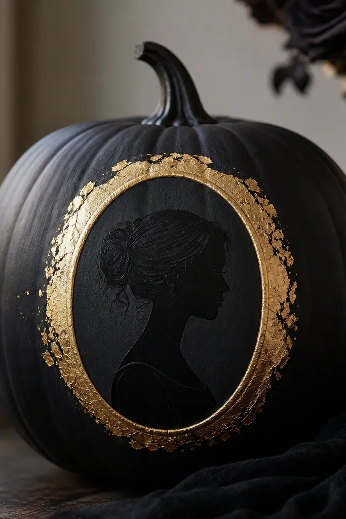
This design looks like an expensive gallery piece. By keeping the portrait as a silhouette, you avoid the “bad face” problem that happens when people try realism on a curved surface. The gold leaf frame adds texture and warmth against the black base. I use textured gold for the frame so it catches porch light and looks dimensional even from the side. This style fits most pumpkin sizes, but it shines on medium pumpkins where the oval frame is easy to center. If your contest crowd likes modern art, this will land.
Paint the pumpkin matte black and let it cure. Apply an oval frame in gold leaf adhesive or metallic gold paint, using a stencil to get a clean oval. Add gold leaf pieces or textured metallic patches inside the frame so it looks layered. Place a simple portrait silhouette in the center using a printed reference and trace it lightly, then fill with black paint. Add one small highlight edge on the frame with a lighter gold metallic for contrast.
Pro tipPress gold leaf gently with your fingertip so it sticks without tearing — harsh rubbing wrinkles it.
AvoidDon’t paint gold leaf all over the pumpkin; it makes the portrait disappear.
24. Monogrammed Name Pumpkin with Underline Spark
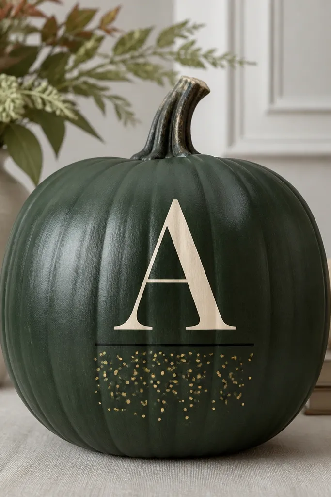
Monograms win contests because they look intentional and personal. A bold single letter reads fast, and adding a clean underline makes it feel like signage. Deep green is my favorite base because it makes cream and gold look crisp without screaming Halloween. This style flatters people who want something classy for a porch photo or a family display. It also hides small bumps because the monogram shape is forgiving on curved surfaces.
Paint the pumpkin deep green and let it dry. Choose one big letter and center it on the pumpkin, then transfer the shape with a stencil. Paint the monogram in cream and let it dry, then outline the letter with a thin black line for separation. Add a thin black underline beneath the letter, then flick tiny gold spark dots with a toothbrush in a small band below the underline. Seal matte to keep the finish even across the letter and background.
Pro tipUse a stencil letter at least 5 inches tall so it stays readable in photos.
AvoidDon’t use cursive with tiny loops; it turns into a smudge on pumpkin texture.
25. Comet Trail Pumpkin with Star Tail Script
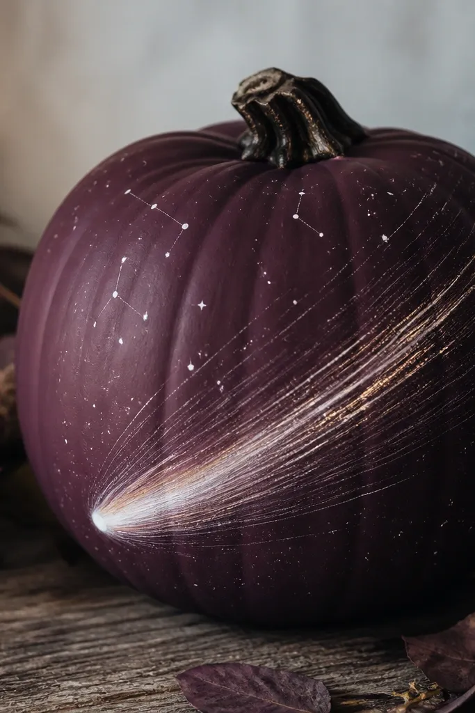
Comet designs look fast and dramatic, which is exactly what judges notice when they walk by. Dark plum is a great base because it’s richer than black and makes white paint look like real light. The diagonal trail gives you motion, and the small constellation dots add “space scene” detail without overcrowding. This design looks best on pumpkins that are slightly taller because the diagonal trail can run from lower left to upper right. It also photographs cleanly because the contrast is strong.
Base coat the pumpkin dark plum and dry completely. Paint a diagonal trail line with a light purple first, then widen it with white toward the comet dot. Place a small bright dot at one end and add a tiny halo circle around it with a lighter gray-white. Use a liner brush to draw short star streaks along the trail, then add a few constellation dots near the top using a toothbrush flick. Seal with matte clear coat so the comet doesn’t look wet.
Pro tipMake the trail brightest near the comet, darker as it goes — that’s what sells the “light” effect.
AvoidDon’t smear the trail with too much water; comet lines should look like paint, not cloudy mist.