1. Cream + Cinnamon Stripe Band Pumpkins
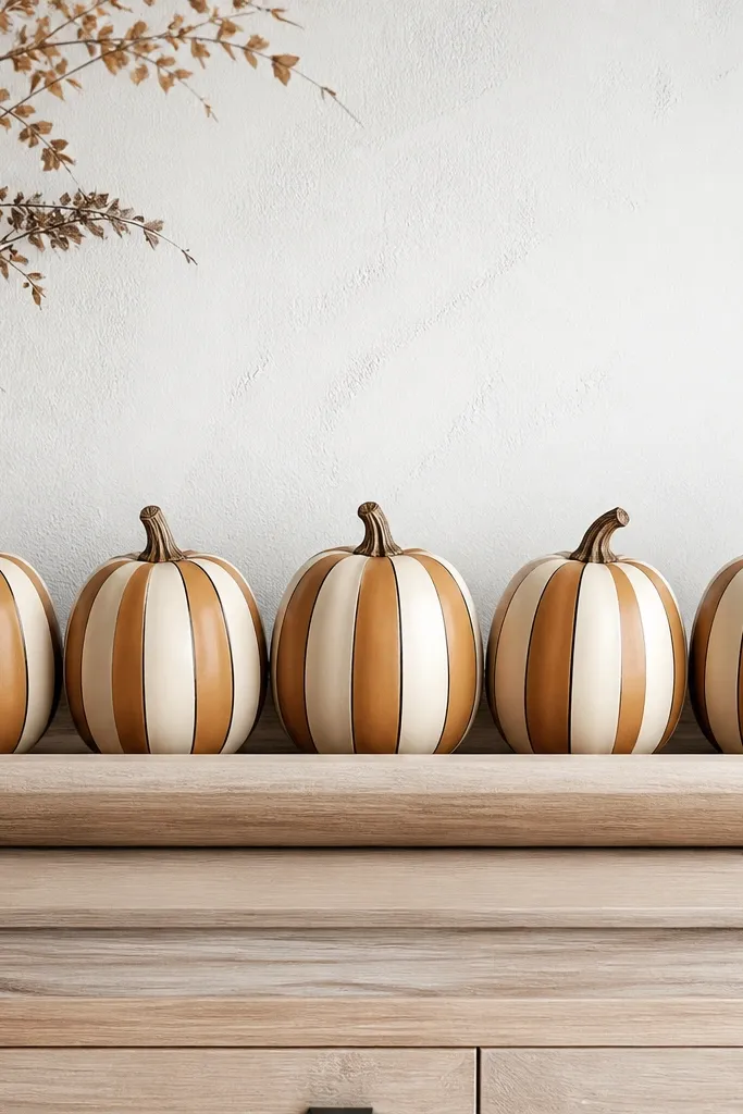
This look is the easiest way to get cozy pumpkin painting ideas for decor that still feels clean. Paint the whole pumpkin a warm cream (not bright white), then add cinnamon-brown stripes that hug the curve. I like leaving the stem natural because it keeps the pumpkin from looking like a toy. The thin black pinlines make it feel “designed” without needing fancy art skills. It reads great in kitchens and entryways with beige, tan, or light oak tones.
Start by scrubbing and fully drying the pumpkin, then brush on two thin coats of warm cream acrylic. Once dry, mark the stripe spacing lightly with a pencil — I do 1/2-inch stripes for 6-8 inch pumpkins. Use a flat brush for the bands, let them dry, then add a thin black pinline with a liner brush at the edge of every other stripe. Finish with two light coats of matte sealer so the stripes don’t look glossy or wet.
If your stripes wobble, paint the first pass a little wider and “correct” with a second cream pass to straighten the edges.
Skipping sealer makes the cinnamon smear when you wipe fingerprints.
2. Mocha Ombre with Soft "Candle Smoke" Bottom
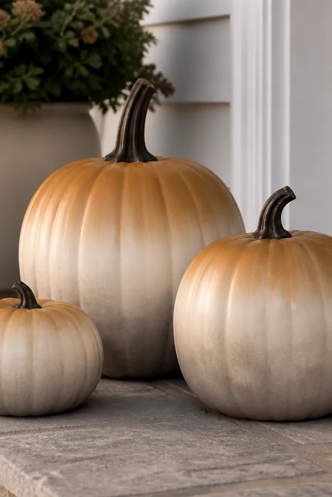
Ombre makes pumpkins look cozy because it mimics warm light fading in the room. This one uses mocha brown at the top, blending into cream at the bottom, then adds a misty band like candle smoke. I paint the smoke with a dry brush so it stays airy instead of a solid smear. It works especially well on larger 7-10 inch pumpkins because the blend has room to look smooth. If your decor is neutral and you want Halloween without loud orange, this is your move.
Pro tipUse a sponge for blending — a brush creates visible lines on curved pumpkins.
Brush the top half with mocha brown acrylic, then blend downward using a wide sponge — dab, lift, and overlap until it fades. While the ombre is slightly tacky, tap a thin layer of warm gray-taupe at the bottom third using a dry brush to create the “smoke” texture. Wipe the brush on a paper towel often so you don’t get harsh blotches. Paint the stem dark brown for continuity, then seal with satin for that gentle glow effect.
AvoidDon’t paint the smoke band too dark; it looks muddy instead of cozy.
3. Terracotta Dot Constellation Minis
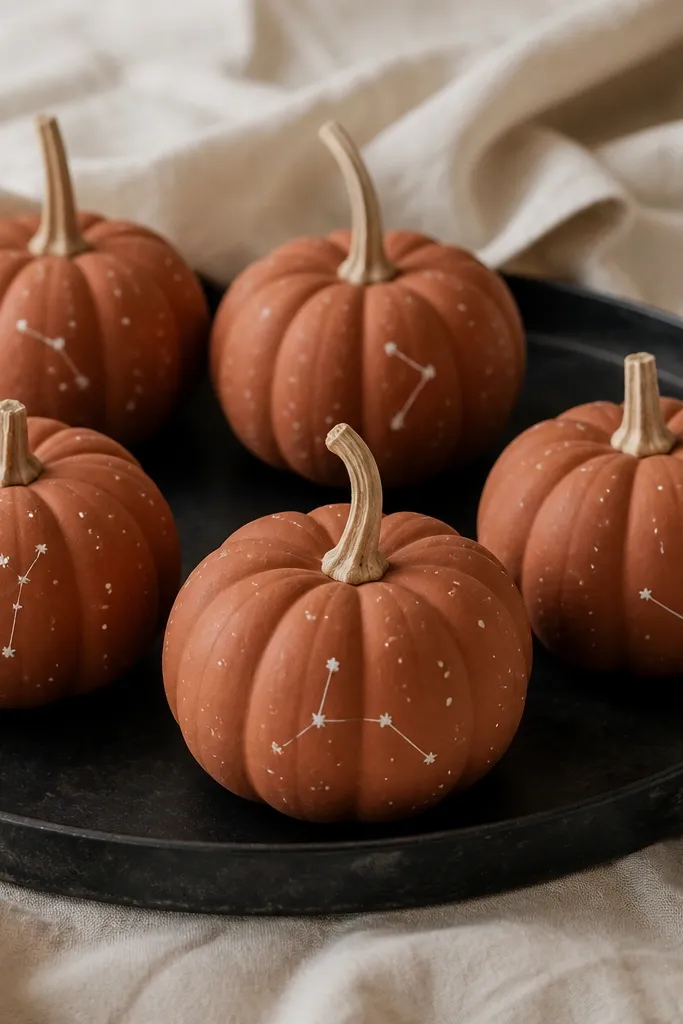
These minis look like cozy night lights. Terracotta gives warmth, and off-white dots feel like stars without turning your pumpkins into a kids' craft. I keep the constellations minimal — three to five dots per pumpkin — so it stays classy on a shelf or mantel. The matte finish makes the dots look like they’re part of the pumpkin surface. This design is perfect for small spaces because you get a big visual impact without taking up width.
Pro tipIf you want perfect circles, tap the dotting tool straight down instead of dragging.
Paint each mini pumpkin terracotta, then let it dry fully for at least 45 minutes. Use a toothpick or a fine dotting tool to add off-white dots — I press lightly so each dot stays small and round. Pick one constellation pattern per pumpkin and connect only two or three dots with a liner brush using the same off-white paint thinned slightly. Add one tiny dot cluster near the stem for a “top sparkle,” then seal with matte so the dots don’t reflect too much.
AvoidDon’t overdo the stars; too many dots make it look like accidental speckling.
4. Hunter Green + Gold Plaid Band
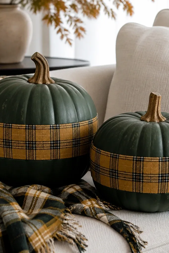
Plaid instantly reads cozy because it looks like fall fabric. This version feels more grown-up than orange-and-brown by using hunter green and antique gold. I paint a band around the middle, then add black lines to “lock” the plaid pattern in place. It looks great with chunky knit blankets, dark wood, and brass accents. If your home has greens, browns, or gold frames, this pumpkin color story will match without effort.
Prime and base coat the entire pumpkin hunter green using two thin coats. Let it dry, then measure a band height — for an 8-inch pumpkin, make the plaid band about 2 inches tall. Sketch the grid lightly with pencil, then paint the gold lines with a small flat brush. Add black lines between the gold stripes, letting each line dry before painting over, then seal with satin so the gold catches light.
Do your gold lines first, then add black — black hides small gaps in the gold grid.
Painting plaid freestyle without a pencil grid makes it look wobbly and cheap.
5. Blush Pink + White Pumpkin Face (Soft Edges)
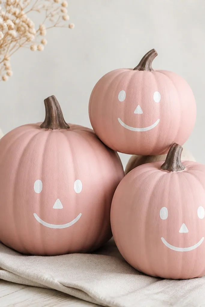
This is the “cozy” look for people who don’t want traditional orange. Blush pink reads warm and modern, and the white face keeps it Halloween without screaming. I use soft edges on purpose by slightly dragging the brush while the paint is still wet. It flatters neutral skin tones on decor photos because the palette is light and friendly. It also looks great in bedrooms and bathrooms where bright orange feels too intense.
Base coat the pumpkin blush pink, two thin layers for smooth coverage. Mix white paint and add a tiny bit of cream to avoid stark brightness, then paint the eyes as small ovals. Make the nose a tiny triangle, but round the corners so it doesn’t look sharp. Paint the mouth as a soft curve, then seal with matte. Paint the stem a muted dark brown so it doesn’t clash with the pink.
Use a damp paper towel to soften the face edges before the paint fully dries.
Don’t use pure bright white — it looks like sticker ink and cheapens the face.
6. Charcoal + Orange "Speckled Clay" Texture
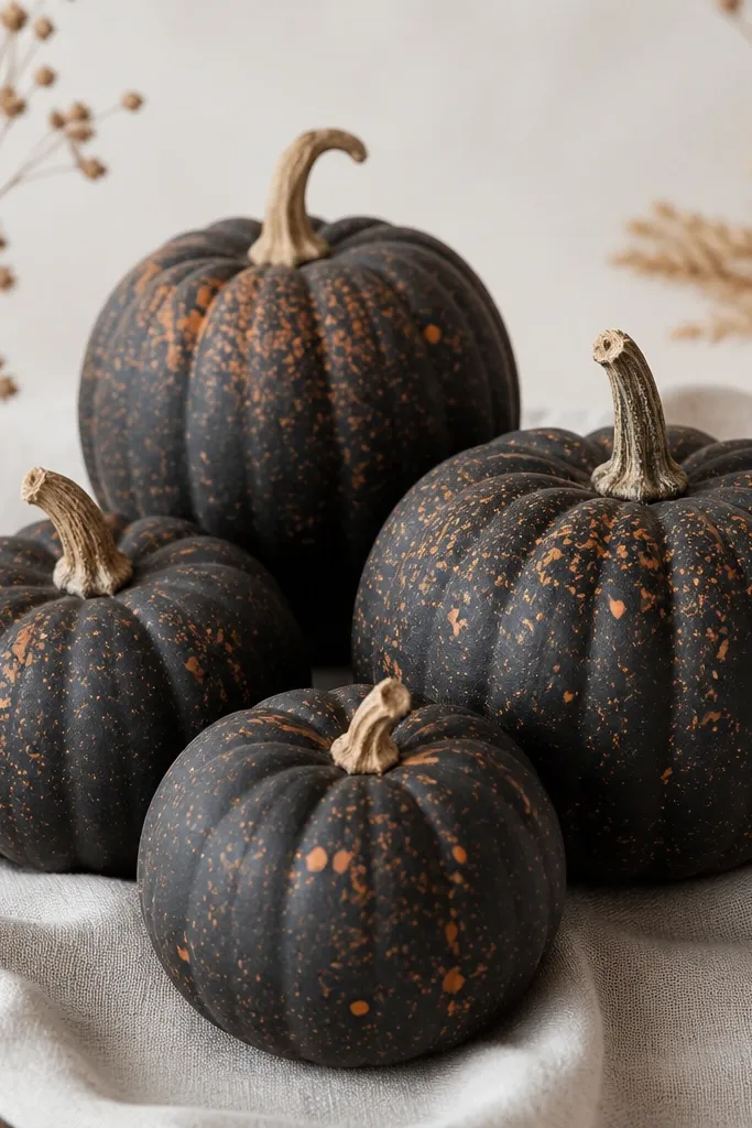
Speckled texture makes pumpkins look handmade and cozy without needing detailed drawing. Charcoal keeps it moody, and orange flecks bring just enough Halloween warmth. I like clustering a few speckles around the stem area so the top feels more alive. This design looks great in modern homes with black frames, slate, and warm wood. It also hides minor imperfections in the pumpkin surface because the texture distracts the eye.
Pro tipFor tighter speckles, use less water and flick closer to the pumpkin surface.
Prime, then brush on charcoal acrylic in two thin coats. After it dries, thin orange paint with a little water so it speckles instead of blobs. Dip an old toothbrush in the orange paint, then flick over the surface with a steady motion — practice on paper first. Add a few heavier clusters near the top third, then seal with matte to lock the speckles in place. Keep the stem natural or lightly glaze it with brown so it doesn’t look unfinished.
AvoidDon’t apply thick orange speckles — they dry raised and look sloppy.
7. Gold Leaf Look with Sponged Corners
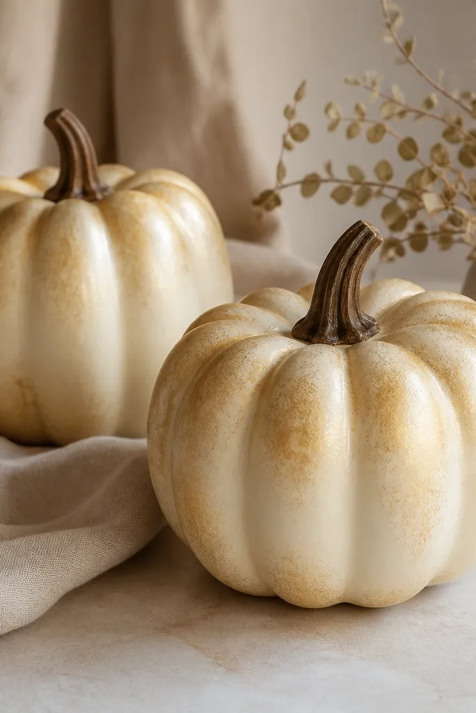
Gold leaf-style accents make any pumpkin feel like decor, not craft. The sponged corners keep it from looking like a sticker sheet of gold. I use a warm cream base so the gold looks antique instead of neon. This look is gorgeous on entry tables because the gold catches light when people walk by. It also works for small gatherings because it stays elegant even in plain daylight.
Pro tipUse a clean makeup sponge and swap it often — dirty sponge edges smear and ruin the antique look.
Paint the pumpkin a warm cream base, two coats. Let it dry, then dab metallic gold acrylic with a makeup sponge on only the top edge and a few curved “corner” sections — don’t cover the whole pumpkin. Feather the edges by tapping lightly, then repeat with a second gold layer in the same spots. Paint the stem dark brown, then seal with satin so the metallic doesn’t get flat.
AvoidDon’t paint metallic gold in straight strokes; it looks like you used a brush.
8. Cream + Burnt Sienna Marbled Swirls
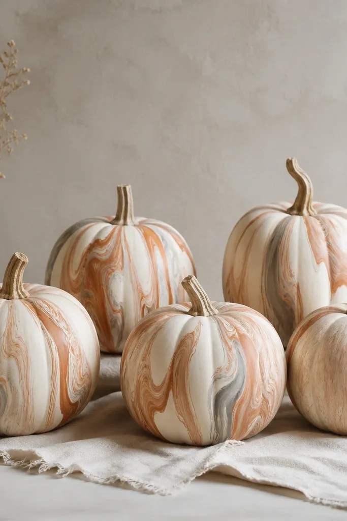
Marbling looks cozy because it feels organic, like fall stone or aged paper. Cream keeps it warm, and burnt sienna adds depth without turning orange. I paint vertical swirls because they stretch the shape and make the pumpkins look taller on a table. The feathered edges are important — hard lines feel cartoonish. This is a great option if you want Halloween decor that works with neutral rugs and beige curtains.
Pro tipWipe your brush between swirls so the marbling looks layered, not muddy.
Base coat with cream, then mix burnt sienna with a little warm gray to create a second marbling tone. Use a round brush to paint thin vertical swirls, then soften the edges with a damp sponge while the paint is still wet. Add a few tiny “vein” lines in the lighter tone for contrast. Let everything dry, then seal with matte to keep it looking like painted pottery instead of shiny plastic.
AvoidDon’t overmix colors on the pumpkin — it turns gray-brown and loses the marble effect.
9. Pale Sage + White Leaf Cutout Look
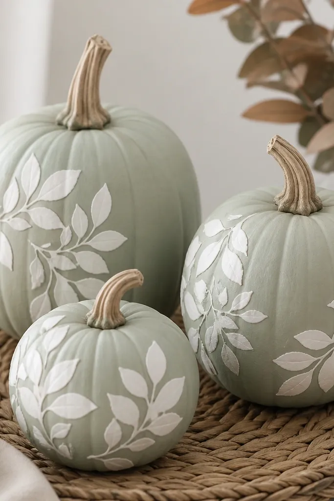
Leaf motifs read cozy because they connect to fall without going full pumpkin-face. Pale sage feels fresh but still seasonal, and white leaf shapes look crisp and clean. I place leaf clusters near the stem and one side, leaving breathing space so it looks intentional. This design flatters decor with linens, rattan, and farmhouse baskets. It’s also great for people who want Halloween decor that works through Thanksgiving.
Pro tipWarm the stencil slightly with your hands before using — it helps it lay flat on the pumpkin curve.
Paint the pumpkin pale sage with two thin coats. Use a leaf stencil or cut paper leaf shapes and lightly sponge white paint over them, keeping the white opaque. Remove the stencil while the paint is still a bit tacky so edges stay crisp. Add a tiny sage dot in the center of a few leaves to mimic veins. Seal with satin for a soft sheen that makes the leaves pop.
AvoidDon’t flood the stencil with paint; it bleeds and looks like a blob.
10. Orange + Black Mini "Witch Hat" Bands
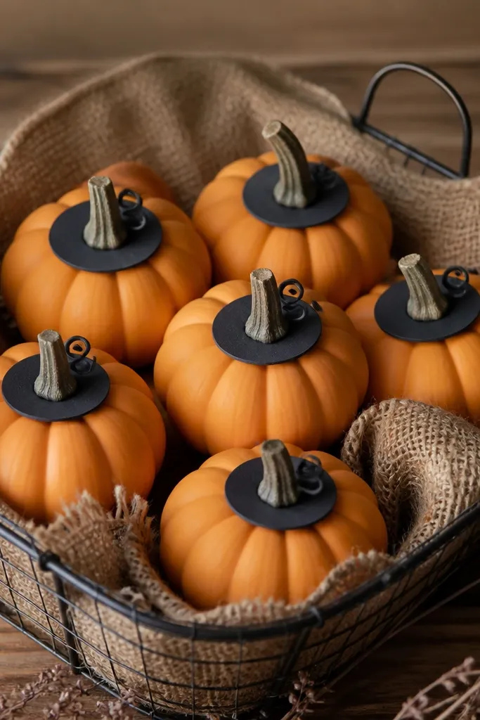
This is playful-cozy without getting childish. The orange base gives classic Halloween, and the black band frames the pumpkin like a hat. I keep the band width consistent so the set looks like a coordinated “character” group. The curled detail near the stem is small, but it makes each pumpkin feel like it has personality. It works best on minis because the proportions look right.
Pro tipUse painter’s tape to get a straight band, then remove it before the paint fully hardens.
Base coat minis matte orange, then let dry. Paint a black band around the middle — for a 4-inch mini, I make it about 1/2-inch tall. Add a small curved “hat brim tail” by painting a short black arc near the stem. Dry brush a touch of dark gray at the edges of the tail so it looks slightly shadowed. Seal with matte so it stays soft and not shiny.
AvoidDon’t make the band too thick — chunky bands look like cheap stickers.
11. Indigo Night Sky with Tiny Star Lines
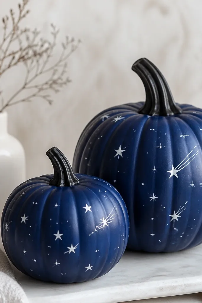
Night-sky pumpkins look cozy because they feel like warm lights at dusk. Indigo replaces orange and still screams Halloween in a calmer way. Tiny star lines add motion without turning into a messy constellation. I keep the stars small and spaced so they don’t look like random dots. This design looks stunning on dark porch steps and with black lanterns.
Pro tipDip the brush in white, then wipe most paint off on a paper towel before dotting.
Prime and base coat with deep indigo acrylic in two thin layers. Once dry, use a liner brush to paint tiny white dots for stars. For star streaks, drag the liner brush lightly for a 1/4-inch line starting from a dot. Add a couple slightly larger stars near the top third to guide the eye. Seal with satin so the indigo looks rich under outdoor light.
AvoidDon’t cover the whole pumpkin — leaving some indigo space makes the stars look intentional.
12. Warm White "Chunky Knit" Horizontal Lines
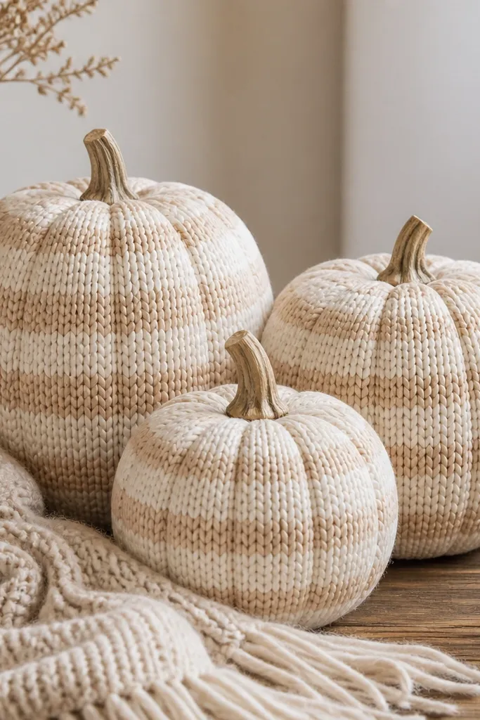
Chunky knit lines make pumpkins feel cozy because they mimic the texture people want to touch in fall. I use warm white and a light tan for the “stitch” areas so it looks soft, not harsh. The trick is painting the bands with slightly thicker strokes so the knit illusion reads even from a distance. This looks best on medium to large pumpkins where the horizontal bands have room. It matches living rooms with cream throws, beige sofas, and wood shelves.
Pro tipLet each band dry 10-15 minutes before adding the stitch line so it doesn’t smear.
Paint the pumpkin warm white with two coats. Mix a light tan by adding a tiny amount of brown to cream. Use a flat brush to paint broad horizontal bands, then, with a smaller brush, add thinner stitch lines centered on each band. Keep the spacing consistent around the curve by rotating the pumpkin while you paint. Seal with matte so the texture looks like painted fabric.
AvoidDon’t use pure white; it looks cold and breaks the cozy vibe.
13. Terracotta Face with Whimsical Freckle Nose
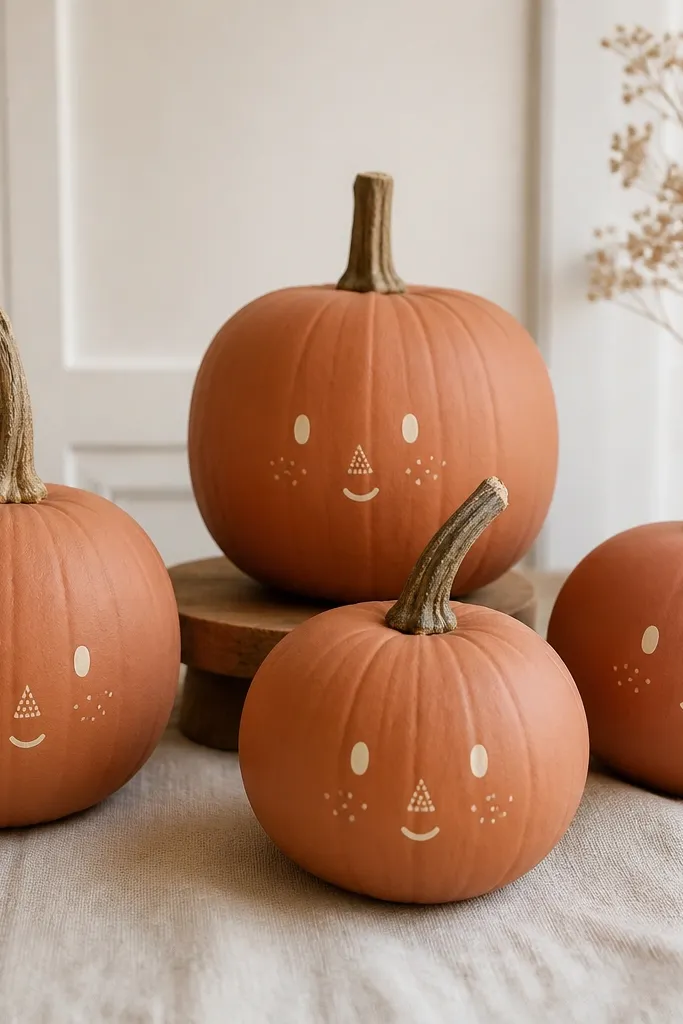
This is cozy Halloween for people who like faces but hate the scary look. Terracotta makes it warm and earthy, and the freckles add a friendly feel. I do the nose as a speckled triangle so it looks hand-painted rather than hard-edged. This design flatters warm-toned decor and looks great on a hearth or mantel. It also reads well for photos because the face has clear contrast.
Pro tipUse a toothpick for freckles — it gives you control and keeps dots from turning into blobs.
Prime and paint the pumpkin terracotta, two thin coats. Paint eyes as small cream ovals and let them dry so they stay crisp. For the nose, dab tiny specks of cream and layer them into a triangle shape with a toothpick. Add a few freckles on each cheek using the same cream paint. Seal with matte for a soft look that doesn’t glare in sunlight.
AvoidDon’t outline the face too thick; thick black lines make it look like cheap Halloween masks.
14. Chocolate Brown + Caramel "Drip" Highlights
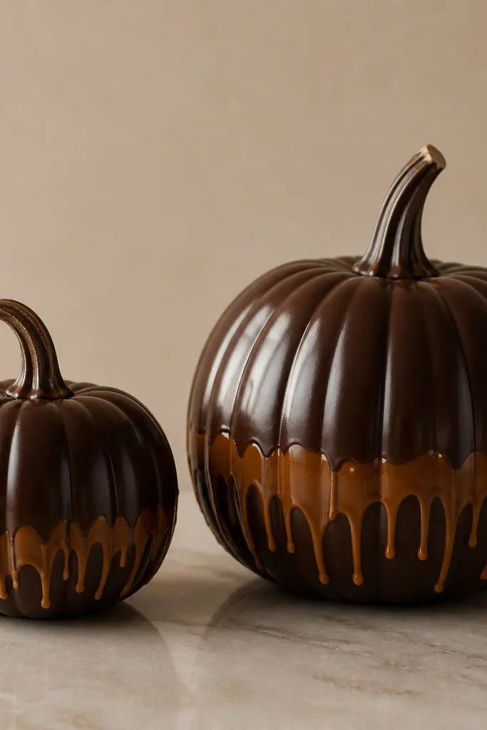
Drips look cozy because they feel like dessert and late-night snacks. Chocolate brown is grounded, and caramel drips add warmth without turning the pumpkin orange. I keep the drips mostly on the lower third so the top stays clean and elegant. This style is great for table decor because it looks rich and intentional. It also works well with gold chargers and brown leather accents.
Pro tipPractice drips on cardboard first — your brush pressure controls how far they run.
Paint the entire pumpkin chocolate brown, two coats for coverage. Mix caramel acrylic and thin it slightly with medium so it flows in controlled drips. Use a liner brush to draw small drip lines starting from the midline, then let them naturally taper. Add a few thicker drops near the edges for a “handmade” look. Seal with satin so the caramel has a gentle sheen under warm lighting.
AvoidDon’t make the caramel too thin; it runs and leaves streaky mess instead of drips.
15. Black + Cream Ghost Swirls
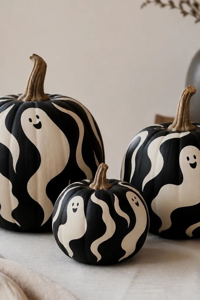
Ghost swirls feel cozy when you keep them soft, not spooky. Black base gives contrast, and cream ghost shapes look like friendly hauntings. I paint the ghost outline in wavy lines rather than a single hard shape, which keeps it from looking like a stencil. This style works on mantels and shelves because it reads clearly even from across the room. If you like Halloween but your decor leans modern, this fits.
Pro tipIf your ghost looks too sharp, soften the edges with a slightly damp brush before it fully dries.
Prime and paint the pumpkin black with two thin coats. Once dry, paint a cream outline for a ghost shape using a round brush, keeping the top wider and the bottom tapering. Add two tiny dot eyes and a small curved mouth, then blend the swirls slightly by dragging a dry brush through the edges. Leave a little black background around the ghost so it pops. Seal with matte so the black stays deep and doesn’t turn shiny.
AvoidDon’t use bright off-white — it looks chalky and cheap against black.
16. Pumkin Patch Stripes with Mini Checkers
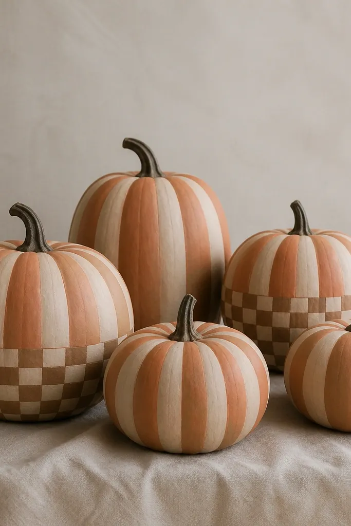
This look reads like farmhouse pumpkin patch decor without the clunky clutter. Muted orange feels warm but not neon, and cream stripes keep it light. The mini checkers add interest only in one area, so the pumpkin doesn’t turn into a pattern overload. I like this for dining tables because it feels seasonal and coordinated with plaid napkins. It also works well for people who want more detail than a stripe-only pumpkin.
Pro tipTape helps with checkers — press it firmly along the curve so you don’t get fuzzy edges.
Paint the pumpkin a muted orange base, two thin coats. Add vertical stripes in cream and pale brown using a flat brush, with 1/2-inch stripe width for 6-8 inch pumpkins. For the checker section, tape off a rectangle at the bottom third and paint alternating squares. Remove tape while paint is still slightly tacky so edges stay clean. Finish with matte sealer and lightly glaze the stem with dark brown so it matches the palette.
AvoidDon’t put checkers across the whole pumpkin; it looks busy fast.
17. Muted Coral + White Starburst Rays
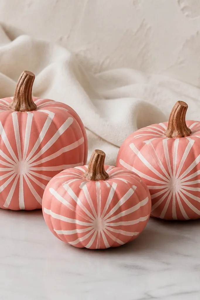
Starbursts feel cozy because they look like warm bursts of light. Muted coral gives you that fall warmth without going full orange, and white rays add graphic clarity. I paint rays with slight variation in length so they look hand-done, not printed. This looks great in entryways with warm lighting and also pairs well with cream candles and woven trays. It’s a good choice when you want something bold but still soft.
Prime and base coat the pumpkin muted coral in two thin layers. Pick a center point slightly above the middle, then paint 10-14 white rays radiating outward using a liner brush. Vary the ray lengths by a few millimeters so it doesn’t look symmetrical. Add a tiny dot at the center in cream for a focal point. Seal with satin so the rays look bright under warm porch light.
If rays look too thin, reload your liner brush with paint and keep the strokes steady — don’t go back and forth.
Don’t make rays too uniform; uniformity turns it into a craft decal.
18. Classic Pumpkin Lines with Sage Stem Topping
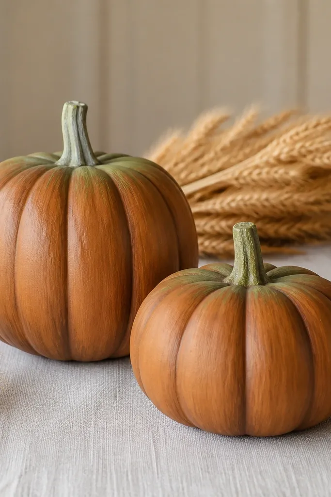
This one leans into “pumpkin realness” but makes it cozy with color accents. I paint the pumpkin with a warm orange-brown base and then emphasize the ridges using a darker brown, so it looks like it has depth. The pale sage stem topping is the cozy twist — it looks like fresh herb accents. It works well when your decor has greens, dried wheat, and neutral baskets. You don’t need faces or scenes; the texture does the work.
Pro tipUse the pumpkin’s own ridges as your guide — don’t try to create new lines.
Paint the pumpkin warm orange-brown, two thin coats. Use a small angled brush to paint darker brown along the ridges, following the pumpkin’s natural grooves. Blend lightly by dragging the brush across the ridge edges so it doesn’t look like thick stripes. Paint the stem pale sage and add a small highlight with a lighter green mix on the top curve. Seal with matte so the ridges look like dried clay.
AvoidDon’t leave the ridges unpainted; it makes the pumpkin look flat and unfinished.
19. Matte Black + Burnt Orange "Vintage Poster" Text Block
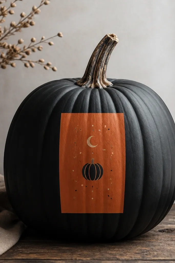
This look is for people who like modern decor but still want Halloween. A matte black base keeps it sleek, and a burnt orange text block gives that vintage poster vibe. I avoid actual words because letters on a pumpkin curve can look uneven; instead, I paint simple icons that still read seasonal. The crisp rectangle is what makes it look designed. It looks great on a console table with black lanterns or modern candle holders.
Pro tipPlan your rectangle size by holding the tape up to the pumpkin — center it and check it from standing height.
Prime and paint the pumpkin matte black with two thin coats. Tape off a rectangle in the center at about 3 inches tall for a 8-10 inch pumpkin, then paint the rectangle burnt orange. Remove tape while paint is slightly tacky for sharp edges. Add small icons inside the rectangle using a liner brush — a tiny pumpkin shape, a crescent moon, and a few dots. Seal with matte so the whole thing stays poster-like instead of glossy.
AvoidDon’t freehand the rectangle; a crooked block ruins the whole modern look.
20. Sage Green + Cream Basket Weave Illusion
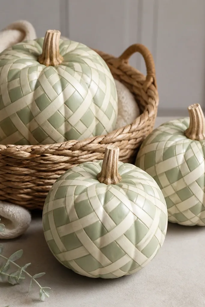
Basket weave reads cozy because it looks like the texture you want under blankets and around fall tables. Sage green keeps it soft and not too Halloween-y, while cream crisscross lines make the pattern pop. I paint the weave in a grid that follows the pumpkin curve, so it looks woven rather than painted stripes. This style flatters rustic wood and neutral textiles, and it’s a nice change from faces and ghosts. It also hides brush marks because the pattern breaks up the surface.
Base coat the pumpkin sage green, two thin coats. Lightly sketch a grid with pencil — four to five vertical “strips” across the pumpkin’s width, then mark horizontal bands. Paint cream strips first, then use a slightly darker sage mix to create the shadow lines between weave bands. Add small breaks where the ridges naturally curve so it doesn’t look too perfect. Seal with matte for a woven-cloth look.
Use a ruler or a piece of cardboard with a straight edge to keep horizontal bands consistent.
Don’t make weave lines too thick; thick lines look like tape stuck on.