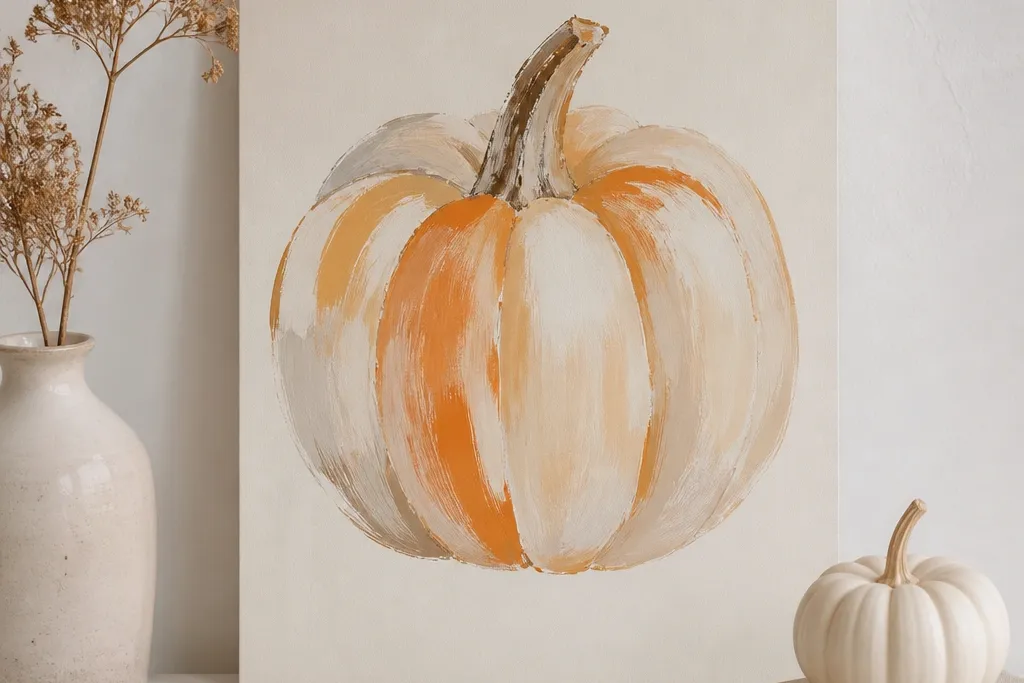

1. Matte White with a Single Black Stem Halo
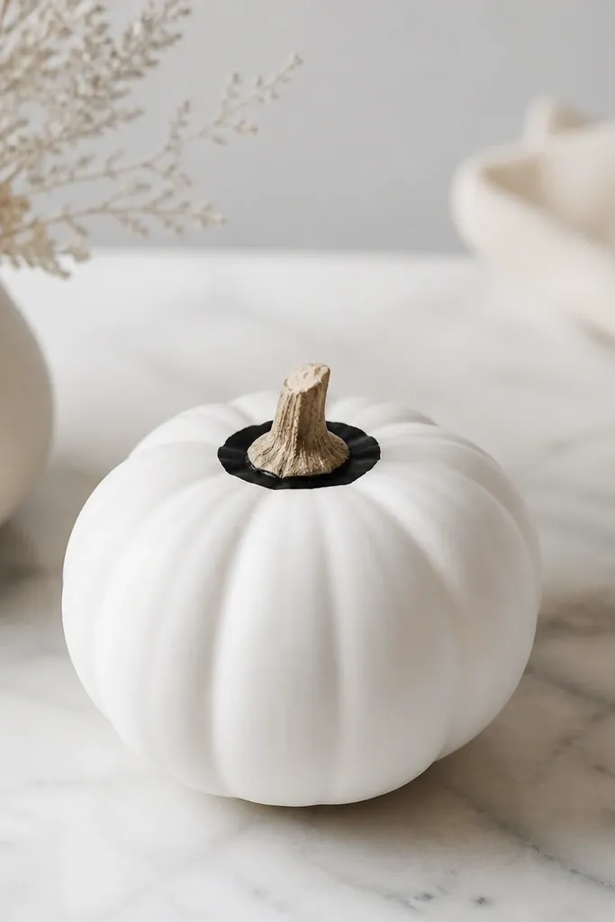
This one looks chic because it treats the stem as the design focal point instead of covering the whole pumpkin. I paint the entire pumpkin matte white, then add a thin black ring that sits just below the stem and follows the curve. The black halo makes the pumpkin read “intentional” from across a room, even if the stem is slightly off-center. It flatters any decor style, but it’s especially good in modern kitchens and Scandinavian setups with light woods and black accents. If your space has warm lighting, the matte white keeps the surface from reflecting unevenly.
Start by cleaning the pumpkin and letting it dry completely. Spray or brush on 2 thin coats of matte white craft paint, letting each coat dry 20-30 minutes. Once dry, use a small round stencil or freehand with a liner brush to paint a black ring about 1/2 inch wide around the stem base. Let the black dry, then do one last thin white touch-up anywhere the ring bled onto the white. Finish with a matte clear sealer so the black stays sharp when you handle it.
Use painter’s tape to mask a 1/2-inch band under the stem if your hands shake — remove tape while the paint is still slightly tacky.
Don’t paint the halo too thick or too low — it starts looking like a random marker circle instead of a design.
2. Two-Tone White and Soft Gray Vertical Panels
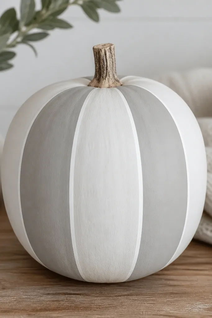
Vertical panels make a pumpkin look taller and cleaner, which is why this design works on both small counters and larger entryway displays. I use soft gray instead of charcoal so it feels calm, not harsh. The white gaps between panels are key — they keep the look airy and minimalist. This is a great fit if you have neutral decor with beige, oak, or taupe. It also works well for people with warm undertone spaces because soft gray doesn’t pull too cold under yellow bulbs.
Paint the whole pumpkin matte white first and let it dry fully. Cut thin strips of painter’s tape and place them where you want the white gaps, spacing them evenly around the ridges. Brush or dab soft gray paint into the exposed sections, keeping edges inside the tape lines. Let it dry 10-15 minutes, then remove the tape carefully to reveal crisp white separators. Add a second gray pass only where the pumpkin ridges show through, then seal with matte clear spray.
Pro tipPress tape firmly along the ridges so paint doesn’t seep under — I run a fingernail along each edge.
AvoidDon’t use thick tape or wide gaps — chunky paneling reads farmhouse, not minimalist.
3. Chalky White with Minimalist Dot Constellation
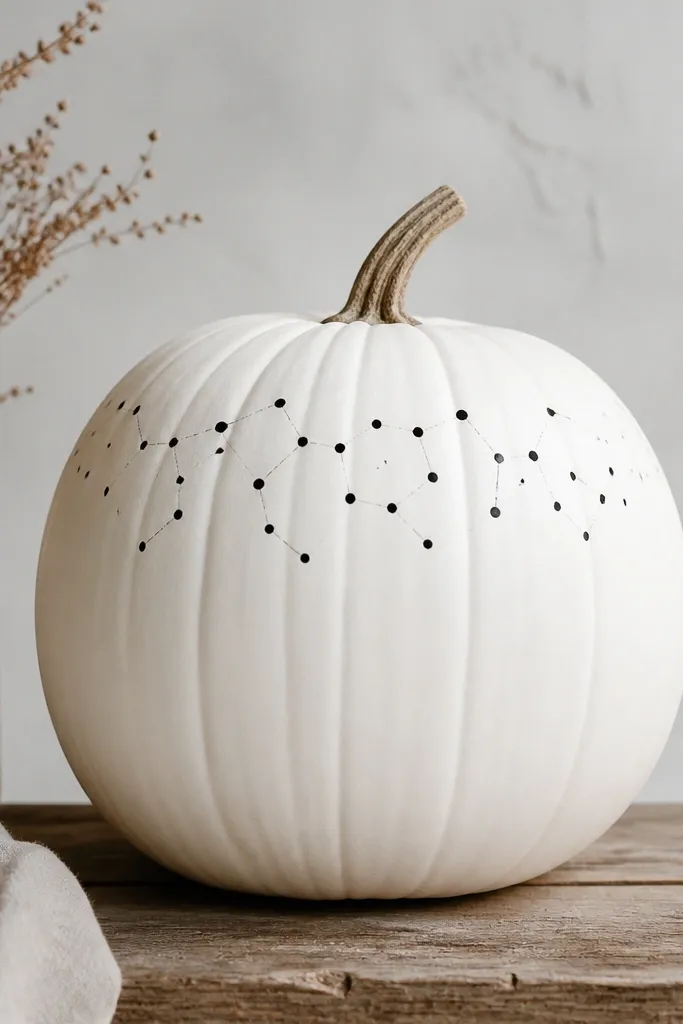
Dots feel modern because they’re graphic without being loud. I paint a chalky matte white base, then use black dots placed like a loose constellation around the top third of the pumpkin. The placement matters: keep the densest cluster near the stem and let the dots thin out as you move down. This design looks great in neutral rooms and also pairs well with silver or black candle holders. It’s flattering for any size because the dot scale stays consistent and doesn’t overwhelm the pumpkin’s shape.
Start with 2 coats of chalky matte white paint, sanding lightly with 320-grit after the first coat if you want a smoother look. Dip a dotting tool or the end of a makeup sponge into black acrylic paint — wipe excess on a paper towel. Press dots in a small cluster near the stem, then add a few scattered dots outward and down. Keep dot size consistent: re-dip often so you don’t get random large blobs. Once everything dries, seal with matte clear, and avoid glossy topcoat so the dots don’t look wet.
If you don’t have a dotting tool, use a clean pencil eraser end — it makes perfectly round marks.
Don’t spread dots all the way to the base — that’s when it turns into a pattern, not a focal motif.
4. One-Line Black Leaf Silhouette on White
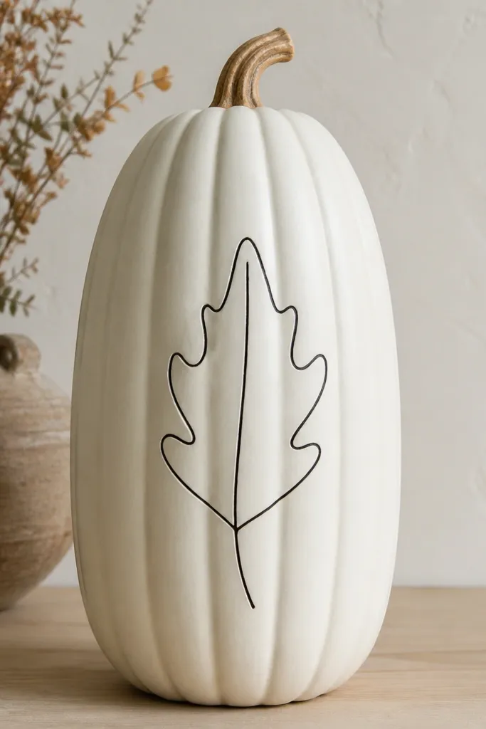
This is the kind of design that looks expensive because it’s confident and spare. I draw one leaf silhouette in black, using a thin liner brush, and I place it slightly off-center so the pumpkin still feels natural. The one-line style keeps the paint from looking heavy, and it’s readable from a distance. It works especially well if your decor has plants or botanical prints, but it also looks clean next to geometric frames. If you have light skin tones in your home styling (warm, airy vibe), black-on-white always photographs well under soft daylight.
Paint the pumpkin matte white in 2 coats and let it dry for at least an hour. Use a pencil to lightly sketch the leaf outline where you want it, then go over with black acrylic paint using a size 0 or 1 liner brush. Keep the line weight consistent; reload your brush before it gets dry so you don’t get broken strokes. Let it dry, then add the center vein with the same brush, staying within the silhouette. Finish with a matte sealer to keep the black from dulling over time.
Pro tipPractice the leaf on a scrap paper first — your brush will stop wobbling once you feel the curve.
AvoidDon’t add extra leaves or fill the silhouette — that’s where one-line turns into clutter.
5. White Pumpkin with Thin Gold Band at Midline
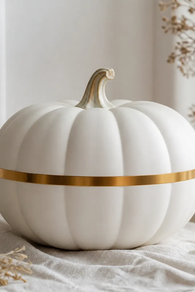
A single metallic band is the fastest way to make a pumpkin look like it belongs in a styled room. I keep the base matte white and the gold band narrow so it reads like jewelry, not decoration. Gold also warms up the white, which helps if your space has cool gray furniture. This design flatters almost every setup because it works with brass, warm metals, and even matte black. It’s especially good for medium and large pumpkins where a bigger visual element is needed.
Start with matte white base paint and let it cure for 45-60 minutes. Measure the midline with a soft tape measure and mark a faint pencil line all the way around. Use painter’s tape to create a band width of about 1/4 inch — press it down tightly along the ridges. Apply metallic gold paint or gold leaf pen in thin coats, letting each layer dry before the next. Remove tape carefully, then seal with a matte clear coat that won’t turn the gold dull.
Pro tipIf your pumpkin ridges are deep, lightly sand after the first white coat so the gold band sits flatter.
AvoidDon’t make the band too wide — anything thicker than 1/2 inch starts looking like a holiday sticker.
6. Monochrome Chevron Stripes with Masked Edges
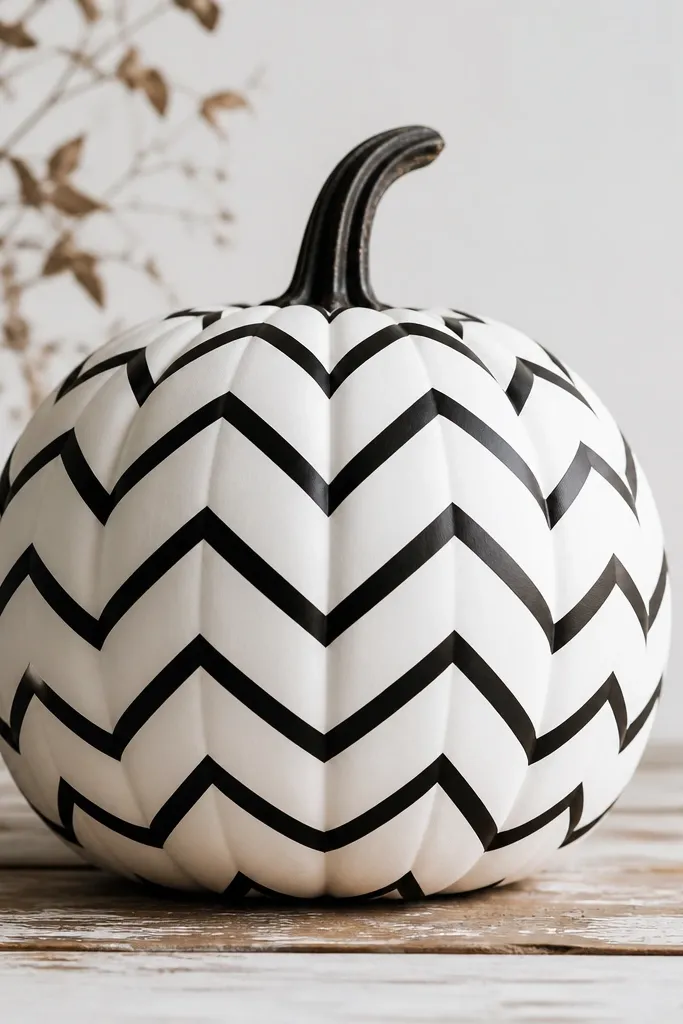
Chevron reads modern because it’s directional and clean, and it makes the pumpkin look designed rather than painted. I stick to black on white so the pattern stays graphic and doesn’t compete with your decor. The key is alignment: chevrons need symmetry or they look messy. This works well on pumpkins with smoother surfaces or after you sand a real pumpkin’s ridges a little. It also photographs well because the contrast is high and edges are sharp.
Paint the pumpkin matte white in 2 coats and let it dry fully. Lightly mark a center line and then map alternating chevrons on both sides using a ruler. Use painter’s tape to mask the black sections, leaving narrow white gaps — press tape around the curves so it doesn’t lift. Brush black acrylic paint over the exposed areas and remove tape once the paint is still slightly tacky. Let dry, then seal with matte clear spray.
Pro tipUse a small angled brush for the chevron points so you don’t get rounded V’s.
AvoidDon’t freehand chevrons without a center guide — crooked lines are what makes it look cheap.
7. White Pumpkin with Floating Rectangle Frame
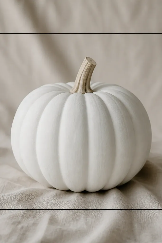
A rectangle frame is minimalist but still interesting because it adds structure. I paint a matte white base, then draw a thin black rectangle that sits slightly inside the pumpkin’s shape, with a small “gap” all around. That gap is what makes it feel like graphic design. It pairs beautifully with modern art prints and black picture frames. This also flatters smaller pumpkins because the frame can be scaled down without losing clarity.
Start with a smooth white base — 2 coats of matte white, then wait until fully dry. Use painter’s tape to block out a rectangle area if you want perfect corners, or lightly pencil the rectangle first. Paint a thin black outline with a liner brush, keeping the line thickness around the width of a standard marker. Remove tape (if used) and let the outline dry. Seal with matte clear and keep the frame crisp by avoiding thick paint layers.
Pro tipIf the rectangle looks wobbly, fix it by lining up a straightedge on top of the dried paint with a tiny brush and re-tracing one side.
AvoidDon’t let the rectangle touch the pumpkin ridges — it should feel suspended, not glued to the texture.
8. White Pumpkin with Single Horizontal Band and Tiny Dashes
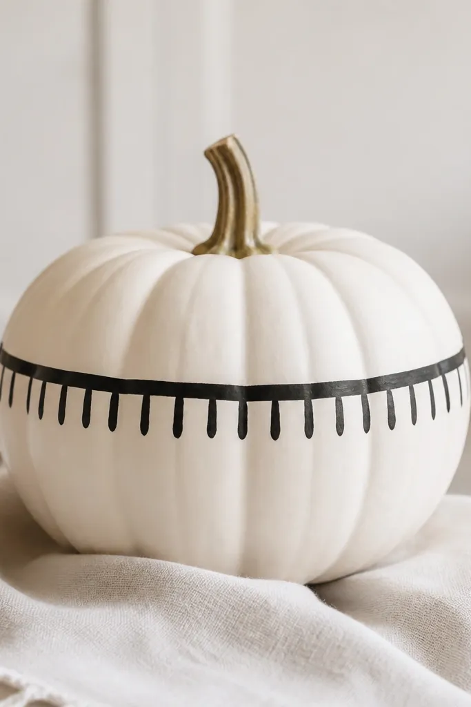
This design looks like a simple pattern you’d see on a Scandinavian throw. The horizontal band gives a clean anchor, and the tiny dashes add just enough detail to feel handmade without going overboard. I keep the band straight and the dashes short so the pumpkin still reads minimalist. It works great for entry tables and shelves where you want a small visual moment. If your home has lots of straight lines — cabinets, shelving, picture frames — this style matches that geometry.
Paint matte white first and let it dry. Place painter’s tape across the middle where you want the band, aiming for about 3/8 inch tall. Paint black acrylic over the exposed band area in two thin coats so it doesn’t streak on ridges. While the band is still slightly tacky, use a fine brush to add 10-12 short dashes downward, keeping spacing consistent. Remove tape after the paint sets, then seal with matte clear once everything is dry.
Count your dashes and mark spacing lightly with a pencil — it prevents the “uneven fringe” look.
Don’t make the dashes long — long fringe starts looking like a party banner.
9. Soft Gray Ombre Fade from Stem Down
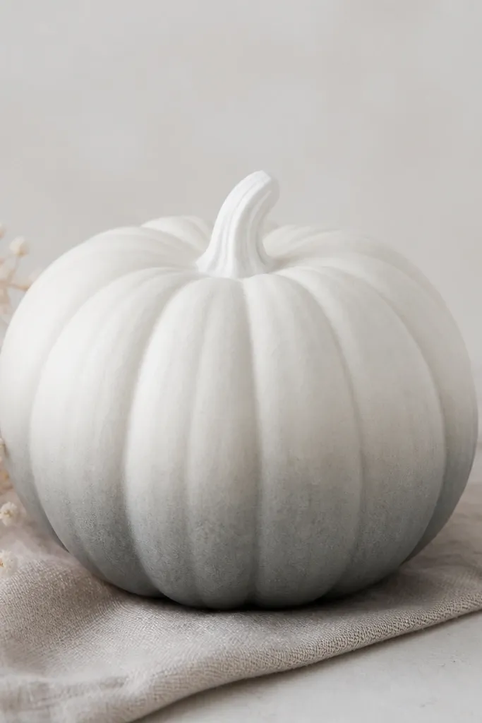
Ombre is minimalist when it’s smooth and limited to one color family. I use soft gray paint and blend it downward so the pumpkin looks like it’s been dipped in dye — calm, not dramatic. This works especially well in monochrome rooms where you want texture without extra graphics. It also hides minor imperfections because the gradient softens the ridges. If your decor uses light neutrals, this is one of the easiest ways to make pumpkins feel like part of the palette.
Start with a matte white base and let it fully dry. Mix soft gray acrylic slightly thinned with water so it spreads smoothly. Load a flat sponge and dab gray starting around the upper third, then blend downward with lighter pressure and fewer paint dabs. Keep adding small amounts of gray until you reach the bottom third, then stop — don’t keep darkening past the look you want. Once dry, do a quick matte sealer coat so the gradient doesn’t look chalky.
Pro tipUse a makeup sponge for blending and wipe the sponge on a paper towel between passes.
AvoidDon’t use thick paint for ombre — it creates tide-like bands that look amateur.
10. White Pumpkin with Black Corner Triangles
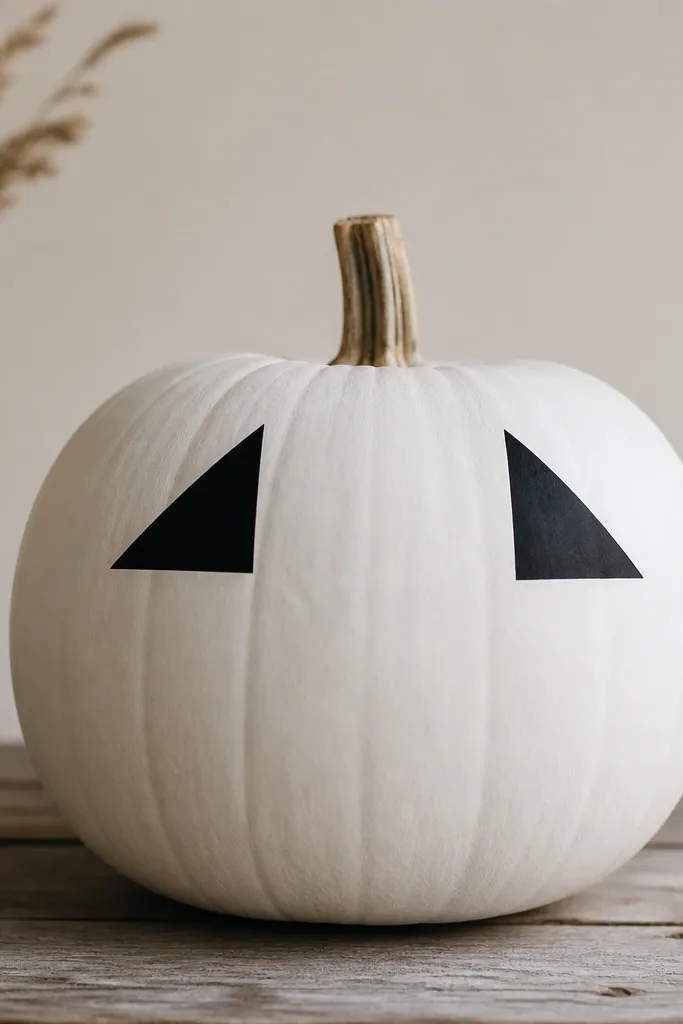
Corner triangles make the pumpkin feel like a modern print because they’re placed like design elements on a poster. I paint two black triangles at the front, one slightly higher than the other, and I keep their edges sharp. The asymmetry makes it feel current instead of symmetrical and boring. This one looks great with black-and-white ceramics and modern table runners. It’s flattering because the triangles visually “trim” the pumpkin shape, especially on rounder pumpkins.
Paint matte white in 2 coats. Cut small pieces of painter’s tape into triangle shapes or use a triangle craft stencil. Place the triangles on the front — I aim for the upper third, with one triangle about 1.5 inches tall and the other slightly smaller. Paint black acrylic over the taped shapes, then remove tape when paint is tacky. Let dry fully, then seal with matte clear to keep the edges crisp.
Pro tipIf your pumpkin is very round, press tape with your fingertip and then smooth again with a clean plastic card so paint doesn’t creep under.
AvoidDon’t place triangles too low — it makes the design look like it’s sliding off the pumpkin.
11. White Pumpkin with Mini Monogram on the Side
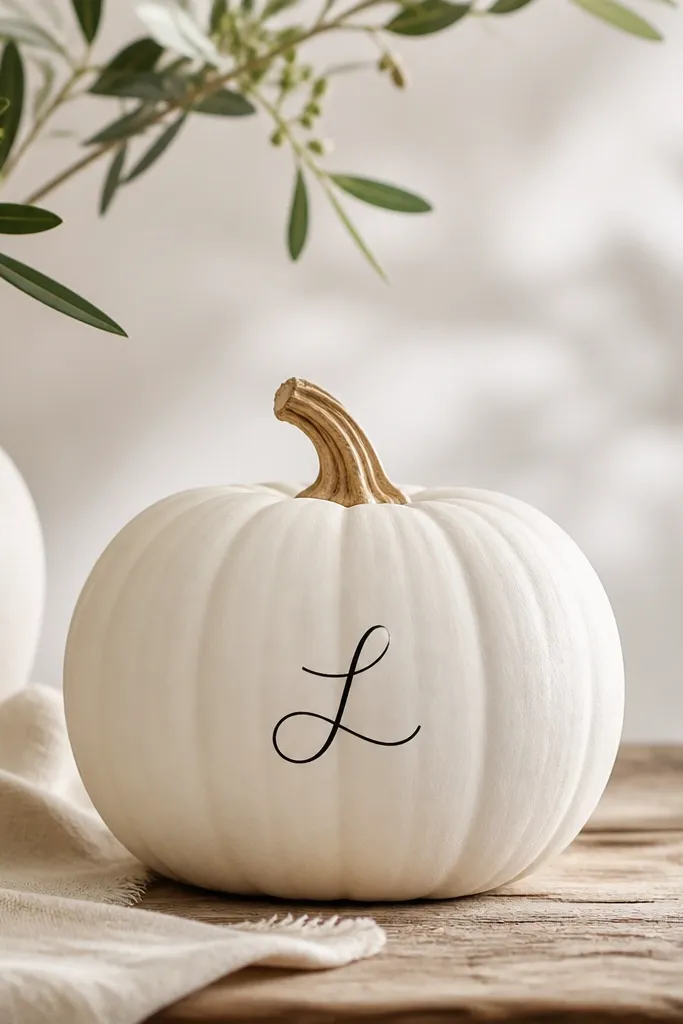
A tiny monogram turns a pumpkin into decor that looks like it belongs on your shelf all month. I keep the letter small and thin so it doesn’t overpower the pumpkin’s shape. Black works best over white, and I avoid fancy fonts that look too ornate — simple block script reads modern. This design flatters people who like personal touches but hate obvious holiday clutter. It also looks good for couples because you can paint two pumpkins with different letters and they still feel cohesive.
Use matte white as your base and let it dry completely. Lightly pencil the monogram location on the side facing outward. Use a liner brush and black acrylic paint, and keep the stroke thickness consistent by reloading often rather than pushing a dry brush. Let the letter dry 20 minutes, then add a second pass only where the pencil lines show through. Seal with matte clear so the monogram stays crisp when the pumpkin is moved.
Use painter’s tape to mask a narrow vertical guide line so the letter stays centered even on ridged surfaces.
Don’t go big with the letter — oversized monograms look like party decor.
12. White Pumpkin with Faux Porcelain Crackle Lines
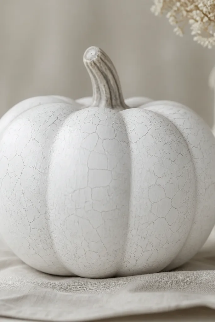
Crackle looks sophisticated when it’s light and controlled. I do a matte white base, then add thin gray crackle lines that don’t fill the whole pumpkin — think “porcelain” not “tire tracks.” This gives texture without bold graphics, so it blends into neutral decor and doesn’t fight patterns. It’s flattering on larger pumpkins because the texture covers ridges and makes the surface look smoother. It also works if you have white pottery, cream linens, or textured rugs in your home.
Paint the pumpkin matte white and let it dry. Mix gray acrylic with a tiny bit of water so the lines are translucent. Use a fine liner brush to draw irregular crackle paths, but keep them mostly concentrated across the upper half and around the front. Add a few longer lines and lots of short breaks so it looks natural, then let it dry fully. Seal with matte clear spray and avoid glossy — gloss makes crackle look like plastic wrap.
Pro tipDo one test pumpkin first so you learn how your brush lays down gray over matte white.
AvoidDon’t make the crackle too dark — heavy gray turns it into a Halloween smear.
13. White Pumpkin with Minimal Black Border at the Bottom
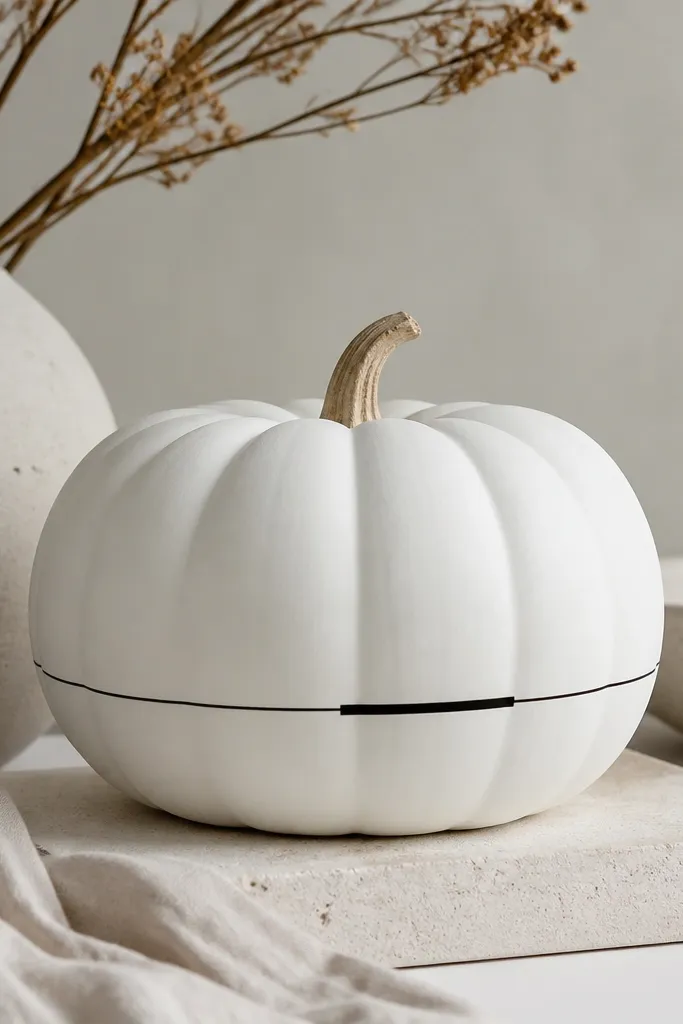
This border design looks like modern packaging labels. The bottom ring anchors the pumpkin visually and helps it look grounded on a tray or console. I keep it to a single thin line, sometimes with a tiny thicker segment on the front for a subtle “handmade” feel. Black over matte white reads clean under both daylight and warm bulbs. If your decor has lots of neutral tones and you want a graphic moment without full coverage, this one fits.
Paint the whole pumpkin matte white in 2 coats. Mark where the border should sit with a pencil line around the pumpkin, then apply painter’s tape just above and just below the border area. Paint black acrylic into the band space, using a flat brush to keep the line even. Let it dry 10 minutes, remove tape carefully, and touch up any tiny gaps with a liner brush. Seal with matte clear so the border doesn’t smear when you dust around it.
Use a flexible measuring tape to keep the pencil line level as you rotate the pumpkin.
Don’t double the border line — two lines make it look like a cheap sticker border.
14. White Pumpkin with Silver Metallic Half-Moon
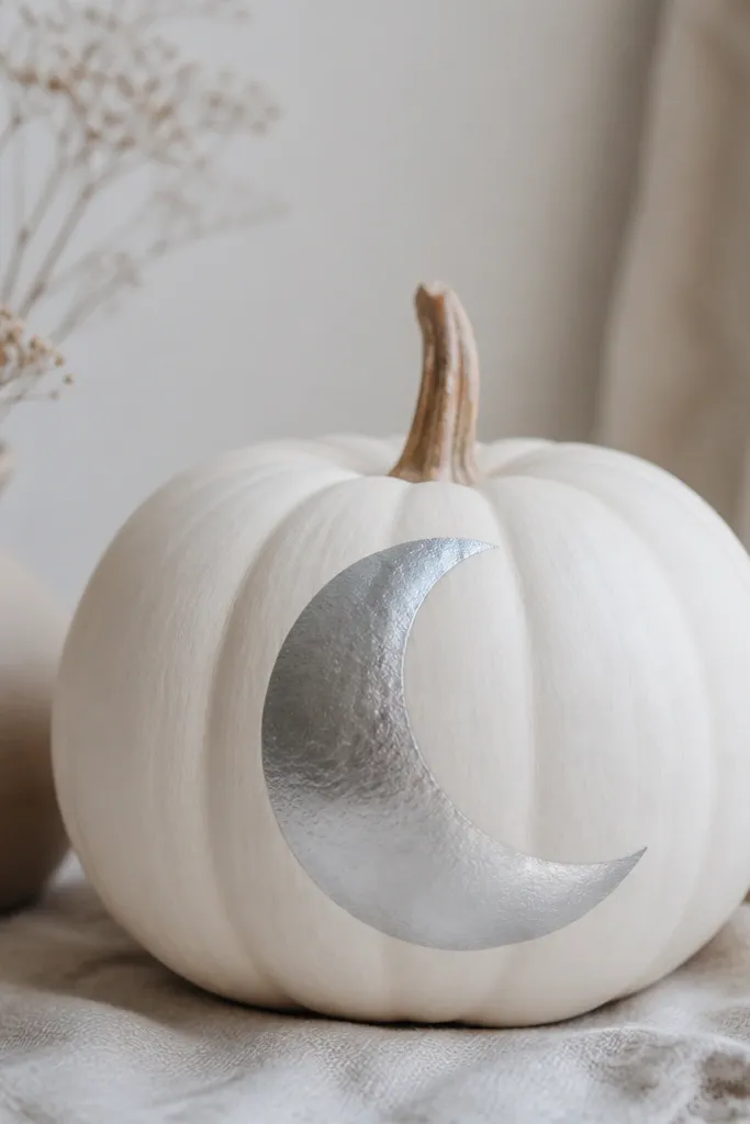
A half-moon is minimalist because it’s one shape with a clear edge. I paint matte white around it and keep the silver crescent clean so it looks like metalwork. Metallic finishes read chic when they’re used sparingly — one half-moon is plenty. This design looks great in homes with gray accents, stainless appliances, or silver candle holders. It also flatters medium and large pumpkins because the crescent gives a strong focal point without covering the entire surface.
Start with a matte white base and let it dry fully. Sketch a half-moon shape on the front using a pencil and a small bowl or stencil to get a smooth curve. Paint the inside of the crescent with metallic silver paint in 2 thin layers, letting the first coat dry so you don’t get streaks. If you want a sharper edge, trace the crescent outline first in silver, let it dry, then fill. Seal with a clear matte coat over everything except the silver if your sealer dulls metallic — test on a scrap pumpkin first.
Choose silver paint labeled for craft use so it levels — cheap metallics look gritty on matte surfaces.
Don’t place the crescent too close to the bottom — it starts looking like a random paint spill.
15. White Pumpkin with Minimalist Black Vertical Lettering Strip
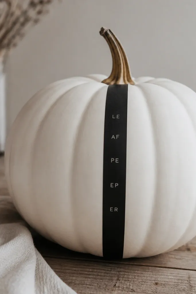
Vertical lettering gives a modern, editorial feel without needing big quotes. I keep it to a short word or even just initials, painted small and stacked so it looks like a label. The black strip keeps everything aligned and clean, and it makes the pumpkin look intentional in a styled vignette. This design is best for people who like typography and neutral decor, not for those who want a full scene painted on the pumpkin. It also looks great in pairs — two pumpkins with matching strip width look like a set.
Paint matte white in 2 coats. Mask a narrow vertical strip with painter’s tape — about 3/4 inch wide — centered on the front. Paint the strip black and let it dry completely. Then paint your letters using a thin liner brush or a small stencil — keep the letter height consistent and leave tiny equal spacing between lines. Once dry, remove tape, touch up edges with a white brush, and seal with matte clear.
If you’re doing initials, practice letter spacing on paper first and mark your brush tip against a ruler.
Don’t use thick paint for letters — chunky strokes make the strip look like marker graffiti.