1. Snow-Globe White Pumpkin With Tiny Dots
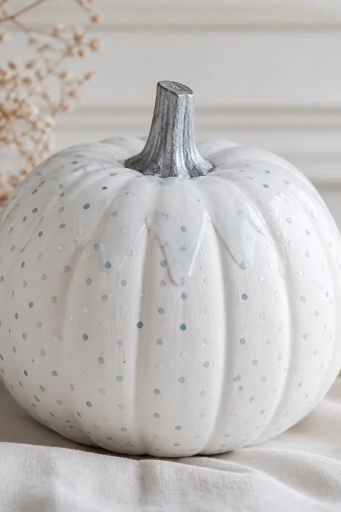
I love this one because it looks clean even when your dots aren’t perfect. Start by painting the whole pumpkin an opaque chalky white, then add a soft “globe” effect near the top by dry-brushing a slightly grayer white. For the dots, use a fine round brush and keep them small — think 1-2 mm — in silver plus a few pale icy blues. This style looks best on pumpkins that are a little rounder, because the dots spread evenly across the curves. It also flatters cool-toned decor like silver trays and white candles, since the finish stays soft instead of orange.
Step 1: Paint the pumpkin with 2 coats of matte white, letting each coat dry 20-30 minutes. Step 2: Mix a second white with a tiny bit of gray and dry-brush it around the top third, blending downward with light passes. Step 3: Add dots with silver paint first, then sprinkle in light blue dots so the pattern has variation. Finally, paint the stem in matte gray and seal the whole piece with matte acrylic sealer.
Pro tipUse a dotting tool made from the eraser end of a pencil for consistent dot size — tap, don’t drag.
AvoidDon’t water down the white too much or you’ll get streaks that show through every dot.
2. Black Cat Night Pumpkin With Moon-Cut Eyes
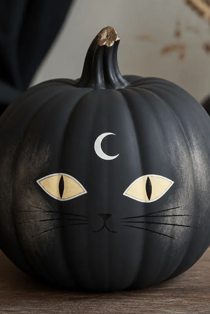
This is my go-to for a spooky-cute look that still feels tidy. I paint the pumpkin matte black first, then create eyes shaped like small moons — almond with a crisp crescent highlight. The highlight color is warm yellow (like butter) with a thin white outline so the face pops from across the porch. If your decor is mostly black and cream, this one looks sharp and intentional. It also hides imperfections because black paint covers uneven texture better than bright orange bases.
Step 1: Prime or basecoat with matte black in 2 thin coats; let it fully dry. Step 2: Sketch eye shapes lightly with pencil, then paint the eye centers in warm yellow. Step 3: Add a thin white outline around each eye and paint a small crescent moon above the face in pale white. Finally, pull whisker lines with a size 0 brush and seal with matte clear so the design stays non-glossy.
Pro tipIf your eyes look crooked, paint one first, let it dry, then use it as a guide for spacing the second.
AvoidDon’t use glossy black sealer under your paint — it makes acrylic details slide.
3. Pastel Rainbow Stripes With Clean Edges
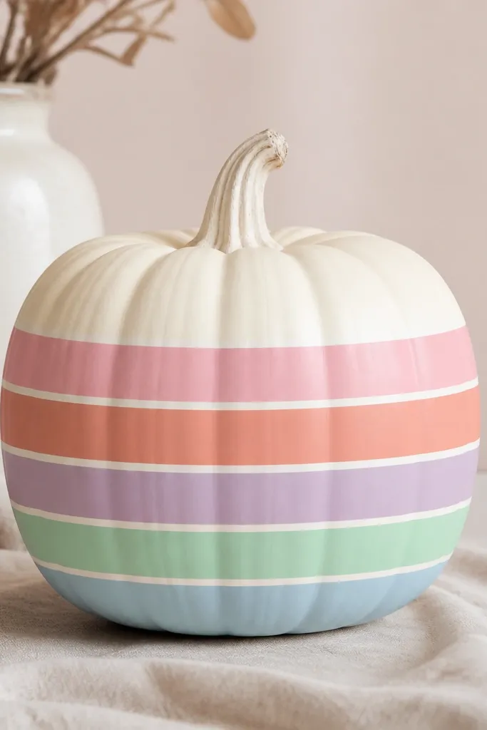
Straight stripes are where I used to mess up — the paint seeped under tape and looked messy. This version fixes that by using thin painter’s tape and spacing the stripes wide enough that tiny gaps don’t ruin the look. Pastels look sweet on a cream base and make the pumpkin feel more spring than Halloween. I like this for people who want cute but not scary, especially if you’re doing a kids' table or a front-step display with light decor. It flatters most color palettes because the cream base is neutral and the stripes stay soft.
Step 1: Paint the pumpkin cream (matte) and let it dry completely. Step 2: Mark stripe bands with light pencil lines, then apply painter’s tape along the lines, pressing the edges down with a fingernail. Step 3: Paint each stripe one at a time using thin coats; remove tape while the paint is still slightly tacky. Step 4: Add a thin white border between stripes if you want extra crispness, then seal with satin sealer for gentle glow.
Wrap tape around the pumpkin in short sections instead of one long strip so it hugs the curve.
Don’t try to paint all stripes in one thick coat — thick paint pulls and bleeds.
4. Berries and Leaves Pumpkin (Red + Green Dot Cluster)
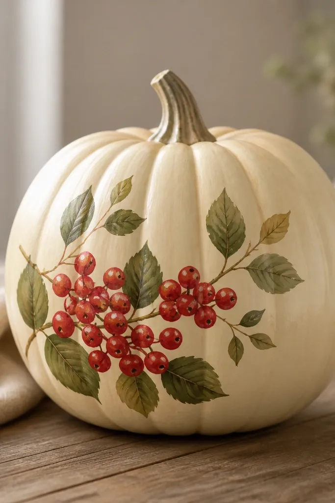
This one looks like a little still-life painting, and it hides beginner-level drawing issues because the cluster is forgiving. Use a warm ivory base so the red berries look richer, then paint 8-12 berries as small circles with a tiny white dot highlight at one edge. Add simple green leaves with a light vein line in a slightly darker green. This style flatters earthy decor — think wood trays, woven baskets, and cream linens. It also looks good on tall pumpkins because the cluster can sit higher and feel balanced.
Step 1: Basecoat the pumpkin in warm ivory matte. Step 2: Choose one side as your “front,” then paint a loose cluster of berries — start with 5 larger circles, then fill gaps with smaller ones. Step 3: Add white highlights on each berry and paint leaf shapes above the cluster, using a size 1 brush for veins. Finally, seal with matte acrylic sealer so the red stays soft and not shiny.
Pro tipMake berry highlights first as tiny white dots, then paint red around them — it keeps the shine believable.
AvoidDon’t outline every berry in black — it makes the cluster look like a sticker.
5. Gold Confetti Pumpkin With Stipple Fade
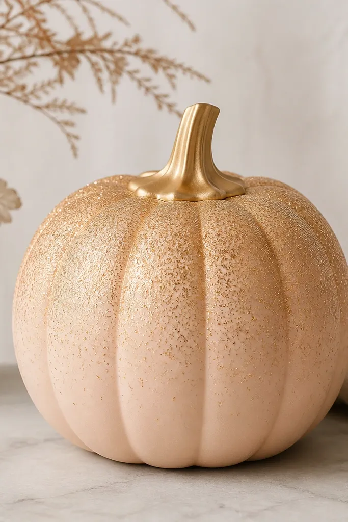
Confetti looks fancy without being hard, and it’s great when you don’t want to draw faces. I paint a soft peach base, then use gold acrylic with a stipple motion so the texture looks like scattered party pieces. The fade matters: start dense near the top, then reduce pressure and spacing as you go down. This style looks amazing under porch lights because gold catches light while the peach keeps it warm and flattering. It also looks good for people who hate messy carving — it stays neat and controllable.
Step 1: Paint the pumpkin peach matte and let it dry fully. Step 2: Load a small stiff brush (or a sponge) with gold paint and stipple near the top third; work in rows downward. Step 3: As you move down, lighten your pressure and increase your spacing to create a fade. Step 4: Paint the stem with a gold cap, then seal carefully with a clear satin sealer so glitter doesn’t shed.
Pro tipPractice the stipple on a scrap cardboard piece first so your dot size matches the pumpkin scale.
AvoidDon’t use craft glitter glue — it stays bumpy and can snag clothing.
6. Monogram Pumpkin in Tiny Dots
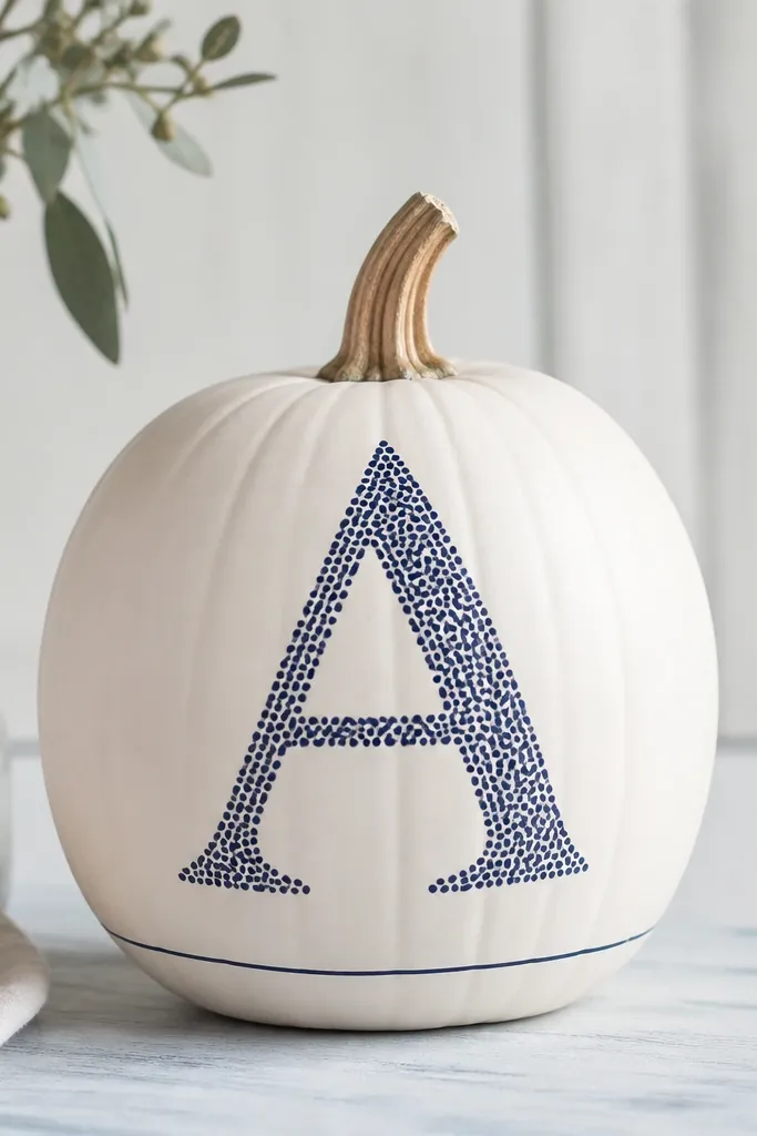
Monograms always look intentional, but the trick is making the letter feel handmade instead of blocky. I paint a dark navy base for the dots, and I keep the rest of the pumpkin mostly clean so the letter reads from across the room. This works best if you choose a single letter that fits the pumpkin’s widest part, usually the middle third. It flatters modern decor — think navy throw pillows, white planters, and minimal centerpieces. If you’re painting for a wedding or housewarming, this is a safe, cute option that still feels personal.
Step 1: Basecoat the pumpkin in matte white and let it dry. Step 2: Lightly sketch the letter with pencil, centered on the pumpkin’s widest band. Step 3: Fill the letter with tiny navy dots using a size 0 brush or dot tool, touching dots together but leaving slight gaps for texture. Finally, paint a thin navy line around the bottom edge and seal with matte sealer.
Pro tipUse a stencil for the outline, then remove it right after the pencil sketch so you can still place dots naturally.
AvoidDon’t paint solid letters first — dots look softer and hide uneven edges.
7. Mushroom Cap Pumpkin With Speckled Spots
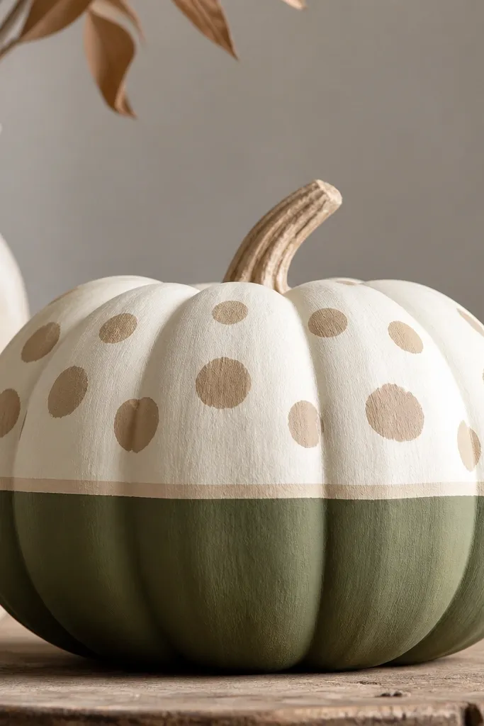
This looks like a cozy forest scene, and it’s easier than it sounds because the mushroom is basically two big shapes. Paint the top half like a cap and the bottom half like moss, then add spots only on the cap. I use tan spots with a small darker outline inside each spot so they look like they have depth. This style is adorable on medium-sized pumpkins because the cap shape matches the curve. It also flatters warm wood and green decor, especially if you pair it with a beige knit throw or faux leaves.
Step 1: Basecoat the top half (cap) in creamy white matte and the bottom half in moss green matte. Step 2: Blend the separation line by painting a thin cream curve in the middle so it looks natural. Step 3: Add tan speckled spots on the cap with a size 1 brush, then add tiny darker dots inside some spots. Finally, paint the stem dark brown and seal with matte clear to keep the mossy look soft.
Pro tipKeep your spots bigger near the center of the cap and smaller near the edges for a realistic gradient.
AvoidDon’t add spots all the way down the green — it makes the design look like random dots.
8. Apple Blossom Pumpkin With Blush Petals
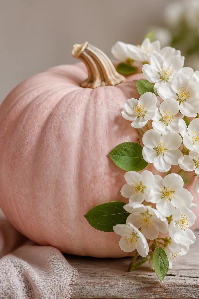
This is a sweet spring Halloween option, and it’s great if you want something that looks good even after October. I use a blush-pink base so the flowers feel airy, then paint small white blossoms with a yellow dot center. The leaves are simple teardrops in muted green, with one darker vein line. This style flatters light skin tones in photos because it’s soft, not harsh. If you have a porch with pale planters or pink decor, it ties everything together.
Step 1: Paint the pumpkin blush-pink matte in 2 coats and dry fully. Step 2: Choose one side for the cluster and mark 4-6 blossom positions with pencil dots. Step 3: Paint five-point petals in white around each dot, then add a yellow center. Step 4: Add small leaf shapes in muted green and finish with a dark green vein line on each leaf. Seal with matte sealer so the flowers stay soft.
Pro tipUse a paper towel to slightly blot your white brush so petals don’t look too wet and thick.
AvoidDon’t use bright neon pink — it makes the blossoms look like candy instead of flowers.
9. Teal Watercolor Pumpkin With Bleed-Edge Effect
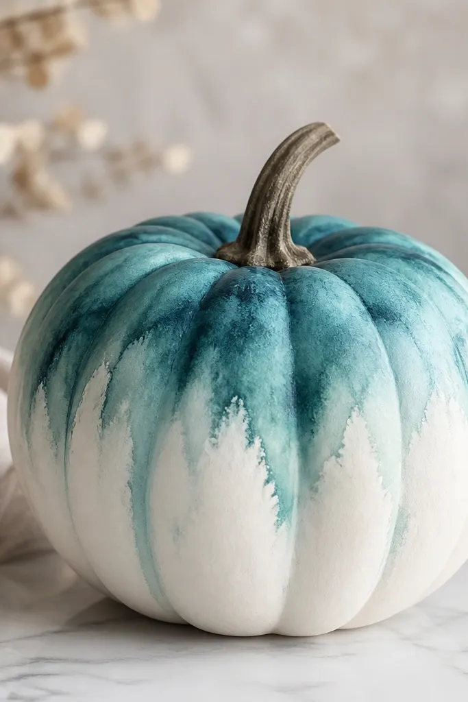
Watercolor looks hard until you realize you’re controlling moisture, not drawing. I paint a white base, then use watered-down teal acrylic (not too watery) and a damp sponge to create soft edges. The key is the fade: darker near the top, lighter as it moves down, so it looks like pigment drifting. This style looks amazing in bathrooms and kitchens because it feels calm and clean. It also flatters cool-toned homes — gray, white, and teal decor look extra cohesive.
Step 1: Basecoat the pumpkin in matte white and let it dry. Step 2: Mix teal acrylic with a small amount of water and test on scrap until it looks like milk, not juice. Step 3: Dab teal with a damp sponge at the top third, then lightly drag downward with a flat brush without pressing. Step 4: Repeat with lighter teal to build the fade until it looks even. Seal with matte sealer once fully dry to lock in the soft edges.
Pro tipKeep a separate dry brush nearby to lift pigment right away — that’s what makes the bleed-edge look.
AvoidDon’t paint over wet watercolor layers — they turn muddy fast.
10. Retro 70s Pumpkin With Checker Band
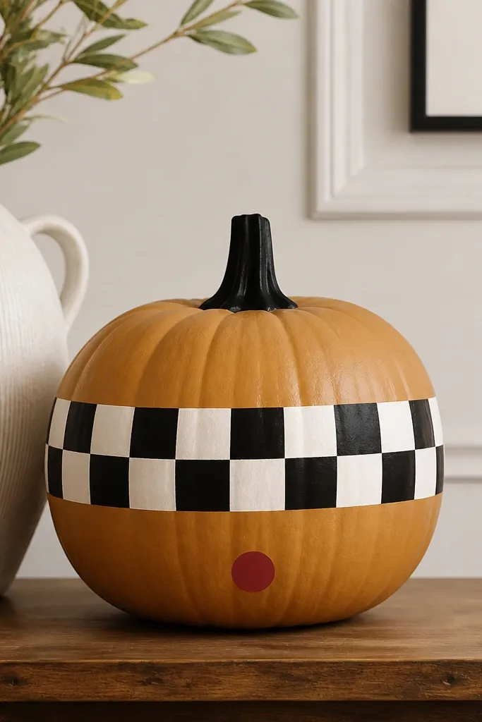
This is the look I do when I want something fun and graphic. A single checker band gives you that retro vibe without covering the whole pumpkin with busy pattern. I like using caramel orange or muted orange so the checker looks crisp, not harsh. White and black are the easiest combo to keep clean on curved surfaces. This flatters people who prefer bold design over cute faces and works great for a porch with patterned doormats.
Step 1: Paint the pumpkin caramel orange matte and let it dry. Step 2: Use painter’s tape to mask a horizontal band around the middle, then paint the band white. Step 3: After it dries, remove half the tape lines and paint alternating black squares, keeping each square about 1 cm wide. Step 4: Add a small red circle near the bottom edge and paint the stem black. Seal with satin sealer so the band stays readable.
Pro tipStick to 1 cm squares — smaller checks start to warp on a pumpkin curve.
AvoidDon’t freehand squares — they look uneven and cheap next to the clean base.
11. Whimsical Face Pumpkin With One-Sided Smile
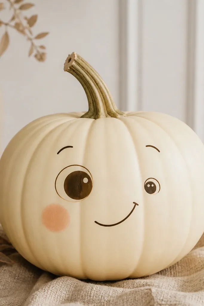
This style is cute because it looks a little human, not perfectly symmetrical. I paint one eye slightly higher and one cheek blush spot so the face looks playful. Use thin eyebrows and keep the smile simple — a curved line with one tiny highlight dot on the eye. This flatters smaller pumpkins because the face fits better and stays readable. It also works with any decor since the base is neutral and the features are delicate.
Step 1: Basecoat the pumpkin cream matte. Step 2: Sketch one eye and one eyebrow, then place the second eye lower by 2-3 mm so it feels off in a good way. Step 3: Paint both eyes in soft brown, then add a tiny white highlight dot. Step 4: Add peach blush under one eye and draw a simple curved smile. Seal with matte sealer to keep the face soft.
Pro tipUse a damp paper towel to correct mistakes — dab off paint before it fully dries.
AvoidDon’t make the smile too wide — it turns into a cartoon grin that looks messy.
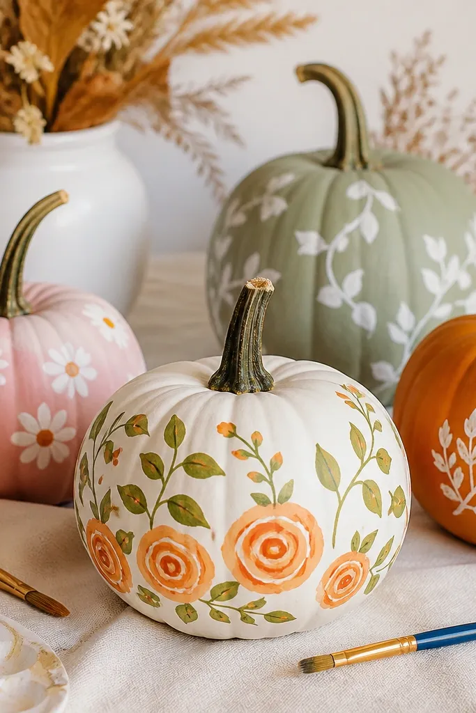
12. Botanical Vine Pumpkin With Fine Line Leaves
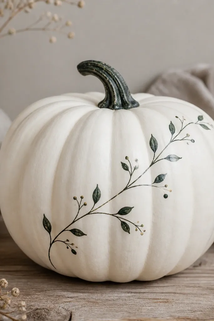
Fine line botanical art always looks expensive when it’s kept minimal. I paint the pumpkin white, then use dark green for a vine that runs diagonally so it follows the pumpkin’s natural shape. Leaves are teardrops with a single vein line, and berries are just three-to-four dots. This style flatters people who like farmhouse decor but want something lighter than full-on country patterns. It also looks great paired with greenery garlands and simple candle holders.
Step 1: Paint pumpkin white matte and let it dry. Step 2: With a size 0 brush, draw a diagonal vine line from top right to bottom left. Step 3: Add leaf teardrops along the vine, then paint one vein line in a slightly darker green. Step 4: Add 3-4 berry dots near the vine and lightly dry-brush the stem. Seal with matte clear.
Pro tipMix your green with a tiny bit of black for a deeper tone that reads well from a distance.
AvoidDon’t thicken the vine lines — thick lines make it look like a craft marker drawing.
13. Rose Quartz Pumpkin With Blush Marbling
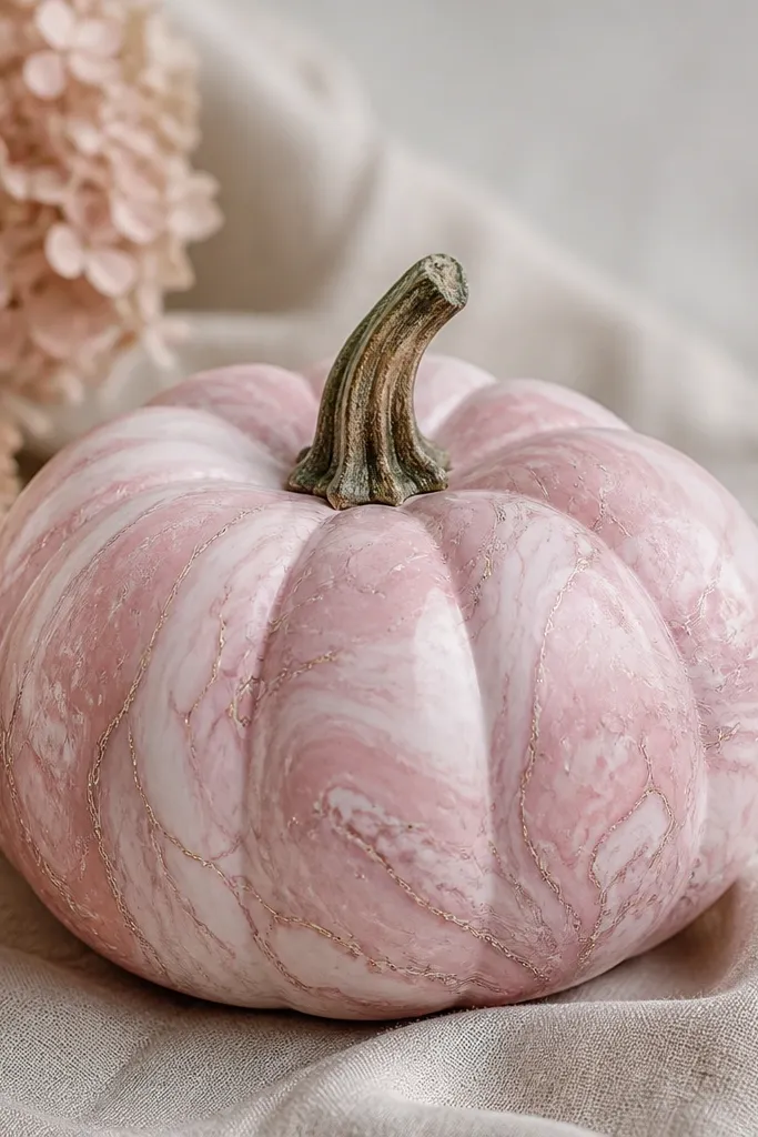
Marbling looks hard, but it’s mostly patience and thin layers. I start with a pale blush base, then add white swirls with a fine brush and gray-pink “veins” that follow the swirl direction. Keep the veining subtle so it looks like stone, not cartoon lines. This looks stunning in photos because soft pink catches light without looking loud. It flatters warm skin tones in portraits and matches neutral decor like beige, ivory, and gold.
Step 1: Basecoat pumpkin with pale blush matte, 2 coats. Step 2: Paint 3-5 broad white swirls across the widest area, then soften edges with a dry brush. Step 3: Add thin gray-pink veins that branch off the white swirls, keeping them hairline thin. Step 4: Add a tiny darker blush shadow where swirls overlap. Seal with satin sealer so the marbling has a gentle glow.
Use a semi-dry brush for veins so they look like pigment lines instead of puddles.
Don’t flood the surface with paint — marbling collapses into blobs.
14. Candy Corn Pumpkin With Two-Tone Top
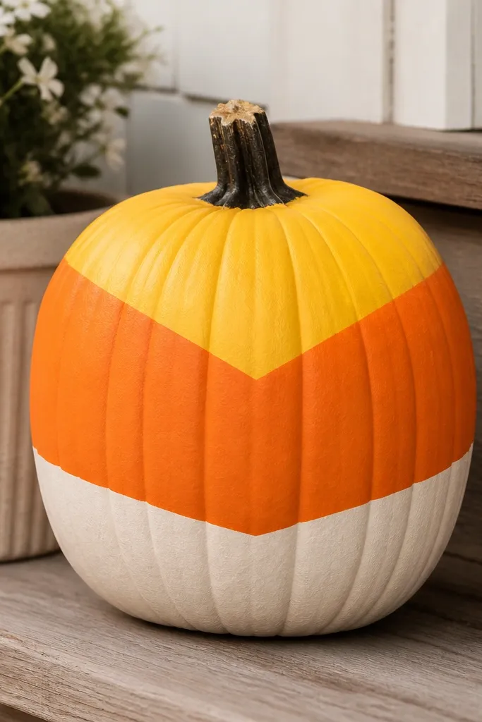
Candy corn is classic, but the cheap version is always the same: blurry triangle edges. This one fixes it with taped angled bands so the transitions stay crisp. I use matte paint so the colors look like candy, not like glossy Halloween plastic. This flatters people who want a fun, obvious Halloween theme without carving. It also reads well from far away because the color blocks are bold and high-contrast.
Step 1: Paint the whole pumpkin cream matte first, then let it dry. Step 2: Use painter’s tape to create angled triangle bands — press edges firmly on the curve. Step 3: Paint the top band yellow, middle band orange, then remove tape to reveal sharp lines. Step 4: Touch up any tiny leaks with a small brush and a steady hand. Seal with matte sealer so the candy effect stays soft.
Pro tipAngle the tape slightly wider at the top so the triangles don’t pinch at the pumpkin’s narrower top.
AvoidDon’t skip tape — freehand candy corn triangles look wobbly fast.
15. Galaxy Pumpkin With Star Sprinkles
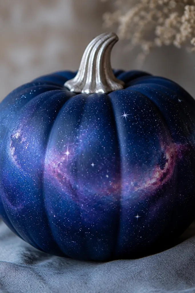
Galaxy pumpkins look amazing and they hide small imperfections because space is messy by nature. I start with a deep navy base, then sponge on purple and blue around the center to create a cloud band. Stars are made with a white paint pen or a toothbrush method, but you control it by testing on scrap first. This style looks best in low light displays like evening porch setups because the navy and purple depth pops. It also flatters modern decor — it doesn’t clash with black lanterns or dark wreaths.
Step 1: Basecoat pumpkin deep navy matte and let it fully dry. Step 2: Sponge on purple-blue clouds around the middle third, blending outward with light dabs. Step 3: Add stars with a white paint pen for small dots, then flick tiny specks with a toothbrush for larger ones. Step 4: Paint a few pink nebula swirls with a thin brush. Seal with satin sealer and paint the stem metallic silver.
Cover your floor with paper and wear a mask for the toothbrush flick — it gets everywhere.
Don’t use pure white everywhere — vary star sizes with different dot techniques.
16. Cheerful Polka Dot Pumpkin in Two Sizes
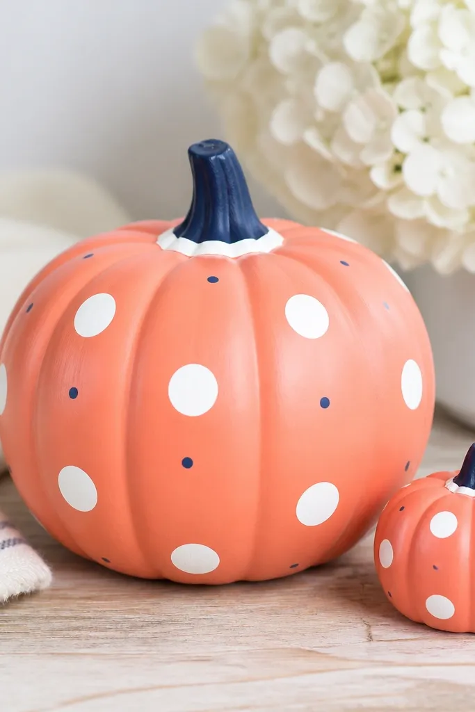
Polka dots are the fastest cute look that still feels designed. I use two dot sizes so it doesn’t look like a kid’s sticker sheet. Coral with white is bright and friendly, and navy adds contrast without turning it spooky. This style flatters warm-toned decor and it looks great on a porch where you want color pop. If your pumpkins are going to be photographed with a lot of other items, polka dots keep the design readable.
Step 1: Paint pumpkin coral matte and dry fully. Step 2: Place bigger white dots first, spaced evenly around the widest band. Step 3: Add smaller white dots between them, then sprinkle a few tiny navy dots for contrast. Step 4: Paint a navy cap on the stem and add a thin white ring near the bottom edge. Seal with matte sealer.
Pro tipUse a ruler to mark a light grid on paper, then copy dot spacing by measuring around the pumpkin’s circumference.
AvoidDon’t make all dots the same size — it looks flat and less “cute” in photos.
17. Monochrome Gray Pumpkin With White Half-Moon Faces
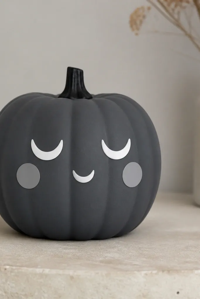
This is my minimal pick when I’m tired of orange pumpkins. The trick is using half-moons, not full circles, which keeps the face graphic and clean. Charcoal gray makes the white details look crisp, and the light gray cheeks soften the expression so it stays cute. This flatters modern monochrome yards and it works with farmhouse too because the colors are neutral. It also looks great indoors because it doesn’t scream Halloween — it reads as simple home decor.
Step 1: Basecoat pumpkin charcoal gray matte. Step 2: Paint two white half-moons as eyes on the upper middle, then paint a smaller half-moon mouth slightly lower. Step 3: Add two light gray cheek circles under each eye and blend their edges with a dry brush. Step 4: Paint the stem black and lightly dry-brush the ridges. Seal with matte clear so it stays modern.
Make half-moons by painting a curved blob, then wiping one edge with a damp brush for a sharper line.
Don’t use bright white on everything — it looks harsh against gray.
18. Orange Pumpkin With White Lace-Effect Border
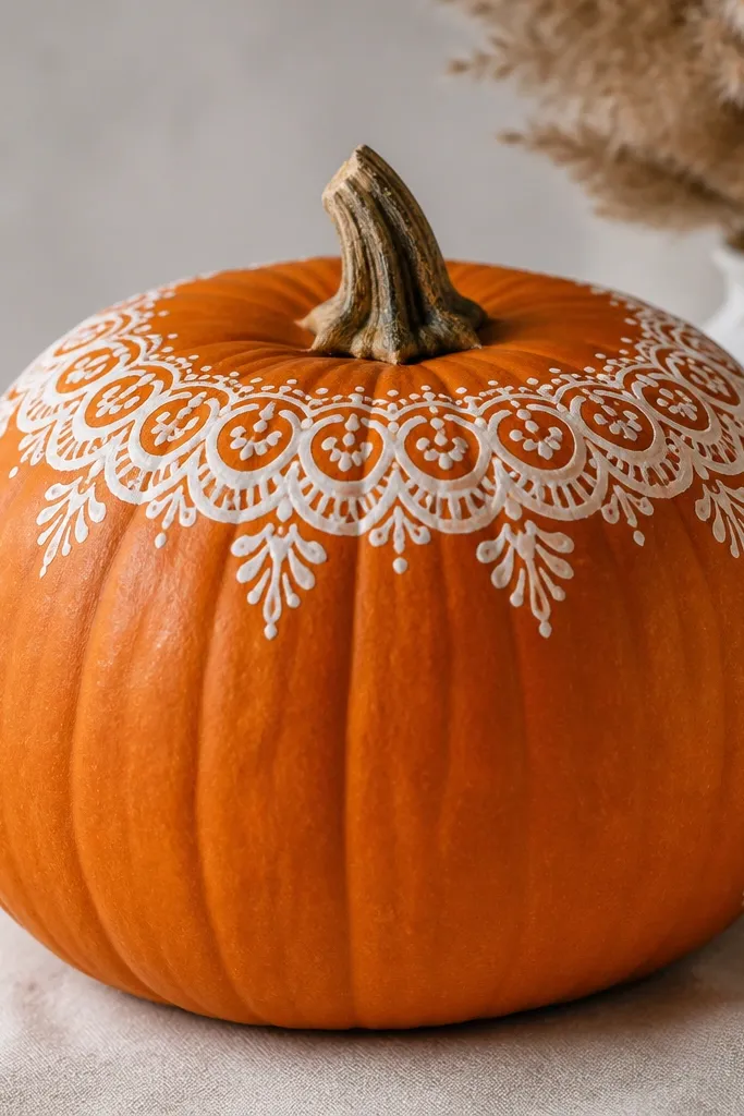
Lace-effect borders look delicate, but you don’t need actual lace fabric. I paint a thin white border along the top rim using a stencil or a lace-pattern sponge, then add a few matching swirls down the side. The rest stays orange so it looks intentional instead of overworked. This style flatters warm outdoor lighting because the white lines catch highlights. It’s also great if you want a design that still looks good when the pumpkin starts softening — less paint coverage means less peeling drama.
Step 1: Clean and dry the pumpkin, then paint a thin layer of primer if the skin is patchy. Step 2: Use a lace-pattern stencil around the top rim and paint white in small dabs so it doesn’t bleed under the stencil. Step 3: Add 3-4 lace swirls down one side, keeping them narrow and spaced. Step 4: Let it dry and seal with matte acrylic sealer. Keep the stem natural or wipe it with a clear matte finish.
Pro tipIf you’re using a stencil, press it down for 10 seconds per section so edges stay crisp.
AvoidDon’t flood the lace stencil with paint — it seeps and ruins the pattern.
19. Pumpkin With Painted Raccoon Mask (Grey + Black)
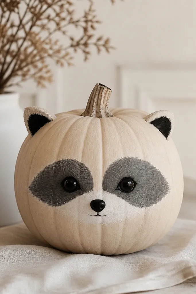
This one is cute because the mask shape does the heavy lifting. I use beige as the base, then paint a soft gray mask around the eyes with a white muzzle area in the center. Add small black ears on top and a tiny black nose dot so it reads as raccoon, not random face paint. This flatters kids' decor and it looks adorable next to lanterns and wooden signs. It also hides uneven pumpkin texture because the mask covers the most visible area.
Step 1: Basecoat pumpkin beige matte and dry fully. Step 2: Paint two gray eye patches, leaving a gap in the center for the muzzle. Step 3: Add white muzzle shape below and connect it to the gray patches with gentle curves. Step 4: Paint small black ears near the top and add a tiny black nose dot. Seal with matte sealer so the colors stay soft.
Pro tipSketch the mask with pencil first — the raccoon look depends on the curve around the eyes.
AvoidDon’t outline the whole face in black — it makes it look like a Halloween costume mask.
20. Tiny Stripe Candy Cane Pumpkin (Red + Cream)
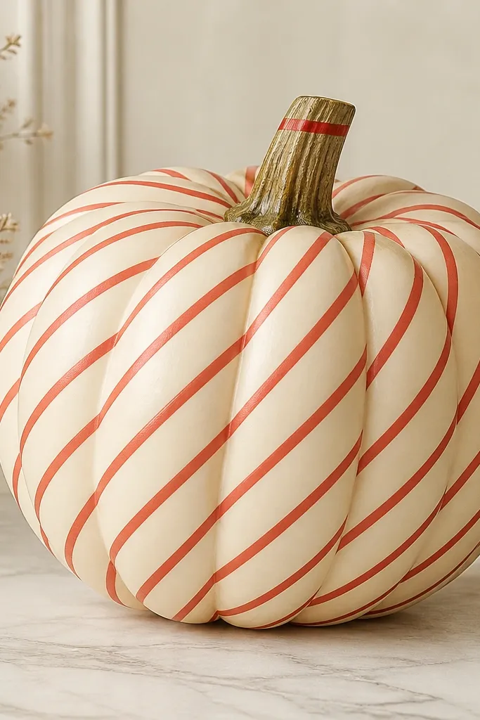
Diagonal stripes look festive and clean when the stripes are thin and evenly spaced. I paint a cream base first, then mask diagonal stripes with thin painter’s tape, spacing them consistently. The red paint is matte so it looks like candy, and the thin stripe width keeps it from getting messy on the curve. This style flatters winter decor and it looks great on a mantle or grouped with other painted pumpkins. It also photographs well because the diagonal lines give a sense of motion.
Step 1: Paint the pumpkin cream matte and dry. Step 2: Apply thin painter’s tape diagonally in parallel rows, keeping stripe width around 6-8 mm. Step 3: Paint red over the exposed tape gaps in 2 light coats, then remove tape while paint is slightly tacky. Step 4: Add a small red band around the stem base. Seal with matte sealer to keep the stripes crisp.
Pro tipUse the same angle for every tape strip by marking one stripe line on paper and using it as your guide.
AvoidDon’t use wide tape — thick stripes look clunky and hide the pumpkin shape.