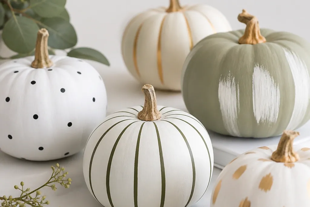
1. Matte Black Stripe with Warm White Dot Halo
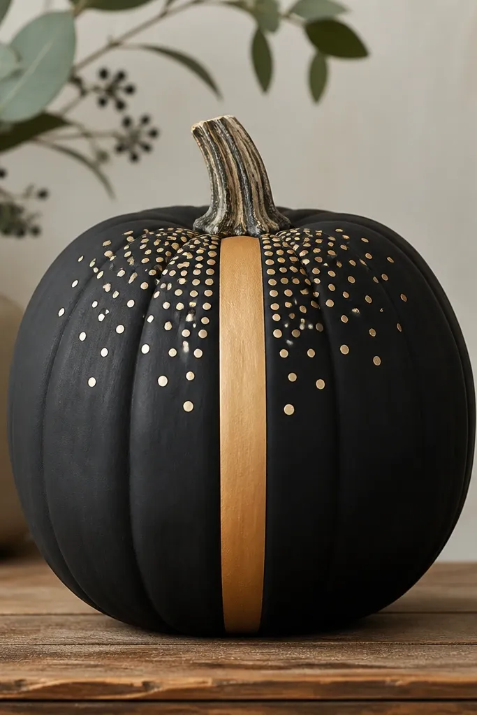
This one wins because it reads like graphic design from across the yard. Start with matte black spray paint for the base, then add a single vertical stripe and a controlled ring of dots in warm white acrylic. The contrast is strong without turning into Halloween chaos. It looks great on pumpkins that are slightly taller than wide because the stripe pulls the eye upward. I’ve used it on pale-skinned pumpkins too, and the black coat covers evenly once you prep the surface.
Step one: wash the pumpkin, dry fully, then scuff the surface with 220-grit sandpaper so paint grips. Step two: tape a single straight stripe using 1/2-inch painter’s tape and spray matte black over the whole pumpkin; remove tape after the coat flashes tacky, not fully dry. Step three: paint a warm white dot halo using a small dotting tool (or the eraser end of a pencil) and keep the dots evenly spaced. Finally, seal with a light matte clear coat only after the dots are dry to prevent smudging.
If your dots wobble, practice on paper first and count 12 dots for the halo so the spacing stays consistent.
Skipping the sand step makes the paint peel when the pumpkin warms in the sun.
2. One-Color Clay Terracotta with Cream Chevron Band
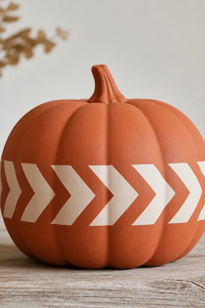
Terracotta + cream looks modern because it reads like home decor, not costume. The chevron band gives motion while staying minimal since it’s only one band and one pattern. This style flatters warm undertones and complements front doors with beige, tan, or wood tones. I like it for pumpkins that have a lot of ridges because the matte base hides texture bumps. The chevron also works well for people who want pattern without committing to a full wrap-around design.
Pro tipMake your chevron band narrower than you think — aim for 3 to 4 inches tall so it looks intentional.
Step one: paint the entire pumpkin clay terracotta using a matte craft spray or foam roller so you don’t get shiny streaks. Step two: mark the chevron center line with a pencil, then place small strips of painter’s tape to form the first V; use that V as your template for the rest. Step three: paint the chevrons cream with a small angled brush, filling each V evenly and letting edges dry before removing tape. Finally, add a thin matte clear coat once everything cures so the cream stays crisp.
AvoidPainting chevrons with a wide brush smears the edges and makes it look homemade in a bad way.
3. Neutral Marble Look with Black Minimal Initial
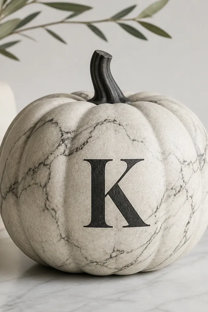
Marble is an instant upgrade because it adds depth without busy clutter. You’re not painting every vein; you’re creating the illusion with a controlled base and a few thin black lines. The single black initial keeps it modern and gives you a clean focal point. This looks amazing for contests because judges can recognize the letter shape quickly. I’ve done it for family names and it photographs better than ornate carving.
Step one: base coat the pumpkin with off-white matte paint and let it dry completely. Step two: thin gray paint with water (about 1:1) and lightly drag a sponge across the surface to create marble patches. Step three: add black veining with a fine liner brush — do 5 to 8 thin lines, varying thickness, and keep them mostly vertical. Finally, paint your initial in black using a stencil so the edges stay sharp, then seal with matte clear coat.
Use a stencil made for signs (not a paper stencil) so the initial edges don’t bleed under the paint.
Overdoing the veining — too many lines makes it look like accidental splatter.
4. Brass-Trimmed Geometric Panels Using Vinyl Tape
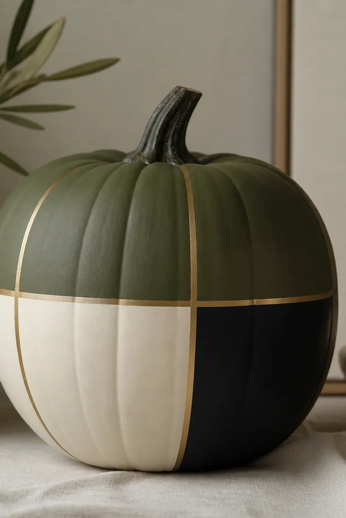
This is the “modern minimalist pumpkin decorating ideas” look that actually survives wind because tape makes the lines. The olive base is calm, and the brass tape adds that warm hardware vibe. You get a geometric structure without needing to paint perfect edges freehand. It looks great on pumpkins with a rounded belly since the panels curve slightly but stay readable. If your home decor leans mid-century or Scandinavian, this one matches immediately.
Step one: spray the pumpkin deep olive matte and let it dry overnight for the best adhesion. Step two: apply vinyl tape or thin metallic strip tape to form a simple grid — I use two vertical lines spaced evenly and one horizontal line across the middle. Step three: fill each panel with acrylic in cream and black using a foam brush, then remove tape while paint is still slightly tacky. Finally, add a quick wipe with a dry cloth around the tape edges and seal with a matte clear coat that won’t yellow.
Press the tape down hard at the ridges with your fingernail so paint doesn’t creep under it.
Using thick tape — it hides the geometry and makes it look like you covered mistakes.
5. Monogrammed Minimal Face with One-Line Eyes
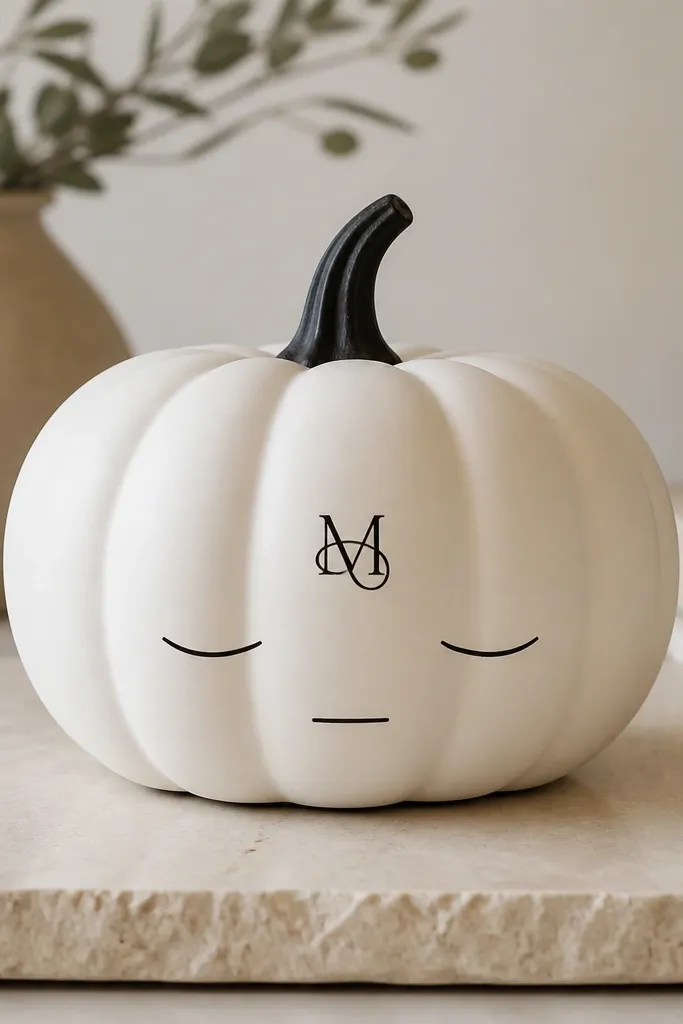
Minimal faces win because they read as design, not horror. The matte white base makes the black linework pop, and the monogram gives it that “intentional decor” feeling. This works for people who want playful without glitter or carving mess. I’ve used it for contests where the theme is “modern home” and it always looks clean in photos. It flatters any pumpkin because the face is small and centered, so you can hide uneven ridges behind the monogram area.
Pro tipIf the pen skips, shake it longer and test on cardboard first so the line weight stays consistent.
Step one: base coat the pumpkin matte white and let it dry fully. Step two: paint the stem black for a finished top — I use a small brush and keep the paint only on the stem and top rim. Step three: add a monogram using a stencil, then draw the eyes and mouth with a fine liner paint pen. Finally, seal lightly with a matte clear spray held 12 inches away so you don’t blur the pen lines.
AvoidDrawing the face too large — big eyes look cartoonish instead of minimalist.
6. Tall Stem Accent with Copper Paint Drips
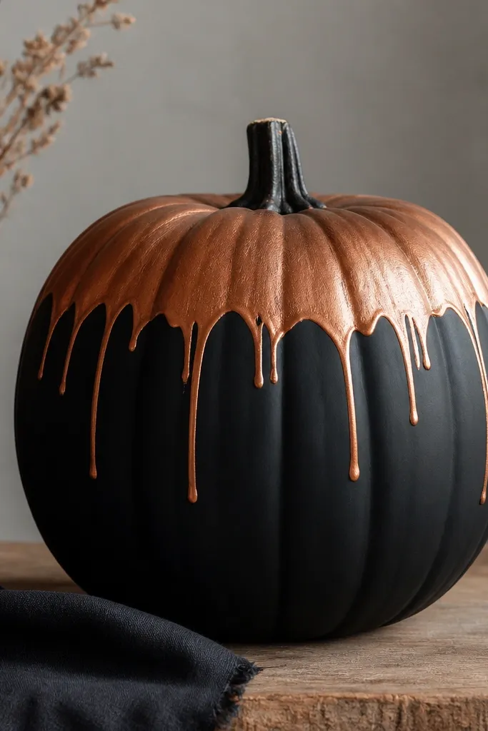
This one is modern because the detail is placed where your eye already goes — the top. Copper drips mimic industrial finishes but stay classy when you keep them sparse. I like this for pumpkins with a nice stem shape since the copper area draws attention upward. It also looks good against dark porches and black planters. If you want a Halloween look that doesn’t scream, this is it.
Pro tipPractice drip count on a scrap pumpkin or cardboard so you don’t end up with too many lines.
Step one: paint the entire pumpkin matte black and let it cure so drips don’t streak. Step two: use painter’s tape to mask a band across the top third, then paint the band copper metallic with a foam brush for an even sheen. Step three: remove tape and tilt the pumpkin slightly; use a thin brush to add 6 to 10 tiny drips from the bottom edge of the copper. Finally, seal with matte clear over the black areas only if you want drips to stay slightly luminous.
AvoidOverloading copper — heavy drips turn into messy runs.
7. Soft Sage Base with White Cut-Edge Tape Stripes
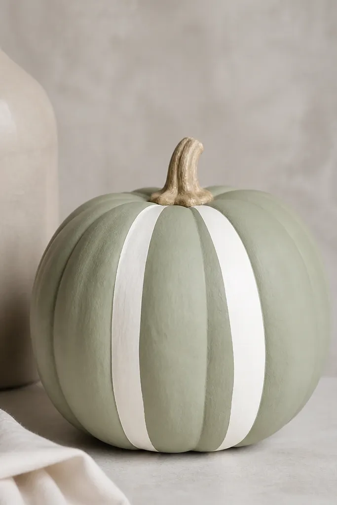
Sage and white feels calm and modern, and it reads as “seasonal decor” even when it’s not full Halloween. The key is using tape to create stripes with clean edges instead of freehand. Asymmetry is intentional here — one stripe wider than the other — so it looks designed. I’ve used this on pumpkins around 10 inches wide because the narrow surface makes stripes look crisp. Warm light from porch bulbs makes the sage look soft instead of dull.
Pro tipUse painter’s tape no wider than 1/2 inch for sharper contrast on smaller pumpkins.
Step one: spray the pumpkin soft sage matte and let it dry completely. Step two: mark placement with pencil — put the wider stripe about 1.5 inches from the centerline and the thinner stripe about 4 inches from it. Step three: apply painter’s tape along the stripe edges, paint white acrylic over the exposed areas, then remove tape as soon as the paint loses wet shine. Finally, add a matte clear coat so the white doesn’t scuff when you move it.
AvoidTrying to remove tape after full drying — it can peel paint and leave ragged edges.
8. Black and Cream Ombre with Straight Tape Horizon
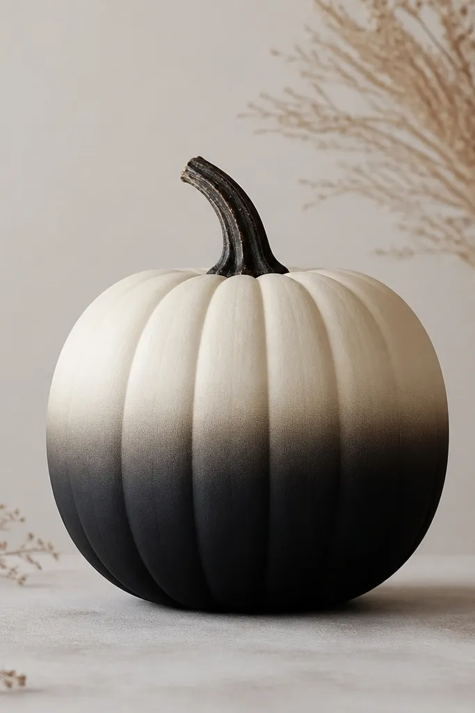
Ombre reads modern when the transition is smooth and the horizon line is straight. The straight tape horizon gives you a deliberate separation, so the blend looks like a design technique instead of an accident. This works well on pumpkins that are wider at the bottom because the gradient flatters that shape. It also looks great in neutral yards where you want seasonal color without bright oranges. I prefer black-to-cream for contests because it photographs with strong contrast.
Pro tipUse a sea sponge and dab, not swipe — swiping creates visible streaks in ombre.
Step one: paint the bottom half black matte and let it dry. Step two: tape a horizontal line across the pumpkin where you want the blend to start, then sponge cream paint onto the top area and gently blend downward with a damp sponge. Step three: remove tape carefully after the cream is tacky so the horizon stays crisp. Finally, touch up any edge lines with a small foam brush and seal with matte clear.
AvoidUsing glossy paint — gloss makes brush marks obvious.
9. Minimal Wire Frame Outline with Tiny Faux Leaves
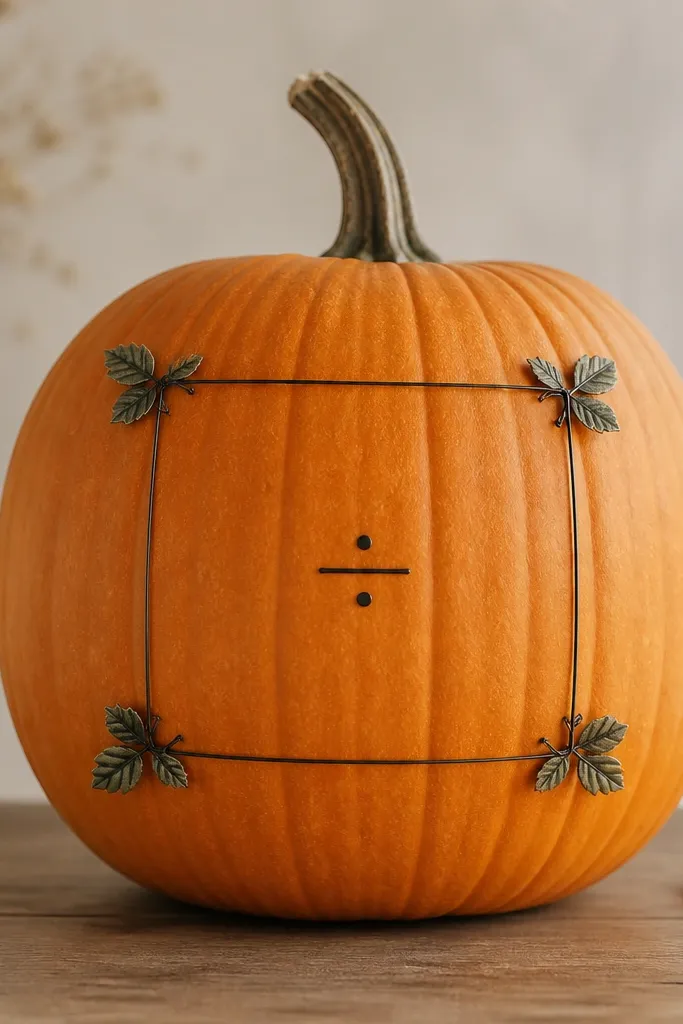
Wire outlines look modern because they’re airy and keep the pumpkin from feeling heavy. You’re basically drawing with linework, which means the yard view stays clean even if you don’t paint. This works best when you leave the pumpkin’s natural color intact and just add one accent. I’ve used matte black craft wire and the result looks like modern signage. Faux leaves add warmth without going full botanical collage.
Step one: clean the pumpkin and dry it, then wrap the front area with a small piece of painter’s tape to mark where the rectangle will sit. Step two: shape black craft wire into a rectangle outline, then press the wire gently into the pumpkin skin so it grips at ridges. Step three: add a tiny dot and short line inside the frame using a black paint pen for the minimal “mark.” Finally, hot-glue two tiny faux leaves — one near the top corner and one near the bottom — and let glue cool before placing.
Heat the wire slightly with a hair dryer if it won’t press into ridges without springing back.
Using thick gauge wire — it looks clunky and covers the pumpkin’s shape.
10. Monochrome Stenciled Pattern in One Dot Size
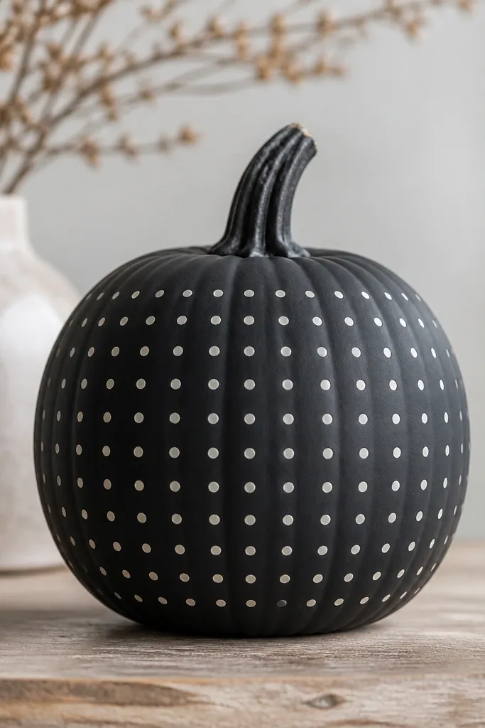
A repeating dot grid looks modern because the spacing is the whole design. When every dot is the same size and the pattern stays aligned, it reads intentional even from far away. Charcoal is a great base because it makes off-white pop without neon energy. This style works for pumpkins that are not perfectly smooth, because the dot pattern hides minor texture changes. It’s also beginner-friendly once you commit to one stencil and one dot size.
Pro tipCount your rows and stop at the same point on both sides so the pattern doesn’t drift.
Step one: spray paint the pumpkin deep charcoal matte and let it cure. Step two: use a dot stencil or make one by punching holes in thin plastic; place it centered and tape it down. Step three: dab off-white acrylic with a foam applicator, using the same pressure each time, then lift carefully and repeat in rows until you cover the front. Finally, seal with matte clear coat and avoid heavy spraying near the dots to prevent pooling.
AvoidFreehand dotting — it spreads and turns into uneven blobs.
11. White Pumpkin with Minimal Black Tape Cross
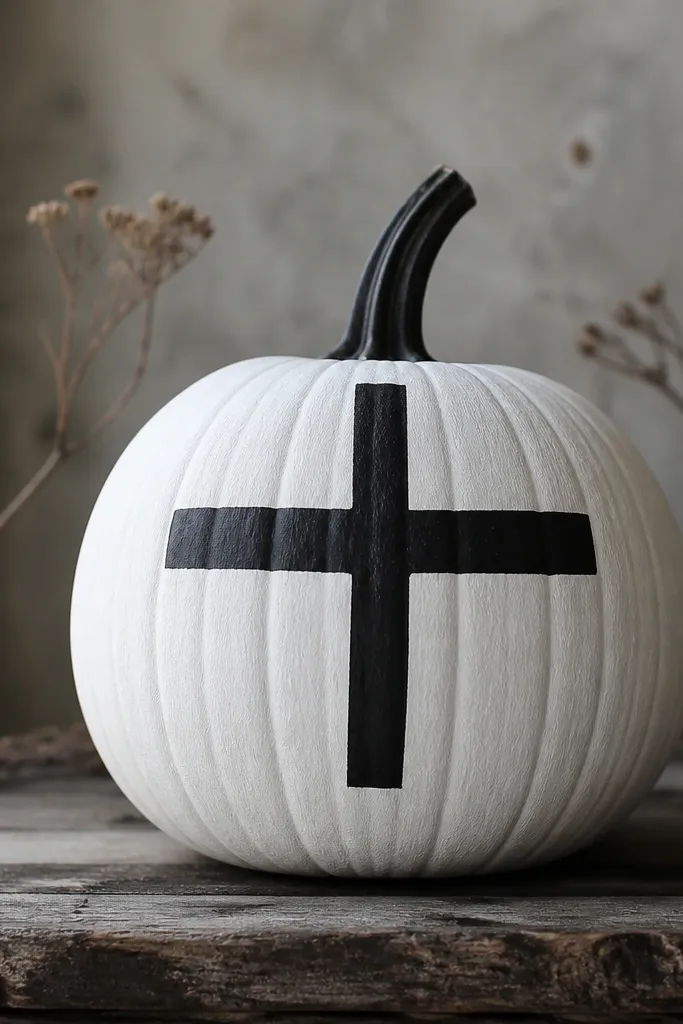
This is modern minimalism at its simplest: one shape, one high-contrast color, and a crisp edge. Removing tape to reveal clean negative space makes it look like a graphic printed on the pumpkin. I like placing the cross slightly above center because it feels like a label mark. This style also looks good on smaller pumpkins because the design doesn’t need extra room. It’s a great option when you don’t want to mess with stickers that lift as the pumpkin dries.
Pro tipPress the tape down at the ridges with your fingernail so the paint doesn’t seep under it.
Step one: base coat the pumpkin matte white and let it dry fully. Step two: apply painter’s tape in a cross layout where the vertical strip is about 1 inch wide and the horizontal strip is about 1 inch wide; place it slightly above the center. Step three: paint over the tape areas with black acrylic (or black spray in light coats), then remove tape while paint is still tacky. Finally, add a matte clear coat over the whole pumpkin after the black dries to protect the revealed edges.
AvoidUsing thick craft tape — it leaves a fuzzy border when you pull it.
12. Cream Base with Thin Black Concentric Circles
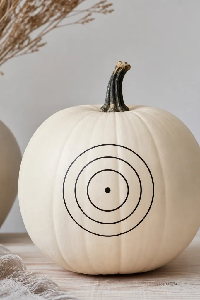
Concentric circles look modern because they’re mathematical and calm. Thin lines keep it minimalist, and a small center dot adds that “logo” vibe. This style flatters pumpkins with a round front because circles look proportional. I’ve used it in yards with lots of carved pumpkins, and mine still stood out because it didn’t compete for attention with messy textures. It also photographs nicely under string lights.
Pro tipIf your circles wobble, trace them lightly with pencil first, then go over with paint pen in one pass.
Step one: paint the pumpkin cream matte and let it dry. Step two: mark the center point and use a compass-style stencil or a string-and-pencil method to draw circle outlines with black paint pen. Step three: paint over the outlines with a thin liner brush so the lines stay crisp and even. Finally, seal with matte clear coat after lines dry so the black doesn’t smear when you touch the pumpkin.
AvoidThick marker lines — they look like a kid’s craft instead of a design.
13. Terracotta Pumpkin with Brass Number Date Sticker
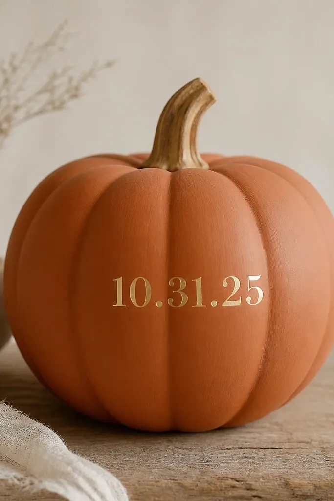
This one wins because it looks like you bought it, not made it. Metallic brass numbers on a terracotta matte base read like house address hardware or a label. It’s also flexible — use any year or month date. I like this for fall events and front-step decor because it feels intentional and neat. It flatters warm-toned porches and looks great with black planters and cream mums. The design is small, so it works on pumpkins that are too tiny for big patterns.
Pro tipUse a straight edge and measure the center point so the numbers sit at the same height across multiple pumpkins.
Step one: paint the pumpkin terracotta matte and let it dry. Step two: clean the surface with a dry cloth so dust doesn’t stop vinyl adhesion. Step three: apply metallic brass vinyl numbers (or cut brass-look vinyl from a sheet) centered on the front; press from the middle outward to avoid bubbles. Finally, seal with a thin matte clear coat sprayed from far away so the vinyl edges don’t lift.
AvoidApplying vinyl to a dusty pumpkin — it peels at the edges within a couple days.
14. Black-and-White Grid with One Accent Color Dot
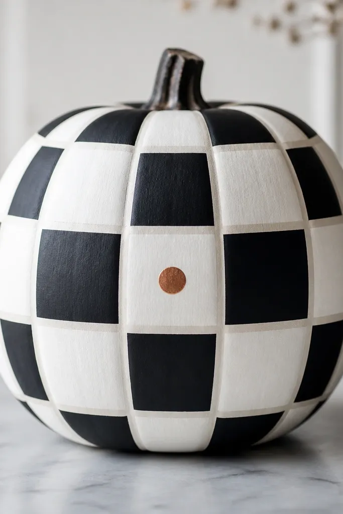
Grid patterns look modern because they’re ordered. Keeping it monochrome does the heavy lifting, and the single copper dot gives you a focal point without adding clutter. This style works on pumpkins with any shape because the grid pulls the eye into alignment. I’ve used it as a matching set on a porch — three pumpkins side by side look cohesive even when sizes differ. Under warm porch lights, the copper dot glows slightly and makes the whole piece feel finished.
Pro tipTake a quick photo before sealing — it helps you spot any tape-edge bumps while paint is still fixable.
Step one: base coat half the pumpkin white matte and half black matte using tape to split the center. Step two: add a grid by taping vertical and horizontal lines in 1-inch increments, then paint exposed squares in alternating colors. Step three: remove tape and let everything dry, then paint one copper dot in the center square with a dotting tool. Finally, seal with matte clear coat, keeping spray light so you don’t blur the grid edges.
AvoidUsing too many accent colors — the grid loses its clean look.
15. Satin Gold Leaf Sticker Cluster on Natural Pumpkin
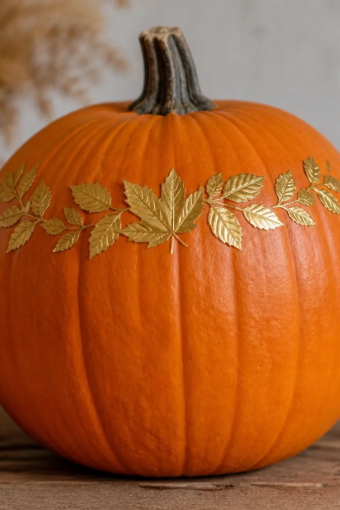
Gold leaf stickers work because they add shine without you hand-painting detail. Keeping the pumpkin body natural keeps the whole look grounded and modern. The cluster sits near the top so it doesn’t fight your porch lighting from below. This style is flattering on pumpkins that already look good — smooth skin and a nice stem — because the decals rely on the base looking clean. If you’re entering a contest with mixed materials allowed, this one holds up because there’s less paint to crack.
Step one: wipe the pumpkin surface with a dry cloth, then lightly dry-buff with a microfiber towel so stickers adhere. Step two: arrange leaf decals on the top third first without pressing — aim for an arc of 6 to 10 leaves. Step three: press each leaf down starting at the stem end, then smooth outward with a credit card edge. Finally, avoid heavy sealing if the decals are vinyl — a light matte spray from far away is okay, but skip thick coats that can dull the shine too much.
Heat the sticker backing with a hair dryer for 10 seconds so it conforms around ridges.
Applying stickers on damp pumpkins — the adhesive traps moisture and lifts.
16. Minimal Etched Look Using White Paint Pen Over Clear Seal
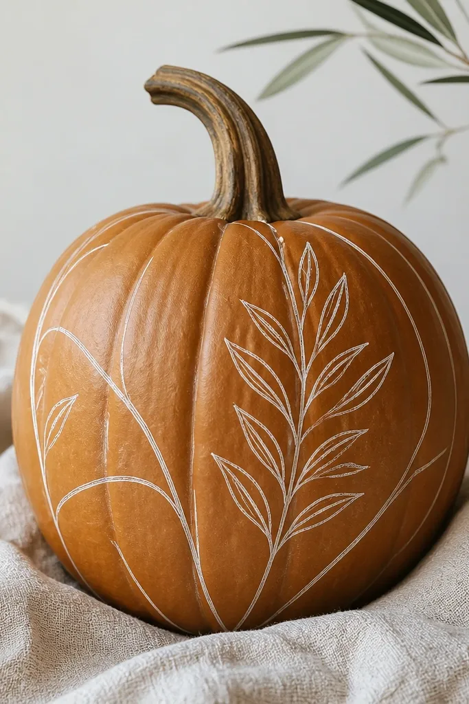
Etched-style line art looks high-end because it stays delicate. The trick is drawing thin lines on a sealed surface so the pen flows smoothly and doesn’t soak into pumpkin pores unevenly. White ink on a natural pumpkin reads modern and wintery, even though it’s still a fall piece. I like this for people who want texture without painting a whole base color. It also works well on pumpkins with ridges because the seal evens out the surface feel for the pen.
Pro tipTest the paint pen on cardboard first to match the line thickness you want.
Step one: wash and dry the pumpkin, then apply a thin matte clear seal and let it dry fully. Step two: sketch your sprig lightly with pencil — keep it small, about 4 inches tall on the front. Step three: trace the sketch with a white paint pen in one steady motion, letting lines build gradually instead of pressing hard. Finally, add one more light matte seal over the drawing once dry, so the lines don’t smear when you handle the pumpkin.
AvoidSkipping the seal — the pen can bleed and turn into chalky blobs.
17. Matte Cream Pumpkin with Black Cutout Squares (No Carving Mess)
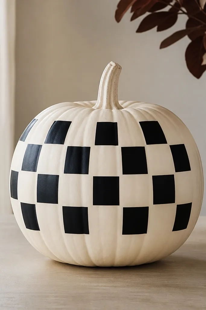
This looks like modern signage because the shapes are flat and uniform. Using applied squares keeps it safer than carving and avoids wet mess inside the pumpkin. Matte cream makes the black shapes feel graphic, and the checker layout reads as intentional pattern. I’ve used it for kids' contests too — it’s easy to scale and you can keep the design small so it doesn’t overwhelm. It also photographs well because you don’t get shadows from deep carving cuts.
Pro tipIf you don’t have vinyl, paint squares using 1-inch painter’s tape cut into clean blocks and remove tape right after paint tacks.
Step one: paint the pumpkin matte cream and let it cure. Step two: cut small black squares from vinyl sheet or craft adhesive vinyl; keep them around 1 inch each for a medium pumpkin. Step three: plan placement on the front in a checker pattern, then press each square down firmly. Finally, seal with matte clear spray from a distance to protect edges and reduce lifting from humidity.
AvoidUsing glossy black — it looks like plastic stickers instead of a clean graphic.
18. Single Centered Stem-Mounted LED with White Dot Light Ring
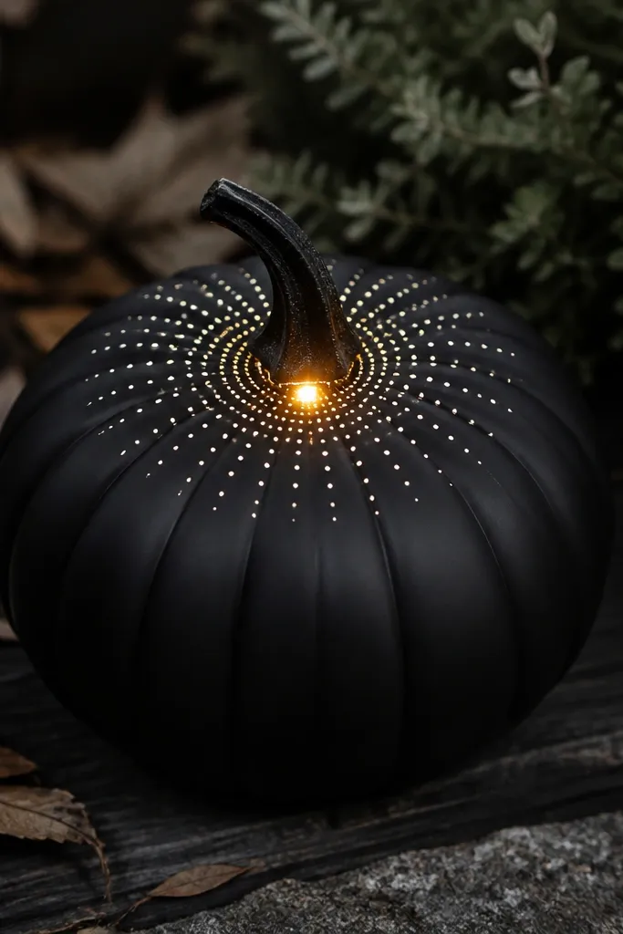
Light makes minimalist designs feel premium because the glow creates depth without extra decorations. A single centered LED keeps the look modern and avoids the classic jack-o-lantern clutter. The white dot ring around the light looks like a halo and ties the glow to the design. This works best on matte black because the light stays crisp and doesn’t get washed out. I’ve tested this during a windy contest night — the matte surface hides scuffs and the LED stays readable even from the sidewalk.
Pro tipChoose an LED with a warm white tone so it matches porch lighting and doesn’t look icy.
Step one: paint the pumpkin matte black and let it dry fully. Step two: install a small battery LED puck near the top center — I use a thin adhesive pad or a discreet hot-glue spot on the back side, then check that the glow faces forward. Step three: paint a ring of tiny white dots around the LED position using a dotting tool, keeping the circle about 3 inches wide. Finally, do a quick nighttime test before displaying so you can adjust dot brightness if needed.
AvoidUsing too bright a white — it turns the whole pumpkin into a spotlight instead of a clean halo.
19. Two-Tone Horizontal Band with Tiny Black Labels
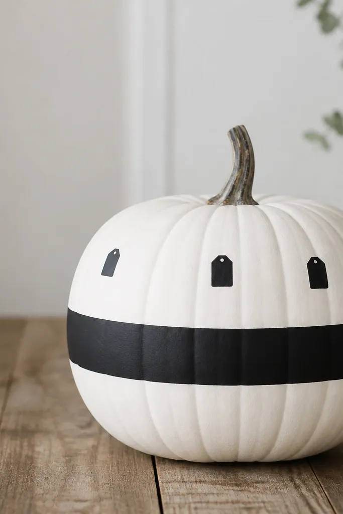
Negative space is the whole point here. The two-tone band gives you structure, and tiny label shapes add a modern “product label” vibe without clutter. I like this for pumpkins that sit in pairs or groups because the band aligns and makes them look like a set. It also flatters front doors with white trim or modern metal planters. The label shapes are small enough that they don’t distract when the pumpkin is lit from behind a porch light.
Pro tipKeep the labels blank if you don’t want to write — the rectangle shape still reads as modern signage.
Step one: paint the pumpkin matte white and let it dry. Step two: tape a straight horizontal band across the center at about 3 inches tall, then spray or paint matte black over the band and remove tape while tacky. Step three: on the white top area, add two small black label rectangles — about 1 inch wide — and write letters using a paint pen or vinyl letter stickers. Finally, seal with matte clear coat, keeping spray light over the label text so it stays sharp.
AvoidOverloading text — tiny writing turns into blobs from a distance.
20. Matte Olive Pumpkin with Cream Ribbon Bow on Front
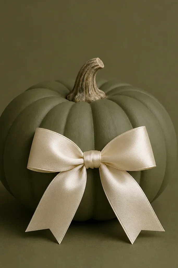
Ribbon bows look classic, but they read modern when the base is matte and the color is controlled. Olive and cream is a strong combo that looks grown-up, and the bow gives a “gift tag” feeling that contests love. This works on pumpkins with a slightly flatter front area so the ribbon sits without twisting. I’ve used this style for fall dinners and it looks right even when the rest of the decor is neutral. The bow also hides small surface dents because ribbon covers uneven spots.
Step one: spray the pumpkin matte olive and let it dry. Step two: cut a cream satin ribbon — about 1 inch wide — and shape a bow with two loops each around 4 inches and tails around 5 inches. Step three: hot-glue the bow center to a small strip of felt or foam (about 1.5 inches wide) and glue that base onto the pumpkin front. Finally, trim the tails so they hang evenly and add one tiny faux leaf at the top of the bow if you want a subtle accent.
Use a narrow ribbon (1 to 1.5 inches) so the bow looks tailored, not bulky.
Attaching ribbon directly with thick glue blobs — they show through the satin.