1. Cream-and-Teal Center Sunburst
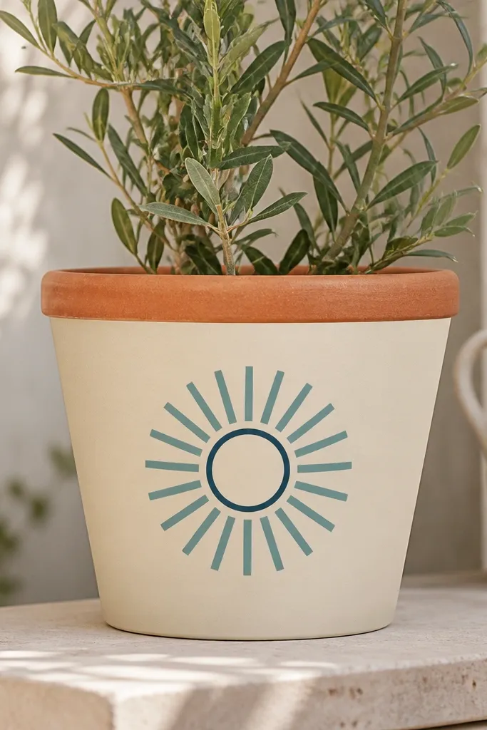
Start by cleaning the pot and letting it dry fully, then paint the whole outside with cream off-white in two thin coats. After the second coat dries, use a pencil to lightly mark the center point on the front and draw a small circle. Paint evenly spaced teal rays from the center outward, keeping each ray about the width of a pencil eraser. When the rays dry, trace a thin dark teal ring around the center circle to frame it. Leave the rim unpainted or lightly seal it so it stays natural.
This design works because a single bold center element makes the pot look taller and cleaner, even when the rest of your space is busy. I like cream off-white as the base because it softens terracotta’s orange and makes teal look bright without screaming. The teal rays are thick enough to cover imperfect brush strokes, and the thin dark teal ring keeps the center from looking flat. It looks great with white flowers, silver-leaf plants, and even plain green herbs because the contrast is high.
AvoidDon’t try to cover terracotta in one thick coat — it dries patchy and makes the rays look streaky.
Pro tipIf your rays wobble, fix it with one pass of teal over the worst edges once the first layer is dry.
2. Terracotta-Edge Ombre with White Fade
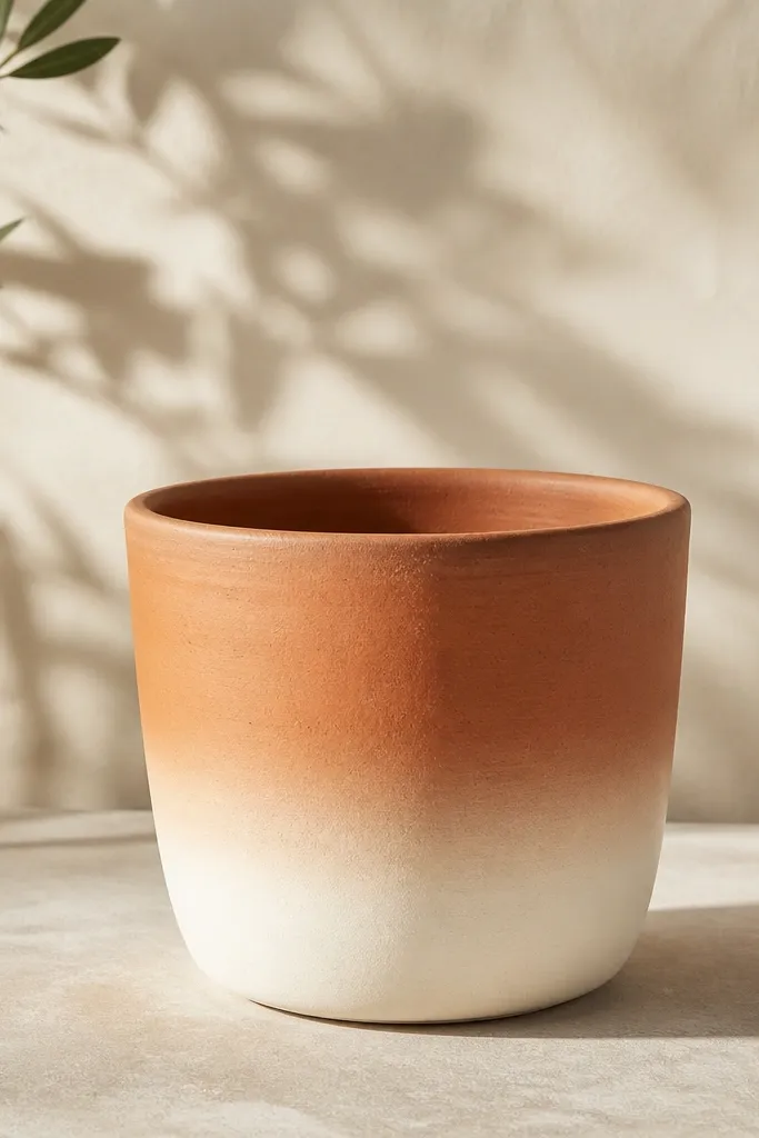
A soft ombre hides brush marks and makes the pot look “designed” without requiring drawing skills. I love this for beginners because you’re not committing to lines; you’re blending. The white fade makes your plants look brighter and cleaner at the base, which is where people notice color first. It also flatters small spaces because the light bottom visually lifts the pot when you set it on dark planters or a black shelf.
Paint the pot with a thin base coat of light cream where you want the transition (about the top half), then let it dry. Mix white acrylic with a little cream and load a sponge so it’s damp, not dripping. Dab the sponge in horizontal bands starting at the bottom, then blend upward by lightly dragging the sponge edge into the previous band. Repeat with slightly more white each band until you get a smooth fade. Seal after it’s fully dry so the sponge texture doesn’t scuff.
Use a sea sponge with uneven pores — it creates a natural blend that looks better than a flat sponge.
Don’t overwork the blend while it’s wet — you’ll lift paint and create muddy streaks.
3. Black Cat Outline on Matte Off-White
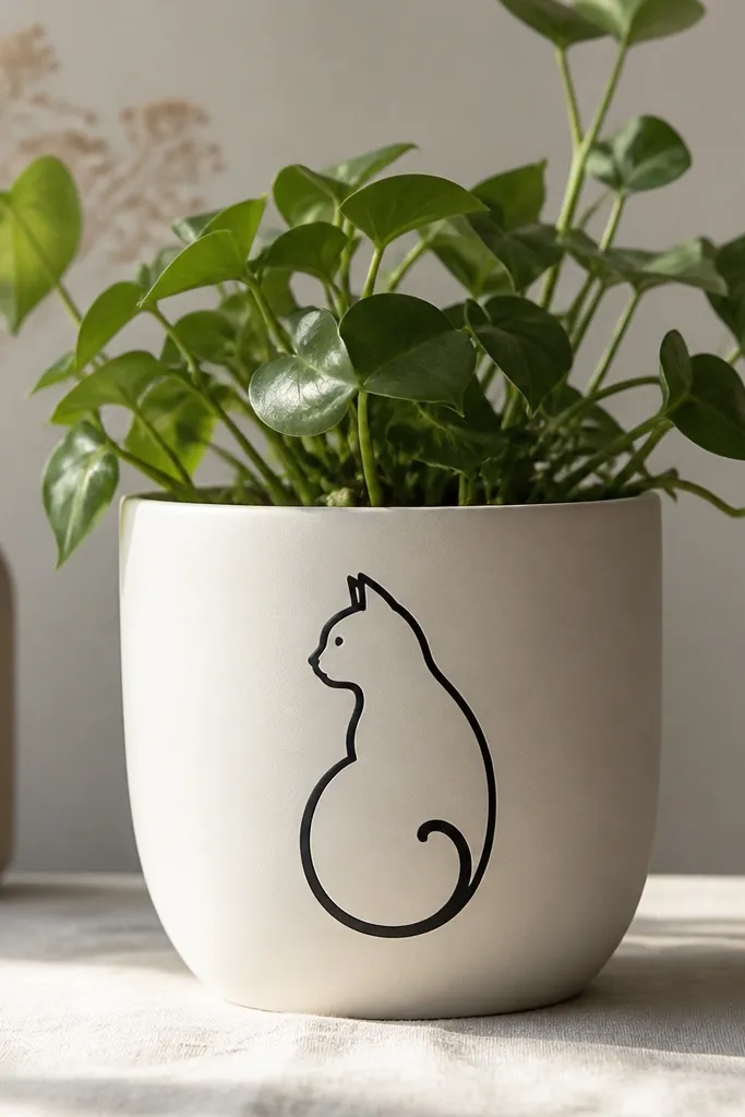
Base coat the pot in matte off-white, two thin layers. Once dry, print or sketch a cat outline about 4-5 inches tall for a 10-inch pot and place it centered on the front. Use a fine paint brush or paint pen to trace the outline in black, then fill the body with black acrylic. Add a small white dot for the eye highlight if you want extra cuteness. Let it cure overnight before sealing with a matte clear coat.
If you’re painting with kids or you just want a cute focal point, a simple cat outline is hard to beat. Off-white gives you a clean canvas and makes black look crisp and graphic. I use thick lines and minimal details because terracotta texture can swallow thin features. This design looks adorable with small succulents or a cat-themed shelf, and it photographs well because the contrast is strong.
AvoidSkip super thin lines — they disappear into the terracotta texture and make the cat look messy.
Pro tipDraw the cat lightly in pencil first, then go over it with paint pen so you can correct line width by pressing harder or lighter.
4. Mint Polka Dots with Navy Rim Band
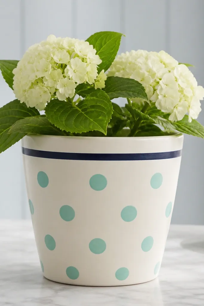
Paint the pot with warm white in two coats and let it dry completely. Measure the dot area with a tape measure: for a 10-inch pot, aim for about 6 inches of dot coverage centered on the front. Use a dot stencil or a cut foam circle as a stamp: dip lightly into mint paint and press straight down. Keep the spacing even by marking tiny dots with pencil first. Paint a narrow navy band around the pot just below the rim, about a half-inch tall, then seal.
Polka dots look polished when spacing is consistent, and terracotta is the perfect background color to make mint feel fresh. The navy rim band anchors the design and makes the dots look intentional instead of random. This one flatters plants that have long stems or trailing leaves because the band gives your eye a “home base.” It also works for kids' rooms because mint and navy look playful without being childish.
AvoidDon’t use watery paint for stamping — it spreads into ovals.
Pro tipIf you’re freehanding dots, rotate the pot a quarter turn each time so you naturally keep spacing even.
5. Tape-Resist Terracotta Geometric Blocks
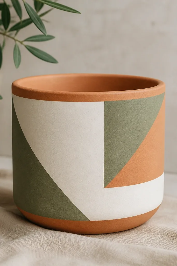
Tape-resist geometry always looks “store-bought” because the edges are clean. This design is forgiving because you can hide minor mistakes inside the next tape edge. I like it for beginners who want a modern look without drawing flowers. Sage and white keep it calm, and the terracotta gaps make the whole thing feel cohesive with the material instead of covering it completely.
Paint the pot with a base coat of white or very light cream and let it cure until dry to the touch. Lay masking tape to form angled blocks; press the tape down hard along the edges so paint doesn’t bleed underneath. Brush sage paint into one section at a time, then remove the tape while the paint is still slightly tacky. Repeat for a second color block, and leave some tape gaps so terracotta shows through. Seal with a clear acrylic sealer once everything is dry.
Use painter’s tape, not cheap masking tape — it peels cleaner and keeps edges sharp.
Don’t flood paint under tape — thick coats creep and blur the geometry.
6. Sun-Kissed Watercolor Leaves
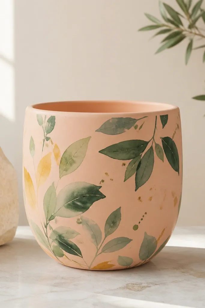
Base coat the pot in warm peach and let it dry. Mix a light green with water for a translucent first leaf layer, then paint leaf shapes in a random pattern across the front. Add a second darker green layer on top of some leaves for depth, leaving others lighter. Use a small brush to add a few yellow-green highlights near leaf tips. Finish with tiny splatter dots using a toothbrush and white or pale yellow paint.
Loose watercolor leaves look good even when your brush control isn’t perfect because the style is meant to be imperfect. The peach base makes green leaves look warmer and more lively, like they’re catching sunlight. I use thin layers so the terracotta still shows through faintly — that’s what makes it look natural instead of flat. This is a great choice for herbs, pothos cuttings, and any plant that has lots of leaf texture.
AvoidDon’t outline every leaf — outlines turn it into cartoon instead of watercolor.
Pro tipUse two brush sizes: one for leaf shapes and one small liner brush for the veins.
7. Sky Blue Mountain Band
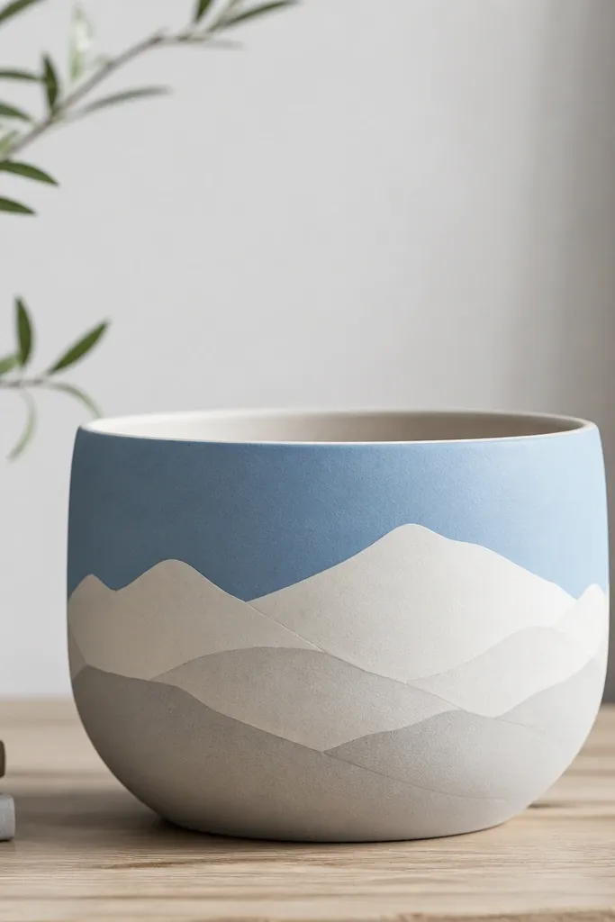
Paint the upper half of the pot sky blue and leave the bottom unpainted or painted a muted cream. Dry brush a light gray over the mountain layers: start with the far mountains using pale gray, then add a lighter white layer in front. Draw mountain peaks with a small angled brush, then soften the edges with a damp brush so they look misty. Add a thin white ridge line on the closest mountain for contrast. Seal after everything dries fully.
This looks great because the band placement matches how people scan a pot: they look at the front band first. Sky blue gives a calm backdrop, and the layered mountains create depth without needing complex trees or tiny details. I like it for beginners because you can make the mountains with simple triangles and uneven top edges. It makes succulents look like tiny “mountain scenes,” especially if you use a gray-green plant or a small rock-textured top dressing.
AvoidDon’t use pure white for every layer — it makes the mountains look cut-out.
Pro tipMistakes are easy to fix: if a mountain looks off, cover it with a new layer of gray instead of scraping.
8. Berry Red Stripes with Baby Pink Dots
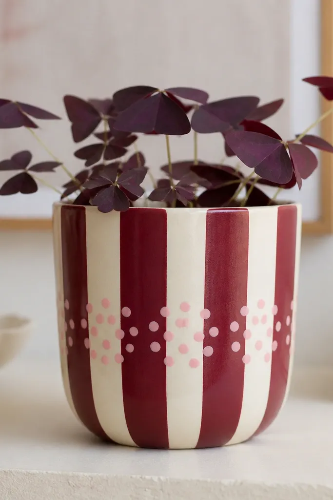
Vertical stripes stretch the pot visually, and the berry red makes terracotta look intentional instead of accidental. The baby pink dots add a playful touch without turning it into a kids craft mess. I use this when I want something cheerful for a porch without going full cartoon. It pairs well with white flowers, pink blossoms, and plants with fine leaves because the texture contrast looks crisp.
Base coat the pot in cream and let it dry. Use painter’s tape to create vertical stripes: spacing for a 10-inch pot works well at about 1 inch per stripe so it looks balanced. Paint berry red over the taped areas, let it set slightly, then pull tape away carefully. For dots, mark a small circle area on the front and stamp baby pink dots with a foam dabber. Keep dot clusters tight near the center so the stripes stay the main event. Seal with a satin finish so colors look smooth.
Press tape down with a credit card edge to prevent paint creep under the tape.
Don’t make stripes too narrow — tiny stripes show every uneven brush edge.
9. Gold Line Minimal Monogram
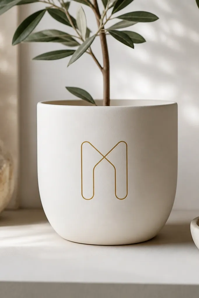
Minimal monograms look classy on budget pots because you’re not covering the whole surface with busy art. Warm white keeps it soft and friendly, and gold line paint makes it feel “gift-ready.” This is the design I reach for when I’m painting for a teacher, a housewarming, or a kid’s plant that needs to look grown-up. It also flatters any plant because the design stays out of the way of leaves.
Paint the pot warm white with matte acrylic in two coats. Let it dry, then lightly pencil your letter or symbol so you can center it. Use gold paint pen or a fine liner brush with metallic gold acrylic to trace the monogram lines. Keep line weight consistent — go slow and let paint flow, don’t drag. Add a few tiny gold dots as spacing markers if you want, then seal with a clear acrylic sealer to protect the metallic.
Practice the letter on paper first and match your pot height by measuring the front face.
Don’t use thick metallic paint — it dries bumpy and catches dust.
10. Charcoal Ink Faces (Messy-Lovely)
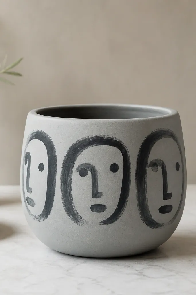
Paint the pot light gray and let it dry fully. Decide where the faces go: I do three small faces across the front, each about 2-3 inches tall on a 10-inch pot. Use a fine brush with watered-down black/charcoal paint for the lines, then add dot eyes with a paint dotter or the tip of a toothpick. Leave some areas unpainted for a sketchy look. Seal with a matte clear coat so the ink doesn’t shine.
Abstract faces look fun and forgiving because the style is meant to be quick. Light gray gives charcoal ink a clean stage, and the imperfect lines look charming up close. I’ve used this on pots sitting in playrooms where the goal is “cute, not precious.” It flatters kids' plants like spider plants or fast-growing cuttings because the faces are playful and the plants fill in the rest.
AvoidDon’t try to erase — terracotta texture holds pencil marks unless you fully sand and repaint.
Pro tipUse a paper towel to wipe your brush after each face so the next lines don’t get too dark.
11. Sage and White Leaf Vine Wrap
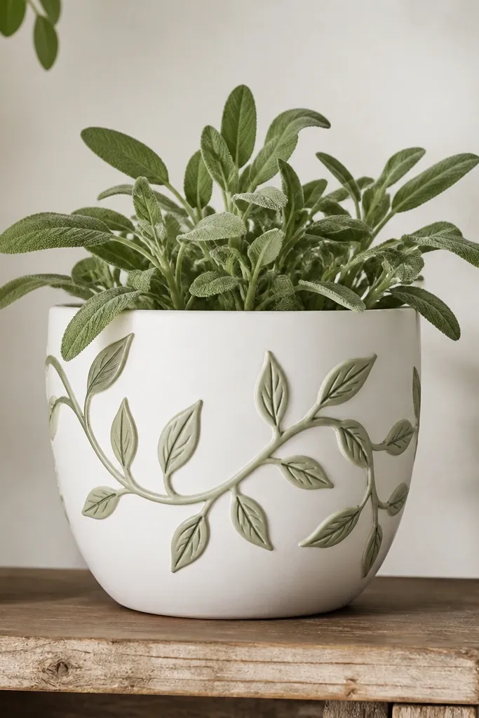
A vine wrap creates movement around the pot, so it looks better when you walk past it from different angles. White base keeps it bright, and sage feels natural with most indoor plants. The trick is to paint a single flowing line first, then add leaf pairs on both sides so it looks like it’s growing. This design looks great on taller pots because the vine has room to travel upward.
Base coat the pot in white and let it dry. Lightly sketch a curved vine line that starts near the left edge and ends near the right, wrapping slightly around the sides. Paint the vine in sage green with a liner brush, then add leaf pairs by using small teardrop shapes on each side of the vine. Add a thin dark green line down the center of a few leaves for depth. Seal with a satin acrylic sealer so leaf edges don’t look chalky.
Paint the vine in one steady stroke if you can — it looks smoother than lots of short segments.
Don’t overcrowd leaves at the top — leave some clean space for balance.
12. Cobalt Tile Pattern with White Grout Lines
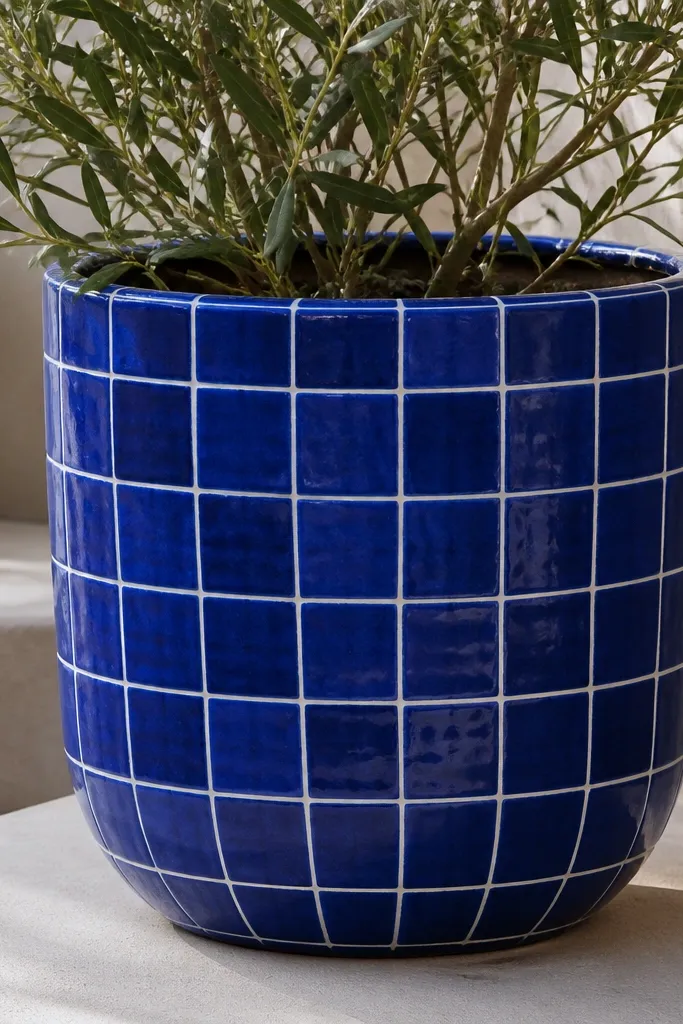
Paint the entire pot cobalt blue and let it cure until it doesn’t feel tacky. Use painter’s tape to create a grid of squares about 1 to 1.25 inches wide for a 10-inch pot. Paint white acrylic over the tape, then remove tape while paint is still slightly wet to keep grout lines crisp. If you want a handmade look, offset one or two rows by cutting a tape strip slightly shorter. Seal with a clear outdoor sealer in two light coats.
Tile patterns read instantly, even from across the room. The cobalt blue is bold against terracotta, and the white grout lines make the design look structured. I like this for outdoor patios because it hides scuffs better than very light colors. It also looks good with bright green plants and flowers because the blue gives a strong contrast.
AvoidDon’t rush tape removal — waiting too long causes paint to tear and break the grout lines.
Pro tipUse a ruler and keep grid lines straight on the front face — the pot can curve, but your grid should start straight.
13. Pastel Rainbow Drip Border
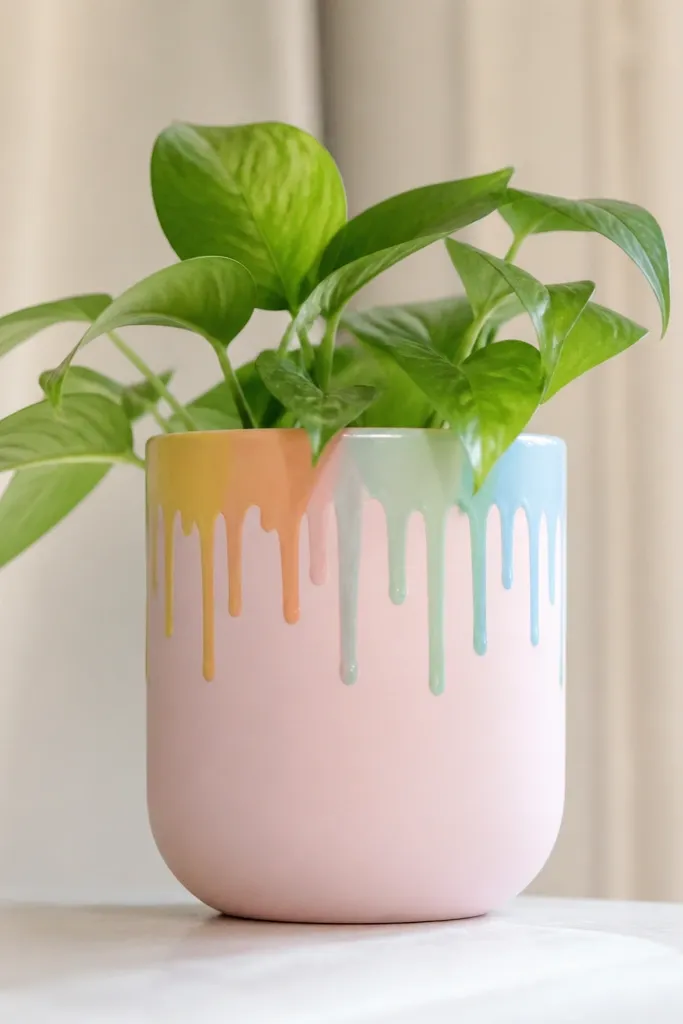
Paint the pot pale pink (or another pastel you like) in two coats. Once dry, mark a straight line across the top front where the drips start. Load a small brush with thicker paint than you think you need, then touch it to the line and let it drip down about 0.5 to 1 inch. Repeat for each color in order: yellow, orange, mint, light blue, and a small amount of lavender if you want. Seal with a glossy or satin finish so drips look smooth.
Drip borders look playful and modern, and they’re easy because you’re repeating a simple action. I use a pastel base so the drips feel like decoration instead of messy paint. The colors fade nicely against terracotta, and the top border frames the plant like a picture frame. This one is great for kids' plants and birthday gifts because it looks cheerful without needing perfect drawing.
AvoidDon’t use watery paint for drips — it runs too far and looks sloppy.
Pro tipKeep a scrap paper under your brush hand so drips don’t accidentally smear the base.
14. White Pebble Dots Grounding
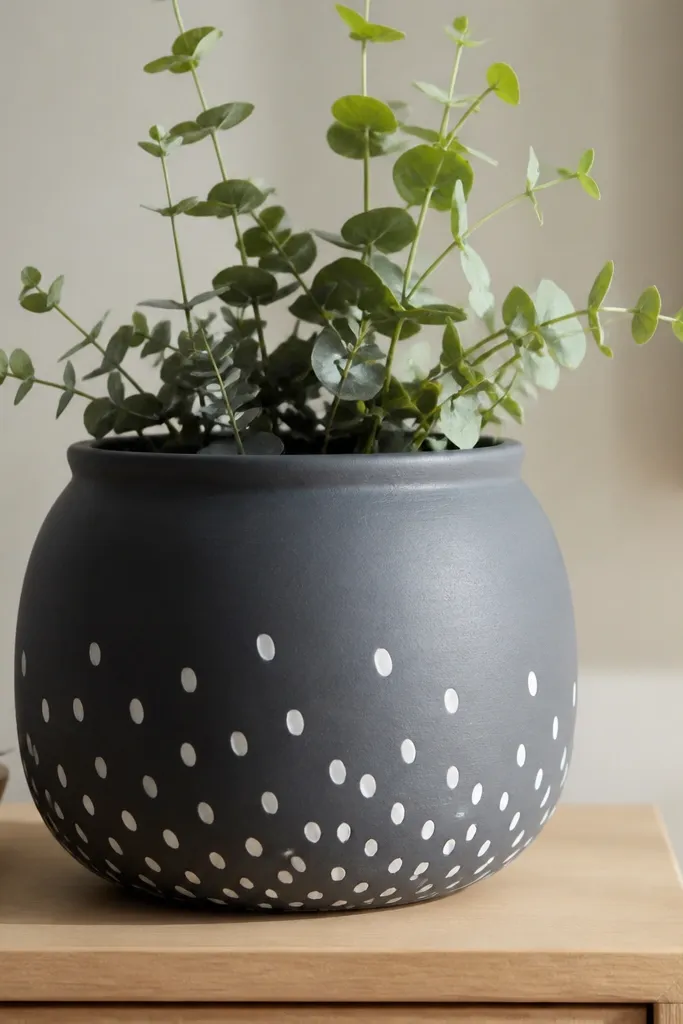
Paint the pot deep charcoal gray and let it dry fully. Decide the dot zone: for a 10-inch pot, cover the bottom 5 inches only. Mix white acrylic with a tiny bit of gray so the dots aren’t stark. Dab oval dots with the corner of a sponge or the tip of a makeup sponge, varying sizes by changing pressure. Leave the top half plain so the plant has space to stand out. Seal with matte so the dots don’t shine.
This design works because it mimics a natural “ground” at the base of a plant. Charcoal is dramatic but still neutral, and the white pebble dots add texture without clutter. I do it when I want a modern look that still feels earthy. It photographs really well because the dots cast tiny shadows and make the pot look dimensional.
AvoidAvoid perfect circles — they look like stickers and kill the natural texture.
Pro tipAim for a loose pattern — pebble fields never look perfectly even in real life.
15. Terracotta Pot with Navy Sailboat Strip
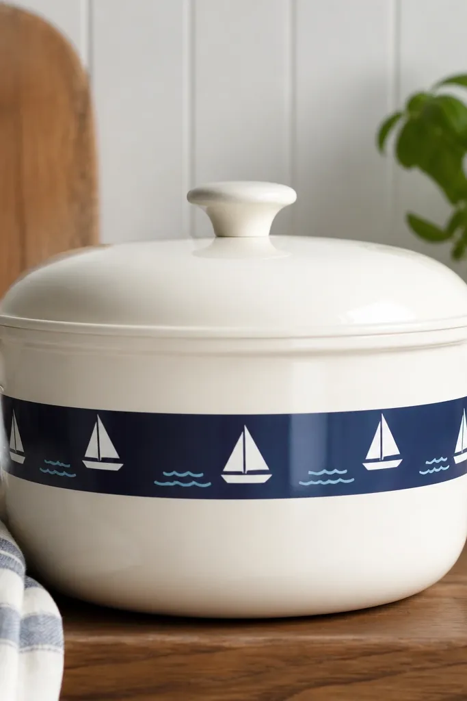
Base coat the pot creamy white and let it dry. Mask a horizontal band across the middle with painter’s tape, about 1.25 to 1.5 inches tall. Paint the band navy and remove tape after it’s tacky. Use a white paint pen to draw sailboat shapes inside the band, then add tiny light-blue wave lines under them. Seal with a satin clear coat so the pen lines stay protected.
This is a clean nautical look that doesn’t require painting a whole ocean scene. The navy strip anchors the design, and the simple sailboat icons keep it beginner-friendly. I like it for patios because it pairs well with blue planters and outdoor cushions. It also looks good with plants that spill over the sides, because the strip sits visually above the plant mass.
AvoidDon’t paint the whole pot navy — it hides the terracotta charm and makes the design heavy.
Pro tipKeep sailboats small and spaced — crowding makes the strip look childish.
16. Monochrome Marble Swipe (White + Gray)
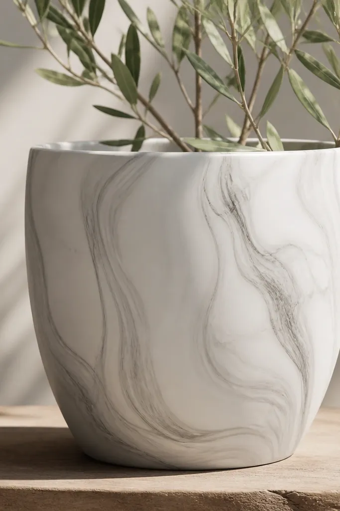
Start with a smooth white base coat and let it dry thoroughly. Thin gray acrylic with a little water so it flows like ink. Dip a wide brush lightly, then swipe vertical streaks from top to bottom, dragging and lifting to create veining. Add a few darker gray accents by repeating a couple swipes in the same area. Let it dry, then seal with a satin clear coat to deepen the marble effect.
Marble swipes look expensive even when you do them with cheap acrylic. You’re creating movement with streaks instead of drawing, and marble patterns hide tiny paint flaws. White and gray look calm and modern, and they work with any plant color because they don’t compete. I use this on pots for shelves where I want the pot to look like decor, not like craft supplies.
AvoidDon’t over-swirve — too many streaks turn it into muddy gray.
Pro tipWipe your brush on a paper towel before each swipe so the veins stay delicate.
17. Butterfly Wing Stencil with Metallic Gold Spots
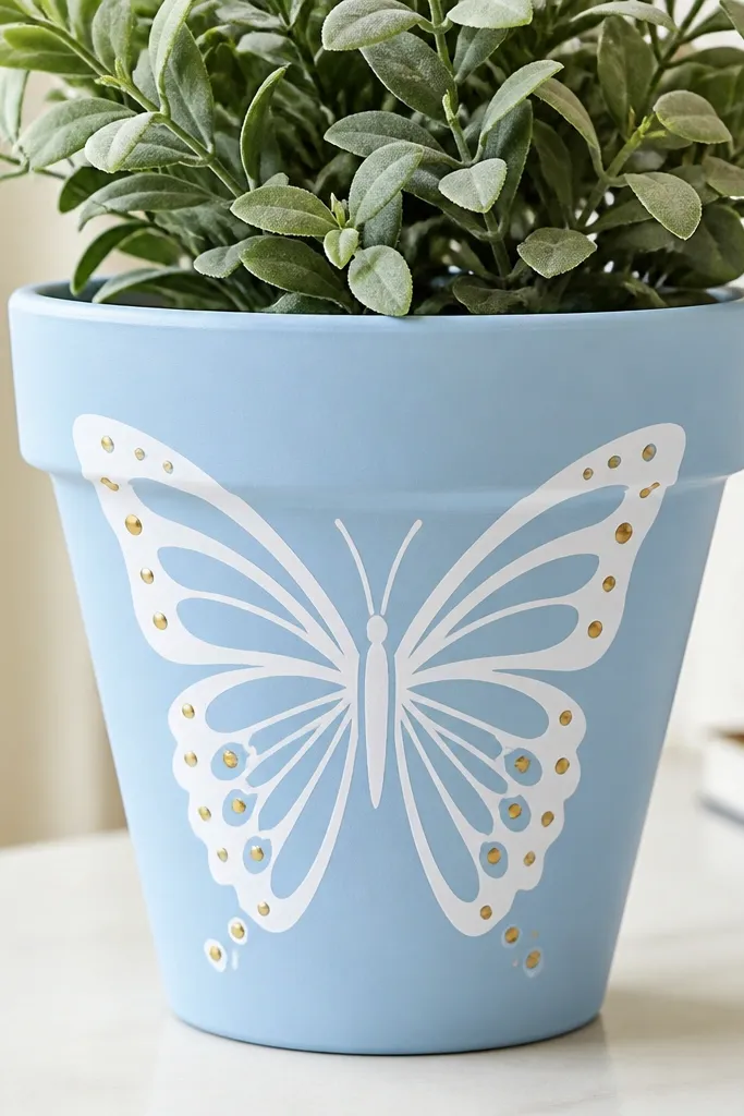
Stencil butterflies look detailed without needing steady hands, and metallic gold dots make them pop in sunlight. Sky blue gives you an airy background, and the white wings stay bright. This is a great pick for beginner painters because you’re repeating a shape, not freehand drawing. It works especially well with plants that have light green leaves so the butterfly feels like it belongs on the plant.
Paint the pot sky blue in two coats and let it dry. Position a butterfly wing stencil on the front and secure it with painter’s tape so it doesn’t shift. Dab white paint over the stencil using a sponge brush (don’t brush — it bleeds). Remove the stencil carefully while the paint is dry enough not to smear. Use a metallic gold paint pen or dotter to add small dots along the wing curves. Seal with a clear satin outdoor sealer if it’s outside.
Use light dabbing pressure — stencil edges stay crisp when paint doesn’t flood under the stencil.
Don’t reuse a stencil with dried paint on it — it leaves gritty marks.
18. Terracotta Pot with Painted Rattan Look Stripes
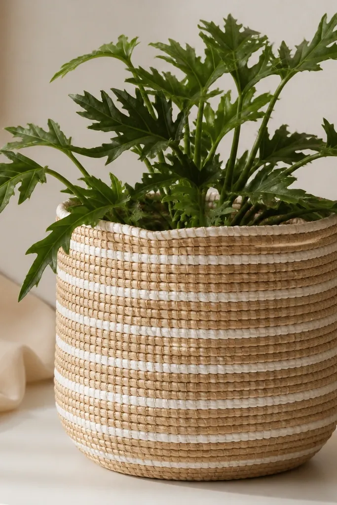
Base coat the pot with a tan acrylic that matches rattan (not bright orange). After it dries, paint thin white stripes across the front, about 1/8 inch wide, using a fine liner brush. Make the stripes slightly wavy by letting your wrist move gently. Add darker tan shadow lines between some stripes using a slightly darker shade and a light dry-brush pass. Seal with matte so it doesn’t look like shiny plastic.
Rattan-look stripes are a cheat code when you want a natural, textured vibe without buying actual woven planters. The slightly wavy stripe edges mimic weaving, and the shadow lines make it look dimensional. This works with warm-toned plants, neutral interiors, and kids' rooms because it feels cozy rather than loud. It also hides minor uneven brushwork because the weave effect forgives variation.
Pro tipPractice on a paper scrap first — rattan stripes look best when you keep your line width consistent.
19. Pink Blush Ombre Top with White Speckles
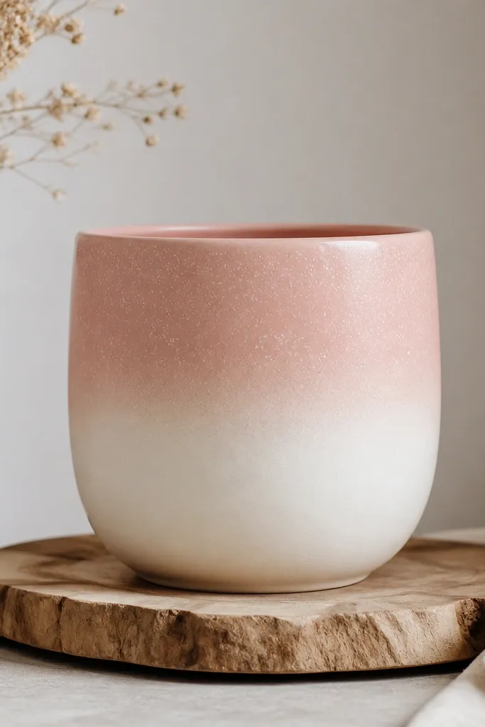
This is a sweet, airy look that makes terracotta feel softer. The ombre top draws the eye upward, and the white speckles add a “frosted” texture that looks cute in photos. I use it for small flowering plants because the pink picks up pink tones in blooms. It also flatters lighter skin tones in styling photos because the color palette stays gentle and warm.
Paint the whole pot creamy white first and let it dry. Mix blush pink and white to create a gradient, then apply blush to the top third with a sponge. Blend downward by dabbing gently so the transition stays smooth. Add speckles with white paint using a toothbrush, keeping them mostly on the pink area. Let dry and seal with satin so the speckles don’t flatten.
Hold the toothbrush farther away for tiny specks instead of big droplets.
Don’t place speckles over the whole pot — it makes the design look dusty.
20. Olive Branch Arches with Tiny Red Berries
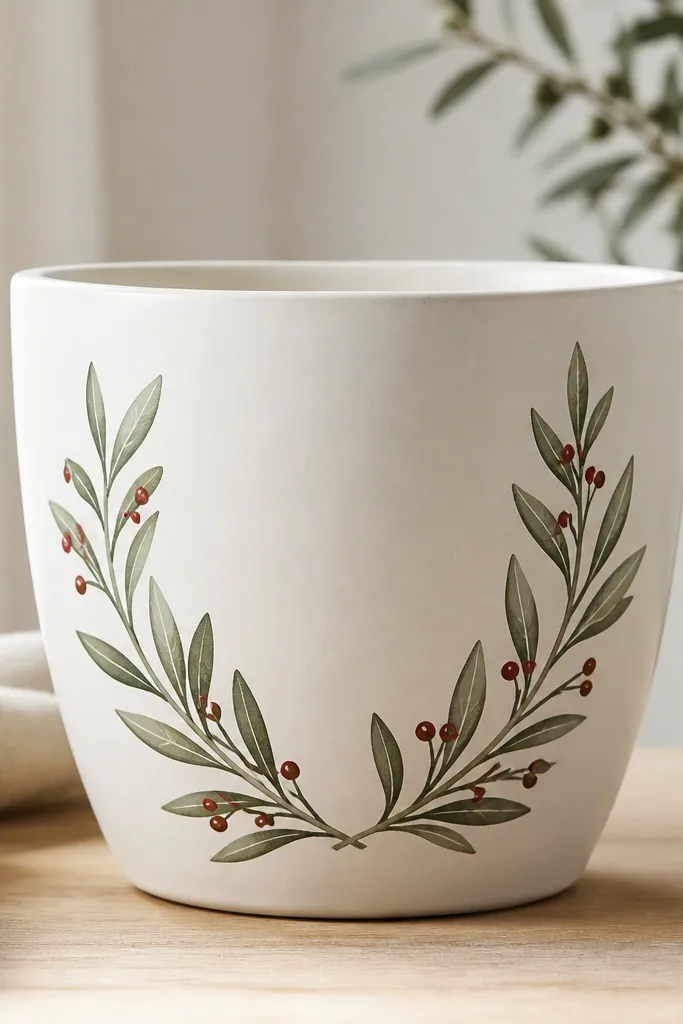
Base coat the pot warm white and let it dry. Lightly sketch two arches that meet at the sides and curve toward the center. Paint the branches in olive green as a single flowing line, then add small oval leaves on both sides. Add a tiny gray vein line inside some leaves with a liner brush. Finally, dot small red berries along the branches using the tip of a toothpick. Seal with a matte clear coat so the berries don’t shine like stickers.
Olive branches look classy and calm, and the small red berries give a little pop without going cartoon. I like warm white because it makes the olive feel aged and natural. The arch shape frames the plant, so when you put a trailing plant inside, the branches look like they’re supporting it. This design is great for kitchen windowsills and farmhouse-style shelves.
AvoidAvoid giant berries — small dots look more natural and less like confetti.
Pro tipUse a toothpick for berries — it makes consistent circles with minimal mess.
21. Primary Colors Corner Squares
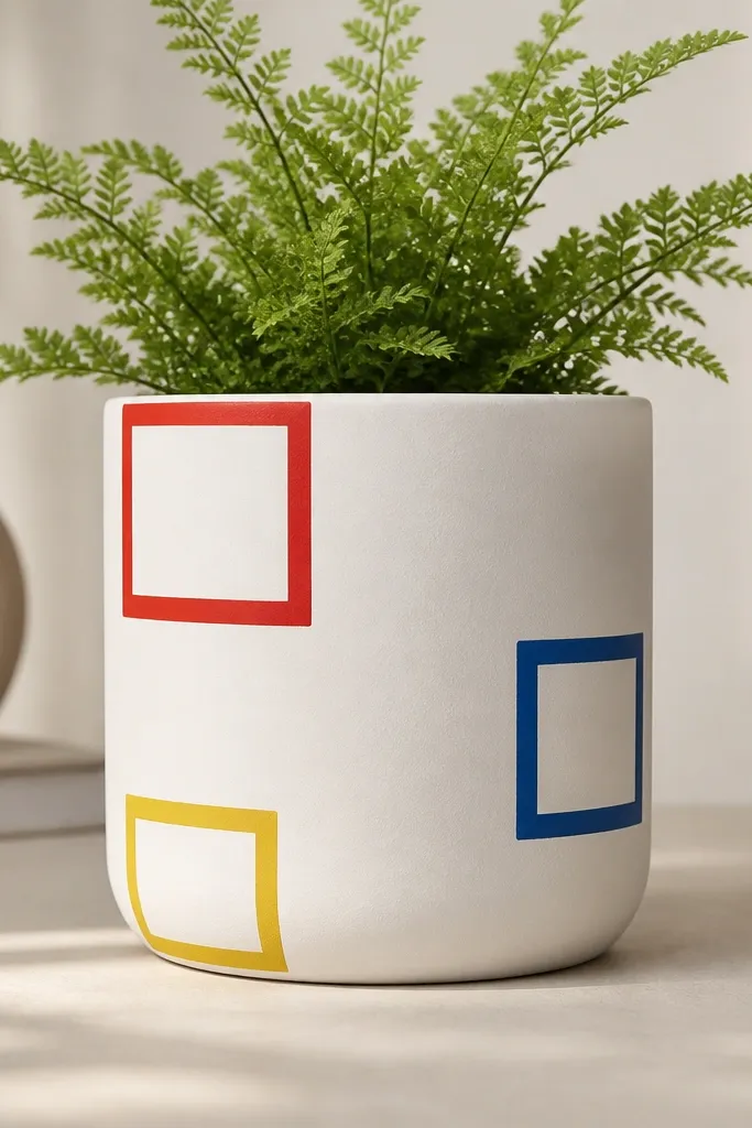
Paint the pot matte off-white in two coats. Choose three corners on the front face and mark square areas about 2 inches each for a 10-inch pot. Paint the squares in red, blue, and yellow, then outline each square with a thin black border using a fine brush. Let everything dry, then seal with a satin clear coat. If you want more depth, add a slightly darker shade inside each square’s bottom-left corner.
Corner squares make a pot look graphic and modern without covering the whole surface. Primary colors are bold, but using them in small placements keeps it from feeling loud. This one looks great for kids and classroom plants because it reads clearly from a distance. It also works well with green plants because the primary colors act like a focal frame.
AvoidDon’t freehand square borders — slight wobbles make the design look cheap.
Pro tipUse painter’s tape to make the square edges straight, then pull it while paint is tacky for the sharpest corners.
22. Chocolate Brown with Cream Lace Borders
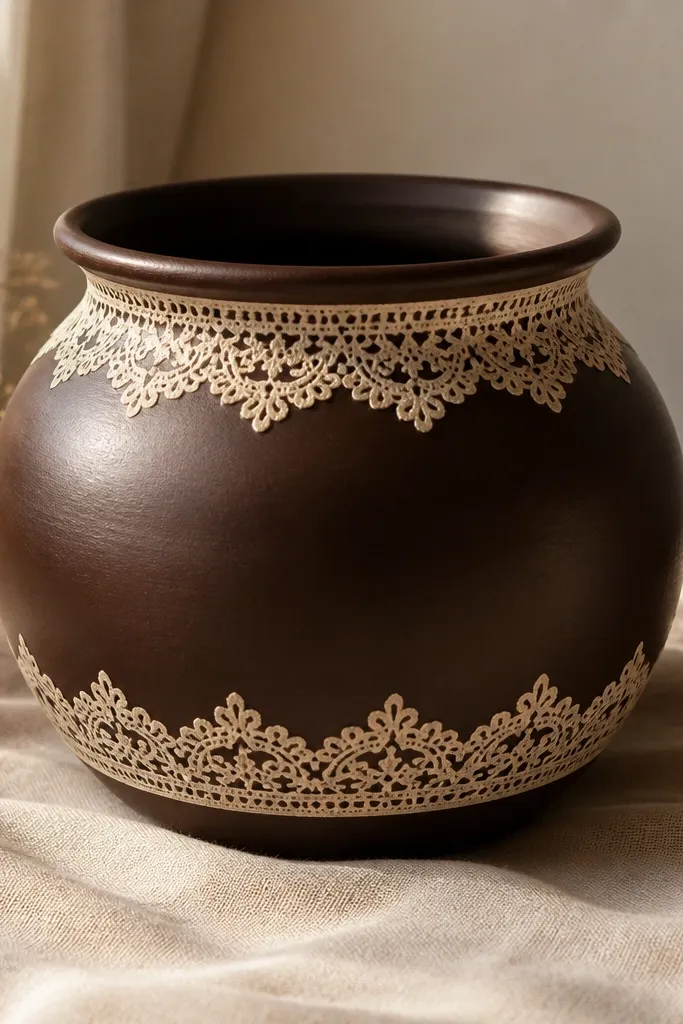
Lace borders look fancy because they frame the pot like clothing trim. Chocolate brown is forgiving and makes cream lace details stand out without using bright white. I do this for gifts because it looks intentional even if the plant is simple. It also hides minor paint patchiness because the brown absorbs light and the lace draws attention to the edges.
Base coat the pot deep chocolate brown and let it dry completely. Use a lace stencil or a lace fabric strip as a template: press the stencil in place and dab cream paint around the rim area. Keep the border about half an inch tall and repeat the motif evenly. Add a second lace border near the bottom edge for symmetry. Seal with matte so the lace stays soft and doesn’t look glossy.
Dab with a sponge brush instead of brushing lace — it prevents paint from bleeding under the stencil edges.
Avoid glossy topcoat on lace designs — shine makes the lace look like plastic.
23. Ocean Teal Waves with White Foam Lines
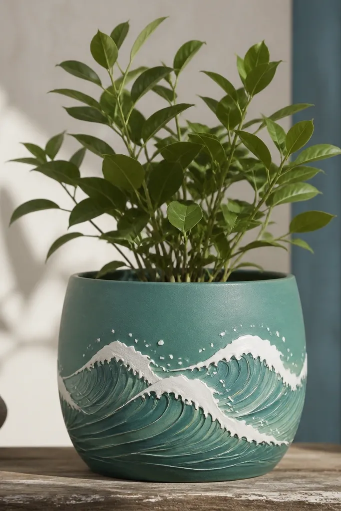
Paint the pot teal in two coats and let it dry. Lightly draw three wave bands across the front using pencil curves. Paint the wave shapes in slightly darker teal, then add white foam lines along the crests with a small liner brush. Dot a few tiny bubbles using a paint pen or toothpick tip. Seal with satin clear coat so the teal stays smooth and the foam lines don’t scratch.
Wave designs look lively without needing a full scene mural. Teal gives a watery feel, and white foam lines add movement and depth. I like this for porch pots because the colors look good next to outdoor lights and blue furniture. It also pairs well with plants that have texture, like succulents or small grasses, because the waves give the pot a natural “texture partner.”
AvoidDon’t make waves too wide — crowded bands make the design feel like a pattern sheet.
Pro tipMake foam lines uneven — real waves never look perfectly uniform.
24. Rainbow Handprint Kids Edition (Non-Toxic Look)
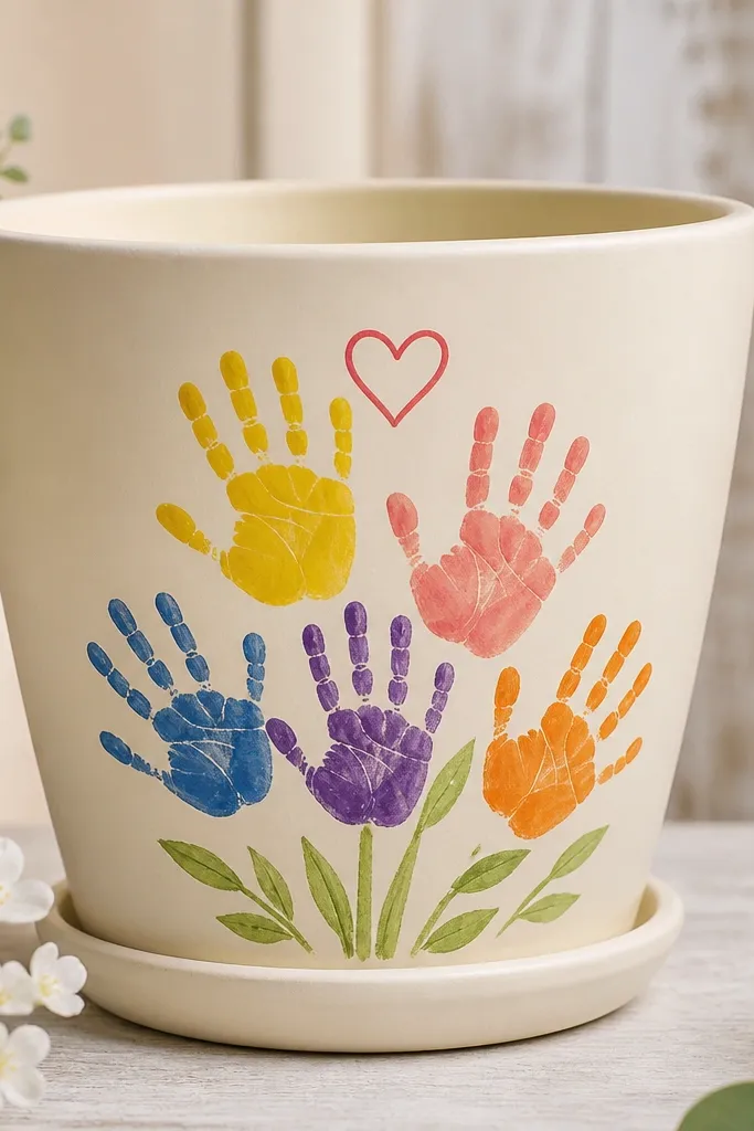
Paint the pot cream and let it dry. Use washable acrylic craft paint applied with a sponge or foam brush to each kid’s hand, then press the handprint where you want the cluster (about 4-6 handprints on a 10-inch pot). After drying, add a small heart outline in red near the top of the cluster with a paint pen. If you want extra structure, draw a simple stem line and add two leaves in green under the handprints. Seal with a clear acrylic sealer once fully cured.
This is the one I use when the goal is happiness over perfection, but you still want it to look cute on a shelf. A cream base makes handprints pop, and the rainbow spread reads like a bouquet even if the hand shapes vary. It’s also a fun way to get kids involved because they can press and paint without worrying about drawing. I’ve done this with toddlers and the result still looks good because the handprints are placed in a simple cluster.
AvoidAvoid thin paint layers — handprints blur if the paint is too watery.
Pro tipUse a damp paper towel right away to clean edges so handprints stay crisp.
25. Rose Gold Brushstroke Band on White
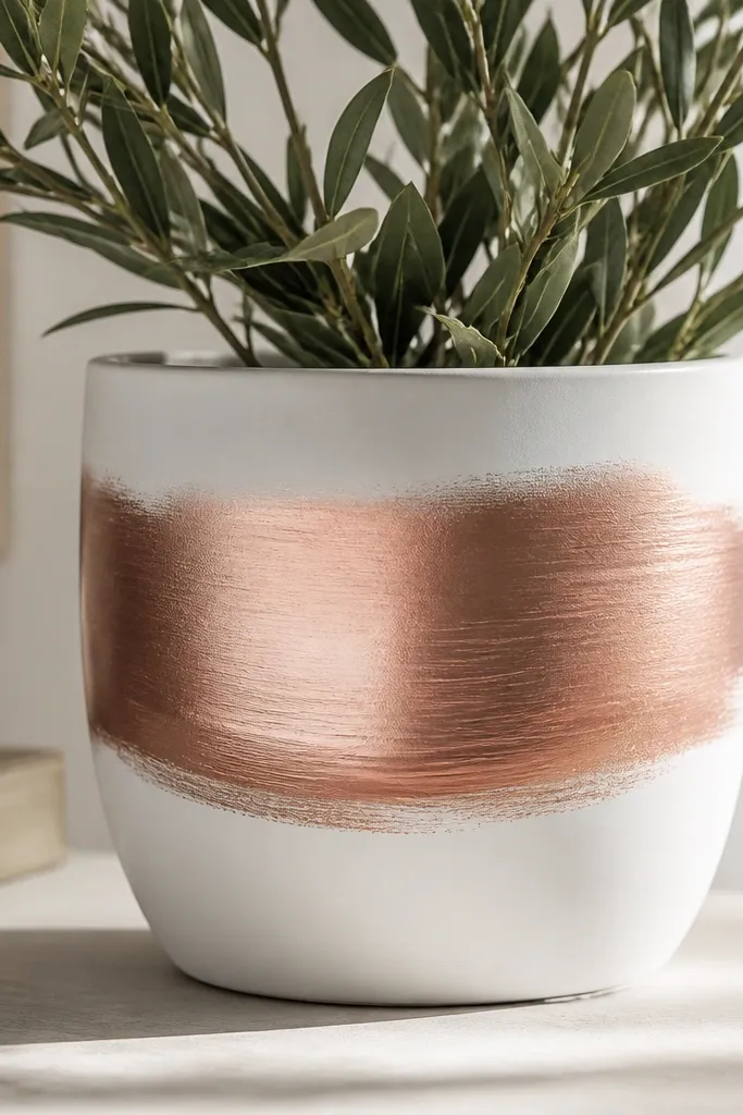
Base coat the pot matte white and let it dry fully. Paint a horizontal band across the middle using rose gold metallic acrylic, aiming for about 2 inches tall on a 10-inch pot. Use a wide flat brush and keep strokes going in one direction for a clean “fabric” look. Add a thin shadow line under the band with a slightly darker rose gold or copper-brown paint. Let metallic dry, then seal with satin clear coat to smooth texture and protect it from scuffs.
A metallic brushstroke band looks like jewelry on a planter. The rose gold flatters warm skin tones in photos and feels romantic without needing flowers painted on the pot. I like it for gifting because it looks expensive even though it’s just paint and a brush. It also works with almost any plant because the band stays neutral — white and rose gold don’t compete with leaves.
AvoidDon’t use glossy sealer — it can make metallic look patchy and sticky.
Pro tipIf the metallic streaks too much, add one gentle top pass with a clean dry brush over the surface.