
1. Rim Stripe + Tiny Dots
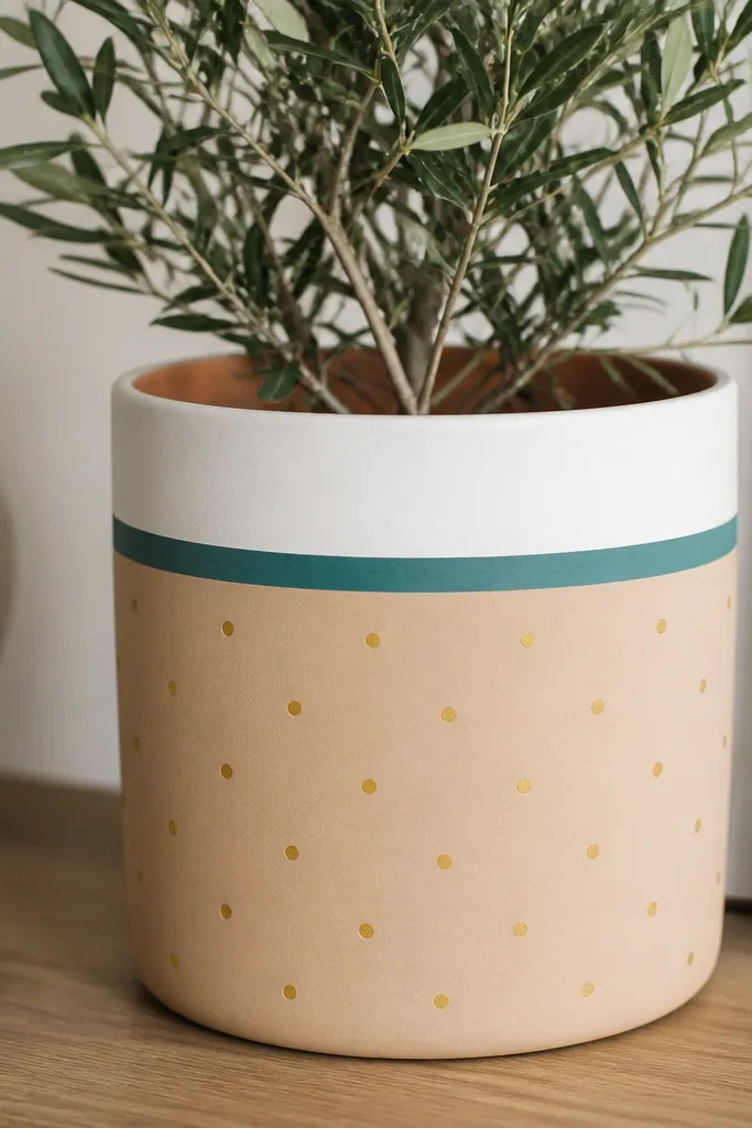
This one looks crisp on any pot with a defined rim because the stripe acts like a visual frame. I paint the base a warm cream, then add a wide rim stripe in white and a thinner teal line under it. The gold dots are small enough to read as sparkle from a distance, but not so small that they vanish up close. It flatters bold, leafy plants like marigolds and basil because the pot stays graphic and doesn’t compete with the flowers.
First, clean the pot and prime it with a thin coat meant for terracotta. Paint the whole body cream, then let it dry to the point where it no longer feels tacky. Apply painter’s tape around the rim at about 1 inch down, paint a white band, and pull the tape while the paint is still slightly wet. Add a thin teal stripe using a 1/4-inch flat brush, then dot with a sponge tip or the end of a wooden skewer. Finish by sealing with satin outdoor clear coat.
Press the tape firmly with a plastic card so paint doesn’t creep under the edge.
Skipping primer on terracotta makes the stripe look patchy after a few weeks.
2. Watercolor Wash Ombre
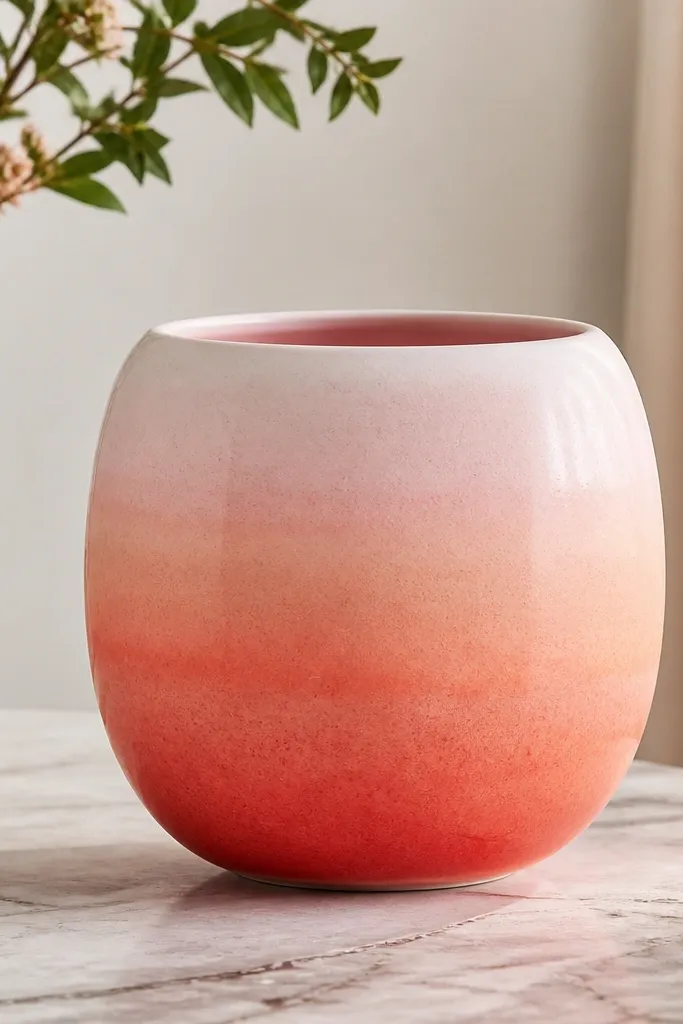
Ombre looks expensive because it feels like dye, not decoration. I like this on smooth ceramic or plastic pots because the wash spreads evenly and looks like it belongs. Coral to peach flatters warm undertones in flowers like zinnias and geraniums, and it also looks great with green foliage because the gradient gives the leaves a warm background. Keep the transition gentle — harsh lines make it look like a craft project instead of a finish.
Start by painting the pot a solid off-white or very pale peach. Mix coral acrylic with a little water and a touch of matte medium so it flows without turning streaky. Load a wide sponge and dab at the bottom third, then wipe the sponge clean and blend upward with light taps. Repeat with thinner layers until the fade is smooth. Let it dry fully, then add a thin white line at the rim for polish before sealing.
Use a hairdryer on low for 2-minute bursts between layers so the blend doesn’t set before you smooth it.
Painting the ombre in one heavy coat — it dries with visible bands.
3. Blackboard Label Panel
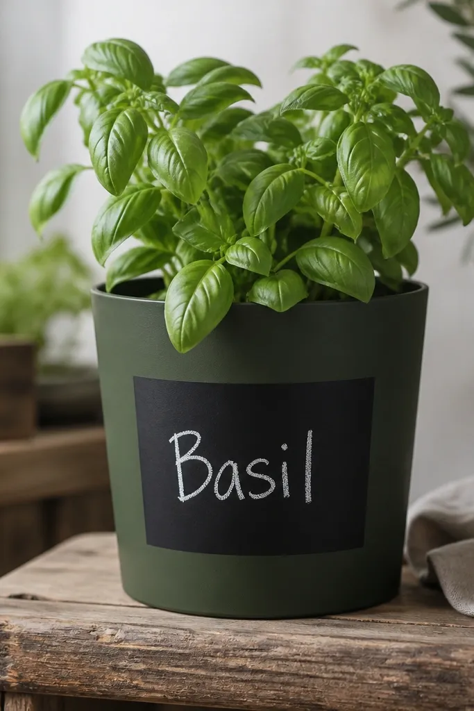
This gives you a functional pot and a clean look at the same time. The matte black panel hides tiny brush marks on the pot body, so it’s forgiving for beginners. I do it on small to medium pots because the label stays readable and doesn’t wrap awkwardly. It looks especially good for herbs and kitchen plants where you want names visible.
Pro tipMake the label slightly wider than you think; narrow rectangles warp when the pot curves.
Prime and base-coat the pot in dark green or charcoal, then let it dry. Tape a rectangle centered on the front — measure so it sits about 2 inches below the rim and 2 inches above the base. Paint the rectangle with matte black craft paint in two thin coats. After drying, write with a white paint pen or chalkboard chalk marker, then seal everything except the lettering if you want a chalky feel. If you plan to seal over it, test a small spot because some chalk markers smear under clear coat.
AvoidUsing glossy paint for the panel makes it look like a sticker instead of a board.
4. Botanical Line Art in One Color
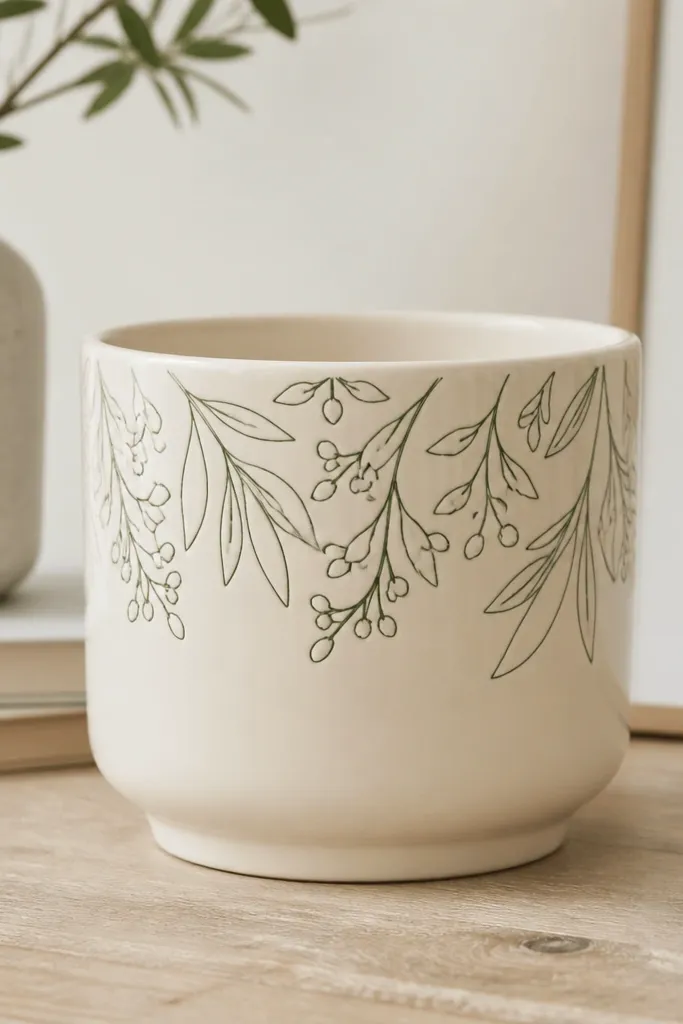
One-color line art is my go-to when I want the pot to look calm and intentional. It works on tall narrow pots because the lines can follow the vertical shape, and it doesn’t get crowded. I paint it in deep green or black so it pairs with almost any flower color. This style also hides uneven pot texture because the design is light and airy.
Start with a cream base and let it dry completely. Print a simple leaf sketch or use a small stencil, then lightly pencil guide marks on the pot. Paint the lines with a liner brush and the same green you used for other yard accents. Keep line thickness consistent — reload the brush as needed instead of dragging it dry. Seal with a matte outdoor clear coat so the lines don’t turn shiny.
Practice the leaf strokes on scrap cardboard first so your curves match the real pot.
Filling every space with details — leave breathing room or it turns into scribbles.
5. Terracotta Revival with White Clay Wash
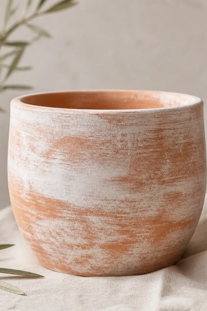
This is the fastest way to make an old terracotta pot look fresh without covering every pore. The key is a thin, semi-opaque wash that keeps the orange peeking through, which makes the pot look like it’s been glazed for years. It pairs well with drought-tolerant plants and grasses because the pot looks earthy but clean. I also use it for kids' pots because it forgives messy edges — the wash hides them.
Pro tipUse a flat brush for the wash and a paper towel to lift extra paint where it gets too heavy.
Clean the pot and dry it. Mix white acrylic with water and a little matte medium until it’s the consistency of cream soup. Brush the wash on in thin passes, then dab with a dry sponge to break up streaks. Don’t chase perfect coverage — stop when you can still see orange through the white. Once dry, add a single accent stripe near the rim if you want more definition, then seal.
AvoidApplying thick paint — it seals the terracotta too hard and can peel when it flexes.
6. Tape-Geometric Panels
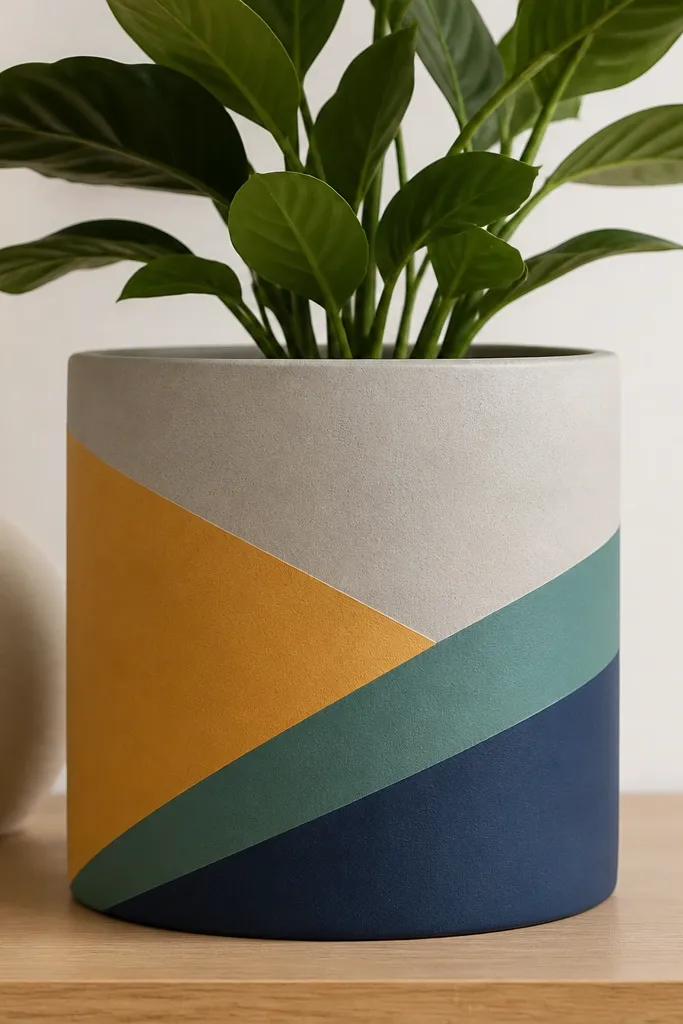
Geometric panels look modern and hide small imperfections because the lines create structure. This style flatters square or slightly faceted pots and also works on round ones if you keep the pattern in bands. I like mustard, teal, and navy because they read sunny and garden-friendly without getting loud. It’s also easy to match to patio cushions or kids' room colors.
Base-coat the pot in light gray and let it dry fully. Plan a simple pattern with painter’s tape strips — I do three diagonal panels across the mid-body. Press tape down hard, paint the first color (mustard), remove tape after 5-10 minutes while paint is still soft. Clean the area, re-tape for the next panel, paint teal, remove tape, then paint the last panel navy. Seal with satin clear so the edges stay crisp.
Remove tape in one smooth pull — stopping halfway creates a jagged edge.
Trying to paint over wet tape — the paint bleeds and you lose the sharp separation.
7. Rainbow Drip Rim
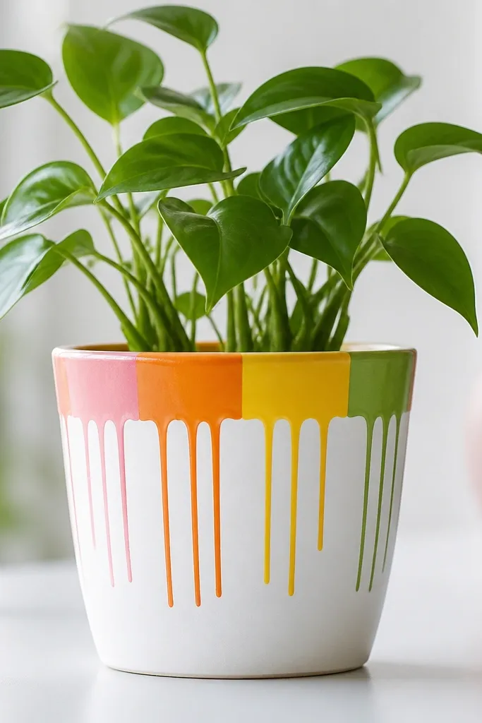
Drips look playful and they’re also great for kids because they’re forgiving. I do this on white or very light pots so the colors pop. The drip pattern flatters hanging baskets and tall plants because the drips create a vertical motion. Keep the drips short — you want them to look like a controlled spill, not a mess.
Paint the pot white and let it dry. Tape a line around the rim at about 3/4 inch down and paint a rainbow band — pink, orange, yellow, and green in segments. Mix each drip color slightly thicker than the band paint so it holds a shape. Load a small brush and touch it at the tape edge, then pull down just 1/2 to 1 inch for drips. Let each color set before adding the next, then remove tape and seal.
Use a paper plate palette and keep the drip paint thick; thin paint runs too far.
Over-thinning the paint — it turns into messy streaks.
8. Polka Dot Ombre
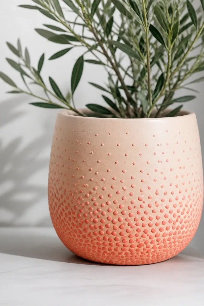
This one looks like pattern wallpaper and it’s surprisingly easy. I like it on pots with a smooth surface because the dots stay even. The gradient of dot size and density gives depth — your eye reads the pot as layered even though it’s just paint. It pairs beautifully with soft flowers like pink wave petunias and dusty miller because the pot feels gentle, not aggressive.
Prime and paint a light peach base. Choose two dot sizes: small near the top and larger near the bottom. Load a sponge or dotting tool and start with light pink dots in the top third, leaving gaps. Work downward with coral, adding bigger dots and filling more space until the bottom third is dense. Let dry, then seal with matte clear to keep the dots from turning shiny.
Mark the pot into three horizontal sections with pencil so your dot spacing stays consistent.
Packing dots too evenly — the ombre effect disappears.
9. Nautical Rope Wrap Look
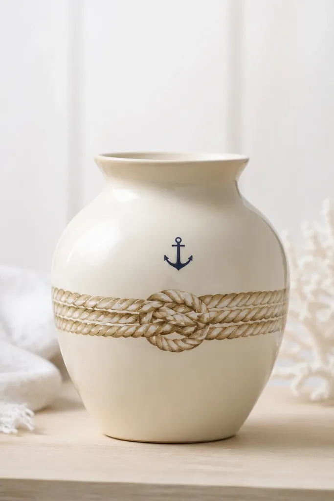
Painted rope is a trick I learned after I ruined a real rope wrap — it frayed in the rain. This version looks textured without bulk, and it’s perfect for patio planters near the grill. The natural tan rope color looks good with blues and whites, so it flatters plants like blue fescue and white alyssum. It also hides scuffs because the rope lines create busy detail.
Pro tipOutline your coil lightly with pencil first so your spiral stays even around the curve.
Base-coat the pot cream and let it dry. Using a thin brush, paint a tan rope coil band around the middle — draw loops like a spiral. Add white highlights along one side of the rope loops so it looks like light is hitting it. Use a small liner brush to paint a tiny navy anchor near the top, keeping it under 2 inches wide. Seal with satin clear so the rope effect still looks dimensional.
AvoidUsing one flat tan only — it looks flat and cheap without the highlight.
10. Monochrome Marble Swirl
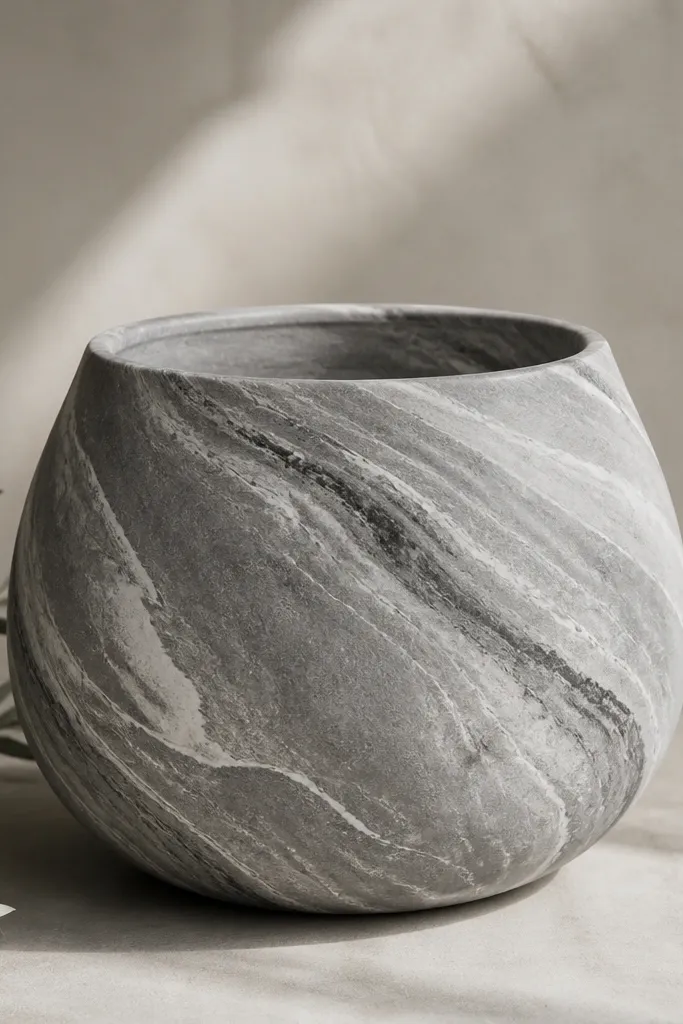
Marble paint looks high-end because it has motion and depth, even with simple colors. I use monochrome — gray, charcoal, and off-white — so it works in any garden palette. It looks great with bold flowers because the pot doesn’t add loud color, it adds texture. This style also makes scuffs disappear because the swirl covers surface flaws.
Paint the pot a medium gray base and let it dry. Thin white acrylic with a bit of water so it flows like ink. Drag a thin brush across the surface in wispy diagonal lines, then add charcoal swirls crossing them. Use a dry brush technique to soften edges: lightly wipe the brush on paper towel and skim over the swirl lines. Seal with satin clear for a stone-like finish.
Work in small sections so the paint stays wet enough for smooth blending.
Overworking the swirls — too many passes make it look muddy.
11. Stenciled Checkerboard Bottom Band
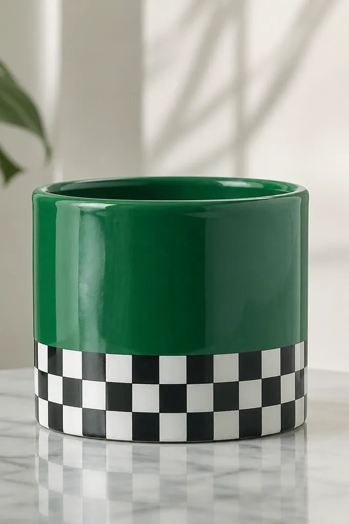
Checkerboard is the easiest pattern to make look intentional because it’s structured. I like it on pots that already have color — it gives you a graphic detail without covering everything. Black and white looks clean and modern, and green foliage makes it pop. This style also hides brush skill gaps because the stencil does the heavy lifting.
Prime and base-coat the pot in a saturated green. Tape off the bottom third, leaving a straight line at the top of the band. Use a checkerboard stencil with 1-inch squares (or measure your stencil size) and dab paint with a sponge brush. Alternate black and white squares in two rounds so edges stay crisp. Let it dry, remove tape, then seal with satin clear.
Use minimal paint on the stencil — too much paint bleeds into the grid.
Trying to paint checks freehand — the pattern warps around the curve.
12. Shiplap Stripe Panels
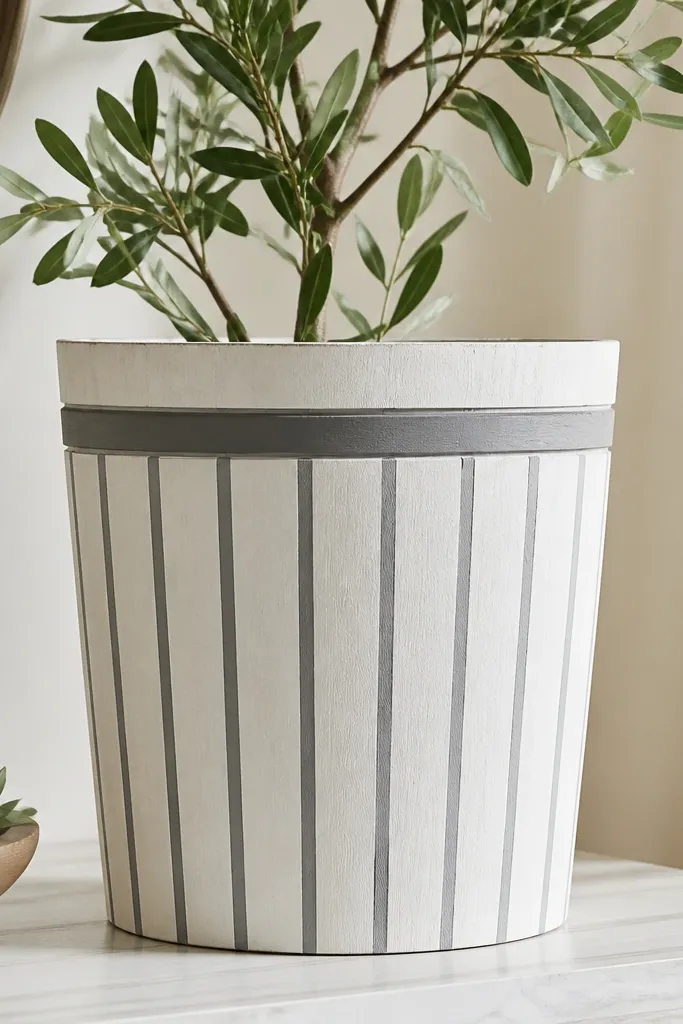
This is a farmhouse look that doesn’t require actual wood. It works best on pots with a slightly taller shape because the vertical lines elongate it. I keep the palette to off-white plus one gray so it reads clean, not busy. It pairs well with herbs and cottage-style flowers because the stripes look like porch siding.
Base-coat the pot off-white and let it dry. Measure the circumference and decide on stripe spacing — I do 1/2-inch stripes for small pots and 3/4-inch for larger ones. Use painter’s tape to mark a straight stripe path around the pot, then paint gray in thin coats. Pull the tape before the paint fully sets. Add a darker trim stripe near the rim by taping a thin line and painting it charcoal. Seal with matte clear so it looks like painted wood.
Spin the pot slowly while painting stripes so the spacing stays even around the curve.
Painting thick gray coats — they fill tape edges and look uneven.
13. Sunburst Halo Backdrop
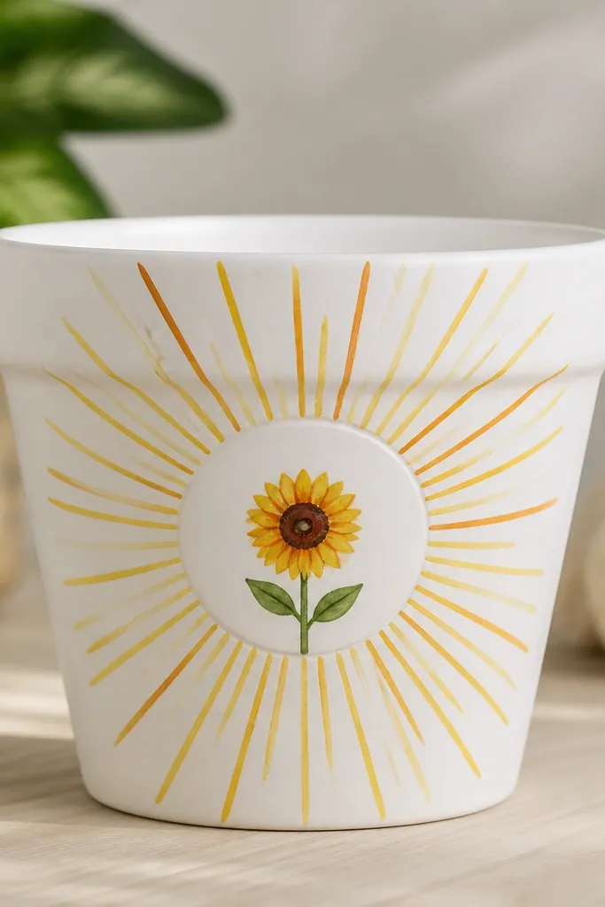
Sunburst designs feel cheerful because the rays create energy without needing lots of tiny details. I do this for pots that will hold one star plant, like a single sunflower, because the pot becomes the backdrop. It looks great against dark soil and green leaves since the rays pull focus upward. Keep the center circle clean so the rays don’t crowd the flower.
Paint the pot white or pale cream. Draw a circle centered on the front, about 3 inches wide on a small pot. Fill the circle with a soft yellow wash, then paint orange rays from the edge of the circle outward. Use a thin liner brush and keep rays about 1/8-inch wide. Add a simple sunflower center and a few petals if you want, then seal with satin clear.
Use a compass or a bottle cap for the center circle to avoid lopsided rays.
Making rays too long — on a curved pot they wrap and look chaotic.
14. Oreo-Style Black and Cream
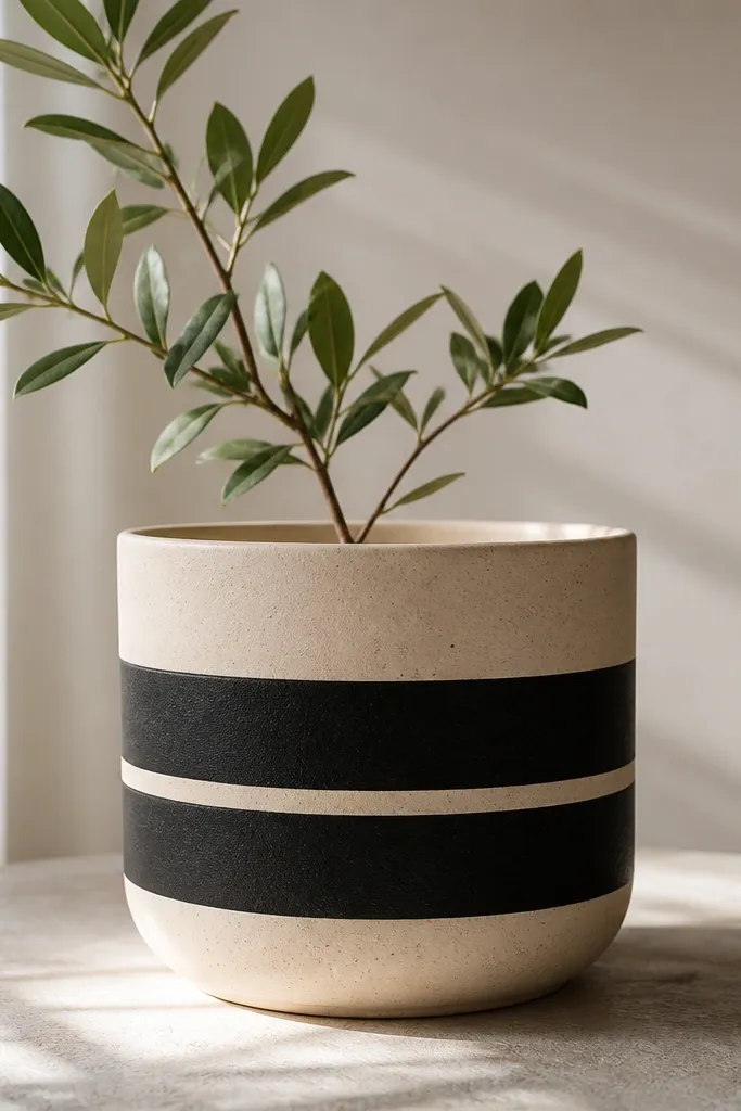
This graphic look is so easy that it feels like cheating, and it still looks bold. It works on medium pots where two bands fit nicely without wrapping unevenly. I use black and cream because it’s high contrast and reads well from across a patio. It also pairs with bright flowers because the pot stays simple.
Prime and paint the pot cream first. Tape two horizontal bands — one near the middle and one slightly below it — and paint them black. Pull tape carefully while paint is still wet. Let everything dry, then paint a thin cream separator line between the bands using a small brush. Seal with satin clear to keep the bands sharp.
Use a level or a ruler to place the tape bands so they’re straight before you paint.
Skipping the separator line — it makes the bands look like one thick smear.
15. Fruit Slice Half-Moon
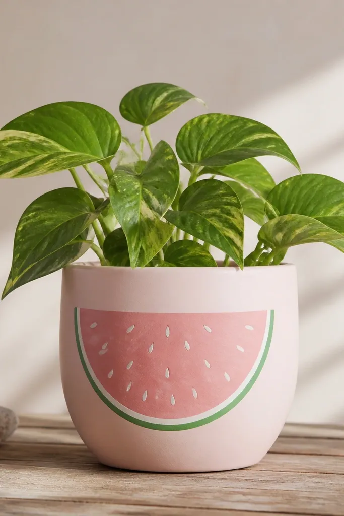
Fruit slices make pots look fun for kids' spaces without turning into cartoon chaos. The half-moon format fits the curve because it’s a single big shape, not scattered icons. I like watermelon because green rind against pink reads instantly. This looks great with trailing plants like strawberry begonias because the pot design feels like it’s part of the garden story.
Pro tipSketch the half-moon lightly with pencil first so the curve lands in the right spot.
Base-coat the pot pale pink or cream. Tape a curved edge guide for the half-moon using a flexible strip of painter’s tape, following the pot curve. Paint the rind green around the outer edge, then fill the inside with watermelon pink. Add thin white seed lines and tiny seed dots with a liner brush. Remove tape, let dry, then seal with satin clear.
AvoidUsing bright neon greens — it clashes with most garden leaves.
16. Lavender Fields Band
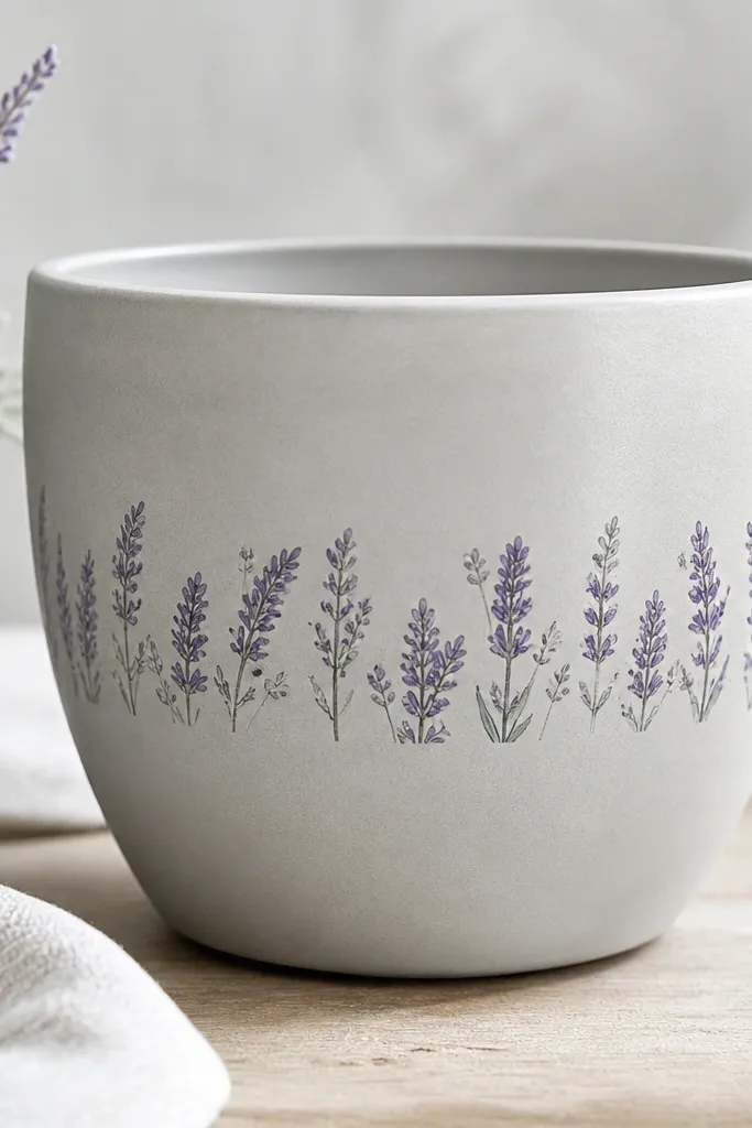
A single band of “stems” makes the pot look like it has a horizon line. I paint this for pots that hold one compact plant because the band gives context and keeps attention low-to-mid. Purple lavender tones look good with silver herbs and dark green leaves. It also hides uneven pot texture because the stems break up the surface.
Prime and paint the pot light gray. Tape a horizontal band across the middle where the lavender will sit. Paint stems in muted purple, pulling lines upward with a small brush. Add tiny bud dots at the top of stems with a slightly lighter purple. When the band dries, add a thin darker purple shadow line under the stems to ground them. Seal with matte clear so it looks soft, not glossy.
Keep stems uneven — straight, identical lines look like a stencil copy.
Painting purple too bright — it turns into loud craft paint on light pots.
17. Tiny House Windows
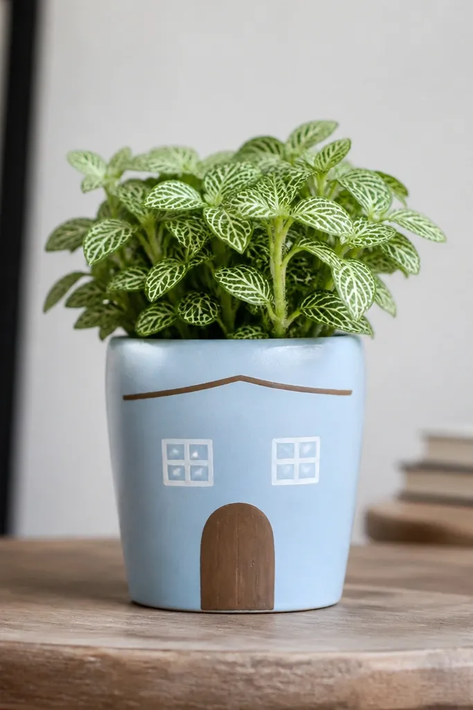
House-window art is adorable for kids' planters because it feels like a little scene. I like it on small pots because the scale stays cute instead of cartoonish. The sky-blue background makes the windows pop, and brown door tones look warm against green plants. This style also works for party favors — the paint is straightforward and you can personalize each pot fast.
Prime and paint the pot sky blue and let it dry. Use painter’s tape to outline two window rectangles, then paint them white. Add smaller inner rectangles for window panes in light gray. Paint a small door rectangle in warm brown under one window, then add a simple roof line with a thin brush in darker brown. Seal with satin clear once dry.
Keep the door smaller than the windows — it keeps the proportions looking right.
Adding too many details — two windows and a door is enough.
18. Gold Leaf Corner Accent
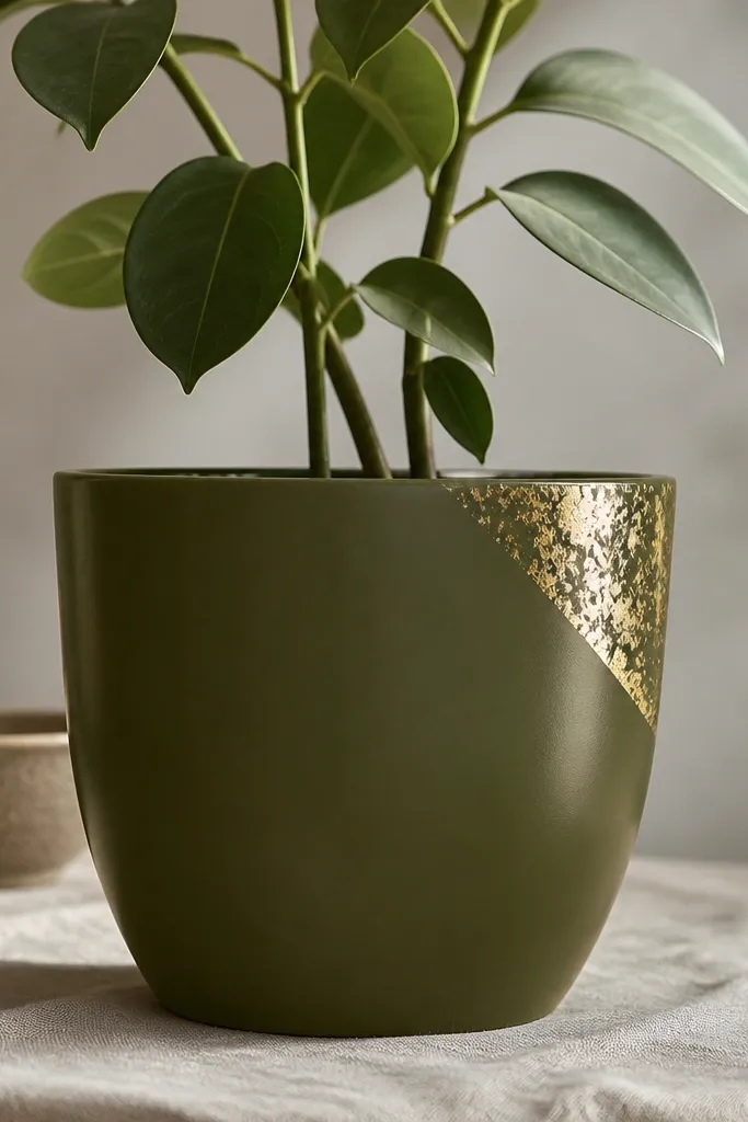
This style makes plain pots look styled without covering the whole surface. I use it when I’m painting one pot for a table and want it to look fancy in photos. Olive green plus gold reads upscale and pairs with almost any flower color. The corner placement flatters the pot because it draws the eye upward and doesn’t fight the round shape.
Pro tipMetallic paint looks best when you don’t overbrush it — tap, don’t stroke.
Base-coat the pot deep olive and let it dry. Choose one front corner and tape a small triangle there — about 2 inches on each side. Paint the triangle in a metallic gold acrylic or metallic gold spray paint. For the leaf texture, stipple over it with a sponge using a slightly darker gold shade. Remove tape, then seal with satin clear to protect the metallic finish.
AvoidCovering metallic areas with matte clear — it dulls the gold too much.
19. Pastel Rainbow Arches
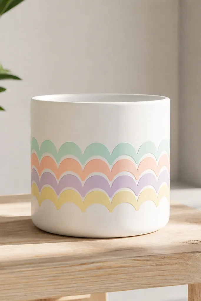
Arches look soft and friendly, and they’re easy to place around a curve. I do this on white pots because the colors float. Pastels flatter kids' spaces and also look good with light-colored blooms like cream roses and pale pink geraniums. The arched shape creates a gentle rhythm that makes the pot feel designed, not random.
Prime and paint the pot white. Mark the mid-body area with pencil so you know where the arch band sits. Use a small bowl or lid to trace a repeating arc guide, then paint arches in mint, peach, lilac, and pale yellow with a small flat brush. Keep each arch line about 1/8-inch thick for a clean look. Seal with satin clear.
Let each color dry 10-15 minutes before the next so you don’t blend pastel into brownish gray.
Thick paint lines — they crack or look raised after sealing.
20. No-Carve Pumpkin Dots
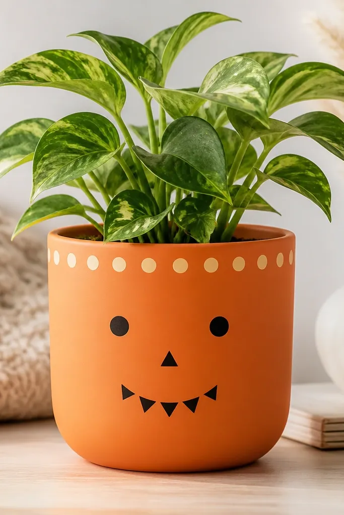
This is a fall look that’s kid-friendly and still looks neat. The dot face reads well even from far away, and the lighter dot ring gives it a finished edge. I use it for small pumpkins planters and mums because the pot matches the season without needing carving tools. It also works on plastic pots because the design is simple and mostly flat.
Prime and paint the pot a solid pumpkin orange. Add a lighter orange dot ring near the top by tapping a sponge loaded with lighter paint. For the face, use a pencil to place eyes and a nose — then paint black triangles and circles with a small brush. Keep features centered so the curve doesn’t distort them too much. Seal with satin clear to protect the black paint.
Outline the pencil marks lightly so you can erase before paint dries.
Painting faces too low — the curve makes them look droopy.
21. Polished Color Block Corner
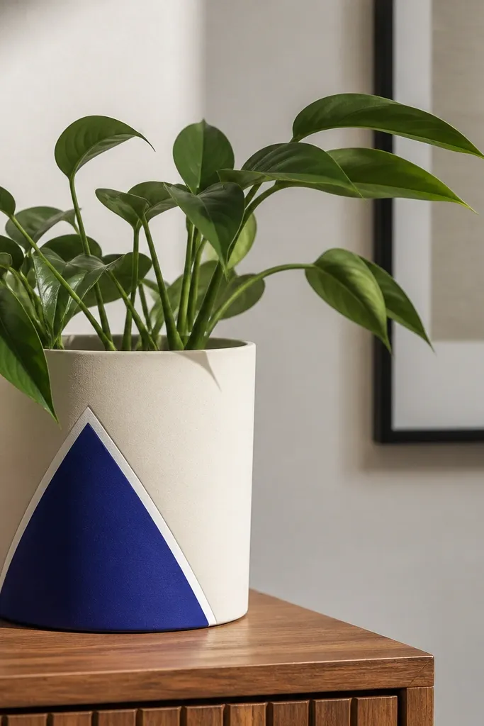
Color blocks look modern and tidy because they’re deliberate. I like this on pots with a slightly matte finish because the paint reads smooth. Cobalt blue against cream makes the pot pop next to green plants and white flowers. It also flatters people who want a “clean” look for a small patio — no tiny details to stress over.
Pro tipUse a fine brush and steady your wrist on the pot rim so the border line stays straight.
Prime and paint the pot cream and let it dry fully. Tape a triangle at the top corner with painter’s tape, then paint cobalt blue inside the taped area. Remove the tape while paint is still slightly wet. Add a thin white border around the triangle by carefully painting over the edge and blending inward. Seal with satin clear.
AvoidFreehanding the triangle — straight edges separate cheap from expensive.
22. Chevron Top Trim
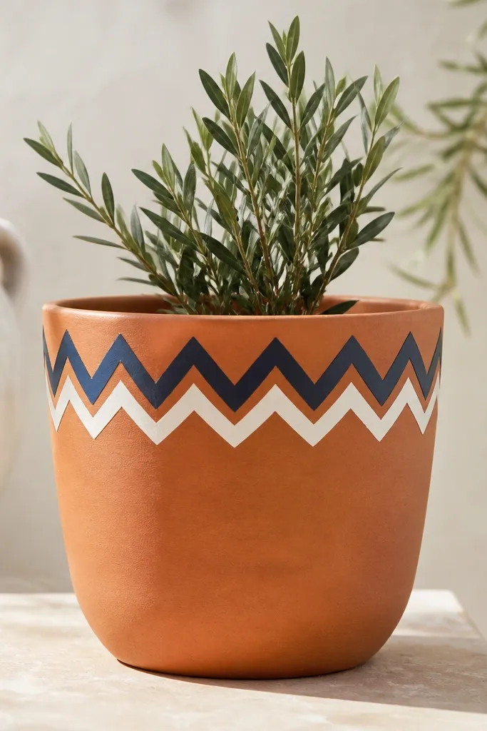
Chevron trim is a great way to dress up a pot without committing to full coverage. It works on terracotta because the base stays warm and the trim looks like decorative molding. Alternating navy and white makes it look nautical and clean. This style pairs well with grasses and herbs because the pot has a neat “top collar” that frames the plant.
Pro tipIf using tape chevrons, press each V corner down hard so the paint doesn’t seep.
Prime the terracotta pot. Paint the body a warm light clay or cream, then tape a band just under the rim about 1 inch tall. Use a chevron stencil or mask the V shapes with tape strips. Paint alternating navy and white in thin coats, then remove tape while paint is still wet. Let everything dry, then seal with satin clear.
AvoidPainting on wet base — trim colors smear and blur.
23. Galaxy Speckle Night Sky
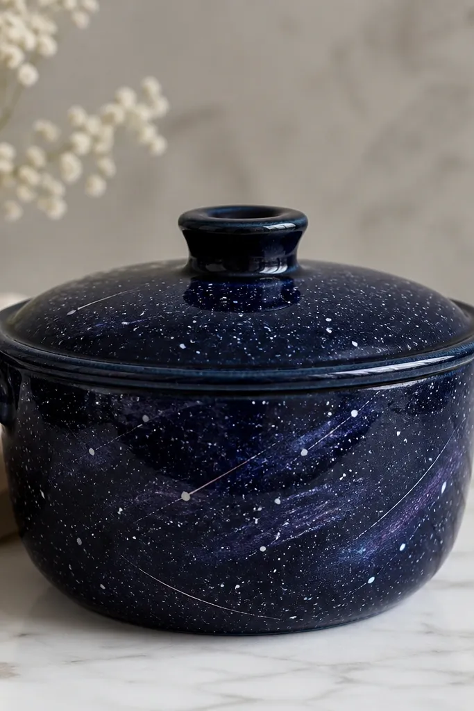
Galaxy pots look magical, and they’re also one of the easiest styles to hide uneven surfaces. I do this on large pots because the speckles need space to breathe. Dark navy makes the speckles pop, and purple swirls add depth without needing lots of detail. It looks great with silver-gray plants like dusty miller or with deep purple flowers.
Prime and base-coat the pot in dark navy. Mix a lighter blue and white acrylic with water so it drips off a toothbrush easily. Hold the toothbrush close and flick with your thumb to create speckles — do it over cardboard so cleanup is simple. Add a few short streaks by dragging a fine brush lightly through a small cluster of speckles. Seal with matte clear so the galaxy doesn’t shine.
Do speckling in good light and rotate the pot — you’ll catch empty spots faster.
Using thick white paint for speckles — it looks like blobs, not stars.
24. Celestial Moons and Stars
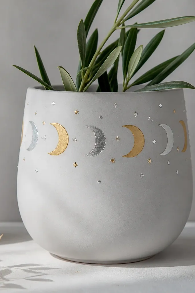
Moons and stars give a bedtime-story vibe that works for kids and adults. I paint this on light gray or pale blue because it makes gold and silver look luminous. It flatters plants with delicate leaves because the design stays light and doesn’t overwhelm. Keep the moons mostly on one side of the pot so the scene feels composed.
Base-coat the pot pale gray. Tape a horizontal band across the top third and paint it in a slightly darker gray for contrast. Remove tape. Use a sponge or small stencil to add crescent moons in gold metallic paint and silver metallic paint, alternating sizes. Add tiny star dots with a liner brush. Seal with satin clear — matte can make metallic look dull.
Use a makeup sponge for moons — it gives smooth edges without brush marks.
Putting stars everywhere — stick to an upper area so it looks intentional.
25. Sunflower Panel with Simple Center
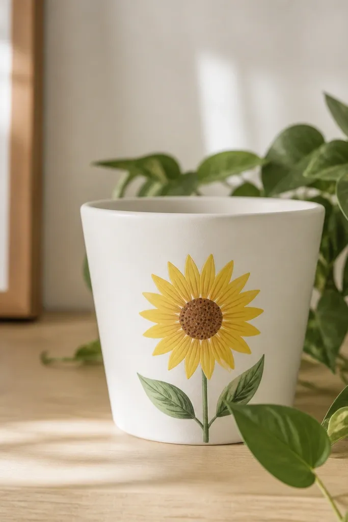
A single sunflower panel is the quickest way to make a pot look like it belongs in a garden photo. I paint it for pots that hold one bold plant, like a sunflower or a tall geranium, because the pot shouldn’t compete. The brown center grounds the bright yellow petals and makes the design feel real. This is also a good beginner project because the flower has clear steps and forgiving shapes.
Prime and paint the pot white or soft cream. Draw the sunflower center circle about 2.5 inches wide for a medium pot. Paint a brown circle, then add yellow petals as teardrops around it — 12 to 16 petals is enough. Add a few green leaves on one side using a leaf shape brush. Finish by painting a tiny highlight dot in the center circle. Seal with satin clear.
Keep petals all the same curve direction; consistent petal flow looks more polished than perfect symmetry.
Overloading the center with thick paint — it cracks as it dries.
26. Leaf Print Texture with Sponge
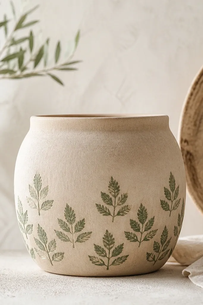
Leaf prints give texture without needing fine line work. I use this when the pot surface is slightly uneven because stamps and sponge texture hide the imperfections. Muted green over beige looks natural and doesn’t clash with busy flowers. It’s also great for kids because the stamping motion is repetitive and easy to control.
Prime and paint the pot beige. Mix green acrylic with a little water so it stamps cleanly without soaking. Dab a sponge with paint, then press a leaf-shaped foam stamp or a real leaf wrapped in fabric onto the pot for the print. Start in the bottom half and work upward, spacing prints about 1 inch apart. Let dry, then seal with matte clear to keep the texture soft.
Test your paint thickness on cardboard first; too wet smears, too dry leaves gaps.
Stamping too close together — it turns into a muddy patch.
27. Terracotta Topcoat + Painted Name Band

This makes the pot feel personal without turning it into a full mural. I like it for kids because names are memorable and easy to update each season. The thin band keeps the look clean and the terracotta still shows through. Dark green lettering on white reads clearly from across a yard.
Pro tipUse a ruler to place the band so letters sit level.
Clean and prime the terracotta pot. Paint the body with a clear or tinted base if you want to keep it warm, then add a thin white band about 1/2 inch wide under the rim using tape. After the band dries, remove tape and write the name with a paint pen in dark green. Add a small leaf icon or dot cluster next to the first letter to make it feel finished. Seal with satin clear, keeping the lettering protected.
AvoidWriting on fully wet paint — it drags and looks streaky.
28. Marigold Dots + Feathered Edge
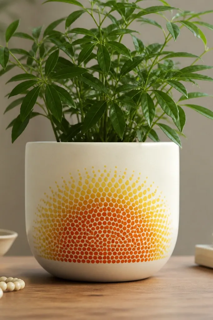
This pattern looks like a soft flower petal without painting a full flower. It works on oval or round pots because the half-oval wraps naturally around the curve. The orange dots feel cheerful, and the feathered edge keeps it from looking like a sticker. It flatters warm flowers and also looks great with deep green foliage because the pot feels sunny.
Prime and base-coat the pot cream. Paint a wide half-oval in light yellow as a base shape in the center. Then sponge on orange dots starting in the middle and spreading outward — keep dots slightly smaller toward the edge. For the feathered edge, lightly blend yellow into the cream around the dot area with a dry sponge. Once dry, seal with matte clear so it looks soft and painterly.
Use a sponge that’s not too wet; dry stamping gives better dot control.
Trying to paint feathering with a brush — it can look like a smear.
29. Rainbow Handprints Kids Pot
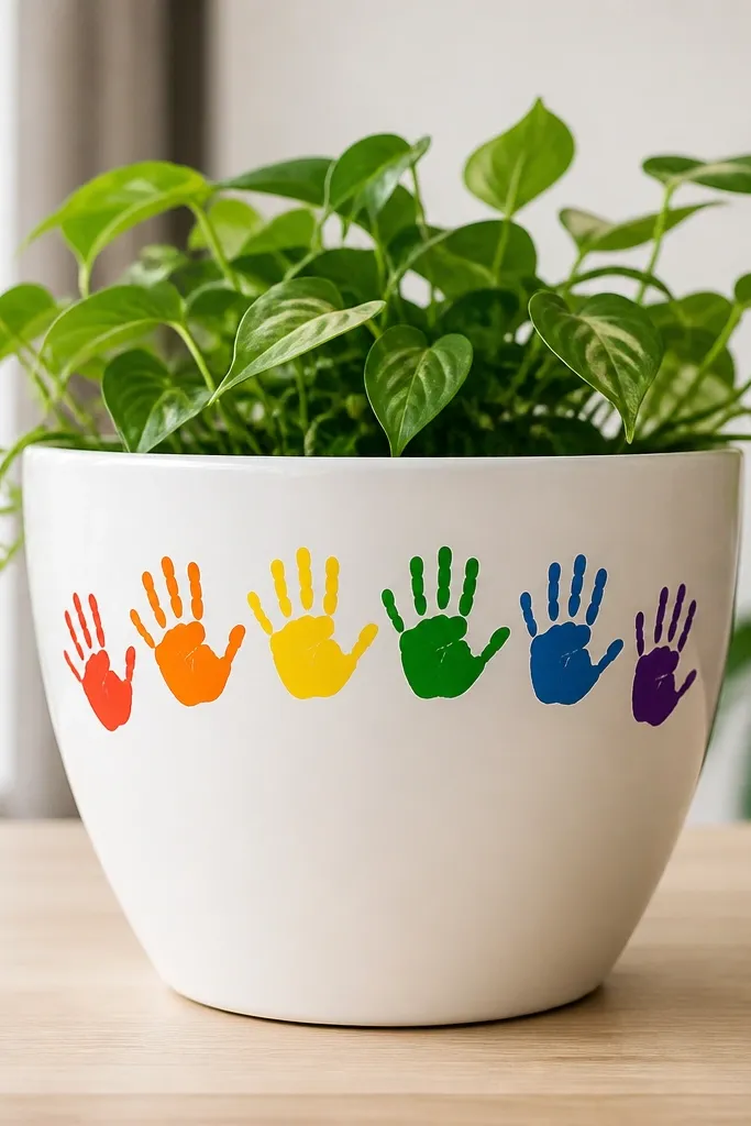
Handprints make a pot personal and they look good even when kids press a little unevenly. I do this on white because the colors stay bright and the prints look like artwork. It flatters kids' plants like strawberries or small succulents because it turns the pot into a keepsake. Keep the handprints grouped — too scattered makes it look chaotic.
Prime and paint the pot white. Use washable acrylic for the first pass if you want easy cleanup while you’re testing, then seal later with outdoor clear coat. Mix red, orange, yellow, green, and blue paint and press child-safe handprints on a sheet of paper first to see pressure. Press each hand onto the pot lightly and evenly, then repeat until you form a rainbow arc. Let dry 24 hours, then seal carefully in thin coats.
Use a damp paper towel to wipe paint smudges right after printing so the edges stay clean.
Skipping full drying time before sealing — it smears under clear coat.
30. Cactus Stripes + Tiny Spines
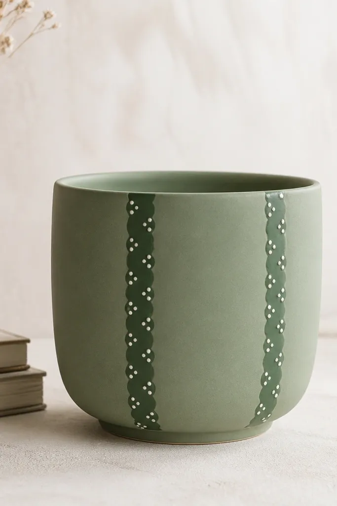
This is a cute desert vibe that works year-round. Vertical stripes elongate the pot, and the tiny white dots read like spines without needing intricate drawing. Sage green looks calming and pairs with bright succulents or any plant with fine texture. It also hides chips because the stripe pattern breaks up surface damage.
Prime and paint the pot sage green. Add two or three darker green vertical stripes using painter’s tape as guides — tape width about 1 inch for medium pots. Paint over the stripes, remove tape, and let it dry. Then use a small dotting tool or toothpick to place tiny white dot clusters along the stripes. Add one simple cactus arm shape on one side if you want more personality. Seal with matte clear so the cactus looks soft, not glossy.
Dot clusters should be small and uneven; perfect spacing looks fake.
Overpainting the dots — too many white marks turn into a chalky blob.