
1. Sunrise Gradient with a Tiny Dotted Horizon
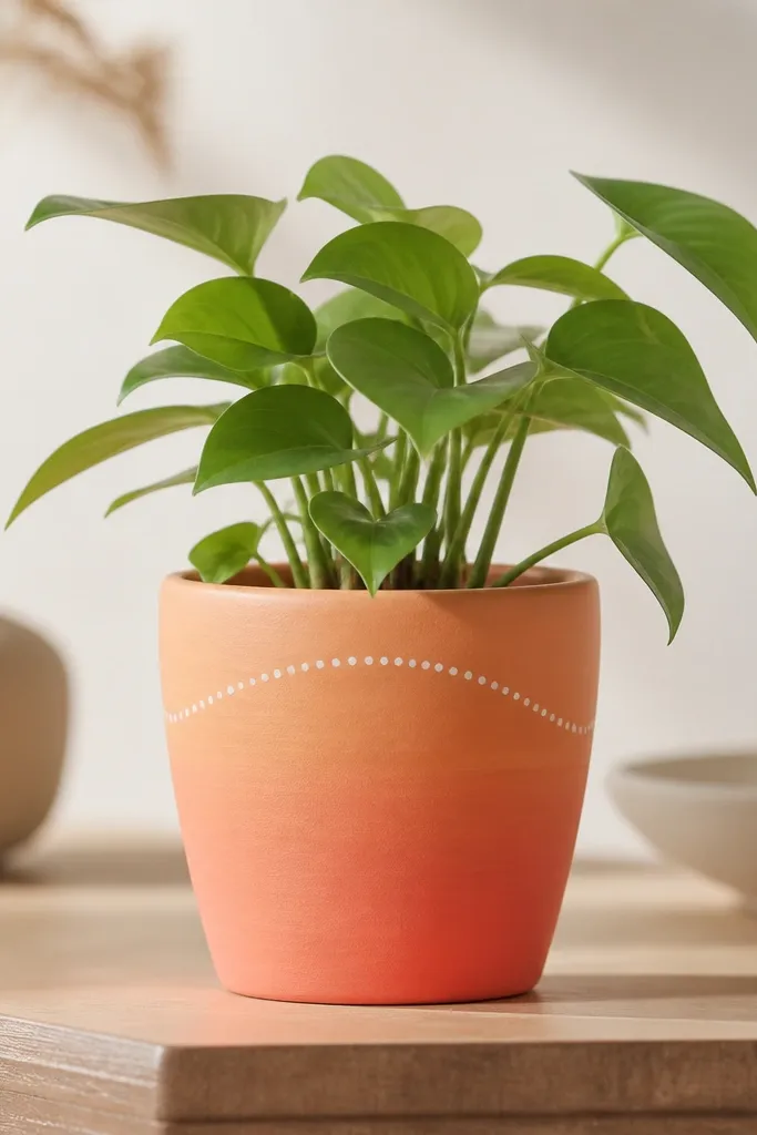
This one makes a small pot feel like a window view. I use peach, coral, and a thin wash of pale yellow near the top so the curve looks like it’s glowing. The tiny dotted horizon keeps it playful and readable from across the room. It flatters light interiors because the warm tones bounce off white walls and pale wood shelves. On darker skin tones or warmer decor palettes, the coral pops without looking harsh.
Start by priming and letting it dry fully, then paint a smooth ombre band from the bottom using peach and blend upward with coral. When the gradient is dry to the touch, add a thin arc near the top with watered-down white paint. Finally, tap a small round brush or dotting tool to place dots along that arc — keep the dots consistent size so they look intentional. Seal with a matte or satin clear coat after everything cures.
Pro tipUse a makeup sponge for the gradient blend; it grabs the acrylic and smooths transitions fast.
AvoidDon’t outline the horizon with thick lines — it looks like a sticker on a small pot.
2. Black Cat Face on a Cream Pot
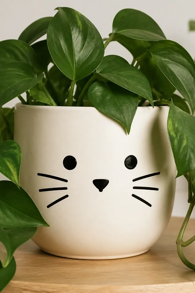
This is the fastest way I’ve found to make a pot look cute without tons of detail. A cream base makes the black lines look clean, and you can keep the cat face centered so it reads clearly. It works great for kids' rooms because it’s friendly and graphic, not spooky. I like it most with a small trailing plant so the leaves look like “hair” around the face. It also looks good against gray walls because the cream warms everything up.
Paint the pot cream and let it dry completely, then use a pencil lightly to mark where the eyes sit on the curve. Paint two round black eyes, then add a tiny triangle nose in the same black. Draw two short whisker strokes each side with a striping brush, and finish with a small curved mouth. Seal with satin top coat so the face doesn’t scuff when you move the pot.
If the cat face feels too hard freehand, print a tiny reference and lightly transfer the eye positions with a pencil grid.
Skip tiny pupils — they smear when the curve stretches your line.
3. Tropical Leaf Wrap with Emerald and Teal
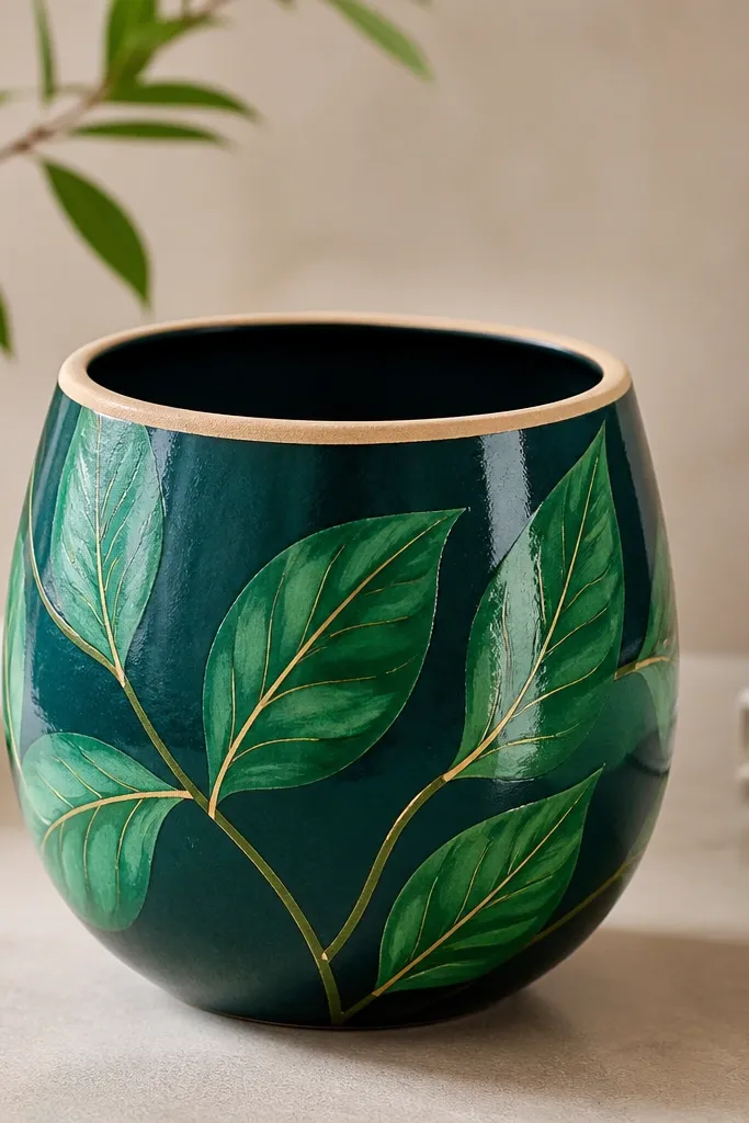
Leaf art makes small pots feel lush even when the plant is still small. I paint a deep teal base, then layer emerald leaves that follow the pot’s round shape — the result looks like a fabric pattern. Adding a few thin yellow veins keeps it from looking flat. This is a strong choice for bright rooms because teal and green bounce light and make the plant look fuller. It also pairs well with brass or gold frames because the yellow veins echo that warmth.
Prime the pot, then paint the full outside deep teal and let it dry. Sketch three leaf shapes around the pot using light pencil arcs, then paint each leaf in emerald, one at a time. Add veins with a thin brush: start from the center stem and pull lines outward, leaving some space so it doesn’t get muddy. Finish by outlining a couple leaf edges with a darker teal for definition, then seal with satin top coat.
Pro tipPaint leaves in a slightly different angle each one so they don’t look stamped.
AvoidDon’t fill every inch with leaves — letting the teal show looks cleaner on small surfaces.
4. Pastel Polka Dots in a Two-Size Pattern
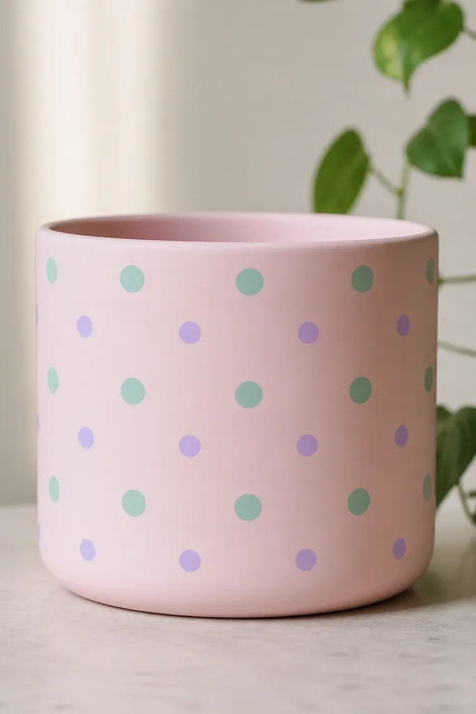
Polka dots are forgiving, and the two-size approach looks intentional on a small pot. I use blush pink as the base because it makes mint and lavender look soft instead of loud. The larger dots give you the main rhythm, and the smaller dots fill gaps without clutter. This style works well for nurseries and small apartments because it reads cheerful without needing extra decor. It also looks great with white planters and light wood shelves.
Paint the pot blush pink and let it dry fully. Use painter’s tape as a guide to lightly mark horizontal bands, then place large mint dots in each band using a dotting tool. Add smaller lavender dots in the gaps between large dots. Keep dot spacing consistent by reloading the brush lightly so each dot lands the same size. Seal with matte top coat to avoid shine.
Pro tipIf you’re off by one dot, wipe it while the paint is still wet — don’t try to cover later, the curve shows layers.
AvoidAvoid random dot sizes all over — it looks messy on a small round shape.
5. Navy Stripes with a Chalky White Center Band
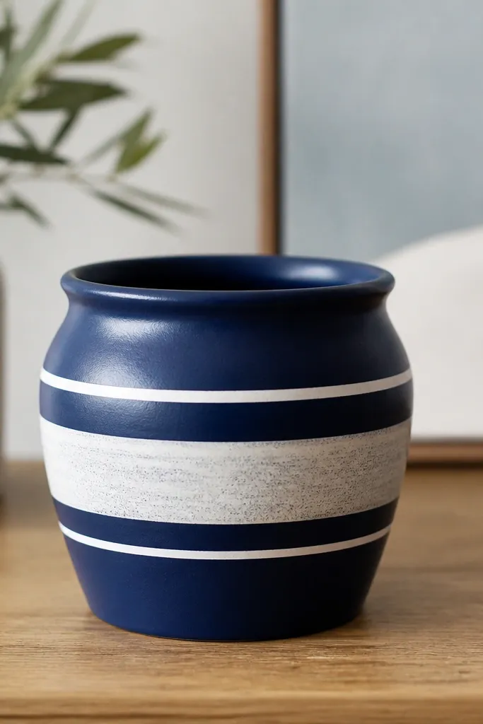
This is the cleanest “grown-up” option on the list. Navy + chalky white looks sharp in offices, dorms, and minimalist shelves. The wider center band makes the pot look taller, which helps when the plant is short. I like this with a pothos or small succulent because the plant’s texture sits nicely against the graphic paint. It also looks good on warm beige walls because the white band adds contrast without needing bright colors.
Prime, then paint the whole pot navy and let it dry. Use painter’s tape to mask a wide center band and two narrow bands above and below, leaving navy visible in between. Paint the masked areas with chalky white acrylic (or mix white with a touch of gray for a softer look). Peel tape while the paint is slightly tacky so edges stay crisp. Seal with satin top coat once dry.
Press tape down firmly along the curve using your thumbnail so paint doesn’t bleed underneath.
Don’t use glossy white — it reflects light and makes the stripes look like a sticker.
6. Terracotta Base with Hand-Drawn Watercolor Dots
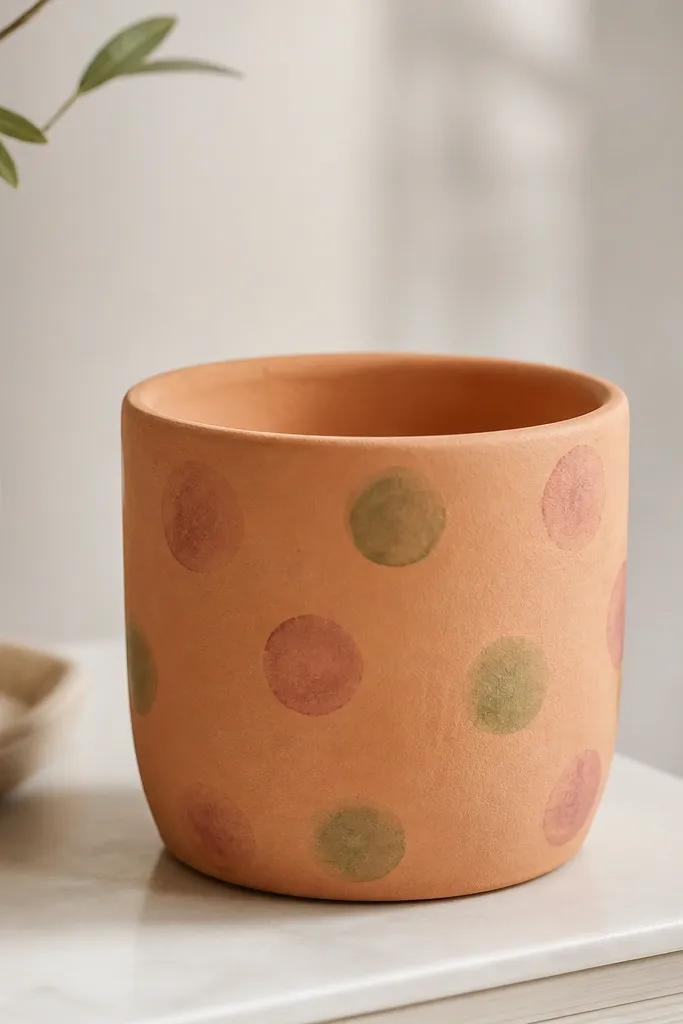
Leaving the terracotta visible makes the pot look handmade and warm. The watercolor-style dots are lighter at the edges, so they don’t feel heavy on a small surface. I mix sage green with a little white and use dusty rose for contrast, then water the paint slightly so it blooms softly. This works best in cozy rooms with neutral rugs or light curtains. It also flatters plants with variegated leaves because the muted colors don’t compete.
Clean the pot, then lightly sand so paint grips. Don’t fully cover; instead, prime only if you want extra adhesion, then apply watercolor dots directly on top of terracotta. Use a round brush and water down paint so each dot has a soft edge; place dots around the upper half first, then add a few lower dots sparingly. Let it dry between colors so the rose doesn’t turn into brown. Seal with matte clear coat to keep the watercolor texture from turning shiny.
Pro tipDo your dots in clusters — three to five dots together — for a more styled look than single dots everywhere.
AvoidDon’t outline the dots with solid color — it kills the watercolor effect.
7. Rainbow Arc Stripes with Off-White Background
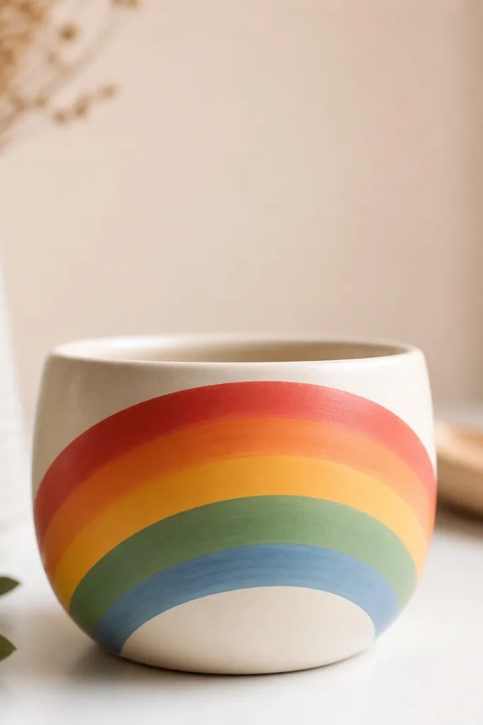
Arc stripes wrap perfectly around small pots because the curve helps the arcs look natural. An off-white base keeps the rainbow from getting too loud, and the stripes stay readable even at a distance. This is the kind of pot that makes a kid’s playroom look brighter without adding clutter. I love it on a shelf where the pot is seen from the side — the arcs follow the silhouette. It also works in kitchens with white tile because off-white blends while the rainbow adds fun.
Paint the pot off-white and let it dry. Lightly draw an arc line across the middle using pencil — then mask stripes with painter’s tape from that arc line outward. Paint each stripe one color at a time, using thin coats so edges stay smooth. When the last stripe is dry to touch, remove tape carefully and add a second coat only where needed. Seal with satin clear coat and let it cure fully before watering.
Pro tipUse thin tape (about 1/8 inch) for smoother rainbow edges on small pots.
AvoidDon’t pack on thick paint — it cracks as the pot flexes slightly when moved.
8. Monochrome Marble Swirl with Gray Veins
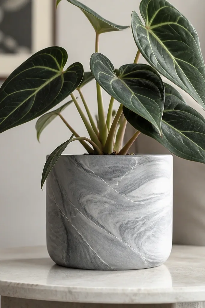
Marble paint looks expensive, but you can do it with simple acrylic layering. A light gray base plus darker gray swirls gives depth without busy colors. Thin white veins make it look like real stone, especially on small pots where the pattern stays tight. This one is great for a bedroom nightstand because it looks calm, not childish. It also pairs well with black pots or dark planters nearby.
Prime and paint the pot light gray. Mix a darker gray and splatter a few small blobs, then drag a dry brush through them to create swirl streaks. Add thin white lines by pulling a striping brush through the swirls at random angles. If you want more stone texture, dab a sponge lightly with darker gray around edges. Seal with satin clear coat for a smooth stone-like look.
Pro tipPractice the swirl on cardboard first so your brush pressure matches what you want on the pot curve.
AvoidSkip perfect symmetry — marble looks real because it’s messy.
9. Gold Foil Stars on Matte Black
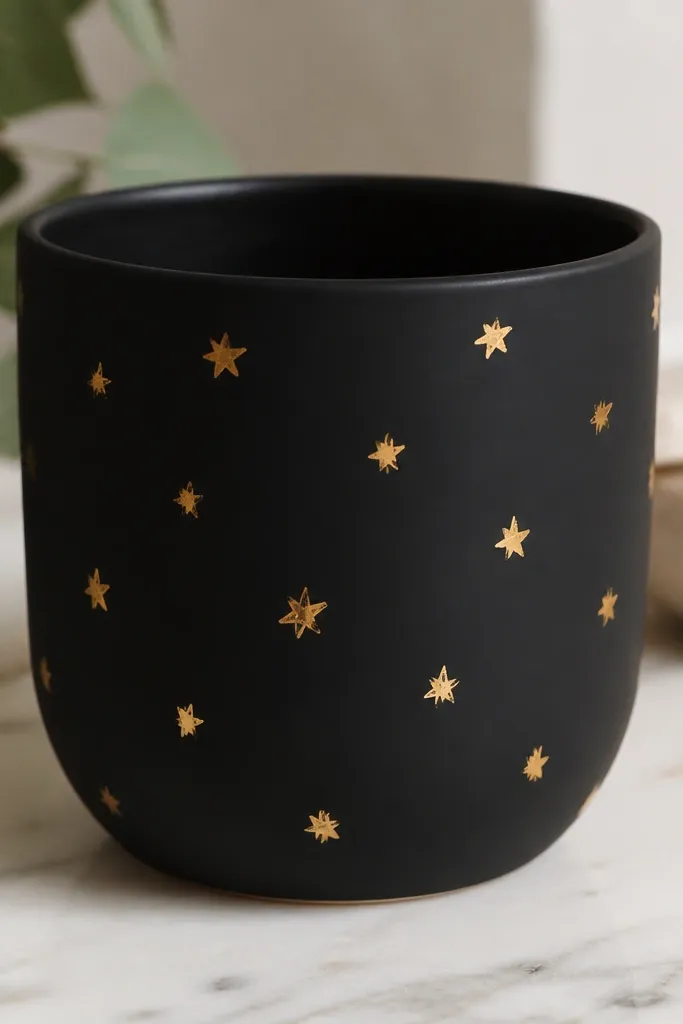
Matte black with gold stars makes a small pot look like it belongs in a grown-up shelf styling. It’s bold, but the stars keep it playful instead of gloomy. Gold foil catches light when you walk by, so the pot looks alive even when the plant is small. This is perfect for a teen room or a holiday corner year-round. I also like it with white planters because the contrast is crisp.
Prime, then paint the pot matte black in thin coats. Once dry, use a pencil to mark star positions lightly. Apply small pieces of gold foil using foil adhesive or press-on foil designed for crafts, then rub gently so edges stick. Add a few tiny dot accents with gold paint near the stars if you want more sparkle density. Seal carefully with a clear coat that won’t dull the foil too much, usually satin over foil.
Pro tipUse star stickers as a stencil: press, paint around, peel — you get clean shapes fast.
AvoidDon’t use liquid metallic paint everywhere — it looks streaky on small pots.
10. Color-Block Top Half with Bottom Fade
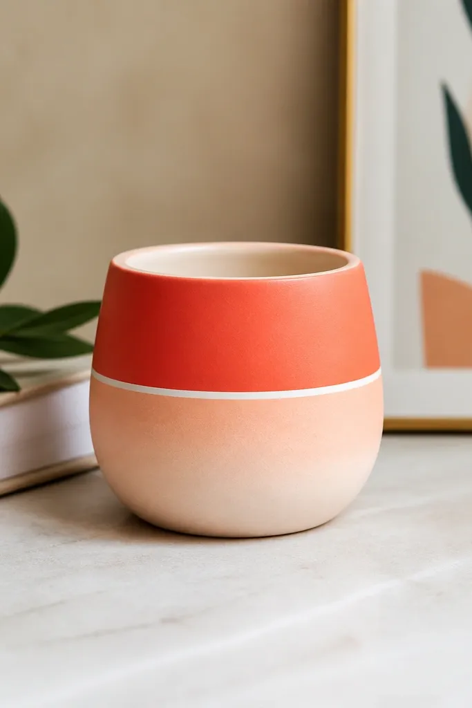
This design makes a small pot look taller and more structured. The top color blocks read as intentional geometry, and the bottom fade keeps it from looking too heavy. I use coral plus pale peach because the fade feels soft, not washed out. It’s a great choice for desks because the pot looks neat even when plants have uneven growth. It also works for kids since the blocks feel graphic and safe.
Prime the pot and paint a pale peach base first, then let it dry. Mask a top area where you want coral blocks, and paint two to three coral sections separated by thin white lines. After removing tape, blend the boundary between coral and peach with a dry brush so it doesn’t look like a hard step. Add a second coral coat only on the blocks if needed. Seal with satin clear coat for durability.
Plan your block widths before taping. On a 4-inch pot, aim for 1-inch-ish block widths so lines stay readable.
Don’t make the blocks too thin — narrow stripes on small pots look shaky.
11. Botanical Line Art with Olive Branches
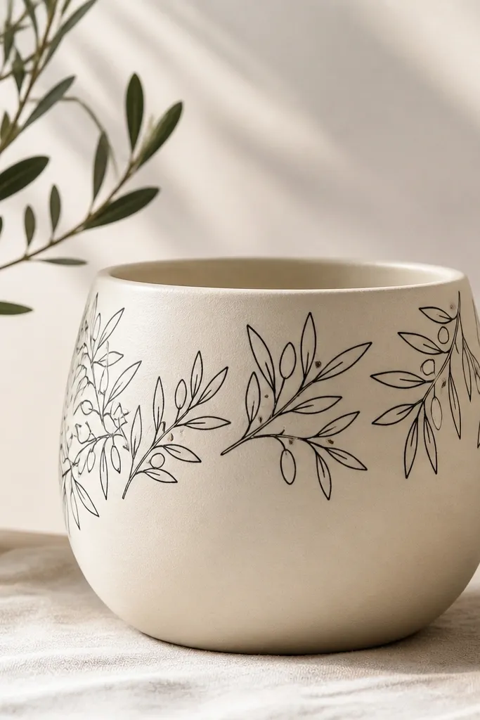
Fine-line botanical drawings look clean and grown-up, even on a tiny pot. A cream base gives you contrast, and black line art stays readable from across the room. Olive branches also work with lots of plant types — I’ve used it with basil starts and small succulents. It’s calm enough for a kitchen shelf, but still interesting. If your decor is mostly beige and white, this adds texture without adding color chaos.
Prime and paint the pot cream, then dry fully. Use a fine liner brush or a 00 brush to draw one branch curving around the top third. Add small leaf teardrops on each side, keeping them consistent size. Add a few dots for berries if you want, then lightly erase pencil marks after paint dries. Seal with matte clear coat so the line art doesn’t glare.
Pro tipHold your brush upright and draw from your elbow, not your wrist, for steadier line thickness.
AvoidDon’t use thick paint for line art — it looks like a cartoon marker on the curve.
12. Pastel Galaxy with Star Sprinkles
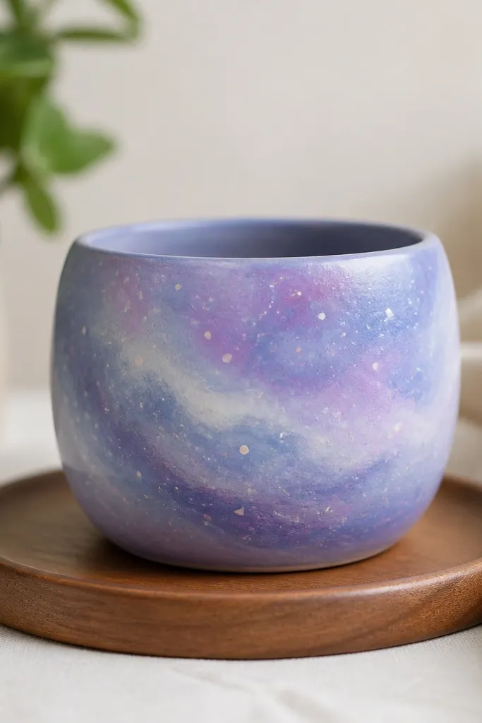
Galaxy pots look great on small stands because they add depth without needing a lot of space. Pastel galaxy works in kid rooms and also looks cute near a reading lamp. The key is keeping the colors blended and not too dark, so the plant stays the star. This one looks best with trailing plants because the leaves interact with the painted swirl. It also pairs well with light wood and white shelves.
Prime and paint a base in lavender, then blend in sky blue with a sponge in small patches. Add darker purple streaks by dabbing and lightly dragging with the sponge. Flick white paint with a toothbrush to create star sprinkles — cover the inside rim with tape so splatter stays outside. Add a few pink specks for contrast, then let it dry. Seal with satin clear coat and keep the top rim protected with tape during sealing.
Pro tipFlick from farther away for smaller stars; closer makes big blobs.
AvoidDon’t overdo the splatter — too many stars make the pot look dirty.
13. Terracotta Decoupage with Matching Napkins
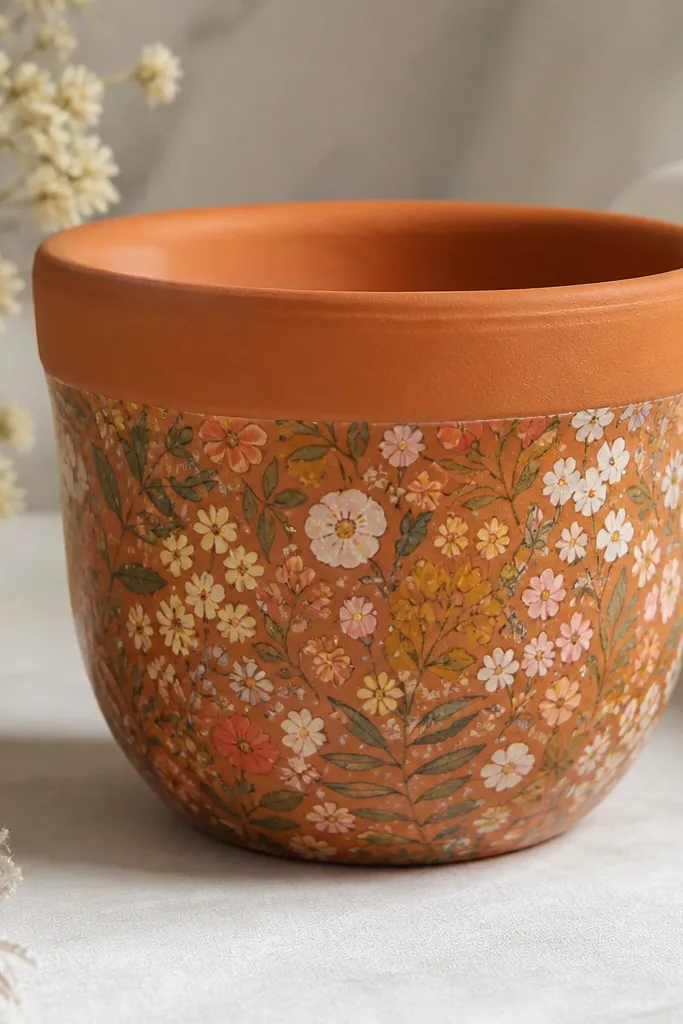
Decoupage is the easiest way to get a detailed pattern on a curved pot without freehand painting. I’ve used it with small floral napkins because the prints are already sized for crafts. The look is cozy and layered, and it hides minor paint imperfections. It’s great for budget decorating because you can use one leftover napkin instead of buying new supplies. This style also flatters warm decor — rattan, wicker, and wood shelves.
Clean and lightly sand the pot, then brush on a thin layer of decoupage medium or watered-down white glue. Cut napkin pieces so they fit the pot curve, and separate the top printed layer if needed. Lay the paper onto the pot and smooth from center outward with your fingers or a soft brush. Add another layer of decoupage medium over the top to seal the paper and prevent peeling. Let it dry overnight, then seal with a clear water-resistant top coat.
Overlap pieces slightly and hide seams around the pot’s curve so they disappear.
Avoid thick napkin sections — they wrinkle and show ridges after drying.
14. Geometric Triangles with a Single Accent Color
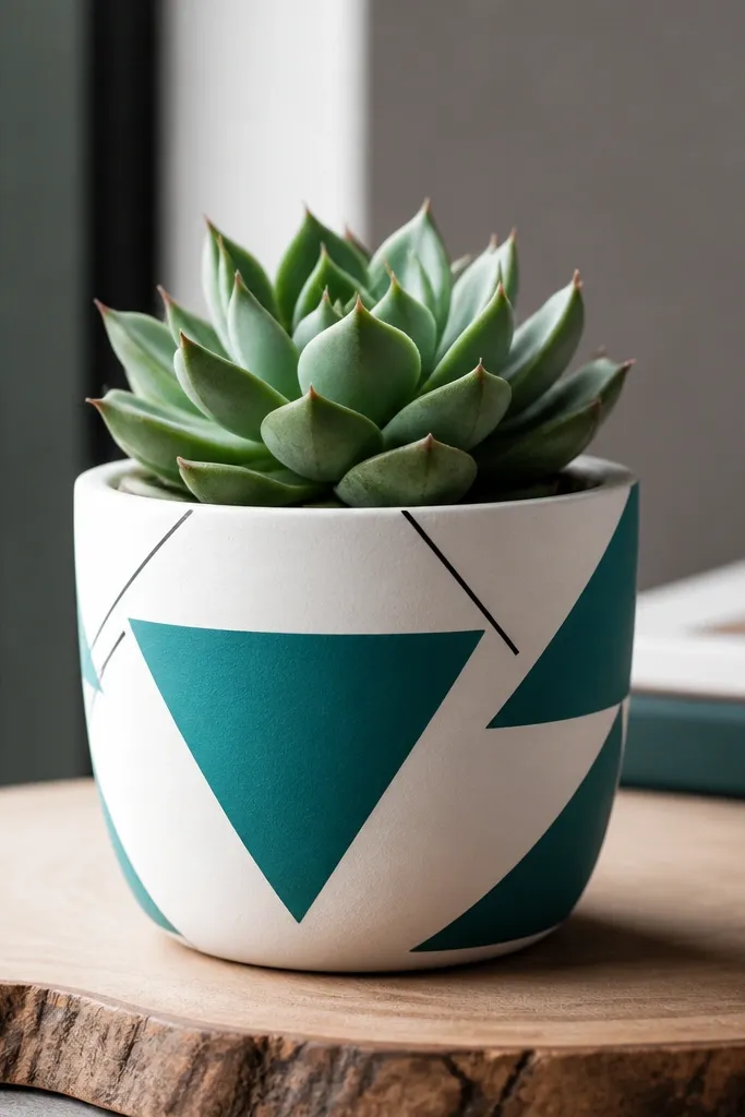
Geometric triangles look modern and they’re easy to control on a small round surface. I keep it to white base, one accent color, and a tiny black line so it looks designed, not random. The triangles create movement around the curve, which makes the plant look more intentional. This is a good fit for a minimalist shelf where you want color but not clutter. It also works well with modern planters like matte black metal stands.
Prime and paint the pot white, then dry. Use painter’s tape to mask triangle sections; on a small pot, aim for 5-7 triangles total, not dozens. Paint the triangles teal, then remove tape while paint is still slightly tacky. Add thin black lines along a couple triangle edges with a fine liner brush to sharpen the pattern. Seal with satin clear coat so the tape edges stay crisp.
Use a ruler for tape placement. Even a small pot benefits from straight angles.
Don’t paint triangle edges too thick — it blurs the geometry.
15. Ombre Bottom Half with White Top Fade
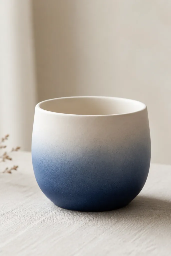
An ombre bottom half is the simplest way to make a small pot look high-end. The fade hides scuffs because the darker color sits lower where hands and saucers touch. I use a deep blue bottom and fade into white, which looks crisp and fresh in any room. This style flatters plants with long leaves because the pot’s gradient pulls attention downward. It also looks great in bathrooms where you want light color that still reads decorative.
Prime the pot and paint it white first, then dry. Tape a straight line about halfway up and paint the lower half deep blue. After the blue dries to touch, remove the tape and blend the boundary using a dry brush or sponge — feather upward into the white. Add a second blue coat only at the bottom for depth. Seal with matte clear coat so it doesn’t glare under lights.
Pro tipBlend in small circles with a sponge for a natural fade that matches the pot’s curve.
AvoidAvoid a hard line where tape ends — it looks like a craft cutout.
16. Candy Stripe Spiral Around the Pot
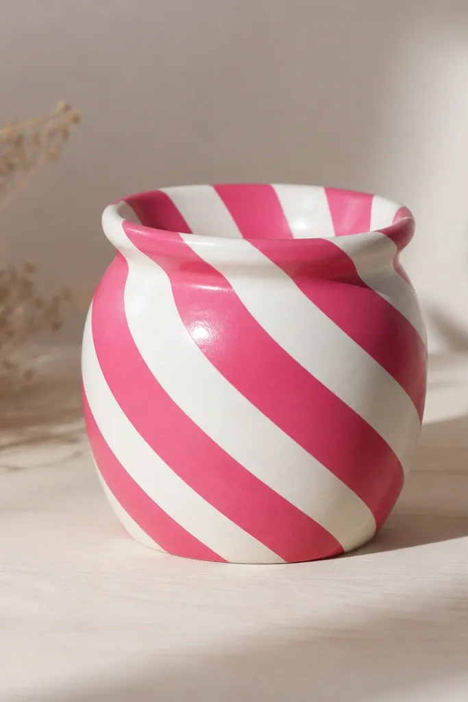
Spiral stripes look playful and they make a small pot feel like it’s moving. Hot pink and white are bold, but the clean spacing keeps it from looking chaotic. I like this when the plant has a simple shape like a small rosette or upright succulent because the pattern becomes the focal point. It’s perfect for a kids' room because it feels like a party theme. It also looks great in a hallway where you pass by quickly.
Prime and paint the pot white, then let it dry. Lightly mark a spiral guide line with pencil using a string or by tracing around the pot while rotating it. Mask stripes using thin painter’s tape, following the spiral guide, and paint hot pink in thin coats. Remove tape carefully, then touch up any gaps with a small brush. Seal with satin clear coat and let it cure fully before watering.
Rotate the pot while you tape so your spiral stays even — don’t try to tape it all in one position.
Don’t make the stripes uneven width. One wide stripe makes the whole spiral look off.
17. Monochrome Checkers in Soft Gray
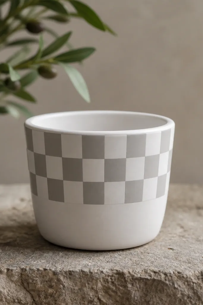
Checker patterns make small pots feel like mini decor objects. Soft gray on white looks modern and calm, not childish, and it works with any plant. Because the pattern is monochrome, it doesn’t fight with colorful leaves. I’ve used it in a home office where everything else is neutral, and it still adds personality. It also looks good on light skin tones and warm wood furniture because the palette stays balanced.
Prime and paint the pot white, then dry. Use painter’s tape to create a grid for the top half only; on a small pot, keep it to 2-3 rows of squares so it stays readable. Paint the exposed squares soft gray, then remove tape while paint is tacky. If the curve makes a seam look off, adjust by trimming one edge with a small brush instead of repainting everything. Seal with matte clear coat for a smooth, even finish.
Mark the grid lightly with pencil first so tape lines land where you expect.
Skip tiny squares — they blur on a round pot and look like smudges.
18. Coastal Waves with Seafoam and Sky Blue
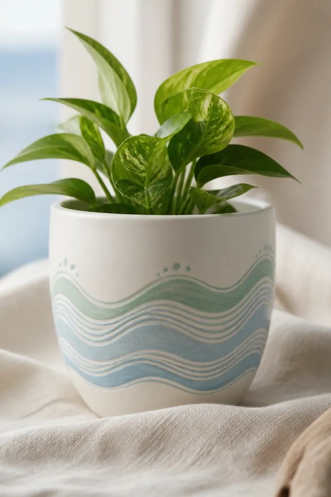
Wave lines make a small pot feel relaxing, and the layered look gives texture even before the plant grows in. White base keeps it airy, and seafoam plus sky blue create that coastal vibe without turning into beach clutter. I like it for kitchens and bathrooms because it looks clean and fresh. It also frames green leaves nicely, so the plant looks brighter. This style flatters both bright and neutral decor because the colors are soft.
Prime and paint the pot white, then draw two or three wave bands across the middle using pencil. Paint the top wave band seafoam, then add a second band sky blue slightly lower. Use a small liner brush to draw wave crests and add tiny dots where foam would be. Keep the wave lines spaced so the plant pot still has breathing room. Seal with satin clear coat and let it cure before watering.
Pro tipUse a thin brush and reload less paint. Lighter, thinner lines look more like waves than thick paint.
AvoidDon’t outline every wave crest. Too many thick foam dots make it look like bubbles.
19. Retro Sunburst with Orange Rays
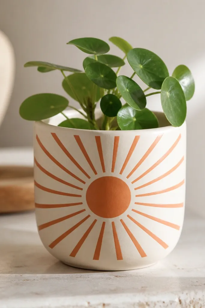
Sunbursts look great on small pots because you can keep the design centered and still get impact. I use cream for the background and a warm orange that doesn’t go neon. The ray spacing makes it feel retro without being childish. It’s a strong choice for a small corner shelf because the pot reads like artwork even when the plant is tiny. It also works well with warm metals like copper or brass.
Prime and paint the pot cream, then dry. Draw a circle near the center using a cup rim or a small stencil. Mask rays with painter’s tape radiating from the circle — I do 10-12 rays on a 4-inch pot so it stays balanced. Paint rays orange, then remove tape to reveal clean lines. Add a thin darker orange ring inside the center circle for depth. Seal with satin clear coat.
Press tape down at the center circle first. That’s where most bleed happens on curves.
Skip too many rays. Overcrowding makes the sunburst look like a fuzzy halo.
20. Matte Green with White Chevron Border
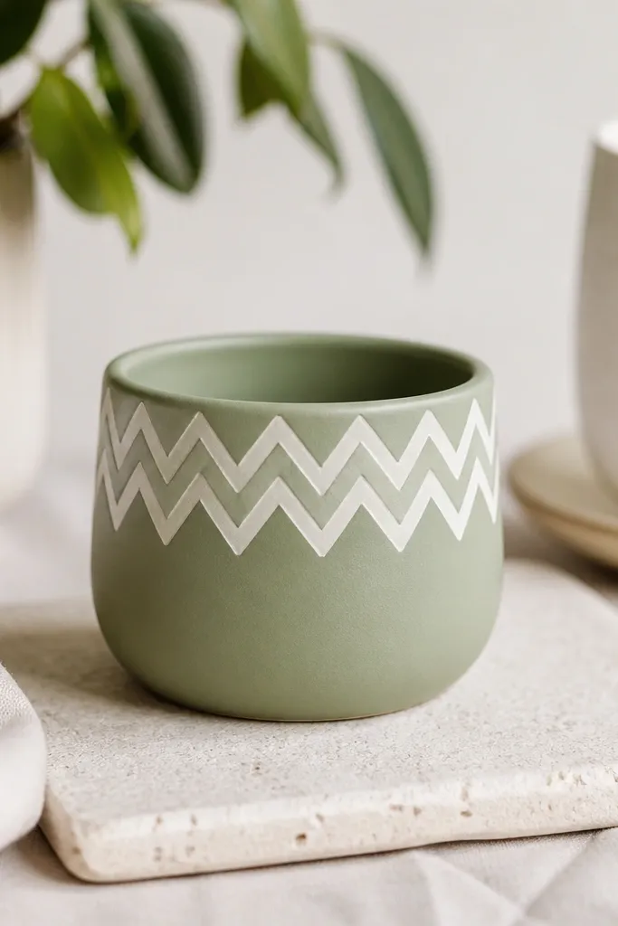
Chevron borders make the pot look tailored, like it has trim. Sage green is forgiving and calm, and the white chevrons add structure without loud color. I like it for small plants on desks because the pattern stays neat even when you’re moving the pot. It also looks good in living rooms with patterned pillows because it repeats a geometric vibe. This style is also friendly for kids since the shapes are simple and bold.
Prime and paint the pot matte sage green, let it dry fully. Mask a horizontal band across the upper half with painter’s tape, then draw or tape chevrons within that band. Paint white over the chevron areas, then remove tape carefully while paint is tacky. Add a tiny black dot at the center of a couple chevrons if you want extra definition. Seal with matte clear coat, especially around the band edges.
Pro tipIf tape chevrons fight the curve, draw them with a pencil first and paint freehand over the pencil lines.
AvoidDon’t use glossy top coat — it makes matte green look uneven.