
1. Ivory-mat grid with one 5x7 hero
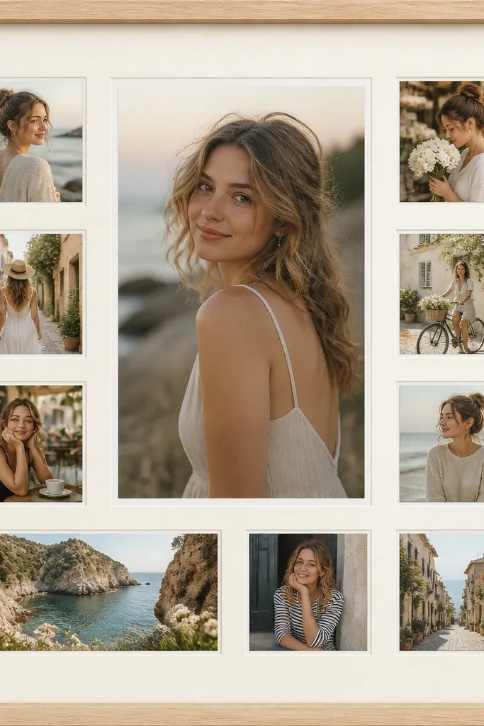
This layout looks expensive because it’s disciplined. The larger hero photo gives you a focal point, and the thin white borders keep everything aligned like a print shop wall set. I’ve used this with family portraits where skin tones can get washed out — ivory matting makes them warmer without adding orange. It also works well for kids because you can include more moments without the wall looking busy. The styling principle is one hero size, one border width, and consistent spacing.
Start with a 12x18 or 16x20 frame opening and choose one mat color — I recommend warm ivory. Print your hero at 5x7 and resize the rest so they fit a grid with equal gaps; aim for 0.5 inches between photos. Add a 1/8-inch white border around each photo by editing them with a white stroke or border in your design app. Lay everything dry on the mat first, measure the outer margin (I use 1.25 inches to the edge), then mount with photo corners or thin double-sided tape. Finally, close it with the frame so the edges look crisp instead of taped.
Use matte photo prints even if your originals are glossy — matte makes a collage look like it came from a lab.
Don’t mix thick and thin borders — that’s what makes it look like a school project.
2. Monochrome gallery wall with matching black frames
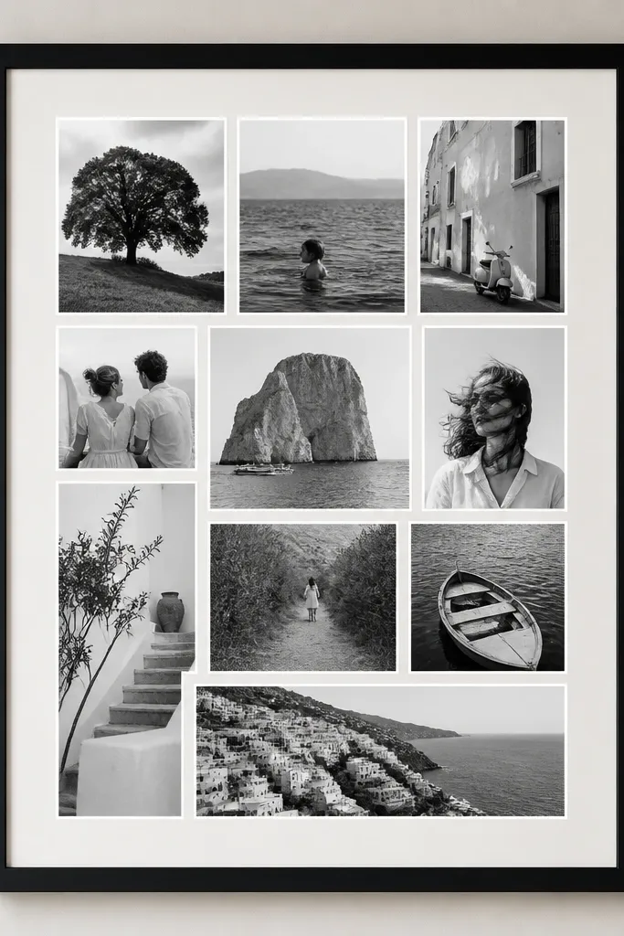
Keeping everything in one color family instantly reads more expensive. When all images are black-and-white (or edited to the same cool tone), the collage stops fighting itself. I did this for a grandparent wall using 10 photos — the wall looked cohesive even though the backgrounds were different. It’s flattering for people because faces look clean and contrasty instead of hazy. The styling principle is color consistency first, layout second.
Start by converting your photos to black-and-white with a consistent contrast level (don’t let some images be flat grey). Choose a single frame color — matte black looks sharp against warm neutrals. Use a design grid with 0.4 to 0.6 inch spacing between prints and keep borders identical. Print on matte paper, then add a thin white mat strip around each photo so edges pop. Mount the collage inside the frame opening so there’s no exposed tape. Keep the hero photo slightly larger by one step (for example 5x7 hero with 4x6 minis).
If you have one photo with a face in strong shadows, lighten it slightly so the whole set has similar brightness.
Skip random colored photos — mixed tones make the wall feel accidental.
3. Cream scrapbook base with faux torn-edge strip
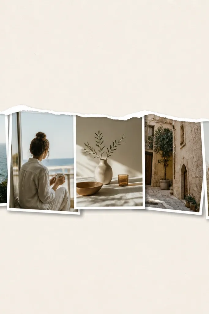
Start with a cream cardstock backing (12x18 works great). Choose 6 to 8 photos and crop them to a consistent height for the strip. In your design app, add a torn-edge effect to a rectangle mask, then print that strip as a guide on the same cream paper or a slightly darker cream. Glue the strip down first, then mount each photo with a small gap — 0.25 to 0.35 inch. Add a thin white border and a tiny shadow by using a 3D effect in editing or by mounting on a slightly raised adhesive sheet. Finish by sealing the edges with a thin layer of spray adhesive so nothing curls.
This one looks expensive because it has a designed “imperfection.” The faux torn edge adds texture and makes the collage feel like a gallery piece, not a straight grid. I’ve used it for kids' milestones because it turns a bunch of snapshots into a story band. Cream cardstock keeps it warm and avoids the harshness of bright white. It also flatters most home styles because the color stays neutral and calm. The styling principle is one textured element plus clean photo borders.
AvoidDon’t scatter the photos — the torn strip should be the only “movement.”
Pro tipUse a paper cutter for straight edges and only tear one edge — the clean contrast is what makes it look intentional.
4. Floating photo frames look with foam board layers
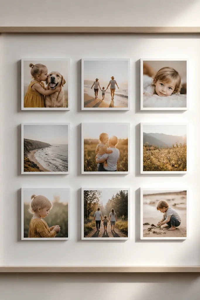
Cut foam board rectangles to match your photo sizes plus a 1/2-inch border. Mount each photo onto its foam layer using photo glue or double-sided adhesive tape, keeping the photo centered. Use a single foam thickness across all photos — I like 1/4 inch for a noticeable shadow. Lay them out inside a larger frame opening with consistent 0.3 to 0.5 inch gaps. Test the height so the frame glass doesn’t press on the photos. Once you like the spacing, glue or tape the foam layers down to the backing board.
Foam board layering creates that expensive “floating print” look you see in boutiques. It adds depth without needing heavy decor, and the shadow gives your photos separation even when you keep tight spacing. I’ve built this for my own wall using 9 photos — it made the whole piece feel more dimensional than any flat collage. It’s flattering for busy photos because the depth reduces the visual clutter. The styling principle is controlled depth: one foam thickness, consistent borders, and centered mounts.
AvoidSkip thick random foam stacks — uneven depth makes it look messy.
Pro tipUse a ruler and a light pencil grid on the backing — floating layouts show crooked alignment fast.
5. Vertical story line with 3 tall panels

Pick a frame size like 18x24. Divide it into three columns with measurements: left 5 inches wide, middle 6.5 inches, right 5 inches (adjust to your frame). Put your hero photo in the top of the middle column, then stack 3 to 4 smaller photos below it with equal gaps of about 0.25 to 0.35 inch. Add thin white borders to every photo so the stacks look like prints, not cutouts. Mount the columns one at a time — left column first, then middle, then right — so you don’t lose alignment. Finish with a crisp matte backing and keep the outer margin even on all sides.
This layout reads like a story because your eye moves in one direction. Three vertical panels create a rhythm that feels intentional, and the wider center column gives you a natural focal point. I used this for a kid’s first-year photos and it looked like a curated timeline instead of random pictures. It’s great for people who hate clutter because you keep the composition structured. The styling principle is vertical alignment and one “column emphasis.”
AvoidDon’t mix portrait and landscape randomly inside a column — it breaks the rhythm.
Pro tipChoose photos with a similar crop style (close-up faces or similar framing) so the columns feel cohesive.
6. Polaroid-style stack with consistent shadow
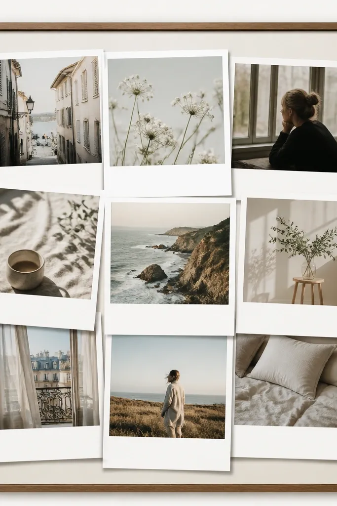
Start by choosing one Polaroid size for everything, like 3x4.5 with a 0.75-inch white caption strip. In your design app, create a template so every photo has the same white top border and the same bottom strip height. Print on matte paper so the white borders look crisp. Arrange the stack in a cluster inside a frame opening, overlapping by about 0.25 to 0.4 inch each time. Add a subtle gray shadow by using a drop shadow effect in the template or by mounting onto a slightly darker backing strip. Mount with photo tape so the overlaps don’t lift.
Polaroid-style prints look expensive when they’re consistent. The trick is not the “retro” vibe — it’s the uniform drop shadow and spacing. I made a set for a teenager’s room with 14 photos and it looked like a designer did it because the edges were aligned and the shadows matched. It’s flattering in a kid or teen space because it feels playful but still clean. The styling principle is controlled overlap: small, even overlaps and one paper color.
AvoidDon’t use random sizes like 2x3 and 4x6 together — it stops looking intentional.
Pro tipUse matte photo prints and clean scissors — rough cuts show instantly in the white borders.
7. Half-and-half split with a color wash photo

This looks expensive because it uses a strong composition rule: split, then emphasize. The bottom color-wash photo acts like a print with a background tint, and it makes the collage feel styled instead of assembled. I used this for a couple anniversary with one hero photo edited with a subtle warm overlay — it looked like a premium art print. It flatters most rooms because the wash color can match your sofa or wall trim. The styling principle is contrast between structured grid and one textured emphasis.
Pick a frame size like 16x20. Divide the backing into two zones: top grid and bottom hero area. Top zone: use 6 to 8 photos in a tight grid with 0.4 inch gaps and thin white borders. Bottom zone: place one large photo around 10x12 and add a soft color wash behind it in the editing step (light peach or dusty rose works well). Print the wash as part of the image so it doesn’t look like a separate sticker. Mount the top grid flat, then mount the hero photo slightly raised with foam tape for depth.
Match the wash color to one existing color in the room (like brass, terracotta, or sage) so it feels connected.
Don’t put two heroes — one hero keeps it from looking like chaos.
8. Single-line contact sheet with tiny captions
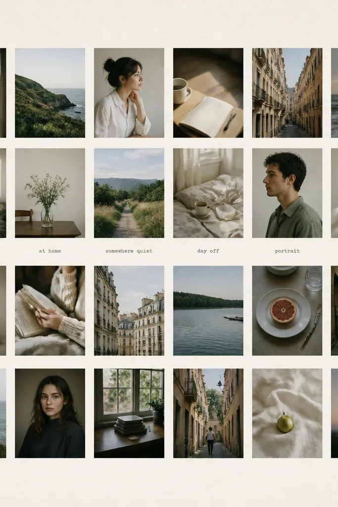
Contact sheet layouts look expensive because they mimic how photographers present work. The small photos read as a curated set, and the off-white backing makes everything feel intentional. I used a 20-photo contact sheet for my daughter’s school year and it looked like printed art instead of a scrapbook page. It’s great when you have lots of small moments and want them contained. The styling principle is tight grid + consistent print size.
Choose a backing size like 11x14 or 12x16. Resize all photos to the same aspect ratio, then crop so faces stay visible. Create a grid with consistent margins: I use 0.1 inch between tiny photos if printing crisp, and 0.3 inch outer margins. Add tiny caption text only to 3 to 5 photos, placed at the same spot under each caption area. Print on matte photo paper, then mount onto thick cardstock. Frame it with glass so it looks like a real print display.
Use a simple font and keep captions short: dates or locations only.
Don’t leave random blank space in the grid — fill the sheet evenly.
9. Waves of photos with curved alignment

Start by choosing 10 to 14 photos and decide one repeating width for each (for example, 3.5 inches wide for all photos). In your design app, use a curved path guide to place photos along a wave. Keep gaps between photos equal at about 0.25 to 0.4 inch. Alternate portrait and landscape but keep the same width so the wave has a smooth look. Print with thin white borders and matte paper. Mount along your curve marks on the backing so the wave stays even when viewed from across the room.
This layout looks expensive because it breaks the grid without losing control. A gentle wave pattern makes the collage feel like art, and the consistent spacing keeps it from looking random. I used this for a beach house wall and the wave motion matched the vibe immediately. It’s flattering because your eye flows naturally, which hides uneven photo quality. The styling principle is one curve, one border, and repeating photo widths.
AvoidDon’t rotate every photo at different angles — keep them level for a clean finish.
Pro tipIf your wave looks jagged, widen the curve by spacing photos farther apart vertically.
10. Corner cluster with oversized negative space
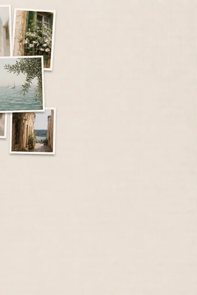
Negative space makes a collage look like design, not craft. When most of the frame is calm, your photos feel intentional and the whole piece looks higher-end. I’ve used corner clusters for family walls where the photos vary in background — the blank space reduces visual noise. It also works well for kids because you can include more photos without covering the whole wall. The styling principle is: cluster small, let space breathe, and keep borders consistent.
Pick a larger frame than you think you need, like 18x24 on a 3-4 photo cluster. Use 6 to 9 photos in the corner, with one hero photo in the middle of the cluster. Add consistent white borders (thin) around each photo and keep them mostly upright. Leave at least 4 inches of blank space between the cluster and the opposite edges. Mount photos using photo corners so the edges look neat. Frame it with a matte or thick backing so the blank area looks intentional, not empty.
Use one paper tone for the background — warm ivory makes the negative space feel soft.
Don’t cram the cluster against the edge — leave a real margin so it looks framed.
11. Two-tone mat with a thin color stripe
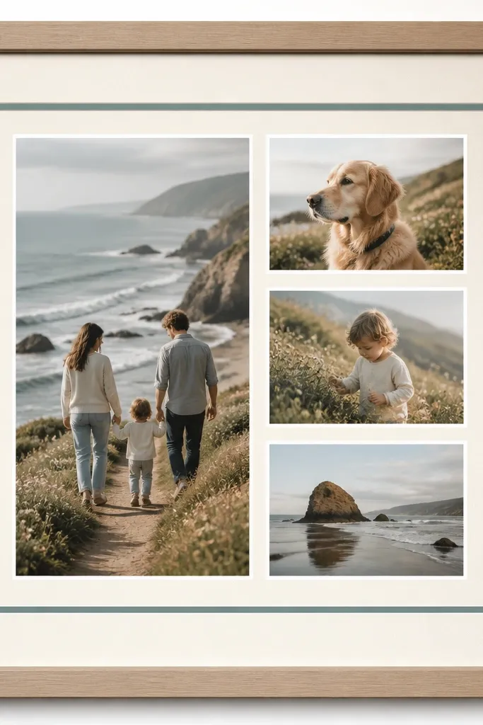
A thin stripe is a cheap way to look like a pro mat job. The stripe gives you a color highlight and makes the photos look like they’re floating inside a gallery mount. I’ve used muted teal and dusty rose stripes with family photos, and it always makes the piece feel more expensive than the materials cost. It’s flattering because the stripe adds a gentle pop without overpowering skin tones. The styling principle is one accent color and a precise mat stack.
Start with a frame that can take a double mat. Cut an outer mat in warm off-white and an inner mat in a slightly darker off-white or gray. Add a thin stripe layer in muted teal or dusty rose — 1/8 inch wide looks best. Place your photos with consistent spacing and thin white borders, then mount them on the inner mat. Use foam mounting tape under the hero photo only if you want a little depth. Keep everything centered so the stripe looks symmetrical.
Choose the stripe color from one detail in your hero photo (a shirt color, a wall color, a toy).
Don’t use a bright neon stripe — it makes the whole collage look like a craft sign.
12. Frame-within-a-frame border using printed paper

This looks expensive because it gives the collage a built-in boundary like a museum label. The printed border adds visual interest without touching the photos, which keeps the focus on your images. I used a tiny dot pattern border for a birthday collage and it looked surprisingly upscale behind glass. It’s flattering for kids photos because the pattern hides minor unevenness in cuts. The styling principle is: one subtle border pattern + clean photo spacing.
Pick a subtle border paper pattern you can print or buy as cardstock (tiny dots or very small gingham works). Create a rectangle window in your design app and print the border so it matches your frame opening. Mount the border first on the backing board, then place photos inside with equal spacing (0.4 inches is a good start). Add thin white borders around each photo so they read as prints. Use photo corners for clean edges and avoid glue smears inside the border. Frame with glass and a backing that’s the same color as the outer mat.
Keep the pattern small — if you can see the pattern clearly from two feet away, it’s too bold.
Don’t add extra embellishments on top of the border — the border does the work.
13. Diagonal runway layout with one centered anchor
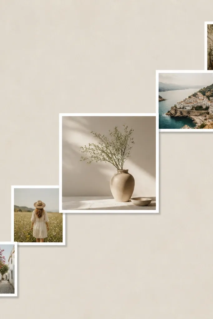
Choose 10 to 12 photos and decide one anchor size, like a 5x7 centered hero. Resize the remaining photos to a consistent width, like 4 inches wide, and keep them level (no random tilts). In your design app, place a diagonal guide line and align the top edges to that line. Keep gaps equal at 0.3 to 0.5 inches along the diagonal. Print matte photos with thin white borders, then mount following your guide marks on the backing. Finish by framing so the diagonal feels crisp against the straight frame edges.
Diagonal layouts look expensive when they’re controlled and repeat the same photo width. The diagonal runway creates movement, and the centered anchor keeps it from looking chaotic. I did this for a graduation wall using 11 photos, and it made the collage feel like an artwork rather than a timeline. It’s flattering because your eye follows the diagonal, which helps when some photos are less strong. The styling principle is one diagonal line + one anchor photo.
AvoidDon’t rotate individual photos — diagonal alignment should come from placement, not angles.
Pro tipIf the diagonal feels off, rotate the whole layout in small increments until it visually balances with the frame corners.
14. Rainbow-free warm neutrals with sepia set
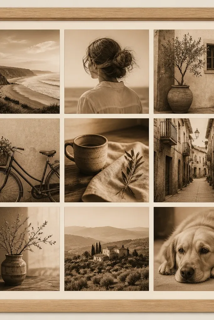
Sepia sets look expensive because they unify everything: lighting, skin tone, and background clutter. I’ve used sepia for older family photos and for kids' photos taken in mixed indoor light, and the collage looks cohesive right away. It’s flattering because it softens harsh shadows and reduces the “yellow/blue” mismatch you get from different cameras. The styling principle is one warm filter across the whole set.
Edit all photos to sepia using the same strength setting in your app, then keep contrast similar across the board. Choose a warm beige or cream border, not bright white. Build a grid layout with 9 to 16 photos and equal spacing of about 0.35 inches. Add a consistent border width (1/8 to 1/4 inch) around each photo. Print matte and mount on thick cardstock for a clean edge. Put it in a light wood frame so the warm tones feel intentional instead of vintage-random.
If one photo looks too dark, lighten it before sepia editing so it stays readable.
Don’t mix sepia with full-color photos — keep the filter consistent.
15. Pastel gradient mat behind the collage

Choose a gradient that matches your room — blush to pale blue or sage to cream are easy wins. In your design app, create a gradient rectangle the size of your backing and add a border margin around it. Place your photos in a grid with 0.4 inch gaps and thin white borders. Print the gradient backing on cardstock or print paper, then mount the photos on top. Use foam tape under the hero photo only to lift it slightly. Frame it with glass so the gradient looks smooth instead of banded.
A subtle gradient mat makes the collage feel like it belongs in a print shop. The photos sit on top and look more intentional because the background has a gentle color story. I used a blush-to-pale-blue gradient for a baby shower memory collage, and the room looked instantly pulled together. It’s flattering because the gradient is soft and doesn’t compete with faces. The styling principle is low-contrast background + clean photo borders.
AvoidDon’t use bright saturated gradients — they make the piece look like a poster.
Pro tipKeep the gradient very light — if you can see the gradient pattern clearly from far away, it’s too strong.
16. Black frame with white photo borders and thin gold line

Use a matte black frame with a deep inner lip if you have it. Create a mat in white or off-white and add a thin gold line sticker strip (1/8 inch or less) around the inside border. Arrange your photos in a grid with equal 0.4 inch spacing and thin white borders. Print matte photos so the gold doesn’t fight glossy reflections. Mount with photo corners or tape, and keep all photos level. Close behind glass so the gold line stays clean and doesn’t collect dust.
Gold accents read expensive fast, but only when they’re thin and controlled. The black frame plus white borders creates high contrast, and the gold line adds a luxe finish without turning into glitter craft. I used this for a holiday family collage and it looked polished even with simple phone photos. It’s flattering because the contrast makes faces pop and keeps the wall readable. The styling principle is high-contrast monochrome plus one gold detail.
AvoidDon’t add multiple gold elements — one line looks intentional, five lines look busy.
Pro tipUse metallic pen to trace a line only if your hand is steady — otherwise go with a pre-cut strip.
17. Kids year-in-review with 12 months labels
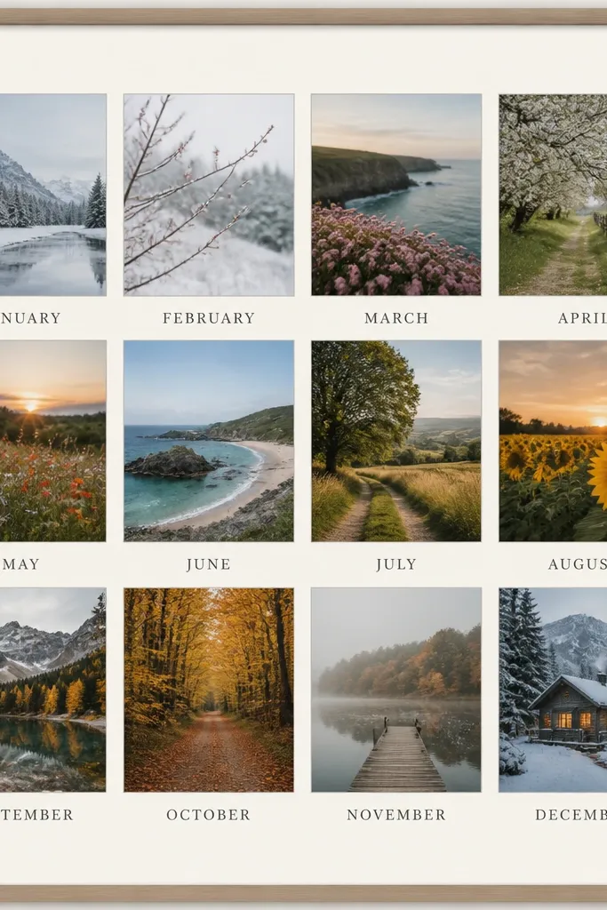
Pick 12 photos and crop them so they match a consistent aspect ratio, like 4x3 or 3x4.5. Create a layout grid with equal photo sizes, then add a text line under each photo for the month name (January, February, etc.). Keep spacing consistent: 0.3 to 0.4 inch between photos and 0.25 inch between photo and text. Print on matte paper and mount under an off-white mat. Use a simple font in your design app, like a clean sans serif, and keep the text color dark gray. Frame it with glass so the text stays crisp.
Month labels make a collage look like a designed product. They give your wall structure even if the photos vary in background and lighting. I made one for my nephew with 12 photos and it looked like a printed keepsake, not a DIY page. It’s flattering because captions help viewers understand what they’re seeing, especially from a distance. The styling principle is adding small, consistent text blocks under each image.
AvoidDon’t use different fonts — consistent typography is what makes it feel store-made.
Pro tipUse the same photo crop style for all months — either close-up faces or full-body, not a mix.
18. Overlapping semicircle layout

A semicircle arc looks expensive because it’s a shape-based design, not a random collage. The overlap creates depth and movement, and the consistent borders keep it clean. I used this for a birthday where the theme was “year of growth” and the curve made it feel like progress. It’s flattering because the arc naturally frames faces and pulls attention toward the center. The styling principle is one arc, one overlap amount, and a centered focal photo.
Choose a frame size like 16x20 and pick 9 to 13 photos. Resize all photos to the same width so the arc looks smooth. In your design app, create an arc guide and place the photos along it with overlaps of about 0.2 to 0.3 inch. Put your largest hero photo in the center of the arc. Print matte with white borders, then mount directly on the backing following your arc marks. Keep the background ivory or cream so the overlapping edges read clearly. Use a thin foam strip behind the outer photos if you want slightly more shadow.
Test the arc from across the room — if it looks lopsided from a distance, adjust now while it’s flat.
Don’t mix portrait widths — inconsistent widths make the arc look crooked.
19. Two-row zigzag with aligned edges
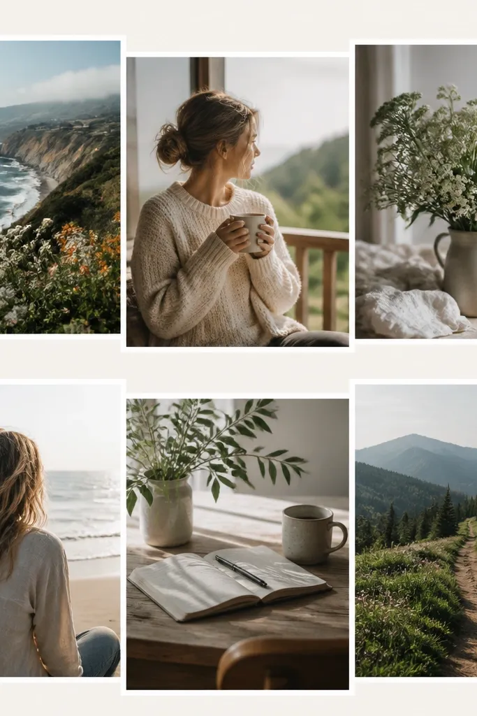
Pick an even number of photos, like 10 or 12, and create two rows on a 16x20 backing. Resize all photos to the same dimensions, like 4x6, and keep white borders consistent. Place row one left-to-right with 0.35 inch gaps. Place row two offset so the photos sit between the gaps of row one, creating a zigzag rhythm, but keep the top edges level. Print matte, mount on thick cardstock, and keep margins at least 1.25 inches from the outer edge. Frame with a simple black or wood frame so the design feels modern.
Zigzag layouts can look cheap if the edges don’t line up, but when they do, they look like modern print design. This works because you get movement without chaos: the photos slide in alternating positions while keeping one consistent row alignment. I used it for a kitchen wall with travel photos and it kept the wall lively but not cluttered. It’s flattering because it keeps faces readable — no photo gets crammed into a weird angle. The styling principle is alternating placement while maintaining straight alignment in each row.
AvoidDon’t rotate photos randomly — the zigzag should come from placement only.
Pro tipUse a paper grid on the backing — zigzags punish eyeballing.
20. Hero photo with 4 corner photos

Start with a frame opening around 16x20 or 18x24. Choose one hero photo size, like 8x10, and center it. Add four corner photos sized to match each other, like 4x6, leaving equal gaps of about 0.5 inches between corner photos and the center photo. Add thin white borders to every photo so edges look like prints. Mount the corners first on the backing using a ruler, then mount the hero photo last so you can fine-tune spacing. Use foam tape under the hero photo if you want a subtle lift.
This is the layout I use when someone says they want it to look expensive but they only have a few great photos. The central hero photo does the heavy lifting, and the four corners feel balanced and gallery-like. I used it for a wedding anniversary where only 5 photos mattered — it looked premium because the composition was strict. It’s flattering because the hero photo gets full attention, and corners frame the story without crowding. The styling principle is symmetry plus scale contrast.
AvoidDon’t add extra photos around the edges — five-photo symmetry looks intentional, extras look cluttered.
Pro tipPick corner photos that share a color theme with the hero (like all taken outdoors or all in similar lighting).
21. Film-strip style with perforation edges

Pick a dark backing color like charcoal or deep navy. Create a film-strip rectangle sized to your frame width, then set photos in a row with equal spacing and consistent sizes. Add faux perforation holes by drawing small circles along both sides in your design app, then print on thick paper. Print the strip and mount it onto the dark backing, centered. If you want extra polish, add a thin white line around each photo inside the strip. Frame it with glass so the dark backing looks smooth and the strip edges stay clean.
Film-strip layouts look expensive when the strip has a real “finished” edge. Perforation holes and a dark backing make it feel like a designed print, not a photo strip taped together. I used this for a dad’s office wall using 8 photos from a trip and it looked surprisingly high-end. It’s flattering because it keeps photos small but readable, and the dark background adds contrast. The styling principle is: one strip, consistent photo sizes, and a dark base for depth.
AvoidDon’t use a white background — film-strip style needs contrast to look like a real product.
Pro tipUse photos with similar contrast — film-strip layouts show differences more than grids do.
22. Matte black backing with white cutout windows
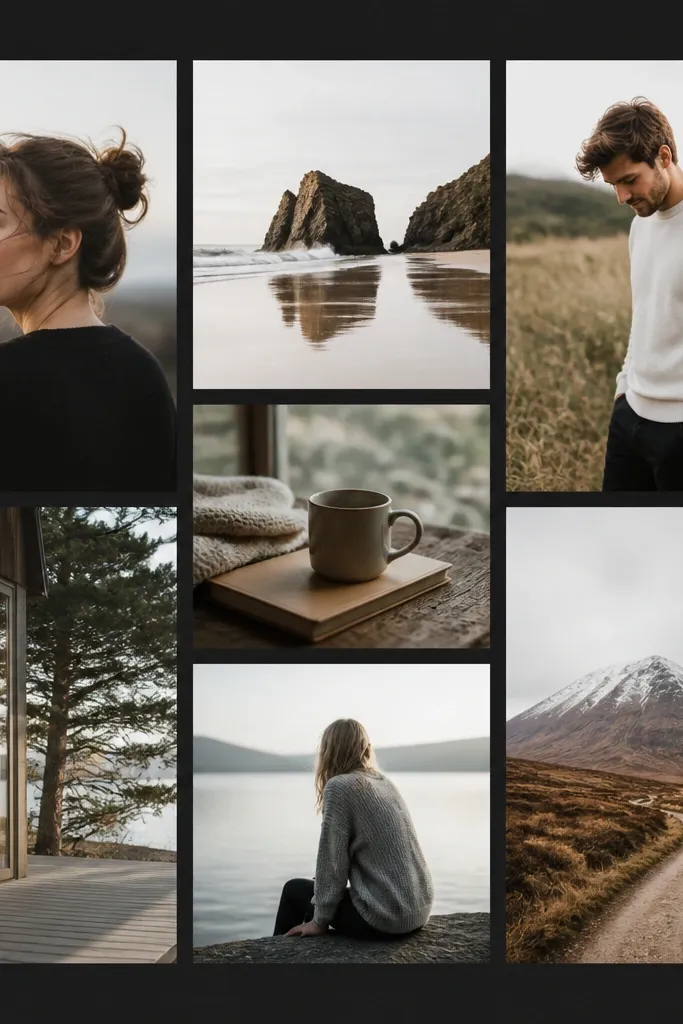
Start with matte black foam board or cardstock as your backing. Cut or print white window frames sized to your photo dimensions, leaving a 1/8-inch white border around each image. Mount each photo inside its window with photo tape. Arrange them in a grid with consistent 0.4 inch gaps between windows. Print photos in matte so the black background doesn’t reflect glare. Place the whole backing into a black frame with glass to protect the surface.
Black backing makes a collage look like a studio display. The white cutout windows frame your photos sharply, and the contrast hides small print imperfections. I used this for a teen’s birthday with 10 photos and it looked like a modern gallery piece. It’s flattering for most skin tones because the white windows keep faces bright. The styling principle is bold background + clean window edges.
AvoidDon’t use glossy photos — reflections on black make it look cheap fast.
Pro tipIf your photos have bright highlights, slightly reduce brightness so they don’t blow out against the black.
23. Staggered grid with alternating sizes
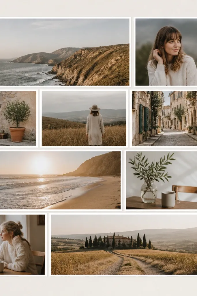
Pick two photo sizes, like 4x6 and 4x4 (or 5x7 and 4x6). Resize your photos so faces stay centered and important parts aren’t cropped awkwardly. Build the grid in your design app with staggered placement: place a 4x6, then offset a 4x4 into the gap. Keep spacing between photos consistent at 0.35 inches and use the same white border width on all photos. Print matte and mount on thick cardstock. Frame with a simple mat so the layout gets the attention.
Alternating sizes makes a grid feel designed without getting complicated. The staggering creates a rhythm that looks like a magazine layout, and the consistent borders keep it from looking random. I used this for a family timeline wall with 14 photos and it felt polished even when some photos were taken in different rooms. It’s flattering because the staggered pattern prevents the eye from getting stuck on one area. The styling principle is repeating two photo sizes in a staggered arrangement.
AvoidDon’t use three or four different photo sizes — that’s where it starts feeling messy.
Pro tipChoose one border width and stick to it — alternating sizes still needs consistent framing.
24. Soft blush wash behind portraits only

This looks expensive because the styling detail is targeted. When you tint only the portrait images, the collage gets a designer touch without turning every photo into a filter match. I used this for a mother-daughter wall where some photos were outdoor and some were indoor — the blush wash brought them together. It’s flattering because blush warms skin tones and softens harsh lighting. The styling principle is selective color treatment plus consistent borders and spacing.
Pick out the portrait photos (close-ups or faces) and add a very light blush rectangle behind them in your design app, keeping the tint subtle. Keep non-portrait photos normal but still bordered with the same white frame. Arrange everything in a clean grid with 0.4 inch spacing and identical border width. Print on matte paper and mount on warm ivory cardstock. Use photo corners so the edges look clean where the tint meets the photo border. Keep the hero photo centered and give it the most blush tint intensity, then dial it down for smaller portraits.
Test the blush tint by printing one photo first — you want it barely noticeable in person.
Don’t tint landscape photos the same way — it makes the collage feel like a template.
25. White-on-white minimal with tiny spacing
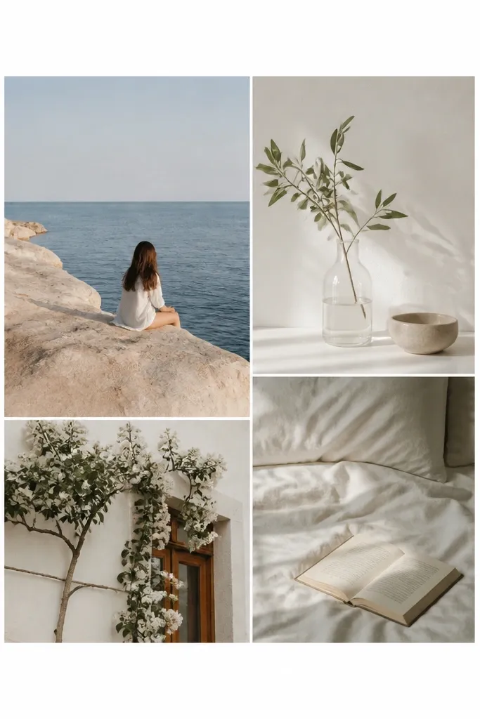
Minimal white-on-white collages look expensive because they look intentional and calm. The trick is to keep borders thin and spacing consistent so it reads like a set of prints. I used this for a bathroom hallway with travel photos and it looked like art, not decoration. It’s flattering because the clean background keeps attention on faces and outfits. The styling principle is restraint: fewer elements, consistent spacing, and crisp edges.
Choose a white mat or backing and print matte photos with thin white borders (around 1/8 inch). Arrange 12 to 16 photos in a tight grid with small gaps, about 0.2 to 0.3 inch. Keep all photos the same orientation or at least the same aspect ratio so the grid stays clean. Mount photos using thin tape so they don’t lift and cast weird shadows. Frame with a simple white frame or a black frame if you want extra contrast. Make sure the glass is clean — fingerprints on white read instantly.
Use a light hand when mounting — thick adhesive creates uneven edges on minimal layouts.
Don’t use heavily colored backgrounds in the photos — minimal white shows every mismatch.
26. Sage mat with matching fabric tape border
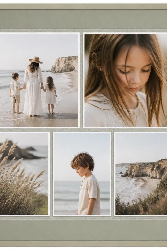
A fabric tape border makes a collage look styled because the texture reads “finished.” It’s not about being crafty — it’s about adding one material layer that feels intentional. I did this for a nursery memory wall and the sage tone made the photos feel calm even when there were lots of bright outfits. It’s flattering because sage is gentle against skin and doesn’t clash with warm tones. The styling principle is one textured border + muted mat color + consistent photo borders.
Use sage cardstock as your backing mat. Add a thin fabric tape strip around the inside edge of the mat window, keeping it straight with a ruler. Arrange your photos in a grid with consistent spacing of 0.4 inches and thin white borders. Print matte photos and mount them so the edges align with the tape border. Keep the hero photo slightly larger, like 5x7, and place it centered. Finish by framing with glass — it protects the tape texture and keeps everything looking clean.
Press the tape down with a burnishing tool or clean card to prevent bubbles.
Don’t add fabric tape anywhere else — one border line is enough.
27. Rounded photo corners with consistent radius

Rounded corners look expensive because they feel modern and consistent, like a designed product. When every photo uses the same corner radius, the collage looks cohesive even if your photos vary. I used this for a friend’s kid wall and it looked less “paper craft” and more like a premium print set. Rounded corners also soften the visual edges for kids photos, which can feel chaotic in sharp rectangles. The styling principle is one consistent rounding style across all photos.
In your design app, create a photo template with rounded corners and set the same radius for every photo, like 0.25 inch. Keep photo borders consistent and thin, and avoid extra frames around rounded corners. Arrange photos in a grid with equal spacing, around 0.35 inches. Print on matte paper and mount carefully so the corners don’t get bent. Use a frame that matches the modern look, like light wood or black. Keep the backing warm ivory so the rounded corners feel soft, not stark.
If you’re cutting by hand, print a test sheet and measure corner radius so your cutting matches the template.
Don’t mix rounded and sharp corners — the inconsistency kills the premium feel.
28. Monogram label strip with one date
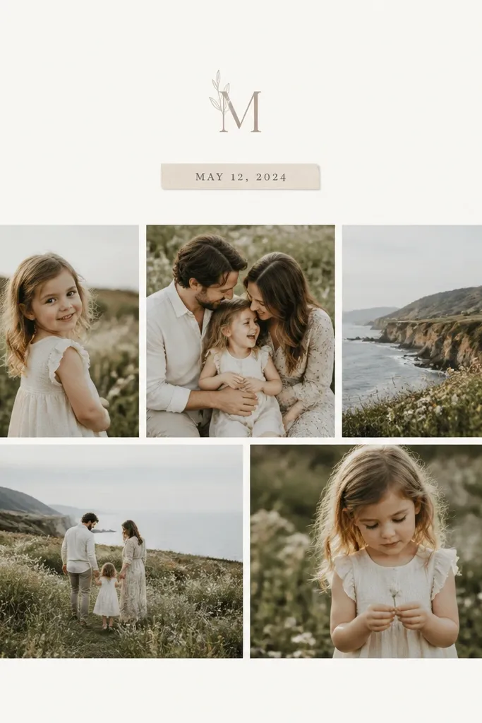
Choose one initial or monogram and place it at the top center of the backing in a dark gray or black. Add one short date line under it, like “May 2026,” using the same font family. Create a grid below with 9 to 16 photos and consistent spacing of 0.4 inches. Add thin white borders to each photo and keep outer margins even (1.5 inches looks good for 16x20). Print matte photos and mount with tape so the label area stays flat. Frame with a mat so the label strip has a clean boundary.
A label strip gives your collage context and makes it feel like a keepsake print. When the typography is small and the label is simple (one date, one initial), it reads intentional. I used this for a birthday collage for a 5-year-old and the monogram strip made it feel like a personalized product. It’s flattering because it doesn’t cover faces and keeps the wall from looking busy. The styling principle is one clean label element and strict photo spacing.
AvoidDon’t add lots of text lines — one label strip reads premium, multiple strips look cluttered.
Pro tipUse a font with thick strokes so the label stays readable behind glass.
29. Asymmetrical modern grid with varied row heights

Asymmetry looks expensive when it’s measured. This layout uses different row heights but keeps edges aligned, so it feels like design, not randomness. I used this for a travel collage with a mix of portraits and landscapes and it looked curated. It’s flattering because it gives each photo space to breathe, especially if one photo is crowded. The styling principle is aligned edges and intentional imbalance.
Pick a frame size like 18x24. Create two or three rows with different heights — for example top row uses 5x7-style crops, bottom row uses 4x6 crops. Keep the left edges aligned across rows so the collage looks structured. Use consistent spacing between photos, about 0.35 to 0.5 inches. Add thin white borders to every photo and keep the background mat warm ivory or light gray. Print matte, mount with tape, and check alignment by measuring from the frame edges at two points. Frame it and keep the glass clean for crisp edges.
If the imbalance looks scary, reduce the difference between row heights — small asymmetry is easier to make look premium.
Don’t eyeball row alignment — asymmetry without alignment looks messy.
30. Holiday lights effect using small photo highlights

Start with a dark navy or deep charcoal mat backing. Choose 4 to 6 photos for the “light path” and apply a subtle warm overlay in editing (keep it light so details stay clear). Place those photos in a diagonal line with small consistent sizes, like 3x4.5. Add 3 to 5 larger photos in a cluster at one end of the diagonal. Keep borders thin and white so the warm overlay doesn’t bleed into the layout. Print matte and mount with tape, then frame under glass so the dark background looks smooth.
This one looks expensive because the warm overlay mimics string lights, and it’s concentrated in a few photos instead of applied everywhere. I’ve used it for winter family walls and it makes the collage glow without turning it into a gimmick. It’s flattering because warm light overlays soften skin and add cozy contrast. The styling principle is dark base + warm highlights + one main path of photos.
AvoidDon’t add overlay to every photo — that’s when it looks like a filter dump.
Pro tipUse warm overlays only on photos with faces — it keeps the effect classy.