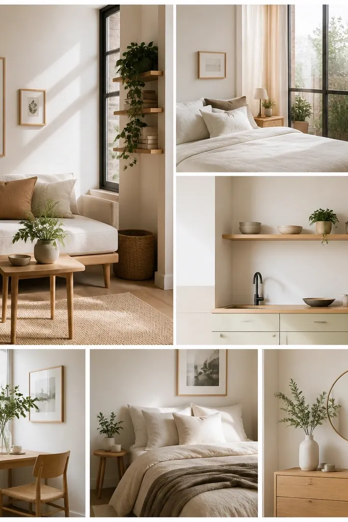

1. Thrift Frame Grid with Cream Mats
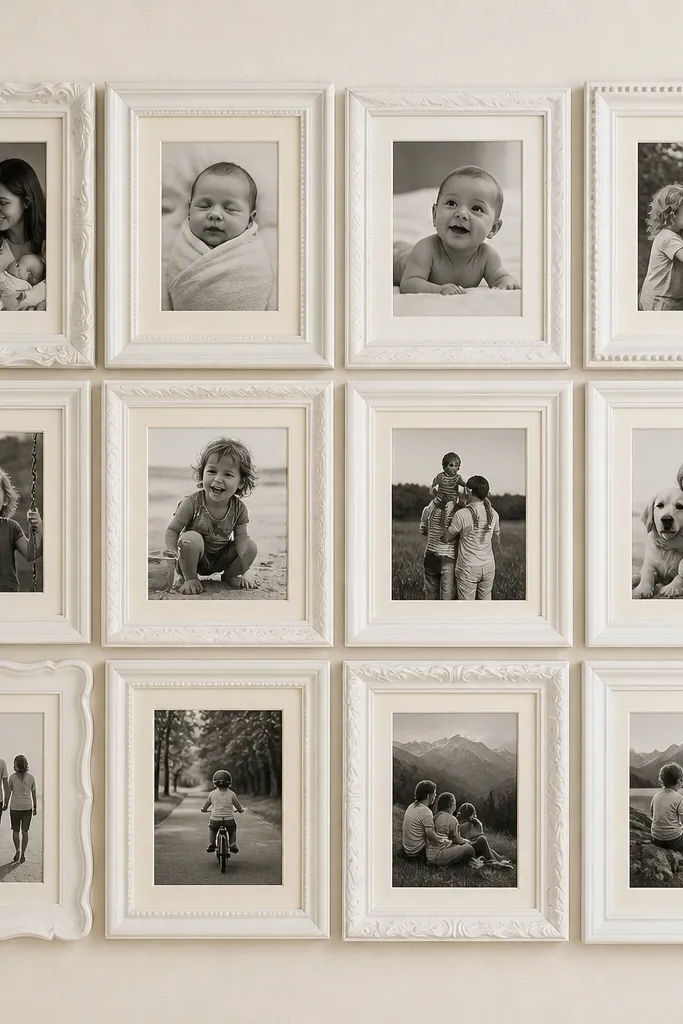
This is the collage style I reach for when I want “put together” without buying matching frames. I use matte white paint on thrift frames because it hides size differences and makes the whole wall look intentional. The cream mats soften bright kid photos and make warm skin tones look natural next to cooler indoor lighting. It’s flattering for rooms with light walls and it looks good even if your photos vary in camera quality. The styling principle is a consistent border — cream paper — so your photos feel like one collection.
Start by gathering 12 thrift frames that roughly fit 4x6 photos, then remove the glass and backing. Cut cream mat paper to leave a consistent border width, about 1 inch around each photo, and slide photos under the mat. Arrange frames on the floor in a grid, then mark spacing with painter’s tape so you keep 1/4-inch gaps. Finally, mount the frames to the wall using picture hooks rated for the frame weight, not the photo weight — cheap frames can be heavier than they look.
Paint the frames the night before and let them dry overnight — rushed paint chips when you handle frames.
Don’t mix shiny gold frames with matte black ones unless you’re repeating one finish across the whole wall.
2. Photo Strip Timeline on Washi Tape
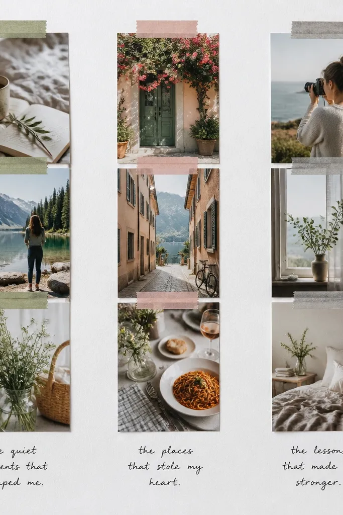
This one looks cute in kids' rooms because it reads like a story without needing frames. I use small photo strips — like 2x3 or 2x2 crops — so it feels playful, and the washi tape adds a gentle “paper craft” texture. It flatters clutter-prone walls because it’s layered and forgiving; you can add more photos over time as the kids grow. The principle is controlled randomness: the photos are random, but the tape style is consistent. Keep the captions minimal so the tape doesn’t compete with the pictures.
Pro tipChoose washi tape with a solid color, not busy patterns, so the photos stay the star.
Start with a big sheet of white poster board or foam board, then decide your timeline direction (top to bottom works best). Print photos in small squares or rectangles, and crop them so faces are centered. Tape the first strip along one long edge, then place the next strip slightly overlapping, about 1/8 inch. Finish by adding one small caption per strip in black marker, and hang the board with two wall hooks spaced far apart.
AvoidAvoid cramming tiny photos with no overlap; it turns into a collage that looks messy instead of curated.
3. Polaroid-Style Border Stack with Dollar Store Clips
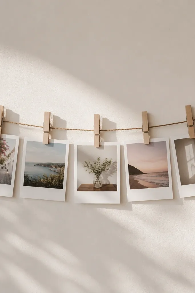
If you want the collage to feel casual but still neat, this is my go-to. I make Polaroid-style borders using cardstock — 1.25 inches wide — so even a 4x6 photo looks like it belongs. The thick white border makes skin tones pop and gives your photos a consistent “camera” look. It’s great for families who take lots of pictures and want to swap them out. The principle is uniform photo framing plus an easy swap system.
Pro tipUse binder clips behind the cardstock at the top corners if your photos curl — it keeps them flat.
Start by trimming your photos to a size that fits the border, then cut white cardstock rectangles with a border frame around each photo. Glue photos to the cardstock backs, leaving a slight lip so it looks like Polaroids. Stretch twine horizontally across the wall and attach it to two hooks. Clip each Polaroid with small clothespins, spacing them 2 to 3 inches apart so faces aren’t crowded.
AvoidDon’t use neon clips; they pull attention away from the photos.
4. Contact Paper Photo Wall with Overlap Squares
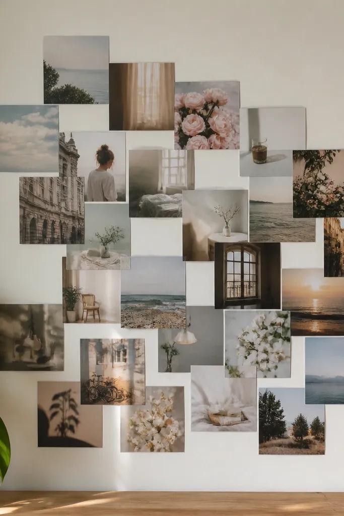
This is a renter-friendly way to get a collage look without permanent mounting. Clear contact paper lets you layer photos without taping directly to the wall, and it keeps everything protected from dust. I use square crops (about 4x4) so the overlap looks intentional rather than accidental. It’s flattering for busy kid photos because the squares unify the chaos. The principle is creating a single “photo skin” over the wall area.
Pro tipIf your contact paper wrinkles, warm it with a hair dryer for 10 seconds, then smooth again.
Start by cleaning the wall and cutting clear contact paper into manageable panels, like 12x12 inches. Place your photo squares on the panel first without sticking, then adjust overlap until it looks balanced. Lift one panel at a time, stick contact paper down, and smooth it with a credit card. Trim any excess contact paper around the edges so it looks clean, then hang a single small nail for the panel’s top edge if needed.
AvoidAvoid sticking photos directly to the wall with lots of tape — it leaves residue and makes replacements harder.
5. Book Page + Photo Window Collage

This is the collage style I use when I want something that looks artsy but still budget. Old book pages create a warm backdrop that makes cooler photos feel cozy, and it hides tiny print imperfections. I like pairing it with black-and-white or muted-color photos because the page text adds texture. It’s flattering for rooms with beige, cream, or light wood tones. The principle is using one consistent background so the photos all feel like they’re part of the same “page.”
Pro tipTrim the book page edges cleanly so the background doesn’t look ragged.
Start with foam board and cover it with book pages using a glue stick or matte Mod Podge. Cut photo windows out of white paper strips so every photo has the same border thickness, about 1 inch. Place photos in a grid or a gentle diagonal, then glue them down with a thin layer of Mod Podge. Let it dry flat for a full day, then seal the surface lightly with matte spray if you want extra durability.
AvoidSkip glossy Mod Podge on top of photos; it can create glare that makes faces hard to see.
6. Frame-less Photo Mounts on Colored Poster Board

Frames can eat your budget fast, so this is the “no frame, still polished” option. I use thick colored poster board (coral, teal, or navy) so the photos pop, and I add simple white borders like a mini mat. The white border makes the collage look intentional, and it softens harsh lighting in indoor shots. This style looks great in kids' spaces because the color feels playful without needing extra decor. The principle is strong background color + consistent borders.
Start by measuring your wall space and cutting poster board to fit, like 24x36 inches. Print photos in one size, like 4x6, and cut white border paper 1 inch around each photo. Arrange photos on the board dry first, then glue them down in a straight grid with 1/4-inch spacing. Mount the board with two picture hooks or a French cleat if the board is large and heavy.
Choose one background color and stick to it — mixing colors makes it look like a craft table.
Don’t glue photos directly edge-to-edge without borders; that’s when it looks cheap.
7. Shadow Box Squares with Dollar Frames
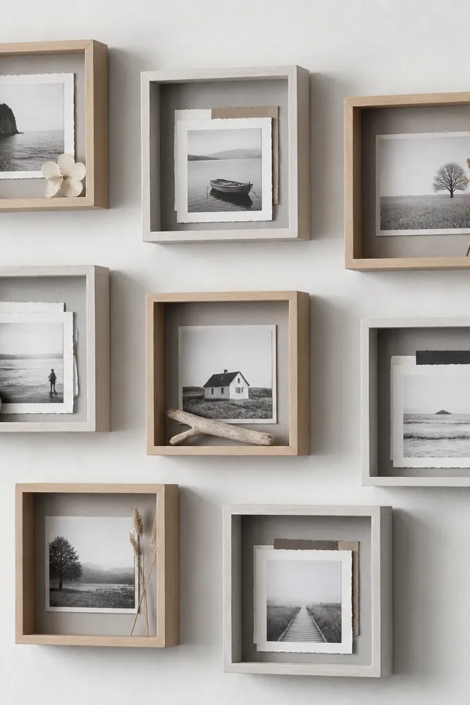
Shadow-box style makes even a simple photo feel collectible because you get depth. I use inexpensive frames from discount stores and add a spacer layer behind each photo using folded cardstock or foam tape. Light gray backgrounds inside the box make kids' faces look clear without turning the photo too warm. It’s flattering for rooms with neutral decor and it hides small photo imperfections. The principle is adding a physical layer between photo and backing.
Pro tipUse foam tape, not hot glue, so you can adjust photo position before it sets.
Start by taking out the glass and backing from each frame. Cut light gray backing paper to fit inside, then place your photo on top with foam tape strips around the edges. Keep the photo centered so the depth looks even, and aim for 1/4 inch of lift. Arrange the boxes on the wall first, then mark drill points and mount using the frame’s hanging hardware.
AvoidSkip thick stacks of paper in one direction; it creates an uneven “tilt” that reads messy.
8. Kraft Paper Backdrop with Color-Coded Captions
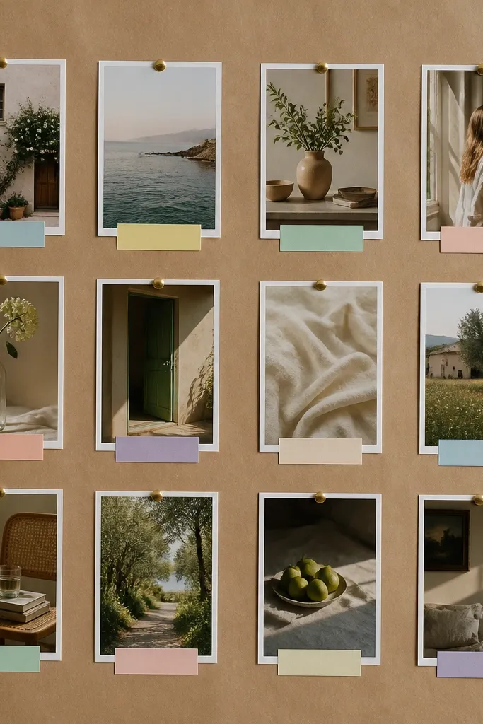
Kraft paper makes everything look warmer and more handmade, even with cheap materials. When you pin photos on top, the collage looks airy, not heavy, which helps kid photos feel lively. I pair it with pastel label stickers or hand-cut labels in three colors max so it stays organized. It’s flattering for both black-and-white and color photos, and it hides wall scuffs better than plain white paper. The principle is texture on the background plus consistent label placement.
Start by covering a foam board with kraft paper, smoothing it down with your hands so it lies flat. Print or crop photos to a consistent size, like 3x4, and pin them using gold tacks at the corners. Cut small label strips, about 1 inch tall, and place them directly under each photo. Color-code by category — like blue for school, pink for birthdays — then hang the board with two hooks for even support.
Write captions small and clean with a fine-tip black marker so the label stays readable.
Don’t use too many label colors; you’ll lose the organizing effect.
9. Magazine Cutout Border Frames
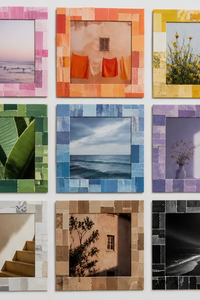
This is a budget trick that looks surprisingly high-end because magazines already have great color and texture. I cut thin strips and wrap them around each photo as a border, keeping the palette consistent. For kid photos, I like borders that include warm tones and a little teal or mustard because it balances skin tones and bright clothing. It flatters rooms with patterned curtains or busy bedding since the border echoes that energy. The principle is using a consistent border method, not consistent content.
Start with photos printed at 4x6 or 5x7 style proportions. Cut magazine strips about 3/4 inch wide and build a border frame around each photo, gluing strips to the photo edges. Make sure corners meet cleanly so the border doesn’t look crooked. Arrange the bordered photos on a large backing board and secure with photo corners or double-sided tape, then hang in a grid with even gaps.
Pick one or two magazine issues so the paper thickness and shine match across the wall.
Avoid mixing glossy and matte borders in random spots; it makes the collage look uneven.
10. Clothespin + Curtain Rod Photo Line
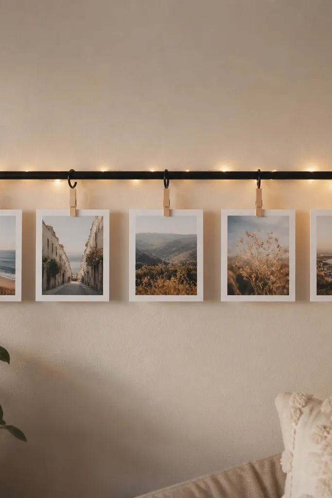
This setup is my favorite for active families because it lets you swap photos without remounting anything. The curtain rod keeps everything straight, which is the part most budget photo displays mess up. I use 4x6 prints cropped down to 3x4 style so they fit the spacing without crowding. The look flatters kids' rooms and playrooms because it feels like a gallery wall you can update. The principle is a fixed horizontal rail plus flexible attachments.
Pro tipUse spring clothespins with a light grip so they don’t bend glossy prints.
Start by mounting a light curtain rod at kid-eye height, around 54 to 60 inches from the floor. Print photos in uniform sizes and slide each into a paper sleeve or clip directly with clothespins. Space photos 2 inches apart and alternate orientation (some vertical, some horizontal) so the line doesn’t look too uniform. If you want extra coziness, tuck battery fairy lights behind the rod so only the glow shows, not the wire.
AvoidDon’t hang the rod too high; clipped photos look like they’re floating instead of belonging.
11. Oversized Circular Photo Halo
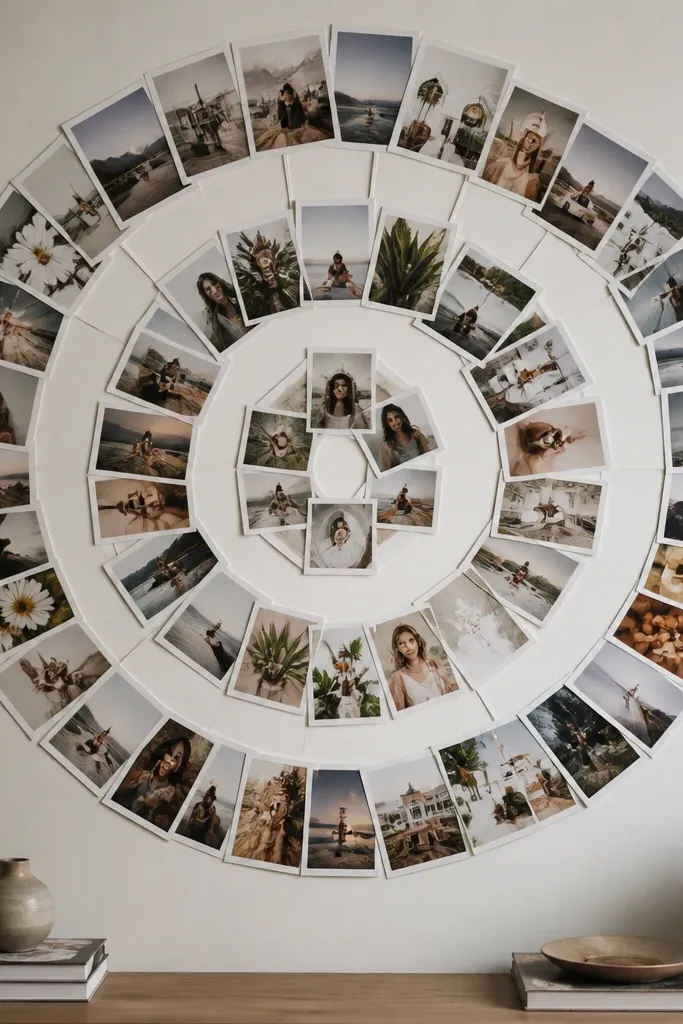
Circles make a collage feel intentional even when the photos are different. I use circular cutouts because they soften the sharpness of squares and add a playful feel for kids' rooms. This works best with photos where there’s a clear subject — faces, pets, or a birthday backdrop — because the circle framing draws your eye. It flatters narrow wall sections since the shape reads from a distance. The principle is one bold shape that organizes everything.
Pro tipUse a consistent border color around each circular photo, like white paper 1/2 inch thick, for a cleaner look.
Start by tracing a large circle on foam board, like 18 inches across, then cut it out if you’re mounting it flat or leave it as a backing ring. Print photos and cut them into circles using a craft punch or template, about 3.5 to 4 inches wide. Arrange photos in a ring with tiny overlaps, then glue them down in layers. Mount the halo centered on the wall using two anchors so it doesn’t tilt.
AvoidDon’t use tiny circles with big gaps; it turns into a random sticker wall.
12. Washer-Tape Photo Grid on Canvas Board
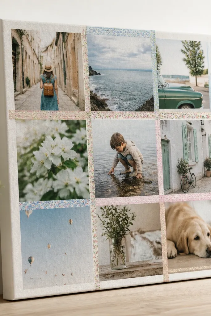
Canvas board makes cheap collages look more finished because the surface has texture. I separate each photo with thin washi tape strips instead of frames, which keeps the budget low and the spacing crisp. Patterned tape works here because the canvas texture already adds depth, but I stick to one tape pattern across the whole grid. This style flatters modern rooms and it looks good with black-and-white photos or bright, high-contrast kid shots. The principle is using tape as “invisible framing.”
Start with a canvas board, like 16x20 inches, and lightly mark a grid with pencil. Place photos in the grid first so you can decide spacing, then tape the first row edges with washi tape. Glue photos down using a thin double-sided tape or glue stick for paper prints. Add tape strips between rows so each photo has a clean boundary, then hang the board using the canvas’s wire hardware.
Press the tape down firmly with a ruler edge so it doesn’t lift at corners.
Avoid thick tape stacks at intersections; it makes the grid look bulky and uneven.
13. Fabric Ribbon Photo Banner with Photo Corners
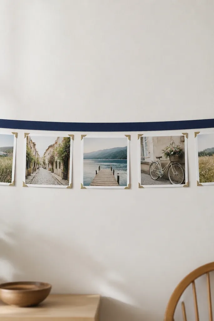
This looks soft and kid-friendly, and it’s easy to change out photos later. Fabric ribbon hides the ugly parts of tape and thumbtacks because you’re attaching everything to the ribbon. I use photo corners because they hold prints flat without wrinkling, and the white borders keep it cohesive. It’s flattering in nurseries and bedrooms because the fabric reads warm instead of rigid. The principle is a flexible hanger plus crisp photo corners.
Start by stretching ribbon horizontally across the wall using two thumbtacks or small hooks. Print photos in one size, then add a white border mat, about 3/4 inch wide. Attach each photo using four photo corners, placing corners at the same spot on every photo. Space photos evenly at 2.5 to 3 inches apart and keep the banner line level by measuring from the floor.
Iron the ribbon first so it doesn’t create waves that fight the photo corners.
Skip stretchy ribbon; it sags and makes the whole banner look crooked.
14. DIY Cork Board with Photo Pinwheel Layout

Cork board is one of the few budget materials that makes photos feel like they belong together instantly. The texture makes the collage look intentional even when you’re mixing photo sizes. I keep it kid-room friendly by pinning photos with color-coordinated pushpins and adding one central anchor photo, like the family holiday or a birthday banner shot. It’s flattering for rooms with natural wood furniture and warm lighting. The principle is using texture as the unifying background.
Pro tipUse the same pushpin colors across the board so it looks designed, not random.
Start by covering a foam board with cork roll or cork sheets, then trim edges cleanly. Print photos and add a thin white border so faces stand out from the cork. Pick one photo for the center, then arrange the rest in a pinwheel pattern with equal spacing. Pin each photo at the corners using pushpins, and adjust until the circle looks even. Mount the board using two hooks so it doesn’t bow.
AvoidDon’t pin photos too close together; overlapping pushpins make the wall look messy.
15. Mini Frame Cluster with One Large Center Photo
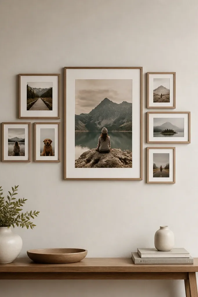
This collage layout looks expensive because it uses negative space. I set one large hero photo in the center, then surround it with smaller frames in the same finish, like matte black or white. The hero photo can be a birthday portrait or a school photo — anything with a clear focal face — because it anchors the eye. It’s flattering for rooms that feel busy already; the empty wall space keeps it calm. The principle is a strong focal point plus consistent frame finish.
Start by choosing one large photo, like 8x10 style, then pick 6 to 8 smaller frames that can hold 4x6 or 3x4 prints. Paint all frames the same matte color if they’re mismatched thrift finds. Arrange frames around the large center photo on the floor, leaving about 1/2 inch between frames. Mount the center frame first, then measure and mount the smaller frames using the back hardware so the cluster sits level.
Keep the hero photo cropped closer than the smaller photos so the center looks intentional.
Avoid a cluster with no empty space; if everything touches, it reads like a pile.
16. Laminated Photo Labels on a Whiteboard Wall
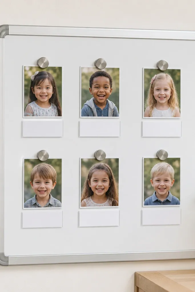
This is a practical collage idea for kids because it doubles as a memory tracker. I use photos small enough to swap out, and I attach them with magnets or removable clips so you can update weekly. Laminating the labels keeps them readable even if sticky fingers touch them. It’s flattering for kitchens, entryways, or playrooms where you want memories without a permanent wall commitment. The principle is using a functional board as the collage base.
Pro tipType labels in a simple font and keep dates in one format, like 2026-07-11, so the board stays clean.
Start with a small magnetic board or a whiteboard panel, like 18x24 inches. Print photos in small sizes, like 2x3 or 3x3 crops, then add a label under each with black text and a date. Cut label cards, laminate them, and attach with magnets. Place photos using magnetic photo holders or small removable clips, then arrange in rows so it looks organized. Hang the board with wall anchors rated for the panel weight.
AvoidDon’t use thick magnets that warp tiny frames; they tilt and make the board look sloppy.
17. Paper Fan Backing with Upside-Down Photo Corners
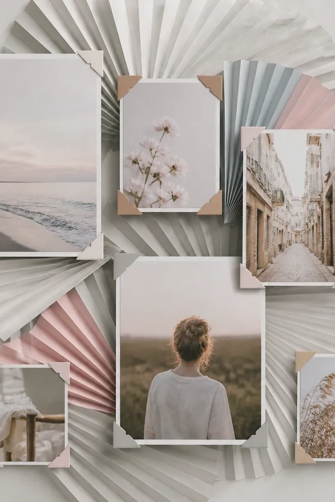
This is a craft-store look that still fits a budget because you’re using paper texture instead of expensive decor. The fan-fold background adds movement without adding clutter, and the photos sit cleanly on top. I like this with black-and-white or muted-color photos because the paper texture does the visual work. It’s flattering for hallways where you need something that catches light at different angles. The principle is adding a single dimensional background beneath flat photos.
Pro tipUse matte photo corners; shiny corners reflect light and can look cheap in overhead lighting.
Start by folding kraft or light gray paper into accordion folds, then glue it to foam board in a shallow fan shape. Cut each photo with a consistent border, like 1 inch white mat, and attach photos with photo corners so they stay removable. Arrange photos in a gentle arc across the fan so they follow the curve. Press everything flat and let glue dry fully before mounting. Hang with two hooks or a single strong nail if the board is small.
AvoidSkip glossy paper as the fan background; it looks slick and doesn’t match the homemade vibe.
18. Corner Gallery with 3 Frames and 9 Photo Squares
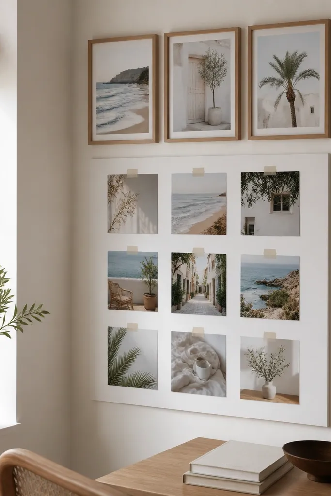
Corners are hard because walls meet and your eyes mess up alignment. This layout fixes that by using a backing board and keeping the photo squares in a neat block. I use three matching frames for the top row so the corner looks designed, then I fill the rest with nine taped squares. It’s flattering for rooms with angled shelves or awkward wall space because the collage “stays inside the lines.” The principle is treating the corner as one unit with a backing board.
Pro tipUse a level app on your phone to line up the top frames; the rest will look straight automatically.
Start by cutting a backing board that covers both sides of the corner area, like 18x24 inches, and wrap it so it sits flush. Paint or cover frames in a matching matte finish, then mount the three frames at the top. Print nine photos as 5x5 inch squares with a thin white border. Tape the squares onto the backing board in a 3x3 grid with 1/4-inch gaps. Mount the backing board with corner-safe anchors so it doesn’t pull away at the seam.
AvoidDon’t tape squares directly onto the wall in a corner; tape tension makes them peel unevenly.
19. Color Wash Mat Board with Photo Overlays

This is the collage I use when I want your photos to look like they’re part of one color story. A light watercolor wash in two tones makes the wall feel warmer and it smooths out mismatched photo backgrounds. I keep the photos bordered with white paper so the overlay doesn’t blend into the wash. It’s flattering for kids' photos with bright shirts because the soft background prevents the wall from looking too loud. The principle is controlling color first, photos second.
Start with foam board and paint a light wash using craft acrylic diluted with water, keeping it subtle so the paper texture shows. Let it dry fully. Print photos in one size, then add a white paper border about 3/4 inch wide. Arrange photos in a staggered grid with light overlaps of 1/8 to 1/4 inch, then glue only the center so edges lift slightly if you want a softer look. Seal the whole board with matte spray to prevent smudging.
Test your wash color on scrap board; too much paint makes faces look washed out.
Avoid dark washes; they make budget prints look dingy and hide details.
20. String Loop Corner with Mini Cloth Clips
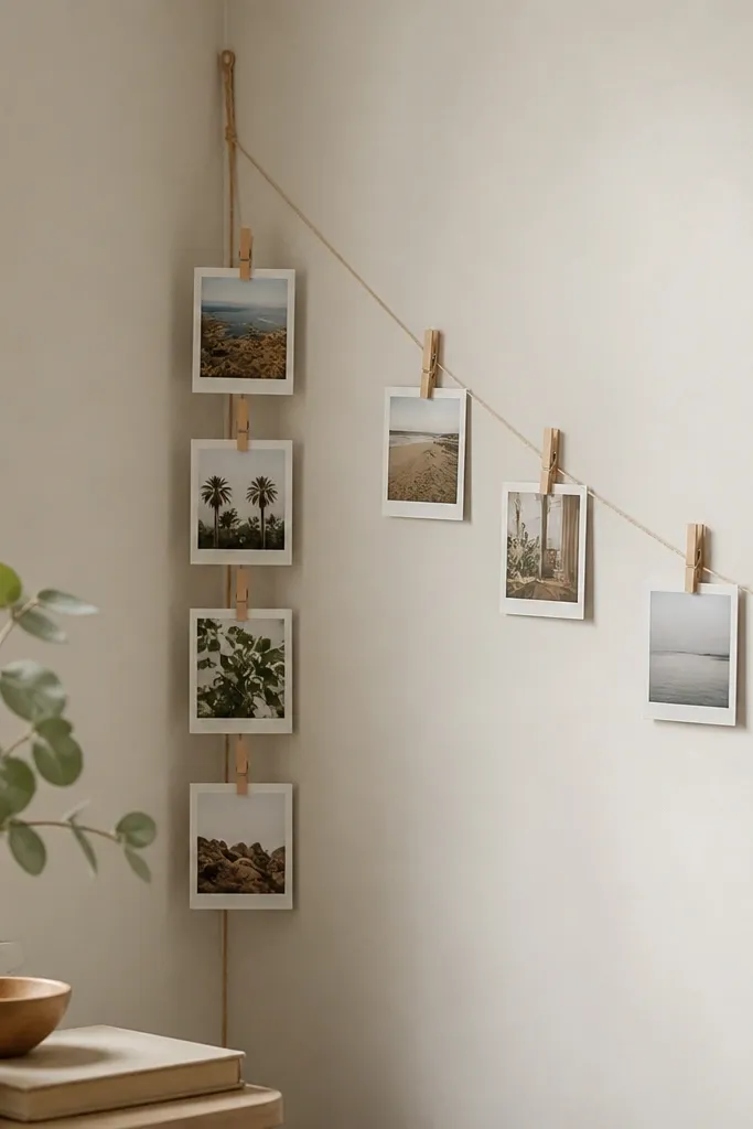
This is a budget collage that looks cute because it’s small and directional. The string loop creates a visual path, so your eye knows where to land even if the photos are from different events. I use mini clips and mini photos, like 2x3 prints, so it feels like a little memory garland. It’s flattering for kids' rooms because it doesn’t take over the whole wall. The principle is making the layout travel — one direction — instead of trying to fill every inch.
Pro tipIf your string sags, twist it once before tying — small tension fixes a lot.
Start by mounting two small hooks in the corner, one slightly higher than the other. Tie beige twine between them to create a vertical and diagonal loop. Print photos in uniform mini sizes and add a thin white border if your prints are busy. Clip photos along the twine at 1.5 to 2 inches apart, alternating left and right placement so the line doesn’t look flat. Adjust spacing until the cluster looks balanced, then secure the twine knots.
AvoidDon’t use oversized clips; they block faces and make the display look chunky.