1. Candy Stripe Terracotta
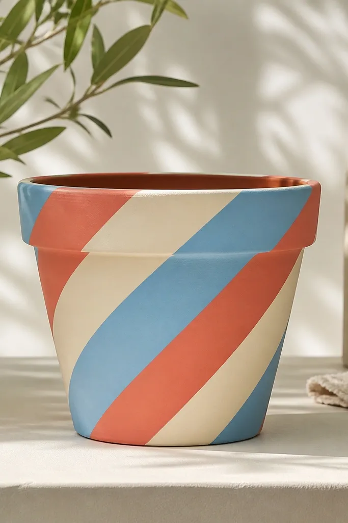
Start by washing the pot, letting it dry, then scuff the surface lightly with 220-grit sandpaper. Prime with a ceramic bonding primer, then paint the cream base in two thin coats. Mark your diagonal lines with painter’s tape using a ruler, then paint coral and sky blue one stripe at a time — peel the tape while the paint is still slightly tacky. Finish with a satin acrylic clear coat so the stripes don’t dull or get chalky.
This one makes a plain terracotta pot look playful without needing fancy drawing skills. I use coral and sky blue stripes on top of a cream base so the colors pop against the pot’s natural curve. The diagonal angle flatters most pot shapes because it follows the body and breaks up the roundness. It looks great on medium and tall pots where the pattern has room to repeat. Kids and teens both love it — it reads like decor, not “craft time.”
AvoidDon’t paint stripes thick in one go — thick paint creeps under tape and you lose sharp edges.
Pro tipIf your tape edges look wobbly, run the brush along the tape edge lightly before you fill the stripe.
2. Mini Geometric Tiles in 4 Colors
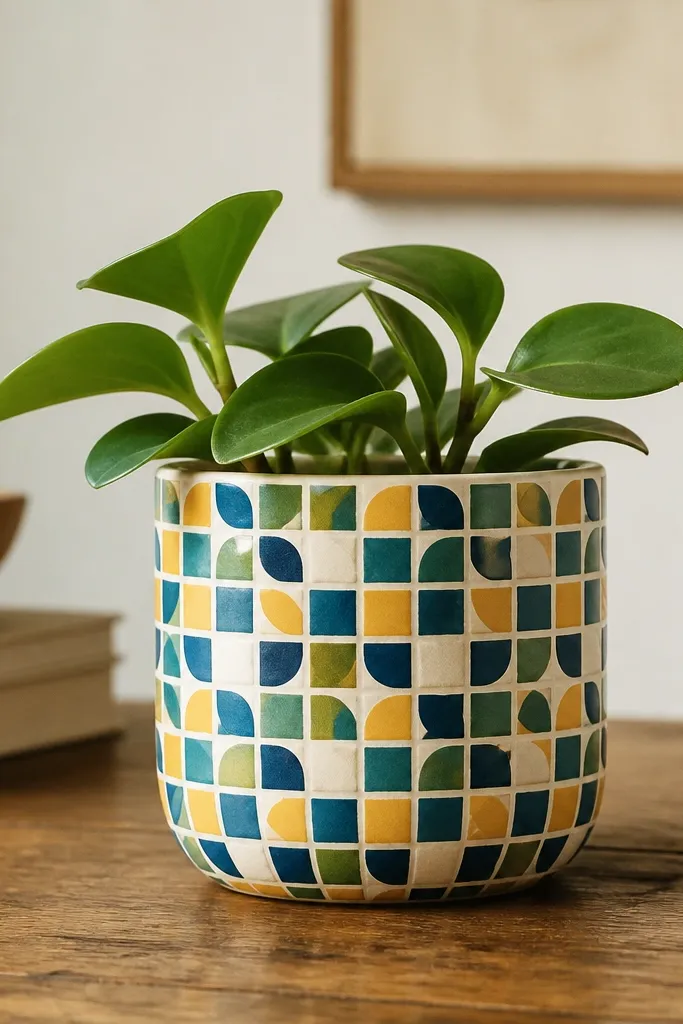
Prime the pot, then paint a cream base. Use painter’s tape to create a grid band around the center — keep it straight by measuring the circumference and placing tape at equal intervals. Paint the small shapes (squares, half-circles, and tiny rectangles) with a liner brush, letting each color dry before the next. Once the pattern is complete, remove any tape lines carefully, then seal with a matte top coat for a clean, non-glossy look.
Tile patterns look polished because they create a rhythm. I keep the color count to four so the pot stays readable and doesn’t look messy. Mustard and teal together make the design warm, while navy anchors it so it doesn’t feel too bright. This works best on short pots because the repeat is quick and you can control alignment with tape. It’s also a strong choice for neutral plant shelves because it adds color without loud brushwork.
AvoidSkip freehanding the grid — crooked repeats look cheap fast.
Pro tipUse a paper template for the tiny half-circles so every curve matches.
3. Sunburst Ombre Bottom Half
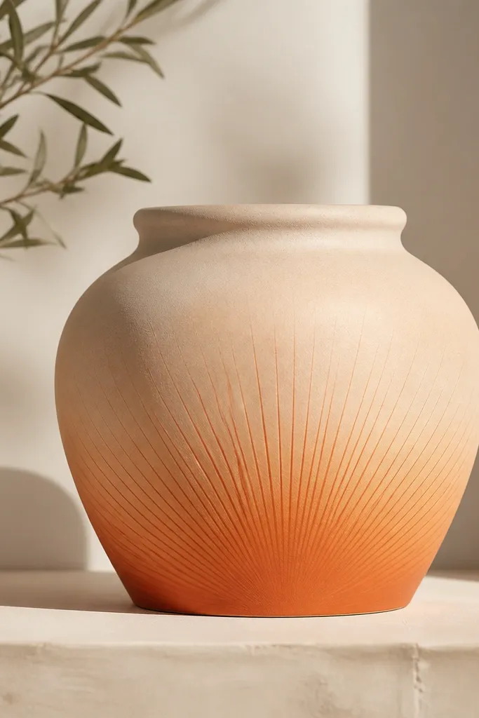
Prime, then paint the top half of the pot pale peach. For the bottom half, sponge on terracotta orange starting at the base and blending upward with a damp sponge. Add sunburst rays using a fine liner brush: dip lightly, then drag outward from the center point near the bottom edge. Let it dry fully, then apply two light coats of satin clear so the rays don’t get muted.
This style gives you movement without drawing complicated flowers. The sunburst rays are forgiving because even imperfect lines look intentional when they’re thin and evenly spaced. I like using a warm terracotta orange for the base and fading into pale peach for the top — it flatters warm skin tones in photos and looks cozy on kitchens. It also hides minor brush strokes because the ombre blends them. This one looks best on medium-height pots where the rays have enough space to show.
AvoidDon’t try to fade with one wet layer — you’ll get streaks instead of a smooth ombre.
Pro tipUse a makeup sponge for the fade — it creates a soft edge that brush blending can’t match.
4. Polka Dot Fade with White Highlights
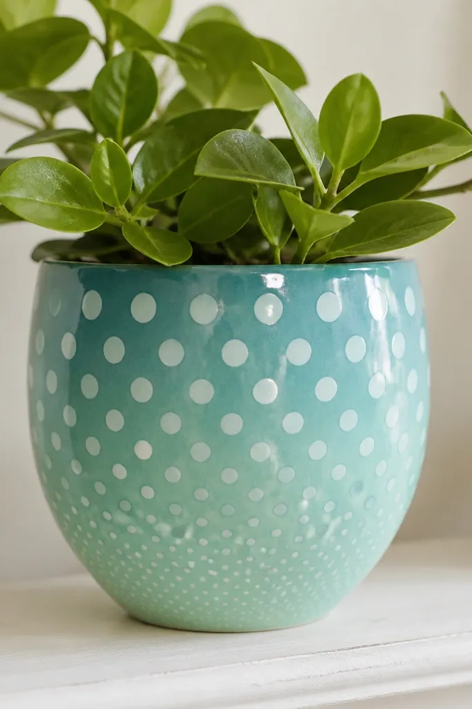
Prime the pot, then paint a mint base. Mark a few horizontal bands with painter’s tape so the dots change size gradually. Use a round dotting tool or the end of a cotton swab to place teal dots in the top band, then mint dots in the middle, then smaller teal dots near the bottom. Add a few white dots on top where you want light to catch, then seal with matte clear.
Polka dots are the easiest way to make a pot feel designed. The fade from teal to mint looks modern, and the white highlights make it feel brighter and cleaner. This design flatters small spaces because it adds color without blocking the plant’s view. I’ve used it on both kids' planters and adult desks, and it works either way. It’s also great for hiding uneven primer coverage since the dots cover small flaws.
AvoidDon’t press too hard with the tool — you’ll make oval dots and they look off.
Pro tipIf dots look flat, add a second tiny dot of white just offset to one side of the teal ones.
5. Hand-Painted Herb Labels
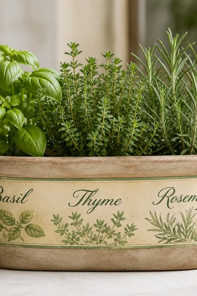
This is the pot painting idea that makes your kitchen look organized without buying labels. I paint a cream label panel on the front, then add herb names in deep green or black. It looks best on pots that sit on a windowsill because the writing feels practical and decorative. Dark green lettering flatters most indoor color schemes, and the cream keeps it from looking too busy. It also works for kids because they can pick the herb names.
Start with a cream base coat on the pot body, leaving a blank area for the label. Tape a vertical rectangle for the label and paint it a slightly warmer cream or light beige. Use a fine liner brush for the herb name and add small leaf icons on either side. Let it dry, remove tape, then seal with satin clear — satin protects text better than matte in my experience.
Practice the letters on paper first and keep your brush loaded lightly so strokes stay consistent.
Don’t paint over wet primer — lettering smears and the edges look fuzzy.
6. Marbled Clay Look with Acrylic Swirls
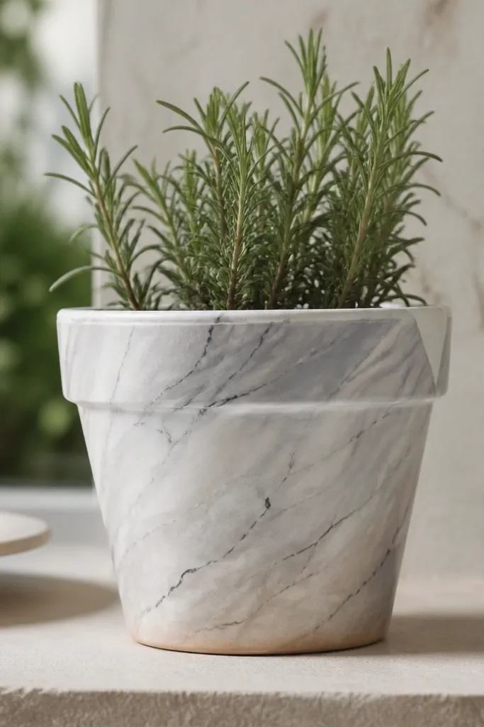
Marble paint jobs look expensive because the pattern is naturally organic. You don’t need perfect drawing — you need contrast and controlled swirls. I use a warm beige undertone, then white and gray swirls, and finish with thin charcoal lines to mimic veining. This works well on terracotta because the base warmth keeps it from looking sterile. It also photographs beautifully, which matters if you’re sharing kids' craft projects or your herb shelf.
Prime the pot, then sponge or brush on a warm beige base. Mix gray paint with a touch of water, then drag a wide brush through it to create soft swirls. Add white swirls with a smaller brush, then use a liner brush for thin charcoal veins. Keep the veins irregular — they look fake when they repeat. Seal with a matte top coat so the marble stays soft, not shiny.
Use a dry brush for veins — the texture looks more like stone than paint.
Don’t overwork the swirls after they start drying — you’ll muddy the colors.
7. No-Sew Lace Collar Accent
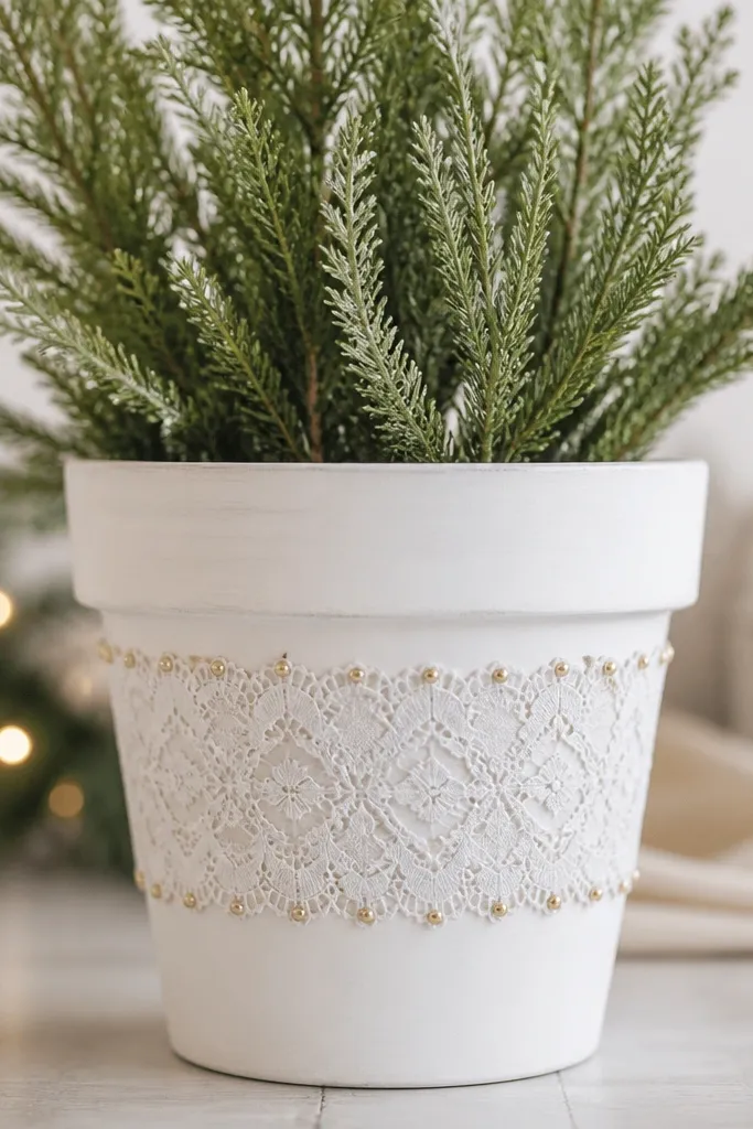
Paint the pot white and let it dry fully. Wrap lace around the middle and secure it with a thin strip of painter’s tape so it stays straight while you work. Dab gold paint on the lace edge with a small sponge, then press lightly so paint transfers onto the raised parts. Remove tape carefully once dry, then seal over everything with clear matte so the lace doesn’t fray from moisture.
This is a beginner-friendly way to make a pot look styled without freehand art. The lace collar gives you a clear design line, and the painted base keeps it clean. I use a white base with a cream lace so it looks soft and not harsh. For kids' rooms, this looks sweet on a shelf because it adds texture even when the plant isn’t huge yet. Gold dots at the lace edge make it feel “finished” when the light hits.
AvoidDon’t soak lace in glue — it warps and the collar looks wavy.
Pro tipIf lace frays, trim after sealing — the seal makes the cut edge hold better.
8. Rainbow Outline Stripes
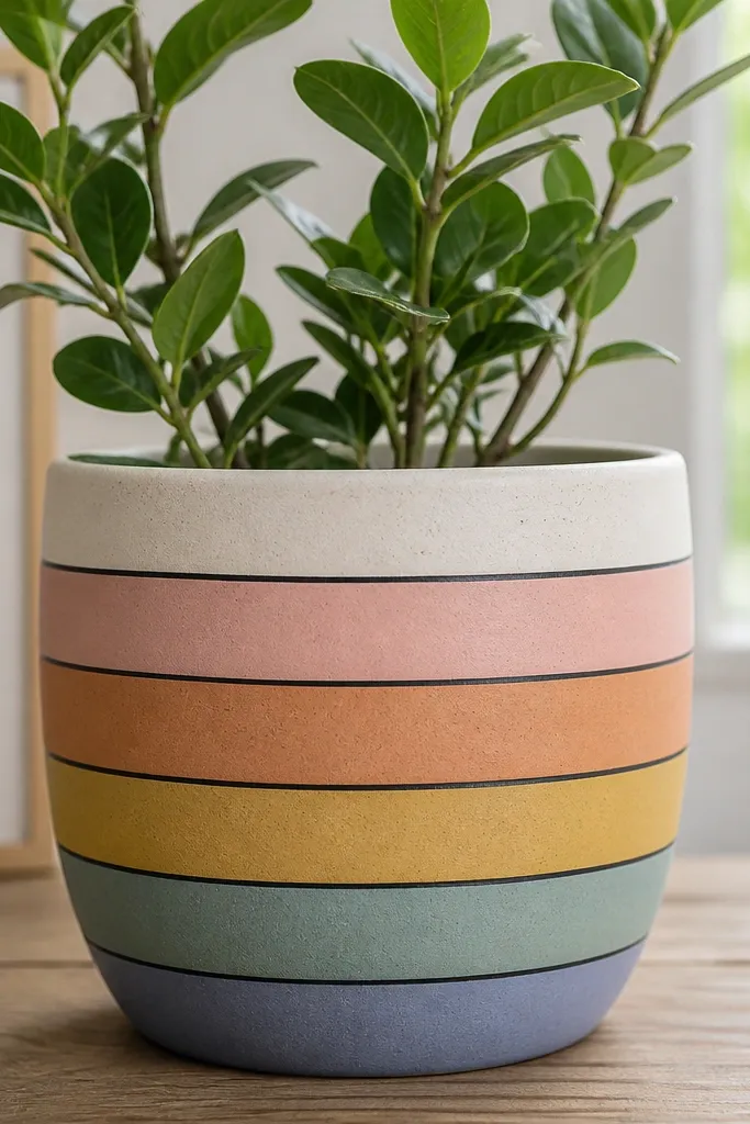
Outlined stripes look neat because the dark line gives structure. I use muted rainbow colors like dusty pink, soft orange, sage green, and sky blue, then outline each stripe in dark navy or black. The outlining makes the colors feel crisp and intentional, even if your fill strokes are a little imperfect. This works on any pot height, but it’s especially good on medium pots where stripes are visible. It also looks great with kids' plants because it reads like a fun pattern, not a messy craft.
Prime and paint the whole pot a light neutral like cream. Tape horizontal stripes where you want the color bands, then paint each band in a different muted color. After the bands dry, use a fine liner brush to outline both edges of each stripe with navy. Remove tape last, then apply satin clear coat for easy wipe-down.
Outline only after the fill is dry to the touch — wet fill makes the outline bleed.
Don’t use bright neon colors with black outline — it looks like cheap party décor.
9. Galaxy Pot with Star Dotting
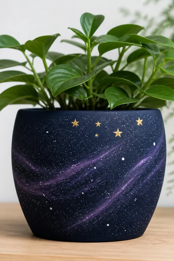
Prime, then paint the pot navy and let it dry. Sponge on purple and teal swirls with a slightly damp sponge, focusing more around the upper half. Flick white paint with a toothbrush for stars, then add a few larger dots with a cotton swab. For extra glow, mix a tiny bit of light blue into white and dot sparingly. Seal with matte clear so it doesn’t look shiny like plastic.
A galaxy pot looks dramatic even with simple techniques. The trick is layering dark base first, then adding lighter swirls and star dots for depth. I paint a navy base, swirl in purple and a little teal, then add white dots of different sizes to mimic stars. This looks great for nightstands and kids' bedrooms because it feels magical without being childish. It also hides scuffs because the dark colors stay forgiving.
AvoidDon’t use thick paint for stars — it leaves blobs instead of dots.
Pro tipFlick stars over a scrap piece of cardboard so you don’t ruin your table.
10. Botanical Dots and Stems
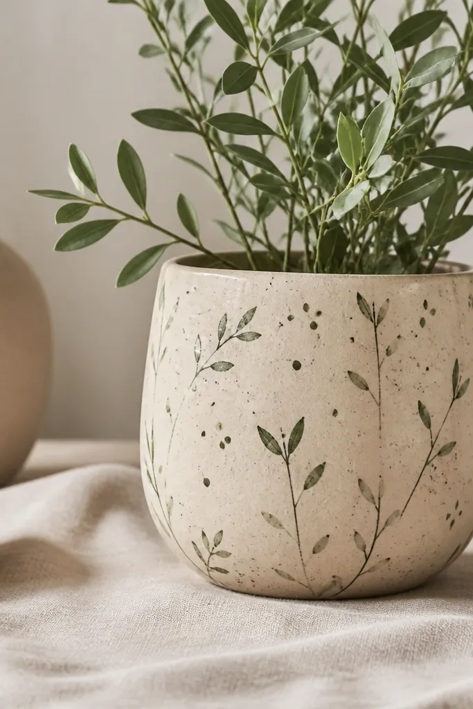
Botanical dots are a calm, beginner-friendly way to make a pot look botanical without committing to full flowers. The dots create texture while the stems give direction, so the design feels alive even when the plant is small. I use sage green and dark green so it stays natural, and I keep the base light beige to make the leaves readable. This style works for people who want something soft for a living room or nursery. It also looks good on any skin tone in photos because the palette is gentle.
Prime, then paint a light beige base. Use a liner brush to draw 5-8 thin stems starting near the bottom and leaning slightly upward. Add leaf shapes by pressing the brush tip and pulling a tiny line, then sprinkle small green dots around the stems. Let everything dry, then seal with matte clear coat to keep it looking like painted paper.
If stems look shaky, use painter’s tape as a guide line for the first stem, then freehand the rest.
Don’t pack dots too densely — it turns into a blob instead of botanical texture.
11. Simple Face Pots for Kids
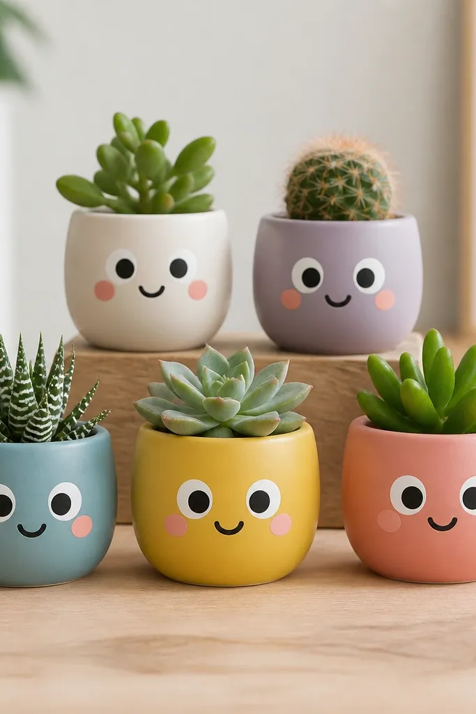
Prime the pot, then paint a solid background color like warm peach or light yellow. Use painter’s tape to block eye placement so they’re symmetrical. Paint the eyes first, then pupils, then cheeks with a small brush or sponge. Finish with a smile line, add eyebrows if you want, and seal with satin clear so the face stays wipeable.
Face pots are the fastest way to get a “wow” reaction from kids and grandparents. Chunky eyes and simple smiles look good from across a room, and the rounded shapes match the pot’s curves. I use white for the eyes, black for pupils, and a soft pink for cheeks so it stays cute instead of clownish. This works best on small pots where the face can fit without squeezing. It’s also great for group projects because each kid can make their own expression.
AvoidDon’t skip primer — the paint can peel around facial details when kids carry the pots.
Pro tipUse a toothpick to dot tiny highlights in the eyes — it makes them look alive.
12. Monochrome Bold Lettering
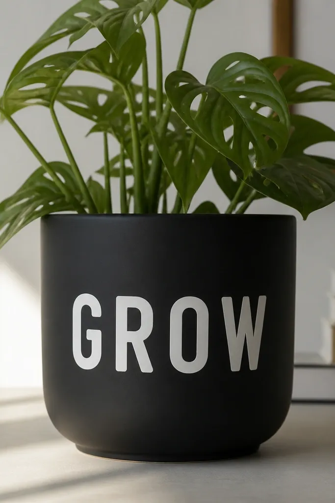
Prime, then paint matte black in two thin coats. Tape a rectangle where the letters will go so you keep the text placement centered. Paint letters with a stencil or freehand rounded block letters using a flat brush. Let it dry, then remove tape and add a small underline or dot accents if you want. Seal with matte clear to keep the lettering from turning glossy.
Bold lettering makes a pot look like decor, not a craft. Monochrome is forgiving because you’re not fighting multiple colors — black and white gives high contrast and reads instantly. I like using matte black base and bright white paint for the letters because it looks crisp in daylight and at night with a lamp. This suits tall planters too because the text can be large. It also works for labeling kids' school plants without turning into a messy handwriting project.
AvoidDon’t use glossy base with matte clear — the mismatch makes the letters look pasted on.
Pro tipIf freehand scares you, use a letter stencil — the pot will still look handmade because of the brush texture in the background.
13. Ombré Watercolor Leaves
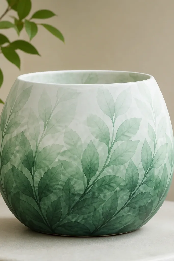
Watercolor-style leaves look dreamy and take very little drawing skill. The ombré fade gives you a smooth transition that hides uneven paint coverage, which is where beginners usually struggle. I use dark green, then dilute it with water for lighter versions, and keep the leaf shapes simple — teardrops with a center vein. This style looks best on light-colored pots because the translucent look needs contrast. It also looks good in nurseries because it’s gentle and not loud.
Prime and paint a light base like off-white. Mix two or three shades of green by diluting dark green acrylic with water (start thick at the bottom, dilute upward). Paint leaf clusters near the bottom first, then use lighter diluted paint as you move up. Keep leaf edges soft by brushing lightly and not overworking. Seal with matte clear once fully dry so the watercolor effect stays soft.
Use a fan brush for feathered leaf edges — it gives a watercolor look faster than trying to blend with a round brush.
Don’t flood the pot with watery paint — it can run and pool at the base.
14. Gold Foil Accent Lines
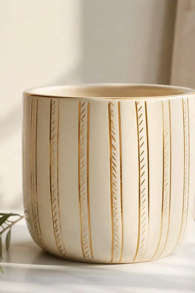
Prime, then paint the pot cream. Use painter’s tape to mark two or three vertical lines, then remove tape and paint gold lines using metallic acrylic paint or gold leaf adhesive with metallic paint. Add small diagonal strokes across one line so the pattern looks intentional. Let it dry, then seal with satin clear because it protects metallic paint while keeping the sheen controlled.
Gold accents make cheap pots look like they belong in a modern room. I keep the gold minimal: a couple vertical lines and a few diagonal marks, so it doesn’t turn into a messy craft gold mess. Cream base keeps it clean, and metallic lines look crisp on camera. This style is flattering for small spaces because it adds shine without covering the whole pot. It also works well for adults who want “grown-up” decor and not cartoon patterns.
AvoidDon’t seal before the gold paint cures — it can dull or smear.
Pro tipPress tape down firmly and run a fingernail along edges so gold lines stay straight.
15. Stripe + Dot Border Frame
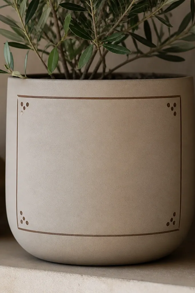
Prime, then paint the pot a neutral like light gray or warm white. Tape a band around the top edge and paint a thin stripe in navy or terracotta. Add a matching stripe band around the bottom edge. Use a dotting tool to add dots at the corners between the bands. Seal with matte clear so the frame edges stay crisp.
A frame design makes the pot look like it has “finished art” even if the center is simple. I like painting a single bold color frame on a neutral base because it creates a focal point. The small dots in the corners are the detail that makes it feel deliberate. This works great on pots that already look good in shape because the frame respects the silhouette. It’s also a good choice for beginners who want structure without freehand flowers.
AvoidDon’t make the frame too wide — it swallows the pot and looks heavy.
Pro tipMake the stripe bands narrower than you think — 1/4 inch looks cleaner than 1 inch on small pots.
16. Painted Rope Twist Accent
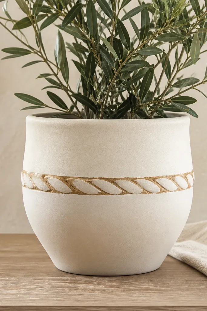
Prime and paint the pot cream. Sketch a loose spiral twist around the middle using chalk or pencil lightly. Paint the main rope band in tan acrylic, then add a thin darker tan line along one side of the rope to create a shadow. Use a small highlight brush with white paint to add a thin lighter line on the opposite side. Seal with satin clear so the texture illusion stays visible.
Rope twists look textured without you needing sculpting skills. The illusion comes from using two tones and a shadow line — tan rope with a slightly darker edge. I keep the base cream so the rope stands out like a wrap. This looks great with rustic plants like pothos or herbs, and it’s also pretty for kids because the twist looks like a toy rope. It flatters round pots because the twist follows the curve and makes the pot feel wrapped.
AvoidDon’t skip the shadow line — without it, the rope looks flat and cheap.
Pro tipUse a small angled brush for the shadow line — it gives a cleaner edge than a round brush.
17. Color Block Corner Pop
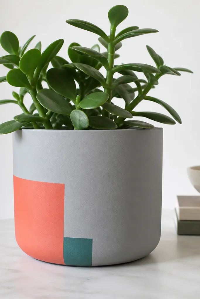
Prime and paint the pot pale gray. Tape two corner shapes on the front: a larger coral triangle or square and a smaller teal block underneath it. Paint coral first, let dry a bit, then paint teal. Peel tape carefully and touch up any chips with a tiny brush. Seal with matte clear if you want a flat modern finish.
This is the “one bold moment” style that looks modern and takes almost no time. Color blocks make the pot feel graphic, and they hide small uneven spots because the design is simple and solid. I like coral with teal because it gives contrast but stays playful. This flatters small pots because the block is compact and doesn’t overwhelm the plant. It also works well for kids because it’s easy to place and kids can pick the colors.
AvoidDon’t add too many blocks — three shapes max keeps it clean.
Pro tipIf tape pulls paint, press it on your jeans once — it releases extra stickiness.
18. Stenciled Mandala in One Band
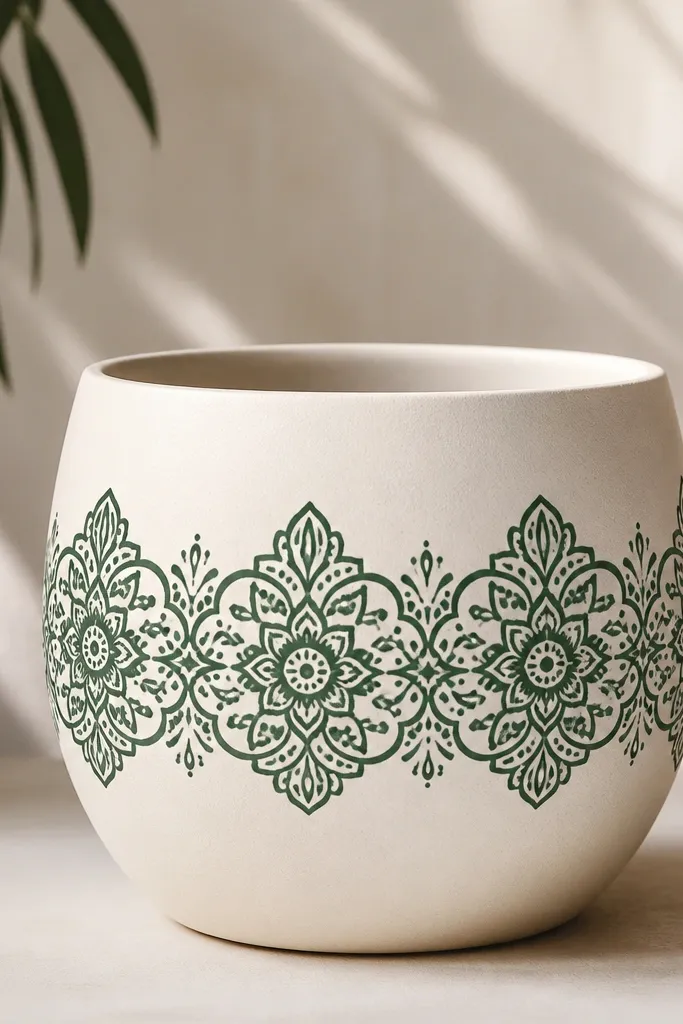
Prime and paint the pot cream. Place a mandala stencil around the middle using painter’s tape to keep it from shifting. Dab deep green paint with a stencil brush or sponge, building opacity slowly so it doesn’t bleed. Lift the stencil straight up, then let it dry completely. Seal with satin clear so the pattern stays sharp and easy to wipe.
Mandala patterns look complicated, but stencils make them beginner-friendly. I keep the mandala in one band so you don’t have to map the whole pot — it also makes alignment easier. Deep green on cream looks classy and doesn’t scream “craft.” This looks great for herb planters and desk plants because it feels calm and intentional. It also hides minor brush marks because the stencil lines guide you.
AvoidDon’t drag the stencil brush — it smears and breaks the symmetry.
Pro tipUse a paper towel to dab excess paint off the stencil brush before you touch the pot.
19. Pastel Waterline Waves
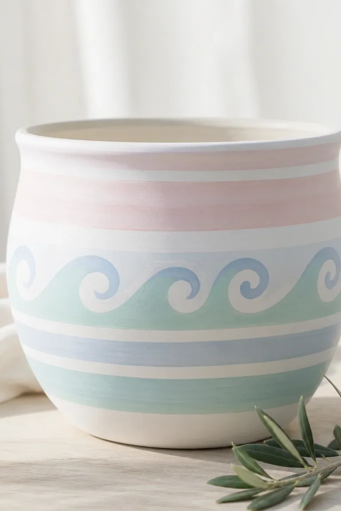
Prime and paint the pot white. Mark a horizontal guide line where the waves will sit. Paint a few pale blue wave crests using a fine liner brush, then fill between waves with mint paint. Repeat the wave pattern around the pot, keeping the crest size consistent. Seal with matte clear so the pastel stays soft and not shiny.
Wave patterns are relaxing and they look good on rounded pots because curves match the shape. I use pale blue and mint so the waves feel airy, not childish. Keeping it pastel makes the pot look good with any plant — from pothos to succulents. This style also works for kids because it’s basically repeated curves. If you want a calm aesthetic for a shared room, this is my pick.
AvoidDon’t make waves too thick — thin lines look more like water.
Pro tipUse a small round brush and keep your wrist steady by resting it lightly on the pot edge.
20. Terracotta + White Doodle Border
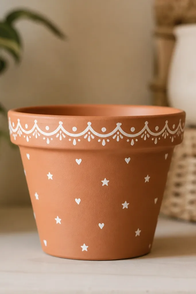
Clean the pot and let it dry, then prime only where the paint will go — usually the top band and a small area for icons. Paint a thin white band around the top edge, then add tiny doodles in a row just below it. Keep icons small, about the size of a pencil eraser tip, so they don’t overwhelm. Let it dry, then seal with matte clear to lock the doodles in place without turning the terracotta shiny.
This is a clever way to keep the pot’s original color while still making it look finished. The white doodle border frames the plant area and adds a handmade vibe that doesn’t require full coverage painting. I use tiny icons like hearts and stars because they’re easy to repeat and they don’t need perfect symmetry. This works for warm, sunny plants and also looks great for kids' desks. It’s one of the few designs that still looks good if your pot has a few small chips.
AvoidDon’t paint the whole pot white if you love terracotta — you’ll lose the warm charm.
Pro tipUse a paint marker for the tiny icons — it gives consistent line weight.
21. Color Splash Drip Fringe
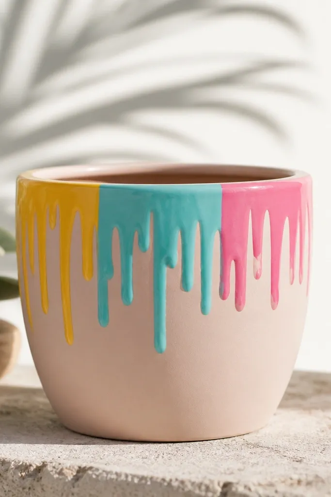
Controlled drips look fun, but they need restraint to look good. I keep the drips to the top inch or two so the pot still looks usable and doesn’t look like a paint disaster. A solid base like cream or light gray makes the drips feel intentional. Bright splashes like yellow, turquoise, and pink add energy for kids' rooms and play areas. This works best on medium pots where the drip zone is visible.
Prime and paint a solid base, then let it dry fully. Dip a small brush in your first drip color and wipe most paint off so it drips slowly. Paint short drip lines from just under the rim, then add a few thicker splashes where you want emphasis. Repeat with the other colors, spacing them so you don’t end up with one muddy stripe. Seal with satin clear — satin handles drips better than matte because it resists scuffs.
Practice one drip on scrap cardboard first so you know how thick your paint is.
Don’t thin the paint too much — watery drips run and pool.
22. Stained Glass Look with Black Lines
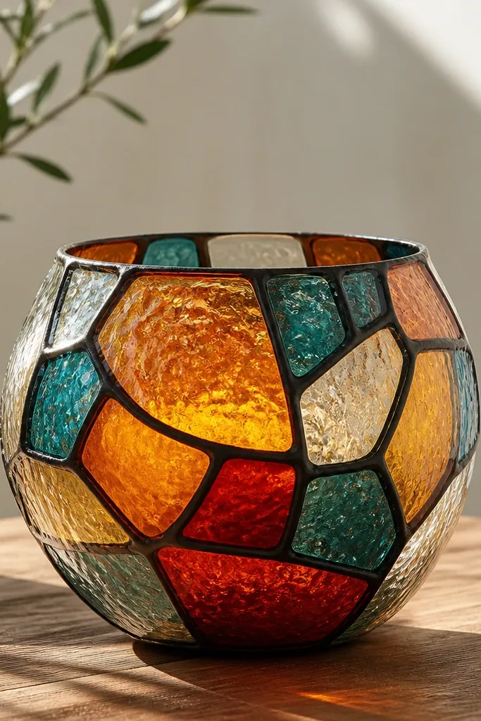
Stained glass pots look like you tried hard, but the method is simple. Black outline panels create structure, and bright colors inside each panel make the pot look jewel-like. I use orange, teal, and a little red because those colors read well against a light base. The look is especially pretty when the plant casts shadows on the pot in daylight. This style is flattering for outdoor patios because it catches light and looks lively.
Prime the pot and paint a light base, then let it dry. Use a black paint marker or thin liner brush to draw irregular panel lines around the pot — think geometric shards, not perfect rectangles. Fill each panel with acrylic paint in bright colors, leaving gaps where you want the base to show through. Add a tiny highlight of white to a corner in each panel for shine. Seal with satin clear; satin keeps the stained-glass vibe from going too flat.
Let each color panel dry before adding another — smudges happen when panels overlap wet paint.
Don’t skip the black lines — without them, it turns into random blobs.
23. Monochrome Brushstroke Bands
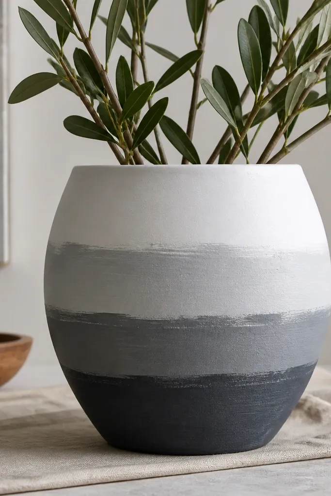
If you want art that looks intentional even with beginner brushwork, textured bands are the answer. The brushstroke texture is the point, and monochrome keeps it classy. I like white with gray bands because it matches almost every room color and it doesn’t fight with your plants. This style flatters small pots because the bands create a visual structure without needing detailed drawings. It also hides tiny dents or uneven primer coverage inside the texture.
Prime, then paint the pot white. Tape three horizontal bands and paint the lowest band charcoal, the middle band medium gray, and the top band light gray. For each band, use a dry brush technique: load paint, wipe most off, then swipe in one direction and stop. Remove tape while the paint is still slightly tacky for clean edges. Seal with matte clear to keep the texture from looking glossy.
Use the same number of strokes per band so the texture feels even, not random.
Don’t blend the bands smooth — the texture is what makes it look like design.
24. Butterfly Wings with Symmetry Guide
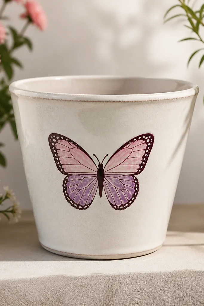
Butterflies look hard, but you can make them beginner-friendly by using a symmetry guide. The outline in plum makes the wings crisp, and the speckles add a delicate feel. Pale pink and purple look good on both warm and cool interiors, and they don’t clash with greenery. This style works best on pots that sit facing forward, like a front porch step or a shelf with a clear view. It also looks great for kids because it gives them a simple subject to copy.
Prime and paint a light base like cream. Draw a vertical center line with pencil on the front and tape a temporary paper guide if you need it. Outline butterfly wings using dark plum paint, then fill one wing color first, flip the pattern by mirroring your strokes on the other side. Add white speckles with a dotting tool and a few slightly larger dots near the wing edges. Seal with satin clear so the speckles don’t smear.
Mirror by flipping your reference photo upside down — it helps your brain copy the shapes.
Don’t freehand both wings separately — asymmetry makes it look messy.
25. Chocolate Dipped Bottom with Drip Finish
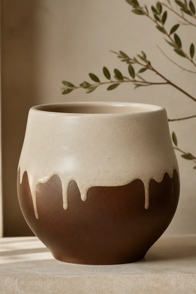
Prime the pot, then paint the top area cream, stopping where you want the dip to begin. For the chocolate bottom, paint brown in a smooth layer, then add a few lighter brown drip streaks by pulling the brush down lightly. Keep drips short so they don’t reach the drainage holes area. Let it dry, then do a second thin coat of chocolate to even the coverage. Seal with matte clear so the dip effect stays soft and velvety.
This looks like a candy dip and it’s surprisingly classy. The contrast between cream and chocolate makes the pot feel cozy and warm, and it pairs well with greenery that has dark leaves. I use matte chocolate brown so it doesn’t look glossy like resin. This works on almost any pot size, but it’s especially good on pots that are slightly wider at the base. It also hides small chips because the brown finish is forgiving.
AvoidDon’t paint the dip edge too high — the pot will look top-heavy.
Pro tipUse a flat brush for the dip edge — it gives you a straighter “dipped” line than a round brush.