1. Sponge Ombre Rainbow
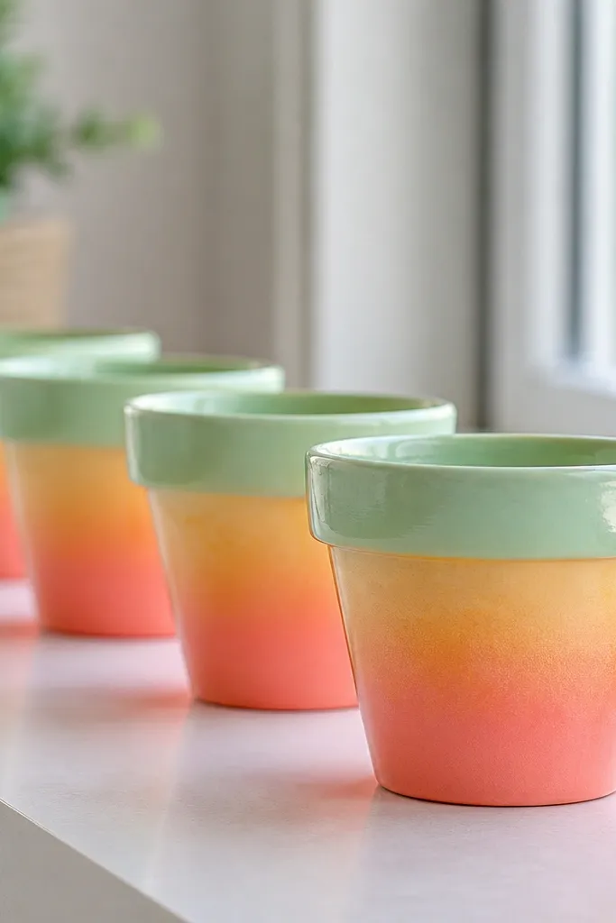
This one looks expensive because the sponge does the blending for you. Start with a white base so the coral and mint show up strong on the terracotta. The colors are warm-to-cool — coral, peach, butter yellow, then mint — which flatters most rooms and looks good on kids with any hair color because it reads bright, not harsh. I like it for small succulents because the gradient makes the plant look intentional even when it’s tiny.
First, paint the whole pot white and let it dry. Then load a foam sponge with coral acrylic and dab the bottom third, stopping before the middle. Clean the sponge, dab peach over the next band, then butter yellow, then mint green up top. Finally, soften any hard lines by lightly dabbing over the boundary areas with a nearly dry sponge.
Pro tipUse a paper towel to blot the sponge before you touch the pot so you don’t get big paint blobs.
AvoidDon’t paint full strokes up and down — brush marks show on mini pots fast and make it look like a craft project.
2. Two-Tone Candy Stripes
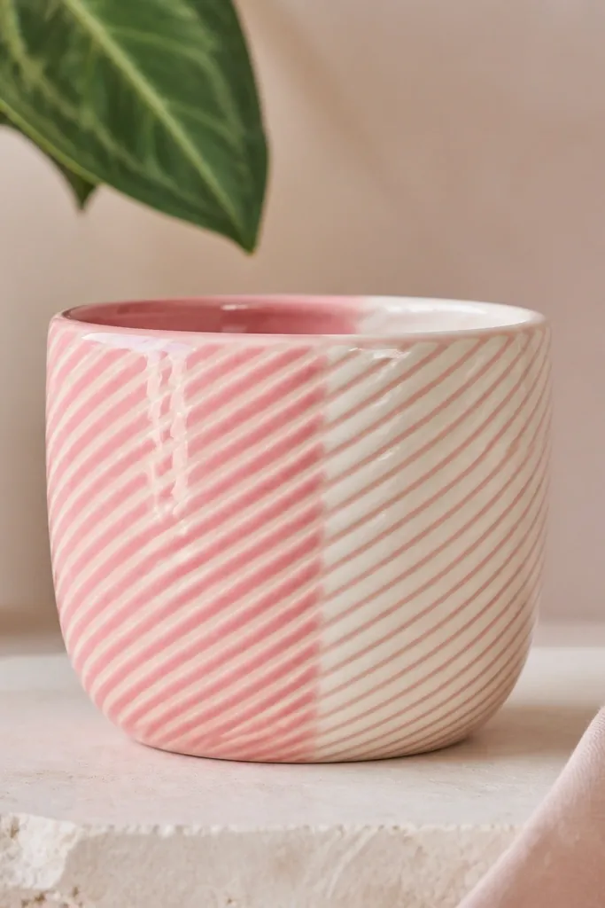
Diagonal stripes make a small pot look taller, which is why I use this when a shelf looks crowded. Pink and cream is a kid-safe combo that works for light skin tones and darker skin tones alike because it’s bright without going neon. The finish looks clean because the stripes are thin and evenly spaced, and the pot reads “graphic” instead of “handmade messy.” It’s perfect for tiny plants on desks where you want something cheerful but not busy.
Start by painting the entire pot creamy white and letting it dry fully. Then use painter’s tape to mark diagonal bands; I place tape at about a 45-degree angle and keep the gaps consistent. Paint the exposed areas glossy pink, let it dry, then peel the tape while the paint is still slightly tacky. Add a quick second coat if you can see terracotta through it, then seal with clear spray.
Pro tipPress the tape down with a fingernail along each edge so paint won’t bleed underneath.
AvoidDon’t use wide tape — wide bands make mini pots look chunky and the stripes stop reading as stripes.
3. Tiny Polka Dot Party
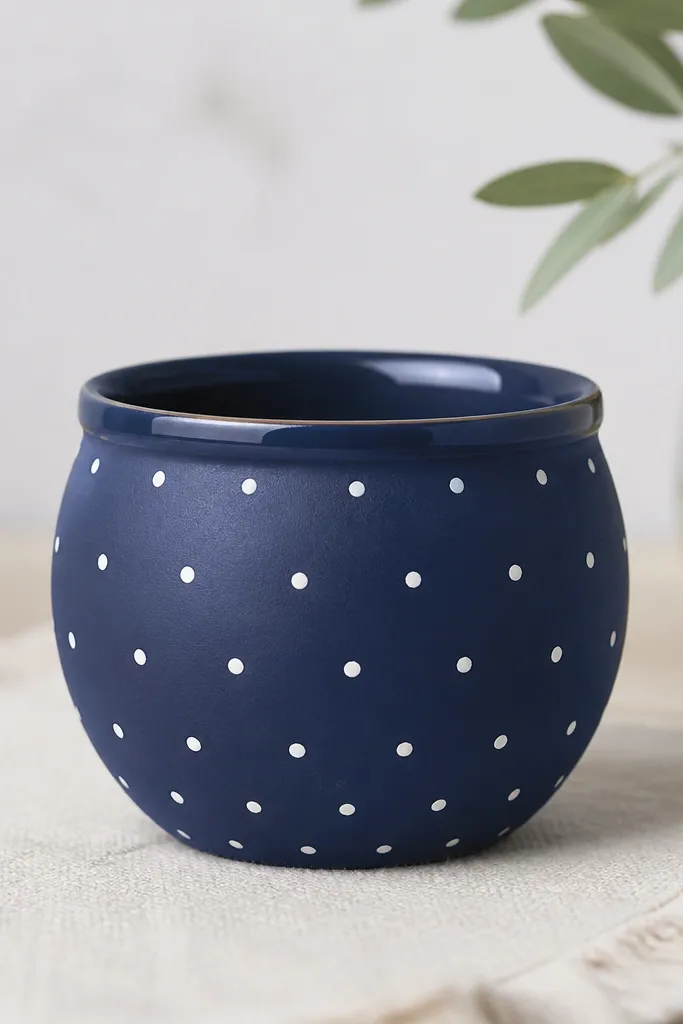
Polka dots are the quickest way to make a mini pot look playful without losing control. Navy plus white is my go-to because it reads crisp in daylight and doesn’t look dirty after a few weeks. The tiny dot scale matters: small dots feel cute on mini pots, while big dots look like a theme-park prop. This works great for kids because it’s readable from across the room and doesn’t require fine lines.
Paint the pot navy acrylic first and let it dry. For dots, use the end of a round foam applicator or the eraser end of a pencil — dip lightly so the dot is small. Make a test dot on paper, then start placing dots in a staggered grid around the pot. Finish by adding a light blue dot near the top edge, then seal with clear coat.
Pro tipIf dots start to smear, wait longer between coats; navy can stay tacky longer than you expect.
AvoidDon’t dot with too much paint on the tool — large blobs ruin the mini scale instantly.
4. Mint Leaf Outline
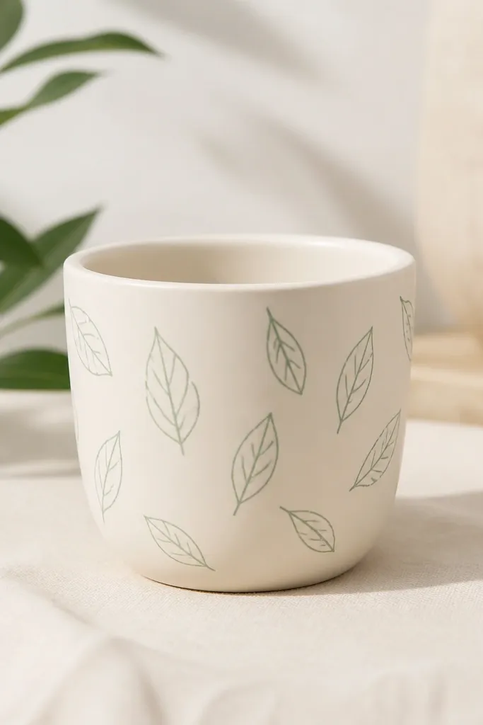
Outline leaves look calm and “put together” even when your painting time is short. Cream background keeps it soft, and mint-green linework stays fresh without looking childish. This style flatters warm and cool color schemes because it doesn’t fight the plant — it frames it. I use it when the rest of the shelf is busy, like books and toys, because the pattern stays lightweight.
Paint the entire pot cream and let it dry. Use a fine liner brush (size 0 or 1) and draw leaf shapes — pointy oval with a slightly curved tip — around the pot in a loose ring. Add a single center vein line through each leaf, then add two or three leaves near the rim so it feels intentional. Let it dry, then add a clear coat in light passes to avoid pooling.
Pro tipSketch the leaf placement lightly with a pencil first; erasing on terracotta is easier before paint sets.
AvoidDon’t fill the leaves solid — filled shapes make the pot look crowded and heavy.
5. Sunbeam Half-Moon Top
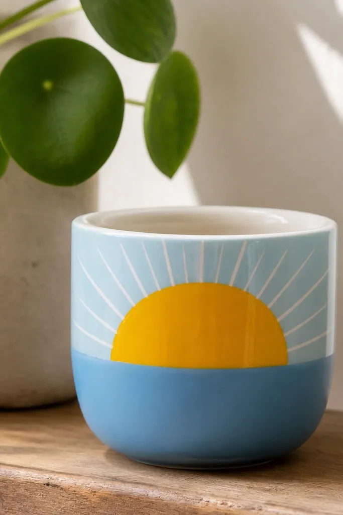
A sunbeam graphic gives you that instant “morning light” vibe, and it’s easy because the design is big and simple. Sky-blue plus bright yellow looks great next to green plants and also looks nice in rooms with warm wood because the blue cools it down. It flatters kids' spaces because it doesn’t have tiny parts that get messy. I’ve used this for birthday party center pots and they look good even after kids carry them around.
Start with a sky-blue base coat, leaving the bottom third slightly darker if you want dimension. Paint a clean half-moon shape in bright yellow across the top half. Use a thin white brush to add 8-10 rays — short lines — starting behind the half-moon edge. After the paint dries, touch up any uneven spots with a second thin coat and seal.
Pro tipUse painter’s tape to mask the half-moon edge for a sharper line.
AvoidDon’t overwork the rays; too many tiny revisions make them wobbly.
6. Pastel Sprinkle Specks
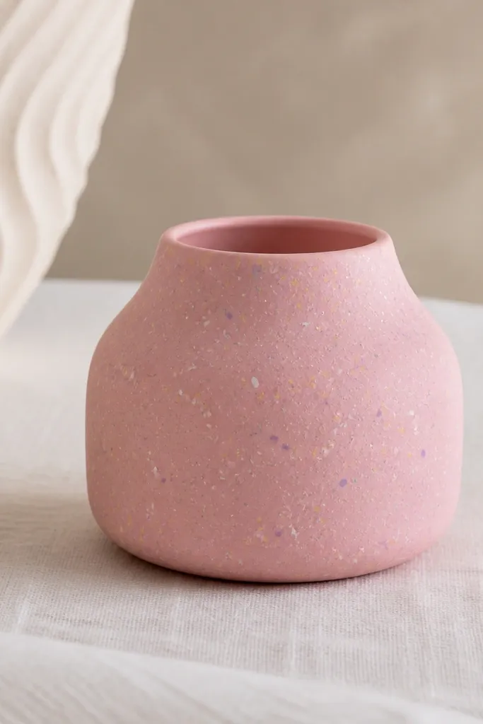
Sprinkle specks are the “I need cute fast” option. The trick is mixing multiple pastel colors but using the same placement logic so it looks planned. Light pink base makes the specks pop without looking harsh, and the pastel palette fits just about any kid room theme. I like it for small herbs because the specks don’t compete with leaves — they sit on the pot surface as a playful layer.
Paint the pot a matte light pink and let it dry. Thin a few colors (white, pale yellow, lavender, mint) with a tiny splash of water so they flow like dots. Dip a toothbrush or small stencil brush, then flick lightly to create specks; practice on a paper scrap first. Add a few slightly larger dashes near the center, then seal with a satin clear coat.
Pro tipIf you flick too hard and get big blobs, let it dry and scrape the edges with a dry craft knife.
AvoidDon’t use only one color for the specks; single-color dots look flat on a mini surface.
7. Chocolate Drip Accent
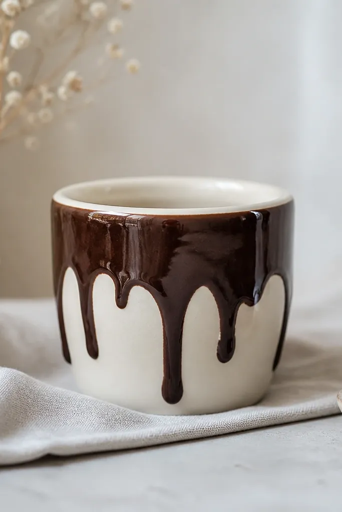
Drips look adorable and they hide small imperfections because the drip shape naturally covers uneven spots. Cream background keeps it bakery-cute, and chocolate brown reads warm against green plants. This is a great pick for kids because it feels like a treat without needing tiny facial features. I’ve done this style on both terracotta and plastic and it always looks cute up close.
Paint the pot cream and let it dry completely. Use a small round brush to paint a thick chocolate-brown line along the top rim area, then pull the paint downward in 6-10 drips of different lengths. Keep drips wider at the top and narrower as they fall. Let it dry, then add one more thin chocolate pass where the drip edges look thin, and seal.
Make your drip line slightly uneven on purpose — symmetrical drips look fake on mini pots.
Don’t thin the chocolate paint too much — watery drips run past the mini pot and look sloppy.
8. Mini Face with Blush Cheeks
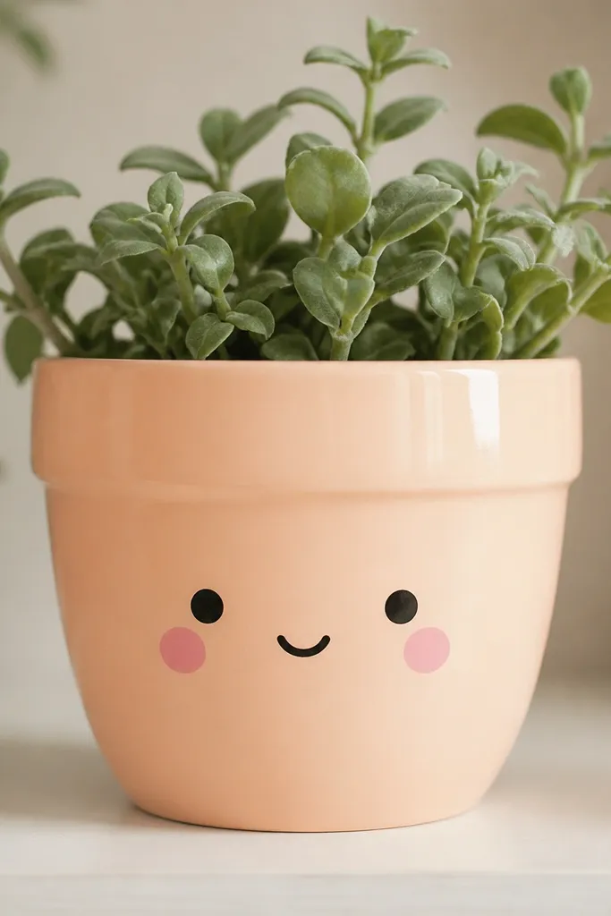
Faces are always a hit with kids, but you need restraint. Two dot eyes and a small smile keep it cute, not cartoonish clutter. Peach base plus blush cheeks flatters a wide range of room colors, and the simple black lines are readable even from a distance. I also like that it works for different ages — toddlers love the cheeks, older kids like the minimal look.
Paint the pot pale peach, then add two black dots for eyes using a toothpick dipped in black acrylic. Draw a small curved smile with a fine liner brush. Add blush cheeks with a sponge — dab light pink circles on both sides of the smile. Finish with a tiny cream highlight dot near the top right and seal with clear coat.
If your smile looks crooked, wipe it off with a damp paper towel before it dries.
Don’t add lots of facial lines — eyebrows, freckles, and extra details make mini faces look messy.
9. Gold Rim + Dot Band
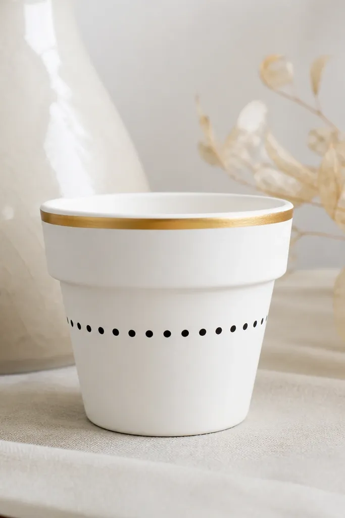
This is the “grown-up cute” option that still works for kids' rooms. The gold rim gives you that polished look without painting the whole pot metallic, and the black dot band adds just enough graphic punch. White background makes it easy to match any plant color, and the dot band holds the design steady so it doesn’t feel random. I use this when I want a set that looks good in photos and doesn’t scream for attention.
Paint the pot matte white and let it dry. Use painter’s tape to mask a narrow strip around the rim, then paint a thin metallic gold line. Remove tape carefully once the gold is touch-dry. For the dot band, place dots in a straight horizontal line across the middle using a dotting tool or the eraser end of a pencil, then seal.
Pro tipPress tape down firmly on the rim so the gold line stays razor-thin.
AvoidDon’t paint metallic gold over wet white — it can bleed and look streaky.
10. Rainbow Side Steps
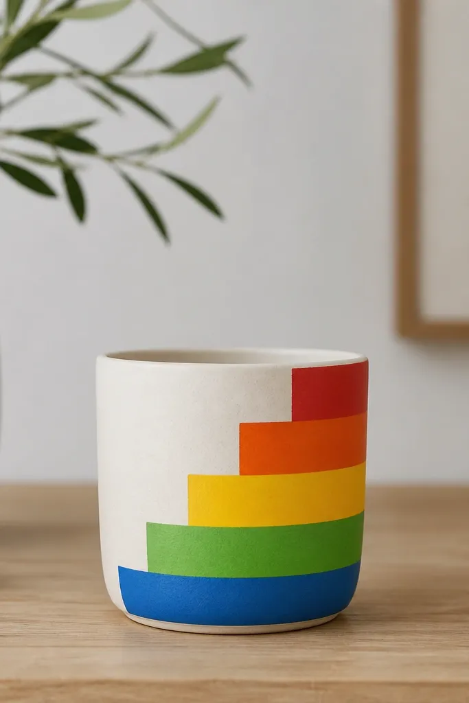
Side steps create movement on a small cylinder, and thick blocks look bold in a good way. I like this on cream because the colors stay bright and don’t get muddy. It flatters kids' spaces because it reads like a game pattern, not delicate art. If you’re matching multiple pots, repeat the same step height and you’ll get a cohesive set instantly.
Start with a cream base coat. Choose one side of the pot and mask a vertical strip about 1.5-2 inches wide using painter’s tape. Paint horizontal blocks inside that strip — red at the bottom of the strip, then orange, yellow, green, and blue — each block about the same height. Remove tape while the paint is slightly tacky, then seal.
Pro tipIf your tape lifts paint, warm it with your fingers first so it sticks better and peels cleaner.
AvoidDon’t blend the block edges — stepped corners are the whole look.
11. Watercolor Wash with Stamped Hearts
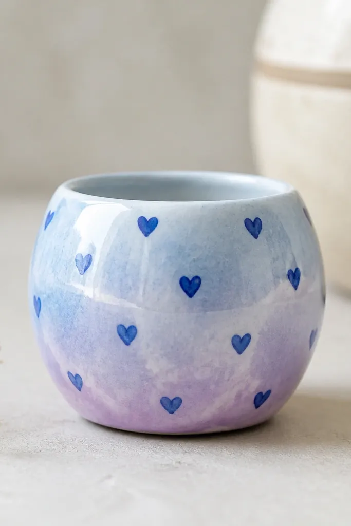
Watercolor wash looks fancy because it’s airy, and hearts keep it sweet for kids. The imperfect edges of stamped hearts look more real than perfectly painted hearts, and that’s what makes it charming. Light blue to pale purple sits nicely next to plants and won’t clash with most toy colors. This style is also forgiving if your first wash looks uneven; the hearts pull the eye to the pattern.
Paint a light watercolor wash using watered-down acrylic: light blue on the lower half, then blend into pale purple upward while it’s still wet. Let it dry fully. Dip a small heart stamp (or make one with a sponge cutout) in darker blue paint and stamp 10-14 hearts around the pot. Leave some blank space so the wash breathes, then seal with clear coat.
Stamp on scrap paper first to learn how hard to press so the heart edges stay crisp.
Don’t stamp too close together — crowded hearts make the wash disappear.
12. Geometric Checker Mini Band
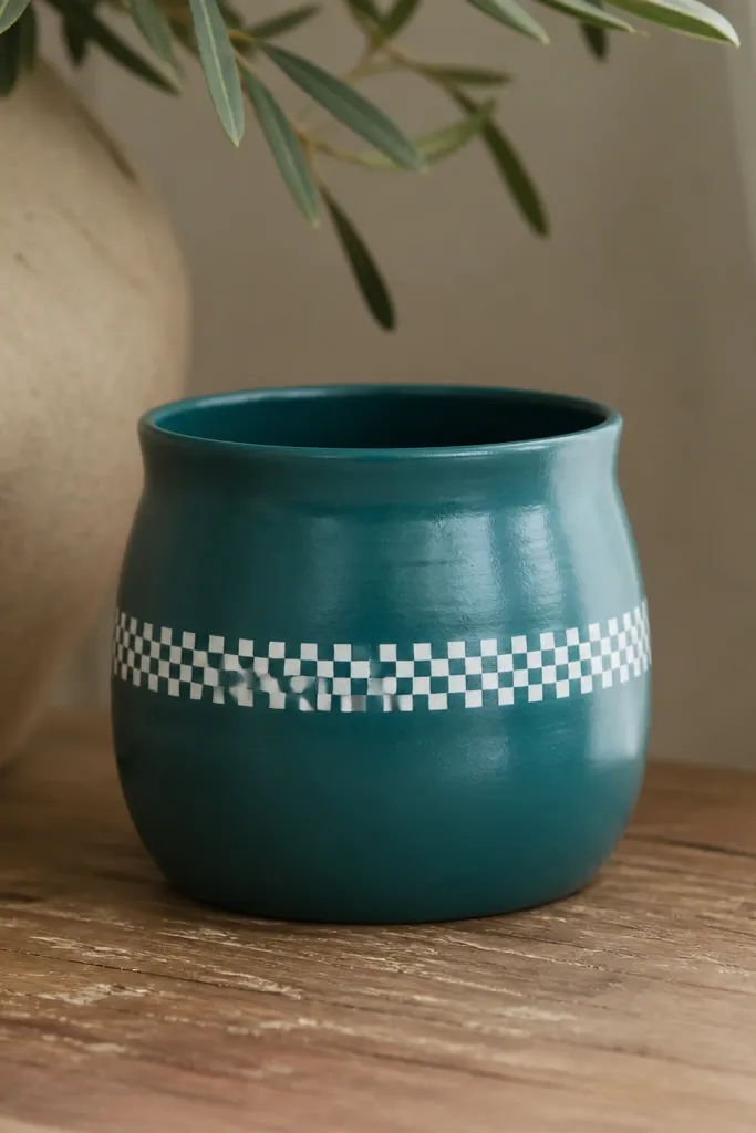
Checker bands look clean and modern, and they’re surprisingly fast if you use tape as a guide. Teal plus white is bright but not loud, and it plays well with silver plant pots too. The pattern flatters small spaces because it has strong structure. I like this for kids who love shapes and for rooms with lots of solid colors.
Paint the pot matte teal and let it dry. Mark the band location with light pencil lines — about the middle of the pot. Tape a grid using painter’s tape — start by placing vertical tape strips across the band width, then horizontal strips at equal spacing. Paint the taped squares white, let it dry, then remove tape to reveal the checker pattern. Seal with clear coat after the paint cures.
Pro tipUse a ruler and keep your tape spacing consistent; the mini scale makes uneven squares obvious.
AvoidDon’t freehand the checker — wobbly squares make it look like a rushed stencil.
13. Lavender Sprig Doodles
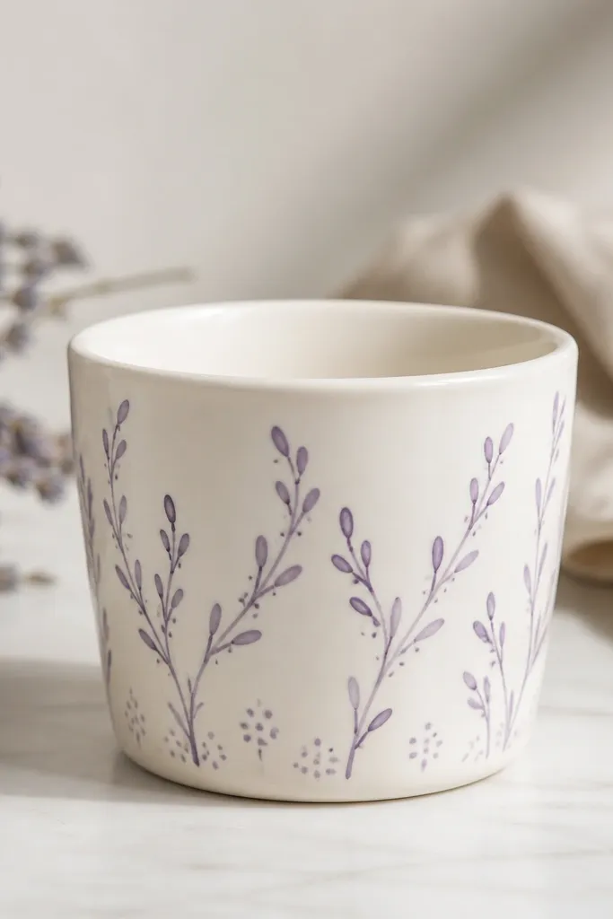
Sprig doodles look delicate but they’re easy if you repeat a single shape. White background makes the lavender lines pop, and the doodle style looks cute without getting too detailed. This works great for kids because it’s not sharp or busy, and the soft purple doesn’t stain-looking harsh. I use it when I want the pot to look like it belongs in a calm corner, even if the rest of the room is chaotic.
Paint the pot white and let it dry. Use a fine liner brush with lavender-purple paint and draw a winding line around the pot like a vine. Add small oval buds along the line and a couple of tiny leaf marks branching off. Finish with a small cluster of 3-5 dots near the bottom edge to balance the composition, then seal.
Pro tipThin your lavender paint slightly so the line stays smooth and doesn’t clump.
AvoidDon’t overload the brush — thick lines make doodles look like paint blobs.
14. Monochrome Black Cat Kitten
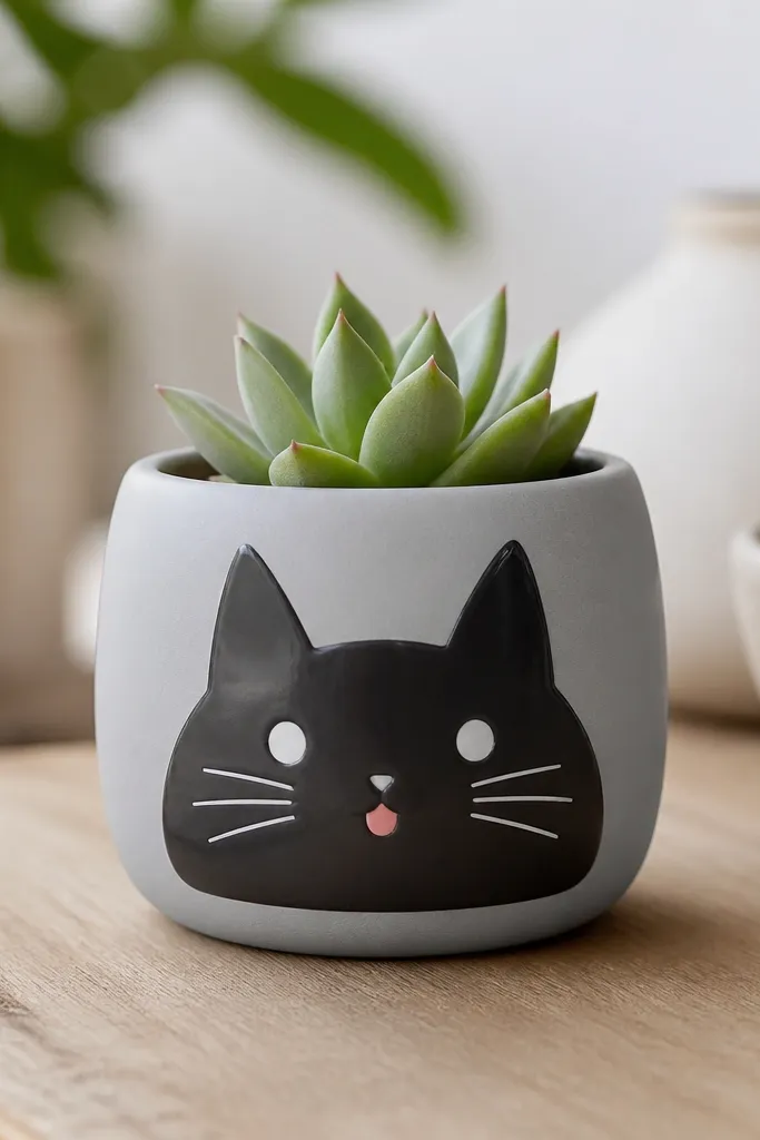
If you want a theme that feels playful but still neat, a monochrome cat face does it. Light gray base makes black lines look sharp, and white eye dots add that instant “aww” factor. It flatters kids because it’s readable and doesn’t require fine color blending. I’ve painted this for Halloween decor and it also works year-round because the face is simple.
Paint the pot matte light gray. Draw two pointy cat ears by making small triangles at the top of the face area. Add two white eye dots, then add small black pupils inside. Draw a tiny triangle nose and a small curved smile, then add 3-4 whisker lines on each side with a fine brush. Finish with a dot of pink for the tongue and seal.
Pro tipLet each color dry before adding pupils or whiskers so lines stay crisp.
AvoidDon’t make the eyes too large — on a mini pot, big eyes can look like a mask.
15. Pastel Rainbow Wash + White Clouds
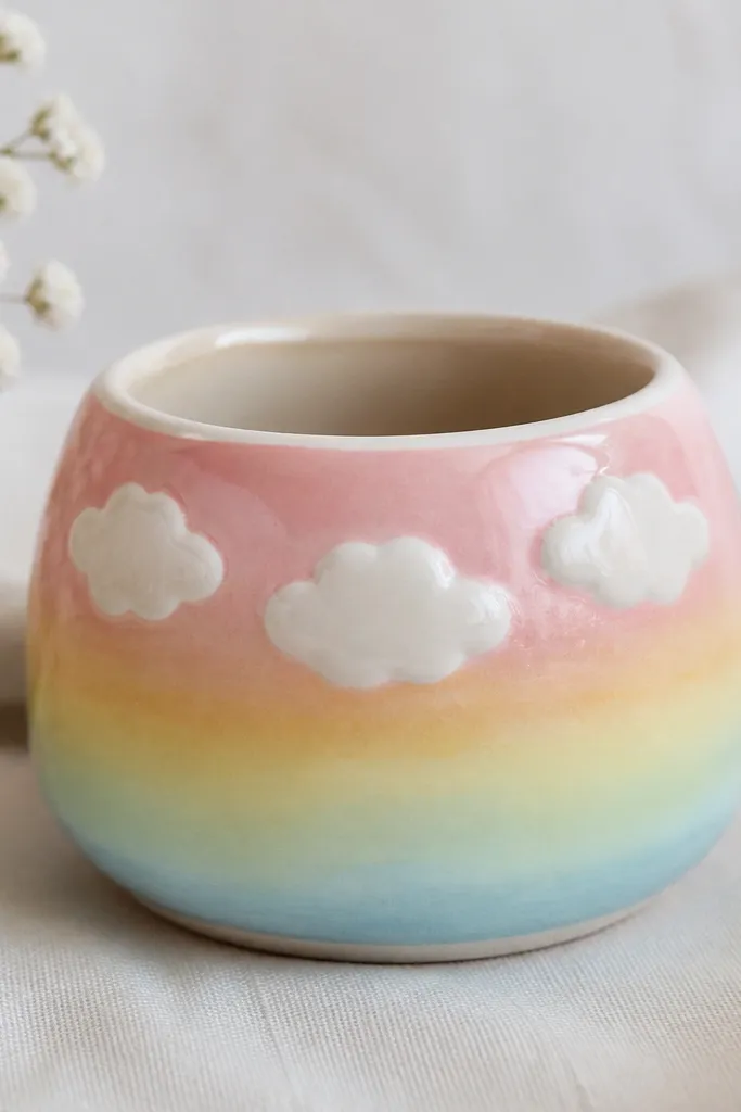
Clouds make kids' pots look like a storybook without requiring tiny flowers or complicated shading. The pastel rainbow wash gives you color depth, while the white clouds keep the design light. This is great for any plant because it doesn’t fight the leaves — the clouds sit above the plant line visually. I like it for nurseries because the palette stays gentle in morning light.
Paint the pot with a white base first. Then brush on pastel rainbow bands across the middle — pink, yellow, mint, and sky blue — blending edges with a dry sponge so it stays soft. After it dries, add 3 cloud shapes in white using a round sponge or a thick brush: big curved bumps connected together. Add a tiny shadow line under one cloud with light gray, then seal with clear coat.
Pro tipUse a makeup sponge for the clouds; it gives the fluffy texture faster than a brush.
AvoidDon’t paint clouds directly on wet rainbow — the colors will bleed into the white.