1. Chalky Black + Warm Sand Half-Moon Bands
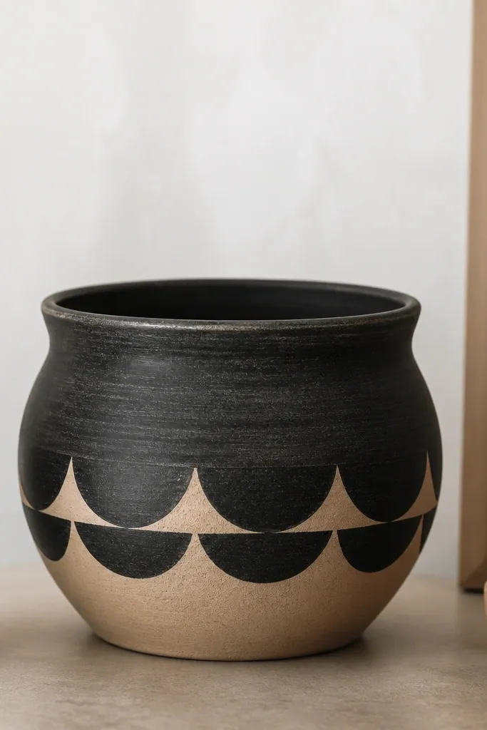
This design looks clean because it uses one strong dark color and one soft light color, then repeats a single shape — half-moons — in a straight horizontal rhythm. I usually pair chalky black with warm sand (like a beige with a hint of yellow) so it reads modern, not harsh. It flatters small spaces because the contrast is high but the palette stays calm. For kids, it’s a win too since half-moons are easy to stamp with bottle caps or a cut sponge. On a shelf or windowsill, it makes the plant look more intentional because the pot isn’t fighting the leaves.
Start by priming the pot and painting the rim and outer lip black. Paint the main base in warm sand, then let it dry 45-60 minutes. Use a foam stencil brush to stamp half-moons along a single middle band: black half-moons pointing up, spaced evenly, then repeat for the next band if you want extra height. Finally, dry-brush a thin line of sand over the black rim so it looks less flat and more handmade — that little texture reads “modern” in real life.
Pro tipIf you want sharper half-moons, dip the sponge lightly and wipe it once on scrap paper before touching the pot.
AvoidDon’t paint the half-moons right on top of wet base coat — you’ll get fuzzy edges that make it look like a rush job.
2. Sage Grid with Tiny White Dots
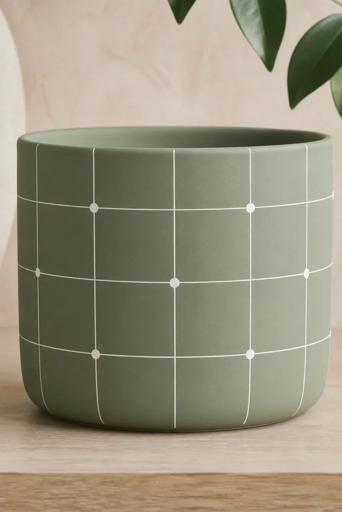
A grid is modern because it’s structured, and sage is forgiving because it hides tiny brush marks. I like adding tiny white dots at intersections because it gives the pot a playful rhythm without turning it into a cartoon. This one looks great on warm skin tones in photos because sage sits nicely next to beige and tan backgrounds. It also makes small plants look styled since the grid frames the greenery like a little poster. If you’re making a set of pots, this pattern looks cohesive even when each pot has different dot placements.
Prime the pot, then paint the whole body sage green in two thin coats. Once dry, mark a grid lightly with a pencil: 3-5 vertical columns and 2-3 horizontal bands, depending on pot height. Paint grid lines with a size 1 detail brush using white acrylic. Then add dots at every other intersection using the tip of a round brush or a toothpick — press lightly so the dot stays round. Finish by painting the rim sage and touching up any white line ends so the grid doesn’t look broken.
Pro tipUse painter’s tape as a guide for the first grid line; remove it while paint is still slightly tacky for clean edges.
AvoidAvoid thick grid lines — chunky stripes on a pot look like kids' markers instead of modern design.
3. Terracotta + Cream Vertical Pinstripes
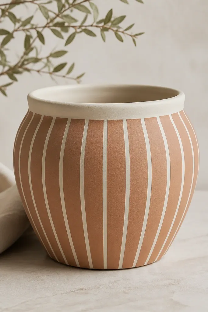
This is the one I recommend when you want modern without covering everything. Leaving the terracotta visible gives warmth and texture, and the cream pinstripes add that clean, tailored look. I’ve used this on pots that hold herbs and small succulents because the vertical lines echo plant stems. It also looks good in photos because the terracotta color gives depth — the cream lines pop without needing loud colors. For kids, it’s easy if you use a ruler and tape to keep spacing consistent.
Clean and prime the pot, then skip full coverage: leave the terracotta tone exposed by only sealing with a thin primer coat. Paint the inner rim and outer lip cream first and let it dry. Place painter’s tape strips vertically as guides, spacing them 1/2 inch apart (or tighter on smaller pots). Paint between the tape with cream acrylic, remove tape while paint is still slightly wet, then repeat around the pot. Finish with a clear matte sealer after everything cures overnight.
Pro tipIf you’re working with small kids, let them place tape strips while you paint — the straight spacing is the whole magic.
AvoidDon’t use bright white — it can look stark and cheap against terracotta; go for an off-white cream.
4. Monochrome Speckle Drips with Matte Seal
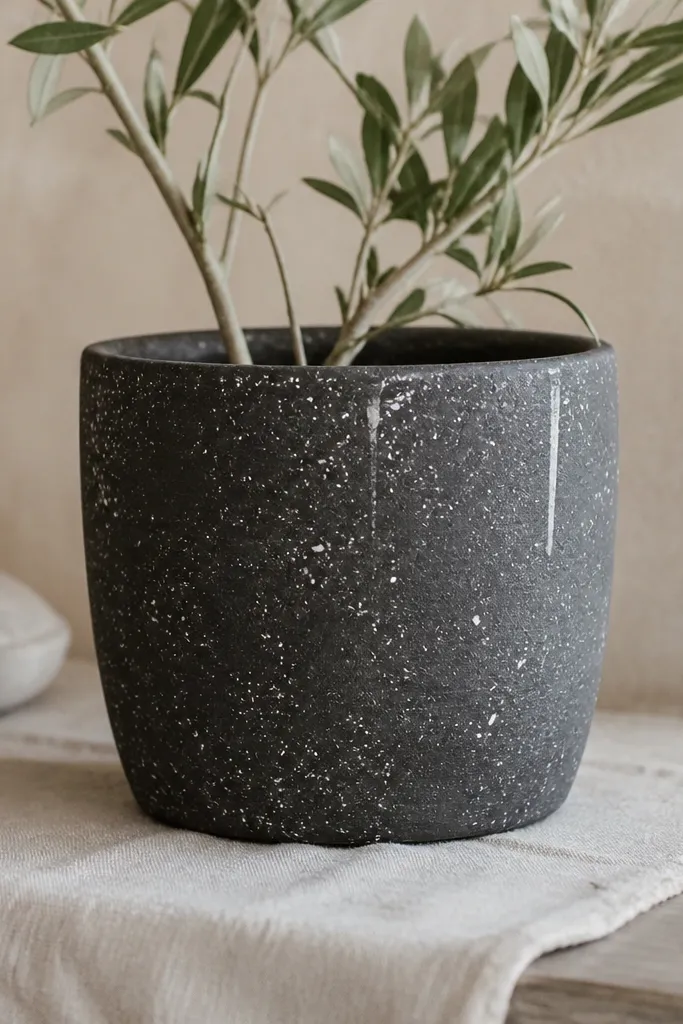
Speckles and drips read modern when they’re controlled — not messy. I’m a fan of charcoal as the base because it makes white specks look crisp instead of dusty. The little drips add movement, like a modern art print, but keeping them short keeps it from looking like a spill. This is great for kids because speckling is forgiving, and it still looks intentional when you stop at a few clusters. It also hides minor imperfections in the pot surface because the texture becomes part of the design.
Prime the pot and paint it charcoal gray in two thin coats. After drying, load a stiff toothbrush or small brush with white paint thinned slightly with water (just enough to move). Hold the brush over the pot and flick lightly for speckles, then add two or three short drip lines by dragging the brush down 1-2 inches. Work one side at a time so you don’t overdo it. Once dry, seal with a matte clear coat — glossy drips look slick and less modern.
Pro tipTest your speckle flick on a scrap piece of cardboard first so you get the size you want.
AvoidAvoid heavy wet drips — if the paint runs, it turns into a blob and ruins the clean modern control.
5. Pastel Diagonal Blocks with One Black Outline
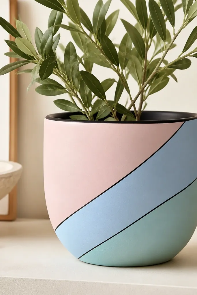
Diagonal blocks look modern because they break the pot’s round shape into graphic sections. I keep it modern by using pastel colors but adding one black outline line — that outline is what makes the blocks feel designed instead of accidental. This palette looks great with bright green plants because the soft pinks and blues don’t compete with leaf color. It also flatters people’s eyes in photos — the high-contrast black edges make the pot readable from a distance. For kids, diagonal blocks are fun because tape makes the angles easy.
Prime the pot, then paint a base color (soft mint works well). Use painter’s tape to mask diagonal stripes from top rim to bottom edge; press the tape down firmly. Paint each block with blush pink, pale blue, and another pastel you like, leaving tape edges crisp. When the paint is dry to the touch, peel tape back slowly. Finally, use black acrylic and a detail brush to trace block edges lightly where tape may have left micro gaps, then paint the rim black.
Peel tape at a 45-degree angle to keep edges sharp.
Don’t skip the black outline if you’re using pastels — without it, the blocks blend and look washed out.
6. Tiny Botanicals in a Single Corner
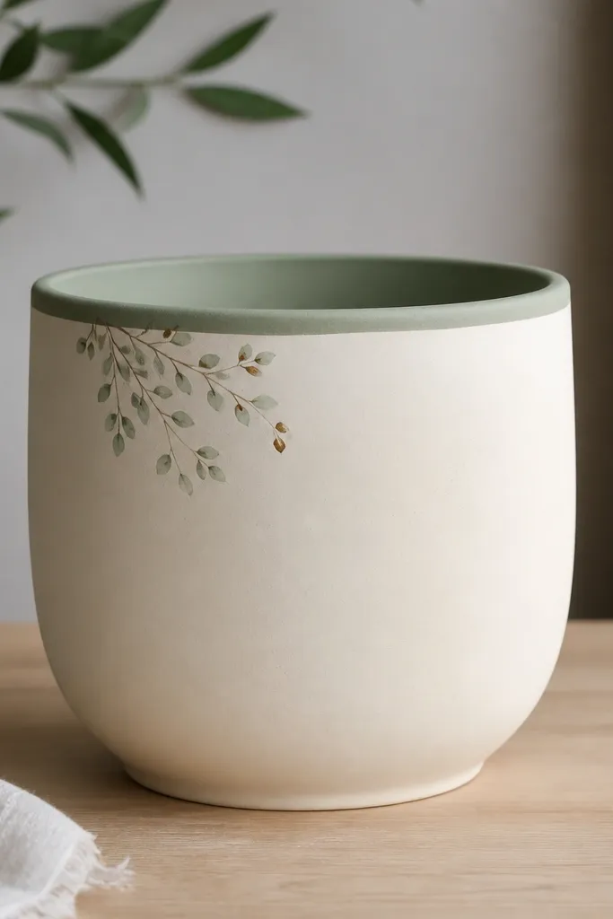
This one looks modern because it’s restraint: a small botanical cluster placed in one corner instead of covering the whole pot. I use muted green for leaves and a tiny dot of terracotta or warm brown for stems so it feels hand-painted, not sticker-like. This design flatters medium to dark plant leaves because the light cream background makes the foliage pop. It also works on larger pots where full patterns can feel busy. Kids can help with the leaf shapes, and you can do the final clean lines with a detail brush.
Prime the pot and paint the entire body cream in two coats. Let it dry fully, then paint a muted green rim and inner lip. Choose one corner and mark a simple guide rectangle with pencil, about 3 inches wide on a small pot. Paint tiny leaves using a fine brush: a few teardrop leaves, then add small stems and one tiny flower dot if you want. Keep the rest of the pot plain for the modern effect, then seal with matte clear coat.
Pro tipMake leaf tips slightly darker than the base color for a more realistic look.
AvoidAvoid covering the whole pot with botanicals — it turns into clutter fast.
7. Navy Rim + Watercolor Wash Ombre
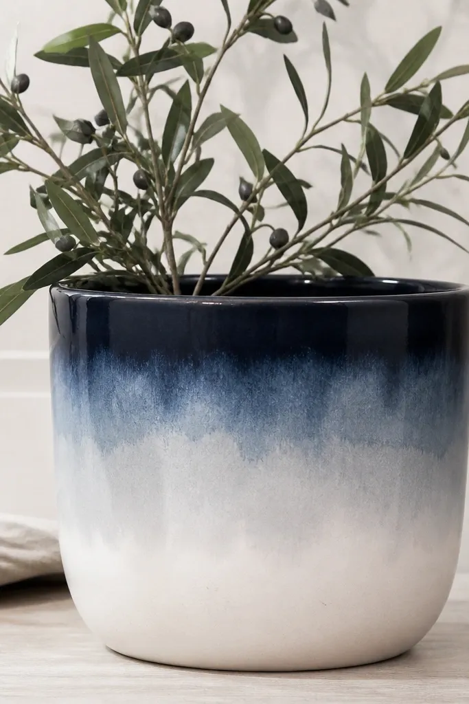
An ombre wash feels modern because it smooths the pot’s round shape into a gentle gradient. I like navy because it’s bold but still calm, and it pairs with almost any plant color. The watercolor effect looks airy, and the navy rim makes the whole pot look finished. This is especially flattering on plants with lighter leaves because the gradient doesn’t compete. For kids, the wash is forgiving since uneven blending looks intentional.
Prime the pot and paint the rim navy first, then pull a thin navy band about 1 inch down. Mix navy acrylic with water to a watercolor consistency, then lightly sponge or brush the wash downward. Work in small sections, blending with a damp brush so the transition stays soft. When you reach the bottom, use mostly water-thinned paint so it fades to pale gray-white. Let it dry, then seal with matte clear coat to keep the wash from looking glossy.
Pro tipUse a makeup sponge for the softest fade — it gives a smoother watercolor edge than a brush.
AvoidDon’t go too opaque at the fade — if it stays dark, it looks like a solid block instead of ombre.
8. Bold Numbering with Tiny Arrows
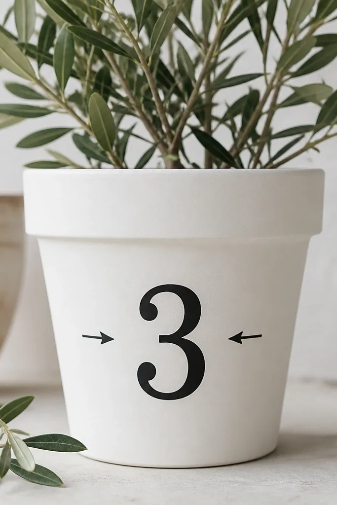
Graphic numbering looks modern because it feels like a label or museum tag. I use one large number and a couple of small arrows, then stop. That keeps it from turning into a messy sticker wall. It’s great for kids because you can pick a number that matches the plant’s spot on a shelf (like Pot 3). This design also looks good for photos because the black text is readable without getting lost in the plant leaves. Keep your font simple and hand-drawn — the slight wobble makes it feel real.
Prime and paint the pot off-white, then let it dry fully. Use a pencil to place the number centered about 2 inches below the rim. Paint the number in black acrylic with a small flat or detail brush. Add two tiny arrows beside the number: one pointing in, one pointing down. Finally, paint the rim off-white and seal matte. If you want extra polish, add a thin black line under the number like a baseline.
If your handwriting is shaky, print the number on paper, tape it under the pot, and lightly trace the outline with pencil.
Don’t use fancy script fonts — they read messy on a round pot and look like craft-store vinyl.
9. Color-Block Chevron Wrap
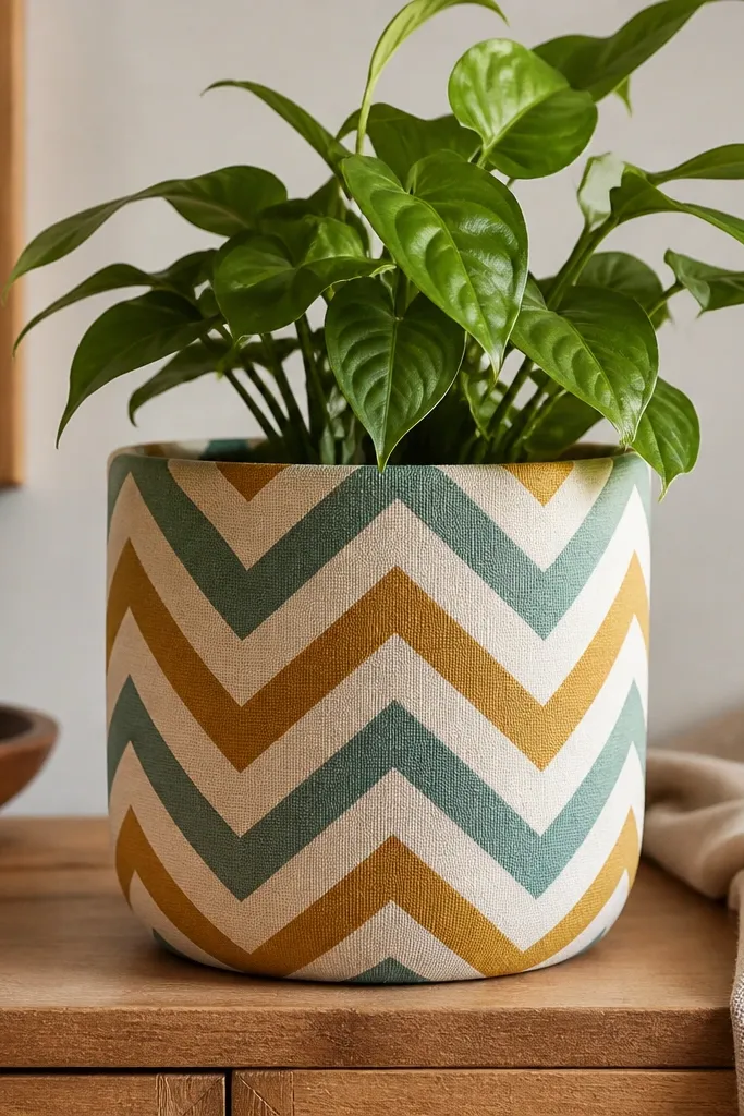
Chevron looks modern when the stripes wrap evenly around the curve. I like using three colors max and repeating the chevron rhythm from top to bottom so it feels like a pattern, not random decoration. Mustard and muted teal look especially good with terracotta plants because the colors echo warm light and leaf tones. This design flatters wider pots because the chevrons give a sense of structure. Kids can help with tape-masked triangles, and you can do the final touch-ups once tape comes off.
Prime the pot, then paint a base color (cream is forgiving). Mask chevrons with painter’s tape: create a zigzag line across the pot, then mirror it for the next row. Paint each chevron color in thin coats, letting each color dry before removing tape. Peel tape back carefully while paint is slightly tacky. When all stripes are done, paint a thin cream or mustard band at the bottom edge and seal matte to lock everything in.
Pro tipPress tape seams down with a plastic card so paint doesn’t bleed under the edge.
AvoidAvoid too many colors — chevrons with more than three shades start looking chaotic on a small pot.
10. Terracotta Pot with White Cutout Frames
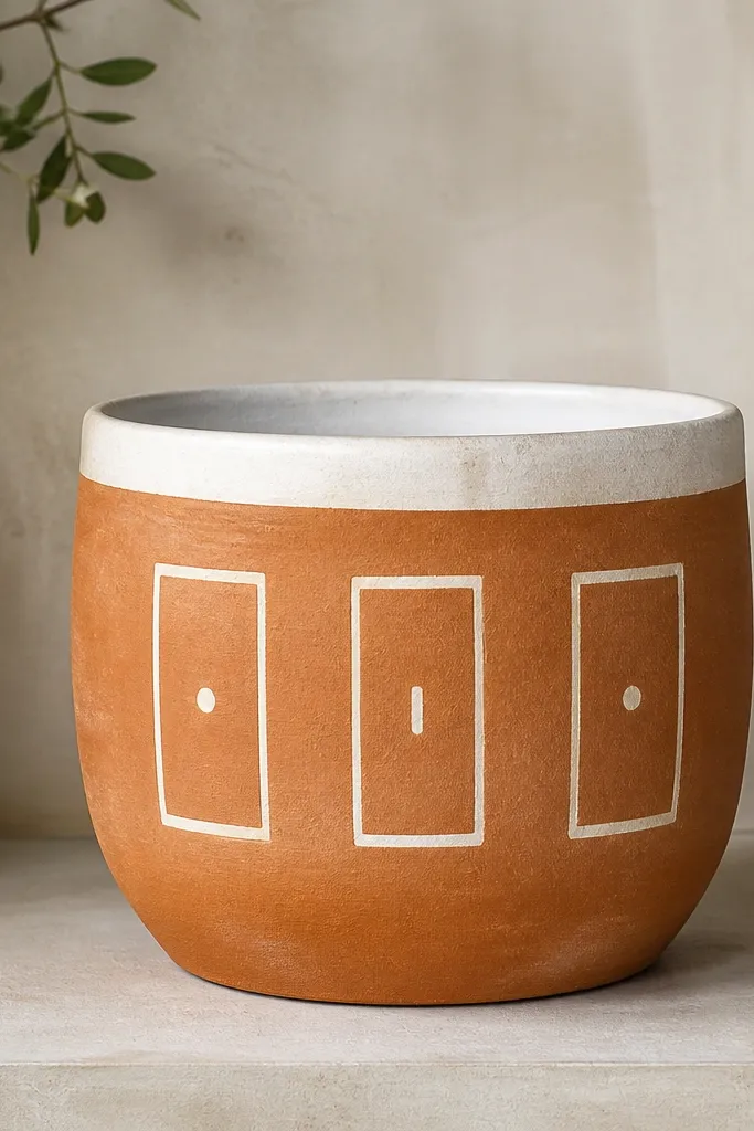
Leaving the pot natural makes this design look intentional and not overworked. White frames add a clean, modern graphic feel, and the tiny marks inside keep it from looking like empty windows. I use this for plants that have strong leaf shapes because the pot doesn’t compete — it just organizes the view. It also looks good in both bright and neutral rooms because terracotta brings warmth. For kids, drawing rectangles is easier than freehand shapes, and the tiny marks are a quick win.
Clean and prime the pot, then paint the rim white. Use pencil to mark three vertical frame rectangles, spaced evenly around the pot. Paint the rectangle frames in white acrylic, keeping the lines about 1/8 inch thick. For the inside details, add one dot or a short horizontal line in each frame using a detail brush. Let dry, then seal matte clear coat so the white stays crisp.
Use a ruler for rectangle corners — even a small angle error shows up on straight frames.
Don’t make the frame lines too thick; thick white borders look like oversized stickers.
11. Monochrome Face Silhouettes in Soft Gray
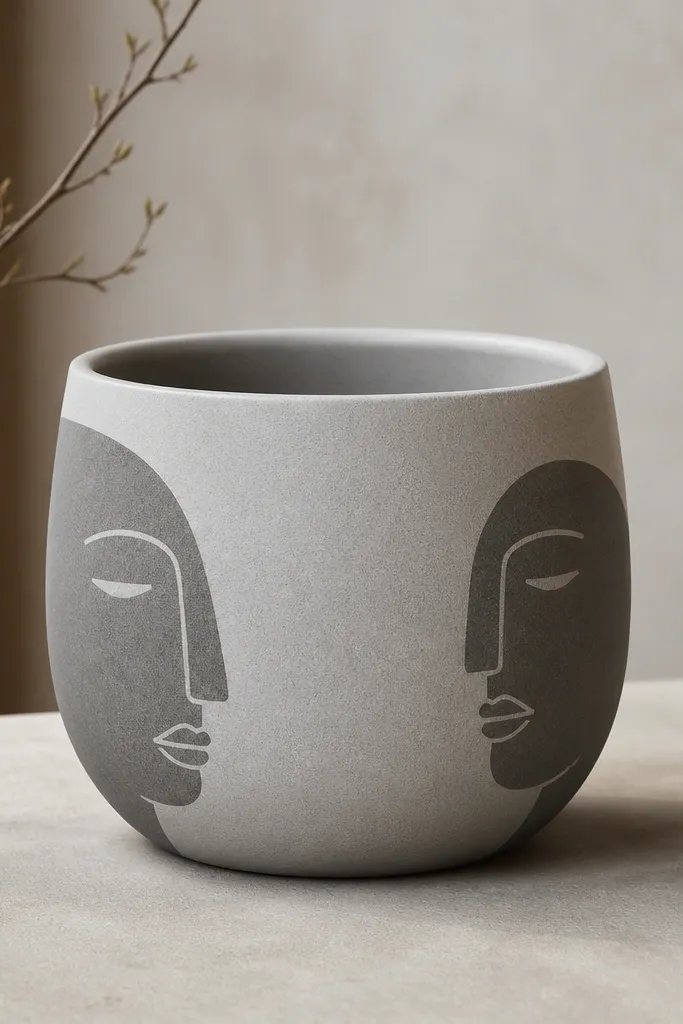
Minimal faces can look modern when they’re monochrome and quiet. I paint silhouettes in soft gray so the pot looks calm next to greenery, not like a loud character. This design flatters plants with wispy leaves because the pot has a gentle focal point without heavy color. It also works well for teens and adults because it feels like contemporary art rather than a kids craft. The key is simple shapes — no tiny details, just a clean profile and a few lines.
Prime the pot and paint it a light gray base. Let it dry, then lightly sketch two face silhouettes on opposite sides with pencil — keep them small, about 3 inches tall. Paint the silhouettes in a darker gray using a flat brush for the main shape. Add one or two simple facial lines with a detail brush, like an eye dot and a nose curve. Seal matte when everything is dry, and keep the rim light gray for a unified look.
Pro tipUse a reference photo printed small so you copy the profile shape accurately without overthinking.
AvoidSkip tiny facial features — they blur on a curved pot and look messy.
12. Gold Outline Rings Around the Pot
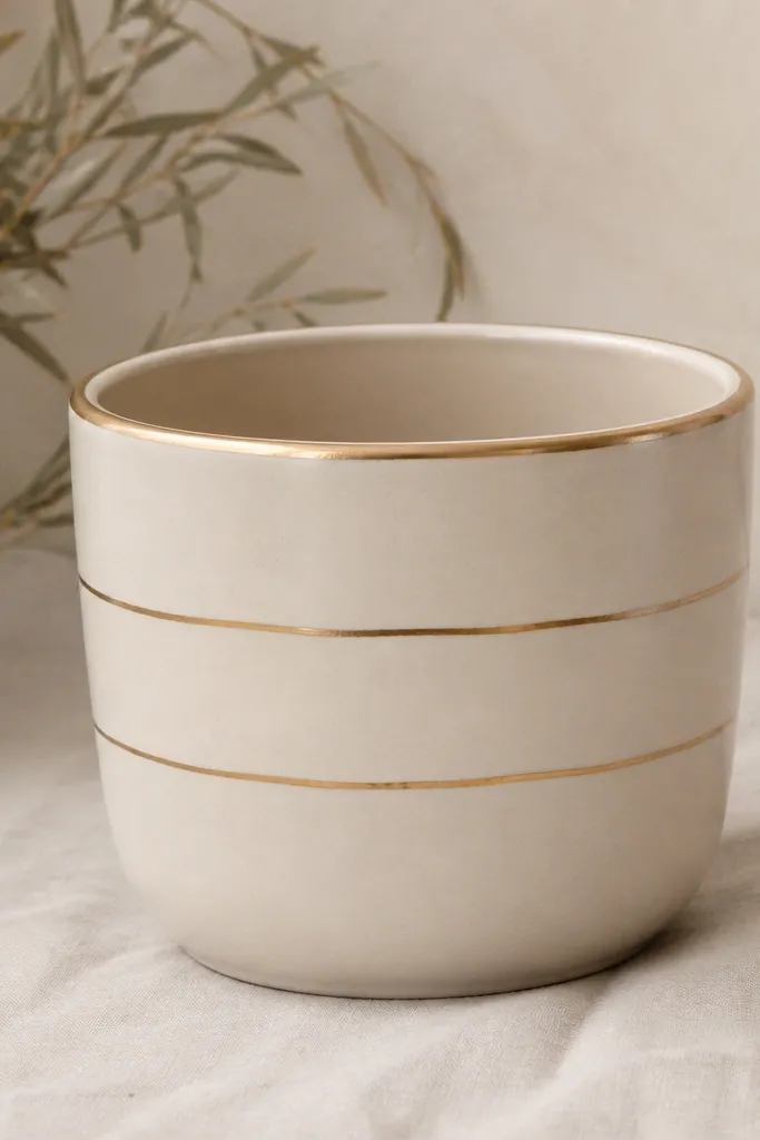
Rings feel modern because they’re simple and clean, and the gold outline adds a little “done” factor without needing a full pattern. I use actual acrylic gold paint or metallic gold marker, but I keep the rings thin so it doesn’t look like craft glitter. This looks great on neutral interiors and on plants with dark leaves because the gold catches light. It also flatters small pots because thin rings don’t overwhelm the shape. Kids can help by placing painter’s tape for ring placement while you do the gold line tracing.
Prime the pot and paint the body cream. Mark three ring positions with pencil: one near the top third, one mid, one near the base. Place painter’s tape along each ring line for a guide, then paint a thin gold line over the tape. Remove tape while paint is still tacky to keep edges crisp. Finish by painting a tiny gold line on the outer rim edge, then seal matte if you’re using acrylic gold (metallics can turn dull under glossy sealer).
Pro tipIf your gold paint is thick, thin it slightly so the line stays smooth and even.
AvoidAvoid thick, bubbly metallic paint — it looks chunky and less modern.
13. Rainbow Stripes with a Single Neutral Base
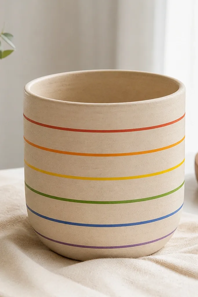
Horizontal rainbow stripes look modern when they’re thin bands on a neutral base. I keep the base beige so the colors feel graphic, not childish. This one makes bright plants look cheerful, but it also works with calm greenery because the pot supplies the color. It flatters kids and adults alike because the design is straightforward and readable. The modern part is the spacing: even bands, same height, and no extra doodles.
Prime the pot and paint it beige in two coats. Let it dry, then measure stripe height with a ruler: around 1/4 inch bands for a small pot. Use painter’s tape to mask each stripe, then paint colors in order: red, orange, yellow, green, blue, purple. Remove tape carefully and touch up gaps with a detail brush. Paint the rim beige and seal matte clear coat so the colors stay soft and not shiny.
If you’re doing this with kids, let them paint only one or two colors per pot so the bands stay consistent.
Don’t freehand the stripe edges — uneven stripes make it look messy instead of modern.
14. Ink-Style Leaves with One Accent Color
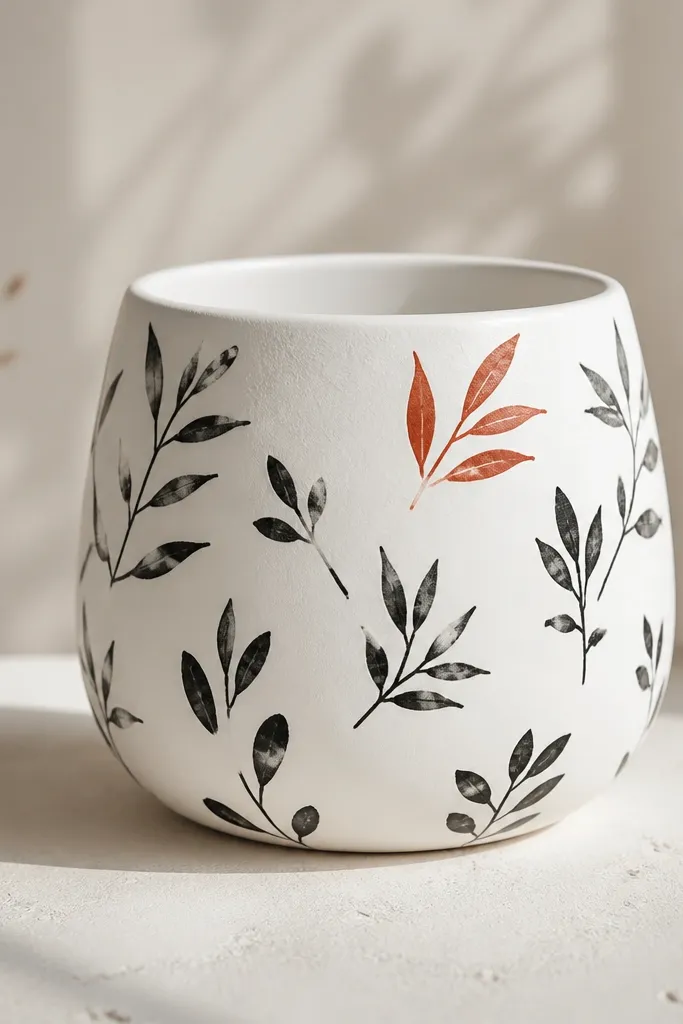
Ink-style leaves look modern because they’re line-based, not filled-in. I paint the leaves in black for that sketchy, contemporary feel, then add exactly one accent leaf in a warmer color like terracotta-red or brick. That single accent makes the design feel intentional, not random. This works on almost any plant because the pot is mostly neutral and the plant becomes the color partner. It also looks great for kids because leaf shapes are easy, and line art can hide shaky brush control. Keep the rest of the pot clean so the leaf cluster reads like art.
Prime and paint the pot white, then let it dry completely. Use a pencil to place 6-10 leaf sketches across the front and sides without covering the rim. Paint leaf veins and edges in black with a detail brush, leaving some leaves lighter by not fully filling them. Choose one leaf near the top and paint it terracotta-red, staying within the outline. Seal matte clear coat after the ink lines dry — matte keeps the sketch look from turning glossy.
Use a hair-thin brush for veins; even a simple line makes the whole leaf look finished.
Avoid filling every leaf solid black — full blocks of black look heavy and less modern.
15. Two-Tone Marble Look with Toothbrush Veins
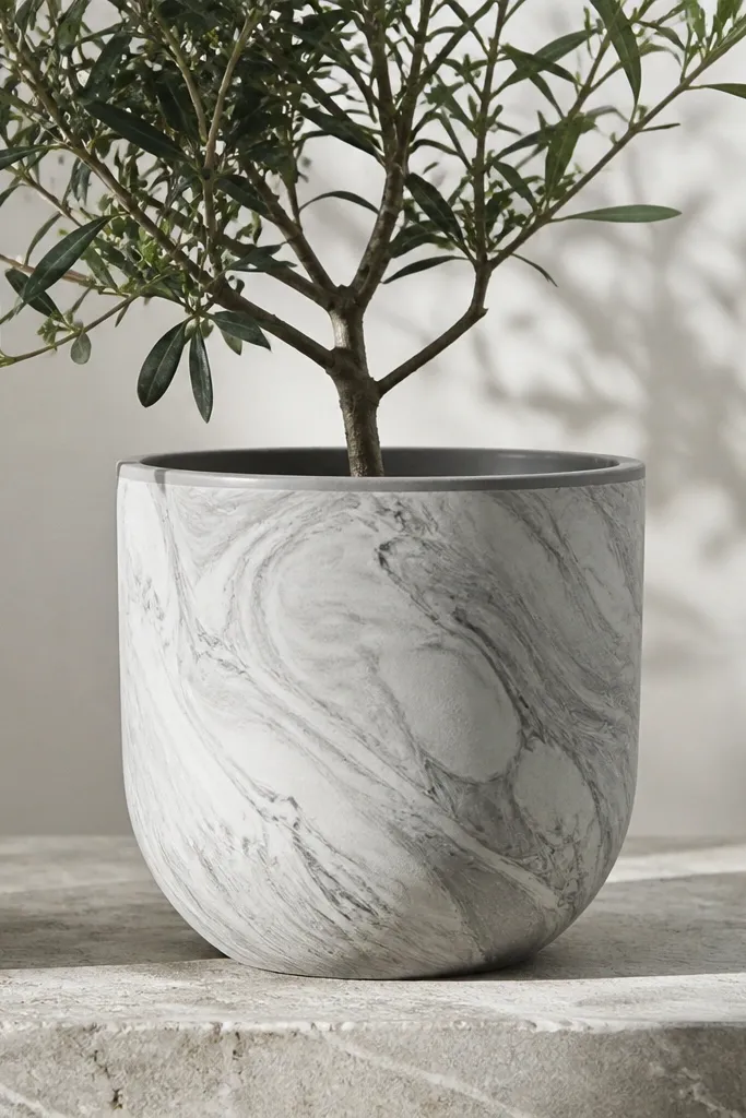
Marble looks modern when it’s not overly dramatic. I use pale gray and white for a clean, airy marble effect that looks expensive without real stone. The toothbrush-vein method adds natural-looking lines without needing special tools. This design looks best with plants that have structured leaves because the pot’s subtle veins don’t compete. It’s also a nice compromise for kids — they can help with the swirls while you handle the fine veins and rim cleanup. The matte finish keeps it from looking like wet paint.
Prime the pot and paint the base pale gray. While it’s still slightly tacky, add white patches with a sponge, then lightly swirl with a dry brush to blend edges. Load a toothbrush with darker gray diluted paint and flick tiny lines for veins. Use a small brush to pull a few longer swirls so it looks like marble instead of random specks. Paint the rim pale gray to match the base, then seal matte once fully dry.
Pro tipDilute your vein paint more than you think — thinner lines read like stone and don’t smear.
AvoidAvoid thick, high-contrast marble — it can look like wallpaper instead of a modern art finish.