1. 12x12 Grid With One Burst Photo
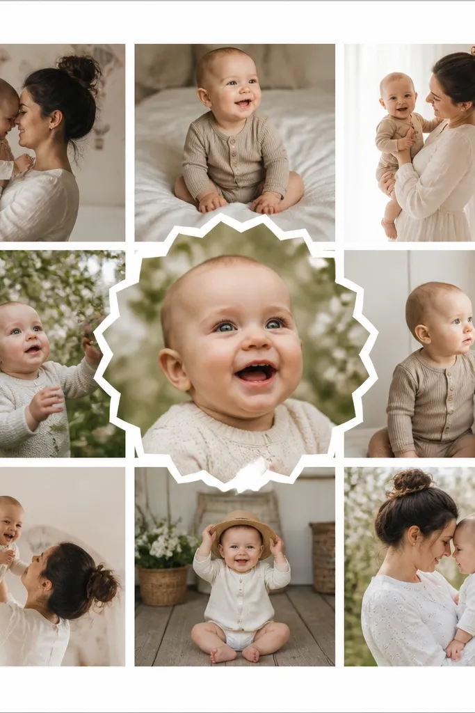
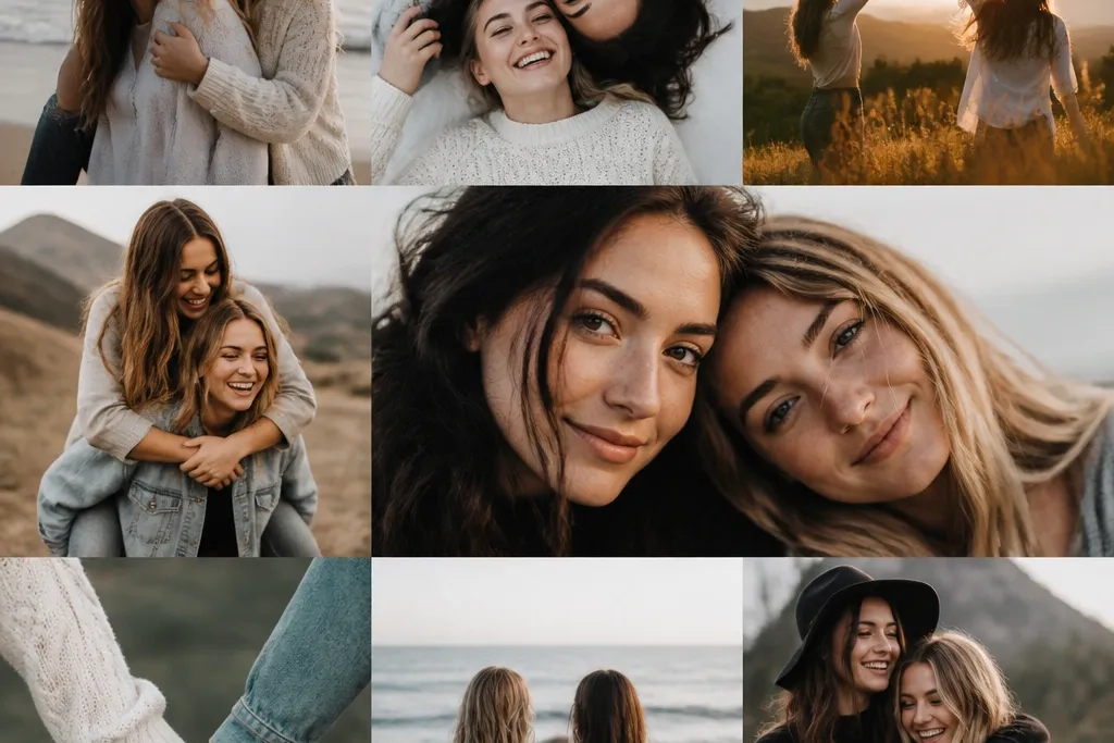
This layout is the one I reach for when I have 10 to 16 photos and I want it to look neat without overthinking. The repeated grid makes it feel tidy, while the burst photo adds a little drama without clutter. Use photos with similar color tones in the grid (like all outdoor daylight shots) so the center hero photo pops. This looks great for any skin tone because the layout doesn’t rely on heavy filters — the spacing does the work. If you’re making it for a birthday or end-of-year gift, the burst photo is where you put the moment that made everyone laugh.
Start with a 12x12 sheet of white cardstock. Cut nine photo squares to 3.5x3.5 inches and mount them in a 3x3 grid with 0.25-inch margins. Pick one photo for the center and resize it to 5.5x5.5 inches, then layer a scalloped circle behind it using yellow or coral craft paper. Finish by adding a thin 1-inch strip of colored washi tape along one edge of the grid, not all around. Press everything flat with a bone folder so corners don’t lift.
Use matte photo paper and keep the hero photo slightly brighter than the rest — it reads like a focal point instead of a random big picture.
Don’t mix portrait and landscape shots in the same grid without cropping them to the same orientation.
2. Two-Lane Best Friends Storyline

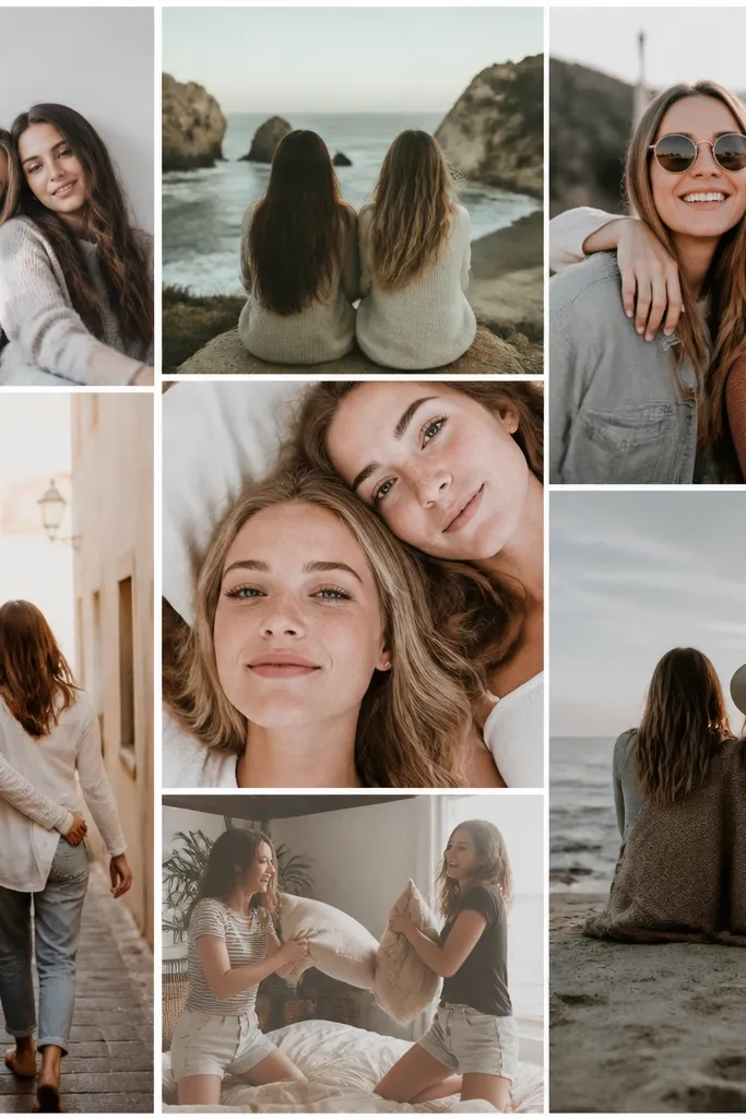
When best friends have separate memories (sports practice for one, band rehearsals for the other), this layout makes the story feel fair. The split down the middle gives clear structure, and the shared diagonal strip shows where you overlap. It flatters different skin tones because you’re grouping photos by lighting and environment instead of scattering everything together. If you’re making this for kids, it also gives them an easy job — “your lane, your picks.” For adults, it feels like a scrapbook page that still looks modern.
Cut an 11x14 foam board and mark a vertical line down the center with pencil. Create the left lane using 4 photos cropped to 3x4 inches, stacked with 0.5-inch gaps; do the same for the right lane. Add a diagonal strip across the center using a 4-inch wide patterned paper band (like small hearts or tiny stars) and mount three shared photos on it at 4x3 inches each. Put the diagonal strip so it crosses the center line at about 6 inches from the top. Finally, add small labels in tiny handwriting on the patterned band, like “our day” or “together,” using black gel pen.
Crop both friends' photos to the same width so the lanes line up visually, even if the heights differ.
Avoid writing long captions; short labels look intentional, long ones make the page busy.
3. Polaroid Stack With Torn Paper Edges
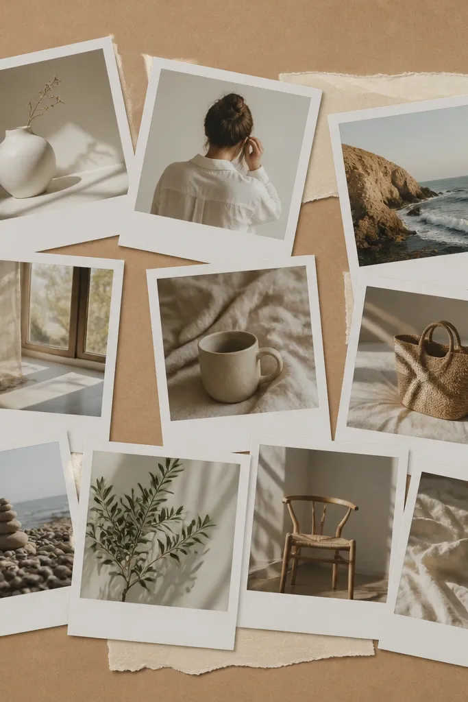
This one makes the collage feel warm and lived-in, and it’s perfect when your photos are mostly candid — selfies, silly faces, and quick moments. The faux polaroid frames keep everything consistent, even if your original photos have different sizes. Kraft brown and cream paper also hide small print imperfections, which matters when you’re printing at home. It looks great for all skin tones because the warm paper background softens harsh lighting and makes faces stand out. I’ve used this for teen best-friend gifts because it looks casual without looking sloppy.
Cut kraft paper to 11x14 and place it on a board. Print your photos and frame them with white paper borders sized to 3.5x4.5 inches faux polaroid look. Arrange 10 frames in two overlapping stacks, angled slightly left and right, leaving 1 inch of breathing room at the edges. Add two torn paper strips behind the stacks — one cream, one pale pink — and tuck them under the top frames. Secure everything with photo-safe tape on the back and small dots of removable glue stick under the bottom edges.
Fold a tiny crease on the top edge of each “polaroid” so it looks like it’s been handled, then flatten it so it stays crisp.
Don’t use glossy tape across the front; it catches light and makes the collage look like a school project.
4. Heart Window Collage (Center Cutout)
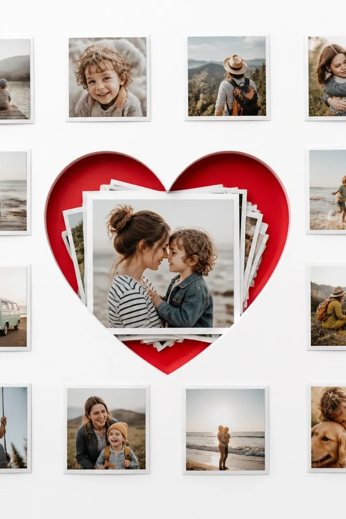
If you want cute and obvious without going overboard, this is the layout. The heart cutout is the focal point, and the surrounding small squares act like supporting cast. It’s especially flattering for photos with clear subjects — a close-up of both friends, a hand-holding pic, or a selfie where you can see smiles. The red heart also gives warmth that helps skin tones look healthy in printed photos. I like using it for Valentine’s gifts or friendship day because it reads instantly.
Start with a 12x12 piece of white cardstock. Cut a heart shape out of the center using a craft die or a printed template, leaving a 1-inch border around it. Behind the heart opening, glue a layered stack of 3 photos (each 3.5x3.5 inches) with a slight offset so edges peek out. Around the heart, mount 8 small photos in a ring pattern using 2.5x2.5 inch squares. Add two thin red washi tape lines at the bottom corners of the page so the heart color repeats.
Use a matte red cardstock for the heart so it doesn’t reflect light and blur the edges.
Avoid tiny hearts; if the heart is smaller than 5 inches wide, it won’t read from across a room.
5. Magazine-Style Timeline Strip
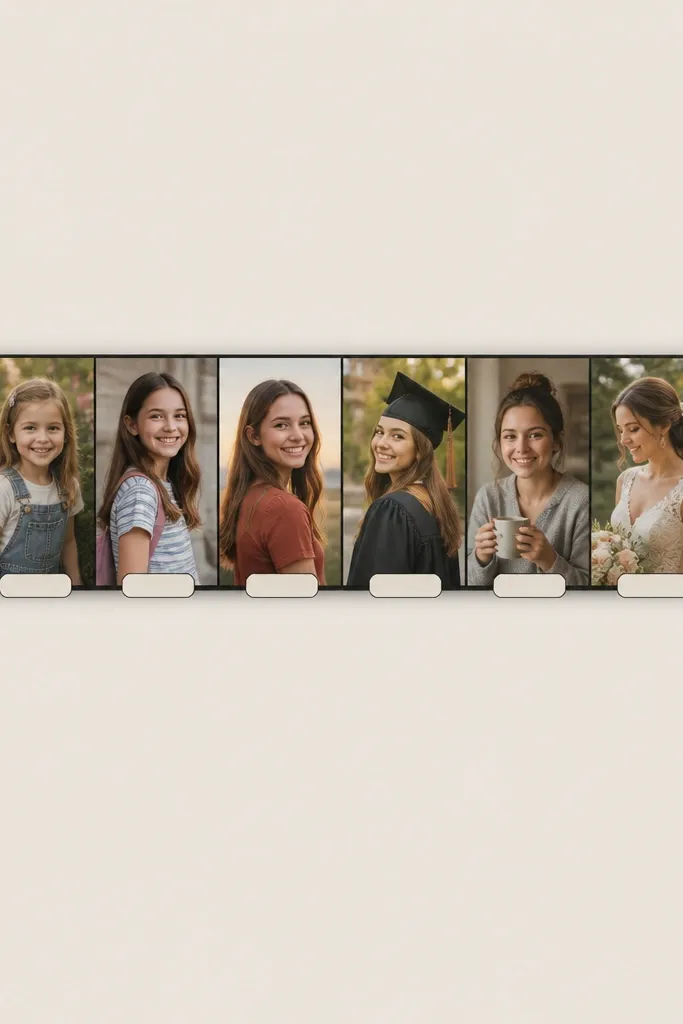
This layout makes your friendship feel like a story with a beginning and a middle, and it’s great when you have photos from the same locations over time. The timeline design also helps when your photos don’t all match in color — the separators give them structure. I’ve used it for “first day to last day” collages where kids can spot their outfit changes fast. It works well for all skin tones because the black separators reduce visual noise and keep attention on faces. It also looks cool in a hallway because it’s long and horizontal.
Cut a 11x14 foam board and cover it with light gray cardstock. Choose 7 to 9 photos and crop them all to 3x2.5 inches. Arrange them in a straight line across the middle with 0.5-inch gaps. Between each photo, draw thin black lines and add a small date label in a rounded rectangle (use a label punch if you have one). Finally, add a thicker black line at each end of the strip, like a magazine divider, and tape the corners down firmly.
Use a fine-tip black marker for the date labels so the text stays sharp next to printed photos.
Skip glitter stickers on the divider lines; they look shiny and cheap next to matte photos.
6. Scrapbook Corner Frames
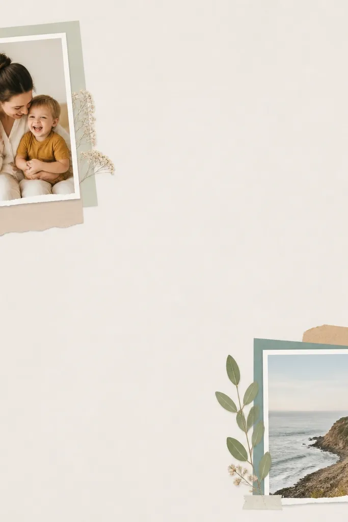
Use a 12x12 page protector or cardstock base. Cut photo mats from patterned paper, each mat sized to 4x4 inches with a 3x3 inch window for the photo. Place one mat in each corner of the base — top-left, top-right, bottom-left, bottom-right — and add two more mats centered along the edges if you have extra photos. Layer the mats with 0.25-inch offsets so you can see the patterned border. Keep the center mostly blank and finish by adding a thin strip of solid paper across the middle only if it looks too empty.
This one looks designer because it uses space on purpose. You place fewer photos, but each one has a frame and breathing room, so it never feels crowded. I like it when you have 6 to 10 photos that are all good quality and you want them to stand out. The neutral paper mats also make printed skin tones look more even because there’s less background clutter. It’s a great choice for adult best-friend gifts because it looks like a real scrapbook page, not a poster.
AvoidDon’t place photos too close to the edges; the border needs at least 0.75 inches or it looks cramped.
Pro tipPick one patterned paper and repeat it for every mat so the page looks intentional.
7. Rainbow Border Photo Strip
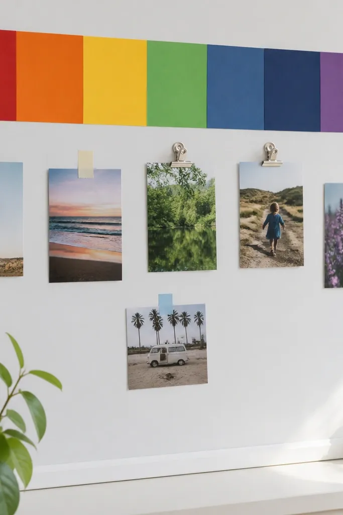
This layout makes even simple phone photos look festive. The rainbow border pulls the eye to the top, and the small photo strip below keeps it playful. I’ve used it for kids because it’s easy to let each friend pick their favorite colors without changing the whole design. It also flatters photos with bright clothing and helps muted photos feel more cheerful because the background carries the color. If you’re making a gift for a birthday, this is the one that feels instantly fun.
Cut a 11x14 board and cover it with white cardstock. Create seven color bands (red, orange, yellow, green, blue, indigo, purple) each about 1.25 inches tall and tape them along the top edge, leaving a 0.25-inch white gap between bands. Under the rainbow, mount 6 to 8 photos sized 3x2 inches in a neat row with tiny 0.25-inch spacing. Add small pieces of washi tape in matching colors on each photo corner to act like “clips.” Keep the rest of the board blank so the strip stays readable.
Use solid-color paper bands, not patterned ones, so your photos stay the star.
Avoid too many different fonts or sticker styles; one rainbow border is enough.
8. Bubble Letters Caption Collage
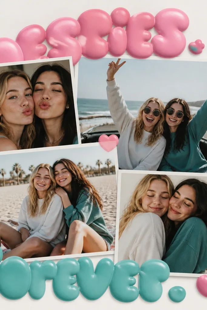
This is the collage you make when you want it to feel like a handmade card that grew up. I use it when the photos are mostly group shots and you need a little text to guide the vibe. Bubble letters make the page look playful without needing heavy decoration, and the bright colors work with both warm and cool skin tones because they add background warmth. It’s best for younger kids and teens since the style feels youthful and personal. Put your captions in short phrases so it doesn’t turn into a wall of text.
Start with a 12x12 kraft or cream background. Choose 7 photos and crop them to 3x3 inches squares, then arrange them in a loose cluster in the center. Add two bubble-letter words using craft vinyl or printed letter stickers: one across the top and one across the bottom, in two colors like hot pink and turquoise. Leave a 1-inch margin around the cluster so the letters don’t squeeze the photos. Finish by adding a few small heart icons between photos using red gel pen dots.
Write bubble letters with a stencil for clean edges; messy letters make the whole page look rushed.
Skip long quotes; they shrink the photo space and make the collage look like a poster.
9. Black and White Film Strip With Color Accent
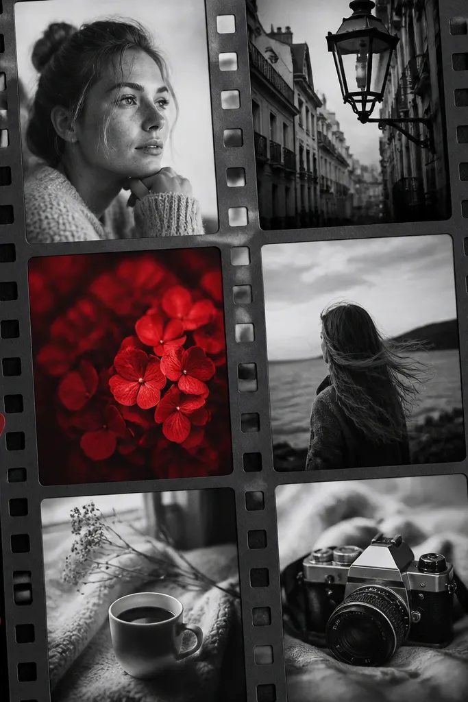
Print 8 to 12 photos in black and white and one photo in color. Cut them into film strip shapes: 2.5x3.5 inch rectangles with small circles drawn at the top as “holes.” Arrange the strips vertically on a white or light gray background, leaving 0.5-inch gaps. Place the single color photo in the middle, slightly larger by 0.25 inch in width. Add a thin red border line around the outside edge of the board using red marker or red cardstock strip.
This layout looks like a photo store print set, and it’s the fastest way to make mismatched photos look intentional. You print most photos in black and white, then pick one photo to keep in color — usually the most meaningful one. The contrast makes the color photo feel like a highlight, and it works for every skin tone because black and white removes the “color mismatch” problem. I’ve made these for adult best friends and they always get stopped for a closer look. It also looks great in frames because the palette is controlled.
AvoidDon’t add multiple color photos; two or more color shots kill the effect.
Pro tipKeep the red accent consistent — choose red clothing or red background in the color photo if possible.
10. Gold Foil Sticker Frame Around a Photo Cluster
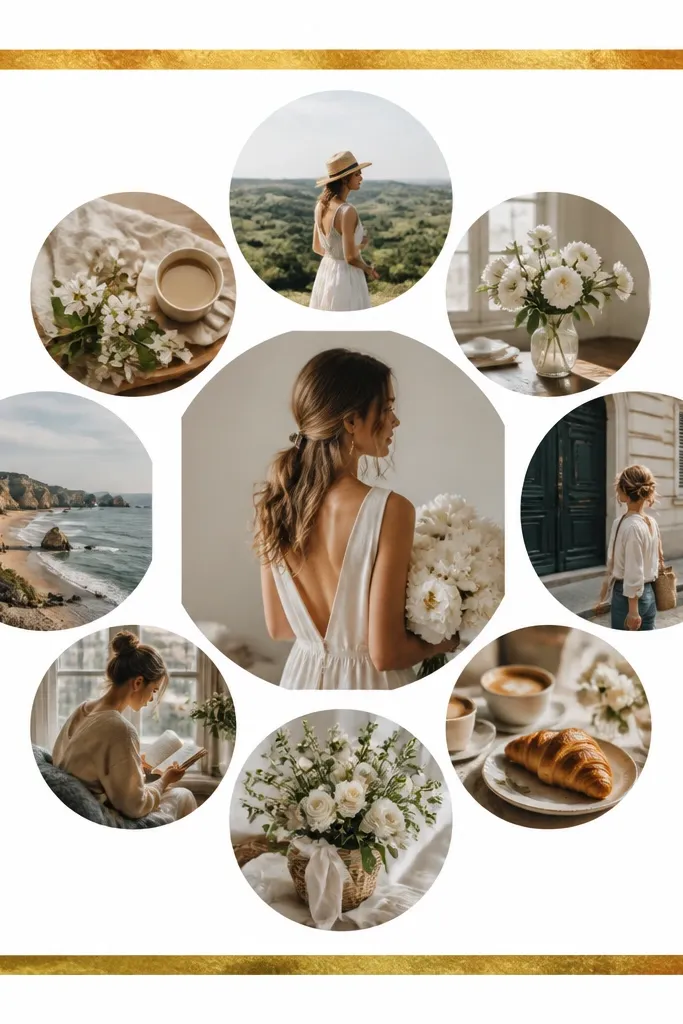
Start with a 12x12 sheet of white cardstock. Apply a gold foil border sticker frame around the edges (leave the center open). Arrange 9 photos sized 3x3 inches into a tight cluster with 0.25-inch gaps. Layer two photos slightly on top of each other so it looks handmade, not perfectly grid-aligned. Add two small gold star stickers near the top corners to balance the weight. Press the border firmly with a flat tool so it sticks without bubbles.
If you want “cute but grown-up,” this is it. The gold foil frame makes the page feel like it belongs in a living room even when the supplies were cheap. Put a cluster of 9 photos in the center so the frame acts like a spotlight. Gold foil also pairs well with warm skin tones because it adds a gentle glow, and it doesn’t fight with cool-toned photos either. I’ve used this for best friend birthdays where the photos are mostly nights out, parties, or birthday cakes.
AvoidDon’t cover the photos with foil stickers; keep foil to the border so it looks intentional.
Pro tipPick photos with similar lighting — warm indoor shots together — so the gold frame doesn’t highlight contrast issues.
11. Washi Tape Corner Grid (No Overlapping Photos)
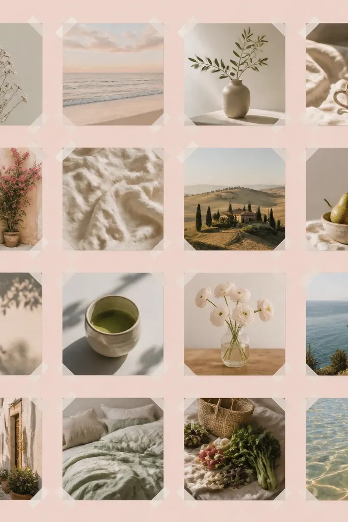
Choose a pastel cardstock base, like light mint or pale lavender, sized 12x12. Print 16 photos cropped to 2.75x2.75 inches. Arrange them in a 4x4 grid with 0.3-inch gaps. Place a small piece of washi tape at each corner of each photo — four tiny tabs per photo — and press down firmly. Keep the tape colors consistent across the grid, like two colors maximum.
This is the “looks neat even from far away” option. You keep photos separated with small tape corners, so there’s no bulky overlap and no uneven edges that lift. It’s perfect for best friends who want a clean look like a gallery wall. Pastel backgrounds also help when your photos have different exposures because the background color softens the differences. I’ve done this with 16 photos for school gifts and it still looks tidy after months. It flatters everyone because the photos aren’t competing with heavy decorations.
AvoidAvoid stacking tape strips on top of each other; it creates uneven thickness and lifts photos.
Pro tipUse matte washi tape if you can; glossy tape can reflect light and look shiny.
12. Clothespin Mini Photo Wall
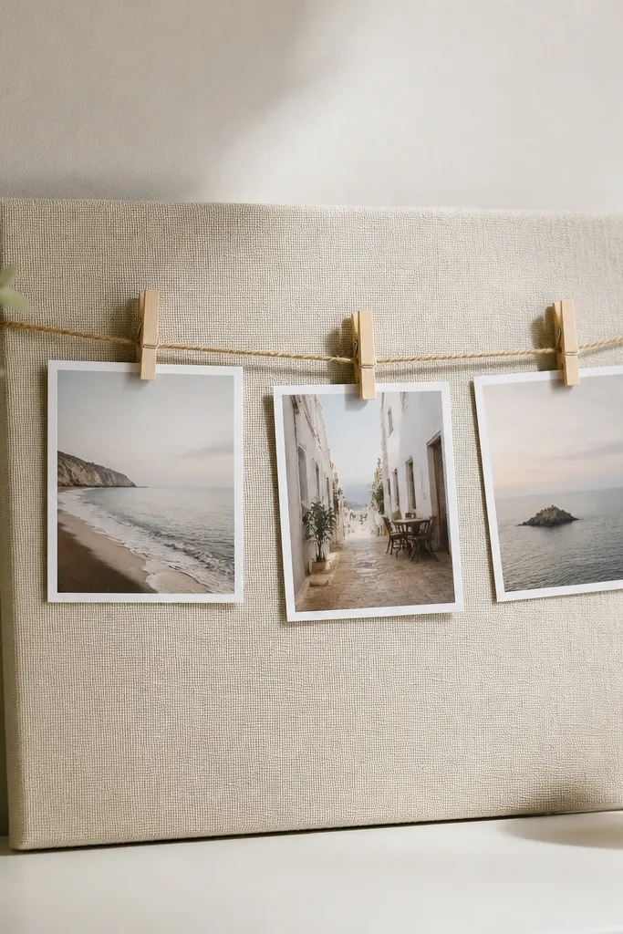
This is a collage you can update, which is great for best friends who keep adding new memories. The fabric background makes it feel soft, and clothespins add a tactile detail people notice immediately. It works best with mini photos — like 2x3 inches — so the wall stays light and not crowded. The warm wood clothespins also look good next to both warm and cool skin tones because wood has a neutral tone. I’ve used this on dorm room walls and it still looks cute after many updates.
Cover an 8x12 board with fabric using spray adhesive or glue, then fold the edges to the back. Tie twine across the board horizontally in two lines, spacing about 4 inches apart. Print 10 to 14 mini photos sized 2x3 inches and attach them with small wooden clothespins. Clip some photos upside down by a few degrees if you want a casual look, but keep most level. Finish with one small strip of ribbon tied at each end of the twine to hide knots.
Use black or dark brown twine if your photos are colorful; it keeps the focus on the images.
Don’t use too many twine lines; more lines make the clips feel chaotic.
13. Origami Photo Paper Cranes
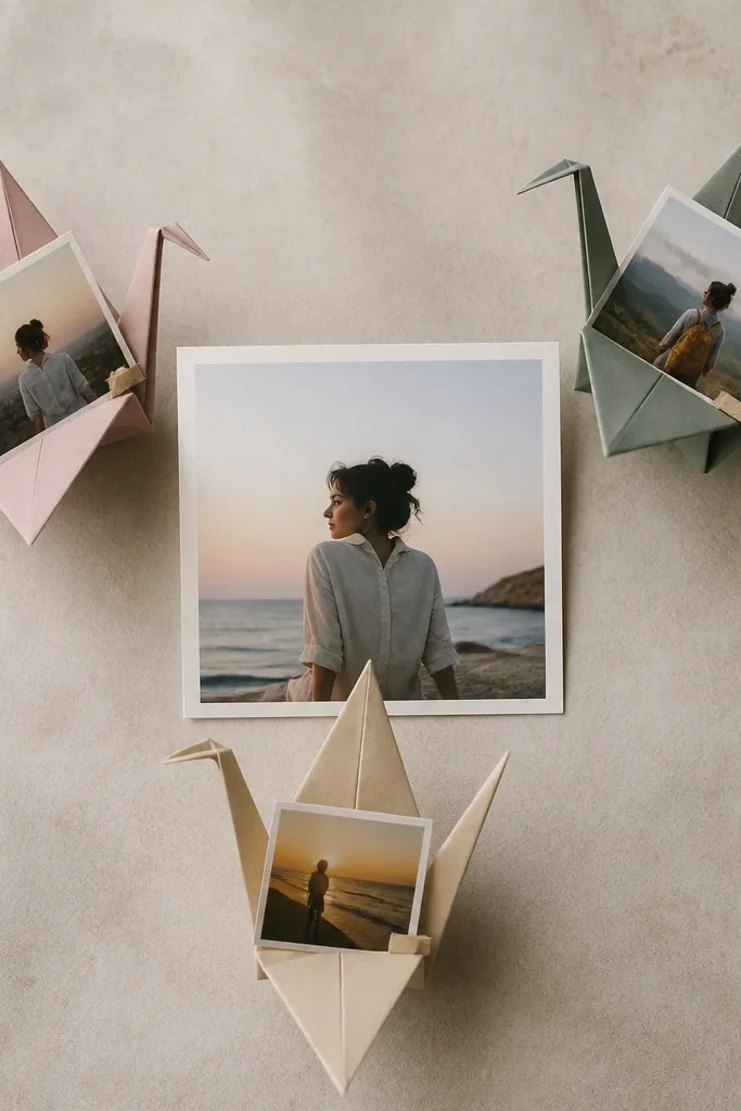
Pick a light background like pale yellow cardstock. Choose one main photo sized 5x7 inches for the center. Print 6 small photos and crop them to 2x2 inches. Fold 3 paper cranes from white paper and attach one small photo to each crane’s body using glue dots. Arrange the cranes around the center photo so they face inward, then add two tiny paper dots as “sparkles” near the cranes' wingtips.
This layout turns photos into little keepsakes, which is why it feels special for best friends. I use it when the photos are sweet but small — like a close-up of hands, a birthday candle moment, or a pet photo that both friends love. The crane shape adds movement, and the clean paper folds look tidy even when the photos are irregular. It flatters all skin tones because the cranes are light-colored and don’t compete with faces. This also works well for kids because cranes are fun to assemble.
AvoidAvoid heavy patterned paper cranes; the folds get lost and the photos stop being the focus.
Pro tipUse matte photo paper so the crane-photo pieces don’t glare under classroom or room lights.
14. Sticker-Map Coordinates Collage
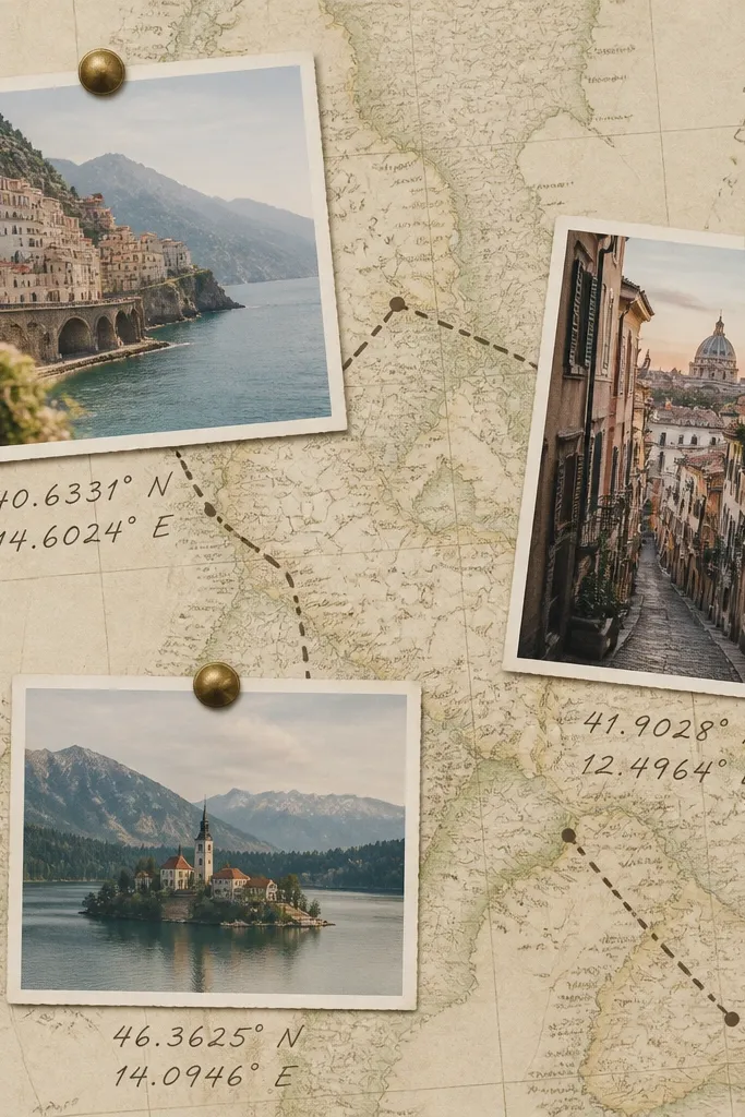
This is the one I use for best friends who travel, even if it’s small trips like the same beach every summer. The coordinates add a story without needing long captions. It looks clean because the map background is busy but still controlled, and the photos sit on top like “pins.” It flatters faces because you’re not adding extra frames; you’re placing them on a single theme background. If you’re making this for older kids or adults, it feels more personal than generic scrapbook stickers.
Cut a 11x14 board and cover it with a printed world map or city map paper. Print 8 photos and crop them to 3x4 inches. Choose three locations and write coordinates next to where each photo will go using a fine black marker. Place the first photo near the top-left, second near bottom-right, third near center, then add small sticker “pin” icons in red or teal. Leave the rest of the map visible so it doesn’t turn into a sticker pile.
Use one pin color for every location so it stays readable.
Don’t crowd the map with too many pins; three to five locations look intentional.
15. Neon Outline Photo Blocks
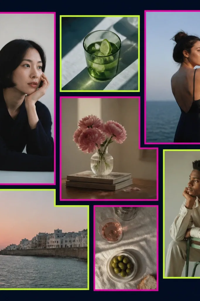
This layout feels bold and teen-cute, and it hides messy print edges because the neon outline creates a clean boundary. I like it when you have photos with strong contrast — nightlife, concerts, or darker indoor lighting. The neon colors also make skin tones look more defined on printed photos, especially when you use matte paper. It’s a good choice for best friends who want something that looks like decor, not just a craft. Keep the number of photos limited so the neon doesn’t overwhelm.
Use a dark navy cardstock base in 11x14 size. Print 6 to 8 photos and crop them into rectangles like 3x4 and 4x5 inch sizes. Glue each photo onto the navy base with 0.25-inch gaps between blocks. Trace around each photo with a neon marker or neon paint pen using a 0.06-inch outline — keep the line thickness consistent. Add one neon arrow or lightning bolt near the largest photo to repeat the energy.
Test the neon marker on scrap paper first; some bleed and smear on glossy prints.
Avoid using too many neon colors; two shades look sharp, five shades looks messy.
16. Pastel Confetti Frame Around a Center Photo
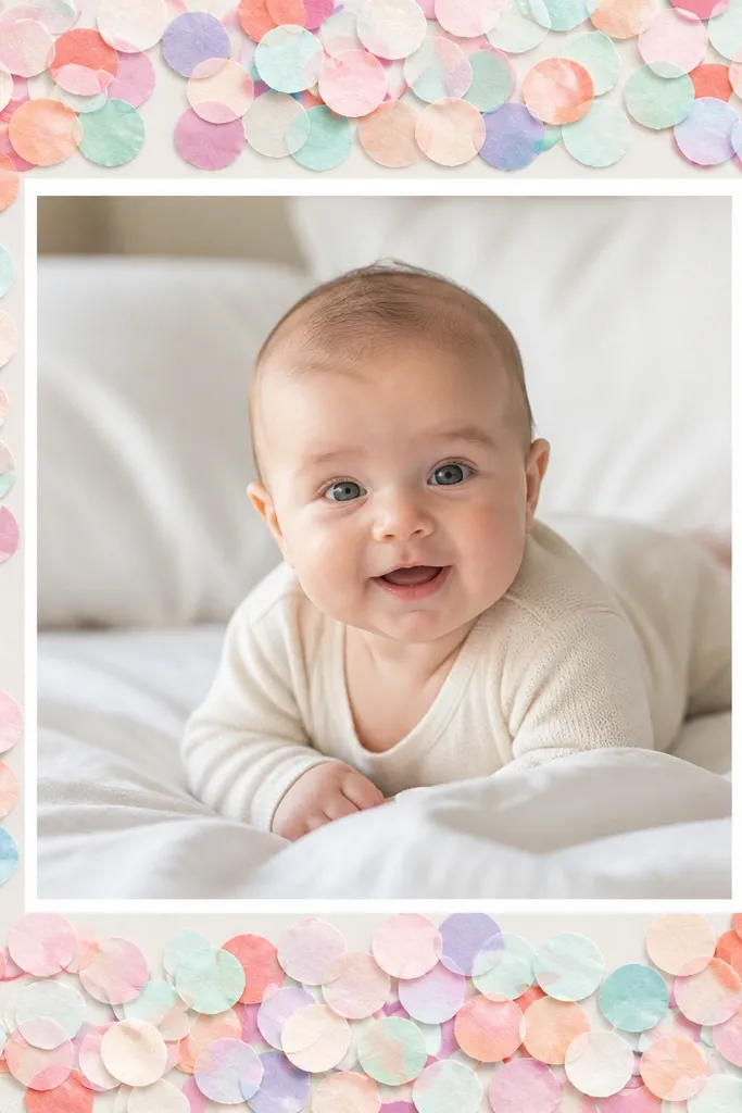
Start with a 12x12 light gray or cream cardstock base. Print one center photo sized 6x6 inches and mount it with a thin white paper mat (0.25-inch border). Punch or cut 150 to 250 tiny confetti dots in pastel colors like mint, baby blue, peach, and pale yellow. Glue the dots around the outer edge of the photo mat, leaving 0.5 inches of clear space between dots and the board border so it doesn’t look jammed. Finish by adding a few slightly bigger dots (twice the size) near the top corners for balance.
This layout is soft and sweet without needing a theme like hearts or rainbows. You place one main photo in the center and build a confetti “frame” using tiny paper dots, so the collage looks festive but still clean. It’s great when you have one standout photo of both best friends and the rest are supporting shots. Confetti dots also hide uneven edges where paper meets photo, which helps when you cut by hand. It flatters all skin tones because the background is light and the confetti colors are gentle. I used it for a friendship day gift and it looked adorable on a desk.
AvoidDon’t glue confetti directly onto the photo; keep the dots on the mat area.
Pro tipUse a regular hole punch for uniform dots; uneven dots look sloppy when they’re this close together.
17. Instagram Post Grid With Fake Captions

If your best friend group actually posts online, this layout feels instantly familiar. A 3x4 grid looks like a feed, and the tiny caption strips give personality without taking over. I’ve made these with kids and they love choosing the caption lines, even if they’re short like “snack run” or “ride or die.” It works for all skin tones because the photos are separated evenly and the background stays simple. The fake caption strips also hide the fact that you’re mixing photos from different days — the design ties them together.
Use a 12x18 cardstock or foam board so you can do a 3x4 grid. Print 12 square photos sized 3x3 inches. Arrange them in three columns and four rows with 0.25-inch gaps. For each photo, add a 0.5-inch tall caption strip under it made from white paper, then write short fake captions in black marker. Keep the caption text aligned left on every strip so it looks consistent. Tape the caption strips under each photo, not over the photo edges.
Use one phrase style — either all lowercase or all with emojis — so it looks like a real feed.
Avoid long captions; anything past 4 to 6 words starts to crowd the grid.
18. Scrapbook Pocket Tag Collage
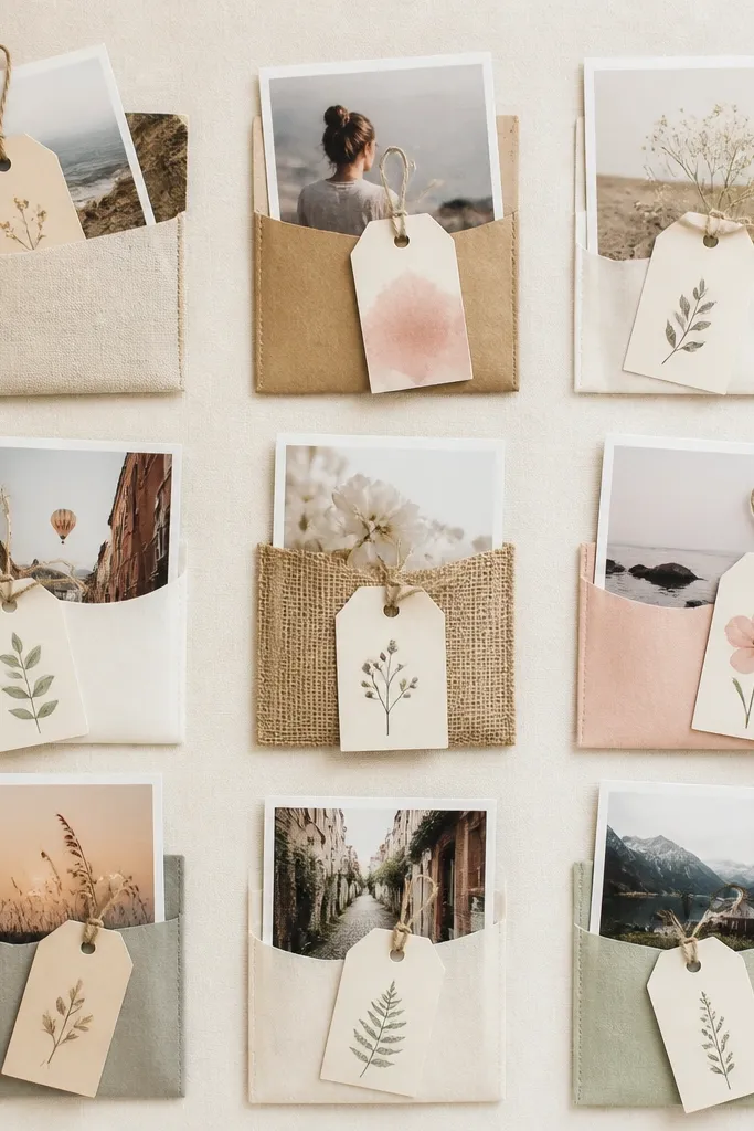
Cut a 12x12 base from cardstock and make four paper pockets using 5x7 inch pieces folded into pocket shapes, then trimmed to fit. Create 8 to 10 photos sized 2.5x3.5 inches and slide them into the pockets in two rows. Add small tags on top of each pocket made from 2x4 inch cardstock, punched with a hole and tied with 6 inches of twine. Write one short message per tag in black gel pen. Arrange the pockets in a 2x2 grid and keep the center open for a small title label if you want one.
This layout is hands-on and fun because it lets you tuck notes right behind the photos. It’s perfect for best friends who like writing, even if it’s just quick jokes or inside references. The pocket structure keeps everything organized and hides messy tape edges. It also flatters the photos because the pockets create consistent frames in a single material. I’ve used this for kid birthday gifts where the recipient wants to read the notes later. It ends up feeling interactive instead of just decorative.
AvoidAvoid thick fabric pockets; they add bulk and the collage doesn’t lay flat.
Pro tipUse matte adhesive tape inside the pockets so tags slide without catching.
19. Mirror-Image Symmetry With Matching Props
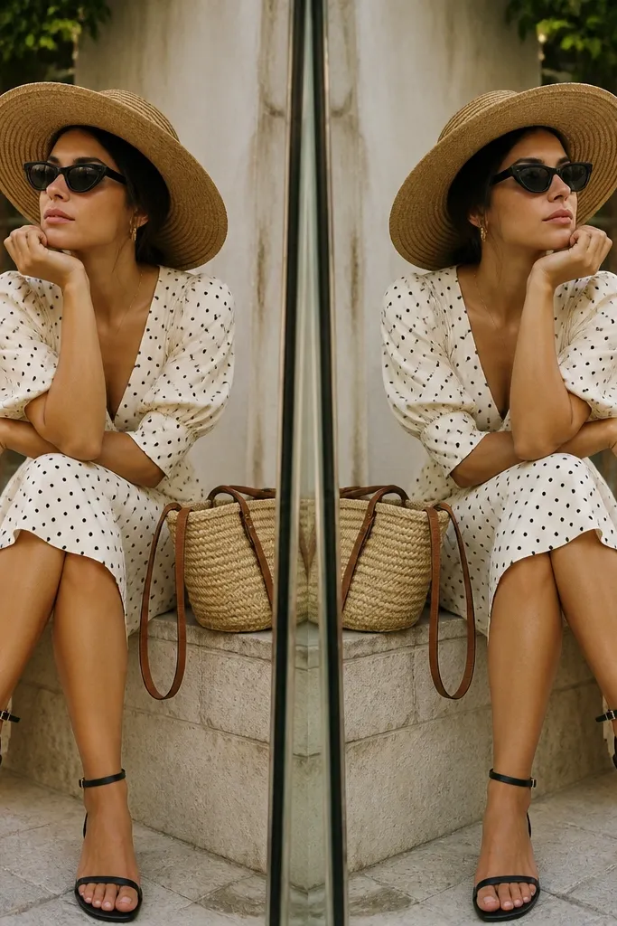
This is the “wow” layout when you have photos with matching props — sunglasses, matching outfits, the same playground, or even the same pet. Symmetry makes the collage feel designed, not random, and it looks great in frames because everything lines up. It flatters different skin tones because the photos are balanced side-by-side, so no one face gets visually drowned by louder backgrounds. I like this for two best friends because it visually answers the question “where do we fit together?” The answer is right down the middle.
Cut a 12x12 cardstock base and draw a faint pencil line down the center. Choose 6 to 10 photos and pair them so each left-side photo has a matching right-side photo with a similar pose or prop. Place one photo on the left at 4x3 inches, then mirror the same placement on the right. Add a central strip of patterned paper sized 1.5 inches wide running vertically through the middle, then glue one shared photo on top of it. Finish by adding two tiny matching stickers (like sunglasses icons) near the top corners so the theme repeats.
Crop both sides so the subject faces the center; symmetry looks off when people look outward.
Avoid mixing vertical and horizontal crops unless you mirror the orientation exactly.
20. Photo Corner Vellum Overlay
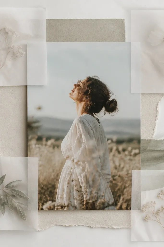
Start with a 12x12 light colored base like white or very pale blue. Mount one main photo in the center sized 7x7 inches with a thin white mat. Cut four vellum squares sized 4x4 inches and place them in each corner, then tape only the edges with clear tape so the vellum stays translucent. Add 4 smaller photos sized 2.5x3 inches tucked under two of the vellum corners, not all four. Finish by adding a thin ribbon strip across the top behind the vellum edges, leaving it mostly hidden.
This one looks airy and soft, and it’s great for best friends who have lots of outdoor photos. Vellum overlays add a gentle layer that makes prints feel like part of a design, not stuck on top. The translucent material also reduces the harshness of overly bright photos, which helps when you have different lighting conditions. It flatters all skin tones because it lightens contrast without turning faces gray. I’ve used it for spring friendship gifts and it always looks clean, especially on a light wall.
AvoidAvoid heavy glue dots under vellum; they show through and look messy.
Pro tipUse clear tape on the back only; clear tape on the front shows as glossy spots.