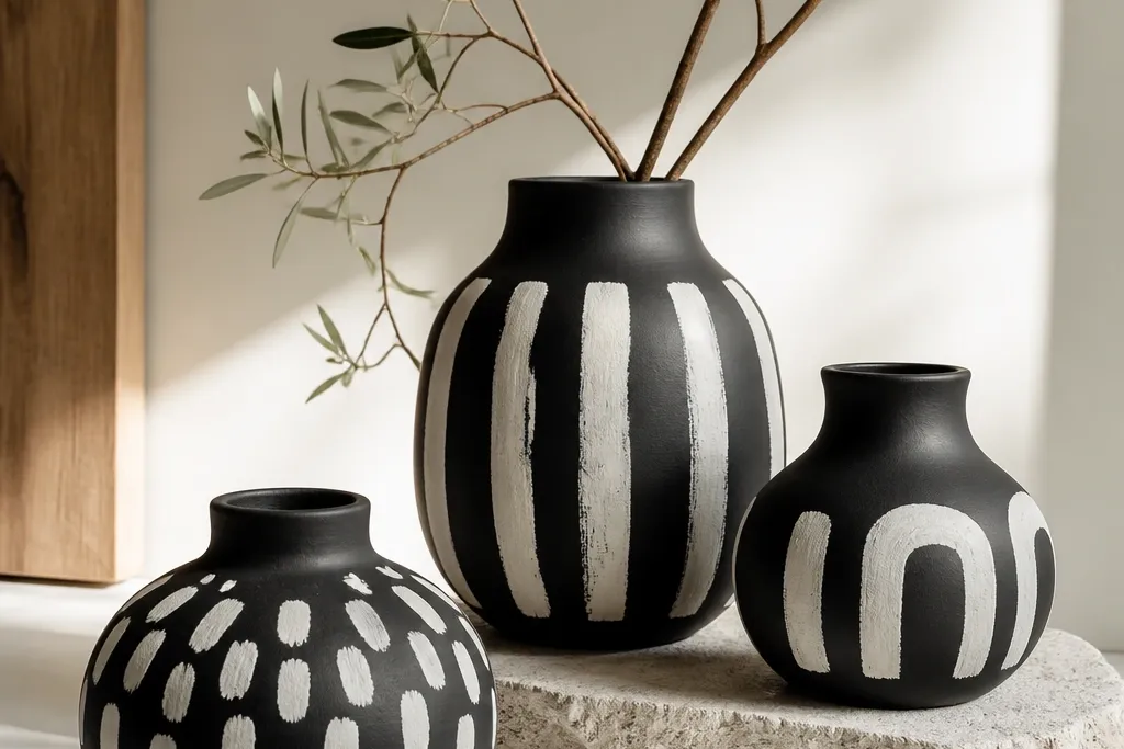

1. Gold band with matte black base
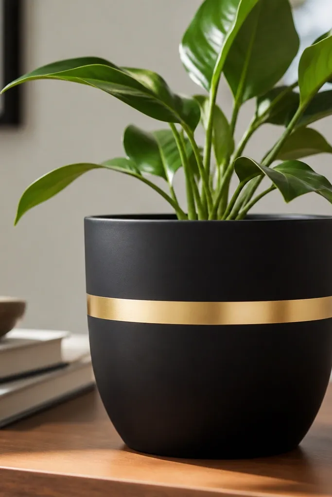
This looks chic because it’s basically jewelry for a pot: one clean gold line against deep black. I like matte black as the base because it hides tiny scratches and looks expensive next to metal. The gold band reads elevated even on a cheap pot, and it pairs well with warm skin tones in the room because gold adds that warm glow. It also flatters small plants because the pot design doesn’t compete with the leaves. If your home has a lot of grays or cool whites, gold keeps the whole setup from feeling cold.
Start by painting the whole pot matte black with 2 coats, letting each coat dry to the touch. Once dry, wrap painter’s tape around the pot at your chosen height, keeping the tape level by checking the gap around the rim. Paint over the band with gold metallic acrylic in thin coats, then peel the tape while the paint is still slightly tacky so the edge stays sharp. Finish with a clear topcoat over everything, using 2 light coats so the gold doesn’t look cloudy.
Use a 1/2 inch wide tape strip if you want a delicate look, and 3/4 inch if you want it to read from across the room.
Don’t slap on one thick gold coat — it drips and the edge turns fuzzy.
2. Chic white zigzag on black
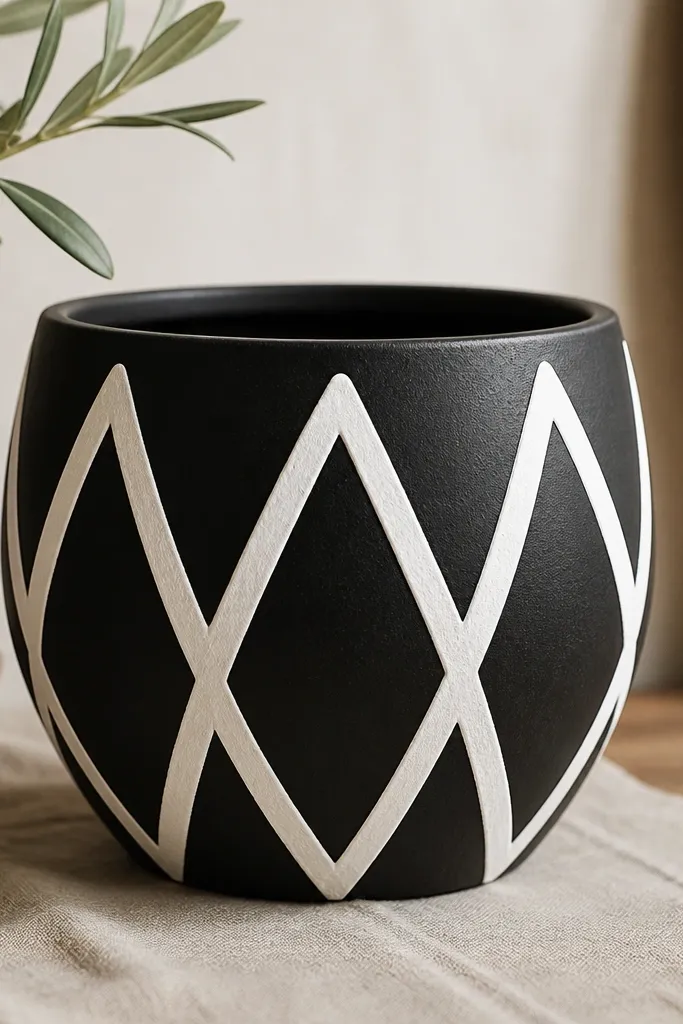
White zigzags on black look chic because they feel graphic, not arts-and-crafts. I’ve done this on pots that were already black, and it still looks intentional because the pattern has rhythm. It works especially well for modern kids' rooms because the contrast is playful without being loud. For people with smaller plants, the zigzag gives the pot a focal point so the arrangement looks styled even when the plant is young. It also photographs well from above, which matters if you post plant pics.
Start by drawing your zigzag lightly with a pencil on the dry black surface — then go over it with a ruler so the angles are consistent. Use painter’s tape as a guide: tape one diagonal side of the zigzag, paint white acrylic, remove tape, then tape the next diagonal. Layer 2-3 thin coats of white so the black doesn’t show through at the edges. Seal with a satin clear coat so the design stays crisp but not mirror-gloss.
If you want it extra chic, keep the zigzag width consistent and center it; don’t let it wander toward the handle or drainage holes.
Avoid freehand zigzags with no marks — the pattern starts to look wobbly and cheap.
3. Black pot with glossy white marbling streaks
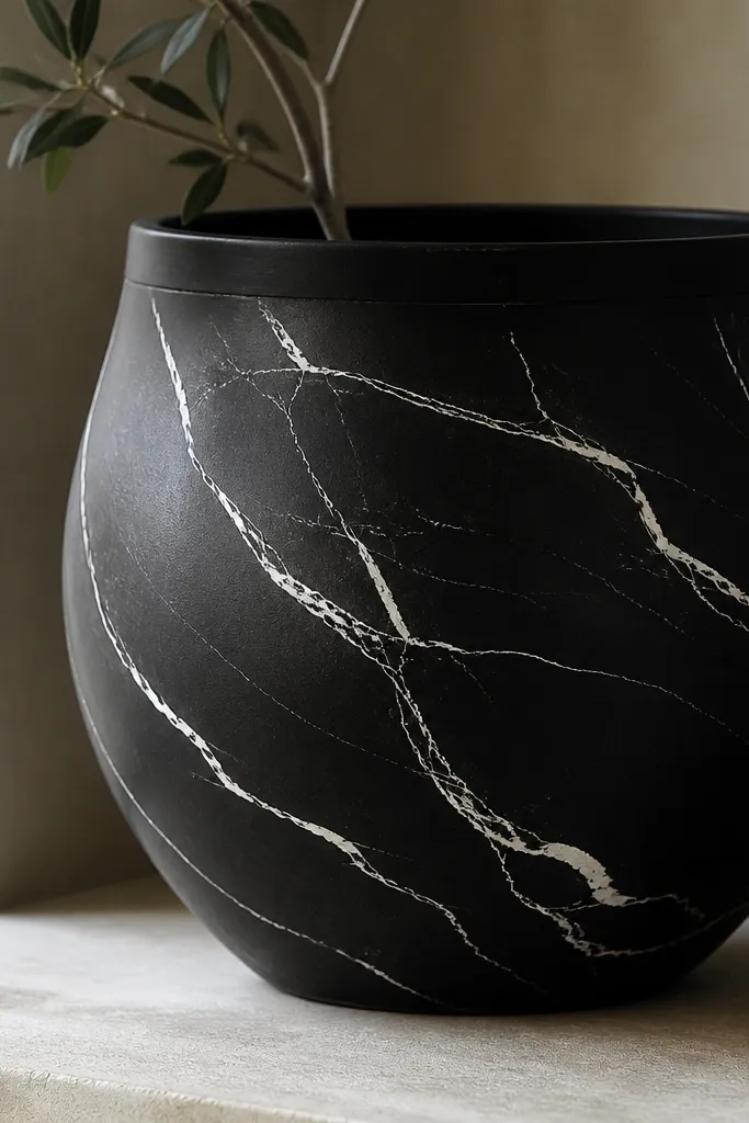
Marbling streaks look chic because they add movement while staying mostly monochrome. The trick is using glossy white on black — it reflects light and makes the veins look like real stone. This works beautifully with office desks and neutral kitchens where you want something soft but still polished. It also flatters larger planters, because the veins can travel upward and visually lengthen the pot. If you have darker floors or a lot of shadows, glossy streaks brighten the whole setup.
Paint the pot matte black first and let it cure at least a few hours. Then mix white acrylic with a small amount of glossy medium or use a gloss white craft paint for the veins. Dip a small foam brush and drag it lightly in curved lines, varying pressure so some streaks are thick and others are hair-thin. Add 1-2 extra “breaks” in the marble so it doesn’t look like a sticker, then seal with a clear gloss topcoat for depth.
Practice on a paper plate first — marble looks right when you keep the lines imperfect on purpose.
Don’t cover the whole pot in white — the chic look comes from negative space.
4. Matte black with thin gold crosshatch
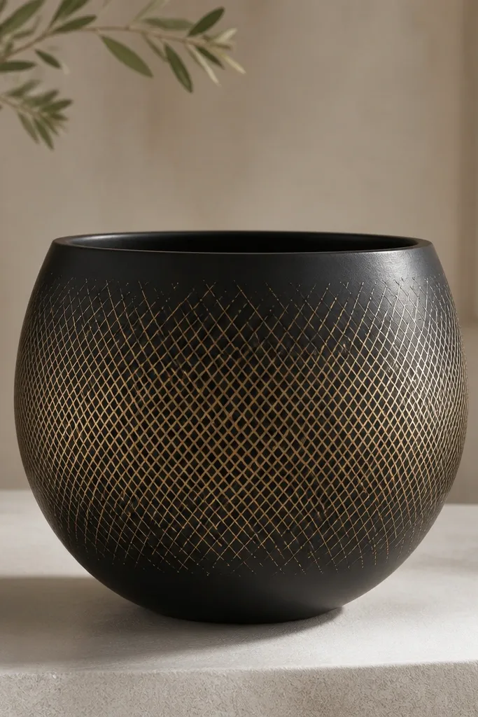
Thin crosshatch looks chic because it’s texture without chaos. On black, gold lines read like woven metal, and the pot looks styled even when the plant is sparse. I like this when you want a design that doesn’t shout, just glints as you walk by. It also flatters medium-sized plants because the pattern sits there like a backdrop. For warmer interiors, gold crosshatch keeps everything cohesive with wood and brass accents.
Start with a matte black base and let it dry fully. Use a fine liner brush (size 0 or 1) and lightly sketch a grid with a pencil — keep the squares small, around 1/4 to 1/2 inch. Paint the first set of diagonal lines in gold acrylic, then rotate your angle and add the second set. Work in sections so it stays crisp, and finish with a clear satin topcoat to protect the gold.
If your lines start to streak, wipe the brush tip on a paper towel before each line.
Avoid thick paint lines — they look like marker, not chic texture.
5. Black pot with blush-pink ombre band
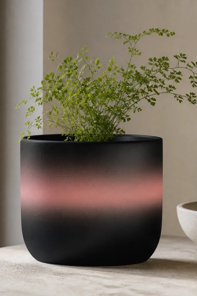
A blush ombre band makes black look softer and more “put together” than plain black ever does. The fade is what makes it chic — the eye reads it as intentional color flow, not a patch. This is a great choice for kids because it hides small scuffs: if someone scratches a bit, the gradient still looks smooth. It also flatters light hair and fairer interiors because blush adds warmth without turning the pot into a loud statement. For small to medium plants, the band makes the pot look taller and cleaner.
Pro tipUse a sponge that’s slightly damp, not wet — wet sponge pulls the paint and makes muddy edges.
Paint the pot matte black first, then mark the band height with painter’s tape. For the ombre, paint a solid blush stripe at the top edge of the band, then blend downward with a dry sponge using gentle dabs. Add a second blush shade (a lighter pink) and blend again to smooth the transition into black. Peel tape when dry to the touch, then seal with a satin clear coat so the gradient doesn’t turn glossy and sticky.
AvoidDon’t blend in one direction only — you need small circular motions to keep the gradient clean.
6. Art deco fan shapes in gold and ivory
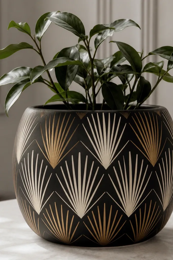
Art deco fans look chic because they feel structured and decorative at the same time. The gold and ivory combo gives you that old-Hollywood vibe without needing bright colors. This design works great for party corners or entryways where you want a “wow” pot that still stays elegant. It also flatters plants with fuller leaves because the fans create a frame around the greenery. If you have a lot of black decor already, this ties everything together with a pattern that looks deliberate.
Start with a matte black base. Use a printed template or measure your spacing: mark 6-8 fan centers around the pot, then lightly pencil the fan lines. Paint ivory fans first with a small flat brush, then paint gold on alternating rays, keeping the edges crisp. After the pattern dries, outline a couple of fan boundaries with thin gold paint for definition, then seal with a satin clear topcoat.
Keep your fans evenly spaced — the chic look comes from symmetry, not from more detail.
Avoid uneven fan lengths — it reads sloppy even if the colors are pretty.
7. Black pot with faux ceramic dots in pearl
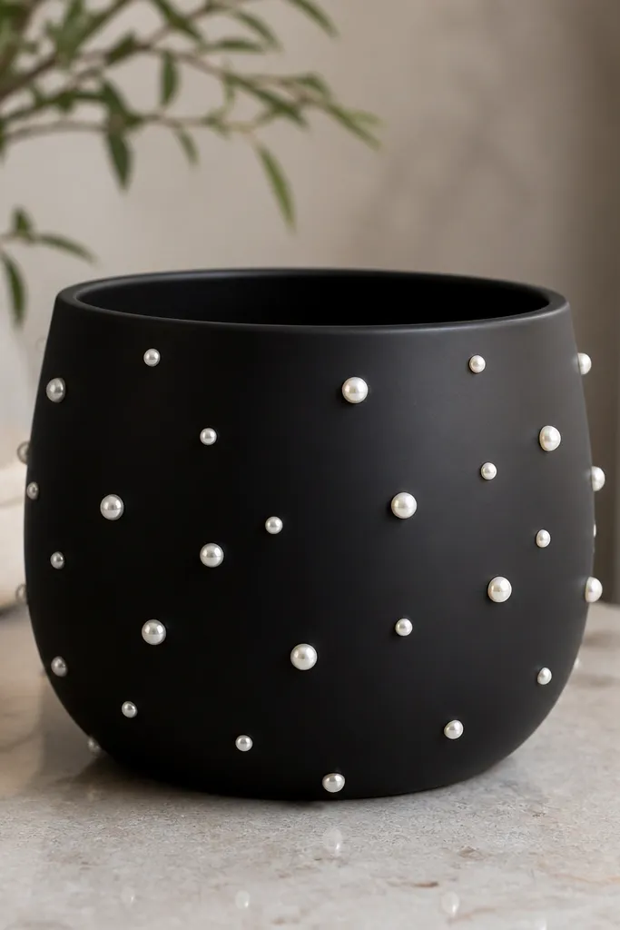
Pearl dots on black look chic because they feel like tiny ceramic hardware. The raised dot effect catches light in small flashes, which looks great on shelves and window ledges. This design is forgiving for kids because it hides minor bumps and hairline scratches; the texture distracts the eye. It also works with any plant style — succulents, herbs, and even tall grasses look cohesive with pearl spots. If your room has beige or cream decor, pearl tones tie everything together.
Pro tipDot in clusters of 5-7 rather than spreading evenly — clumps look more “ceramic” and less “sticker.”
Base coat the pot matte black and let it dry completely. Use a dotting tool or the back of a small paintbrush to place pearl paint dots — start near the bottom and work upward in loose clusters. Keep dot sizes mixed: about 1/8 inch for small dots and 1/4 inch for larger ones, so it looks organic. Let it dry, then add one more thin layer of pearl paint on top of the dots to build a slight raised look, finishing with a satin clear coat.
AvoidDon’t use glitter pearl in thick chunks — it looks gritty.
8. Monochrome black-on-black geometric blocks
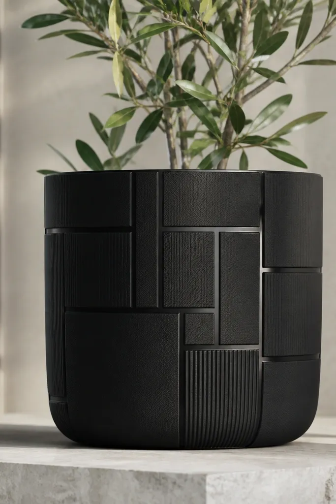
This is chic because it plays with finish instead of color. Matte black next to a slightly glossy black line gives depth without adding noise. I like it for minimalist homes and for anyone who hates bright paint but still wants a styled pot. It also flatters darker skin tones on hands in photos because the design stays neutral and crisp. For kids, it hides messy fingerprints better than glossy designs since matte covers smudges.
Pro tipUse 220-grit sandpaper lightly between the base coat and the glossy lines so the glossy paint grips.
Paint the pot fully matte black first. Then tape off geometric shapes — think rectangles and narrow triangles — and paint the exposed sections with glossy black acrylic or a semi-gloss black medium. Remove tape carefully while paint is still tacky so edges stay sharp. Once everything is dry, add a clear coat that matches the sheen you want: satin over the whole pot makes the contrast subtle and classy.
AvoidDon’t mix different black paints without testing — some blacks dry with a brown tint.
9. Thin silver vertical lines for a tall look
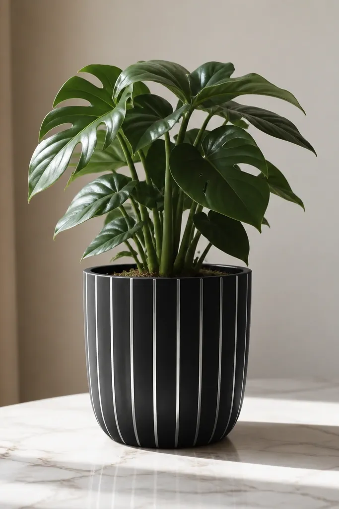
Vertical lines make the pot read taller, and silver on black looks crisp without feeling flashy. This design is great when you have a shorter plant and want the whole arrangement to look more balanced. It also looks chic in bathrooms and laundry rooms because silver ties into fixtures and mirrors. For kids, the straight lines make the pot easy to wipe down since you’re not relying on lots of texture. In photos, the reflective stripes catch light and pull attention to the plant.
Start with a matte black base and let it cure. Mark 6-10 stripe positions around the pot using a soft pencil, keeping spacing consistent — I aim for about 1/4 inch between stripes for a standard 6-8 inch pot. Use painter’s tape to mask the stripe widths, then paint silver metallic acrylic in thin coats. Peel tape when the paint is tacky and finish with a clear satin topcoat to protect the metallic sheen.
For straighter stripes, wrap tape around a pencil first to create a clean curve, then press it onto the pot.
Avoid wide stripes — they make the pot look like a toy bucket.
10. Black pot with white botanical line art
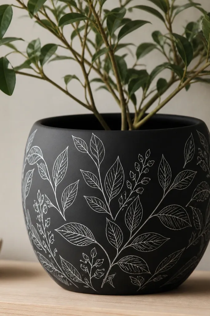
Botanical line art looks chic because it’s delicate and readable from a distance. White ink-style lines over black feel modern, not country, especially when the leaves are simple and consistent. This is a strong pick if your plant is subtle, like a small pothos or a single herb, because the pot carries the interest. It also flatters pretty much every skin tone and room palette since it stays monochrome. Kids can touch it too — the lines are protected under clear coat and don’t smear like thick paint blobs.
Pro tipUse a reference photo of one leaf shape and repeat it; repetition looks intentional and chic.
Base coat the pot matte black and let it dry fully. Sketch your leaf stems lightly with pencil — keep them flowing upward so the pot looks alive. Use a fine liner brush with opaque white paint and paint the line art in one smooth motion per leaf vein. Add a few small dots or tiny buds for detail, then seal with a satin clear topcoat in two thin layers so the lines don’t get thick.
AvoidAvoid chunky white fill — it turns into paint-splotch territory fast.
11. Black pot with terracotta-and-cream terraced stripes
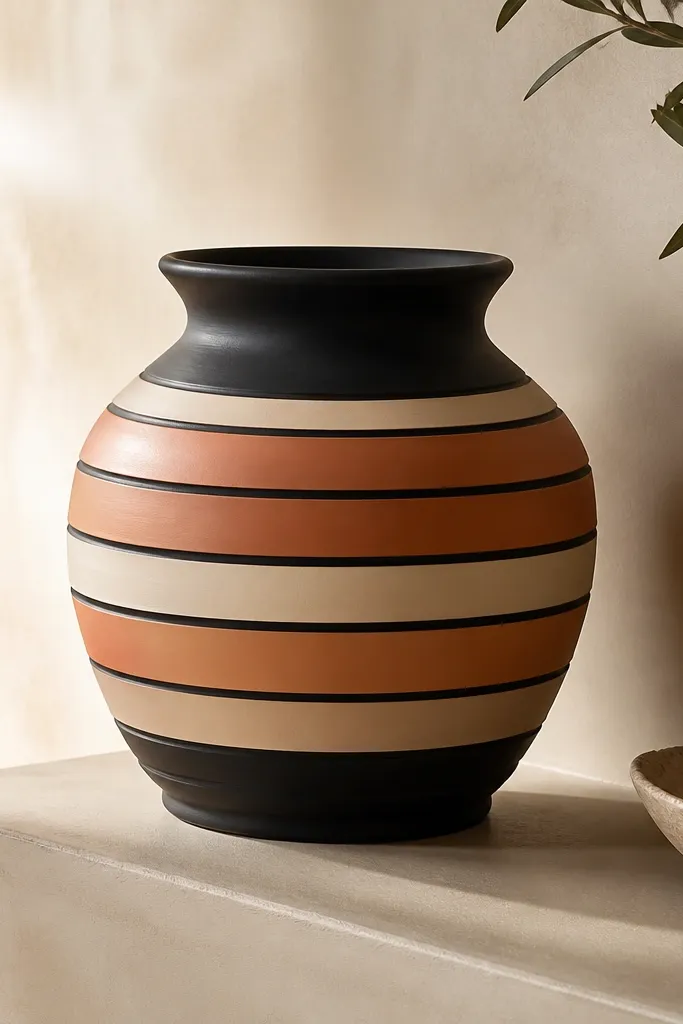
Terraced stripes look chic because they feel architectural. The warm terracotta and cream tones soften black without turning the design into bright farmhouse. This works well if you have a lot of wood furniture or warm lighting — the pot blends in and still looks special. It also flatters herbs and succulents because the colors echo natural plant vibes. For kids, it’s practical: even if the pot gets scuffed, the stripes hide imperfections better than a single-color finish.
Paint the pot matte black first. Decide on band thickness — I like 1/2 inch stripes with thin 1/8 inch black gaps. Tape off the first stripe area, paint terracotta acrylic, let it dry, then tape again for the cream stripe. Build 4-5 bands around the pot, keep the top rim clean, and then seal with a satin topcoat so the stripes look smooth and protected.
Use painter’s tape on a cool surface; warm pots make tape edges lift and ruin the crisp gaps.
Don’t blend the stripe edges — the chic look needs hard lines.
12. Black pot with a single color block corner

One color block corner looks chic because it’s graphic and controlled. When you keep the rest black, the color becomes an accent instead of a distraction. I use deep teal, because it looks rich next to black and doesn’t scream “kid craft” like bright neon. This design works best for medium pots where the corner sits where people naturally look — usually upper front. It also flatters small plants because the corner detail gives the pot a focal point even if the leaves are thin.
Pro tipIf your pot has a handle or texture, place the color block so it aligns with the smoothest panel.
Base coat the pot matte black and let it dry. Choose a corner placement and mark it with tape — I like a triangle that starts near the rim and tapers toward the middle. Paint the block with deep teal acrylic in two thin coats, then remove tape while the paint is slightly tacky. Finish with a clear satin topcoat, keeping the rim and drainage holes unpainted for a clean finish.
AvoidAvoid painting over textured bumps without smoothing — the block edges crack and look cheap.
13. Black pot with copper leaf-style strokes
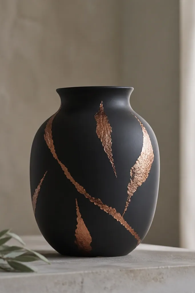
Copper leaf-style strokes look chic because they mimic real materials without needing real leaf. The organic shape breaks up the black, and copper warms up cool rooms. I like using copper on black because it looks richer than gold when paired with terracotta planters or warm wood shelves. This design flatters plants with larger leaves since the copper strokes don’t fight the leaf shapes. With kids, it’s also forgiving — small chips don’t ruin a clean geometric layout because the strokes are meant to look imperfect.
Pro tipFor a more realistic leaf look, dab a tiny amount of paint at the end of each stroke instead of dragging it long.
Paint the pot matte black and let it fully dry. Use a sponge or dry brush to apply copper metallic paint in irregular strokes, starting smaller near the top and slightly larger toward the middle. Add a second pass with a lighter copper or metallic medium to create highlights on the top edges of the strokes. Seal with a satin clear coat so the copper stays metallic but doesn’t get sticky or dull.
AvoidAvoid perfect straight strokes — copper leaf should look organic, not like a brush test.
14. Chalky black pot with white faux lettering stripes
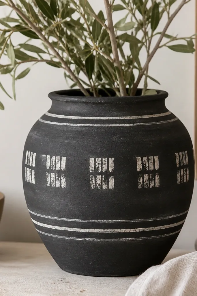
This works because it reads like design typography, not messy kid writing. Chalky black gives you that soft texture, and white stamped stripes keep it clean and readable. I’ve used this style when I needed a pot that looked good in a budget kid space but still matched my adult decor. It also flatters plants that have lots of small leaves because the pot pattern stays mostly horizontal and doesn’t compete with leaf detail. The best part is that you can keep the “letters” minimal and abstract so it never turns into a spelling mistake.
Start with chalkboard paint or chalky finish black acrylic as your base, then let it cure. Tape two or three horizontal bands where you want the typography look. Use a small stencil or tear-off masking technique: press white paint through a letter-like stencil shape or paint blocky letter fragments in a few spots. Remove tape cleanly, let it dry, then seal with a clear topcoat made for chalk paint so it doesn’t rub off.
Use a stencil with thick shapes so the white stays opaque after sealing.
Don’t write actual words freehand — uneven letters look messy once you clear coat them.
15. Black pot with satin black-to-graphite gradient rim
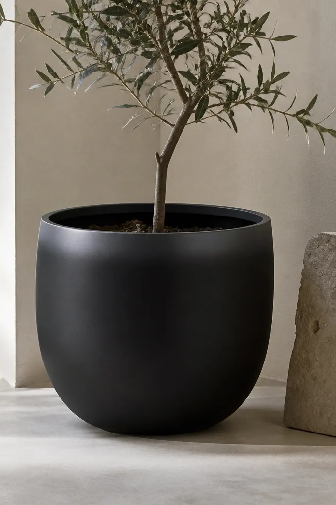
A rim gradient looks chic because it mimics premium ceramics. It’s subtle, but it makes the pot look intentional and finished, like it came from a studio shop. I use it when I want something calmer than patterns but still more interesting than plain black. It also flatters plants because it frames the top without covering the leaves. In bright sunlight, the satin rim catches light and makes the pot look darker and deeper.
Pro tipKeep the gradient band thin — about 1/2 inch — so it stays designer, not sloppy.
Base coat the pot matte black and let it dry. Mix graphite gray with a bit of black and water down slightly so it blends. Tape a narrow band around the rim, then paint the gradient by starting with darker graphite at the very edge and blending inward with a soft sponge. Remove tape and add one more thin layer of the graphite mix if you see streaks, then seal with satin clear coat for that smooth cuff effect.
AvoidAvoid painting the whole pot with a gradient — it looks like a dye job.