1. Oatmeal + Burnt Sienna Wipe Wash
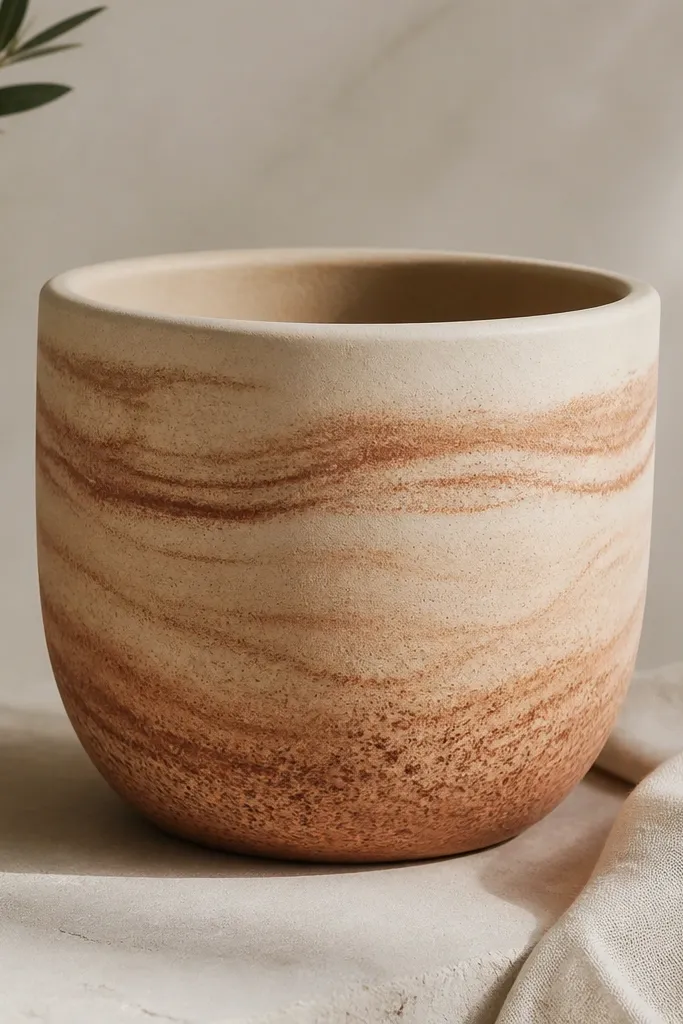
This one looks cozy because it mimics clay that’s been warmed by sunlight. Paint the whole pot with a thin oatmeal base, then mix burnt sienna with a little water so it spreads like a stain instead of sitting on top. When you wipe across the surface with a paper towel, you get feathered edges that look natural rather than “painted.” I like it for small planters on shelves because the movement in the bands makes the pot feel fuller without adding clutter. It also flatters warmer interior spaces — think beige walls, wood shelves, and neutral linens.
Start by cleaning the pot and priming it. Brush on oatmeal acrylic craft paint in 2 thin coats, letting each coat dry 20-30 minutes. Then load burnt sienna on a flat brush, wipe off most of the paint on a paper towel, and drag horizontal strokes around the pot. Finally, dab a few extra sienna dots in the lower third and seal once fully dry.
Pro tipUse a wide, gentle stroke pattern — one direction — so the wash looks intentional, not streaky.
AvoidDon’t flood the pot with thin paint; pooling makes tide marks that look messy.
2. Sponge Dots in Moss + Clay
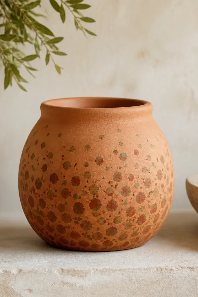
Sponge dots give that handmade, cozy “textile” vibe because they’re imperfect by design. The contrast between moss green and clay-orange reads warm and earthy, not neon. This design works great for kids because it hides little chips — the dots act like camouflage. I’ve used it on medium pots (about 8-9 inches tall) and it looks best when the dots get denser in the lower half. It also looks good on plants with wide leaves since the patterned pot doesn’t fight the foliage.
Prime the pot, then paint a clay-orange base and let it dry completely. Cut a small piece of sponge (about 1 inch wide) and dab off excess paint so you get crisp specks, not blobs. Dab moss green dots in loose rows starting 2 inches from the bottom, then add darker terracotta dots between them. Keep the top third lighter with fewer dabs, then seal with a matte finish.
Pro tipIf you want dots to look more “fabric,” rotate the sponge every few dabs so each dot has a slightly different shape.
AvoidSkip tiny dots if you’re rushing; they blur and look like accidental smudges.
3. Dry-Brush Cedar Stripes
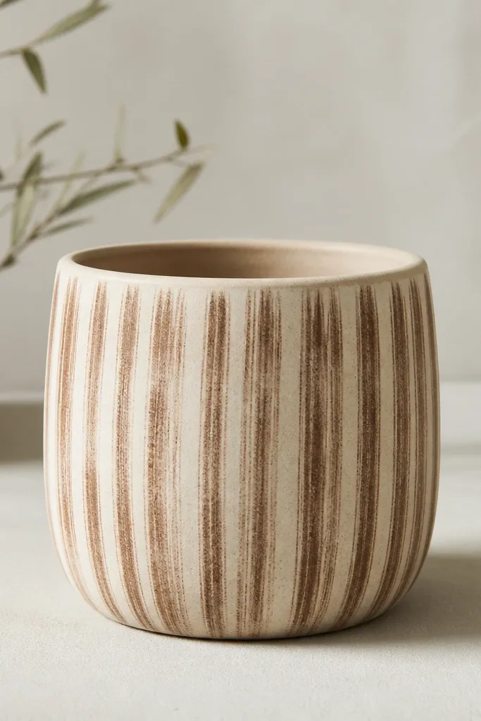
Dry-brushed stripes feel cozy because they look like worn paint on wood. Use a cream base so the cedar color reads warm, not harsh. Vertical stripes elongate the pot visually, which is flattering on shorter tabletop stands because it adds height. I like this when you want something calm and grown-up for an entryway or bathroom shelf. It also pairs well with plants that have long, trailing stems because the stripes echo that gentle movement.
Paint the pot with 2 coats of cream, then let it dry. Dip a flat brush into cedar brown, wipe off almost all paint on a paper towel, and lightly pull downward in short passes. Overlap slightly so you get broken stripes, not solid ones. Keep stripes spaced about 1/2 to 3/4 inch apart, then add a final thin dry-brush pass around the upper rim for cohesion.
Pro tipTest your dry-brush pressure on the pot bottom first; you want the base to show through clearly.
AvoidDon’t go back and fill stripes fully; that turns the look into a flat painted band.
4. Terracotta Half-Moon Band
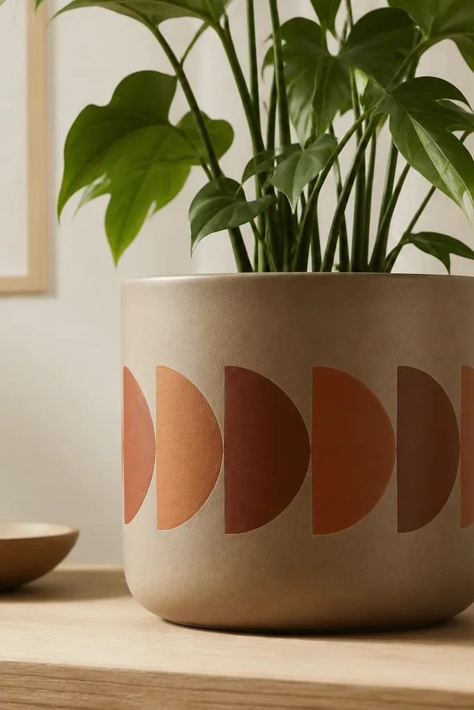
The half-moon band is cozy because it reads like pottery decoration you’d see at a roadside market. The alternating terracotta and burnt sienna gives warmth without needing bright colors. This one looks especially good on pots that sit on the floor or a plant stand because the band becomes the focal point. It also flatters small rooms since the pattern stays in one location instead of covering the whole pot. For kids, it’s friendly because the shapes are big and forgiving.
Prime and paint the pot taupe, then let it dry. Mark a horizontal band around the pot with painter’s tape at the height you want — usually about mid-pot. Use a small craft sponge or a round brush to dab half-moons upward, alternating terracotta and burnt sienna. Peel the tape while the paint is still slightly tacky for a cleaner edge, then seal after full dry.
If you’re nervous about straight placement, wrap a strip of tape around the pot and press it evenly with your palm.
Don’t use a thin liner brush for half-moons; it takes too long and makes wobble lines.
5. Warm Taupe + Charcoal Dot Border
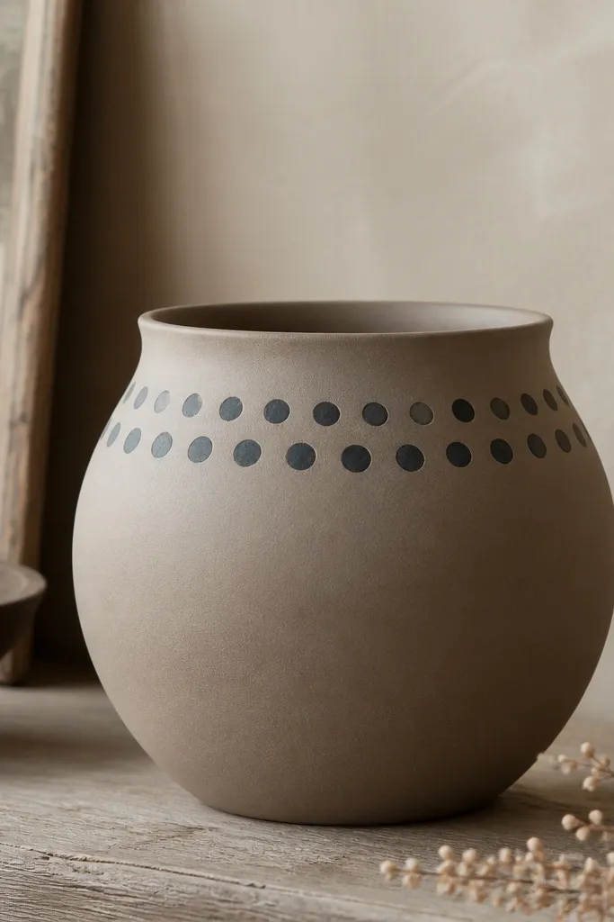
A dot border looks cozy because it’s tidy but still handmade. Warm taupe keeps the pot soft, and charcoal adds just enough contrast to make the top area feel framed. This is a great design for taller pots where you want a focal band without painting the whole surface. I’ve used it on 10-12 inch pots and it instantly makes the pot look intentional, like it was matched to the room. It also works well for darker plant leaves because the charcoal border echoes their depth.
Prime, then paint the pot warm taupe in 2 thin coats. Use a pencil to lightly map two horizontal lines for your dot rows. Dip a toothpick or dotting tool into charcoal and place dots about 1/4 inch apart, keeping them slightly uneven for realism. After the border dries, add one faint charcoal wash under the dots to blend, then seal.
Pro tipIf your dots look too perfect, vary the pressure by a hair so some dots are half size.
AvoidSkip glossy craft paint; glossy borders look plasticky beside matte bases.
6. Leafy Corner Clusters with Sage
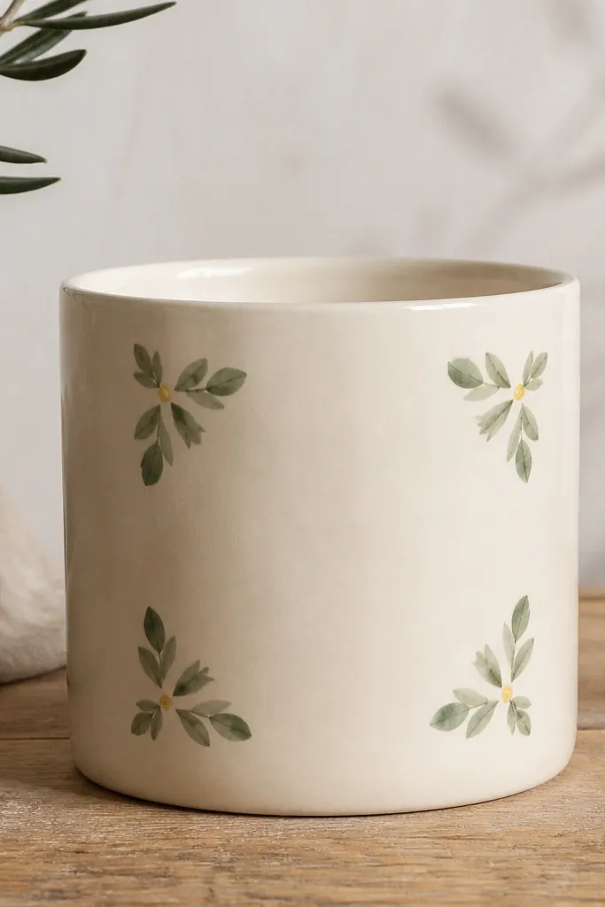
Corner clusters feel cozy because they leave breathing room while still adding detail. Sage green is soft and earthy, and the tiny yellow dot centers give a warm “seed” look. This design flatters pots that sit against walls or on mantels because the corners catch light when you walk by. It’s also good for kids because the leaves are small but simple — you’re repeating a shape, not drawing a full garden scene. Pair it with plants that have narrow leaves like rosemary or pothos for a natural match.
Prime and paint the base cream, then let it dry. Choose two or three corners — for a round pot, I pick spots that line up with the front when the pot sits on a shelf. Use a small round brush to paint leaf shapes by pulling from a point outward, then add tiny yellow dots at leaf centers. Repeat the cluster around the pot so it looks consistent from different angles, then seal with matte.
Pro tipMake your leaves slightly angled in different directions so the cluster doesn’t look like a sticker sheet.
AvoidDon’t outline every leaf with dark paint; it makes the design look like a coloring page.
7. Chunky Clay Crayon Effect (Wax Resist Look)
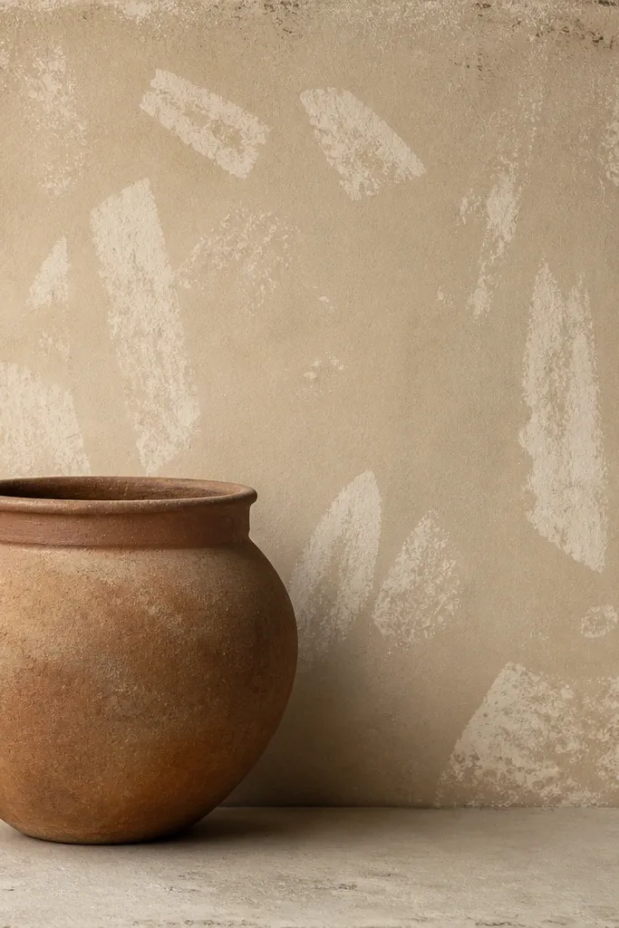
This one gives a cozy, lived-in look because the surface has that wax-resist texture. Use a cream or oatmeal base, then scribble with a light crayon (white or pale cream) on dry primer. When you paint over it with a thin layer of burnt sienna or terracotta, the waxy areas stay lighter and look like worn pottery. I like this for kids because it turns painting into a fun “scribble then reveal” moment. It also hides hairline chips since the texture already looks imperfect.
Prime and let the pot dry fully. Color over random sections with a light crayon using chunky strokes — don’t worry about covering everything evenly. Paint a thin wash of burnt sienna over the entire pot, then wipe lightly with a paper towel while damp. Let dry completely, add one more thin glaze coat for depth, then seal.
Pro tipUse wax crayons meant for art, not cheap kids' crayons that crumble — the wax layer matters.
AvoidDon’t paint thickly over the crayon; it fills in the resist and kills the effect.
8. Ombre Base to Charcoal Ground
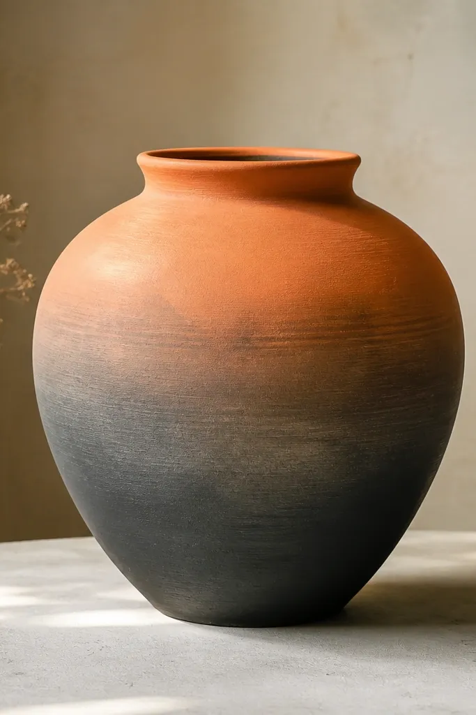
An ombre pot feels cozy because it looks like a shadowy ground under the plant. Warm clay-orange at the top looks inviting, and charcoal at the bottom anchors the pot so it doesn’t look like it’s floating. This looks great for medium to large pots where the gradient can be seen from multiple angles. I’ve used it for kids' desk plants and it makes the whole setup look calmer. It also flatters darker interiors since charcoal grounds the color.
Prime and paint a clay-orange base. Mix charcoal with a tiny bit of water and paint it on the bottom third, then blend upward with a dry brush. Keep blending across the seam area for 2-3 minutes so you don’t get a hard line. Add a second charcoal pass to deepen the bottom, then seal with satin for a slightly softer look.
Pro tipBlend while the paint is still slightly tacky; once it sets, you’ll get a visible band.
AvoidDon’t use a foam roller; it creates bubbles and a too-smooth plastic finish.
9. Herringbone Band with Warm Taupe and Ochre
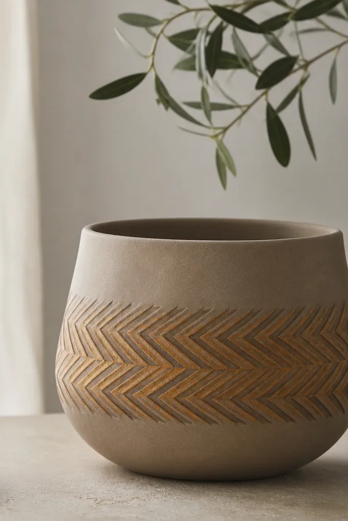
Herringbone feels cozy because it looks like woven fabric, and weaving always reads warm. Ochre plus a deeper brown keeps it earthy and not too bright. This design makes the pot look styled even when the plant is small, which is handy for kids' desks. The pattern also frames the pot midsection, so it looks balanced. I’ve done it on 6-7 inch pots and it still reads clearly without covering the whole surface.
Prime and paint the pot warm taupe. Tape a band around the pot about 2 inches tall. Paint a base stripe in ochre, then use a small angled brush to add V shapes: start each V at the left edge of the band and meet in the center. Repeat row by row, alternating with the darker brown for contrast. Remove tape carefully and seal once dry.
Pro tipUse painter’s tape as your measuring tool — press it firmly and pull it back slowly.
AvoidAvoid freehand V shapes without a guide; crooked lines make it look like a rushed stencil.
10. Tiny Terracotta Squares with Cream Highlights
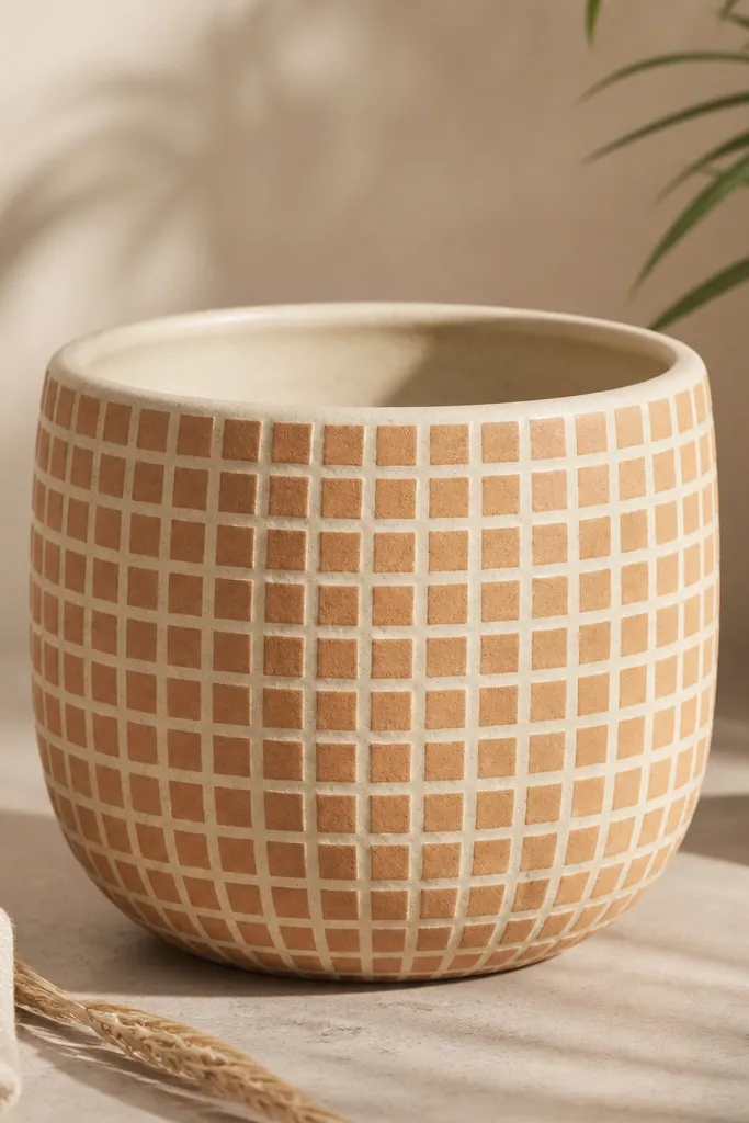
This looks cozy because it has the rhythm of simple tiles. The terracotta squares warm up a cream base without feeling loud. It’s especially flattering for kids because it’s easy to repaint if a section gets scuffed. I use this design when I want the pot to look like it belongs in a playroom corner — soft colors, simple shapes. It also works with plants like snake plants or succulents where the pot pattern can be a steady background.
Prime and paint the pot cream in 2 coats. Mark a grid lightly with a pencil using a ruler — squares about 1 inch (or smaller if the pot is tight). Paint small terracotta squares, then use a fine brush to add thin cream lines where the grid meets so the pattern looks crisp. Add a couple of tiny dark specks with a dry brush for texture, then seal.
Pro tipIf your grid scares you, start with only 12 squares around the front and expand once you’re happy with spacing.
AvoidDon’t make the squares all the same exact size if you want it to look handmade; perfect repeats can feel sterile.
11. Burlap-Inspired Sponge Panels
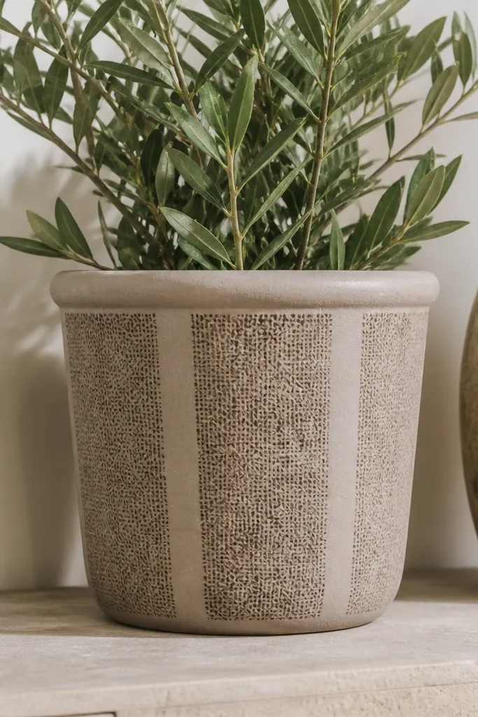
Burlap texture reads cozy because it looks like fabric without needing fabric. The secret is repeating small dabs and then dragging a darker wash through the texture. I like this on larger planters because the panels add structure from across the room. It also pairs well with warm neutrals and wood furniture since the texture matches that natural vibe. For kids, it’s forgiving since the texture hides small bumps and paint chips.
Prime and paint the pot taupe. Tear a sponge into a rough edge shape — it should look uneven. Dab the sponge in vertical panels using a slightly darker taupe, leaving the base showing between panels. Then mix a thin brown wash (burnt umber + water) and lightly brush over the entire pot so it settles into the texture. Seal with matte when dry.
Pro tipUse a sponge that has real pores; cheap foam smooths out and loses the burlap effect.
AvoidDon’t overwork the texture; if you keep scrubbing, it turns muddy.
12. Sun-Baked Rim and Speckled Body
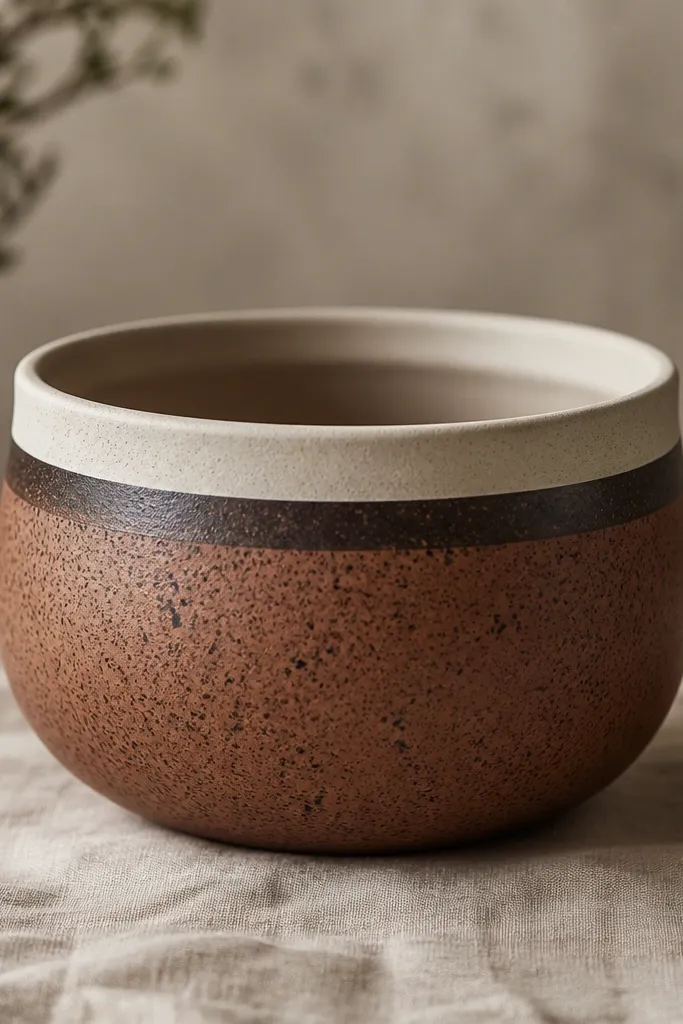
This design looks cozy because it imitates sun-baked pottery. The clean rim is important — it frames the pot and makes the speckles feel intentional. Terracotta speckles plus cocoa-brown give a warm, aged look without going full “distressed.” I’ve used it for window sills where the pot catches sunlight and the speckles sparkle slightly. It’s also great for kids because the body pattern hides uneven brush strokes.
Prime and paint the pot cream. Paint a thin band of terracotta about 1 inch below the rim, then let it dry. Load a toothbrush with cocoa-brown, run your finger across the bristles to splatter small specks across the body. Add a few larger specks near the band for depth. Once dry, seal with matte and keep the rim clean by masking it with tape.
Cover your floor with newspaper, and do splatter over a cardboard box so you control the mess.
Don’t splatter too close to the rim; it makes the rim look dirty.
13. Peach Rosebuds with Sage Stems
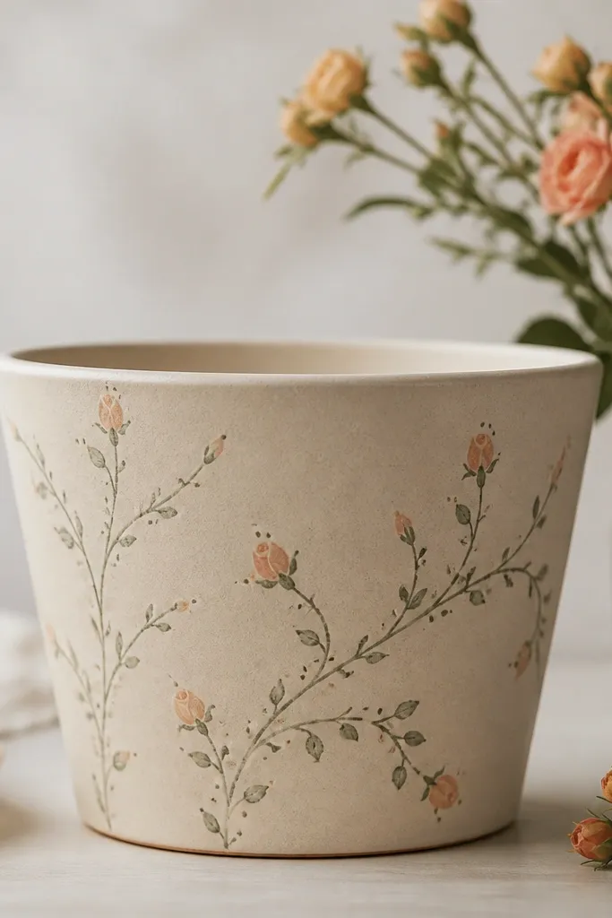
Rosebuds look cozy because they’re small, sweet, and airy. Peach is warm and friendly, and sage stems keep it grounded so the pot doesn’t look like a cartoon. This works well for medium pots on dressers or side tables — the flowers read clearly at arm’s length. It also flatters warm skin tones in photos since the peach echoes that warmth. I like this design for kids' gifts because it feels special without being hard.
Prime and paint the pot pale beige. Use a fine brush to draw a looping sage stem that travels around the pot; add small leaf dots along the stem. For rosebuds, paint tiny teardrops in peach, then add a darker peach dot in the center. Keep the flowers spaced so you have 6-10 buds total around the circumference. Seal with satin so the painted petals look soft, not chalky.
Pro tipTurn the pot as you paint so your stems stay centered instead of drifting to one side.
AvoidDon’t outline the buds in dark red; it makes them look harsh and less cozy.
14. Charcoal Corner Vines on Warm Cream
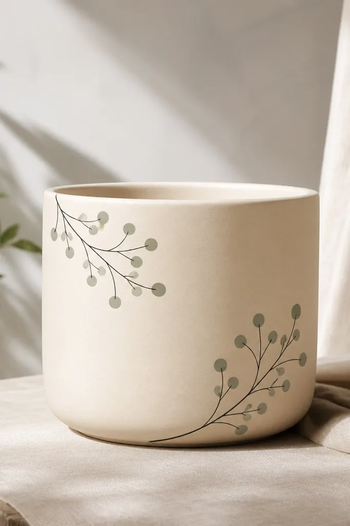
Thin vine lines feel cozy because they’re delicate but not fussy. Charcoal gives you contrast without shouting, and warm cream keeps the pot soft. I like this for slim, tall pots because the vines visually guide the eye upward. It also looks good in kids' rooms because it reads like a doodle, not a complicated art project. The sage dots add a tiny pop that makes the design feel alive.
Prime and paint the pot warm cream. With a fine liner brush, draw two vine paths starting near the corners — around 1 inch from the rim down. Add small loops and leaf-like teardrops in charcoal along the vines. Dot a few sage circles where you want the “flower” points. Let it dry, then seal with matte so the charcoal stays crisp.
Pro tipIf the vine line wobbles, stop, let it dry, and repaint the same line over it — it looks like intentional variation.
AvoidAvoid thick paint for the vines; thick lines look like marker on clay.
15. Beige + Burnt Umber Faux Terrazzo
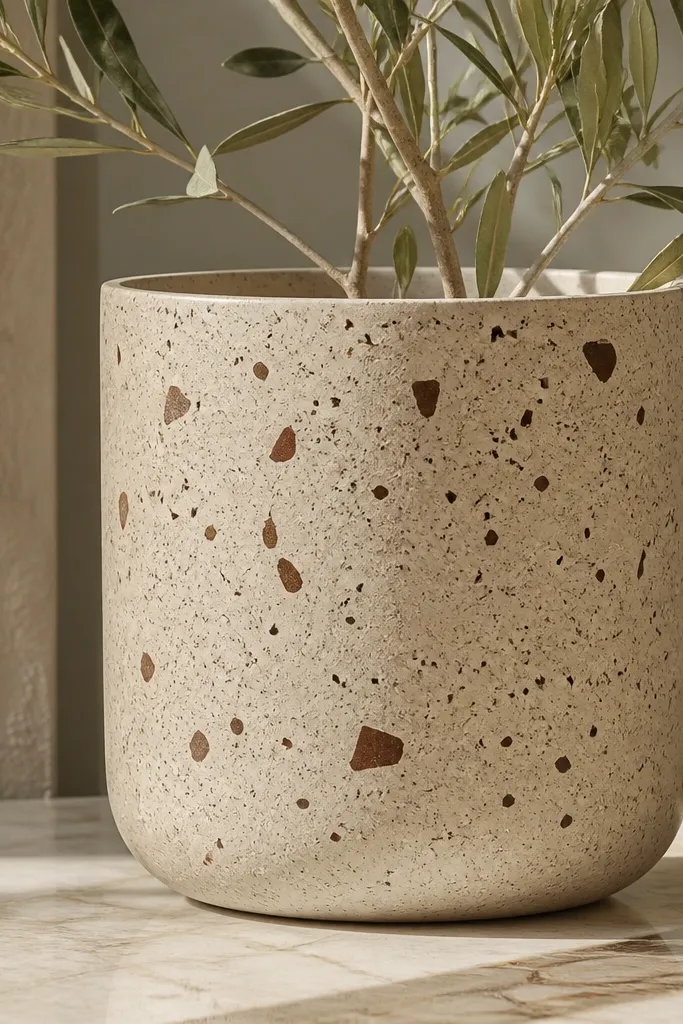
Faux terrazzo reads cozy because it looks like handmade stone. Beige keeps it warm, and burnt umber specks add depth without needing big shapes. This design is great if you want something that looks good from far away but still has texture up close. I’ve done it on pots holding small succulents and it makes the whole arrangement feel like a designer piece. It also hides scuffs well, which matters for kids and frequent handling.
Prime and paint the pot beige. Mix burnt umber with a little water for a thinner paint, then use a toothbrush to splatter fine specks across the surface. Add a second color in pale cream or light oatmeal by splattering larger, lighter flecks in a few spots. Use a toothpick to place 10-15 tiny “chip” dots for variation. Seal with satin for a stone-like sheen.
Pro tipDo 2 rounds of speckling instead of one heavy round so the texture looks layered, not dusty.
AvoidDon’t use black specks; they make the pot feel colder.
16. Color-Block Terracotta with Oatmeal Corners
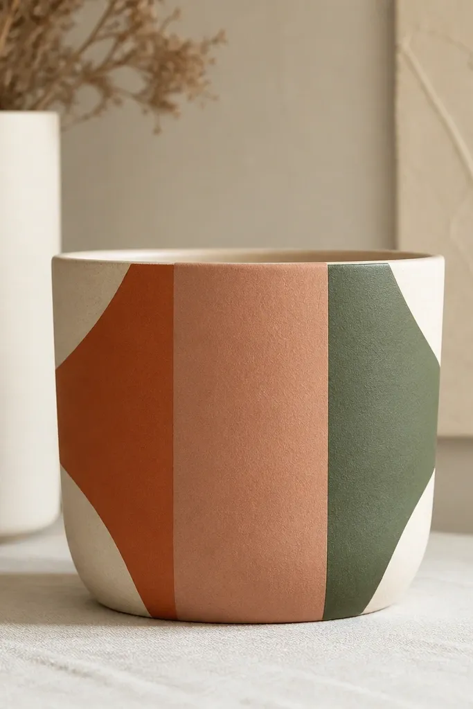
Color-blocking looks cozy when the blocks are soft and separated cleanly. Terracotta and moss green feel warm and grounded, while oatmeal corners act like gentle framing. This design works best on pots where you want a modern cozy look for a living room or hallway — it’s graphic but not harsh. I like it for kids because the shapes are large and you can correct mistakes by repainting a block. It also looks great with plants that have simple leaf shapes, like peace lilies or zz plants.
Prime and paint the pot in a base color (warm clay or oatmeal). Use painter’s tape to create vertical stripes — aim for 1.5 to 2 inches wide on a medium pot. Paint each section with terracotta, moss green, and a darker clay brown, letting each section dry 15-20 minutes before removing tape. Add oatmeal corner shapes by taping diagonal or square corners and painting them last. Seal with matte for a cozy, non-gloss finish.
Press tape down firmly with a credit card so paint doesn’t bleed under the edges.
Don’t remove tape after the paint fully cures; pull it when it’s slightly tacky for the cleanest lines.
17. Mud-Paint Ridges with a Stiff Brush
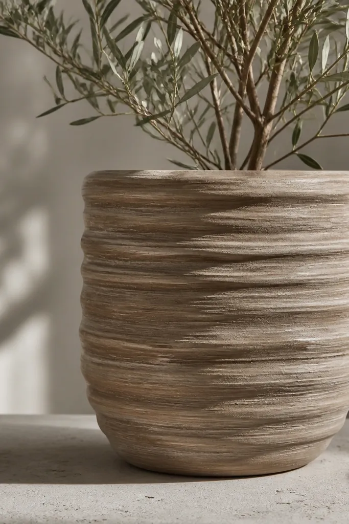
Ridges feel cozy because they look like hand-sculpted plaster. You don’t need fancy tools; a stiff bristle brush creates those raised strokes that catch light. Warm taupe keeps it calm, and a slightly darker umber on the ridges adds depth. This is my go-to for bigger pots because the surface texture reads from across the room. It also looks good with plants that have big, glossy leaves since the texture adds balance.
Prime and paint the pot warm taupe. Load a stiff brush with thinned burnt umber paint so it spreads but still leaves texture. Brush horizontally in overlapping strokes, letting the paint build slightly on the brush path. After the first layer dries, do a second pass using mostly the brush tips so you get lighter peaks and darker troughs. Seal with satin so ridges don’t get dulled.
Pro tipWork in sections and keep stroke direction consistent so the ridges look designed.
AvoidDon’t use a soft sponge for ridges; it flattens the texture and kills the effect.
18. Kids' Chalkboard Style with Sage Writing
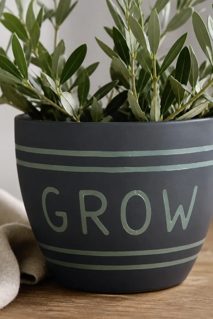
Chalkboard-style pots are cozy because they feel interactive and playful. The trick is not to make it look like a school project — keep the lettering simple and warm. Charcoal is cozy when you use matte paint, and sage writing makes it feel fresh instead of gloomy. I’ve used these for kids' room shelves with small plants, and they look great even when the plant is tiny. It also lets you personalize gifts without complicated art.
Prime the pot, then paint it with charcoal paint in 2 thin coats. Let it dry fully, then use painter’s tape to mark a horizontal underline and two small “banner” spots. Paint sage block letters or simple icons like a tiny leaf and a heart using a small craft brush. Remove tape carefully and let it cure overnight if possible. Seal lightly with a matte sealer that won’t turn the surface glossy.
Pro tipIf you want the chalkboard look to last, avoid soaking the pot — water the plant from inside, not by flooding the sides.
AvoidDon’t use glossy craft paint for this; it looks like cheap plastic.
19. Seafoam + Clay Waves Around the Belly
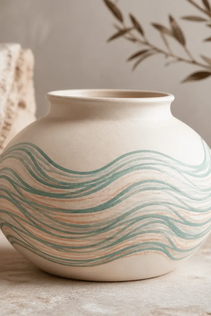
Waves are cozy because they add motion without needing a full scene. Seafoam is soft and calming, and clay-orange under-waves keep it warm so it doesn’t read cold. This design looks great on pots that hold plants with trailing vines, because the wave pattern matches the plant’s movement. It’s also friendly for kids because wave lines are repetitive and forgiving. I’ve used it on medium pots and it makes the arrangement feel cheerful without being bright.
Prime and paint the pot cream. Mix seafoam green and paint a thin wave line around the pot at about mid-height. Add a second wave line just above or below it, slightly offset, using clay-orange for the under-layer. Let the first wave dry 10 minutes before adding the second layer so they don’t smear. Seal with matte so the waves keep a hand-drawn look.
Pro tipUse a ruler as a guide for height and rotate the pot slowly so the waves stay level.
AvoidAvoid drawing all waves in one continuous line; stopping and restarting makes the pattern look intentional.
20. Gold-Touched Leaf Prints with Sponge
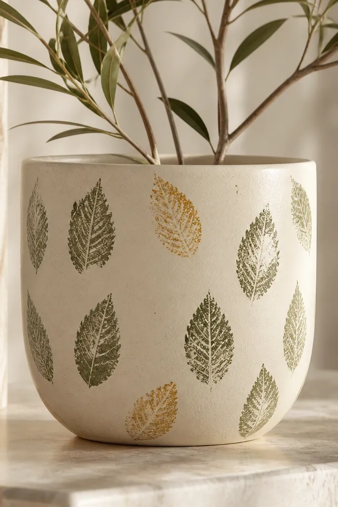
Leaf prints with a tiny gold touch look cozy because they feel like nature meets warm home décor. Sage keeps it earthy, and gold is restrained — just enough to catch light when the plant moves. This design works best for pots that sit where light hits, like near a window or lamp. It also flatters both warm and cool interiors because sage bridges the gap. For kids, it’s a win because the print shape is consistent and forgiving if a leaf overlaps.
Prime and paint the pot warm cream. If you have a leaf sponge stamp, press it lightly with sage paint to create repeating leaf prints around the pot. For gold, dab metallic acrylic paint on only every third or fourth leaf — keep it sparse. Use a paper towel to wipe off extra metallic so it doesn’t look chunky. Seal with satin so metallic stays smooth and not dull.
Pro tipPractice on cardboard first so you know how hard to press for crisp leaf edges.
AvoidDon’t cover every leaf with gold; that turns it into a glittery mess.