1. Two-Tone Vertical Stripe Pot
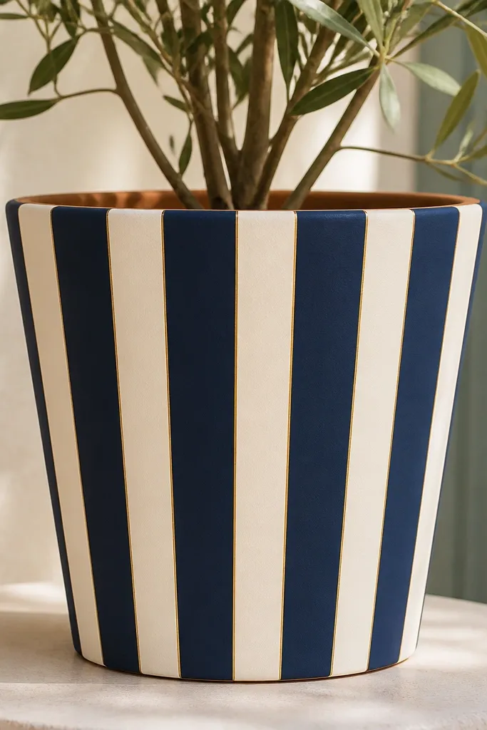
This one looks sharp because vertical stripes pull the eye up and make a short pot look taller. I use navy and cream because cream hides clay shadows and navy reads clean even with small brush imperfections. If you have a warm skin tone or you want a cozy shelf look, cream + muted blue always plays nice with wood and beige decor. The design also flatters kids' rooms because it reads playful without tiny details. Keep the stripes medium-width, around 1 to 1.5 cm each, so you’re not fighting micro lines.
Start by priming the pot with terracotta primer or gesso, then let it dry completely. Tape off 6-10 vertical columns with painter’s tape, spacing them evenly around the pot; press tape edges firmly so paint won’t creep. Paint the first color (navy) in smooth horizontal strokes across the tape edges, then remove one tape strip early to prevent tearing. Let it dry, then paint the cream areas. Finally, add a thin gold line band about 2 cm below the rim with a small flat brush.
Use a flat craft brush for stripes and wipe excess paint on a paper towel so it doesn’t pool at the rim.
Don’t freehand thin stripes on a curved surface — they wobble and look like a beginner attempt.
2. Dotted Ombre Band (Sunset Fade)
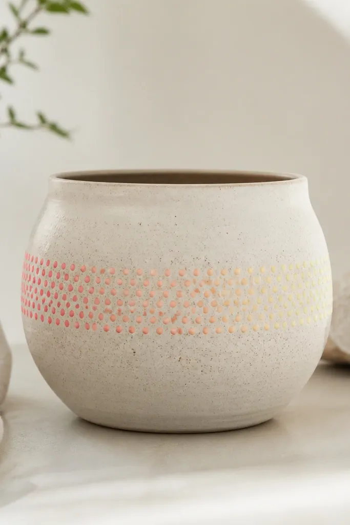
A dotted ombre band is forgiving because dot spacing hides uneven drying and tiny clay bumps. Coral to peach to pale yellow gives that warm sunset effect that looks good next to greenery and also looks cute on a windowsill. I like this for wide pots because the band wraps and reads like a deliberate design, not random decoration. It also flatters darker decor because the bright dots pop against terracotta tones. Keep the band height around 5-7 cm so it feels like a design, not a full repaint.
Pro tipIf dots look too heavy, load less paint on the tool and do two lighter passes instead of one thick one.
Prime the pot, then mark a horizontal band around the middle with a pencil line. Paint a thin base wash of pale yellow inside the band with a sponge so it looks even. Use a round dotting tool or the eraser end of a pencil to dab coral dots, starting at one side and working across. Clean your tool on a paper towel between colors, then dab peach dots in the middle and pale yellow dots on the far side to create the fade. Let it dry, then seal with matte varnish.
AvoidDon’t try to make a perfect gradient with paint strokes — dots give you control.
3. Gingham Check with Mini Ribbon Band
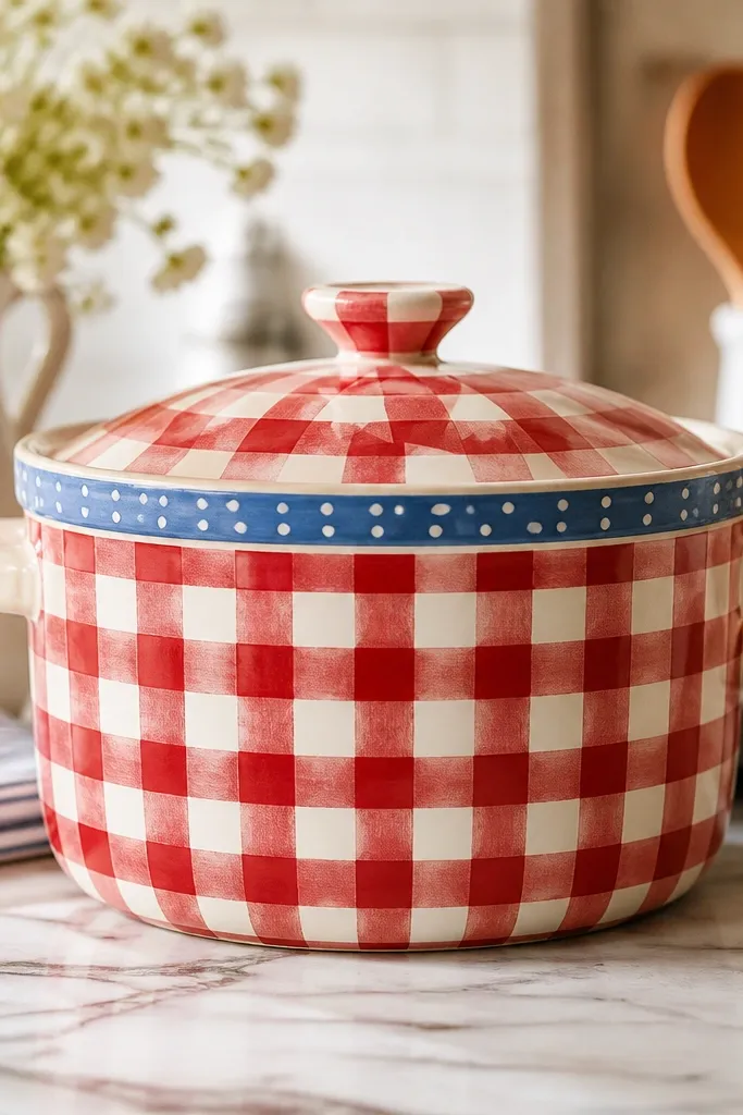
Gingham is one of the easiest patterns to make look intentional because it’s all about grid lines. Red and white feels classic and reads festive even in plain rooms, and it pairs well with green plants or dried grasses. I use a blue ribbon band at the top to give the pot a “finished” look without adding lots of tiny motifs. This is great for kids because the checks are repetitive and you can correct mistakes by repainting a square. It also flatters small spaces since the pattern stays crisp from a distance.
Prime the pot first. Tape off a grid: measure the pot’s circumference and plan square sizes about 1.5 cm each. Create one set of vertical stripes with tape, paint alternating red, then remove tape and let dry. Repeat with horizontal tape lines to form the checks. For the ribbon band, paint a 1 cm wide blue band 2 cm below the rim, then add tiny white dots with a dot tool. Finish with a matte sealer so the checks don’t smear when you handle the pot.
Press tape edges with a fingernail so paint doesn’t bleed under and ruin the grid.
Don’t pick a square size smaller than 1 cm — tiny checks look messy on curved clay.
4. Leaf Silhouette Cluster (3-Layer Look)
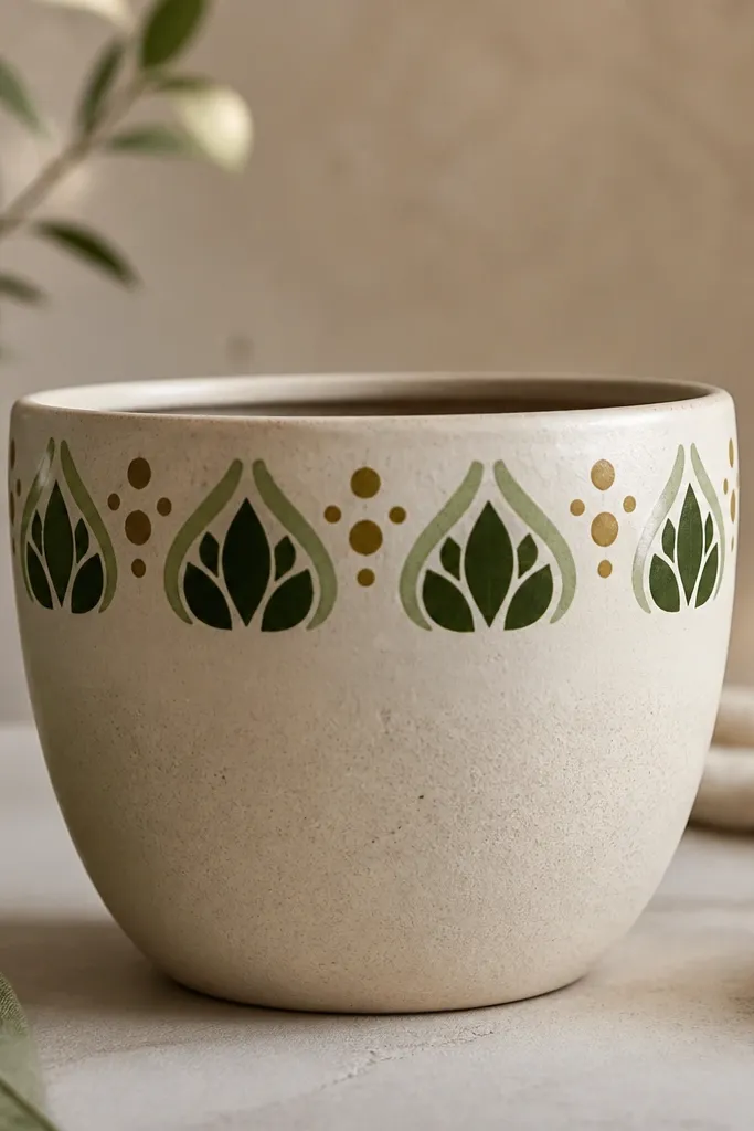
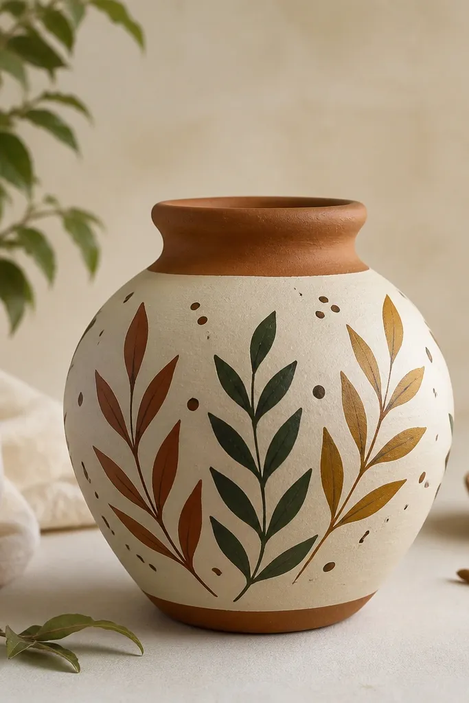
Leaf clusters look expensive because you get depth from layered greens without needing fine detail. I paint three layers: a dark green base, a medium green middle layer, and a light olive highlight. This works beautifully on pots that are a bit textured because leaf shapes fill the texture instead of fighting it. It also looks good on medium to warm-toned interiors because greens and olives sit naturally with wood and cream walls. For beginners, keep the cluster to one side or one corner so it’s not a full wrap.
Prime the pot and paint a thin wash of light green over the area where the leaves will sit. Sketch three leaf shapes lightly with a pencil, then paint the biggest dark green leaves first. While they’re still dry-ish, add medium green leaves slightly offset behind or beside the first layer. Finish with small light olive leaf tips and a few mustard dots for pollen. Seal after everything dries.
Use a leaf stencil or trace a real leaf vein pattern onto paper, then transfer with graphite for clean shapes.
Don’t use bright neon greens — they look harsh next to terracotta and make the pot feel school-craft.
5. Celestial Dots and Star Map Band
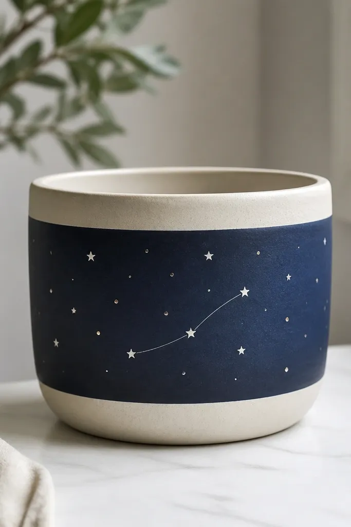
This design reads like a night sky because the contrast is strong and the details stay simple. A navy band makes white stars pop, and silver dots add that “sparkle” without glitter fallout. I like it for kids because the stars are just dots, and you can keep it playful with uneven star sizes. It also looks great for gifting because it feels thoughtful even when it’s easy. If your pot is wider, the band makes it feel intentional and not cluttered.
Pro tipStar placement looks better when you cluster 10-15 dots in one area instead of spreading them evenly.
Prime the pot, then paint a navy band about 6 cm tall around the middle. Let it dry. Use a small round brush or toothpick to dab white dots of different sizes, then add a few tiny silver dots spaced between. Draw two curved constellation lines in white with a liner brush. Finally, seal with a matte varnish so the navy doesn’t turn shiny and greasy-looking.
AvoidDon’t paint the whole pot navy — keep the band so the design has breathing room.
6. Rainbow Arc with Cloud Top
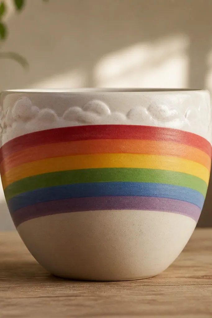
Rainbows make people smile, and the arc layout is beginner-friendly because you only need one curve. I use a thick rainbow arc in 5 colors, then I add a small cloud top so the pot looks like a complete scene. This is perfect for kids' plants because it’s cheerful without being overly busy. It also flatters small planters because the arc draws attention to the top where your eye already goes. Choose softer rainbow colors like coral, peach, sunshine yellow, sky blue, and dusty teal so it doesn’t look like a party store.
Pro tipIf your arc looks lopsided, paint a thin cream outline on the top edge to “correct” it visually.
Prime the pot, then mark the arc height with a pencil line. Paint the outer arc first in dusty teal, then layer inward: sky blue, sunshine yellow, peach, coral. Use a flat brush for the broad sections and rinse between colors. Add the clouds by painting small white blobs across the top area and slightly flattening them with a damp brush. Let dry fully, then seal with matte varnish.
AvoidDon’t use super-thin paint layers — they dry streaky and make the rainbow look patchy.
7. Terracotta Base with White Margin Dots
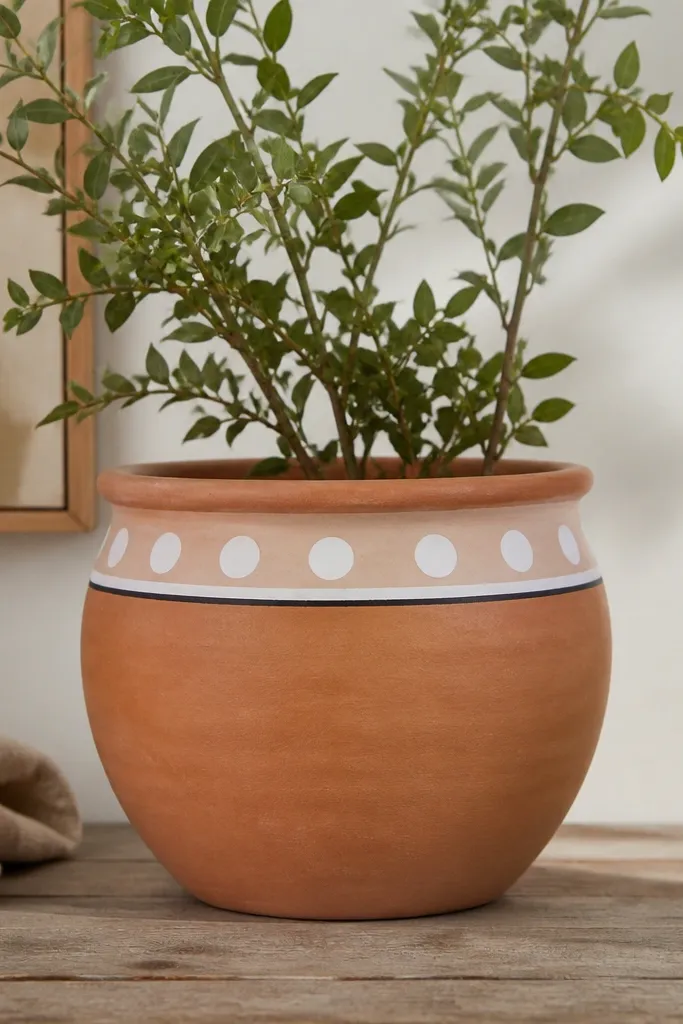
This is for beginners who want a clean look without covering the whole pot. Leaving the terracotta base shows the natural texture, and the white margin dots create a crisp, modern border. I also add a thin black line because it makes the white band look intentional, not random. This design looks great on neutral shelves and works for any plant style — succulents, herbs, even faux stems. It’s flattering for small pots because the border keeps attention near the rim.
Pro tipMark dot spacing with a ruler and pencil — you’ll avoid that crowded look.
Prime the pot lightly if you’re sealing for longevity, then paint a thin black line about 2 cm below the rim. Above it, tape a 2 cm wide band where the dots will go. Paint the band white in one smooth coat, then remove tape after it’s dry to the touch. Use a dot tool to add evenly spaced dots in a slightly different white shade or the same white if you prefer simple. Seal with matte varnish once fully dry.
AvoidDon’t skip sealing if the pot will be handled often; border paint chips first at the rim.
8. Monochrome Face Pot (Simple Smiley)
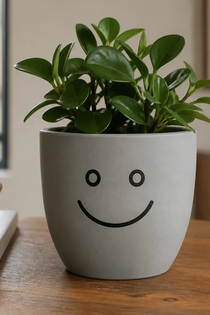
9. Monochrome Face Pot (Simple Smiley)
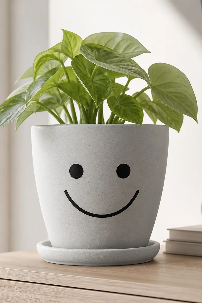
A simple face looks charming because it reads from far away and doesn’t require delicate painting. I do a soft gray base with black features and a tiny blush dot in pink near the cheeks. This style suits kids' rooms and also looks surprisingly good on adult desks when the palette stays limited. It flatters most spaces because gray and black match everything, including warm wood and white walls. Keep the face centered on the widest part of the pot so it doesn’t stretch.
Prime the pot, then paint a full coat of soft gray acrylic craft paint. Let it dry and add a second coat if you can still see terracotta patches. With a pencil, lightly sketch two eye circles and a smile curve. Paint eyes and outline with black using a small round brush, then add a tiny pink blush dot on each cheek. Seal with matte varnish after the paint dries fully.
Use painter’s tape as a guide for the face width — tape a rectangle around the center and paint inside it.
Don’t make the eyes too big — oversized features can make the pot look like a cartoon sticker.
10. Sunflower Half-Wrap (Big Center, Easy Petals)
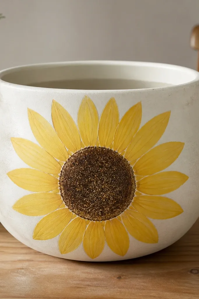
Sunflowers look detailed even when you use basic shapes. The trick is a big center circle and consistent teardrop petals, all on one side so beginners don’t have to cover the whole curvature. I use sunflower yellow, warm orange, and deep chocolate brown for the center. This looks amazing with green plants because the colors echo natural leaves and stems. It also works well for gifts because people instantly recognize it. For pots with a handle or wider face, half-wrap makes the motif look like it belongs.
Prime the pot, then paint the background area a light beige or leave it terracotta for contrast. Mark the sunflower center with a circle about 6-8 cm wide. Paint the center brown, then texture it with a dry brush using lighter brown streaks. For petals, paint teardrops in warm orange-yellow around the center, keeping them the same size and spacing. Finish by adding a few small green leaf shapes beneath the sunflower. Seal after everything dries.
To get teardrops, start with a dot, then drag the brush slightly to one side — it forms a point.
Don’t add tiny vein lines on day one; it makes the pot look busy and uneven.
11. Pastel Speckle Pot with Clear Coat Glow
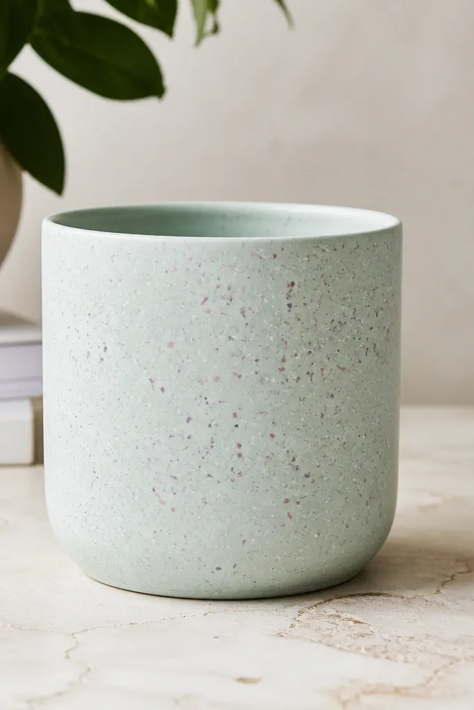
Speckle looks professional because it hides brush strokes and makes the surface feel textured. Pale mint is my favorite base for beginners because it covers terracotta well and pairs with almost any plant. White speckles keep it airy, while blush and lavender add softness. This design flatters light interiors and makes a small pot look like it belongs in a modern shelf. It’s also great for kids because speckling is simple and hard to mess up.
Prime the pot, then paint a smooth coat of pale mint acrylic. Let it dry fully. Load a toothbrush or stiff brush with white paint, then flick small splatters over the surface. Rinse and repeat with blush pink and a little lavender, leaving some areas more speckled than others for a natural feel. Once dry, seal with a clear matte varnish; if the base looks too flat, add a very light second coat of sealer for even coverage.
Practice your flick speed on a scrap piece of cardboard first so you don’t get giant blobs.
Don’t use watery paint for speckles — it runs and makes muddy spots.
12. Striped Rim with Polka Dot Body
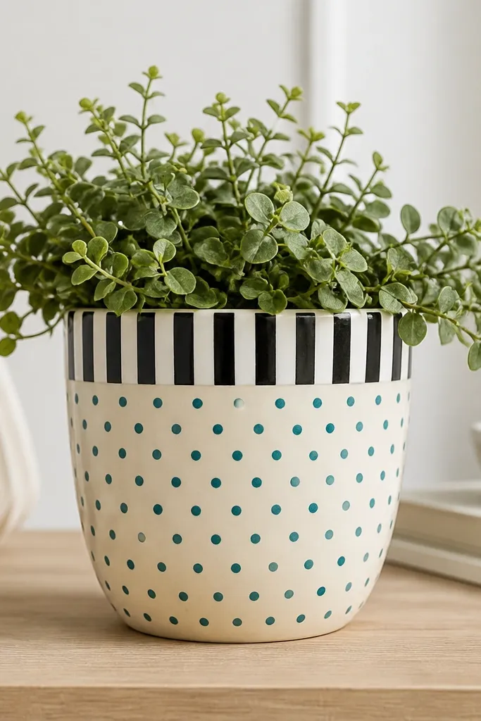
This one looks clean because it mixes two easy pattern types: a bold rim and a calmer body. Black-and-white stripes around the top frame the pot, and teal dots keep it playful without overwhelming the surface. I use a cream base so the dots stay crisp and don’t blend with terracotta shadowing. This design suits kids because it’s repeatable and fast. It also looks great for herbs because the teal feels fresh next to green leaves.
Prime the pot, then paint a cream base coat. Tape a 2 cm band around the rim and paint it alternating black and white stripes; remove tape after each stripe dries a bit. Once the rim is done, remove tape and let everything dry. Use a dot tool to add teal dots across the body, keeping them about 1 cm apart. Seal with matte varnish when dry.
If dots start to look uneven, slow down and keep your dot tool straight up and down.
Don’t paint dots before the base is fully dry — they drag and smear.
13. Boho Triangle Stack (Muted Earth Palette)
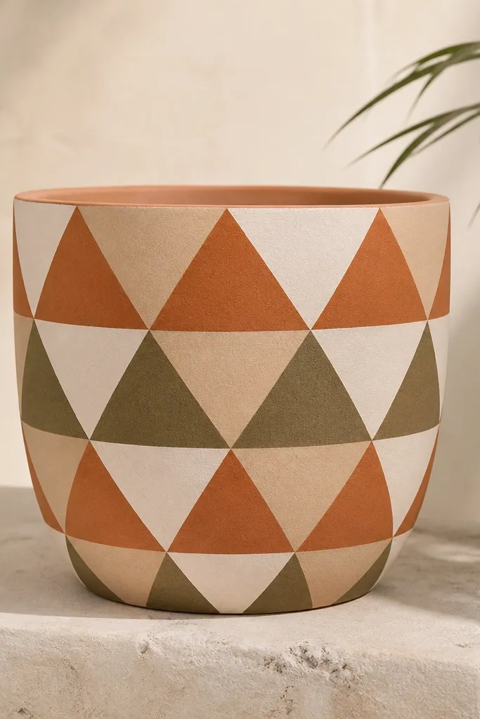
Triangle stacks make a pot look like patterned fabric without needing complex linework. Using muted terracotta, sand, olive, and off-white keeps it earthy and calm, which is exactly what I want for budget planters on a shelf. This flatters medium and warm-toned rooms because the colors match natural wood and woven textures. It’s also beginner-friendly because triangles are easy to repeat once you pick a size. For pots with a wider front, stacking across one side looks intentional.
Prime the pot and paint a sand base. Draw a vertical center line and then mark triangle rows about 5 cm tall across the front. Paint the bottom row triangles in muted terracotta, then the next row in olive, then off-white, alternating as you go up. Use painter’s tape for the triangle edges if you want crisp lines; otherwise, use a thin angled brush and steady your hand with your wrist on the table. Seal when dry.
Keep triangle width consistent; if they vary, the pattern looks accidental.
Don’t use bright neon colors — they clash with the clay and look cheap fast.
14. Vintage Floral Border with One Main Bloom
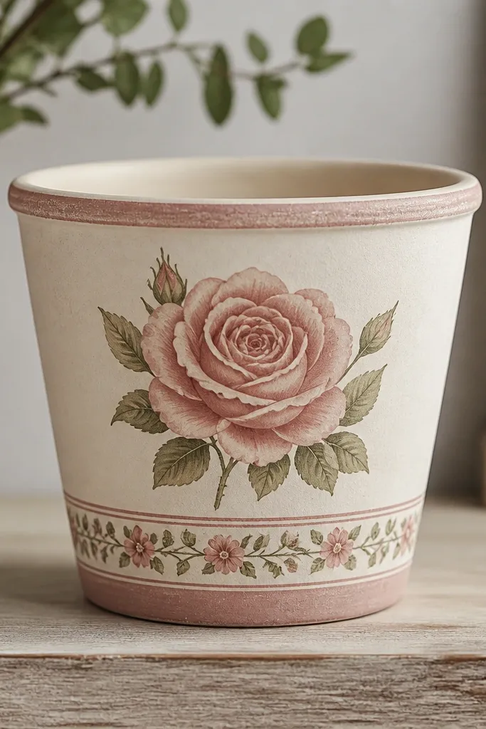
This looks like a thrift-store find because you get one main bloom plus a simple border. Dusty pink and cream keep it vintage, and sage green makes the leaves look natural. I like it on medium pots because the border gives structure and the bloom gives personality. It also flatters indoor spaces where you want something soft instead of bold. Beginners can do it because the border is just small repeating flowers, not a full painting.
Prime the pot, then paint a cream base wash. Mark two bands: one at the lower third for the border, and one centered bloom area. Paint the border first using a small flower stamp or a tiny brush to make 5-petal flowers in dusty pink, with sage dots in the centers. For the main bloom, paint a larger flower with layered petals, starting with darker pink at the center and fading outward with lighter pink. Add two simple leaves on either side. Seal after it dries.
If your petals look messy, use a stamp for the border and save freehand for the main bloom.
Don’t add too many tiny flowers — a few repeating ones look cleaner than a dense scatter.
15. Navy Waves with White Sailor Dots
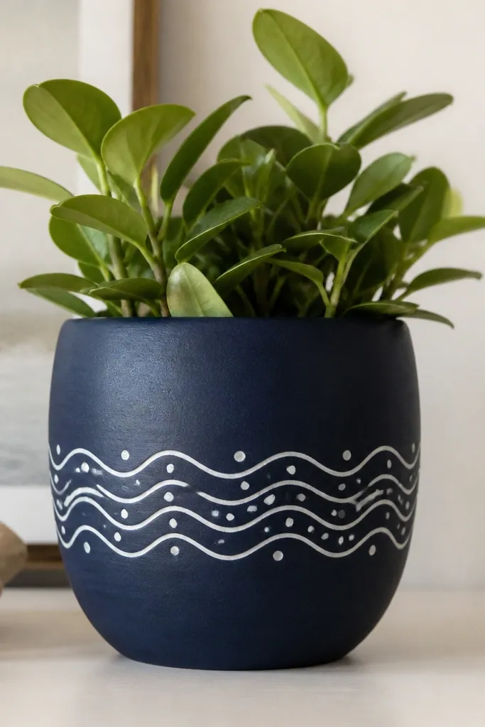
Waves make a pot feel playful and coastal without needing a full beach scene. Navy as the base gives depth, and white waves keep the design readable. The dots between waves add motion and help hide uneven paint texture on the clay. This design flatters cool-toned decor and looks great with silver or white pots nearby. It also works well for kids because you repeat wave lines and dots instead of drawing detailed objects.
Pro tipFor neat waves, keep your brush loaded lightly so lines stay crisp instead of thick.
Prime the pot, then paint the whole thing navy and let it dry. Tape a 5-7 cm wide horizontal band where the waves will go. Inside the band, paint 4-6 curved wave lines in white using a small round brush or liner brush. Add dots between the waves with a dot tool. Remove tape carefully and seal with matte varnish.
AvoidDon’t paint waves too close together — they merge and look like scribbles.
16. Rainbow Handprint Tree on One Side
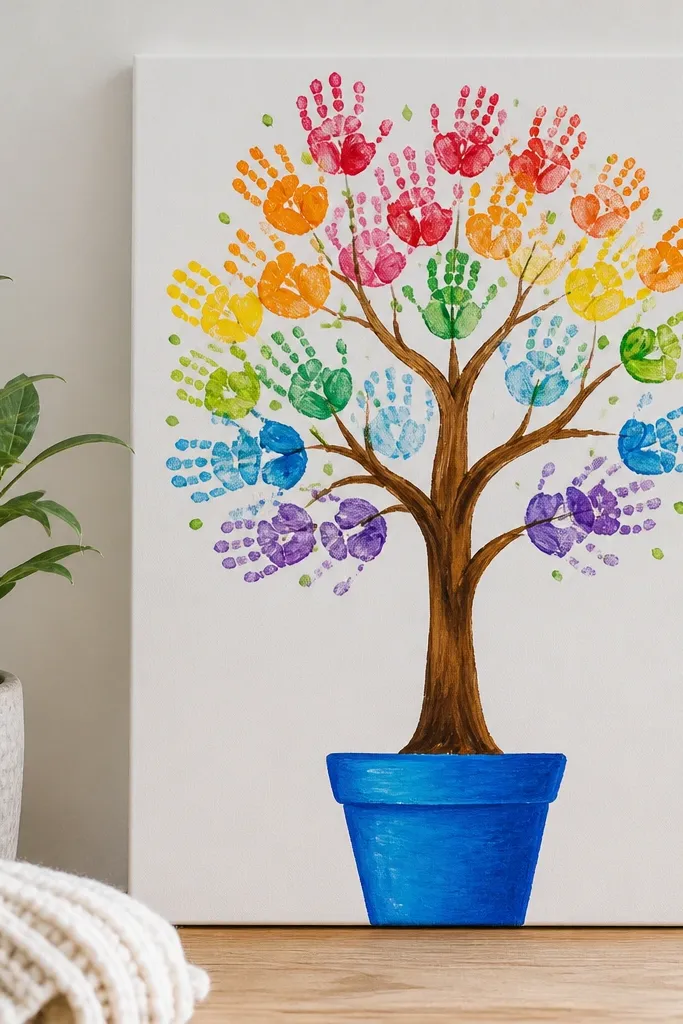
This is a kid-friendly “wow” design because it turns basic circle shapes into a tree canopy. I do a brown trunk with a simple fork, then use a sponge or stamp to make handprint-style circles in bright rainbow colors. It looks cheerful and personal, and it’s easy for little hands to help with without precise brush control. This also works great on pots that have a slightly uneven surface because the circles fill gaps. Keep the tree on one side so the pot still looks like a pot, not a full mural.
Pro tipIf you’re doing this with kids, use foam stamps instead of brushes to prevent streaks.
Prime the pot and paint a brown trunk about 8-10 cm tall on one side. Add two or three branches by painting short curves. For the canopy, dip a sponge (or a small foam stamp) into each rainbow color and press in a loose cluster around the top of the trunk. Use green dots to connect the circles and make it feel leafy. Seal once everything is dry, then add a thin white highlight line on the trunk for dimension.
AvoidDon’t press too hard with sponges — you’ll smear paint into the clay texture.
17. Monstera Leaf Stencil Wrap
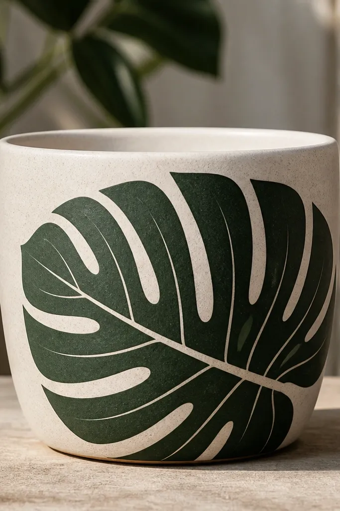
Monstera leaves look modern and calm, and stencils make them beginner-proof. Dark green with a lighter green inside line gives the leaf depth even if you’re not confident in freehand. This design flatters neutral interiors because the green reads clean and graphic. It also looks great on taller pots where you can place one leaf vertically. If you want a plant-themed pot without tiny details, this is the one.
Pro tipWarm the stencil in your hands for 10 seconds so it sticks better and stays flat on the curve.
Prime the pot. Hold a monstera leaf stencil against the front, align it so the leaf points upward, and tape the stencil edges so it doesn’t slip. Sponge or dab dark green paint through the stencil, then remove carefully. While the paint is still a bit tacky, use a smaller brush to add lighter green lines in the cutout areas. Paint a thin dark green stem line below the leaf for a finished look. Seal with matte varnish after drying.
AvoidDon’t use thick paint through the stencil — it bleeds and loses leaf edges.
18. Terrazzo Pebble Specks (DIY Stone Look)
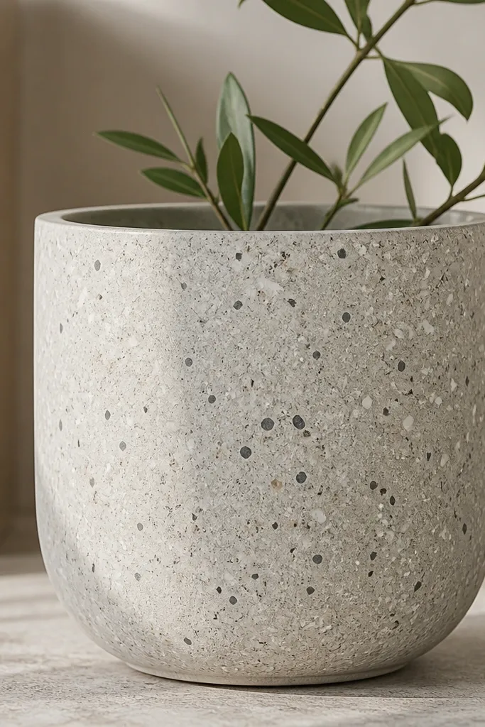
Terrazzo specks make an earthen pot look like it belongs with concrete planters. A light gray base is forgiving because it covers clay and makes specks pop. I use white, charcoal, and taupe for a stone feel that doesn’t scream craft project. This looks great for adults who want something stylish but still handmade. It also flatters small plants because the pot texture becomes the interest, not the plant alone.
Pro tipFor better control, use semi-dry paint — too wet creates blobs.
Prime the pot and paint a light gray base coat. When dry, use a toothbrush technique with white and charcoal paint — but flick closer for smaller specks. Then add taupe specks with a dry brush: load a dry brush with taupe and lightly tap so it creates tiny irregular marks. Keep the density higher near the middle and lighter near the rim for natural variation. Seal with matte varnish and let it cure fully.
AvoidDon’t overdo speckle density to the point where the base disappears.
19. Gold Dotted Halo Around the Rim
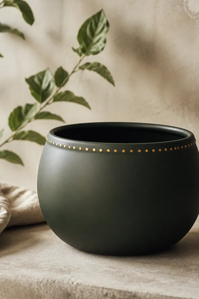
A gold dotted halo looks classy because it frames the pot and makes the rim feel finished. I use deep green or matte black as the base so the gold reads warm and not flashy. This style flatters dark interiors and makes a plant look like it’s in a styled vignette. It’s also a great “first try” because it only requires one clean band. Keep the gold dots small and evenly spaced for the best effect.
Pro tipSpace dots by counting: 18-24 dots around the rim works well for most small pots.
Prime the pot and paint a full base coat in deep green or matte black. Let it dry fully. Tape a thin band around the rim area about 1 cm tall. Paint gold dots by dotting with a small round brush or dot tool — don’t drag the brush, just place dots. Remove tape while paint is still slightly tacky for a crisp edge. Seal with matte varnish over the base; if the gold paint is metallic, test first so it doesn’t dull too much.
AvoidDon’t use glitter gold unless you want texture that catches dust.
20. Color Block Corner Accent
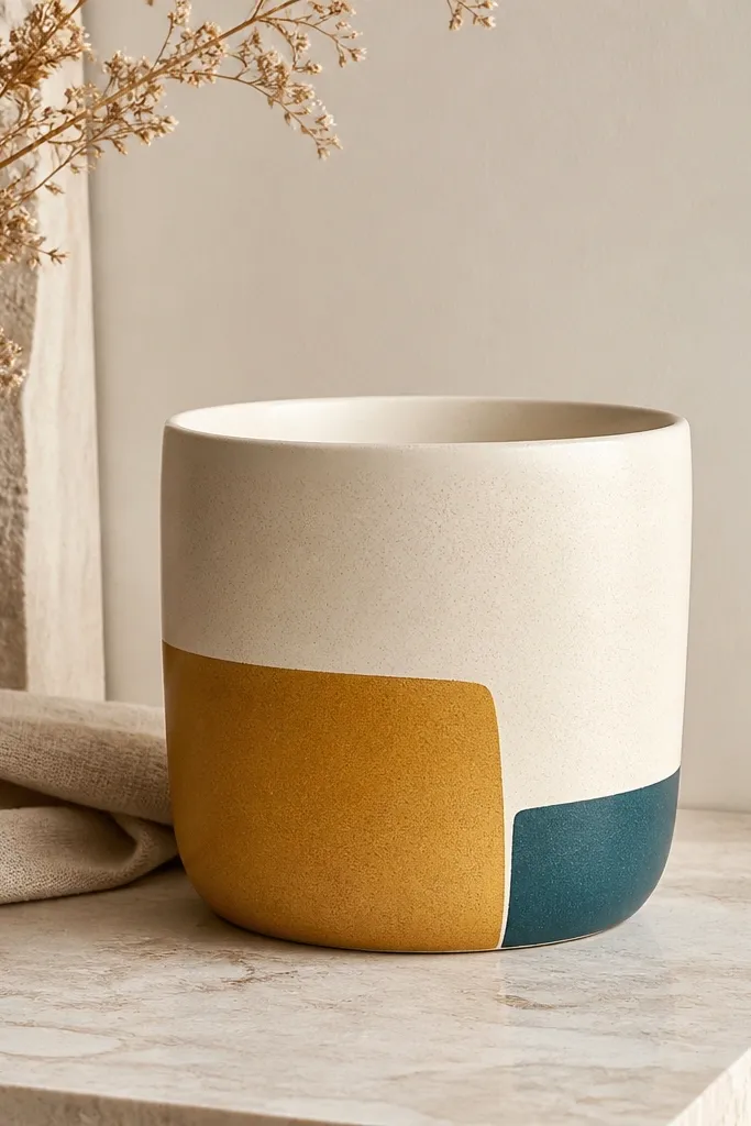
Color block corners look modern because they use negative space and big shapes. This is a beginner favorite when you want the pot to look intentional without covering the whole surface with patterns. Cream base keeps it bright and makes the mustard and teal pop like a design on paper. It flatters kids and adults because it’s graphic, not fussy. Place the blocks on the widest front area so you don’t stretch the shapes around the curve.
Prime and paint a cream base coat. Let dry, then tape off two rectangles in the upper front corner: a larger mustard block and a smaller teal block touching it. Paint mustard inside the taped area, let it dry, then remove tape. Repeat for teal. Add a thin black outline around both shapes with a fine brush for crisp edges. Seal with matte varnish.
Use painter’s tape for clean edges, then peel tape slowly at a 45-degree angle.
Don’t skip outlines if your blocks touch — without a line they blend into each other.
21. Hand-Drawn Striped Flower Pot (Linework + Fill)
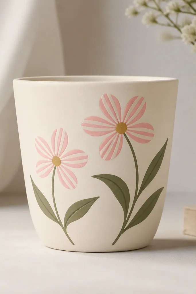
This design looks impressive because the flowers have striped petals, but it’s still beginner-friendly because the stripes are only on a few petals. I use cream base and keep linework bold with a dark marker-like paint color. Pink and white stripes on petals look sweet and clean, and sage leaves balance it so it doesn’t feel too sugary. This style flatters people who like subtle details but don’t want a full mural. It also looks good on pots that are small enough to keep the flowers centered.
Pro tipUse a toothpick for stripe lines if your brush feels too thick.
Prime and paint a cream base. Sketch two flower heads centered on the pot with a pencil circle guide. Paint petals solid pale pink first, then use a thin brush to add white stripes from the petal base to the tip. Add a dark center dot cluster in warm brown or charcoal. Paint two or three sage leaves beneath the flowers. Seal after drying.
AvoidDon’t stripe every petal perfectly — slight variation looks more handmade.
22. Blackboard Chalkboard Pot with White Doodles
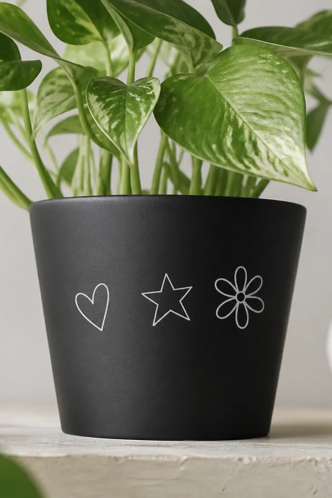
Chalkboard-style paint makes the pot interactive, and the look is clean because chalk lines are easy to control. I use matte black as the base and white paint or chalk marker for doodles. This is great for kids because they can add new drawings later, and it also works for parties because you can personalize the pot quickly. It flatters neutral decor because the black base grounds everything. If you want a pot that doesn’t need constant repainting, this is it.
Pro tipUse a chalk marker for doodles if you want clean, bright lines without brush streaks.
Prime first, then paint a thick matte black base coat. Let it cure as directed on your paint jar. Once dry, use a stencil or freehand to draw simple shapes in white: one heart, one star, one tiny flower. Add a short message-like line if you want, but keep it small so it stays cute. Seal with a clear coat only if you want waterproofing; otherwise, leave it as a chalk surface and avoid water exposure. For indoor plant pots, I seal lightly around the rim only.
AvoidDon’t use glossy paint for the base — it looks like plastic and kills the chalkboard vibe.
23. Rainbow Spiral on a Tall Pot
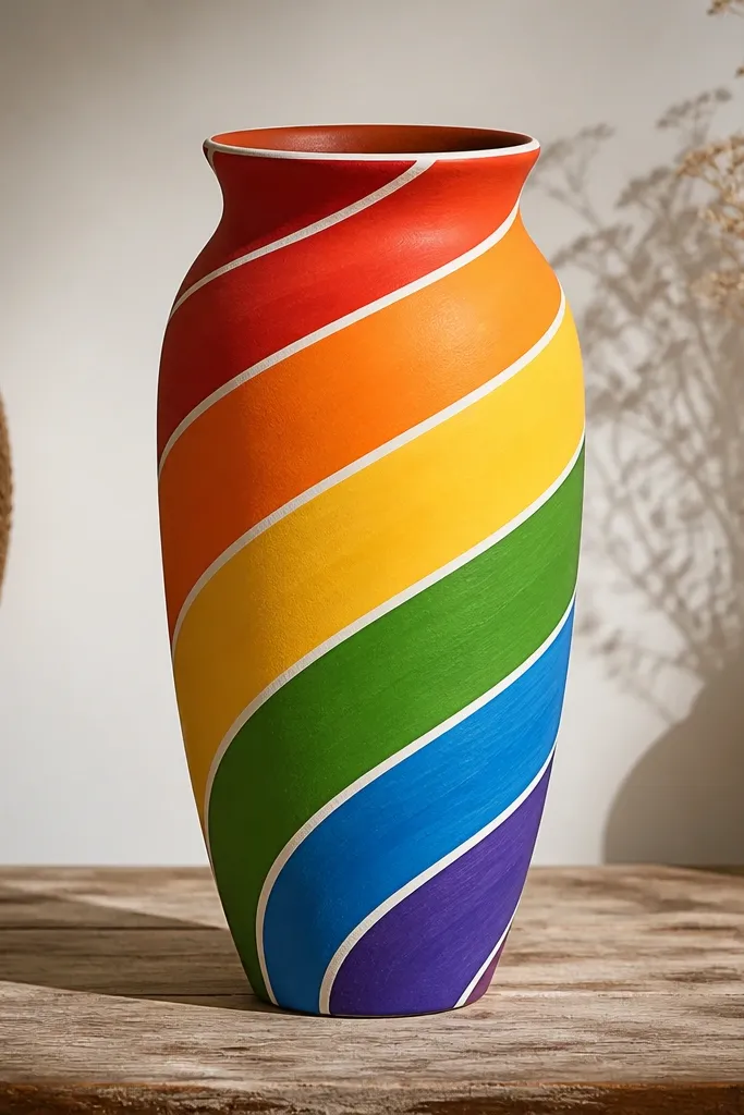
Spirals look complex but they’re manageable if you tape color bands and keep the spiral spacing consistent. A tall pot is perfect because the spiral naturally follows the shape and makes the pot feel taller. Thin white separators keep the rainbow clean and help hide minor unevenness in paint thickness. This design is great for kids because it’s fun to watch the curve go upward, and it’s great for adults because it looks like modern wall art. Use soft rainbow colors if you want it calmer — bright neon looks louder than you expect.
Pro tipIf taping the spiral feels hard, draw the spiral guide with pencil first, then tape along the pencil line.
Prime the pot. Paint the base coat white or light cream so colors stay true. Tape a spiral guide with painter’s tape: start near the base and spiral upward, keeping the tape width around 2 cm. Paint the first color band, remove tape when it’s dry to the touch, then re-tape for the next band. Repeat until you reach the rim. Finally, outline each band edge with a thin white line using a small brush. Seal with matte varnish.
AvoidDon’t rush between colors — pulling tape off wet paint smears the edges.
24. Blue Watercolor Wash + White Edge Dots
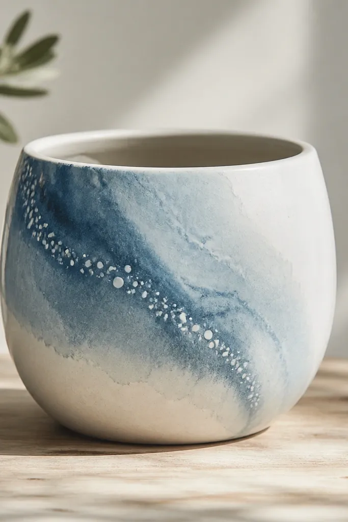
Watercolor-style washes look soft and expensive because you get natural variation without perfect brush control. I do it with thinned acrylic paint so it moves on the primer surface like dye. The white edge dots make the wash feel intentional and give you a crisp finish point. This design flatters people who want calm decor — it looks great next to white furniture and light neutrals. It also works well on pots with slight texture because the wash settles into the bumps.
Pro tipUse a damp rag to soften edges — hard edges look like marker, soft edges look like watercolor.
Prime the pot and paint a light base coat. Mix acrylic paint with a little water until it drips slowly off a brush. Load a flat brush and paint a wash on one side, then blend outward by wiping the brush with a damp cloth. Let it dry halfway, then add a second lighter wash layer for depth. Finally, dot a thin line along the wash edge with white paint using a dot tool. Seal with matte varnish once fully dry.
AvoidDon’t add too much water — overly thin paint can run into streaks you can’t fix.
25. Tiny Planet Dots with Night Sky Base
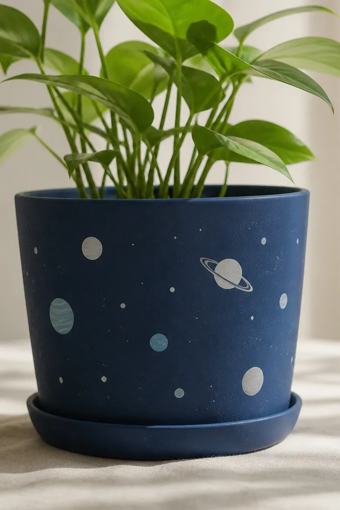
Planet dots are adorable and still easy because you only need circles and a few simple ring lines. A midnight blue base makes the planets pop, and you can vary planet sizes to make it look like a mini solar system. This works for kids because it’s playful and not too detailed, but it also works for adults because the color palette stays controlled. Place the planets in a loose cluster on one side so the curved pot doesn’t distort the scene too much. It looks especially good with small succulents.
Pro tipFor better planet texture, dab a second lighter color on one side of each circle while it’s still a little tacky.
Prime the pot and paint a midnight blue base coat. Let it dry. Use a small round brush to paint 6-10 circles in light blue, white, and gray, with one slightly larger planet near the center. Add a thin ring line on one planet by painting an oval and leaving a gap for the ring center. Add a few tiny white dots for stars with a dot tool. Seal with matte varnish.
AvoidDon’t draw too many rings and moons — keep it to one ring detail.