
1. Thrift-frame grid with warm gray mats
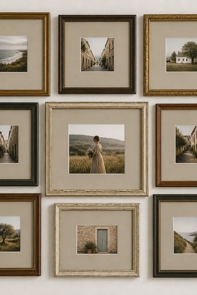
This is the easiest way to get luxury high end photo collage ideas without buying new frames. I like warm gray mats because they calm down busy kids' backgrounds and make skin tones look softer than stark white. Use one hero photo in the center at 5x7, then keep the eight surrounding photos at 4x6 so the eye knows where to land. It looks polished on walls with beige, wood, or tan decor, and it works for families because it gives every child equal space. The luxury effect comes from uniform spacing and matching mat color, not from frame matching.
Pro tipUse matte photo paper and wipe the frames with a dry microfiber cloth so fingerprints don’t catch the light.
Start by laying nine frames on the floor and measuring the inside mat openings. If mats are missing, cut 1.5-2 inch strips of warm gray cardstock and build a simple mat by gluing it to a stiff backing. Print your photos in 4x6 and 5x7, then trim each with a paper trimmer so edges are crisp. Center each photo in its mat, tape the back corners, and keep the spacing consistent by using a ruler at the floor stage. Finally, hang the whole set with the same height for each frame so the grid reads as one piece.
AvoidAvoid mixing mat colors like black, cream, and neon — it makes the collage look like spare parts.
2. Gallery tape borders on a single foam board
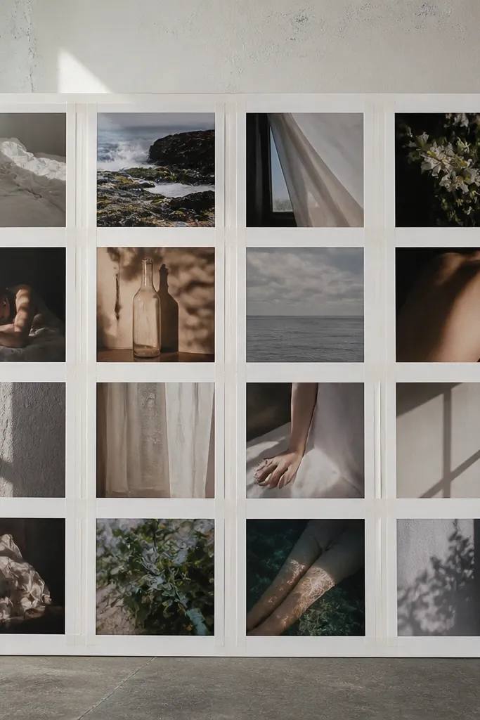
This one looks expensive because it mimics museum matting. The paper tape border creates a clean edge that feels intentional, especially when your photos are matte. It flatters faces and bright outfits because the tape separates color blocks and prevents everything from blending. This style is great for kids' first-year updates because you’ll have plenty of small shots and you need them to look organized. The luxury part is the consistency of the border thickness across the whole board.
Pro tipChoose one tape finish — matte white — and stick to it for the entire collage.
Start with a foam board cut to 12x16 or 11x14 and lay your photos down before you tape anything. Use a ruler to create 1 inch tape borders around each photo, and press the tape down firmly with a burnishing tool or the back of a spoon. Place photos in a grid pattern, leaving 0.25-0.5 inch gaps between taped borders. After placement, tape each photo at the corners only so you can adjust slightly. Finish by adding a final tape frame around the outside edge to make the whole piece feel like one object.
AvoidAvoid thick, uneven tape borders that look hand-done instead of measured.
3. Layered "floating" collage with 3D photo mounts
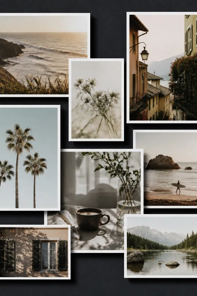
Floating layers are my go-to when I want luxury high end photo collage ideas to feel modern instead of scrapbooky. Dark backing (charcoal or deep navy) makes the photos pop and makes skin tones look richer without looking harsh. This works best for portrait photos because the raised layers frame faces and give depth. It also hides minor print imperfections since the eye reads the layers, not the tiny flaws. The styling principle is depth you can see — raised edges and controlled overlap.
Start with a 12x16 backing board painted matte charcoal or covered with charcoal craft paper. Pick three layers: background photos (flat), middle photos (raised 1/8 inch), and hero photos (raised 1/4 inch). Arrange your background first, then add foam mounts under the middle layer corners and edges. Overlap by about 0.5-1 inch so it looks designed, not accidental. Finish by trimming any photo edges that stick out with a craft knife and straightedge for clean lines.
Use matte mounts and keep overlaps consistent in one direction so the shadow pattern looks intentional.
Avoid stacking too many layers at once — it turns into clutter fast.
4. Vintage postcard strip collage
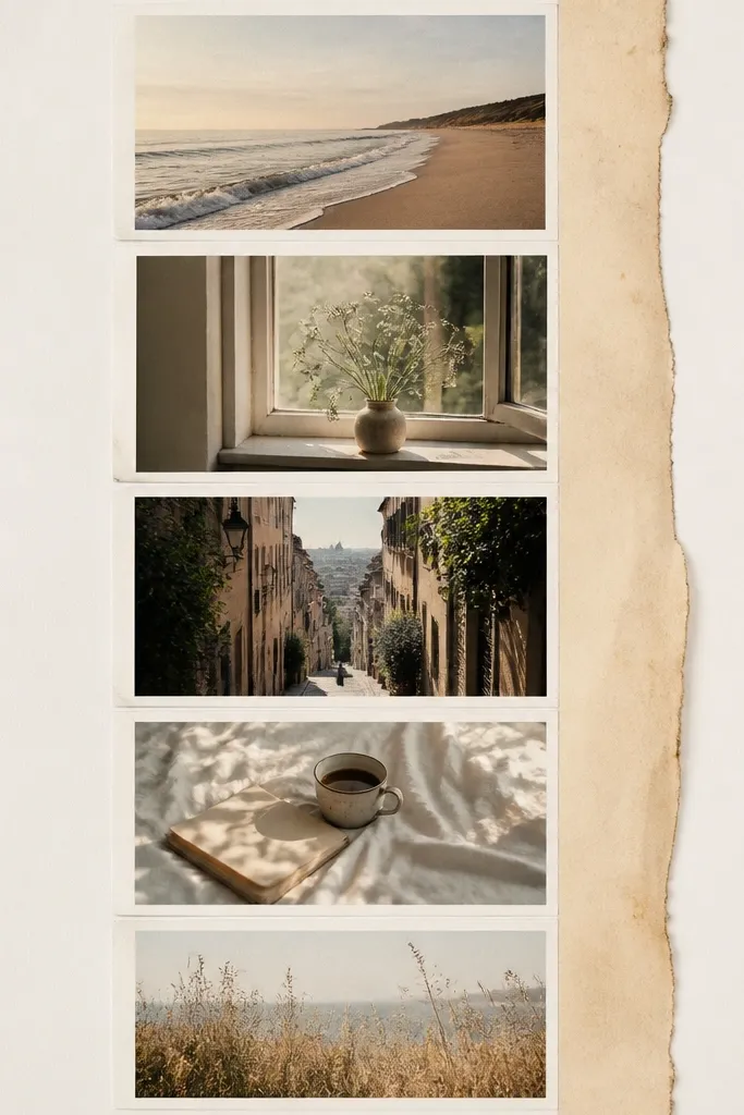
If you want luxury high end photo collage ideas that feel warm and personal, postcard strips are the move. I’ve done this with travel photos and birthday memories, and it looks best when your photos have similar color temperature (like warm indoor light or golden hour). Narrow strips create a “story” even when you don’t add captions. It flatters busy backgrounds because each photo takes less visual space. The luxury look comes from uniform strip width and a consistent vertical rhythm.
Pro tipChoose one “date” photo as a hero and make that strip 1 inch taller than the rest.
Print your photos as 4x6, then trim them into 2.5x4.5 inch postcard rectangles with a paper trimmer. Cut a backing board to 8x16 and cover it with cream paper or linen-textured cardstock. Arrange the postcard strips in one vertical column, leaving 0.25 inch gaps. Add a thin 0.5 inch aged-paper strip on the left or right edge using photo-safe glue. Secure each postcard with double-sided photo tape at the corners only.
AvoidAvoid mixing random aspect ratios — keep every strip the same width so it reads like a set.
5. Two-tone mat collage inside a frame
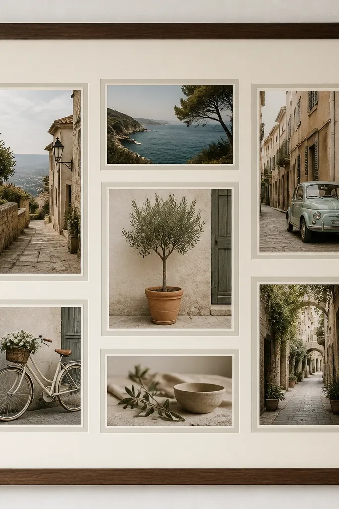
A two-tone mat is a fast route to a luxe look because it creates layers without adding bulk. Cream on the outside softens everything, and warm gray on the inside keeps it grounded. This style flatters families because it makes mixed photo tones feel cohesive. It also works beautifully for kids because it frames faces and reduces glare compared to glossy prints. The principle is mat hierarchy: one color for the “gallery” feel and one for the “detail” edge.
Pro tipKeep the inner mat ring between 1/8 and 1/4 inch so it reads clean, not busy.
Start with a 12x16 or 11x14 frame and remove the backing. Cut a thick cream border mat, leaving an inner window that matches your photo sizes. Then cut a thin warm gray inner mat ring for each photo window. Place photos behind the inner mat and tape the photo corners to the backing using photo-safe tape. Finally, align all inner mats so the gray rings are the same thickness across the whole collage.
AvoidSkip stacking mats that are all the same width — it looks flat and cheap.
6. Fabric ribbon seams with mounted photos
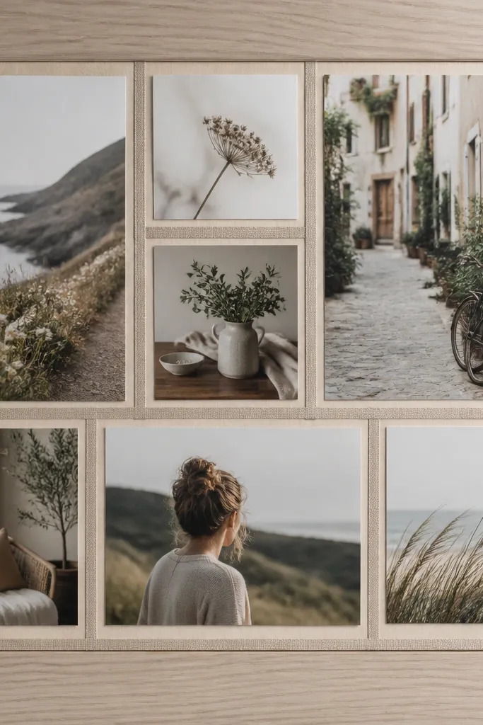
This one looks high end because it adds textile texture where most budget collages use plain paper. I use 1/4 inch grosgrain ribbon in a single color, usually oatmeal, olive, or dusty rose. The ribbon seams make the layout feel designed and hide small gaps between prints. It flatters kids' bright outfits by adding a neutral divider. This is also a great choice for bedrooms and nurseries because it feels softer than tape.
Pro tipPress the ribbon flat with a warm iron on low through a thin cloth to keep it crisp.
Cut a backing panel from thin plywood or foam board, then cover it with craft paper in an off-white tone. Arrange your photos first in a grid with 1/2 inch gaps. Cut ribbon strips to match the seam lines and glue them down with fabric-safe adhesive or a thin line of hot glue on the backing only. Mount each photo with double-sided photo tape, aligning the edges to the ribbon. Finish by trimming any ribbon ends clean at the corners using scissors.
AvoidAvoid using shiny satin ribbon — it reflects light and can cheapen the look.
7. Black backing with gold-foil corner labels
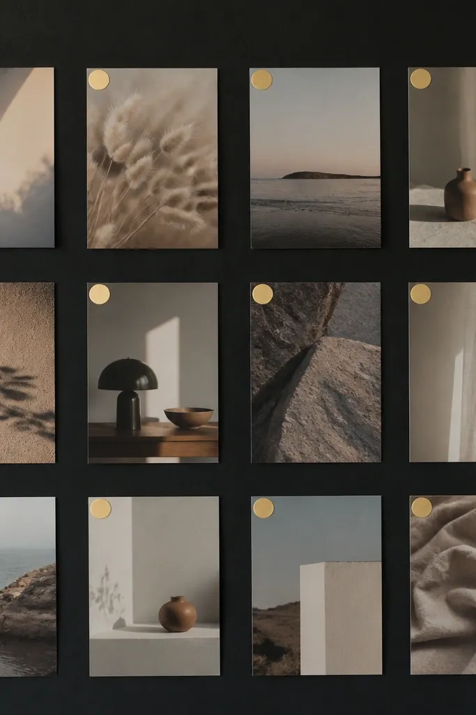
If you want luxury high end photo collage ideas that look like a fashion magazine wall, go black and add tiny gold accents. The photos look sharper against matte black, and the gold corner labels give that “styled” feeling without needing fancy typography. This works best for moody indoor photos, evening events, and older kids who like dramatic outfits. It also hides print noise and slight color shifts because the background does the heavy lifting. The luxury principle is contrast: matte photos, matte black, tiny metallic detail.
Start with a 12x16 black foam board or craft board. Print your photos on matte paper and trim to consistent sizes, like 4x6 and 5x7. Arrange them with 0.5 inch gaps and tape a temporary grid on the backing so you don’t drift. Add small gold foil labels (or gold corner stickers) to one corner of each photo before mounting. Mount photos with double-sided tape at corners only, then press down so labels sit flat.
Keep gold labels under 1 inch so it reads classy, not scrapbooky.
Avoid covering large areas in gold foil — it shifts from luxury to party decor fast.
8. Acrylic photo strip wall with binder clips
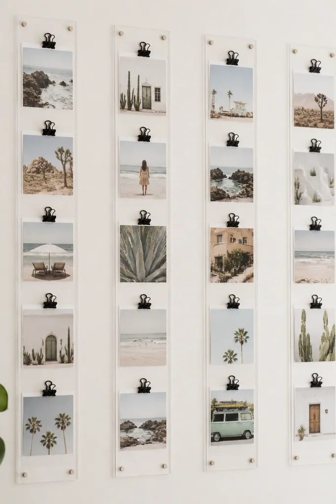
This is a clean, modern way to get luxe without permanent glue. The acrylic reads glossy and high-end, while the binder clips add a crisp, industrial edge. It’s perfect for kids because you’ll swap photos as they grow, and the layout stays neat. The photos look bright because acrylic reflects light, and consistent clip spacing makes the wall feel planned. The styling principle is repeatable hardware — same clip type, same spacing, same photo sizes.
Buy clear acrylic photo strips or cut acrylic sheets into long strips and drill holes for screws. Mark wall placement with a level so rows are straight. Print photos in matching widths, like 4x6 trimmed to 3x4.5, and punch a small hole at the top corner if your clip needs it. Clip photos into the acrylic strips with black binder clips, keeping 0.75-1 inch between photos. Step back and adjust before tightening screws so the whole row lines up.
Use matte photo paper so reflections don’t glare off faces.
Avoid random photo sizes — acrylic makes mismatched proportions stand out.
9. Shadowbox collage with layered background paper
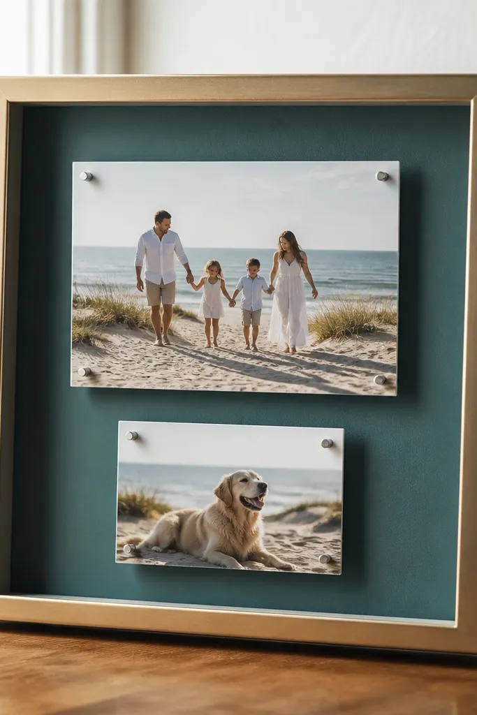
Shadowboxes look expensive because they create real depth you can see from across the room. Layered background paper gives you a color story, like teal for ocean memories or blush for birthdays. This style is great for kids' milestone collections because you can include a small memento like a tiny ticket or a handwritten note. It flatters photos with warm tones by adding a subtle color field behind them. The luxury effect is the enclosed, gallery-like presentation and the controlled layering.
Pro tipWipe the inside glass with glass cleaner and a lint-free cloth so fingerprints don’t show through.
Start with a 12x16 shadowbox or 16x20 if you can find one cheap. Cut layered background paper in two tones and glue the bottom layer down first, leaving a thin border visible. Place your photos on top using foam tape spacers so they sit above the paper. Arrange in a loose grid, then add one hero photo larger (like 8x10) in the center. Seal nothing — just use photo-safe adhesive on the backing and keep the inside clean.
AvoidAvoid clutter inside the shadowbox — one small memento looks intentional; five looks messy.
10. Map-line collage on linen-texture board
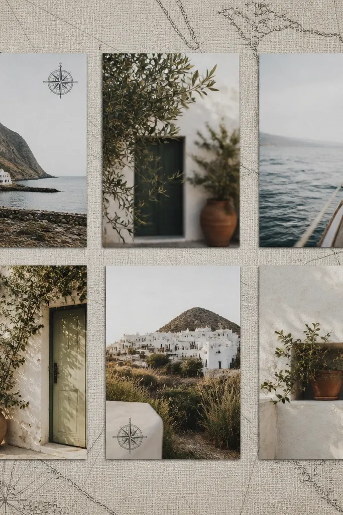
This is the closest I’ve found to “designer travel collage” without expensive materials. Linen-texture board makes everything feel tactile, and thin black line art keeps the photos from competing with the background. It works best for family trips where you have a mix of landscapes and portraits. The line art flatters busy photos because the background stays minimal. Luxury high end photo collage ideas come from texture and restraint — one background pattern, not ten.
Pro tipUse a black pen with a fine tip (0.3 or 0.5) so lines stay delicate.
Cover a 12x16 board with linen-texture craft paper or fabric stretched taut and glued to the back. Lightly draw or print simple map-line routes using black fine-liner pen. Arrange photos in a grid with consistent margins, then trace where the photos will cover parts of the lines. Mount photos with double-sided tape, keeping the line art visible in the gaps. Add small compass icons or tiny date stamps near the outer edges only, then step back to check balance.
AvoidAvoid bold, thick scribbles — they overpower the photos.
11. Monochrome family wall collage with one accent color

Monochrome makes the collage feel expensive because your eye reads the layout first and the emotion second. When you add one accent color, like a single bright red or teal photo, the whole wall looks styled. This flatters families of any skin tone because black-and-white reduces color mismatch. It also works for kids' school photos because the backgrounds can be distracting — turning them monochrome cleans it up. The luxury principle is controlled color: one accent, everything else neutral.
Choose 12-18 photos and convert most to black-and-white at the print stage. Keep one photo in full color — I pick the one with the strongest emotion or best outfit color. Print black-and-white on matte paper and the accent photo on the same matte paper. Mount everything on a warm off-white backing with 1 inch borders made from cardstock or paper tape. Place the accent photo in the center or upper third and keep all other photos the same size, like 4x6.
If your accent photo is red, match it with a small red element elsewhere like a red pen date label in the corner.
Avoid adding two or three accent colors — the look becomes noisy.
12. Matte white-on-cream collage with thin gold thread lines
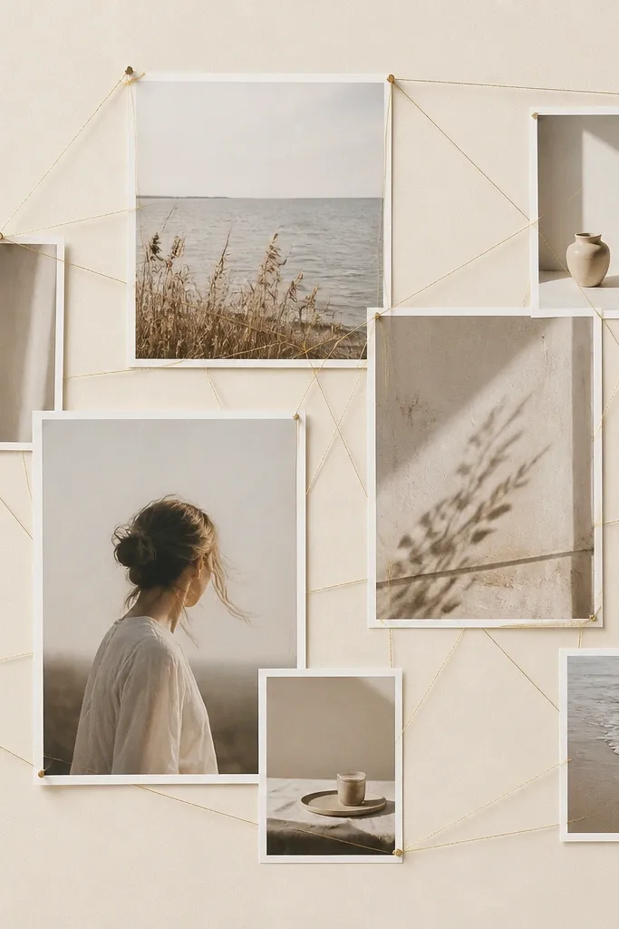
This is one of my favorite luxury high end photo collage ideas because it adds a delicate line without adding clutter. The cream background and matte photos keep it calm, and the gold thread adds jewelry-level detail. It flatters light outfits and blond hair especially because the gold warms the scene. It also looks good in kitchens and hallways where you want something pretty but not too “kid-like.” The styling principle is a single line motif that repeats — thread lines connect photo zones.
Pro tipUse a foam board beneath the fabric so the thread points stay secure.
Cover a 12x16 board with cream cardstock or fabric-backed paper. Arrange photos in two rows, leaving gaps where thread can run. Pull thin gold thread or metallic embroidery thread between tape points or tiny nails on the backing, keeping lines taut and evenly spaced. Mount photos so they slightly overlap the thread paths, hiding where thread attaches. Keep thread lines to 2-3 directions so it looks intentional, not tangled.
AvoidAvoid thick yarn — it looks craft-store, not luxe.
13. Book-spine collage using printed photo strips

Book-spine layouts look surprisingly high end because they create rhythm. I’ve used this for “years” collages where each photo strip represents a month or milestone. Narrow vertical photos also flatter smaller spaces since the collage doesn’t take over visually. The dark outer frame makes the photos look like a curated collection. The luxury principle is consistent strip width and a clean outer boundary.
Choose a dark backing, like deep espresso brown, and cut it to 12x16. Trim photos into narrow strips about 1.5 inches wide and 4.5 inches tall. Arrange them in rows like book shelves, keeping 0.25 inch gaps. Add a thin border around the outside using brown craft cardstock. Mount strips with double-sided tape at the center or corners only, then check straightness with a level.
Pick one consistent crop style for all strips, like centered faces, so the wall looks curated.
Avoid mixing portrait and landscape strips — it breaks the book rhythm.
14. Wedding-album style corner mat collage
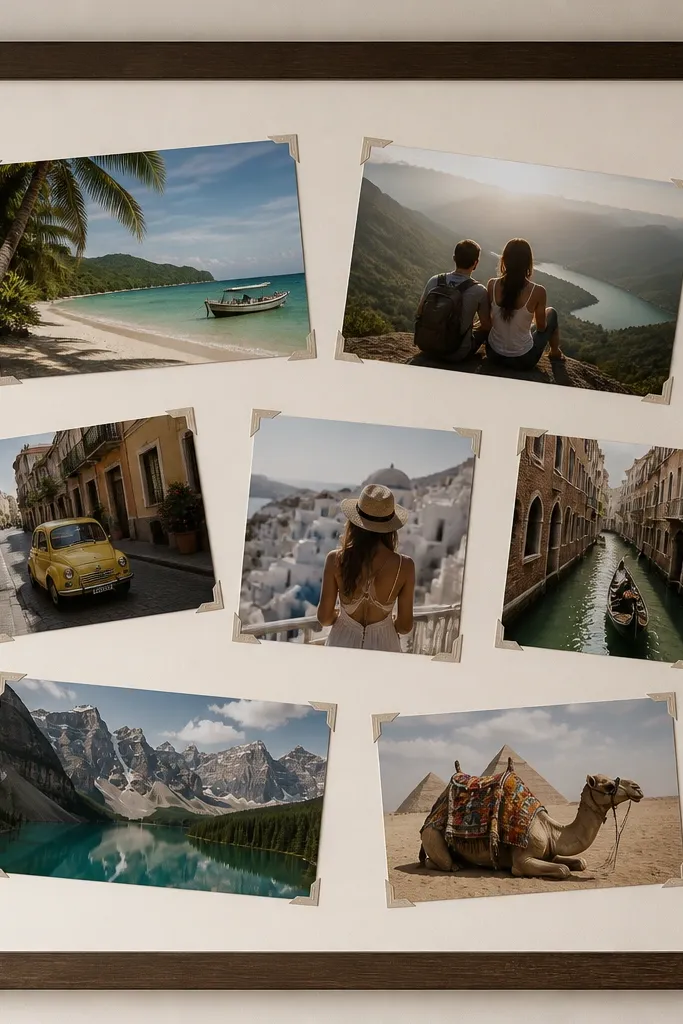
This style borrows from high-end album pages. Instead of full mats, you use corner-only mats so the photos feel lighter and more modern. It looks luxury because it frames images without taking over the whole space. It’s flattering for candid shots because the corner frames keep attention on faces even when backgrounds are busy. Kids photos work great here because you can angle a few shots for personality while keeping the structure clean. The luxury principle is corner restraint plus a consistent frame system.
Use a large frame with a single backing board inside, like 16x20. Print photos in mixed sizes, like 4x6 and 5x7, but keep the same mat corner width. Cut L-shaped corner mats from off-white cardstock and apply them around each photo edge. Tape each photo in place so it sits behind the corner mats, then angle only the corner mats, not the photos, for a crisp look. Finish with a final outer border mat so the whole frame reads like one album page.
Use a paper cutter for L-corner accuracy so the corners look intentional.
Avoid thick foam under every photo — too much lift makes it look like a craft project.
15. Chalkboard-style date strips with printed photos
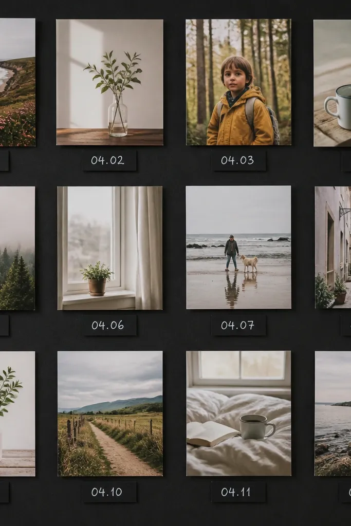
Luxury high end photo collage ideas don’t have to be fancy frames. Date strips make the collage feel like a designed timeline, and the chalkboard look hides minor print color mismatch. I use this for school year progress and birthdays because kids love seeing “what happened when.” It flatters families with lots of outdoor photos because the black background makes the greens feel intentional. The styling principle is readable structure — every photo has a date strip aligned to the same baseline.
Use a matte black board or paint a board with chalkboard paint. Print photos in one size set, like all 4x6, and mount them in a grid with 0.5 inch gaps. Cut small paper rectangles (about 1.5x3 inches) for dates and mount them under each photo. Write dates using white gel pen or chalk marker, then seal with a light fixative if needed. Keep all date strips centered and the same font size so it reads consistent.
Write the date with the same number of characters each time (month abbreviation + day) for neat alignment.
Avoid cursive that varies wildly — it makes the whole thing look like last-minute labeling.
16. Clip-on washi frame with removable photos
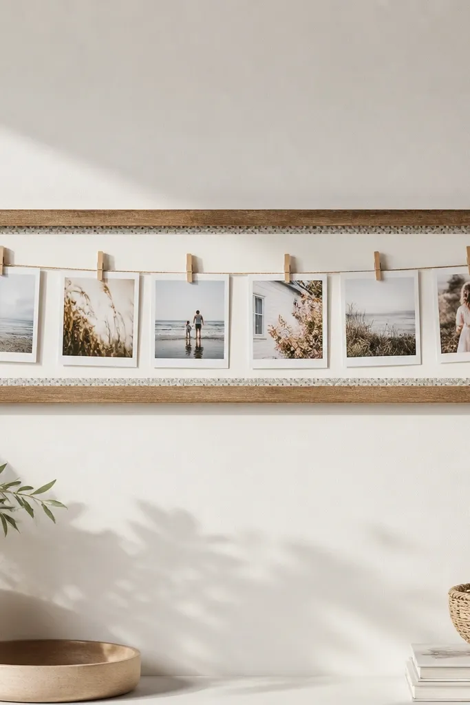
This is for people who want the luxe look but don’t want to commit forever. Clip-on layouts are clean when the frame border is consistent and the clips are the same color. I’ve made these for kids because you end up swapping photos after events, and glue-based collages get messy fast. The washi border adds a soft pattern without looking like a birthday banner. The luxury principle is a tidy border plus repeatable hardware.
Build or buy a shallow wood frame about 12x24, then paint or stain it matte. Add a 1 inch border using a single washi tape pattern, keeping it straight with a ruler. Print photos in 4x6 and trim width so they fit under the frame lip. Use mini binder clips or clothespins painted black and attach them to a thin string or wire inside the frame. Arrange photos in two rows with consistent spacing, then tighten the wire so everything sits flat.
Use a matte clear spray on the washi tape border to prevent curling from humidity.
Avoid mixing clip colors — it looks like a random craft bin.
17. Acrylic stand collage with stacked photo blocks
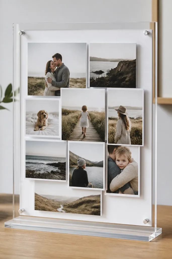
This one feels luxury because it’s a tabletop display, not a wall sticker. Stacked blocks give dimension without needing a full shadowbox, and acrylic makes it look crisp under daylight. It’s great for parents who want a rotating “current favorites” set and don’t want to reframe every time. It flatters kids because you can keep the photos large and face-forward without clutter. The luxury principle is keeping the backing clean and using one acrylic surface for a gallery look.
Pro tipKeep the stack height under 1.5 inches so it looks intentional, not bulky.
Start with a clear acrylic sheet stand or a DIY acrylic panel with a base. Use a white foam board behind it as the photo backing. Print photos in 5x7 and 4x6, then cut them into matching blocks so edges line up. Layer photos behind the acrylic using small foam tape strips, stacking 2-3 at a time. Arrange by placing the hero photo in the top center, then build outward with smaller photos. Finally, secure the bottom edges so the stack doesn’t shift when the stand is moved.
AvoidAvoid busy background colors behind acrylic — they show through and ruin the clean look.
18. Wood-slat collage with photo squares
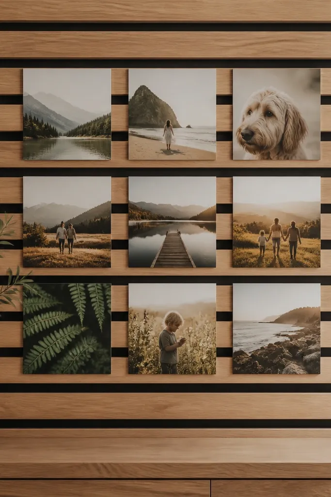
Wood slats make the collage feel high-end because they add structure and shadow lines. I’ve used this with kids' outdoor photos, and the natural wood warms everything so it doesn’t feel cold or overly modern. It flatters families because the photo squares feel orderly, even if the photos themselves are busy. The luxury principle is repeating architecture — the slats create the “grid” for you.
Pro tipUse matte laminate prints so wood shadows don’t glare off the surface.
Buy thin wood slats or cut strips and mount them horizontally on a backing panel. Stain or seal in a warm tone like walnut or honey, then let it dry fully. Print photos as 4x4 or trim 4x6 into 4x4 squares. Place photo squares between slats with 0.5 inch margins and mark placement with pencil. Mount using photo-safe double-sided tape or small adhesive squares, pressing firmly. Finish by adding a thin outer wood frame or trim so the edges look finished.
AvoidAvoid uneven slat spacing — it makes the whole piece feel handmade in a bad way.
19. Monogram corner frames around each photo
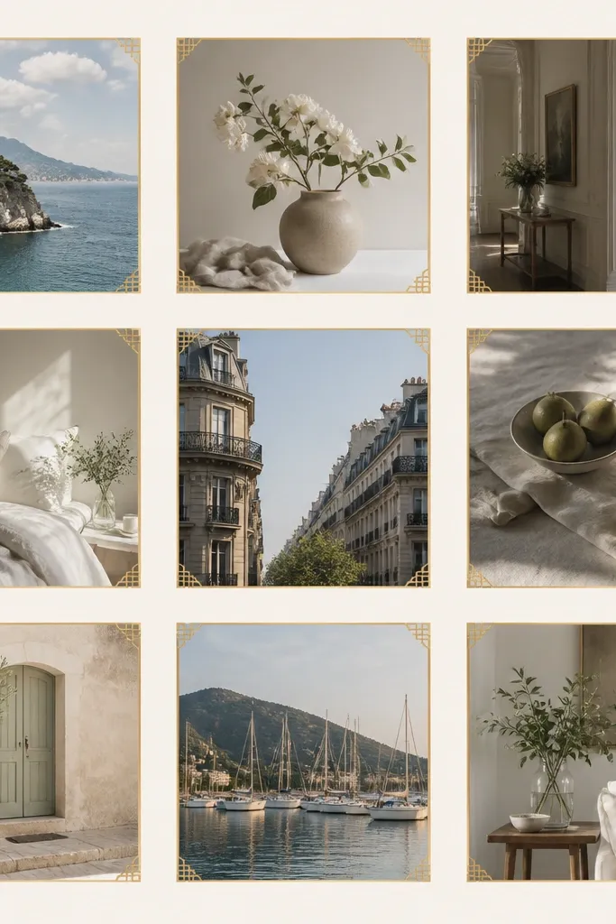
Corner frames with a monogram vibe look luxury because they add a custom design element without covering the photo. I use gold ink pens for the corners and keep the monogram initials tiny, like 1 inch tall, in one consistent spot. It works for families because it ties the whole collage together even if the photos vary in color. It also flatters skin tones because the corners focus attention on the center of each photo. The styling principle is one repeating graphic — corner frames — plus a tiny consistent signature.
Pro tipPractice on scrap paper first — gold ink mistakes show up fast.
Start with a light backing board, like warm white. Arrange photos in a grid with consistent gaps, then mount them with double-sided tape. Cut thin corner frame overlays from cardstock or draw them directly with a gold fine-tip paint pen. If drawing, use a ruler and make each corner about 0.5 inch long with a 1/8 inch line thickness. Add initials in the bottom-right corner of each photo or only on the hero photo to avoid clutter. Let paint dry flat and don’t touch the ink until it fully cures.
AvoidAvoid heavy gold lines — thick strokes look like foil stickers from a craft store.
20. Overlapping photo waves with clean negative space
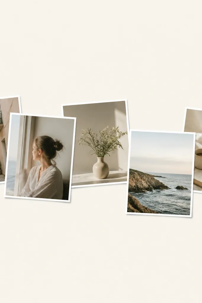
This style feels high-end because it uses negative space like a designer would. Instead of filling every inch, you create a wave of overlapping photos and leave breathing room around it. It flatters kids because it turns smaller photos into a “moment” instead of a pile. The clean negative space also makes it work in small rooms — it doesn’t overwhelm walls. The luxury principle is controlled overlap plus intentional gaps.
Pro tipUse a long ruler or a piece of string to map the wave curve before taping anything down.
Use a cream backing board and place a thin 1 inch border tape around the edges. Print photos in one consistent size like 4x6, then trim to uniform rectangles. Arrange them in a wave pattern, overlapping each photo by about 0.75 inch. Add paper tape borders around each photo edge so the overlap seams look clean. Mount photos with tape on corners only so you can adjust the wave curve. Finish by keeping the wave centered and leaving at least 2 inches of blank space on both sides.
AvoidAvoid overlapping in random directions — it looks messy instead of flowing.
21. Kids' artwork + photo hybrid with mat windows
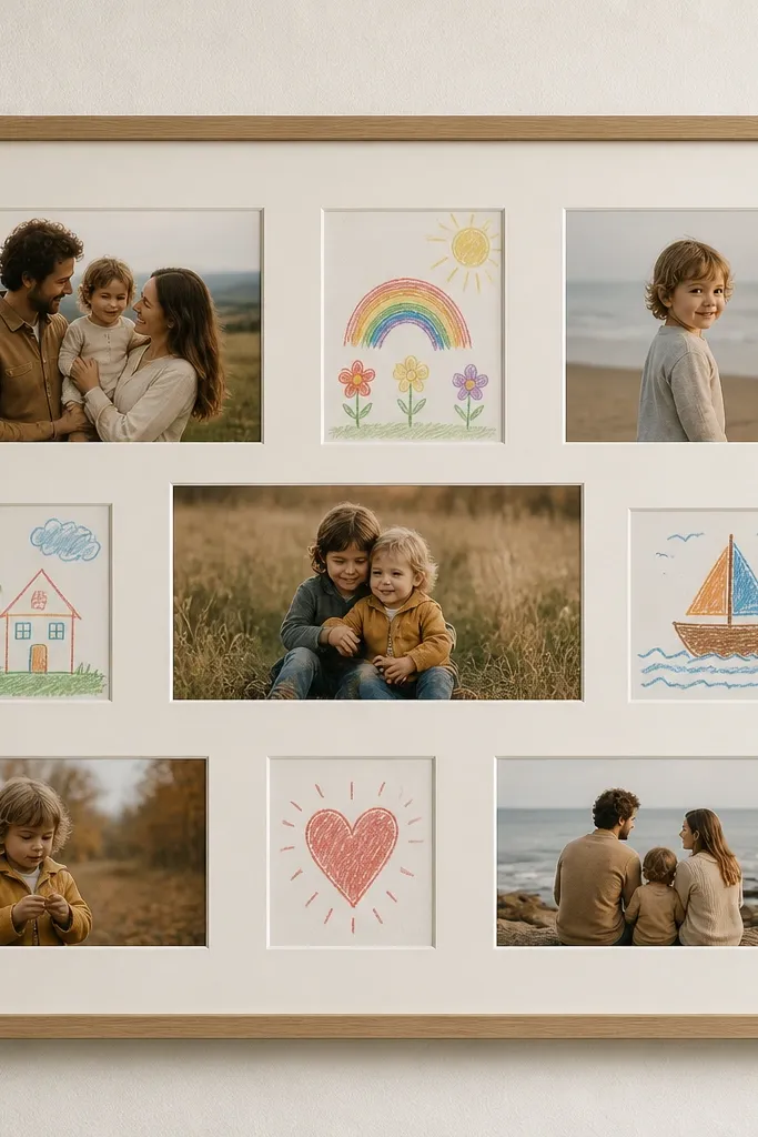
This looks luxury because it feels curated, not chaotic. I’ve done this with school-year memories by mixing 6-8 photos with 3-4 small drawings, all in the same mat style. Off-white mats unify the whole piece and keep paper textures from clashing with photo gloss. It flatters families by turning “kid clutter” into a gallery moment. The luxury principle is consistent matting and limited mix: a few drawings, not a whole stack.
Pick a large frame, like 16x20, and create a mat layout with 10-12 windows. Cut off-white mat boards and measure each photo window so photos don’t get distorted. For drawings, scan or photograph them, then print them onto matte paper and cut them to fit the same windows as the photos. Arrange with 2-3 photos per row and place drawings at the ends or corners for balance. Mount everything with photo-safe tape on the backing so edges stay flat.
Scan drawings at high resolution, then print on matte so pencil marks don’t glare.
Avoid adding too many drawings — it turns into a scrapbook wall fast.
22. Navy corner tape frame with gold numbers
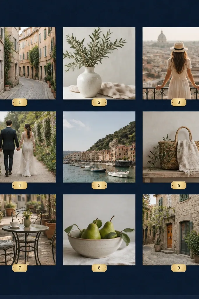
This is my go-to for “firsts” collages because it turns dates into design. Navy makes photos look richer and hides minor print imperfections, while gold numbers look like museum placards. It flatters kids because it keeps attention on their faces rather than background clutter. The luxury principle is a clean numbering system — every photo has a matching label style and placement. When you keep labels consistent, the whole collage feels planned.
Pro tipUse sequential numbering that matches your memory order, not random photo order.
Start with a navy board cut to 11x14 or 12x16. Print photos in two sizes, like 4x6 for the majority and 5x7 for the most important one. Arrange in a grid and add 1 inch paper tape borders around each photo. Cut small label rectangles, about 1x1.5 inches, and write numbers with a gold paint pen or gold marker. Place label numbers in the same corner of each photo, then mount photos with double-sided tape. Finish by adding a navy corner frame using tape or cardstock strips on the outer edge.
AvoidAvoid gold labels that are different shapes — square and rectangle mixes look messy.
23. Clear label strips with typed dates
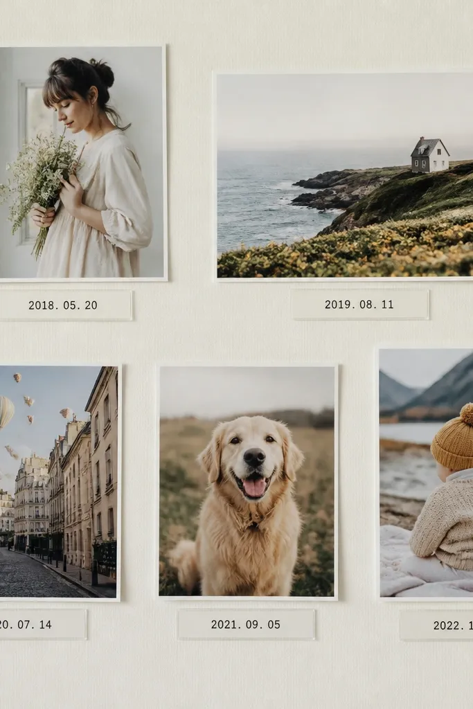
Clear label strips give a high-end “catalog” feel and make the collage look intentional even with a tight budget. I’ve used this with weekly kid updates and it always looks cleaner than handwriting. The typed dates read crisp, and the clear label keeps the focus on the photo while still giving context. It flatters families because it reduces visual noise from mixed photo backgrounds. The luxury principle is readable typography and consistent label placement.
Pro tipUse label tape that’s matte or semi-matte so it doesn’t glare under indoor lights.
Print your photos in 4x6 and mount them on a white or cream backing with even gaps. Create date labels using clear label tape or thin acetate strips — I print on label sheets and cut into small rectangles. Type the date in a simple font and keep it short, like 03/12. Place one label strip under each photo, aligned to the center, and tape the label to the backing, not the photo. Finally, add a thin outer border frame so the collage looks finished.
AvoidAvoid long captions — short dates look classy; paragraphs look like a classroom poster.
24. Polaroid-style collage with faux instant frame
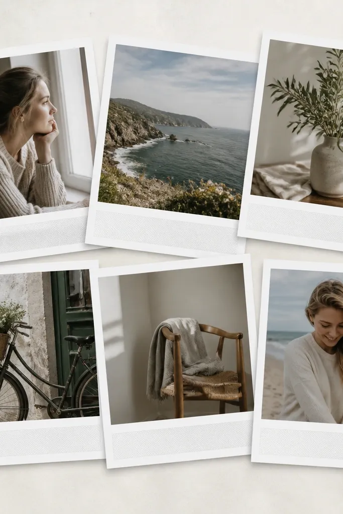
Polaroid-style frames feel playful, but you can make them look luxury high end photo collage ideas by keeping the borders consistent and using matte prints. The faux film stripe adds an instant-photo vibe that reads nostalgic without looking cheap. It flatters kids because it gives every photo the same “photo moment” wrapper, even if the lighting varies. This works best for wall art in hallways and playrooms where you want it to feel fun but still tidy. The luxury principle is controlled tilt and uniform border thickness.
Pro tipChoose one accent color for the film stripe text, like light gray instead of bright black.
Print your photos in a size that matches your faux frame, then add white borders around them using a template in a photo app or by cutting cardstock. Make the border thickness about 1/2 inch and keep the bottom film stripe about 1/4 inch tall in a light gray. Arrange on a warm white backing and tilt only 3-4 photos by 2-3 degrees; keep the rest straight. Use photo-safe double-sided tape to mount at corners only. Add a thin outer border so the whole collage looks like one set.
AvoidAvoid random border sizes — that’s what makes Polaroid collages look like a hobby.
25. Oversized hero photo with small supporting grid

This is the simplest way to make a budget collage look expensive: one hero photo and supporting shots that behave. Luxury high end photo collage ideas often rely on hierarchy, and the hero photo creates it instantly. I choose the photo with the best lighting, a clear face, and the most emotion. It flatters families because it anchors the whole wall and reduces visual chaos from many smaller images. The principle is scale — one big moment, then a tidy supporting cast.
Pro tipPrint the hero photo on higher quality matte paper so skin tones look smooth.
Pick a frame size like 16x20 and plan a layout with one center 8x10 photo. Add eight 4x6 photos around it in a grid-like pattern, leaving 0.5 inch spacing. Create 1 inch borders around all photos using cardstock or paper tape so edges match. Mount the hero photo first, squared to the frame, then build outward. Use a ruler to align the rows so the supporting grid looks straight. Finish by adding a final outer border mat that matches the border thickness of your inner photos.
AvoidAvoid making the hero photo the same size as everything else — that’s what removes the luxury effect.