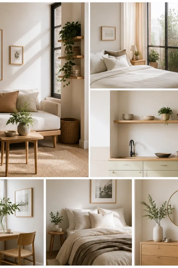

1. 3x5 Grid with One Wide Anniversary Photo
Start by choosing a base size like 8x10 inches and print 15 photos in a uniform crop that matches your grid. Next, set up a 3x5 layout in a simple design tool, then make the center-row image wider so it spans two columns — keep the top and bottom edges aligned. Print on 65-80 lb matte cardstock, then trim with a paper trimmer so every photo has the same border. Mount using double-sided tape strips only at the corners and midpoints so the centers don’t bubble. Finally, add a typed date label (same font style as your hero image caption) and keep it under 1 inch tall.
This layout works because the grid does the heavy lifting while the single wide photo gives your eye a “main character.” I use it for couples who have one standout shot — a wedding portrait, a vacation candid, or an anniversary dinner photo with great lighting. The off-white background keeps skin tones warm without looking yellow, and the thin margins make it look like a modern print, not a craft project. It flatters most photo sets because the consistent cropping makes uneven originals look intentional. For people with varied photo quality, the wider hero image draws attention away from the small inconsistencies in the rest.
AvoidAvoid adding extra stickers or multiple font styles — the grid only looks minimalist when it stays disciplined.
Pro tipUse a 0.25-inch margin between photos so the white space reads clean from six feet away.
2. All-White Background with Black-and-White Photo Row
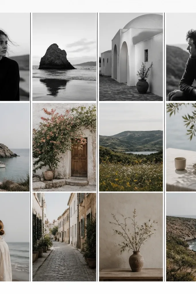
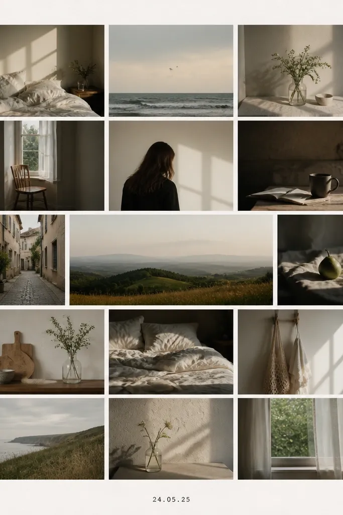
This is the simplest way I know to make modern photo collage ideas minimalist without needing fancy props. I pick one row to be black-and-white because it creates a visual rhythm and hides color mismatches between older and newer photos. The black-and-white row also looks great in anniversary gifts because it feels classic without turning into a “funeral monochrome” vibe — the contrast stays punchy. For skin tones, black-and-white is forgiving, especially if you have photos with slightly uneven lighting. It flatters couples who want a clean, artsy look but don’t want to edit every photo to perfection.
Start by choosing 12-16 photos and converting only the top row to black-and-white with the same contrast setting across all those images. Then desaturate the remaining color photos slightly so they don’t fight the black-and-white row — I aim for a gentle muted look, not gray. Create a grid with thin black separator lines (about 2-3 pt thickness) so everything feels designed. Print all photos on matte paper and mount them onto a white cardstock backing. Add one small caption in the bottom right — “Year 1 to Year 10” or the anniversary date — using black ink or a typed font.
Keep the black-and-white row to one strip only; two strips makes it look like a template instead of a deliberate design.
Don’t mix glossy photo prints with matte cardstock — the shine makes the collage look uneven.
3. Stone-Gray Mat with Tiny Gold Date Stamp
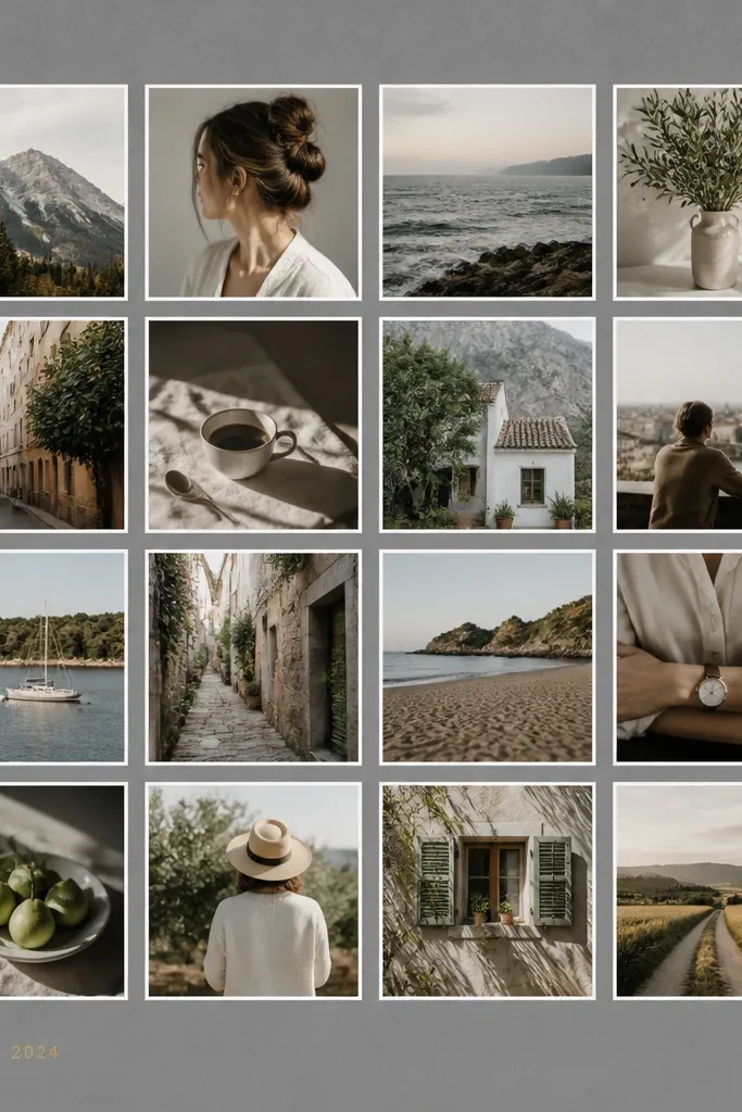
Start with a 16x20 or 11x14 backing in stone-gray cardstock — the thicker the better, around 80-100 lb. Print your photos as a 4x4 grid with a consistent border, like 0.4 inches of white or a thin light-gray frame. Mount photos with a thin adhesive so the edges don’t lift. Cut a date stamp label about 1.25 inches wide, either from gold foil cardstock or a printed gold-look label. Place it in the lower left, keeping at least 0.5 inches from the edge so it reads clean under frame glass.
A gray mat makes skin tones look smoother and gives the collage that gallery feel. I use stone-gray when the couple’s photos include both bright outdoor shots and darker indoor shots because gray backgrounds balance them. The tiny gold date stamp is the only “luxury” cue, and it stays minimalist because it’s small and placed once. This layout is flattering for people who have lots of beach photos — gray stops the sand yellows from dominating. If your photos are a mix of warm and cool, gray helps them settle into one visual tone.
AvoidDon’t use big gold lettering — large foil accents ruin the minimalist look fast.
Pro tipIf you’re printing at home, do a test print and check that your gray mat doesn’t make blacks look washed out.
4. Vertical Timeline Strip with Four Seasons
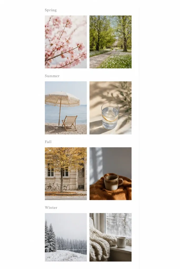
Start by choosing 8 photos — two per season — and crop them all to the same aspect ratio. In a design tool, create a vertical column with four labeled sections; each section gets one top photo and one bottom photo. Use consistent spacing between sections, like 0.75 inches of white margin. Print on matte paper, then mount onto a white or very light gray backing. Add the season labels in light gray text at a small size, around 10-12 pt, and keep them aligned left.
This layout makes anniversary photos feel like a lived-in timeline without crowding the page. I use it when you have seasonal variety — maybe one set of outdoor photos in different months. The vertical format reads modern because your eye moves top to bottom, and the labels give structure. It also flatters couples with lots of similar-looking photos because grouping by season prevents the collage from feeling repetitive. Kids photos fit well too — if you have a child’s growth across seasons, they can sit in the same section as the couple shots.
AvoidDon’t add extra icons for each season. Two labels are enough.
Pro tipPick one font weight for labels and stick to it — I like a simple sans-serif and one color only.
5. Two-Column Split with One Side Full-Bleed
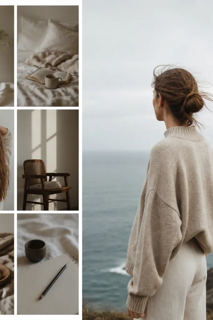
Choose a backing size like 11x14. Create a two-column layout: left column for 6-8 bordered photos, right column for one large full-bleed photo. Print the full-bleed photo with extra bleed so the edges look crisp after trimming. Mount the left-column photos with uniform borders, then place the full-bleed image so it touches the right edge with no white frame. Keep a consistent gutter between columns of about 0.5 inches. Add a small caption at the bottom center with the anniversary year.
Full-bleed is the quickest way I’ve found to make a collage look modern and intentional. The trick is balance: keep one side disciplined with borders, then let one photo breathe edge-to-edge. I use it for anniversary portraits where one image has strong composition and lighting — like a couple photo with clean background. This works well for couples who want the gift to feel more “designed” than “collected.” It also helps when some photos are landscape and some are portrait because the full-bleed image becomes the anchor.
AvoidAvoid full-bleed on multiple images. One is the sweet spot for minimalist.
Pro tipPick a full-bleed photo with minimal background clutter; full-bleed makes messy backgrounds look louder.
6. Minimalist Contact Sheet with Numbers
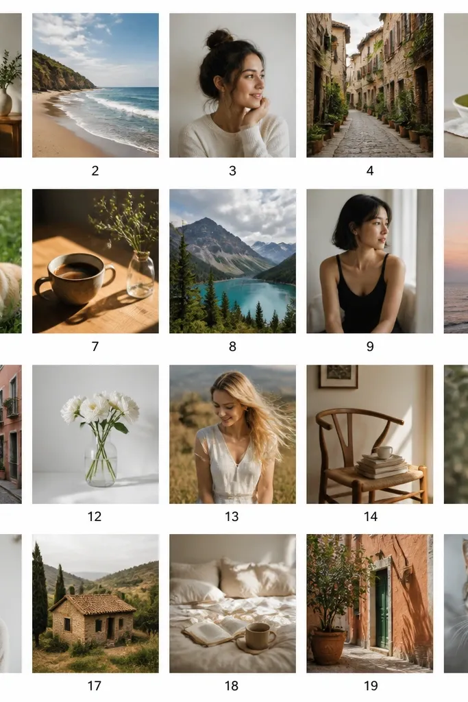
Print 20 photos as a contact sheet grid in a consistent size, like 2x2 inches each if your backing is 16x20, or 1.5x1.5 inches each for 12x16. In your layout, add small numbers under each photo, aligned and evenly spaced. Keep the font small and plain, around 9-11 pt, black or dark gray. Print on matte white cardstock or thick photo paper, then mount onto a white backing if needed. Use a paper trimmer to keep edges straight, and keep the outer margin around 0.75 inches.
This one looks like you pulled it from a photographer’s archive, and it feels modern because it’s structured. I use it for couples who have lots of candid shots and don’t want to pick “the best” — the grid makes the set feel curated without adding fluff. The tiny numbers help keep the vibe editorial, not random. It flatters mixed-quality sets because the small scale reduces the impact of noise or slight blur. It’s also great when you want to include kids shots without turning the collage into a kid-themed craft.
AvoidDon’t crop with wildly different compositions. Contact-sheet style looks best when the subjects sit similarly within each frame.
Pro tipMake all photos the same brightness level so the grid looks even instead of patchy.
7. Matte Black Frame Look with White Border
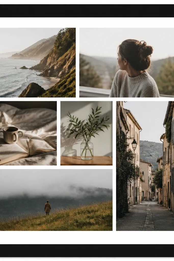
Start with a backing board that you can cut to fit your frame — I like 11x14 or 16x20. Create a thick black border by cutting a black cardstock mat and leaving a white inner opening for photos. Place photos in a balanced grid, like 3x4 or 4x4, with equal margins between each photo. Add a small year label in the bottom right inside the white area, about 1 inch wide. Mount photos with double-sided tape strips and press flat under a book for 10 minutes so corners don’t lift.
A matte-black border makes the collage feel like a framed gallery print even if you made it at home. I use this when the couple’s photos include lots of warm tones and I want the gift to look crisp. The white inner mat keeps it minimalist and prevents the black from overpowering the photos. This layout flatters portraits because the contrast makes faces pop without looking harsh. It also works well for people who have a favorite frame size and want the collage to match it.
AvoidAvoid uneven border thickness. Measure and cut once.
Pro tipChoose matte black cardstock, not shiny — shiny black reflects light and makes the photos look washed.
8. One Accent Row in Color, Rest Muted

When you have a mix of older and newer photos, this layout makes it look intentional. I mute most photos slightly so skin tones and lighting feel consistent, then leave one row full color as the “present day” feel. It reads modern because it’s controlled — one accent only. This flatters couples who have one anniversary trip photo that looks amazing but would otherwise stand out too much. With kids in the mix, the color row can highlight the child’s newest photo without turning the entire collage into a bright mess.
Pick 15-16 photos and decide which row will stay full color — usually the bottom row. Adjust all photos to a consistent muted look, then revert saturation only for the chosen row. Build a 3x5 or 4x4 grid with equal spacing, like 0.3-0.4 inches between images. Print on matte paper and mount to a light cream backing to keep the overall tone warm. Add a small title label at the top center in gray text — just the anniversary year — and keep it under 2 inches wide.
Use a single saturation level for the accent row; don’t push it wildly higher than the rest.
Don’t use multiple color accents. Two accent rows make it look like a collage with random edits.
9. Centered L-Shape with Big Spacing
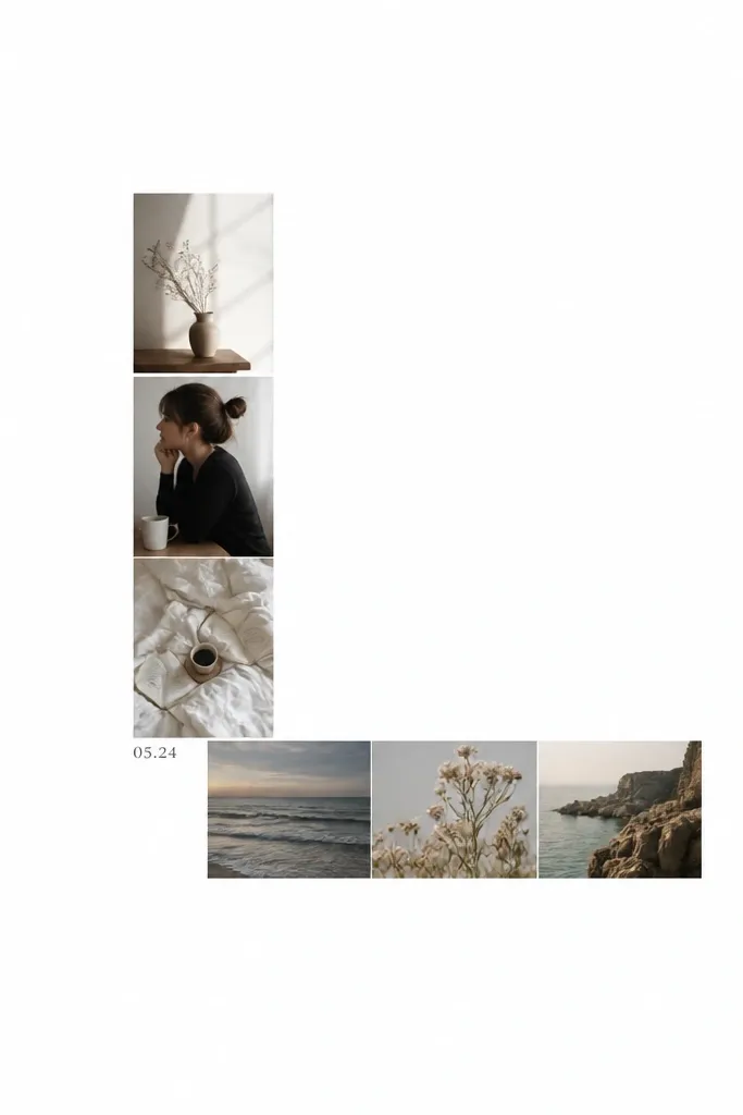
Choose 8 photos and print them at a consistent size, like 4x3 inches for an 11x14 backing. In a design tool, arrange 4 photos in a vertical column and 4 photos in a horizontal row, forming an L shape. Keep at least 1 inch of white space between the photos and the page edges. Mount photos in the exact L arrangement with tape strips at corners and center edges. Add a tiny date label near the inner corner of the L, aligned with the photos' left edge.
This is the layout I reach for when the couple wants “clean” more than they want “many photos.” The big spacing makes it feel calm, and the L-shape gives movement without clutter. I use it with 6-10 photos where you have a few strong images and want the gift to feel airy. It flatters smaller photo sets because it doesn’t cram them into a grid that makes some images look cramped. If you’re worried about cropping, this layout gives you more room to place photos thoughtfully.
AvoidAvoid mixing portrait and landscape sizes in the same leg — it makes the L look crooked.
Pro tipUse consistent photo heights in the vertical leg and consistent widths in the horizontal leg so the edges stay visually straight.
10. Polaroid-Style Frames in One Size Only
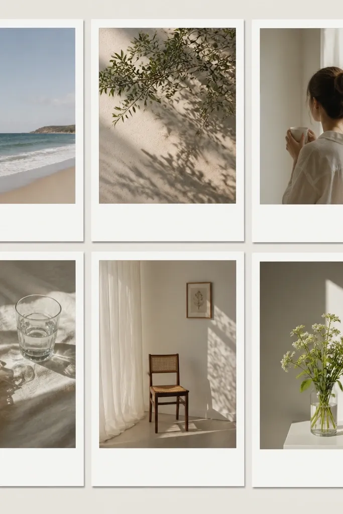
Pick one polaroid frame size and repeat it — for an 8x10, I use a 3x4.5 photo inside a 4x6 frame. Create a grid in your design tool with equal gaps, like 0.35 inches. Print photos and then add the white frame borders using pre-cut cardstock rectangles, or print the borders if your software supports it. Mount photos centered within each border and keep the same top margin for every frame. Add one small date strip at the bottom using the same white cardstock and black text.
Polaroid-style frames look warm, but minimalist is the key — you keep them uniform. I use this when the couple’s photos have a cozy, candid vibe and you want the gift to feel personal without looking like a theme party. One-size frames keep it modern because everything lines up. It flatters most body types because it gives photos a consistent margin, which hides awkward cropping. If you’re using phone photos, the thicker border helps mask slight color shifts.
AvoidDon’t vary frame sizes. Mixed polaroid sizes make it look like a random sticker wall.
Pro tipUse a very light gray “shadow” in your digital layout, not a heavy black shadow, so it stays subtle.
11. Thin Line Art Hearts Only as Wiring
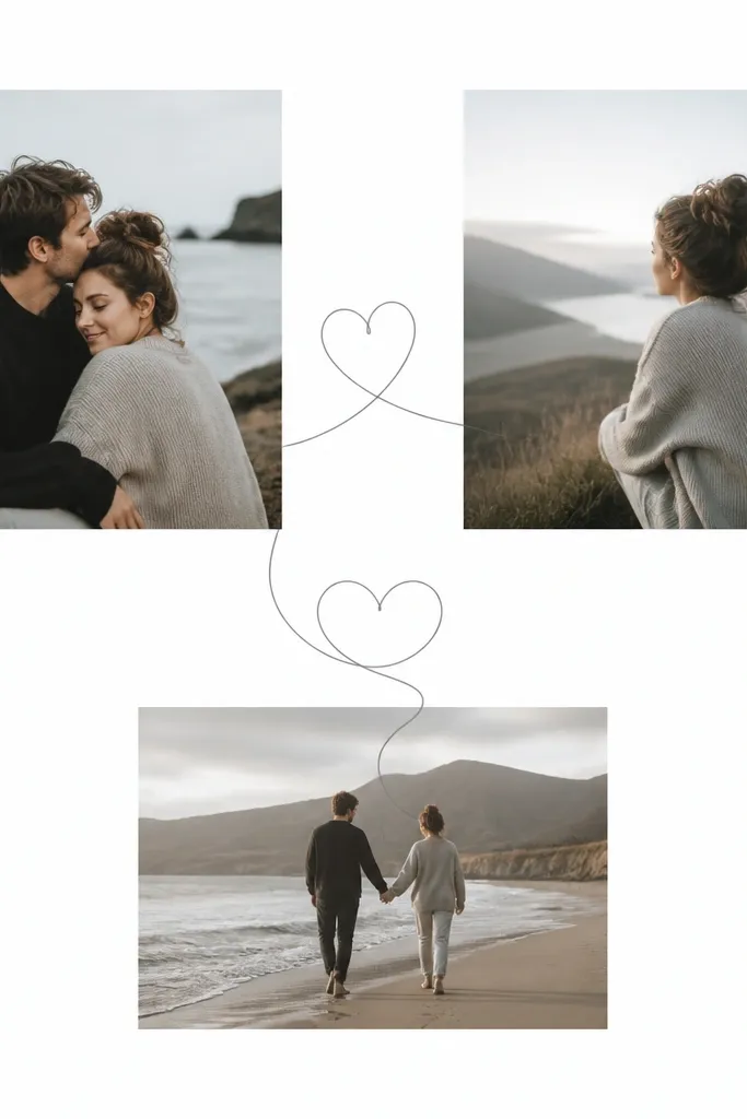
This one adds emotion without cluttering the photos. I use thin line art hearts sparingly — like two or three simple connections — because it reads as design rather than decoration. The line art is gray, not pink, so it stays modern. This layout flatters couples because it points the eye between related photos, like “before and after” or “trip then dinner.” It also helps if some photos are visually busy; the line art gives structure so the collage doesn’t feel chaotic.
Start with a simple grid layout, like 3x4 or 4x4, with equal spacing. Print photos on matte paper. Add line art hearts digitally in your layout tool, placing them between two specific photos — keep them thin and light gray. Print the line art on the same sheet if you’re using a design template, or overlay it after by tracing a template and using a fine-tip black pen on the matte backing. Mount photos, then place the line art where the heart connects the two images. Keep the line art only in one color and one weight.
Choose hearts that are small and geometric; rounded cartoon hearts look childish fast.
Avoid multiple colors in the line art. Two shades is enough to look messy.
12. Circle Cutouts with Square Photo Backgrounds
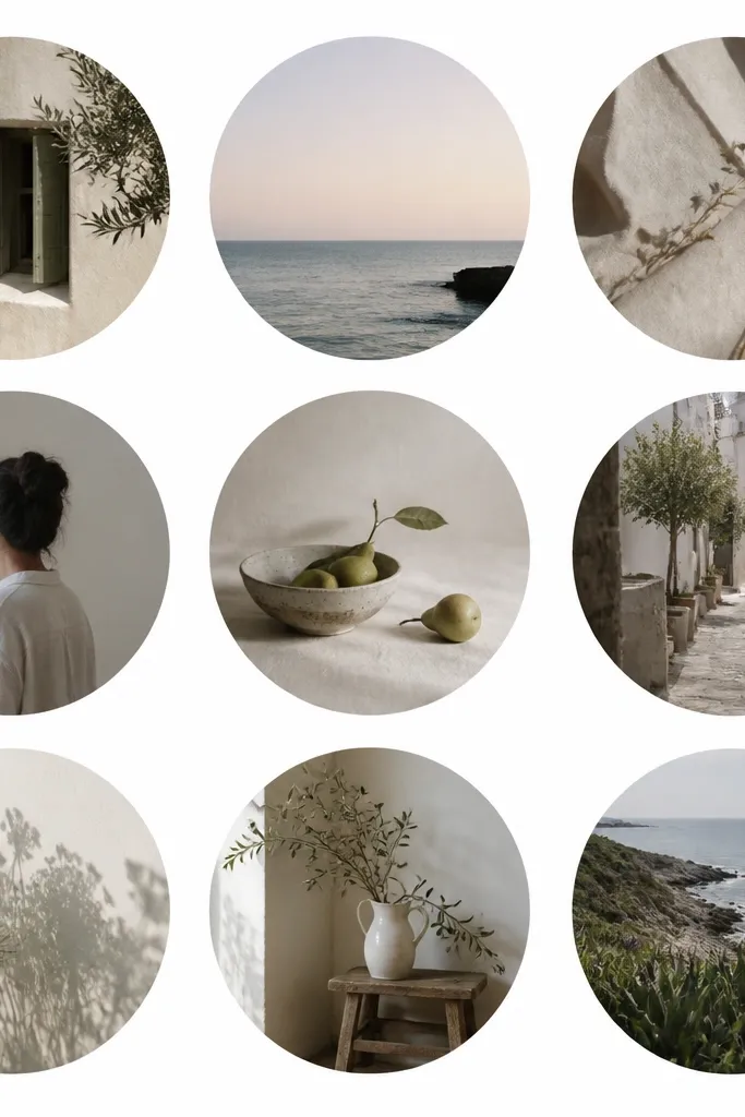
Pick a backing size like 12x16. Use a design tool to create a grid of circle windows, like 3x4 circles, with each circle sized the same, around 2.75 inches diameter. Print photos cropped to fill the circles — you need a full-bleed inside each circle area. If you’re doing physical masks, print photos slightly larger than the circle, then cut circles from the top layer of cardstock and mount photos behind the cutouts. Use a thin adhesive so the edges stay flat. Keep circle spacing equal and align rows with a ruler so it looks intentional.
Circle windows look modern when they’re consistent and the rest stays clean. I use this when you have portrait photos and want faces to feel like “floating” cutouts. The circle mask reduces visual noise because it crops the image into a simple shape, which also helps if your backgrounds are busy. This flatters couples because it keeps attention on faces and upper bodies. It’s also a good option for kids because it prevents the collage from turning into a busy rectangle wall.
AvoidDon’t mix circles and rectangles randomly. Either commit to circles or keep it fully rectangular.
Pro tipPractice one cut first. A single perfect circle cut makes the whole sheet look professional.
13. One Word Title in Small Type, No Big Banner
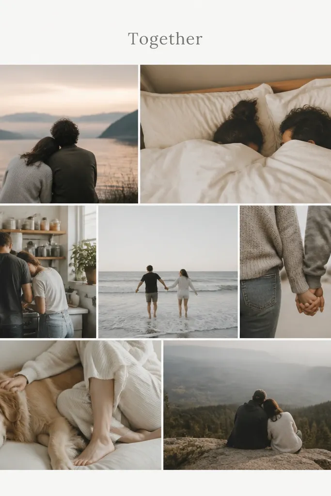
Choose a grid that fits your photo count, like 14 photos in a 2x7 strip or 16 in a 4x4. Leave a small top margin for the title, around 0.6-0.8 inches. Add the word in a small gray font, centered, using one font weight only. Print the collage layout with the title baked in, or print photos and add the title label after using a neat printed label and tape. Mount photos so borders are consistent and press flat. Frame behind glass if you can — it keeps the paper from scuffing.
A single word title keeps the vibe modern and avoids the “anniversary poster” look. I use this when the couple has great photos and doesn’t want heavy wording. The minimalist text placement also helps you hide gaps from uneven photo counts by letting the photos fill the space around the title. It flatters almost every couple because it doesn’t compete with faces. For kids-included collages, one word title keeps the focus on the relationship while still making the gift feel personal.
AvoidDon’t add a long sentence. Minimalist text should be one small line.
Pro tipUse lowercase or title case sparingly — I like one word in all lowercase for a modern look.
14. Museum Caption Style Under Each Photo
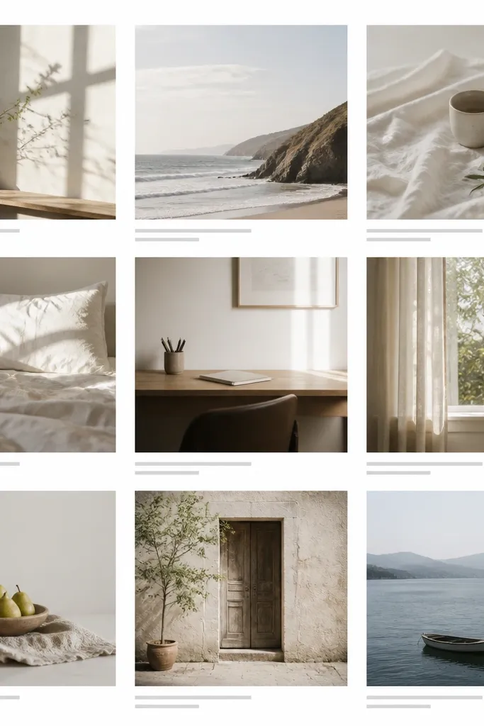
Pick 10-12 photos and decide on one caption format like “City, Month Year” or “Location — Year.” In your design tool, place each photo in a grid with a caption area below it, about 0.4-0.6 inches tall. Keep the caption font small, gray, and aligned left. Print on matte paper and mount to a white backing. Use a trimmer so the caption lines don’t get cut off and keep consistent spacing between caption baselines. Add a small title at the bottom center if you want, but keep it under 2 inches wide.
Captions make this feel like a gallery exhibit, and they also solve a real problem: what do I do with photos that don’t match a strict order? I’ve used this for couples who have mixed dates and locations because the caption gives context. The key is to keep captions short and consistent — location and month, not stories. It flatters older photos because the text gives meaning even when the image quality varies. If you have kids, captions like “First school day” can anchor a picture without adding cartoons.
AvoidDon’t write long captions. Two short lines max per photo.
Pro tipUse one caption color only. Black captions look too heavy; gray stays modern.
15. Fabric Strip Divider with Photos on Either Side

Start with a backing size like 11x14 on thick cardstock. Print photos in two matching groups, like 6 on the left and 6 on the right, in the same dimensions. Cut a fabric strip about 0.75-1 inch wide and long enough to run from near the top margin to near the bottom margin. Glue the fabric strip down with a thin layer of fabric glue or double-sided tape designed for paper, then let it dry flat. Mount photos on both sides with equal spacing from the fabric. Keep the rest of the page empty so the fabric stays the only texture.
A single fabric divider is the minimalist way to add texture without turning your collage into a sewing project. I use a thin linen strip in oat, sand, or light gray because it looks calm next to photos. This works best when you have two photo sets that feel connected, like “our wedding” on one side and “our life now” on the other. It flatters couples because it creates a clear visual boundary — the photos never blur into each other. If your photos have slightly different color tones, fabric helps smooth the transition.
AvoidDon’t use a patterned fabric. Plain texture only.
Pro tipPress the fabric under a book while it dries so the strip stays smooth, not wavy.
16. Single Photo Center with Smaller Satellites
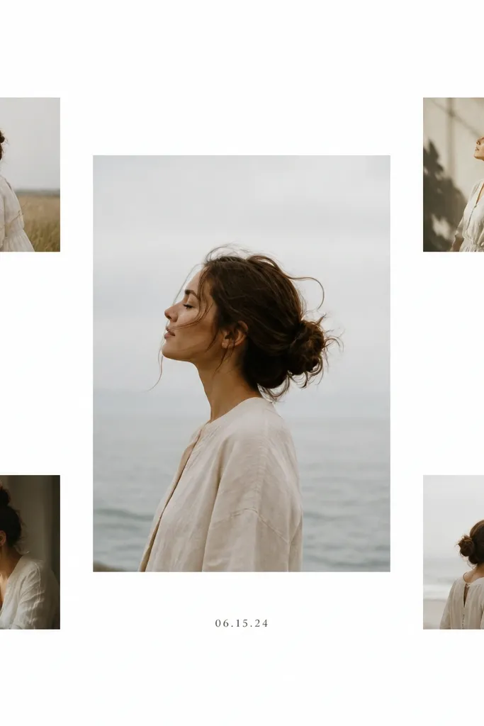
Pick a backing size like 11x14. Print one large center photo, around 6x8 inches, then print four smaller photos at about 3.5x4.5 inches. Arrange them so the gaps between photos are equal, around 0.6-0.8 inches of white space. Mount the center photo first, then place the satellites around it using measured spacing with a ruler. Add a small typed date label under the center photo, aligned with its left edge. Keep everything matte and avoid glossy finishes for a clean look.
This layout looks modern because it’s built around one focal point. I use it when the couple has a “signature” photo — maybe a couple portrait in good light — and the rest of the photos are supporting cast. The surrounding smaller photos add warmth without cluttering the central image. It flatters couples with one standout shot and a handful of candid extras. If you mix photo quality, this design hides the weaker shots because the eye stays on the center.
AvoidAvoid adding more than four satellites. More photos crowd the layout.
Pro tipUse a center photo with a simple background. The more cluttered the center, the less minimalist it feels.
17. Corner Stack with Top-Left Date Block
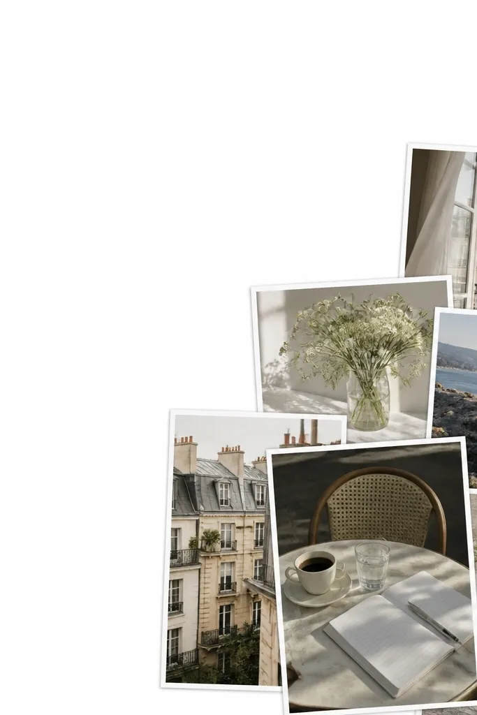
Choose a backing like 16x20 in matte white or soft gray. Design a grid for 10-12 photos, but anchor it to the bottom-right corner so there’s empty space on the top and left. Keep photo borders consistent, and leave at least 1 inch between the stack and the edges. Create a date block label in the top-left corner, around 2.5 inches wide, with black type on a light gray rectangle. Mount photos with tape strips and keep alignment tight using a ruler. Frame behind glass so the empty space stays clean and crisp.
This is a great option when you want the collage to look like modern wall art, not a full-page photo dump. I use it when I have 10-12 photos that don’t all match in lighting but still belong together as a set. The corner stack keeps the arrangement calm because the rest of the page stays empty. It flatters couples because it keeps faces prominent and gives each photo a bit more breathing room. If kids are involved, this layout makes their photos feel like a “moment collection” instead of competing with the main couple shots.
AvoidDon’t put the corner stack too close to the edge. A tight corner makes it look rushed.
Pro tipMake the date block the same width for every project you do, so your gift series looks like one set.
18. Alternating Landscape and Portrait Bands
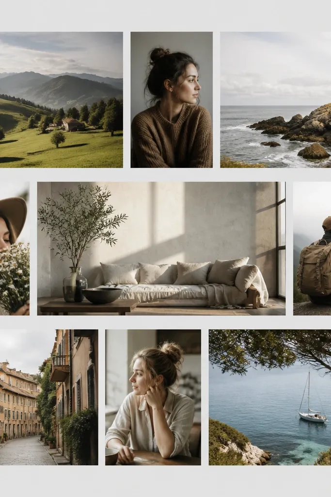
Orientation variety looks modern when it’s organized into bands. I do this when I have a real mix of portrait and landscape shots from phone cameras. The bands create a rhythm so the collage still looks designed. It flatters couples because it lets you choose the best crop for each photo without forcing everything into one boring shape. For anniversaries, it also makes the collage feel more like “our life” than “our photo shoot.”
Pick a backing size like 12x16. Create three horizontal bands across the page, each band separated by wide white gutters, about 0.8-1 inch. In the top band, place two landscape photos side-by-side, then rotate one portrait photo into the band and keep it aligned. Repeat the pattern across bands so you get consistent alternation. Print photos so each band uses the same height measurement for every photo in that band. Mount photos with equal margins, then add one small year label centered at the bottom.
Crop portraits so the subject’s eyes sit at the same relative height in each portrait frame.
Avoid random orientation changes within a band. The alternation has to be consistent.
19. Minimalist Photo Strip Along Bottom Edge
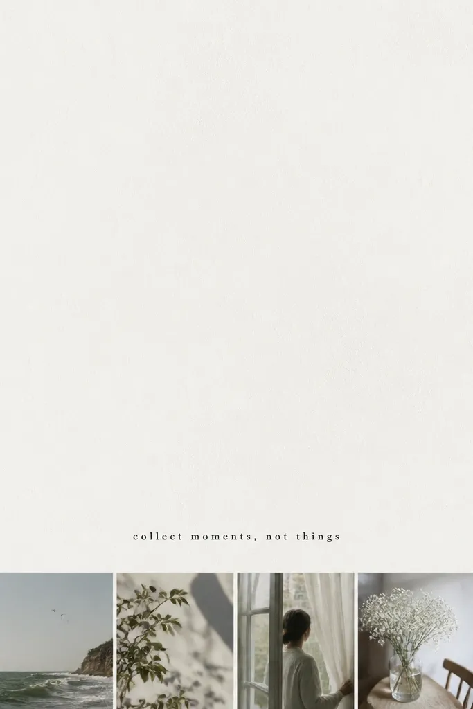
This layout feels modern because it uses negative space like design, not like leftover room. I use it when you want the collage to look good even from a distance, like over a console table. The bottom strip makes a visual anchor, and the top clean space lets the gift feel calm. It flatters couples who have photos that vary in brightness because the strip keeps them together in one controlled zone. If you have kids photos, keep them in the strip too so the whole collage stays cohesive.
Start with a 11x14 backing. Leave the top 60% of the page mostly empty. Place a bottom strip of 12-16 photos as small squares, like 2x2 inches, with tiny gaps of about 0.2-0.25 inches. Print the photos on matte paper and mount them carefully in a single straight line. Add a small phrase above the strip, around 2-3 inches wide, like “10 years” or “Always.” Keep the phrase in gray or black and align it with the strip’s center.
Use a metal ruler and cut guide tape on your work surface so the strip stays perfectly level.
Don’t add extra text blocks. One phrase keeps it minimalist.
20. Grid with One Vertical Accent Photo in Black Frame

Choose a backing like 12x16. Build a 3x4 grid with consistent white borders, then replace one center slot with a taller vertical photo. Keep that accent photo’s width consistent with its column, but let its height extend into two rows. Add a thin black frame around the accent photo, like 0.1-0.15 inches wide, while other photos keep only white borders. Print all photos and mount them in the exact layout. Add a small date label in the bottom center, aligned with the grid.
This layout is minimalist but still gives you a “wow” moment. The tall accent photo pulls attention without needing extra colors or decorations. I use it when you have one portrait shot that’s stronger vertically — like a couple standing with great posture or a candid with movement. The black frame around the accent photo adds contrast and makes the collage feel intentional. It flatters all photo types because the rest stays consistent, while the accent photo is given a clear role. It also helps if your other photos are slightly mismatched; the black frame creates a visual anchor.
AvoidAvoid thick black borders. Thick frames look heavy and break the minimalist feel.
Pro tipMake the accent photo’s background simple so the black frame doesn’t pick up clutter.