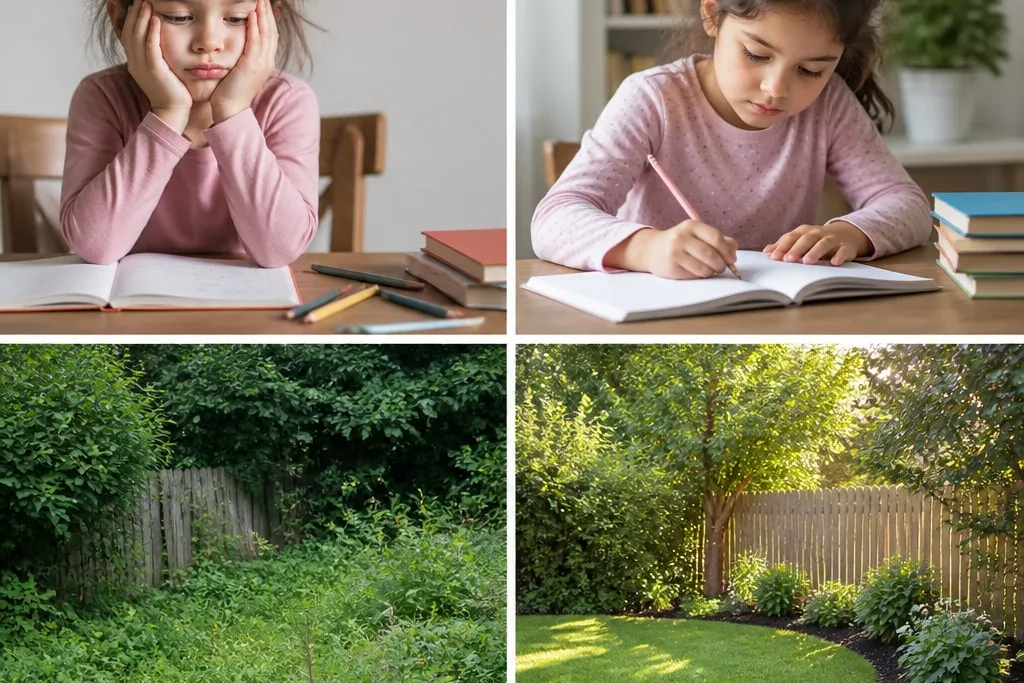
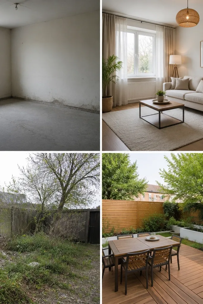
1. Mat-Board Split Screen with Title Bar
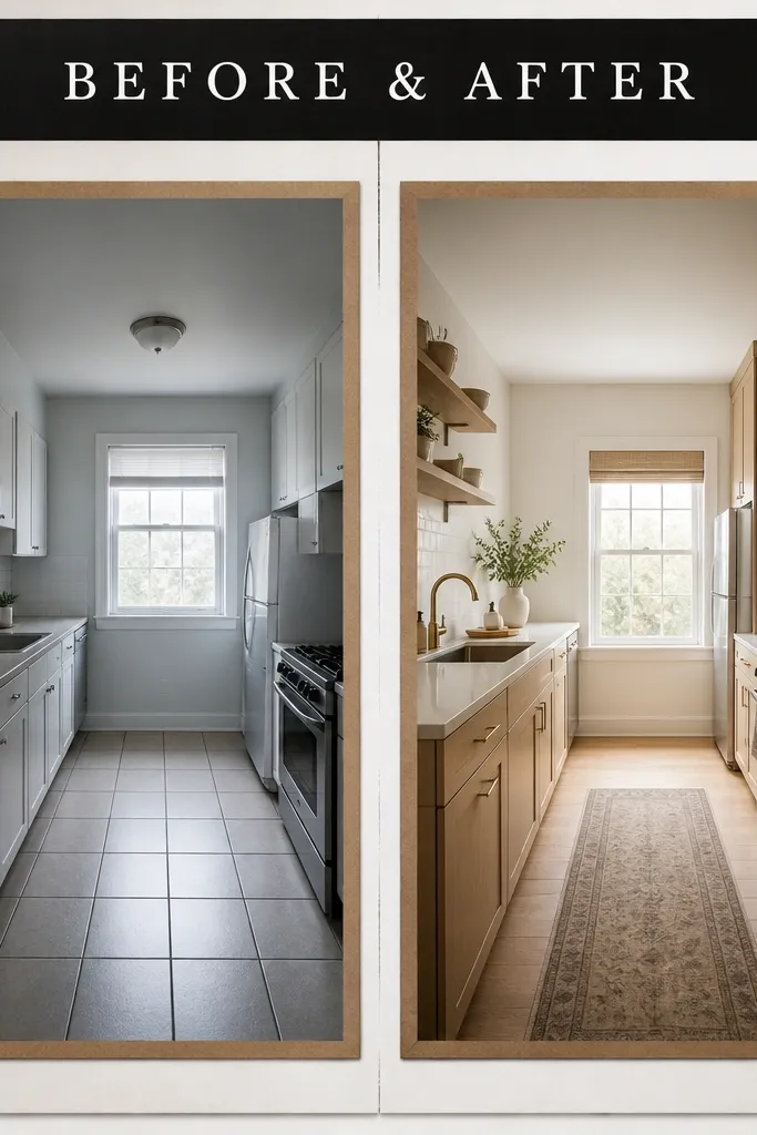
This one looks sharp because it’s basically a clean comparison page. I use a 12x18 poster board, then create two equal photo windows with 1/2-inch matte borders in a warm brown paper. For the “before” side, I slightly adjust the photo temperature warmer or cooler so it still looks natural, not edited to death; the goal is consistent lighting, not a filter. It looks best for projects like plant growth, room cleanup, or skill progress because the eye naturally reads left to right. The split also flatters kids' projects because it makes the before moment feel “set up” and the after moment feel “solved,” without extra clutter.
Cut two rectangles of photo paper to fit inside your mats, leaving a 1/2-inch border all the way around. Place the mats so both sides are perfectly level — I tape a ruler along the center line, then measure the top edge of each photo window. Add the title bar first: a strip of black cardstock across the top, about 2 inches tall, then glue it down before any photos. Finally, add two small labels in the bottom corners with white gel pen: “Before” on the left and “After” on the right, then press everything under a book for 10 minutes.
Pro tipUse matte photo prints and a foam roller or credit card to press down edges so the photos don’t curl.
AvoidDon’t use thick glue blobs — they create ripples that show through matte prints.
2. Washi Tape Timeline Between Two Photos
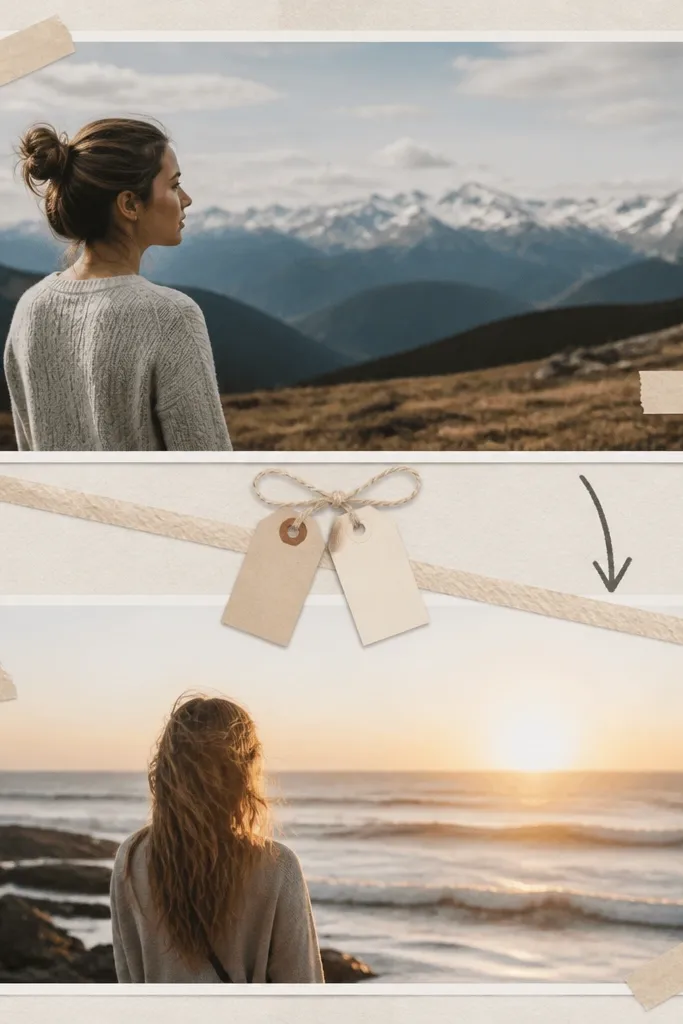
This layout is kid-friendly because it turns the before-after story into a simple timeline. I use it for science experiments, homework routines, or “learning progress” projects where the after is the result of practice. The washi tape adds soft color without looking like craft-store chaos, especially when you limit it to one pattern and one solid tape. It looks best with portrait-oriented photos because the tape line can run diagonally like a path. For skin tones, I prefer matte prints and avoid shiny stickers over faces because classroom lights reflect off gloss.
Start by placing two photos vertically on a letter-size sheet or a half poster board, leaving at least 1 inch of margin around the edges. Run one piece of washi tape diagonally from the bottom corner of the top photo to the top corner of the bottom photo, then add a second thin solid tape line parallel to it. Attach two date tags with small paper strips: “Day 1” near the top photo and “Day 14” near the bottom photo. Write the project name on a small label banner above the top photo, then glue the rest of the page around it.
Pro tipPick washi tape with one dominant color that matches the school theme paper, like navy plus white dots.
AvoidAvoid using three different washi patterns — it makes the page read messy from the back row.
3. Photo Grid with Before/After Color Coding
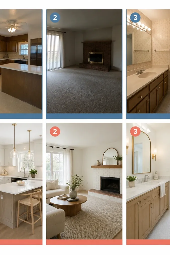
This is the layout I use when a project has multiple steps, like baking, coding, or a multi-stage art process. The grid keeps it organized, and the color coding makes before and after instantly recognizable without extra writing. I choose two border colors only — one for before, one for after — and keep the rest of the page neutral. It looks great on mixed content projects because each photo gets equal space, so nothing feels like an afterthought. The style flatters most skin tones because the focus is on the border color and not on glossy overlays.
Pick a grid size that fits your photo count. For six photos, I use a 3x2 grid on an 11x17 sheet, with 1/4-inch gaps between photos. Print each photo with a consistent size, then glue a thin border strip behind it: blue for before photos and coral for after photos. Put numbered circles in the top-right corner of each image using a 1-inch punch or pre-made circle stickers. Add a short key at the bottom: “Blue = Before, Coral = After,” then keep all text in the same font style with a black marker.
Use the same border thickness on every photo so the grid looks intentional.
Don’t let some photos touch the edge while others have thick margins — it looks uneven fast.
4. 3D Layered After Photo with Offset Shadow
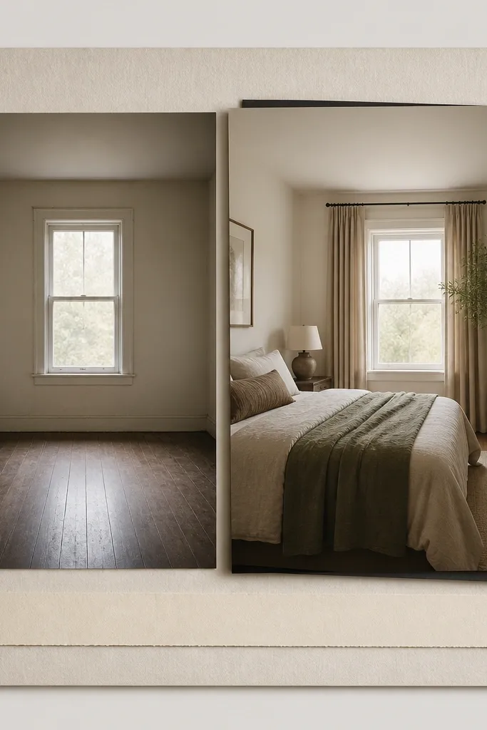
This one makes the after feel like it pops off the board, which teachers notice because the page has depth. I use it for “before and after” makeovers like poster redesigns, room tidy-ups, or repaired items. The trick is that only the after photo gets the 3D treatment; the before stays flat so the comparison reads immediately. Choose a shadow color that matches your border color, like charcoal or deep navy. It looks best with photos that have clear edges — desks, bookshelves, or whole objects — because the offset shadow frames the subject.
Print both photos at the same size, then mount the before photo flat on the board. For the after photo, cut a second backing layer from black cardstock the same size and glue it slightly offset by 1/8 inch down and right. Mount the after print on top of that backing so the offset becomes a crisp shadow. Add a caption strip under each photo with the same width, then draw a simple arrow from the before caption to the after caption using a fine-tip marker. Press the layered after piece under a book so it stays flat.
Pro tipOffset in tiny steps: 1/8 inch looks clean, 1/4 inch looks like a mistake.
AvoidSkip foam tape that’s too thick — it creates wobbly edges when the board gets moved.
5. Before/After Corner Frames with Matching Icons

Corner frames look neat without covering your photos, and the icons let kids label the story without writing essays. I use this when the project is more about process than measurement, like “how my drawing improved” or “how my plant care changed.” The rounded corners make the page feel friendly, which works well for younger kids. I also like using icons because they’re readable from a distance and reduce handwriting pressure. The color choice matters: keep icon color to one shade like teal or maroon so the page stays calm.
Cut a rounded-rectangle border frame for each photo using a template or a corner punch, leaving about 3/4 inch of border around the photo. Glue the frames onto a light background sheet, then place photos inside the frames. Add icons in the top corners: a simple clock outline for “Before” and a checkmark for “After,” drawn in the same marker color. Put the labels in the bottom corners with tiny text, like “Before” and “After,” then draw an arrow between the two frames. Keep the border color consistent across both photos so it feels like one set.
Use a ruler to align both icon corners at the same height.
Don’t use tiny glitter glue — it catches light and makes photos look messy.
6. Tape-Resist Sticker Labels and Clear Photo Margins
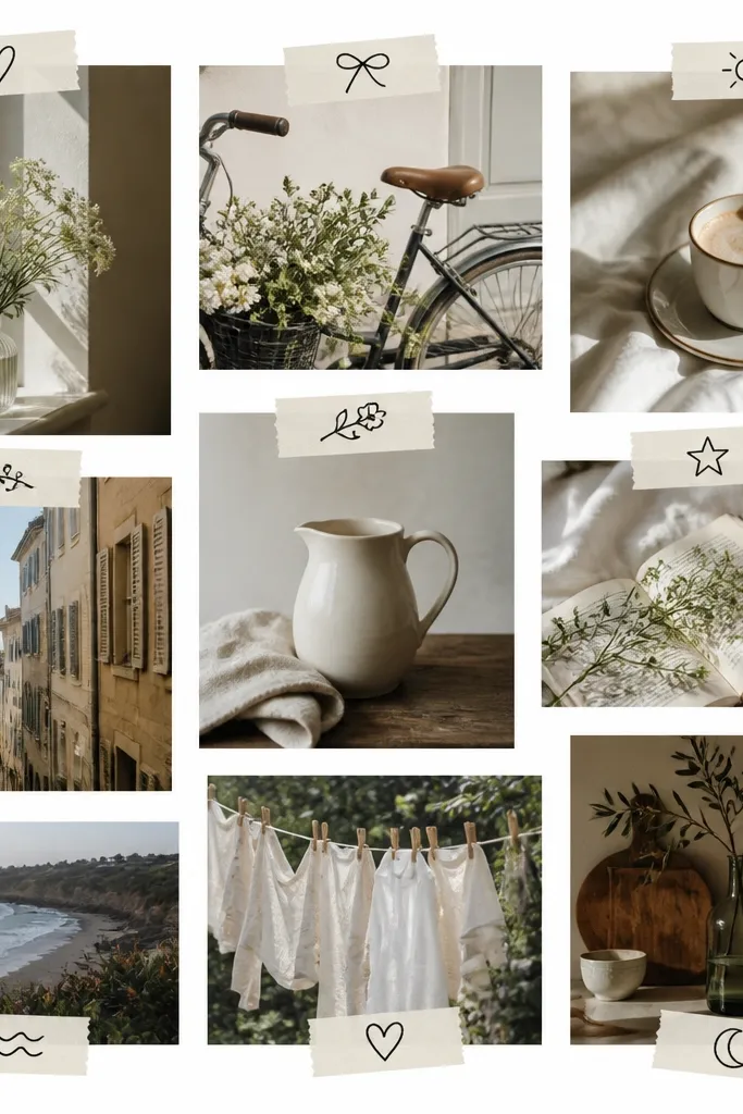
This design looks like a store-bought organizer board because it keeps clear margins and uses labels like graphic elements. I use it for school projects where you have several “before” shots of the same thing from different days, then one strong “after” shot. The tape-resist labels give a handmade look, but they stay crisp if you use painter’s tape and a steady hand. It’s especially good for kids who want the collage to feel “fun” without making it hard to read. The plain background makes skin tones and artwork photos look natural because nothing shiny competes with them.
Print your photos as small cards, like 3x4 inches, and leave a 3/4-inch white space between each card. Arrange your before cards in a column, then place the after card larger or centered at the bottom. Make labels by cutting painter’s tape strips, placing them where you want the text, then writing on the exposed paper with a black marker. Remove the tape to reveal clean edges, then glue labels or cover them with a thin layer of clear tape if your teacher allows it. Finish by adding one arrow label at the side that says “Same project, later” with a simple icon.
Print one extra copy per photo so you can re-cut if a label lands crooked.
Don’t crowd the margins — cramped spacing is what makes these look like a last-minute craft.
7. Notebook Paper Background with Photo Windows

This is my go-to for school projects because it looks academic without feeling like a worksheet. The notebook lines make it easy to place photos straight, and the background gives a soft texture that hides small glue marks. I use it for homework improvement projects, essay revisions, and “study routine” before-after sets. The cool blue lines look good with warm skin tones and colorful crafts because the background stays subtle. It also helps your collage read as organized, not random, because the lines guide the eye.
Cover a poster board or presentation board with printed notebook paper, using a glue stick on the back so it doesn’t warp. Cut photo windows with a white mat border about 1/2 inch thick, then glue them centered on the page. Put the before photo on the upper left and the after photo on the lower right, then draw a single line with a dark pencil or black marker connecting them. Add two small handwritten date lines like “Before: Oct 2” and “After: Oct 16” along the connecting line. Keep the handwriting size consistent, about 12-14 point equivalent, so it’s readable.
Pro tipIf the lines are too distracting, choose a lighter blue notebook pattern or reduce the photo size slightly.
AvoidAvoid glossy notebook paper — it reflects classroom lights.
8. Polaroid-Style Before/After Stack with Rounded Tape Hinge

Polaroid stacks make before-after projects feel like a personal journal, which is exactly why teachers accept them when the content is solid. I use this for kids' art growth, sports improvement, or “learning to cook” projects. The rounded tape hinge adds a handmade touch but still keeps the photo secure. Choose neutral frame colors like cream or light gray so the collage doesn’t look like a party craft. This style flatters most skin tones because the frame acts like a soft buffer around faces and hands.
Cut two polaroid frames from cardstock, like 4x6 photos with a 1-inch white border and a 1-inch bottom caption area. Place the before polaroid flat first, centered. For the after polaroid, add two small curved tape pieces at the top edge like a hinge, then glue the bottom edge so it doesn’t lift. Write “Before” on the bottom caption strip of the first frame and “After” on the second. Use consistent tilt — I keep the after photo tilted only 5-7 degrees — so it looks intentional, not messy.
Pro tipUse a ruler to line up the bottom edges of both polaroids — it’s the difference between cute and chaotic.
AvoidDon’t use tape along the sides — it wrinkles and makes the frame look cheap.
9. Science Fair Graph Paper Layout with Measured Labels
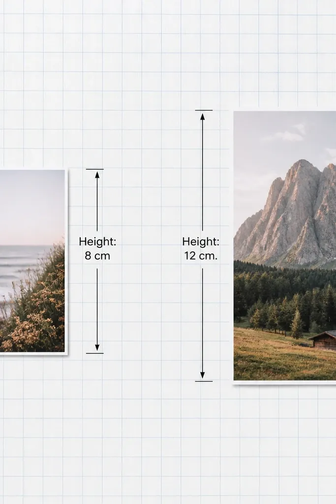
If your project has numbers, this layout makes them look like they belong. I used it for plant growth and for measuring a craft build where the after had a clear size change. The graph paper gives structure, and the measured labels turn the before-after comparison into data. It looks best when the before and after photos show the object in full so the arrows make sense. The grid also helps keep handwriting straight, which makes it more readable from the back of the room.
Cover the board with printed graph paper, then place two photos side by side with a 1-inch margin. Use a colored marker for callout arrows, like blue for before and green for after, and keep the arrow style consistent. Write one measurement per photo — big enough to read, about 16-20 point equivalent — and include units like cm or g. Add a simple title at the top on a strip of white paper, then draw a faint rectangle border around the whole layout. Glue down everything with a thin layer so the graph paper doesn’t ripple.
Pro tipWrite measurements in one line and keep decimals out unless your teacher requires them.
AvoidAvoid tiny text — a label that’s 2 inches long is too small for classroom viewing.
10. Magazine Cutout Border with One Theme Color
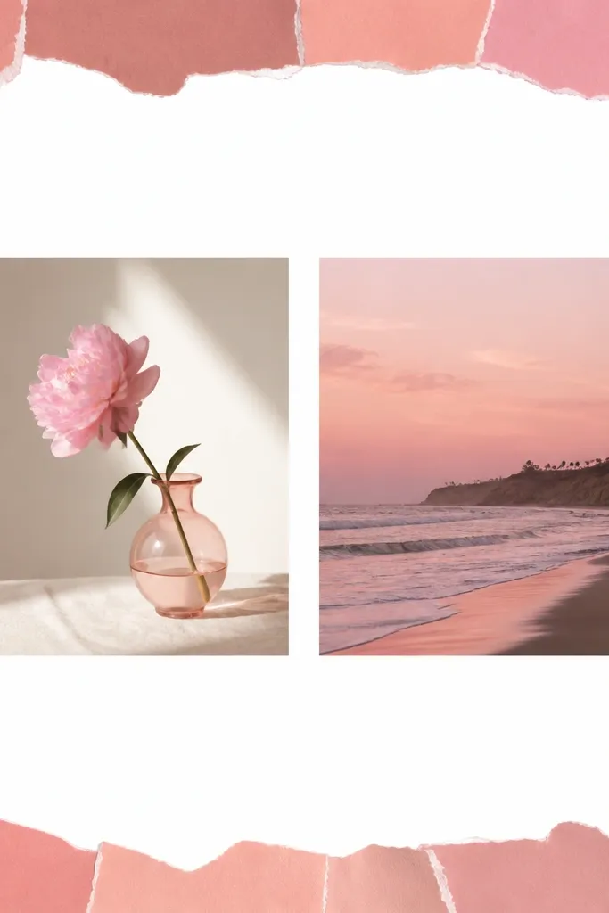
This one looks artsy without turning into a collage mess. I use it when the project is creative, like a poem revision, poster redesign, or a handmade item. The magazine border adds energy, but keeping one theme color keeps it from looking random. I pick a color family that matches the after photo — if the after has bright red, I use red magazine clippings. The center stays clean so the before-after comparison is still the main event.
Tear magazine strips into 1-inch pieces, then sort them into one color family before gluing. Cover the edges of a white sheet with the torn strips, overlapping them slightly like shingles. Place your before photo on the left and after photo on the right, then add a thin white mat border so the photos stand out from the torn texture. Write captions directly under each photo with a black marker, and keep them to two short words like “Before” and “After.” Finish by adding one small shape cut from the same magazine color — a circle or star — near the title.
Pro tipUse a glue stick, then press with a flat hand for 30 seconds so the paper tears lie flat.
AvoidSkip multicolor borders — they distract from the photos.
11. Fabric Scrap Frame with Photo Corners
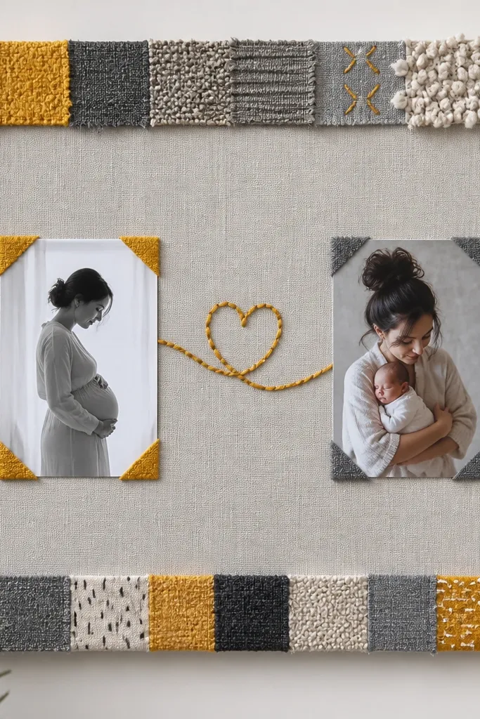
Fabric frames make before-after projects feel handmade and a little more “premium,” especially when the photos are simple. I use it for craft repairs, sewing practice, or any project where texture matters. The frame is the star here, so you keep the photos clean and matte. Gray and mustard, or navy and cream, work well because they don’t fight with most school photo colors. It flatters the whole page because it adds warmth around the edges while keeping the center photo focus.
Cut a border strip from cardboard or cardstock to fit your board edges. Glue fabric scraps to the border first — overlap seams slightly — then attach the border to your board. Place your before and after photos in the center with 1/2-inch white mats. Hold each photo corner with a small fabric tab made from the same fabric — like a 1-inch fold on each corner — then glue those tabs down. Add one yarn line from the before corner to the after corner with small glue dots behind the yarn so it looks stitched.
Pro tipUse matte Mod Podge on fabric edges if your teacher allows it; it seals fraying.
AvoidAvoid fuzzy, high-pile fabric — it makes the board look uneven and hard to press flat.
12. Photo Booth Strip with Numbered Before/After Frames
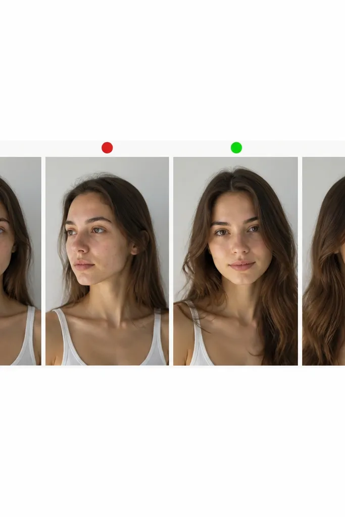
This layout is great for projects that have multiple steps, not just one before and one after. I used it for a “how my essay changed” project where the student revised in two stages and then finished. The photo booth strip keeps the viewer moving along the story without needing a lot of writing. Numbered circles make the order obvious, which helps when the teacher checks quickly. It also looks clean because the frames repeat, and repetition is what makes it feel polished.
Print four photos in the same size, like 3x4 inches, and cut them into equal frames with a white border. Arrange them in a row across a 12x18 board with 1/2-inch spacing. Put red numbered circles on the first two frames labeled 1 and 2, then green numbered circles on the last two frames labeled 3 and 4. Add small text under the strip: “Before” under the first two frames and “After” under the last two. Glue the strip down last so you can align the spacing perfectly.
Keep circle sizes identical — mismatched circle sizes make the whole strip feel off.
Don’t mix portrait and landscape frames — the strip looks lopsided fast.
13. Before/After Arrow Path with Sticky-Note Captions
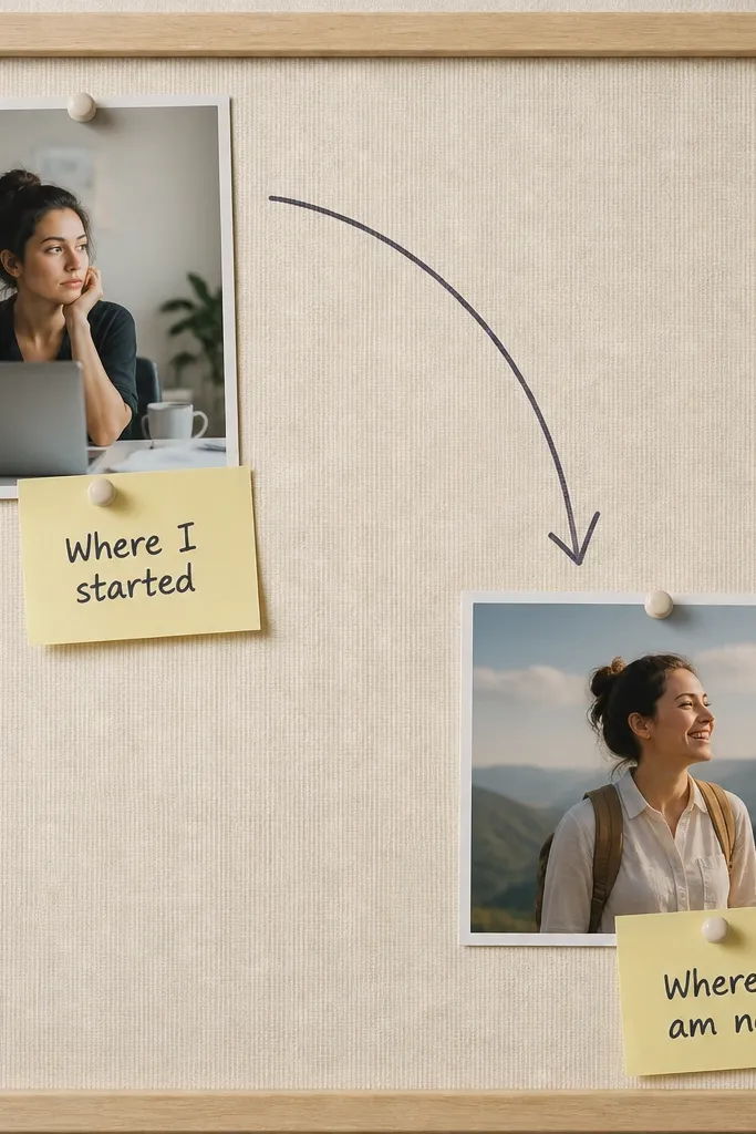
This one is practical and looks cute because it tells the story with direction. I use it when the project has a clear “do this, then this” flow, like building a model, fixing a broken item, or learning a routine. The arrow path makes the read order obvious, even for someone glancing quickly. Sticky-note style captions keep writing short and readable. It flatters most photos because the captions sit in blank space instead of covering faces.
Choose a layout where the before photo starts at one corner and the after ends at the opposite corner, like top-left to bottom-right. Place the photos with 1-inch margins and a thin white mat border. Draw a curved arrow between them using a ruler and a dark marker, then add two sticky-note style rectangles near each photo. Write one phrase per note, like “Before: messy edges” and “After: smooth finish,” then glue the notes down. Finish by adding a small title strip at the top with the project name.
If your arrow looks shaky, draw it lightly in pencil first, then trace with marker.
Avoid captions that are longer than two lines — they start to look crowded.
14. Shiny Foil Accent Frame Around After Only
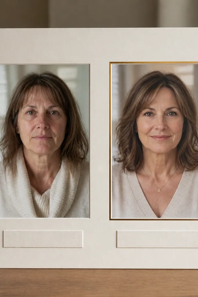
This design makes the after feel like the “finished product” without adding extra elements. I use it for projects where the after is visibly polished, like a painted box, a cleaned desk, or a completed craft. The foil should be thin and controlled — one accent edge is enough. It looks best when the after photo has light areas or clean surfaces, because the foil catches attention. For kids with darker hair or deeper skin tones, the matte board helps avoid glare, while the foil draws focus to the comparison.
Mount both photos on matte paper first so the surface stays consistent. Frame the before photo with 1/2-inch paper mat in navy or charcoal. For the after photo, cut a thin frame from metallic gold contact paper or foil sheet and place it around the photo with a 1/4-inch inner gap. Glue the foil frame carefully, then add a caption strip under both photos in the same color as the frame. Press everything flat for 10 minutes, especially around the foil edges.
Pro tipUse a craft knife on a cutting mat for foil contact paper so edges look clean.
AvoidDon’t wrap foil around the whole board — it gets loud and distracts from the photos.
15. Scrapbook Sticker Labels with Consistent Handwriting

Sticker labels work when you keep them consistent. I use this for kid projects where parents took lots of photos and the student needs a clear story without heavy explanation. The secret is handwriting consistency, not label variety. I pick one ink color, usually black, and I keep the label style the same on every photo. Star for before and heart for after gives quick contrast without needing long text. The page looks friendly and readable, which matters when teachers flip boards quickly.
Choose 6-8 photos, then print them in a consistent size like 4x4 or 3x4. Arrange them in a grid or a loose rectangle, leaving 1/2-inch margins between photos. Add sticker-labels made from cardstock rectangles — cut them about 1.5 inches wide — then glue them on top of the background, not across faces. Write “Before” labels with a star icon and “After” labels with a heart icon using the same marker thickness. Put one small legend at the bottom if you have multiple before moments, like “Star = earlier.”
Make a quick practice sheet of your handwriting style before labeling the real photos.
Avoid mixing marker thicknesses — thin and thick lettering together looks sloppy.
16. Before/After Split with Transparent Clear Sleeve Cover
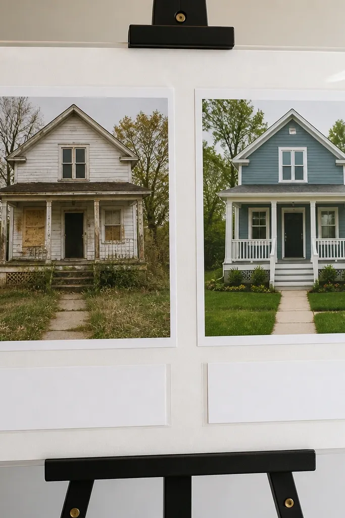
Clear sleeves protect everything and keep the collage looking new through presentation day. I use this when kids have to carry their project in backpacks, or when the board needs to survive multiple days. The sleeve also makes the colors look slightly deeper, especially with matte prints under a clear layer. It looks clean because the photos sit behind one smooth surface, so glue edges don’t show. This layout is great for projects with lots of handling because it reduces wear.
Print your photos and labels, then mount them on cardstock with a thin glue stick. Cut a clear plastic document sleeve or use clear contact paper to cover the photo area only, not the whole board. Place the before and after photos side by side first, then slide the sleeve over them and tape the edges to the back of the board. Add labels under the plastic so they stay readable, like “Before” left and “After” right, written on white paper strips. Seal the tape edges so they don’t peel when moved.
Pro tipUse matte photo paper so the clear plastic doesn’t create glare spots.
AvoidAvoid covering glossy prints with plastic — reflections make text hard to read.
17. Before/After Window Cutouts with Curved Paper Borders

Window cutouts make the collage look like it belongs in a gallery, but it’s still easy to build. I use it for projects where the before and after are both “scenes,” like a room corner, a garden bed, or a model setup. Curved borders soften the page and make it feel less harsh than straight rectangles. It works well for kids of all ages because it hides uneven cutting — the border frames the edges. The gentle curves also keep attention on the photo subjects without covering important details.
Cut two rounded-rectangle windows in white cardstock mats, leaving about 3/4-inch border around each window. Glue the mats onto a light background, then insert the printed photos behind the cutouts. Add curved paper borders by cutting thin strips, like 1/2 inch wide, and gluing them along the outer edge of each window. Write “Before” and “After” as small subtitles above each window using a black marker. Add one thin arrow between the windows, centered, so the reading order is clear.
If cutting rounded rectangles is hard, use a craft die or trace a drinking glass for a consistent curve.
Don’t make the border too thick — thick frames swallow the photo and look bulky.
18. Before/After Photo Strip with Chalkboard Caption Panel
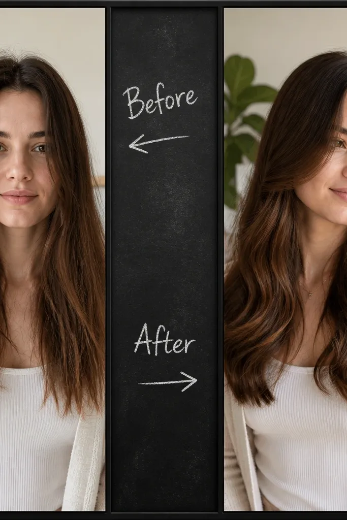
Chalkboard panels add contrast and make labels pop without needing a lot of writing space. I use it for history projects, classroom experiments, or any before-after where you want the caption to look like it belongs on a classroom wall. The black panel makes white chalk-style text readable from far away. Keep the rest of the layout simple: two photos, black borders, and one centered panel. This style flatters the photos because it reduces visual clutter and keeps the focus on the comparison.
Border both photos with black cardstock strips about 1/4 inch thick. Place the photos side by side or top-bottom, then leave a gap in the middle for a chalkboard caption panel. Cut a rectangle of dark gray craft paper or chalkboard paper, then write “Before” and “After” labels with a white chalk marker. Glue the panel into the gap and add one short sentence under each label, like “Started” and “Finished.” Finish by adding a small piece of colored tape at the top as a title underline.
Use chalk marker only on matte surfaces — shiny craft paper makes the text smear.
Avoid long paragraphs on the chalk panel — it looks like a wall of writing.
19. Before/After Sticker Tabs with Clear Ordering Numbers
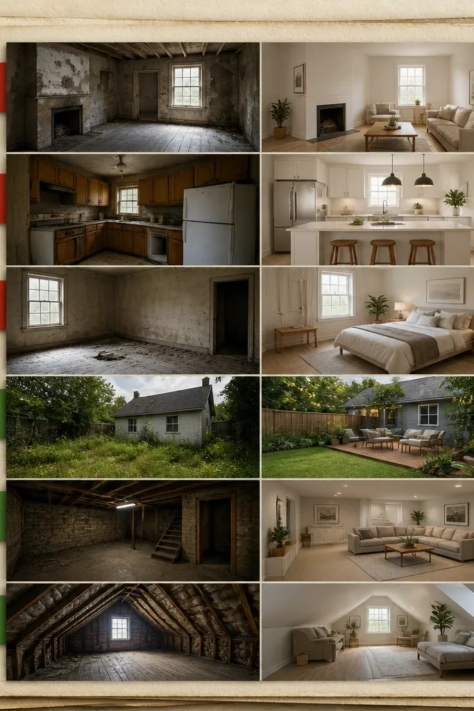
Numbered tabs are my favorite fix for when kids have multiple before photos and one after photo. It stops the teacher from asking, “Which one is first?” because the order is built into the design. I use this for projects like “before cleaning, after cleaning,” where you have close-ups plus one overall shot. Red and green tabs make the before/after distinction immediate. The layout also flatters photos because the tabs sit in the margin, not over faces or important details.
Print and cut your photos into matching sizes, like 5x7 or 4x6, depending on your board. Arrange them in a vertical column with 1/2-inch spacing. Create small tabs from colored cardstock, about 1 inch wide and 2 inches tall, and glue them along the left edge so each tab points to a specific photo. Put numbers on the tabs using a black marker, then color-code: red for before steps and green for after. Add a title at the top and a tiny legend at the bottom: “Red = Before, Green = After.”
Pro tipKeep tab text centered by using a ruler and light pencil marks before writing.
AvoidDon’t stack tabs on top of each other — they hide the photo margins and look messy.
20. Book Page Background with Photo Labels as Marginal Notes
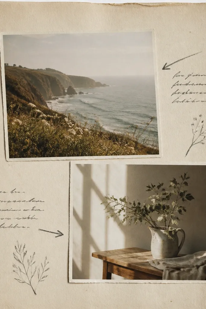
This style looks thoughtful because it mimics margin notes from a textbook. I use it for reading projects, history timelines, and “before-after understanding” assignments where the after is a revised conclusion or improved explanation. The book background gives texture, but you still need to keep the center clean so the photos stand out. Marginal note labels with arrows are readable and feel age-appropriate for middle school. It also flatters photos because the background is busy at the edges while the photo area stays calm.
Cover your board with book pages using a glue stick, then trim edges so they don’t hang over. Place your before photo on the left and after photo on the right with a 1/2-inch white mat border. Write marginal note captions beside each photo using a black marker, like “Before: I thought...” and “After: I learned...” Keep the text short and place arrows that point to the top edge of each photo. Add a small title strip at the top on plain white paper so the background doesn’t compete. Seal the book paper lightly with a thin coat of Mod Podge if the teacher allows it to prevent smudging.
Use matte Mod Podge — glossy makes the book text glare.
Avoid covering faces with dark background text — it makes skin tones look muddy.