
1. 24x36 grid with corner trailing pothos
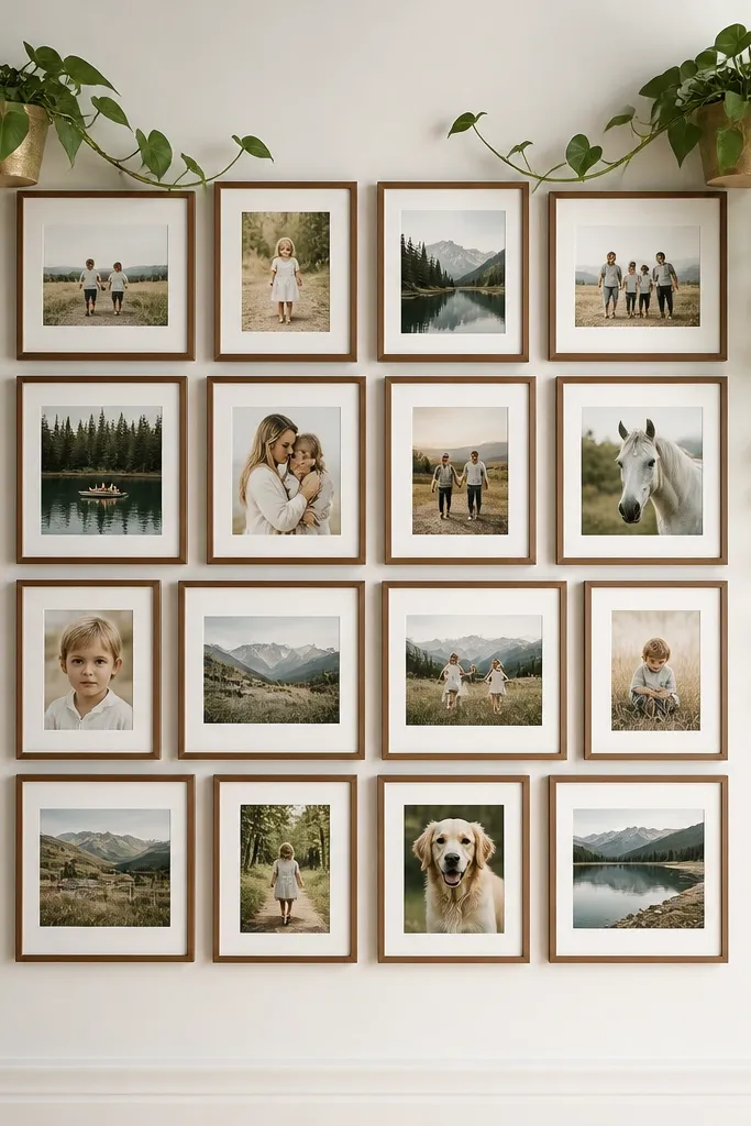
Start by dry-fitting your frames on the floor in the exact 24x36 rectangle. Leave 1 inch between frame edges so you can add plant accents without crowding. Mount the frames on a cork board backing using small picture hooks or binder clips on the cork — I prefer binder clips because you can swap prints later. Then install two corner planters on the top left and top right — I use 6-inch ceramic pots with a macrame hanger or wall bracket so the vines hang naturally. Finally, tuck the vines inward so they land near the second row of photos, not over the top row.
This layout works best when your kids' photos include a mix of close-ups and full-body shots, because the grid keeps everything readable. I use a 24x36 inch backing and keep the frames matte — either warm wood or flat black — so the green leaves look crisp instead of muddy. The plant placement in the top corners pulls your eye across the collage, which is great for family walls where people stand back and take it all in at once. If your wall is light-colored, the contrast from black frames looks sharp; if your wall is darker, warm wood frames soften the look and make the greens feel brighter.
AvoidAvoid placing the vines directly against frame glass — it smears over time and looks messy in photos.
Pro tipPick pothos vines that are already long enough to reach the second row; short vines look like they got stuck mid-grow.
2. Cork board swap wall with mini herb planters
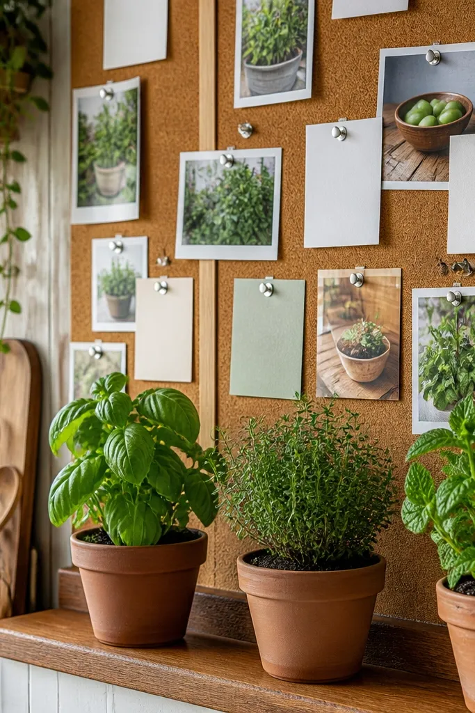
Start with a cork board cut to about 30x40 inches (or buy a sheet that size) and hang it so the bottom edge is at kid eye level, around 48 inches from the floor. Arrange your photo prints in a loose grid using 4x6 and 5x7 sizes, keeping a 3/4 to 1 inch gap so pins don’t fight each other. Pin each photo using two clips — one at the top corners — so the image stays flat. Mount three mini planters along the bottom row using wall hooks or a narrow shelf bracket, spaced 8-10 inches apart. Then place the tallest herb in the center so it balances the photos, and trim any leaves that reach into the photo area.
If you want photo collage ideas layout with plants that survive constant updates, this one is the most practical. Cork lets you pin new prints in minutes, which matters when you’re changing school photos, sports photos, and birthday updates all year. The herb planters add a natural, kid-friendly vibe without covering faces, and the narrow leaves keep the wall from looking bulky. I like this look in kitchens and playrooms because the plant colors echo real life — green pops against the warm cork and makes the photos feel cozy.
AvoidDon’t pin photos too close to the cork edges; the board warps slightly and you get uneven gaps.
Pro tipUse plant saucers under the planters even if you think you’ll never spill — kids bump shelves and you’ll thank yourself later.
3. Gallery ledge with layered frames and a single central planter
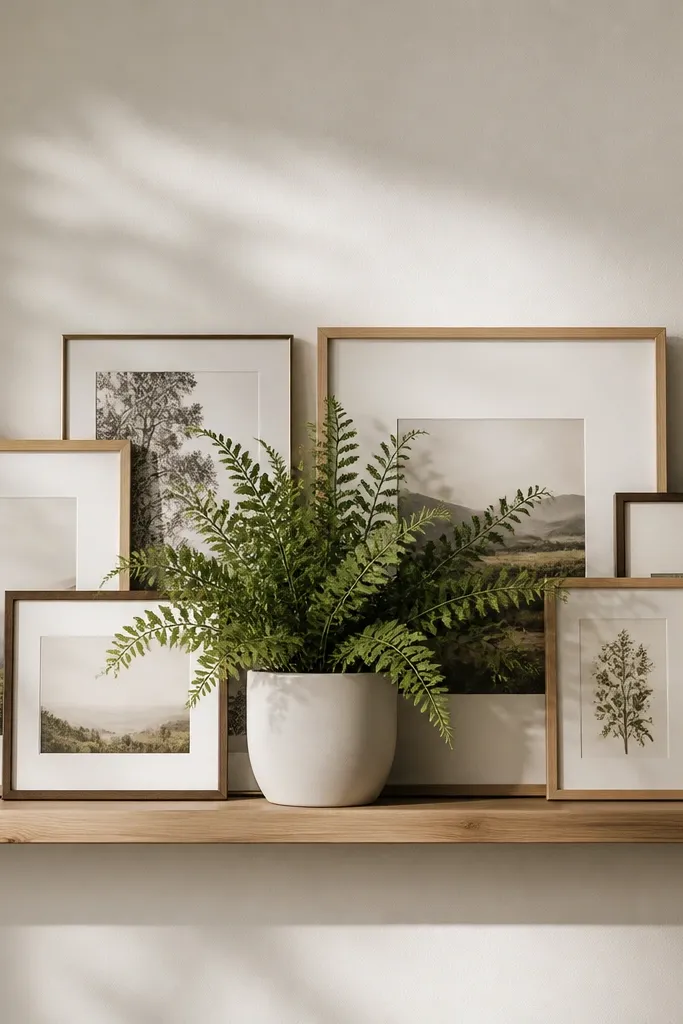
Install a floating ledge about 6 inches deep at a height where the center planter will sit around 58-60 inches from the floor. Build your collage on the wall above and around the ledge using 5x7 frames in a mostly vertical pattern, with one or two horizontal frames to break the rhythm. Overlap frames by about 1/2 inch so the front edges don’t look like they’re floating. Place the central planter directly in the middle, aligned with the center of the frame grid, and choose a plant with a rounded shape — fern-like fronds look airy, but you need a dense base. Finish by adding one small secondary green accent, like a tiny trailing vine in the corner, only if there’s empty space left.
This layout looks intentional even when your photos vary a lot in size, which is exactly what happens with kids' milestones. The layered frames create depth, and the single central planter gives your eye a stopping point so the wall doesn’t feel like it’s falling. I use light frames — white or pale oak — because they make the plant look brighter and keep the overall wall from feeling heavy. This is also a good choice for renters because you can mount a ledge and frames on removable hardware without drilling into every corner.
AvoidAvoid placing the planter too low; if it sits at eye level with faces in frames, it looks like the plant is blocking heads.
Pro tipIf your plant is faux, dust it with a makeup brush before mounting; it makes leaves look less matte and more real.
4. Staggered ladder grid with wall shelf planters
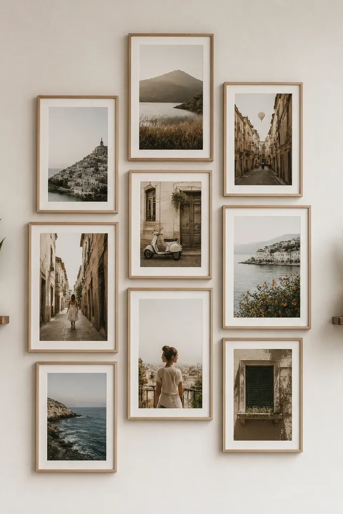
This is my go-to for kids' photos that include more “action” shots — dance, soccer, outdoor play — because the diagonal ladder feel matches motion. The shelves on the left and right keep the plants separated from the photos, so nothing smears or crowds. I choose plants with upright leaves, like faux eucalyptus bundles or small potted succulents, because they read cleanly at a distance. If your wall has a busy paint color, this layout still looks crisp because frame edges and shelf lines create order.
Mark three vertical columns on the wall with pencil dots, each column about 12-14 inches wide depending on your frames. Put the frames in a staggered pattern: top-left starts highest, then drop one row as you move down, keeping about 1 inch between frame edges. Mount shelves on both sides first — I use 10-12 inch shelves — and keep them aligned with the middle row of frames. Place one plant per shelf and keep the plant height to about the height of a 5x7 frame, so it doesn’t overpower faces. Finally, hang your frames so the plant edges don’t overlap the photo borders; that spacing makes the collage feel designed.
Use pencil marks for shelf brackets and measure twice — shelves that are 1/2 inch off make the ladder look crooked fast.
Don’t pick plants with long drooping vines for this layout; they tangle visually with the staggered frames.
5. Framed shadow box look with mossy backdrop and photo cutouts
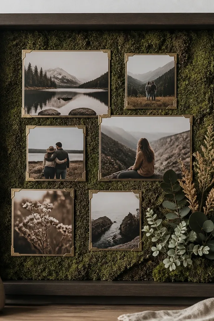
Buy a square shadow box frame around 18x18 or 20x20 inches, and remove any backing that’s too thin. Cut your moss-like sheet or faux moss mat to fit, leaving a 1/4 inch border for grip. Print photos slightly smaller than the opening, then mount each photo with photo corners so edges stay crisp. Place one small plant cluster in the bottom right inside the frame, and keep it low — about 2-3 inches tall — so it doesn’t block eyes. Use a thin craft glue to anchor the moss and plant, then let it dry flat before closing the shadow box.
This one is for when you want photo collage ideas layout with plants that look like a custom art piece, not a school-project collage. The mossy backdrop fills empty space so you don’t need to cram frames together, and it makes the photos feel grounded. I use shadow boxes because the depth hides messy edges from print trimming, and it keeps everything protected from sticky fingers. This look flatters warm skin tones really well because earth tones pull attention to faces without the glare you get from glossy prints.
AvoidAvoid glossy photos inside a shadow box — the light catches the surface and makes faces look shiny.
Pro tipTrim photos with a paper cutter for clean edges; scissors make the collage look handmade in a sloppy way.
6. Row of frames with matching plant color blocks
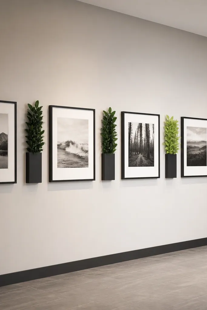
This layout is clean and modern, and it works when you want the photos to read fast — like a timeline of kids' ages. The plants act like color separators, so the wall doesn’t feel like a repetitive line of rectangles. I match plant tones to your photo palette: darker green leaves pair well with warm-toned photos, and lighter green plants pair well with cooler, outdoor pictures. If you’re dealing with a narrow wall, a horizontal row keeps the collage from getting too tall and overwhelming.
Choose a consistent photo size like 4x6 for every frame, and pick frames in one finish so the row looks intentional. Measure your wall width and decide how many frames fit with 1 inch spacing between them. Hang the frames first, level and aligned, using a laser level if you have one. Then place three narrow planters between selected frames: one near the center, one slightly left, one slightly right so the accents feel balanced. Keep planters slim — around 3-4 inches wide — and choose plants with similar leaf texture so the wall looks cohesive from across the room.
Use a real plant in a hidden plastic pot inside the planter; it’s easier to water and looks full longer.
Don’t mix wildly different leaf shapes in the same row; the collage starts looking like random decor.