1. Off-White Frame Grid with Equal Spacing
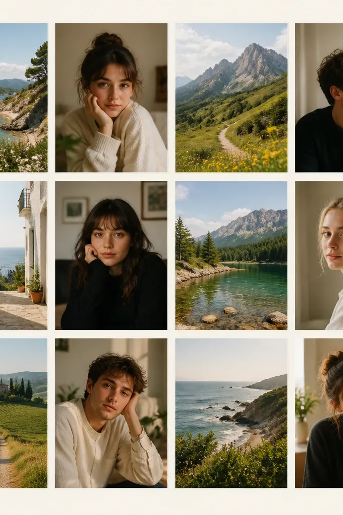
This one is the easiest way to make a collage look “put together” fast. I use an off-white background because it doesn’t compete with skin tones, and it makes mixed lighting look intentional. Keep the borders consistent — thin and the same color on every tile — so the eye doesn’t bounce around. This layout flatters anyone’s photos because it treats each image equally; you don’t end up with one face too big or too dark compared to the rest.
Start by creating a canvas at your phone resolution (for most people it’s 1170x2532 or 1290x2796 — check your device). Add 12 photos and arrange them in a 3x4 grid. Set the border to a thin width (think 8-12 px) and keep the gap between photos the same on every row and column. Finally, export and preview with your clock widget on so you can adjust the center spacing if it covers faces.
Pro tipPick 4 photos with similar brightness and 8 that are slightly darker, then the grid looks cohesive instead of patchy.
AvoidAvoid thick black borders — they make the wallpaper look like a sticker sheet.
2. Hero Photo with Four Mini Tiles Around It

I love this layout when you have one “main character” photo — a birthday shot, a first-day-at-school photo, or a holiday portrait. The big center image anchors the composition, and the surrounding minis feel like context instead of clutter. Use it for lock screens because the center hero photo can handle the clock overlap better than a dense grid. It also flatters faces: the hero image gets the best crop while the mini tiles are cropped tighter so you don’t get awkward half-heads.
Start by choosing your hero photo and crop it so the eyes land near the middle of the frame. Place four mini tiles in the corners around it, leaving a clear margin so the clock doesn’t cover the hero face. Add a light border only to the mini tiles, not the hero, so your eye lands on the main image first. Finish by adding a subtle background tint (light beige or warm gray) and export at full resolution.
If your hero photo is bright, pick mini tiles from the same lighting direction (window light vs flash) so the collage doesn’t look mismatched.
Don’t put mini tiles too close to the center — the clock will eat them and the whole thing looks cramped.
3. Filmstrip Collage with Date Tags
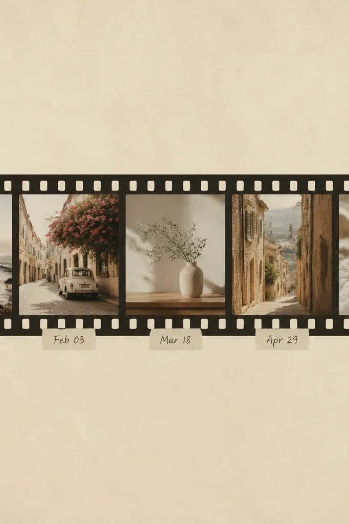
This is the one I use for kids' milestones because it turns plain photos into a story you can read. The filmstrip shape is natural for timelines, and the date tags make it feel intentional even when the photos are random snapshots. It looks good on OLED screens because the cream background and muted text keep contrast readable. It also works for different skin tones because the photos are framed in a consistent strip, so no single face gets swallowed by a harsh border.
Create a horizontal band layout across the center of the canvas, leaving space above and below for the lock-screen clock. Add 6-8 photos and crop them to a uniform aspect ratio like 3:4 so the strip stays consistent. Add a subtle sprocket edge effect by using a small repeating circle pattern or a filmstrip overlay if your app has it. Put date tags under each photo with a small font size and medium gray color, then export and test the text legibility at lock-screen distance.
Pro tipUse the same date format every time (like 2026-07-11) so it looks designed, not improvised.
AvoidAvoid neon text colors — they look like an anniversary meme, not a wallpaper.
4. Polaroid Stack with Realistic Shadows

If your camera roll has a mix of selfies and family pics, polaroid stacking makes it feel curated without needing perfect matching. The thick white margins give you room to breathe, and the slight tilts add that lived-in, hands-on feel. I’ve used this for birthdays and weekend trips, and it always looks better than straight grids because overlap hides uneven cropping. It flatters most photos because the polaroid margin acts like a neutral buffer around faces and clothing.
Start by choosing 5-7 photos and crop them to a similar portrait ratio. Add a thick white margin around each (about 10-16% of the photo width) to mimic polaroid borders. Place them in a loose stack with small rotations (between -6 and +6 degrees) so it doesn’t look messy. Add a soft shadow that’s gray with low opacity, then export and check that the stack doesn’t cover your notification area.
Pick one color theme from your photos — warm browns or cool blues — and let the polaroids sit on a matching background tint.
Avoid hard-edged shadows — they make the whole thing look cut out with a cheap app.
5. Matte Color Blocks with Photo Windows
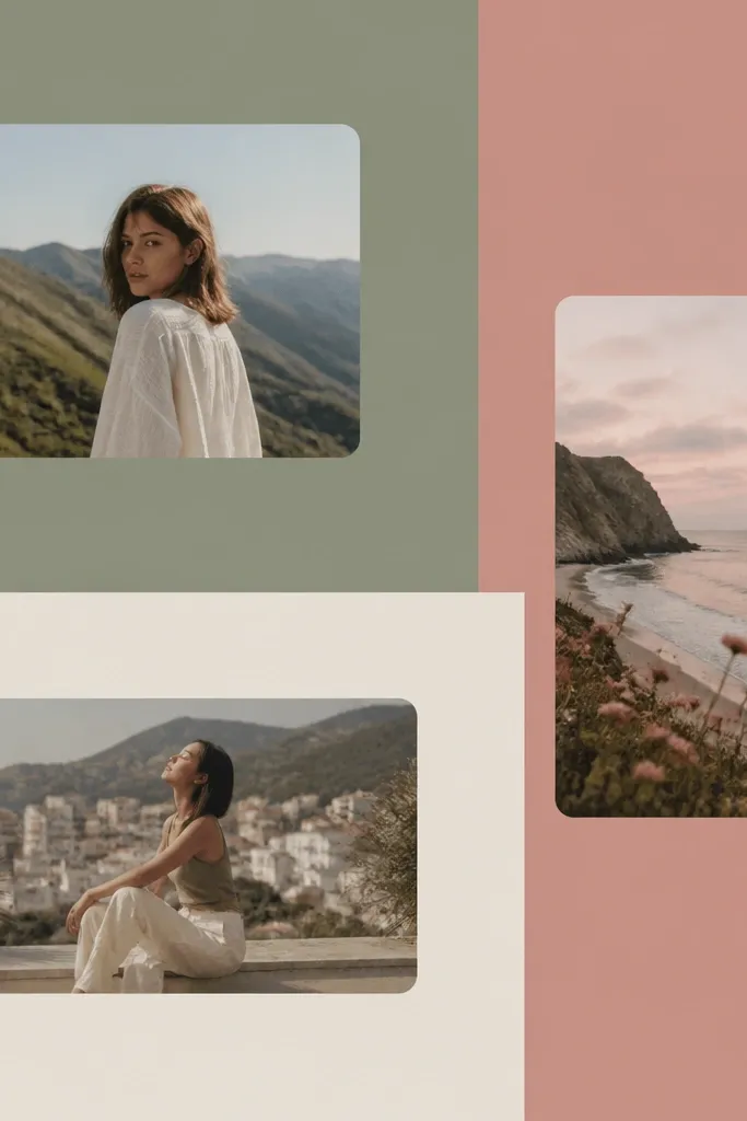
This is a clean option when you want the collage to look like design, not a scrapbook. The matte blocks cover up the “random photo lighting” problem by giving every image the same visual container. Rounded photo windows keep skin tones from looking too harsh against straight edges. It’s especially flattering for kids' photos because busy backgrounds get toned down by the color blocks.
Pick 3 muted background colors that show up in your photos — I usually use one green, one pink, and one cream. Create big blocks that take up about 60% of the canvas, leaving photo windows for the remaining 40%. Add 6-9 photo windows with rounded corners and keep the window sizes consistent within each color block. Finish by adding a tiny white inner stroke around each window (2-4 px) so the photos separate cleanly, then export.
Pro tipIf your photos include a lot of sky, lean toward cooler blocks (sage/blue-gray) so the overall tone stays calm.
AvoidAvoid bright primary colors — they overpower the photos and make faces look washed out.
6. Black-and-White Portrait Grid with One Color Accent
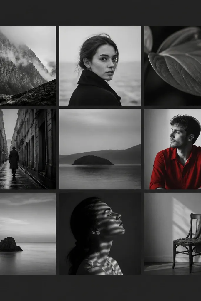
This layout looks sharp and intentional because it forces consistency. Converting most photos to black-and-white removes the “why does this one look different?” problem, and the single color accent gives you a focal point. I’ve done this with kids where one photo has a red hoodie — it instantly makes the collage feel designed. It flatters faces because high-contrast B&W keeps features readable without color noise.
Start by converting all photos to black-and-white in your editing tool, but leave one tile unedited for the color accent. Arrange 9 photos in a 3x3 grid, with a dark gray border (not pure black). Use a charcoal background so the colored tile pops. Export at full resolution and zoom in on the colored tile to confirm the color reads on lock-screen brightness settings.
Choose one accent color that appears in at least two photos (even if you desaturate one) so the vibe stays cohesive.
Avoid more than one accent color — two colored tiles usually look accidental.
7. Sunrise Gradient Background with Side-by-Side Favorites
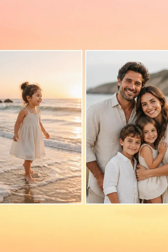
Gradients work when you want the collage to feel warm and happy without turning into a busy patchwork. A sunrise gradient is forgiving because it matches skin tones and makes outdoor photos look cohesive even if they were taken on different days. This format is also practical: two big photos are easy to crop and easy to read with clock placement. It flatters most body types because wide, side-by-side crops reduce the chance of awkward headroom.
Create a background gradient using peach (#F6B08A) to pale yellow (#FFF1C9). Place two large photos side-by-side with a small gap, and give them a thin white border. Crop both photos to the same height and similar subject framing (eyes at about the same vertical position). Leave extra empty space at the top for the lock-screen clock, then export and test under both dark-mode and bright-mode settings.
Pro tipIf one photo is indoors and one is outdoors, use a color-matching filter on the indoors photo so both feel like the same “sunlight.”
AvoidAvoid gradients with high contrast stripes — they make the collage look like an old app background.
8. Sticker-Style Clip Frames for Kids' Photos
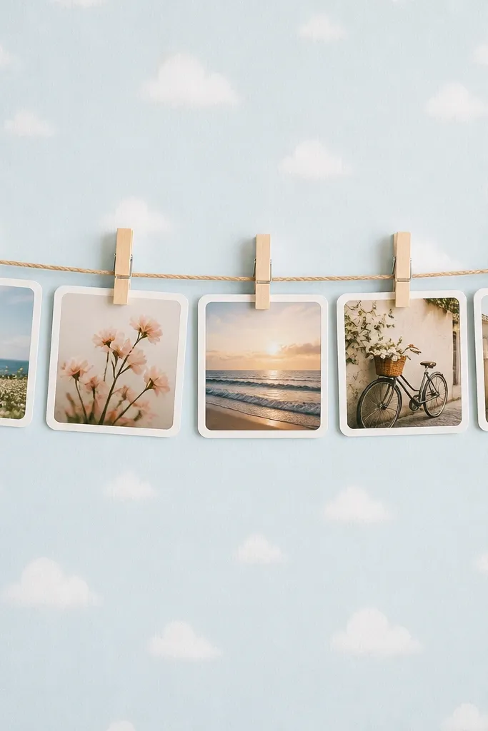
This is playful without being chaotic. The clip frames tell your brain “these are separate moments,” so you can include more photos than a grid and it still feels organized. I use it for weekly kid updates because it turns “samey” snapshots into something you want to check. The light blue background keeps skin tones looking natural, and the white frames prevent busy backgrounds from bleeding into each other.
Start by picking 7-10 photos and cropping them to a consistent portrait ratio. Place them in two rows, with each photo hanging from a horizontal line that runs across the middle third of the canvas. Add a small clothespin graphic above each photo and keep it the same color (light gray or pale wood tone). Finish with tiny dotted texture on the background (very subtle), then export and confirm the clothespins don’t cover faces.
Use only one background texture across the whole wallpaper; mixing textures makes it look like cheap sticker packs.
Avoid dark backgrounds with stickers — the clips disappear and the whole thing feels flat.
9. Minimal White Border with No Background (Let Photos Breathe)
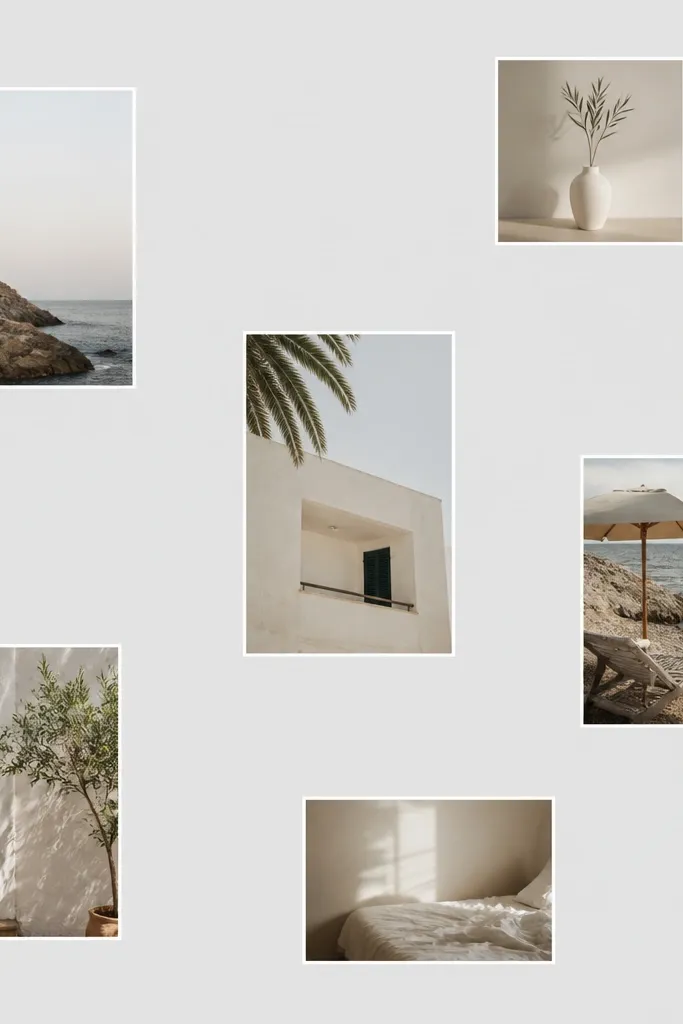
When your photos are already good and you just need them arranged, this minimal style looks expensive. The thin white border is enough separation, but the big empty spaces stop the wallpaper from feeling crowded. This is also a lifesaver for lock screens because the clock and icons sit on calm zones. It flatters photos with strong composition — the ones where the subject is centered and the background isn’t messy.
Create a light gray canvas (#EDEDED works well). Place 6 photos in a loose 2x3 arrangement, but leave wider gaps than a grid — about 5-8% of canvas width. Add a thin white stroke around each photo (6-10 px) and keep the corners slightly rounded (radius about 12-18 px). Export and test on your lock screen with notifications on so you see if any faces get covered.
Pro tipUse photos with similar saturation so the collage feels calm even with different locations.
AvoidAvoid too many photos — if you fill the canvas, the minimal look turns into a cluttered collage.
10. Diagonal Grid with Rotated Tiles
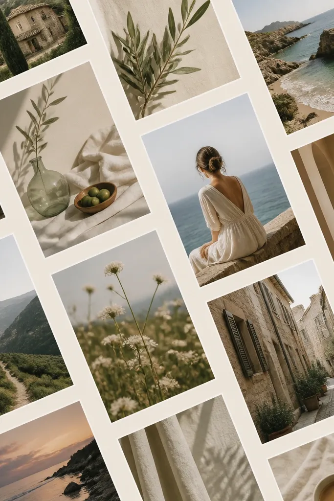
This layout adds energy without sacrificing structure. Diagonal grids make your phone wallpaper feel like it has motion, and the slight rotations keep it from looking like a spreadsheet. I use it when I want a collage to feel fun for kids' activities — dance class, playground days, school events. It flatters photos because the diagonal alignment draws the eye across the collage instead of forcing attention on one awkward crop.
Choose 10-12 photos and crop them to a consistent size ratio. Lay them in a grid, then rotate the whole grid by about 10-15 degrees so it sits diagonally across the canvas. Add a thin light border and keep the gap uniform. Leave a clear area at the top center for the lock-screen clock, then export and check that rotated tiles aren’t cutting off faces.
Pro tipPick one dominant color in your photos and let the background match it (cream for warm, pale gray for cool).
AvoidAvoid big rotations per tile — tiny consistent angles look designed, big angles look sloppy.
11. Polaroid Strip Across the Bottom
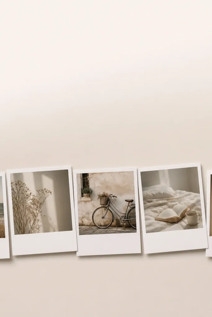
This is perfect when you want your lock screen to stay readable. By putting the collage along the bottom, you keep the clock and notifications clean up top. The polaroid strip also lets you show more photos without making the top feel cluttered. It flatters kids' photos because the bottom placement reduces the chance you’ll cut off heads from tall portrait shots.
Create a calm background gradient or solid color in the top two-thirds (light gray or warm cream). Place 6-8 polaroid frames in a strip across the bottom third, keeping the strip height around 35-40% of the canvas. Rotate each polaroid slightly (-4 to +4 degrees) and add soft shadows with low opacity. Export and test so the strip doesn’t collide with the notification bar.
Use the same crop style for all photos in the strip — either close-ups or full-body, but don’t mix both.
Avoid polaroids touching the bottom edge — leave a margin so the frames don’t look cut off.
12. Memory Reduct-style Scrappy Grid with Hand-Trim Edges
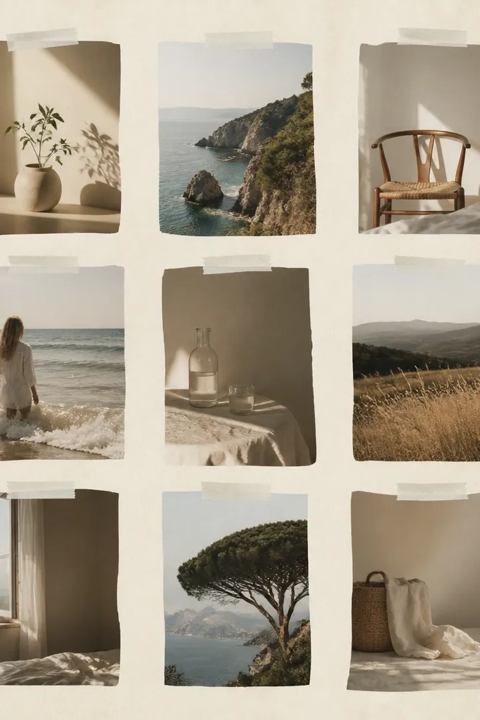
If your photos are very different sizes and you hate cropping, this is the style that makes that look intentional. The hand-trim edge effect and tape strips hide uneven borders and keep the collage from looking like a template. I use this for family events where people are moving — the shots are imperfect, but the wallpaper still feels warm and real. It flatters mixed skin tones because the tape and paper background unify the palette.
Start with a paper-beige background (#F3E8D8). Arrange 10-14 photos in a loose grid, but don’t crop them all perfectly — keep slight variation. Add a thin “tape” strip overlay across the top edge of each photo (same color and width), and add a subtle drop shadow that’s soft gray. Keep the center area clearer for lock screen readability, then export and check that the edges don’t bleed into icons.
Pro tipUse one paper tone across the whole collage so the “scrappy” look stays consistent.
AvoidAvoid using full-on scrapbook stickers in multiple styles — stick to tape only.
13. Monochrome Landscape Strip with Letterboxing
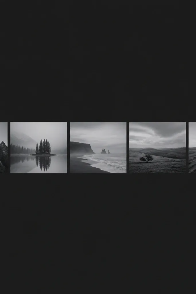
This one looks clean and grown-up, and it’s great if your camera roll is full of scenery, parks, or travel days. The monochrome treatment makes all locations feel like one set, and the letterboxing adds that cinematic order. I use it when I want the wallpaper to feel calm, not cute. It flatters photos with strong horizons because the bars keep the subject centered and prevent the collage from feeling cramped.
Pick 7-9 landscape photos and convert them to monochrome with a cool gray tint. Place them in a single horizontal strip across the middle, leaving space above and below for the lock screen. Add letterbox bars (thin dark gray rectangles) above and below each image so every tile matches in height. Keep borders minimal — just a subtle gap — then export and check contrast on your lock screen brightness.
Pro tipUse photos with clear light direction (morning sun or late-day shadows) so the monochrome still has depth.
AvoidAvoid adding bright colors into one tile — it breaks the cinematic uniform look.
14. Rainbow Corner Collage with Matching Background Tint
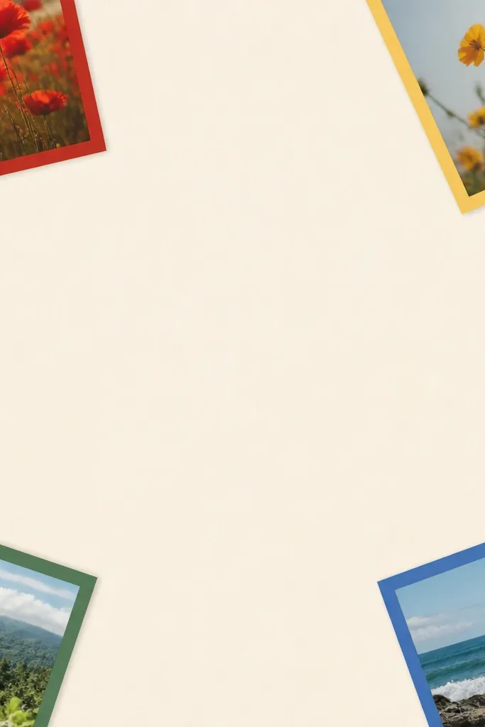
This is my pick for kids' art photos or birthday themes because it adds color without covering the whole screen. The colored borders give each corner a job, and the calm center keeps it readable. I’ve used it when the photos are small or slightly blurry — the border color helps the collage still look intentional. It flatters faces because the center stays clean and the eye lands on each corner photo quickly.
Create an off-white center background and keep the middle third mostly empty. Place 4 photos in the corners, each with a thick border in a single color family (red, yellow, green, blue). Crop each photo so the face or main subject sits near the inner edge, leaving room for the border. Add a small rounded-corner radius to match across all four, then export and confirm the colored borders don’t clash with your lock screen clock color.
Pro tipPull the border colors from what’s already in your photos so you’re not forcing random shades.
AvoidAvoid using every color in every border — keep it to four.
15. Soft Shadow Mosaic with 3D-Look Frames
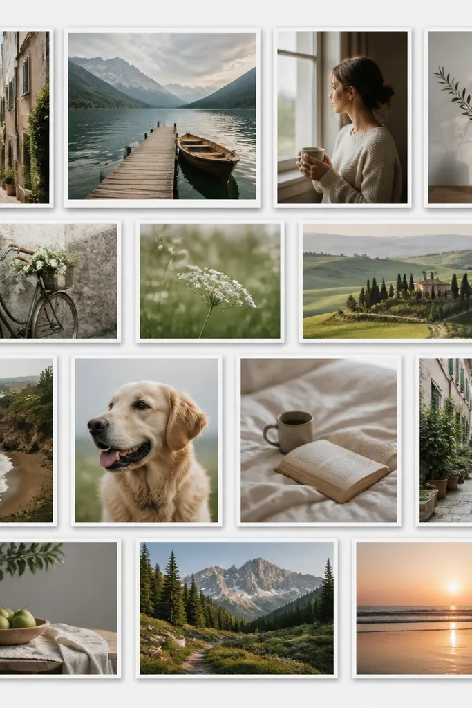
This is the “looks like it came from a design store” option when you have a lot of photos you want to use. The raised tile effect gives separation even when photos are busy, and the light gray background keeps it modern. I use it when I have lots of small moments from a week — playdates, parties, field trips. It flatters mixed lighting because the uniform frames and shadows make the photos feel like part of one set.
Create a light gray background (#F2F2F2). Arrange 14 photos in a grid that’s slightly tighter than a standard 3x4, like 4 rows with 3-4 tiles each, but keep a clear center margin for lock screen elements. Add a white frame around each tile (10-14 px) and apply a soft drop shadow with low opacity and a small blur radius. Keep the shadow direction consistent so it looks like one light source. Export at full resolution and zoom in to make sure faces aren’t cut off by the grid edges.
Pro tipIf your phone has a dark theme, preview the wallpaper in both modes so shadows don’t disappear.
AvoidAvoid heavy shadows — thick halos around photos look like a slideshow transition.